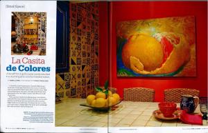
Well, not as small as the Chilean miners experienced after having been encapsulated in an underground tomb without prior planning to make such an accidental situation become a long-term living space and we’re not talking about designing for the astronauts in the space station…but planes, trains, boats and motor coaches…all are unusual spaces that provide fun and challenging design issues. We were recently thrilled to be recognized by Tucson Lifestyle Home and Garden magazine, in their October 2010 issue, for a casita project that qualified as an example of good design for a small space.
The interior design of a two bedroom three bathroom townhouse however, is far different from space utilization and design details in any of the unusual aforementioned references. And, and inasmuch as we have designed for nearly all of those unusually tight interiors, it is still a design test to see how to maximize the real and perceived space of a smaller footprint – even a townhome.
To start, it’s volume. By enhancing and utilizing the vertical opportunities and also the open connection between the interior spaces and the exterior, it expands the perceived footprint of the area. Lift the ceiling, bang out a few more windows, add skylights and clerestory slots…and you will change things exponentially. Bring the outside in – if you have unused spaces outside that can easily be incorporated into the interior – go for it! We captured an outside atrium space and created a patio-like interior dining room, incorporated interior windows for light-borrowing purposes and opened former glass clerestories into non-glazed open connecting spaces.
It’s like the Taco Bell Chihuahua – be small but think BIG! In interior design, it’s all about perception and practicality in space utilization/maximization. In today’s economy it’s all about making the most with the least…throttle back and take stock – creativity is often spawned by the challenges of limitation!

Recent Blog Posts
- DOWNSIZING: Part Two of Three February 21, 2025
- DOWNSIZING: Part One of Three November 5, 2024
- Colors and the Creamy Attraction of Latte August 29, 2024
- Designing, Styling and Why – Finding Personal Style April 30, 2023
- Fabrics – Texture, color, pattern, design & style – The Art of Transformation August 7, 2022
Come Visit Us!
216 GOLD AVENUE
ALBUQUERQUE, NM 87102
MON-FRI: 9 AM – 5 PM
SAT-SUN: 9 AM – 2 PM

