
It seems counter intuitive – and that is why so many people ask me about the effect of dark wall colors – “won’t it make it look small?” and I assure them – “no,” and they are still not so sure. The most recent example of this was in an expansive home where we were talking about accent walls – not willy nilly mind you, but in an architectural recess behind the stately china cabinet in the dining room and a doorway recess in another room. In this case, using neutral, warm grey tones – shades of same hue – value shifts for depth and architectural enhancement. Not yet painted, check out our website in a few weeks for befores paired with afters to see this example. Here though is another example 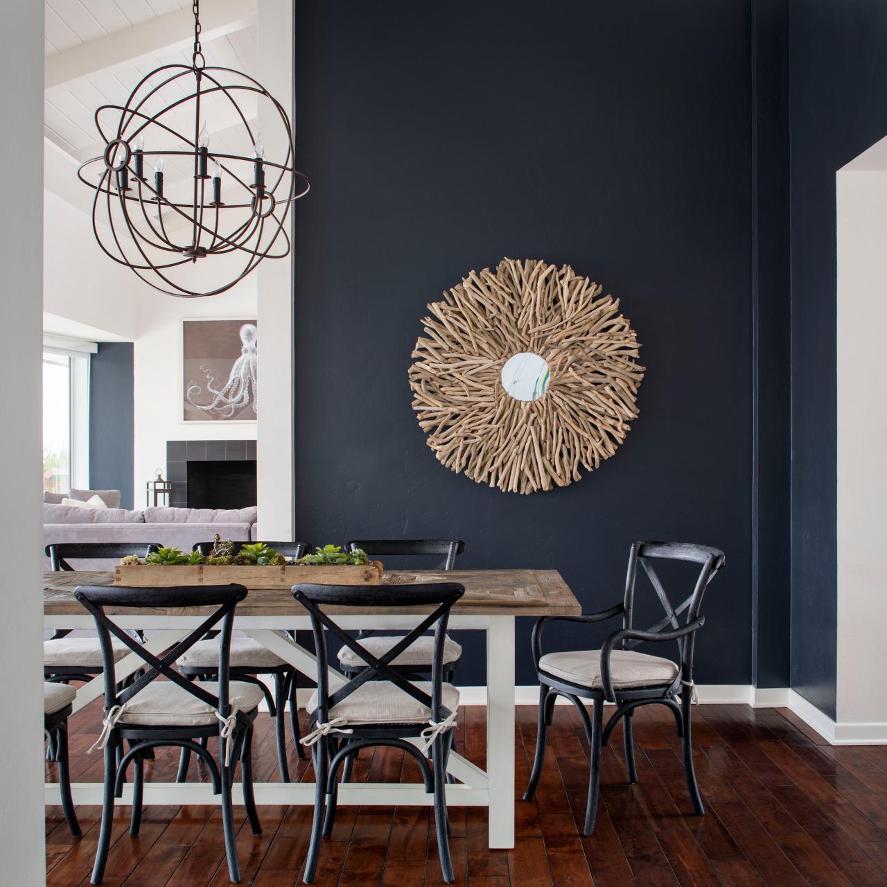
The above photograph for CM Natural Designs by Chipper Hatter.
If a dark color was to make anything look small – why would one want to paint it in a tiny space? There is the more specific, counterintuitive question. The answers is that there are illusions of space. A dark color in a small space can actually read as though there is more depth to the space. Where it can be close and cozy, it is also a subtle enhancer of depth and therefore size. 
So in another example currently in a state of remodel, a petite powder room previously papered in a dark green patterned wall-covering, now was being refreshed. There are no rules – it could have been bright, light, bold or dark…flat, glossy, organic or metallic – the possibilities are endless. But the previous rendition of this space was pleasing for its dark tones and therefore a decision was made to select a deep-toned paint for the re-do.
Dark colors, contrasts and lighting all can have dramatic effects on the perception of a space. Dark colors actually recede. Therefore, in many situations, if the application of a dark color will convey a sense of depth and additional space it’s an intriguing experiment. 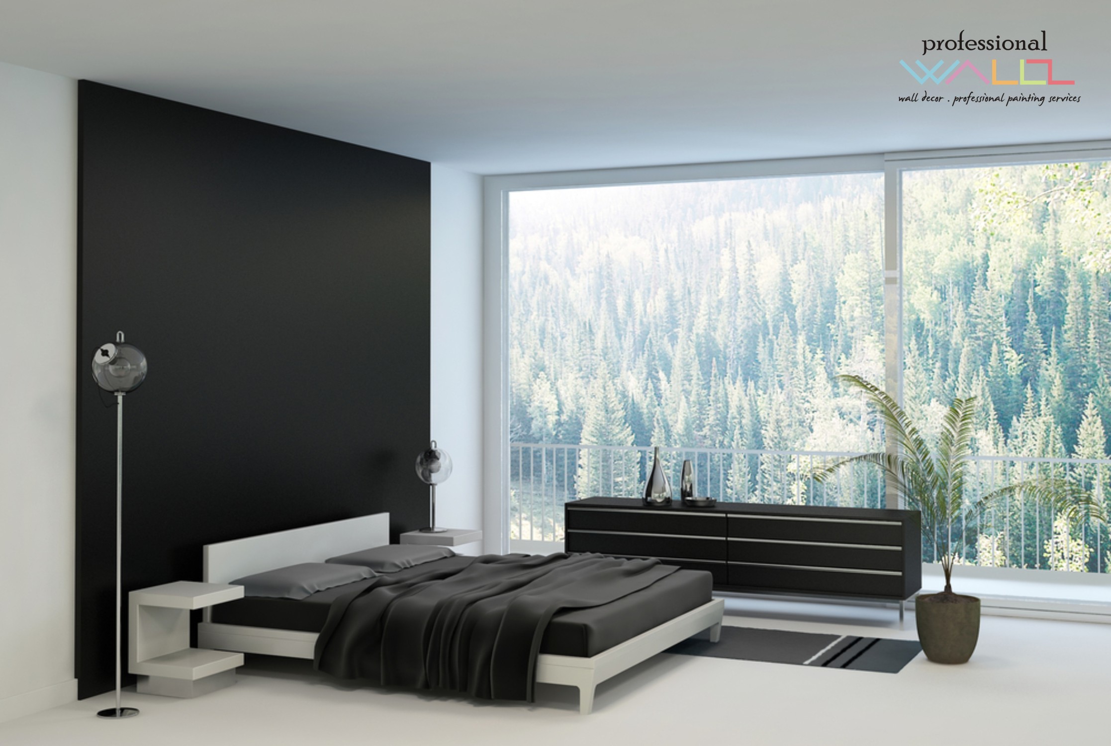 Like reaching into a hole or looking into space, and not seeing the boundaries well. It s a brain thing. If the brain reads dark, it suggests a depth of space and therefore more than is really apparent. This is often used in ceiling treatments. Having a low ceiling appear higher, when painted dark, due to the illusion of depth.
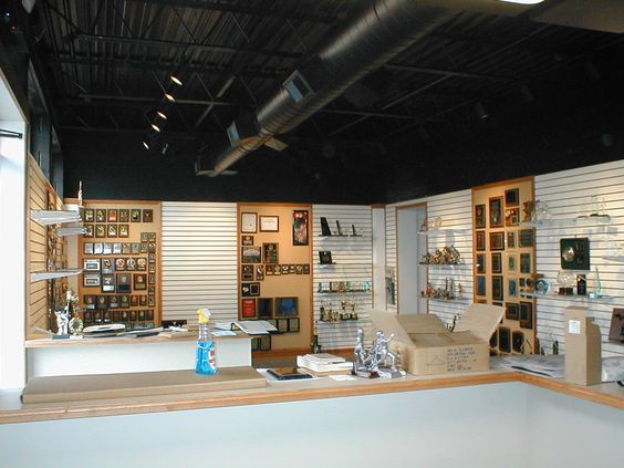
It is also effective to make something go away. An exposed mechanical or white lay-in acoustical ceiling can be institutional looking and not desirable in certain settings. Painting it black or another dark value of color, while sacrificing a bit of acoustical rating, the ceiling will seem higher, less distinguishable and not as imposing upon the decor of the space.
So the petite powder room currently being re-floored with dark tile, re-painted with Benjamin Moore HC-166 Kendall Charcoal, new dark matrix granite vanity top and cabinet, new lighting and mirror…will soon be finished and we will post the drama of dark in before and after shots!

Great Inspiration!