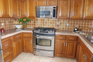
It’s happened before, I try to extract a color for the sake of discussion or comparison and I resort to food. Today it was about kitchen cabinets. They were a rich cherry. We were discussing what color backsplash would go well in context with the cabinets and rest of their color scheme.
I asked him – how would you describe the color of the cabinets? He said “brown.” He further said “with a little yellow. “ His wife held back…I said “what color of brown?” He thought…and I said “like a Mounds bar?” And he said, “well no, not a dark chocolate brown.” So I said a ‘milk chocolate or cocoa?” and he shook his head. I offered, “maybe a caramel or butterscotch and they both chimed in unison “yea, yea!” And we went on to discuss the nuances of the colors. Like a bag of caramel candy cubes.
It is interesting how something like wood is not regarded like paint when it comes to describing color. I said “if you were to paint this – how would you render the color.” It’s not just wood – wood isn’t a color and brown is waaaay too limiting – it’s a honey, golden, caramel striation of color.
That same color could be described as a warm, worn saddle leather brown…but that still doesn’t express the striations. It is funny how food seems to offer more references to describing the color. Cinnamon and nutmeg hit those orangey brown colors…cayenne red for another redder color description…
What used to be “earth tones” are now “organic.” So to describe browns as spice and candy colors, the green tones are cactus green, tarragon, basil, grass, leaf…they all have plant references…grey tones are stone, graphite, slate…maybe a mousey tone…but all of these color descriptions are only as good as each person’s familiarity with the comparison and also their perception of the comparison as relates to the other person with whom they are having this discussion.
So think about how YOU would describe a color of an item…any item…try to observe the color and not the object – clear your mind of the material and isolate the actual color – it’s fun and informative and will heighten your sense of color – its context and its effect on your mood, enjoyment, reaction…The flavor of Color!!!
Recent Blog Posts
- DOWNSIZING: Part Two of Three February 21, 2025
- DOWNSIZING: Part One of Three November 5, 2024
- Colors and the Creamy Attraction of Latte August 29, 2024
- Designing, Styling and Why – Finding Personal Style April 30, 2023
- Fabrics – Texture, color, pattern, design & style – The Art of Transformation August 7, 2022
Come Visit Us!
216 GOLD AVENUE
ALBUQUERQUE, NM 87102
MON-FRI: 9 AM – 5 PM
SAT-SUN: 9 AM – 2 PM


