TRENDS – How Does One Decide?

TRENDS…we HAVE to have them…it makes us think, makes us shift…not to mention keeping viscosity in the economy. The shift is the element that moves the economy forward. Without that shift, we would be stagnantly content. And who wants to be stagnantly content – except the “Settlers” from the Direct TV ads?  DIRECTV_Commercial_2015_The_Settlers-520x245

Yet if you Google design trends they are all over the place. The intrigue is when they land on an actual theme that becomes THE TREND.

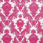
So as we advance into the new year and winter fades to spring – what lies ahead? I’m finding lots of nostalgia – features on milk glass and floral patterns and fancy geometric patterns, a recall to wallcoverings in floral prints and botanicals…Rose-wallpaper-Bari-J-WallAppeal-pattern-pink-yellow-zoom

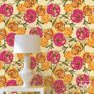
The trick is how to invest in these elements and not have them become passé by next year. It’s all about balance – unless you have the desire and pocketbook to change out your interior annually! The desire to add something new to your personal spaces, or as my mother has always said “punch it up” is an art unto itself. How does one decide?

Information is so accessible. Access to ideas is endless. But HOW does one decide? How to make the decisions, the right combinations, what to keep and what to change…? The internet and TV…Anthropologie to Pottery Barn, Pinterest and beyond…You pin a gazillion things – but how do YOU decide?

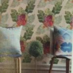
But it gets kind of funny  – because for as many sites as you visit – there are oh so many professed “trends.” Therefore,  sifting through is the challenge and distilling what seems to take the lead. Pastels, patterns and florals is my finding…but is this just spring? Will this fade with the next season? Or is this a “look” that will last for a while? And do I embrace it all or pick and chose? How does one decide? Elle Decor 2016 design trends table

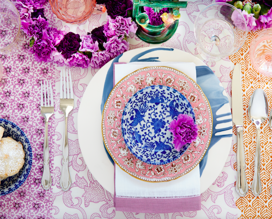
Pantone the color experts are even all over the place. Their designers were “inspired by the contrast of urban design and lush vegetation.” Whoa, really? That sure is a wide swath of possibilities!  And to say that these colors  are unisex is as though attempting to blurr the lines. A guy might wear a pastel pink, Rose Quartz, shirt – but would he upholster his sofa with it? Fashion and Home Decor often parallel their trends – and then they must veer off that same course for practical if not socially directed reasons.  Redford-3-Seater-Sofa-Peony-Pink

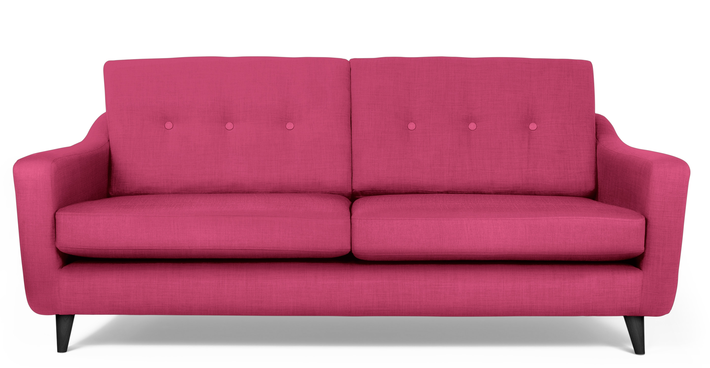
But the rationale is so amusing…for example,  Pantone writes: “Colors this season transport us to a happier, sunnier place where we feel free to express a wittier version of our real selves.” Yes, we all long to escape the doldrums of the short, dark, cold days of winter – hence the positive effect of transporting us to a happier, sunnier place is obvious – every year for that matter. That’s why tropical destinations are the prime vacations for winter getaways. Even most avid snow skiers manage to sneak in a run to the white sand beaches for some sun and fun alongside their plans to hit the slopes, get frost-bitten and nestle by the big fires.

I guess I’m looking for a more cerebral explanation for the color movements. And yet, maybe there aren’t any – so let’s not pretend then. What does it mean a “place where we feel free to express a wittier version of our real selves.” Wittier like a guy upholstering or painting his man cave with Rose Quartz or Peach Echo? That’s witty all right!!!!! That’s not the cerebral that I meant. But it is an interesting rationale. Color is giving us permission to express our REAL selves. I guess that’s one way.

Yet, here are 5 different color series for the upcoming year…and as you can see – it’s all there – it’s all covered.  Pantone color-trends-2016


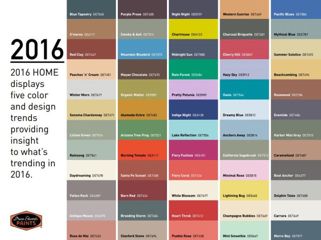
So as you climb out of the dark, cold recesses of winter and squint your eyes at the bright, colorful luminosity of spring in bloom, where will trends take you on your journey to “punch-up” your interiors?


Red – A GIFT of LOVE and the Little Bug Behind the Magic

A little bug selectively bred on a cactus in Mexico way back in the 1500s, for its use as a magnificently unique red dye, soon became recognized, by European traders who discovered it while bartering  in the Aztecan markets, as the most dazzling rich red on the planet. The result was the realization that this red bug juice was a rare trading commodity that rivaled even gold!  Yes, a squished bug that oozed a red color that was so extraordinary that it was nearly valued above all. This indigenous American discovery spread worldwide and altered the course of history for art (obviously), cultural  influences, certainly its trading value and even science.

Before I continue with this brief summary of this extraordinary discovery and my personal  comments on the subject, try this little experiment.  Think of all the things that you associate with red. Think of all the things that are special and standout because they are red. Do this yourself – make a list or maybe make it a game of it at a party – have everyone make their own list and then share the lists – see how many make the same observations and how many identify different items.  More on this later…

This story behind  today’s blog is derived from a book by Amy Butler Greenfield, A Perfect Red Empire, Espionage, and the Quest for the Color of Desire which influenced a collective of international experts, in a variety of fields of expertise, to produce an incomparable exhibit  at the Museum of International Folk Art in Santa Fe that astonished the world.  The book that compiles photographs of worldly treasures and narrative describing the making of and content of this extraordinary exhibit is A Red Like No Other – How Cochineal Colored the World. It was my Valentine’s gift and it truly is a treasure – a gift of love. A red likeno other - book

Cocheneal, this little bug and its unexpected authority and influence, is the center of this universal love affair. A love affair with a color so seductive and so powerful that it evokes passion and emotion with everything that bears its true hue. The forward of this book by co-editor Carmella Padilla states that “everyone has a visceral knowledge of red. Therein lies its power. ” Red is imperative. And if you didn’t realize the depth of this statement, you will be amused, challenged,  amazed and intrigued beyond belief to read about the history and processes behind this exhibit .

Carmine  – this regal bug juice, so purely red, the prized pigment – is something all artists revere. They know the importance of this hue as they strive to create their projects. The quest for the perfect colors and the balance of colors in painting and in other art forms is an ongoing progressive journey. I feel remiss to not have known about this earlier. How can you take art history for semesters on end and not be introduced to this? It’s been an exciting discovery for me to learn of this viscose bug extract, carmine, and this recent journey I have taken to read of its history has been truly thrilling.

As I write this, by stark contrast to the wonderfully cerebral documentation and observations in this book, I find myself watching the endearingly inane movie Nacho Libre out of the corner of my eye.  And  what surprises me all of a sudden is that the color red is so effectively inserted into the scenes. nacholibre

The director, Jared Hess,  knowingly or not recognized the value of the color pop and punctuated many artful scenes that would have lacked depth and interest had he not had the eye to do so. My heightened awareness amuses me – especially in the context of this crazy, silly movie. The creatively artful incorporation and placement of red is so apparent in this nutty, fun film.  Ana de la Reguera lips Nacho  Libre
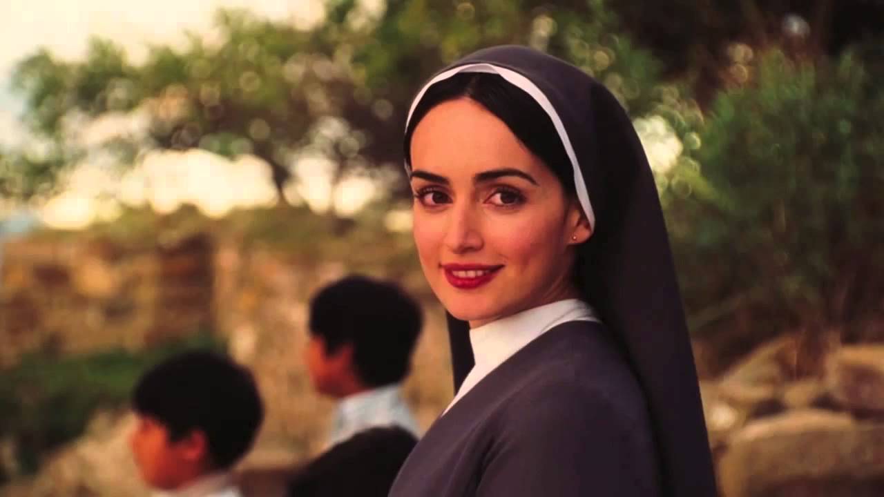
Her lips, his costume, the children’s masks, a sunspot on a bus, the fighting ring ropes, structural elements in the arena are all so subliminal yet so vivid. Consistent and repeated use of the contrast with the bold red color in combination with turquoise is also a key element in this film.Nacho Libre masks

So back to the party where everyone is listing things they associate with red. If you can get a copy of this book and whip it out after everyone has read the lists, I promise everyone will find it captivating on so many levels and subjects – great lively conversation, fun, fascination and amazement will ensue!!


What is art? Enjoying The Art Forger

I just finished a book. So? Well…with great books piled on many surfaces around my bedroom, the time never seems to avail. I’ll have the best intentions – like selecting one to take on a trip, but I work for hours in the car or upon settling in on a plane, I tend to open the in-flight magazine and flip through the articles – generally discovering some tasty tidbits and then nod off for the rest of the flight – whether for 45 minutes or 4 hours! No better chance upon arrival at the destination, as relaxing is generally not my primary activity anywhere!!

So the recent completion of The Art Forger was a silly accomplishment by most people’s the art forger
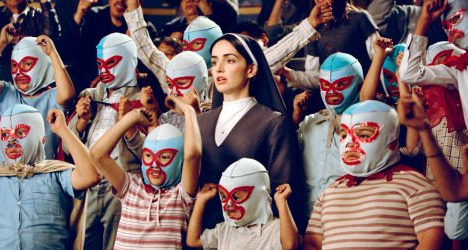
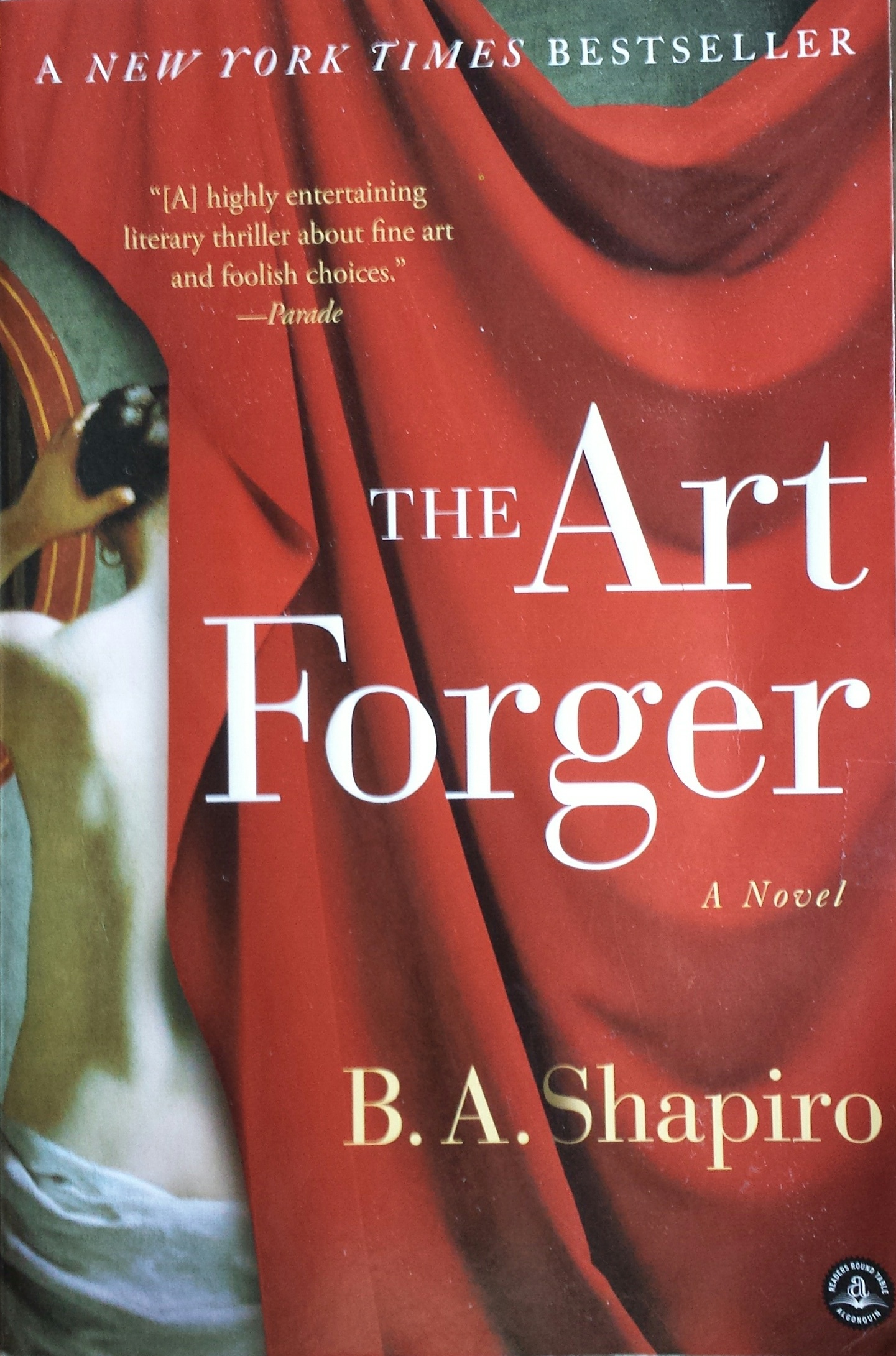
measure.  I followed B. A. Shapiro’s protagonist, Claire, as she navigated the mystery of a missing Degas. Set in a relatively small footprint of NYC, the story is one that could only effectively happen here in this city of superlatives. From the best of the beset to the worst of the worst  and the enormous middle ground of mediocrity which again is superlative due to its sheer density of people, texture, concentration of multi-cultural influences, exceptional urban scenarios and unique prospects.


I have imagined Claire and her extraordinary artistic talents living in a one horse town someplace in the  middle of nowhere. This story would not take place or it would have to have had many more chapters and be quite convoluted. In NYC the seemingly faceless masses live, thrive, struggle and prosper in a dense infrastructure of architecture and opportunity. It provides a setting and gathering of people breathing the aspirations of personal dreams and collective shared frustrations and weary survival efforts in a remarkably competitive urban microcosm(s).

The story centers around Claire’s innate and learned talent for reproducing paintings. With which talents, she actually works for a company who pays her to copy originals for sale. Degas bathers 
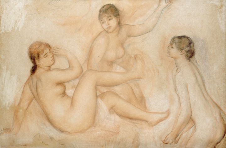
She is not forging as that would mean that the copies were intended to be marketed as, or represent, or be sold as though the original. Hers are legally sold as reproductions – until the plot thickens…Where a love interest, temptations of wealth and fame, innocent confusion and clever problem solving are woven between the past and the present and ultimately begs the question about the value of art – how is it established and when is it talent versus celebrity? The chicken and the egg thing or the Emperor’s New Clothes, either way,a mystery that boils down to what the market will bear.

With just enough technical information regarding the processes required to create an effective reproduction or, more importantly, a convincing forgery – the story weaves clever innocence with selfishly profitable and ego-feeding intents. It includes petty jealousies and fiercely loyal friendships which provide a believable combination to embody Claire’s world.

In the end, without giving anything away, as an interior designer and more specifically, a gallery owner representing the varied talents of a variety of media, my enjoyment of the story and ultimate amusement for placing value and awarding varying degrees of talent was satisfied. The nod to the OTC (Over the Couch) acronym that derogatorily describes art purchased for the express purpose of matching one’s decor was spot on! And I even gave a talk once entitled “I Want to Buy a Painting to Match My Red Sofa” as a valid niche for some. There is an endless  equation of context, timing, association, validity, originality, creativity, exposure, personality, and marketing. Which leaves me thinking, once again, about the base question – What is art? That too could join the classic bumper stickers  “What is reality?” and “Why be normal?” Hmmm…..something else to ponder…

And next I intend to immerse myself in what I expect to be my Valentine’s present tomorrow – A red likeno other - book 
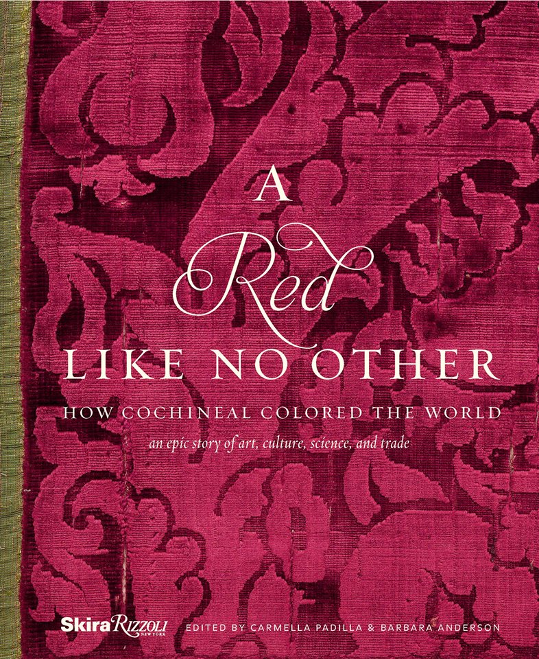
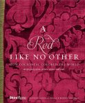
A Red Like No Other – but unless I am on a roll, it might take me a while.

Whales Up Close and Observations on the Spirit of Joy Series

How can I say that I am too busy to write this week? As Saturday approaches,  I realize that I have not stopped long enough to focus on any one thing, of the many that are bombarding me from all angles, about which I might formulate a theme for my story. I have to apologize, for once again, missing my Saturday deadline and hope that this was worth the wait!

Oh, to be so entertained by an onslaught of inspirational design elements as I have seen in the past few days only. And yet not only design – there was more. So I would like to start with an insert about Saturday as I (instead of writing my blog) took one last kayak cruise of the year.

A few people had gathered at the edge of the sand, pointing and remarking that they thought they had seen a whale. I looked in that direction and noticed that a few boats had gathered – often a sign that whales are spotted. I quickly pushed off in my single kayak through the gentle surf out onto the beautiful Banderas Bay and experienced for the first time whales from that most intimate vantage point. Up close and personal, it was thrilling to say the least. The beach was crowded with onlookers oohing and ahhing as they blew mists of water into the air and rose up from and back down, under the bay’s glistening surface. I paddled out and maintained a safe distance, but close enough to hear and feel the graceful power. Hump-backed and for which they are aptly named, the dark, sleek black bodies of the mother and calf were magnificent as they broke the surface and greeted the encircling boats full of eager spectators wanting to catch the show. And a show it was as the mama rolled onto her side and raised her unbelievably long, towering fin to slap the water sending spray high into the air. She slapped again and everyone thought that once was a rush and two was a treat and three and then four and I lost count at 30 times she slapped the water as though to say – “You want a show? I’ll give you a show!” She must have known that it was too dangerous to breach at that point, for a grand finale, as the close proximity of boats could have had deadly results. And I was right on the water with them. Unforgettable. The pity is that I was without camera and have only the memory of this life affirming event . An event that was awesome and outrageous and yet brought a surreal, serene sense of calm, peace and palpable, tingling joy. Friends on the beach greeted me upon my return in awe of what they had witnessed and welcoming me warmly, with enthusiasm, over my good fortune to have been out there for such an amazing display.

P1120423

This photo taken a week earlier – a bit choppier seas, with Tricia in the single and I with Victoria in the double, sets the scene of the Bay surrounded by the Sierra Madre range.

Now, having shared that incredible experience, I have decided to focus on one of the many design inspirations that I have encountered this week, but I hope you will visit our PATRICIAN DESIGN facebook page to see the collage of colorful art and texture that I have compiled to represent the many images that I have seen and offer to further stimulate your imagination.

https://www.facebook.com/media/set/?set=a.10153225877316619.1073741934.232272436618&type=3

My focus at this seaside gallery of  delights today, as we  bring to a close a magical month,  is a collection of precious little figures made from synthetic foam, wood and steel. These humble little animations represent three shared events, a group hug, the “wave” at a stadium event and a gathering for solemn prayer lead by a figure of distinction – the one in the red scarf.


The spirit of collective participation is conveyed. The spirit of humble expression is conveyed. They present a sense of simplicity of some of life’s joyful moments. These simple figures are happy and content. They are intriguing and relaxing to study from many angles.

P1130108


Form and movement, color and  texture the Spirits of Joy by Federico Leon de la Vega are a wonderful representation of life’s simplest and most basic moments of sharing joy. To see art in such a distillation, such a unpretentious media, execution of mechanics and form is true pleasure. It is not overwhelming or startling, it is not outrageous or provoking – it is moving and modest.

I hope that they bring a sense of joy to the start of your week and create an indelible memory to which you can return in your quiet thoughts to bring you peace and joy.