Everyone loves “Before & Afters.” The transformation of an object or a space is the magic of interior design. One of the most valuable elements in our design wheelhouse is fabric. Fabrics have the ability to transform. Like paint – color – altering to enhance a piece or the entire environment, fabrics offer not only color, but texture, pattern, design and style.
I love a good find. Call it antiquing, thrifting, scouting, treasure hunting…the hunt is the intrigue. Exploring random sources to find the perfect piece. Once found – knowing what, if anything, is needed to transform it.
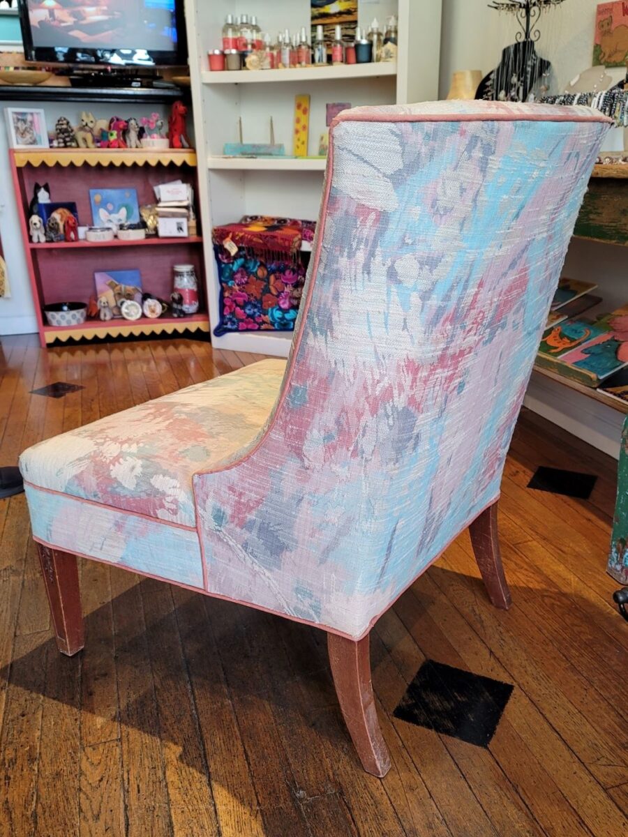
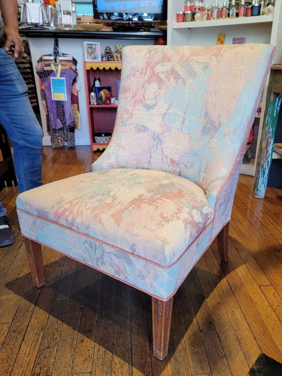
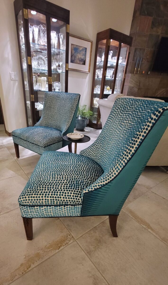
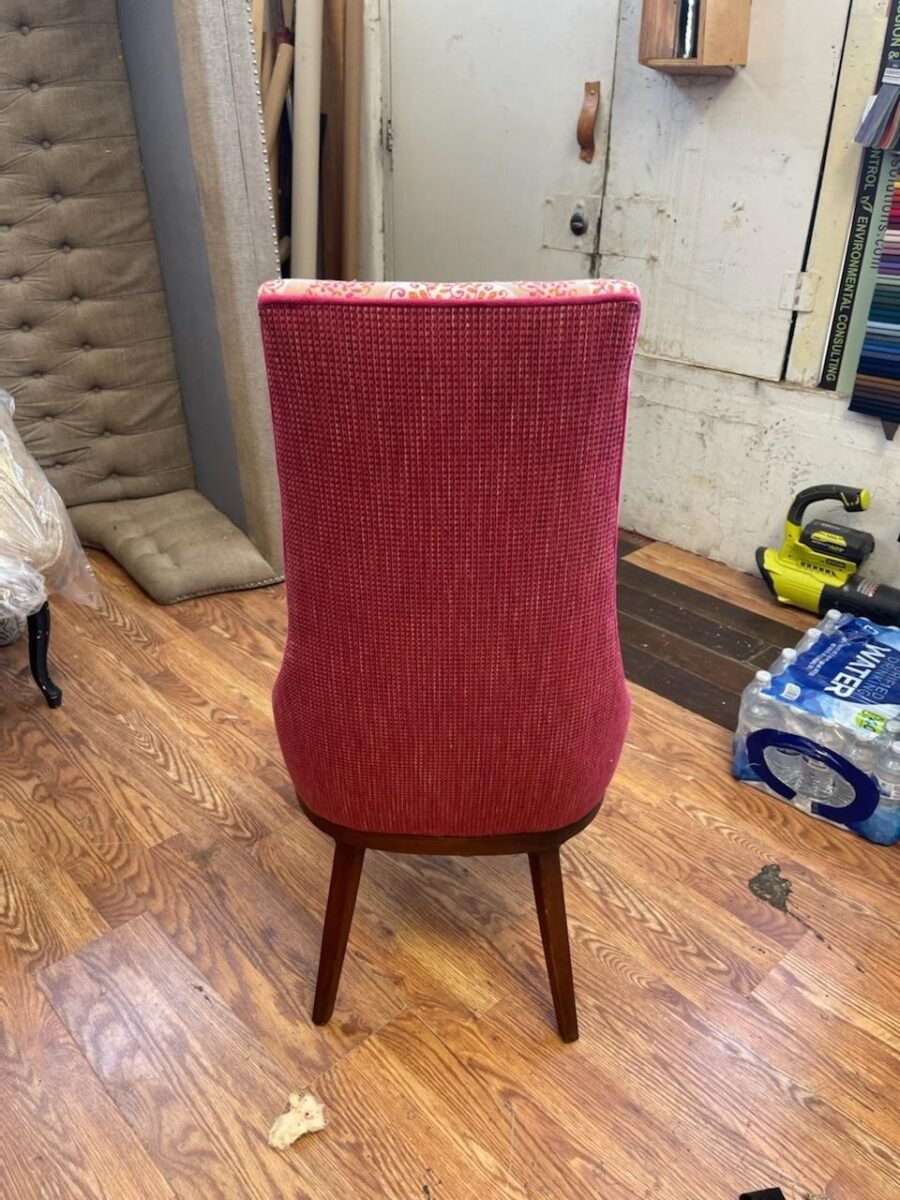
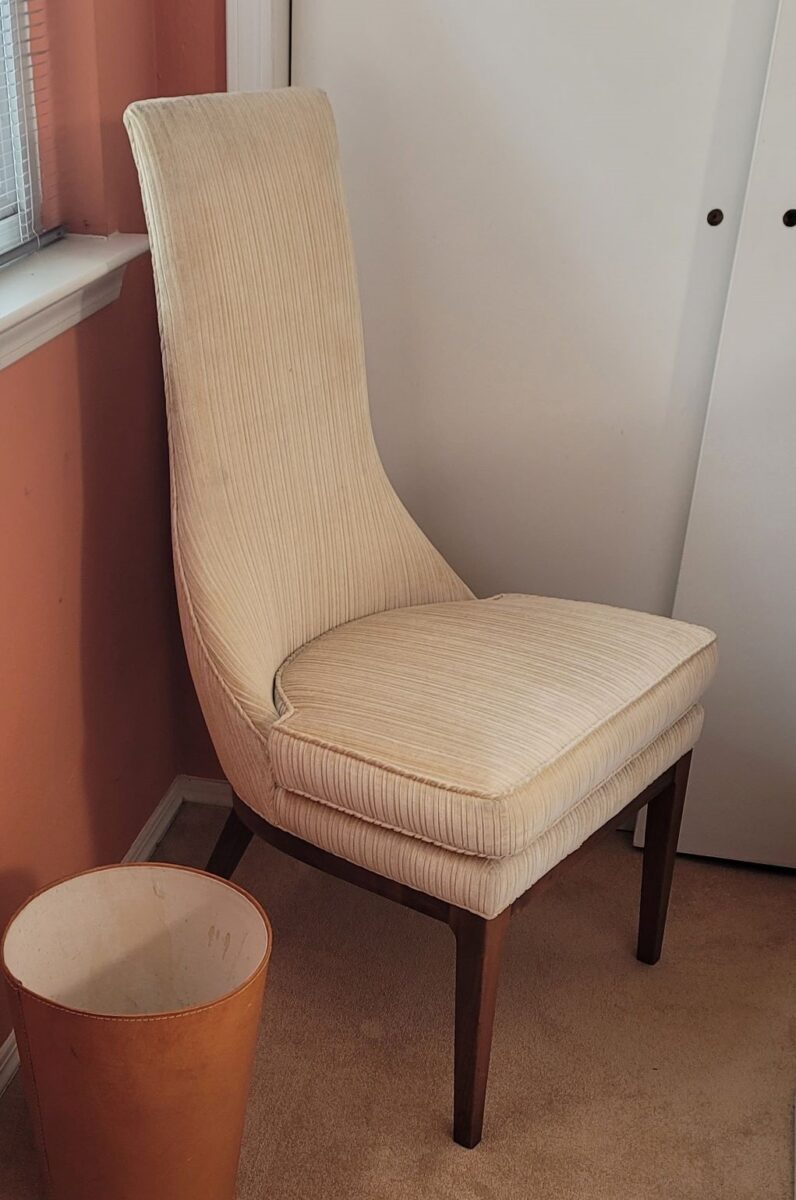
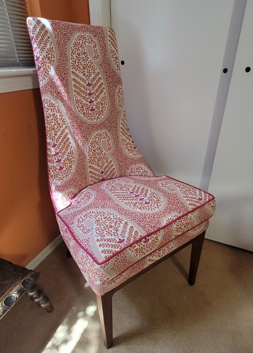
The lines of these handsome armless chairs caught our attention out in the elements, on the front porch as we passed by.We inquired of the owners if they were for sale and they said yes! it was apparent that they were nicely done in their original iteration, but the dated floral fabric was tired and ready for replacement.Having fun mixing fabrics is another layer of design detail. Here, the backs of the chairs have an intricate overstitching over the printed graphics.Piping the chair with a solid welt cord to complement the other two fabrics defines and details the chairs.
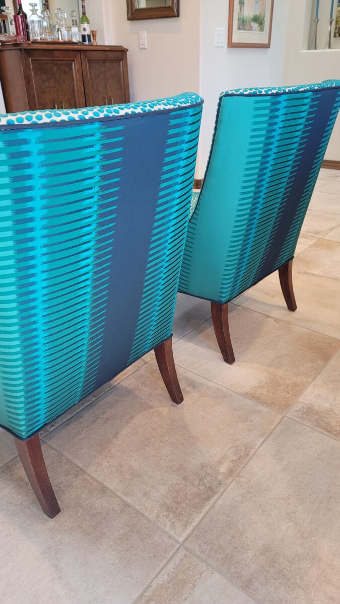
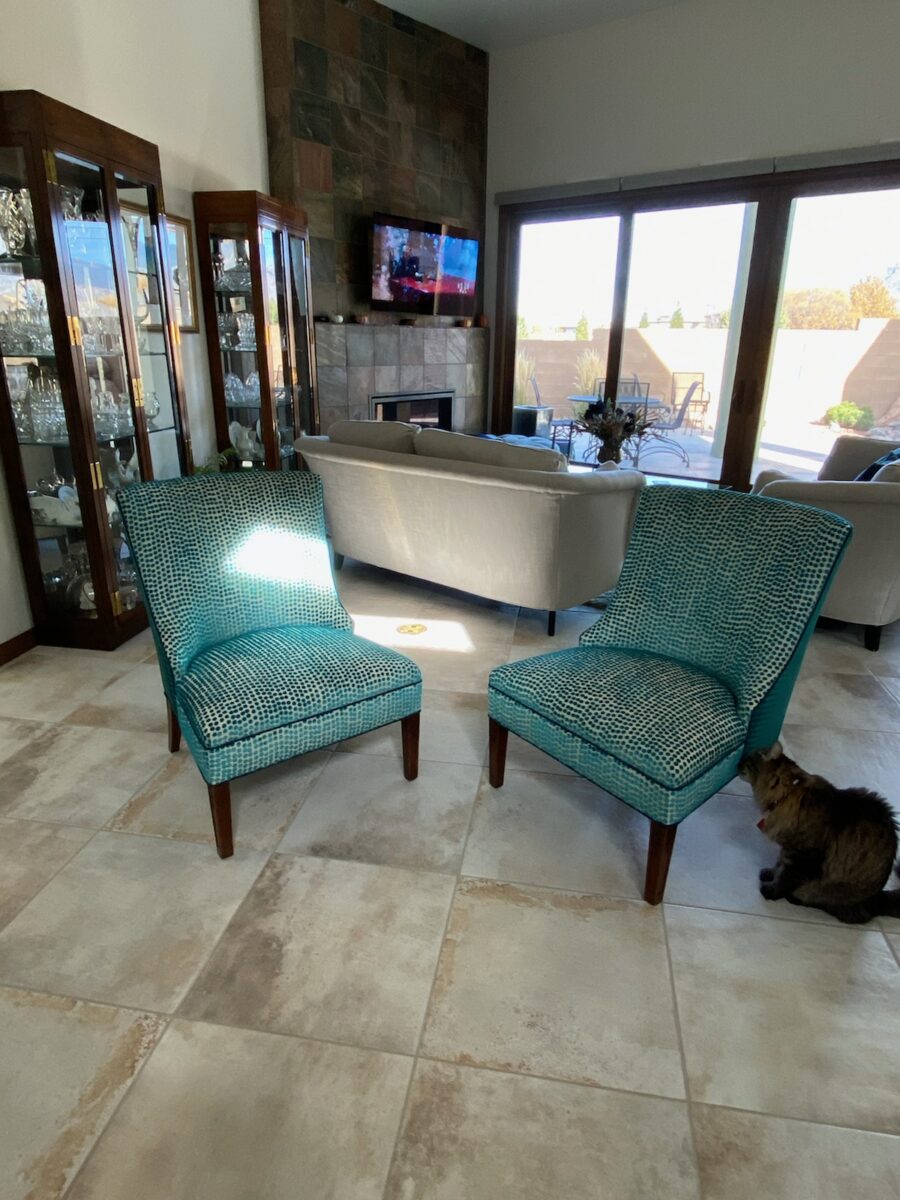
Reupholstery is a life-saving treatment. To salvage a tired piece with good bones and great lines is a service to good design. Pairing old pieces with new fabrics is rejuvenating. Inserting fabulous fabrics into a design scheme is a fine art that gives aged pieces a new life and contributes to the uniqueness of the composition of a space.
As we placed the chairs for an intimate conversational grouping, the scene started to take shape. Seeing the chairs in the context of the new interior illustrates how effectively they contribute to the composition of the room’s design.
Of the design elements, paint is the one with the seemingly limitless choices. Fabrics are next. The worldwide variety of textiles, creatives, fibers and the combinations thereof are vast. Searching for just the right fabric for a specific piece is part of that treasure hunt.
You have heard the term “run of the mill.” Even for many, having never thought of this as a fabric metaphor – this phrase is used commonly to describe the common. It means ordinary – a common, mass-produced product’s run of a manufacturing mill. Using common fabrics is a cop-out when it comes to creating unique designs – especially when there are so many incredible fabrics from which to choose.
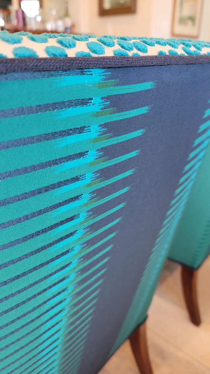
Focusing on a close-up of this recent upholstery fabric, we see the intricacies of the colors and textures of the weave.Here too, upon closer inspection, the overstitching on the printed graphic is an exquisite detail.
Personality comes into play when selecting a fabric. Along with function (how durable/cleanable it needs to be), the taste and preferences of the user, and the context in which it might occur – personality of the pieces plays a major role. For example, reading the personality of a chair – its lines and scale.
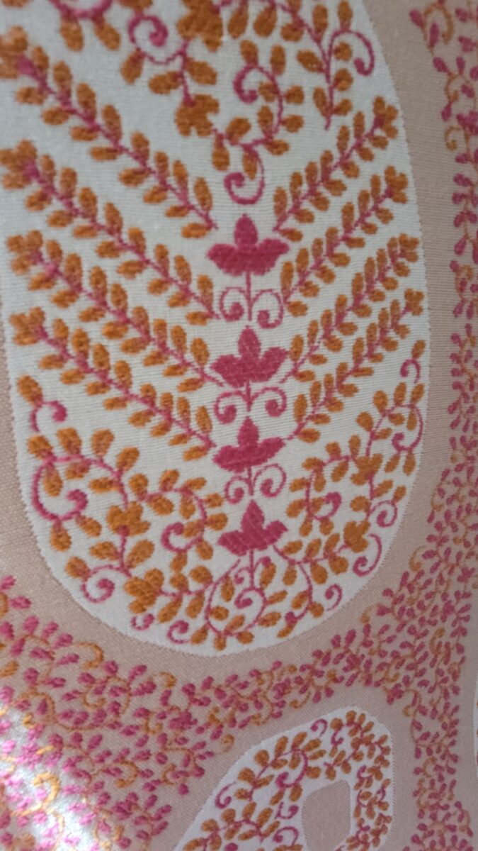
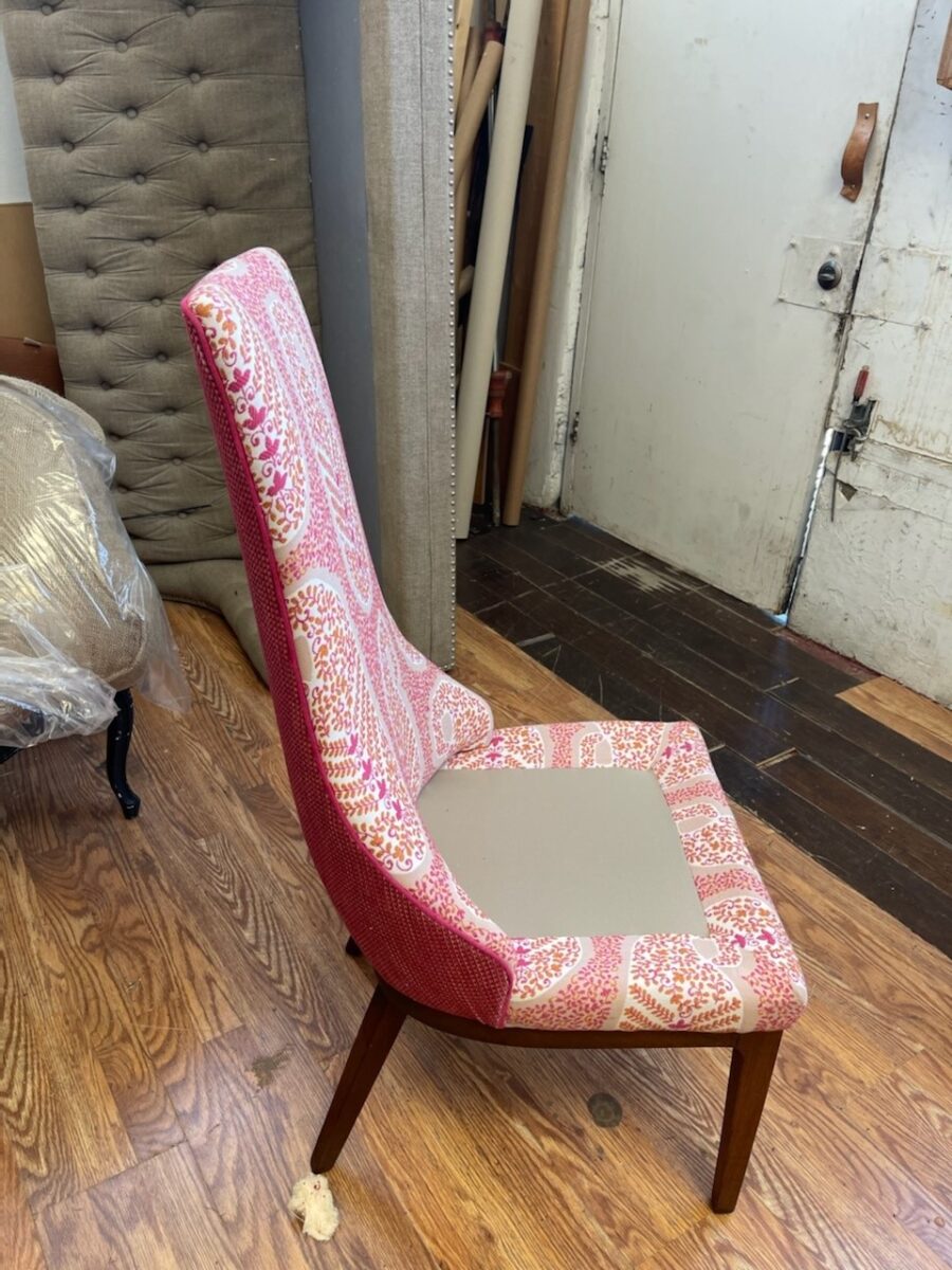
In the workroom, the chair begins to express its new identity.Extracting the raspberry color from the paisley pattern we’re using on the front of the chair, once again offers layers of design detail.This elegant little pair of chairs exhibited grace and style.Once reupholstered, it took on even more personality!
The personalities of fabrics are as endless as the textiles themselves. Fabrics evoke moods, seasons and even attitude. For commercial use, as well as heavy-use residential – workhorse fabrics have evolved. Not long ago, durable fabrics looked durable, less attractive and limited. And without turning this into a continuing education course about fiber content, it is obvious once you investigate the options, durability for wear, ultraviolet tolerance, mildew resistance, and antimicrobial properties – are all woven or applied to fabrics allowing amazing installations in commercial interiors that you would not hesitate to have on your living room sofa!
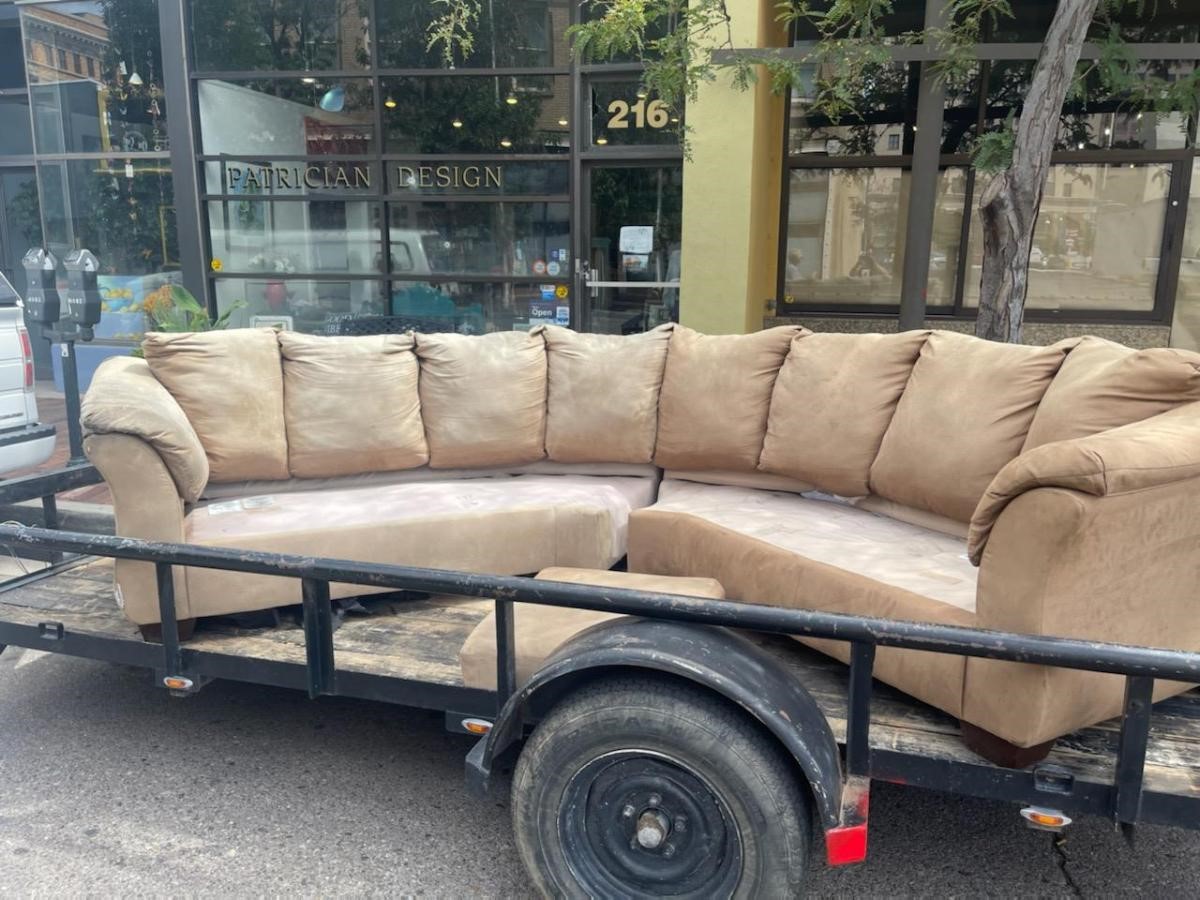
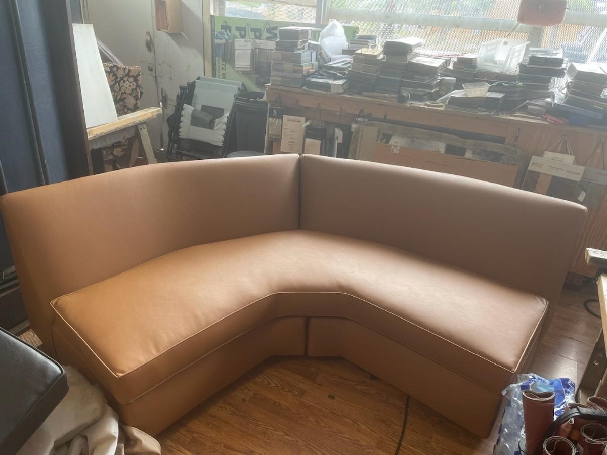
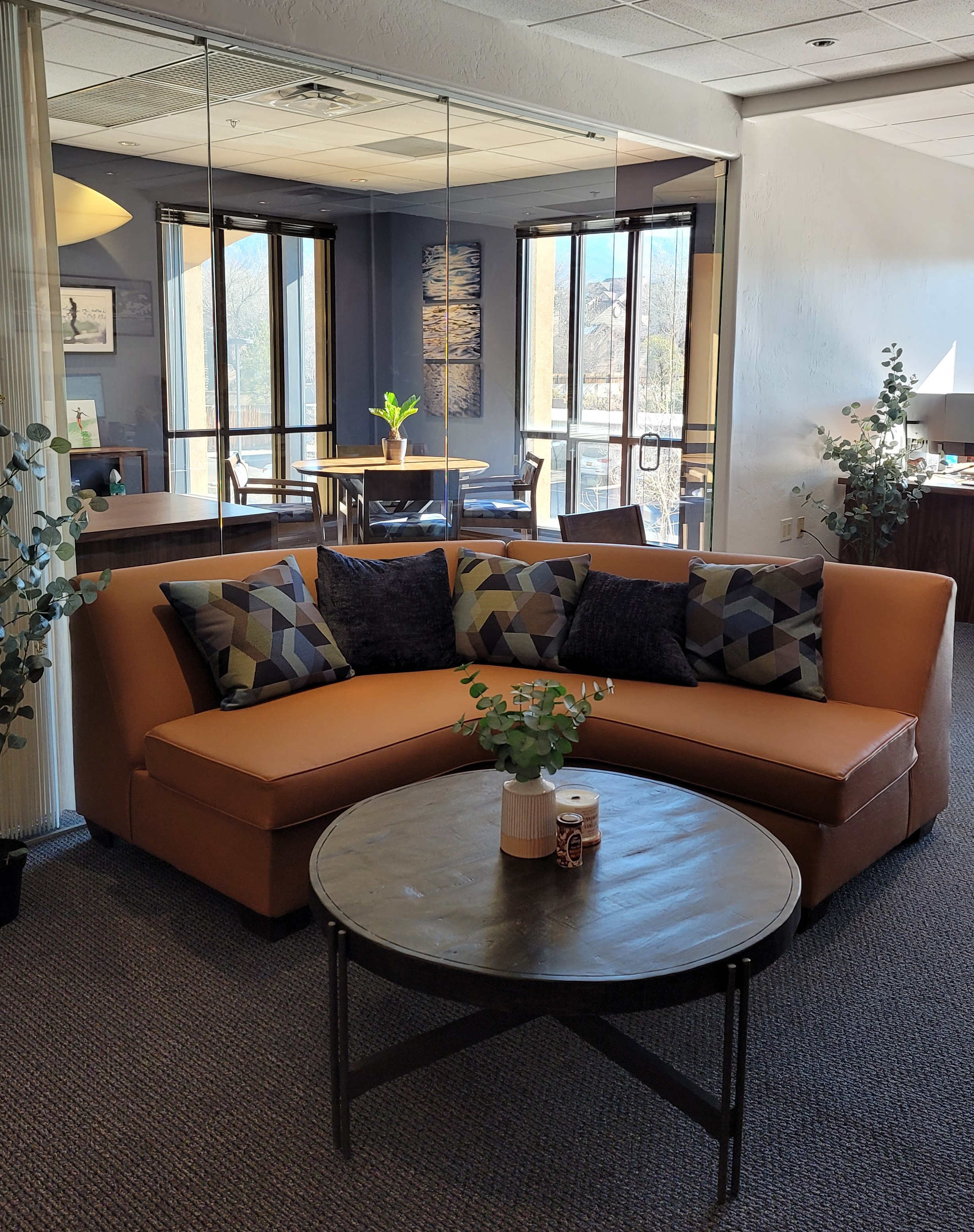
Most people wouldn’t look twice at this tired sectional, however, we knew we wanted a portion of a curved sectional (not an “L”, but a soft curve).Once we determined the bones were good, we realized it was going to work perfectly in its new interior. We selected a commercial-grade faux leather for the new skin.Voila! The finished sectional is further detailed with custom throw pillows to bring together the caramel and blue tones of this color scheme. Warmly greeting guests upon arrival.
Residential interiors can now enjoy what commercial interiors have realized for years. By incorporating the durability and cleanability which allows for the wear and tear – without showing those signs of real life – residential and commercial interiors incorporate fabulous fabrics that defy their strength – beauty and style conquer!
Sustainability of the fiber sources is an increasing topic of conversation. That and the fiber contents regarding the health/safety of the materials and treatments, if any, used (Okeo Tex certification, for example).
With all this information regarding the myriad options, enhanced durability and the unique opportunities that textiles provide to dress your great pieces – treasure the history, family hand-me-downs (if not heirlooms) and give them new life!!!! Its ART!!!
The serenity of neutral color schemes has a significant place in interior design. However, it is more about the fear of color that I approach this article today. Committing to color arrests most people – they want it and admire it but are fearful about selecting and committing to bold colors.
Beautiful neutrals are a color all to themselves. Layers of whites, creams, grays offer sophisticated schemes.
However, that is not all that causes clients to reach out for assistance. Even if they have made a decision about taking the leap, it is how much, where and with what or to what the color is applied or occurs.
A white kitchen receives a patchwork of blue and white Talavera tile as a backdrop adding depth and interest.
In addition, upon closer inspection, we have incorporated a fine detail of an aqua glazed Spanish tile running horizontally and vertically through the patterned tiles.
I remember when architect Antoine Predock’s project for United Blood Services in Albuquerque https://bit.ly/3LBQbDv made a splash – a really RED splash when he stuccoed the entire exterior brazenly brilliant, bold, blood red! It was astonishing – astonishingly effective!!! https://bit.ly/3NNQihd If a picture speaks a thousand words, color is right there in conveying remarkable communications.
From branding to personal style, color is key.
The addition of our tongue and groove walnut wall established the theme for the rest of the furniture in this interior.
With freedom to select colors for this new brand, the signage and interior finishes all contribute to a unified statement using a dark cadet blue, warm gold, and caramel colors throughout the space.
From T-shirts to interior finishes, the brand is reflected and reiterated in colors throughout.
My staff recently investigated information from projects. They posed questions and gathered observations regarding my use of color. Photos, at the end illustrate some specific color decisions and why. The resulting questions and answers are as follows:
Patti Hoech‘s design practice has been and continues to be an exploration and emphasis of the subtleties and strengths of color. It is an integral part of her work. We wanted to know why and when she discovered this specialization in her design sensitivity and how it relates to her approach to effective design decisions. We are asking clients and colleagues to pose questions to get the answers.
Why is color so important?
Patti Says: Color is power and peace. Color is important on so many levels – personal joy (or aversion), perceived temperature, brand identification, seasonal interactions, emphasis, and contrast. Color is everywhere. Understanding and harnessing it for specific purposes is key.
This new backsplash had a specific purpose, which was to acknowledge the existing rust-colored porcelain sink and the intensely green marble stone countertops. By pulling those two colors into the tile selection so strongly and interspersing other colors that complemented the palette, the result was an effectively unifying design detail.
How do you determine the color specifics for your projects?
Patti Says: What color brings you joy? What color tells your story? Interviewing clients about their color preferences – being an important questionbegins the dialog regarding what colors to incorporate and why. This can be personal preferences or aversions or specific colors relating to branding whether it is new or existing. Also, existing fixed design/architectural elements might also play a significant part in developing an effective color scheme.
This couple wanted turquoise and other blue tones to weave through their interior. By selecting a neutral backdrop in the floors and walls, it allowed the accent color to punctuate the space from several key pieces of fabric and finishes.
Do you believe color affects the lives of your clients in their homes and workplaces?
Patti Says: Absolutely!! Color can insert many subliminal effects that impose on people’s perception of a space or graphic. Color can evoke emotion, instill comfort or agitation, rekindle memories, spur appetite, affect perceived temperature. It can embed recall for commercial brands. Color can be a clever tool.
In this interior for Boba Tea, we played with the colors of the flavors and the multi-colored tiles to correlate to the fun experience of sucking the tapioca pearls.
How do you navigate color trends?
Patti Says: Trends are necessary to keep our market moving. Capitalism is based on consumer activity, and nothing generates purchasing frenzies like stimulating new trends in the market. However, basing design decisions on trends must take into consideration the intended longevity of the design. Much of color trends are based upon pairings and combinations of color. It is those combinations that can “date” a color scheme – not so much a specific color. It is how, where and with what it is used that pegs it.
A classic, well-balanced color combination of blue, white, and yellow is a comfortable warm and cool with a neutral that transcends trends. Fabrics and finishes contribute to how one updates a classic color scheme.
Do you feel you are a forecaster or influencer?
Patti Says: I believe that I have imparted and am still providing thoughtful, challenging color consultation to my commercial and residential clients. Having prospective clients request designs based upon others that we have produced is telling and flattering. It means they have confidence in the decisions regarding long-lasting color schemes – if not timeless, in some cases. However, it must be said that design elements that present the color often determine – in many ways – how well a selected color or color scheme “holds up” over time. Considerations regrading patterns, materials, and elements can and might be either improved or modified over time while maintaining the same color scheme. Forecasting anticipates color trends. I have successfully influenced clients to make selections based upon an anticipation of future color directions in the market or merely go with classic combinations that have been proven over time. . .
Playing off the colors in this corporate logo, the interior design reflects and further strengthens the brand. This company invited us to design various locations in three different states over the course of several years. The interiors have held up against the ravages of changing trends and market directives.
What has influenced your appreciation for and interpretation of color in design?
Patti Says: It started at an early age. Observing the world around me. Nature, architecture, decorative arts (china, textiles, artwork), fashion, logos/brands, trends, regional colors, seasonal colors, cycles of color…Pinks, turquoises, yellows of buildings in the West Indies, bold color statements of Mexico…Color is profoundly important and signature in its application. From fish to birds, flowers to leaves – color captivates me and urges me to find words to express it and continue to have it a primary part of my descriptive vocabulary. As an omnipresent element in the design process, color is unavoidable, but to enjoy it so fully and embrace the limitless range of options is an exciting artist’s pallet of possibilities which stimulates me at every turn.
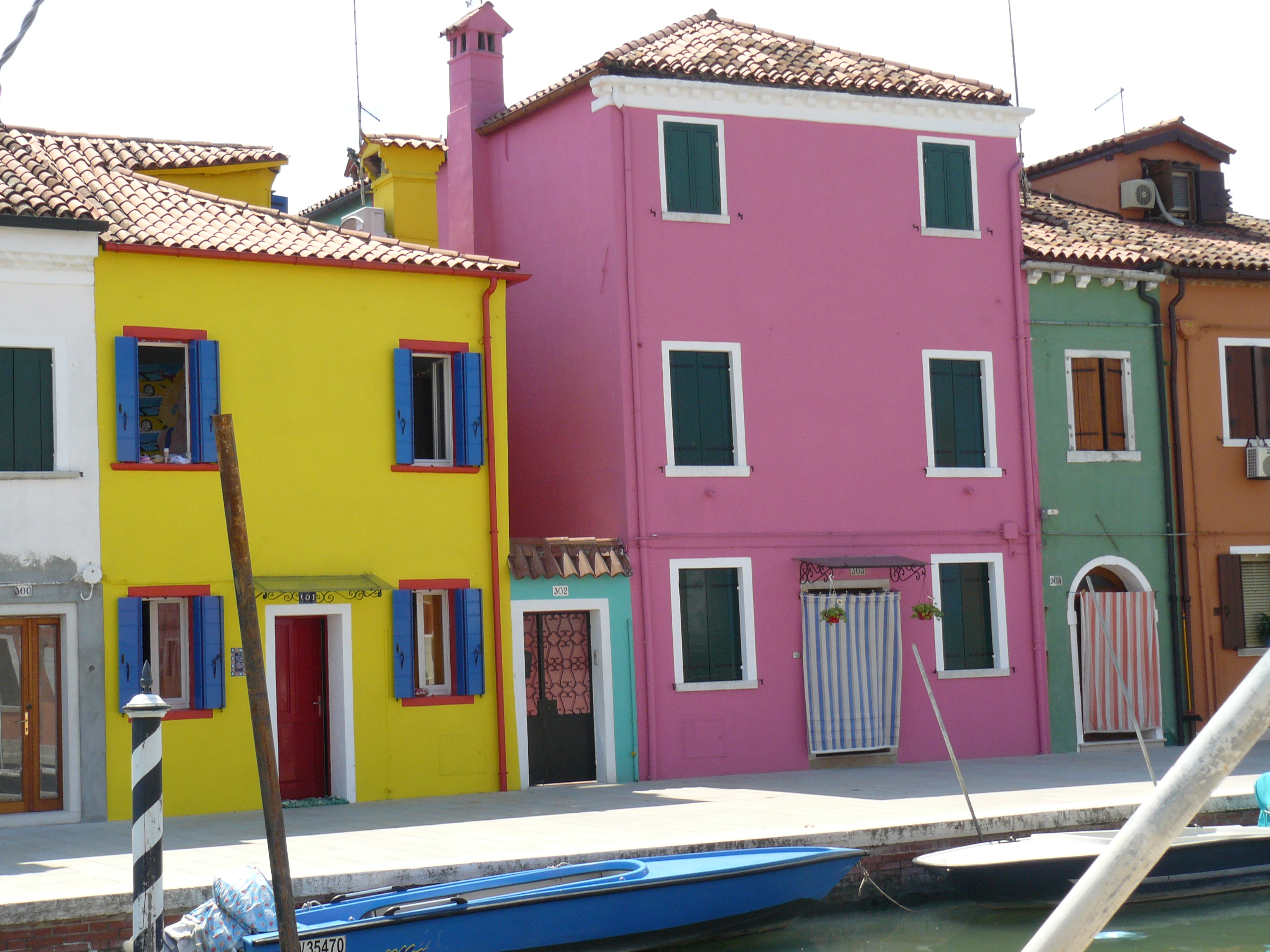
The magic of color on architectural exteriors can be amazing. Here in Burano, Italy my dear friend captured the colors! Similar to what we see in Guanajuato, Mexico and the sunny islands of the West Indies.
I attribute much of my color awareness to my mother. I remember being greatly influenced by her sense of color and design. Her sensitivity and talent were innate. She selected fabrics that had unusual color and pattern combinations. When orange, avocado, brown, and gold prevailed in the 60s and 70s, she selected the olives with chartreuse and gold for the less formal areas of our lives and leaned into Lily Pulitzer’s dynamic colors and patterns for her clothing and a pastel version of soft pinks and verdant greens for our more formal areas. The master suite was primarily yellow with beautiful bits of blues. Beach scenes always emphasized blues and greens. Nothing in our world was on common trend, but an artful interpretation of color combinations, eclecticism and comfort. Pairings of orange and brown were never her happy place nor was gold and brown. But orange and PINK – YES! Pink and green especially! And browns were recognized in context with stone shades of greys and tans. I believe that sense was greatly influenced by richly organic, textured stone walls of the West Indies – Danish architecture in the tropics where limitless colors of greens and blues punctuated with flowers were all around.
As a result of this of this early introduction to the value of color, my personal spaces reflected similar sensitivities. Beginning with pink in the early years I graduated into blues, turquoise and greens for my teen years. The final scheme, in my room in the home in which I grew up, was a dusty pink, clay, and mocha-rose. No one in my world had that color scheme in the late 70s and it was difficult to assemble. It helped that I worked part time in a design showroom in Georgetown where handling the amazing abundance of fabulous fabrics was a daily inspiration. Throughout my life experiences color has been a constant distraction. Not in a bad way, but rather a noticeable, unavoidable interruption that causes me to pause and take note. Ask anyone who knows me – I stop and remark about color at every turn. For better or worse, I comment on color. It is a deep appreciation that I enjoy sharing. And the most rewarding is discovering color for clients who yearn for it but don’t quite know how to find and use that which would make them feel the joy of color!
A dear friend in Mexico recently took a leap in selecting an accent color for his seaside villa. Once an all white interior, which was lovely and fresh, he wanted a new look that provided contrast and strengthened his color theme. The yellow accents made me smile when he unveiled his new look!
Color plays a major role in discovering and expressing personal style. Fear not – color is your friend. Find your style. Live your style. Love your Style.
Color schemes are limitless. The permutations are endless. Color is exciting and fun. It is personal. Colors evoke feelings, memories, emotions and are key to a comfortable interior.
How often have you been asked or pondered on your own…”What is your favorite color?” Some people hesitate to answer, while others blurt-out readily with their fav. But what color you choose to wear versus what you enjoy in your interior surroundings and how much might be quite different.
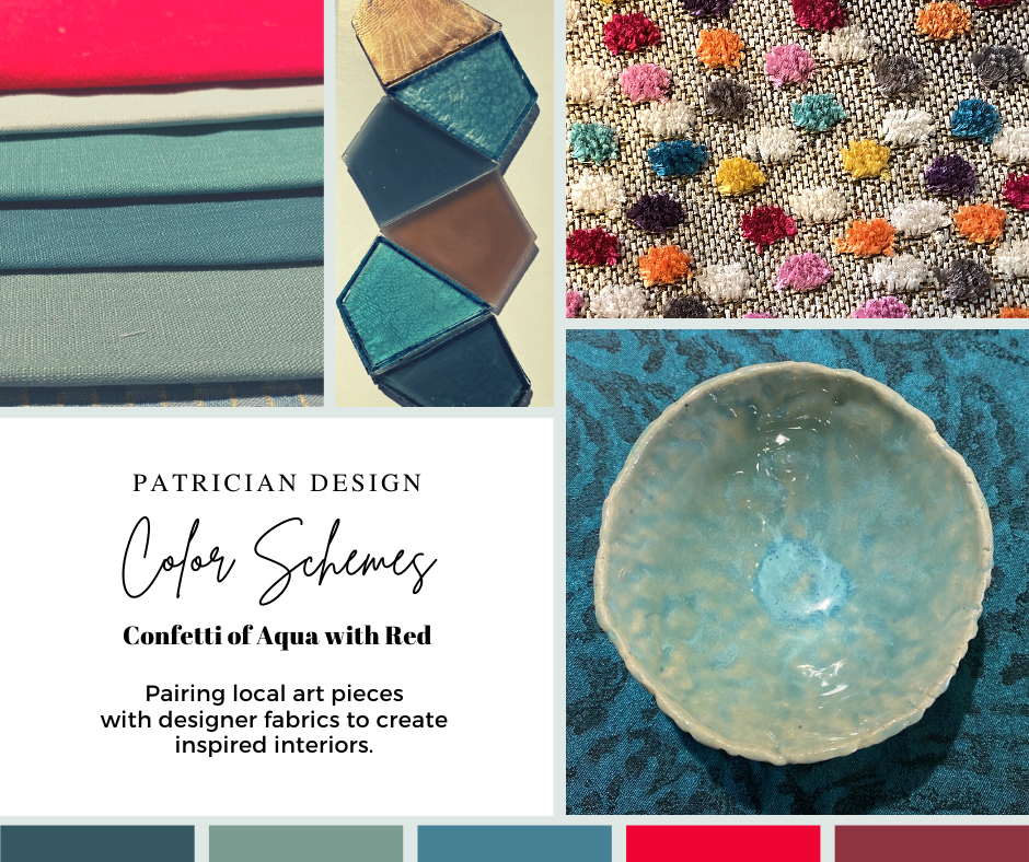
Several weeks ago, I launched a weekly post on our PATRICIAN DESIGN Facebook page called “Color Schemes.” The idea is to inspire design ideas by pairing artwork with designer fabrics. When planning an interior there is always a focal point complimented and surrounded by supporting elements. Whether a key painting will command the space or an expansive window with a view will direct the focus to a scene of outside colors and textures – that key element will greatly influence a successful interior color scheme.
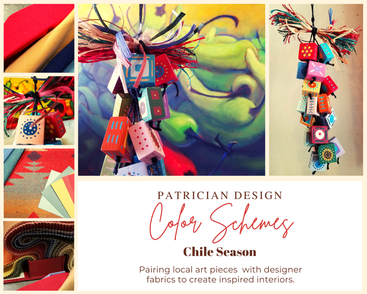
Annette Donald creates colorful cubes in her creative take on our beloved chile ristras. A serrano chile oil painting, on canvas, by Federico Leon de la Vega is quite representational. Paired here with Romo and Ralph Lauren fabrics, Sherwin Williams paints…fresh and festive!
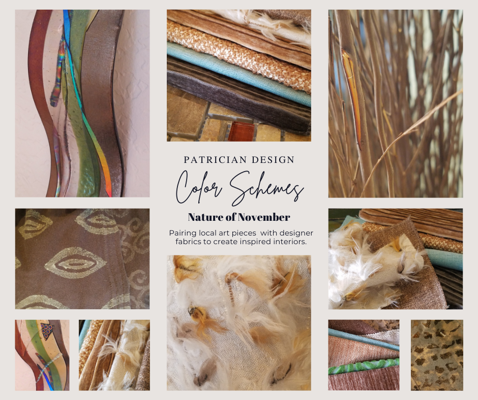
Here is the example of a November Scheme and you can scroll back each Monday for the past few months to enjoy a variety of the Color Schemes! https://www.facebook.com/PatricianDesignABQ/photos/a.243005986618/10157154423221619/
We embrace the The Nature of November with its unique colors and textures. As the air becomes chilly and the leaves fade…warm, soft colors bring us indoors. Featured here an elegant fused glass ribbon wall piece by Lisa Checnoff.
There are four primary considerations that I discuss with my clients when determining which colors to choose, emphasize, avoid, use as accents and where. To establish these selections, we evaluate personal preferences, contextual implications, seasonal influences and even trends.
PERSONAL: In planning an interior, I always want to know what colors make our clients happy, comfortable, stimulated, vexed or relaxed. These personal insights reveal important information for selecting types of materials too.
By examining what might be one’s favorite color, the discussion will navigate the distinctions, if any, regarding preferences for clothes versus interior furnishings. Interestingly, they are not always the same – although, by mere comfort and familiarity, they often are. Simply asking about a favorite color is not enough.
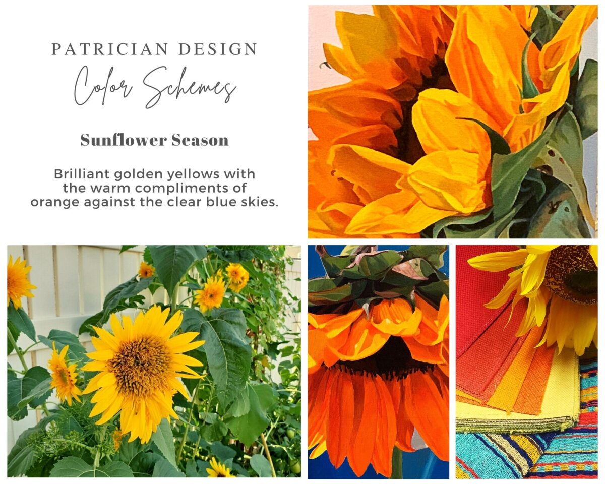
Brilliant golden yellows and blues – splash color! Featured here are fabulous photo-realistic acrylic paintings by Sheri Mays paired with amazing fabrics of the same exciting palette.
CONTEXT: The context of the interior might dictate or at least steer the direction of the design. The luxury of having multiple personal environments offers the opportunity to have different color pleasures exercised in different places. The ski condo might be woodsy and textural with browns, greys, stone and wood punctuated with a pop of color versus the seaside retreat with its crisp whites and cool blues and greens punctuated with pastels or bold contrasts. Therefore, the location of an interior might direct the desired color palette.
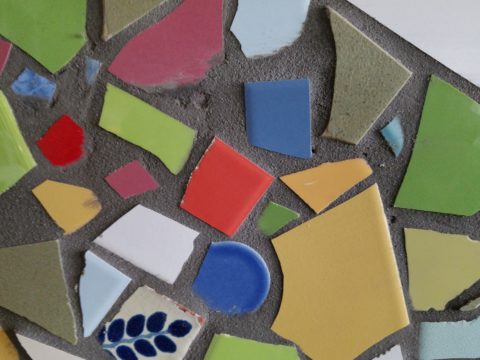
Inspired by this spa-aqua pottery bowl by Penny Roberts and the custom glass tile mosaic we recently combined to face a newly remodeled kitchen wall – the cool seaside/spa feel balanced with ambers and warm dots of color – pink, fuchsia, orange and golden yellow. Durable brushed cotton solids come in myriad colors and are perfect for pillows or upholstery.
SEASONAL: This one is tricky because it plays on the perceived climate outside – even if the interior is maintained at a constant temperature. It takes a concerted effort to plan a color scheme – including textures and finishes in anticipation of changing seasons and relative temperatures. I previously mentioned that a window with a view might be the focal point of a room…imagine the effect the changing seasons might have on the selection of interior colors and textures versus a consistent tropical scene, for example?
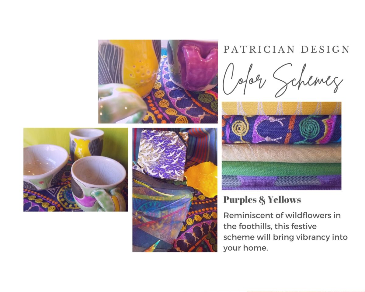
Perhaps you love purple – ever pair it with golden yellow? Here, functional, fantasy pottery designed and crafted with the most precise attention to detail by Jen DePaolo inspires our boldly brilliant scheme.
TRENDS: Inasmuch as I avoid being steered by trends, it is impossible and not advisable – in design – to avoid them. Clients are influenced by them and bring that would-be preference to the table. It is essential to continue to have “colors-of-the-year” and other market-driven colors change to stimulate the economy with buying and selling, replacement and updating. It’s our socio/economic norm. It also serves as an encouragement to re-fresh. But to limit that influence, in favor of long-term personal pleasures, is best. The pressure of this marketing color influence contributes to our being a disposable culture. Not time here for a lecture on such things – but rather to instill an appreciation for and confidence in personal selections an decisions – in this case, color.
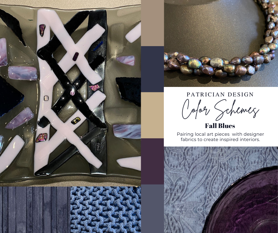
Patinaed pearls and stunning glasswork by Margaret Hidalgo Vanderheyden inspire the soft, greyed lavenders and blues of this cool scheme.
An interesting and on-going test for evaluating a successful interior is when designing in one season – it has to work in all others. For example, when I meet with clients in the heat of July with lush foliage and color, warm temperatures and long days, that same interior has to succeed when it is frigid outside, barren, and with darker, shorter days. What might the challenges be in creating a successful scheme and what might be the solutions to make it work?
Having noted all of this and knowing the different reactions people have to color, isn’t it interesting when an interior is so successful that it appeals to many, if not the majority, of those who experience it? This is more applicable to commercial or public spaces – from doctors’ offices to hotels. However, the challenge and success is in knowing the many things to be considered and implementing a balance of them throughout all aspects of the interior.
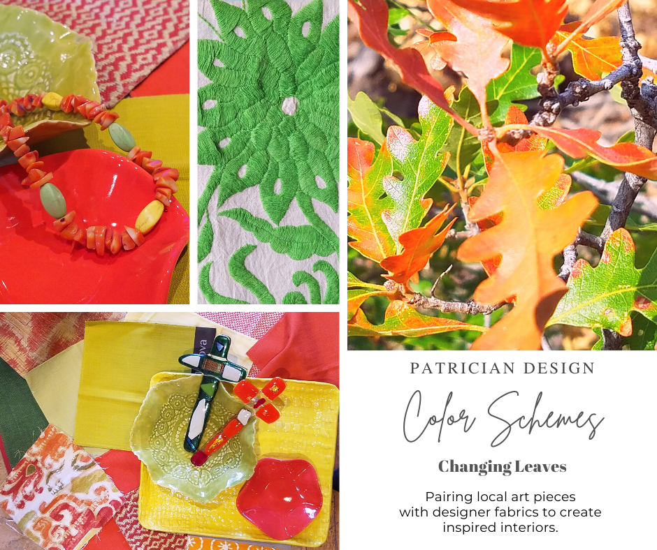
Anne Marie Werner-Smith’s brilliantly glazed pottery here with Margaret Hidalgo-Vanderheyden’s lovely fused glass crosses along with coral and dyed stone necklace and woven table runner from Chiapas reflect the changing colors of fall leaves…
Appreciating color is a gift to designers. It truly is an imperative to appreciate all colors and have the sensitivity to discern the nuances between various values and the effects of selections and combinations from the infinite choices.
I hope this has given you ideas and inspiration to move forward with YOUR color schemes! Sign-up for our weekly email of Color Schemes with classic blue and white and stunning neutral greys coming!! And follow the posts on Facebook every Monday.
Where are you finding comfort, peace and a reprieve from the crazy of it all? I’ve been checking in with people from around the country asking where they are finding peace and tranquility during these unusual times. Sharing their peaceful places has been fun and thoughtful.
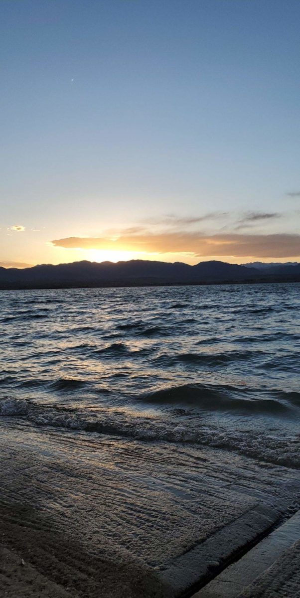
Isabel sends greetings from “The Beach” – Standley Lake in Westminster, Colorado.
Discovering comfort in familiar and new places is the name of the game during this time of uncertainty and isolation. Some are more isolated than others. Some are surrounded by real or virtual workmates, others family, some have the companionship of a pet while others find themselves living alone and feeling a different kind of isolating solitude.
Several sunsets submitted…seems that is a restful time for most. Jan finds peace, at the end of the day, from her backyard. Nice.
Snuggling up with music or a good book, watching movies, playing games and exercise are all a part of our daily lives, but in this current situation they are magnified with importance. Technology has certainly broadened our reach. The information we can access is nearly limitless and connecting platforms to video chats have facilitated the way we communicate over the miles. Activities and focus on our senses heightens our physical and sensory benefit and enjoyment .
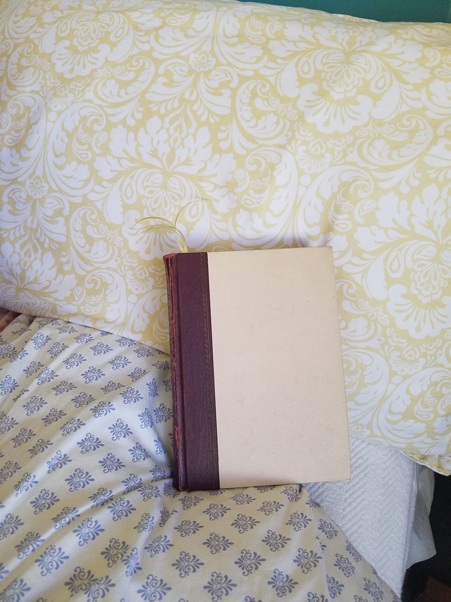
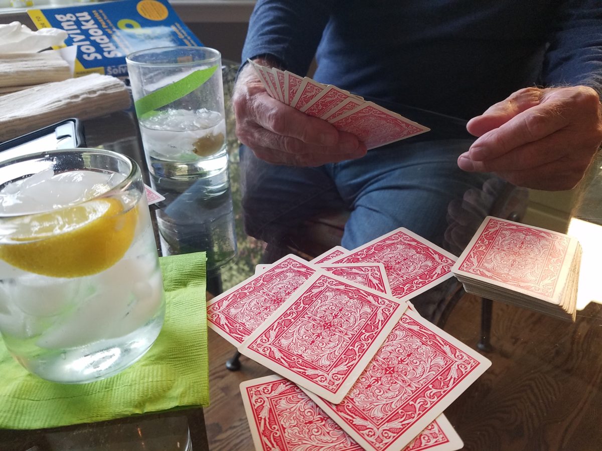
Whether a tablet, paperback or hardcover – nothing says escape like a good book.Solitaire or a battle of gin…with a little gin.
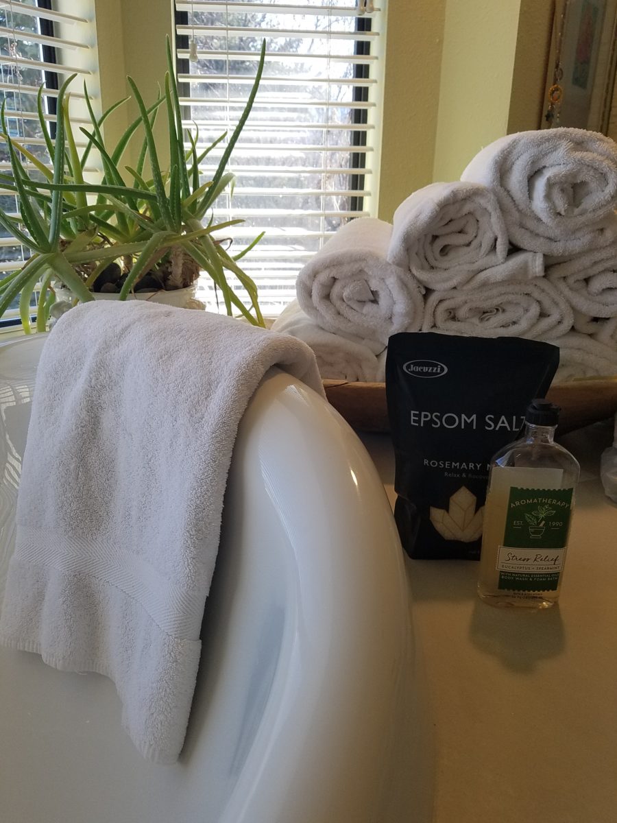
Interiors are our haven. Finding peaceful places within your realm is a new adventure of discovery that is occurring as a result of a resourcefulness to stay comfortable and balanced. It’s a great time to pamper yourself. Who doesn’t like to take a bath? I don’t. But these days, that tub and inviting bubbles and fresh scents are intriguing. If you don’t have any bath salts or bubbles…find some fresh rosemary sprigs or pine needles…lemon juice or grated rind…perhaps a little ginger powder or grated fresh…put it a cloth pouch so as not to clog your plumbing.
Light a scented candle, make your own fragrances, play a little music and escape for a bit.
I usually feel too rushed – and that’s ironic because taking a restful soaker is supposed to be a perfect stress-reliever. How awful is it not to have time to decompress? Well…we all have a lot of time on our hands – albeit time being utilized differently.
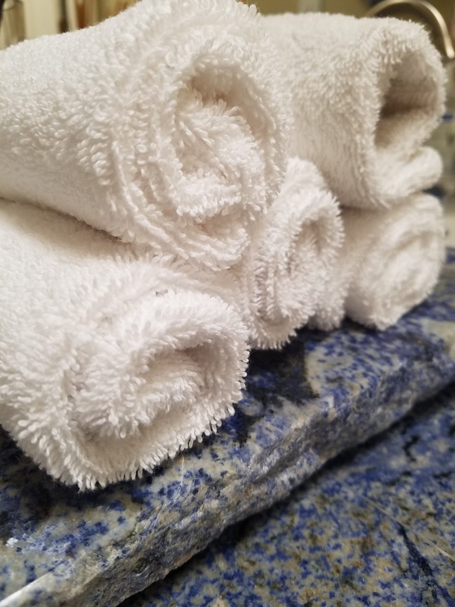
Roll-up a few towels to set the stage – make it like a vacation spa – if only for an hour until the world catches up again!!!
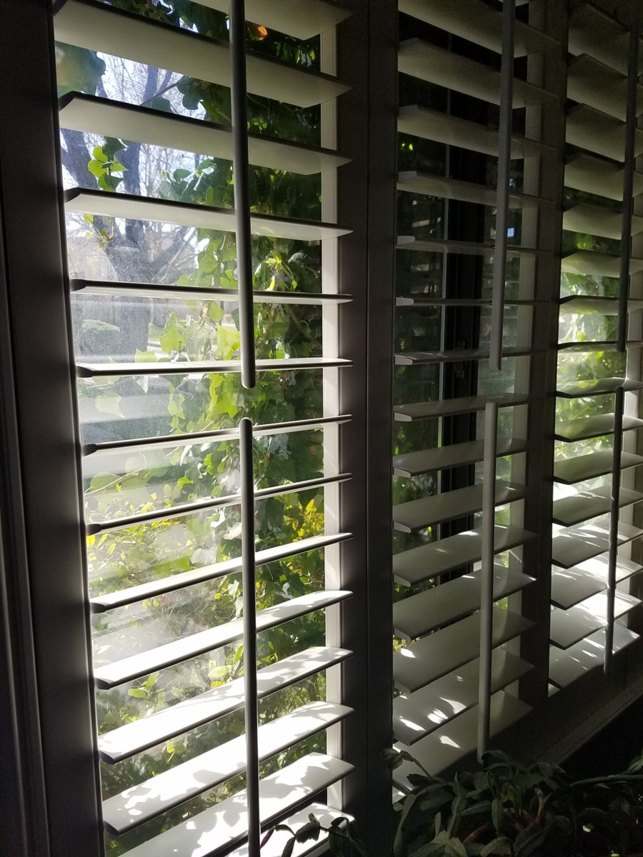
Curling up with a good book. We know that getting up and getting dressed in the morning provides a normalcy and participation that keeps us from feeling less reclusive. Preparing for the day! And inasmuch as it is a rarity for most of us to stop in the middle of the day and read a book – it is a luxury we should allow ourselves. It is an escape, a reprieve. Discovering new places and positions to enjoy a good read is another way to find peace. Places where daylight filters in is restorative.
Tracking daylight through your interior…you might notice the orientation, time of day and penetration of light with more time spent at home.
Outside, weather plays a big part in how we can expand our isolation beyond or interior walls. From quiet garden spaces to hiking and exploring nature’s playground – the ability to enjoy exterior spaces is prime. Having warm weather on the way broadens that area of our safe shelters.
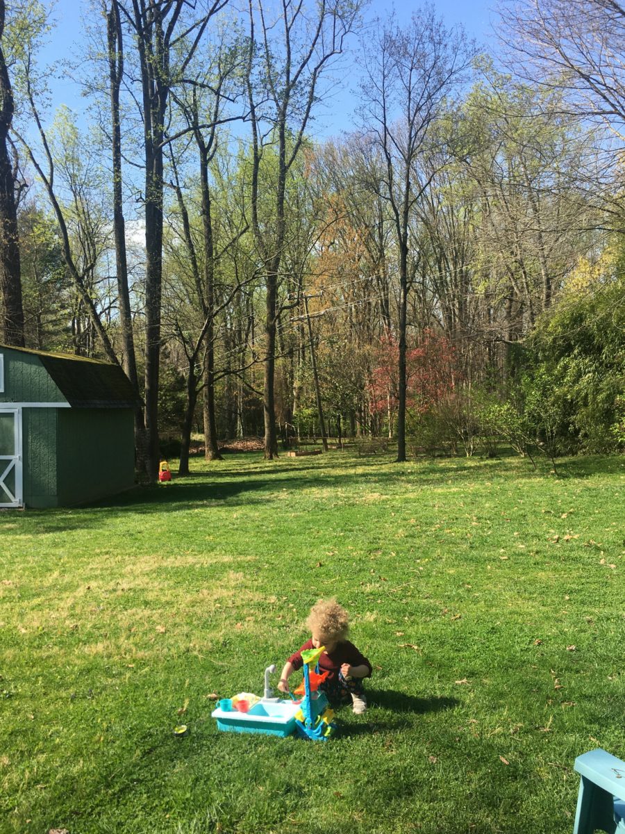
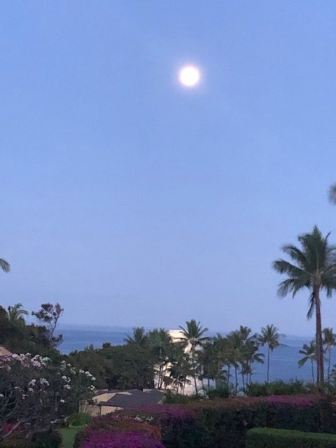
Hi Zoe in Northern Virginia!!!!! Families are having lots of outdoor time. “What a GREAT backyard you have!!!!!!!” “The better to stay isolated and still have lots of adventures,” says she!!!!!Wowee from Maui – thanks Linda for this shot from your window- some people have it rough!!!! Isolation in paradise!!A quiet corner of a garden can be a new discovery now that we have the time to pause and focus on the details around us.
Biking and walking trails are being explored, in these new times, and revealing great resources within our reach. One of the positive outcomes of this “down time” is a desire to get out and move – the restlessness is prompting a newfound need and satisfaction gained from exercise.
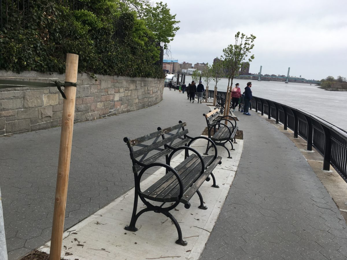
New growth brings new promise as spring peeks through….taking walks is great for both body and mind in the high desert of Albuquerque.Hello Heather over there in Arlington, Virginia – running over the Rt 66 trail!! Not much traffic!!!!! Shelley sends this scene from their lovely Lake Keowee neighborhood in the secluded woods of northwestern South Carolina. My friend Jeannie, who usually works at the now very enormously lonely Metropolitan Museum of Art in NYC, writes that her Peaceful Place is “on one of these benches in this jewel of an oasis called Carl Shultz Park here on the Upper East Side overlooking the East River. Nice breezes to enjoy and usually lots of pleasure boats. Been doing a lot of reading here and a fine place to get a whiff of fresh air.”
Hobbies and projects have flourished. Weather permitting, outside gardens need tending and indoor projects/hobbies have truly been re-vitalized with renewed appreciation and interest.
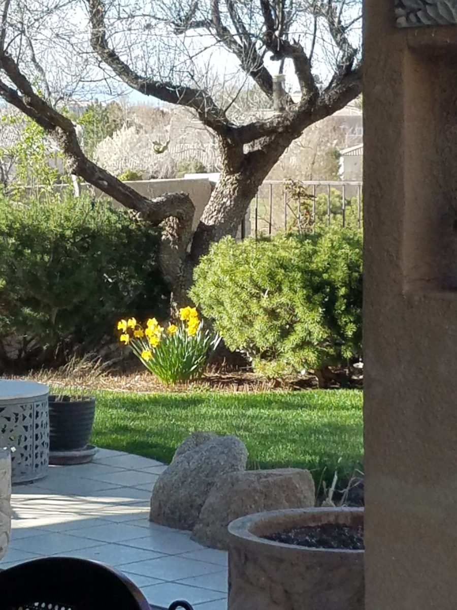
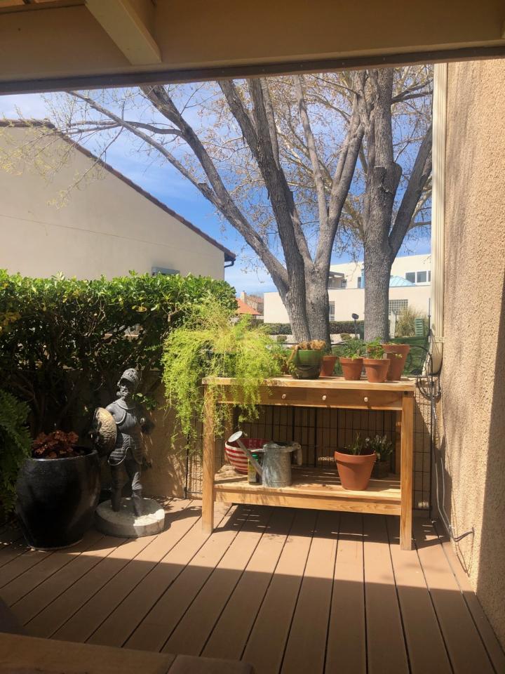
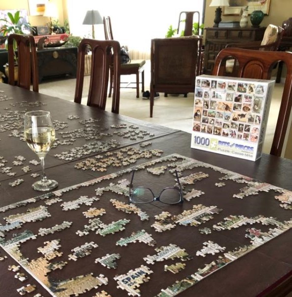
A recently added potting table on Cathy’s deck provides a perfect area to focus on preparing patio pots and new growth!!Adjacent to her potting area, Cathy has a perfect place for repose. Reading or playing cards, enjoying a morning coffee, evening cocktail or a quiet meal – this area provides a perfect retreat. More fun and games as Bonnie attacks her 5th jigsaw puzzle since the quarantine started just a few weeks ago…with a little refreshment and plenty of early evening sunshine! Love that the days are getting longer!!!!
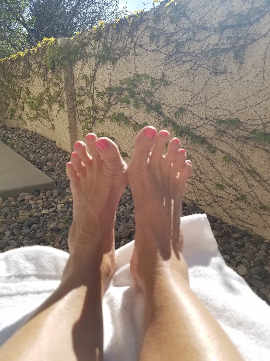
Plump your pillows and prop up your feet – inside or out – a healthy combination of rest and meditation, healthy eating, brain work and physical exercise is the recipe for success during our surreal pause. Find your peaceful place – find your joy.
Hidden talent – that remarkable artwork that appears (seemingly) out of nowhere, on a par with great masters of the medium. I considered this element of surprise – looking back several decades to a local painter, Wilson Hurley, who had more than one very different, distinguished career and diverse life experiences before he delved deeply into his passion for painting in his 40s. Once exposed, his paintings revealed his extraordinary talents and he become a nationally recognized treasure for his sweeping landscapes and a variety of other subjects.
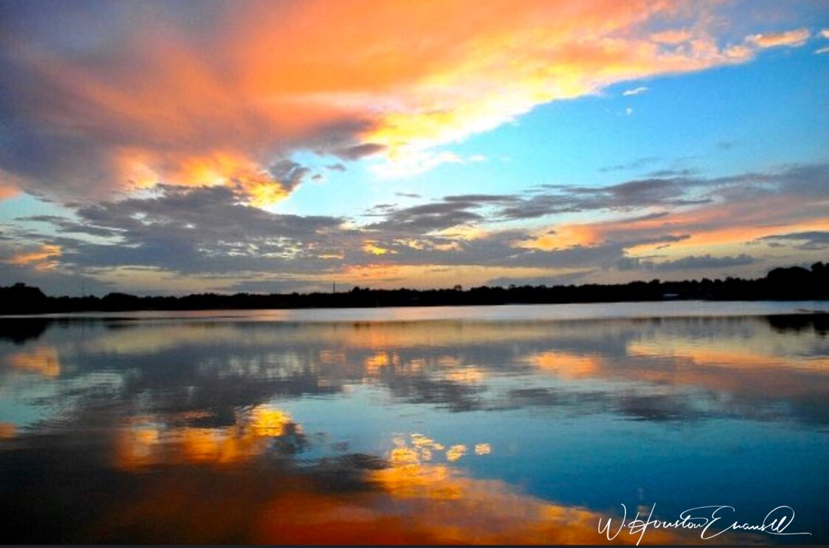
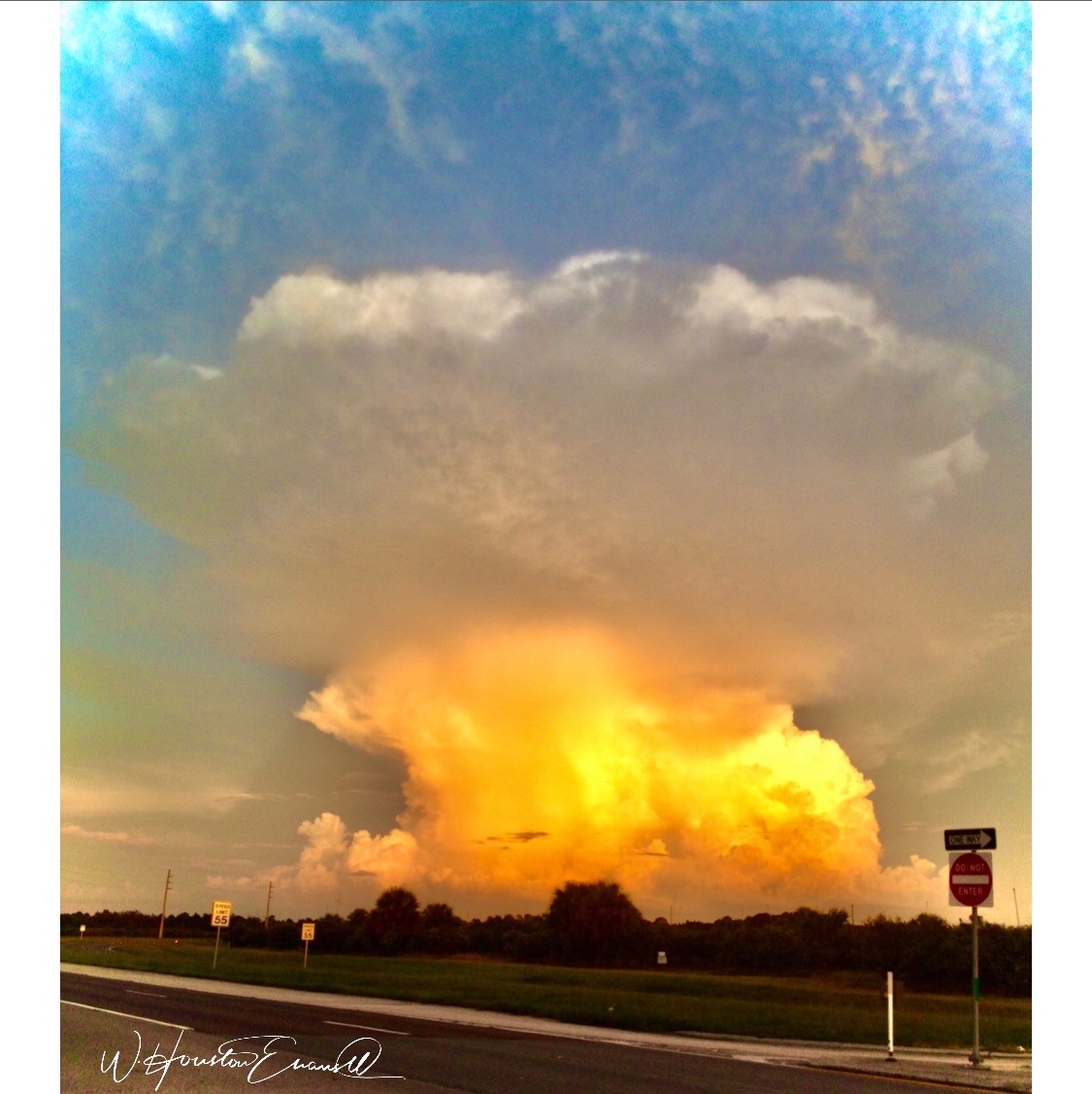
On that note, I have just gotten off the phone with a very good friend, in Florida, Houston Evans. I have recently learned that he is a passionate weekend photographer! An amazing photo appeared in a Facebook post and I was astonished by the enchanting image, color and composition. I was instantly captivated – and curious. Upon closer inspection, his stylish swashbuckling signature made me realize that this hobby was subtly becoming more than that – yes, he had his mark digitally mastered and is probably THE perfect brand for his diverse and stunning work.
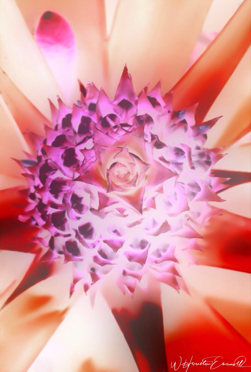
“Star Power” is the luminous celebration of a pineapple.
As I quizzed him about his interest in photography, I learned that he attributes his eye for art, color and design to his mother who’s side of the family has spawned other talented artists, in his generation. He has been posting on Instagram for quite some time – hundreds of images. I didn’t know. I didn’t “follow.” He is modest about his photos and does it for his own amusement, pure pleasure and personal enjoyment – that he likes to share. “I don’t do it to imagine it on someone’s wall.” Yet this observer believes that there is where it absolutely should be! Many walls…many places! #houstonevansphotography
He plays with the medium and all the tools and tricks of the trade. He enjoys the freedom of experimentation. The results are controlled, yet spontaneous. From high resolution to fuzzy pixels that require distance to assimilate. Up close for precise detail and soft smears for imagination to take hold, the variety of clarity or lack thereof are a part of the experience and expression.
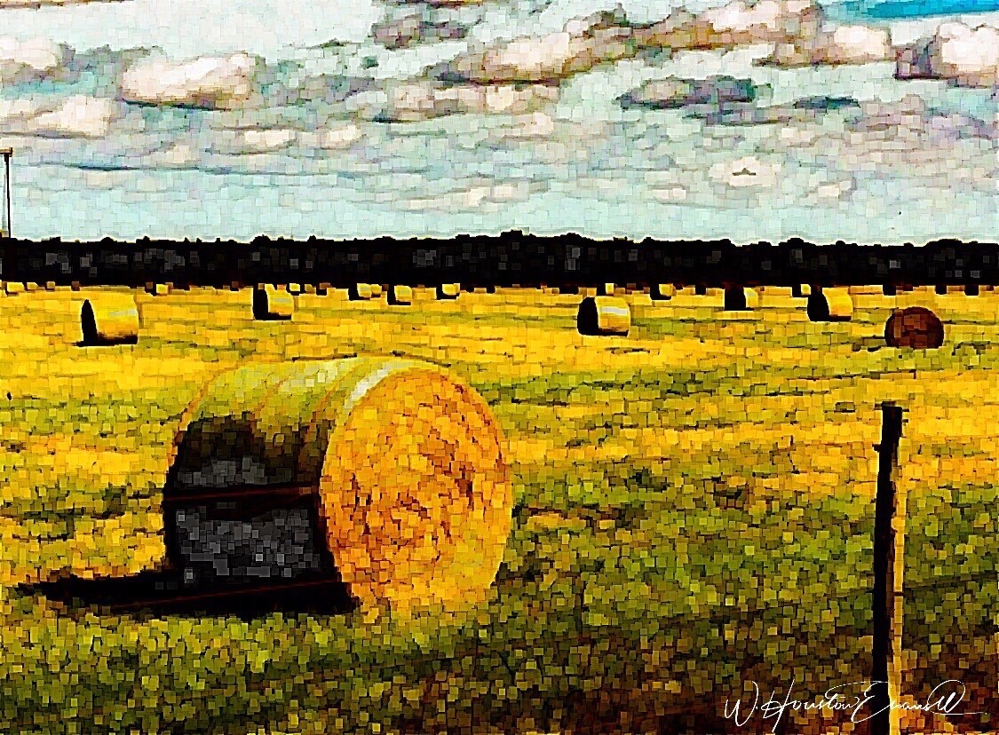
“Makin’ Hay” has an enhanced pointillist treatment – a Van Gogh-esque subject with a twist.
From my interior designer’s perspective, his bold images would be key focal points in the drama of architectural spaces – interiors from Miami to Honolulu and on around the world!!! I can see the towering orchids in hotel lobbies, bars, restaurants and swanky condos everywhere!!! I am eager to find a project, for which his work would be the key to the scheme, unveiling a spontaneous design resulting from the inspiration of the image.
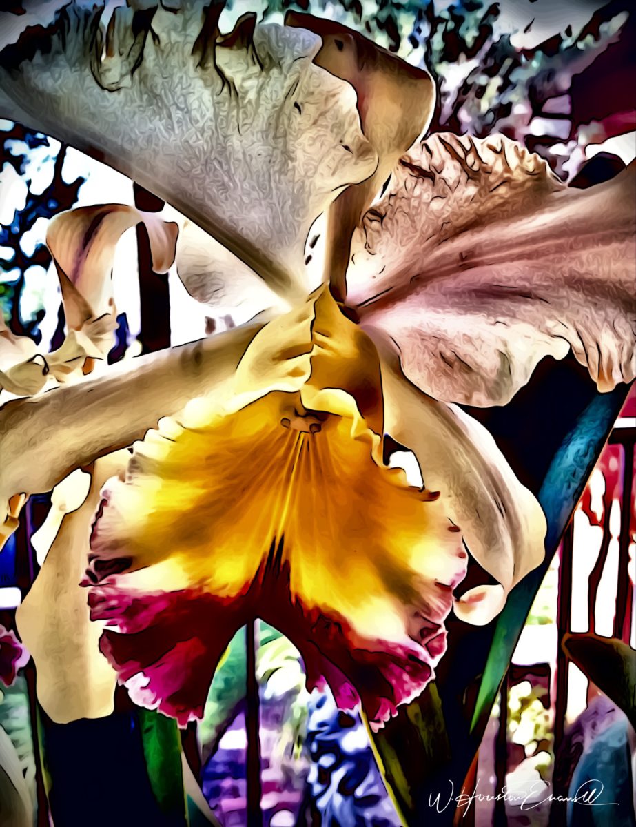
“Oblique Orchid” screams floral superiority as a commanding focal image. “Shooting the Bird” speaks to paradise revisited!!!
In the beginning, the photos stood on their own merits. Evans keeps his originals – some of which remain just that – in their original form, while others are tweaked or more radically manipulated to create stunning subjects and compositions.
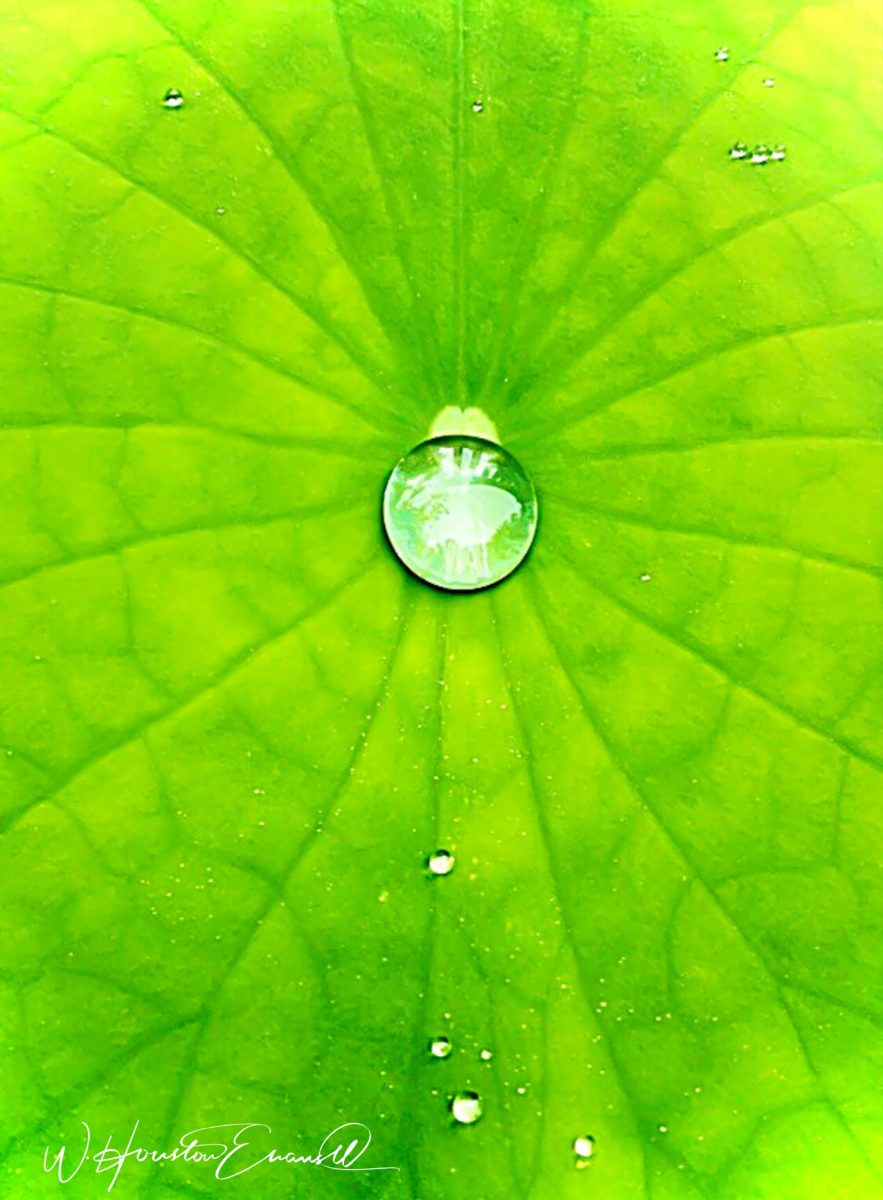
This brilliant, fresh simplicity of “Aqua Eye” observes the droplet’s reflection in the center of the cheery chartreuse petal. Coming upon a cool caddie “Daddy Long Legs.”
I can see his limitless fantasies contributing to the imaginative narrative of Meow Wolf, gracing hotel lobbies with larger-than-life orchid explosions and commanding condo walls with magical statements of tropical color, subject and form. Translucent installations of LED illumination could result in magnificent walls of design influence.
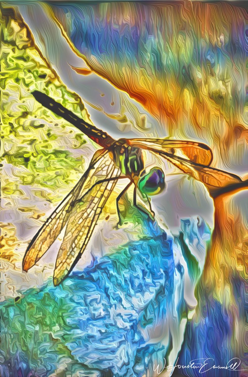
“No Flies on Me” is a fantasy of oozing colors and form melting and melding around the psychedelic dragon fly.
The digital age is advancing with such a pace that we are
all caught-up in photos of food, whacky selfies and sunsets on fire…but
having an artist’s eye, to truly see the potential and master the tools that
are now available – using them to create valid and valued masterpieces of art,
is extraordinary.
“Copy Cat” reflections mirror a chorus of color from sky to watery impressionistic likeness.This “Roadside Attraction” must have been a startling scene to distract dazzled drivers.
I truly believe that his work is exceptional – full of heart and soul – and spectacular fun!!!!!!!! I’m thrilled to learn of these images and now enjoy the continued progress of his discoveries and creations. Let’s see where this goes!!!!! He just might be coming out of hiding!!
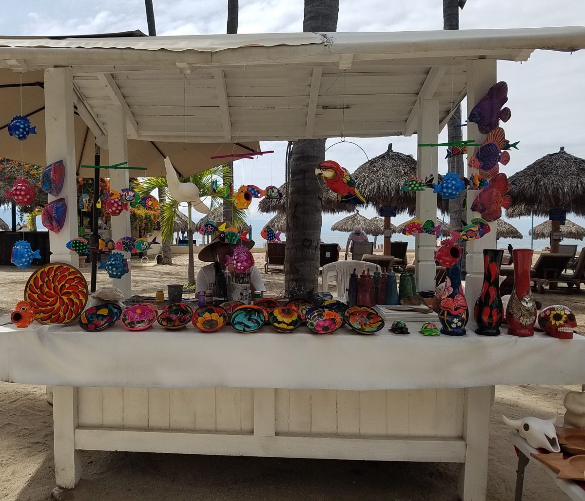
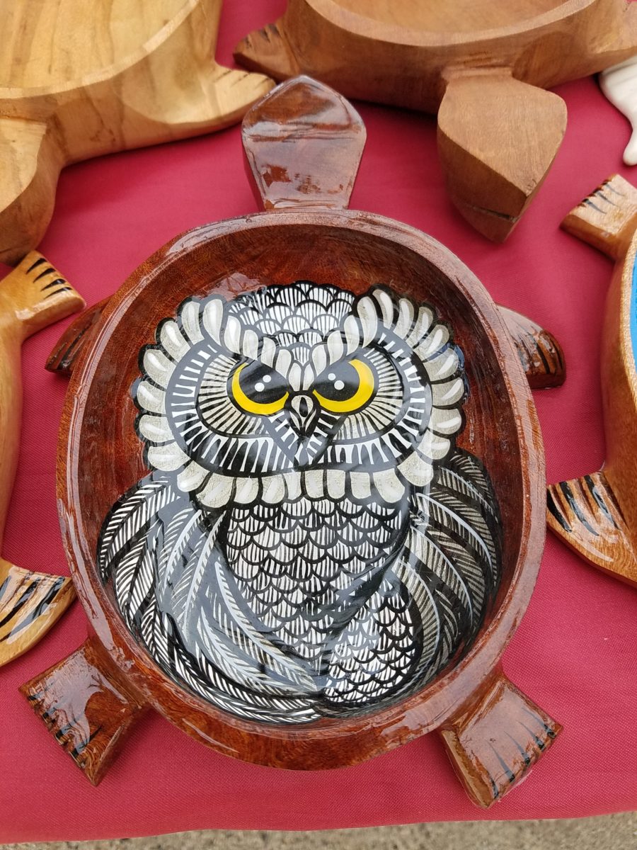
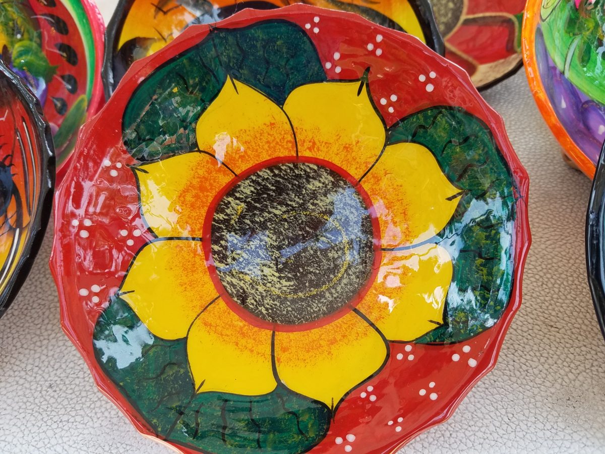
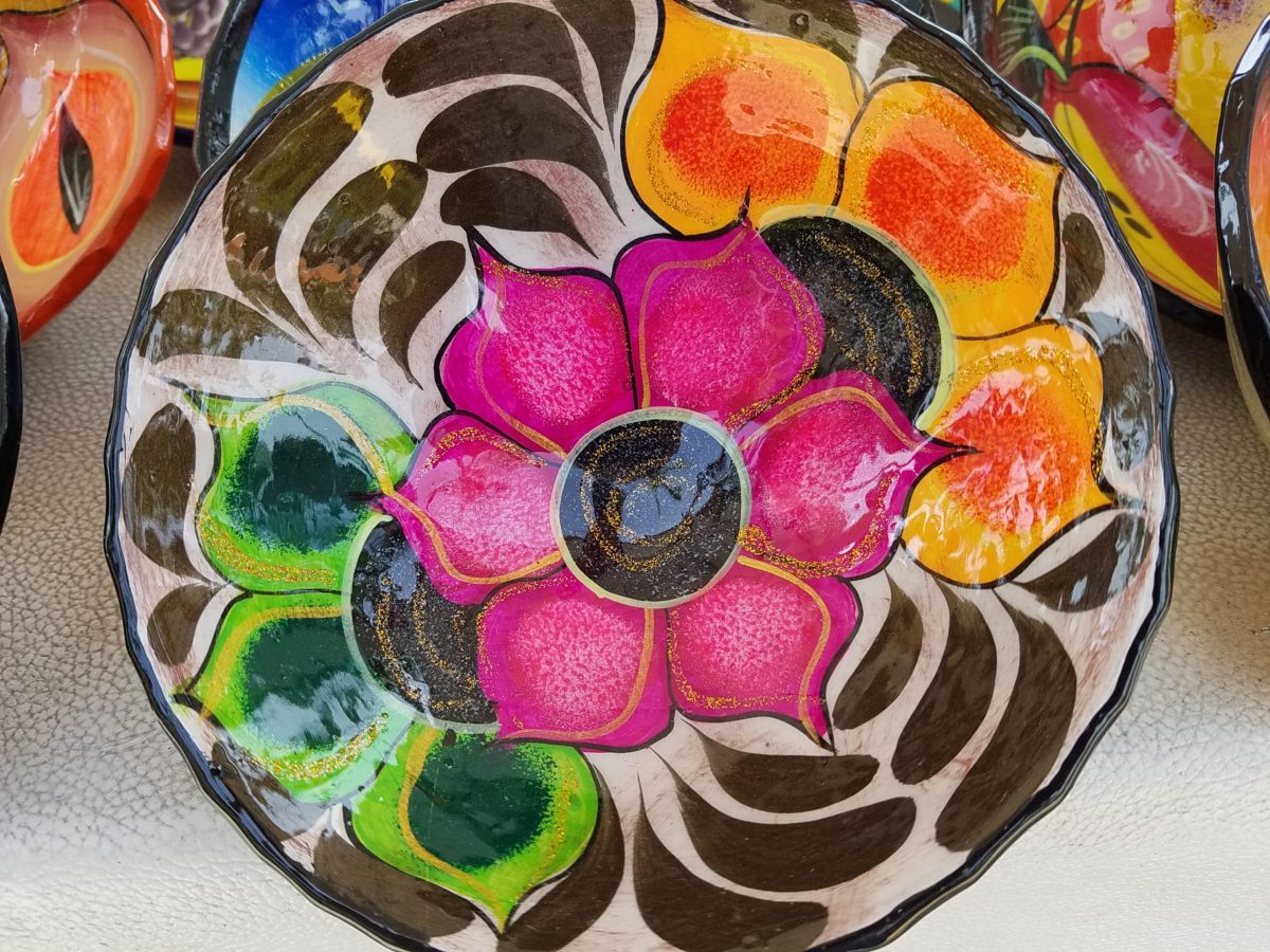
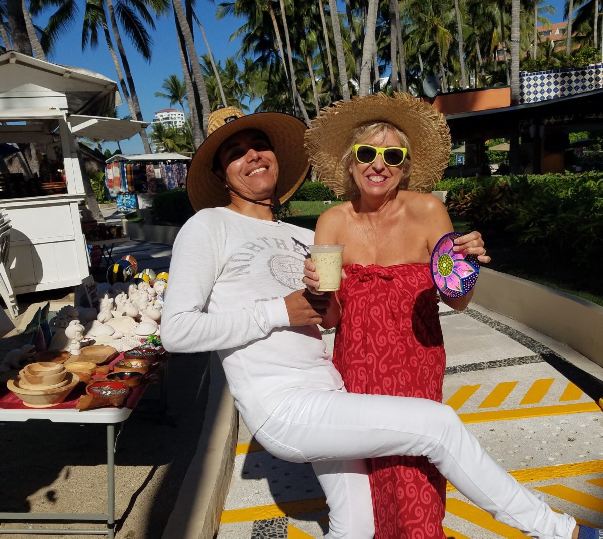
Hidden genius can be found amidst seemingly redundant arts and crafts. Walking by you might not notice. Passing by many beach stands, they begin to look alike – very repetitive. The colorful wares and handcraft are striking and eye-catching and full of fiesta, yet if you pay attention you will notice the nuances. Discovering the true designer/artist.
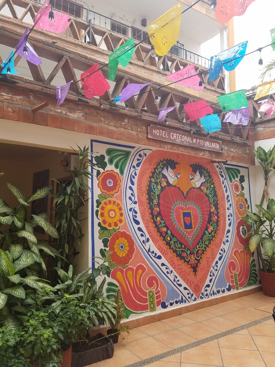
An escape to the tropics and especially to another country offer a reprieve from the cold and add an exotic element to getting out-of-town. Discovering the many indigenous art forms that come from all over Mexico is fun and exciting. Getting to know the makers and the distinctions in their work is another exciting level of appreciation.
As is true with so many things, detail and design matter. I buy a smattering of things for my gallery/gift boutique. I like to support the local vendors and makers that produce these fantasy-filled folk-art pieces. From fabrics to stuffed animals, painted pottery to murals and mosaics, the art is abundant and deserves to be examined.
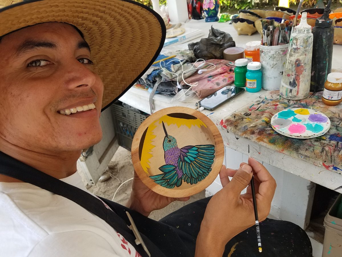
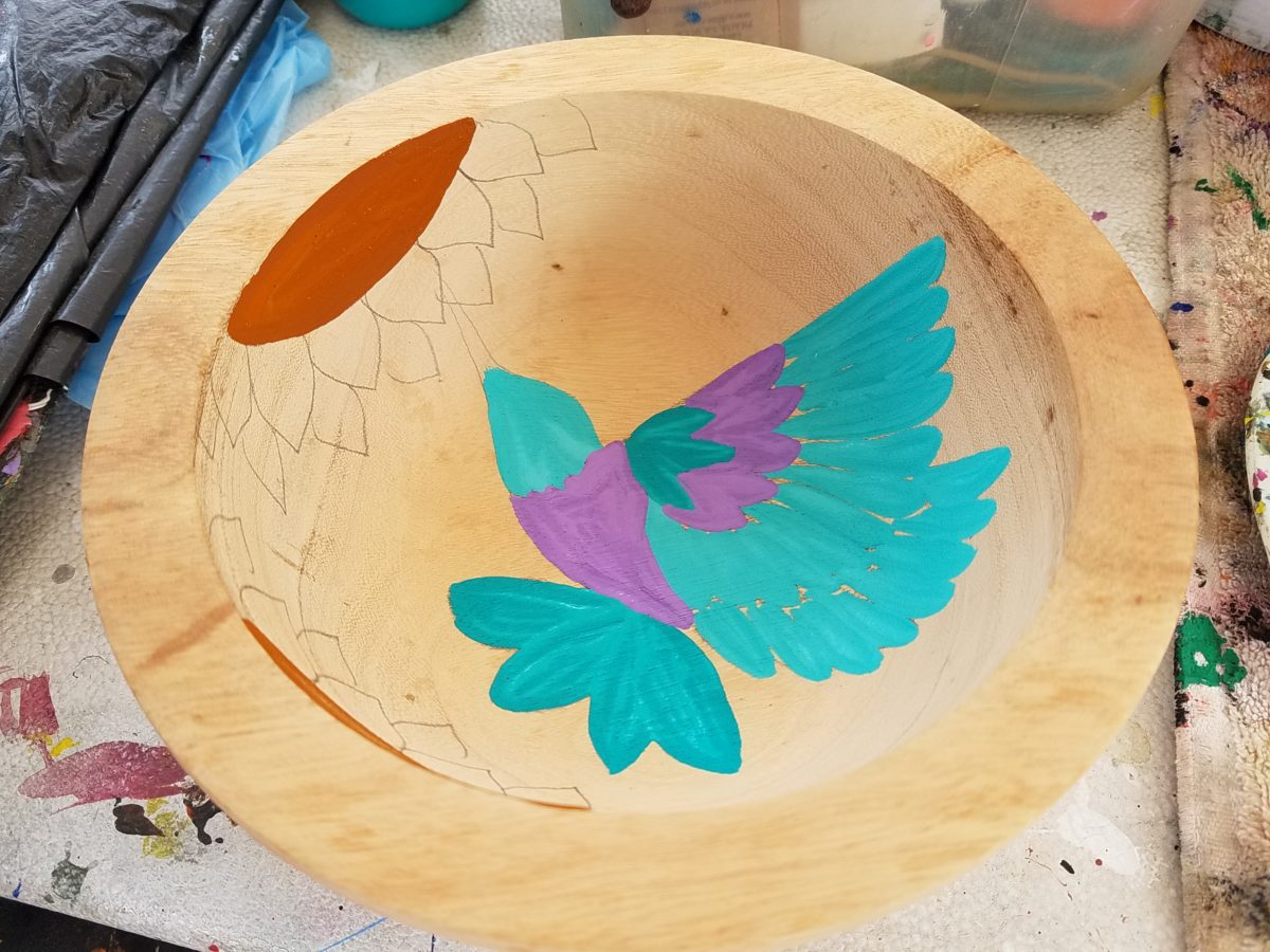
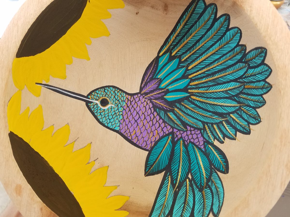
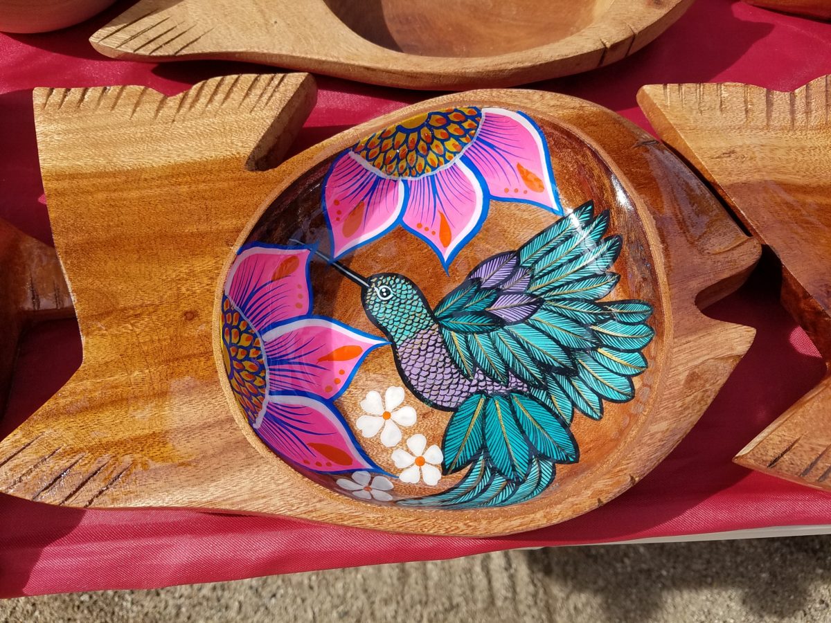
As an example, I am focusing on Victor Rivera. Victor is an artist and more so, an incredibly gifted designer. His sense of pattern and imagery is exquisite. It reminds me of my mother’s love of Marimekko and Lily Pulitzer in the 60s and 70s. Her appreciation was a tremendous influence on me. The joy of color and pattern was a exhilarating celebration to wear and accessorize your home. Victor seems to possess a like-kind of innate sensibility and talent for devising and executing sensational color, pattern, motif and resulting design. He is currently creating, from a modest beach stand, what I believe is clearly different from others doing what might be thought to be similar work.
Like Maija Isola – a peer of my mother’s, having been born in the 20s her designs transcend the many decades in which she influenced color, pattern and bold imagery. Her work continues to live and influence the evolution of Scandinavian artistic direction and its impact on the world of design. https://www.marimekko.com/com_en/world-of marimekko/design/designers/maija-isola
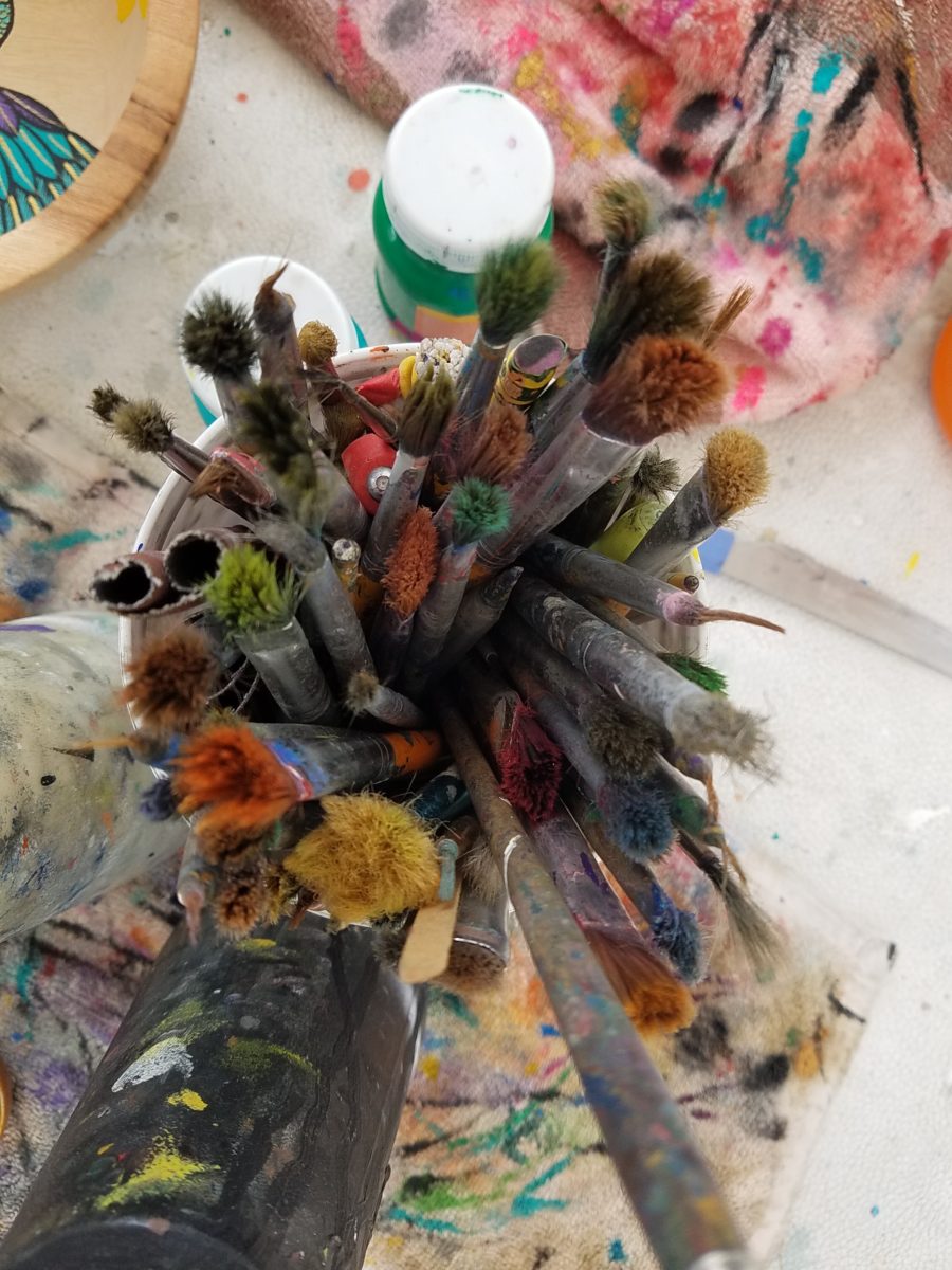
Watching Victor select his brushes, for the various applications and control on his designs, is fascinating and amazing.
The sense of pattern and design is a different category of artistic talent, in my observation and estimation. A master, of pattern, form, design detail and art, is an artist. However, the focus on the repetition and integral connection of patterns – for this purpose in a one-dimensional application – is an intensely different pocket of an artistic brain.
And this brings me back to Victor. I want someone in a position to embrace and promote him, in the world of fabric design and influence, to catapult him to the level to which he can and should aspire. Shout-out to Alegreea and the fabulous designers at Pineda Colavin!!!!!!!
His hummingbirds begin with a pencil drawing and basic “fill” colors at the start. Working on both clay and wood prefabricated bowls by other artisans, his many layers of colors and details take shape.
With myriad, mostly monotonous, Mexican street/beach artists, Victor is a beacon of light that stands out among the throngs. Once you stop to notice – the work he is creating is astonishingly unique and beautiful. His designs are laced with meticulous detail, outstanding color combinations captivating and beautiful.
He will paint expeditiously simple works to satisfy the tourists and keep an inventory at the ready for spontaneous purchase – but when he has quiet time and is caught-up on his table of offerings, he creates amazing pieces that are truly remarkable. It is important to note though, that his more expeditious pieces still have a color combination with strokes of accents that still are above and well beyond the common.
He will paint commissions all day long – but left to his own devices, his creativity is boundless. And, referencing back to the Scandinavian designers, his floral designs are outstanding!
Taking time to examine the world around you and the beauty of detail that awaits, is a joyful experience of great discovery and satisfaction! Not to mention great fun!!!
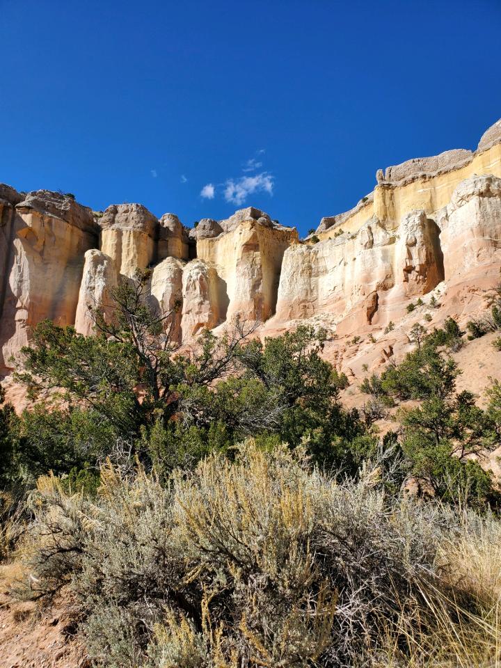
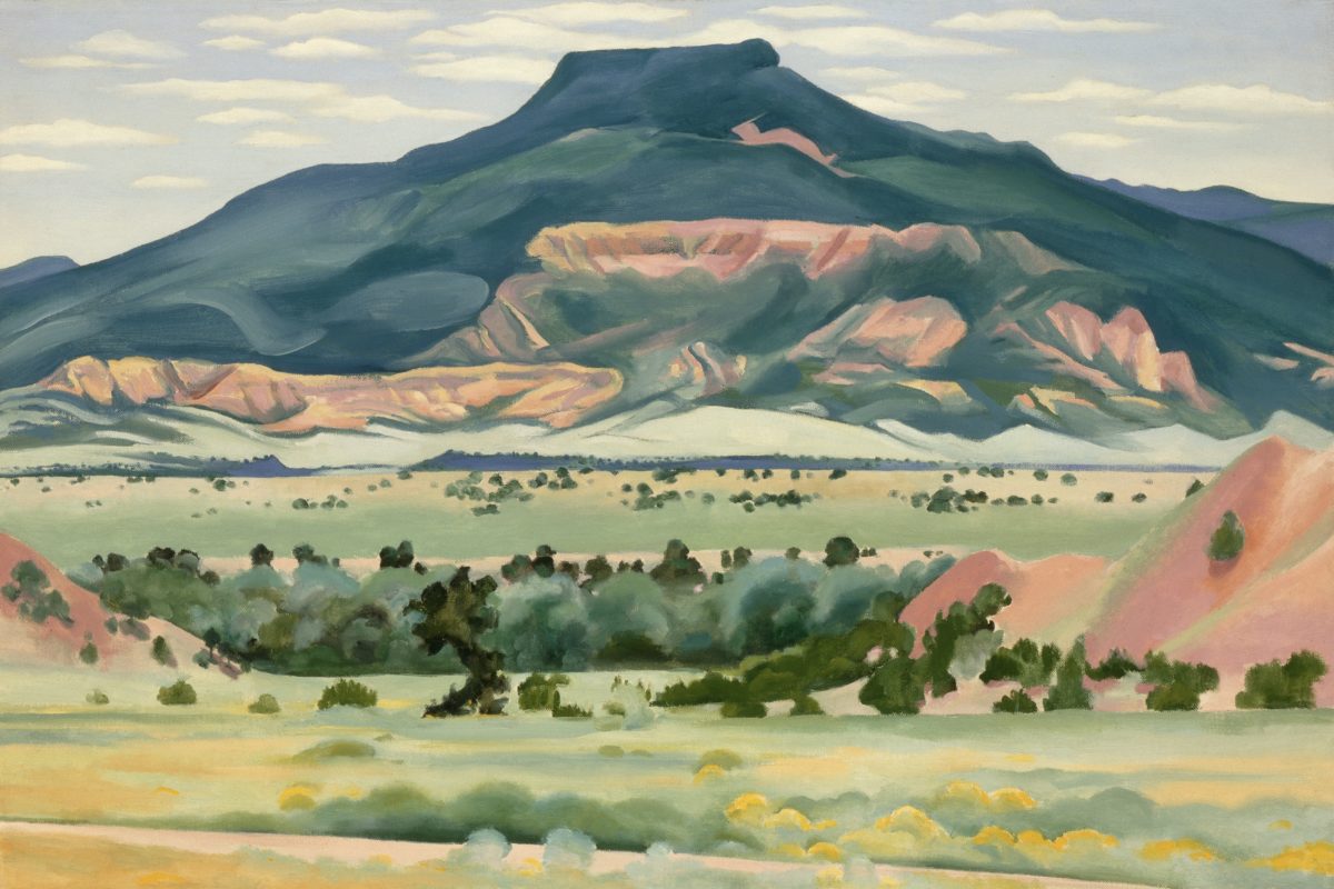
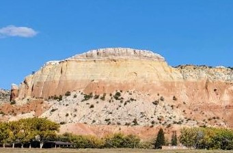
Had I planned this blog, I assure the readers that it would have been more thoughtfully compiled. However, as it is a pure reaction to recent exciting experiences, I am without much fodder that, although was before me, I neglected to document. Such as card racks full of Georgia O’Keefe greeting cards featuring prints of her magnificent work and exact pairings of the amazing landscapes we witnessed with her paintings and her magnified flowers too. Dashing in and out of her distinctive museum just off the Santa Fe Plaza bearing her name and thoughtful work (a MUST see when visiting Santa Fe), to stepping up the steps at the Ghost Ranch Abiquiu property, I didn’t document as I was too busy looking at and absorbing – so much. Yet without prior planning, I seem to have assembled enough that surprises me and therefore has become the body of this blog, about taking time to look…
The striations of color are as though painted – nature and its creator – amazing art and artist.
On this recent road trip and surrounding days in our immediate environs, I experienced inspiring images and pairings, beauty and detail, color and form…that evolved into this blog featuring the landscape and expressive paintings of Georgia O’Keefe. Captivated by the remarkable light and surreal landscape as have been so many artists, O’Keefe settled into the colorful backdrop of Abiquiu where the formations of color, sand, rock, and sky were interwoven with sparse, but all the more beautiful vegetation and flowing water carving its way through the enchanting scenery.
Those of you who enjoy taking photos, capturing moments, items and scenes will appreciate the exhilaration and awestruck sense of this humble presentation.
An iconic land form Abiqui, New Mexico
Art and nature. Design and nature. Nature
inspires artists and designers with color and proportion. The natural world is
a limitless collection of examples of perfection, majesty, detail and form.
Living in New Mexico presents amazing opportunities for studying so many
offerings from the natural world – verdant valleys and lush bosques to towering
mountains, contoured mesas, golden plains, glistening rivers and rainbows of
geology rising up from the earth. The sculptural land formations are what seem other-worldly. And yet there they are – majestic sculptures
against the sky.
O’Keefe was keenly aware of the extraordinary
world she encountered and she captured it through her eyes and expressed through
her strokes with fluid sensitivity and sense of color.
Georgia O’Keefe loved and appreciated around the world for her sensitivity and ability, to capture and convey her enchanting surroundings.
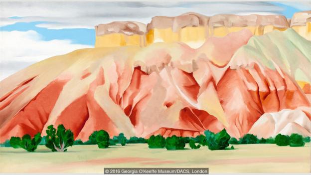
Very real and hauntingly beautiful landscape of Ghost Ranch – Abiquiu, New Mexico translated into the sharp, crisp, colors and forms of O’Keefe’s paintings.
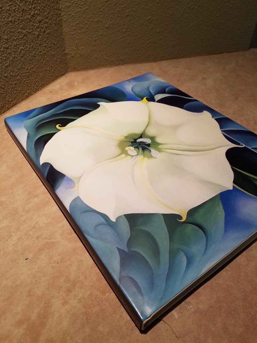
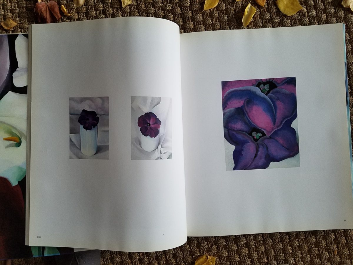
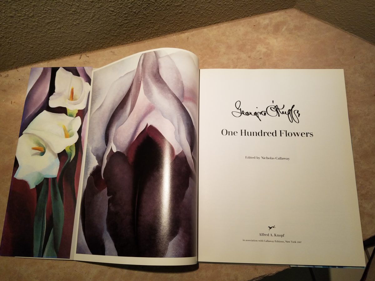
Years ago a very dear friend gave me an exceptional gift, of a book. The farther along I progress in this world and enjoy the vast opportunities to appreciate the beauty of nature, limitless boundaries of design, art and all that is produced by talented, creative, observers, treasures such as this have increasingly greater meaning. One Hundred Flowers a 1987 masterpiece collaboration of photographer, publisher, editor and scholars presents an outstanding collection representing this significant subject matter – flowers – that she took time to observe.
Up close and personal…in intimate detail she saw and rendered sensational studies of flowers. Expanded to enormous scale well beyond their reality, these explosions of color and contrast, fluid form and detail are amazing to encounter. Even in the pages of this stunning book her work is startling. In person it is awe-inspiring.
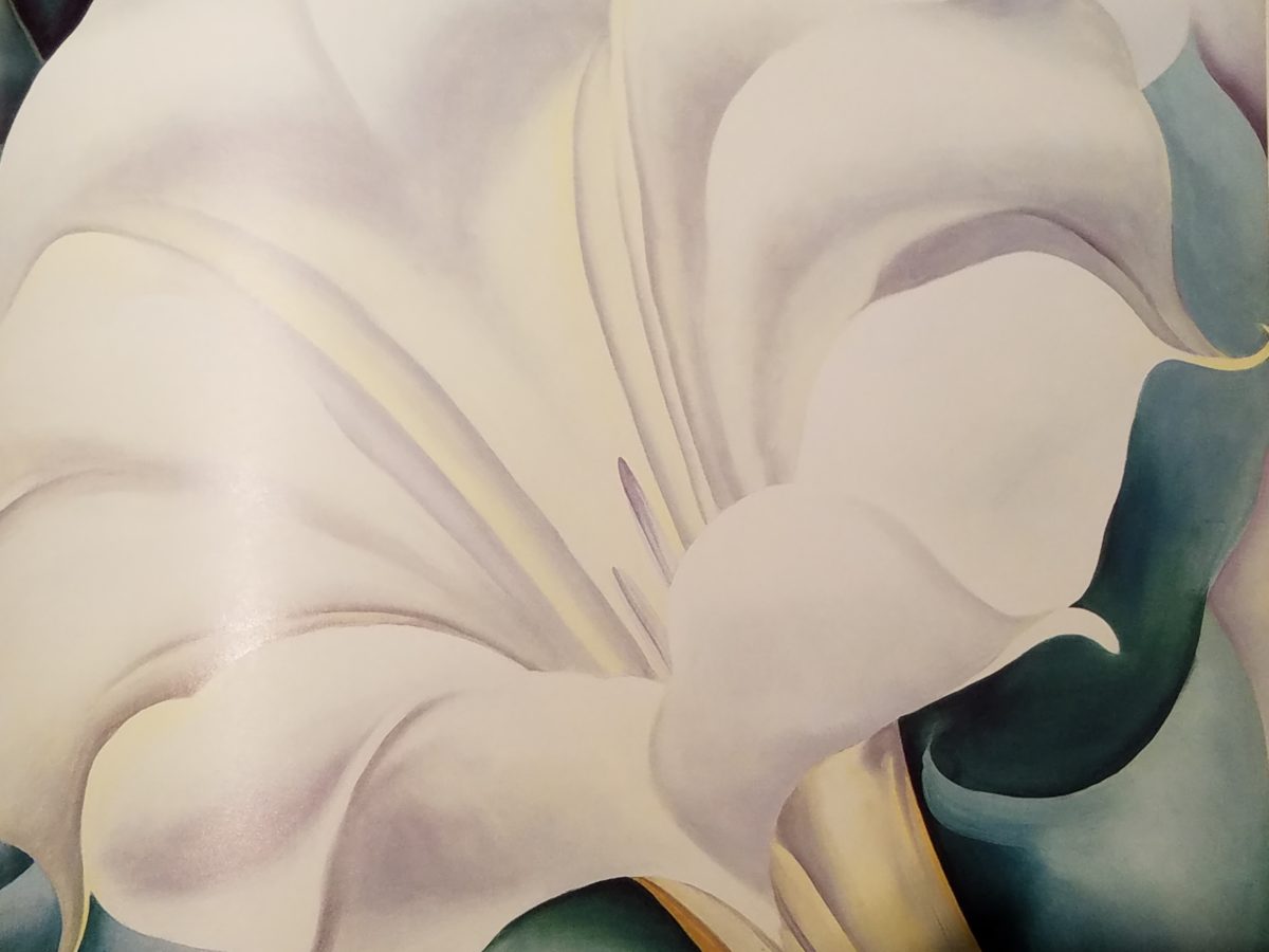
Upon returning from the Abiquiu visit, I retrieved my beautiful book. I took great joy in the dust cover – suitable for framing. A brilliant white squash blossom captivates, before even opening the cover. As I leafed through these large format pages in this lovely, exquisitely bound tome, I realized that, within a week prior to this O’Keefe familiarization trip, I have taken photos of flowers for a similar reason as she – stopping to look and observe their singular beauty amidst all else in the surrounds.
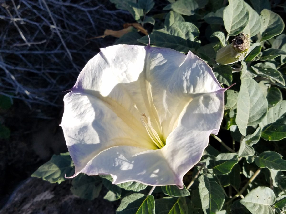
Unknowingly, a couple of days earlier I captured this spectaculalr squash blossom that had survived our first frost.
Just a few days prior to the Abiqui visit, while walking among the petroglyphs at the base of the dramatic black volcanic rock rubble of our west mesa, we came upon a singular, stellar squash blossom. Having survived recent frosts, this one was luminous and brilliant among so many other spent blossoms dried and shriveled away for the season. It was irresistible.
Little did I know, at the time we encountered this beauty of a squash blossom, that I would soon revisit O’Keefe’s studies of this wild and magnificent bloom.
Here more studies from the One Hundred Flowers book featuring this dazzling white squash blossom.
In the design world, we often quote architect and furniture designer Ludwig Mies Van Der Rohe (1886-1969), one of the founders of modern architecture and an advocate for the simplicity of style with his popular phrase “less is more.” I felt that O’Keefe’s interpretations distilled the forms of her subjects to the essential elements that best conveyed them in a manner of simplicity. Her flowers are bold and clear sweeps and contours, of the design of each. Distilling to these essential elements is the practice of “less is more.”
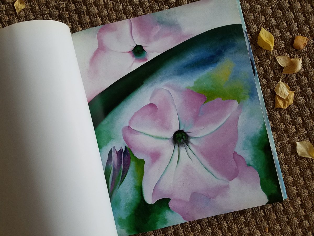
Her bell-flower trumpets of petunias and hollyhocks in purples, pinks and even arresting blacks reminded me of a photo that I took less than two weeks prior to enjoying my book for this study.
However, she was not sparing with color nor scale. Fabulously daring color combinations and contrasts are signatures of her interpretations along with her magnificent sense of magnification – presenting bold gifts to we, her viewers.
The opening of the book quotes O’Keefe about her profound
appreciation for a flower.
“A
flower is relatively small. Everyone has many associations with a flower – the
idea of flowers. You put out your hand to touch the flower – lean forward to
smell it – maybe touch it with your lips almost without thinking – or give it
to someone to please them. Still – in a way – nobody sees a flower – really –
it is so small – we haven’t time – and to see takes time like to have a friend
takes time. If I could paint the flower exactly as I see it no one would see
what I see because I would paint it small like the flower is small. So I said
to my self – I’ll paint what I see – what the flower is to me but I’ll paint it
big and they will be surprised into taking time to look at it – “ Georgia O’Keefe “About
Myself,” 1939
Be surprised. Be inspired. Be aware of your surroundings, for all the beauty of nature and its influence. Embrace color and contrast, punctuations and accents. Take time. How might your next design project reflect observations from nature?
A few years ago, awesome
crept into our vernacular and took over. It stole our ability to select
options for descriptive excess or exception. Everything from accolades for a
job well done, positive reinforcement for anything, to a spectacular sunset, a
great new outfit or a startling meteor shower – everything from a tad past the
norm…to something truly fantastic – became awesome. Our language offers so many superlatives, yet
we have gotten so lazy.
At the expense of sounding like an advertisement or
otherwise paid spokesperson, I write today of a late-night confection
experience that is truly like no other. An experience so artful that I could not
take enough photos. Artistic delights at a bustling urban eatery where flowers
and gold leaf adorn each piece of fanciful frosted awesomeness. Ha -there it is! Had to add more to the mere “awesome,”
though!
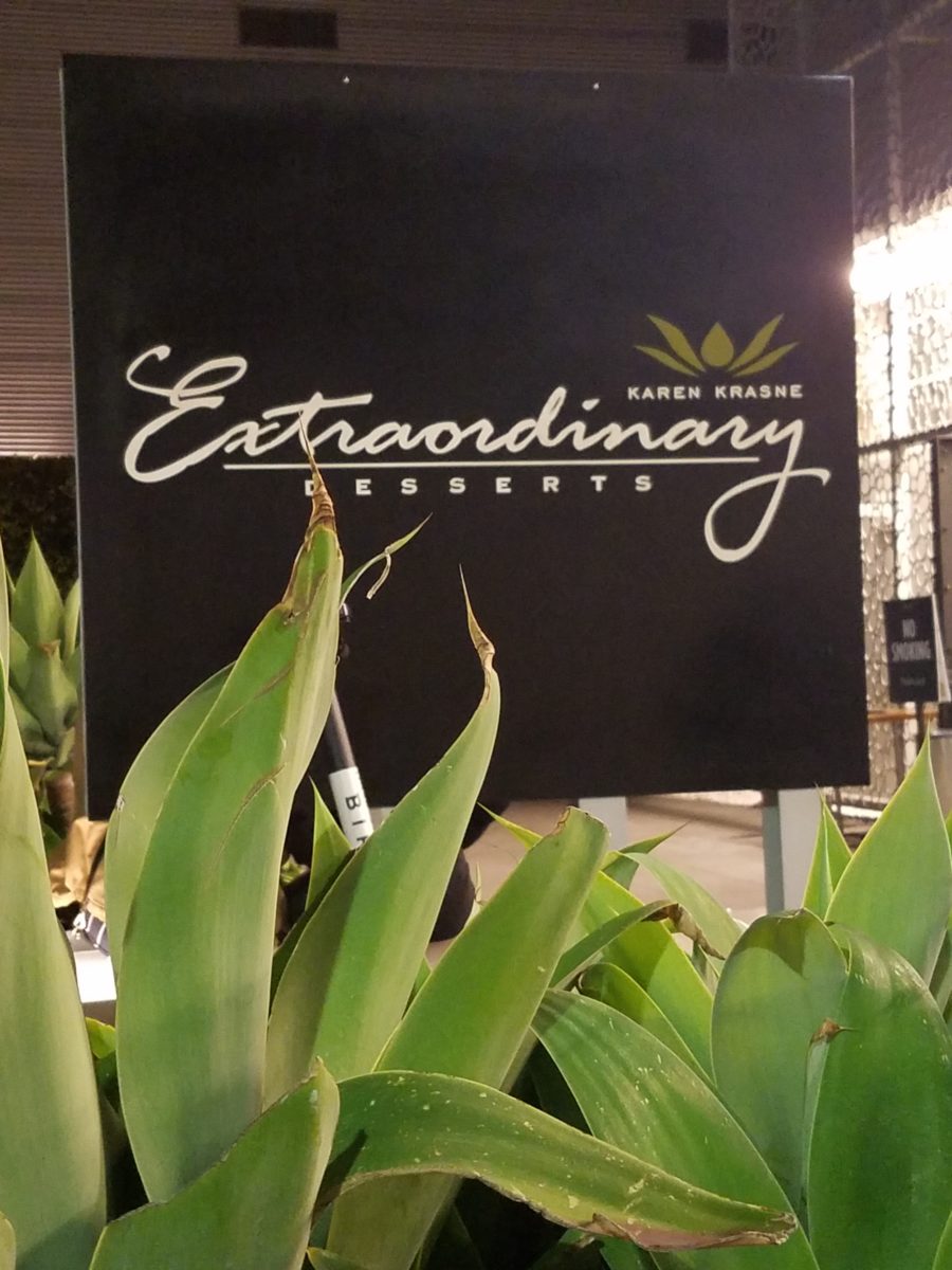
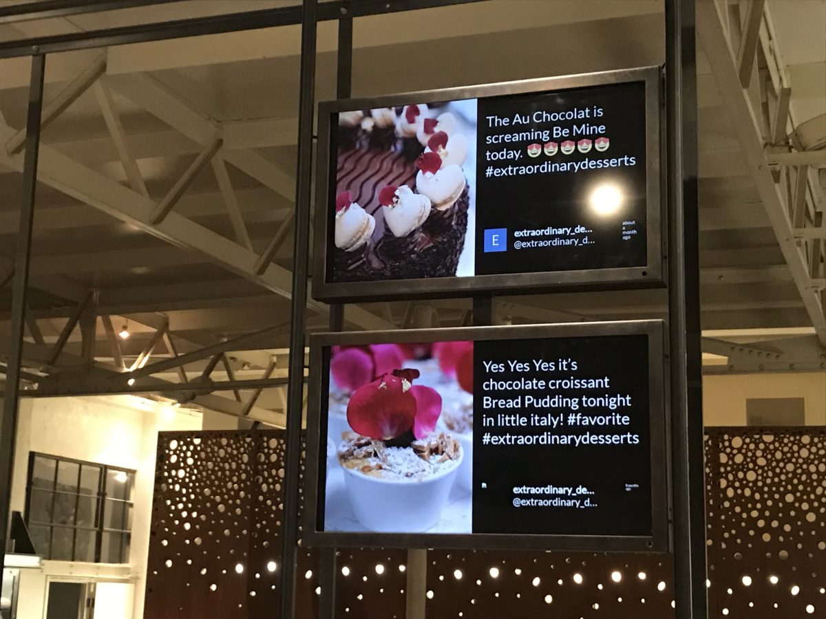
Extra ordinary – extraordinary
– beyond the norm – beyond ordinary, yes, that is an understatement for what I
am about to reveal. Yet, that is the moniker of this extraordinary establishment
– Extraordinary Desserts!
Several years ago we were treated to a late night surprise.
Not knowing our intended destination, we were taken winding through the streets
and came upon this little structure the read like an Asian garden. Twinkling
lights peeking through wooden slats softened by lush tropical vegetation – the
scene was magic. Once we realized the focus of this cozy pocket, we were
enchanted. Patrons stood in line to pass along the “extraordinary”
dessert cases displaying all manner of outrageously beautiful desserts. Once they
decided and paid for their selection, they gathered in intimate twosomes or small
groups to savor the delectable delights they had chosen.
Last night, we decided to rediscover this uniquely sweet
spot and Googled our way into downtown San Diego. What we found, by happy
accident, was a second location – an urban edifice presented on a crowded
sidewalk packed with people waiting eagerly to be seated and begin their
indulgences.
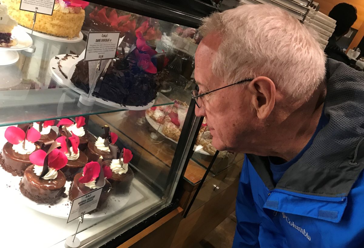
After leaving our name with the greeters at the podium, we
squeezed through the throngs to get a peek at the cases full of magical
wonders. Ok – you think I exaggerate…so now begins the photos…
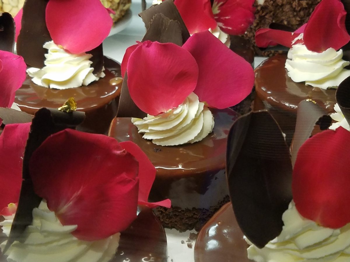
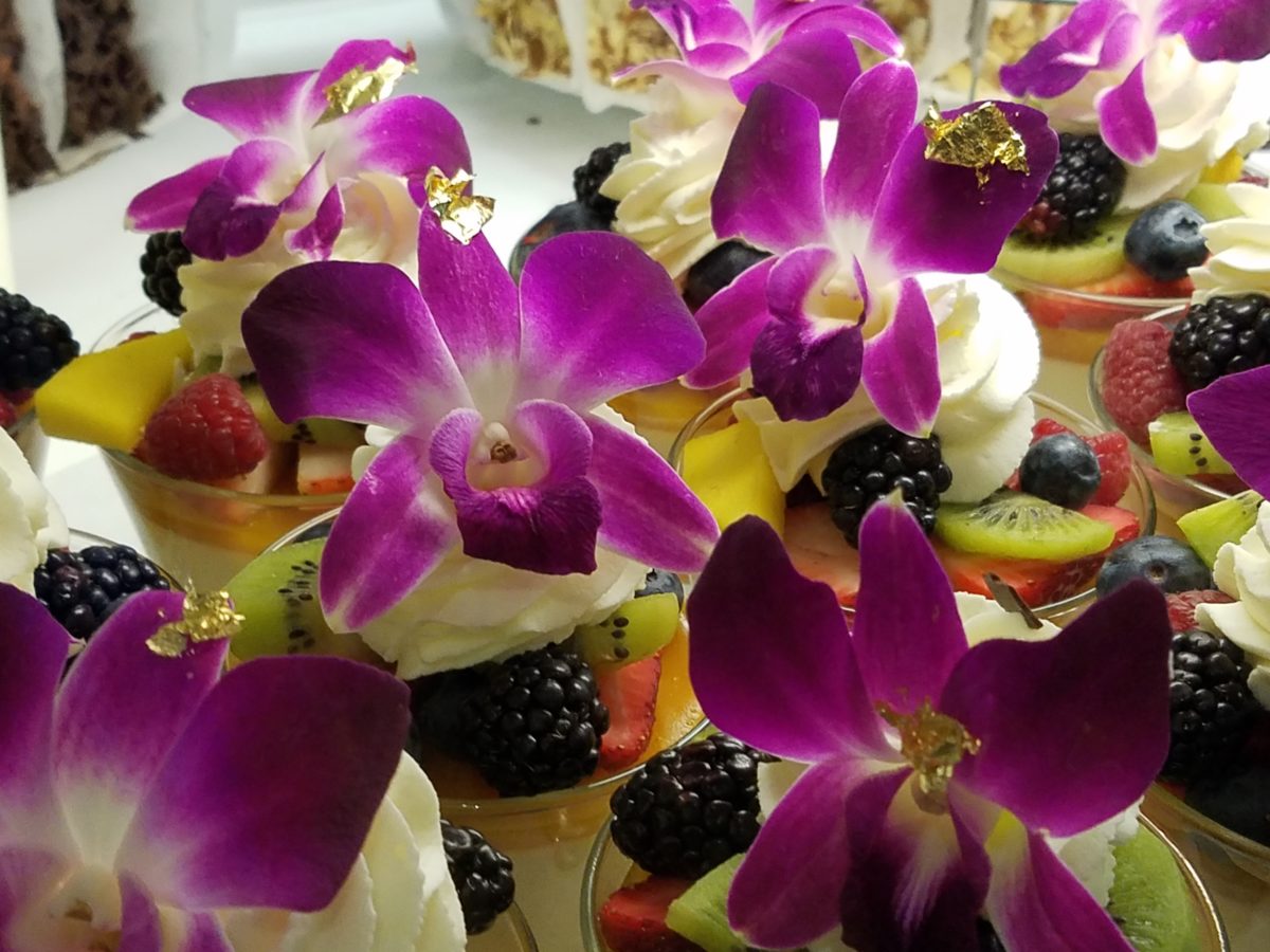
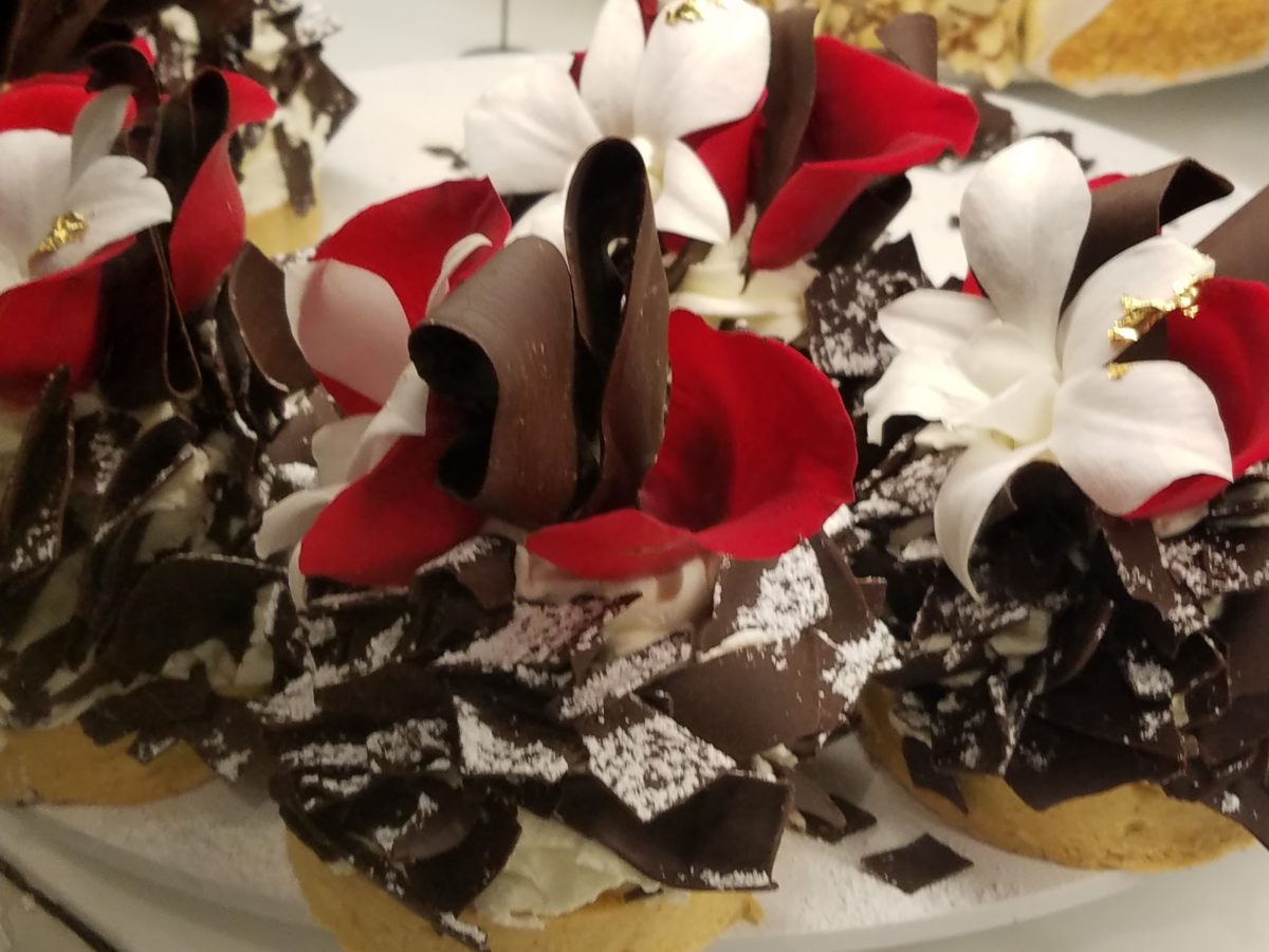
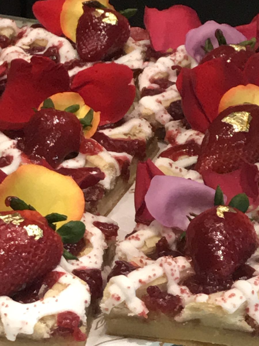
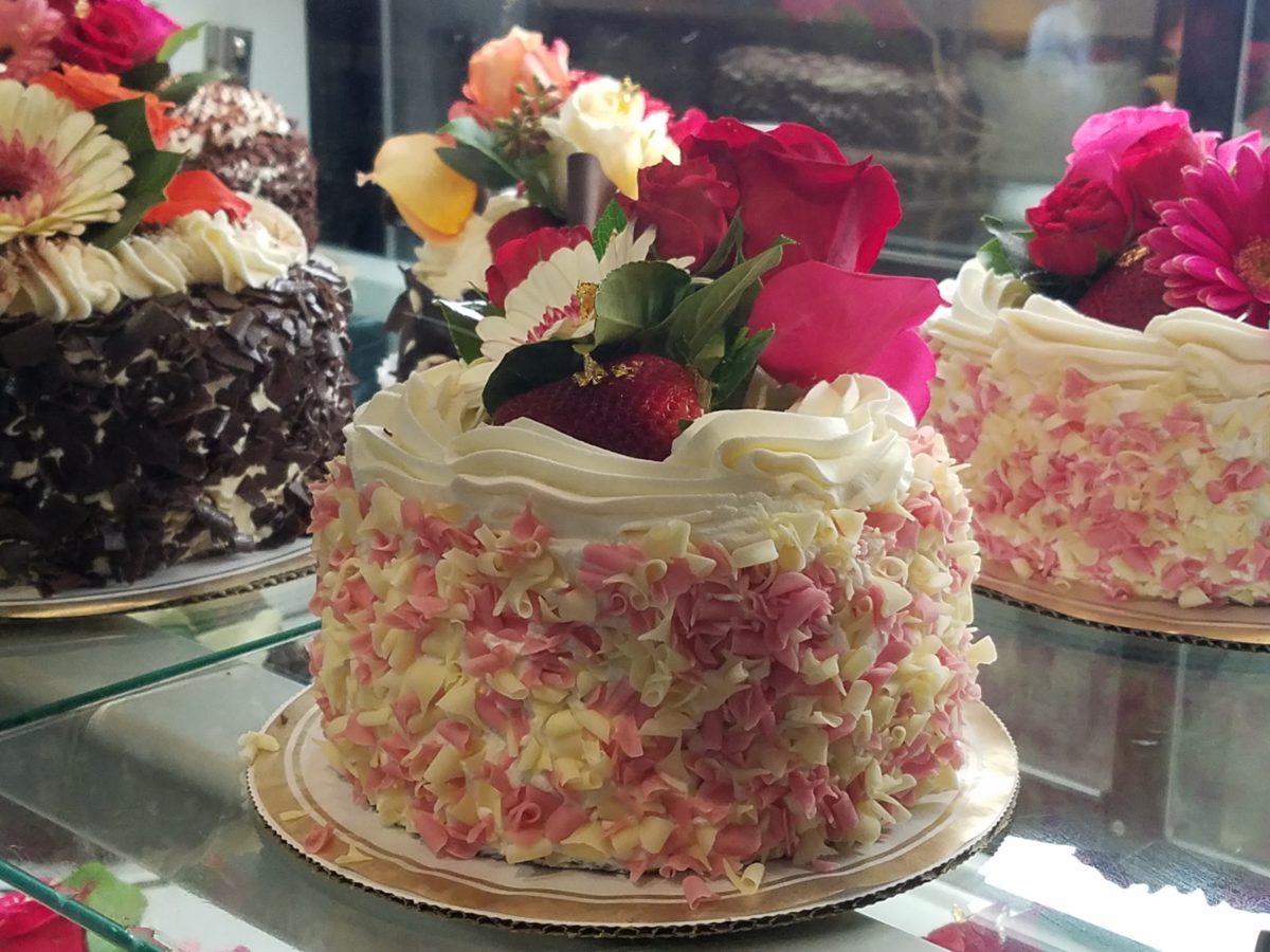
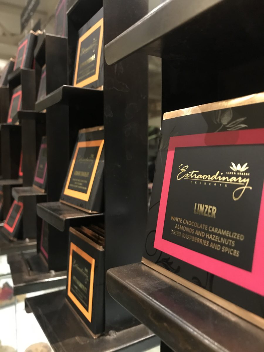
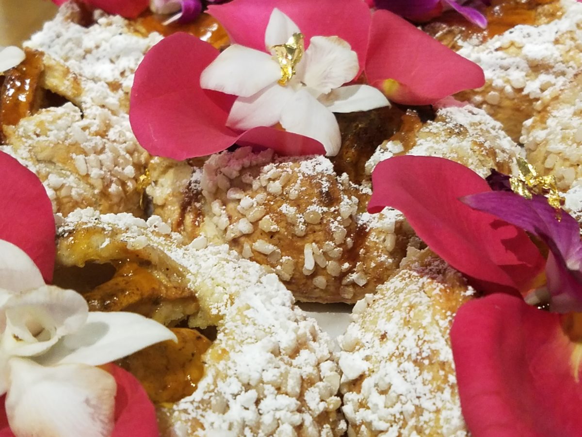
When extraordinary is an UNDERSTATEMENT, you know you are in the presence of something quite special. Maybe that’s why people invent words like splendiferous or supercalifragilisticexpialidocious!
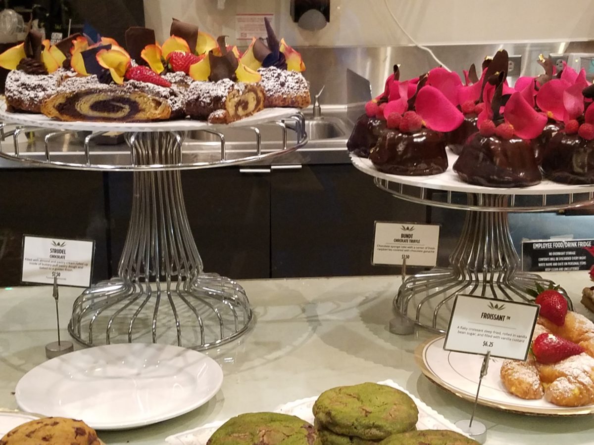
The rich velvety and textured frostings and layers of fabulous flavors awaited us as we scanned the displays.
Floribunda- yes, gilding the lilies (orchids as it were) – nothing was too over-the-top! The rich velvety and textured frostings and layers of fabulous flavors awaited us as we scanned the displays.
Seeing so many astonishingly spectacular desserts in one place all for the spontaneous taking is almost too much to bear. You mean I can HAVE that right now??? I can have a piece of many of them – RIGHT NOW?????
Emulating fine Cerelene Limoges, the would-be doilies of parchment paper rimmed with gold detailing and lettered with Extraordinary the details were dazzling! No stone left un-turned, they thought of everything to make this a tantalizing treat and patrician presentation!
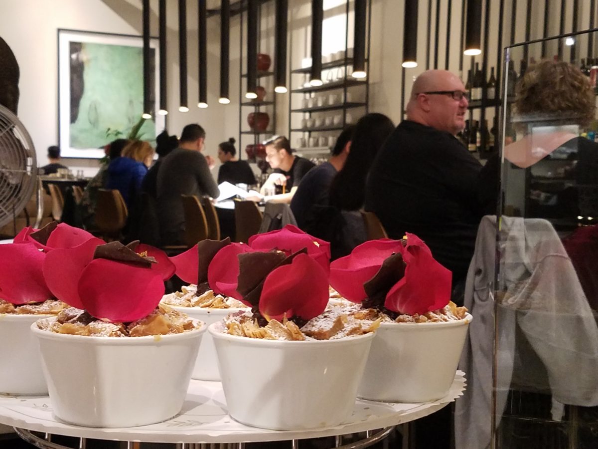
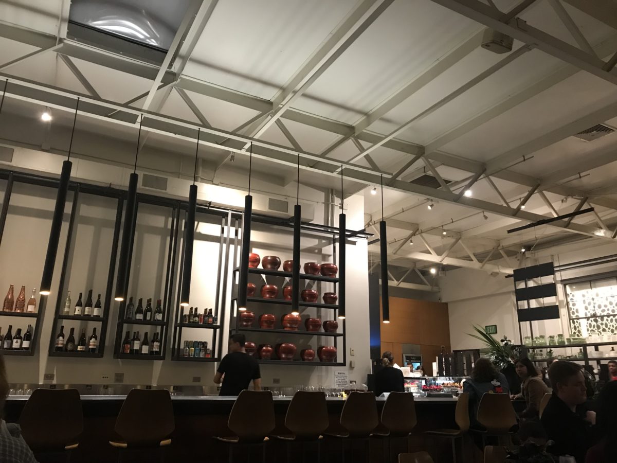
The interior offers seating at the bar and tables organized
throughout. Two tops or ganged together for a crowd, everyone was so focused on
their prizes – beauty set before them – animated chatter wafted through the
sugar-spun air! Some chose to sample
several knowing that they would take a goodly portion home. Others savored a
single serving of a beautifully flavorful masterpiece.
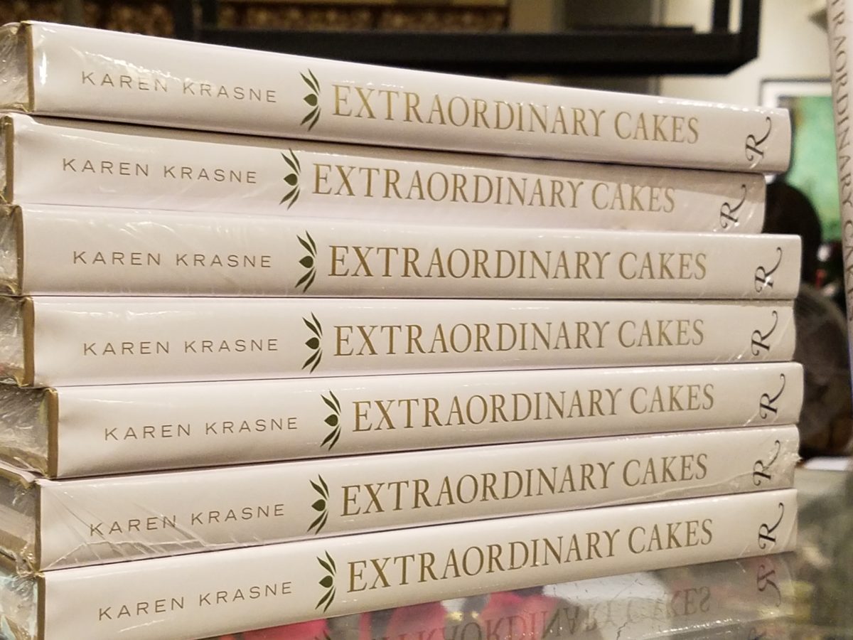
And yes, there’s a book about the cakes – Karen Krasne – appears
to be the brain behind this bounty. I look forward to meeting her. She has an
amazing machine with a well-oiled staff. Everyone was efficient and friendly
and shared in the enthusiasm that was being expressed all around.
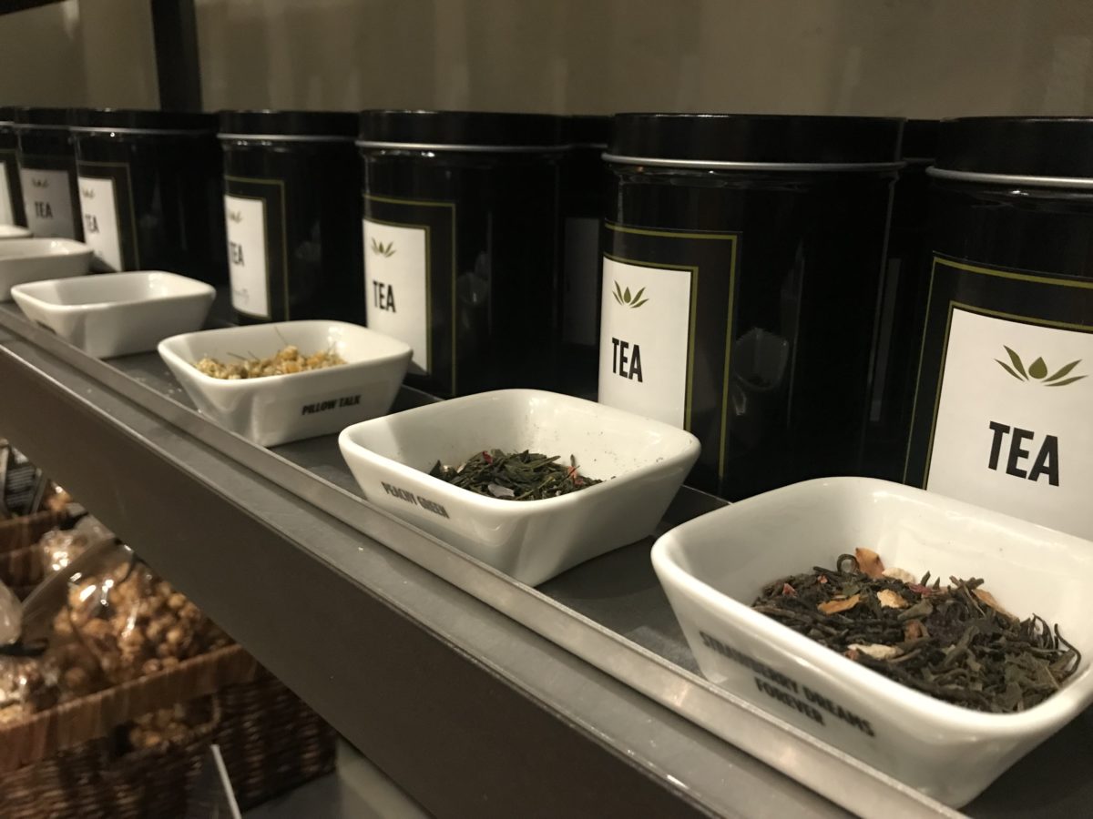
The shelves are filled with teas and other sweet
temptations, interesting vessels and serving pieces.
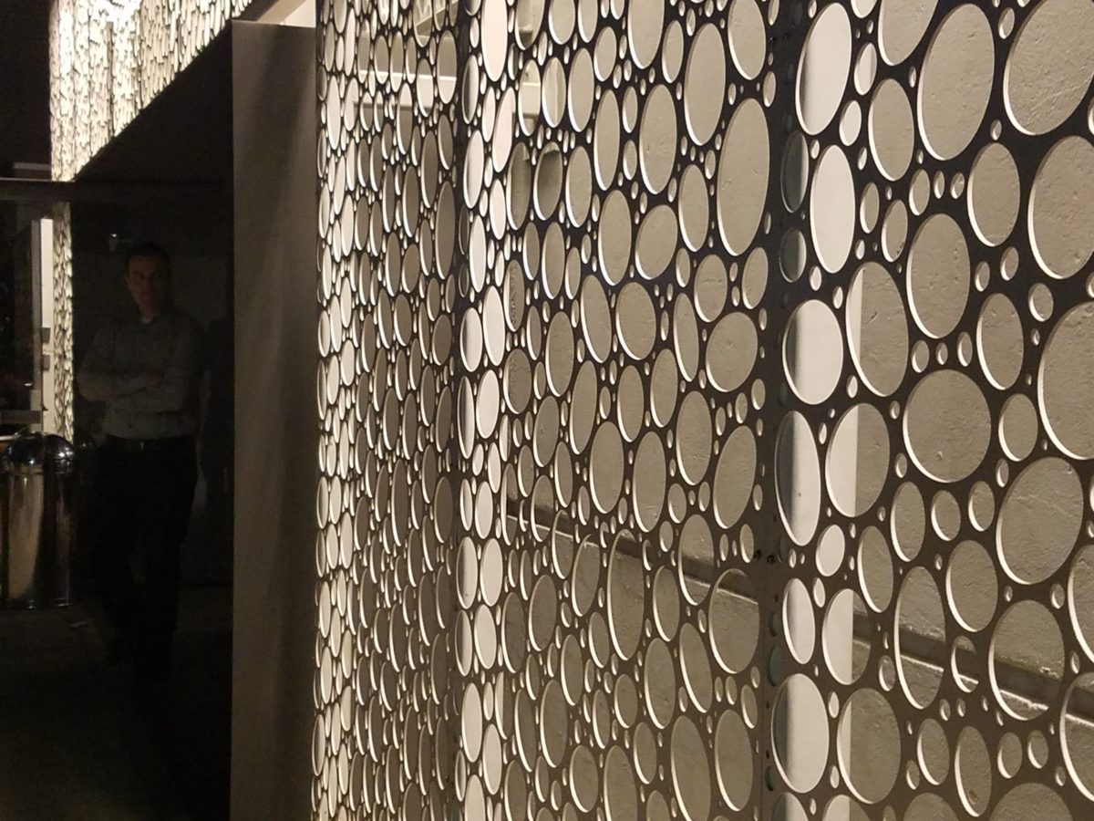
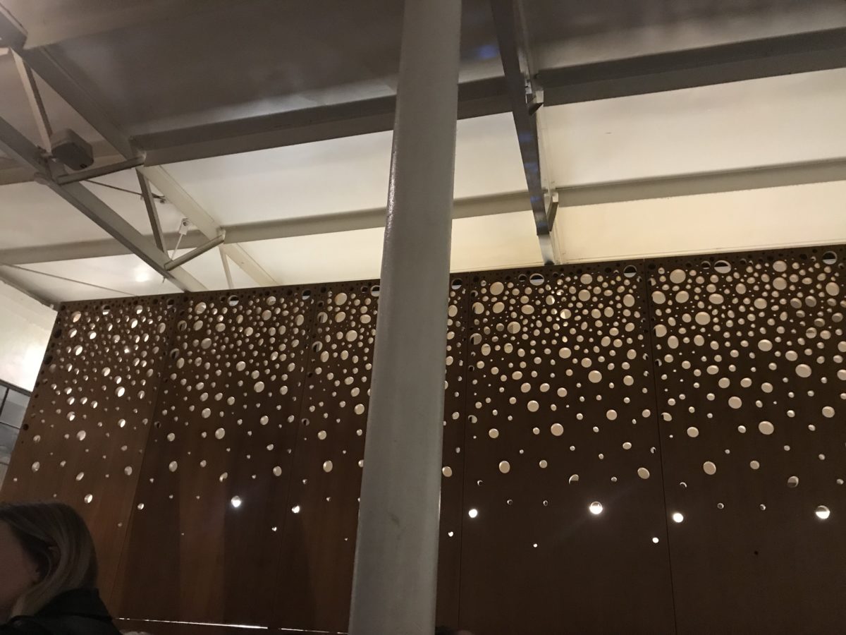
The lighting is dim and the structure envelopes the interior with white-washed frosting of voluminous space punctuated with dark cylindrical pendant lights and pierced bubble-like panels back-lit for added interest, subtle luminosity and dimension.
Raw, polished concrete floors, steel tables and molded wood
chairs give a nice balance of warm and cool, rigid and suave – while clean and
almost hygge in feel.
Perhaps, in the world of custom confections and TV foodie competitions, these desserts might be within some semblance of a norm – but only from the finest of creatives, in circles of which we usually do not run.
But having cavorted last night through the cheerful melee of confection connoisseurs – albeit one doesn’t have to be clubbed over the head or knighted by the cooks of the kingdom to appreciate what we experienced – we are sufficiently spoiled both visually and flavor-wise to be tough to ever satisfy again. Good design. Great design. Extraordinary design is often still an understatement!
The world is full of detail. From the wonders of nature and the perfection of a flower, to the man-made creations that come from inspiration of all sorts. The combined influences that result, in interesting and good design, are limitless and we now have layers of platforms upon which ideas are presented. The access to creativity is staggering.
Take Etsy and Pinterest. There the ideas abound. Everyone has access to creative ideas unlike ever before in our world. In the past, a keen eye observed and discerned. The clever managed to find inspiration in the most obscure places, analyze observations and interpret them for their own purposes. Creativity was spawned from observation paired with original thought. Yet, that observation was generally first-hand. Therefore, those that got about more, saw more and had greater exposure to more (and there you have it) were creatively stimulated more!
We (perhaps I should say I since it is from my own vantage point and experiences, from whence I speak/write), often are so busy observing that we don’t take the time to dissect and catalog the information we discover. I am so very guilty of that as I am so captivated by design and creativity that I forget to remember!!! Ha – yes – forget to remember or record!!!!
I constantly find myself regretting to have taken a photo of something (some who know how many photos I take might want to take exception with this point), but it’s true. I regret not taking a photo or studying something which, retrospectively, I recognize as something quite special. In the rush to experience the entire scene, I fail to notice or retain the details. Have you ever felt that you were so caught-up in a new experience that afterward you feel you should have paid closer attention? I forget to remember to store the observations or I forget to take a photo – regretting it afterward.
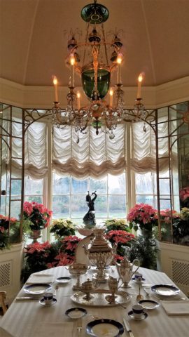
The breakfast room aat Hillwood Mansion where Marjorie Post rarely entertained, but was always set to do so. Pink poinsettias are the seasonal choice.
This can be from a class lecture to a theatrical production. I wish I had focused more closely rather than getting distracted by my own imagination which often runs rampant with the encounter. However, the stimulation can be so great that the imagination kicks in and causes diversions, in the attention, resulting in a deficit of detail gathering. Hence a clear case of un-diagnosed ADD!!!
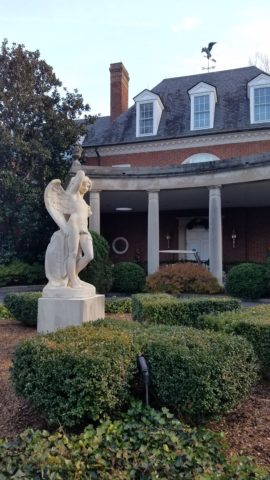
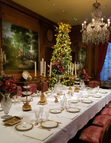
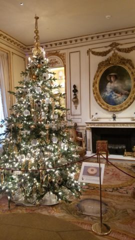
With all of this having been the prelude to my thoughts for the day, I have elected to pick out a few details from a recent tour of the Hillwood Estate and Gardens nestled on magnificent wooded grounds in the heart of northeast Washington, DC. And how wonderful to have had the opportunity this week to stroll through the mansion, now museum, of the late Marjorie Merriweather Post during the Christmas season.
As previously mentioned, I would have, could have, should have taken more photos, but was so enchanted at every turn by the beauty and gracious luxury that unfolded, I was too busy darting from one magnificent scene to the next to capture more than I share here. I apologize.
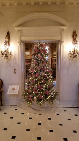
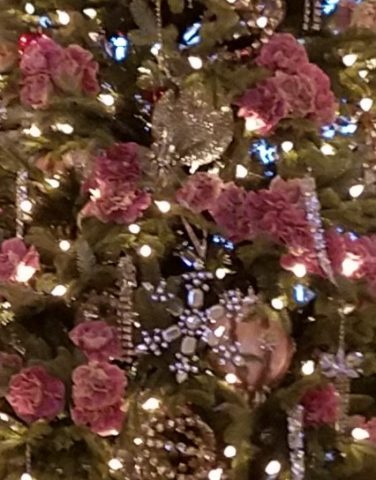
Her favorite color was pink and this tree greeting visitors upon arrival is a precious jewel among many beautiful Christmas trees and decorations displayed in the mansion.
From the reflection on the polished floors of the little white lights to the shimmering crystal punctuated with pink blossoms bedecking the tree was undeniably elegant.
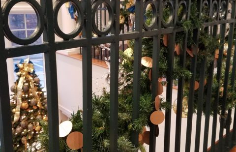
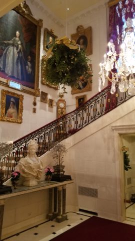
The railings ascending the staircase at the reception desk were draped with garland and strung with simple gold painted discs which were repeated in the coordinating tree which also featured a collection of blue reproduction Faberge eggs.
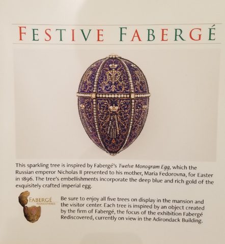
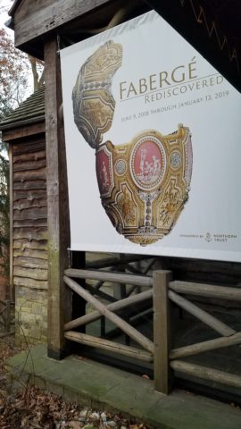
Marjorie Post was a discerning collector of all manner of artistic beauty including exceptional Russian decorative art. The actual exhibit of Faberge currently available for view on the property is nearing its end. Many dazzlingly detailed pieces from her own collection and others on loan for the exhibit are being shown.
If you are in Washington this month, please treat yourself. This exhibit of Faberge pieces is outstanding.
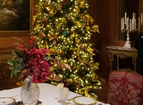
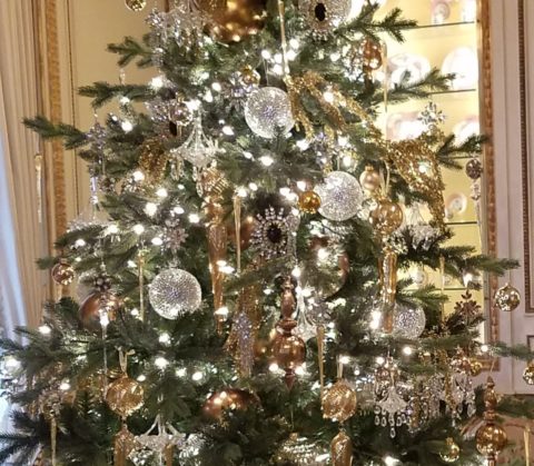
The gold leaves on this magnificent tree in the dining room would be fun to replicate. Could have easily been dipped in gold leaf. Like lime leaves – or from your garden perhaps photinia or laurel even rhododendron – maybe go faux with silk from the craft store – spray ’em gold!!! Paint magic!
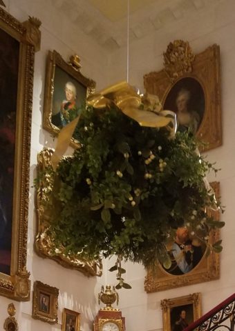
And if you have ever installed a dangle of mistletoe…check this out! This elegant bundle suspended, from the towering heights of the entry hall, puts all other sprigs to shame!!! In the opulent foyer, this grand ball of gilded ribbon-clad mistletoe invites those to tempt the fates of love and superstition, with but a kiss!
Whether it is a theme of gold or a snowy season of white, find details and enjoy the creative opportunities that present themselves to you in passing or from the depths of your imagination and create your own holiday magic!!!
Creating fantasy, festivity or seasonal celebration, gather the details every day from observing all the particulars around you. It is amazing from where you can collect ideas and be inspired to create your own festive fantasy!!!!!! Then be sure to take some photos!!!!!!!
Pick a color. What’s your fav? Do you HAVE a favorite color? I was asked the other day that very question and I was really at a loss…I looked at her, furrowed my brow and cocked my head. I wanted to have an answer – a simple answer that stated a definitive preference for a color – my most favorite. Rather than producing a quick sure pick, I faltered as she stepped in and said – I’ll bet it’s purple!
Well, actually I can definitively say that purple is NOT my favorite color, but the funny thing is I can love purple, in certain context. The real answer is that I love nearly any color in a certain context.
When I ponder the question a bit more, I can assertively say bright pinks, cornflower blues, golden yellows, chartreuse and brilliant orange. But the truth is, I love so many colors that I am hard-pressed to select just one! It sounds like a Lilly Pulitzer color board.
So I thought of a little exercise. I decided to pick a color at random. Then overwhelmed with the myriad colors that might produce one random pick, I fine-tuned random and said to myself, perhaps a color of the season. To me that was currently and boldly orange. So the idea was that I would walk in and around my house today and capture things that were orange.
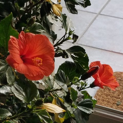
This screaming orange hibiscus just came in from the patio to escape the chilling temperatures that have swept down in the last couple of days…happy to transition indoors for the winter!
Try it. Pick a color – not necessarily your favorite – but certainly one you like and walk inside and outside of your house and see how many examples you can find, of that color, in your immediate world. Photograph things that have that color – all or in part, even little details – anyplace that color occurs. It’s fun and very interesting to see what you discover!!
Autumn is loaded with vibrant colors, but orange is one of the most fiery.
So I selected orange as my color today. I dashed around the house and collected a variety of things that were orange. I was actually astonished at how many I discovered.
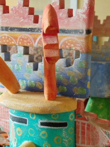
This dramatic Hopi – influenced kachina by Gregory Lomayesva sports stylized antlers in a flat but brilliant orange.
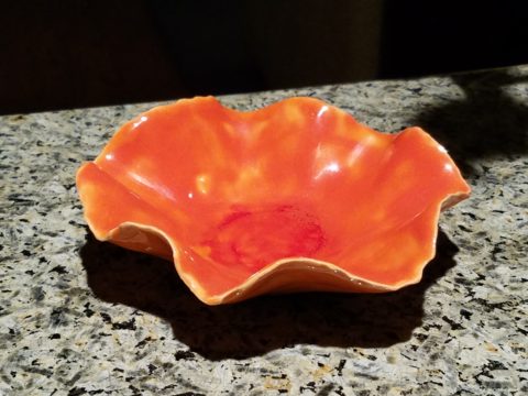
Festive ceramics by Ann Marie Werner Smith – here a graceful orange bowl that sits on the counter…it pops against the contrasting granite.
It is interesting because I know my world is not heavily orange, but I found so many wonderful splashes of it throughout my interior and even startling exterior, in the way of the leaves on the Bradford Pear tree.
From fresh mini pumpkins and flowers…
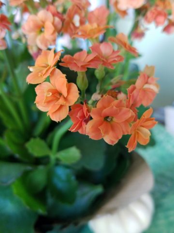
A succulent orange flowering Kalanchoe is our seasonal centerpiece on the kitchen table.
A variegated Croton plant has lacy veining of bright orange, pink and yellow contrasted against it dark green background.
to artwork with swaths of orange streaking through them.
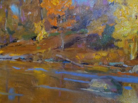
A lovely little oil painting by Jeff Otis depicts a very autumnal New Mexico river scene.
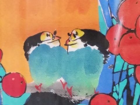
At the last minute, while waiting in the Bejing airport, I found this precious little painting of birds and berries. The background is a vibrant orange. Notice the fresh blues adjacent to the orange. This is a detail of the much larger piece.
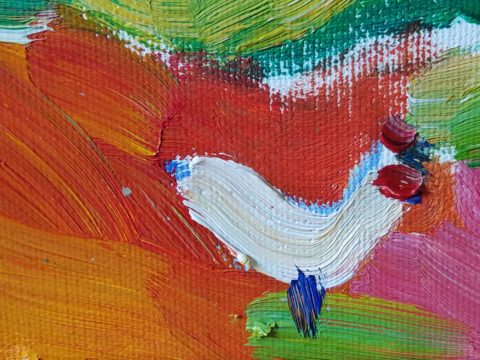
Peggy Zuris really knew color. Her bold and confident brush strokes applied in luscious swaths placed adjacent colors perfectly juxtaposed creating uplifting renditions of daily life. This little chicken is a detail of a fanciful rural scene.
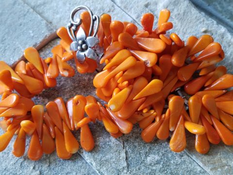
The balance of color was so interesting. Where I found orange, I nearly always found blue – unless it was a stand-alone like the glass bowl of oranges – or my coral necklace with its nuggets of bright orange coral.
Fresh oranges with their intricately textured rinds fill a glass bowl on the kitchen counter.
Nuggets of coral look like candy corn tightly beaded on this delicious necklace I wore too Santa Fe today!!
Colors balance and contrast.
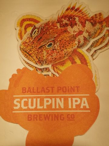
Even the coasters that attracted my attention last weekend at a bar. I was so taken by them that I brought them home and had them sitting on the kitchen counter. They were intriguing and offered interest and visual stimulation to my graphic art sensibilities.
I began this story earlier today, then took a break and tootled up to Santa Fe where I came across a couple more bright orange pieces…
And on the way home, I was even blinded by an orange fireball glowing beneath the stormy sky silhouetting the dark mesas and glistening off the wet pavement. It’s intense heat contrasting with the cold, damp asphalt that was a result of our first seasonal snow seen here spitting at the windshield.
Gather your collection of photos of your color today. Ponder how they and the color make you feel. Do you get joy from the color and the things you have discovered? Was this not your thought-to-be favorite color and if not, might it be one of them? How do YOU answer the question, what is your favorite color and having determined that, ask yourself: Do I wear it a lot? Would I paint my walls that color? Do I have upholstery that color? When is a favorite color an accent? Is the joy in the little spots of punctuation? Are they intense, but small, elements of joy without over-doing it? I see a collection of abstract images, details of things – some of which can be cropped more – to create an abstract collage of wall art. Voila!
Color – an amazing facet of design and it’s most versatile component. It’s been a fun test and a compelling story. So what’s YOUR favorite color?