Designing, Styling and Why – Finding Personal Style

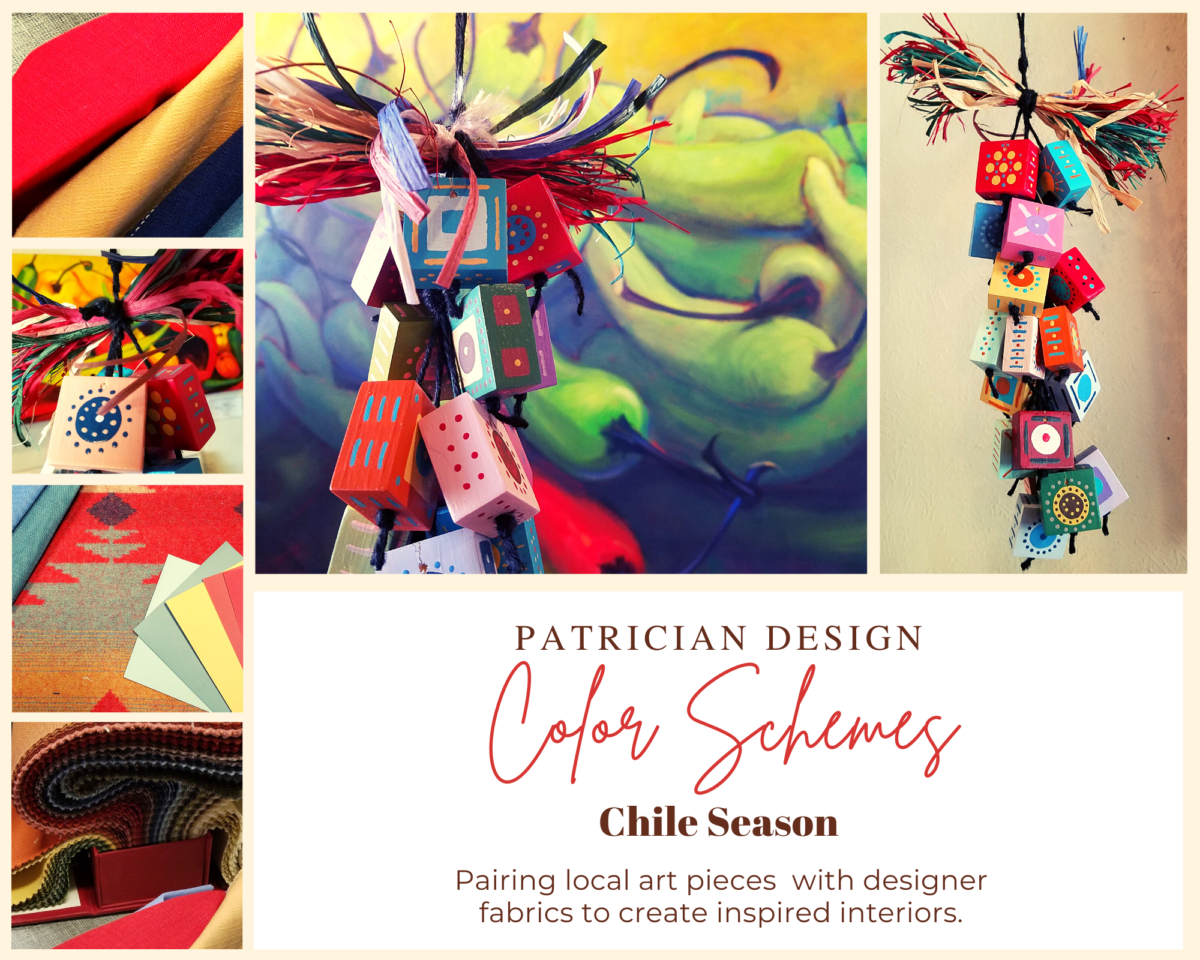
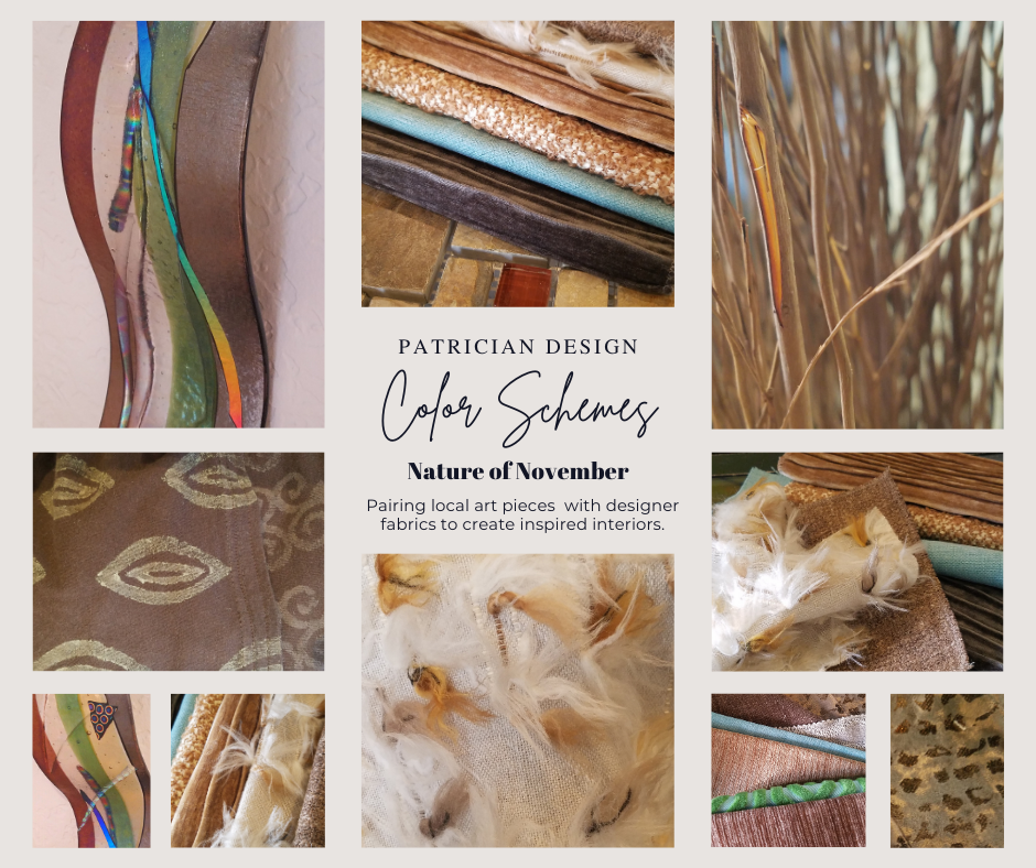
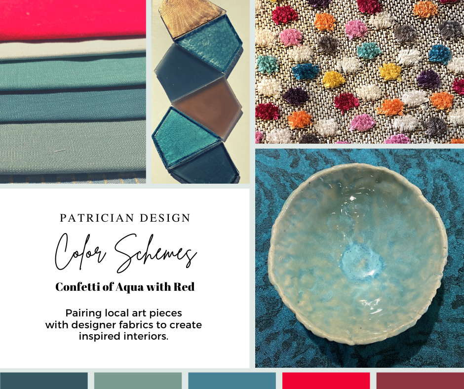
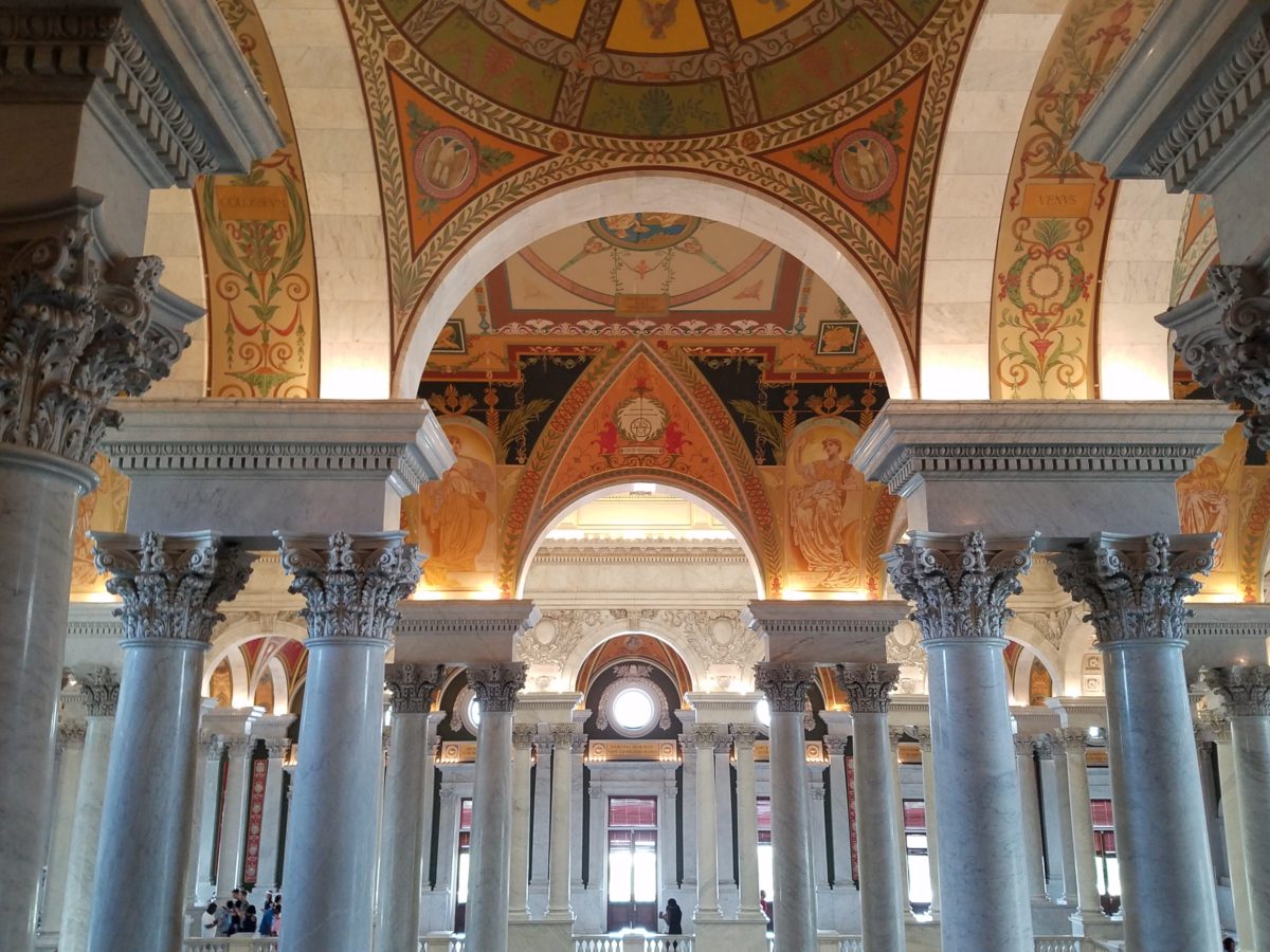
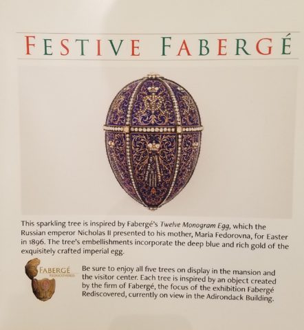
Styling is a vague term used popularly now for many facets of artful design that come together to create a presentation (in this case) for interiors. Interior designers practice the artful tricks of “styling” while calling on their expertise with many other important professional elements regarding practical and functional design decisions, structural considerations, mechanical and electrical aspects, client collaboration, budgeting parameters, and more. Terminology can confuse the conversation because often the illusive thing that clients are seeking is finding their “style.”  This goes deeper than embracing a new trend or changing a style of furniture from Scandinavian to French. It goes deeper into the very personal places that are uniquely individual. It’s about lifestyle and personality, temperament, and taste.

Assembling elements in your home or workplace is about lifestyle and personality, temperament, and taste. This living room is taking shape for a single man wishing to update his furnishings and fixtures throughout his home.

I was told in school that there is no such thing as bad taste – just bad design. I love that. It takes an enormous percentage of the judgement out of it and leaves the important characteristics to be critiqued such as function, form, balance, color, texture, volume, lighting…

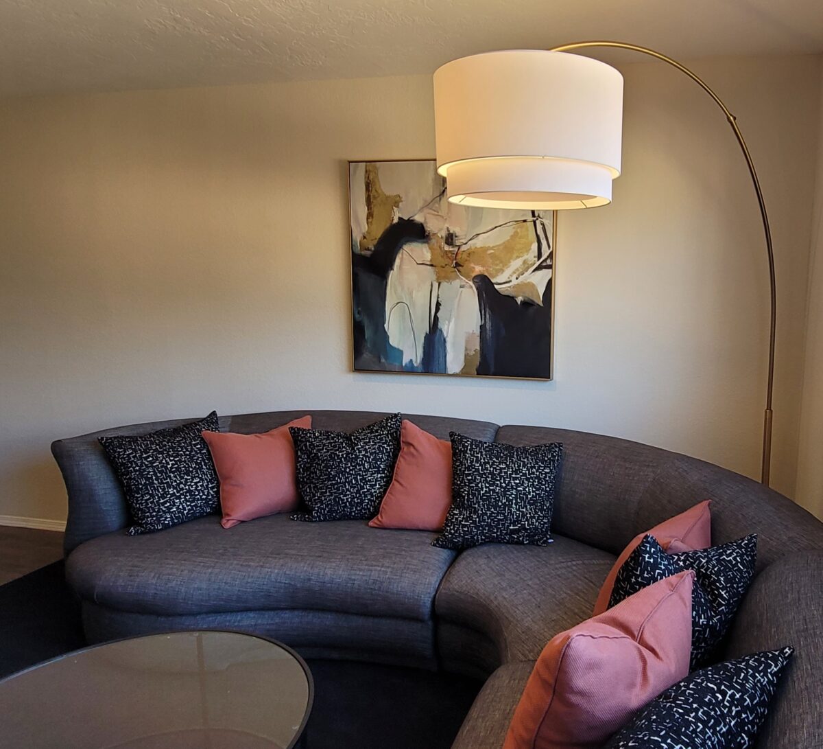
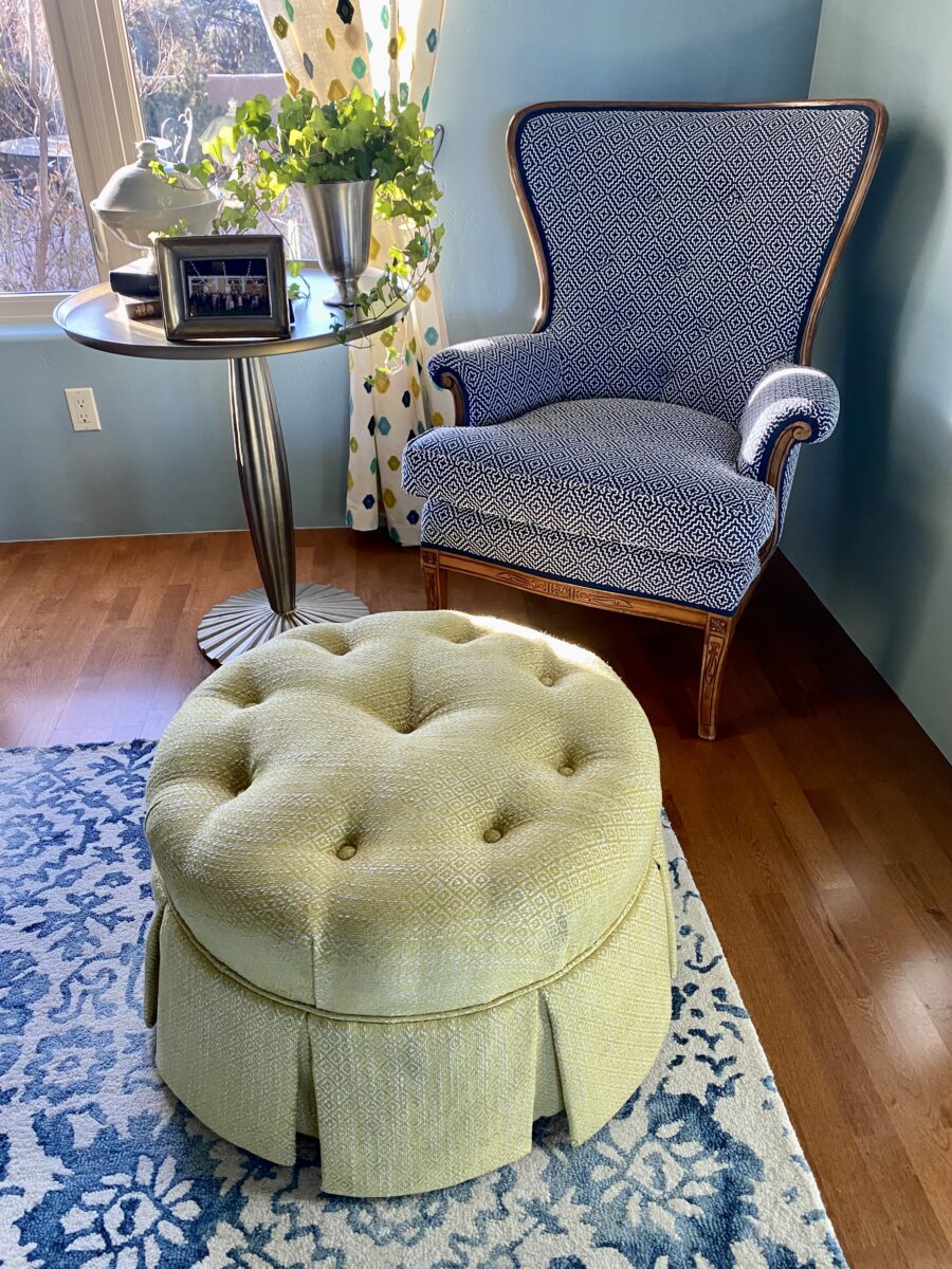
Styling and designing both require balance – designing being the more comprehensive of the two. Each consider many of the same elements, but designing digs deeper. I often converse with clients about the opposites in their spaces. Hard/soft, smooth/rough, light/dark, warm/cool, simple/complex…finding the effective, pleasing, balance in all the elements in a space is critical to the comfortable success of the design. I seek the positive, buoyant, uplifting effect that elicits good vibes.

The result should be more than satisfying, it should be joyful and personal. This chair and ottoman were vintage pieces handed down in this family and here we reupholstered them to give them new life in a new context.

As an interior designer my job is to extract and decipher the wishes of my clients – commercially or residentially. Not only what they want and need, but how to achieve it. It has to do with the art of design and the practicality or reality of executing the work. The result should be more than satisfying, it should be joyful and personal – designed for the specific needs and goals of the individual(s) with whom I am working.

Discovering your personal style might be like a lightbulb turning on – it’s been there all along but wasn’t recognizable. You have it but don’t realize it. Which begs the question, what is style? It is very representative.

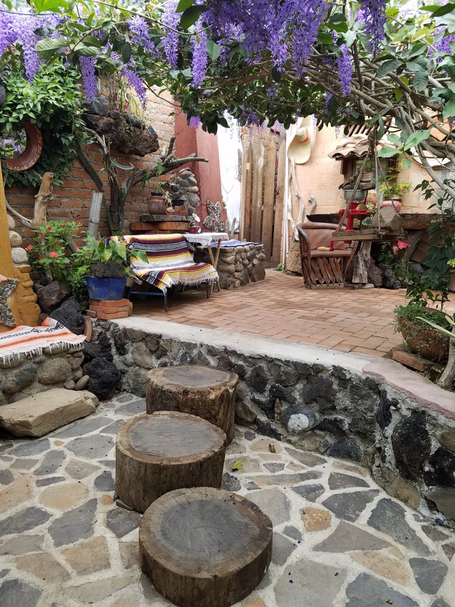
From my experience, there is no such thing as no style. Not having style. The very concept of that is like a reverse condition of being without style (un-styled ) – like messing up a hairdo. Yet that disheveled do is a style unto itself – albeit not in the contrived sense of order and intent. That same hairdo in a fierce wind might become similarly disheveled – but without the intent – it might be considered an organic style.

Tidy to disheveled, style is limitless. The occupant of the space is surrounded by books that never quite get put away.
Fascinating to some – unnerving to others.

Interior design can be contrived with much intent, formalized with attention to detail or a more unselfconscious approach that always appears more casual, organic and lived-in. Of course, there are happy mediums too. However, the risk of the “unselfconscious” approach is that by the very nature of the approach to create that which does not LOOK contrived – can be very contrived!!! Hence the unfortunate, if not unintended, result!!

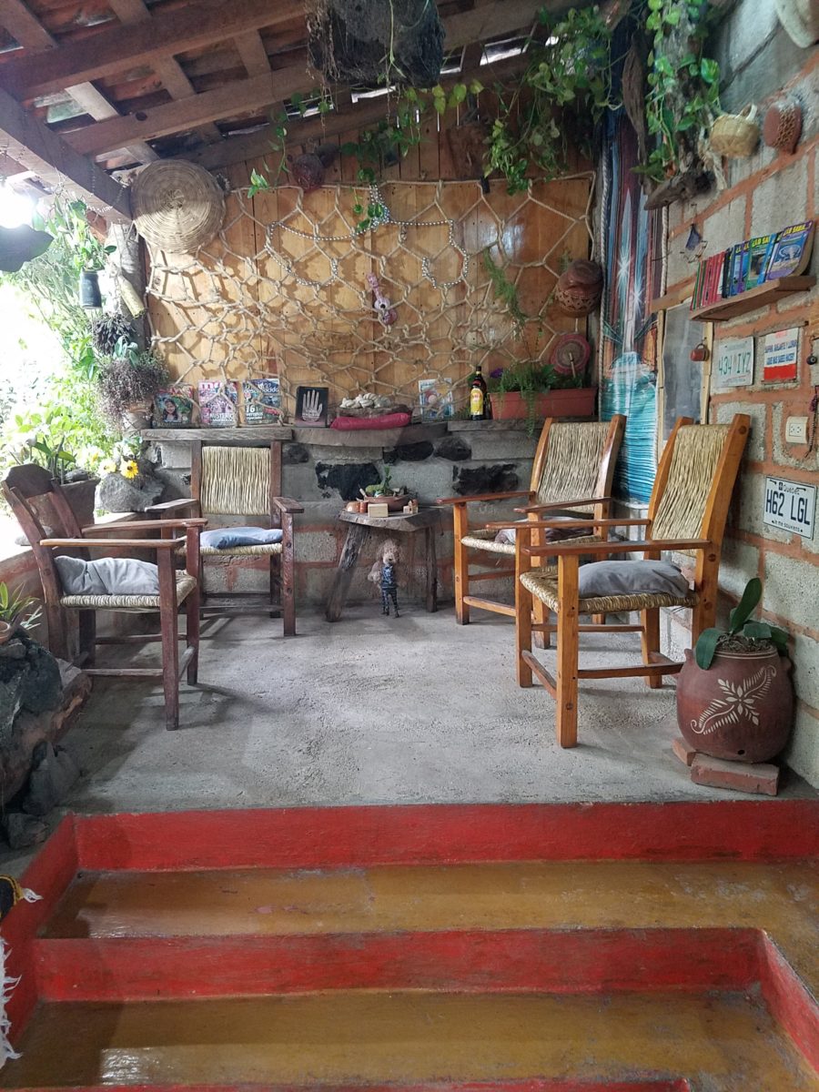
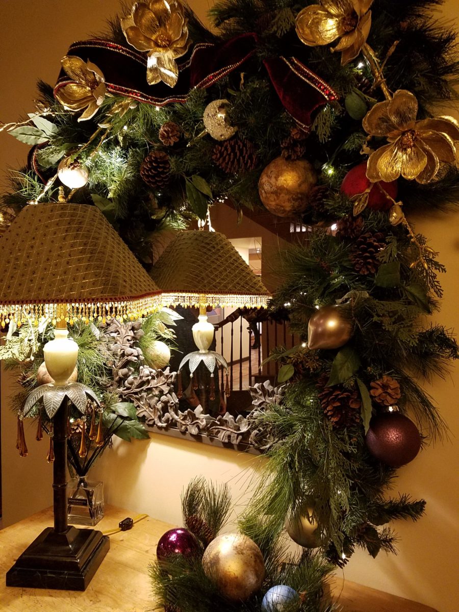
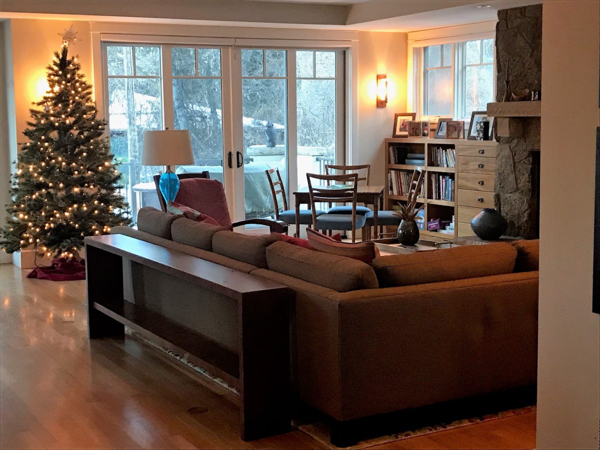
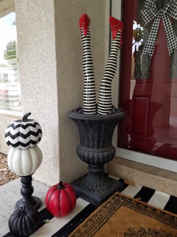
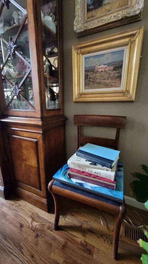
Tidy to disheveled, style is limitless – the permutations and opportunities are endless. But when styling a “scene”, do we keep books in the bookshelves with perhaps one on an end table or nightstand for practicality and interest or do we present piles of books as though the occupant of the space is surrounded by books that never quite get put away? Fascinating to some – unnerving to others.

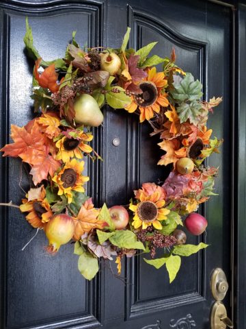
Some categories of interior design allow a “stylist” to express themselves – rather than focusing on the specific design needs, desires, requirements, and ultimate joy of a client. Style for the sake of imagery. These categories include product representation and promotion/branding – ads and TV commercials, and vignettes that are not intended for real life but for effect. To create appeal and promote trending marketing efforts, assembling for model homes or staging for individual homes for sale and theatrical set design are also examples of the applicability of styling. This “styling” is a very marketable talent – different from designing for and about a client’s personal wants and needs – in a residential or commercial setting.

Commercial interiors combine the branding of the business as well as the personality of the occupants and the culture of the workplace. We completely redirected the focus of this insurance office by emphasizing their brand in color, imagery and graphics. Corporate marketing material was enlarged and used for artwork to further reinforce the brand and emphasize the mission for both employees and clients.

Style evolves. Styling can be an ongoing process – even daily. But that becomes a preoccupation that is not necessarily practical for everyone. Our tastes change with life experiences and with them new interests, accommodations and necessities all contribute to the evolution of personal style. But look at your own personal style and see what about it has remained constant even if your design direction has changed.

You have style. You need to try to articulate it, embrace it or change it. I often hear “I know what I like when I see it.” That’s true of all of us. But being a “creative,” a designer, we create and not merely discover, find, and assemble – through all parts of the process.  Helping clients distill the flood of inspiration, imagery and ideas presented, on the limitless platforms dedicated to interior design, new construction, remodeling, styling, and decorating, is the first stage of the job. With so many choices and directions from which to choose, navigating that circuitous path through the oh so many images and ideas is daunting, but essential to finding the right elements to combine and create the design – and set forth the style.

The stuff of life. This couple downsized and culled their belongings to their very favorite things. Their new interior, in their custom home, incorporated all of their treasures and added some new pieces for their next chapter.

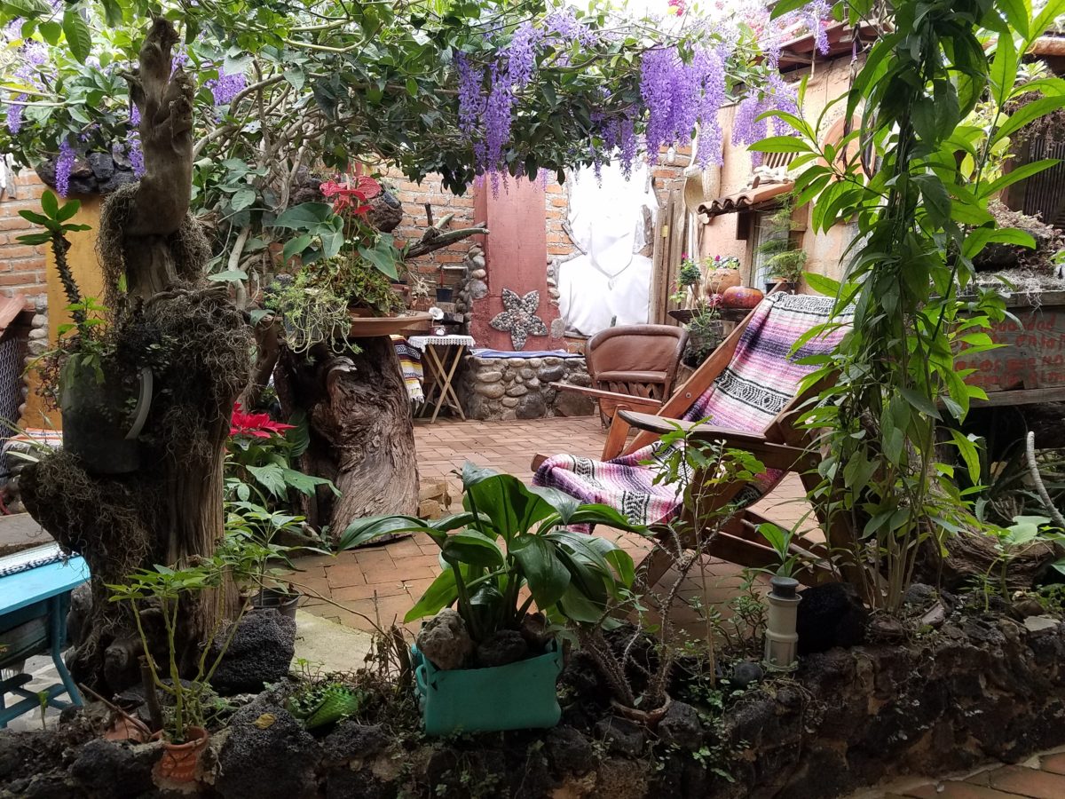
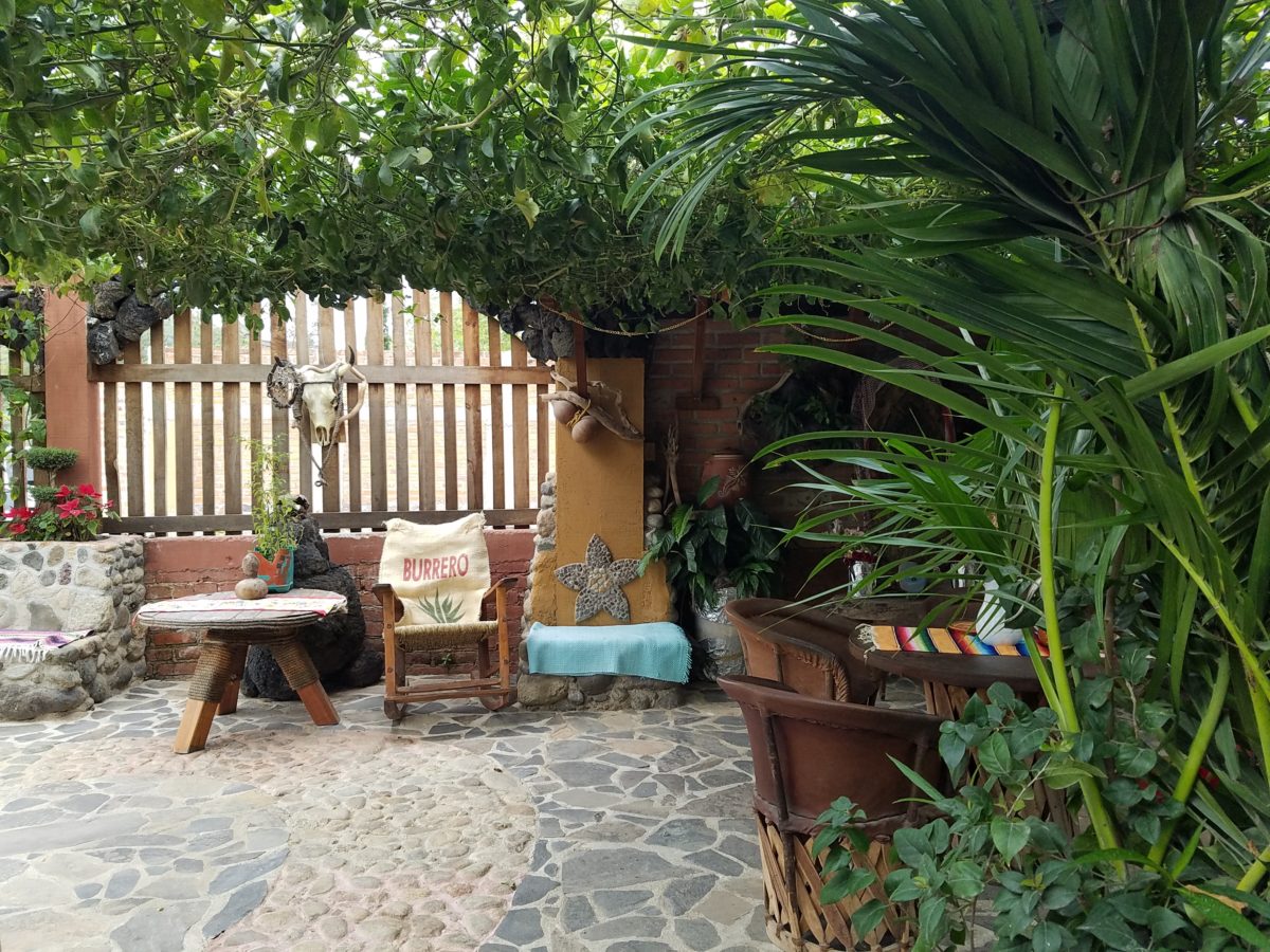
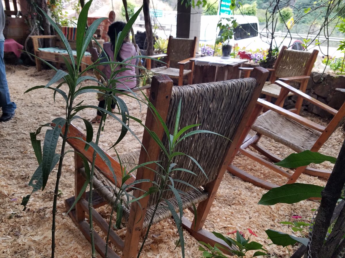
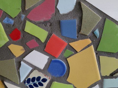
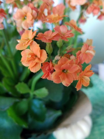
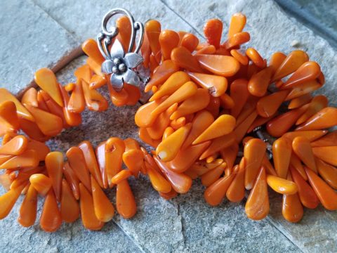
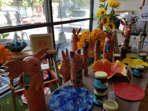
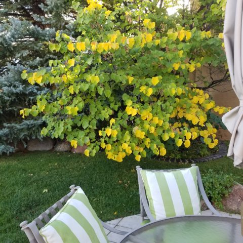
Knowing what you like when you see it and collecting as you go is what results in what I fondly call the stuff of life. Your life is partially represented in the things you have discovered and saved – things that bring you joy that you want to see and have around you. They may change over time. Your fascination or appreciation for an object might wane…but the principle of having things collected over time and life experiences (or minimalist lack thereof) is a personal expression. Often the trick is to re-arrange what you have. The style is there, but the placement and orientation can make a significant difference. Arranging is very much a central part of effective styling and interior design. Styling is a fun way to play with options, trends, make statements, influence, and experiment. Have fun finding your style and incorporating all you love and enjoy into your interiors!

Color Scheme Tips

Color schemes are limitless. The permutations are endless. Color is exciting and fun. It is personal. Colors evoke feelings, memories, emotions and are key to a comfortable interior.

How often have you been asked or pondered on your own…”What is your favorite color?” Some people hesitate to answer, while others blurt-out readily with their fav.  But what color you choose to wear versus what you enjoy in your interior surroundings and how much might be quite different.

Several weeks ago, I launched a weekly post on our PATRICIAN DESIGN Facebook page called “Color Schemes.”  The idea is to inspire design ideas by pairing artwork with designer fabrics. When planning an interior there is always a focal point complimented and surrounded by supporting elements.  Whether a key painting will command the space or an expansive window with a view will direct the focus to a scene of outside colors and textures – that key element will greatly influence a successful interior color scheme.

Annette Donald creates colorful cubes in her creative take on our beloved chile ristras. A serrano chile oil painting, on canvas, by Federico Leon de la Vega is quite representational. Paired here with Romo and Ralph Lauren fabrics, Sherwin Williams paints…fresh and festive!

Here is the example of a November Scheme and you can scroll back each Monday for the past few months to enjoy a variety of the Color Schemes! https://www.facebook.com/PatricianDesignABQ/photos/a.243005986618/10157154423221619/

We embrace the The Nature of November with its unique colors and textures. As the air becomes chilly and the leaves fade…warm, soft colors bring us indoors. Featured here an elegant fused glass ribbon wall piece by Lisa Checnoff.

There are four primary considerations that I discuss with my clients when determining which colors to choose, emphasize, avoid, use as accents and where. To establish these selections, we evaluate personal preferences, contextual implications, seasonal influences and even trends. 

PERSONAL:  In planning an interior, I always want to know what colors make our clients happy, comfortable, stimulated, vexed or relaxed. These personal insights reveal important information for selecting types of materials too.

By examining what might be one’s favorite color, the discussion will navigate the distinctions, if any, regarding preferences for clothes versus interior furnishings. Interestingly, they are not always the same – although, by mere comfort and familiarity, they often are.  Simply asking about a favorite color is not enough.

Brilliant golden yellows and blues – splash color! Featured here are fabulous photo-realistic acrylic paintings by Sheri Mays paired with amazing fabrics of the same exciting palette.

CONTEXT:  The context of the interior might dictate or at least steer the direction of the design. The luxury of having multiple personal environments offers the opportunity to have different color pleasures exercised in different places. The ski condo might be woodsy and textural with browns, greys, stone and wood punctuated with a pop of color versus the seaside retreat with its crisp whites and cool blues and greens punctuated with pastels or bold contrasts. Therefore, the location of an interior might direct the desired color palette.

Inspired by this spa-aqua pottery bowl by Penny Roberts and the custom glass tile mosaic we recently combined to face a newly remodeled kitchen wall – the cool seaside/spa feel balanced with ambers and warm dots of color – pink, fuchsia, orange and golden yellow. Durable brushed cotton solids come in myriad colors and are perfect for pillows or upholstery.

SEASONAL:  This one is tricky because it plays on the perceived climate outside – even if the interior is maintained at a constant temperature. It takes a concerted effort to plan a color scheme – including textures and finishes in anticipation of changing seasons and relative temperatures. I previously mentioned that a window with a view might be the focal point of a room…imagine the effect the changing seasons might have on the selection of interior colors and textures versus a consistent tropical scene, for example?  

Perhaps you love purple – ever pair it with golden yellow? Here, functional, fantasy pottery designed and crafted with the most precise attention to detail by Jen DePaolo inspires our boldly brilliant scheme.

TRENDS:  Inasmuch as I avoid being steered by trends, it is impossible and not advisable – in design – to avoid them. Clients are influenced by them and bring that would-be preference to the table.  It is essential to continue to have “colors-of-the-year” and other market-driven colors change to stimulate the economy with buying and selling, replacement and updating.  It’s our socio/economic norm.  It also serves as an encouragement to re-fresh. But to limit that influence, in favor of long-term personal pleasures, is best.  The pressure of this marketing color influence contributes to our being a disposable culture. Not time here for a lecture on such things – but rather to instill an appreciation for and confidence in personal selections an decisions – in this case,  color.

Patinaed pearls and stunning glasswork by Margaret Hidalgo Vanderheyden inspire the soft, greyed lavenders and blues of this cool scheme.

An interesting and on-going test for evaluating a successful interior is when designing in one season – it has to work in all others. For example, when I meet with clients in the heat of July with lush foliage and color, warm temperatures and long days, that same interior has to succeed when it is frigid outside, barren, and with darker, shorter days. What might the challenges be in creating a successful scheme and what might be the solutions to make it work?

Having noted all of this and knowing the different reactions people have to color, isn’t it interesting when an interior is so successful that it appeals to many, if not the majority, of those who experience it?  This is more applicable to commercial or public spaces – from doctors’ offices to hotels.  However, the challenge and success is in knowing the many things to be considered and implementing a balance of them throughout all aspects of the interior.

Anne Marie Werner-Smith’s brilliantly glazed pottery here with Margaret Hidalgo-Vanderheyden’s lovely fused glass crosses along with coral and dyed stone necklace and woven table runner from Chiapas reflect the changing colors of fall leaves…

Appreciating color is a gift to designers. It truly is an imperative to appreciate all colors and have the sensitivity to discern the nuances between various values and the effects of selections and combinations from the infinite choices.

I hope this has given you ideas and inspiration to move forward with YOUR color schemes! Sign-up for our weekly email of Color Schemes with classic blue and white and stunning neutral greys coming!! And follow the posts on Facebook every Monday.

Serenity and Peace in Water Features

The serene sound of a fountain can provide mesmerizing relaxation. Like white noise, but better. Close your eyes, in close proximity to a little fountain, and be lulled into a wonderful respite zone. Even indoors, this is an effective relaxation element…outside the birds and breeze contribute to the joy. 

Pets reap benefits too! Kona gets a refreshing sip from the fountain!!!
At night, that same fountain offers gentle water sounds and an interesting sculptural effect.

Social distancing and isolation – these two popular terms that have defined so much of our daily living in the last several months and imparted a negative connotation. They paint a picture of living more at home – alone and even “out-of-touch” – literally.  All of my childhood I heard the phrase “ne touche pas!” My uncle’s favorite, for sure! And now I hear it in my mind all the time. Don’t touch the shopping cart, door handle, people’s hands, “ne touche pas!” and if you do – wash and sanitize to a fare-thee-well!

Yet, on a positive note, this stay safe – be safe – living at home has spawned creativity to maximize that environment and relieve stress. It means, more than ever, expanding your outdoor options from placing a pair of chairs and tiny table on a previously unused, diminutive urban balcony or adding a palatial pool in your backyard…there are many options in-between depending on your circumstances and means. 

Our cousin in Tucson has created a lagoon effect with the dark bottom and mosaic trim. an oasis in the desert.

Water features are an amazingly therapeutic design element. Water suggests cleansing. It is refreshing and renewing. Water has promise. It can also suggest escape.

The Calgon add campaign of decades ago resonates today for those of us who remember…”Calgon, take me away…Lose yourself in luxury” The escape and indulgence of a relaxing soak in a tub. The gentle buoyancy relieves tension and encourages rest. It often suggests leisure. It is a luxurious, pampering exercise.

 https://www.youtube.com/watch?v=8yjGPgs0_S0  Here is a video from the 70s to take you back to “Take me away…” Come back Calgon!!! We miss your commercials now more than ever!!!

Taking that refreshing water scene outdoors is one of the most popular design projects trending today. From DIY to major construction people are discovering ways to escape without leaving home. Water features provide virtual escapes and actual refreshment for many people seeking that added dimension, diversion and sought-after pleasure in their lives.

A friend in Phoenix has tricked out her pool with fabulous landscaping, spectacular iridescent glass tiles and LED lighting – the luminous colors an be changed with her mood!!!!

Swimming pools, a gorgeous grotto, lap lane, all afford the luxury of submersion and even exercise.

We’re speaking with Diamond Spas of Longmont, Colorado this week on behalf of a client who is interested in a partially above ground swim spa!! https://www.diamondspas.com/swimming-pool-spa-collection/custom-pools/stainless-steel-swimming-pools/

The sound of a small water feature to a creek-like landscape addition in your yard – the projects are many. This DIY guy created what he fondly calls “Covid Creek” – a project that took several weeks of focused creativity and back-breaking work all prompted by being stuck at home. The results are a magical mountain stream flowing beneath the trees in their modest-sized backyard. A creek-like water feature or pond can offer a respite to sit beside, dangle your toes and imagine scene far from the confines of our limited environs. You would be amazed at what beautiful illusions can be accomplished!!!

A babbling backyard book built as a therapeutic DIY project during the COVID confinement.

Such multi-sensory water features offering the touch and feel of water, gentle sound and visual beauty are powerful design elements to exercise the senses. Our senses suffer with redundant stimulation.  The reclusive limitations of recent months have us stagnating with sameness.  It’s the variety if stimuli we are so accustomed to experiencing that keeps things interesting and alive. Moving water is one of these exceptional sensory stimulations. 

Organic garden sculptures – chiseled granite boulders with re-circulating water – meld with the landscaping.

Whether a tiny fountain or in-ground pool…even a galvanized livestock tub – investigate your options. Regard your environment and study your spaces to select the best design elements for your setting. 

Discovering Extraordinary Ambiance on the Side of a Dusty Road.

After experiencing and pondering the value of incorporating nature’s elements into architectural planning in the previous blog, I find myself winding into the countryside from sea level to a mile high into jungles and ultimately pine forests, across vast expanses of rivers and towering bridges spanning grand abysses…and stopping at a modest panaderia (bakery) on the side of the road.

You can’t tell a book by its cover as this simple little rural structure – standing alone – looked curiously intriguing and quaint enough, with an unpaved parking area transitioning to well-tended pea-gravel. Traffic cruised by, on the way across the bridge.

Those that knew, turned in. We pulled off the road and were told that this couple had a wonderful bakery and were promised an exceptional treat! Fresh empanadas that would bring remarkably satisfying mid-morning joy.

Very tidy and thoughtfully eclectic, this little destination bakery is a precious find.

Oh, were we in for a surprise! At the entry, I stopped to shoot the whimsical cup of coffee mosaic set in a field of stone and concrete. I thought – what a fun design element to greet arrivals and set the stage. But I had no idea to what extent I was about to be elated. What unfolded so exceeded my expectations that I wanted to stay all day!!!

Happy stone and tile-work adorned the pathways. From the textures of stone and brick, tile and wood – it was an organic fantasy – an unexpected design experience.

Simple, yet spectacular – simply spectacular!!!!!

 Ceilings of colorful floral blooms – perhaps wisteria – suspended from their vines and other plantings intertwined with the structure.

Spotless and meticulous the eclectic elements were a harmonious creation.
Stone walls, wooden slats, vines and adobe all worked together to define the spaces.

 The wafting aroma of fresh baked goods – it was more than delightful.  From warm savory clouds with mushroom filling and another with chile-laced sausages – and an array of sweet strawberry, cream and pineapple empanadas to corn muffins, banana muffins and more! All nestled beneath colorfully woven cotton tablecloths.

Light and delicious – the best empanadas ever!! With a tiny sprinkles of granulated sugar, for a sweet crunch, before sinking into the fabulous fillings! Muffins challenged any others and savory treats were so satisfyingly delectable. Little buttons of banana slices on top denoted which were the banana muffins!!

Rich Mexican coffee with a touch of freshly ground cinnamon and luscious hot chocolate were served in custom-glazed “barro ware” complimenting the fresh-from-the-oven confections.

The exhibition baking kitchen overlooked the serving line. The buffet of pastries thoughtfully explained by our gracious and welcoming host, Jesus!

Carmen presents fresh strawberry tarts just from the oven!!!
A combination of old and new – tradition and technology meet in this cozy kitchen.

Fragmented spaces open, yet enclosed, offered intimate pockets in which to pause and enjoy.

Color-pops insert themselves effectively around the interior and exterior spaces.
Inviting seating areas semi-concealed offer private repose.
Tucked away – more areas to enjoy…

Clever use of clean blond wood shavings on the floor of the main covered patio created a wall-to-wall carpet of fresh aromatics complimenting the inviting aromas emitted from the ovens.  Rocking chairs and rigid sturdy versions, with a fun little rope swing, all surrounded  by tropical plantings made a cozy area to gather.

Soft underfoot and subtly fragrant – the wood chips make a great shag carpet!!!

As I meandered around exploring all the interesting spaces, textures, colors and plantings, I marveled at the sensitivity with which this had all been crafted and assembled. It was artful interior design with an exterior feel – open air and charming, with a decidedly handcrafted, Mexican sense of place.

Slices of handsome tree trunks make perfect stepping “stones” with graduated heights.

It was an eclectic collage of furniture, structure and organics – living and static – that was welcoming and artful, delightful and so pleasing, that it was a treat for all the senses.

The cool morning air of the mountains mingled, with the comforting fragrances, creating an atmosphere inviting gentle conversations of people gathered around good food and artfully relaxed surroundings.  

Peek in places and through doorways to find worlds of design waiting to be discovered!!!

Cool Rides Hot Design!

Racing through the Albuquerque Sunport several times this summer, I had seen in swift passing the blindingly brilliant bling of the Low Rider exhibit that had been set-up at the end of June. Last week I had an opportunity, while waiting in the arrival area, to peruse the many amazing rides that commanded the concourse.

This powerful art exhibit of the unique Latino culture of Low Riders represents great personal pride and emotional attachment on behalf of the owners and artists (often one and the same).

These finished products are almost like songs…from memorials to love interests, family and friendships – they express heartfelt emotions to present and share with the world.

Once stereotypically  thought to be limited to the bad boys taunting law enforcement with their wild paint jobs, gleaming chrome, bold moves, wild suspension, blaring music in a defiant statement of cultural expression, these amazing art pieces have since been recognized by distinguished museums worldwide for their exquisite attention to detail and the stories they tell.

In this exhibit, these moving statements of artistic expression are all home-grown. Yes, each made here in New Mexico it makes it all the more relevant.

Visitors to the Sunport have this wonderful opportunity – up close and personal – to examine the seemingly flawless machines adorned with sensational color, pattern and design. “Kids” of all ages will appreciate this show!

Each as though a canvas for the artist…motorcycles, kid’s versions and cars adorned with glitter, shine, polish and paint colors all contributing to the each unique statement. From airbrush to tedious handwork and limitless patient detailing results in exciting assemblages.

There are also decades of photos featuring the evolution of the culture here.  

By highlighting these fine, local examples the City hopes to elevate the art form on its merits and dismiss some of the stigmas attached with the stereotypes.  

And we all will have a little fun imagining the thrill of taking a ride in/on one of these beauties!!!

The Wealth of Art That is Our Elegant Library of Congress

If the Basilica in my last blog didn’t get your juices flowing about incredible public art spaces, the Library of Congress was our next stop. Yes, it houses nearly everything having to do with writing, recording, documenting…but the building itself is amazing! It in itself is a wealth of artistic detailing. The interior has more gold leaf – not gold paint – but hammered metal gold leaf – than any other building in our Nation’s Capital. Inside and out, the craftsmanship of the stone carvings and architectural embellishments is magnificent. This inestimable landmark is so much more than the sober name suggests.

We parked in the garage of Union Station and walked the few blocks past the Supreme Court and the Capitol Building to our destination of the Library of Congress. The brilliant blue skies behind the bright white edifices belied what some regarded as the oppressive heat. I however am a heat freak – it’s summer – bring it on!

Columbus Fountain at Union Station also known as the Columbus Memorial is a public artwork by American sculptor  Lorado Taft, located serves as a tribute to the explorer Christopher Columbus.
The Supreme Court – cool, brilliant white against a striking blue sky – at 100 °
Crouching to get a shot of our Nation’s Capitol Building.

Symbolism is executed with every inch of the design details both inside and out of the imposing Library of Congress. Ascending the exterior stairs sets the stage for arriving at a monument of immeasurable wealth of human dissertation and history. Here I can only touch on the tip of the iceberg…

Picnic tables out front at our Library of Congress…relax, grab and bite and read a bit before going back to work!!!

From an inauspicious beginning of modest expectations to greater expanses with devastating fiery catastrophes in between, the Library of Congress has an amazing story. Thomas Jefferson played a significant role in re-building the foundation of what we now have today.

While waiting for the tour to begin in the magnificent Thomas Jefferson building, we were directed to two remarkably entertaining exhibits on the lower level – a Gershwin gathering and a Hope homage.

The George and Ira Gershwin Room is a tribute to the two brothers and their contribution to American music. This nostalgic and very familiar subject matter makes you hum and tap your toes. The exhibit presents George’s piano and custom-designed writing desk, Ira’s table and typewriter, self portraits and myriad documents that trace their lives and amazing careers.

The Hope for America Exhibit focuses on the varied careers of Bob Hope along with other recognizable entertainers. The exhibit offers the satirical humor – crossing party lines – both socially and politically for which Hope was so appreciated, admired and beloved. Hope received the U.S. Congressional Medal of Honor and the Presidential Medal of Freedom for his commitment, in his nearly 50 year service, entertaining the men and women of the armed forces abroad.

As the actual tour began, we were introduced with a short film as an overview of what was to come. We were then guided up a staircase and gathered in what was a most astonishingly beautiful, expansive space full of piercing, daylight, sunbeams glancing off incredibly detailed architectural stone carving and sculpture. Vast murals, vaults and arches in the 360 degrees of beauty from floor to voluminous ceiling was staggering.

” Founded in 1800, the Library of Congress is the nation’s oldest federal cultural institution. The Library seeks to spark the imagination and creativity and to further human understanding and wisdom by providing access to knowledge through its magnificent collections, programs and exhibitions.” Thomas Jefferson stepped-in to save the Library of Congress after a few inauspicious starts.  Not enough time devoted here to a history lesson – learn more at https://www.loc.gov/  –   but this grand space into which we entered is the Thomas Jefferson Building.

The focus of this blog is to share a bit of the art and decorative embellishments of this stunning architectural environment – beginning with the Commemorative Arch by Olin L. Warner (1844-1896) featuring a young man to the left and a bearded elder man on the right signifying that the process of learning never ceases…

Grand staircases on opposing sides of the space are adorned with carvings of “putti” – Italian for little boys – as they are pictured representing various occupations from gardeners to astronomers – the depiction of each vocation is fascinating with what it means to have that respective knowledge to pursue one’s career path.

Beneath the string of putti are representations of the 4 corners of the globe depicting figures of each, Asia paired with Europe and American paired with Africa.

Minerva, the Roman Goddess of Learning and Wisdom is aptly featured in a series of statues and images.

Most fascinating to me, up in an adjacent domed ceiling area was the “Evolution of the Written Word,” a series of lunettes by John White Alexander (1856-11915). Having previously written about the importance of handwriting for a million reasons that go beyond, but are directly connected to, this depicted evolution, I found this to be simple, yet profound. It is a beautifully rendered and fascinatingly distilled artistic expression of a very significant timeline. Beginning with The Cairn – we see them stacked stones on beaches for fun and on paths in the wilderness as markers, but here Alexander renders primitive man communicating by stacking stones to possibly mark the dead, a passage or a place of significance. 

As the history progresses, Oral Tradition becomes the means of communication – but only/obviously in personal contact. Words are created. Then Egyptian Hieroglyphics enter the scene with images representing words depicted on surfaces.

Picture Writing on animal skin – and ultimately more refined to vellum – becomes a more mobile means of communication.

Theologians recording ancient stories of biblical history brought monks to the art of the written word in compilations of the Bible as the first manuscripts/books became recorded.

And then an exponential leap in communication came with the invention of John Gutenberg ca. 1400-1468 of the Printing Press! Asia had its versions of printing machines even before Gutenberg, but inspired by seeing grapes at harvests being “pressed,” he put that concept into the process of placing individual letters in place and pressing them onto paper. Western Europe then had a movable metal type process that increased productivity of printed material – printing the first ……in Western Europe. The tour guide sadly explained to us that Gutenberg died a pauper as his investors, not patient with economic fluctuations, excused him from his rightful place in the business and left him to live out his life only to receive proper recognition posthumously.

It is the first complete book extant in the West and is also the earliest to be printed from movable type. This rare version is printed on vellum.

Unfortunately, at this point in the tour, we had to excuse ourselves with a quick wave and thanks to our guide as we were departing later that afternoon. Before leaving the building though, we dashed upstairs to discover the main Reading Room – entering from a way upper tier, we had a bird’s-eye view of this grand space. The scale was daunting and the spectacular architectural detail was breath-taking. The WOW-factor was palpable!

The Reading Room.

Eight giant marble columns each support 10-foot-high allegorical female figures in plaster representing characteristic features of civilized life and thought: Religion, Commerce, History, Art, Philosophy, Poetry, Law and Science.

Layer upon layer of intricate, symbolic details.

The 16 bronze statues upon the balustrades of the galleries are a tribute to men whose lives symbolized the thought and activity represented by the plaster statues.

Shhhhhhhhh……it’s the Reading Room

And with that – we only had enough experience and education about this incredible resource and monument of artistic beauty to whet our appetite for more and surely lure us there again for more information about all that comprises this amazing public gift and resource.  

Ta Da!!! Seriously – standing there in awe…taken with my phone!

There are so many wonderful things to see and do – get out there and see it!!!

Wrapping It Up for Christmas in More Ways Than One!

There are presents to wrap as Christmas approaches, but here is another kind of wrapping up –  from completing projects to taking inventory – the end of the year is busy and  everyone is anxious to get things wrapped up!!

Parties are scheduled and scenes are set.

Lovely party  last night! Thank you Anne and Ken!!!

Company is coming and the final kitchen drawer was just finished,  walls are painted, custom iron rods were just installed, the tree is up and all is decked for Christmas. The draperies are being finished and should be installed before the big day! Will they be finished before the guests arrive?  

The new store is open! (Watch for more on this soon!) The front window is in festive mode with a Christmas tree and mannequins sporting the newest fashions. The last minute details are installed on the magnificent wrap desk, the POS (Point of Sale – not to be confused with what they might be calling it during the glitch) computer cash register system is on the fritz and hours of remote consultation puts everyone on edge.

The custom designed and crafted tables are finished – although we missed the Thanksgiving deadline – a ski trip that weekend  made that a forgivable situation. Delivery to Boulder dodging snow storms was a success and the tables exceeded expectations!

Two entirely  different tables custom designed and fabricated, delivered and installed!

Other projects proceed as chair cushions are being finished, cabinet pulls are on order, the rug pad is due any day, the construction drawings for the  commercial kitchen are underway, the solar shades are in and working nicely on the designated remotes, the walls need to be patched and painted – hopefully this week, the landscape plans are being priced, the sign package for the exterior of the building are also being priced and the plumbing fixtures aren’t here and might not be in time, the counter tops are still to be fabricated, the plumbing needs to arrive and be installed…and those last few items are for my own house!

If anyone thinks that the designers’ projects go more smoothly or finish on time and go off without a hitch – think again. Murphy’s Law isn’t prejudiced. My own indecision, delivery of the wrong sinks, budget modifications and time delays related to design details being painstakingly executed all contributed to my project not being cleared up before Christmas. Through no fault of my wonderful contractors, so many other things are in play.  Designing projects is like conducting orchestras – well, to the extent that there are many players who must perform when expected without flaws – and that is not the nature of most projects. Unlike an orchestra performing a piece, having practiced for hours, days, months, years…projects are never identical and practice cannot make perfect. The variables are many and the permutations and possibilities for glitches seem endless! Perhaps it’s more like juggling rather than conducting!!!

So as we wrap-up the year and hope that everyone’s projects are providing comfort, enhanced function, fun and even profitability, we thank all of our clients and contractors who participate in the process. We are thankful for each of you – our clients and we are equally thankful for all those artists and craftspeople on our team who make our dreams come true.  

DETAILS Found at Hillwood Estate This Christmas

The world is full of detail. From the wonders of nature and the perfection of a flower, to the man-made creations that come from inspiration of all sorts. The combined influences that result, in interesting and good design, are limitless and we now have layers of platforms upon which ideas are presented. The access to creativity is staggering.

Take Etsy and Pinterest. There the ideas abound. Everyone has access to creative ideas unlike ever before in our world. In the past, a keen eye observed and discerned. The clever managed to find inspiration in the most obscure places, analyze observations and interpret them for their own purposes. Creativity was spawned from observation paired with original thought. Yet, that observation was generally first-hand. Therefore, those that got about more, saw more and had greater exposure to more (and there you have it) were creatively stimulated more!

We (perhaps I should say I since it is from my own vantage point and experiences, from whence I speak/write), often are so busy observing that we don’t take the time to dissect and catalog the information we discover. I am so very guilty of that as I am so captivated by design and creativity that I forget to  remember!!! Ha – yes – forget to remember or record!!!!

I constantly find myself regretting to have taken a photo of something (some who know how many photos I take might want to take exception with this point), but it’s true. I regret not taking a photo or studying something which, retrospectively, I recognize as something quite special. In the rush to experience the entire scene, I fail to notice or retain the details. Have you ever felt that you were so caught-up in a new experience that afterward you feel you should have paid closer attention? I forget to remember to store the observations or I forget to take a photo – regretting it afterward.

The breakfast room aat Hillwood Mansion where Marjorie Post rarely entertained, but was always set to do so. Pink poinsettias are the seasonal choice.

This can be from a class lecture to a theatrical production. I wish I had focused more closely rather than getting distracted by my own imagination which  often runs rampant with the encounter. However, the stimulation can be so great that the imagination kicks in and causes diversions, in the attention, resulting in a deficit of detail gathering. Hence a clear case of un-diagnosed ADD!!!

With all of this having been the prelude to my thoughts for the day, I have elected to pick out a few details from a recent tour of the Hillwood Estate and Gardens nestled on magnificent wooded grounds in the heart of northeast Washington, DC. And how wonderful to have had the opportunity this week to stroll through the mansion, now museum, of the late Marjorie Merriweather Post during the Christmas season.

As previously mentioned, I would have, could have, should have taken more photos, but was so enchanted at every turn by the beauty and gracious luxury that unfolded, I was too busy darting from one magnificent scene to the next to capture more than I share here. I apologize.

Her favorite color was pink and this tree greeting visitors upon arrival is a precious jewel among many beautiful Christmas trees and decorations displayed in the mansion.


From the reflection on the polished floors of the little white lights to the shimmering crystal punctuated with pink blossoms bedecking the tree was undeniably elegant.

The railings ascending the staircase at the reception desk were draped with garland and strung with simple gold painted discs which were repeated in the coordinating tree which also featured a collection of blue reproduction Faberge eggs.


Marjorie Post was a discerning collector of all manner of artistic beauty including exceptional Russian decorative art. The actual exhibit of Faberge currently available for view on the property is nearing its end. Many dazzlingly detailed pieces from her own collection and others on loan for the exhibit are being shown.

If you are in Washington this month, please treat yourself. This exhibit of Faberge pieces is outstanding.

The gold leaves on this magnificent tree in the dining room would be fun to replicate. Could have easily been dipped in gold leaf. Like lime leaves – or from your garden perhaps photinia or laurel even rhododendron – maybe go faux with silk from the craft store – spray ’em gold!!! Paint magic!

And if you have ever installed a dangle of mistletoe…check this out! This elegant bundle suspended, from the towering heights of the entry hall, puts all other sprigs to shame!!! In the opulent foyer, this grand ball of gilded ribbon-clad mistletoe invites those to tempt the fates of love and superstition, with but a kiss!

Whether it is a theme of gold or a snowy season of white, find details and enjoy the creative opportunities that present themselves to you in passing or from the depths of your imagination and create your own holiday magic!!!

Creating fantasy, festivity or seasonal celebration, gather the details every day from observing all the particulars around you.  It is amazing from where you can collect ideas and be inspired to create your own festive fantasy!!!!!! Then be sure to take some photos!!!!!!!


What’s YOUR Favorite Color? A Little Project for Fun!

Pick a color. What’s your fav? Do you HAVE a favorite color? I was asked the other day that very question and I was really at a loss…I looked at her, furrowed my brow and cocked my head.  I wanted to have an answer – a simple answer that stated a definitive preference for a color – my most favorite. Rather than producing a quick sure pick, I faltered as she stepped in and said – I’ll bet it’s purple!

Well, actually I can definitively say that purple is NOT my favorite color, but the funny thing is I can love purple, in certain context. The real answer is that I love nearly any color in a certain context.

When I ponder the question a bit more, I can assertively say bright pinks, cornflower blues, golden yellows, chartreuse and brilliant orange. But the truth is, I love so many colors that I am hard-pressed to select just one! It sounds like a Lilly Pulitzer color board.

So I thought of a little exercise. I decided to pick a color at random. Then overwhelmed with the myriad colors that might produce one random pick, I fine-tuned random and said to myself, perhaps a color of the season. To me that was currently and boldly orange. So the idea was that I would walk in and around my house today and capture things that were orange.

This screaming orange hibiscus just came in from the patio to escape the chilling temperatures that have swept down in the last couple of days…happy to transition indoors for the winter!

Try it. Pick a color – not necessarily your favorite – but certainly one you like and walk inside and outside of your house and see how many examples you can find, of that color, in your immediate world. Photograph things that have that color – all or in part, even little details – anyplace that color occurs.  It’s fun and very interesting to see what you discover!!

Autumn is loaded with vibrant colors, but orange is one of the most fiery.

So I selected orange as my color today. I dashed around the house and collected a variety of things that were orange. I was actually astonished at how many I discovered.

This dramatic Hopi – influenced kachina by Gregory Lomayesva sports stylized antlers in a flat but brilliant orange.

Festive ceramics by Ann Marie Werner Smith – here a graceful orange bowl that sits on the counter…it pops against the contrasting granite.

It is interesting because I know my world is not heavily orange, but I found so many wonderful splashes of it throughout my interior and even startling exterior, in the way of the leaves on the Bradford Pear tree.

From fresh mini pumpkins and flowers…

A succulent orange flowering Kalanchoe is our seasonal centerpiece on the kitchen table.

A variegated Croton plant has lacy veining of bright orange, pink and yellow contrasted against it dark green background.

to artwork with swaths of orange streaking through them.

A lovely little oil painting by Jeff Otis depicts a very autumnal New Mexico river scene.

At the last minute, while waiting in the Bejing airport, I found this precious little painting of birds and berries. The background is a vibrant orange. Notice the fresh blues adjacent to the orange. This is a detail of the much larger piece.

Peggy Zuris really knew color. Her bold and confident brush strokes applied in luscious swaths placed adjacent colors perfectly juxtaposed creating uplifting renditions of daily life. This little chicken is a detail of a fanciful rural scene.

The balance of color was so interesting. Where I found orange, I nearly always found blue – unless it was a stand-alone like the glass bowl of oranges – or my coral necklace with its nuggets of bright orange coral.

Fresh oranges with their intricately textured rinds fill a glass bowl on the kitchen counter.

Nuggets of coral look like candy corn tightly beaded on this delicious necklace I wore too Santa Fe today!!

Colors balance and contrast.

Even the coasters that attracted my attention last weekend at a bar. I was so taken by them that I brought them home and had them sitting on the kitchen counter. They were intriguing and offered interest and visual stimulation to my graphic art sensibilities.

I began this story earlier today, then took a break and tootled up to Santa Fe where I came across a couple more bright orange pieces…

And on the way home, I was even blinded by an orange fireball glowing beneath the stormy sky silhouetting the dark mesas and glistening off the wet pavement. It’s intense heat contrasting with the cold, damp asphalt that was a result of our first seasonal snow seen here spitting at the windshield.

Gather your collection of photos of your color today. Ponder how they and the color make you feel. Do you get joy from the color and the things you have discovered? Was this not your thought-to-be favorite color and if not, might it be one of them? How do YOU answer the question, what is your favorite color and having determined that, ask yourself:  Do I wear it a lot? Would I paint my walls that color? Do I have upholstery that color? When is a favorite color an accent? Is the joy in the little spots of punctuation? Are they intense, but small, elements of joy without over-doing it? I see a collection of abstract images, details of things – some of which can be cropped more – to create an abstract collage of wall art. Voila!

Color – an amazing facet of design and it’s most versatile component. It’s been a fun test and a compelling story. So what’s YOUR favorite color?

Seasonal Shifts in Design – When Do YOU Make the Transitions Between Seasons?

I am often asked, “When should I make seasonal changes and how?” This can come from retailers debating their front window displays to individuals wondering when, to change the wreath on the front door and on into their interior decor, to reflect the seasons.

The answer is a combination of things. It’s personal – probably starting with where you live. And for me, it is more than just decorative accents, it’s food and drink and clothing for sure. Clothing though might have real, practical adjustments for temperature, but fashion design and seasonal changes are part of the fun!

So to kick-off fall, I shifted into my seasonal drinking modification  – dark drinks – moving from citrus embellishments to the delightful, succulent, marinated cherry at the bottom of a well crafted Manhattan. The perceived warmth of darker drinks is real for me. I would never select a Manhattan in the summer. But I must admit, a vodka martini with a twist is a 365 fall-back beverage for any festive situation.

The rich warmth of a well crafted Manhattan…

Clothing and the opportunity to make design statements that reflect the seasonal shift are also fun to embrace! Along with the Manhattan last Friday night, I transitioned into a felted wool tunic with a local artist’s hand-woven black chenille over-sized scarf. Still sleeveless – as the shift is still a bit of a struggle to let go of summer, it was a decidedly seasonal reality nod!

Truth be known, the wide expanse of floor to ceiling folding glass panel doors were wide open right behind us as we sat at the bar allowing a direct connection with the crowds gathered on the patio beneath the high-hat heaters. Truly a straddling of the seasonal shift – not quite ready to let go of al fresco dining???!!!

Seasonal shifts in weather will be a sure way to respond to a want to change decorative elements. And even being a bit pro-active can be a good thing – but when is too early – too early?

Most of us cringe when we hear Christmas music in October or see the merchandise out that early – combining Halloween costumes and candy corn with Christmas trees and all the ornaments. Awful!!!!!!

Across the country, we have experienced a delay in the autumnal shift this year. Summer kept clinging. Warm weather belied the calendar. But when the weather shifts…and the temperature drops…we want to hunker down and cozy up. Perhaps in addition to the decorative items, you might simmer cinnamon sticks on the stove or light candles with spicy scents. How about a hearty beef stew for dinner?

Here we are in mid-October and summer was here yesterday and gone today with the incoming storms, cool drizzle and cloudy skies.

I just got off the phone with Victoria up and over in Fairfield and she bemoaned the fact that last week she was attending classes in shorts and today she is bundled up in a Patagonia fleece jacket not wanting to leave her bed! The seasons have shifted like a slap in the face!

Color is a key element in expressing the seasons. Between summer and fall, golden yellows bridge the gap. Leaves on our red bud tree change from brilliant lime green of summer to brilliant lemon yellow as fall sets in…lime to lemon – a brilliant color statement!

From late summer sunflowers to early autumn chrysanthemums, the brilliant golden yellow satisfies the transition between seasons.

As fall proceeds, the darker tones of rust and caramels suggest the waning season…crunchy, dried leaves and final wisps of foliage going dormant for the winter.

I’m hanging my Black-eyed Susan wreath today out on the front door! I might even leap to the addition of a funky black cat that I have to welcome Halloween. But it has not been a gradual expression of acknowledging the change in seasons, it has been summer…bam – fall.

DIY – I made this and one for Mom a few years ago – they last. Get a grapevine wreath, select your favorite leaves, fruit and flowers, grab your glue gun and wire clippers – Voila!

What spurred this subject for this week’s blog was seeing my neighbor’s witch’s legs a few days ago sticking out from the elegant planter by her front door. I first thought – what a riot! Then I realized, it’s mid-October and I have yet to accept that!

I am very reluctant to release summer. I’m a warm weather one for sure. I cling to the last vestiges of sunlight as it tracks around out house…less evident, less accessible…shorter days…darker mornings and evenings… NO!!!!!!! I resist, but must succumb. There’s no escaping it. The seasons change and time marches on….The happy fuchsia and pink vinca in our front yard might not make it another day with night temperatures threatening to drop.

The happy pinks and greens of vinca out by the mailbox are about to get nipped!!!

Decorative accessories punctuate the landscape of autumnal interior design. From real pumpkins and gourds, squashes and mums, to their artificial counterparts made from many media. Glass and pottery, papier-mâché and straw-like wraps, silk flowers and faux fall leaves, the possibilities are endless.

This year some outstanding hand-built pottery figurines caught my eye. Artist Robyn Chlad of Tucson, Arizona has designed and created a collection of wonderful statuary luminarias that are an extraordinary design decree for this and all seasons! Kachina-like, these art-pieces make a fabulously functional statement!

This proud raven holds a berry in his beak!

At first I was attracted to their vertical shape and fine detailing. The characters had personality – rigid in their cylindrical forms, yet very animated of expression and fine features.

Chlad has depicted regional animals with a bit of folkloric whimsy (in the jackalope – half jack rabbit/half horned antelope) to  present a collection of irresistible characters to gather at your dining table, or greet you on your entry console, perk-up your powder room, collect on your cocktail table, grace your patio, or animate your kitchen!!! How fun are they?

A caped coyote – the masked bandit!

They each are pierced with designs, to allow the light to glow from inside, that depict the landscape or regional architecture in and around which these creatures roam. Illuminated by electrical lamps, battery bulbs, or candles, they are fantastic!


Functional art – these pottery luminarias are exciting art pieces to add a joyful glow to your shorter days and darker hours….

The raw terracotta clay contributes to their natural beauty and complimentary color with a fall palette.  It is a strong statement, yet the surfaces are smoothly burnished and have a soft read. The touches of matte glazes add just enough adornment enhancing the statues with soft earthen color accents.


Embrace the seasons and have fun selecting your personal design statements as you transform between seasons!!!