Discovering Extraordinary Ambiance on the Side of a Dusty Road.

After experiencing and pondering the value of incorporating nature’s elements into architectural planning in the previous blog, I find myself winding into the countryside from sea level to a mile high into jungles and ultimately pine forests, across vast expanses of rivers and towering bridges spanning grand abysses…and stopping at a modest panaderia (bakery) on the side of the road.

You can’t tell a book by its cover as this simple little rural structure – standing alone – looked curiously intriguing and quaint enough, with an unpaved parking area transitioning to well-tended pea-gravel. Traffic cruised by, on the way across the bridge.

Those that knew, turned in. We pulled off the road and were told that this couple had a wonderful bakery and were promised an exceptional treat! Fresh empanadas that would bring remarkably satisfying mid-morning joy.

Very tidy and thoughtfully eclectic, this little destination bakery is a precious find.

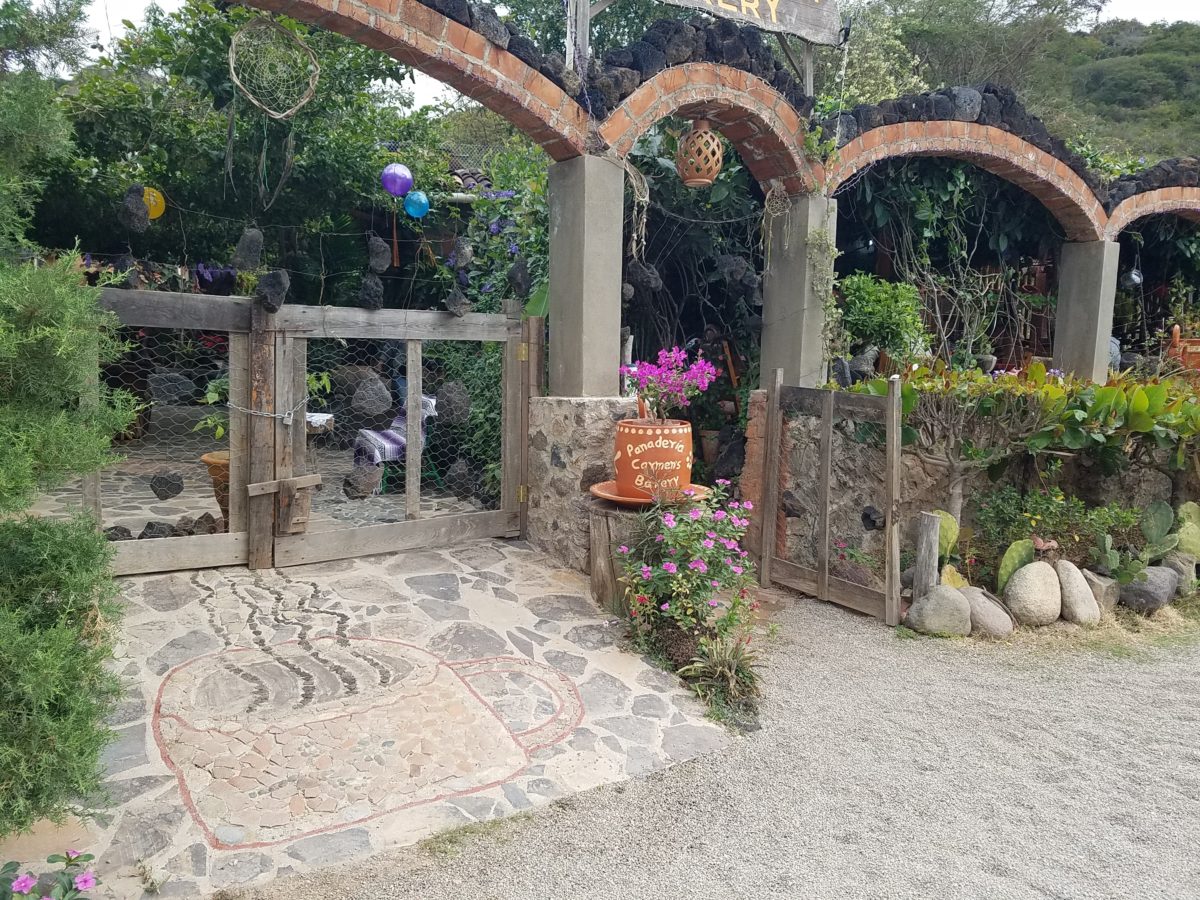
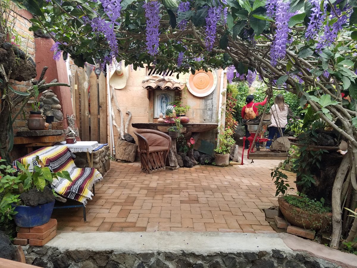
Oh, were we in for a surprise! At the entry, I stopped to shoot the whimsical cup of coffee mosaic set in a field of stone and concrete. I thought – what a fun design element to greet arrivals and set the stage. But I had no idea to what extent I was about to be elated. What unfolded so exceeded my expectations that I wanted to stay all day!!!

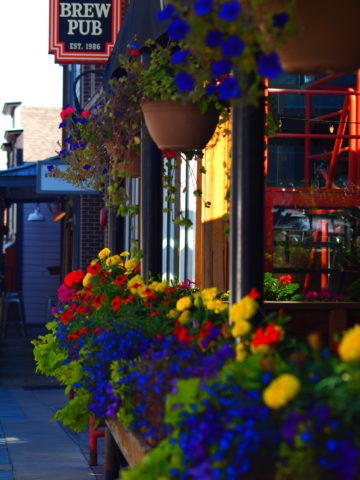
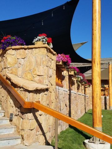
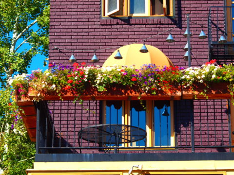
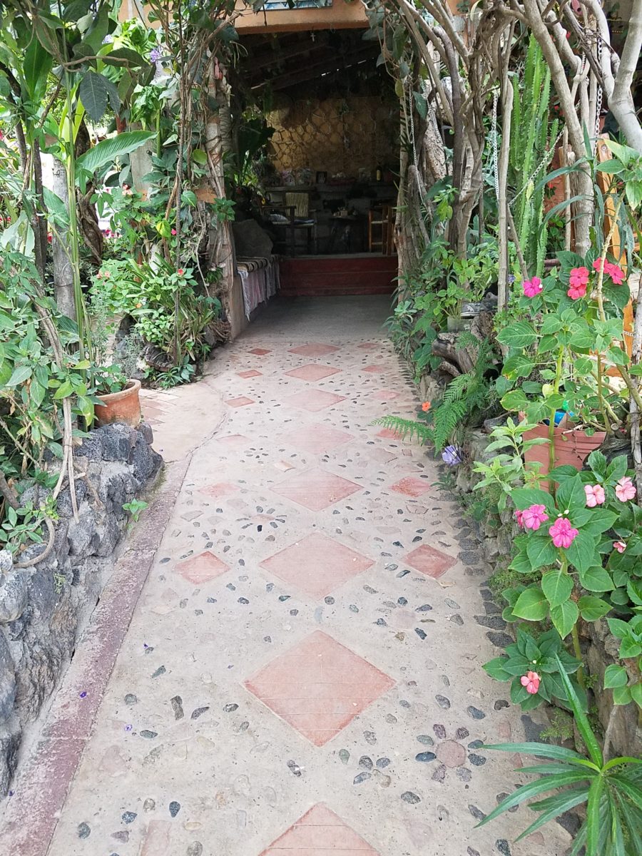
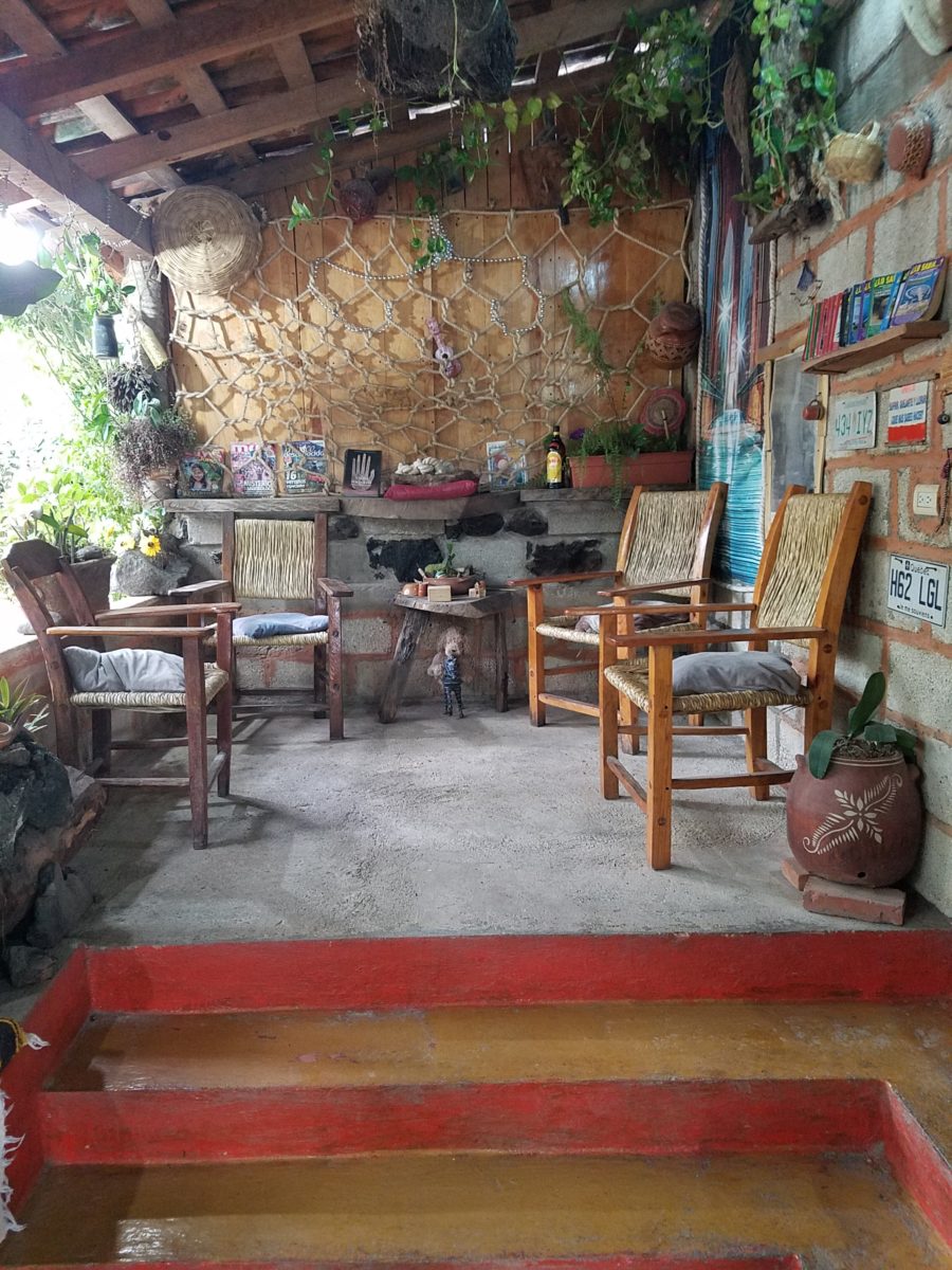
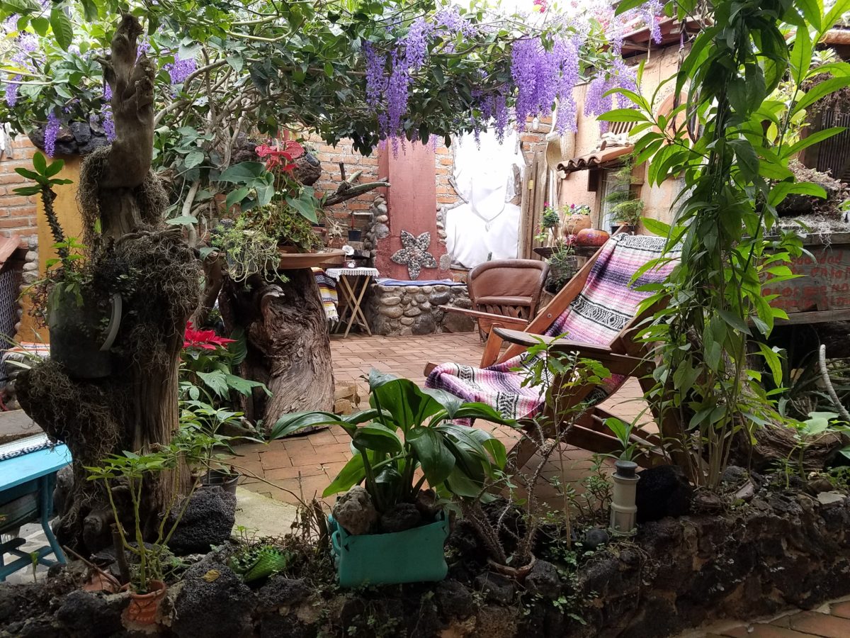
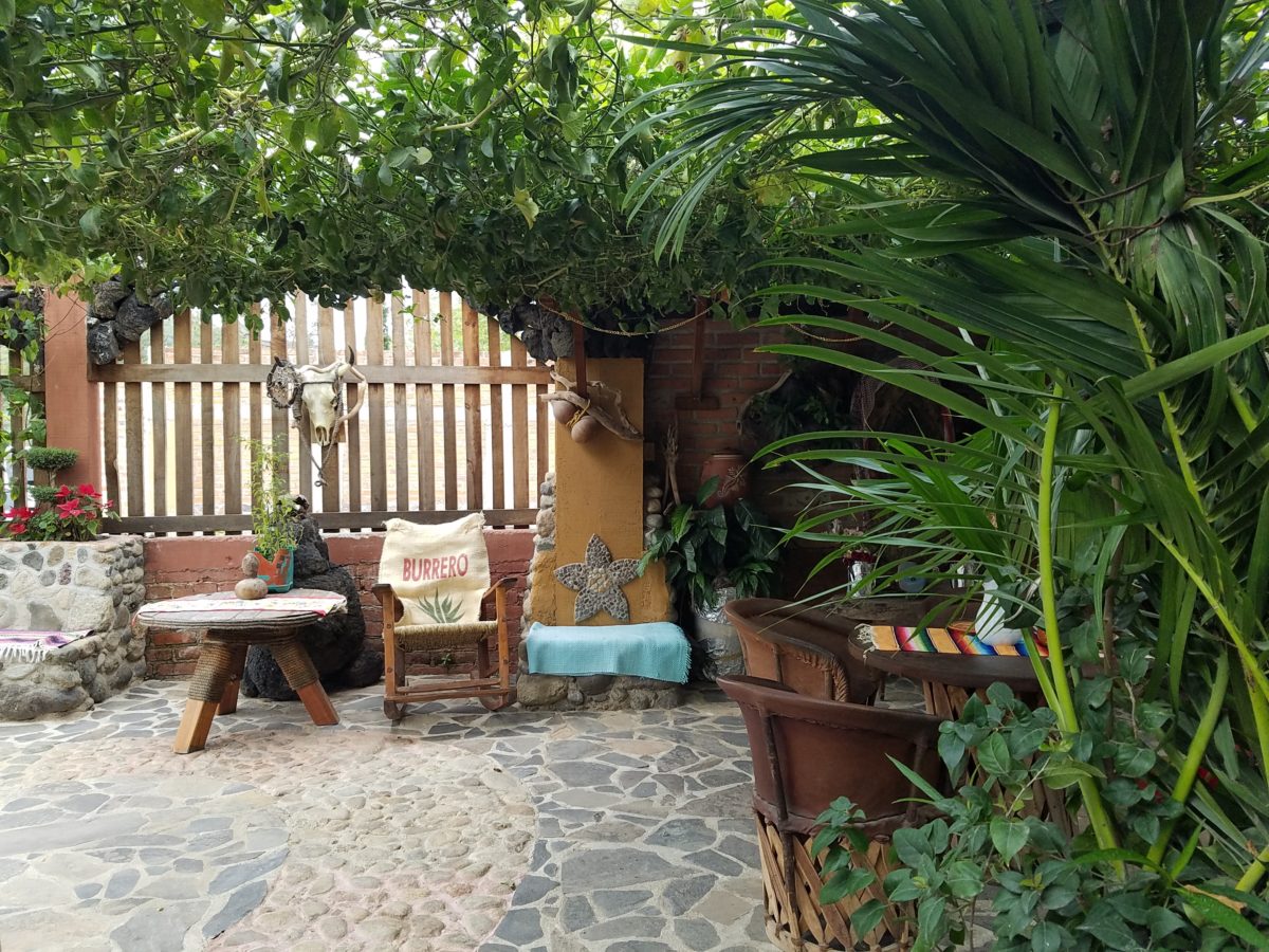
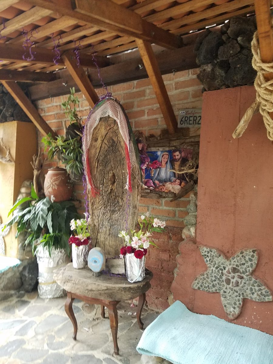
Happy stone and tile-work adorned the pathways. From the textures of stone and brick, tile and wood – it was an organic fantasy – an unexpected design experience.

Simple, yet spectacular – simply spectacular!!!!!

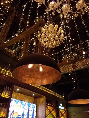
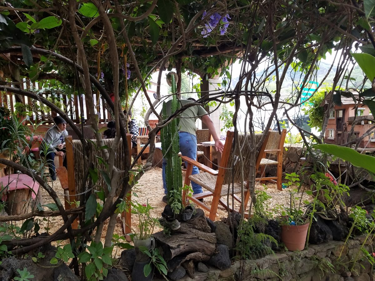
 Ceilings of colorful floral blooms – perhaps wisteria – suspended from their vines and other plantings intertwined with the structure.

Spotless and meticulous the eclectic elements were a harmonious creation.
Stone walls, wooden slats, vines and adobe all worked together to define the spaces.

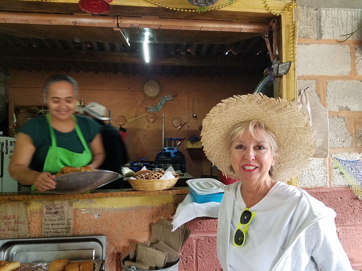
 The wafting aroma of fresh baked goods – it was more than delightful.  From warm savory clouds with mushroom filling and another with chile-laced sausages – and an array of sweet strawberry, cream and pineapple empanadas to corn muffins, banana muffins and more! All nestled beneath colorfully woven cotton tablecloths.

Light and delicious – the best empanadas ever!! With a tiny sprinkles of granulated sugar, for a sweet crunch, before sinking into the fabulous fillings! Muffins challenged any others and savory treats were so satisfyingly delectable. Little buttons of banana slices on top denoted which were the banana muffins!!

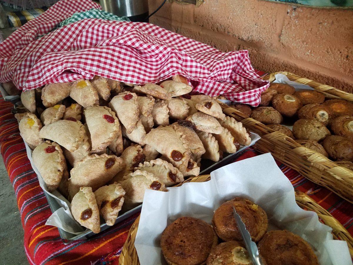
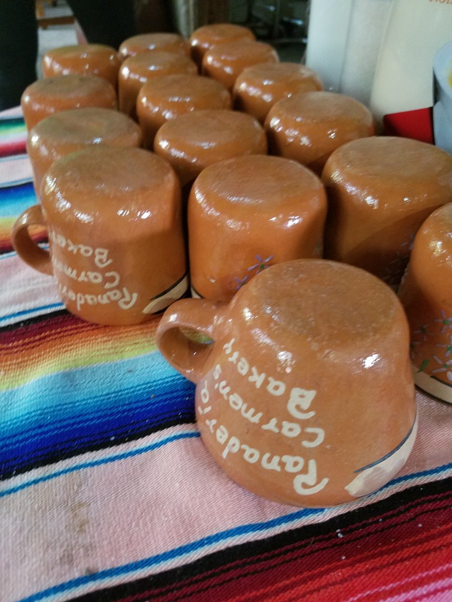
Rich Mexican coffee with a touch of freshly ground cinnamon and luscious hot chocolate were served in custom-glazed “barro ware” complimenting the fresh-from-the-oven confections.

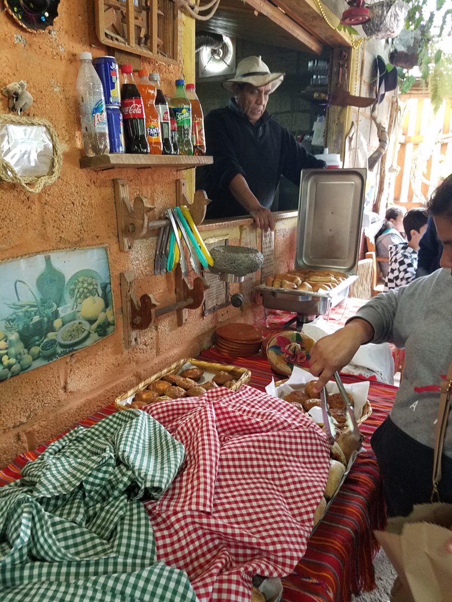
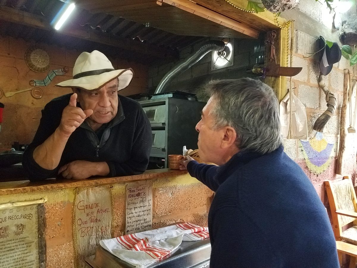
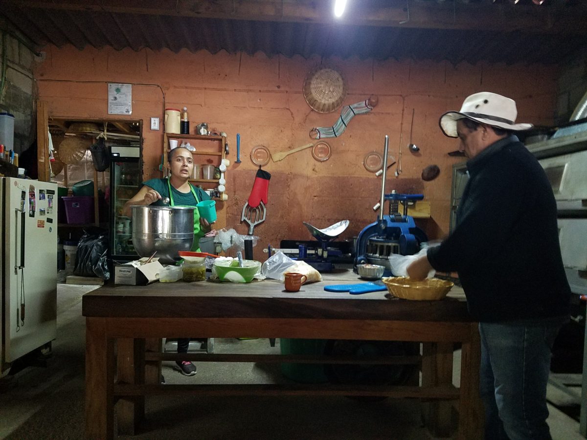
The exhibition baking kitchen overlooked the serving line. The buffet of pastries thoughtfully explained by our gracious and welcoming host, Jesus!

Carmen presents fresh strawberry tarts just from the oven!!!
A combination of old and new – tradition and technology meet in this cozy kitchen.

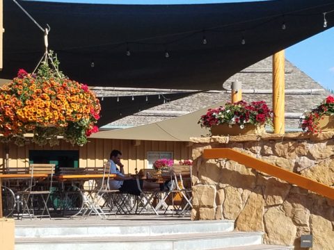
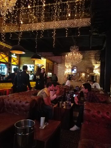
Fragmented spaces open, yet enclosed, offered intimate pockets in which to pause and enjoy.

Color-pops insert themselves effectively around the interior and exterior spaces.
Inviting seating areas semi-concealed offer private repose.
Tucked away – more areas to enjoy…

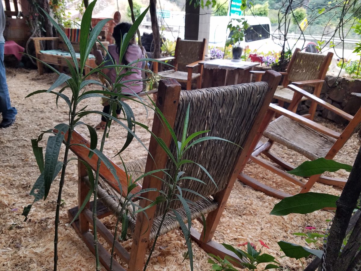
Clever use of clean blond wood shavings on the floor of the main covered patio created a wall-to-wall carpet of fresh aromatics complimenting the inviting aromas emitted from the ovens.  Rocking chairs and rigid sturdy versions, with a fun little rope swing, all surrounded  by tropical plantings made a cozy area to gather.

Soft underfoot and subtly fragrant – the wood chips make a great shag carpet!!!

As I meandered around exploring all the interesting spaces, textures, colors and plantings, I marveled at the sensitivity with which this had all been crafted and assembled. It was artful interior design with an exterior feel – open air and charming, with a decidedly handcrafted, Mexican sense of place.

Slices of handsome tree trunks make perfect stepping “stones” with graduated heights.

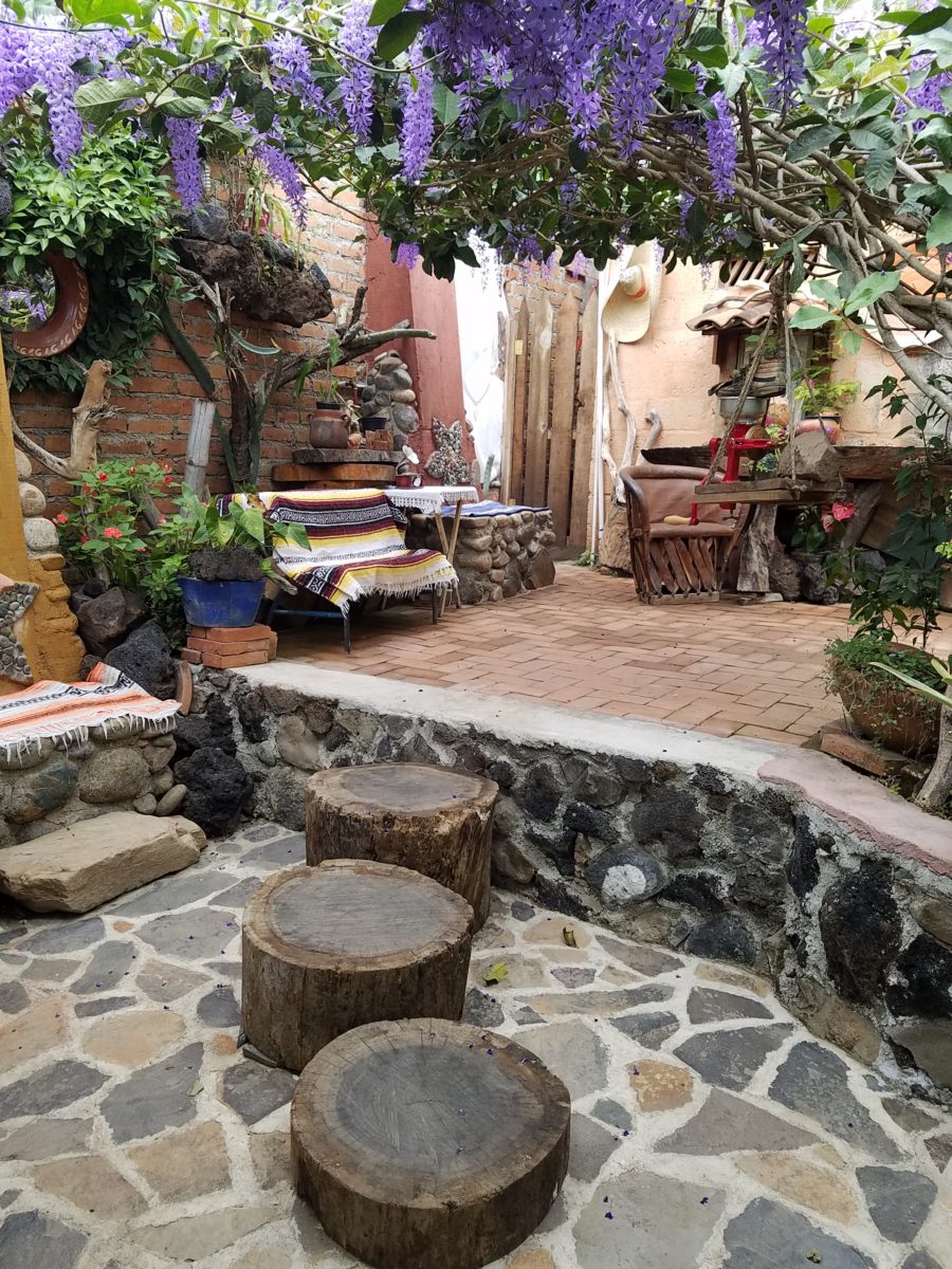
It was an eclectic collage of furniture, structure and organics – living and static – that was welcoming and artful, delightful and so pleasing, that it was a treat for all the senses.

The cool morning air of the mountains mingled, with the comforting fragrances, creating an atmosphere inviting gentle conversations of people gathered around good food and artfully relaxed surroundings.  

Peek in places and through doorways to find worlds of design waiting to be discovered!!!

WHITE by Design…

With all the New Year buzz about the new color forecasts…I started taking notice of the seeming non-color, white. It is often considered the absence of color when in fact it is a very complex color of many shades and values. Just try to select a white and you will know what I mean.

When you look at white paint samples, you will notice the nuances. There are pink whites and blue white, grey whites and yellow whites. Each white is off-set and contrasting to another. You see the differences by comparison and by context. You think you have just the right white until you place it against another sample and see that it is grey or cream and then second guess yourself again…and again…How do you know which white is right?

Dunn Edwards groups their whites and pastels in a separate section of their fan deck as do other paint companies. What is interesting here is that the background is a sheet of white copy paper. Notice how is reads against the colors in the samples…it seems to be a purple blue color. This shot was taken under a full-spectrum LED lamp. The colors should be true. The range of “white” is amazing.

To intentionally design with white is bold. To have the confidence, to decide that white IS the color and that white IS the scheme, is challenging. To effectively design with white, you not only have to select the right white(s), but you have to know just how much of anything else might be effective yet not detract.

Le Leche in Puerto Vallarta is a fabulous example of designing exclusively with white. Only with minimal punctuation with black lettering on the wall of containers and also by allowing shadows is the white interrupted. But the blacks’ minor interruptions gives depth and fine detail.

White design can be cold or warm. Depending upon the desired effect, mood or function of the space, the whites need to be carefully selected. This is true with lighting as well. Warm whites or cool whites…what gives you the desired result?

Popular white string lights add festivity and a warm glow to an evening scene.
See how many lighting colors you can identify in this scene…Starting on the left, a cool pocket glows through the underbrush. The walkway has a warm pink-ish light. The very cool blues of the pool area give a dramatic read. A bold yellow accent peeks from the far left and also over on the right. The palm trees are wrapped in a warm white tube lights while the far right side illuminates the entry to the dining palapa with a cool white light source. The foam of the surf on the beach is captured with a cool white spotlight that maintains its naturally expected white color.

Knowing when to add color to a white scene to achieve an intentional POP is an art. The color itself, the amount and placement is all part of the success of a good design result. From the fine black detailing in the previous shot of La Leche to this still-life composition of a tropical cocktail that I propped the other day, the minimal punctuation of color is key.

White mosaic shards of tile in the background of this composition featuring a peeled coconut and the POP of a pretty pink party umbrella result in a white-on white scene. Yes, this shot says PARTY with a perky smile!

The bench which served as the backdrop for the coconut cocktail is a dramatic serpentine sculpture of site furniture that plays with the white-on-white of the tile and grout.

Contrasting against the organic wood decking, this white monolithic bench snakes around the periphery of this outdoor lounge area. The sunset is casting a soft pink wash over the all white glazed tile.

Beach settings using white materials compliment the white sand and greenery of the tropical plants. From wood frame platform cabanas to the sprinkling of umbrellas, white is a wonderful, fresh color for a crisp clean scene.

Whites on whites…creamy sand colors to crisp white terrycloth, the white-on-white scheme is soft, inviting and clean.
Greenery compliments the white umbrellas and sunning beds on the lawn by the beach.
Palm trunks and other fruit trees are often painted white to protect against insects and what insects insist on climbing the surface are easily spotted by birds who appreciate the help to capture a snack! In this case, they contribute to the white design theme.

The soft creamy off-white folds of fabric offer a soft, inviting scene.

Shadows in the creases and depths of the folds add the dimension to the luxurious feel of the cotton damask fabric.
White stucco is dappled by shadows and greenery while given a warm, strong base by the brick pavers. White as an architectural finish is only successful if the context compliments it. This is true in all design.

Architectural color and texture of surfaces is a moving target. A recent discussion about a white building with black detailing would not have proved right for this particular use of white. The hard, commercial read would have been too severe for the intended effect. Yet that same project, with a warm white and an ochre accent, will be just the right combination to achieve the desired result. Watch for this project to be featured in a few months.

Architectural surfaces incorporating tones and textures of white provide interesting opportunities

Block and crumbled edge accent bands on the facade of an exterior wall.

White in design is an exciting selection. Knowing how, when and why to use it is a test of your creativity. Picking the right white is the challenge.

The limitless colors of white found in a pile of gravel…..

So the next time you think white, think a lot about it. Study the context and what you are trying to accomplish. Feel freed by the fact that white is a color to express and enjoy.

FLOWER POWER – A Marketing Imperative

While in Park City this weekend, I pondered what might the subject of this week’s story be. Dazzled by the smart presentation of this hidden little jewel of a town, I was continuously remarking about the fresh abundance of flowers, well maintained facades, manicured lawns and medians and the obviously collective appreciation for what draws patrons to want, if not need, to invest in property, art, clothing, home decor and food! Yes, need – it can become an imperative!

Here a restaurant has dressed their facade with brilliant red flowering boxes beneath the sidewalk window.

Oh – oops…do you think it might have been the Ferrari that was drawing attention?

Imagine your patrons being drawn into your establishment as an imperative – a must see, or must buy here, or must try this place, or must check out their wares, or must taste their food or drink their craft beer!

The patio of this brew pub is surrounded by fresh flowers in rustic wooden boxes.

Preparing to open for the day, this pub also has light strings to animate the patio at night.

You see this charming presentation potential in small resort communities and those who have cultivated their assets to the max, reap the benefits of their vision, smart development and on-going maintenance.

 Another brew pub sees value in an eye-catching floral frontage. Courtesy – Heather Harrell

The architecture is decidedly mountain themed, vintage 19th century colorful and textural, but interestingly punctuated by modern elements and fresh ideas. The practical pitched roofs, quaint scale, textural wood trim and detailing, all contribute to this charming scene.

Courtesy – Heather Harrell

To dismiss the value of flowers in marketing is to ignore the Flower Power!

Some places take a little more work to grow seasonal sprays of abundant color in pots, buckets,  bowls, barrels and boxes, but the effect of drawing people is undeniable.

 Courtesy – Heather Harrell

From Key West to Anchorage, the results are proven. Beauty, color, nature sells.

It’s a combination of color being a visual POP amidst concrete and brick, but it is also the positive life-affirming statement that it projects.

We know color in advertising is a draw and we know that anything that adds animation is a draw – flowers colorfully animate the street-scape and draw customers to them.

Here the passers-by are drawn to the menus posted in the window by the red geraniums that brilliantly are placed in planters in front of them.


Courtesy – Heather Harrell

They infuse the built environment with nature.


Like hummingbirds swiftly hone in on the finest blooms or like bees collecting pollen, we are drawn toward that which speaks visually from the surrounding foliage.


Courtesy – Heather Harrell

Texture is another element in this mix. We know that good design is about balance. Flowers balance the otherwise hard surfaces in their periphery. The finishes on a streetscape or sidewalk scene are generally, if not exclusively, hard. Flowers soften the surrounding surfaces and also balance the smooth and hard with random shape, texture, flexibility and even movement.

Whether a casual bar or fine dining restaurant, retail shop or any business wanting to attract and invite the public to them, flowers are an asset.

I feel about flowers similarly to how I feel about twinkling lights on a patio or in public trees. The advantage in the lights is that they can survive the frigid elements and make their statement in all seasons. Lesson here – once the plants are spent for the season, keep the lights on!!! Both elements are valuable draws and enhance the atmosphere of any establishment or environment. (Go back and notice how many photos have visible stringed lights in them!)

And if possible, plant those past-season pots with hearty pansies, ornamental kale or evergreen shrubs to keep the life calling from the sidewalks.

An art gallery has boxwood in steel vessels at the entrance.

A potted evergreen will add life to the paved surfaces when the flower season has passed.

And  for the sake of broadening the reach on this subject, to include not only the flowers and the mention of stringed lights, is the inclusion of creative signs, banners, flags, umbrellas and other elements that contribute to the festive nature that attracts peoples interest and draws them into your business.

Courtesy – Heather Harrell


Rooftop bar with flowers, flags and umbrellas – King Edward too!        Courtesy – Heather Harrell

Celebrate the the power of flowers!


Young Family Prioritizes Remodel

We all know that traditional housing floor plans are changing to maximize smaller footprints. The result is a more open layout. This preference, often seen in “loft” design where warehouse space is converted to living spaces – without many walls and with an eye on the interestingly industrial finishes of the existing space.  But this same concept applies to new home construction for starters or down-sizing to smaller homes and is definitely applicable in remodels of existing traditionally compartmentalized plans.

Lifestyles too have opened kitchens. Although often to maximize smaller spaces, they are also more open as cooking is more celebrated in the home and related activities are shared.  Kitchens have truly become the fulcrum of family life. So when this young  couple purchased their first home, the vintage 1960s split-level plan was not quite right.

The kitchen was a narrow galley-style tucked into a rear corner of the main floor. And although it had recently been remodeled, it was confining and not conducive to entertaining and growing a family.

The point of arrival was an open space with entry wall about 12-15 feet from the front door. To the right, the living room had a focal fireplace and the adjacent dining room made an “L” back to where the kitchen was tucked behind that previously mentioned entry wall.

So this progressive young couple thought way beyond merely  opening the wall creating a pass-through bar to better connect the kitchen to the living spaces. No, they said ” Let’s blast this baby out of here!” And with that they proceeded to visualize the point of arrival being the actual kitchen in full-view as guests arrived. Hello!!!!!

The former kitchen containment was revealed to present the new elongated welcoming bar counter-top, luminous glass pendants and supplemental recessed down lights, to meet and greet all who pass through their front door! Original hardwood floors were refinished in a dark walnut stain.

Their priorities were to create a larger, more functional kitchen with a clean, modern look and feel while making all open to better interact with their soon-to-arrive baby!

The clean white on white finishes in the kitchen are fresh and crisp. Lest you think they saved and added to existing cabinets, they did not – all cabinets are new!

And this might be considered gilding the lily, but we added a splash of artistic expression when we hand-painted the small squares in the new brushed stainless cabinet pulls to give them a bit of extra pizzazz!!!

By using the Carrara mosaic as a wall-covering, rather than merely a back-splash, the walls get a truly finished built-environment “read.”

The upper bar counter-top bows at bar-level to offer a more comfortable conversation scene.

The living room became a cozy sitting area off this wonderfully open kitchen and dining area.

Existing brick walls were softened with a grey-taupe to contrast with the white trim making it POP!

The fireplace now has a complimentary new Carrara mosaic in a diamond pattern to coordinate with the new herringbone mosaic of the kitchen wall.

And baby accoutrements adds colorful animation to the beautifully finished scene!

“HELLO!” they say. “Welcome to our beautiful new home!”


Discovering Patterns

This week began with a juicy fabric presentation. I say juicy because it got my design juices working and I was inspired to take photos and imagine the opportunities to insert these wonderful colors, patterns and textures into upcoming projects.

Take the chicken and the egg scenario. Do YOU often find that exciting design elements invite thoughts of projects for which to use them?

A fun exercise is to take your camera and search for patterns to photo…patterns are everywhere from cast shadows to fabrics, signs and graphics to fallen leaves.

Seeing these exciting new fabrics – you had no intention of changing all your throw pillows, but these stimulating samples might make you consider changing your entire collection!

The opportunity to offer unique fabrics for clients who would otherwise never be exposed to the samples – not know of the possibilities – is exciting. Being able to make this introduction is a treat.

This first batch was of clean, sophisticated, woven, geometrics in blacks, whites and charcoal tones.

Whimsical patterns and textures, with splashes of color, offer more possibilities.

Now see these rich woven patterns and colors in this next series. An explosion of color and pattern  with a decidedly native direction – prime for New Mexico and design projects looking to evoke the elements of the southwest and other opportunities inspired by indigenous art.

With all this freshly implanted in my ever-swirling brain of design fragments waiting to be assembled, I traveled north this weekend for an enchanting New Mexico wedding that further fed the theme of indigenous art, pattern and design.

The lobby of Buffalo Thunder was riddled with magnificent pueblo pottery. The designs were wonderfully intricate and I saw them as stand-alone elements that could easily be fabric motifs. Here on pottery – but so fascinating to consider as possible inspirations for fabric patterns and designs.

Anasazi Buffalo Pot – Acoma Pueblo

Suggestive of a court jester, this expressive piece tells a figure story. The bold patterns make a powerfully beautiful statement. Who loves bold stripes? Do you wear them? Do you upholster with them?

Evening Star by Katherine Wall from the Jemez Pueblo

Cut-outs on lobby lounge chairs, with geometric upholstery, atop bold zig-zags of the area rug proves combining patterns creates a fine line between exciting juxtapositions and pairings – and risking possible disturbing disruption of order. Comedian Steven Wright uses dry wacky wit delivering hysterically funny observations to convey a sense of the obvious with a twist. I’m paraphrasing one I remember from years ago… “You know that feeling that you get when you lean way back in a chair…way back on the back legs…back so far that you are just about to fall…I feel like that all the time.” That’s like that feeling with challenging design. It goes just far enough to get your attention…designers get that feeling as they push the theoretical limits of design – all the time!

Ok- this is not perhaps THE most outrageous example of this theory – but a fun, eye-catching combination nonetheless!

Buffalo Thunder resort was the jumping off point to then venture beyond into the thrilling landscape of La Mesita Ranch.

Mixing different colors of brick make this random patterned walkway very pleasing and interesting.

The setting was natural, organic and inspired.

Simply lovely centerpieces

See a lovely, intense example blooming blue and white and much more in Nantucket on the cover of the new June 2018 issue of Architectural Digest.  http://www.theenglishroom.biz/2018/05/29/nantucket-beauty-by-markham-roberts/

So look for patterns all around. Discover exciting opportunities to mix patterns and textures.

Be brave – play with patterns!


Remodeling? How to Embrace Existing Conditions – Celebrate the Story

This happening scene provided fabulous fodder, to observe existing conditions being incorporated into a design, for great benefit on many levels. Applicable to all remodel projects – see what you think!

In this case, Night Club design. The styles are many, but the concept is of a  commonality comprised of a few basic functions – a fun place to socialize, meet people and enjoy the entertainment of the overall scene often including live performances. We probably all picture the image of a flashy, glitzy environment.

We were recently in a most unusual space that combined the glitz and bling you might expect with a “nightclub” atmosphere, but juxtaposed with rustic finishes that were unique to the original architecture. This brick expressed in some of the remaining structural elements – walls and column/arched spans of structure – was warm and rich providing an unexpected pleasing combination that so easily might have been eliminated – concealed behind slick new finishes.

To play-up the vintage aspects of the space, ornate traditional chandeliers were suspended amidst myriad dangling strands of sparkling, golden LED lights. These provided a glittering glow of ambient light in the upper reaches of the space effecting both the downstairs and upper level of the club. This mixed lighting treatment was obviously the eye-catching  emphasis of the interior.

Ample light was provided by the luminous chandeliers and thousands of dangling LED pin-dot lights along with the indirect lighting of the back-bar shelves. Therefore, the large steel domes that hung suspended over the bar needed not to contribute ambient light, but were limited to effectively cast direct downward light on the bar surface. Their golden interiors provided a warm glow while the exterior surface disappeared into the darkness.

The bar was quite simple and raw, yet read in enough of an interesting and complex fashion, to compliment the scene. The design was sufficient in its components and indirect lighting worked well with all the other design decisions.

The simple Tolix-styled stools were an understated easy fit with the other surprisingly raw materials of the bar.

To answer the need for friendly group conversations, there were comfortable places to gather with zoned seating areas of tufted leather sofas and leopard-patterned rugs,  wooden grouping tables, then hi-top tables with stools and finally barstools along the length of the bar. The various areas provided options for patrons to pick the most inviting or appropriate spot to enjoy the atmosphere with friends.

Having choices in any hospitality setting is invaluable. It allows the patrons to make their own decision how best to utilize and enjoy the space. It answers different needs and appeals to different people for different reasons, therefore inviting a variety of patrons to invest their time and money in the establishment. A broader reach of clientele.  A broader client base.

I’ve mentioned more than once that having restroom design follow the theme and quality, of the rest of the interior, is imperative. As it relates to night clubs, it is often the meeting-ground for dating, meeting new people, attracting new people and therefore,  the restroom should promote attractive feelings of approval and confidence in the guests.

Jazzing up the restrooms in keeping with the jazzy feeling of the club environment should be a natural continuation of the design scheme. That means mirrors – full length – not merely above the sinks,  good lighting without down-lights to cast unappealing shadows on the guests.

Here the placement of sinks outside the restrooms frees up space in the stall areas, while adding interest to the extended restroom area. The design theme presents free-standing bureaus for the sink cabinets. Often shared sinks are used in these anti-room set-ups, but in this case opposing sides of the vestibule provided an attractive vanity area for men and a separate one for women.

What was so inspiring and interesting as we scanned the interior were the various zones all within this complex mix of original, traditional architectural elements and adding traditional if not vintage lighting fixtures paired with modern high-tech lighting effects and large brilliant monitors featuring exotic, playful, getaway beach videos. It worked.

Have you ever encountered a structure that at first glance did not comply with the supposed new program? Awkward supports, raw materials, exposed mechanical…so ,many “unfortunate” things to get in the way of your design. Often the “imagined” design over-rides the reality of the moment. The challenge is to allow the moment – the reality of the existing conditions – to participate in the process rather than being briskly eliminated without thorough consideration.

And the additional bonus might often be cost-savings and budget stretching while not betraying that benefit at expense of the finished design. Brilliant to have incorporated the “whatever it is” – wasn’t that creative and hence, interesting!! OK – I’ll take that!

To have concealed or negated the architecture would have been almost criminal – certainly a loss of architectural integrity and textural interest.

The crime of missing opportunities like the seemingly conflicting traditional elements with the need to be glitzy and modern is to be too one-directional . It’s like having “design-blinders” on that direct and focus a theme without recognizing the value of thoughtful salvage of  content, contrast and context.

All of what we observed applies to both residential and commercial design. The takeaway is to consider existing conditions and, if applicable, embrace them. Give thoughtful consideration to the opportunities before glossing over them, concealing them or eliminating them altogether. Try to appreciate the gifts that might escape you if you insist on unnecessarily hammering and manipulating a space into submission – design submission. Rather, let it tell a story and contribute to the design process – which would more than likely result in a more unique and creative end project for that thoughtful integration of the existing elements.