A friend sent me one of her trade articles from the residential real estate perspective regarding how this COVID crisis might bring change to the housing market. In the article, it touched on the size of homes, working from home, privacy in the home and smart technology that will play a larger role. Plus a nod to adding a stock tank pool to your backyard to beat the summer heat!
It’s true that this period of weeks having a close-up look at our homes – their design, function, aesthetics – has resulted in some new ideas and opinions about how and where we live. Have you felt the need for more privacy or more space?
How might Covid 19 brings changes to the housing market?
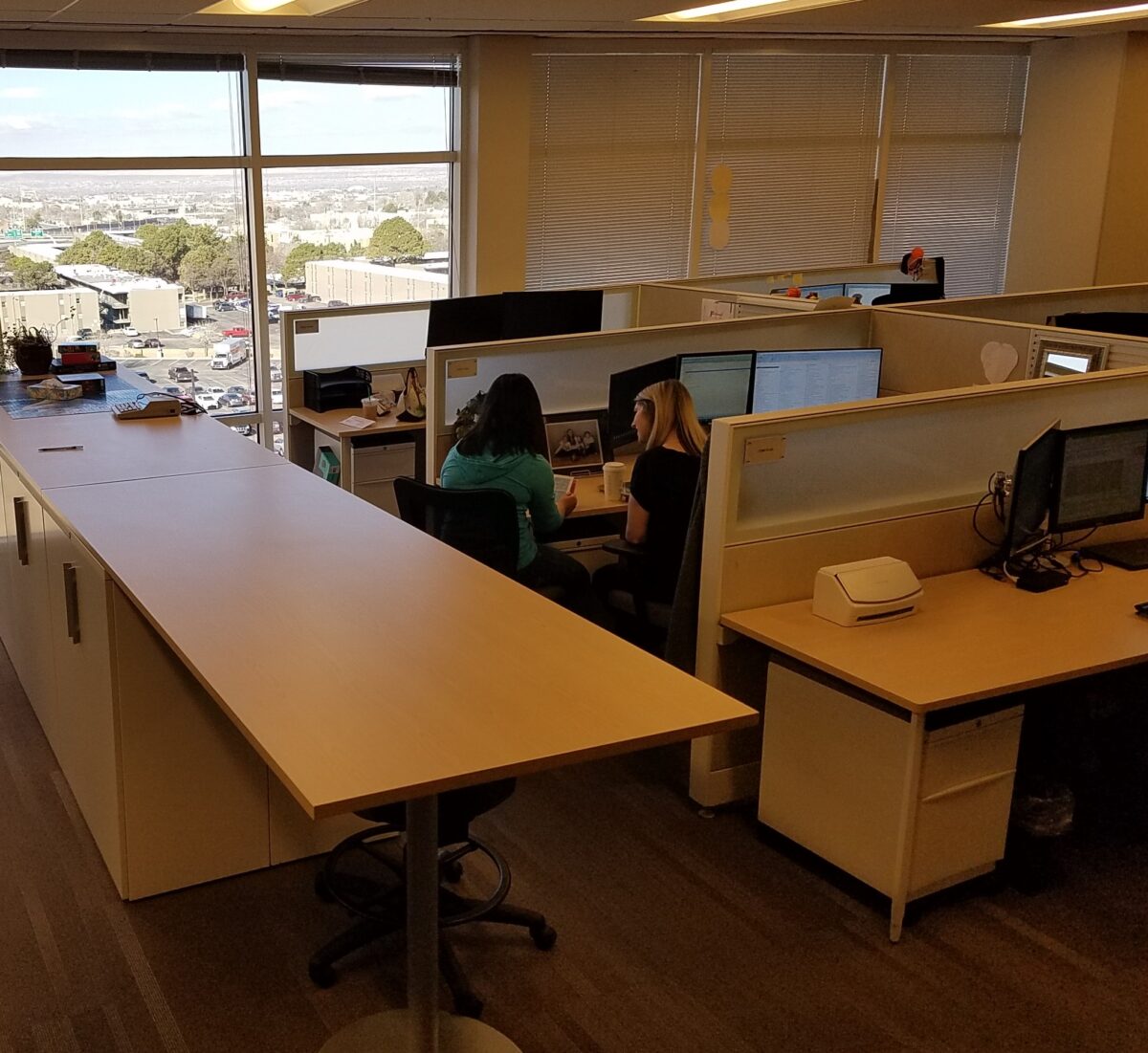
A few years ago the pendulum swung in commercial design favoring the open office/collaboration layout. What was a new concept of open office spaces in the middle of the last century, resulted in the design and development of systems furniture flourishing. Then the even more “open” concepts of collaborative spaces with foosball tables to entertain the staff providing breaks without leaving the building entered the scene.
Open office encourages interaction – not as much as fully, open collaborative spaces.It maximizes space, but still omits total privacy for more concentrated work .
This has continued today as some were slower to jump on the trend and are still experiencing the “new-found” re-design of fewer private offices and more collaborative spaces. However, the pendulum is swinging back a bit with feedback from some employees reporting that they need more quiet space to do their work and focus away from distractions. Having a private space can be grounding and comforting and allows an individual to worry about less and focus on more.
In a rotating office, there less comfort and familiarity. This can contribute to distracted performance. Yet, all of this data is variable depending upon the nature of the work, temperament of the individuals, style of individual work practices, existing conditions in the workplace, culture of the business and even geographic considerations.
But as this relates to homes, many of these factors have similar effects. The real estate article notes that rather than down-sizing homes, with more open floor plans which has been a recent market trend , they will see a rise in the desire for buyers to want larger homes, in which to partition activities. This might very well be true. Especially if working from home is instituted. The need for privacy away from the possibly over- collaborative office environment, to finding oneself commandeering a pocket of the house for their work needs, requires a design focus.
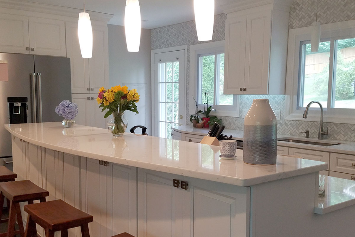
Where larger, open kitchens had become the fulcrum of family life, the real estate article suggests that this might not be so popular moving forward. I’m not sure I agree. Where the article states that “the noisy epicenter” might require re-thinking, I believe that it will remain the vibrant epicenter adjacent to the primary living area, but that other areas of the home will be designed to provide needed escape and privacy.
Too much collaboration and collective living/working can result in a desperation for private spaces. There seems to be a cry for balance. Where we want gathering spaces for the family to be together for meals, games, movies or projects, the confinement with family, although precious and priceless on the one hand, has also proven that there is great value/need in private spaces.
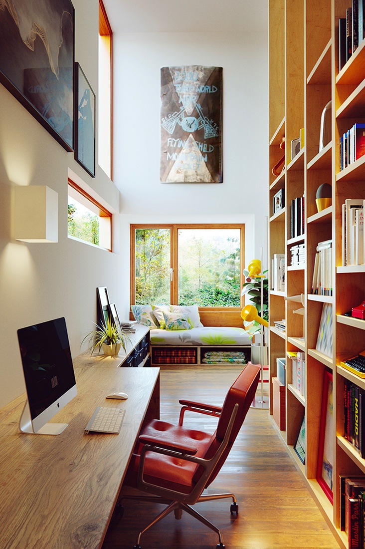
Home-designing.com is a great resource for visual ideas. Here a cozy reading nook with office/study space and going vertical, to best use the space, are tall shelves. They can also make room-dividers when partitioning off private spaces! Lots of natural light connects inside spaces with the outdoors.
Partitioning spaces within an interior is something we reference as “zoning.” We design “zones” to offer certain tasks or activities to take place separately from others. Sometimes this is partially divided by low walls or screens and other times the need for complete partitioning – as in separate rooms – is in order.
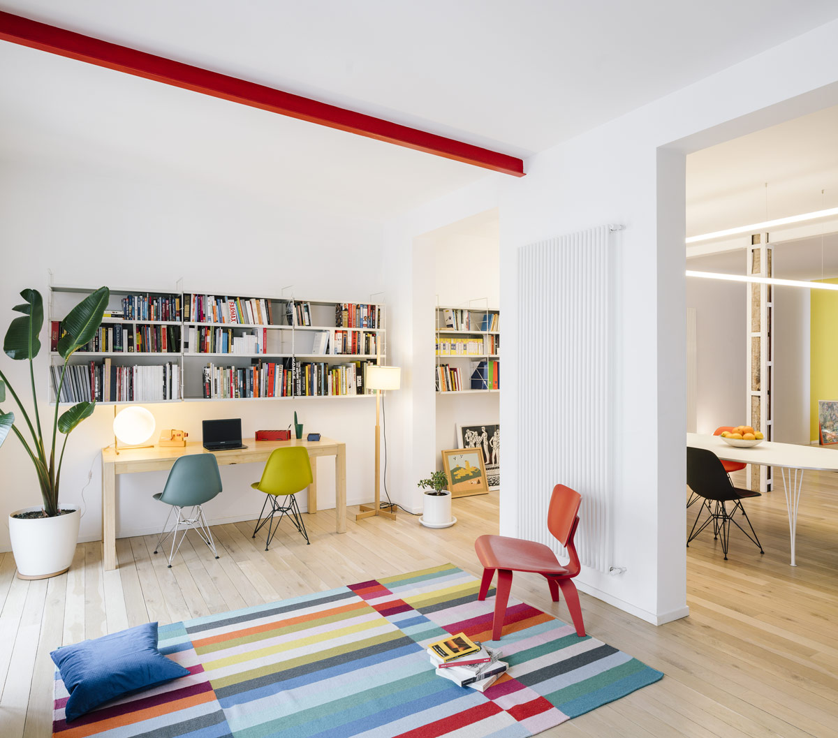
Another creative space from home-designing.com featuring a double workspace, partial wall partition to “zone” spaces. Color “pops” are fun too!!!
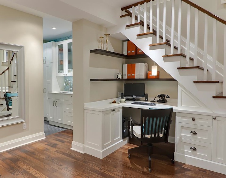
The ever popular Jack and Jill bathroom might connect a bedroom with a separate study – a bedroom suite rather than merely a pair of bedrooms. Study spaces will play a more important role as more on-line options for schooling are made available. Learning and working from home have been eye-opening experiences. Privacy is paramount when trying to focus on your work. Study spaces can be single rooms dedicated to this purpose or pockets in the home – converting closets and beneath stair areas for small desk spaces and study nooks. Slivers of garage space might be opened to the indoors. Unused attic spaces might be captured for loft-like openings up and away.
Decorpad.com is another great resource for creative space-planning and design ideas. Here Leslie Goodwin shoots this valuable space which is captured to carve-out a home-office.
Space-saving and consolidating furniture pieces like bunk beds – going vertical to better utilize the “real estate” in bedrooms, etc. Valuable square-footage will be captured and used creatively – much like clever design efficiency on a boat or motor home. Space is precious – let’s use it wisely.
Back to the kitchen being the fulcrum – multi-tasking can also be a result of this confined at-home mix of activities and responsibilities. At certain ages, parental assistance is necessary to navigate the studies and coordination with the on-line programs. The kitchen has been and becoming more and more a classroom/study hall. While older kids might just want to be in the center of things while they don their headphones effectively separating them from much of the surrounding activities, still keeping them in the mix, others are actively sharing their lessons with their at-home parent/teachers smack dab in the center of the activities.
Larger homes – rather than downsizing to smaller can allow for multi-generational living. College kids studying on-line rather than going away might return or stay at home. Grandchildren requiring day care might be with grandparents part of the time.
Conversations centered around energy conservation with the desire to have a more open connected feeling with the outdoors can seem contradictory; but technology has advanced window, skylight, door, and many different translucent and transparent panels, to bring the outdoors in!
Lucere resin panels can be used a limitless commercial and residential settings!!
Residential design might be enlarging, partitioning, adding light and connections to outdoor living. Therefore, sharing the joy while providing space, privacy, healthy circadian rhythm and connections to expanding to and enjoying the outdoors.
Here, today, find designer focus and pro-tips for improving our living spaces. Most of us have spent more time at home than we have in years. Sure, we usually wake up, prepare for the day and return in the evening, to end the day. Weekends are usually that bonus time around the house – unless we spend them on road trip excursions. However, being at home every day is unusual for many and has provided opportunities to critique and take stock. Go from “making-do” to making better, with a little focus on the details and some professional help!
New catch-phrases like “shelter-in-place” have become part of our vernacular. Staying home has resulted in massive numbers of internet orders, cautious home improvement store visits and related activity. The shared anxious energy and creative energy spawned, from our restricted living and working regimens, is “going viral!”
Well, we certainly never really considered that trendy term of something being popular being a REAL virus spreading across the planet – but the humor, common complaints and simple joys, of this surreal modification to our lives, are “going viral” all over the internet. From the vantage point of the design world, we are seeing a multitude of comments about people going stir-crazy and making plans for needed home and office improvement.
HOME DEPOT – Pick-up in the store or have it delivered FREE to your doorstep!!
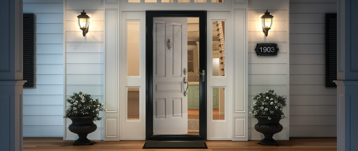
We are finally – and I say finally, after nearly everyone else we know has done so – ordering storm doors. Yes, to leave open and let in the light of day!!! It has taken being around the house for so many consecutive days that has geared us to the circadian rhythm that our orientation provides and illustrated the need to avail our interior of a significant missed opportunity for natural light! Just never seemed that important…until now! We have labored over having lights (glass) in new primary doors, but after weighing the options for light, security and transparency have opted for clear, full-panel laminated glass storm doors with interchangeable screens, for fresh air – weather permitting.
Yes – Anderson DOES do double storm doors – but try finding that information on their website or even through Home Depot – they’re terrific – you just need to inquire!!!
This unique opportunity to be quarantined inside our homes has given us an opportunity to evaluate the flow, function and lifestyle within our private environments. Have you noticed any things that you want to change as a result of this confinement and forced, close-up evaluation?
Here are a few topics and tips that have come-up in recent conversations from both consumer/clients and designers:
More perceived space: Perhaps open a wall or completely remove a wall(s) and connect two rooms for better communication and visual enlargement of the floor plan.
Adding mirrored walls or individual mirrors add depth and also expands a space to give it a perceived increase in size.
Add cozy color and texture with area rugs, throws and accent pillows.
Add skylights for more daylight.
Change paint colors for a refreshed feel.
Remodel kitchens and bathrooms – people have been sharing intimate spaces and preparing meals significantly more than regular lifestyles dictate and now recognize limitations in their current designs.
Re-upholstery of existing pieces that function well, but need to be refreshed and modernized.
Purchase new furnishing to improve the comfort, function and visual appearance of the interior.
Desires for additional lighting or replacement fixtures, to improve and enhance the quality and color of light inside all rooms for tasks, ambiance, accent spots, indirect illumination, decorative fixtures and even landscape lighting to highlight the features of the plantings and exterior structures, have been heightened.
Workplace design has migrated into homes prompting consideration for a more efficient permanent pocket of living spaces designed for that specific purpose of home-offices. A few from our website portfolio are illustrated here…
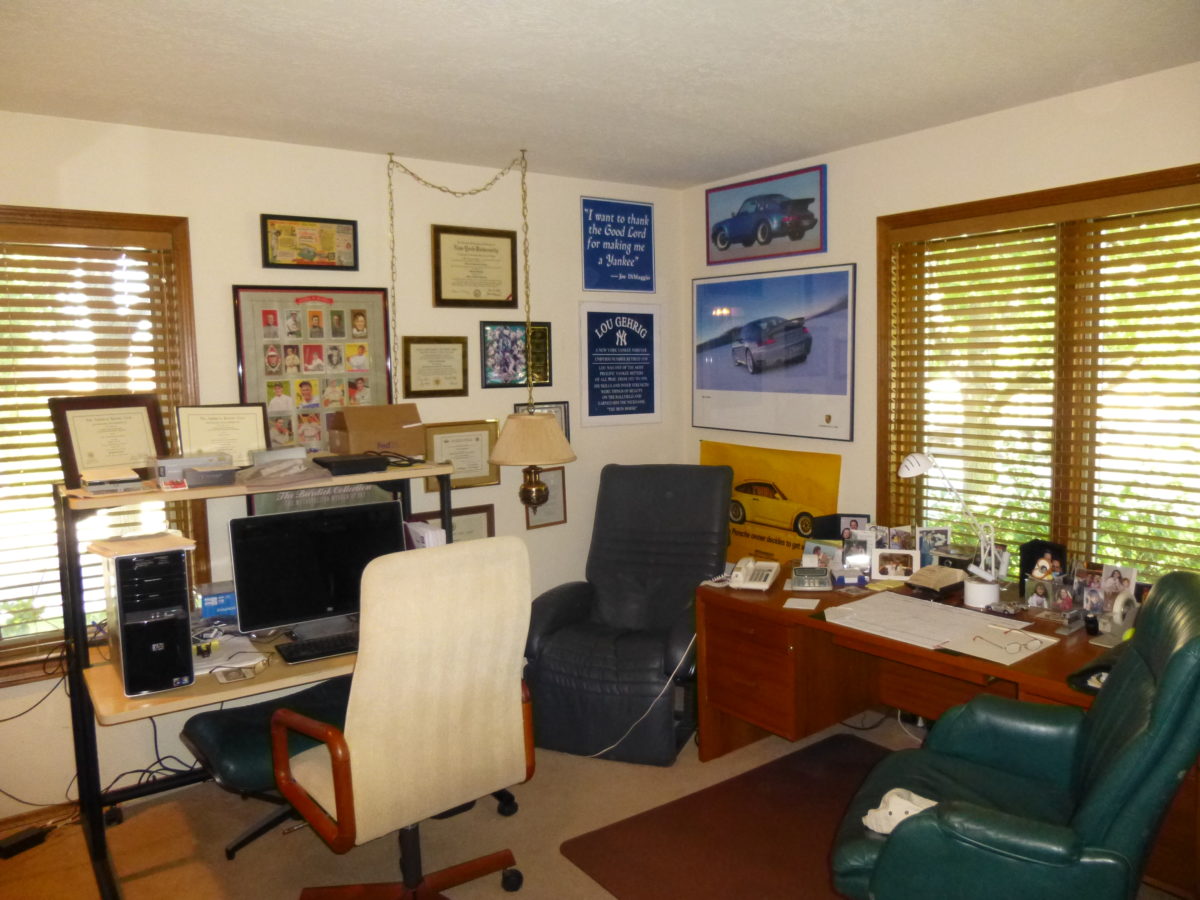
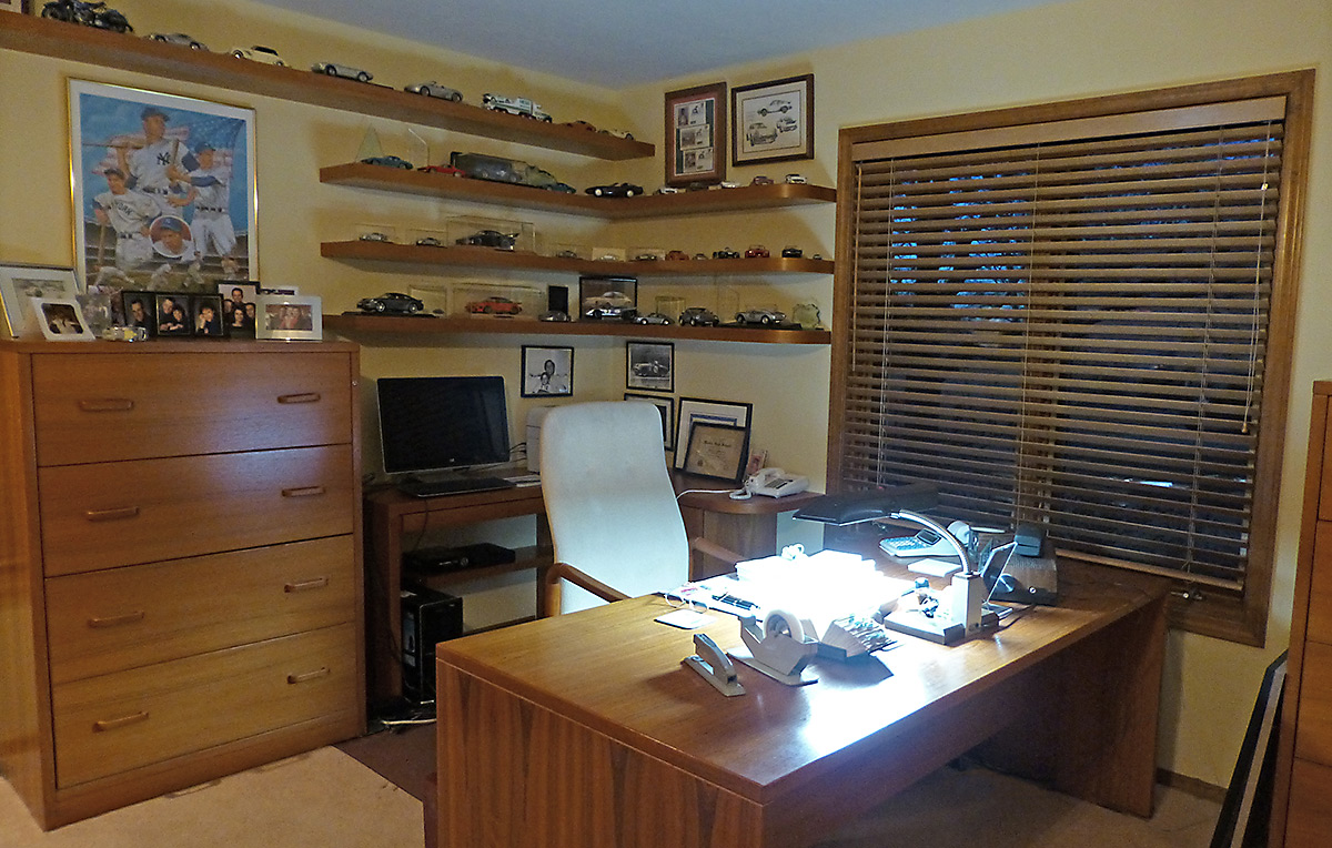
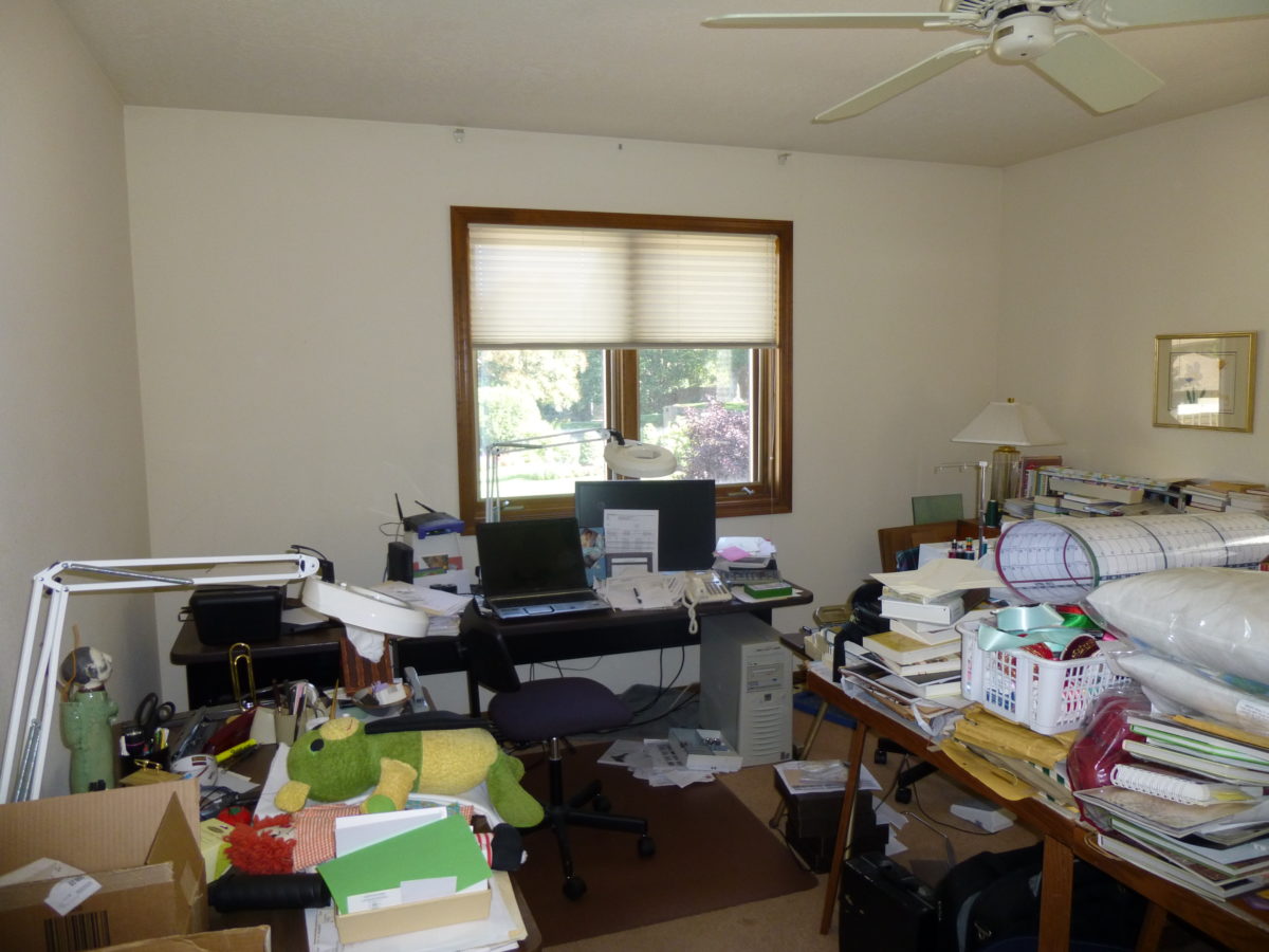
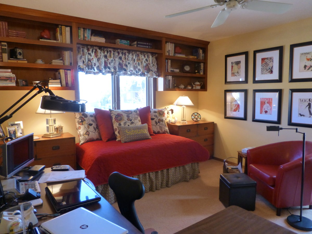
Before – this cluttered space was serving as an office – but without organization or pleasing aesthetics. After – this same space reorganized furniture placement, added new work-surfaces and cantilevered shelves to match existing teak pieces, creating an atmosphere of organization, enhanced workspace and display of personal hobbies and memorabilia. Before – this room doubled as a sewing room and home office – but the lack of organization made it inefficient and unpleasant.After – by adding storage, cutting a steel trundle bed (found in their storage unit) down to window-width, and rearranging the workspaces, this same room can now comfortably accommodate a guest, organize work and sewing spaces and pleasantly display art and memorabilia.
For both working from home and schooling from home – the needs, for this space, have become critical. Imagine, down the road, more on-line courses might be considered and even more opportunities to work from home now that the practice has been proven!!
Even a pocket tucked in the corner of a room can be ample space for quiet focus and an organized workspace. Areas designed for study can also be used for arts and crafts and other projects.
Office spaces will reflect this modification in the working environment, by creating more flexible workspaces allowing a variety of scenarios for performing tasks between home and office and an increasing appreciation for a more fluid arrangement of office layouts and furnishings.
During this isolation, I have enjoyed several ZOOM continuing education classes offered by Knoll that have centered on workspace layout and furniture both at home and in corporate settings.
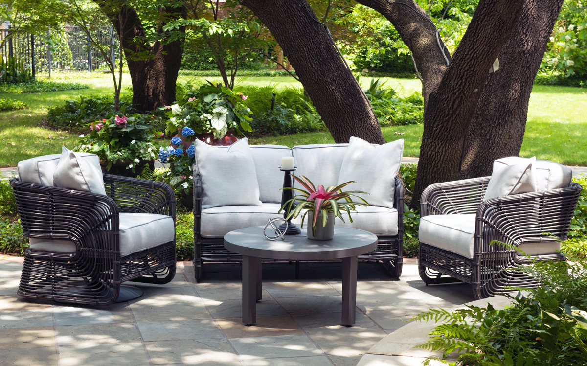
Patio perk-ups to expand the enjoyment outdoors – at both home and office – maximizing the livable exterior areas of either small balconies to expansive spaces, backyards, decks, improved landscaping, outdoor kitchens and fully-furnished furnished living spaces – are seeing increased attention to detail.
Woodard furniture – one of our favorites – has been designing and fabricating for well over a hundred and fifty years. Since 1934 they have perfected the art of metal furniture design and fabrication. As industry leaders, their expertise brings a collection of superior craftsmanship and a wide variety of materials and styles to accommodate both commercial and residential applications.
Let’s keep moving forward through this pandemic with positive vibes for creating enhanced living spaces – both inside and out – for more productive and enjoyable living!
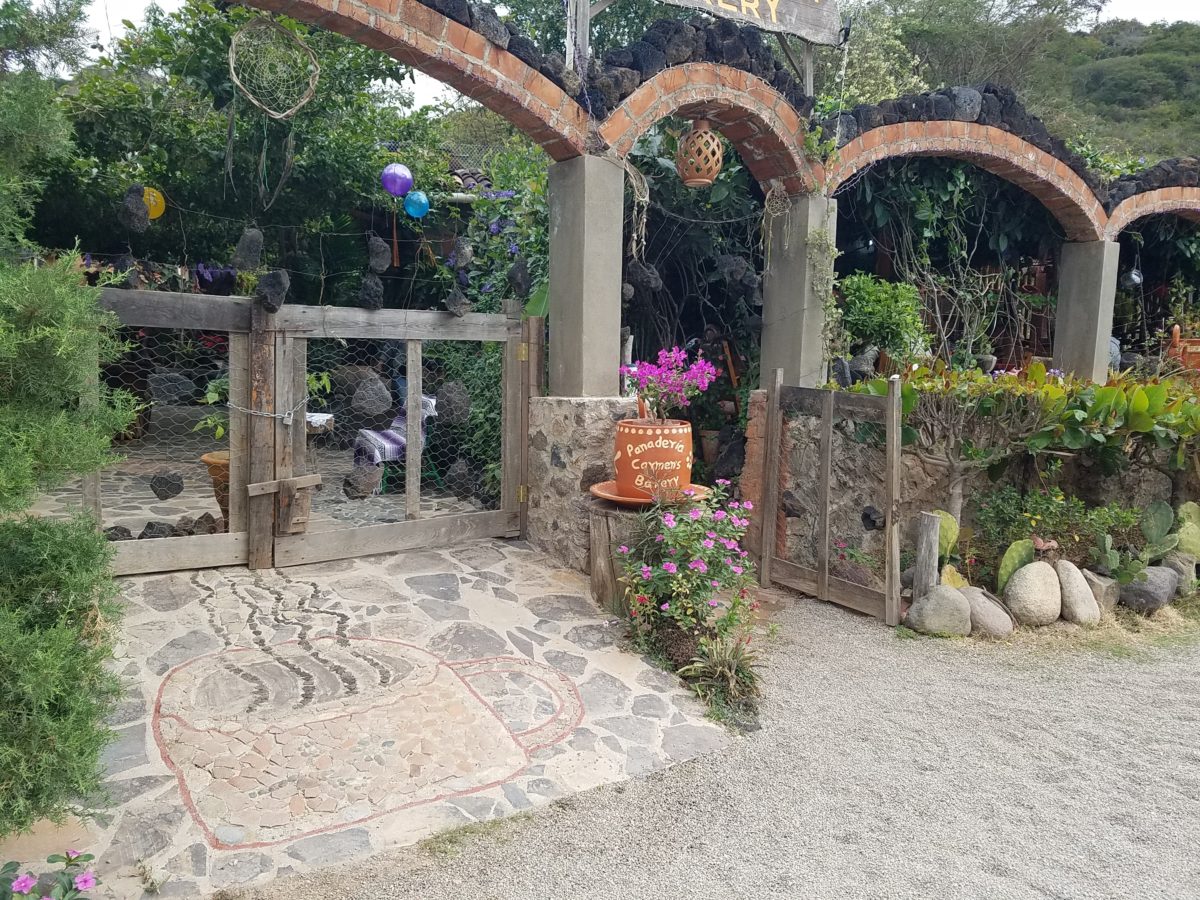
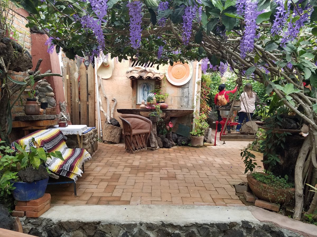
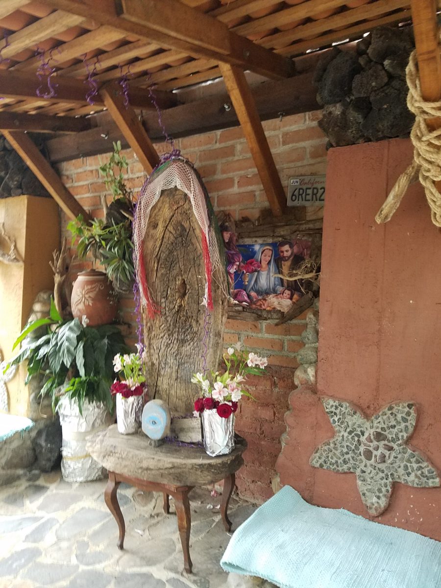
After experiencing and pondering the value of incorporating nature’s elements into architectural planning in the previous blog, I find myself winding into the countryside from sea level to a mile high into jungles and ultimately pine forests, across vast expanses of rivers and towering bridges spanning grand abysses…and stopping at a modest panaderia (bakery) on the side of the road.
You can’t tell a book by its cover as this simple little rural structure – standing alone – looked curiously intriguing and quaint enough, with an unpaved parking area transitioning to well-tended pea-gravel. Traffic cruised by, on the way across the bridge.
Those that knew, turned in. We pulled off the road and were told that this couple had a wonderful bakery and were promised an exceptional treat! Fresh empanadas that would bring remarkably satisfying mid-morning joy.
Very tidy and thoughtfully eclectic, this little destination bakery is a precious find.
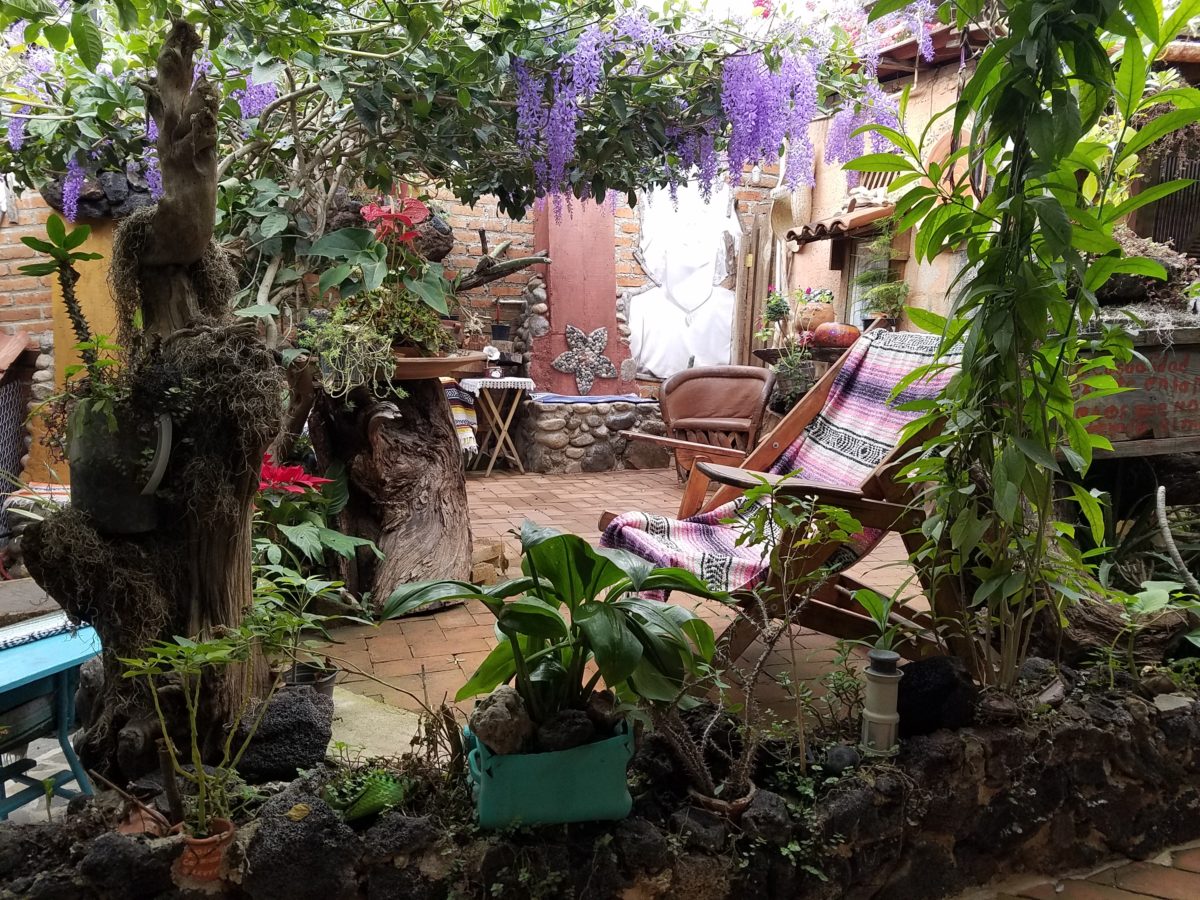
Oh, were we in for a surprise! At the entry, I stopped to shoot the whimsical cup of coffee mosaic set in a field of stone and concrete. I thought – what a fun design element to greet arrivals and set the stage. But I had no idea to what extent I was about to be elated. What unfolded so exceeded my expectations that I wanted to stay all day!!!
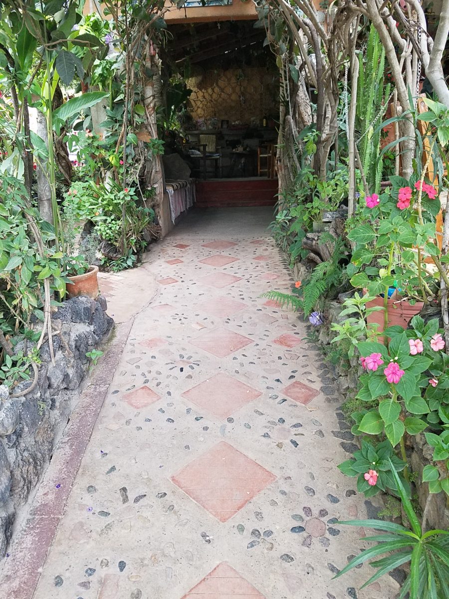
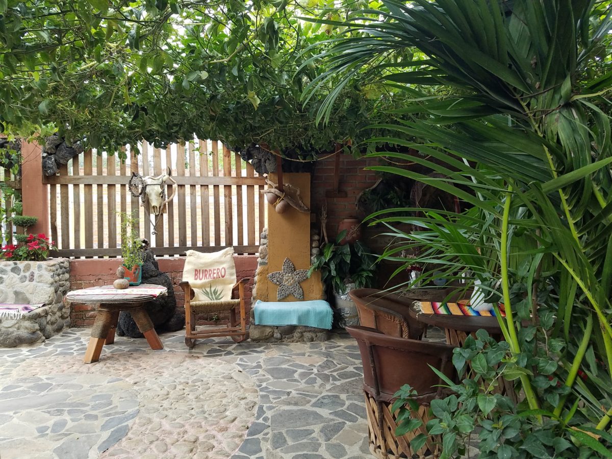
Happy stone and tile-work adorned the pathways. From the textures of stone and brick, tile and wood – it was an organic fantasy – an unexpected design experience.
Simple, yet spectacular – simply spectacular!!!!!
Ceilings of colorful floral blooms – perhaps wisteria – suspended from their vines and other plantings intertwined with the structure.
Spotless and meticulous the eclectic elements were a harmonious creation.Stone walls, wooden slats, vines and adobe all worked together to define the spaces.
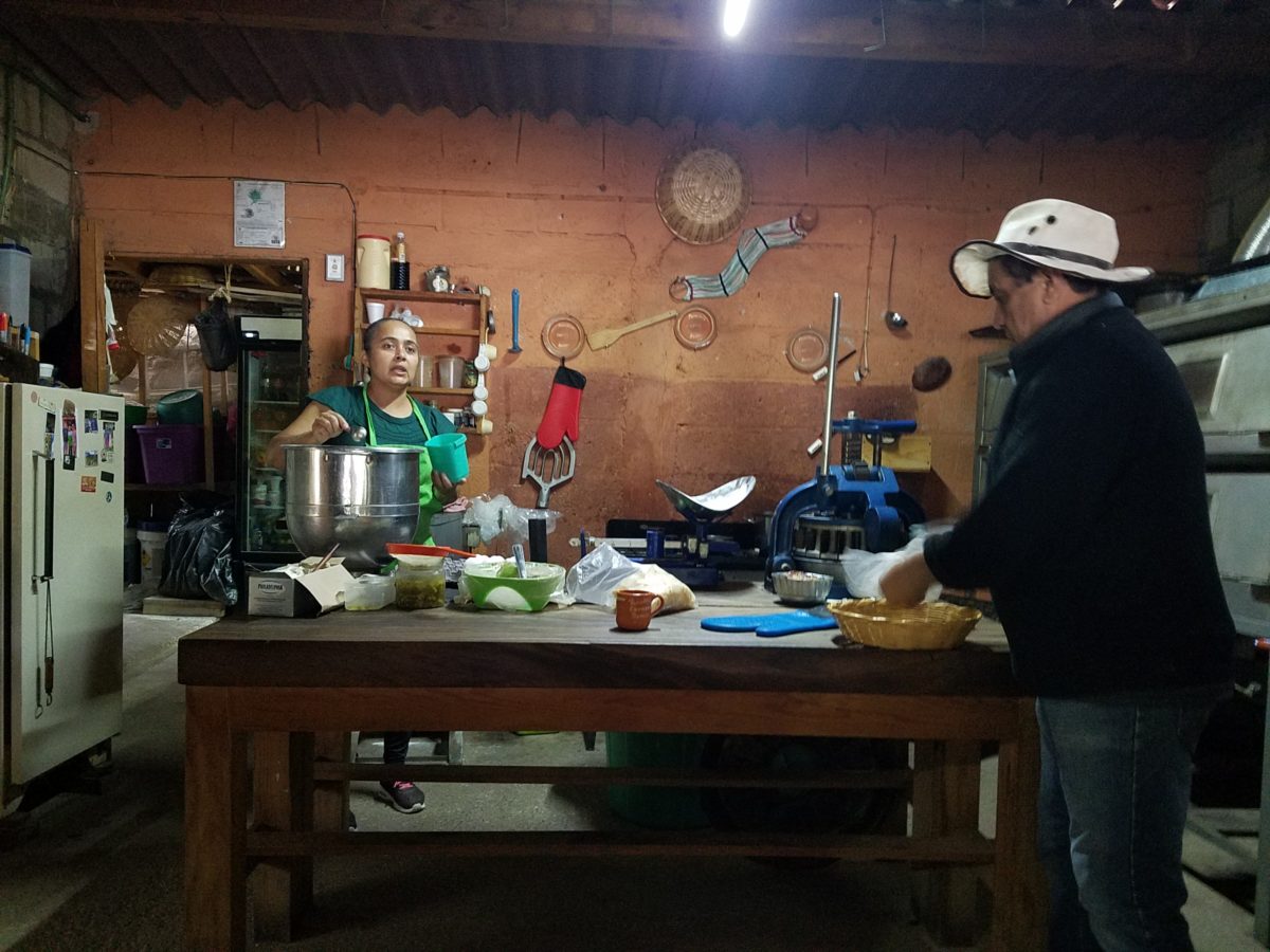
The wafting aroma of fresh baked goods – it was more than delightful. From warm savory clouds with mushroom filling and another with chile-laced sausages – and an array of sweet strawberry, cream and pineapple empanadas to corn muffins, banana muffins and more! All nestled beneath colorfully woven cotton tablecloths.
Light and delicious – the best empanadas ever!! With a tiny sprinkles of granulated sugar, for a sweet crunch, before sinking into the fabulous fillings! Muffins challenged any others and savory treats were so satisfyingly delectable. Little buttons of banana slices on top denoted which were the banana muffins!!
Rich Mexican coffee with a touch of freshly ground cinnamon and luscious hot chocolate were served in custom-glazed “barro ware” complimenting the fresh-from-the-oven confections.
The exhibition baking kitchen overlooked the serving line. The buffet of pastries thoughtfully explained by our gracious and welcoming host, Jesus!
Carmen presents fresh strawberry tarts just from the oven!!! A combination of old and new – tradition and technology meet in this cozy kitchen.
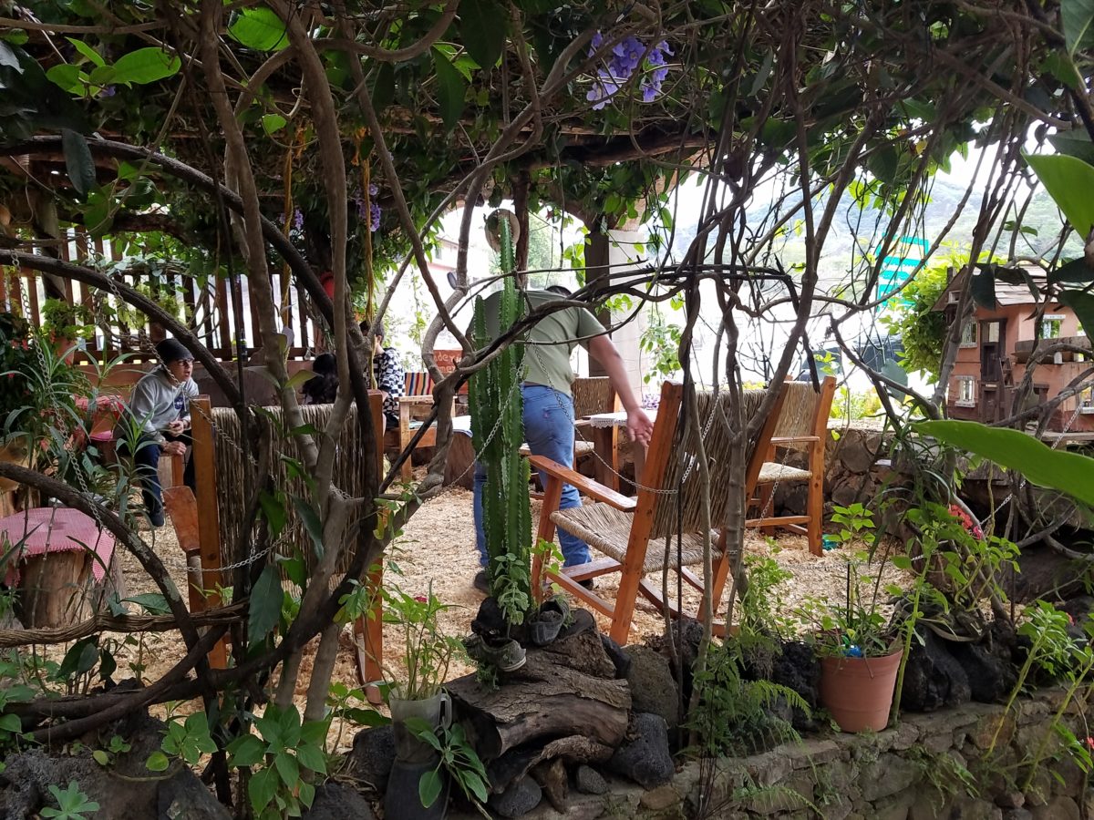
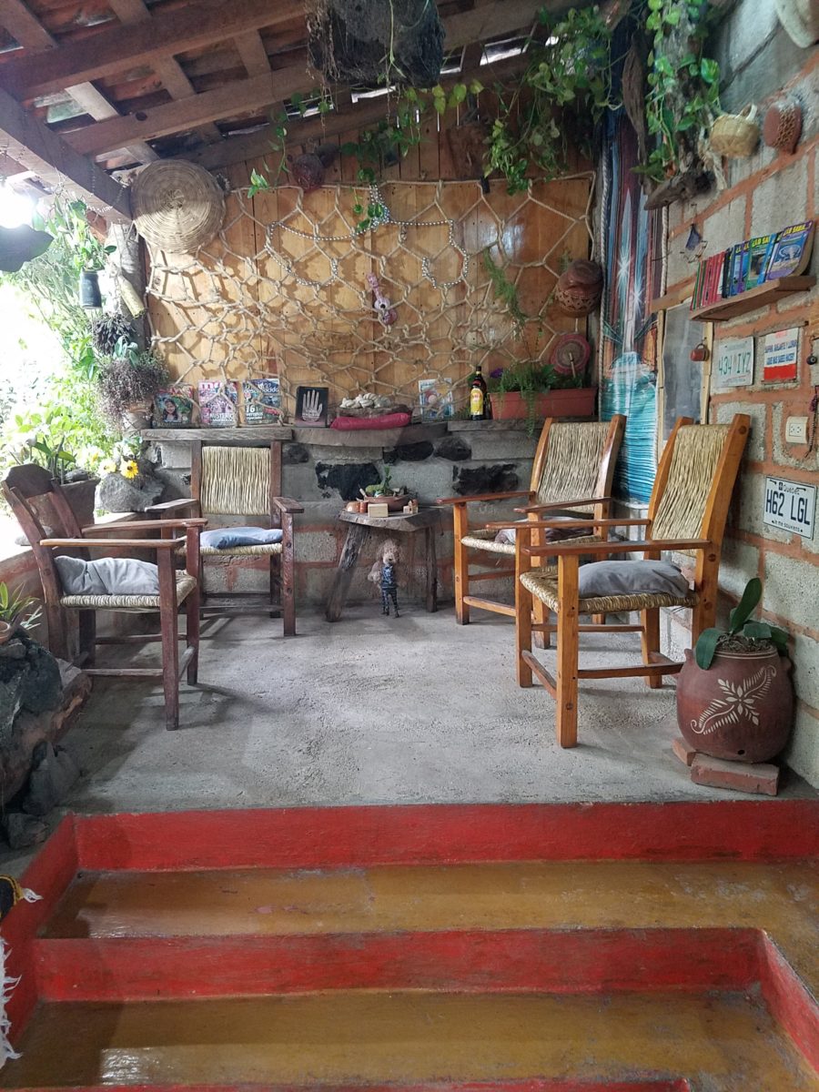
Fragmented spaces open, yet enclosed, offered intimate pockets in which to pause and enjoy.
Color-pops insert themselves effectively around the interior and exterior spaces.Inviting seating areas semi-concealed offer private repose. Tucked away – more areas to enjoy…
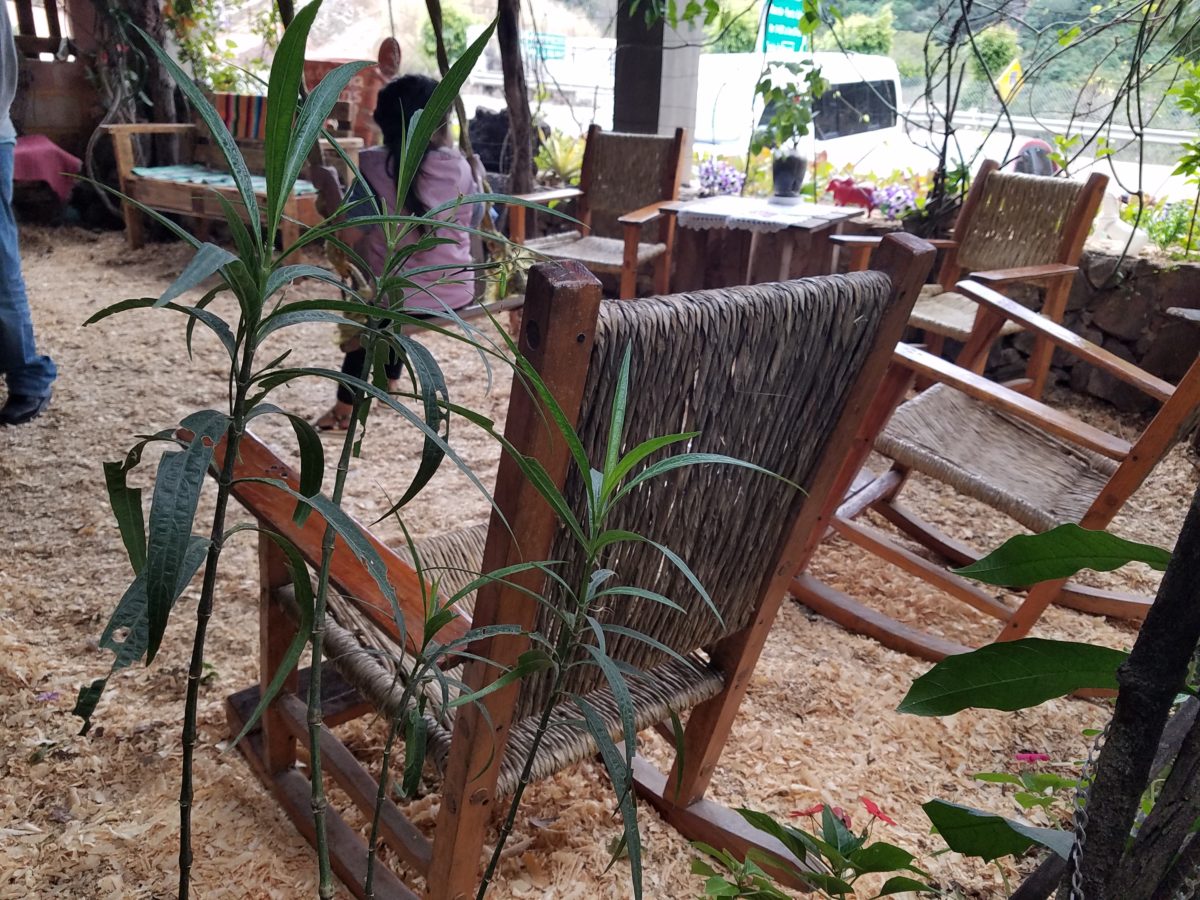
Clever use of clean blond wood shavings on the floor of the main covered patio created a wall-to-wall carpet of fresh aromatics complimenting the inviting aromas emitted from the ovens. Rocking chairs and rigid sturdy versions, with a fun little rope swing, all surrounded by tropical plantings made a cozy area to gather.
Soft underfoot and subtly fragrant – the wood chips make a great shag carpet!!!
As I meandered around exploring all the interesting spaces, textures, colors and plantings, I marveled at the sensitivity with which this had all been crafted and assembled. It was artful interior design with an exterior feel – open air and charming, with a decidedly handcrafted, Mexican sense of place.
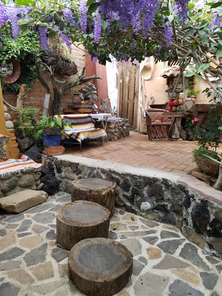
Slices of handsome tree trunks make perfect stepping “stones” with graduated heights.
It was an eclectic collage of furniture, structure and organics – living and static – that was welcoming and artful, delightful and so pleasing, that it was a treat for all the senses.
The cool morning air of the mountains mingled, with the comforting fragrances, creating an atmosphere inviting gentle conversations of people gathered around good food and artfully relaxed surroundings.
Peek in places and through doorways to find worlds of design
waiting to be discovered!!!
Neighborhood covenants, zoning, physical practicality, budgetary constraints…all enter into whether it is realistic or desirable to save vegetation when clearing land for development. Carving around existing growth can be a tedious and costly addition to a project. But there are times when it is a design asset – an imperative even – to the over-all setting and effect of the scene.
Saving trees when designing a built environment is a challenge
that often pays off.
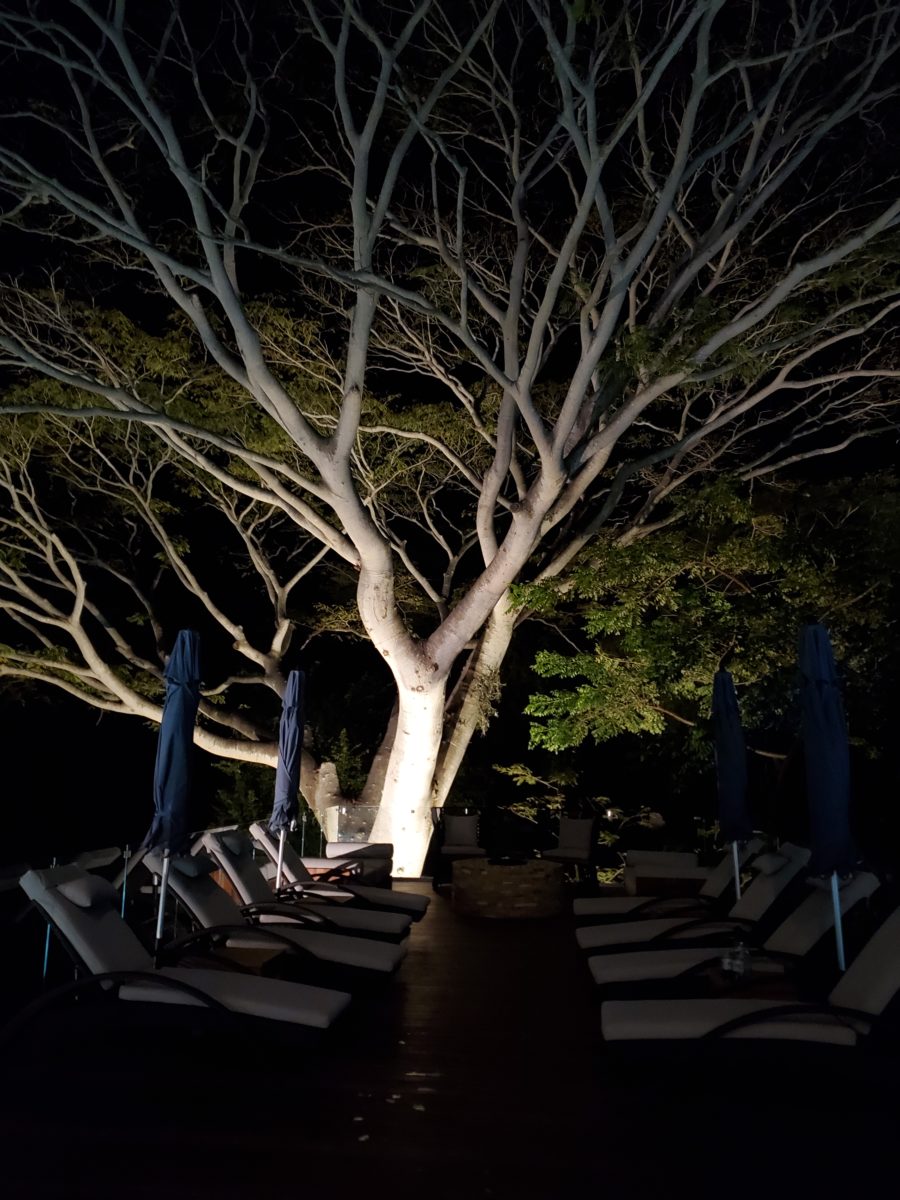
A spectacular backdrop to this seating area – the decades old tree is the focal point.At night – well lit – the same tree towers with dramatic illumination in the darkness as the rear “wall” of this seating area.
Raping acres of woods for barren subdivisions and adding back newly planted saplings the caliper of a quarter is unfortunate and takes years to satisfy. FHA requirements were the tell-tale token of bringing green back after a bulldozer’s brutal removal of all plant-life on a property. That lanky stick standing in the center of a dirt patch, that might get sod or seed…or rock, was a pitiful attempt to give back to the environment. However, in addition to broad-sweeping examples, individual decisions to saver rather than remove can prove valuable.
Years ago, when planning a patio expansion and exterior kitchen, friends brought the plans to me for a quick check before committing to the design from the design/build contractors that they had engaged. The new patio plan meandered along nearly the entire back facade of the house. With all the exciting kitchen layout and bar, seating areas and dining space, I instantly focused on the fact that their beautiful red-bud tree was gone – not in evidence on the pans! I exclaimed about it and was told that they were told it had to go. That was about 10 years ago – or more, yet it still stands today having modified the design to include a tree-well in the patio and opening in the proposed high-ceiling patio cover. The stunning multi-truck tree thrives, in the ground as it had for decades, and climbs skyward through the opening spreading widely toward the second story of the home. A wonderful, living, sculptural element, in the space. Good save!
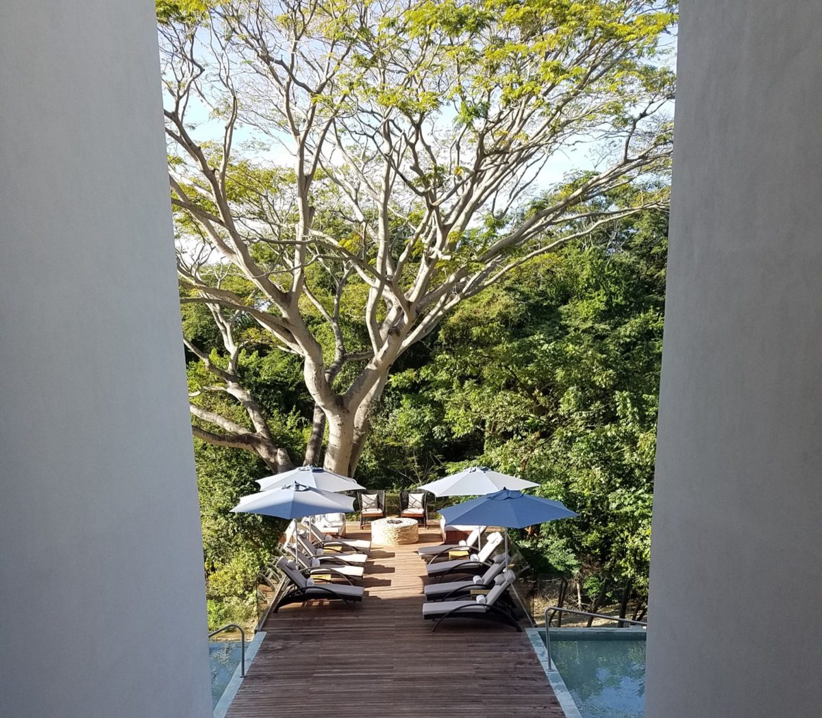
Warmer climates invite the indoor/outdoor melding of living spaces. We all try to achieve them despite bitter cold transitions and near, if not complete shut-downs “off-season.” But in the tropics, outdoor living spaces become remarkable dimensions to expand living.
Sculptural trees are powerful elements viewed from inside and outside.
This past week, that situation came to mind as I enjoyed several examples of incorporating nature into the design scheme. Yes, landscape design is just that. Landscape architects do just that. They design exterior spaces with organic material. But what I was feeling recently was two complimentary things – one that designing in and around existing growth is so satisfying and in some cases, the living plant material becomes the architecture – not merely compliments it.
In addition to their sculptural beauty, they add balance, scale and a canopy over the exterior rooms.
This past couple of weeks, we have see the results of 2 years of preparation and construction which transformed of a piece of partially vacant land into a seaside resort. Several key palms and a couple other key trees were saved and hundreds more were brought to the site to complete the design. The towering new trees showed signs of shock with their dried frond tips – but will surely survive.
What has been a foreground of some landscaping and virgin jungle ,with houses beyond, was bladed and terraced last year in preparation for a new project. Buildings and pools appeared, jungle growth was removed and a few key organic elements retained. The recently finished scene is dramatically different – incorporating specimen trees throughout the property into the new plan.
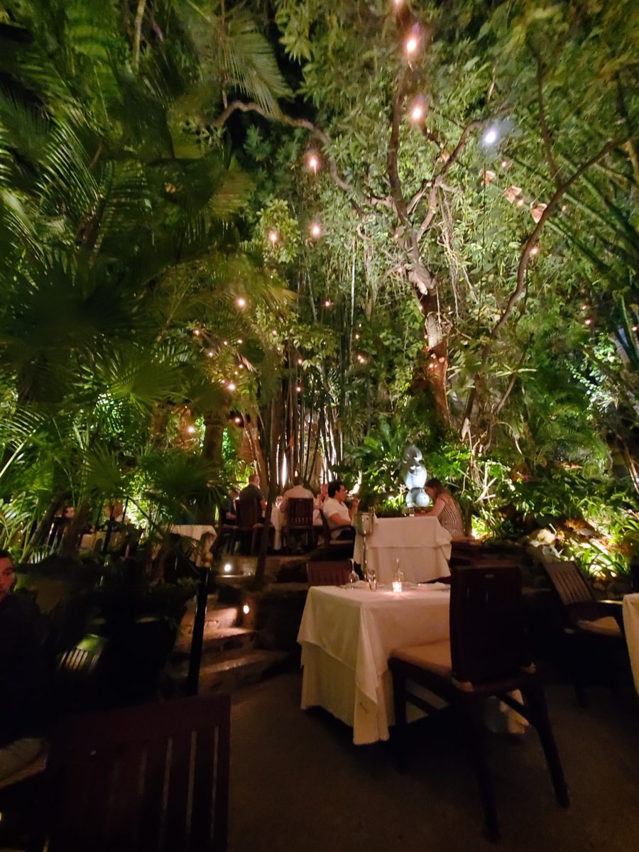
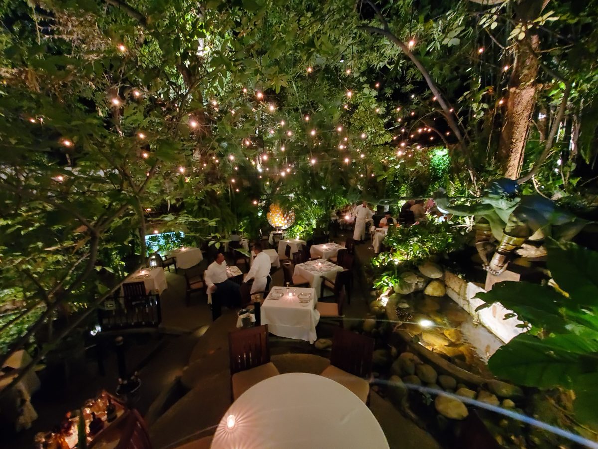
When landscaping becomes architecture you know you have crossed an exciting line. What I mean by that is to have the growth become walls – to have the vegetation read as though structural framework.
This terraced dining patio is framed by massive bamboo and other large trees and plantings. They are substantial enough to read like screens, if not walls, framing the space. From a canopy of growth, strings of LED lights are suspended as though from the ceiling – a ceiling of branches over this enchanting outside dining venue.
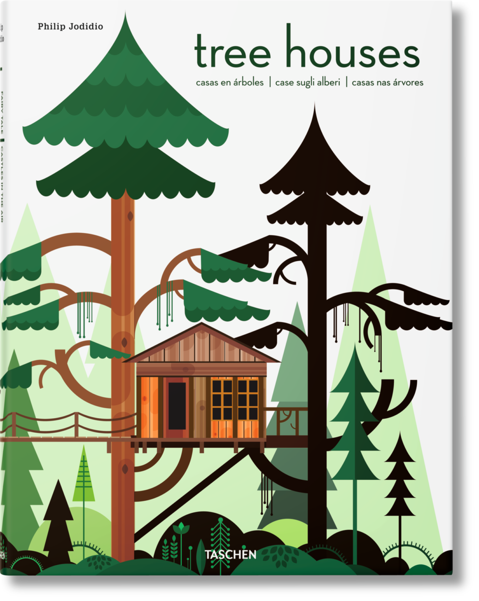
A tree house is another example. The tree is the structure – the framework to begin the additional elements that create a suspended room.
This entertaining and imagination-spurring book by Philip Jodidio is worth investigation. Here. find extraordinary examples of trees as the structure of other amazingly fanciful spaces!
By observing examples in your world, you will see, when designing around and in concert with the natural landscaping, the effects can be dramatic and of great value to the scene. On your next project, consider the possibilities of saving rather than removing – incorporating and celebrating nature’s design elements!
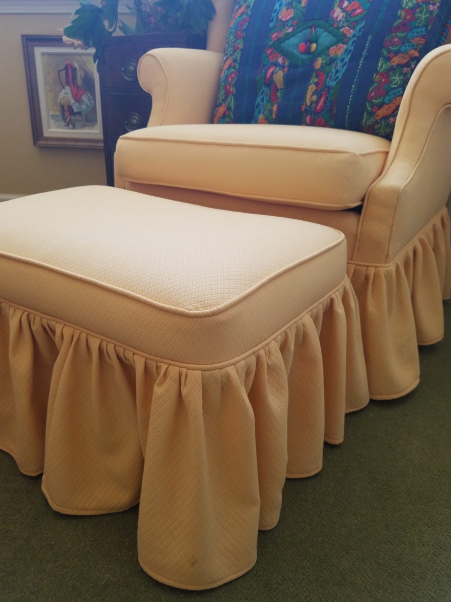
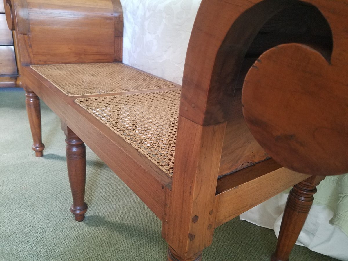
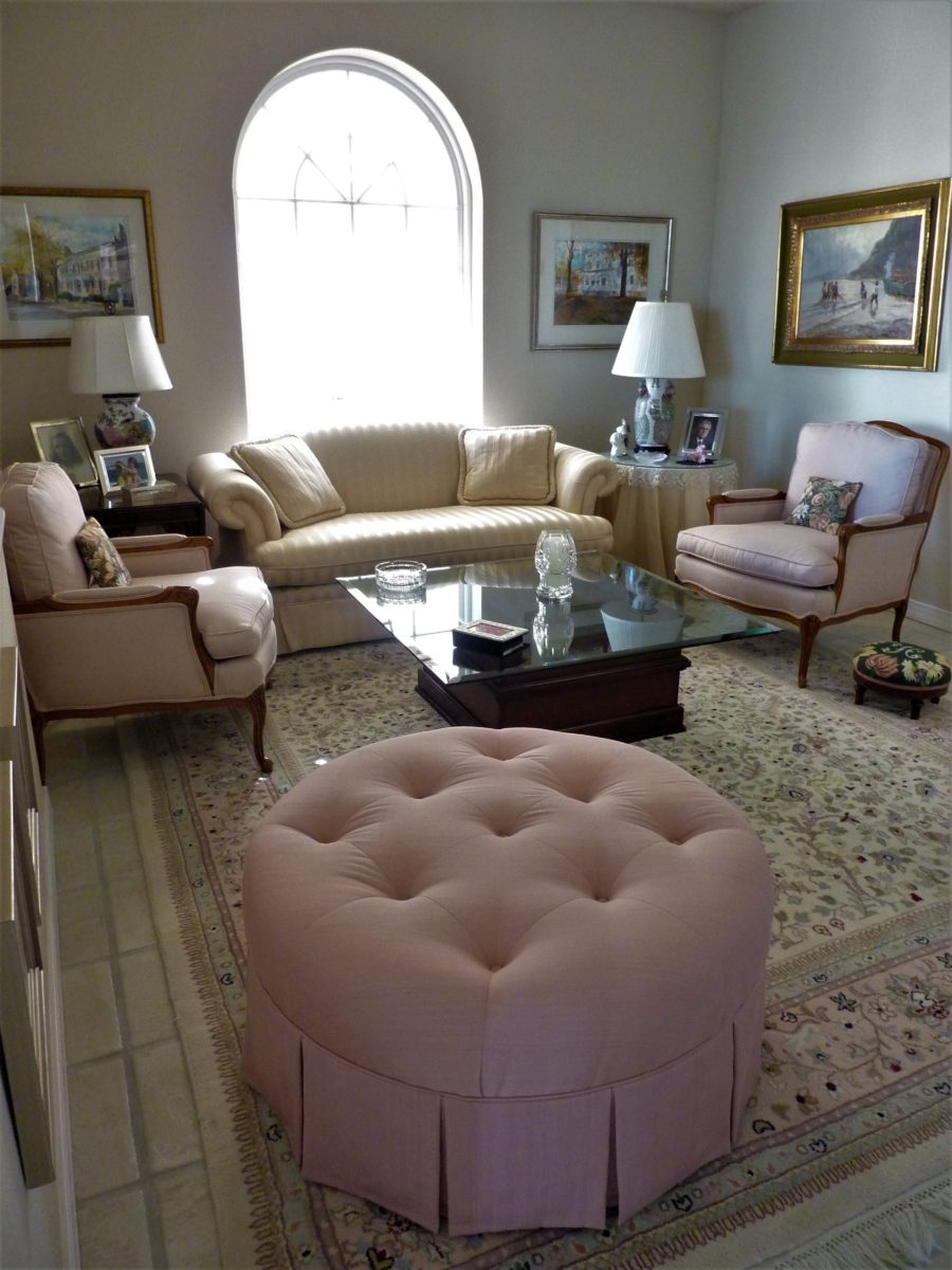
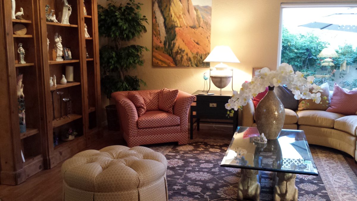
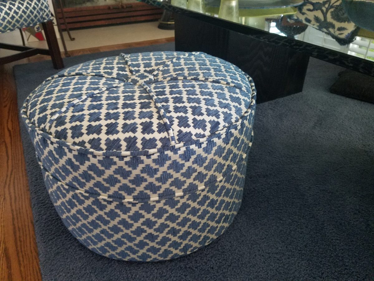
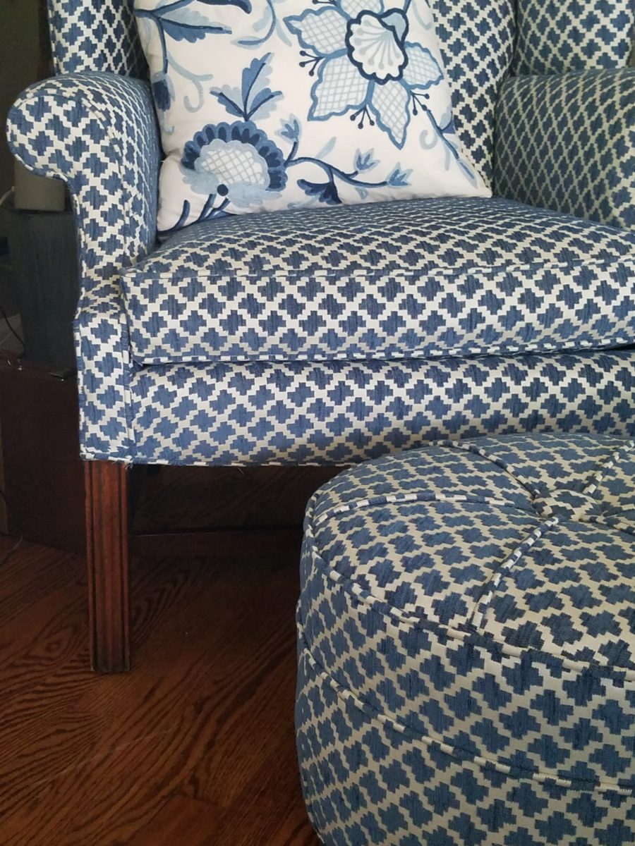
It’s always a good idea to have extra seating, but in small spaces, it’s not always easy to make a room arrangement work. Apartments, lofts, condos…pulling up dining chairs isn’t necessarily the best solution. What is a great solution is something low that does not block the scene and can be easily moved to change the groupings.
Footstools, benches, poufs, ottomans…as an ensemble with a chair or a stand-alone piece, the options are endless. Trends are often spawned from necessity or convenience of not change for the sake of change.
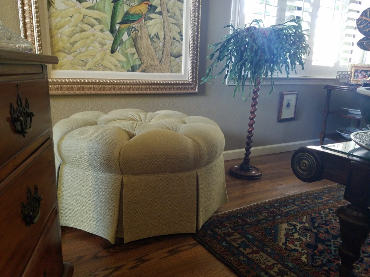
Bedrooms can also offer footstool/ottomans when there is only room for one chair. For reclining to read or as a pull-up for a second seat.Benches are a great seating option.It’s not a wonder that we have sold numerous of these clever SURYA Cotton Poufs in myriad colors in our shop!
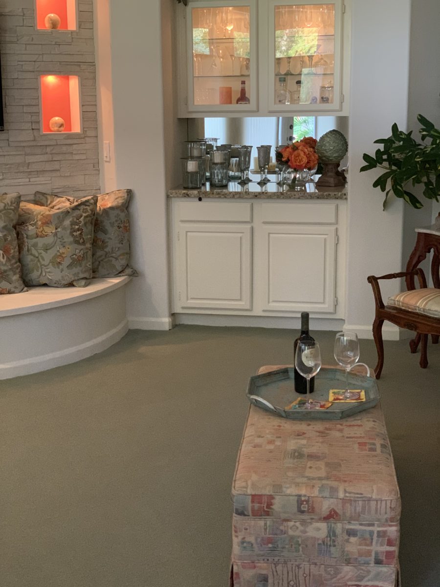
Often used for coffee tables – with a tray for stability beneath drinks, benches or ottomans can double as a foot rest or table-like surface.
An upholstered bench can be pulled in front of the fireplace or used as a cocktail table with a sturdy tray.
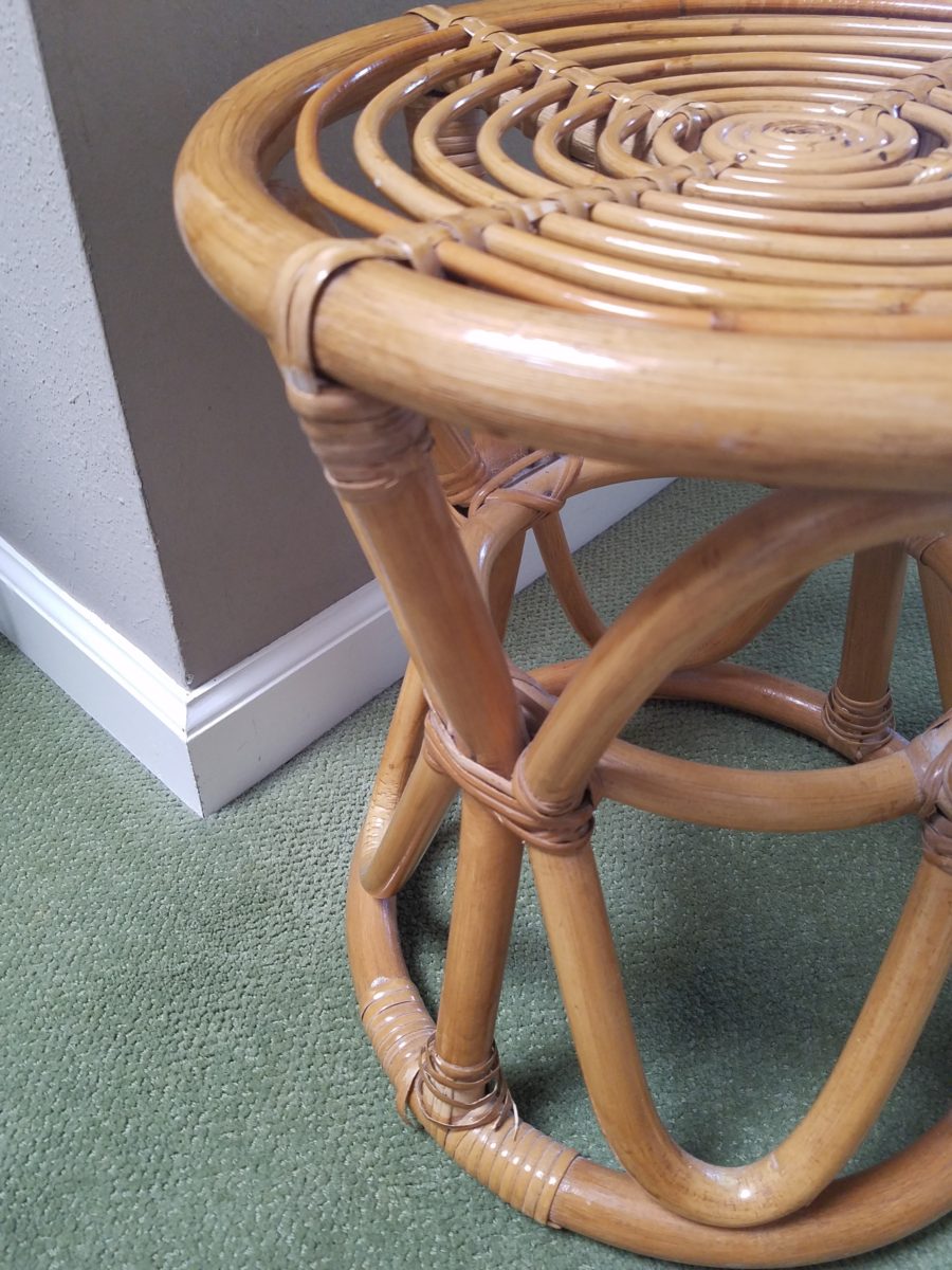
Something as simple as a rattan stool can be easy to pull-up.
A pair of ottoman frame a seating area. An ottoman never has its back to anyone or anything.
You can seat more than one person on a good-sized piece.
A round one can have guests facing different directions to join in different conversations around the room.
Low in front of a fireplace, tucked beneath a coffee table or a console table, they can easily be pulled out when needed.
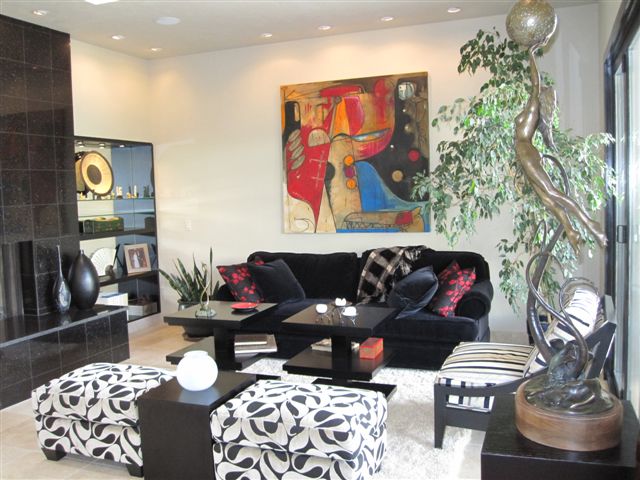
Here a pair of square cubes are stowed beneath a console and pulled up to the group for extra seating.
They add a splash of color or pattern.
Or they can meld in with the color scheme.
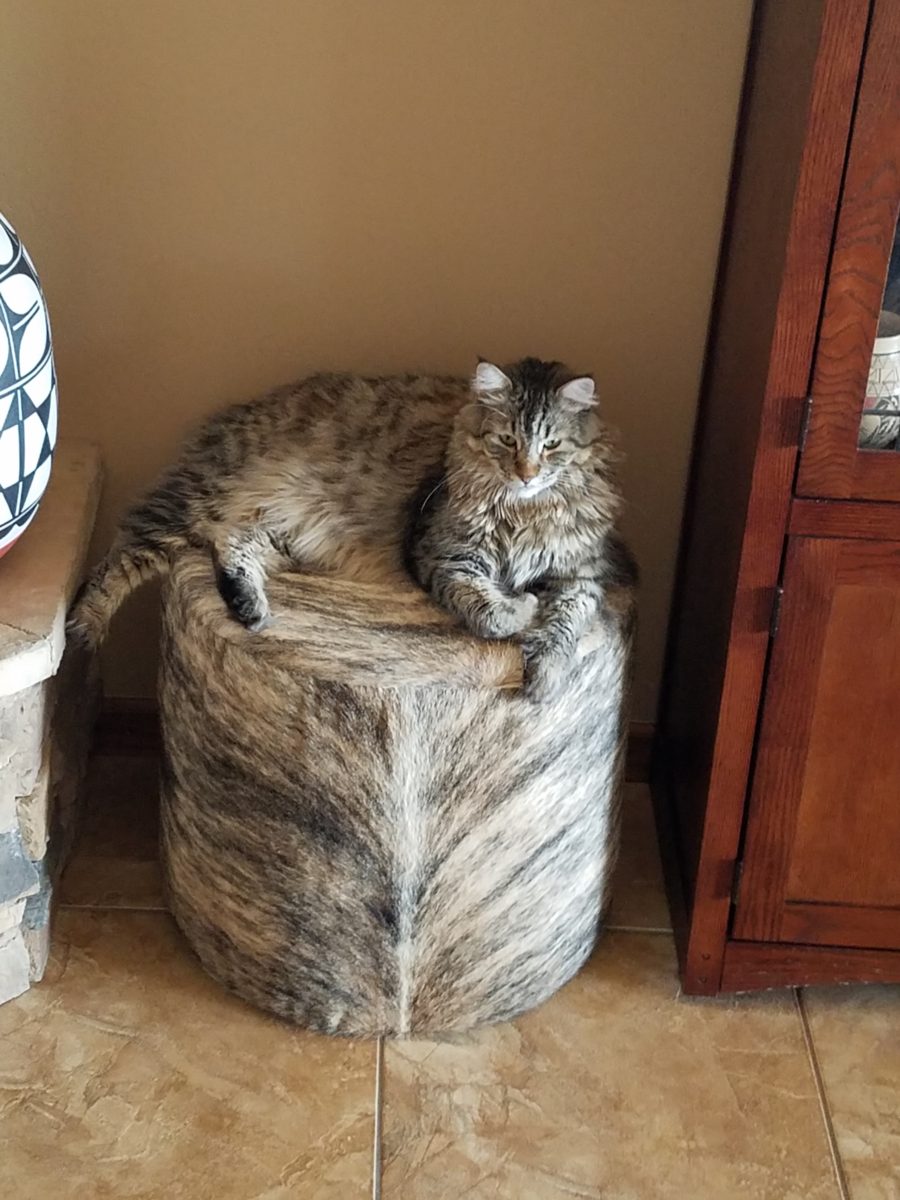
These cats think they are hiding on these custom fabricated cow hide stools. Cow hide camouflage makes the perfect perch for these cats…but they are intended to be handy for guests as pull-up seats around the coffee table in front of the fireplace.
Look at your room and see if it wouldn’t benefit from an extra low-profile seat or two.
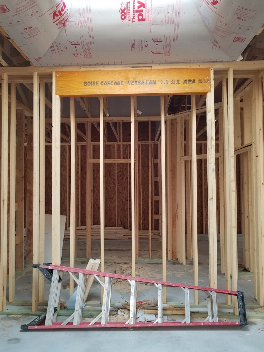
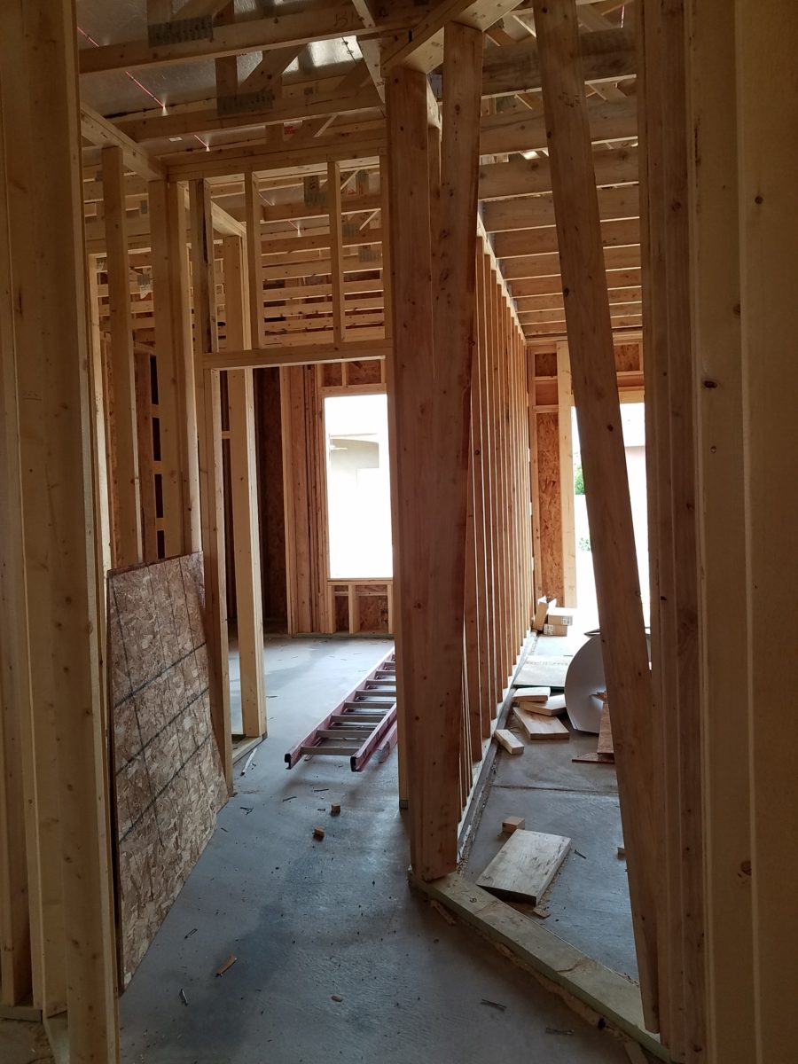
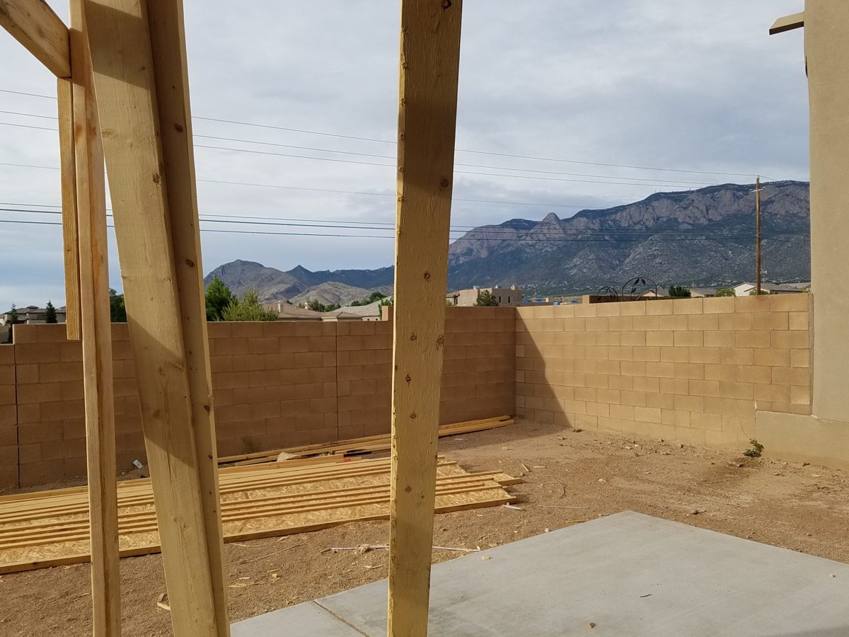
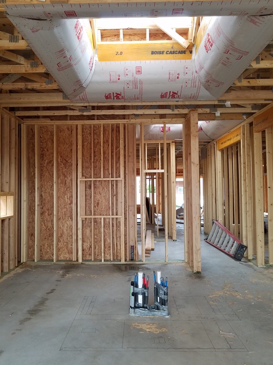
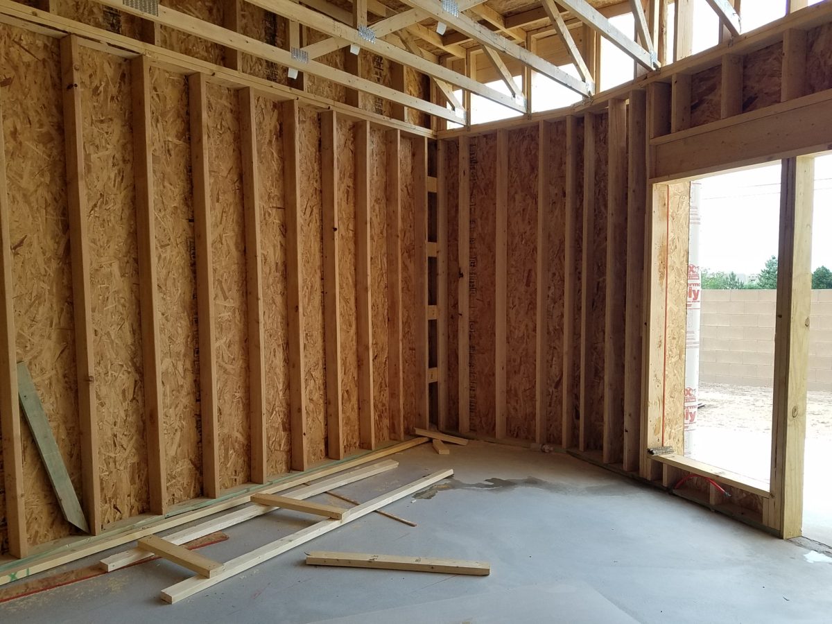
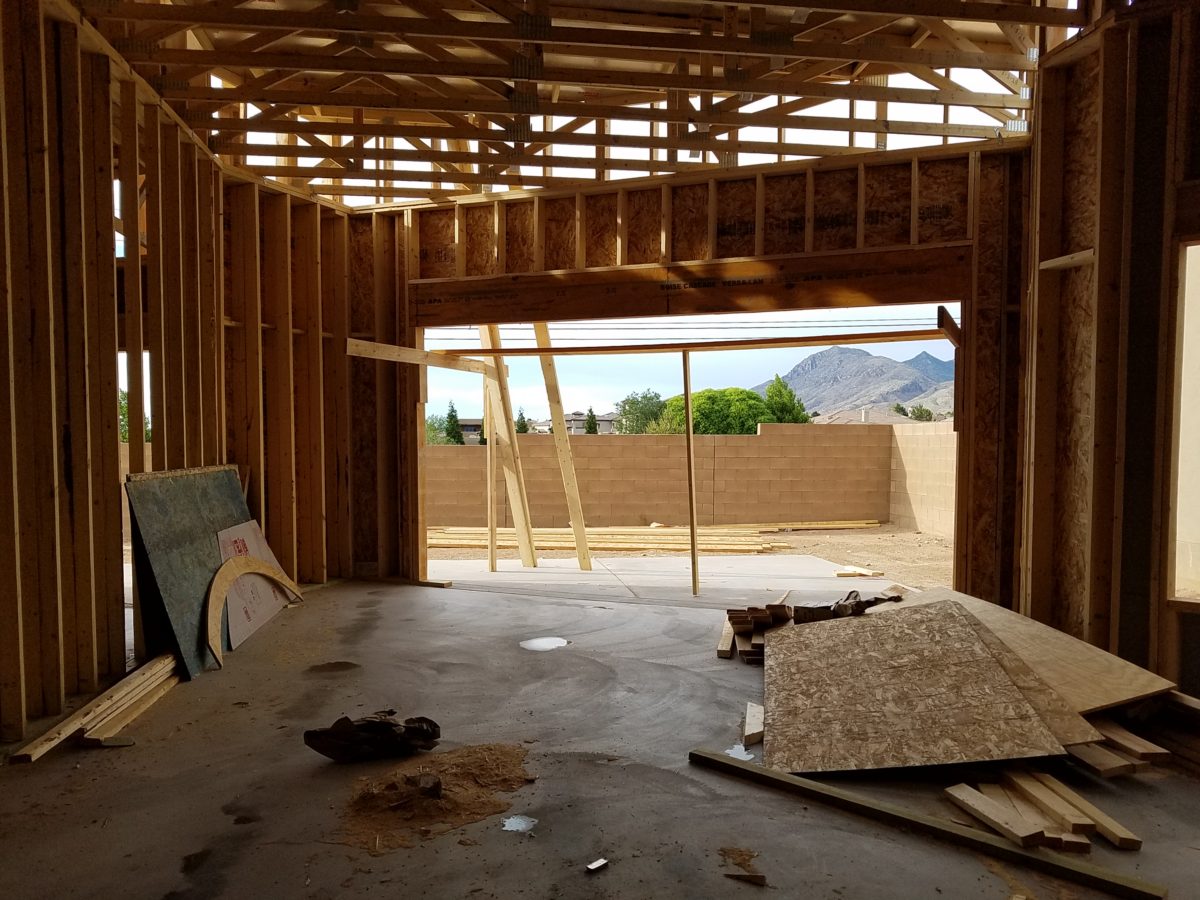
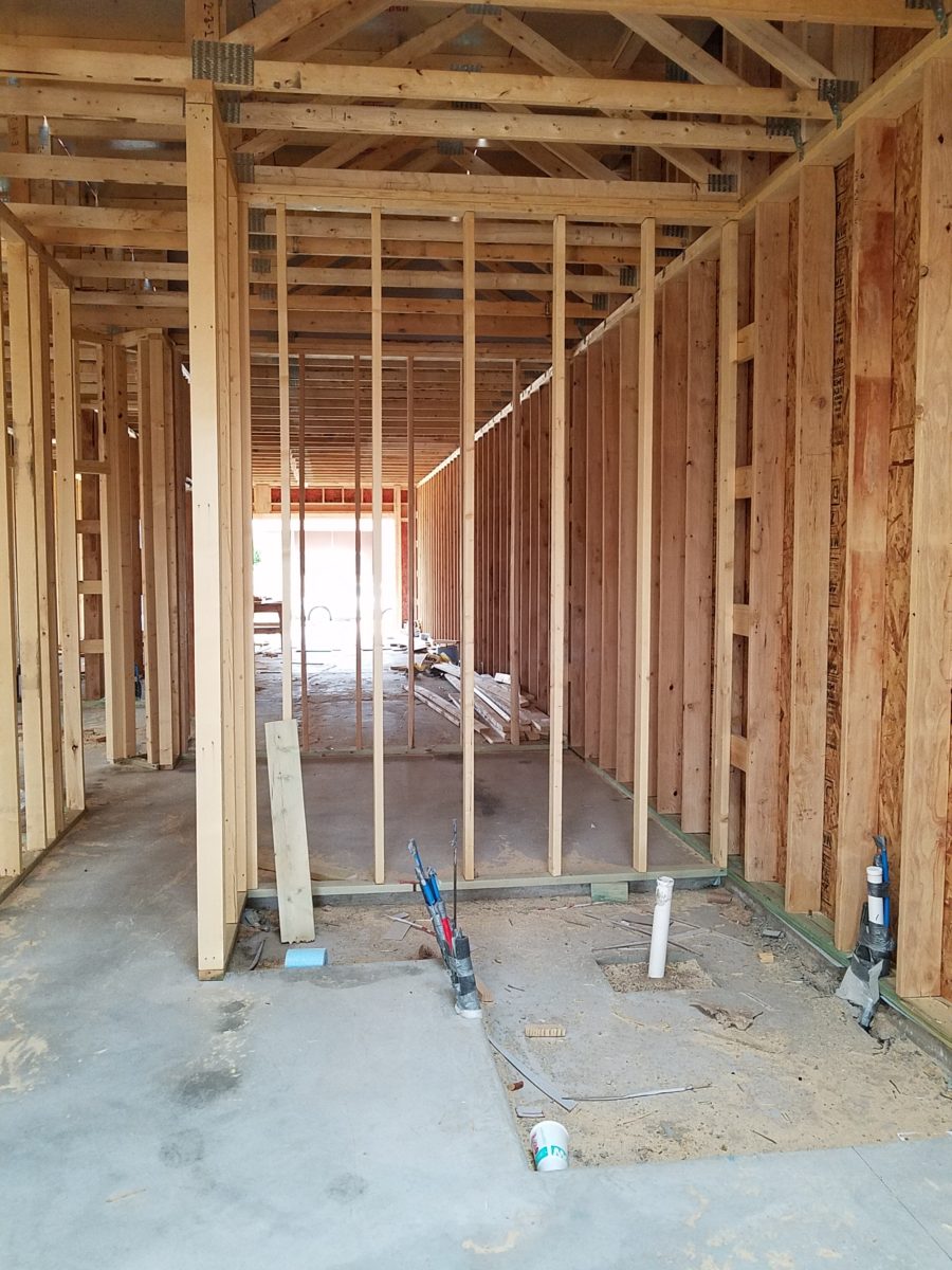
Building a new home? There are many ways to go about it. Here are a few photos of a semi-custom home, in the framing phase, that is currently under construction. Watch for a future blog featuring progress photos and finished shots!
Upon arrival, here at the entry, is a recessed niche – or as we say out here in New Mexico, a nicho! It is a perfect focal point, yet the dimensions are not illustrated in an elevation. The owners have an opportunity to have it sized for an existing piece that they own, plan for a custom piece or allow it to be framed-out by the contractor, without further specification, and find something that works.
From a tract home, with all the decisions distilled to a narrow selection featured in a model home and/or sales office…to the very custom where the owners select everything, from a world of choices with their consultants, there are commonalities that are worth noting to assist with the process .
In the tract home, a price for a finished product is presented and all standard, pre-priced details are included – within a range of narrow selections. The selections are recorded, but not often incorporated into the plans which are is usually generically pre-designed. Changes are usually not an option. It is efficient, for both contractor and owner. In full-bore custom projects, all is decided, selected, designed and recorded on the plans to the last detail prior to pricing and breaking ground. All costs are identified, yet changes are often in the mix as owners have new ideas that they have the prerogative to change. They exchange or pay for every modification – every “change order”.
In the middle is the “almost custom”, but still packaged product. This is a package that is presented with pre-established designs and details, budgets and allowances. Potential buyers are shown examples of homes – models or occupied recent completions. A cost for construction is determined based upon square footage and amenities, as illustrated in the examples. This is a great way to get a more custom home with easier to execute plans and design details.
Which process best describes your project? In any of these new home design and construction approaches, there are similarities that challenge the owners along the way. Even for the seasoned professional, circumstances alter cases (changes in availability of materials, weather delays, clients who continue to visualize, imagine and fine-tune their ideas and involvement in the details). All can challenge the schedule and alter the intended smooth progression of the project.
With the tract home approach not many, if any, of the on-going wish-list items can or will be implemented. They are not set-up to make changes, alter plans or deviate from offerings and the signed-off package, in any way.
In the very custom design-from-scratch home, with the “world is your oyster” approach, changes are welcome and accommodated – after all, that is the goal – to create the perfect home, for this client who is paying for the flexibility, world of choices and luxury of it all.
In the middle is the interesting situation where the owners perceive custom flexibility, have budgets assigned and make selections based upon those numbers. Once these numbers are created to establish the budget, examples are usually presented so the owners have an idea about what their dollars will buy during the selection process. Often that method is a bit unrealistic. As estimators know, this is a tedious process – yet presenting it, in an overview, seems easy.
After examples have been shown, floor plans drawn, finishes and other design details have been budgeted, the owners sign-off on the basic idea of the home and then set out to fill-in-the-blanks. What will the flooring be? What light fixtures? What door hardware and finish? What sinks, faucets and towel bars? What countertops? What wall tile, paint or other treatments? It is usually not until that very process of assembling all the selections that an owner will know if the budget they created will satisfy their ultimate needs and desires.
With this sense of “custom” paired with the packaged example, comes the owner’s complacency – through no fault of their own – to miss details that arise from the attempt to create a unique product, plan, design – but without having seen the actual example. It doesn’t exist – anymore than it would in the very custom home. That’s why it is unique. However, unlike the very custom home, where there are layers of design assistants from architect, interior designer, lighting consultant, A/V consultant, landscape designer, general contractor, and subcontractors who work together to best explain options, implement wishes and get it all on paper for clarity, the middle approach proceeds with pre-determined practices that don’t require recording on plans and rarely elevations, as all is based upon an expeditious course-of-conduct for the like-kind of homes presented, at the out-set. But having seen the examples/model/features, the homeowners make their plans guided by the project managers which might include a general contractor, subs and a few hours with an on-staff design consultant. Inevitably details are over-looked in the process.
Here are a few tips
for proceeding with a new home project.
Don’t be afraid to ask for sketches of design details or
photos of examples.
Walk through the floor plans, in your imagination. Start at the front door and shut your eyes and try to visualize the progression. Make notes along the way. Do the same from the garage or any other alternative entry, into the home. I will suggest you do this several times – each time with a different focus.
Be mindful of window locations…exterior fenestration and interior placement as they relate to furniture and artwork. Consider them both from inside and out! One they are framed and ordered, this is either difficult, expensive or impossible to change.
The first focus might be to walk through from each exterior entry and visualize where the light switches are located and what they operate. Do you want some of your switches to be three-way? This means, for convenience, that there are two different locations to switch on/off the same light or appliance.
Secondly, as you walk through the spaces in your mind, picture if there are things that you wish to highlight such as a piece of art on a pedestal or painting on a wall, sculpture in a niche or even a spot on a table for games or hors-d’oeuvres. Some things might be lit by free-standing lamps – depending upon where they are located. Beware the dreaded, but often necessary, floor plug!!
Light fixtures….locating the power sources – the junction boxes…will you have recessed fixtures, surface-mount, suspended, or wall mount? Consider the heights of the ceiling, what is centered or not, from where you will see the fixture, and where you want it to illuminate and how. This will help plan the location of the j-boxes.
With changes in technology, wireless systems, phone apps, etc…these details will change. Know the pros and cons of advancing technologies and select the best for your present and future needs. Consider the longest period of time you will be in this home and design accordingly – aging in place.
Consider what things are easy or cost-effective to modify later, if needed, and what makes sense to install initially, to be the best investment. This might be temporary light fixtures, in favor of more expensive ones once you recuperate your cash-flow! Perhaps you don’t need glass shower enclosures at the outset – can be added later…additional cabinets…many things can be upgraded later. While other items such as the flooring material, cabinets/countertops, wall treatments, skylights, electrical sources and others…should be considered in the first-pass.
At every turn, when you are walking through the space in your imagination, see your focal point. As you enter – what is dead ahead? As you turn to the right – what do your face? Do the same to the left and make your way through the house and see each focal point, in front of you, to determine what will be placed there, how will it be lit (with each exercise – imagine daytime and nighttime), does it require power, is there enough room to place the piece you intended to go there? Inches might count.
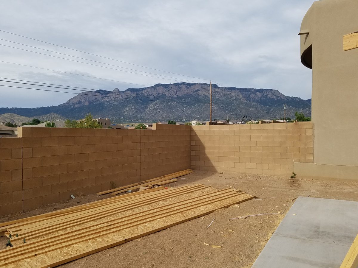
While walking through and around the plans or even during the early stages of construction, also look out the windows. What do you face? What do you see? Capture views and avoid what you don’t want. Should the wall be higher? Will this be a landscaping opportunity or necessity? Check patio covers and light sources. Consider the compass – what faces what? Seasonal temperature considerations are worth a nod. And think about exterior lighting.
A spectacular upgrade of over-sized sliding glass doors and flanking windows were selected to maximize this view…only to learn, after the slab was poured and framing up, that there was a massive corner column planned to support the yet-to-be erected patio cover . A modification was still possible, by sharing the load on two separate well-spaced columns and cutting back the patio cover between them to avoid a cantilever that was said to be cost prohibitive.
Check to see if things, inside and out, that should be centered ARE centered. And if they don’t, make sure from all angels that it won’t matter – or will in some advantageous, artfully, asymmetrical manner.
Per the plans, the island was not centered beneath the skylight. The cabinet-maker was doing his field dimensions and asked it this was the desired position. To which we replied – no – as it impacted the location of the pendant lights in addition to being off-center from the skylight.
Furniture layouts should be placed on the plan before you finalize the plans and certainly before you break ground. If you visualize a sectional sofa from which to watch the TV – make sure you can plan for one that exists. If it is from a sofa that you will view the TV- is there a space for an adjacent guest? Make sure some collection of desired furnishing or possibilities is realistic. If you have actual pieces you own – it is an imperative and so easy to accommodate on paper before the slab is poured and framing begins.
By not centering the bed and coordinating TV and dresser which was intended to occur on the opposite wall, the master will have a entire seating area off to the side. Had the recessed niche for the TV along with wiring and backing installed for the articulating wall-mount bracket, the bed and flanking nightstands would wither have been forced to center or been awkwardly off-center to best utilize the floor space.
As previously mentioned, beware the dreaded floor outlets – will you need them? Layout the furniture, to have the best chance of getting the location right.
Yet-to-be installed fireplace, in the far corner of the room, dictates the furniture placement. Floor plugs will allow lighting to be located, on floor or tables, away from the wall – floating in the center of the space. They were placed prior to a furniture layout having been specifically planned. This might pose a challenge.
Ask friends for their opinions. Examine their suggestions from every angle. Don’t wait to ask friends for their opinions too late, in the process!
A fun snail shower enclosure will have no door…but the placement of product niches, termination of the wall tile and transition of the floor tile are critical details.
In any approach to this process…plan. Don’t guess anything that you don’t need to guess.
In about 3 months, this patio will be in full-swing for entertaining. Hopefully all the anxiety of the process will be left behind…….
Be prepared to have new or changing ideas as things proceed – but prior, proper, planning will better serve the entire process.
Don’t be that guy like in the old joke about purchasing a vehicle…after signing the purchase agreement, you realize something is missing and mention it to the agent who replies, “Oh, you want wheels on that car?”
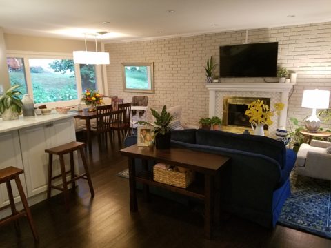
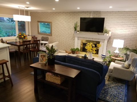
As an adjunct to last week’s story about the progressive young couple and their dramatic kitchen remodel, I thought I should finish the subject and tell about the adjacent living room transformation and comfortable family room on the lower level.
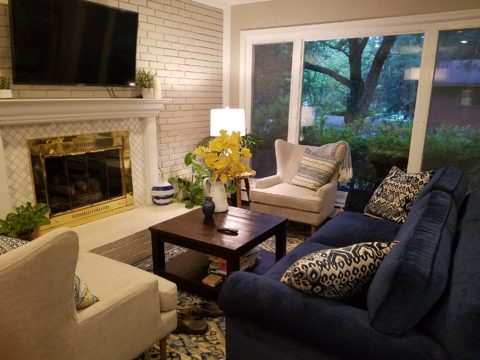
When the kitchen grew to become the focal point upon entering and the bar counter expanded into the living area, it reduced that space to now become a comfortable sitting room for guests to gather or the family to relax while activities are brewing in the kitchen.
Looking through to the dining room where a built-in storage bench was added along the window wall, offers additional seating. A new fabric-shade chandelier softens the light levels. All lighting in this remodel are on dimmers.
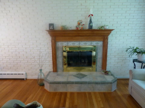
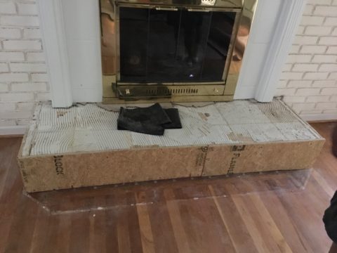
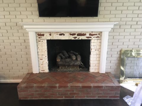
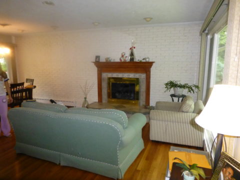
The former white brick wall had gently rubbed edges to suggest a distressed condition exposing the red brick beneath. The fireplace had an unrelated golden oak mantle and surround with insipid tile inset also used to cover the hearth. The tile was a glazed faux marble with a Victorian design accent feature.
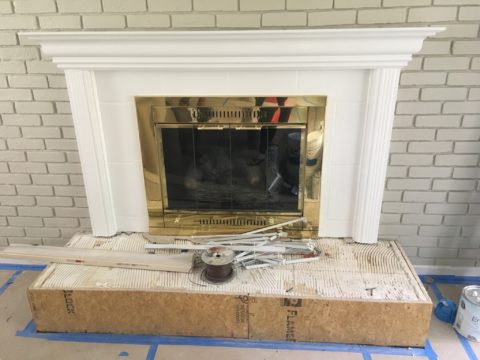
By simply painting the oak white to match the rest of the wood trim throughout the home and also painting the brick a soft taupe/grey tone, the look was instantly transformed. But they still had that awful tile…so here’s a design tip: to buy time either while you decide or until you save-up for the next phase, paint the tile away!!! To accommodate a new TV that is to go over the mantle, the wood surround was shortened. Notice the extra piece of wood trim that was removed to lower the mantle.
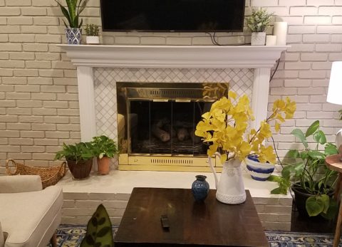
The hearth was removed and rebuilt (without the cut-off corners) with brick and painted to match the wall. Lucky for them the hardwood floor went beneath the hearth – so when they modified the size, they didn’t have to patch the floor! Tile was removed and replaced with 2×2 mosaic Carrara marble to coordinate with the herringbone mosaic of the same marble in the new kitchen backsplash/wall (see last week’s blog).
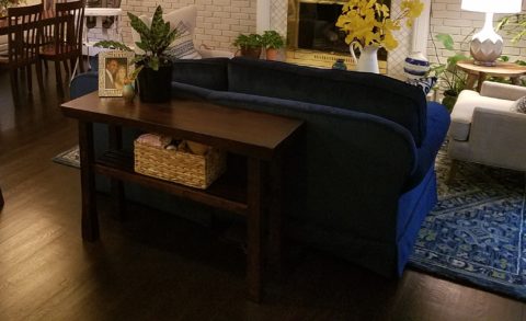
A sofa found, for nearly free, was in good shape and reupholstered beautifully in this plush, durable navy solid.
The classic blue and white motif was punctuated with organic yellow.
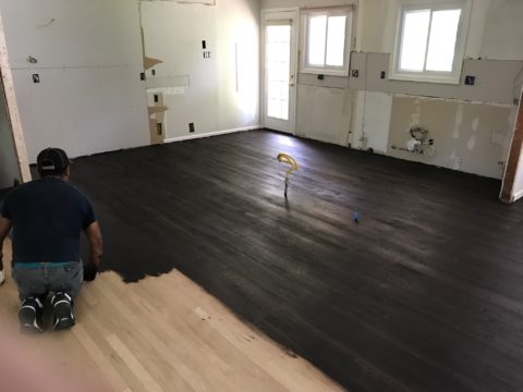
The newly refinished original hardwood floors – taken from a golden oak finish to a rich espresso/walnut stain…
…with the blue and white wool hook rug creates a handsome contrast. The rug actually “reads” blue and white, but upon closer inspection has warm khaki tones, soft turquoise detailing and is quite complex.
This revitalized cozy ambiance of this new sitting area/living room is perfect for this growing young family!
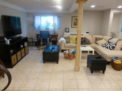
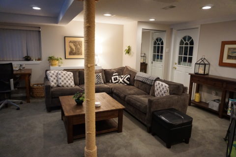
And for a more expansive gathering space, the lower level family room received a new sectional sofa in a durable charcoal fabric and a low-pile small diamond patterned wall to wall carpeting to conceal what had been cold tile floors and make a comfortable room for all seasons!
Purrrrrrhaps someday they’ll have a cat to climb that crazy rope-wrapped pole!!!!!
We all know that traditional housing floor plans are changing to maximize smaller footprints. The result is a more open layout. This preference, often seen in “loft” design where warehouse space is converted to living spaces – without many walls and with an eye on the interestingly industrial finishes of the existing space. But this same concept applies to new home construction for starters or down-sizing to smaller homes and is definitely applicable in remodels of existing traditionally compartmentalized plans.
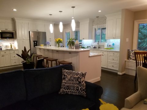
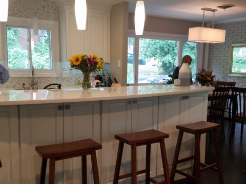
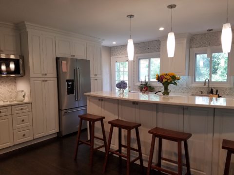
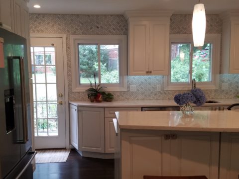
Lifestyles too have opened kitchens. Although often to maximize smaller spaces, they are also more open as cooking is more celebrated in the home and related activities are shared. Kitchens have truly become the fulcrum of family life. So when this young couple purchased their first home, the vintage 1960s split-level plan was not quite right.
The kitchen was a narrow galley-style tucked into a rear corner of the main floor. And although it had recently been remodeled, it was confining and not conducive to entertaining and growing a family.
The point of arrival was an open space with entry wall about 12-15 feet from the front door. To the right, the living room had a focal fireplace and the adjacent dining room made an “L” back to where the kitchen was tucked behind that previously mentioned entry wall.
So this progressive young couple thought way beyond merely opening the wall creating a pass-through bar to better connect the kitchen to the living spaces. No, they said ” Let’s blast this baby out of here!” And with that they proceeded to visualize the point of arrival being the actual kitchen in full-view as guests arrived. Hello!!!!!
The former kitchen containment was revealed to present the new elongated welcoming bar counter-top, luminous glass pendants and supplemental recessed down lights, to meet and greet all who pass through their front door! Original hardwood floors were refinished in a dark walnut stain.
Their priorities were to create a larger, more functional kitchen with a clean, modern look and feel while making all open to better interact with their soon-to-arrive baby!
The clean white on white finishes in the kitchen are fresh and crisp. Lest you think they saved and added to existing cabinets, they did not – all cabinets are new!
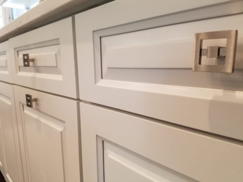
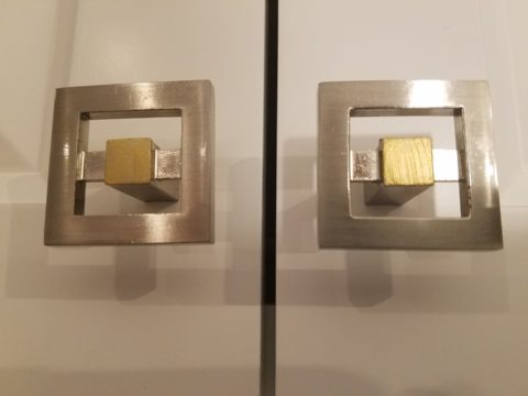
And this might be considered gilding the lily, but we added a splash of artistic expression when we hand-painted the small squares in the new brushed stainless cabinet pulls to give them a bit of extra pizzazz!!!
By using the Carrara mosaic as a wall-covering, rather than merely a back-splash, the walls get a truly finished built-environment “read.”
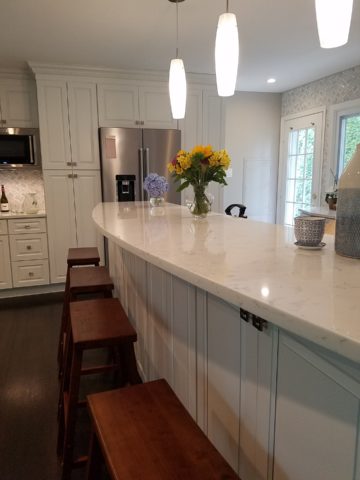
The upper bar counter-top bows at bar-level to offer a more comfortable conversation scene.
The living room became a cozy sitting area off this wonderfully open kitchen and dining area.
Existing brick walls were softened with a grey-taupe to contrast with the white trim making it POP!
The fireplace now has a complimentary new Carrara mosaic in a diamond pattern to coordinate with the new herringbone mosaic of the kitchen wall.
And baby accoutrements adds colorful animation to the beautifully finished scene!
“HELLO!” they say. “Welcome to our beautiful new home!”