It’s a popular word in the recent vernacular. Increasingly pertinent whether it is your grandparents, parents or YOU, the trend to leave your large home, consolidate and either move to a smaller home or apartment/condo or to enter the realm of the organized social scene of a retirement community – downsizing is an increasingly popular move.
It might be a financial decision to better manage the money or a social move to connect with friends, cultivate new friends and activities, or make a physical move to facilitate independent or even assisted living. Whatever the reason, interior designers are finding this to be a very important niche.
Problem solving, creative lifestyle design, updating, or as my mother said “punching up” to refresh, designers find their challenges and satisfaction in helping make environments more accommodating, attractive, and appealing. Function in tandem with form – not necessarily preceding.
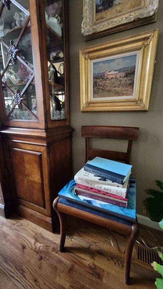
Helping to organize, make decisions, prioritizing, placing items on a floorplan to better understand size and scale – what to take with and what to leave behind. It can be exciting, but it can be emotionally stressful. Parting with things that have been collected over a lifetime is a huge chapter to turn.
Connecting with a interior design professional who can assist with the process of planning the move, placing the furnishings, selecting the finishes and colors of the new space, finding things to better fit the new rooms, while curating the things that mean the most or work the best is an invaluable decision-making process.
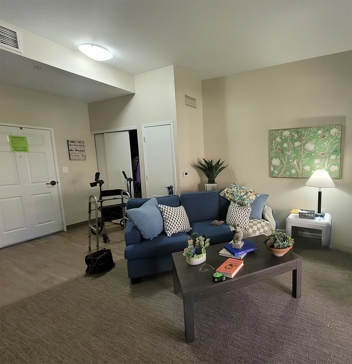
This bright senior – about to enter her nonagenarian years and still working on courtroom Zoom sessions 3 states away as an expert witness – found herself through a series of circumstances, physically challenged and displaced to New Mexico to be closer to family. Her multi-level home of 50 years was so familiar and unique that the move, while being practical for many reasons, became onerous and depressing. The despair with which she found herself was painful. Once the move was made, house sold along with all of it’s contents (yes, she was persuaded by family to leave everything behind) the clock could not be turned back. Her family had retained a decorator to bring in and arrange some rental furniture – sadly, it deepened her depression.
She, being a tenacious, previously independent individual, got on her computer and Googled interior designers and found us. Without any reference other than our on-line presence – she retained our services and I went to work.
Her 5-decade home was professionally designed in the 70s and was a testimonial to the talents of that person or team. Although dated in some ways, the interior was classic and of excellent quality. It stood the test of time, but now it was time for a change. This feisty gal declared that she wanted this new space to be purple. Not lavender – purple. She wanted it done fairly quickly as every day she spent in this confined space (two bedrooms – one was her office and two baths with a small kitchen and adjacent living room), with the undesirable rental furniture, her despondency worsened.
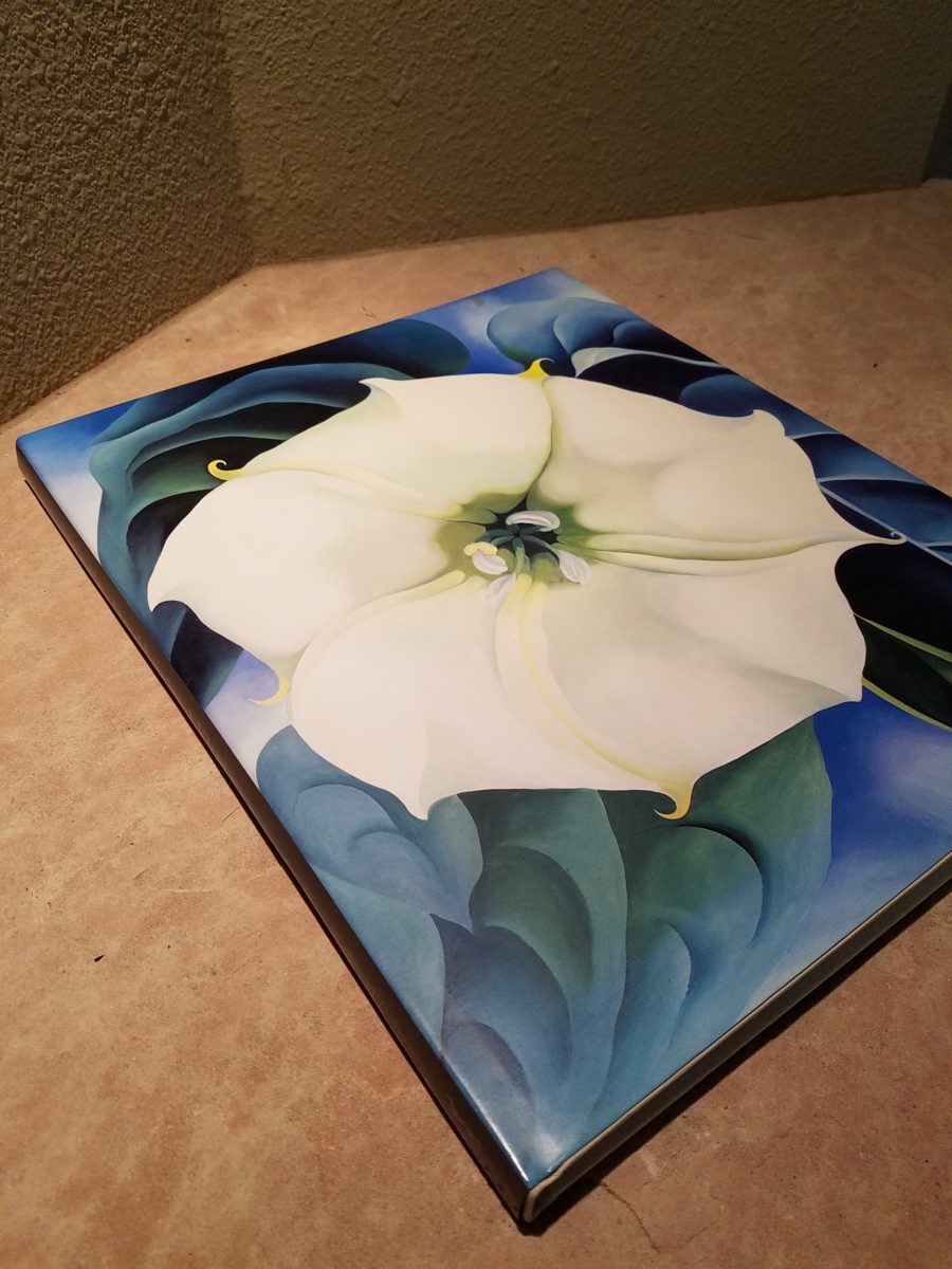
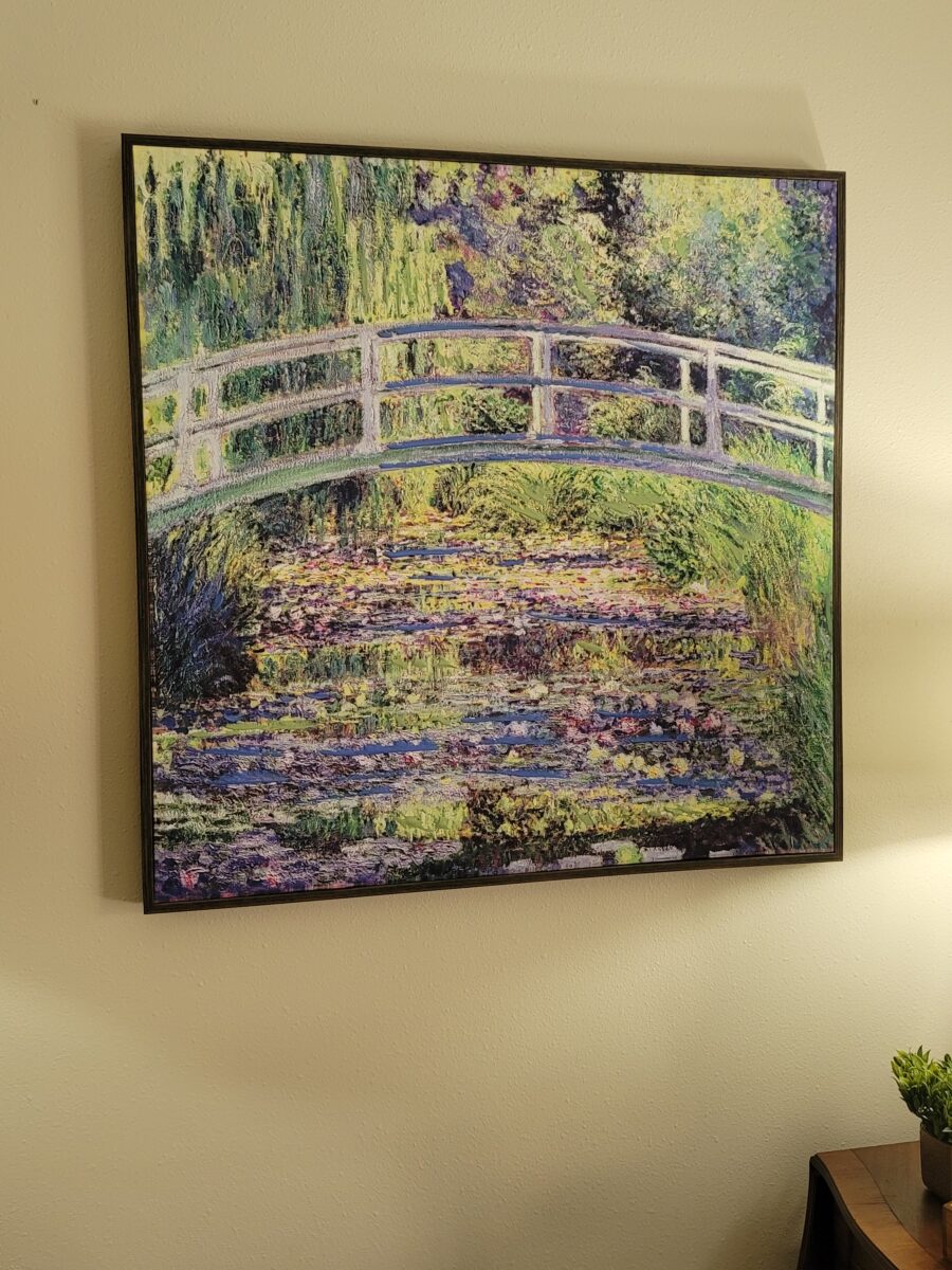
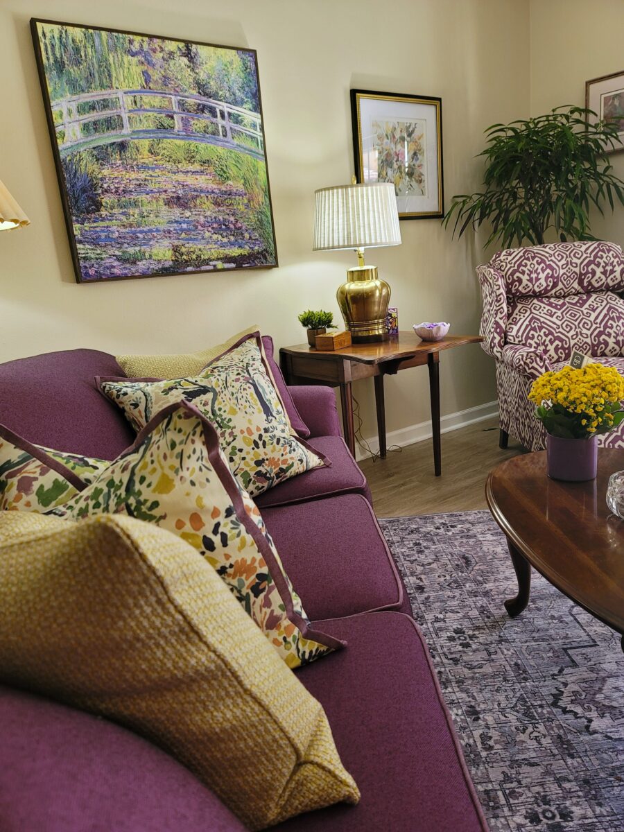
Quite a task, but up to the challenge, I probed her interests and tastes, likes and dislikes, preferences and wishes. She had recently acquired a framed print of Monet’s Giverny bridge over the lily pad pond. It became the inspiration that drove her desired design direction.
Having heard the reference about being old and wearing purple: “When I am an old woman I shall wear purple,” evidently from the opening line of the poem “Warning” by Jenny Joseph, suggests a desire to celebrate one’s individuality and defy society’s expectations about old age by wearing intensely bright colors like purple, at the expense of them being seen as inappropriately loud, I embraced the concept and ran with her purple palette.
In order to customize this special color scheme and transform this interior as soon as possible, I scouted thrift stores, antique shops, local retailers, Facebook Marketplace and Craig’s List. Exaggerating slightly regarding her not having brought any furnishings with her – she had a print of an 1890s dining/party scene in an ornate gold wood frame, a few music boxes that were irreparably damaged in shipment, and her little dog.
The existing flooring was a combination of new vinyl plank and a grey commercial grade direct-glue carpet. She elected and succeeded in having the management change the flooring to eliminate the carpet and continue the LVT. We found an area rug online that was thin and washable and worked well to anchor the living area.
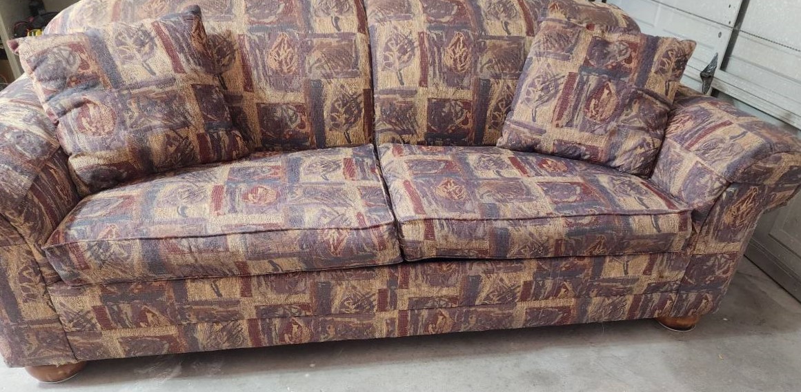
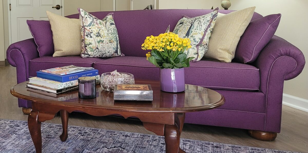
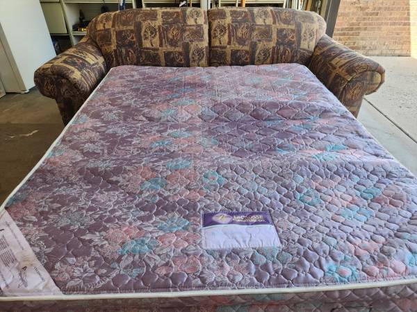
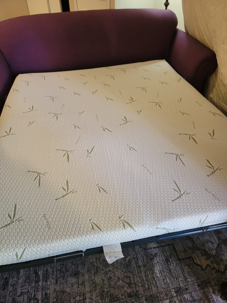
She wanted a sleeper sofa for her visiting grandson, I found one on Facebook in near-new condition, albeit the fabric was all wrong. We reupholstered it in her choice from about 20 fabric samples I had gathered for her consideration. It was a bold, high performance purple textile that could have been garish had the other elements of the room not come together as they did. We piped it in a lighter more pink/purple detail for contrast and interest. The sleeper was a little too wide, so we reduced the dimension by modifying the arms. We also eliminated the center seam in the back and made the seat three cushions instead of two.
We also replaced the original mattress with a new memory foam in a bamboo envelope.
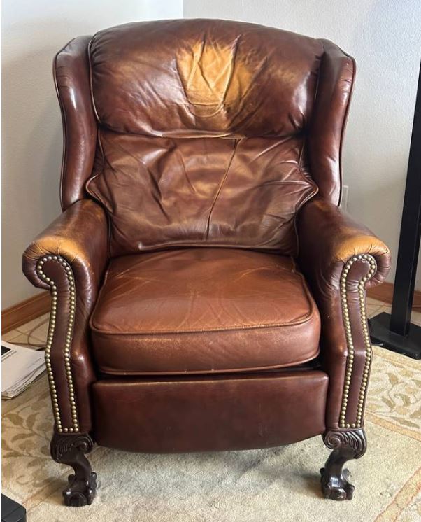
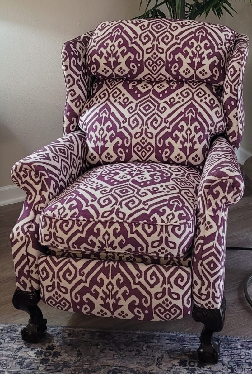
Another second-hand find was a handsome recliner with carved cabriole legs and wingchair style. It was in a badly worn leather, yet the mechanism was in perfect condition, and it was our next reupholstered piece using one of the 20 coordinating fabrics I had initially presented.
As there was no specific, much less a formal dining area, I found a small square table – like a card table also with cabriole legs. It had been painted with a black finish and gold accents.
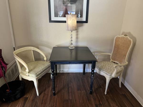
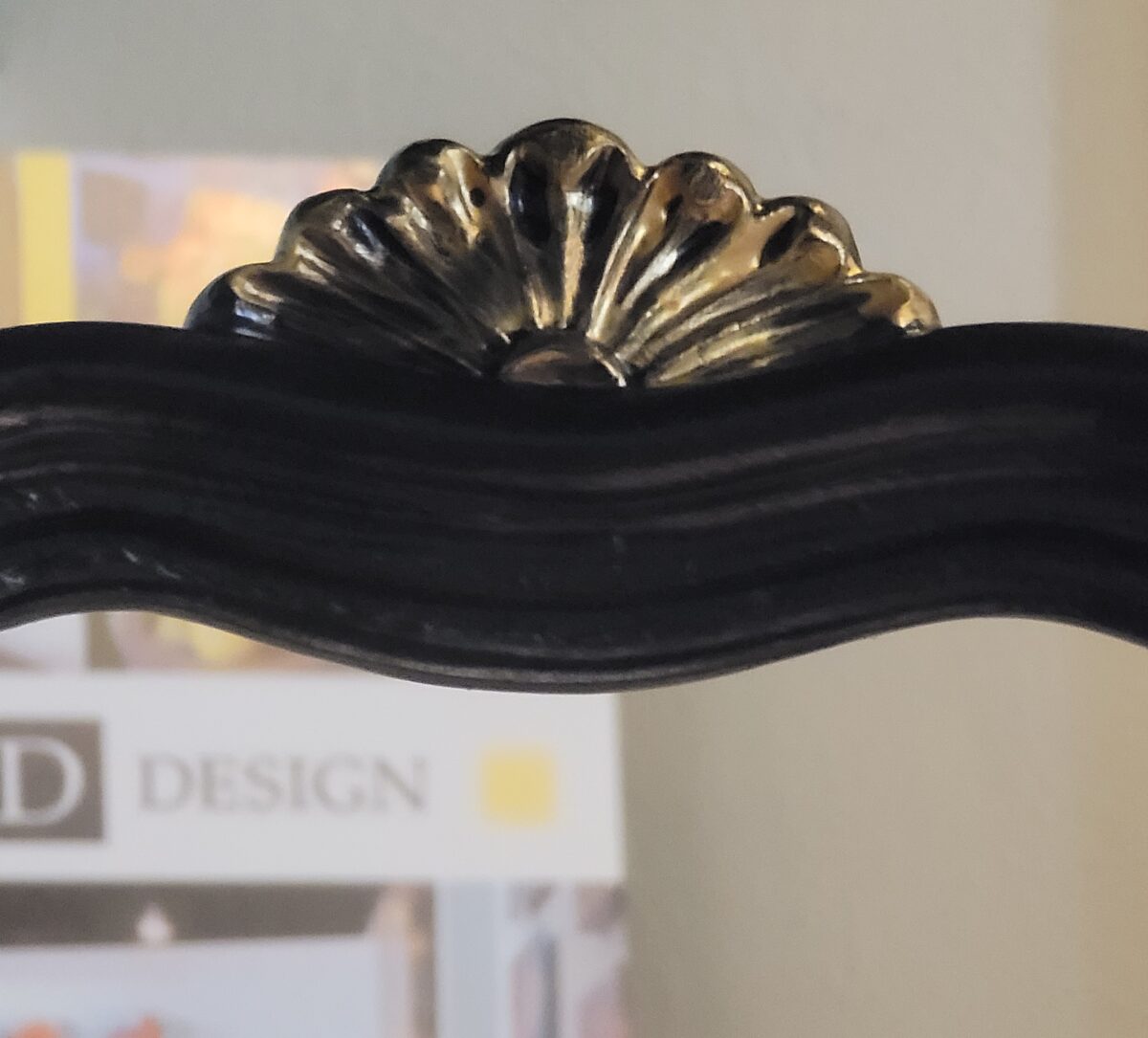
With it, a coordinated, but mismatched pair of French chairs were also being sold. The chairs were provincial in white with light blue trim. I had them painted black and then placed them on top of my conference table and detailed them with gold accents. Both chairs had arms and upholstered seats.
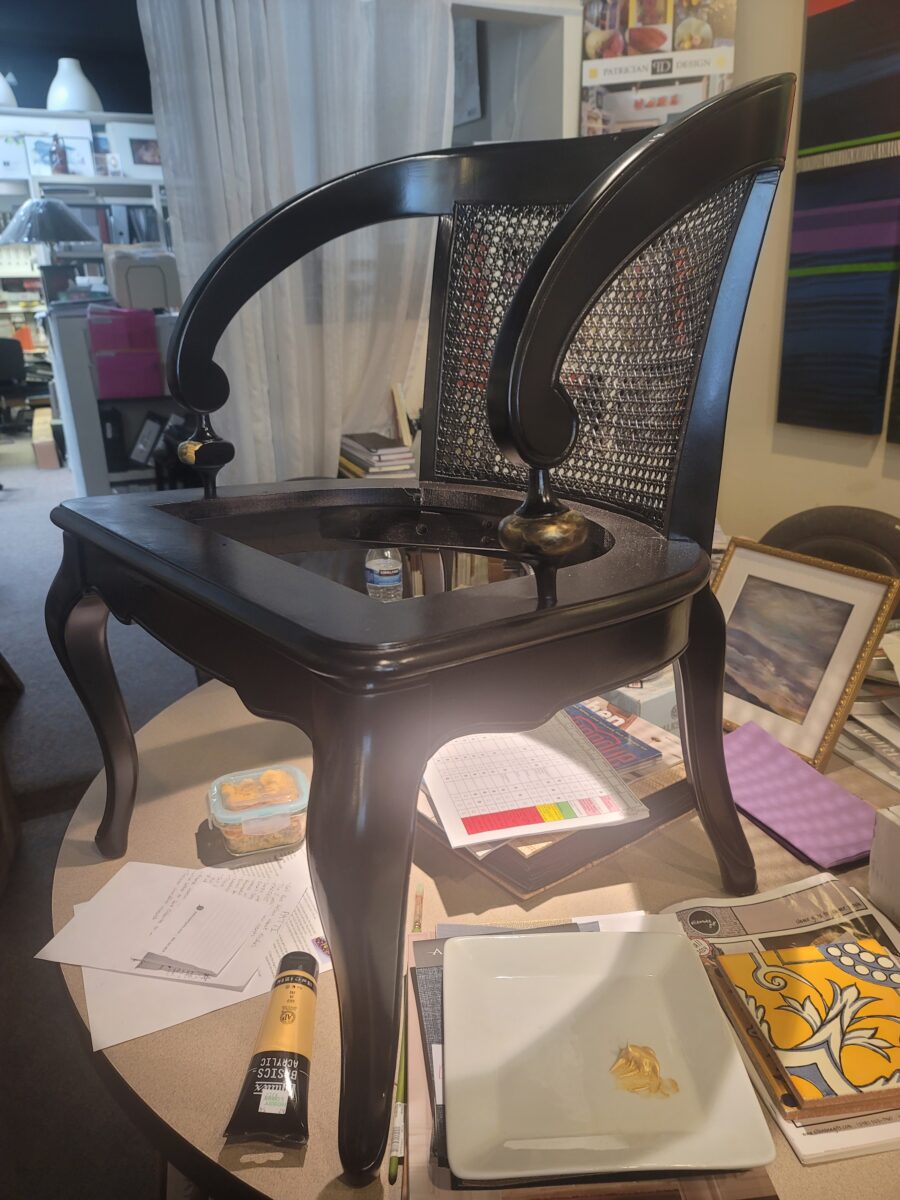

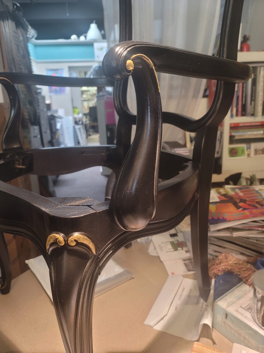
One had a cane back and the other upholstered. One chair was short and the other tall. Yet they were a good quality, sturdy, Drexel duo from the 60s or 70s. Another fabric from our collected samples was selected for the two chairs. The three pieces made a clever, attractive and inviting little bistro dining setting. Her gold-framed print of the Victorian dining /party scene was hung above the vignette.
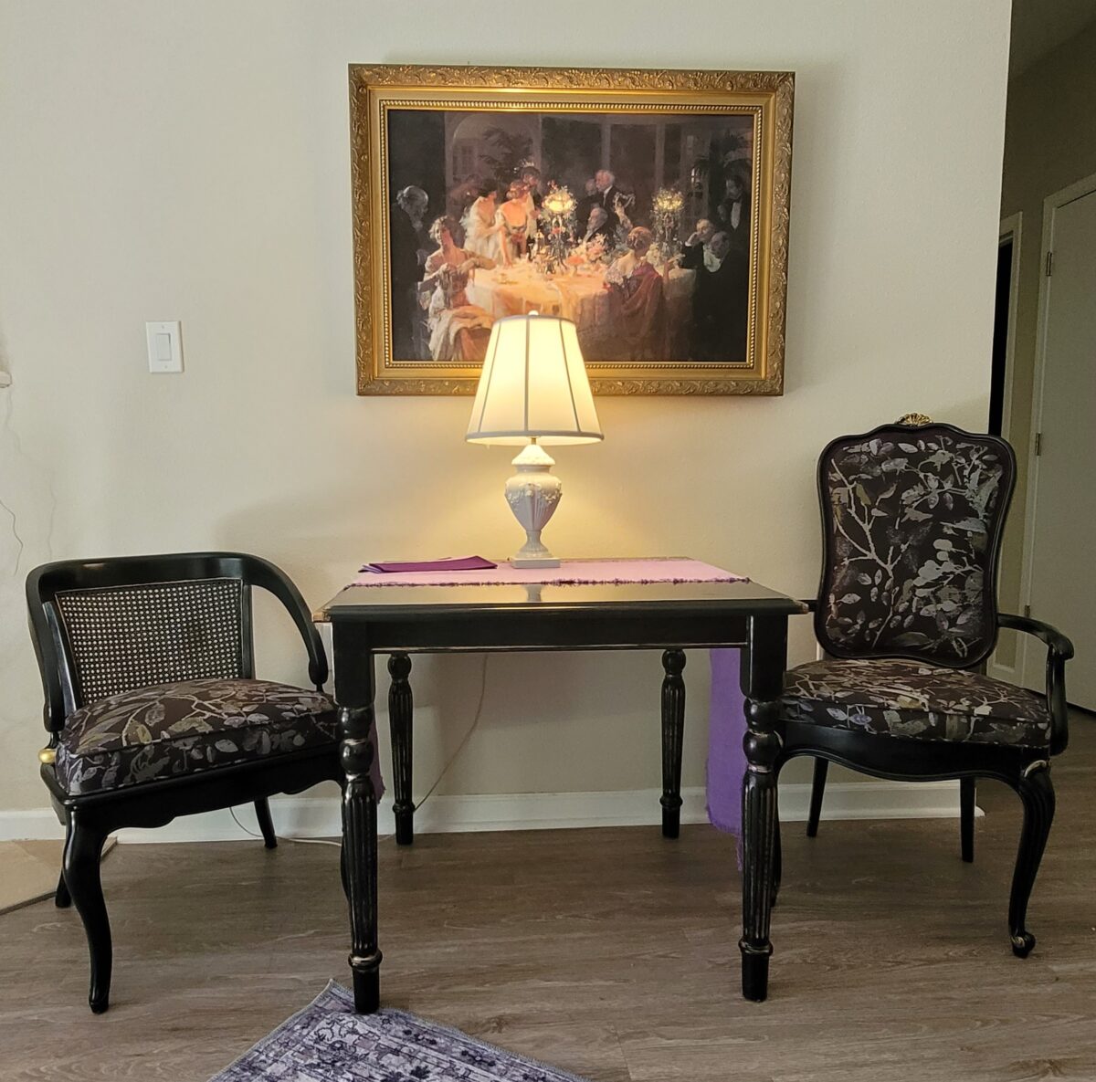
A purple runner adds a splash of color, and a sweet little white vintage ceramic lamp (another antique shop discovery) finishes the scene. It is at this table that she spends most of her time – sorting paperwork, reading, holding court with visitors. From this perch, she can look out to her patio and large grassy communal courtyard beyond, with a fireplace in the near corner for cozy winter nights.
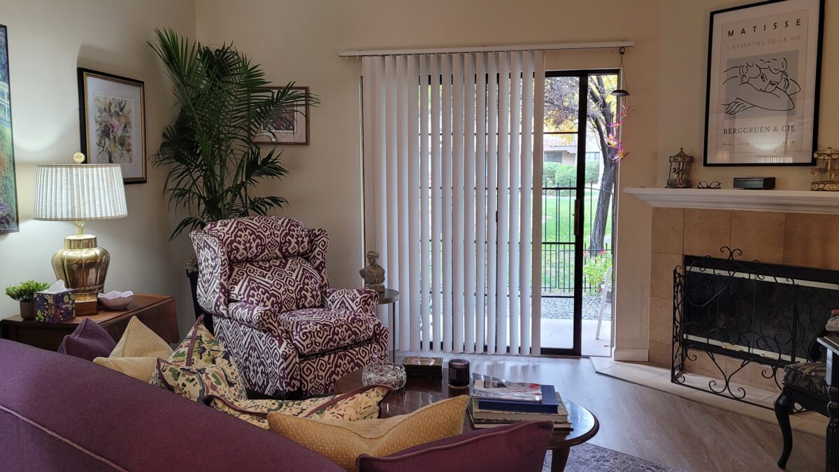
A simple reproduction cabriole coffee table from a thrift store, a vintage drop leaf table from an antique shop, a couple of lamps and filler wall-art pieces to support the theme and color scheme – with a leafy live palm in the corner, resulted in an inviting space. The vertical blinds are building standard.
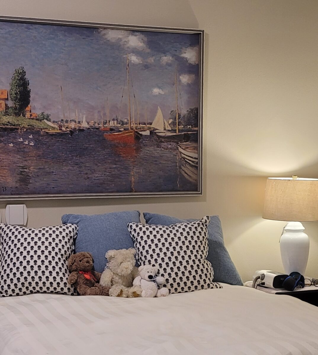
Her bedroom was mostly bed. But a Monet print to hang above in lieu of a headboard, piled with pillows that she had used on her rental sofa, with a couple of eclectic nightstand finds and a new lamp created a room for repose.
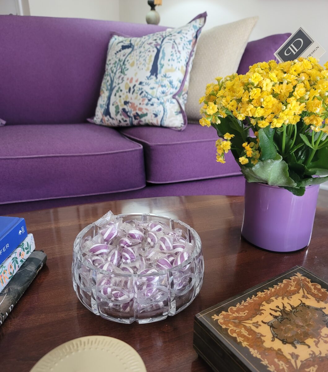
The result is a very happy client very pleased with her new interior. Neighbors on her floor and members of the staff have stopped by to compliment her on her transformation – which has gone a long way in getting her settled, comfortable and happier about her move. As soon as I presented her with this vintage find of a lovely hand-cut leaded crystal bowl, she promptly ordered purple candies to offer her guests.