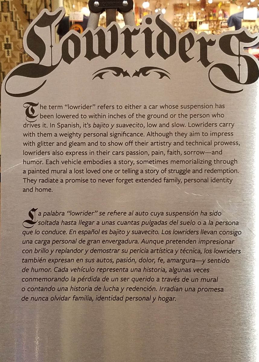
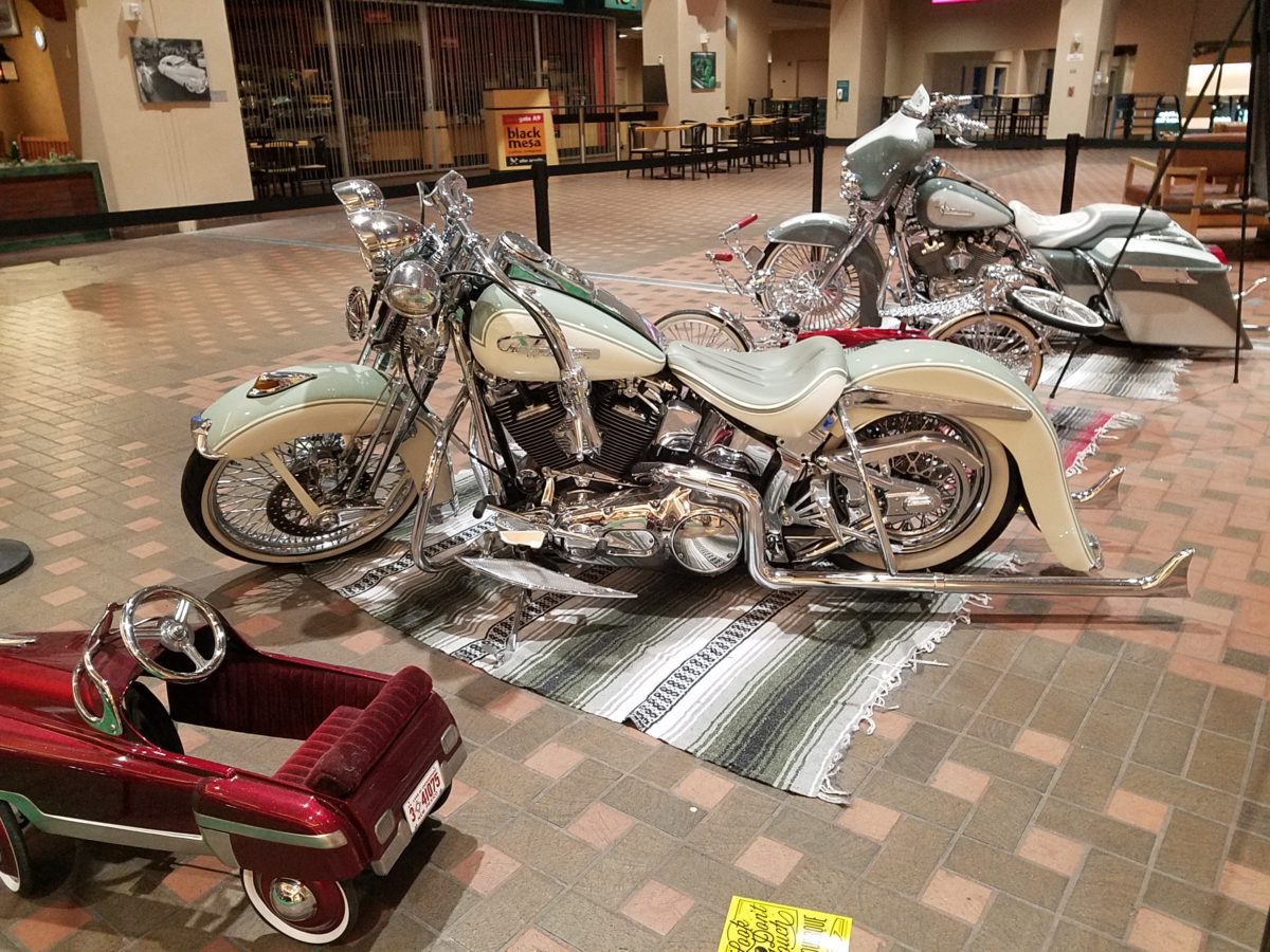
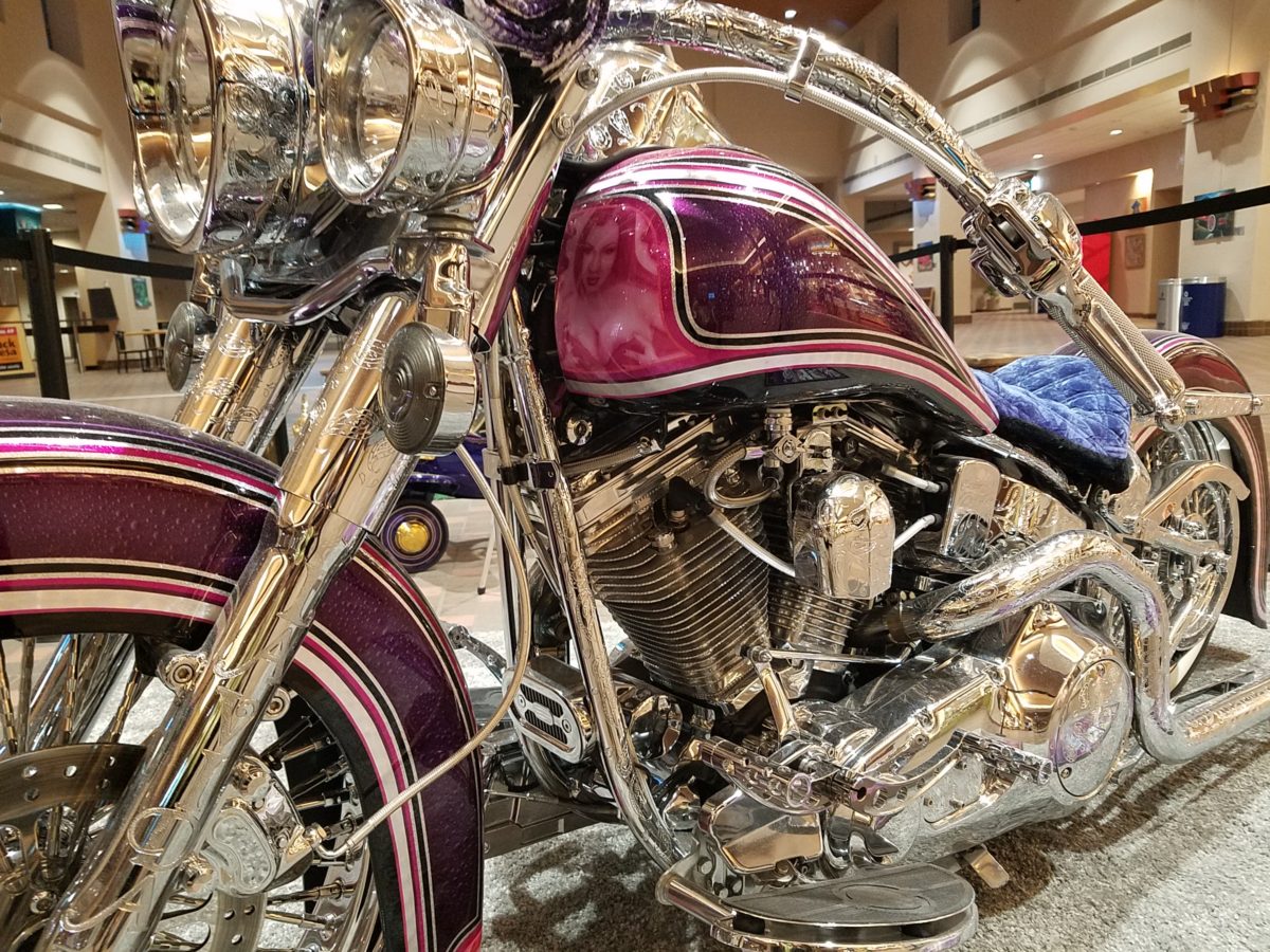
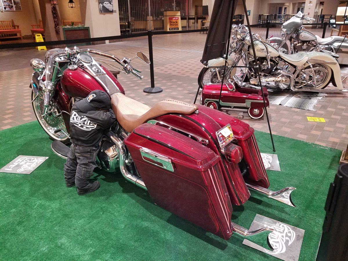
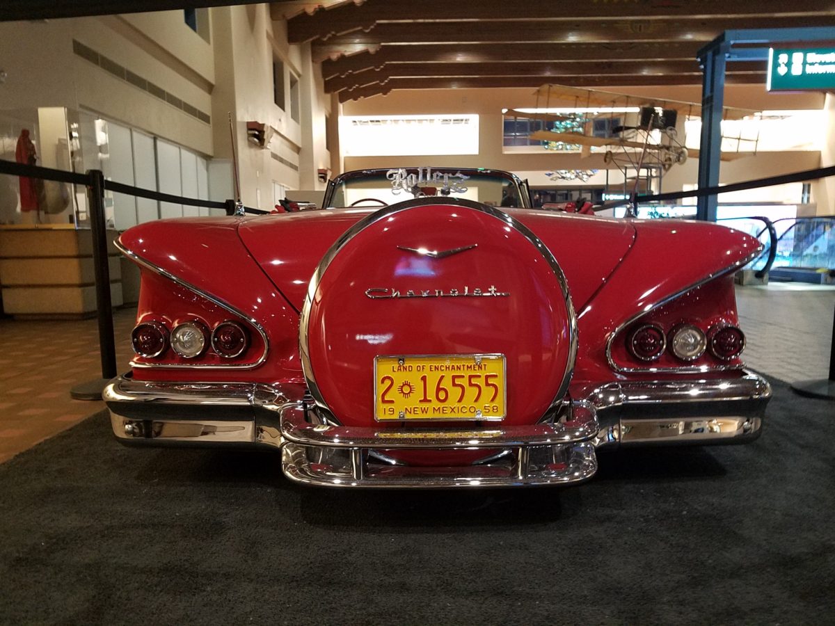
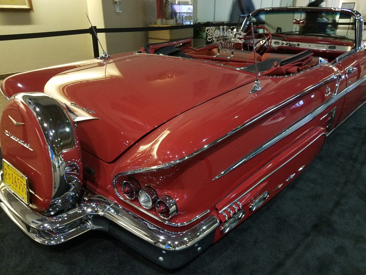
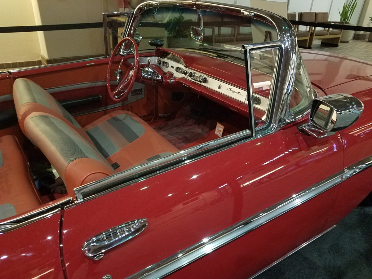
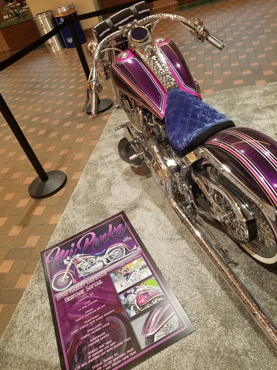
Racing through the Albuquerque Sunport several times this summer, I had seen in swift passing the blindingly brilliant bling of the Low Rider exhibit that had been set-up at the end of June. Last week I had an opportunity, while waiting in the arrival area, to peruse the many amazing rides that commanded the concourse.
This powerful art exhibit of the unique Latino culture of Low Riders represents great personal pride and emotional attachment on behalf of the owners and artists (often one and the same).
These finished products are almost like songs…from memorials to love interests, family and friendships – they express heartfelt emotions to present and share with the world.
Once stereotypically thought to be limited to the bad boys taunting law enforcement with their wild paint jobs, gleaming chrome, bold moves, wild suspension, blaring music in a defiant statement of cultural expression, these amazing art pieces have since been recognized by distinguished museums worldwide for their exquisite attention to detail and the stories they tell.
In this exhibit, these moving statements of artistic expression are all home-grown. Yes, each made here in New Mexico it makes it all the more relevant.
Visitors to the Sunport have this wonderful opportunity – up close and personal – to examine the seemingly flawless machines adorned with sensational color, pattern and design. “Kids” of all ages will appreciate this show!
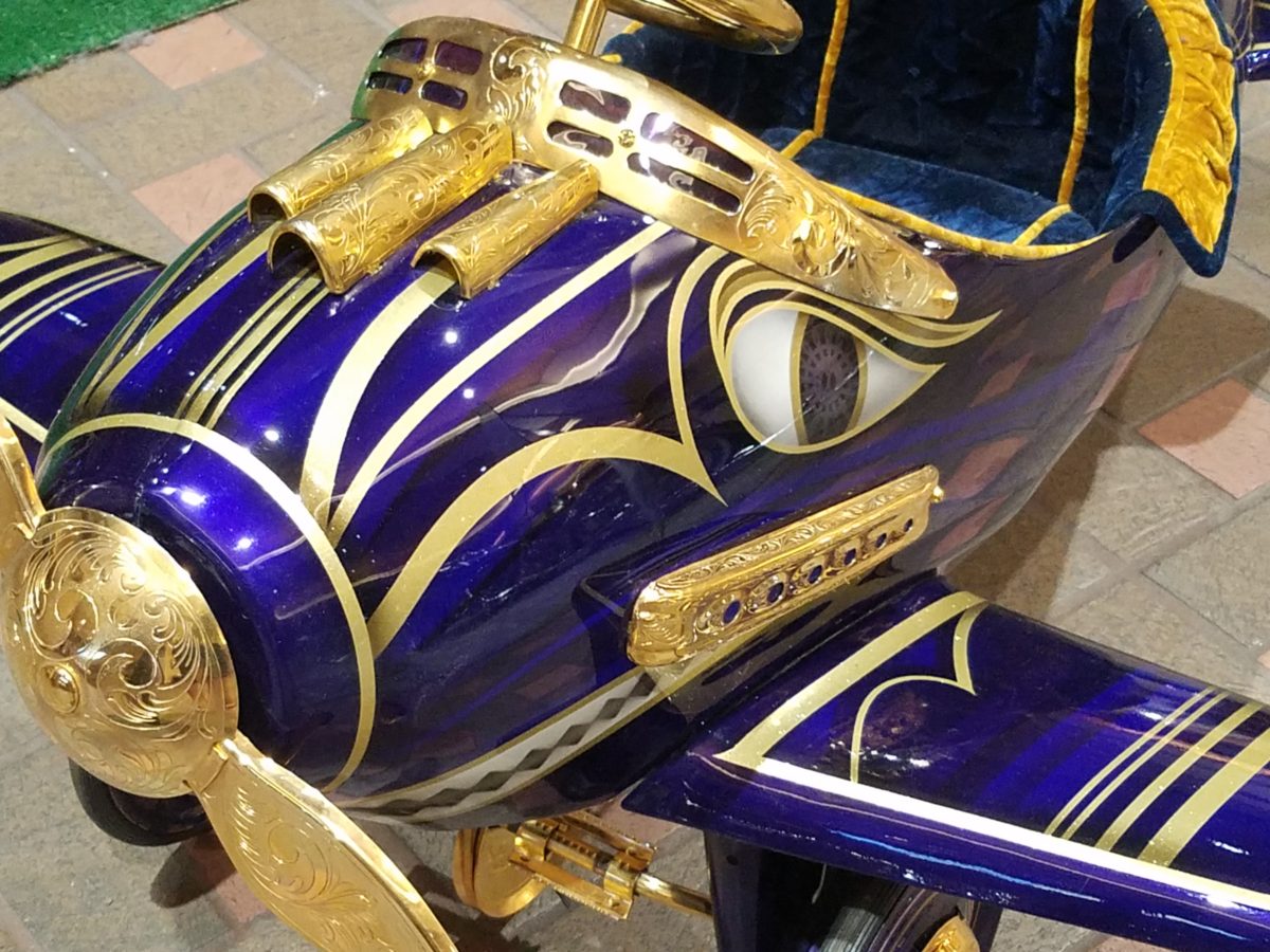
Each as though a canvas for the artist…motorcycles, kid’s versions and cars adorned with glitter, shine, polish and paint colors all contributing to the each unique statement. From airbrush to tedious handwork and limitless patient detailing results in exciting assemblages.
There are also decades of photos featuring the evolution of
the culture here.
By highlighting these fine, local examples the City hopes to elevate the art form on its merits and dismiss some of the stigmas attached with the stereotypes.
And we all will have a little fun imagining the thrill of taking a ride in/on one of these beauties!!!
After
last week’s Color of the Year observations, I furthered the subject regarding
the importance, influence and value of colors.
I
don’t know the science behind how individual’s eyes perceive and translate
color… rods and cones and the anatomy of the eye as it speaks to the
brain…but what I do know is that
COLOR and the context of COLOR MATTERS even if it is not perceived exactly the
same by everyone.
My
parents were coincidentally both apt to notice, remark about and describe color
specifically. To them, and ultimately to me, colors were something to
regard and absorb, for better or for worse, and all colors deserved acknowledgement
and specification.
I distinctly remember their descriptions, “Parrot Green, Sapphire Blue, Lemon Yellow, Fire Engine Red and Brown as a berry” – a compliment which indicated that you had tanned sufficiently! I think it was a result of our island home-away-from-home that prompted many of these titles. We, for sure, had no parrots making their presence known in Virginia! But for some reason, colors in the islands prompted unusual appreciation and scrutiny. This parrot green was like grass green but a bit more intense – saturated – not a dark green and certainly not a spring green – just a brilliant, clear, secondary green! The result of true, primary blue and yellow mated to make GREEN!
Color is a communication tool to convey – color. But what color? What type of color? What specific color? Is your version of a color the same as mine? Do we “read” color the same way? Do we express the description of color the same way? How might you explain a color to a person who is blind?
I’m writing this today from the tropics and it seems worthy to note that colors are abundant here in brilliant evidence through all seasons. Whereas in a decidedly changing seasonal and climate, colors come alive in spring, progress through changes and pretty much crash for the dormant winter months. Contrarily, the topics meld their rainbow of blooming floribunda, bounty of fruits and palette of these brilliant colors year round.
Maybe
it is because we straddled both worlds. The lush, verdant, colorfully blooming
and always reliable tropics countered by the decidedly and distinctly changing
seasons through dormancy in the northern climes. There must be an appreciation
for the change. The lovely, yet possibly monotonous climates that produce
blooming color all year round might dull the senses to the seasonal reemergence
and staggering beauty of new growth and blooming abundance and mute the verbal
expression and appreciation thereof.
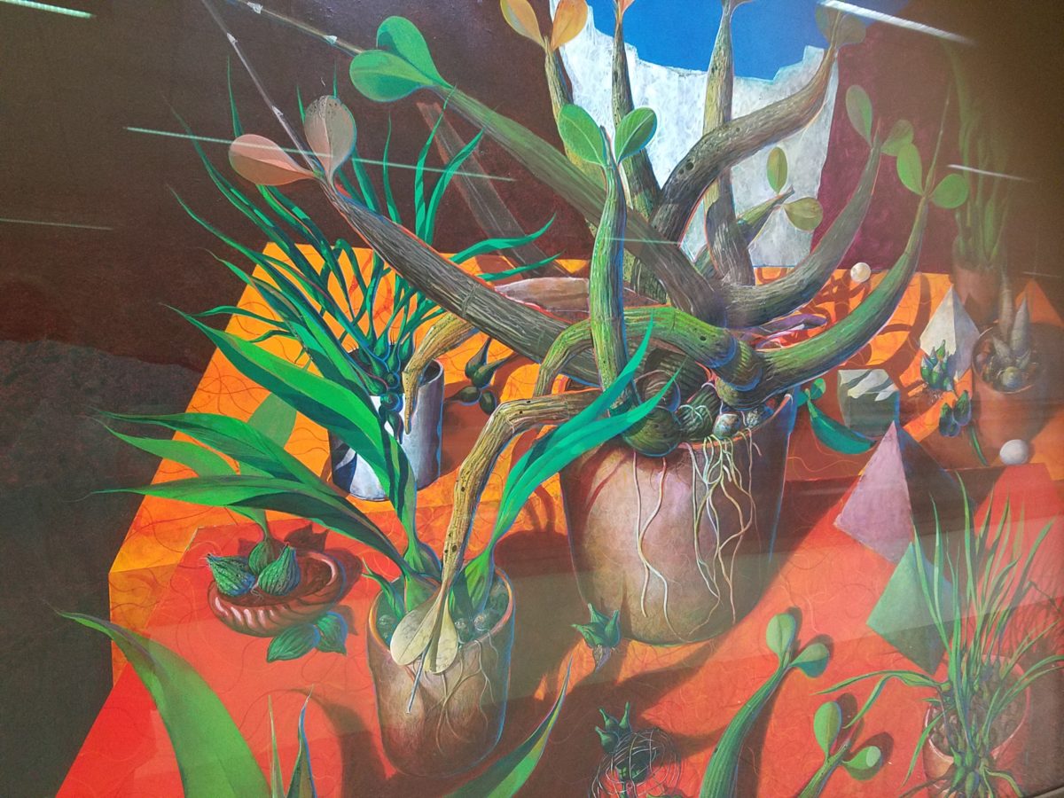
For example, my color antenna is always up and running. As I struggled with my pair of carry-on luggage monstrosities clearly in excess of 75 pounds (good thing there is only a size and not a weight limit!!), I came upon 2 art pieces in the Houston Hobby airport. The colors beckoned me. Although I had noticed them in swift passing, I couldn’t help wanting to see more. So I stopped and dashed back, disassembled my cumbersome haul and quickly took photos of these two paintings on exhibit, in the concourse, in order that I could enjoy them a bit later. Initially attracted by the color, they arrested me allowing and inviting an opportunity for further examination of their subject matter and detail later, when I had the luxury of time.
The wildly organic plant life, featuring an animated orchid that tangled and writhed on the painting’s surface in a variety of verdant green’s set against a perfectly selected fiery orange table surface, was brilliantly alluring and seemed to set the stage as a precursor to my soon-to-be-destination in tropical Mexico. ARTIST: Lucas Johnson Still Life with Schomburgkia
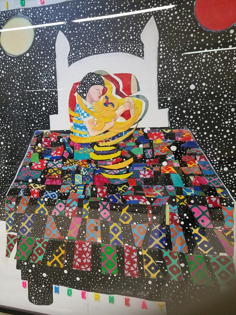
A bit further down the corridor of the concourse another piece caught my attention. Similarly with its colorful invitation, but with entirely different subject matter which upon closer inspection was quite intriguing, a patchwork quilt of batik fabrics and collage with applied letters beckoning the viewer to wonder what might be beneath was magic. The woman or child and beloved pet in the center of the action nestled under a cozy and colorful quilt, wrapped in a cloak of starry darkness which might suggest clinging to each other against the foreboding imaginings of the night.
The intense collection of the brilliant colors contrasting against black was dramatic, mystic and inescapable in this powerful piece, It Helps to Think We’re Sleeping Underneath the Same Big Sky by artist Joo Young Choi.
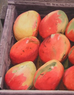
Watercolor
artist extraordinaire, Susan Weeks, captured this crate of mangos at
an exotic market somewhere very south of here. Peru? Ecuador? I don’t remember.
Susan gets around. And, Susan sees color and detail and renders it with
remarkably exacting precision.
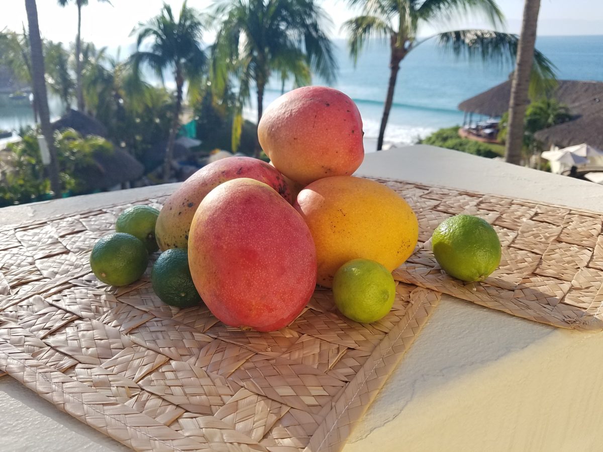
As I greet the day, I’m taking my stash of mangoes out onto the balcony to be seen and photographed in context. Reminded of how Susan rendered this succulent sweet fruit, with the delightfully “hairy pit” (nods to Tricia), I celebrate this colorful collection of nature in a sensational setting! These gorgeous tones of warm golden yellow, baby iguana green and yes, 2019’s rosy warm coral (Pantone’s “Living Coral”) are nature’s color scheme. The orbs are sensuous and the colors are excitingly bright and luscious.
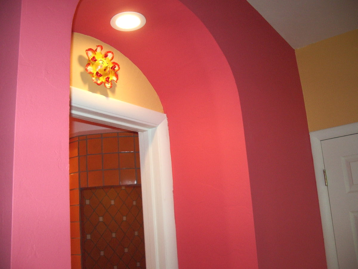
Mango colors of rosy coral and warm, golden yellow are paired in this arched interior entry.
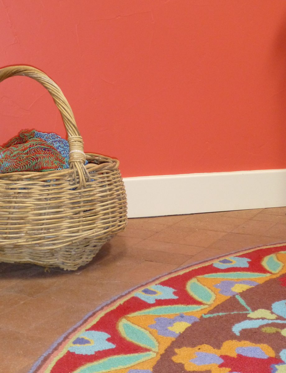
Here a similar scheme featuring one of our favorite Company C rugs illustrates the bold, effective power of color selection.
Try this exercise with color. I have no idea what your eyes see and your brain translates, but walk around and look at things in your world. Notice color. Notice individual items…book bindings to fresh fruit. Evaluate each color’s effect. Does it evoke any emotion…good or bad? If you wanted a painter to paint a wall that color and you didn’t have the paint selected, how would you describe that color in an attempt to get it on the wall as you desired?
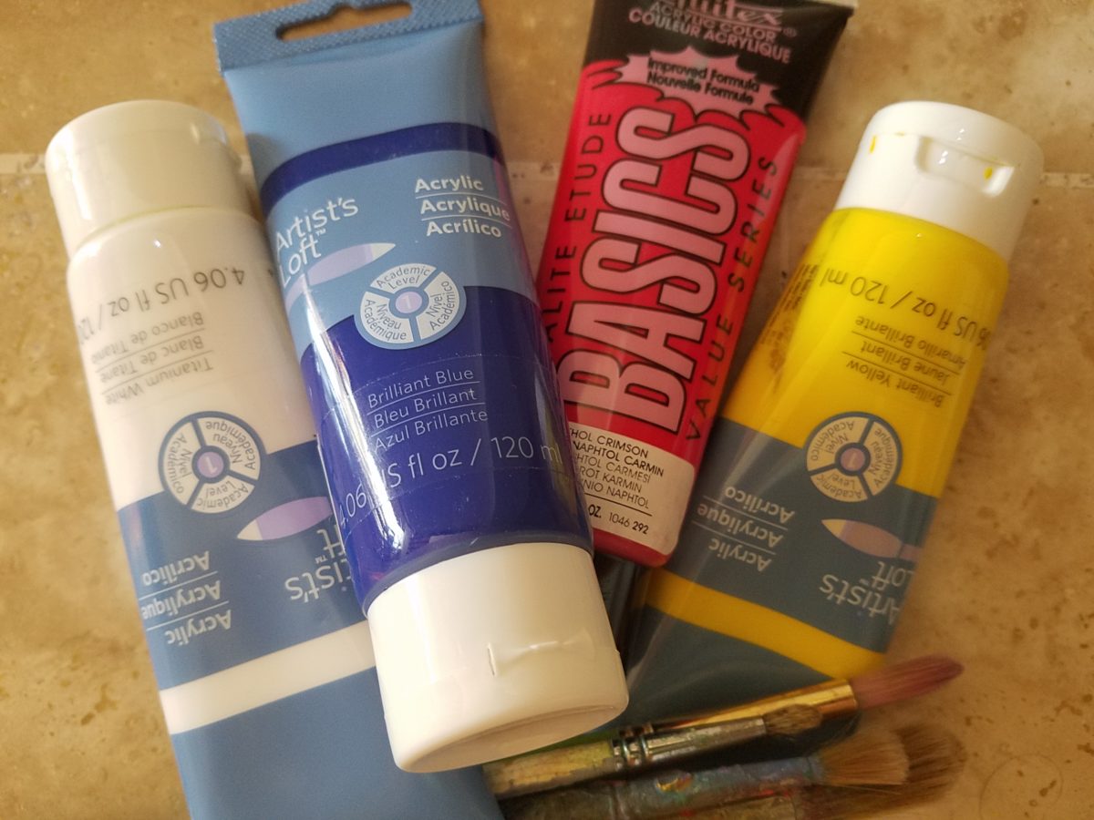
In a more thorough test, you might be prepared with actual paint – like tubes of acrylic from the craft store. Get a print-out of a color wheel to illustrate the primary, secondary and tertiary colors. https://bit.ly/2SVKUMg Buy red, blue, yellow and white and use them to attempt to create the color being described. This could be a party game – but you would need to also have paint chips from the home improvement store or paint store to use as the prompts that would have to be described and used to match the success or failure of the person attempting to create the color.
Noticing color brings appreciation to the details and nuances of our color-filled world. The little exercise/game, to try to convey a color to another person based upon similar life experiences and references, is interesting. Please share your thoughts and experiences, dilemmas and frustrations with this project through the blog’s email.
I hope this encourages you to go forth with a new-found appreciation of color and how it adds layers of depth and interest to all that you see. Examine the natural world, or man-made creations in film, set-design, architecture, graphic advertisements, fashion design or interior design. See why color matters!
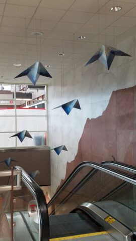
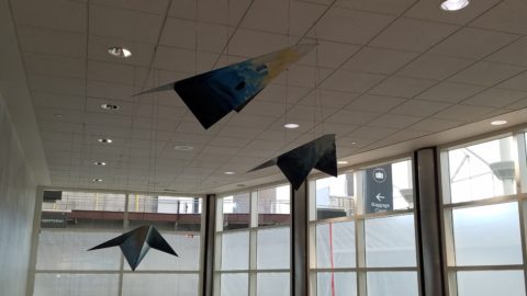
This week, upon arrival at the Denver airport, as I navigate this architecturally dramatic facility, I’m funneled with the masses making our way, from the gate area, to the trains, to the terminal. When suddenly, gracefully overhead as we ascend the escalator, large versions of paper airplanes hover above. Probably steel, but with the familiar fold and form of the simple paper origami originals, they were a whimsical attention divergence.
When I arrived at the top of the escalator, I realized that they were also above the escalator across the way so I walked over there (to the surprise of the masses with whom I had been funneling along). A couple in the crowd even called out “hey” or “ma’am” …I turned to see some were concerned that I had lost my way and expressed concern that I follow the pack. I waved to these helpful strangers indicating with my phone in hand that I was stopping to take a photo of these wonderful suspended planes.
This ignited a curiosity that led me to investigate a bit more. I have since learned that they are part of the Denver International Airport’s Arts & Venues Denver: Public Art Program 1994. There are 140 of these suspended would-be-paper (steel alloy) planes and they are the work of artist Patty Ortiz titled Experimental Aviation. A well-recognized artist and curator of contemporary art with decades of art management experience she “believes that art intrinsically is a social object and when placed as an action in relationship with the viewer ad participant that art carries a profound interconnectedness within real experience.” And there I was experiencing the simple loveliness and joy that these airplane sculptures conveyed, in context with the often monotonous air travel experience.
Kids who love paper airplanes never seem to grow up. I’ve written about this before, in the blog about Federico Leon de la Vega’s TEDx Talks a couple of years ago. Watch his Talk and see the final scene as the planes fly through the audience. https://www.youtube.com/watch?v=H9j_pLgCr1U
Paper airplanes are timeless tools of communication set flying from one person to another often with a secret note inside. Unfold and discover the message. Like passenger pigeons of days gone by…but unlike their obsolete and ultimately extinct message-delivering cousins, paper airplanes are timeless.
Never taking up the art, it has fascinated me forever. Origami seems to be originated from the Japanese word for folding – ori – and paper – kami = Orikami. Japanese art is so fine in all of its forms. And back to the paper airplanes, San Francisco hosted a competition Origami-Palooza complete with education and presentation of many facets of origami work including the Paper Airplane Challenge. Last month “The Paper Airplane Guy,” John Collins, the world record holder for paper airplane distance was there to assist in honing your paper airplane folding skills to insure greater success with your paper airplane flying! https://japancentersf.com/events/origami-palooza-great-paper-airplane-contest/
My happy observation of this past week and my advice with it – grab a piece of paper and try your hand at folding and flying a paper airplane!!!!!