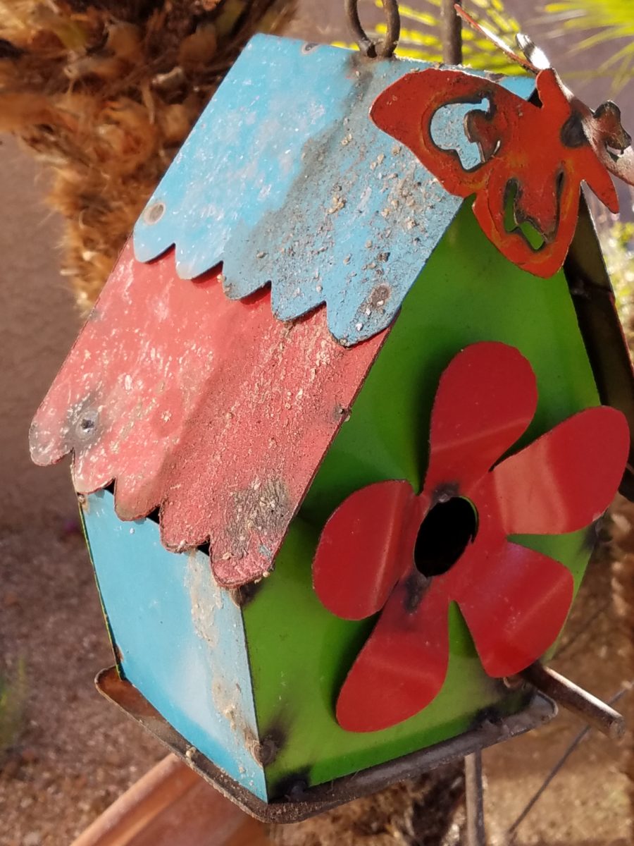
Serenity and Peace in Water Features

The serene sound of a fountain can provide mesmerizing relaxation. Like white noise, but better. Close your eyes, in close proximity to a little fountain, and be lulled into a wonderful respite zone. Even indoors, this is an effective relaxation element…outside the birds and breeze contribute to the joy. 
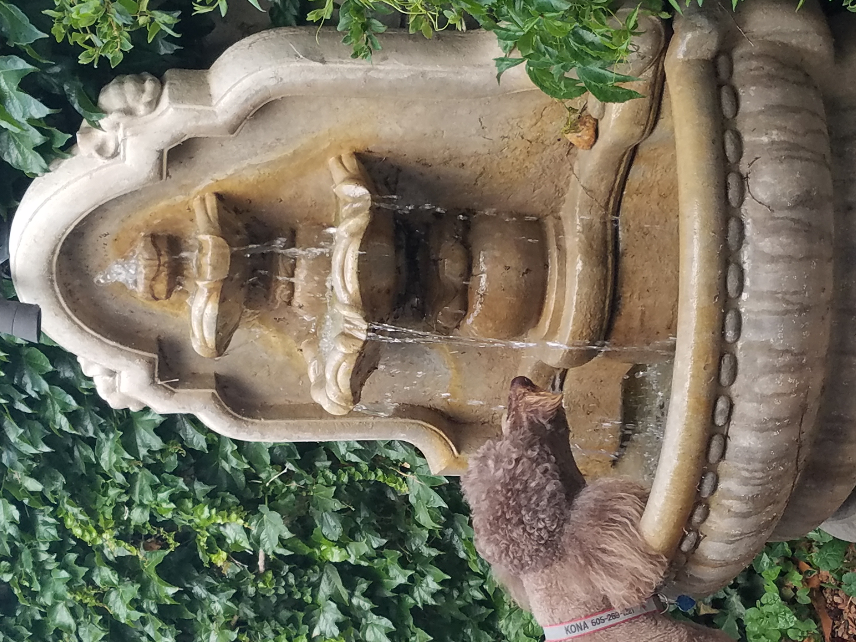
Pets reap benefits too! Kona gets a refreshing sip from the fountain!!!
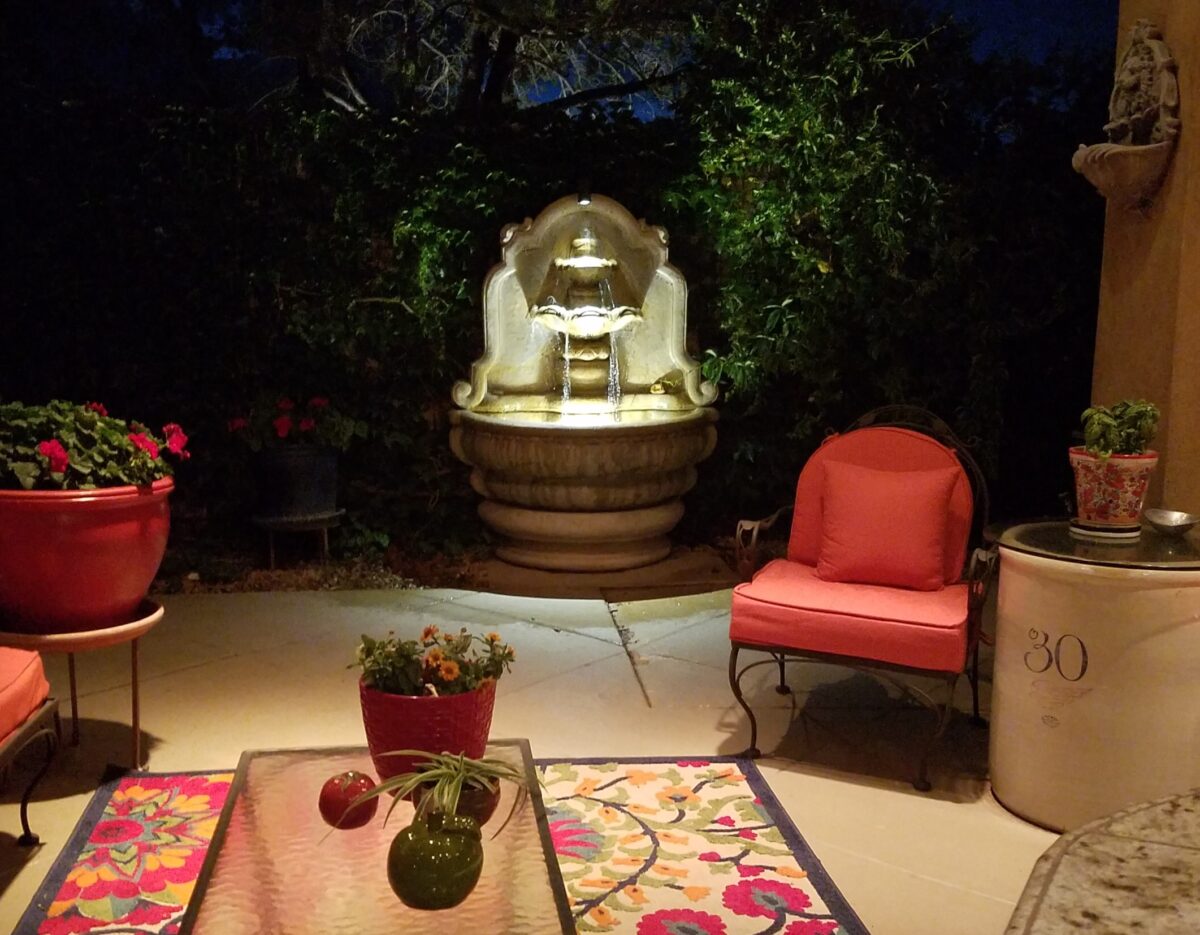
At night, that same fountain offers gentle water sounds and an interesting sculptural effect.

Social distancing and isolation – these two popular terms that have defined so much of our daily living in the last several months and imparted a negative connotation. They paint a picture of living more at home – alone and even “out-of-touch” – literally.  All of my childhood I heard the phrase “ne touche pas!” My uncle’s favorite, for sure! And now I hear it in my mind all the time. Don’t touch the shopping cart, door handle, people’s hands, “ne touche pas!” and if you do – wash and sanitize to a fare-thee-well!

Yet, on a positive note, this stay safe – be safe – living at home has spawned creativity to maximize that environment and relieve stress. It means, more than ever, expanding your outdoor options from placing a pair of chairs and tiny table on a previously unused, diminutive urban balcony or adding a palatial pool in your backyard…there are many options in-between depending on your circumstances and means. 
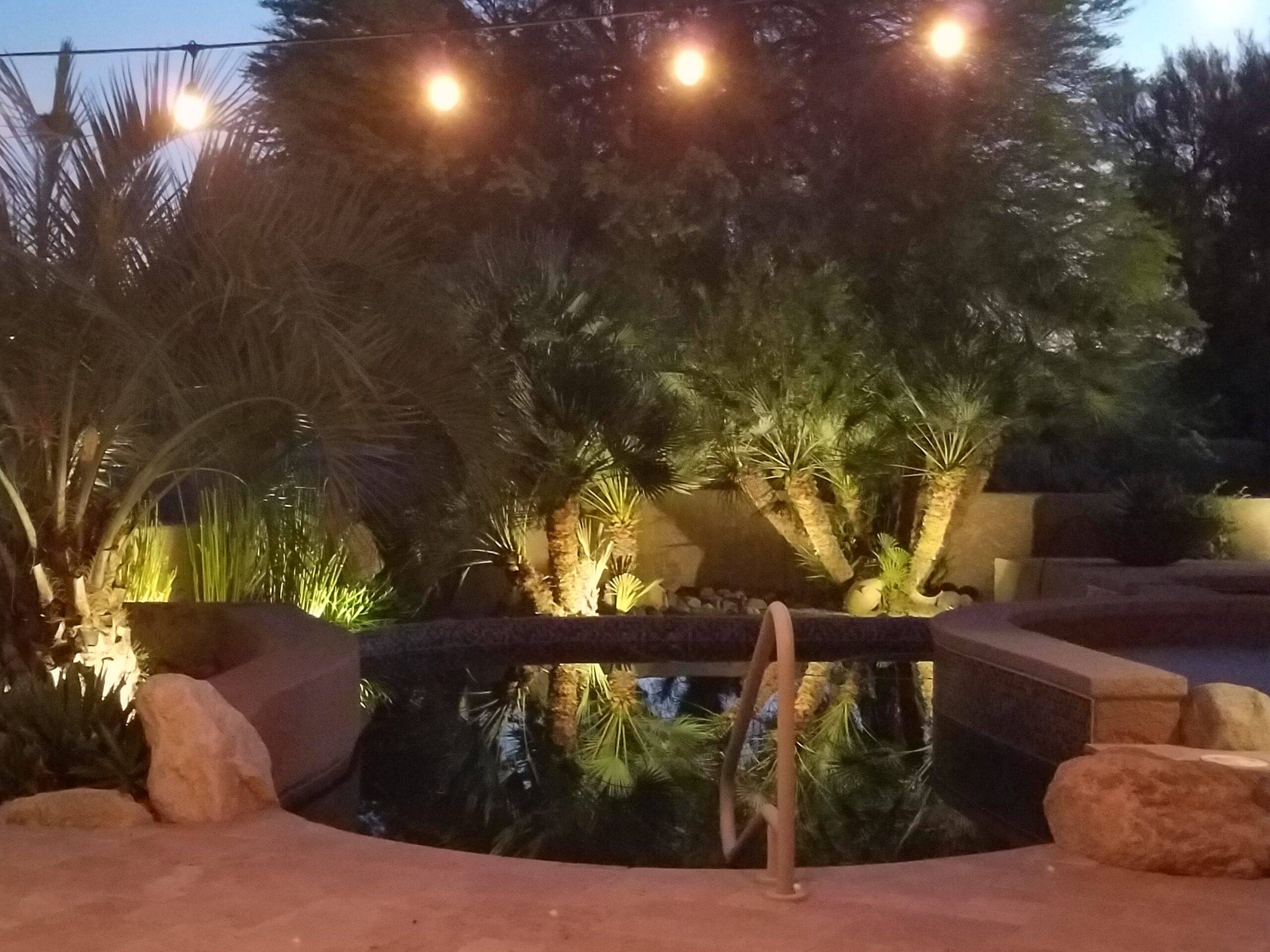
Our cousin in Tucson has created a lagoon effect with the dark bottom and mosaic trim. an oasis in the desert.

Water features are an amazingly therapeutic design element. Water suggests cleansing. It is refreshing and renewing. Water has promise. It can also suggest escape.

The Calgon add campaign of decades ago resonates today for those of us who remember…”Calgon, take me away…Lose yourself in luxury” The escape and indulgence of a relaxing soak in a tub. The gentle buoyancy relieves tension and encourages rest. It often suggests leisure. It is a luxurious, pampering exercise.

 https://www.youtube.com/watch?v=8yjGPgs0_S0  Here is a video from the 70s to take you back to “Take me away…” Come back Calgon!!! We miss your commercials now more than ever!!!

Taking that refreshing water scene outdoors is one of the most popular design projects trending today. From DIY to major construction people are discovering ways to escape without leaving home. Water features provide virtual escapes and actual refreshment for many people seeking that added dimension, diversion and sought-after pleasure in their lives.
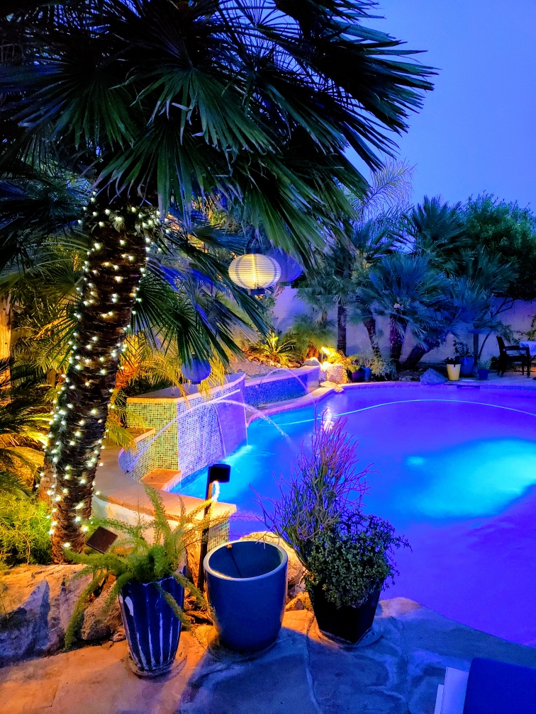
A friend in Phoenix has tricked out her pool with fabulous landscaping, spectacular iridescent glass tiles and LED lighting – the luminous colors an be changed with her mood!!!!

Swimming pools, a gorgeous grotto, lap lane, all afford the luxury of submersion and even exercise.

We’re speaking with Diamond Spas of Longmont, Colorado this week on behalf of a client who is interested in a partially above ground swim spa!! https://www.diamondspas.com/swimming-pool-spa-collection/custom-pools/stainless-steel-swimming-pools/

The sound of a small water feature to a creek-like landscape addition in your yard – the projects are many. This DIY guy created what he fondly calls “Covid Creek” – a project that took several weeks of focused creativity and back-breaking work all prompted by being stuck at home. The results are a magical mountain stream flowing beneath the trees in their modest-sized backyard. A creek-like water feature or pond can offer a respite to sit beside, dangle your toes and imagine scene far from the confines of our limited environs. You would be amazed at what beautiful illusions can be accomplished!!!
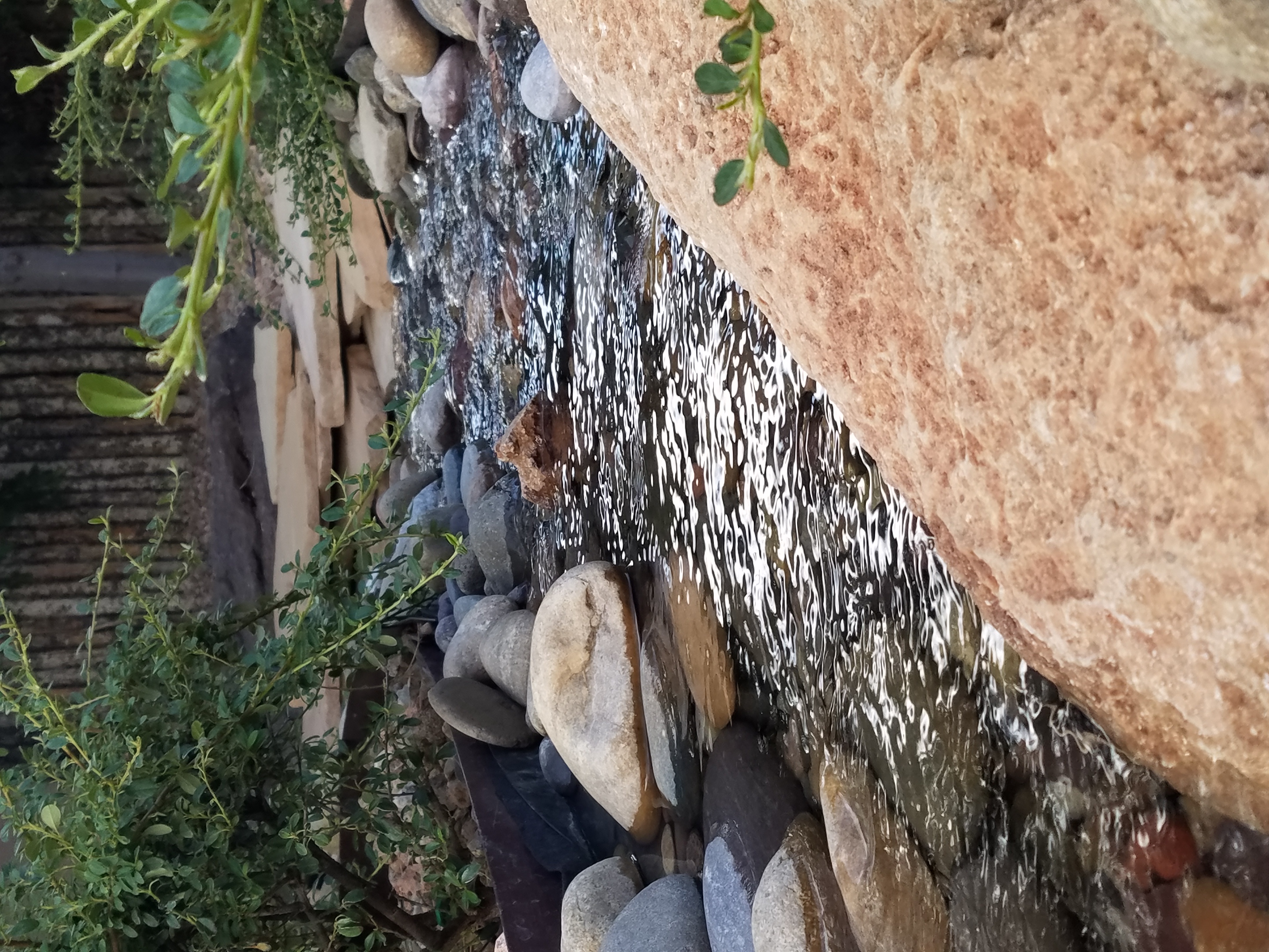
A babbling backyard book built as a therapeutic DIY project during the COVID confinement.

Such multi-sensory water features offering the touch and feel of water, gentle sound and visual beauty are powerful design elements to exercise the senses. Our senses suffer with redundant stimulation.  The reclusive limitations of recent months have us stagnating with sameness.  It’s the variety if stimuli we are so accustomed to experiencing that keeps things interesting and alive. Moving water is one of these exceptional sensory stimulations. 
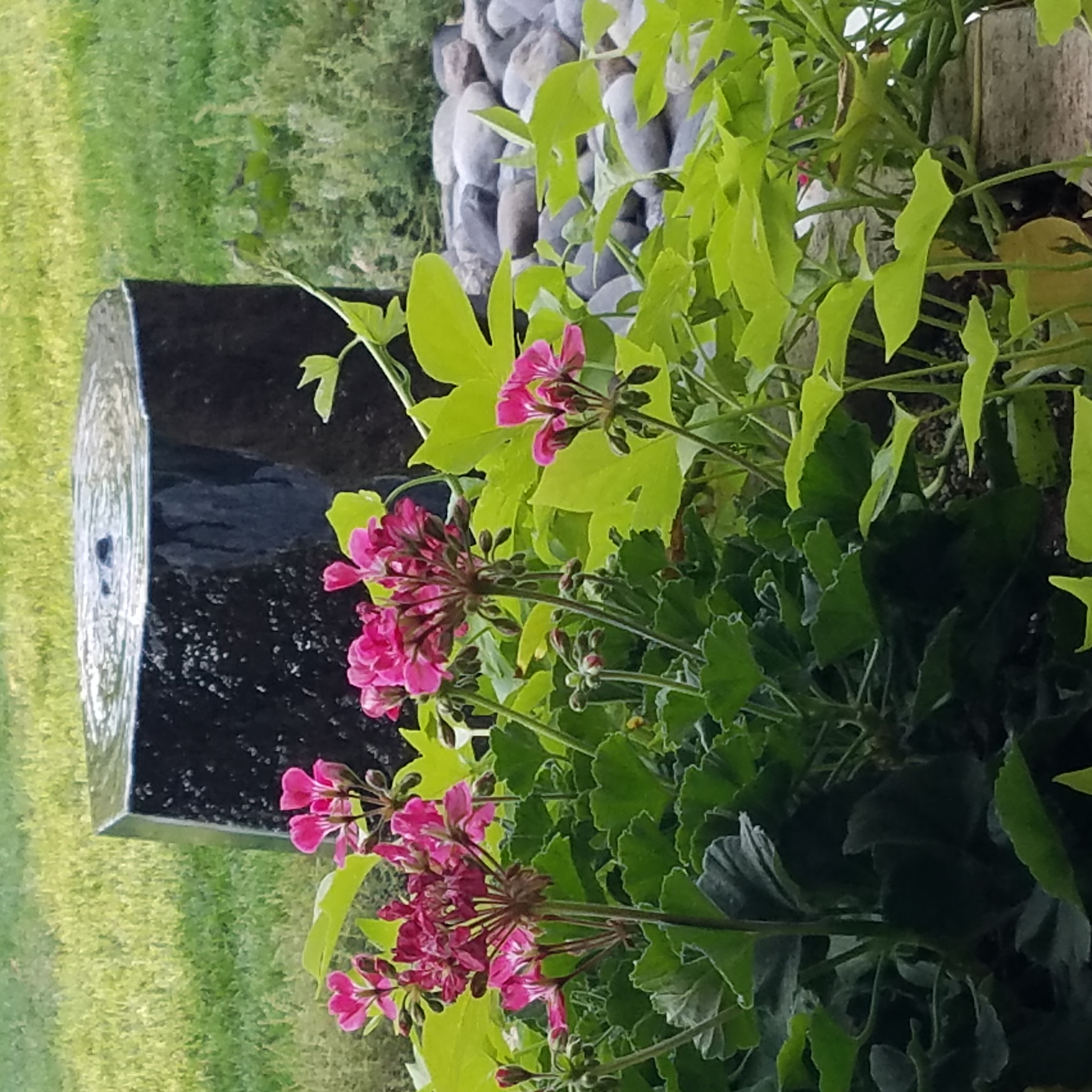
Organic garden sculptures – chiseled granite boulders with re-circulating water – meld with the landscaping.

Whether a tiny fountain or in-ground pool…even a galvanized livestock tub – investigate your options. Regard your environment and study your spaces to select the best design elements for your setting. 

Pull Up a Seat and See What’s Trending

It’s always a good idea to have extra seating, but in small spaces, it’s not always easy to make a room arrangement work.  Apartments, lofts, condos…pulling up dining chairs isn’t necessarily the best solution. What is a great solution is something low that does not block the scene and can be easily moved to change the groupings.

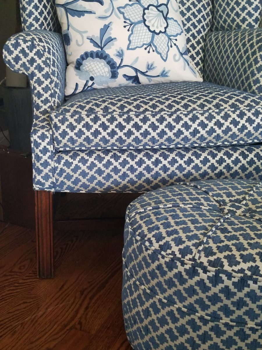
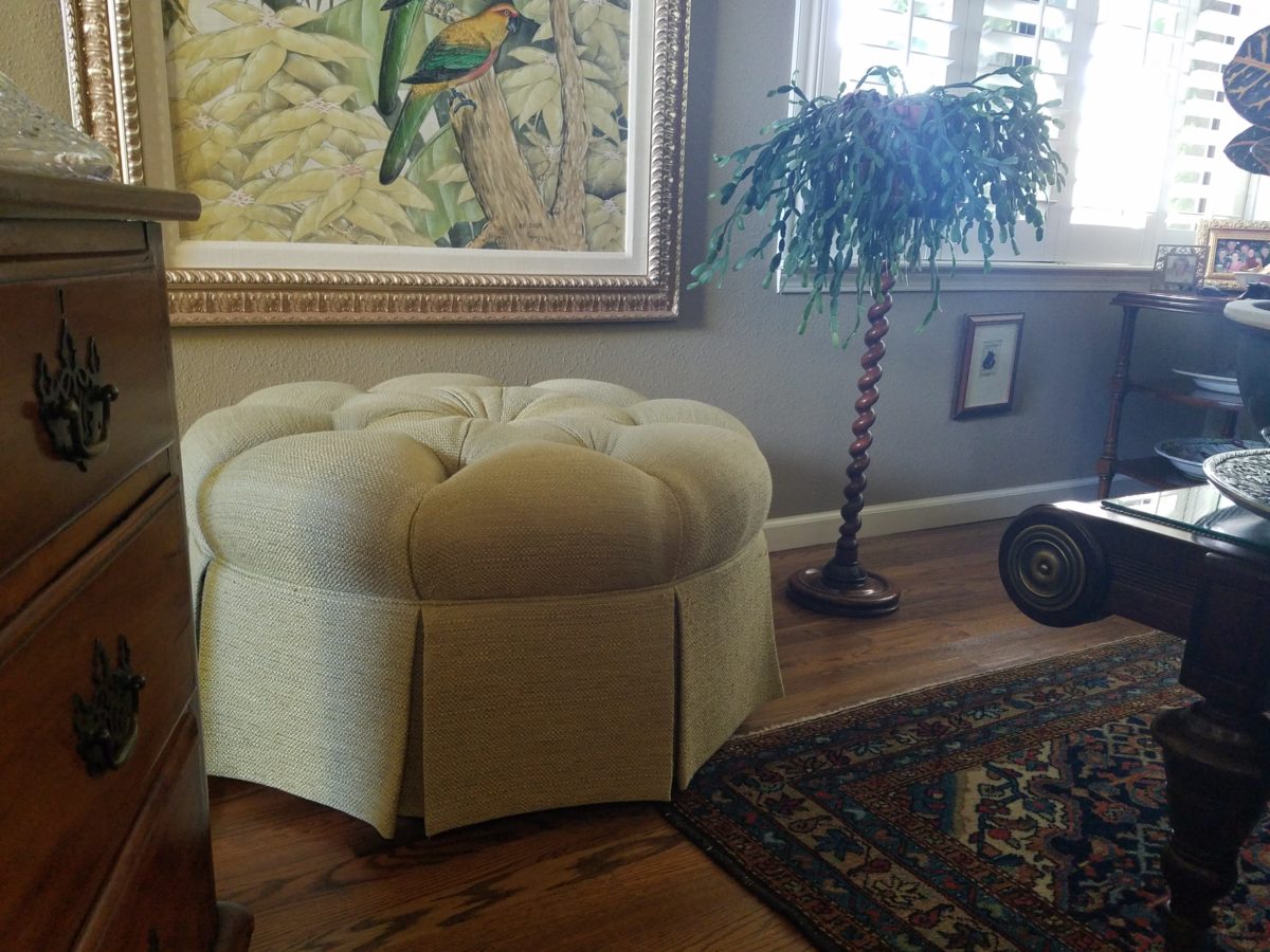
Footstools, benches, poufs, ottomans…as an ensemble with a chair or a stand-alone piece, the options are endless. Trends are often spawned from necessity or convenience of not change for the sake of change.

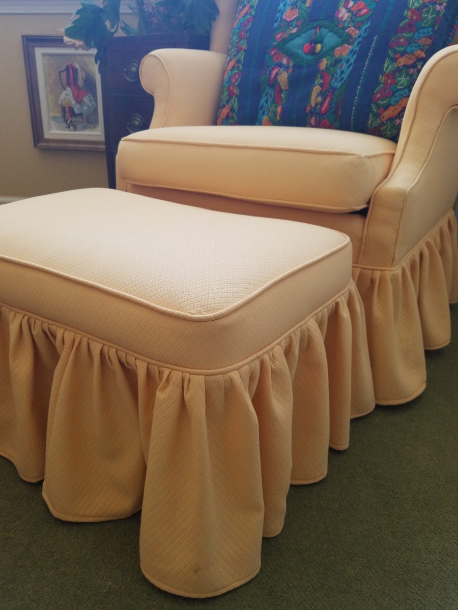
Bedrooms can also offer footstool/ottomans when there is only room for one chair. For reclining to read or as a pull-up for a second seat.
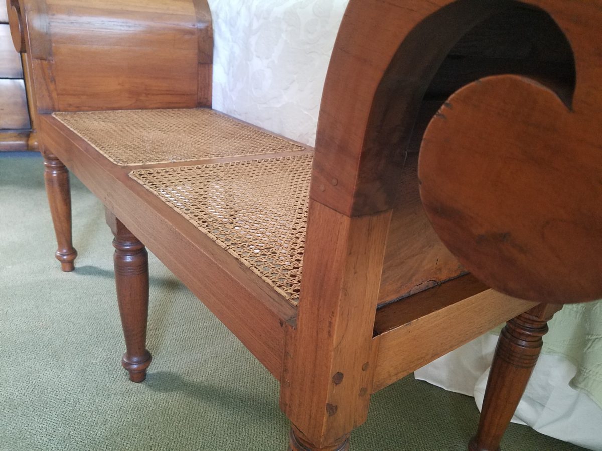
Benches are a great seating option.
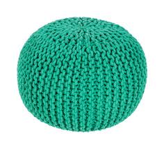
It’s not a wonder that we have sold numerous of these clever SURYA Cotton Poufs in myriad colors in our shop!

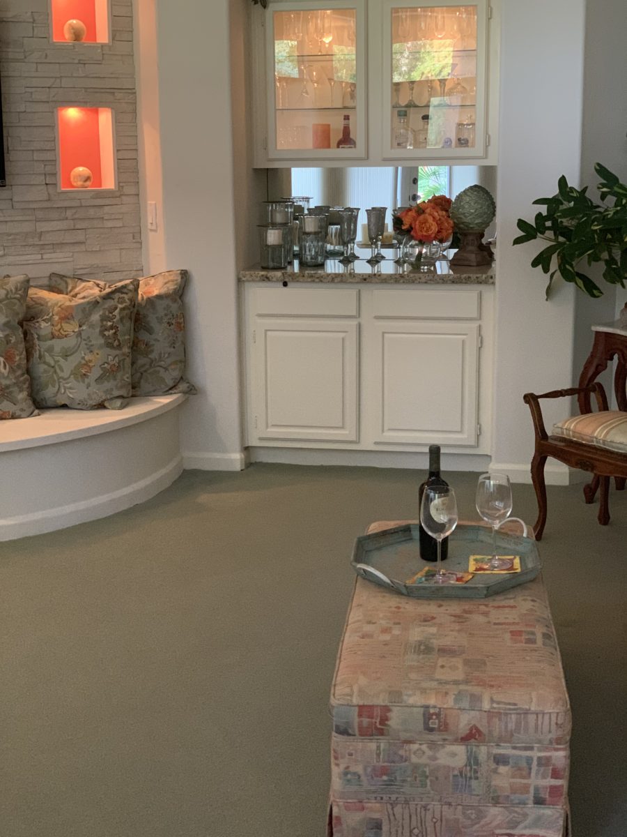
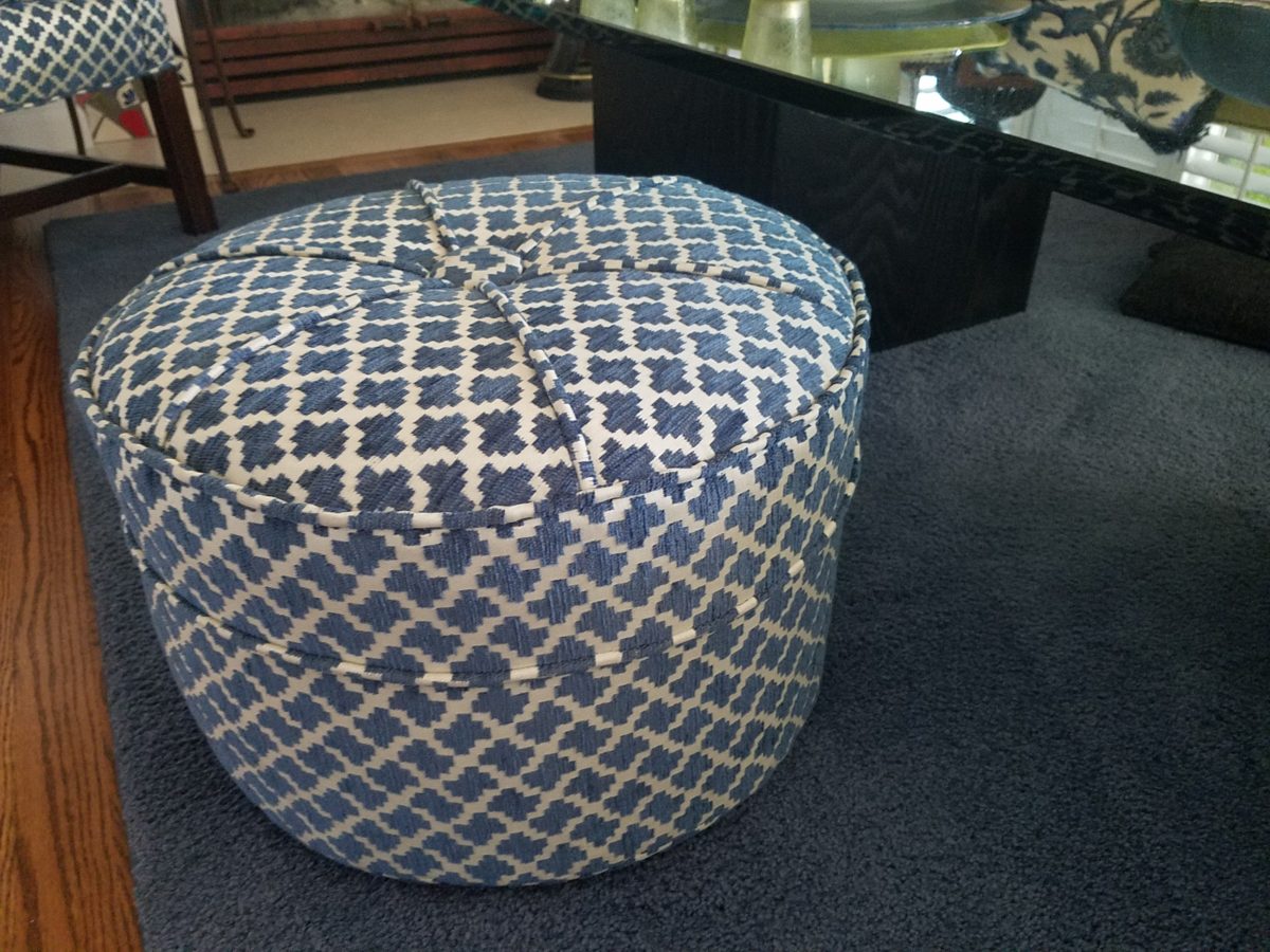
Often used for coffee tables – with a tray  for stability beneath drinks, benches or ottomans can double as a foot rest or table-like surface.

An upholstered bench can be pulled in front of the fireplace or used as a cocktail table with a sturdy tray.

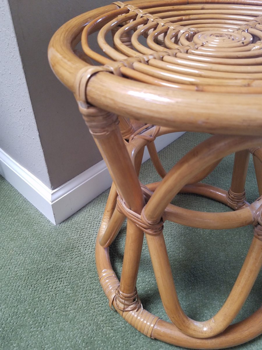
Something as simple as a rattan stool can be easy to pull-up.

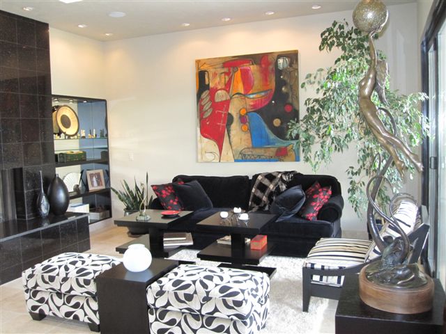
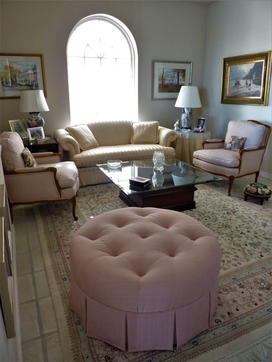
A pair of ottoman frame a seating area. An ottoman never has its back  to anyone or anything.

You can seat more than one person on a good-sized piece.

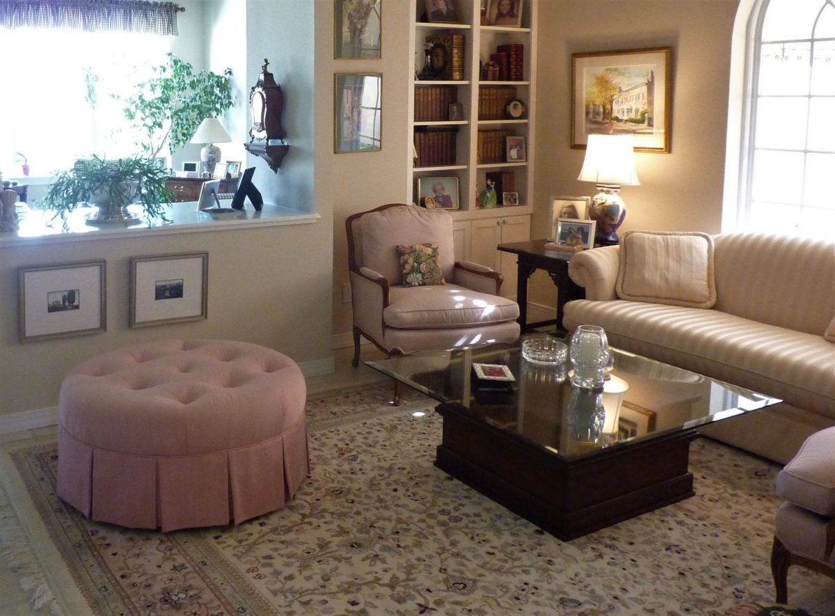
A round one can have guests facing different directions to join in different conversations around the room.

Low in front of a fireplace, tucked beneath a coffee table or a console table, they can easily be pulled out when needed.

Here a pair of square cubes are stowed beneath a console and pulled up to the group for extra seating.
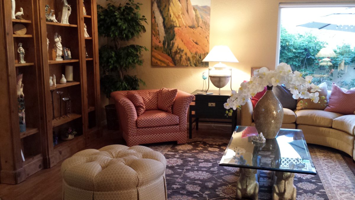
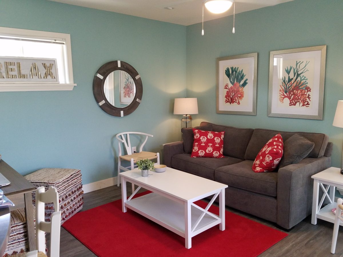
They add a splash of color or pattern.

Or they can meld in with the color scheme.

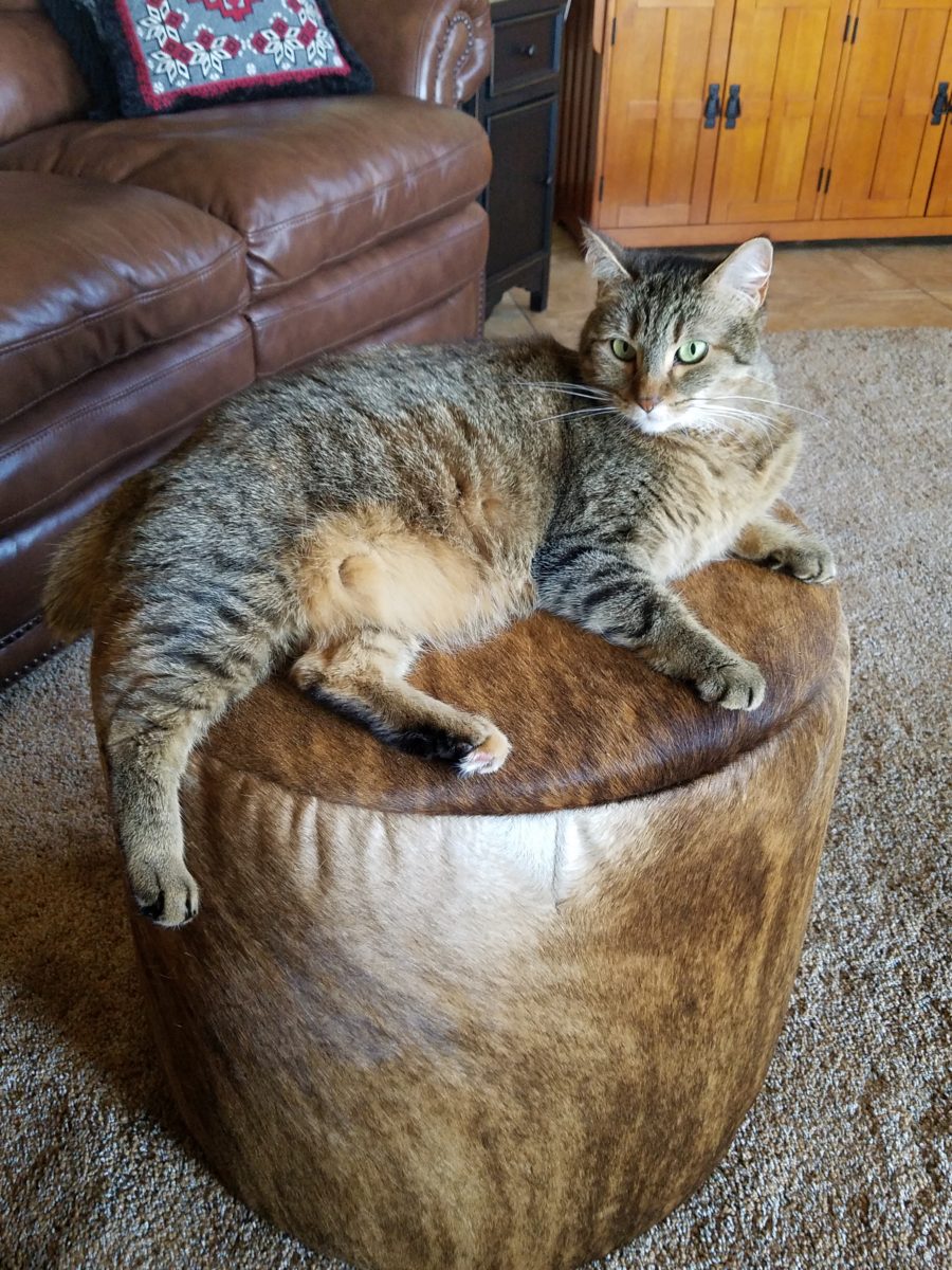
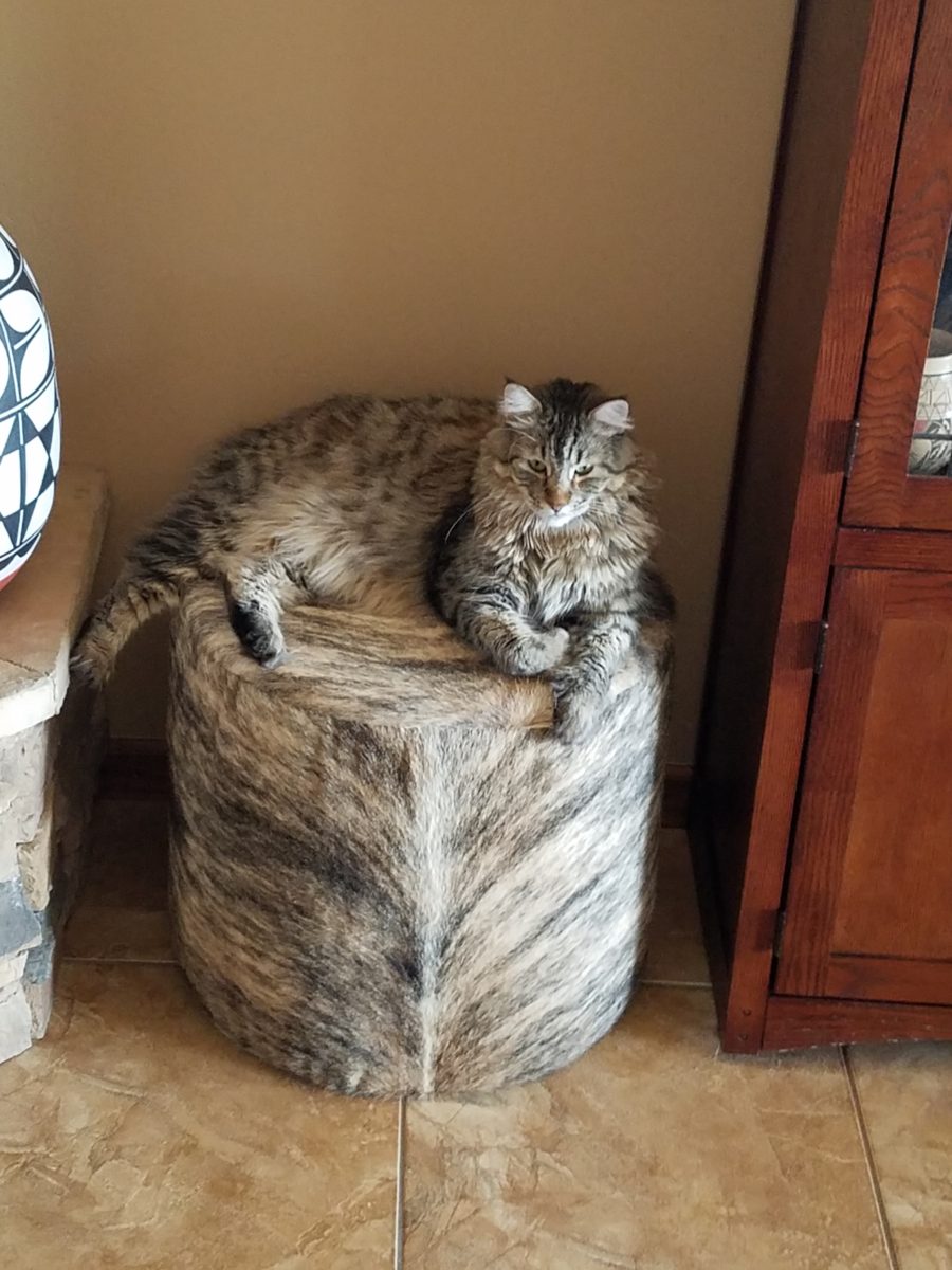
These cats think they are hiding on these custom fabricated cow hide stools.
Cow hide camouflage makes the perfect perch for these cats…but they are intended to be handy for guests as pull-up seats around the coffee table in front of the fireplace.

Look at your room and see if it wouldn’t benefit from an extra low-profile seat or two.

Back to School: 10 Pro-tips for Setting Up a Dorm Room

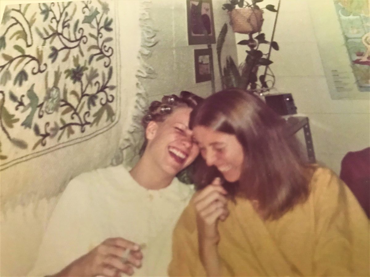
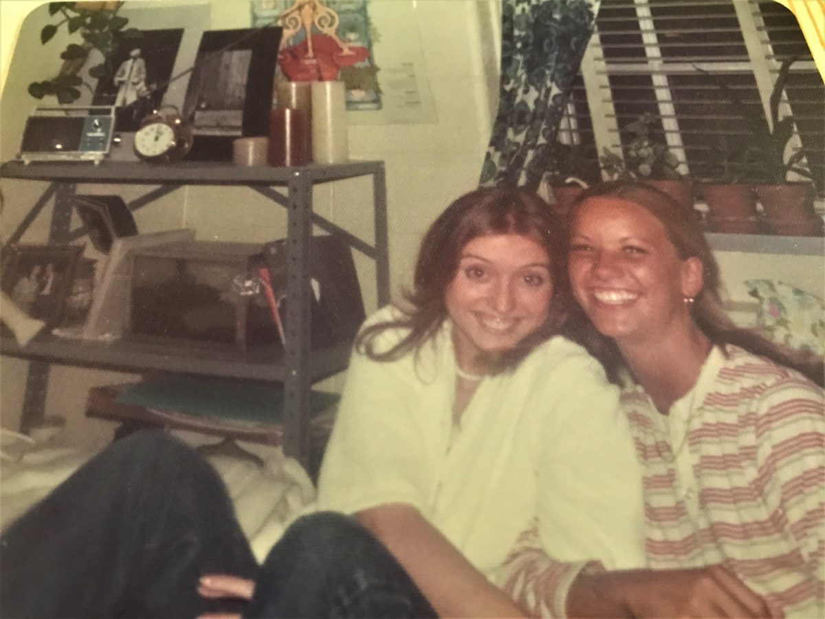
It’s that time again…the end of summer and getting kids back to school…exciting, hectic, a bit stressful and today, very nostalgic. I (who saves everything) still have my little black and white Sony TV, embroidered fiber art that hung on my wall, floral twin bed sheets and bath towels! I remember the white chenille bedspreads that I got – giving one to my bestie/roommate so we’d match – even though she was a red accent person and I chose blues and greens!! We picked each other, our college and designed our neat and tidy package.

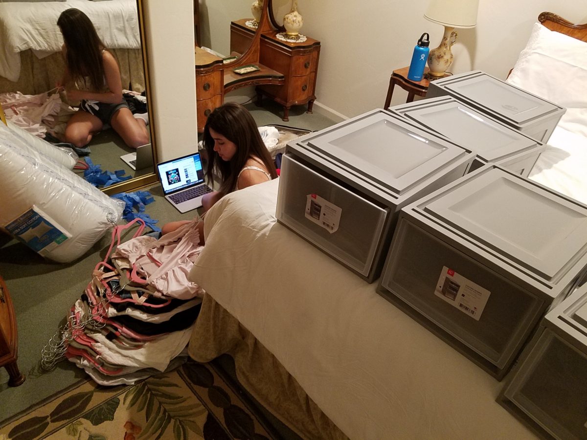
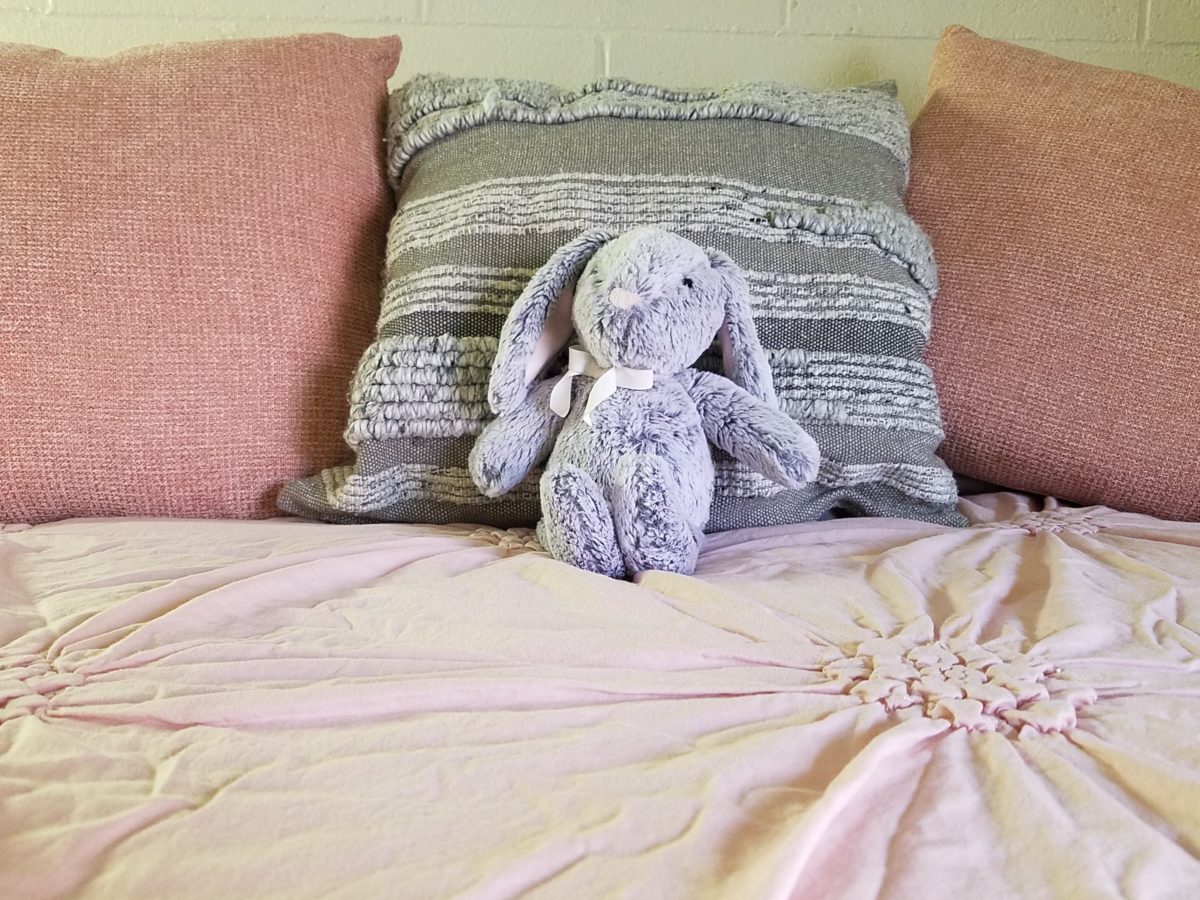
Earlier this weekend, as Victoria navigated this information highway that is the lead-up to getting her dorm room assignment, roommate and all the related details, she texted her yet-to-meet roomie and asked what her color scheme was going to be. Victoria, having established her pink (dusty rose) and grey scheme last fall upon entering her freshman year elsewhere, was hoping that she was not going to have to share her intimate space with a shocking orange scheme or similarly discordant color. All of a sudden, from the back seat came a exclamation – “NO Way!” To what, we asked  – “What?”  And she said “Guess what her color scheme is? Pink and Grey!!! YAY!!! What were the chances?”

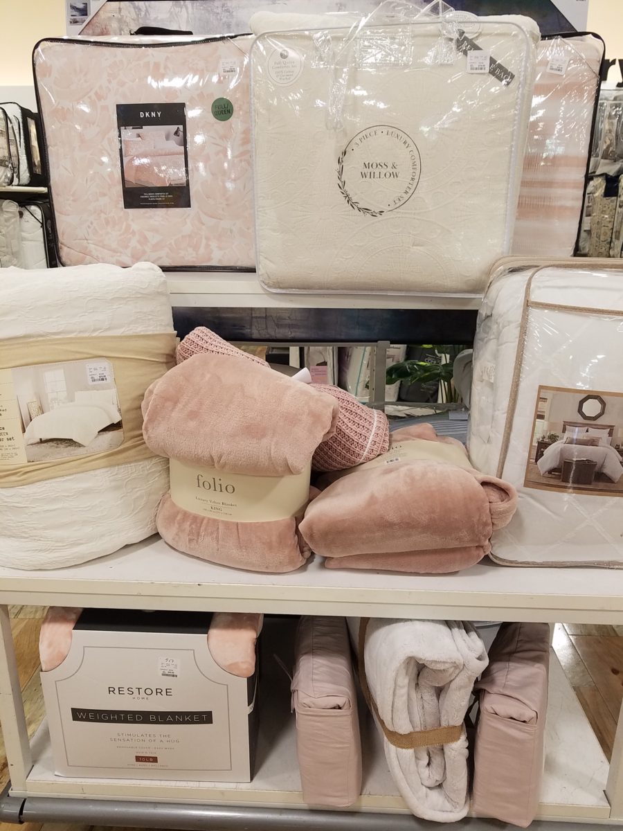
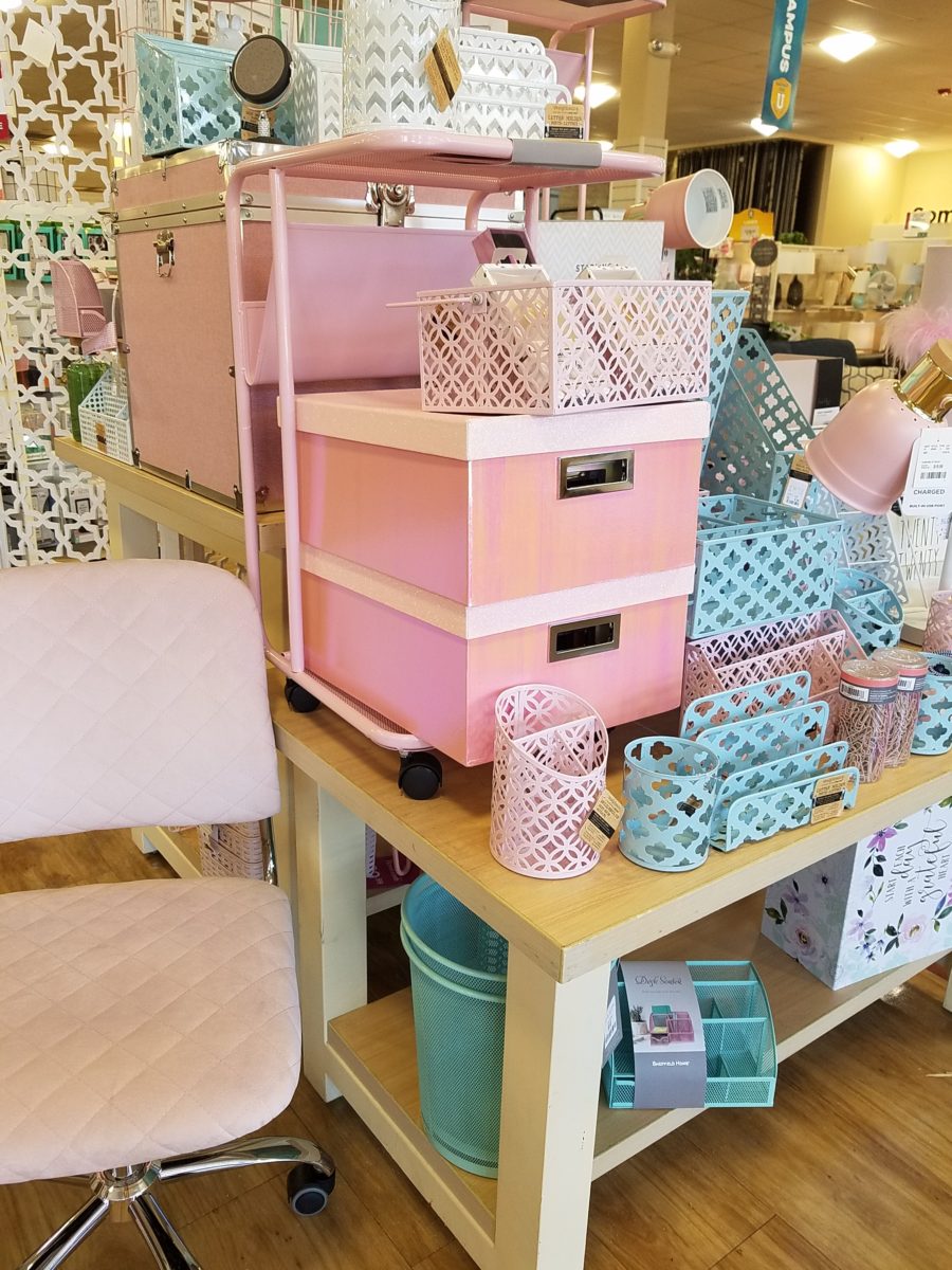
Well, strolling through the stores with their piles of offerings displayed in tempting color-coordinated arrangements, pink and grey still carries over from last fall in a big way – so the chances, it seems, were not all that far-fetched!! LOL.

With the prominent pink and grey,  popular turquoise and grey and for the boys (if we are being color/gender-esque) black and grey – seems grey is the common denominator facilitating merchandising and keeping everyone in color-trend order.

Pro-tip #1 Make a list of what you’ll need prior to hitting the stores with their limitless temptations for dorm decor! It can be daunting if you go shopping – cold. It can be daunting anyway – but best to attempt to be prepared! As I looked around all the displays leading these trends…leading these kids…I wondered how many – if any – might veer off course and pick an orange and lime green  theme or brilliant cherry red…and what does it say about one if they buck the established trends?  Some might be oblivious to the trends – despite being bombarded in every store by the “must have” selections. Those independent thinkers who like what they like – if it matches or not.  The eclectic ones who are driven by memories, personal expression and acquisitions gathered and honed over the years that were not guided by trending decor influencers.

However, it is entirely possible to genuinely LOVE the trends and invest in the colors for more than the first semester of eager dorm room decor! We were living it! What was purchased last fall was saved and expanded upon, with new-found knowledge of the tips learned from the pros! There are boxes, bins, rugs, lamps, staplers, desk organizers, linens, bulletin boards, throw pillows, blankets and throws – all color coordinated making the job relatively easy and swift.  

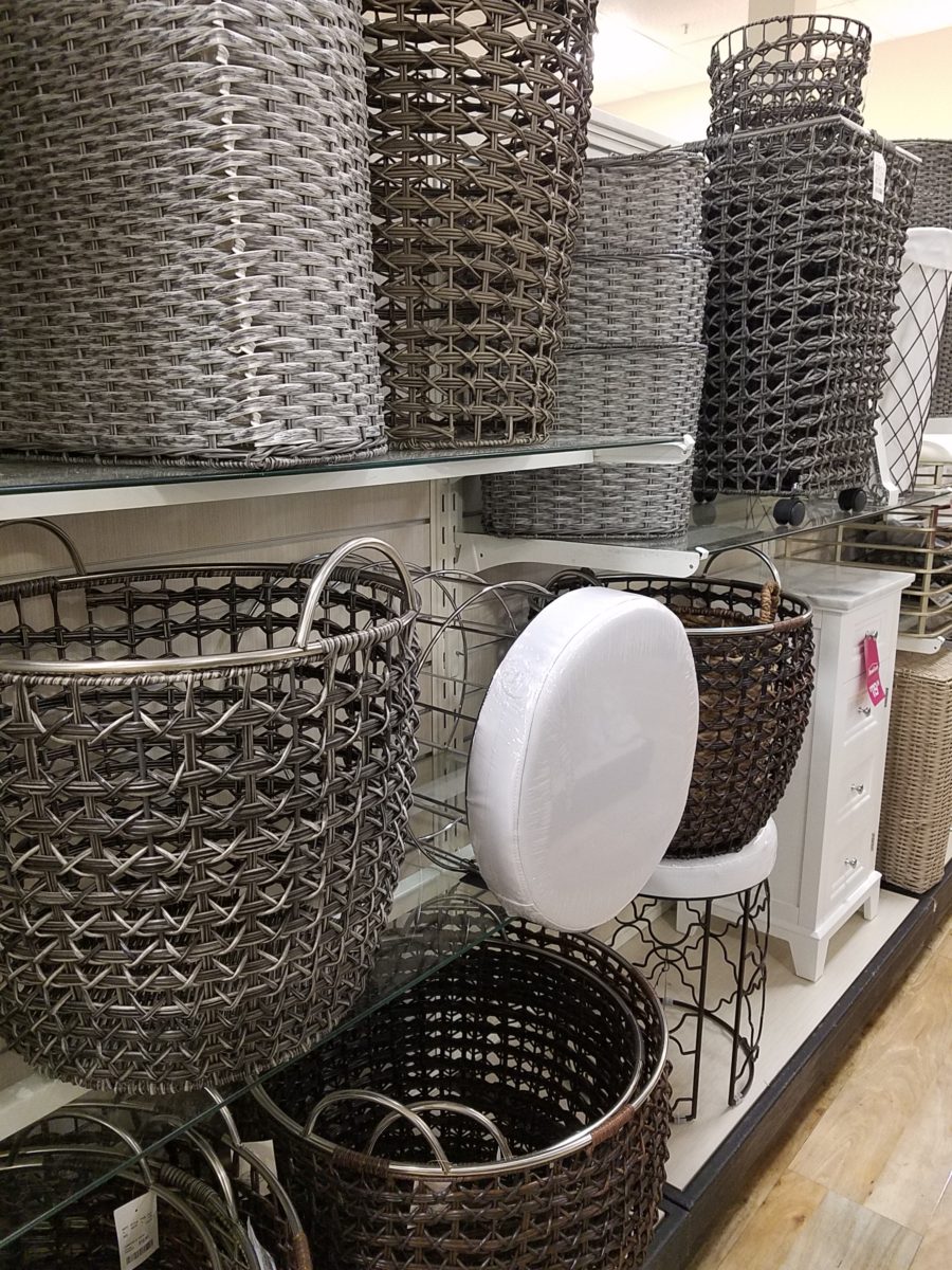
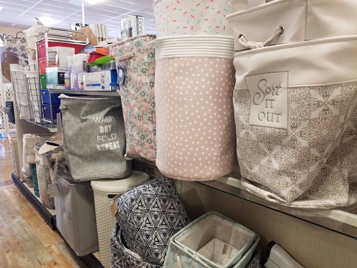
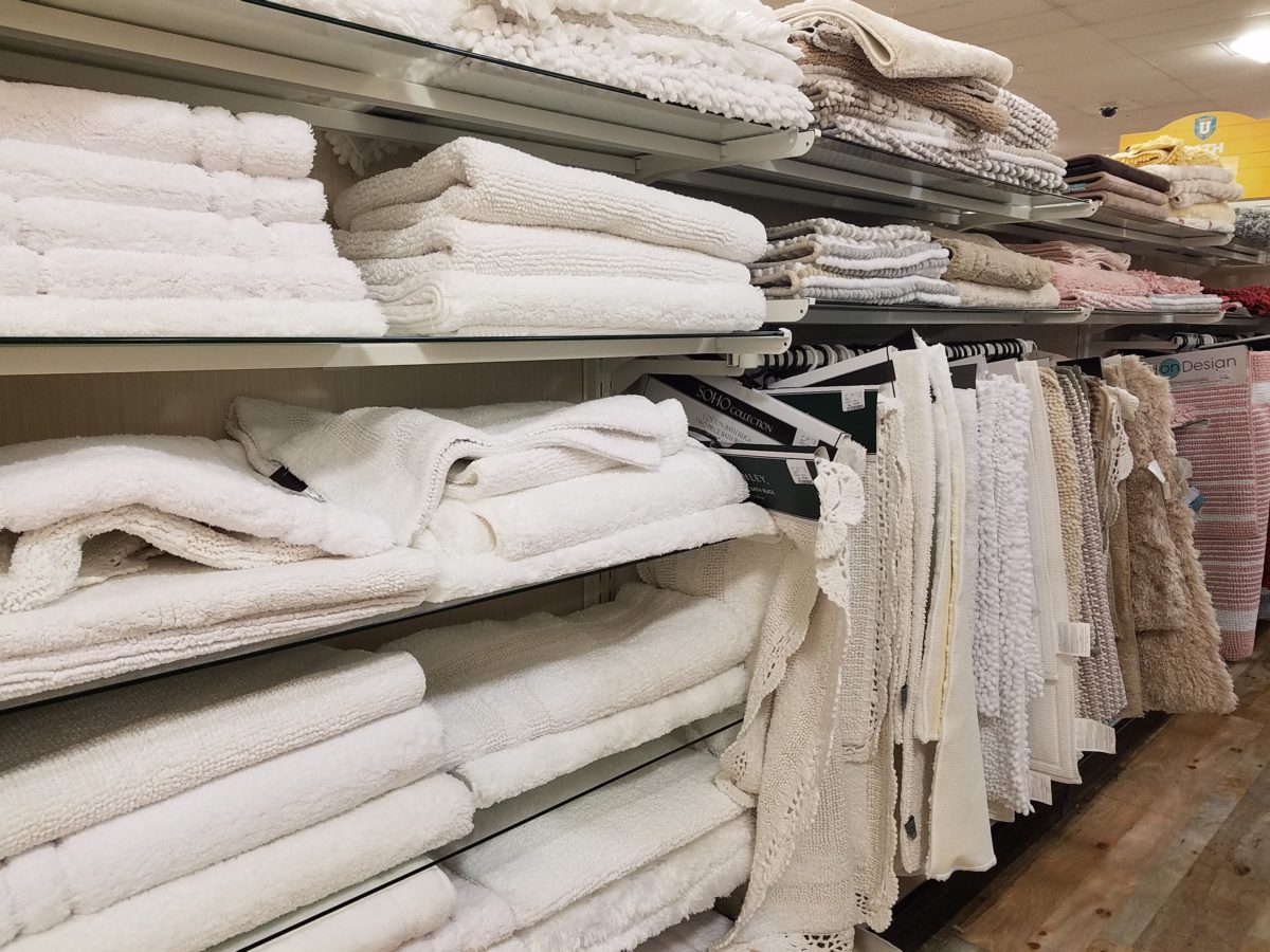
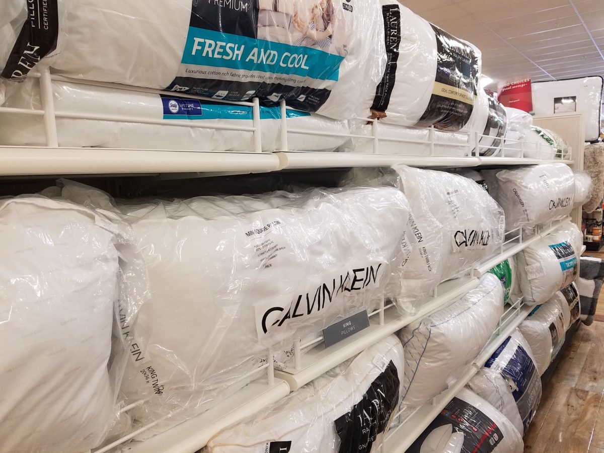
The stores are prepared. Welcoming students – their signs are out and their shelves are stocked! Rows of pillows, mattress covers, foam pads, artsy accessories and accents galore…all to enhance the otherwise bare rooms that will soon come to life!

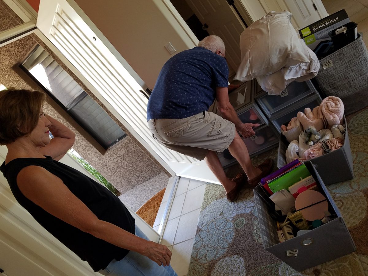
The morning of the move, they staggered the move-in time to insure an orderly point of arrival and processing to the rooms. We were assigned 9:30 and met curbside by a handsome posse of volunteer boys who were armed with rolling cartons cleverly created using carpet-wrapped moving dollies upon which were mounted large, sturdy cardboard cartons. These rolling bins were piled high with contents from the cars and wheeled into the dorm rooms with efficiency. Co-eds in red t-shirts identified them as the RA staff – the ones with the answers to all of your questions.

Being organized is key. Victoria had benefit of a previous semester where she watched the pros and got their tips! Pro-tip #2  Be organized!

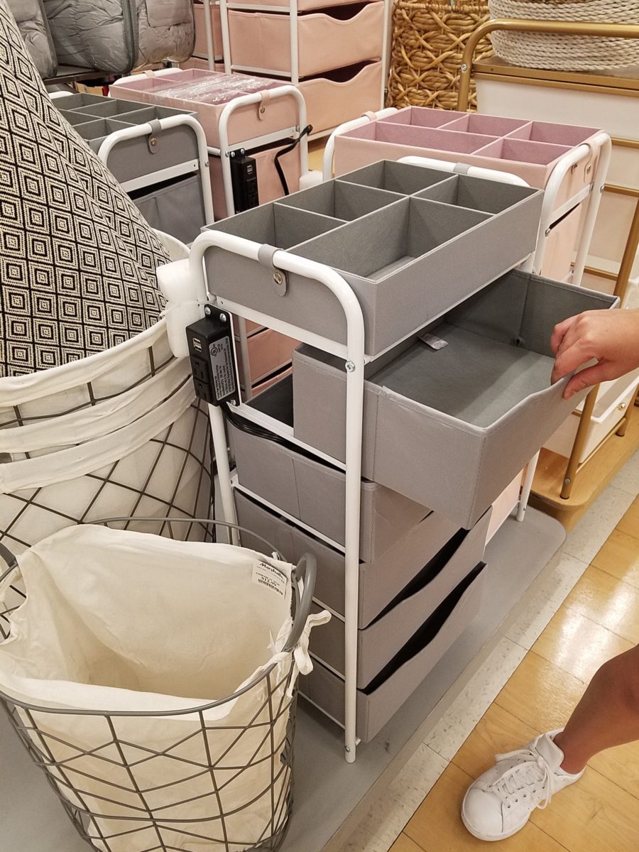
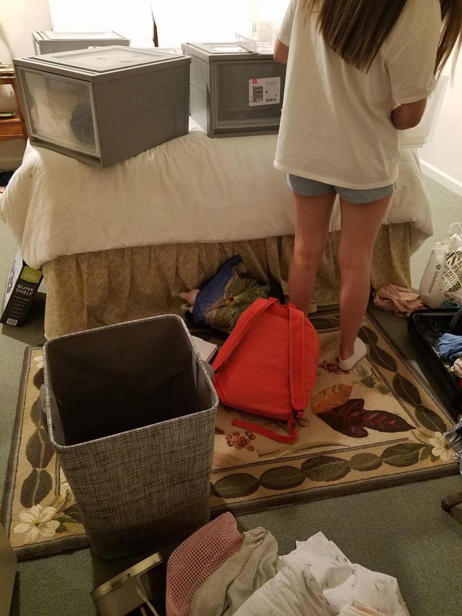
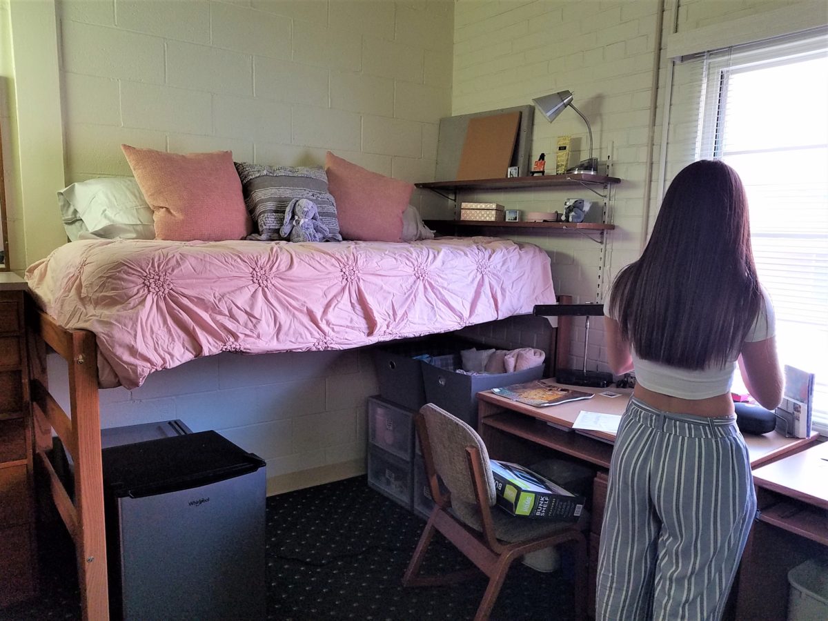
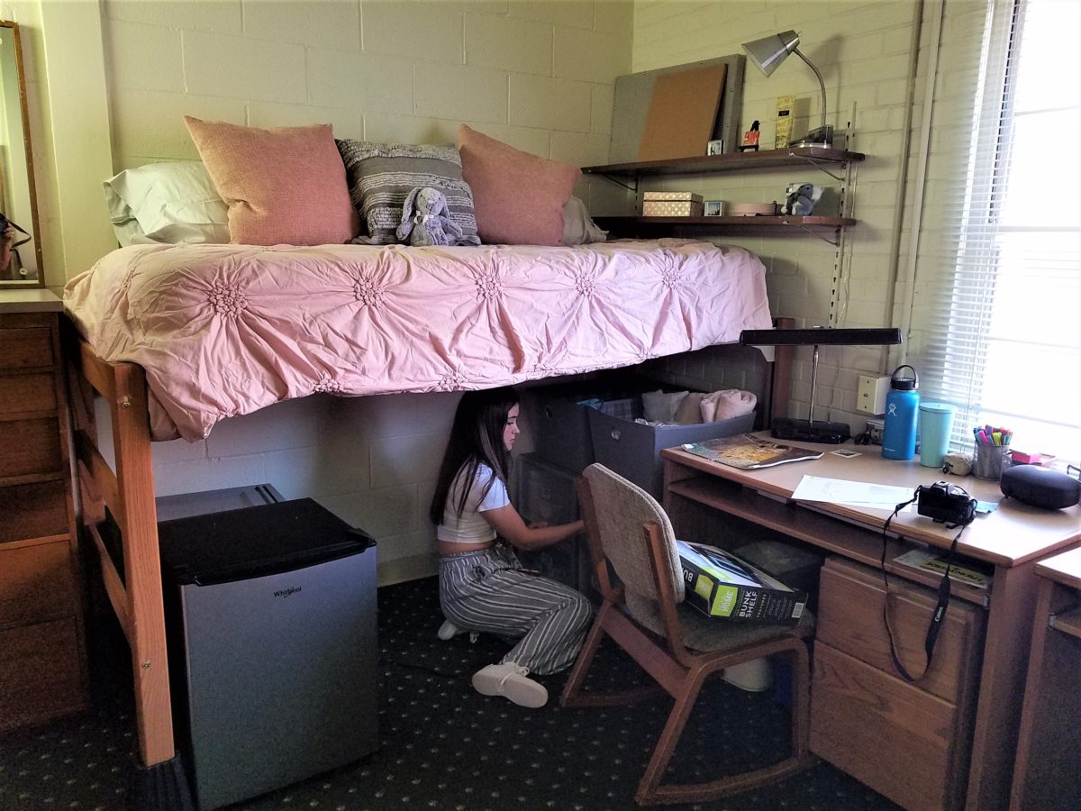
To that end, utilize your limited space to the max! Capture all available real estate! Pro-tip #3  Bed risers. The beds are high – high enough to stack storage drawers/bins beneath them. They can be raised even higher with risers. Pro-tip #4 The plastic stacking drawers are cool because they make easy access to contents just like added dresser storage space.

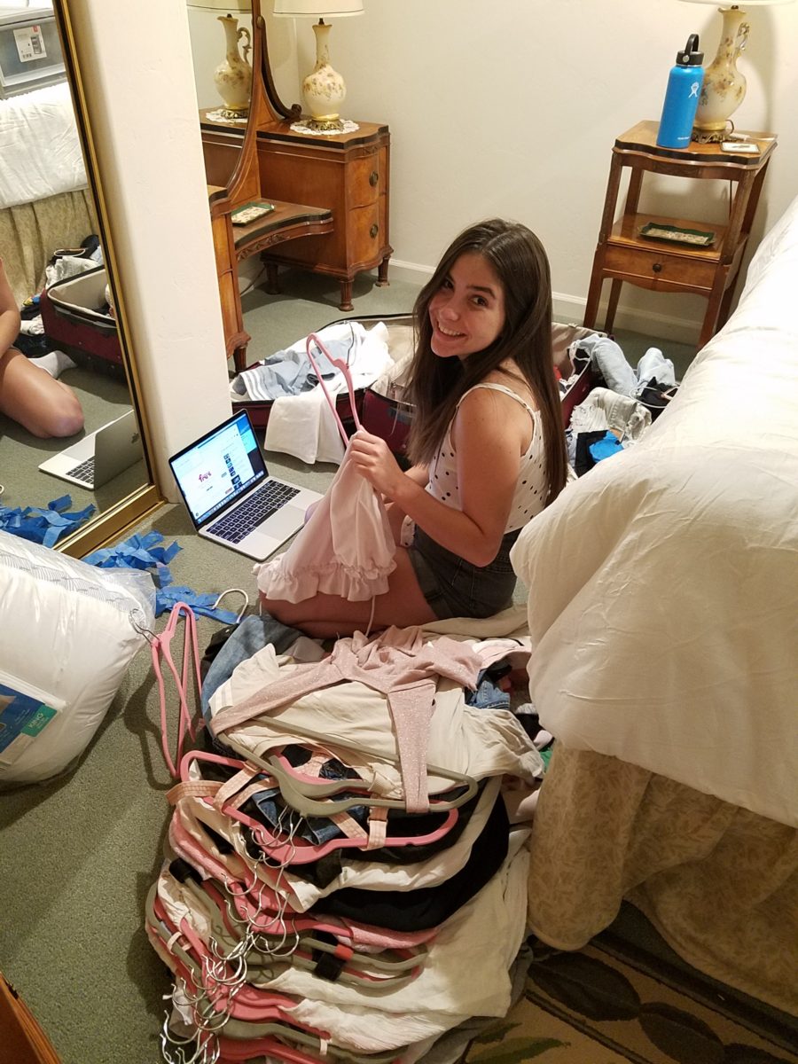
Victoria had it all figured out. Pro-tip #5 To consolidate luggage, she packed a lot of her clothes in the bins – all in very specific order and folded making it easy to transfer once in the room.

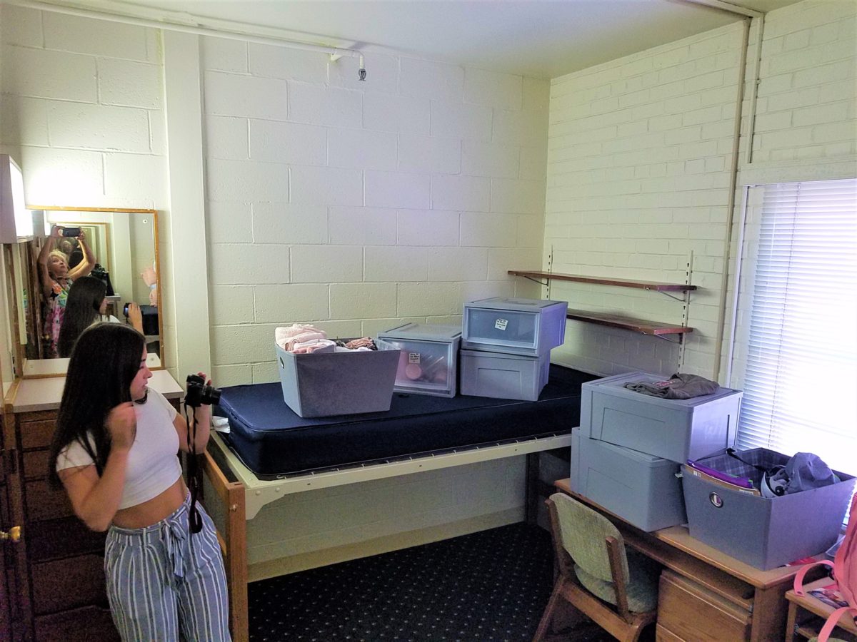
Once in the room, she raised the bed even higher on 4 cone-shaped plastic riser units that she had purchased. She then placed her new mini frig (Pro-tip #6 Get a mini frig) and bins beneath the bed in an organized fashion. She emptied the bins one-by-one into the chest of drawers thereby freeing the bins for other supplies such as snacks, kitchen supplies and miscellaneous other necessities.

Having a mini frig in the room keeps personal perishables under control and handy instead of having to label things in the shared frig down the hall.

Pro-tip #7 Take extension cords and multi-plug surge protectors. This was handy for the reading lamp waaaaay up high above the now super high bed and also to run power to the mini frig. You can never have enough power sources and another bonus was that one of the set of four bed-riser units had power outlets and a short cord!

Pro-tip #8 Get a collapsible shoe rack/shelf (for ease of storage and transport). They have nifty wooden ones – but we took ours back as the closet had a tidy set of built-in shelves perfect for shoes.

Once the power was all connected and the bins organized clothes put away, it was time to make the bed and add the finishing touches.

It was beginning to look like a home-away-from-home! Pro-tip #9 With hanging implements that will not harm the wall like Command Strips, the walls will gradually come to life with strings of photos clipped with clothes pins, twinkly lights, bulletin boards and other imagery.

 Pro-tip #10 Take photos – the memories are priceless!!!!!!

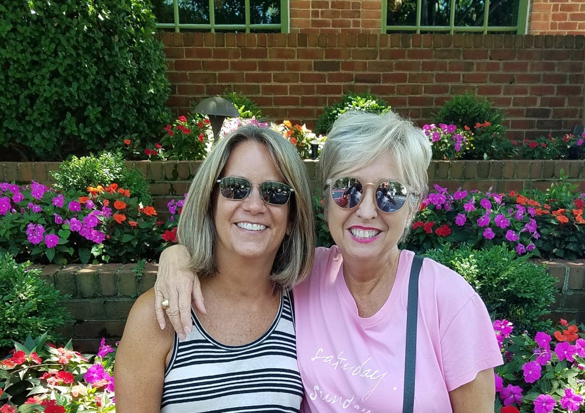
Still crazy after all these years…..

Thanks Sam, for the memories!!!!!

“COLOR IT FABULOUS” – A Color Game to Play and Learn!

After last week’s Color of the Year observations, I furthered the subject regarding the importance, influence and value of colors.

I don’t know the science behind how individual’s eyes perceive and translate color… rods and cones and the anatomy of the eye as it speaks to the brain…but what I do know is that COLOR and the context of COLOR MATTERS even if it is not perceived exactly the same by everyone. 

My parents were coincidentally both apt to notice, remark about and describe color specifically.  To them, and ultimately to me, colors were something to regard and absorb, for better or for worse, and all colors deserved acknowledgement and specification. 

I distinctly remember their descriptions, “Parrot Green, Sapphire Blue, Lemon Yellow, Fire Engine Red and Brown as a berry” – a compliment which indicated that you had tanned sufficiently! I think it was a result of our island home-away-from-home that prompted many of these titles. We, for sure, had no parrots making their presence known in Virginia! But for some reason, colors in the islands prompted unusual appreciation and scrutiny. This parrot green was like grass green but a bit more intense – saturated – not a dark green and certainly not a spring green – just a brilliant, clear, secondary green! The result of true, primary blue and yellow mated to make GREEN!

Color is a communication tool to convey – color. But what color? What type of color? What specific color? Is your version of a color the same as mine? Do we “read” color the same way? Do we express the description of color the same way? How might you explain a color to a person who is blind?

I’m writing this today from the tropics and it seems worthy to note that colors are abundant here in brilliant evidence through all seasons. Whereas in a decidedly changing seasonal and climate, colors come alive in spring, progress through changes and pretty much crash for the dormant winter months. Contrarily, the topics meld their rainbow of blooming floribunda, bounty of fruits and palette of these brilliant colors year round. 

Maybe it is because we straddled both worlds. The lush, verdant, colorfully blooming and always reliable tropics countered by the decidedly and distinctly changing seasons through dormancy in the northern climes. There must be an appreciation for the change. The lovely, yet possibly monotonous climates that produce blooming color all year round might dull the senses to the seasonal reemergence and staggering beauty of new growth and blooming abundance and mute the verbal expression and appreciation thereof. 

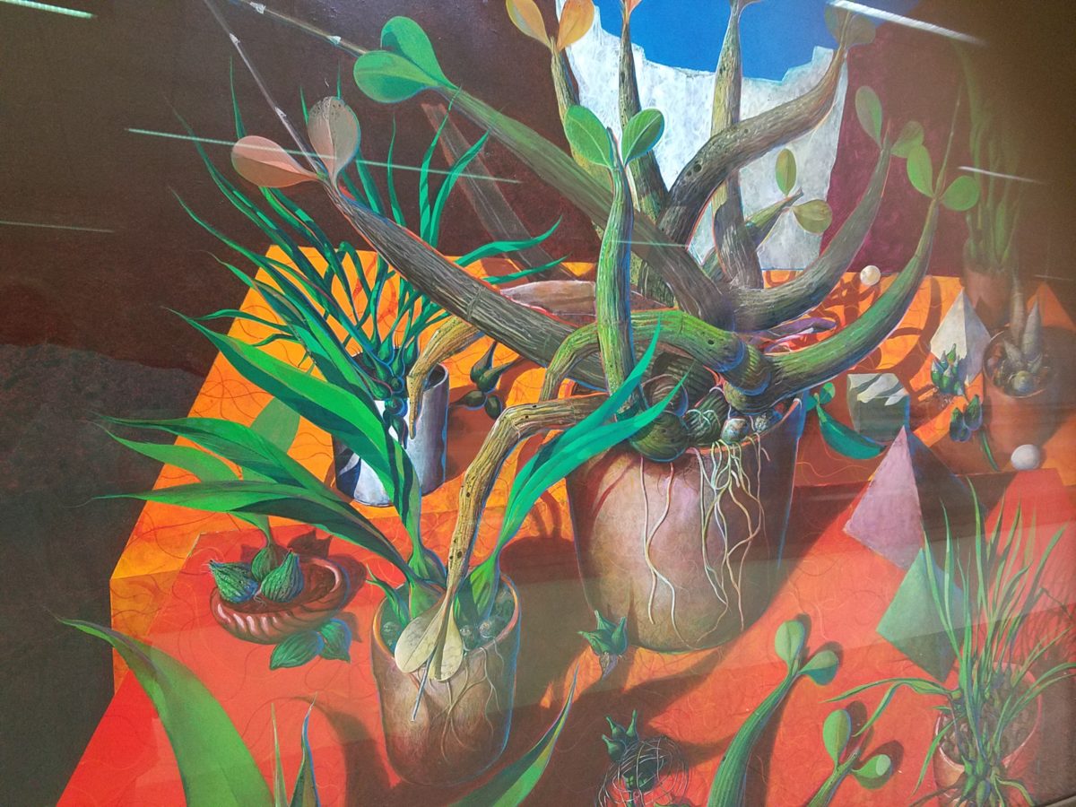
For example, my color antenna is always up and running. As I struggled with my pair of carry-on luggage monstrosities clearly in excess of 75 pounds (good thing there is only a size and not a weight limit!!), I came upon 2 art pieces in the Houston Hobby airport. The colors beckoned me. Although I had noticed them in swift passing, I couldn’t help wanting to see more. So I stopped and dashed back, disassembled my cumbersome haul and quickly took photos of these two paintings on exhibit, in the concourse, in order that I could enjoy them a bit later. Initially attracted by the color, they arrested me allowing and inviting an opportunity for  further examination of their subject matter and detail later, when I had the luxury of time. 

The wildly organic plant life, featuring an animated orchid that tangled and writhed on the painting’s surface in a variety of verdant green’s set against a perfectly selected fiery orange table surface, was brilliantly alluring and seemed to set the stage as a  precursor to my soon-to-be-destination in tropical Mexico.  ARTIST: Lucas Johnson Still Life with Schomburgkia

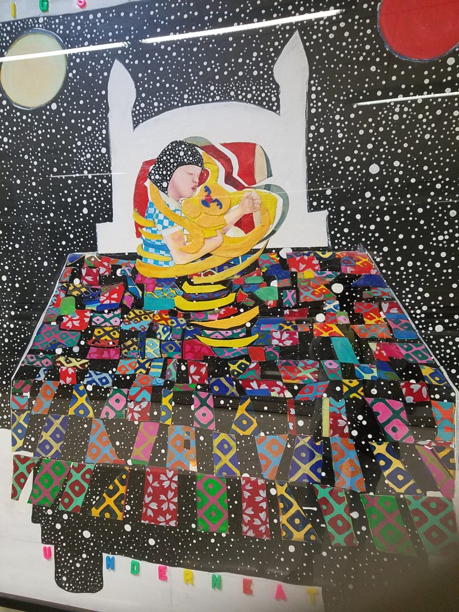
A bit further down the corridor of the concourse another piece caught my attention. Similarly with its colorful invitation, but with entirely  different subject matter which upon closer inspection was quite intriguing, a patchwork quilt of batik fabrics and collage with applied letters beckoning the viewer to wonder what might be beneath was magic. The woman or child and beloved pet in the center of the action nestled under a cozy and colorful quilt, wrapped in a cloak of starry darkness which might suggest clinging to each other against the foreboding imaginings of the night.


The intense collection of the brilliant colors contrasting against black was dramatic, mystic and inescapable in this powerful piece, It Helps to Think We’re Sleeping Underneath the Same Big Sky by artist Joo Young Choi.

Watercolor artist extraordinaire, Susan Weeks,  captured this crate of mangos at an exotic market somewhere very south of here. Peru? Ecuador? I don’t remember. Susan gets around. And, Susan sees color and detail and renders it with remarkably exacting precision. 

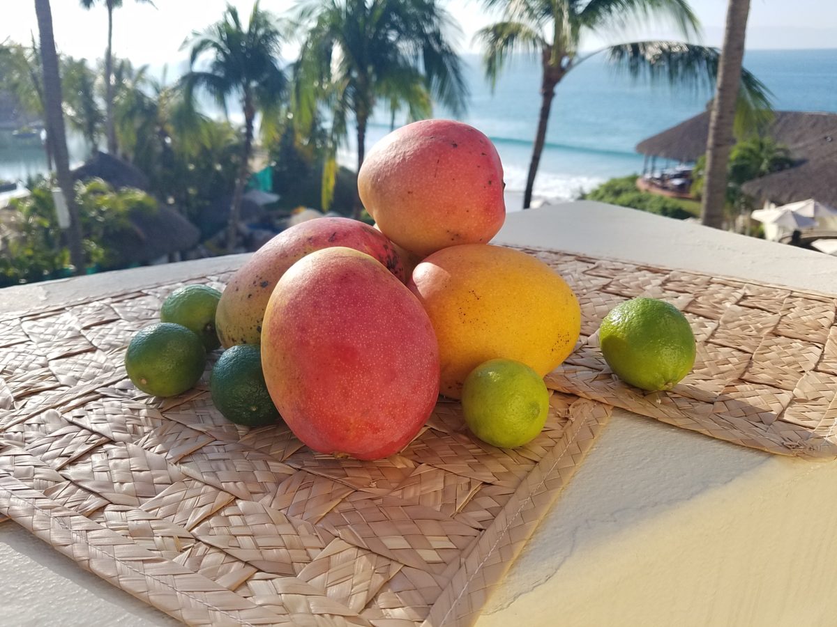
As I greet the day, I’m taking my stash of mangoes out onto the balcony to be seen and photographed in context.  Reminded of how Susan rendered this succulent sweet fruit, with the delightfully “hairy pit” (nods to Tricia), I celebrate this colorful collection of nature in a sensational setting! These gorgeous tones of warm golden yellow, baby iguana green and yes, 2019’s rosy warm coral (Pantone’s “Living Coral”) are nature’s color scheme. The orbs are sensuous and the colors are excitingly bright and luscious. 

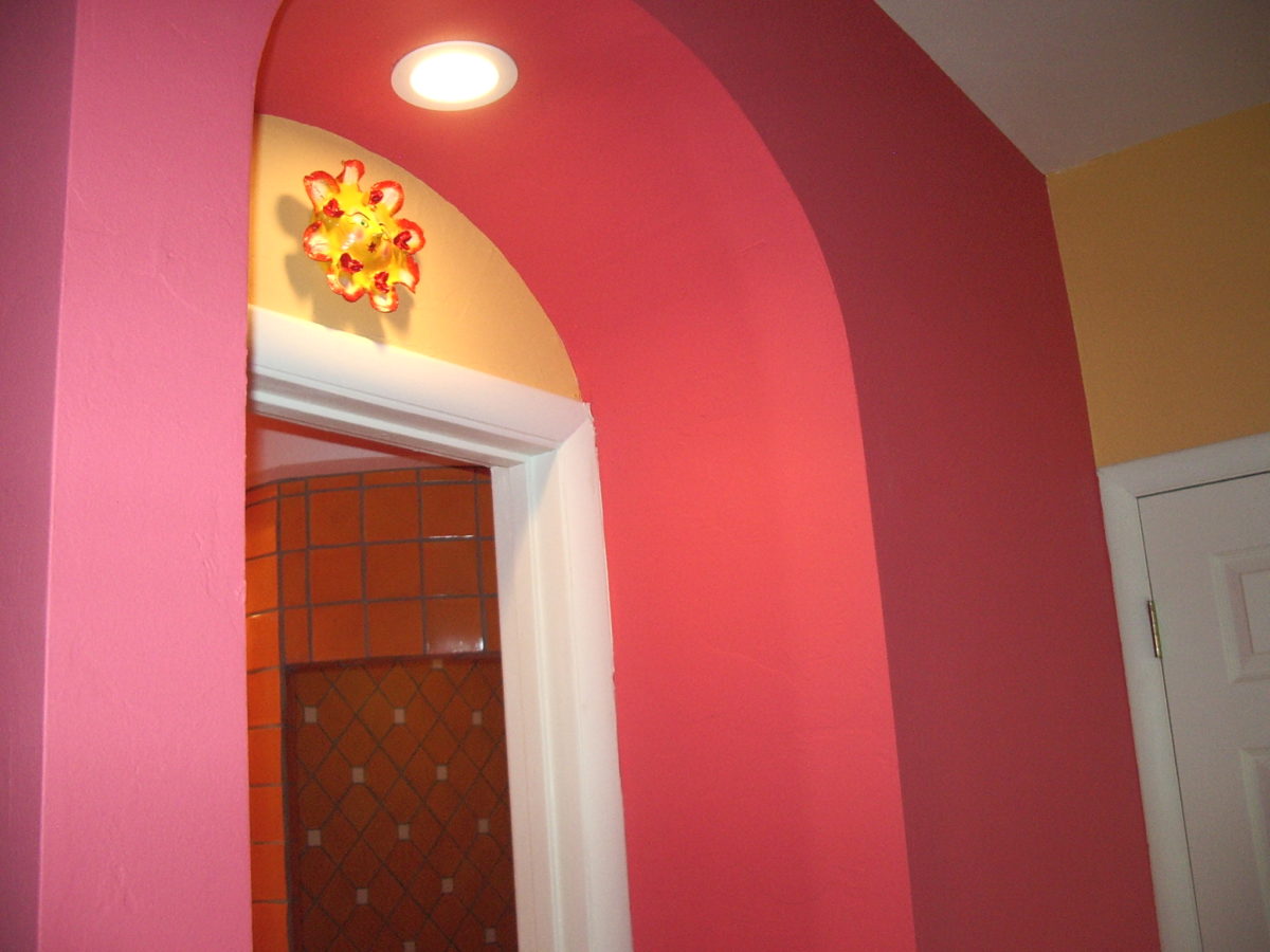
Mango colors of rosy coral and warm, golden yellow are paired in this arched interior entry.

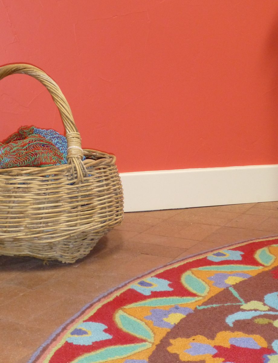
Here a similar scheme featuring one of our favorite Company C rugs illustrates the bold, effective power of color selection.

Try this exercise with color. I have no idea what your eyes see and your brain translates, but walk around and look at things in your world. Notice color. Notice individual items…book bindings to fresh fruit. Evaluate each color’s effect. Does it evoke any emotion…good or bad? If you wanted a painter to paint a wall that color and you didn’t have the paint selected, how would you describe that color in an attempt to get it on the wall as you desired?

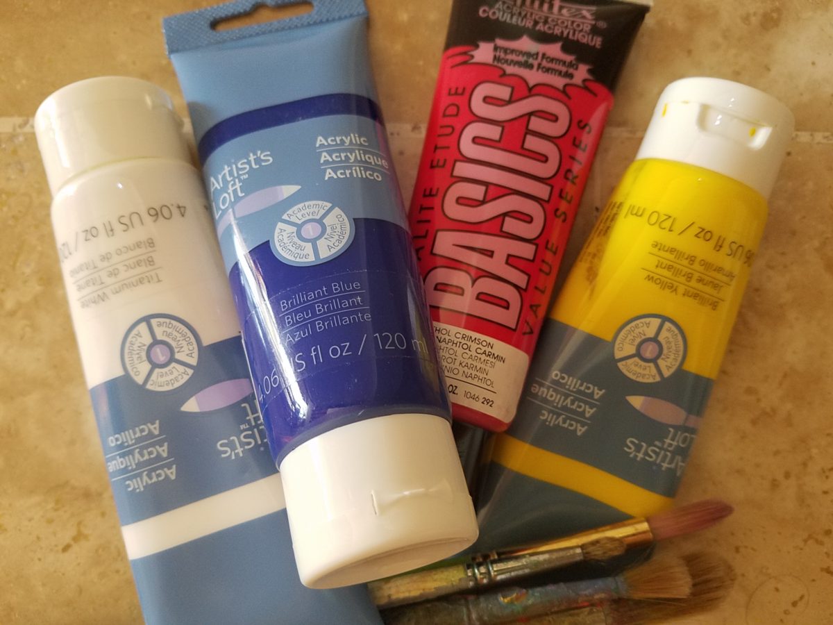
In a more thorough test, you might be prepared with actual paint – like tubes of acrylic from the craft store. Get a print-out of a color wheel to illustrate the primary, secondary and tertiary colors. https://bit.ly/2SVKUMg Buy red, blue, yellow and white and use them to attempt to create the color being described. This could be a party game – but you would need to also have paint chips from the home improvement store or paint store to use as the prompts that would have to be described and used to match the success or failure of the person attempting to create the color.

Noticing color brings appreciation to the details and nuances of our color-filled world.  The little exercise/game, to try to convey a color to another person based upon similar life experiences and references, is interesting.  Please share your thoughts and experiences, dilemmas and frustrations with this project through the blog’s email.
I hope this encourages you to go forth with a new-found appreciation of color and how it adds layers of depth and interest to all that you see. Examine the natural world, or man-made creations in film, set-design, architecture, graphic advertisements, fashion design or interior design. See why color matters!

2019 Pantone’s Color of the Year LIVING CORAL!!!

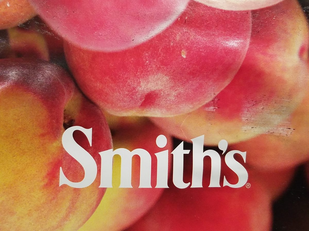
Color. Fashion and trends. Pantone’s annual pick and announcement – this year, based upon observation of the field of design scenes namely Airbnb and Apple, really? I find that amusing. Described by Pantone as “an animated life-affirming shade of orange, with golden undertones.” If orange had golden undertones, it would be more yellow-orange – a golden orange – NOT the pinky-orange suggested by their swatch of Living Coral and myriad examples that are being set forth.  However, a few months ago I noticed and saved (because I liked the colors), a Smith’s Food Store envelope featuring peaches that illustrated the cozy combination of the rosy-orange coral tones with the golden yellows – a perfect pairing.
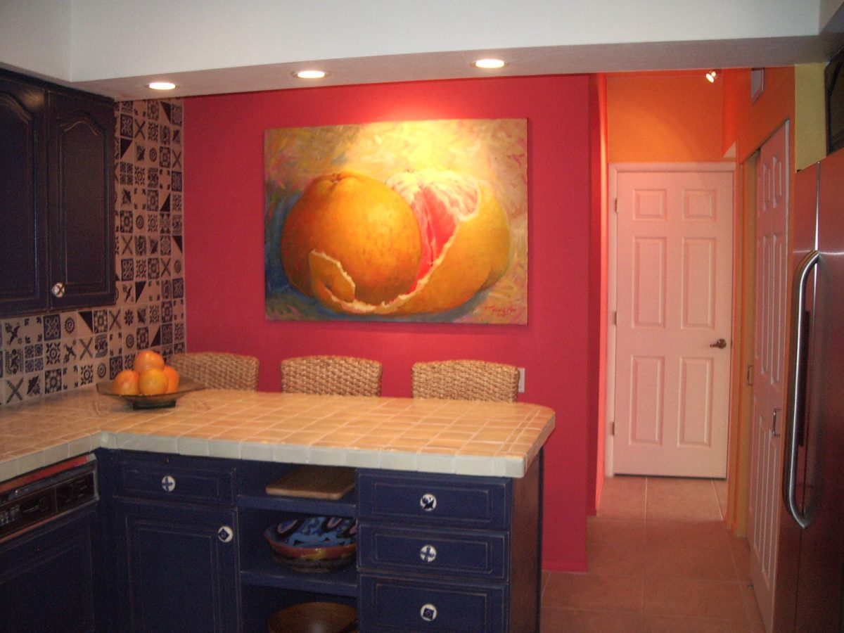
This pinky coral – a hot, but smooth, orange-ish color – has been one of my favorites for years! In 2004 I referenced it as “lipstick” that wonderful color between red, orange and pink! A hard-to-find  lipstick shade sought by many!!! It melds fabulously with citrus colors and is cooled and contrasted by blues. A wall of colors depicts this perfectly.


We painted the wall, took a photo of it and emailed it to Federico Leon de la Vega in Mexico to commission him to do this grapefruit painting with its luscious, pink center and coral shades, wrapped in  a yellow peel and surrounded by cool, bold, brushstrokes of whites and brilliant blues.

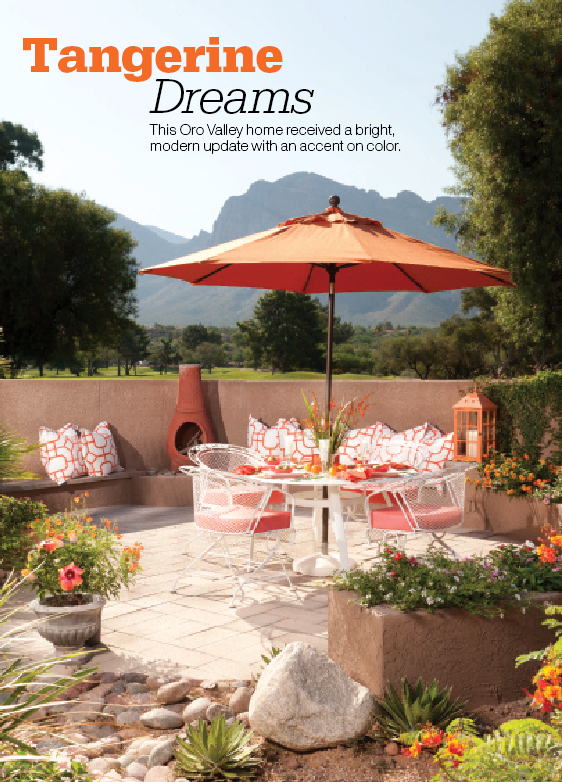
A few years later we devoted an entire project to the fresh, citrus, color tangerine – which because of my personal preference leaned toward the coral shade of orange rather than the pure, natural tangerine. But art is about taking liberties and when developing an orange accented color scheme, all versions are allowed. Right?

This project was punctuated with orange tones from tangerine (for which it was named), and deep warm coral-pink shades. The hue and its many vibrant values!

However, to photo these nuances of color is tough. I walked around the Tangerine project a couple of days ago. It has  stood the test of time by beating trends by a few years and not adopting any particular design elements that would have given it away today.


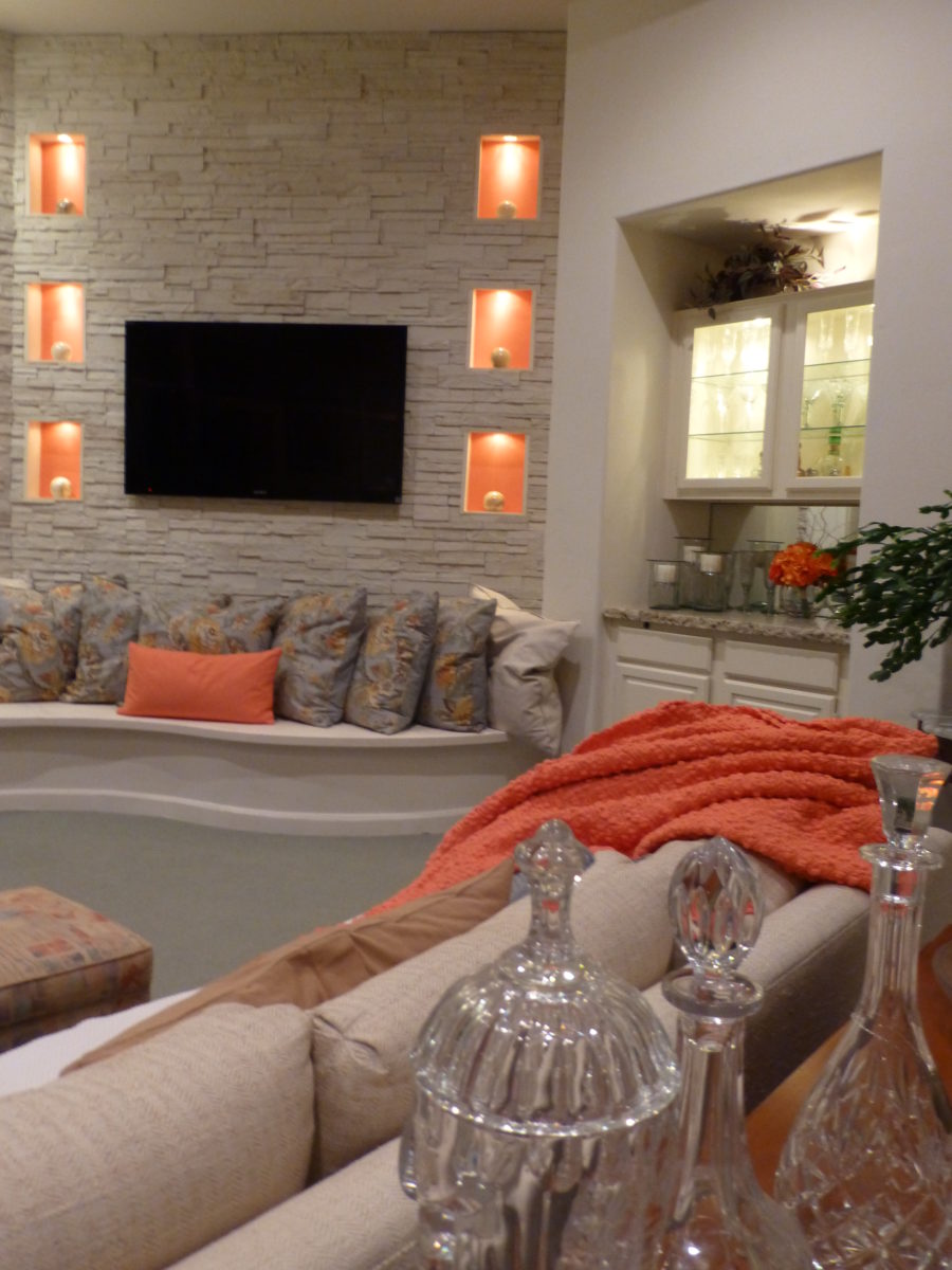
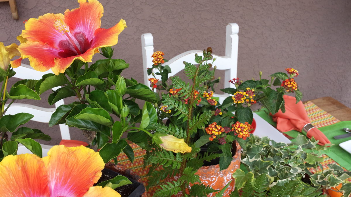
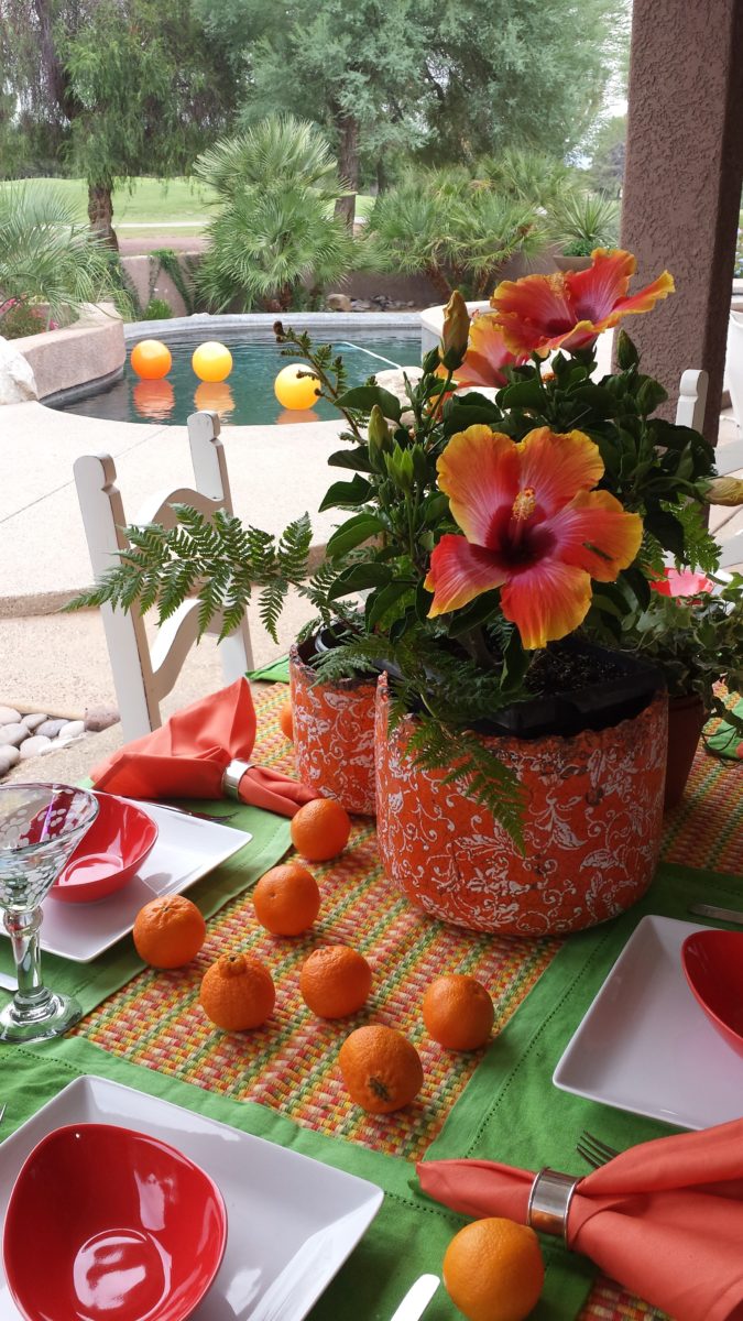
Look at how much nature played a part in the staging of these coral infused scenes!

My advice is to pick the colors that  you like – the colors that make you feel good. Once determined, develop design based upon when to use that/those colors and when to contrast them or perhaps neutralize them.

Coral is bold and warm. It can read hot and energized – although is softer than red and less harsh than orange.

Nature is abundant with coral – not just the living sea coral – but flowers and the rare fabulous accent fur of Vietnamese monkey the red-shanked douc!

Vietnam’s red-shanked douc- brilliant coral accents in his coat!

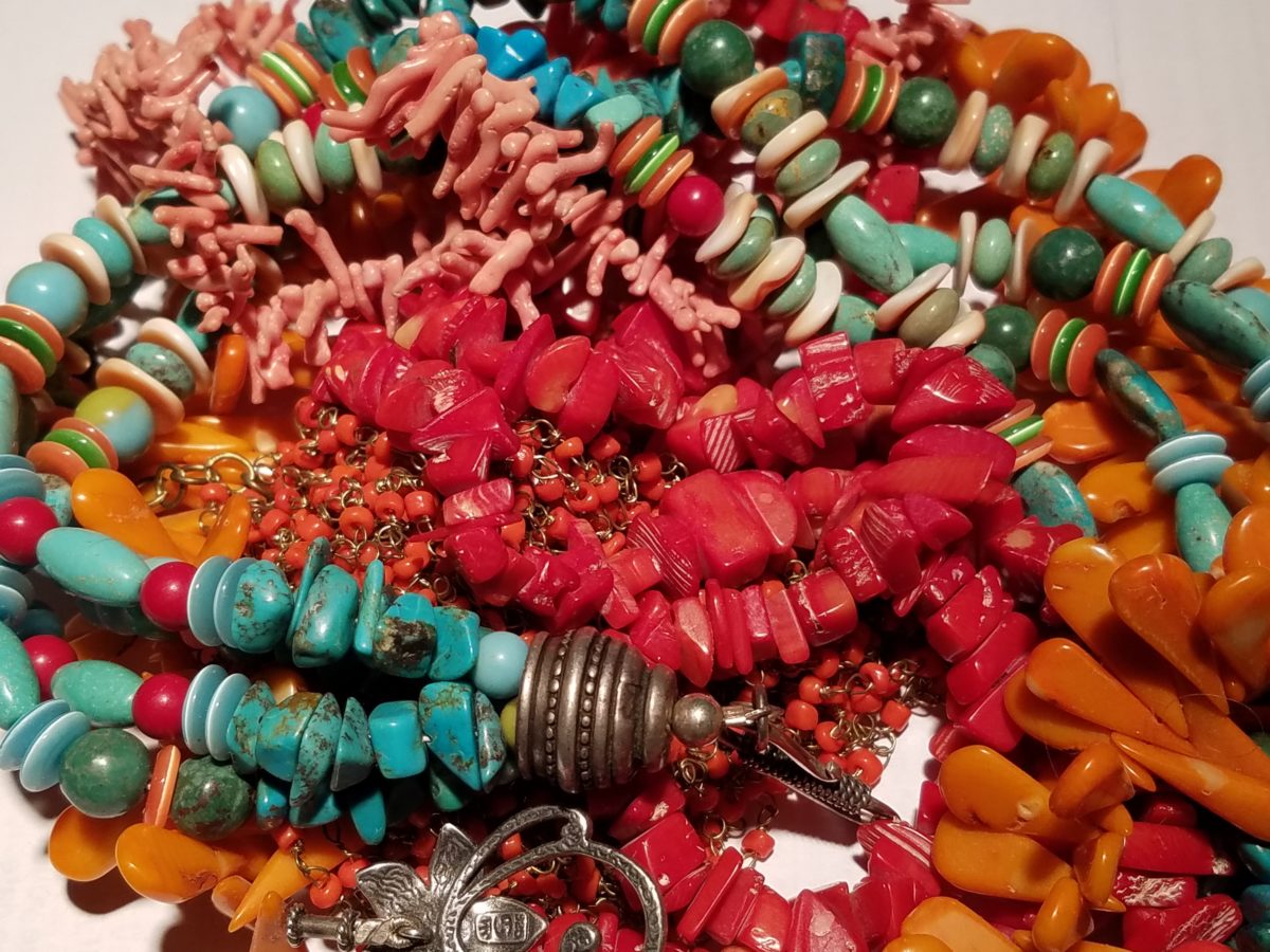
The thought of warm saltwater and fresh sea air at this time of year is tantalizing. Living  coral doesn’t just say – coral, (of which there are many colors) it  evokes that shade that we snap to when mentioned. Hot, soft pinky coral – a color of seduction. It is featured in jewelry and art renderings, architecture and interiors.

My advice is to pick the colors that  you like – the colors that make you feel good. Once determined, develop design based upon when, where and how to use that/those colors and when to contrast them or perhaps neutralize them.

A little whimsy to celebrate this bold exciting color of the year!!!

Have fun with color – any color- all colors! Welcome Pantone’s Living Coral, into the conversation and design elements, for this New Year!!!