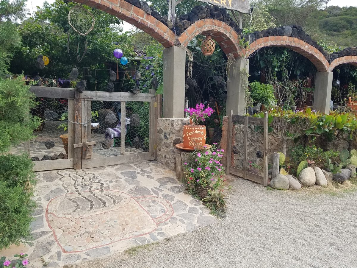
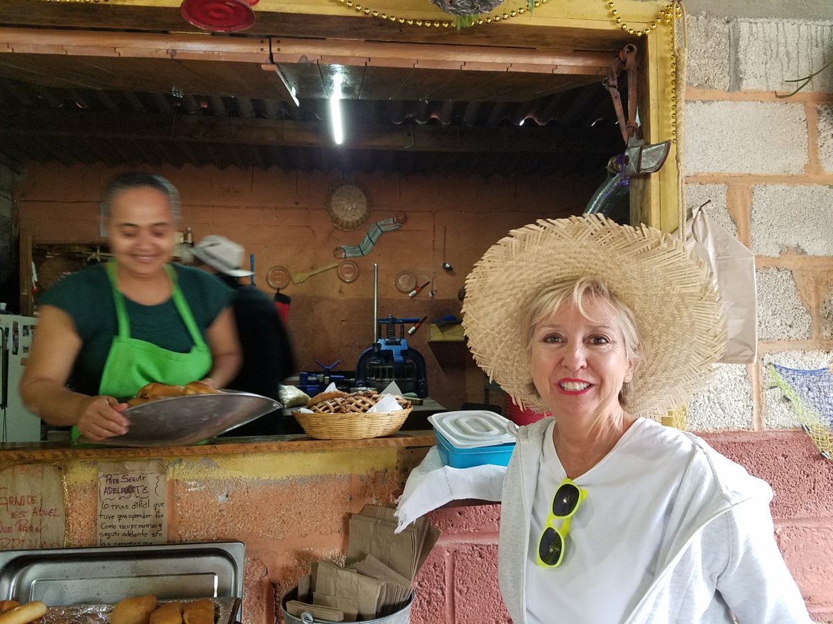
After experiencing and pondering the value of incorporating nature’s elements into architectural planning in the previous blog, I find myself winding into the countryside from sea level to a mile high into jungles and ultimately pine forests, across vast expanses of rivers and towering bridges spanning grand abysses…and stopping at a modest panaderia (bakery) on the side of the road.
You can’t tell a book by its cover as this simple little rural structure – standing alone – looked curiously intriguing and quaint enough, with an unpaved parking area transitioning to well-tended pea-gravel. Traffic cruised by, on the way across the bridge.
Those that knew, turned in. We pulled off the road and were told that this couple had a wonderful bakery and were promised an exceptional treat! Fresh empanadas that would bring remarkably satisfying mid-morning joy.
Very tidy and thoughtfully eclectic, this little destination bakery is a precious find.
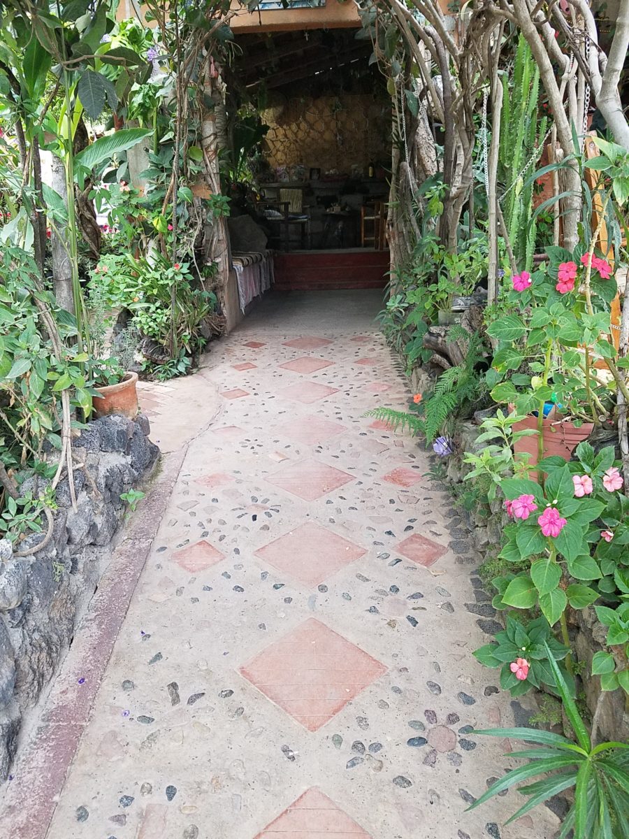
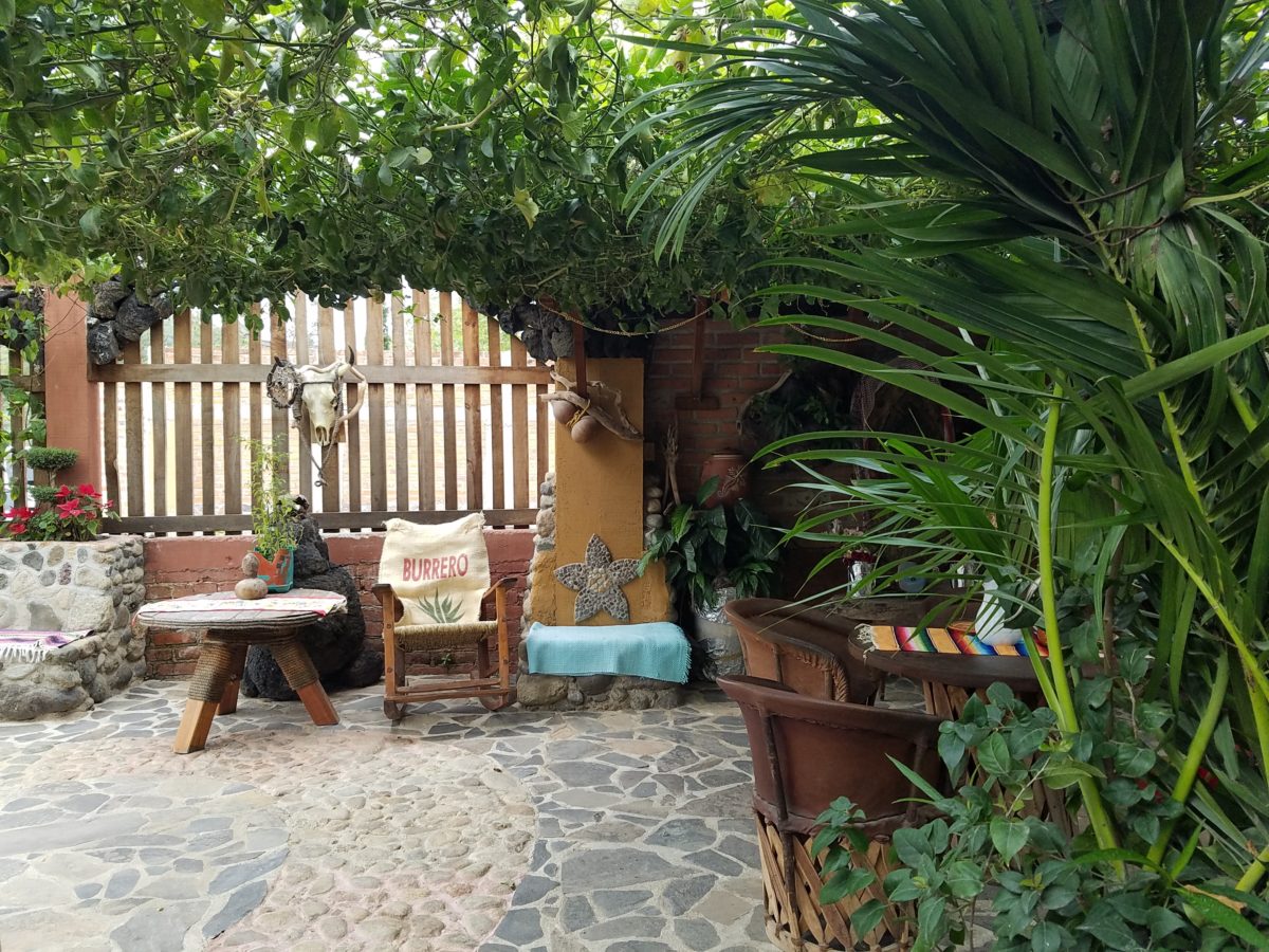
Oh, were we in for a surprise! At the entry, I stopped to shoot the whimsical cup of coffee mosaic set in a field of stone and concrete. I thought – what a fun design element to greet arrivals and set the stage. But I had no idea to what extent I was about to be elated. What unfolded so exceeded my expectations that I wanted to stay all day!!!
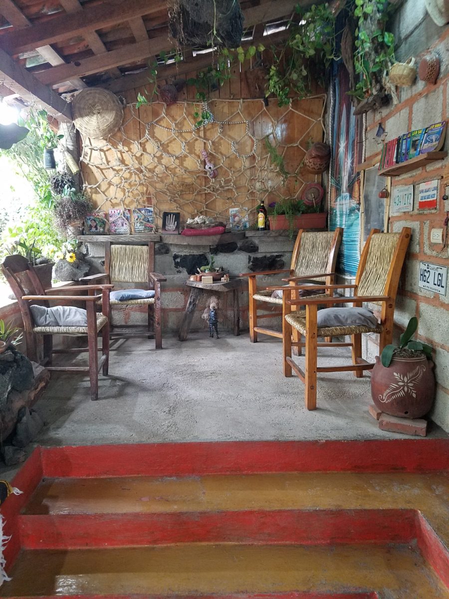
Happy stone and tile-work adorned the pathways. From the textures of stone and brick, tile and wood – it was an organic fantasy – an unexpected design experience.
Simple, yet spectacular – simply spectacular!!!!!
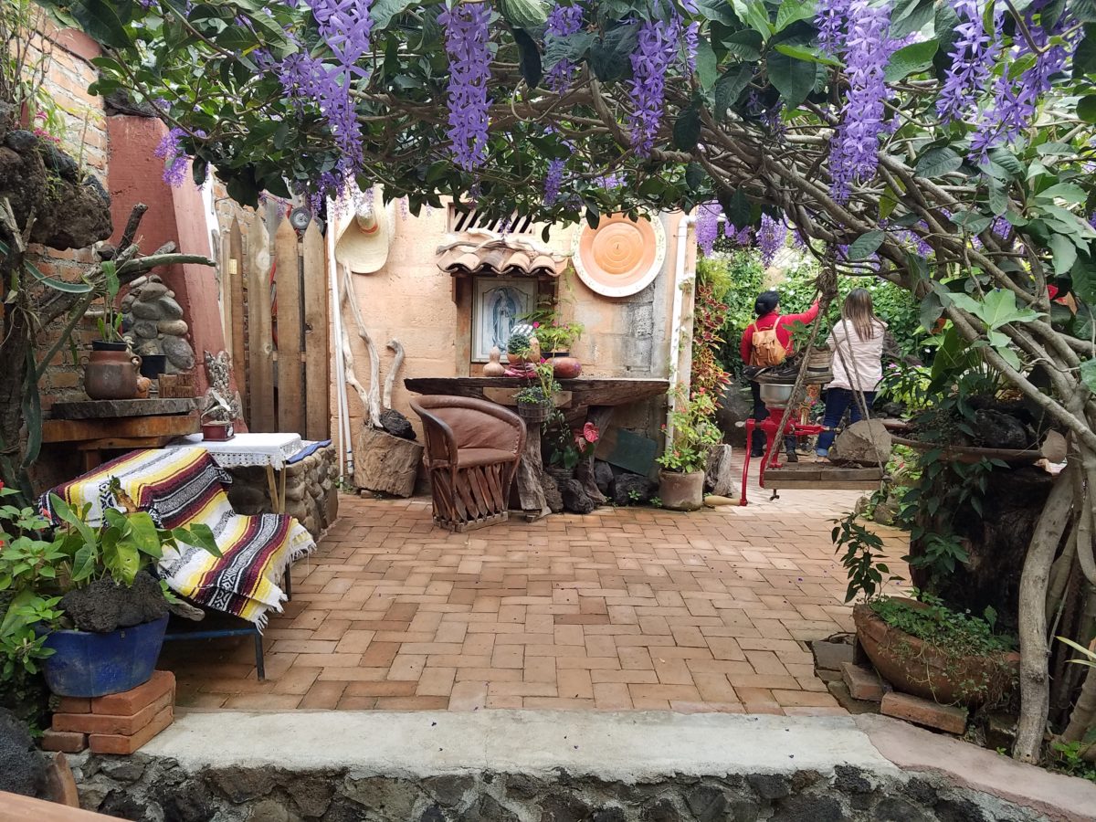
Ceilings of colorful floral blooms – perhaps wisteria – suspended from their vines and other plantings intertwined with the structure.
Spotless and meticulous the eclectic elements were a harmonious creation.Stone walls, wooden slats, vines and adobe all worked together to define the spaces.
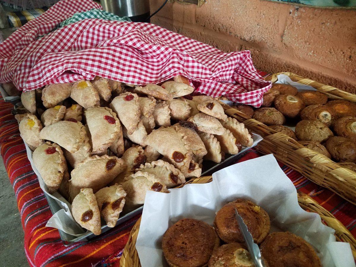
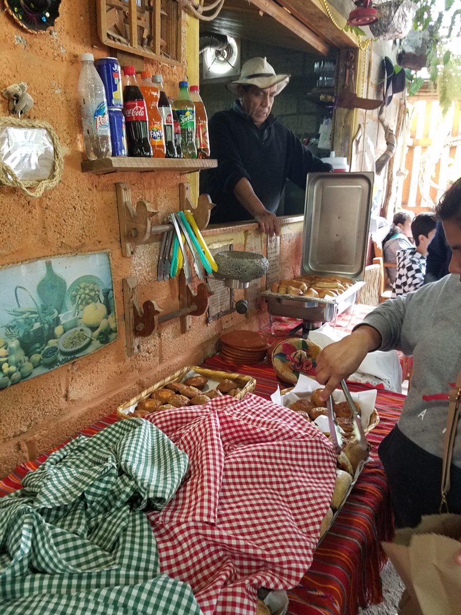
The wafting aroma of fresh baked goods – it was more than delightful. From warm savory clouds with mushroom filling and another with chile-laced sausages – and an array of sweet strawberry, cream and pineapple empanadas to corn muffins, banana muffins and more! All nestled beneath colorfully woven cotton tablecloths.
Light and delicious – the best empanadas ever!! With a tiny sprinkles of granulated sugar, for a sweet crunch, before sinking into the fabulous fillings! Muffins challenged any others and savory treats were so satisfyingly delectable. Little buttons of banana slices on top denoted which were the banana muffins!!
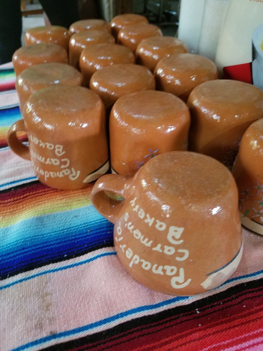
Rich Mexican coffee with a touch of freshly ground cinnamon and luscious hot chocolate were served in custom-glazed “barro ware” complimenting the fresh-from-the-oven confections.
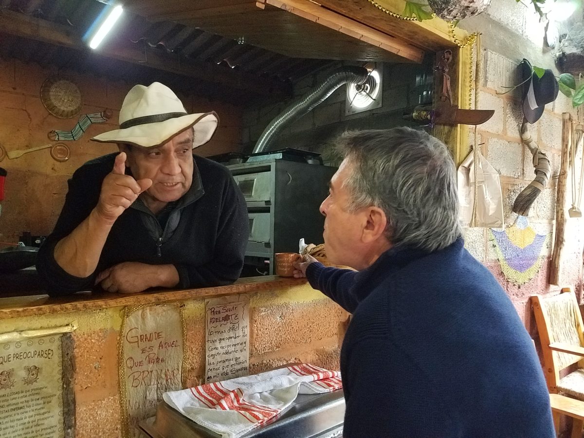
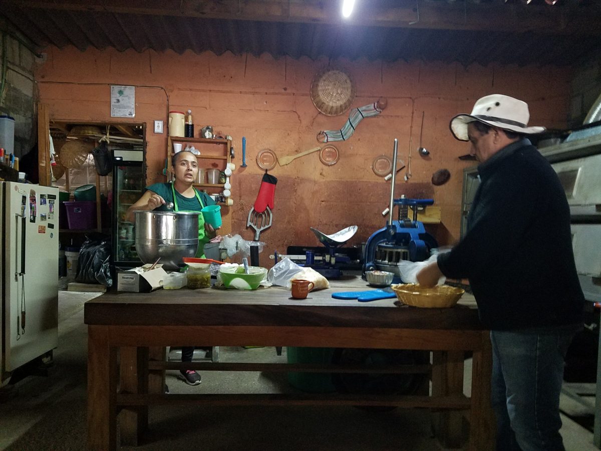
The exhibition baking kitchen overlooked the serving line. The buffet of pastries thoughtfully explained by our gracious and welcoming host, Jesus!
Carmen presents fresh strawberry tarts just from the oven!!! A combination of old and new – tradition and technology meet in this cozy kitchen.
Fragmented spaces open, yet enclosed, offered intimate pockets in which to pause and enjoy.
Color-pops insert themselves effectively around the interior and exterior spaces.Inviting seating areas semi-concealed offer private repose. Tucked away – more areas to enjoy…
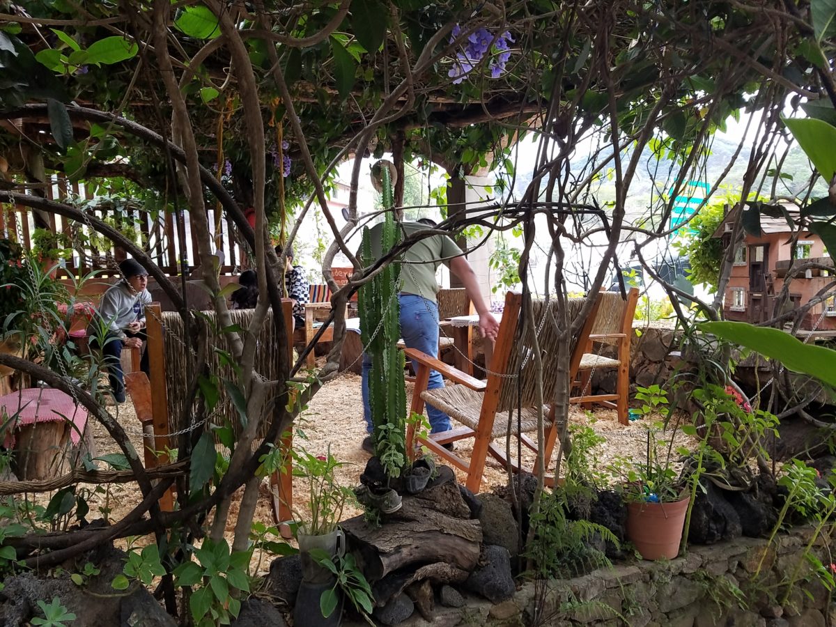
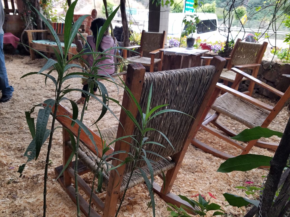
Clever use of clean blond wood shavings on the floor of the main covered patio created a wall-to-wall carpet of fresh aromatics complimenting the inviting aromas emitted from the ovens. Rocking chairs and rigid sturdy versions, with a fun little rope swing, all surrounded by tropical plantings made a cozy area to gather.
Soft underfoot and subtly fragrant – the wood chips make a great shag carpet!!!
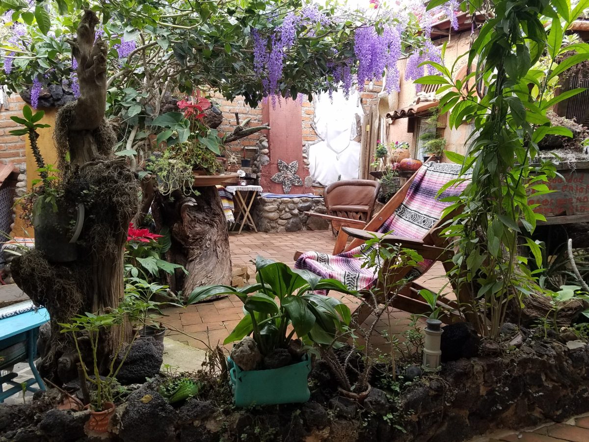
As I meandered around exploring all the interesting spaces, textures, colors and plantings, I marveled at the sensitivity with which this had all been crafted and assembled. It was artful interior design with an exterior feel – open air and charming, with a decidedly handcrafted, Mexican sense of place.
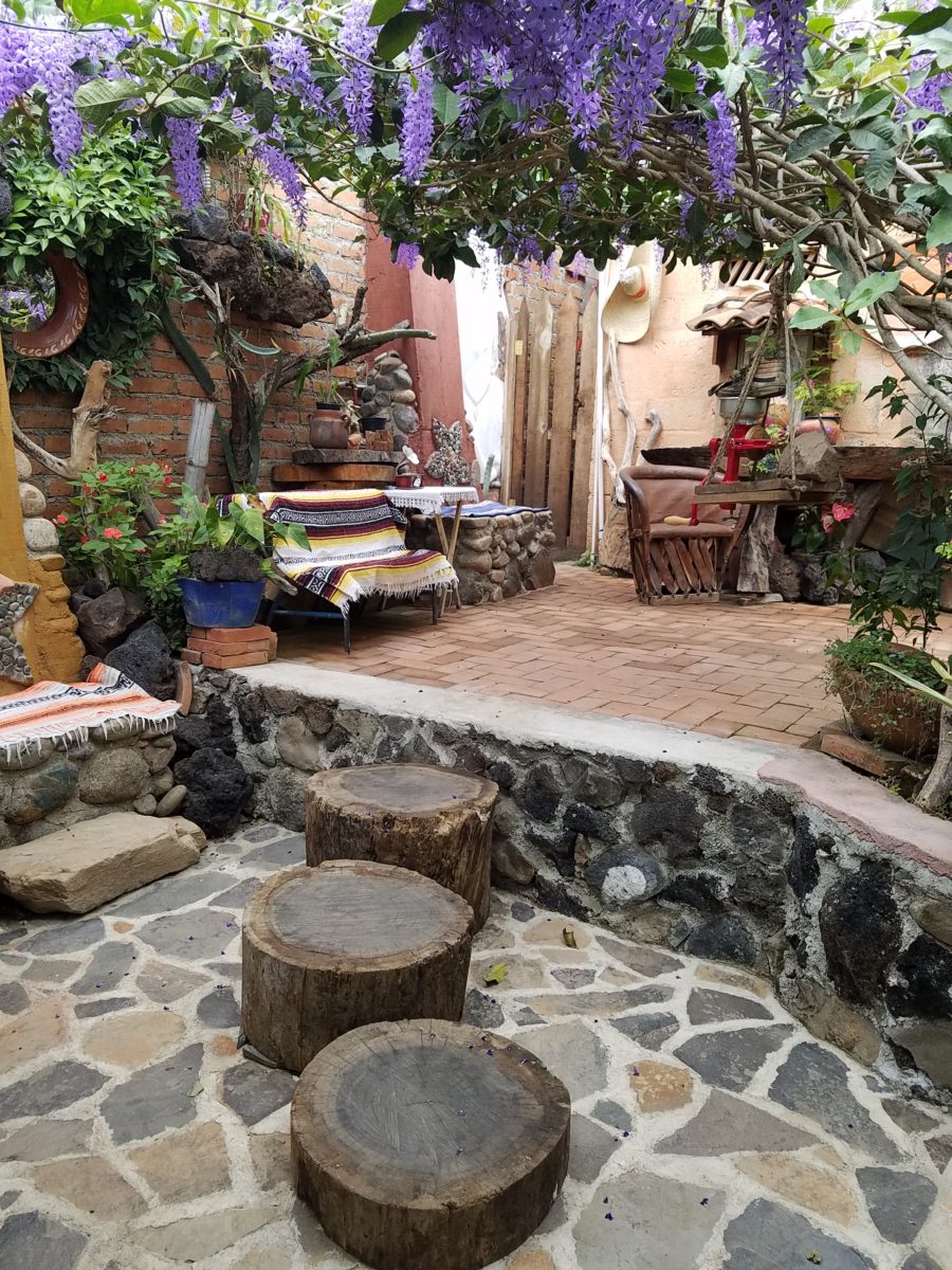
Slices of handsome tree trunks make perfect stepping “stones” with graduated heights.
It was an eclectic collage of furniture, structure and organics – living and static – that was welcoming and artful, delightful and so pleasing, that it was a treat for all the senses.
The cool morning air of the mountains mingled, with the comforting fragrances, creating an atmosphere inviting gentle conversations of people gathered around good food and artfully relaxed surroundings.
Peek in places and through doorways to find worlds of design
waiting to be discovered!!!
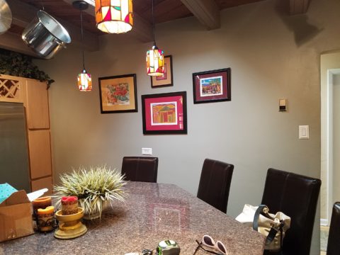
Time to remodel the kitchen!! This charming little bungalow had already experienced its share of remodeling – well, not so much structural – although, many interior design transformations had occurred over the decades. In the mix, the well-used and enjoyed kitchen was feeling a quite tired and dated.
You might remember I have used this now completed project, in the last few months, during its transformation process to identify certain features and design practices. Here is the as-promised unveiling of the before and after photos for further discussion about the design process, intent and results.
We loved the mottled color and organic character of the existing slate floors and opposing green-grey beams with spanning boards of a caramel stain. These were the two elements that went well together as though intentionally planned. Yet in between, the pale, peachy pickled oak cabinets with their radius detailing and red-rose/black matrix of the tiled granite counter-tops, didn’t seem to speak at all well with the ceiling treatment and slate floor’s greens, rusts and charcoal tones. It was a dark, confused space.
When observing and “listening to” the house, it was evident that the current kitchen, in addition to being poorly coordinated, had absolutely nothing to do with the original architectural intent. The new owners had brought a few very fine antique pieces into the home. The mid-century circa 1964 age of the house accepted them on its original hardwood floors also adorned with their fine antique rugs…but something was missing. There was no cohesive thread running through the house. Over the years finishes and decorative elements had been selected and installed without any consideration for original materials or an attempt to introduce compatible and harmonious materials for the good of the home’s overall theme.
In all fairness, had the entire interior been gutted and a
contemporary interior been uniformly installed into the framework/shell of the structure,
I might have considered it a success. However, this multiple decade decor was a
mix of disparate trends and preferences that had no commonality.
To begin the process of bringing this home into a cohesive
design last year, we had redesigned the living room. There we introduced a classic
blue and white color scheme derived from the Persian rug in the adjacent dining
room.
To the corner kiva fireplace, we added a sandstone hearth and
mantle with just enough blue and white Talavera tile trim at the base of the
hearth to subtly coordinate with the new scheme. The Talavera was an
appropriate material for this New Mexican bungalow.
The original fireplace had a dark, broken brick quarry tile hearth and no cap on the mantle.The face-lift replaced the hearth material with broken-edged sandstone slab and matching mantle cap with Talavera detailing at the bottom.
With this living room having been so successfully re-designed, the obvious thought came into the discussion to continue the vernacular of the blue and white Talavera into the kitchen. As a bit of a purist when it comes to application and termination of materials, I was not content for a mere back-splash. No, if the tile were to be effective and commandeer the stage, it had to be used wall-to-wall as though an entire wall treatment.
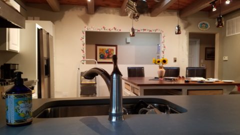
Treating the Talavera tile as wall-covering, it continues from the kitchen, into the adjacent pocket-space housing a desk and laundry machines.
But wait! The addition of an earthy aqua handmade tile from
Spain offered an appealing and unexpected accent woven intermittently through
the Talavera. It created a coordinating thread from the colors found in the mottled
slate floors and ceiling beams.
Pre-grout shot shows the individually cut 1″ pieces inserted as mosaics into the random field of Talavera
The cabinets were in excellent condition, but the doors were
sadly dated and in no way spoke to the home’s other cabinets, doors and finish
carpentry.
The confused interior finishes we in need of a transformation!
With the white raised panel theme throughout the home’s original appointments, we elected to salvage the cabinet boxes and replace the doors and drawer fronts with a similar raised panel detail. The same red oak was used and, with a glossy white paint applied, the grain “read-through” with a very intentional yet subtle moiré-like pattern. The new raised panel white doors and drawers, with crowning top molding provided a crisp, timeless motif. The random patterned Talavera used as an entire wall-covering was very effective. The kitchen was quite gussied-up!!
The transformation was dramatically successful!
The existing slate floor was beautifully organic and I felt, from a design standpoint, was a must to salvage. Making it look like an intentional selection – part of the new scheme – was imperative. Therefore, selecting a counter-top that communed with the tones in the floor resulted in a selection of concrete-like engineered Italian quartz material – balancing the floor with the next horizontal plane and ultimately with the stained and green-grey boards of the existing ceiling treatment.
The new concrete-like Italian quartz counter-tops coordinate well with the other materials.
Another asset was the connection to the outdoors, however the existing window over the sink was high and small.
The window over the sink was high and small…
By bucking the warranty of the Pella people, we had a new double-hung window made to close down onto the new counter-top that passed through from inside to out. They would not fabricate the window to do what we intended, so we had the contractor remove the bottom of the new window frame, thus rendering the warranty null and void, in order to have a completely open, uninterrupted pass-through when raised.
Amusing and interesting…existing family pieces of blue and white ceramics are being discovered and used as decorative accessories in the new kitchen!
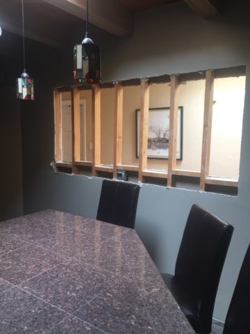
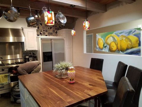
We also captured the opportunity to open the opposing wall into the hallway adding pass-through light and dimension to the space. This exponentially expanded the space and made the encapsulated kitchen feel much less confined.
Before, the kitchen felt small and dark…Opening the wall into the hallway brought in additional light and dimension.
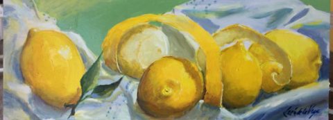
To add drama to the newly created dimension, we discussed having a painting commissioned to pop an accent of yellow into the blue and white scheme on the far hallway wall. Lemons, a perfect citrus for the kitchen, was decided for the theme.
A miniature oil painting by Federico Leon de la Vega was used to Photoshop into the scene to inspire and convey the design intent.
The additional POP of yellow is a dramatically effective contribution to the overall composition. After consideration, the owners selected a local artist to paint the full-scale painting.
A local Albuquerque artist, Thomas Tomlinson rendered the lemons in acrylic with blue and white tile details.
In summary…keeping the original slate floor, existing cabinet boxes (replacing door and drawer-fronts only), with a bling of new chrome cabinet pulls, switching out the stained glass pendants, replacing the island’s surface with a handsome solid walnut top and a new coordinating concrete-like counter-tops on the periphery, with the decorative embellishment of the Talavera tile continued from the subtle introduction at the living room’s kiva fireplace, the transformation of the kitchen is stunning – not trendy – and was truly, uniquely designed for the architecture and forward, on-going contextual design conversation of the home.
Uniquely designed…
Look around and listen to the environment for and in which
you are designing. What makes the best sense for the design direction
considering the function and context of your project?
The total sum of an interior…comprised of the shape and volume of a space, the colors and textures, architectural details…then layer the lighting, furnishings and decorative accessories and ta-da! But is that all there is?
The beauty and intrigue of interiors is what keeps us
discovering and creating. Yes, finding intimate pockets or grand expanses that
please and dazzle.
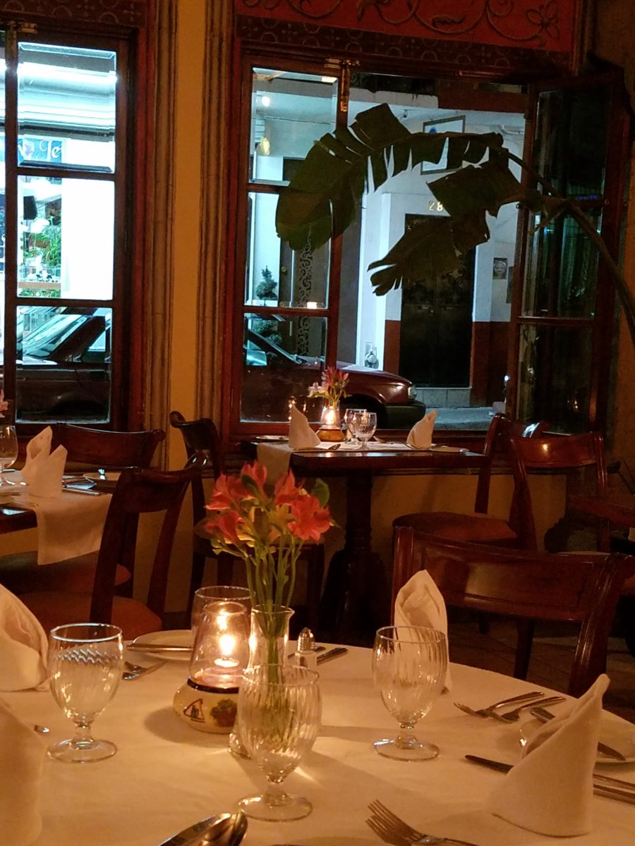
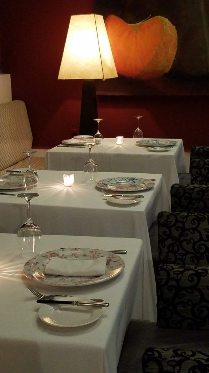
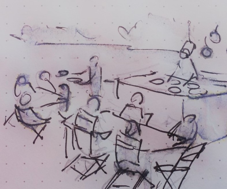
The romance of this setting caught my eye…the far table by the window – set for two seemed a likely scene for a tete e tete to take place!
While traveling in the tropics these last few weeks, I
discovered many interesting places. Oddly, while experiencing all the sights
and sounds flavors and colors of this paradise, I immersed myself in the
unlikely and completely opposite world of early 20th century Russia with A
Gentleman in Moscow.
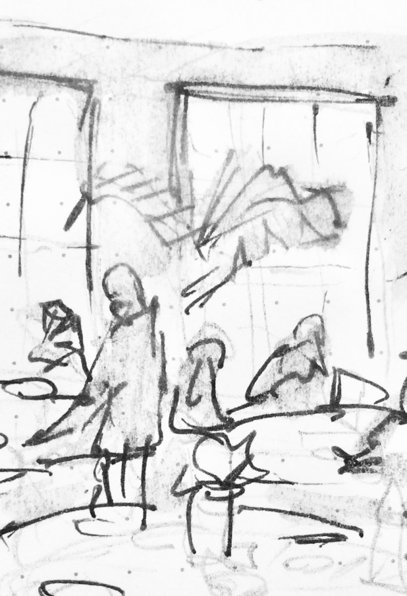
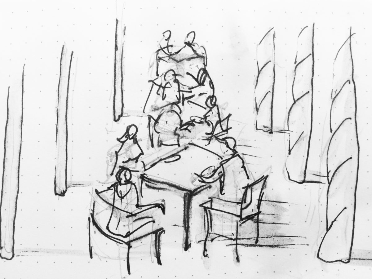
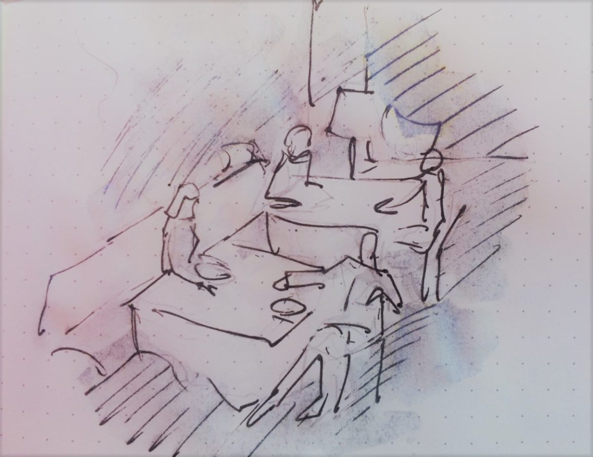
Just for fun, I sat with Federico Leon de la Vega today as he did 4 – minute sketches of some of my photos…needless to say, proper illustrations would have proved more telling of my romanticizing the talents of artists conveying imaginary activities in interiors…but it was fun to play with this today!
The beautifully and artistically articulate writing style of
Amor Towles held me captive. And what a dichotomy to play ping-pong with my
brain as I digest the restricted realm of Count Alexander Ilyich Rostov while
basking in the warm sunshine with fresh sea air and palms rustling overhead…It
seems that the extremes of this pairing suited me well as it was a dual escape
– a vacation getaway while taking me further into fantasy with another dimensional
experience of this incredibly great read!
Although there were many fascinating observations made by
the author, it was this passage regarding the Count encountering a young
artist/architect that prompted this subject for this week’s blog. The
architect, finding himself in Moscow in the post Czar age of socialistic
experimentation and implementation, bemoans the lack of work “The way things
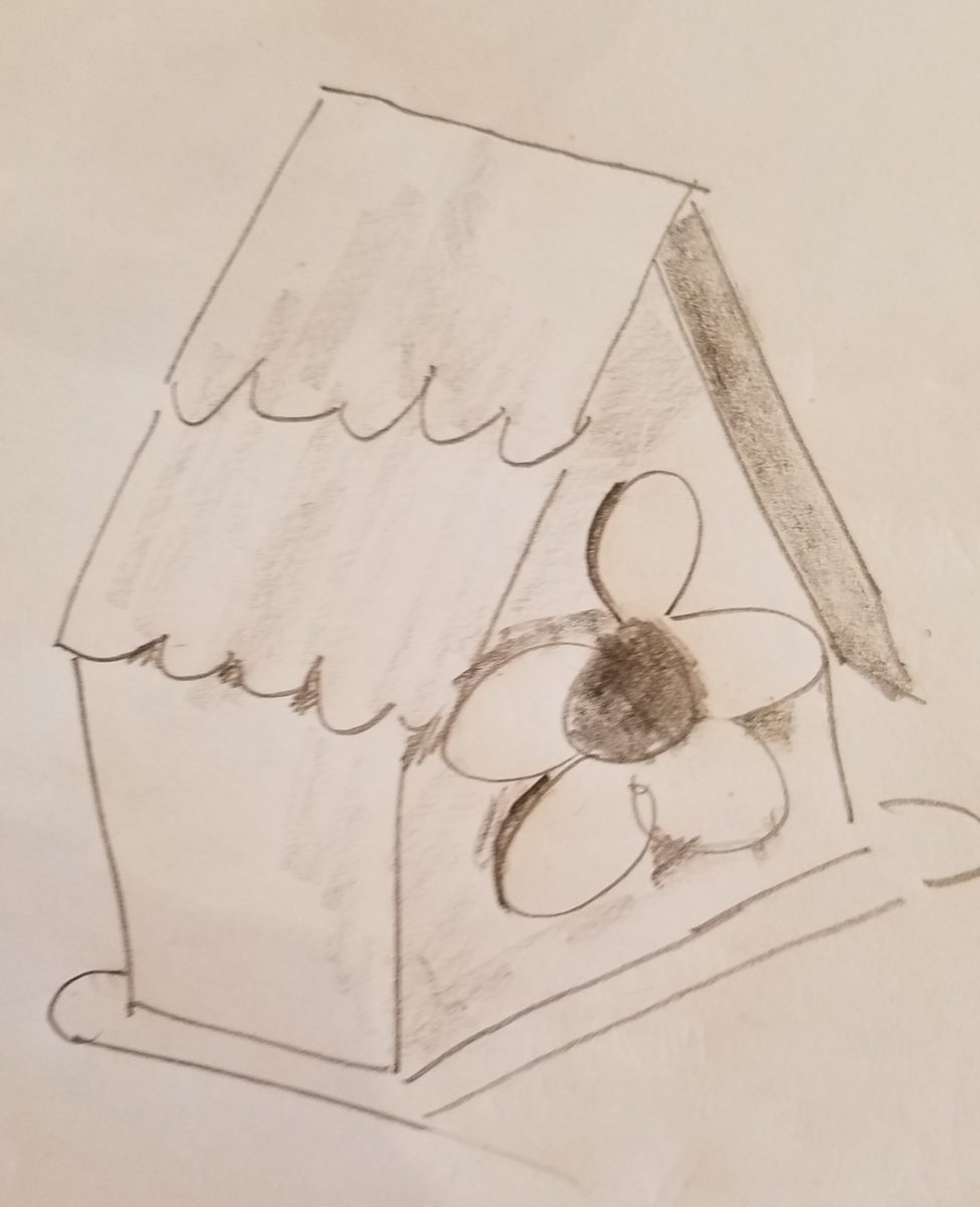
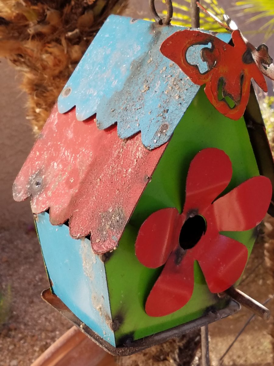
stand, I’d be happy to design a birdhouse.”
“The way things stand, I would be happy to design a birdhouse!” Sketch by PH
The mayor of Moscow has made an observation espousing the birth of “the golden age of the prefabrication, cement-walled, five-story apartment building” – with the very practical “four-hundred-square-foot living spaces with ready access to communal bathrooms boasting four-foot tubs (after all. who has time to lie down in a bath when your neighbors are knocking at the door).” The mayor further emphasizes and rationalizes “So let us not get bogged down with elaborate designs or bow to aesthetic vanities. Let us apply ourselves instead to a universal ideal that is fitting for our times.” A horribly inhuman decree in my opinion, rather than a should-be, truly magnanimous spirit. Humans are designed to design!!
The sentiments of the new regime left the architect with having to find avenues to utilize his talents – specifically sketching as he set forth to illustrate a brochure of the city’s finest hotels as retained by the Intourist department. How sad to possess the talent and passion and be reduced to capturing the grandeur without having the opportunity to design??!!
So three things struck me about this situation…one – that the artist was practicing only a portion of his talents and not the true, complete creativity that beckoned him to pursue his career…two – that renderings not only offer the opportunity to preview the proposed design of a space, but they can use artistic license to animate the space for its intended function and three – that spaces are not truly realized until they are filled with the people that are intended to occupy them.
So much so is a room not really finished until it is occupied by the inhabitants for whom it was intended to function, but Towles observes through the renewed appreciation by his architect, “I suppose a room is the summation of all that has happened inside it.” And that is what I enjoyed being revealed as a result of this simple exchange in this one of many experiences in this remarkable storyline .
Humans are designed to design. Rooms are intended to perform a function. They cannot function until they are animated with whatever they were intended to serve. Sketches allow the preview. Sketches are more spontaneous and artfully creative than computer generated versions of the same. Celebrate beauty, creativity and artists!
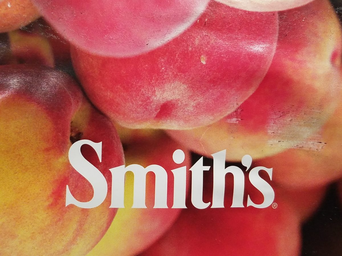
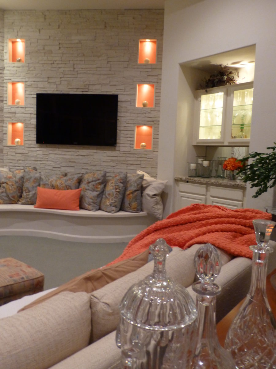
Color. Fashion and trends. Pantone’s annual pick and announcement – this year, based upon observation of the field of design scenes namely Airbnb and Apple, really? I find that amusing. Described by Pantone as “an animated life-affirming shade of orange, with golden undertones.” If orange had golden undertones, it would be more yellow-orange – a golden orange – NOT the pinky-orange suggested by their swatch of Living Coral and myriad examples that are being set forth. However, a few months ago I noticed and saved (because I liked the colors), a Smith’s Food Store envelope featuring peaches that illustrated the cozy combination of the rosy-orange coral tones with the golden yellows – a perfect pairing.
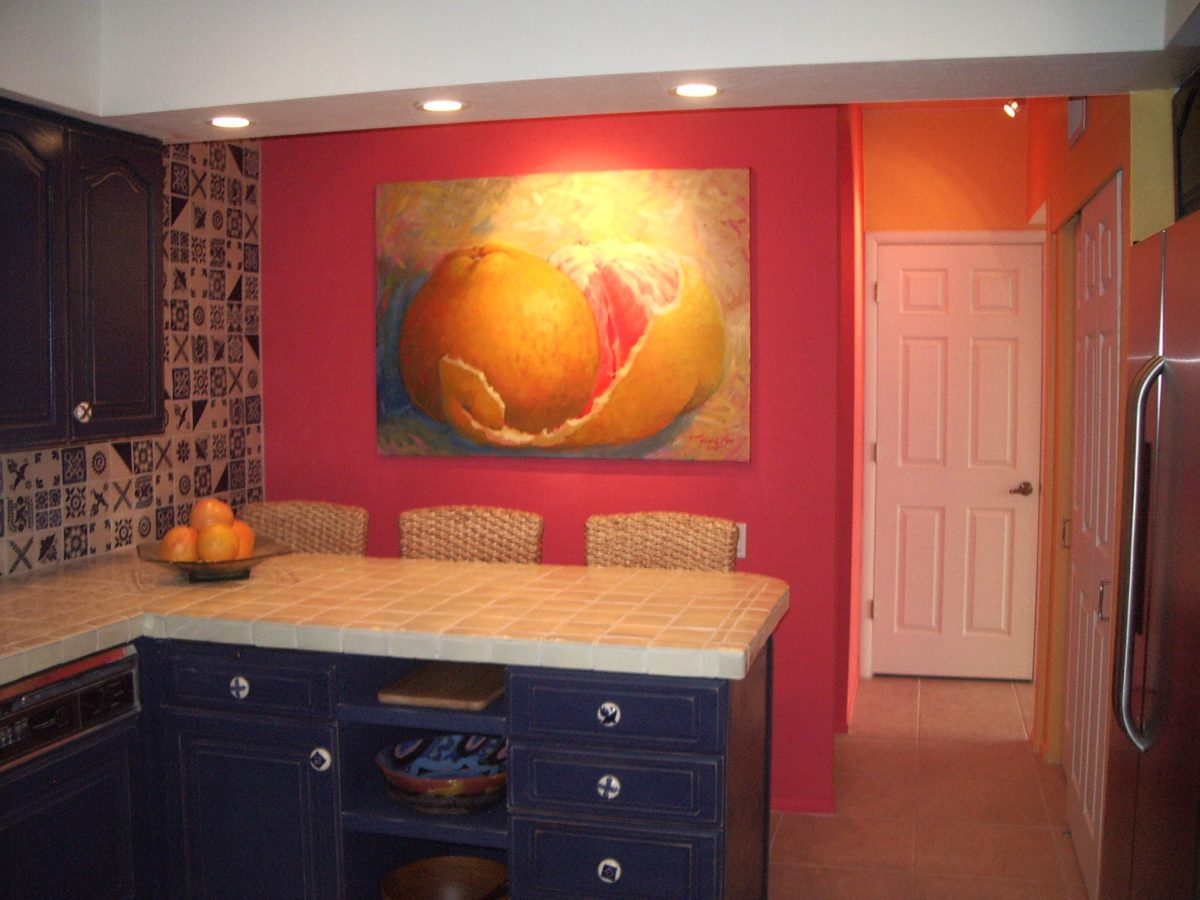
This pinky coral – a hot, but smooth, orange-ish color – has been one of my favorites for years! In 2004 I referenced it as “lipstick” that wonderful color between red, orange and pink! A hard-to-find lipstick shade sought by many!!! It melds fabulously with citrus colors and is cooled and contrasted by blues. A wall of colors depicts this perfectly.
We painted the wall, took a photo of it and emailed it to Federico Leon de la Vega in Mexico to commission him to do this grapefruit painting with its luscious, pink center and coral shades, wrapped in a yellow peel and surrounded by cool, bold, brushstrokes of whites and brilliant blues.
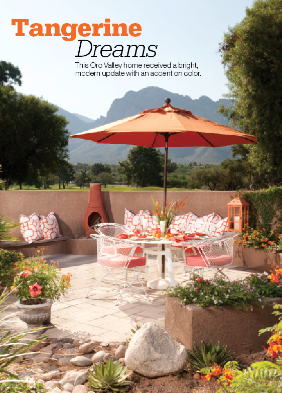
A few years later we devoted an entire project to the fresh, citrus, color tangerine – which because of my personal preference leaned toward the coral shade of orange rather than the pure, natural tangerine. But art is about taking liberties and when developing an orange accented color scheme, all versions are allowed. Right?
This project was punctuated with orange tones from tangerine (for which it was named), and deep warm coral-pink shades. The hue and its many vibrant values!
However, to photo these nuances of color is tough. I walked around the Tangerine project a couple of days ago. It has stood the test of time by beating trends by a few years and not adopting any particular design elements that would have given it away today.
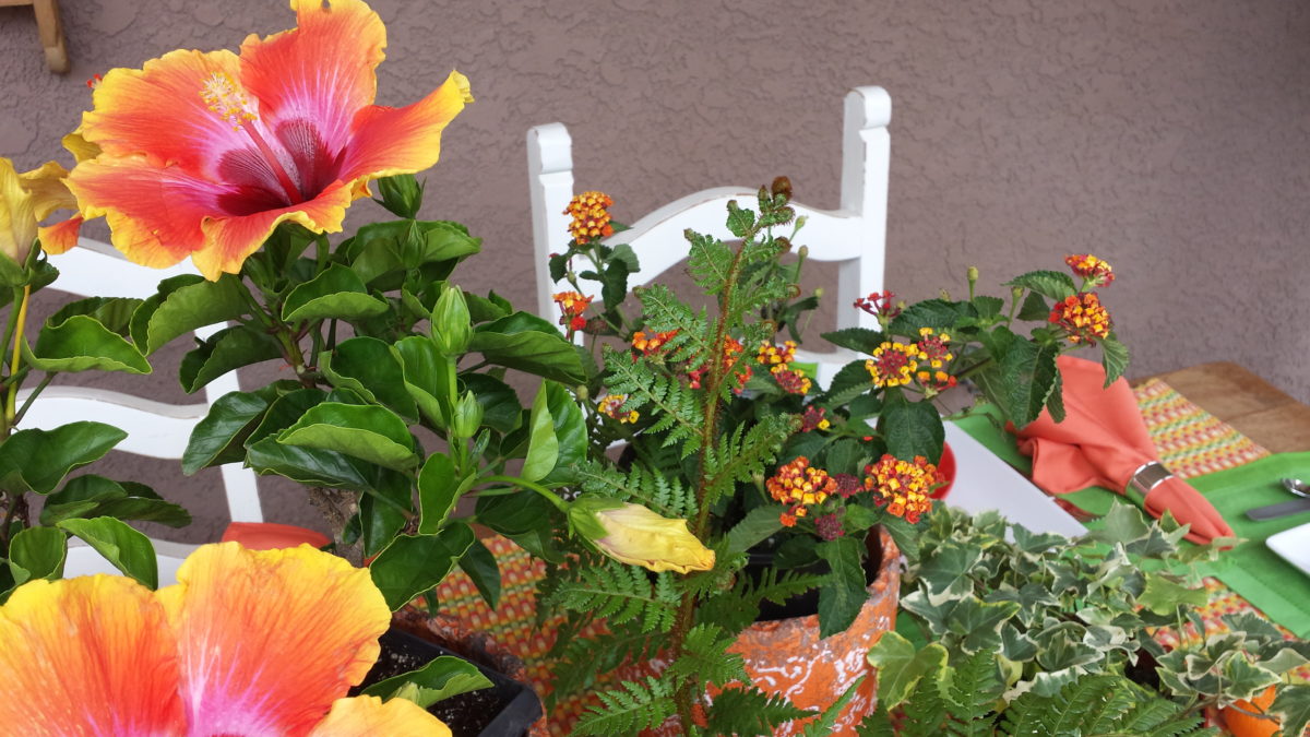
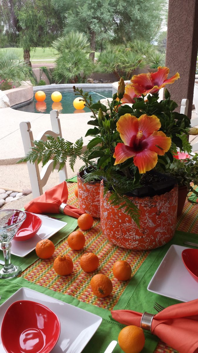
Look at how much nature played a part in the staging of these coral infused scenes!
My advice is to pick the colors that you like – the colors that make you feel
good. Once determined, develop design based upon when to use that/those colors
and when to contrast them or perhaps neutralize them.
Coral is bold and warm. It can read hot and energized –
although is softer than red and less harsh than orange.
Nature is abundant with coral – not just the living sea
coral – but flowers and the rare fabulous accent fur of Vietnamese monkey the
red-shanked douc!
Vietnam’s red-shanked douc- brilliant coral accents in his coat!
The thought of warm saltwater and fresh sea air at this time
of year is tantalizing. Living coral
doesn’t just say – coral, (of which there are many colors) it evokes that shade that we snap to when
mentioned. Hot, soft pinky coral – a color of seduction. It is featured in
jewelry and art renderings, architecture and interiors.
My advice is to pick the colors that you like – the colors that make you feel good. Once determined, develop design based upon when, where and how to use that/those colors and when to contrast them or perhaps neutralize them.
A little whimsy to celebrate this bold exciting color of the year!!!
Have fun with color – any color- all colors! Welcome Pantone’s Living Coral, into the conversation and design elements, for this New Year!!!
In past blogs Patti Says a lot about selecting paint colors. Pondering paint colors and the elusive nature of selecting just the right color. https://patriciandesign.com/5677-2/
Walls surround your world. Walls encapsulate and enclose your personal spaces. They can also frame your world and dramatize a focal point. They add effective dimension when punctured.
A current study we have in front of us is about those specific things. Walls – opening them, their color and the context of the color decision. Months ago we examined a wall in a kitchen soon to be remodeled. Re-painting it was the most obvious and least complicated of the options. We also looked at creating a dimensional recess to house art or an accent color or something to take the curse off of its up-close, massive, solidness. It was like the 10,000 pound elephant in the room!
The wall encapsulated close quarters. It divided the space between the kitchen and the parallel hallway.
What we were looking to change was atmosphere. This involved improving the dated and worn cabinets and counter-tops, updating the lighting, enhancing the back-splash and addressing the closed, isolated feeling of the room.
Smoke and mirrors might be the answer. Like a magician appearing and disappearing behind a veil/dimension of smoke – or when the physical space is not negotiable, mirrors will give the illusion of added space. They are VERY effective tools, but neither was the right solution for this room’s current condition. Yet, we knew we needed dimension, depth and something to help expand the space.
Hmmm…the window over the sink offered an exciting option to open out to the patio. We did that – save that for another story. However, this large elephant of a wall was still so confining.
Sometimes small spaces can be cozy. Some people prefer tight spaces while others find them to be claustrophobic. This was not exactly claustrophobia instilling, yet it certainly spoke to all of us as an imposing, confining factor that needed attention.
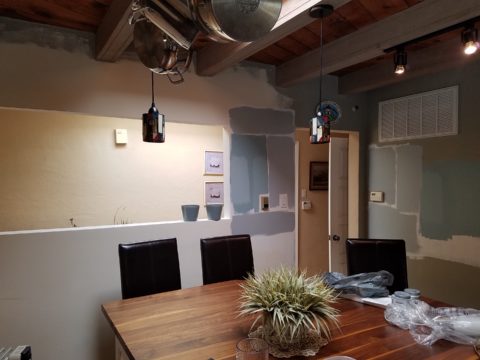
After discussing all the colors and recessed options someone has the brilliant idea to ask – “What about removing the wall?” That seemed a bit radical considering that it only opened to the hallway and it served a purpose of defining the access to the kitchen and opposite bedroom quarters. To open it entirely might have given an orientation to the kitchen that suggested that the island seats be positioned facing that point-of-arrival. Hence looking directly into the far hallway wall. That was not the desire. Rather, we decided to cut a large opening in the wall exposing the far hallway wall while maintaining the orientation of the kitchen toward the outdoors and island seats facing into the kitchen not out into the hall. It worked!
The space was instantly enlarged. Opening the space onto the patio and this opposing generous puncture of the Great Wall of Kitchen changed everything! The light borrowed from the skylights in the hallway was significant and the sensation of enlarging the space was undeniable. Except the footprint had not changed.
The physical feeling of a space is what counts. It was proven here that it wasn’t about enlarging the space but feeling like it was enlarged. Like mirrors, the illusion of space is so important. But, unlike mirrors this space was physically opened creating the sensation of enlarging the space by adding actual dimensional reality . The benefits were immediate. It actually conveyed a palpable feeling of relaxation. It was freeing and created an entirely new experience of enjoyment.
A passing idea for a stenciled surround was entertained…
Tight spaces give some people comfort. Contrarily, open spaces give comfort to others. Personal reactions to space, color, texture, temperature all enter into the equation of good design. What tasks are being performed also play a part in determining what solutions are best.
This dark, isolated kitchen benefited from changing the cabinets to a white traditional raised panel style detailed with crown molding which added a refreshingly light element. The house was a decades old vintage bungalow and had been dealt a disservice to have had the kitchen remodeled years ago in a not-so-sensitive, style-of-the-day fashion. But, in addition to the more traditional timeless approach to the design, opening the space resulted in additional natural light borrowed from the hall’s skylight and an enlarged interior over-the-sink window brought more coming in from the patio. Now colors…
So we know that picking colors is contextual.. .what’s in and around the room are all part of the equation. Any walls that are seen beyond (through doorways, around corners) contribute to the layering of colors and therefore, participate as well. The floors are multi-colored mottled slate. The tile chosen to enhance the backsplash and also serve as wall-covering was a blue and white Talavera accented with a soft aqua mosaic. The ceiling mimicked the floor as the beams were a smoky grey with caramel-color stained knotty pine boards between – we embraced these existing design features as their unselfconscious non-trendy nature suggested a more grounded, permanent place – one with organic finishes that might have resulted from local availability sourcing and craft – and probably did all those decades ago. See what Patti Says in another blog about this very project: https://patriciandesign.com/trust-and-custom-designs/
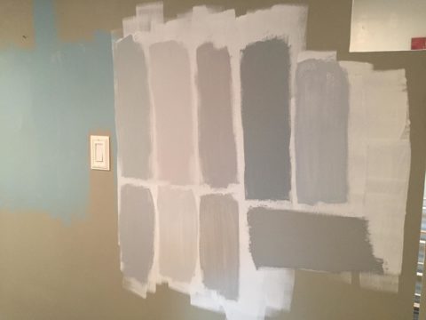
The fact that all of these elements contribute to the equation, for deciding a color, is key to our study today. After discussing the options for treating this newly opened wall, we found ourselves doing the paint sample potpourri on the walls!
Taking cues from the aqua accent mosaic which was derived from those tones found in the slate floor, we directed the color choices toward smoky aquas and grey blue tones.
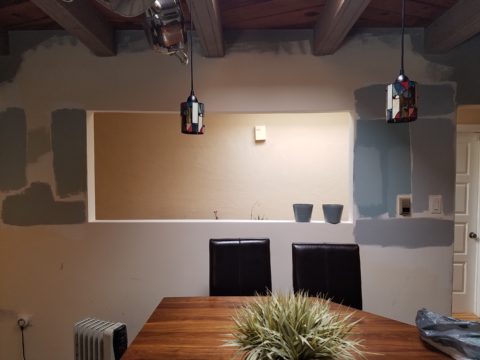
Sometimes white is actually a color, rather than the absence of color. The wall was currently frosted with smooth crisp drywall mud as an aftermath to the demolition and framing of the new opening. The stark white was clean and fresh. Like matting around a painting – this might just be the way to go.
And at this point, we must introduce the idea that was also in the works and that was to have a painting commissioned that would POP through the opening providing a spectacular backdrop to the kitchen and dress the dimensional contribution that the opening into the far wall of the hall presented.
We knew that yellow was a great color POP for this cool kitchen pallet. A recurring bowl of lemons kept proving that to be true. Lemons became the fresh, culinary subject that seemed to be the perfect fit. So we enlisted our master muralist Federico Leon de la Vega to meet the challenge. Armed with the blue and white scheme and the accents of aqua he created a miniature to test the concept.
Isolating the image and framing it is always an important component in the formatting of scene. Whether to spotlight a sculpture on a pedestal, or properly and effectively matting a painting in a frame, this aura is important to highlight art. The same became true as we considered the painting being “framed” by this opening. The wall itself became the mat. So to get an idea of what this might look like, a quick digital manipulation did the trick.
The final decision seems to be that we will keep the wall with the opening white, as though a matting around a painting, while painting the perpendicular wall a smoky aqua. Another opportunity for layering these two colors occurs when the smoky aqua wall is layered over a receding laundry room wall soon to also be painted white.
Watch for the completion of this wonderfully unique little kitchen to be unveiled with all the dramatic before and afters! Meanwhile, look around your interior and see if opening a wall might be an option to expanding your sense of space. The transformation can be rejuvenating!