Colors are all around and I am certainly clued into them. As a designer, my love of color, design, art and connecting all things through these elements, influences all that I do. From interiors to tablescapes to clothes to cars – cars?
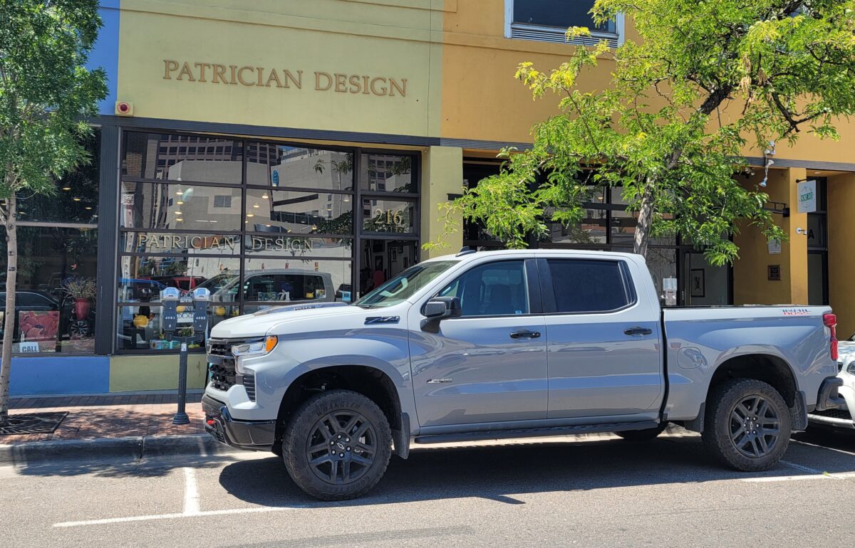
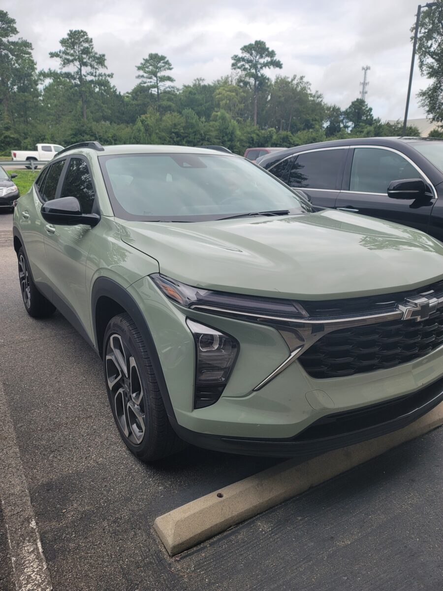
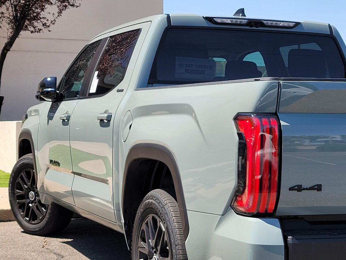
Well, my interest has been peaked with the very apparent trend in car colors the last few years of what I call the “latte effect.” Picture a rich dark cup of coffee blended with dairy and the result is a milky derivation of the original color. Cars of all makes and models have adopted this very interesting approach to introducing new colors on the market. Adding white to a hue will “milky” it down. Indigo with white softens the deep blue/purple hue. Rich olive green is softened by the “latte effect” of adding white to the original color.
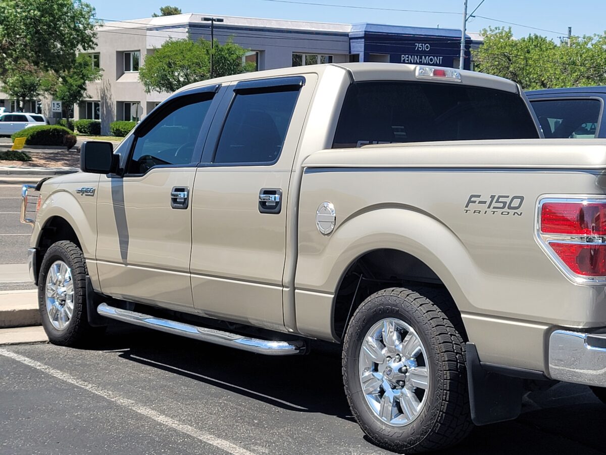
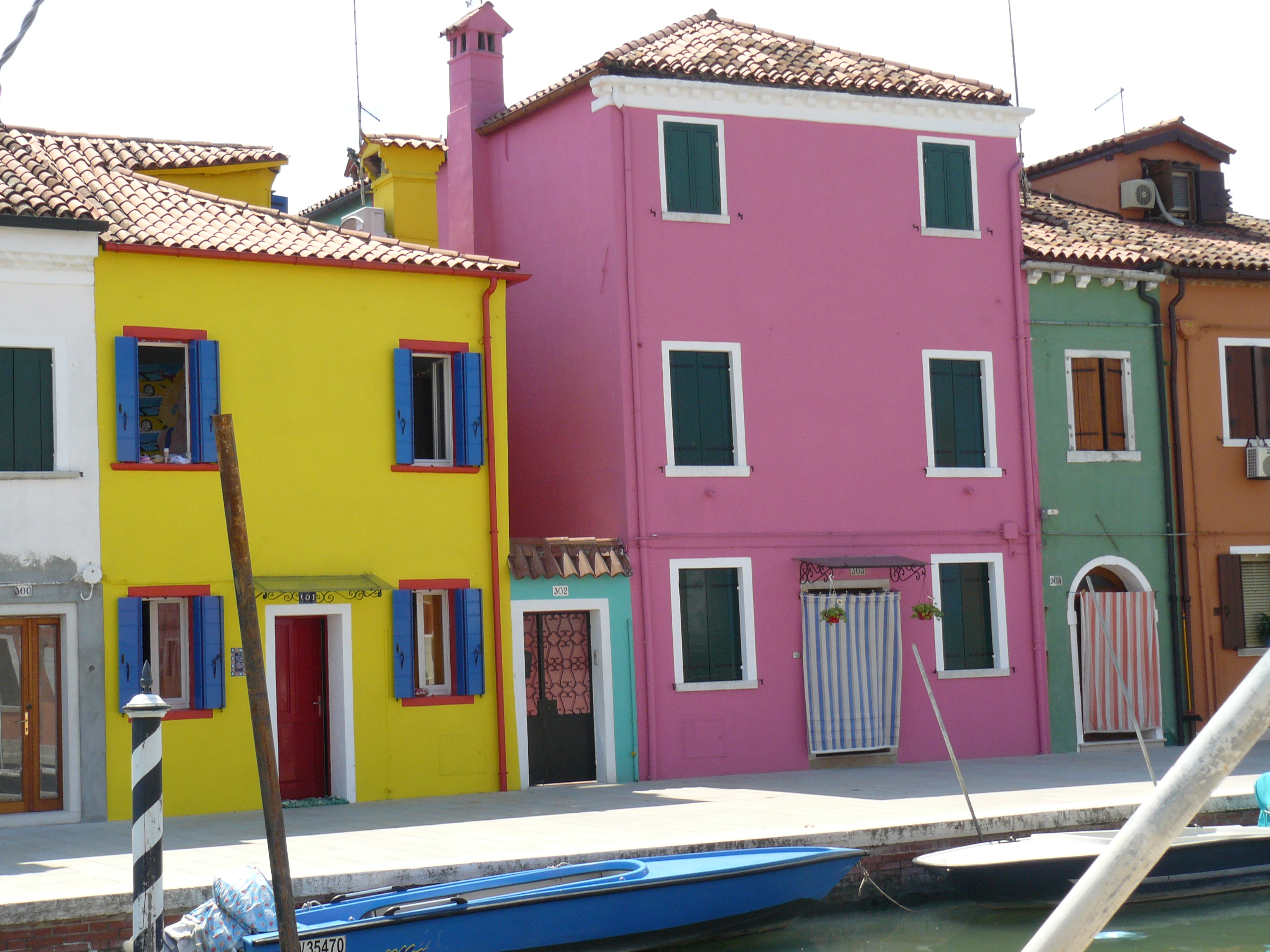
These decidedly softened colors present a new range and offering of color options. Brilliant, I think. It takes any color we have known on a car and creates an entire stratum of new colors never before seen all at one time as though a newly discovered color palette.
Intense charcoal becomes a softer version of itself – still strong and powerful, yet with an eased edge. Blues, greens, golden tones all have their softened versions driving down our roads with a softer shade weaving in and out of the traffic of our lives. Sprinkled in parking lots, these soft colors are becoming a fascinating contribution to the mix of common colors.
I found an article by Peter Bohr, an award-winning automotive journalist who penned a piece about how the color of a car could affect its resale value. It makes perfectly good sense, when color affects almost everything we encounter. Color attracts. People respond to color and make selections based on color.
A shirt, a dress – a wall color, or bedspread, people pick paint, clothes, and home décor with a tendency toward a color preference. Do you have what you might consider to be your “favorite” color?
Colors mean something – like red being attention-getting or urgent, warm to hot. While blue is calming, cool, and conservative. It is interesting to observe how often the color choices of things in a person’s world reflect that individual’s identity or, more interestingly, their alter ego – an opposite expression of their outward persona.
Kate Smith, a color consultant quoted in Peter Bohr’s article “Colorful Considerations,” states “Color is emotional and personal. On a canvas as large as a car, color shares something about the car’s owner with the rest of the world.” Bohr goes on to identify the most popular colors for cars White and Black. That to me means “blank canvas”. A clean blank white canvas or a bold blank black canvas – neutrals to go with anything and allow the owner to find their accents elsewhere. The “go with anything colors.” One open and fresh, the other closed and perhaps mysterious…
Red cars perplex me. I cannot drive a burgundy car. I have difficulty even riding in one. Due to my sensitivity in this department, when renting cars we would specify, in advance, that we did not want a red car. That was to avoid saying that a fiery Ferrari would be fine, but that burgundy sedan is not going to fly. And despite the fact that the chances of leasing a fiery Ferrari – or exciting shades of cherry-bomb red were quite limited, we were safe to avoid any misinterpretation about the shade of red – so we de-selected all of them.
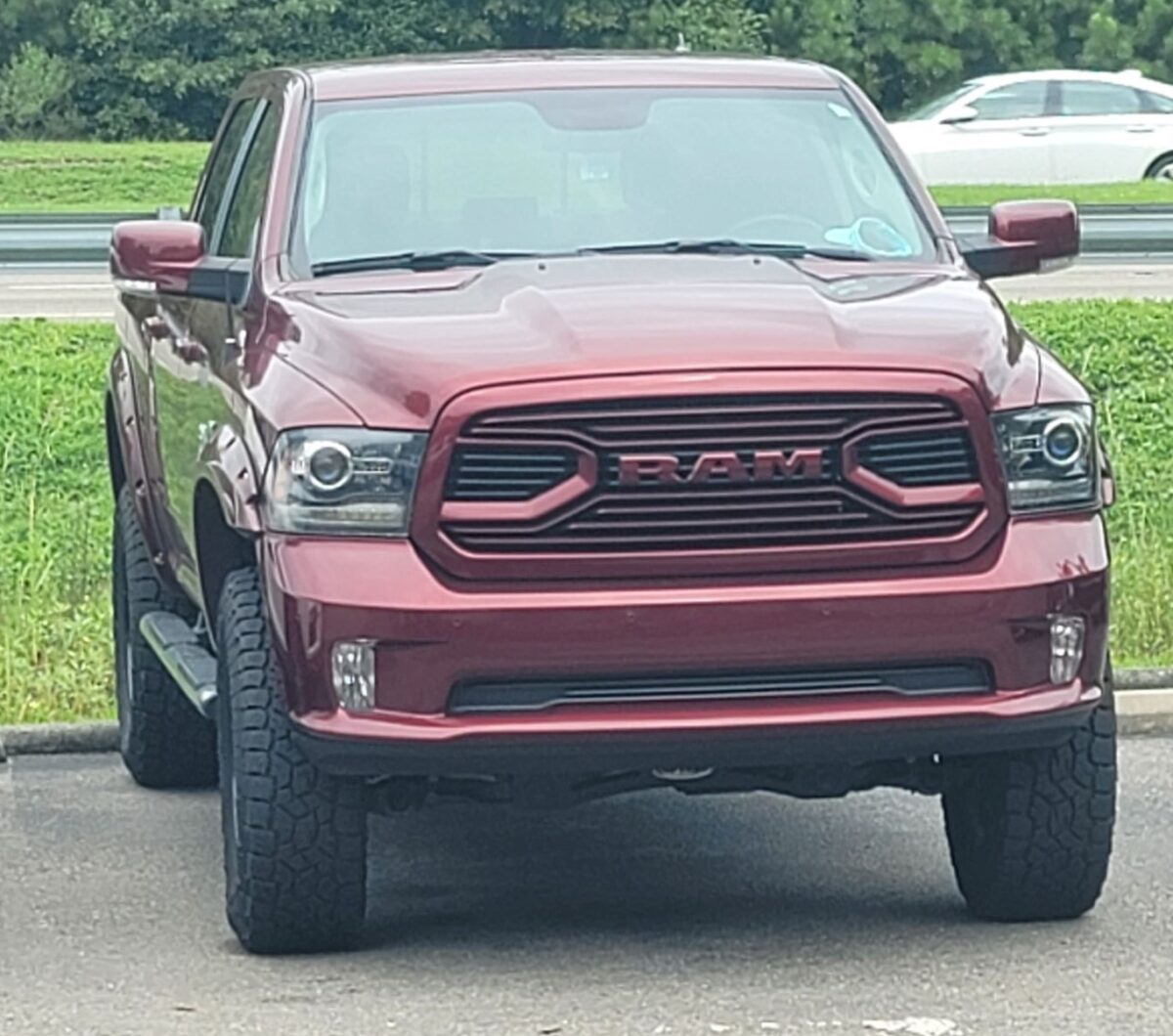
But what I have NOT seen is the latte effect applied to any red car color. Have you? To take a burgundy and milky it down would be a resulting dusty rose color. To apply the latter effect to a fiery red would result in a carnation pink/coral. Depending upon that original hue, the softened color would vary, but regardless, I have not seen this introduced on the market. Perhaps preliminary studies showed that other than dedicated Mary Kay sales associates attaining the highest level of reward, the pink tones were not big car picks. (Since having started this missive, I have seen a softened burgundy, but it is apparently still a rare find in the new color palette of cars.)
Yet, having a favorite color or what you consider to be your favorite color might not apply to all things in your world. As I have always said about design and color, decisions are usually based upon context whether you are aware of it or not.
For the last 20+ years, my car color has been white. To me it is freeing. It cleanses my palette, (intended play on words). I know I won’t tire of it, and it allows me to approach and own that blank canvas when the entire rest of my world is ruled and stimulated by color and my constant critique, application of it or response to it.
As an exercise, think of what your favorite color might be. If you are super color sensitive like I am, you might consider that you have many favorite colors – usually based upon context – but for this exercise, pick one and then see where you have selected to use it in your world. Is it the color of your car or wall or favorite outfit? Don’t be surprised if it is not any of those seemingly significant things in your world. But check the the context. If it is on one or more of those things, ask yourself what about that “favorite” color resonates – makes you comfortable or even joyful. Then see what other color choices do not include that color and ask “why?” You might be surprised that this is fun and illuminating. It will provoke your thoughts about color and choices and perhaps heighten your awareness of the colors around you.