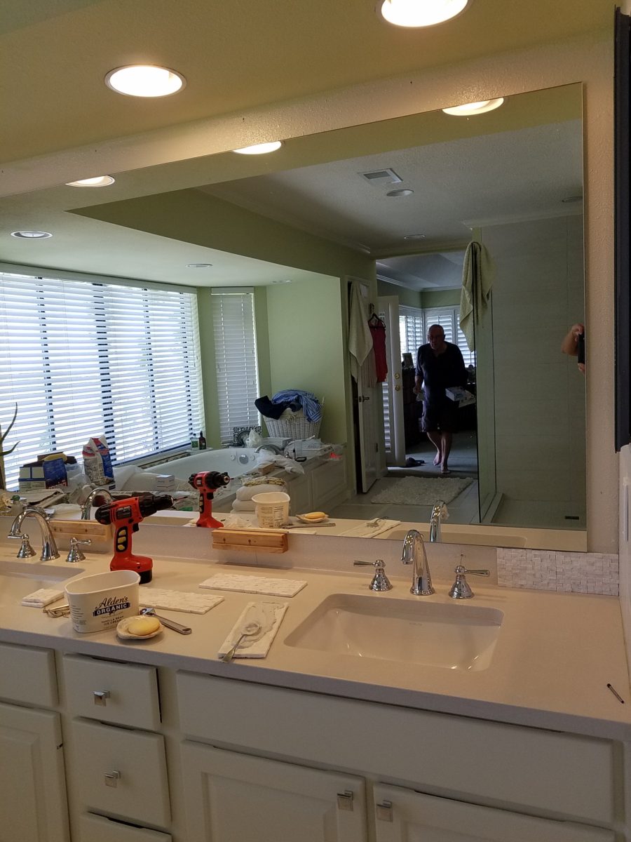
Last August 11, 2019, I left you hanging with a radical bathroom remodel that was in the throws of being transformed. The title of the blog was Everyone Loves Before and Afters. https://patriciandesign.com/everyone-loves-before-and-afters/ Here today, I am excited to present the finished product and a little more to the story…
Everyone DOES Love “before and afters.” The original blog identifies the material process of the project, but as important as the material applications are the emotional aspects of design and precede the material selections.
The home is a bungalow style home from the 1950s. Charming architectural elements and traditional details set the stage, sensitivity, and the emotions behind any design decisions we were to consider. See the first phase of this home’s updating design in the primary living space at this link: https://patriciandesign.com/project/classic-blue-white/ The kitchen was also re-finished. Maintaining the same design layout and appliances, the new finishes resulted in a startling transformation. https://patriciandesign.com/project/kitchen-transformation/
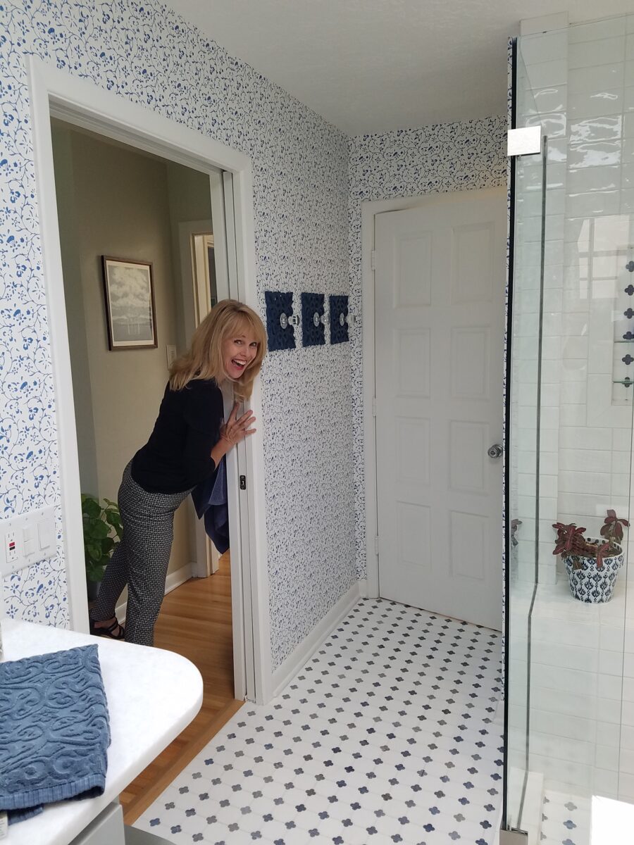
The challenge in this project was to retain the character and traditional charm that the couple so enjoyed about their home, while introducing new, modern design features and trends melding with traditional design elements. New custom cabinets for the vanity and linen storage/display unit along with the re-design of the shower – eliminating the tub and making a “doorless” access and a pocket door connecting to the adjacent guest room were the three key construction components.
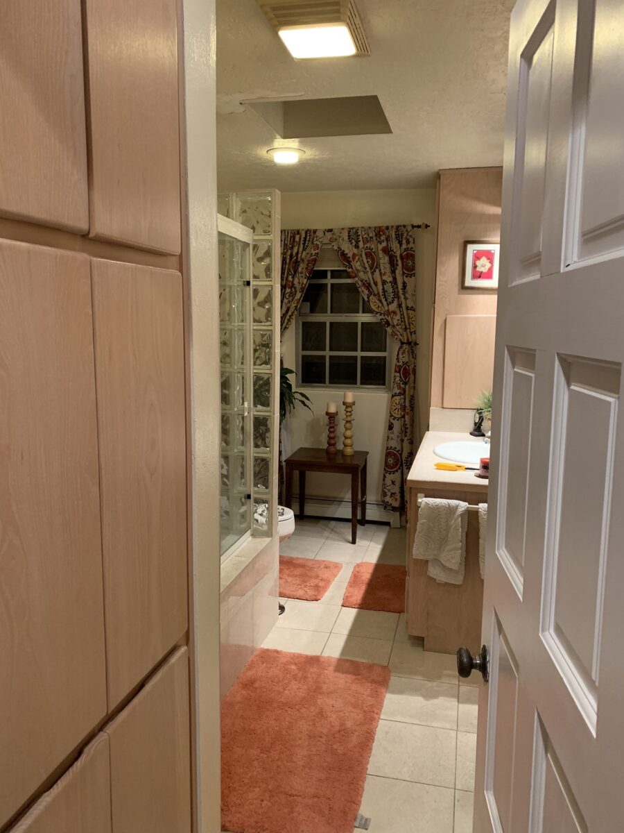
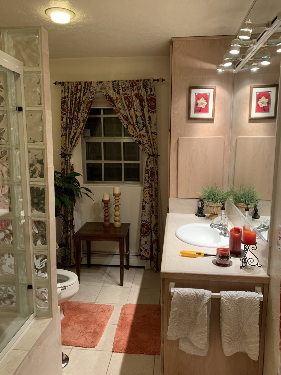
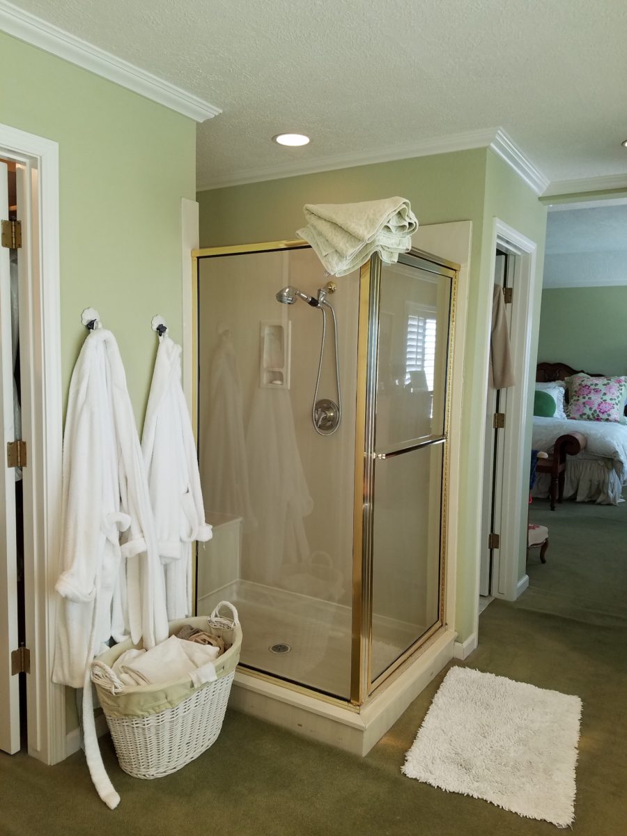
Dated finishes done in the 80s, by previous owners, were common and bland. The tub and shower were enclosed with by-passing glass doors in aluminum tracks and frames. This bathroom was the dated and fussy room that we presented last August. The tired and dull finishes needed replacing and refreshing. It was to be a complete make-over to compliment other recent improvements in the home.
Once the general concept for the remodel is determined, the “what if” stage begins. The stage where ideas are tossed about and decisions lead to other decisions. The options are massaged giving way to different combinations and considerations.
After all the options are discussed the plan is adopted – a combination of everyone’s input. Hopefully not design by committee, but in this case the couple, in whose house we were working, and the me, the designer. After the design is determined, the input of the general contractor and/or the sub-contractors can come into play. They are generally given the opportunity to evaluate existing conditions and voice opinions and procedures or details that their expertise can bring to the project. Everything is considered until a cohesive plan is developed.
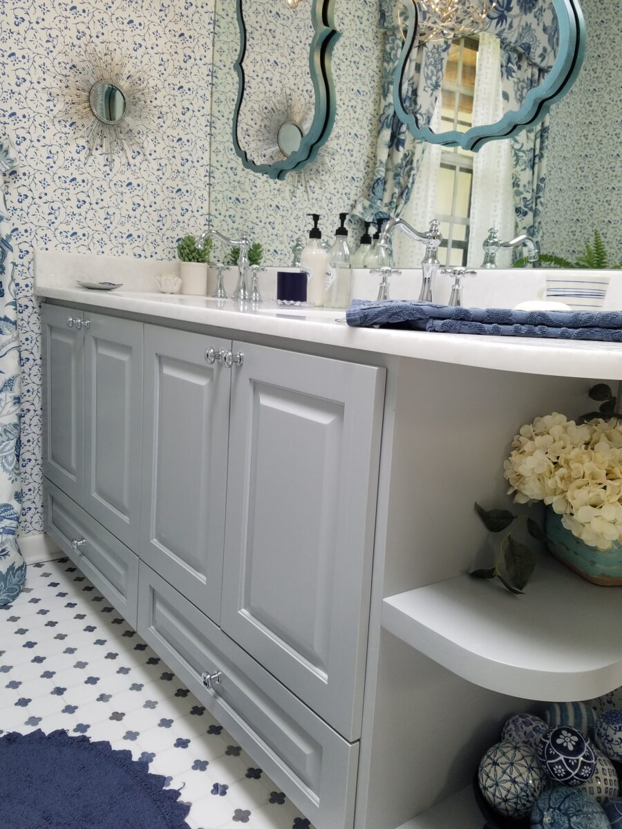
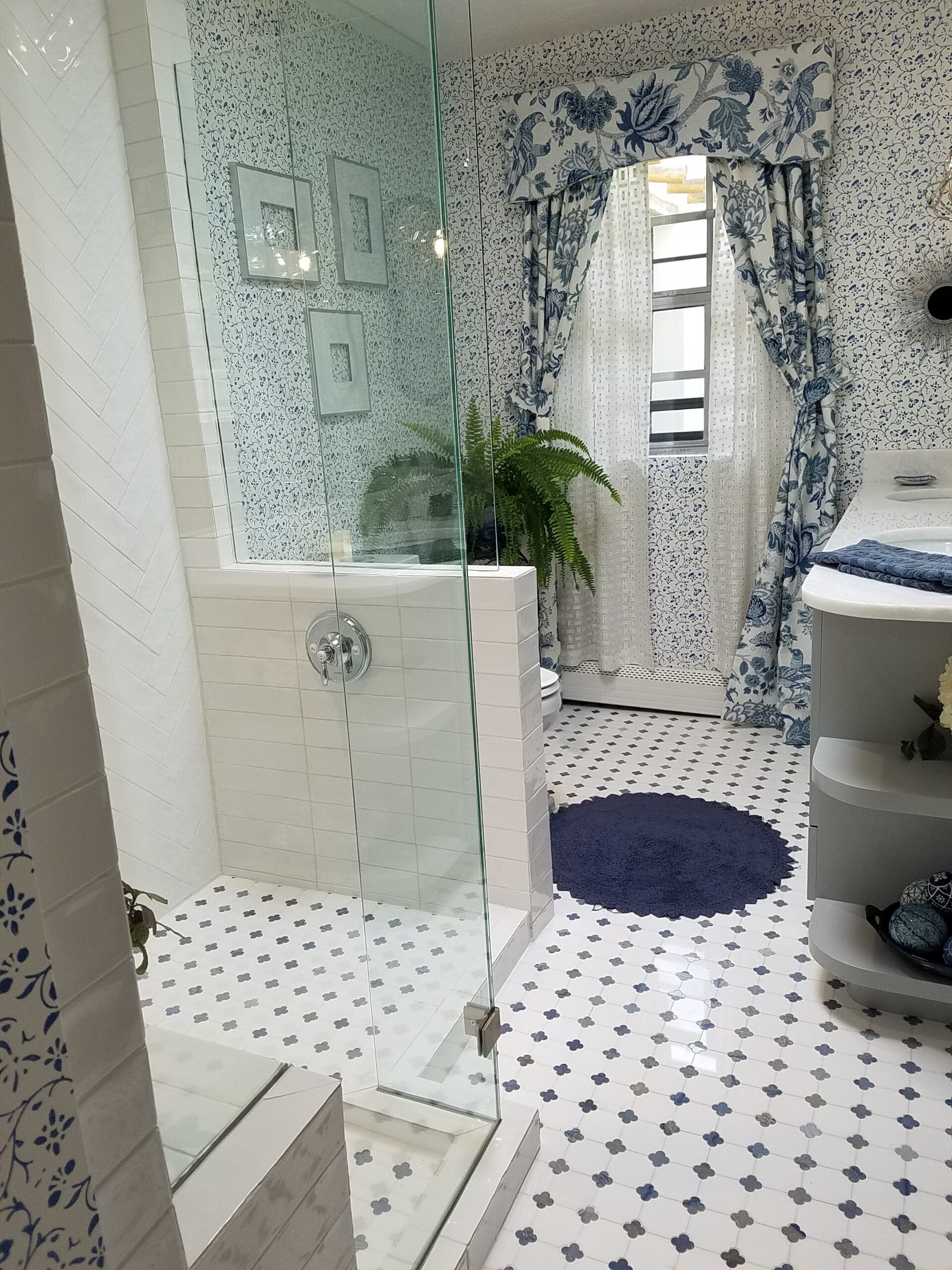
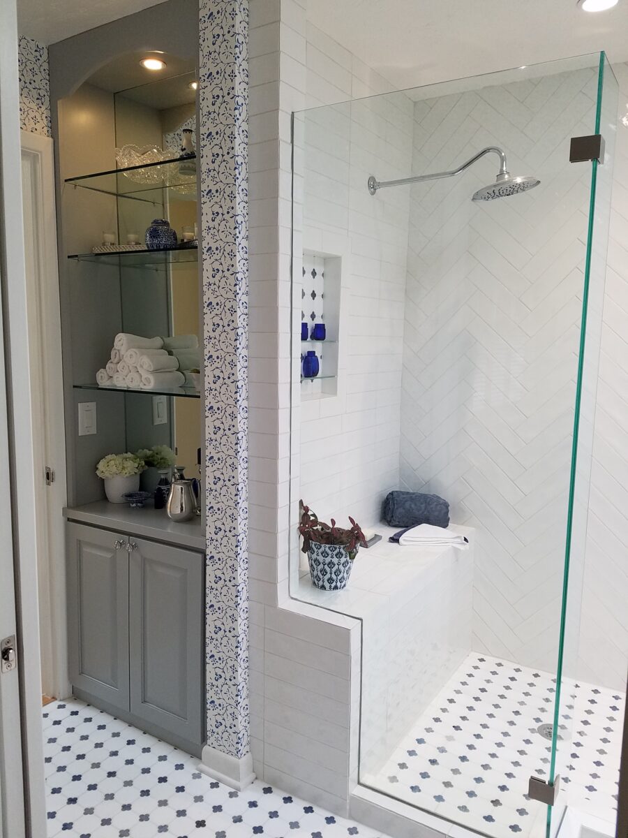
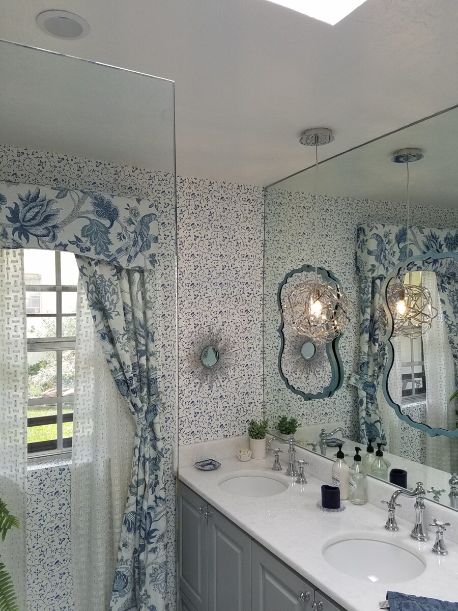
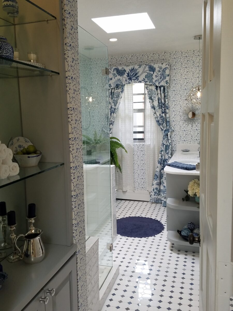
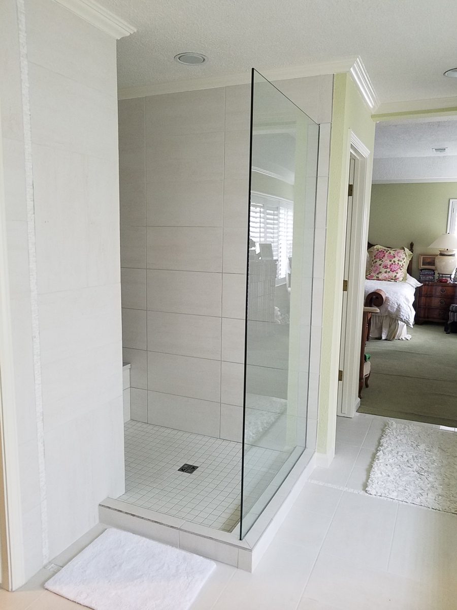
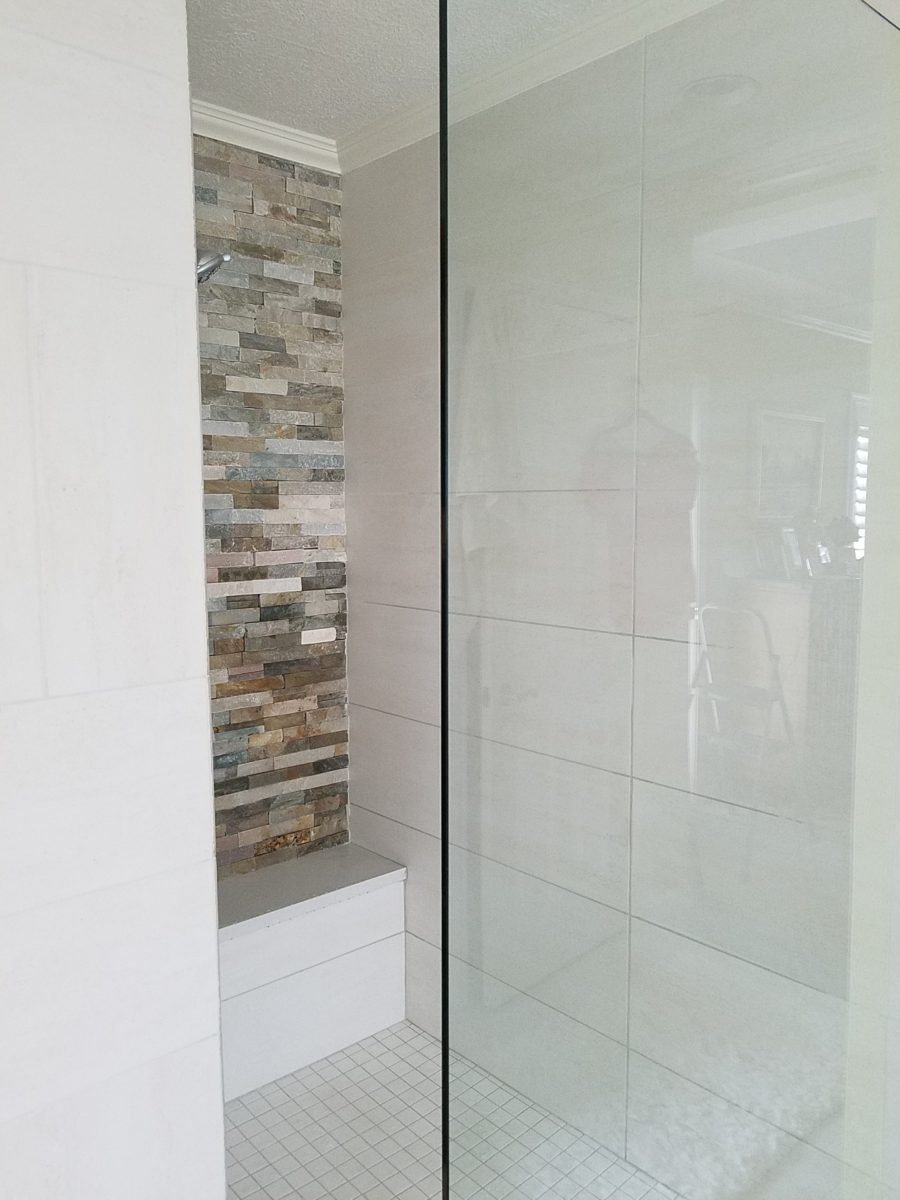
New cabinets were locally fabricated to not only insure excellent craftsmanship, but to customize the fit (left to right) and provide specific drawer configurations for the desired new height of the cabinets with an additional sink.The tub was removed, and the new shower enclosure was clear glass and given a wider footprint to allow for a jog which eliminated the need for a door. The shower valve was relocated from beneath the shower head to the opposite “pony” wall, making it easier to operate the temperature and flow without getting wet first!
Other than the shower reconfiguration, new cabinets, and pocket doorway into the guest room all else was superficial cosmetic design features. This is where the layers of embellishment come into play.
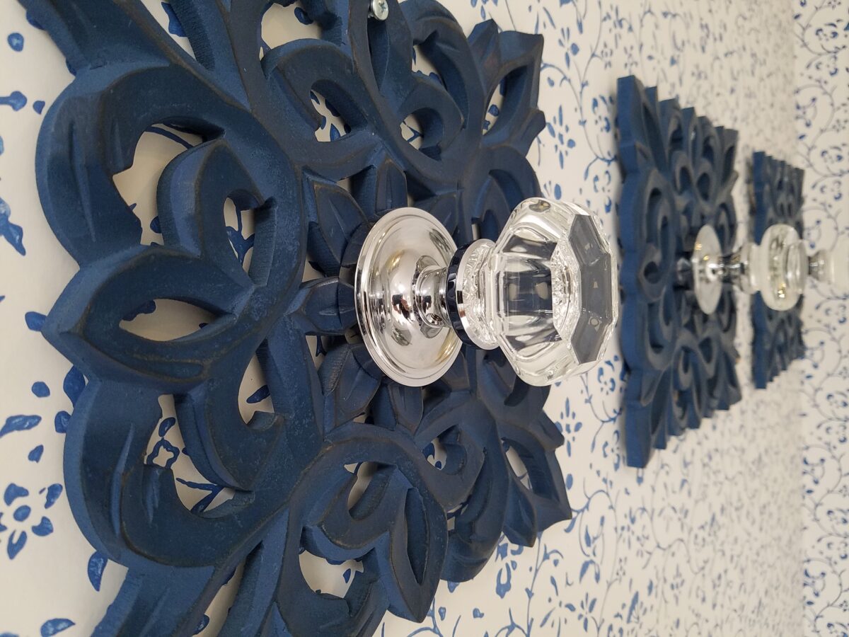
During the process, there were certainly hesitations about the combination of patterns and finishes being proposed…however, you know you’re on the right track when the happy homeowner has fun accessorizing and creates the perfect towel/robe hooks! DIY – finding these blue, wooden, open-work plaques, our creative homeowner bought polished chrome and glass doorknobs and attached them securely to the plaques – Voila!
In keeping with the traditional design direction previously adopted in updating the interior, the flooring was selected for its natural stone mosaic authenticity. With a warm grey selected for the custom cabinets and white herringbone patterned subway tile on the rear wall of the shower enclosure made for a fresh modern look.
A mix of patterns – a balancing act – the art of design. Do not be afraid.
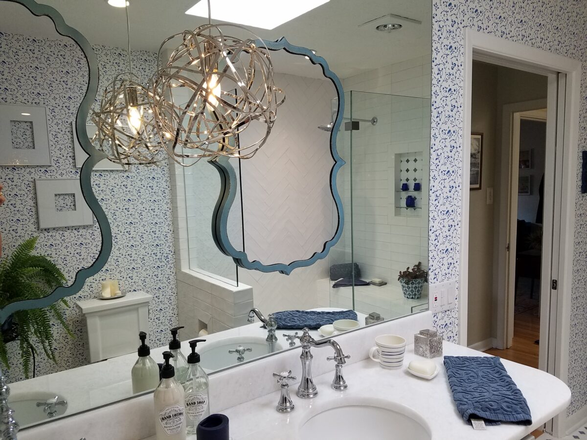
But wait! These traditional elements and modern trends were further embellished with a second layer of curvy turquoise mirrors installed over the full-wall mirror – suspended between is a polished chrome sphere of open bands providing ambient light and additional task light for the vanity area.
Layer upon layer until the composition is complete!
Classic blue and white screen-print on paper with an overall pattern of vines and leaves fills in the voids creating a not-too-busy backdrop – adding further dimensions to the design.
Natural stone slab of a white crystal-like granite – looks like a stone quartz crystal.
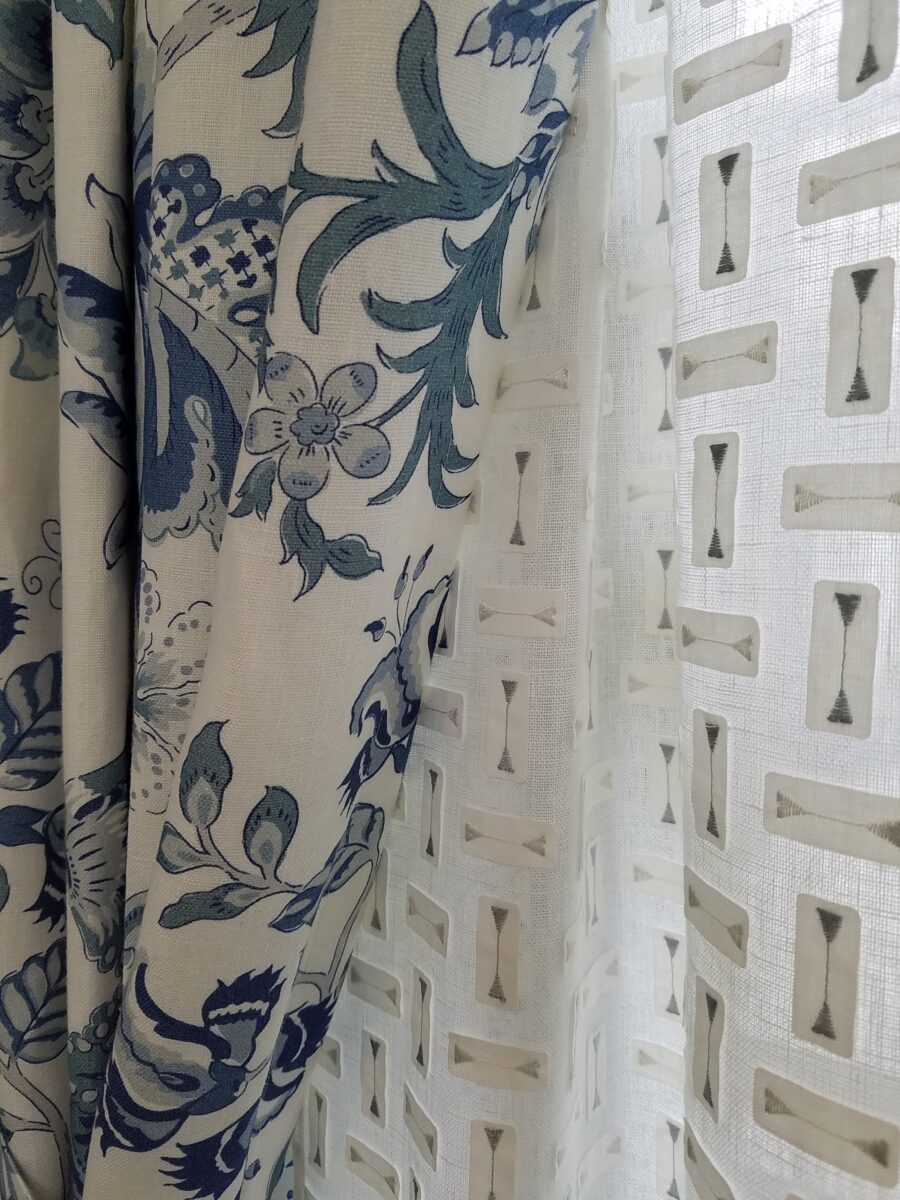
Drapery fabric in a traditional floral on linen with whimsical, modern “martini glass” sheers soften the window and diffuse the incoming light.
The resulting completed interior is a radical transformation from the dull beige and peach of the previous scheme. Fresh and crisp – with just enough busy to be playful – the new owners claim that they smile every time they enter or even walk by.
Remember the first photo? The BEFORE & AFTER transformation is extraordinary.
It’s true. If you think designer’s projects go more smoothly than the ones they do with and for you, you’re wrong. It’s true – they don’t! It’s about Murphy’s Law and I have been remodeling our master bath for months. Starting in November and as recently as this weekend personally installing (DIY) the stone surrounding our mirror, it is still not finished. But it’s close.
The full-wall mirror was re-used. During the removal and transportation to be cut-down, the edge cracked and had to be cut down…we lost an inch or so – no big deal EXCEPT that it then affected the dimensions of the new stone surround that had already been determined. Oh well…we now will have to cut the tile – had intended not to have to do that. One of the many little surprises and delays. We had to order more stone and will now engage the installer to cut the ones that would not fit the new and slightly non-parallel conditions .
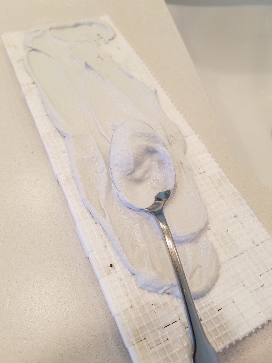
It’s actually fun to tile…until you have to cut it. It is like frosting a cookie and then pressing it onto the wall. It goes quickly and gives instant gratification. But when things are not perfectly parallel, something has to give. That’s when we cut. (Or call someone to cut!!!)
The effect, of having almost all of the mirror surround finished, gets us that much closer. The effect is great and is beginning to feel like the intended design.
The shower before and after is providing the open expansive look that our little shower enclosure didn’t provide. Despite the facts that the footprint is nearly the same and the old enclosure was all clear glass – albeit framed in gold finished aluminum – this new single panel of 1/2″ clear glass and white-on-white floor and walls looks clean and open. Not a snail design – but, no door. Prepared to add a white shower curtain on a custom curved aluminum ceiling track once winter returns – but for now we’re enjoying the refreshing and comfortable atmosphere.
We elected to use stacked stone on the rear wall of the shower as our house sits at the base of the majestic Sandia Mountain and selecting stone seemed more grounded and contextual than other decorative options – of which there are a million from printed concrete, glass mosaic, embossed porcelains…the list goes on…
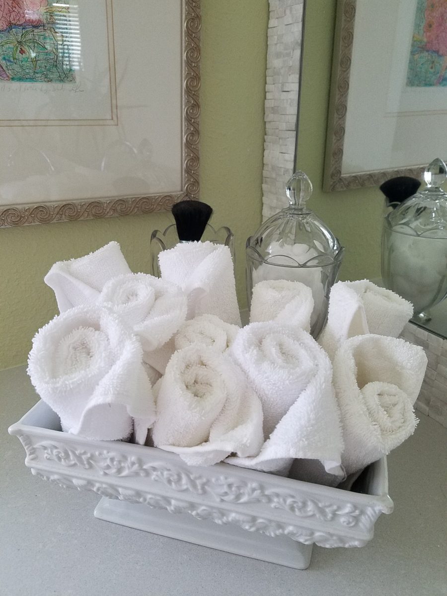
Decorative elements are beginning to “read”
against the new finishes. The same Portuguese ceramic footed rectangular
container holds a bouquet of white washcloths. Yes, I think that the rolled
terry towels look like rosebuds and I have always enjoyed the softening effect
they provide amidst all the other hard surfaces. Plus they are handy on the
countertop for clean replacements.
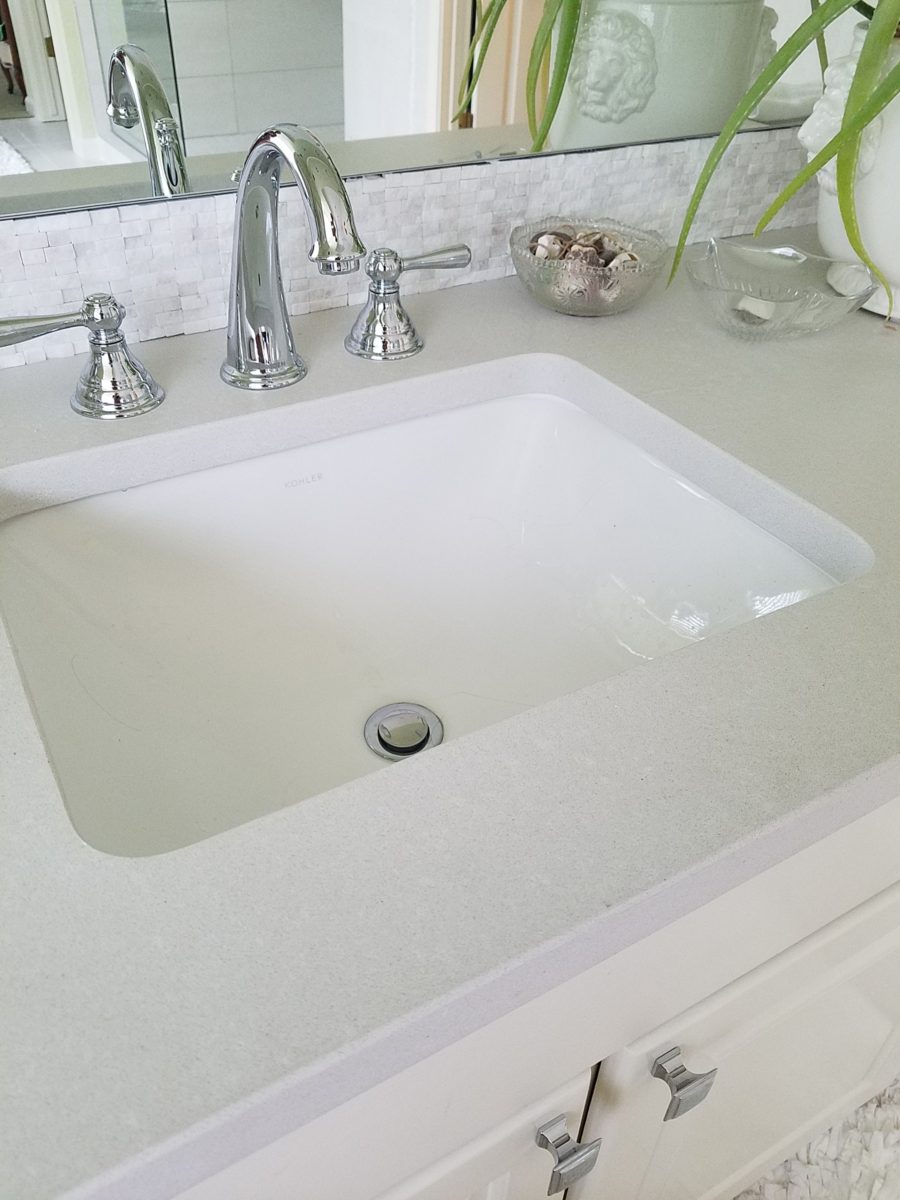
Footed Italian porcelain has had wash cloths in it for years and stays on the new counter top in a slightly different location.
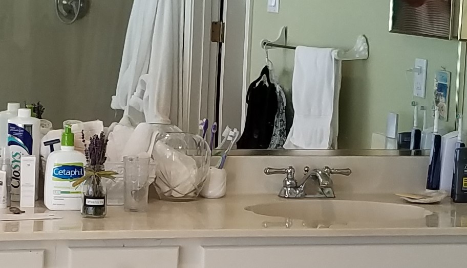
Behind the terry rosettes, notice the pair of Heisey open and lidded pair of stemmed glass vessels that I use for make-up brushes and cotton balls respectively.
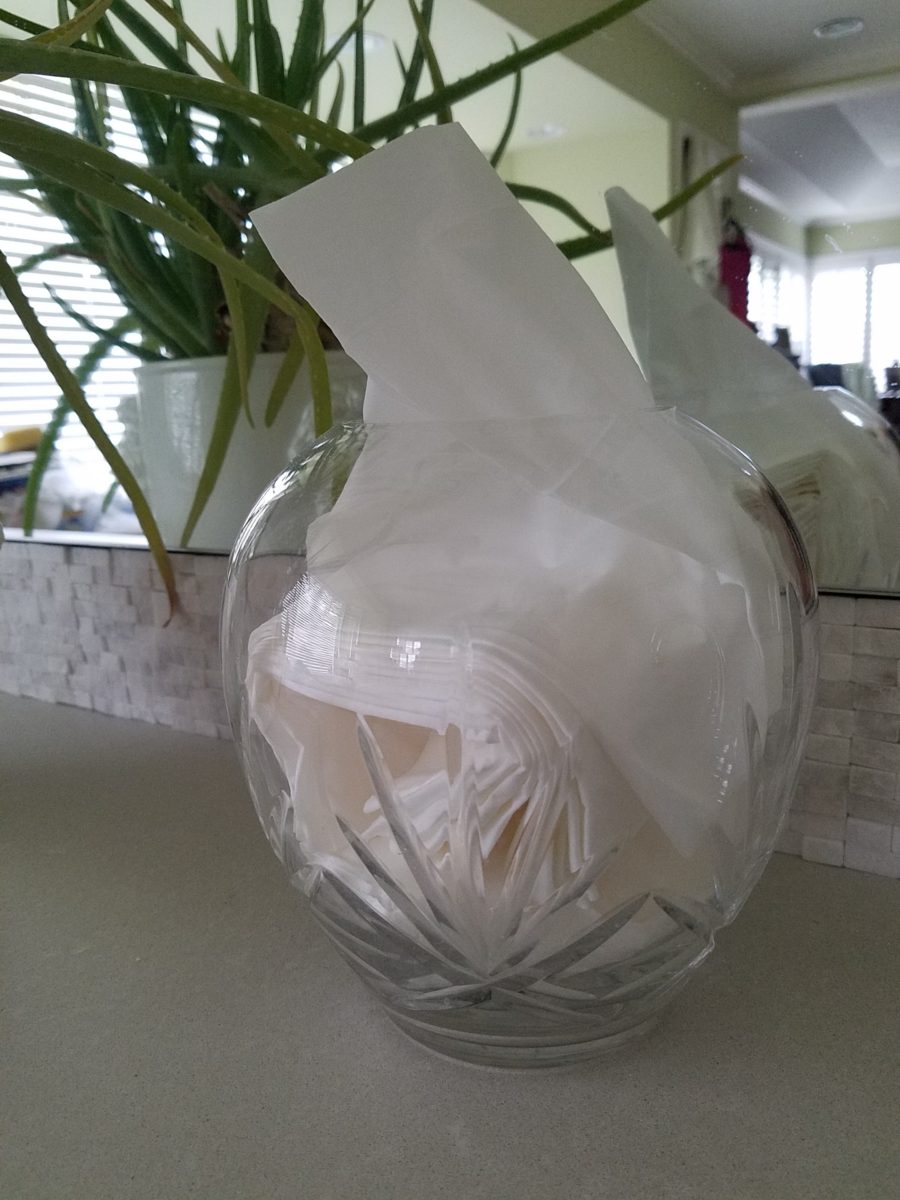
The same crystal wide-mouth vase holds and dispenses the facial tissues. I love the effect of the white-on-white coiled folds of the tissues. They are soft and read interestingly through the cut crystal.
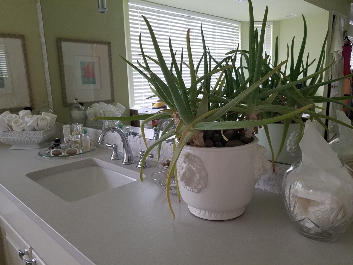
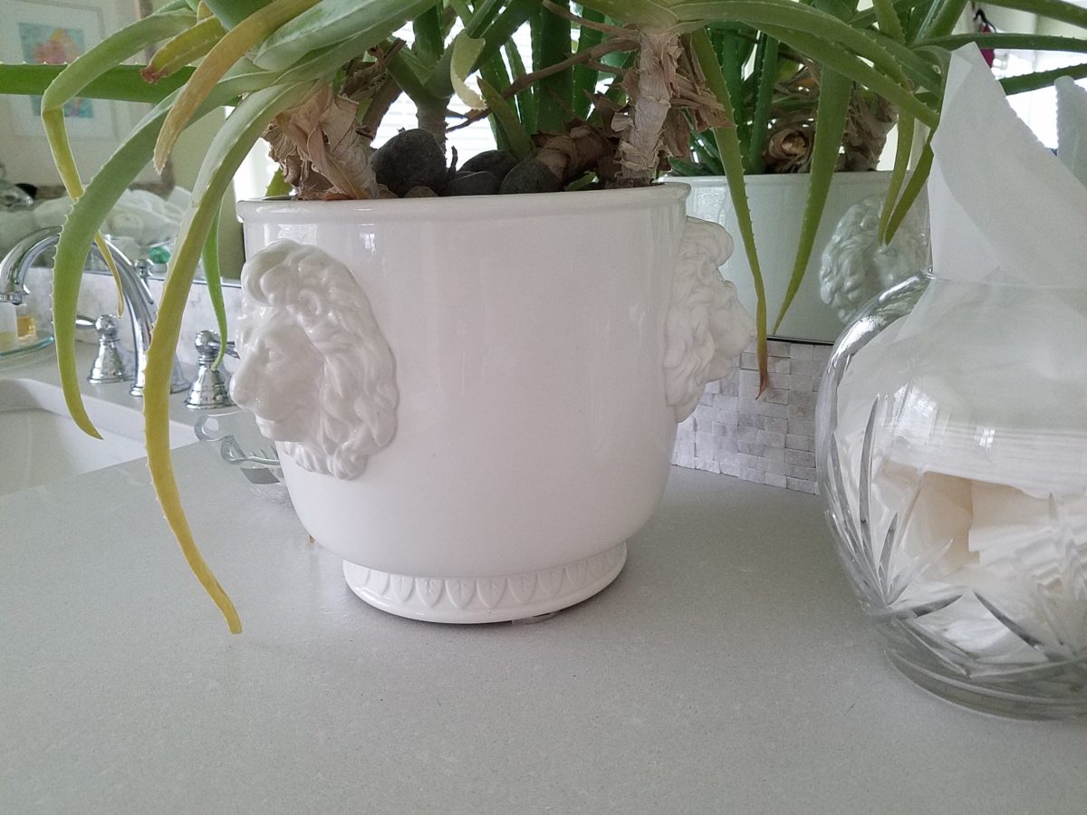
I’m a LEO and find myself discovering and enjoying subtle references to lions. Our front door knocker and this cache pot that I’ve had for over 20 years as examples.
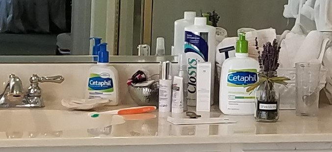
Nothing in this new scene is new. These accessories are all
the exact items that were scattered on the countertop previously! Funny how the
exact same decorative accessories work so well in this new interior!
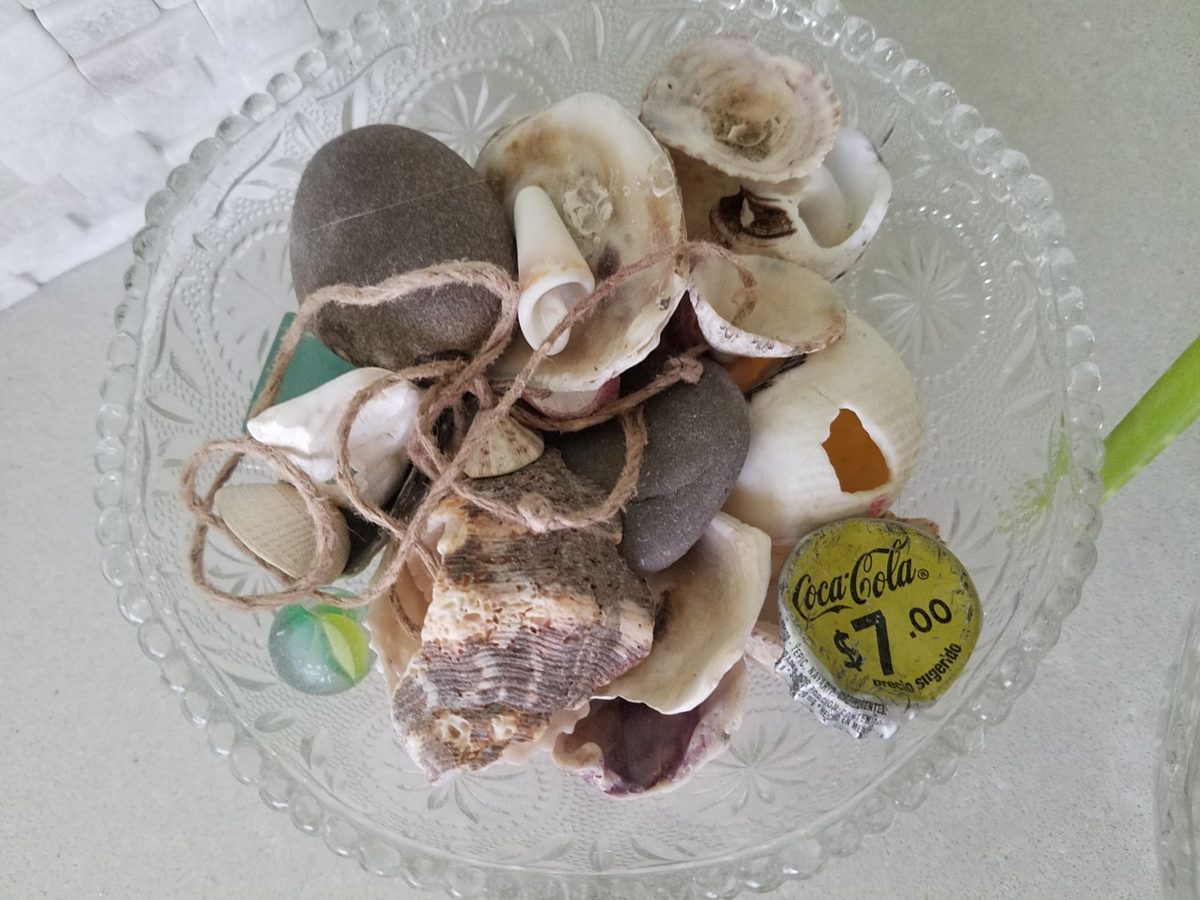
A silly little collection of found things in a family inherited vintage pressed glass bowl including a glass marble, square frosted glass coke-bottle-colored mosaic tile, various sea shells and fragments, a squashed bottle Coca Cola bottle cap from Mexico, a hemp cord DIY necklace with a shell pendant…
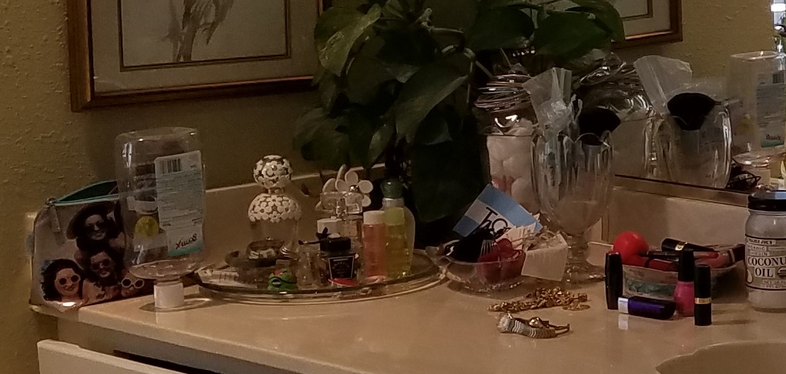
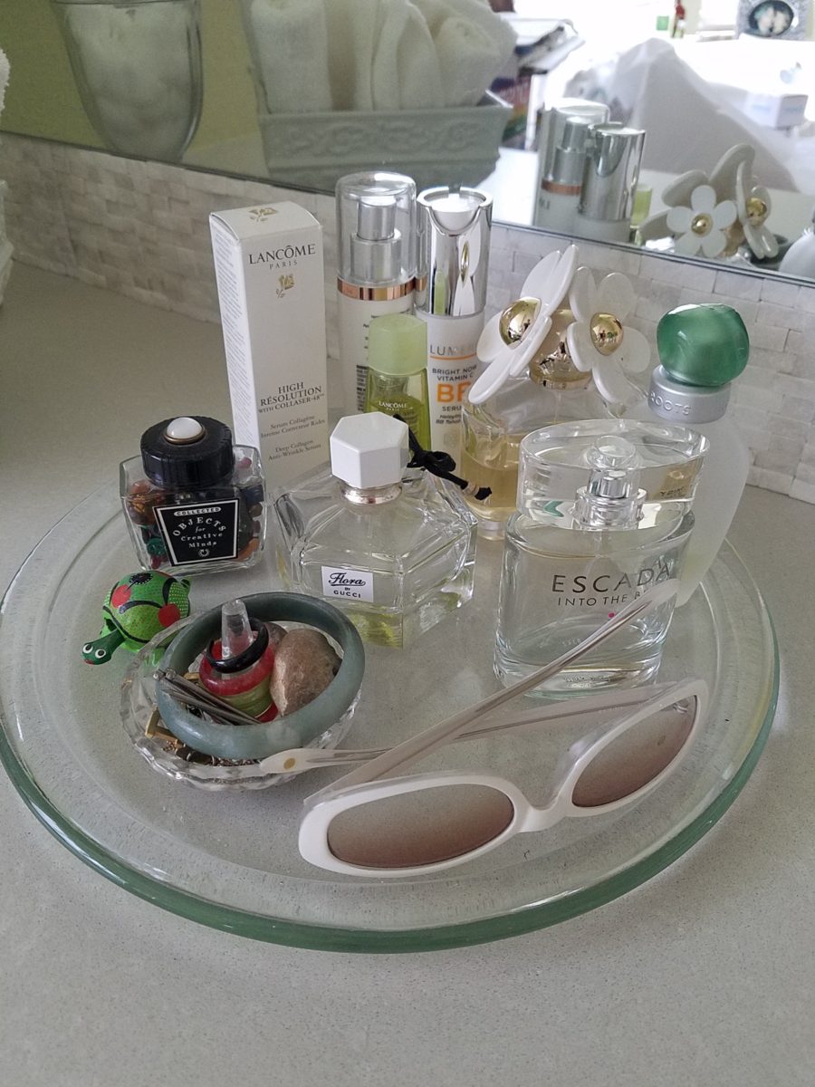
Another glass tray that was also on the previous countertop presents my fragrances, a few products, a bobble-head turtle, my Waterford ring stand stacked with costume glass rings, my tragic, yet miraculous jade bracelet (save for another story), a fossilized bone – in – stone I found as a child, my white framed sunglasses which might seem selected for the new color scheme – when, in fact, they are a result of my love for white framed glasses and these that I bought even though I didn’t like the would-be “reader” small lenses – I kept. I don’t like the way they look on – so have relegated them to the master bath for emergency dashes to the outdoors, on the upstairs deck when my other sunglasses are downstairs!
Still to complete…the stone mirror surround, hang the glass shade for the new pendant light fixture, install the towel/robe plugs, install the polished chrome drawer bar handles to match the new square door and drawer pulls, clear all the remaining stone pieces, thin-set and grout bags and boxes from the tub deck, install the new window sills…
Re-evaluate your existing accessories (and/or furniture)
before feeling the need to change everything when you remodel. Watch for the
completed before and after shots of this remodel soon to come. Well, relatively
soon!!
Busy lives in a new town, he in his residency and she working
in a busy OR, they bought a house – their first house – and asked for help
making it theirs.
They have traveled the world and collected art along the
way, a disparate inventory of things that caught their eye, spoke of their
experiences and reminded them of people, places and things to savor once home.
Home, that was the task. Create HOME in this new, old house. Built mid-century, it was simple, clean with some patchy remodeling from previous owners reflecting rather common decisions, with limited funds. We needed to discuss priorities and budget, evaluate what should stay and what needed to be changed.
They both had a love of Guatemala. Their travels there left
them with dreams of color and pattern, handmade functional art and an exotic
sense of place. Having these elements ingrained in their longing, they
expressed a desire to have that sense, but with a bit of a modern twist.
Assembling the colors and materials…
We salvaged the existing natural granite slab countertop and
unfortunate surface-mounted sink. The granite was a practical save and the sink
came along for the ride. In order to integrate the granite as though
intentional, I selected a multi-colored
Talavera tile that specifically had a dollop of mustard glaze in the design
picking up that Dijon field color in the speckled granite. As is my usual
preferred mode of installation, we took it wall-to-wall as a complete wall-covering.
We also saved the cabinet boxes and doors, but needed to
give them a lift from their median caramel stain on oak. Deconstructing the
colors in the design of the Talavera, we
knew we wanted blue cabinets – so the paint shades were fanned and the color
pinned-down. To give the cabinets that wabi-sabi look of loving wear, we sanded
the edges after the painting was finished. We also added cabinets over the
stove for additional storage space and utilization of that blank wall.
We removed all the doors and drawer fronts, filled the holes from the old pulls/knobs and painted them off-site. We painted the boxes in the field. Granite was salvaged along with the sink. New paint, Saltillo flooring, Talavera tile and cabinet pulls along with new appliances gave an updated look to the scene.
In real life, when
practicality rules, certain things have to give way for the good of the
whole. The whole being the pocketbook and other elements that take precedence
at the time. So we live with the radiant heaters, keep the chandelier for now,
until they have one fabricated to their specifications, use a machined rug
instead of a handcrafted piece and know that over the years they will massage
this starting place and truly make it their home.
Continuing to dissect the colors from the new wall tile, our
colorful young couple wanted more color…we chose individual values of bold
paint colors – smoky turquoise, slightly
burnt orange and brilliant golden yellow to intersect the planes throughout the
space.
Typical mahogany doors common to that era of home interiors,
the decision to match the white trim would have been easy, but we labored over
the existing natural, tropical wood and decided to keep it in the mix.
Although the nearly immaculate, original hardwood oak floors
were revealed after removing the wall-to-wall carpeting, the kitchen floor
throughout the rear vestibule and laundry room was an inexpensive and
uninspired sheet vinyl. Saltillo clay
tiles were the answer to furthering the Guatemalan feel. More commonly
associated with Mexico, these clay tiles are historically the plebian choice.
Taking many forms, some artful enough to be the cornerstone of patrician interiors
in fine mosaic installations and other patterns and designs, clay tiles –
glazed and unglazed always add an artful, soulful human element. Speaking to
that, we inserted 2″x2″ glazed Talavera accent tiles into the floor’s
new Saltillo field in the vestibule creating
an almost area-rug-like definition.
The dated floor-plan enclosed the kitchen separating it from the rest of the living area. The very first comment made by our clients was questioning if we could open that wall – connecting with the living room and large picture window beyond.
The mottled cobalt blue light fixtures add another punctuation of color over the bar along with the parrot green barstools that our home-owners spontaneously nailed in an irresistible lust for even more color!!
Rather than trying to continue the existing “Dijon” granite, white Talavera tiles were used on the new pass-through bar counters – both high and low on the new cabinets.
The first phase of this colorful project has set the stage for an enjoyable work-in-progress for years to come as they now have a basis for design, more collectibles to come, and all they enjoy from places near and far. The upcoming annual trip to Guatemala, in April, will reinforce the joy and appreciation for this special place “home base” in their lives.
The dogs look in eagerly, but are limited to their expansive backyard, their vestibule and full run of the master suite.
Although they selected a durable denim twill fabric to reupholster their sofa and loveseat that they were gifted from a friendly neighbor, the primary living area is – for the most part – “off-limits,” but that seems to work for everyone in the family!!!
Time to remodel the kitchen!! This charming little bungalow had already experienced its share of remodeling – well, not so much structural – although, many interior design transformations had occurred over the decades. In the mix, the well-used and enjoyed kitchen was feeling a quite tired and dated.
You might remember I have used this now completed project, in the last few months, during its transformation process to identify certain features and design practices. Here is the as-promised unveiling of the before and after photos for further discussion about the design process, intent and results.
We loved the mottled color and organic character of the existing slate floors and opposing green-grey beams with spanning boards of a caramel stain. These were the two elements that went well together as though intentionally planned. Yet in between, the pale, peachy pickled oak cabinets with their radius detailing and red-rose/black matrix of the tiled granite counter-tops, didn’t seem to speak at all well with the ceiling treatment and slate floor’s greens, rusts and charcoal tones. It was a dark, confused space.
When observing and “listening to” the house, it was evident that the current kitchen, in addition to being poorly coordinated, had absolutely nothing to do with the original architectural intent. The new owners had brought a few very fine antique pieces into the home. The mid-century circa 1964 age of the house accepted them on its original hardwood floors also adorned with their fine antique rugs…but something was missing. There was no cohesive thread running through the house. Over the years finishes and decorative elements had been selected and installed without any consideration for original materials or an attempt to introduce compatible and harmonious materials for the good of the home’s overall theme.
In all fairness, had the entire interior been gutted and a
contemporary interior been uniformly installed into the framework/shell of the structure,
I might have considered it a success. However, this multiple decade decor was a
mix of disparate trends and preferences that had no commonality.
To begin the process of bringing this home into a cohesive
design last year, we had redesigned the living room. There we introduced a classic
blue and white color scheme derived from the Persian rug in the adjacent dining
room.
To the corner kiva fireplace, we added a sandstone hearth and
mantle with just enough blue and white Talavera tile trim at the base of the
hearth to subtly coordinate with the new scheme. The Talavera was an
appropriate material for this New Mexican bungalow.
The original fireplace had a dark, broken brick quarry tile hearth and no cap on the mantle.The face-lift replaced the hearth material with broken-edged sandstone slab and matching mantle cap with Talavera detailing at the bottom.
With this living room having been so successfully re-designed, the obvious thought came into the discussion to continue the vernacular of the blue and white Talavera into the kitchen. As a bit of a purist when it comes to application and termination of materials, I was not content for a mere back-splash. No, if the tile were to be effective and commandeer the stage, it had to be used wall-to-wall as though an entire wall treatment.
Treating the Talavera tile as wall-covering, it continues from the kitchen, into the adjacent pocket-space housing a desk and laundry machines.
But wait! The addition of an earthy aqua handmade tile from
Spain offered an appealing and unexpected accent woven intermittently through
the Talavera. It created a coordinating thread from the colors found in the mottled
slate floors and ceiling beams.
Pre-grout shot shows the individually cut 1″ pieces inserted as mosaics into the random field of Talavera
The cabinets were in excellent condition, but the doors were
sadly dated and in no way spoke to the home’s other cabinets, doors and finish
carpentry.
The confused interior finishes we in need of a transformation!
With the white raised panel theme throughout the home’s original appointments, we elected to salvage the cabinet boxes and replace the doors and drawer fronts with a similar raised panel detail. The same red oak was used and, with a glossy white paint applied, the grain “read-through” with a very intentional yet subtle moiré-like pattern. The new raised panel white doors and drawers, with crowning top molding provided a crisp, timeless motif. The random patterned Talavera used as an entire wall-covering was very effective. The kitchen was quite gussied-up!!
The transformation was dramatically successful!
The existing slate floor was beautifully organic and I felt, from a design standpoint, was a must to salvage. Making it look like an intentional selection – part of the new scheme – was imperative. Therefore, selecting a counter-top that communed with the tones in the floor resulted in a selection of concrete-like engineered Italian quartz material – balancing the floor with the next horizontal plane and ultimately with the stained and green-grey boards of the existing ceiling treatment.
The new concrete-like Italian quartz counter-tops coordinate well with the other materials.
Another asset was the connection to the outdoors, however the existing window over the sink was high and small.
The window over the sink was high and small…
By bucking the warranty of the Pella people, we had a new double-hung window made to close down onto the new counter-top that passed through from inside to out. They would not fabricate the window to do what we intended, so we had the contractor remove the bottom of the new window frame, thus rendering the warranty null and void, in order to have a completely open, uninterrupted pass-through when raised.
Amusing and interesting…existing family pieces of blue and white ceramics are being discovered and used as decorative accessories in the new kitchen!
We also captured the opportunity to open the opposing wall into the hallway adding pass-through light and dimension to the space. This exponentially expanded the space and made the encapsulated kitchen feel much less confined.
Before, the kitchen felt small and dark…Opening the wall into the hallway brought in additional light and dimension.
To add drama to the newly created dimension, we discussed having a painting commissioned to pop an accent of yellow into the blue and white scheme on the far hallway wall. Lemons, a perfect citrus for the kitchen, was decided for the theme.
A miniature oil painting by Federico Leon de la Vega was used to Photoshop into the scene to inspire and convey the design intent.
The additional POP of yellow is a dramatically effective contribution to the overall composition. After consideration, the owners selected a local artist to paint the full-scale painting.
A local Albuquerque artist, Thomas Tomlinson rendered the lemons in acrylic with blue and white tile details.
In summary…keeping the original slate floor, existing cabinet boxes (replacing door and drawer-fronts only), with a bling of new chrome cabinet pulls, switching out the stained glass pendants, replacing the island’s surface with a handsome solid walnut top and a new coordinating concrete-like counter-tops on the periphery, with the decorative embellishment of the Talavera tile continued from the subtle introduction at the living room’s kiva fireplace, the transformation of the kitchen is stunning – not trendy – and was truly, uniquely designed for the architecture and forward, on-going contextual design conversation of the home.
Uniquely designed…
Look around and listen to the environment for and in which
you are designing. What makes the best sense for the design direction
considering the function and context of your project?