Everyone loves “Before & Afters.” The transformation of an object or a space is the magic of interior design. One of the most valuable elements in our design wheelhouse is fabric. Fabrics have the ability to transform. Like paint – color – altering to enhance a piece or the entire environment, fabrics offer not only color, but texture, pattern, design and style.
I love a good find. Call it antiquing, thrifting, scouting, treasure hunting…the hunt is the intrigue. Exploring random sources to find the perfect piece. Once found – knowing what, if anything, is needed to transform it.
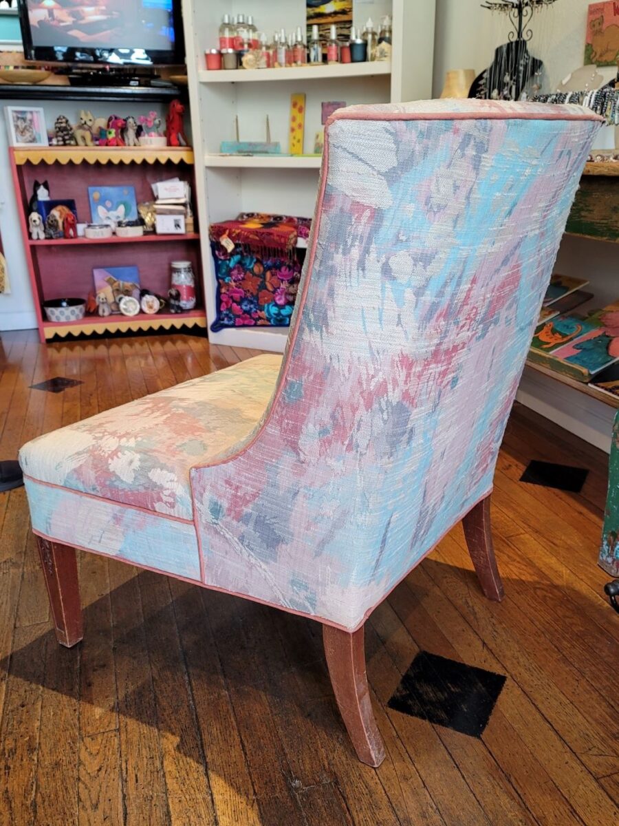
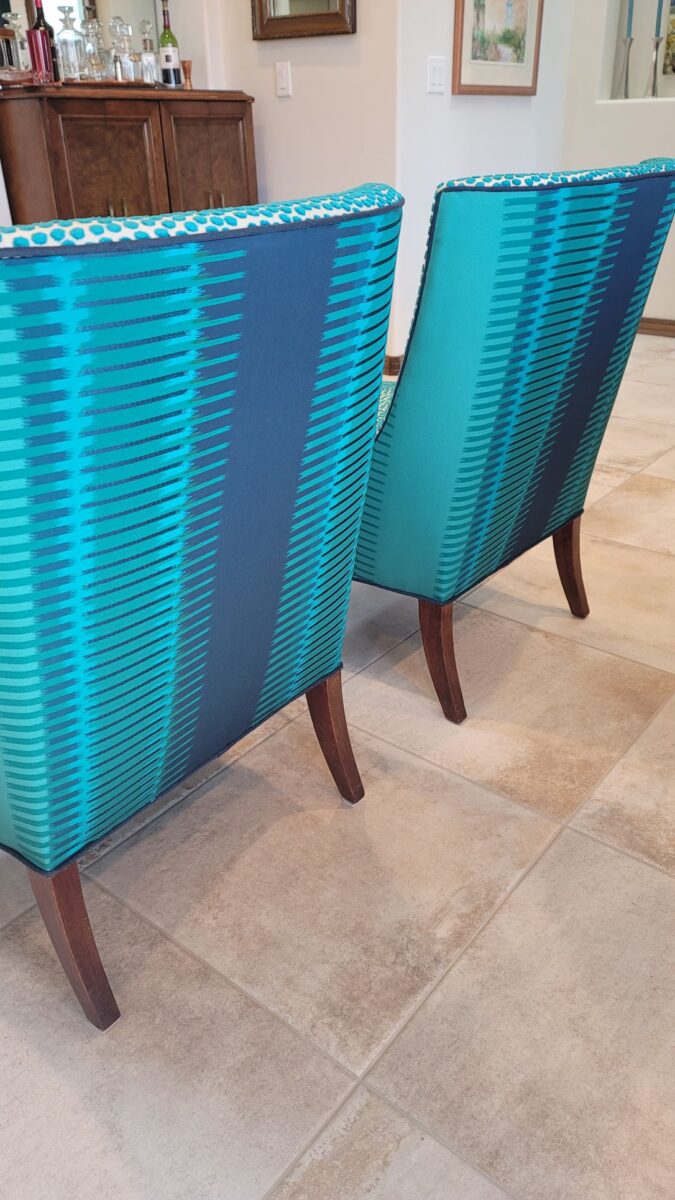
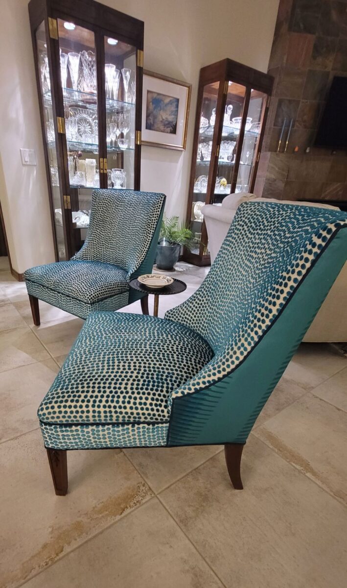
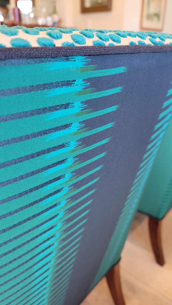
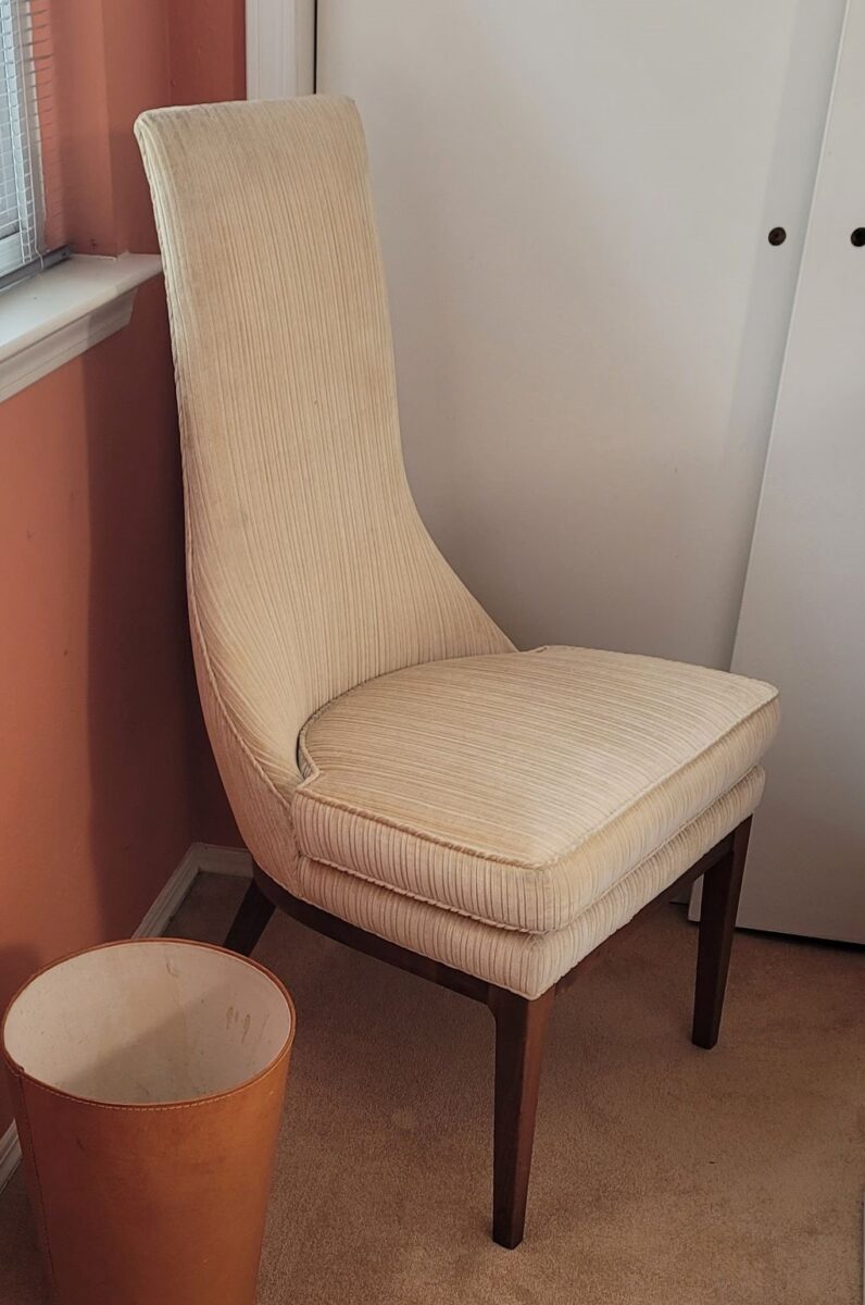
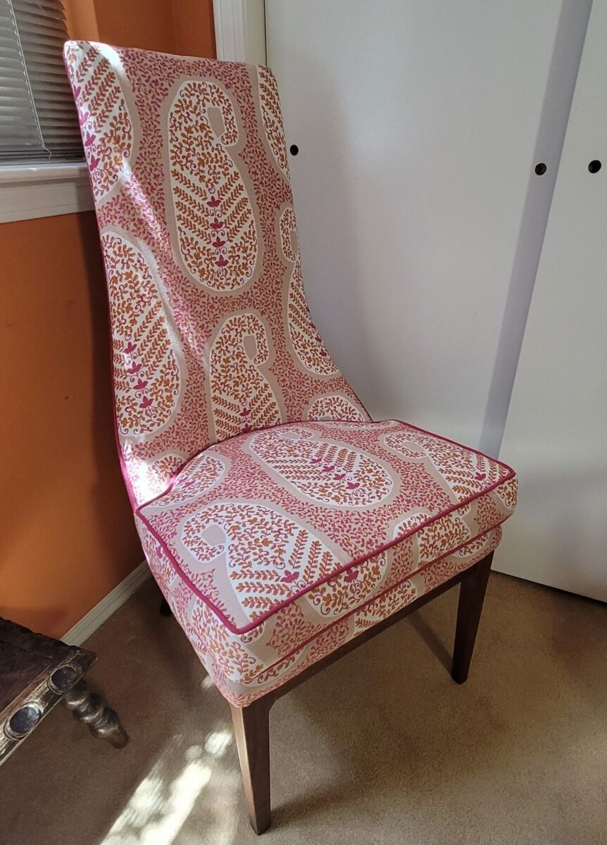
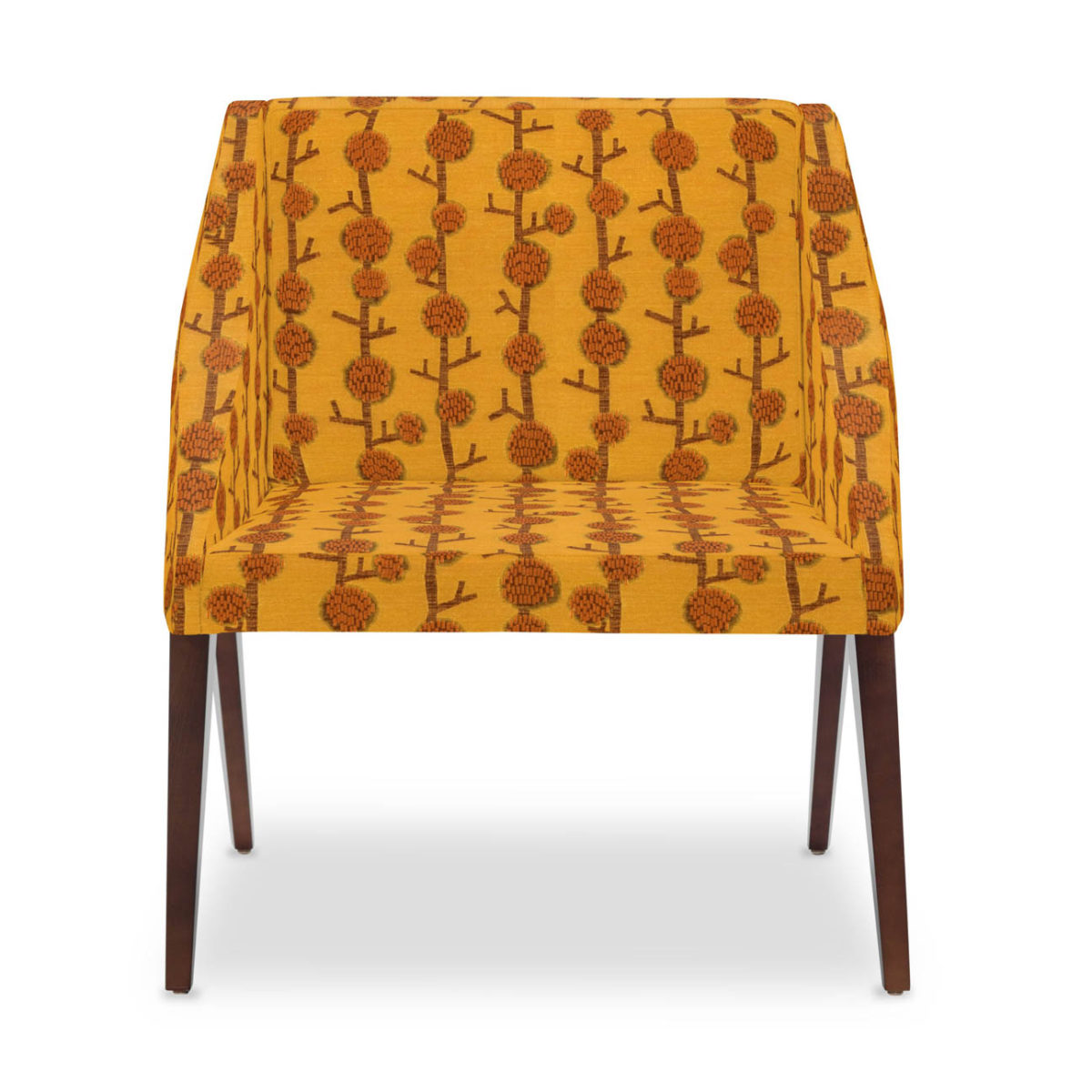
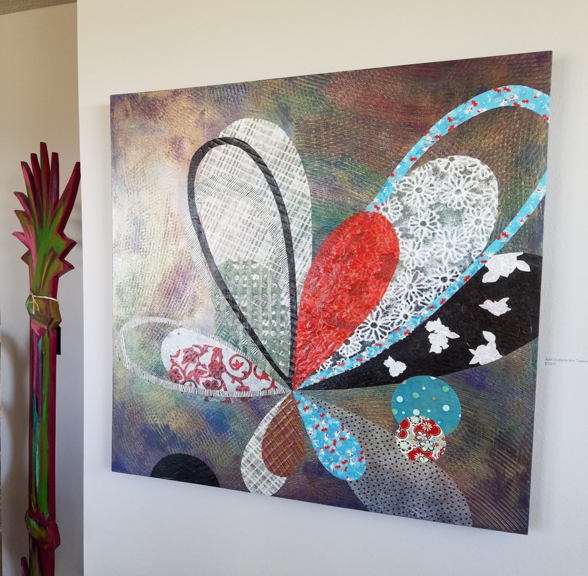
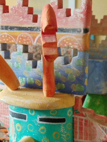
The lines of these handsome armless chairs caught our attention out in the elements, on the front porch as we passed by.We inquired of the owners if they were for sale and they said yes! it was apparent that they were nicely done in their original iteration, but the dated floral fabric was tired and ready for replacement.Having fun mixing fabrics is another layer of design detail. Here, the backs of the chairs have an intricate overstitching over the printed graphics.Piping the chair with a solid welt cord to complement the other two fabrics defines and details the chairs.
Reupholstery is a life-saving treatment. To salvage a tired piece with good bones and great lines is a service to good design. Pairing old pieces with new fabrics is rejuvenating. Inserting fabulous fabrics into a design scheme is a fine art that gives aged pieces a new life and contributes to the uniqueness of the composition of a space.
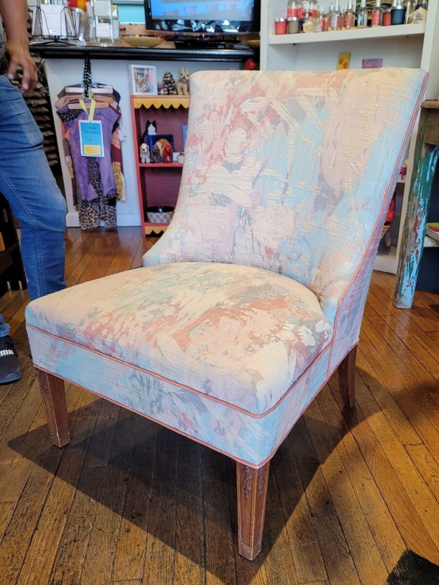
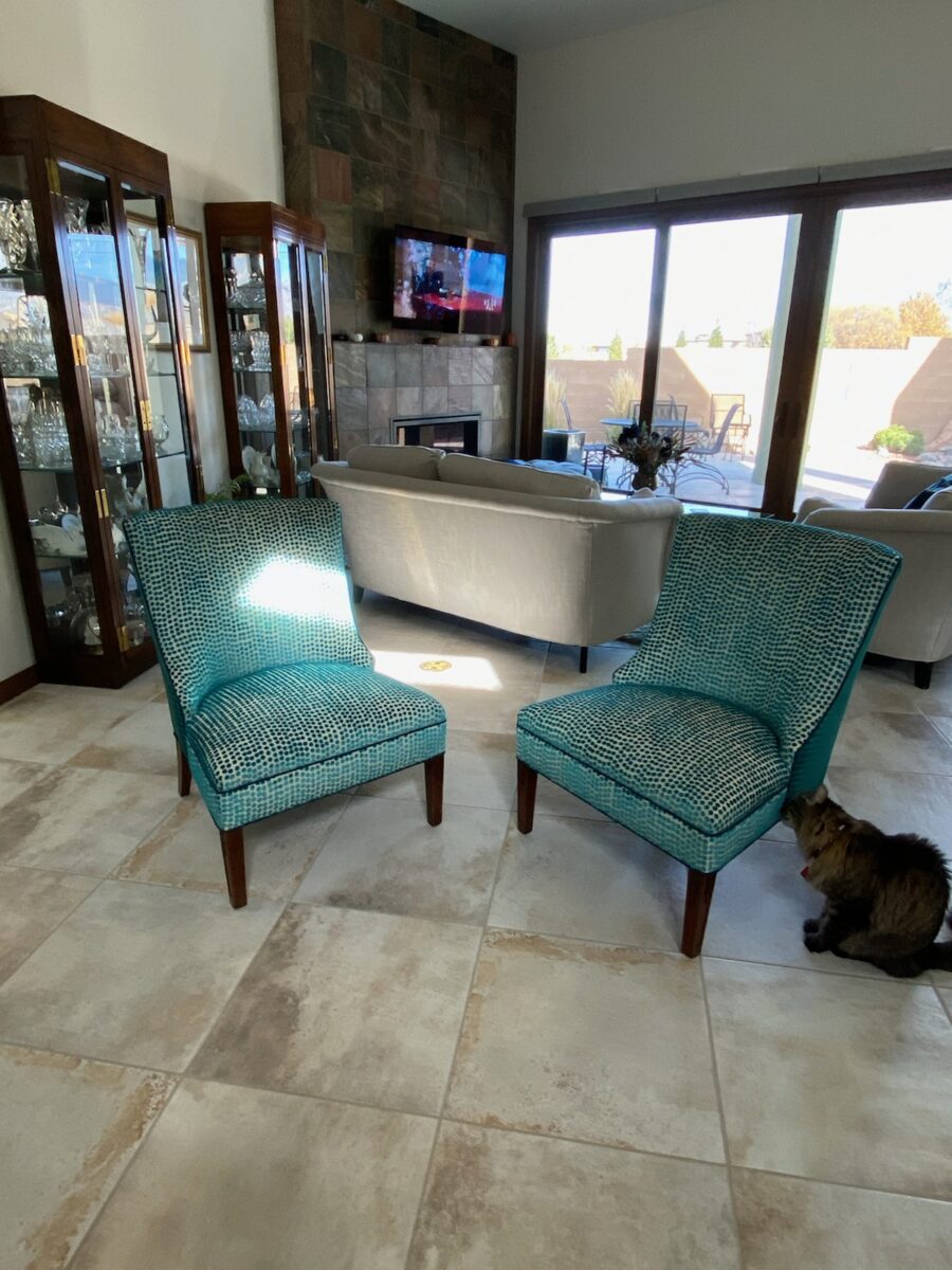
As we placed the chairs for an intimate conversational grouping, the scene started to take shape. Seeing the chairs in the context of the new interior illustrates how effectively they contribute to the composition of the room’s design.
Of the design elements, paint is the one with the seemingly limitless choices. Fabrics are next. The worldwide variety of textiles, creatives, fibers and the combinations thereof are vast. Searching for just the right fabric for a specific piece is part of that treasure hunt.
You have heard the term “run of the mill.” Even for many, having never thought of this as a fabric metaphor – this phrase is used commonly to describe the common. It means ordinary – a common, mass-produced product’s run of a manufacturing mill. Using common fabrics is a cop-out when it comes to creating unique designs – especially when there are so many incredible fabrics from which to choose.
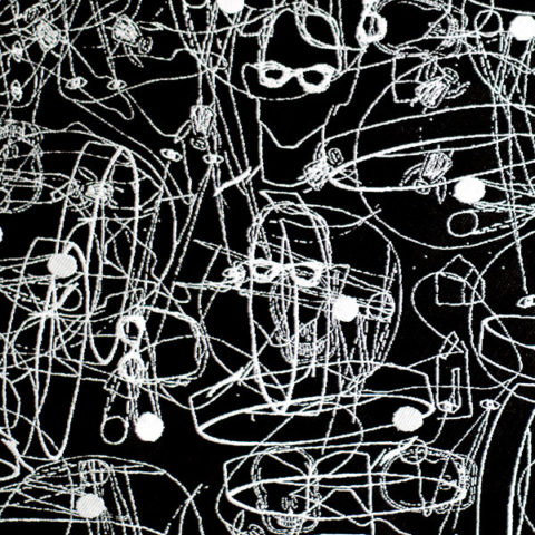
Focusing on a close-up of this recent upholstery fabric, we see the intricacies of the colors and textures of the weave.Here too, upon closer inspection, the overstitching on the printed graphic is an exquisite detail.
Personality comes into play when selecting a fabric. Along with function (how durable/cleanable it needs to be), the taste and preferences of the user, and the context in which it might occur – personality of the pieces plays a major role. For example, reading the personality of a chair – its lines and scale.
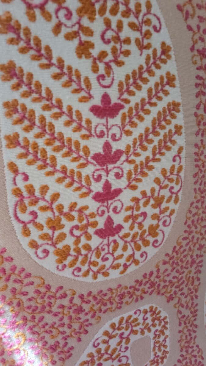
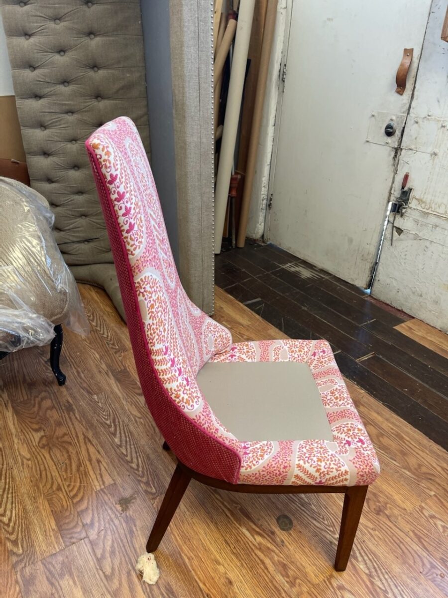
In the workroom, the chair begins to express its new identity.Extracting the raspberry color from the paisley pattern we’re using on the front of the chair, once again offers layers of design detail.This elegant little pair of chairs exhibited grace and style.Once reupholstered, it took on even more personality!
The personalities of fabrics are as endless as the textiles themselves. Fabrics evoke moods, seasons and even attitude. For commercial use, as well as heavy-use residential – workhorse fabrics have evolved. Not long ago, durable fabrics looked durable, less attractive and limited. And without turning this into a continuing education course about fiber content, it is obvious once you investigate the options, durability for wear, ultraviolet tolerance, mildew resistance, and antimicrobial properties – are all woven or applied to fabrics allowing amazing installations in commercial interiors that you would not hesitate to have on your living room sofa!
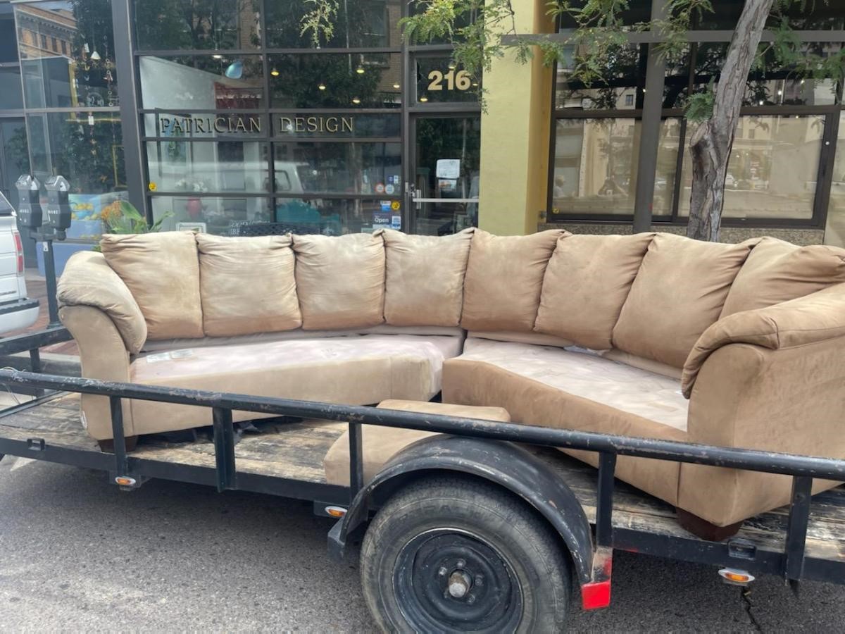
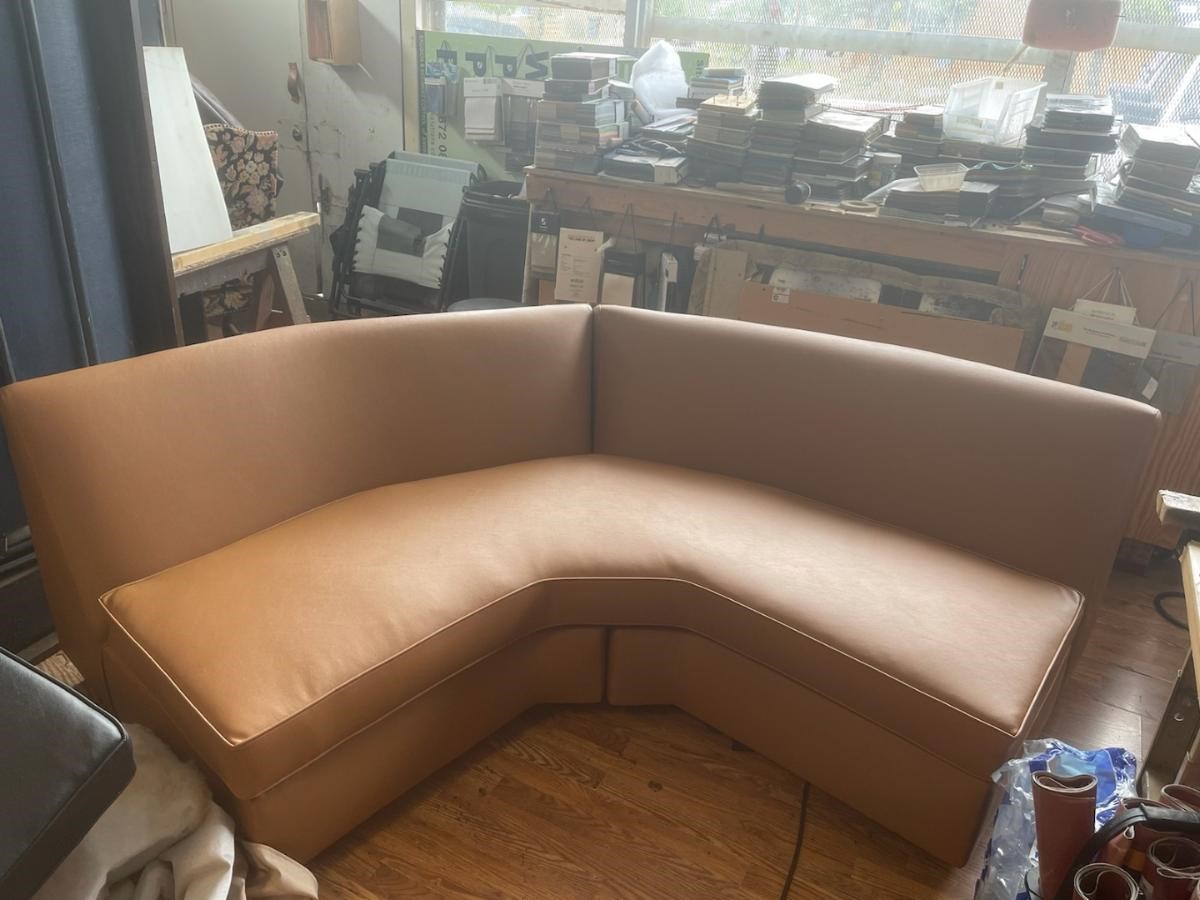
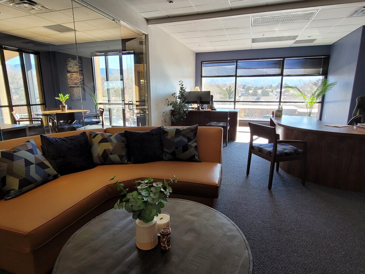
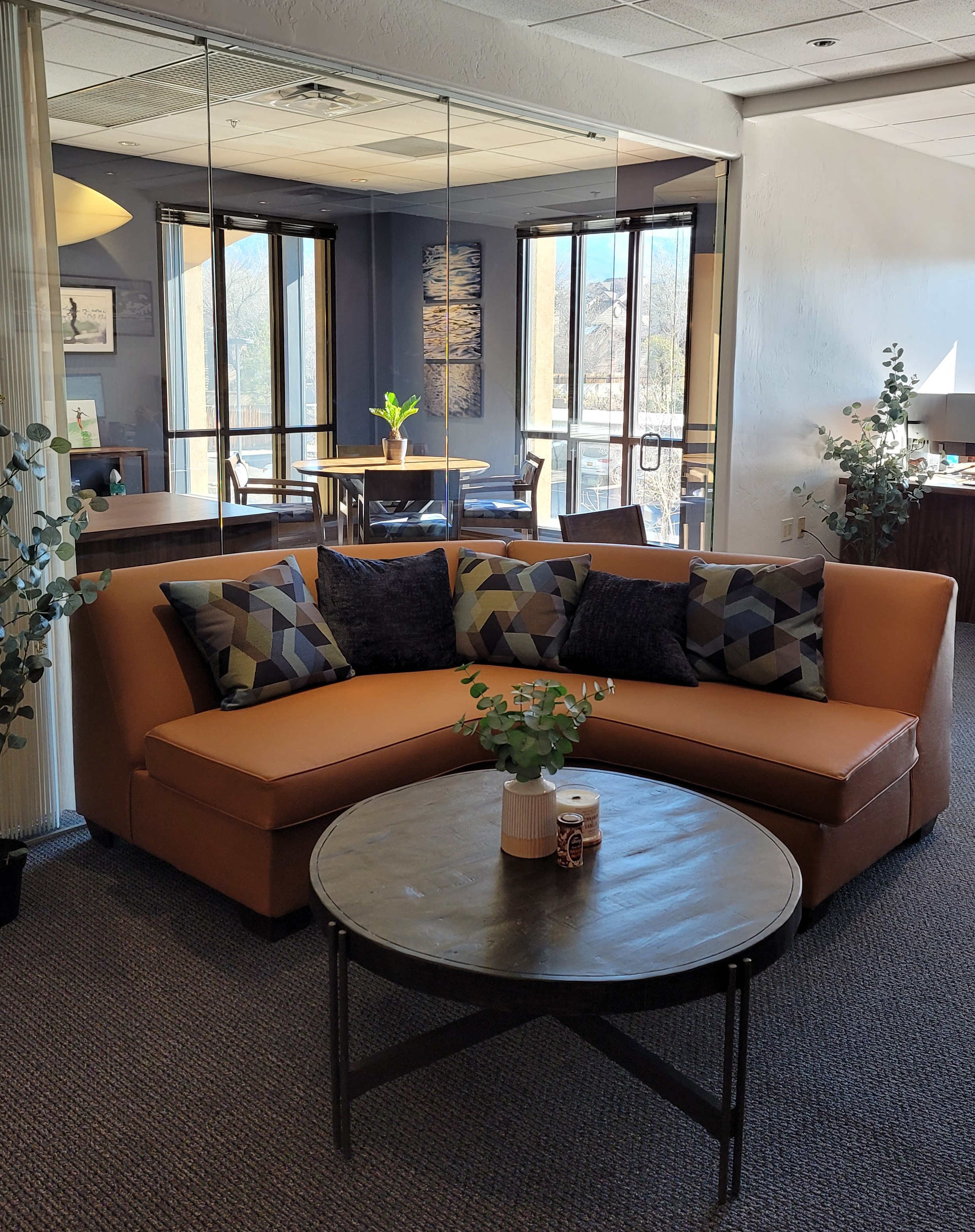
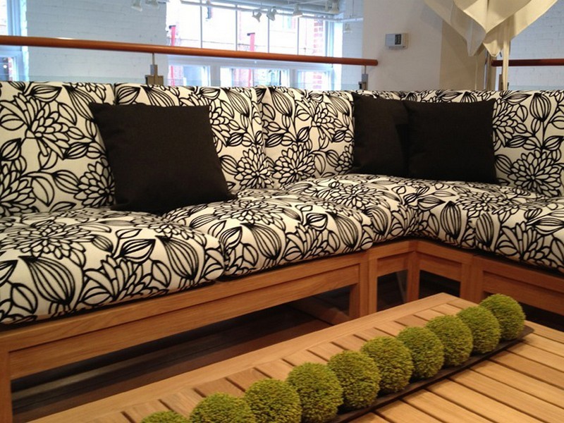
Most people wouldn’t look twice at this tired sectional, however, we knew we wanted a portion of a curved sectional (not an “L”, but a soft curve).Once we determined the bones were good, we realized it was going to work perfectly in its new interior. We selected a commercial-grade faux leather for the new skin.Voila! The finished sectional is further detailed with custom throw pillows to bring together the caramel and blue tones of this color scheme. Warmly greeting guests upon arrival.
Residential interiors can now enjoy what commercial interiors have realized for years. By incorporating the durability and cleanability which allows for the wear and tear – without showing those signs of real life – residential and commercial interiors incorporate fabulous fabrics that defy their strength – beauty and style conquer!
Sustainability of the fiber sources is an increasing topic of conversation. That and the fiber contents regarding the health/safety of the materials and treatments, if any, used (Okeo Tex certification, for example).
With all this information regarding the myriad options, enhanced durability and the unique opportunities that textiles provide to dress your great pieces – treasure the history, family hand-me-downs (if not heirlooms) and give them new life!!!! Its ART!!!
The serenity of neutral color schemes has a significant place in interior design. However, it is more about the fear of color that I approach this article today. Committing to color arrests most people – they want it and admire it but are fearful about selecting and committing to bold colors.
Beautiful neutrals are a color all to themselves. Layers of whites, creams, grays offer sophisticated schemes.
However, that is not all that causes clients to reach out for assistance. Even if they have made a decision about taking the leap, it is how much, where and with what or to what the color is applied or occurs.
A white kitchen receives a patchwork of blue and white Talavera tile as a backdrop adding depth and interest.
In addition, upon closer inspection, we have incorporated a fine detail of an aqua glazed Spanish tile running horizontally and vertically through the patterned tiles.
I remember when architect Antoine Predock’s project for United Blood Services in Albuquerque https://bit.ly/3LBQbDv made a splash – a really RED splash when he stuccoed the entire exterior brazenly brilliant, bold, blood red! It was astonishing – astonishingly effective!!! https://bit.ly/3NNQihd If a picture speaks a thousand words, color is right there in conveying remarkable communications.
From branding to personal style, color is key.
The addition of our tongue and groove walnut wall established the theme for the rest of the furniture in this interior.
With freedom to select colors for this new brand, the signage and interior finishes all contribute to a unified statement using a dark cadet blue, warm gold, and caramel colors throughout the space.
From T-shirts to interior finishes, the brand is reflected and reiterated in colors throughout.
My staff recently investigated information from projects. They posed questions and gathered observations regarding my use of color. Photos, at the end illustrate some specific color decisions and why. The resulting questions and answers are as follows:
Patti Hoech‘s design practice has been and continues to be an exploration and emphasis of the subtleties and strengths of color. It is an integral part of her work. We wanted to know why and when she discovered this specialization in her design sensitivity and how it relates to her approach to effective design decisions. We are asking clients and colleagues to pose questions to get the answers.
Why is color so important?
Patti Says: Color is power and peace. Color is important on so many levels – personal joy (or aversion), perceived temperature, brand identification, seasonal interactions, emphasis, and contrast. Color is everywhere. Understanding and harnessing it for specific purposes is key.
This new backsplash had a specific purpose, which was to acknowledge the existing rust-colored porcelain sink and the intensely green marble stone countertops. By pulling those two colors into the tile selection so strongly and interspersing other colors that complemented the palette, the result was an effectively unifying design detail.
How do you determine the color specifics for your projects?
Patti Says: What color brings you joy? What color tells your story? Interviewing clients about their color preferences – being an important questionbegins the dialog regarding what colors to incorporate and why. This can be personal preferences or aversions or specific colors relating to branding whether it is new or existing. Also, existing fixed design/architectural elements might also play a significant part in developing an effective color scheme.
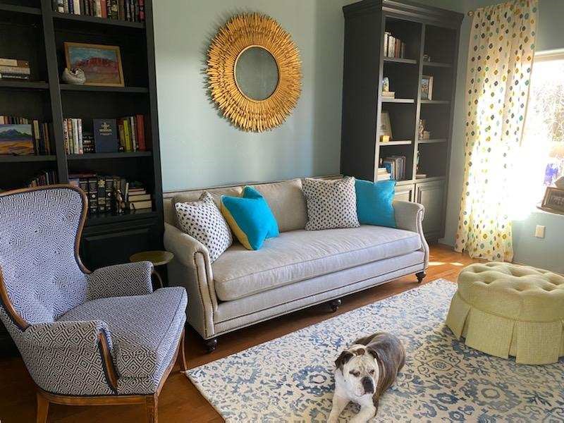
This couple wanted turquoise and other blue tones to weave through their interior. By selecting a neutral backdrop in the floors and walls, it allowed the accent color to punctuate the space from several key pieces of fabric and finishes.
Do you believe color affects the lives of your clients in their homes and workplaces?
Patti Says: Absolutely!! Color can insert many subliminal effects that impose on people’s perception of a space or graphic. Color can evoke emotion, instill comfort or agitation, rekindle memories, spur appetite, affect perceived temperature. It can embed recall for commercial brands. Color can be a clever tool.
In this interior for Boba Tea, we played with the colors of the flavors and the multi-colored tiles to correlate to the fun experience of sucking the tapioca pearls.
How do you navigate color trends?
Patti Says: Trends are necessary to keep our market moving. Capitalism is based on consumer activity, and nothing generates purchasing frenzies like stimulating new trends in the market. However, basing design decisions on trends must take into consideration the intended longevity of the design. Much of color trends are based upon pairings and combinations of color. It is those combinations that can “date” a color scheme – not so much a specific color. It is how, where and with what it is used that pegs it.
A classic, well-balanced color combination of blue, white, and yellow is a comfortable warm and cool with a neutral that transcends trends. Fabrics and finishes contribute to how one updates a classic color scheme.
Do you feel you are a forecaster or influencer?
Patti Says: I believe that I have imparted and am still providing thoughtful, challenging color consultation to my commercial and residential clients. Having prospective clients request designs based upon others that we have produced is telling and flattering. It means they have confidence in the decisions regarding long-lasting color schemes – if not timeless, in some cases. However, it must be said that design elements that present the color often determine – in many ways – how well a selected color or color scheme “holds up” over time. Considerations regrading patterns, materials, and elements can and might be either improved or modified over time while maintaining the same color scheme. Forecasting anticipates color trends. I have successfully influenced clients to make selections based upon an anticipation of future color directions in the market or merely go with classic combinations that have been proven over time. . .
Playing off the colors in this corporate logo, the interior design reflects and further strengthens the brand. This company invited us to design various locations in three different states over the course of several years. The interiors have held up against the ravages of changing trends and market directives.
What has influenced your appreciation for and interpretation of color in design?
Patti Says: It started at an early age. Observing the world around me. Nature, architecture, decorative arts (china, textiles, artwork), fashion, logos/brands, trends, regional colors, seasonal colors, cycles of color…Pinks, turquoises, yellows of buildings in the West Indies, bold color statements of Mexico…Color is profoundly important and signature in its application. From fish to birds, flowers to leaves – color captivates me and urges me to find words to express it and continue to have it a primary part of my descriptive vocabulary. As an omnipresent element in the design process, color is unavoidable, but to enjoy it so fully and embrace the limitless range of options is an exciting artist’s pallet of possibilities which stimulates me at every turn.
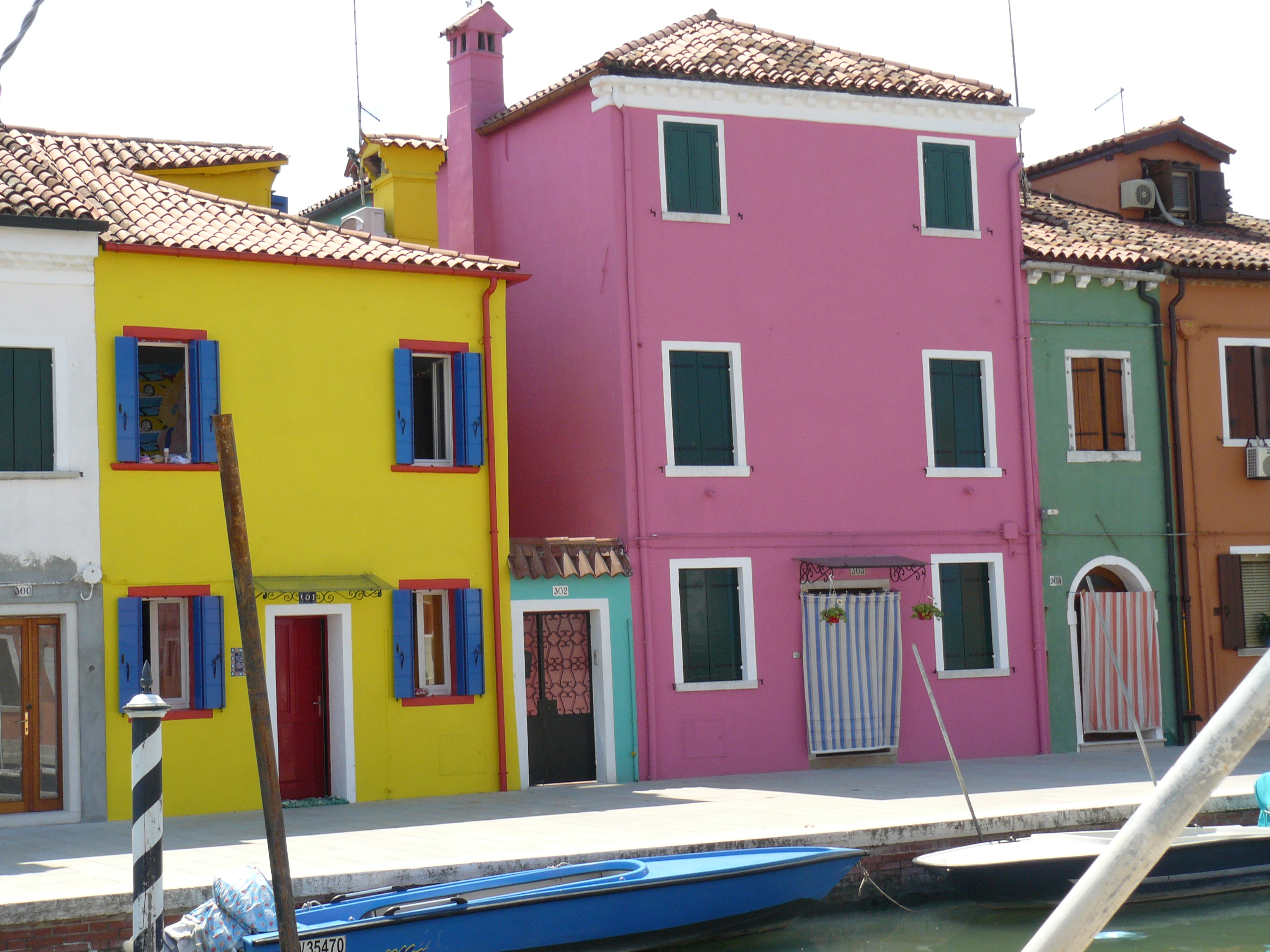
The magic of color on architectural exteriors can be amazing. Here in Burano, Italy my dear friend captured the colors! Similar to what we see in Guanajuato, Mexico and the sunny islands of the West Indies.
I attribute much of my color awareness to my mother. I remember being greatly influenced by her sense of color and design. Her sensitivity and talent were innate. She selected fabrics that had unusual color and pattern combinations. When orange, avocado, brown, and gold prevailed in the 60s and 70s, she selected the olives with chartreuse and gold for the less formal areas of our lives and leaned into Lily Pulitzer’s dynamic colors and patterns for her clothing and a pastel version of soft pinks and verdant greens for our more formal areas. The master suite was primarily yellow with beautiful bits of blues. Beach scenes always emphasized blues and greens. Nothing in our world was on common trend, but an artful interpretation of color combinations, eclecticism and comfort. Pairings of orange and brown were never her happy place nor was gold and brown. But orange and PINK – YES! Pink and green especially! And browns were recognized in context with stone shades of greys and tans. I believe that sense was greatly influenced by richly organic, textured stone walls of the West Indies – Danish architecture in the tropics where limitless colors of greens and blues punctuated with flowers were all around.
As a result of this of this early introduction to the value of color, my personal spaces reflected similar sensitivities. Beginning with pink in the early years I graduated into blues, turquoise and greens for my teen years. The final scheme, in my room in the home in which I grew up, was a dusty pink, clay, and mocha-rose. No one in my world had that color scheme in the late 70s and it was difficult to assemble. It helped that I worked part time in a design showroom in Georgetown where handling the amazing abundance of fabulous fabrics was a daily inspiration. Throughout my life experiences color has been a constant distraction. Not in a bad way, but rather a noticeable, unavoidable interruption that causes me to pause and take note. Ask anyone who knows me – I stop and remark about color at every turn. For better or worse, I comment on color. It is a deep appreciation that I enjoy sharing. And the most rewarding is discovering color for clients who yearn for it but don’t quite know how to find and use that which would make them feel the joy of color!
A dear friend in Mexico recently took a leap in selecting an accent color for his seaside villa. Once an all white interior, which was lovely and fresh, he wanted a new look that provided contrast and strengthened his color theme. The yellow accents made me smile when he unveiled his new look!
Color plays a major role in discovering and expressing personal style. Fear not – color is your friend. Find your style. Live your style. Love your Style.
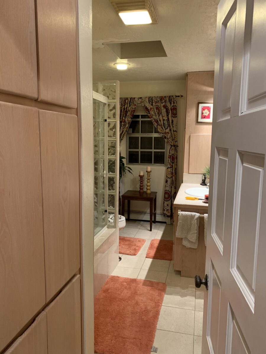
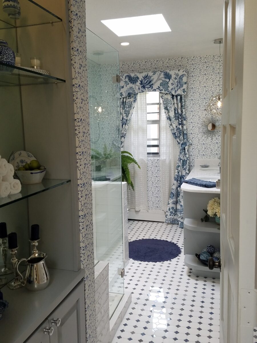
Last August 11, 2019, I left you hanging with a radical bathroom remodel that was in the throws of being transformed. The title of the blog was Everyone Loves Before and Afters. https://patriciandesign.com/everyone-loves-before-and-afters/ Here today, I am excited to present the finished product and a little more to the story…
Everyone DOES Love “before and afters.” The original blog identifies the material process of the project, but as important as the material applications are the emotional aspects of design and precede the material selections.
The home is a bungalow style home from the 1950s. Charming architectural elements and traditional details set the stage, sensitivity, and the emotions behind any design decisions we were to consider. See the first phase of this home’s updating design in the primary living space at this link: https://patriciandesign.com/project/classic-blue-white/ The kitchen was also re-finished. Maintaining the same design layout and appliances, the new finishes resulted in a startling transformation. https://patriciandesign.com/project/kitchen-transformation/
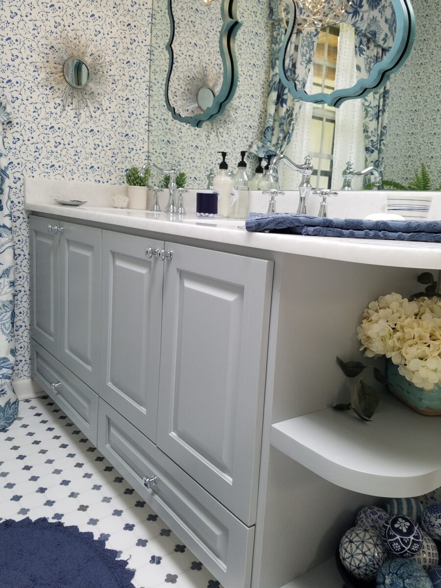
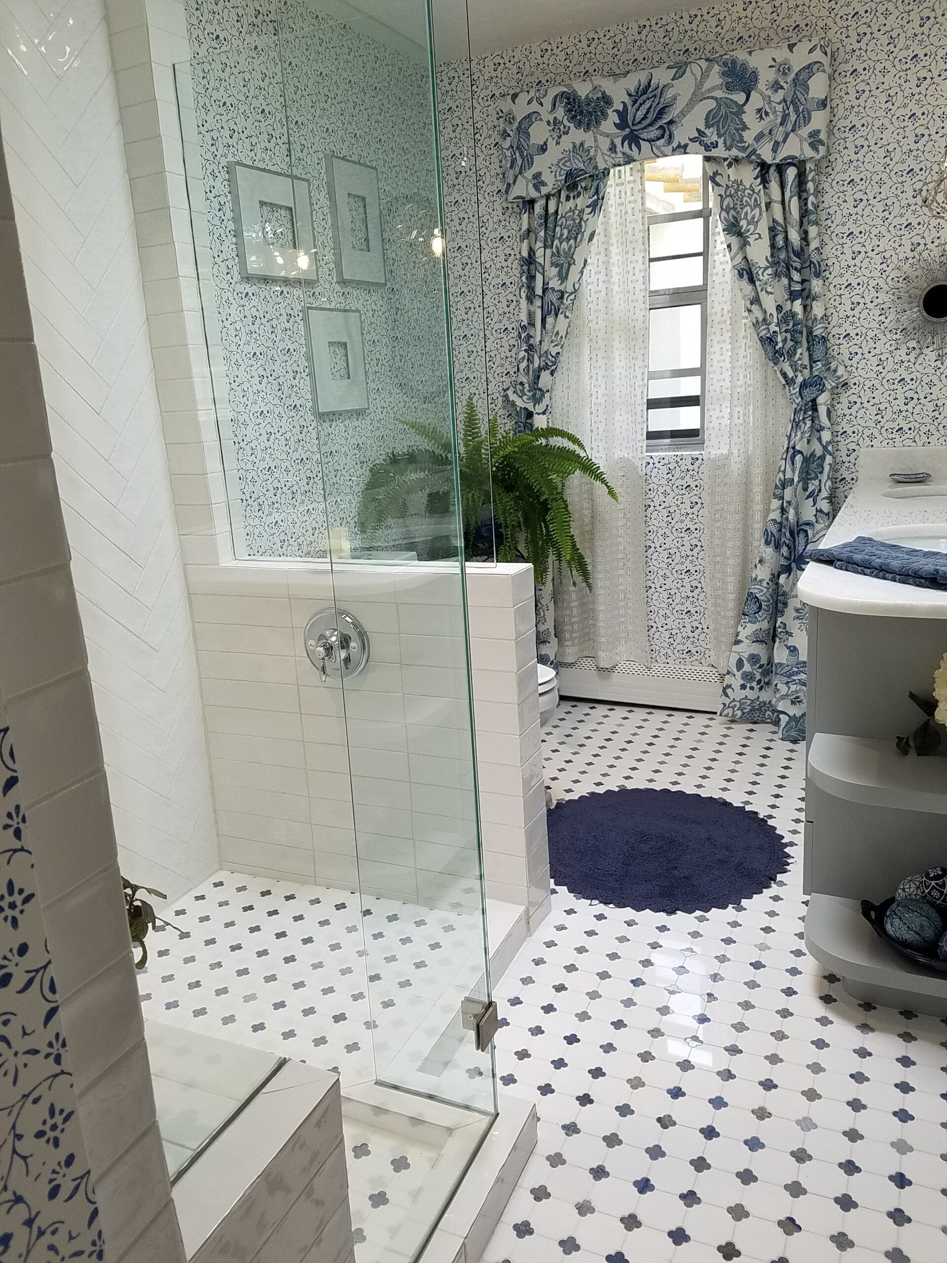
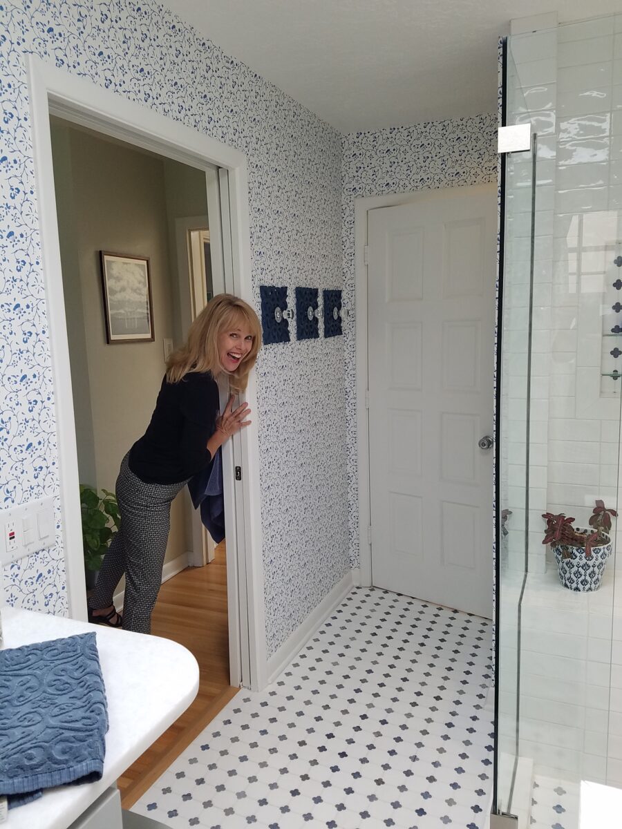
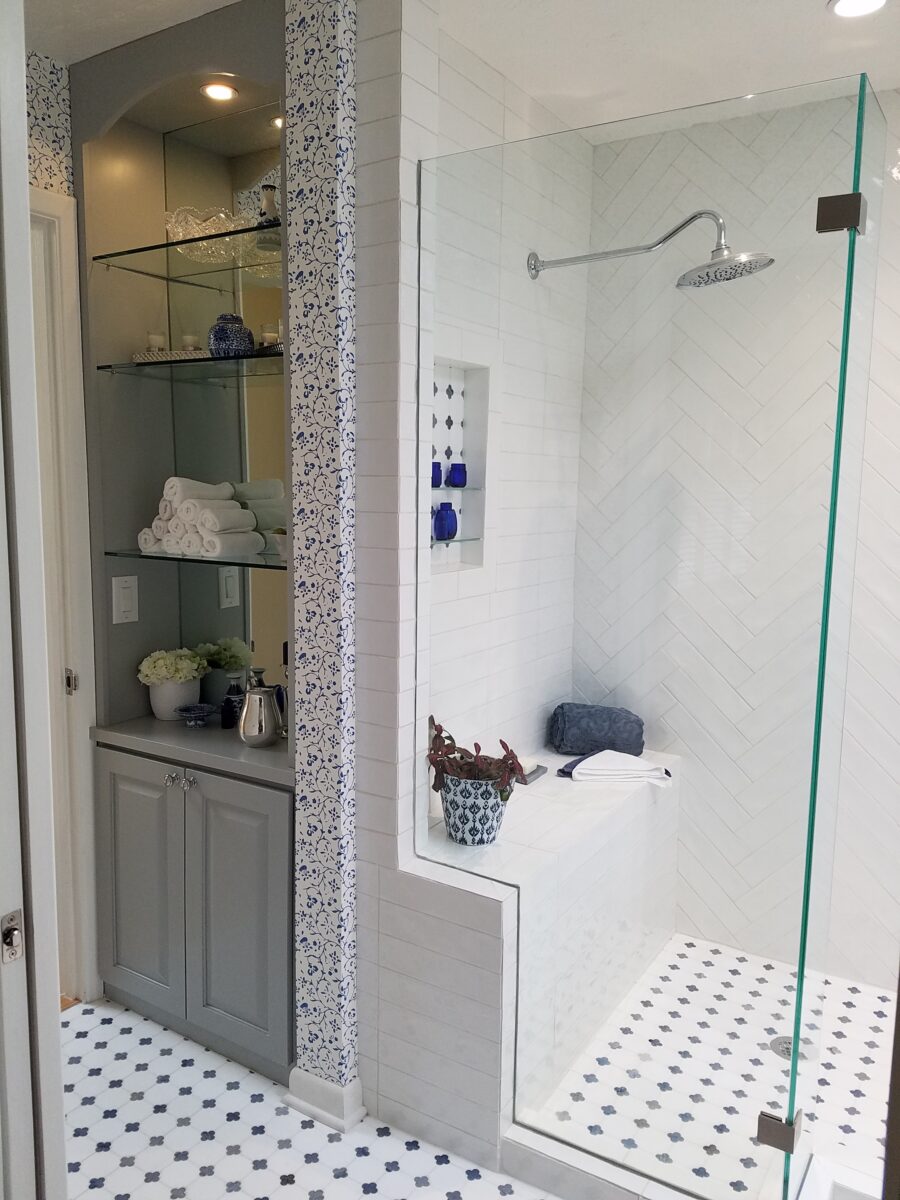
The challenge in this project was to retain the character and traditional charm that the couple so enjoyed about their home, while introducing new, modern design features and trends melding with traditional design elements. New custom cabinets for the vanity and linen storage/display unit along with the re-design of the shower – eliminating the tub and making a “doorless” access and a pocket door connecting to the adjacent guest room were the three key construction components.
Dated finishes done in the 80s, by previous owners, were common and bland. The tub and shower were enclosed with by-passing glass doors in aluminum tracks and frames. This bathroom was the dated and fussy room that we presented last August. The tired and dull finishes needed replacing and refreshing. It was to be a complete make-over to compliment other recent improvements in the home.
Once the general concept for the remodel is determined, the “what if” stage begins. The stage where ideas are tossed about and decisions lead to other decisions. The options are massaged giving way to different combinations and considerations.
After all the options are discussed the plan is adopted – a combination of everyone’s input. Hopefully not design by committee, but in this case the couple, in whose house we were working, and the me, the designer. After the design is determined, the input of the general contractor and/or the sub-contractors can come into play. They are generally given the opportunity to evaluate existing conditions and voice opinions and procedures or details that their expertise can bring to the project. Everything is considered until a cohesive plan is developed.
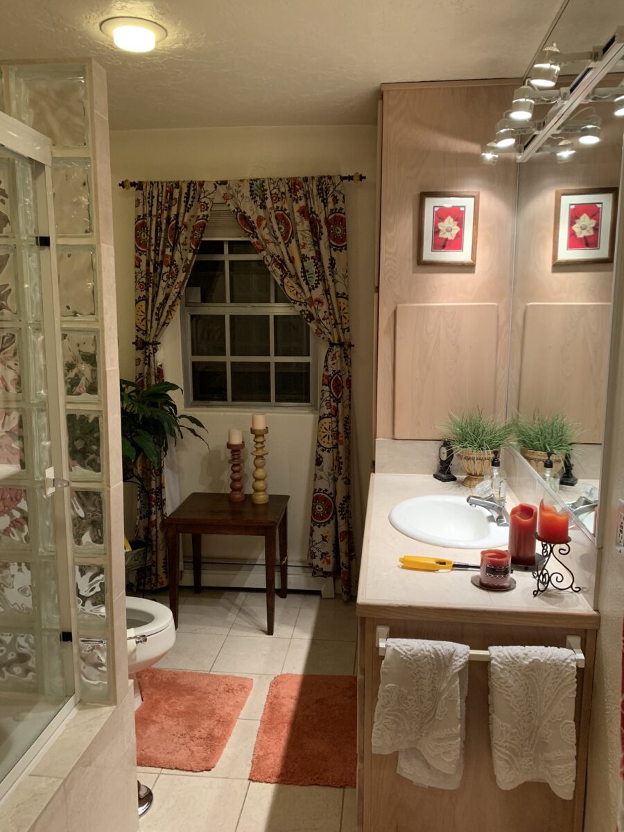
New cabinets were locally fabricated to not only insure excellent craftsmanship, but to customize the fit (left to right) and provide specific drawer configurations for the desired new height of the cabinets with an additional sink.The tub was removed, and the new shower enclosure was clear glass and given a wider footprint to allow for a jog which eliminated the need for a door. The shower valve was relocated from beneath the shower head to the opposite “pony” wall, making it easier to operate the temperature and flow without getting wet first!
Other than the shower reconfiguration, new cabinets, and pocket doorway into the guest room all else was superficial cosmetic design features. This is where the layers of embellishment come into play.
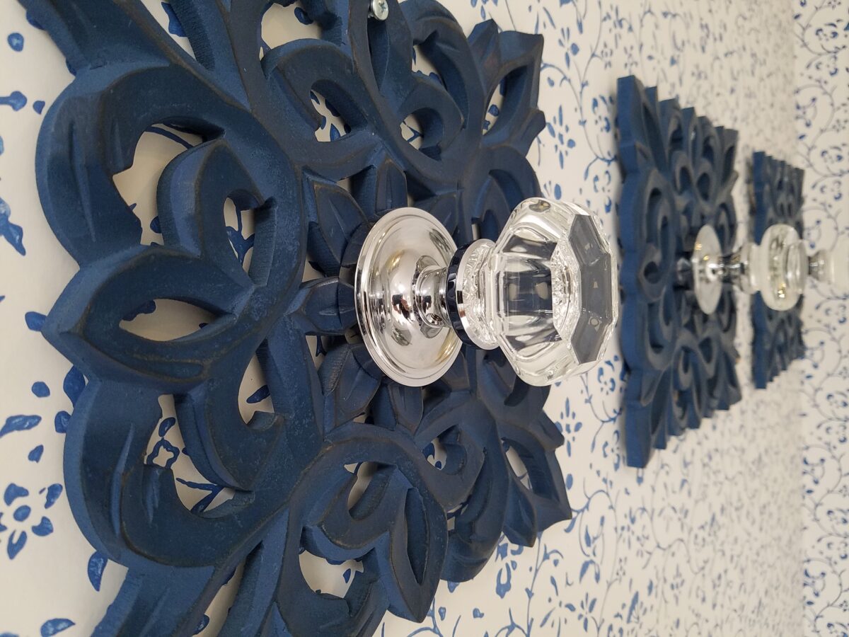
During the process, there were certainly hesitations about the combination of patterns and finishes being proposed…however, you know you’re on the right track when the happy homeowner has fun accessorizing and creates the perfect towel/robe hooks! DIY – finding these blue, wooden, open-work plaques, our creative homeowner bought polished chrome and glass doorknobs and attached them securely to the plaques – Voila!
In keeping with the traditional design direction previously adopted in updating the interior, the flooring was selected for its natural stone mosaic authenticity. With a warm grey selected for the custom cabinets and white herringbone patterned subway tile on the rear wall of the shower enclosure made for a fresh modern look.
A mix of patterns – a balancing act – the art of design. Do not be afraid.
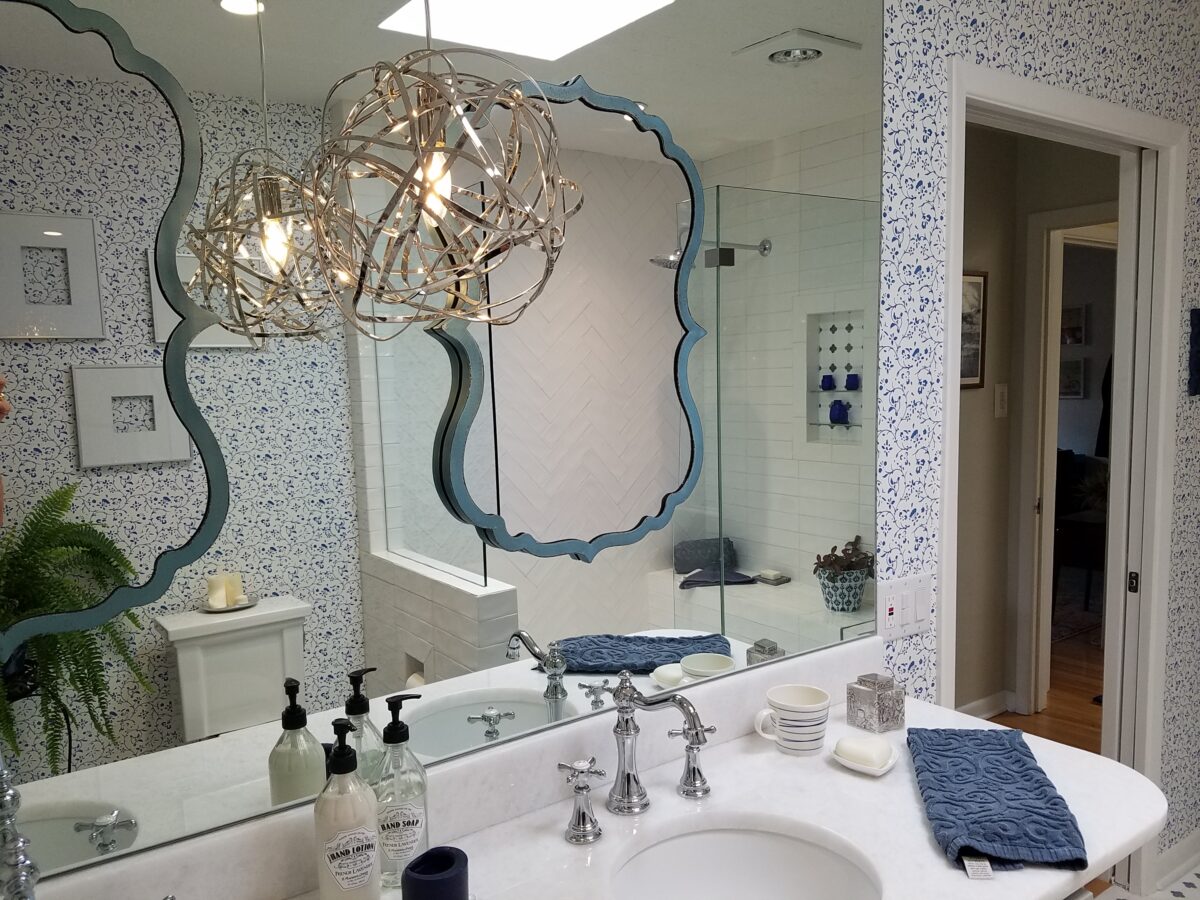
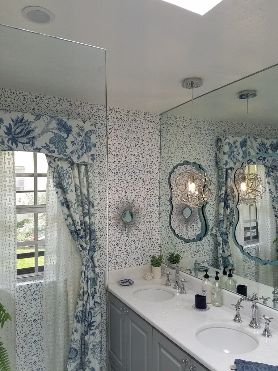
But wait! These traditional elements and modern trends were further embellished with a second layer of curvy turquoise mirrors installed over the full-wall mirror – suspended between is a polished chrome sphere of open bands providing ambient light and additional task light for the vanity area.
Layer upon layer until the composition is complete!
Classic blue and white screen-print on paper with an overall pattern of vines and leaves fills in the voids creating a not-too-busy backdrop – adding further dimensions to the design.
Natural stone slab of a white crystal-like granite – looks like a stone quartz crystal.
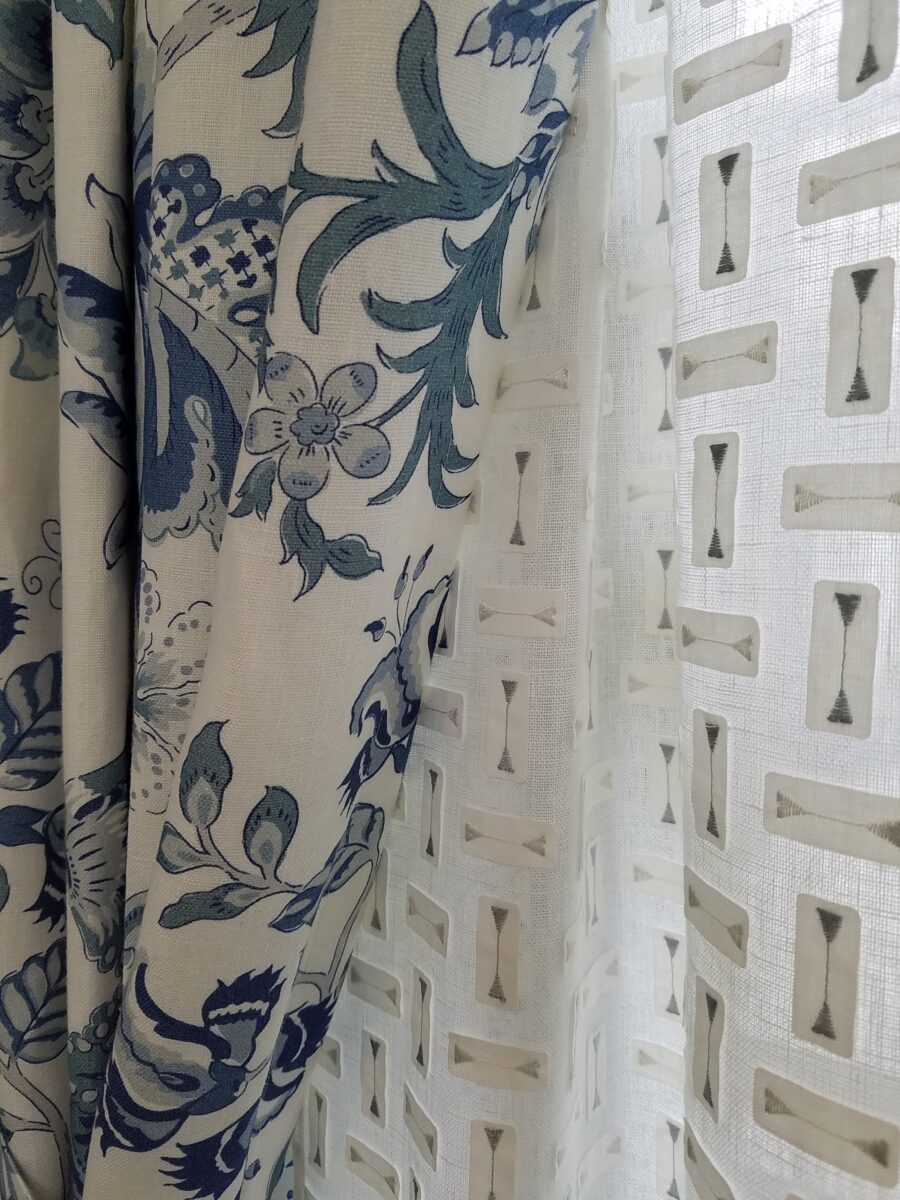
Drapery fabric in a traditional floral on linen with whimsical, modern “martini glass” sheers soften the window and diffuse the incoming light.
The resulting completed interior is a radical transformation from the dull beige and peach of the previous scheme. Fresh and crisp – with just enough busy to be playful – the new owners claim that they smile every time they enter or even walk by.
Remember the first photo? The BEFORE & AFTER transformation is extraordinary.
Hidden talent – that remarkable artwork that appears (seemingly) out of nowhere, on a par with great masters of the medium. I considered this element of surprise – looking back several decades to a local painter, Wilson Hurley, who had more than one very different, distinguished career and diverse life experiences before he delved deeply into his passion for painting in his 40s. Once exposed, his paintings revealed his extraordinary talents and he become a nationally recognized treasure for his sweeping landscapes and a variety of other subjects.
On that note, I have just gotten off the phone with a very good friend, in Florida, Houston Evans. I have recently learned that he is a passionate weekend photographer! An amazing photo appeared in a Facebook post and I was astonished by the enchanting image, color and composition. I was instantly captivated – and curious. Upon closer inspection, his stylish swashbuckling signature made me realize that this hobby was subtly becoming more than that – yes, he had his mark digitally mastered and is probably THE perfect brand for his diverse and stunning work.
“Star Power” is the luminous celebration of a pineapple.
As I quizzed him about his interest in photography, I learned that he attributes his eye for art, color and design to his mother who’s side of the family has spawned other talented artists, in his generation. He has been posting on Instagram for quite some time – hundreds of images. I didn’t know. I didn’t “follow.” He is modest about his photos and does it for his own amusement, pure pleasure and personal enjoyment – that he likes to share. “I don’t do it to imagine it on someone’s wall.” Yet this observer believes that there is where it absolutely should be! Many walls…many places! #houstonevansphotography
He plays with the medium and all the tools and tricks of the trade. He enjoys the freedom of experimentation. The results are controlled, yet spontaneous. From high resolution to fuzzy pixels that require distance to assimilate. Up close for precise detail and soft smears for imagination to take hold, the variety of clarity or lack thereof are a part of the experience and expression.
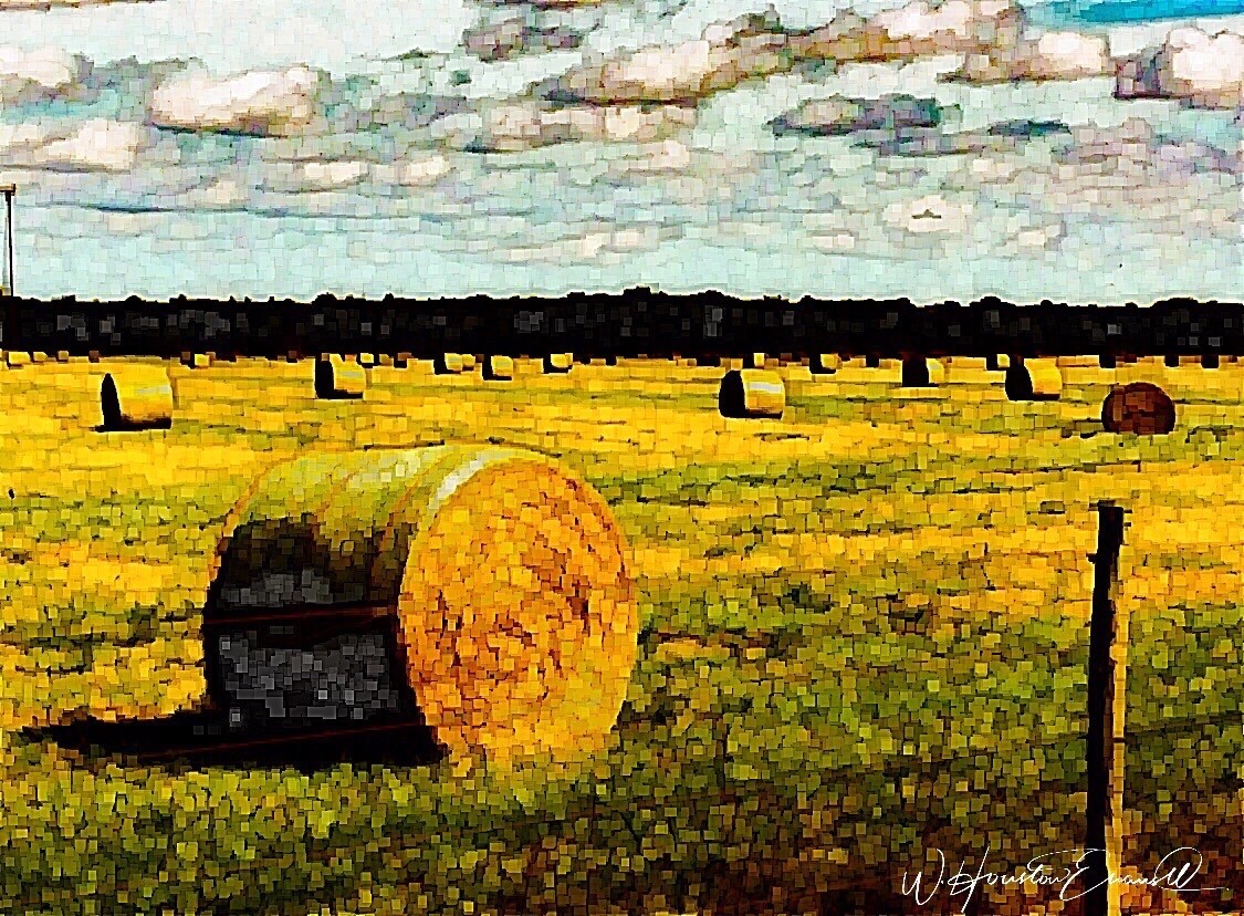
“Makin’ Hay” has an enhanced pointillist treatment – a Van Gogh-esque subject with a twist.
From my interior designer’s perspective, his bold images would be key focal points in the drama of architectural spaces – interiors from Miami to Honolulu and on around the world!!! I can see the towering orchids in hotel lobbies, bars, restaurants and swanky condos everywhere!!! I am eager to find a project, for which his work would be the key to the scheme, unveiling a spontaneous design resulting from the inspiration of the image.
“Oblique Orchid” screams floral superiority as a commanding focal image. “Shooting the Bird” speaks to paradise revisited!!!
In the beginning, the photos stood on their own merits. Evans keeps his originals – some of which remain just that – in their original form, while others are tweaked or more radically manipulated to create stunning subjects and compositions.
This brilliant, fresh simplicity of “Aqua Eye” observes the droplet’s reflection in the center of the cheery chartreuse petal. Coming upon a cool caddie “Daddy Long Legs.”
I can see his limitless fantasies contributing to the imaginative narrative of Meow Wolf, gracing hotel lobbies with larger-than-life orchid explosions and commanding condo walls with magical statements of tropical color, subject and form. Translucent installations of LED illumination could result in magnificent walls of design influence.
“No Flies on Me” is a fantasy of oozing colors and form melting and melding around the psychedelic dragon fly.
The digital age is advancing with such a pace that we are
all caught-up in photos of food, whacky selfies and sunsets on fire…but
having an artist’s eye, to truly see the potential and master the tools that
are now available – using them to create valid and valued masterpieces of art,
is extraordinary.
“Copy Cat” reflections mirror a chorus of color from sky to watery impressionistic likeness.This “Roadside Attraction” must have been a startling scene to distract dazzled drivers.
I truly believe that his work is exceptional – full of heart and soul – and spectacular fun!!!!!!!! I’m thrilled to learn of these images and now enjoy the continued progress of his discoveries and creations. Let’s see where this goes!!!!! He just might be coming out of hiding!!
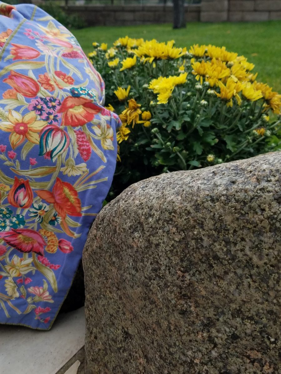
Some fabrics are just so fabulous that they can carry a design scheme. You could wrap a rock with them and feel that they are accomplishing the design statement to set the theme, mood and encourage interest, if not confidence in comfort! Stimulating the senses is a major part of design.
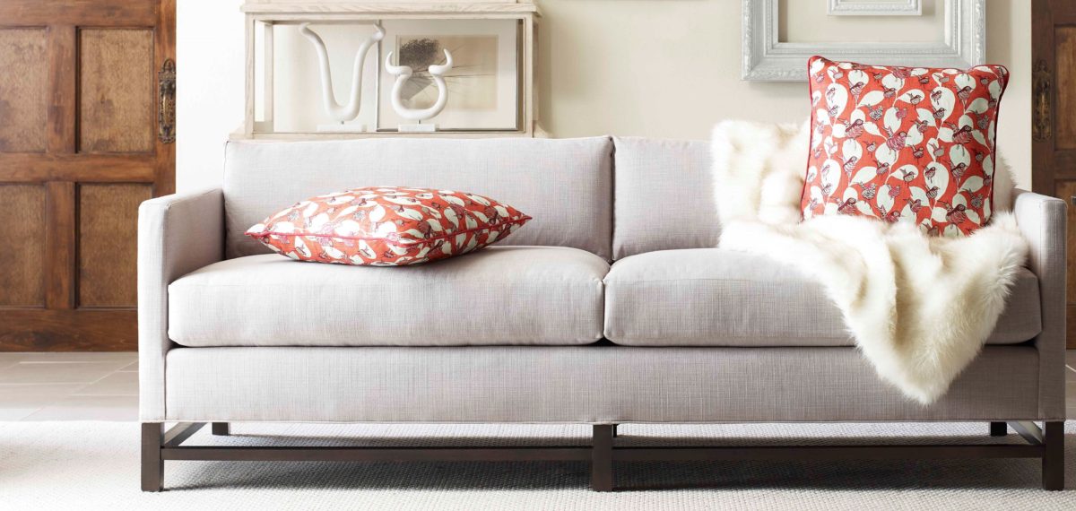
Often, a throw pillow can make an effective accent. We joke often when we find exclusive fabrics in the hundreds of dollars a yard and say “Perhaps a throw pillow?” Knowing that the projects affording such luxury for miles of drapery panels are few and far between!
Duralee offers statement furniture pieces of unpretentious luxury and comfort with a collection of fine fabrics that will satisfy any budget. Birds take flight from this delightful Duralee pattern.
Sight Sound Smell Taste and Touch – you know. Colors and textures catch one’s attention. They set the mood.
Upon entering a space you take-in the colors and textures and if fabric is in play.With further tactile examination fabric contributes greatly to these two sensory perceptions – sight and touch.
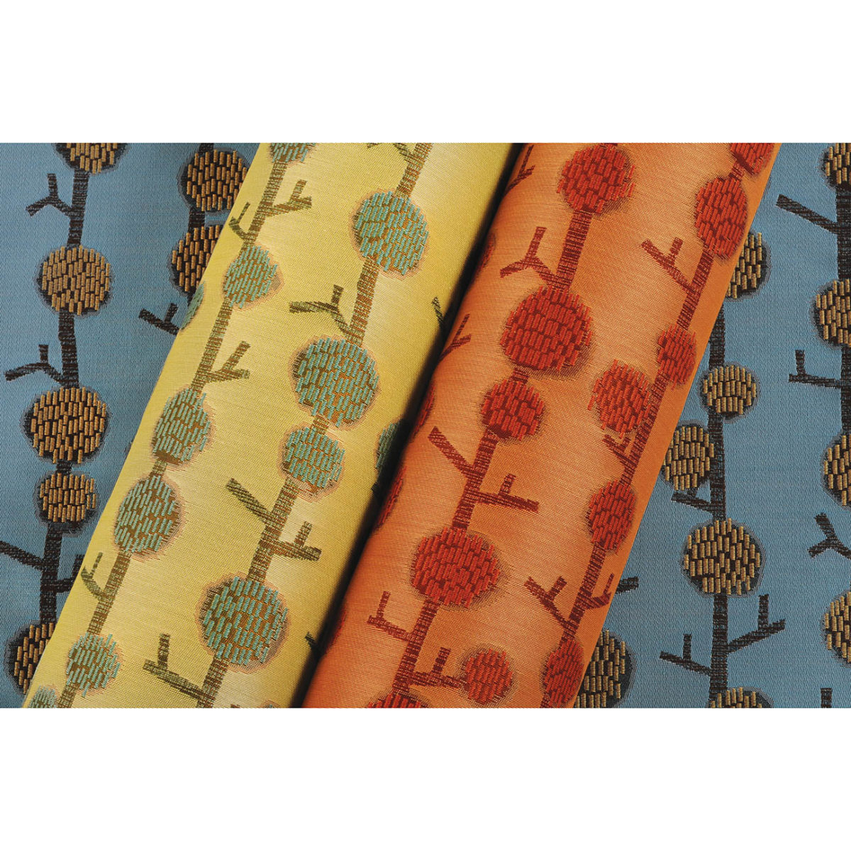
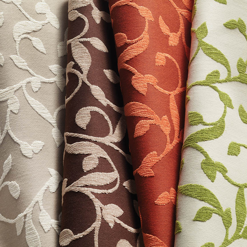
This playful Donghia organic has fuzzy tactile balls sprouting from the linear twigs. From the “ground” to all the intertwining and overlaying weaves, the complexity of textiles is exciting. Come see these exceptional designer fabrics in our studio.Many fabrics have multiple colorways. If you see an intriguing fabric that’s not “your color”, its worth asking about the entire collection.
Juxtaposition can also be an effective technique. When placing a modern pattern on a vintage piece, you breathe new life into the forgotten history – refreshing and capturing the best of both worlds!
You might not have a lot of confidence in someone who wants to wrap a rock to make a design statement. However, my point is, when you love something you want it regardless of the delivery system! Find fabrics that you love and insert them into your rooms – home or office. It’s like your favorite flavor. Sweet or savory – slather it on a piece of cardboard and you’ll be significantly satisfied. You need not struggle with how to do it – just make it happen. So to get a little taste of an exciting textile, make a table runner, simple dining chair seats, select a backing and make a throw or an accent pillow. Bring the joy of exciting textiles into your interiors.
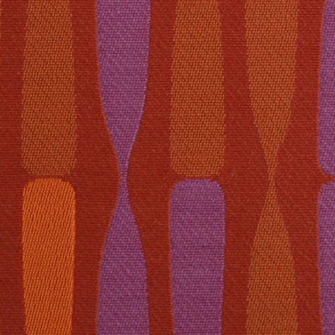
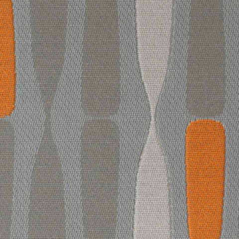
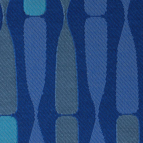
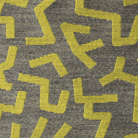
Here are a series of fun fabrics from our source library – tools of the trade. We LOVE fabrics and must touch the texture, feel the weight and evaluate the colors. Seeing images on-line do NOT do justice to the many incredibly creative textiles are available to enhance interiors.
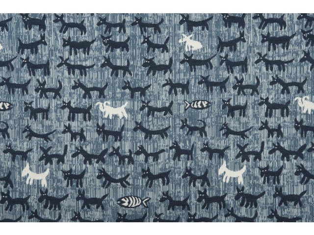
Cute critters march across this sophisticated yet whimsically novel woven.
Other considerations not necessarily in evidence are the wear-ability/durability of a fabric and the resistance to ultraviolet rays, mildew and other elements. Wool is inherently flame retardant, for example. And exteriors have come alive as these amazing performance textiles will often fool you in disbelief that they have the properties to withstand the radiating ultra-violet rays of the sun and damp conditions which invite mold and mildew. These incredible fabrics are truly indoor-outdoor in appearance and extraordinary performance!
High-performance luxury weaves such as jacquards, piques, tapestries, matelassé, ottomans, damasks and sheers defy their extraordinary performance properties.
Roy Hamilton a recognized designer in many media, brings fresh patterns to Chella. Roy Hamilton, designer of exclusive ceramics, sculptural and textural interior elements and fabrics for over sixty years.
Call for an appointment to explore our source library for the most unique fabrics in the world!
Floor-to-ceiling shelves of samples await your exploration for commercial and residential application!! You can order most textiles by the yard!
Is your story important? Does anyone care about your story?
And what does this have to do with interior design?
Whether you are marketing yourself or your business, your story has merit. It is about identity, branding and connecting. It is about letting people in a bit. It is about sharing history, experiences and process. It is about your unique reason for doing what you do.
For the past several months, I have been working with a
client on a combination of interior design, graphic design, exterior
design…it is all intertwined. A successful design laces together all these
design elements. And that brings me to “the story.”
Even Facebook features a section to tell “your
story.” Yet, my client resisted
presenting/using the story of this new business venture as a part of the
design. He told me that was “so seventies.” That he had read that it
was a dated concept that was no longer relevant. I begged to differ. For months
I begged to differ! We agreed to disagree.
I believe that this is similar to many interpretations of design. What might be considered “dated” is often the manner in which it is used or done – not the thing itself. Whether a color, a font, a style of furniture, a wall tile or wallpaper, an architectural detail or form…so many design elements are considered dated due to their context. Often, this is fair to observe. But, mix it up a bit and use things differently or with other different elements than the original trend presented and – Voila! You have a perfectly valid, even fabulous design – think outside the box!
The idea of a “story” is not unlike the “mission statement” which became a standard feature decades ago in every company’s presentation on printed media, lobby plaques, conference room walls, break rooms… Some say it is passe, but when something is good and has meaning – re-consider. Like “the story”, “the mission statement” identifies goals and intent…when paired with the story, it provides an overview of the who, what, why that inquiring patrons want to know.
So back to the story…about “the story.” When a business or any concept is respected or
liked, revered or praised, it is natural for people to wonder “How did
they get started?” “How did they come up with this idea?”
“What is their history in this business?” These are common questions
that clever ideas or designs invite. So why not satisfy that interest, create a
buzz…Let’s give them something to talk about!!!
In this world of disconnection, making connections seem all
the more important. What used to be a natural exchange – of communication,
ideas, sharing – is now something that has to be inserted with greater
intention.
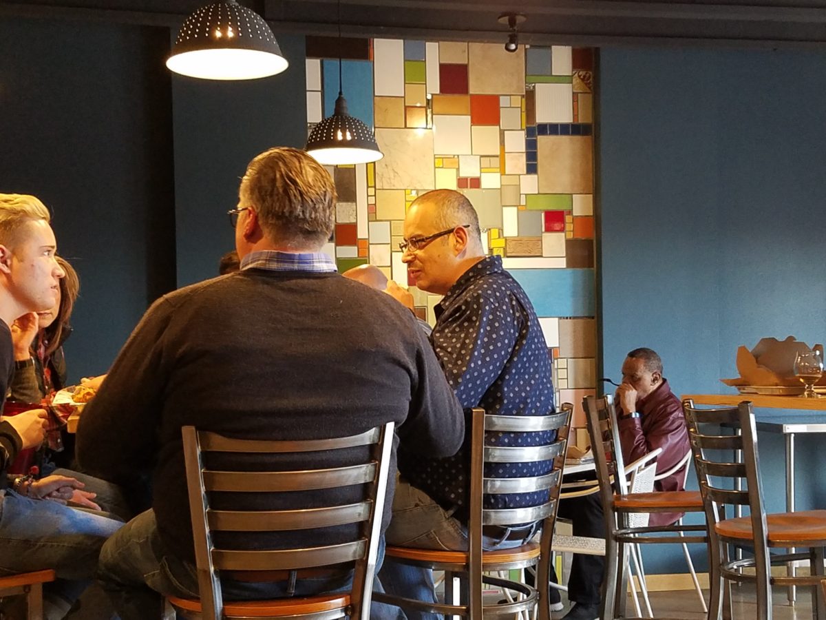
So this new business, for which I have been designing, is a barbeque establishment. There are a million. They have certain things in common. Without my enumerating them here – can you envision some common denominators that you might connect with barbeque joints? As is true with any venture, I asked: “What makes this one different? Better barbeque? Maybe. Cool interior? Hopefully. Are those the only unique traits? Is that the memorable take-away? It certainly isn’t a bad one – the idea is to have great food – and a fun environment, but what else might contribute to the experience of this barbecue being unforgettable? What might you have, to tell your friends, to spread the word?”
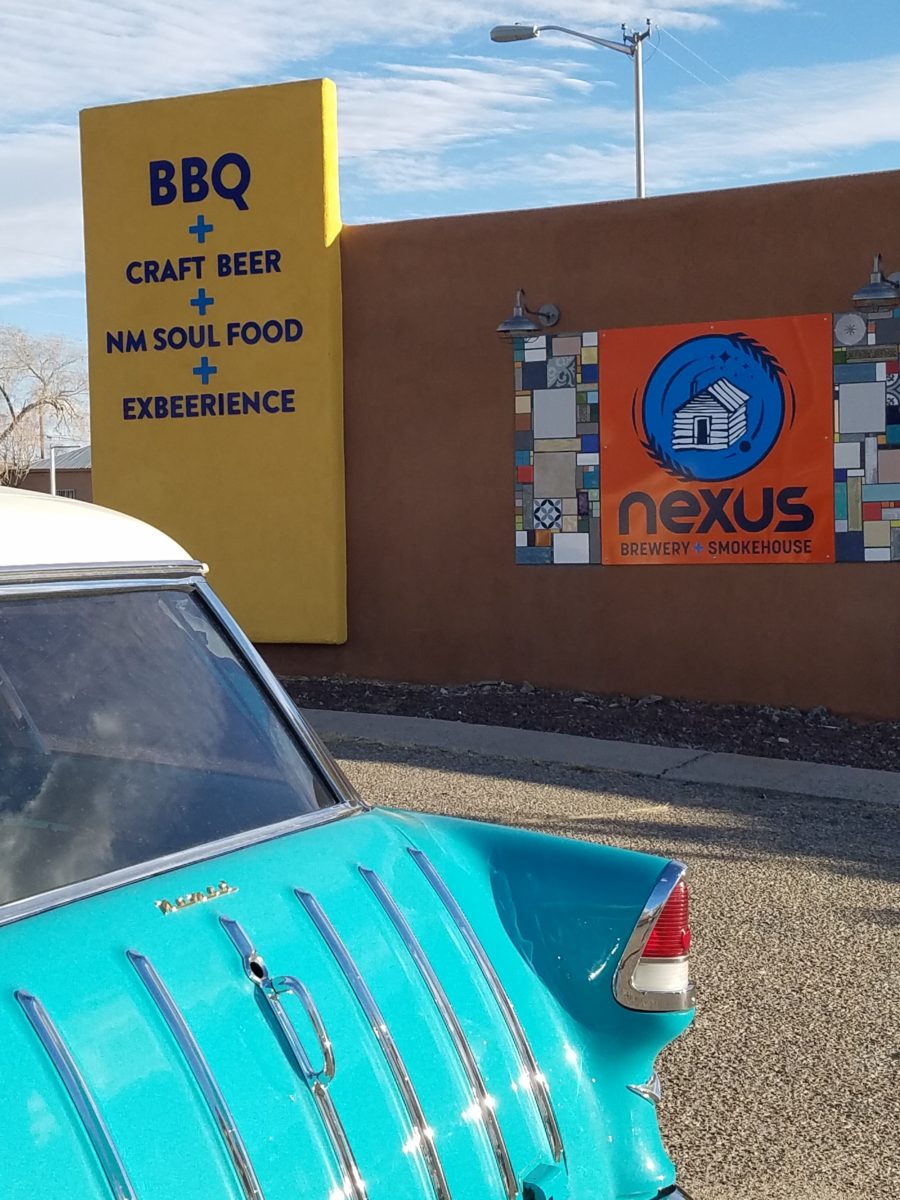
My opinion was a combination of an intriguing brand and “the story.” But before I go further, they coined a word to express their beer brewing prowess – exbeerience! This will enter into the story as we go along.
Now maybe my opinion about their story was so worthy of consideration because there was so much to this story. That certainly helps. It happens to be a great story with layers of interesting twists and turns – riddled with history and significance. Plus, it had a local interest angle that has the potential to create a buzz far beyond their actual location.
To begin to tell the story, I encouraged the development of
a unique logo for this specific branch of the brand. Taking the lead to design
it, and incorporating it into interior/exterior
design was part of my vision for a complete design package and presentation. Extracting
from the story to create the logo seemed natural. The private persona was
becoming public.
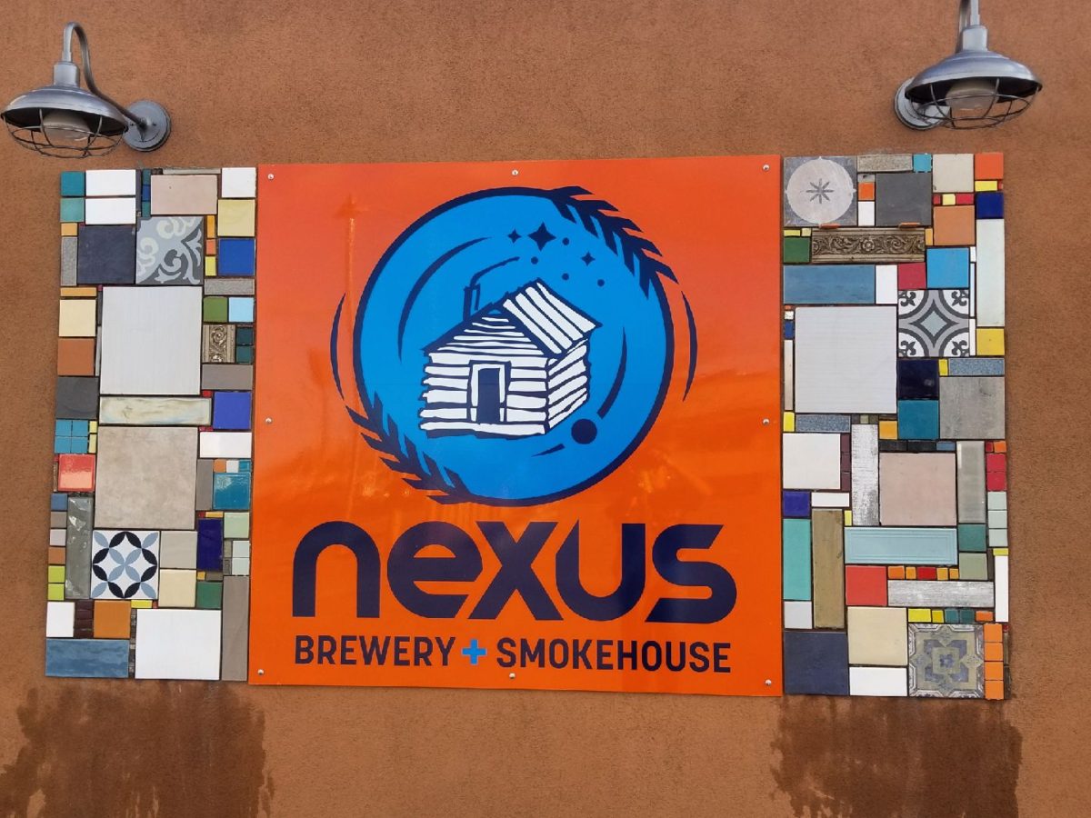
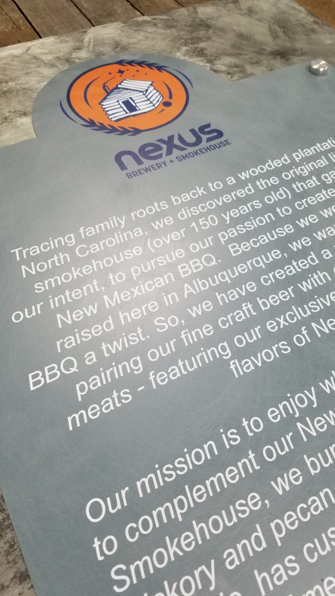
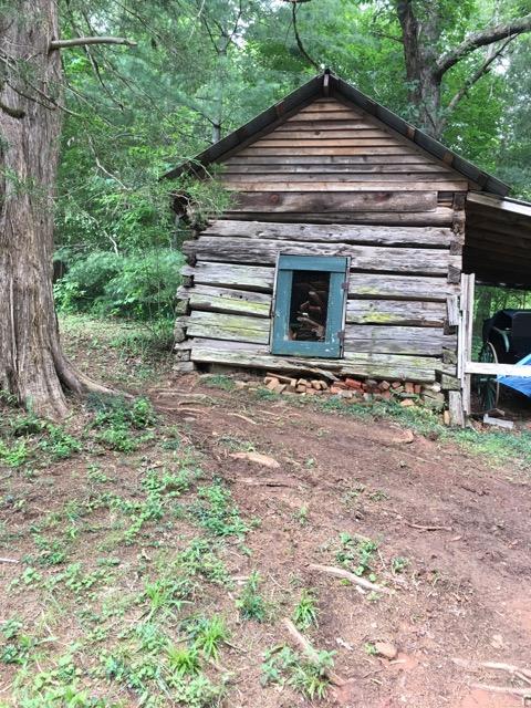
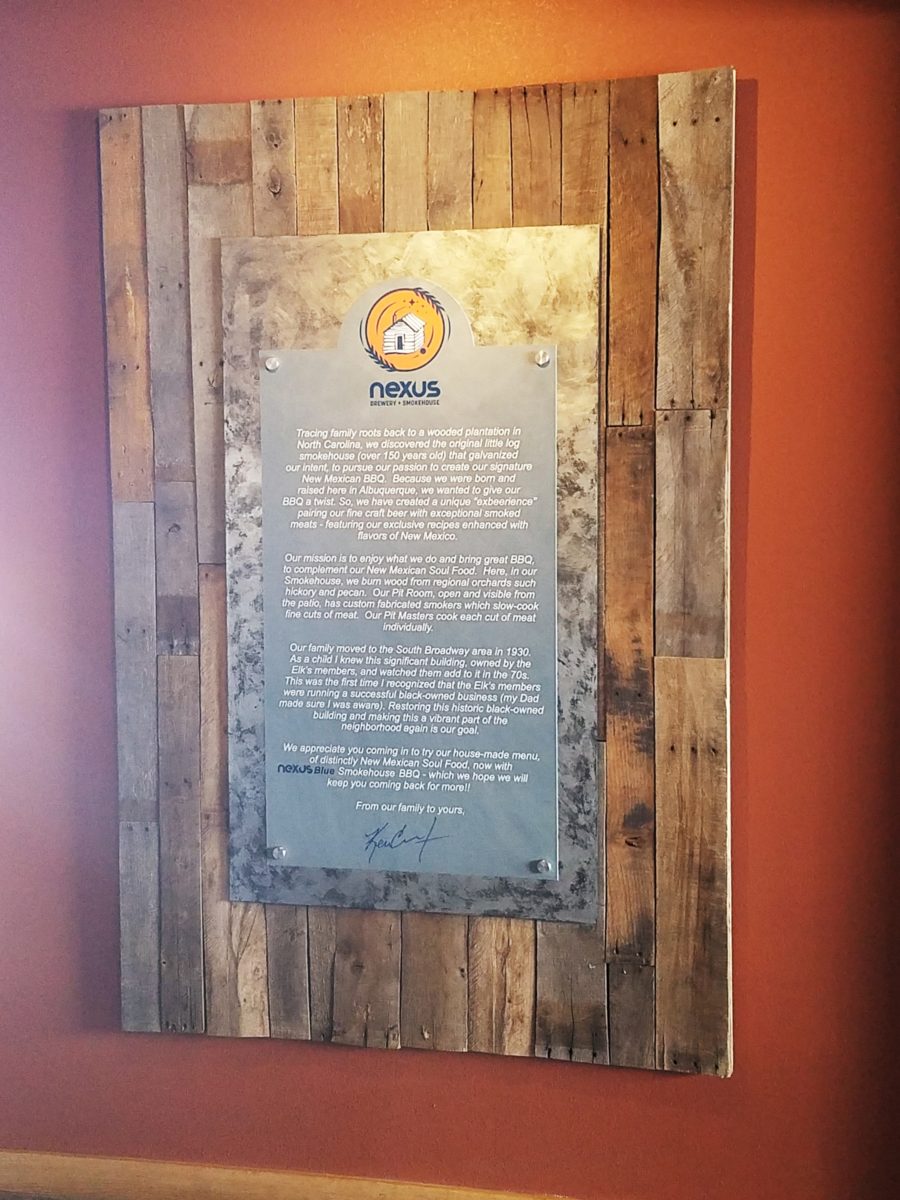
As we developed the logo, featuring a wood-carved graphic of an original log cabin/smokehouse, the story was recorded and edited down to a summarized version.
It was available for printed material, social media, and as art to be presented on walls. Yes, it was intended to become a decorative element too.
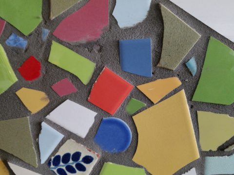
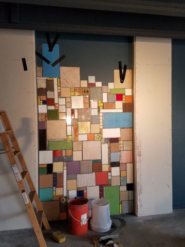
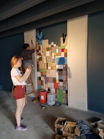
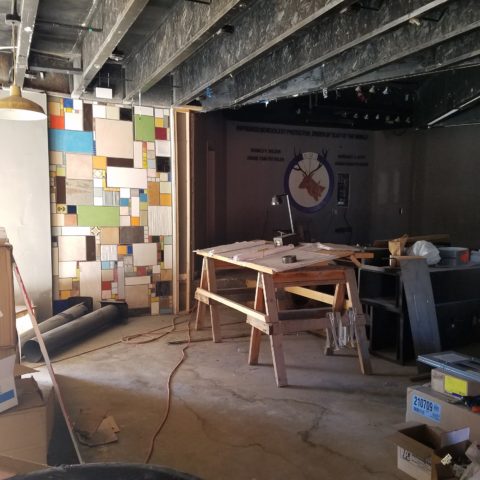
The Story became a focal piece in the interior along with authentic, original photos of the log smokehouse and an interpretation of patchwork quilts entitled Urban Piecework made from leftover ceramic and porcelain tiles, glass and clay assembled in wall-mounted panels throughout the interior and exterior spaces.
Photos of the original smokehouse in North Carolina will soon be presented to further reiterate the story on the interior walls.Urban Piecework commands the interior with bold mosaics reminiscent of patchwork quilts – an intriguing backdrop installed both inside and out.
Connecting with patrons, followers, clients, friends, family and acquaintances is valuable. As a business, it wraps who and those elements that are important to you in a familiar cocoon of context. It can instill a level of comfort and confidence in addition to sparking additional interest that might have taken longer to establish, without the introduction of your story.
The final multi-dimensional and multi-textural wall-piece featuring the story and mission is a striking 4’x6′ multi-textural panel. It offers patrons an opportunity to get a few questions answered as they enjoy their “exbeerience” at BLUE.
It was a privilege to promote, extract and produce this story and contribute such an important and valuable element to this business’s marketing and solidifying it’s new, exciting chapter of their brand.
Consider your story. Own it. Share it. Celebrate the uniqueness of your story. Design with your story in mind.
Collecting art, investing in art, loving art, designing with
art…one aspect or all of the above, art in interior design has many facets. I
have written previously about and presented a workshop about “I want a
piece of art to go with my red sofa,” a kind of raspberry in the face of curators,
collectors, critics and appraisers who would never take or condone that
approach. But the desire and need exists and as a interior designer it is
wonderful to work with artists who can and want to respond to cues, take on
commissions and create for specific parameters.
Contrary to opinions from the high-brows, this is not to say that these artists lack artistic integrity or meaningful self-expression. Their value is as any other – determined by what the market will bear. The basis for this writing is that we work with many artists who love their work. And creating it (even under direction) brings them and their patrons joy.
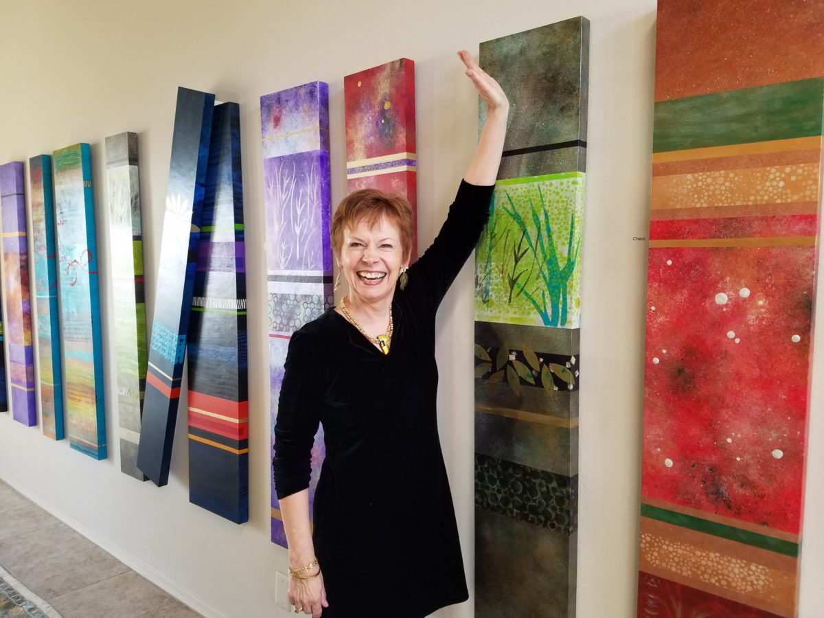
Featured here is the up-lifting, colorful and texturally abstract
work of Patricia Forbes. We have enjoyed commissioning her for specific
interiors over the years and are never disappointed in the quality and creativity
of her pieces.
For scale, diminutive Forbes poses by her Vertical Stick series.
With so many mass-produced art offerings at the trendy home
decor stores, it is refreshing to encounter new clients who are at the start of
their nesting years, establishing their own domains, selecting things that
bring them comfort and identity and who’s appreciation lies in acquiring original art.
Designing an interior is about comfort and personal identity. It is about surrounding oneself with things that work – both functionally and aesthetically. Individual’s requirements, in either of those departments, can vary greatly – but suffice it to say, each person or couple or family unit creates a home environment based upon their likes and needs (and budget).
Enter the interior designer. When calling on the assistance
of someone outside the intimacy of the home, the client is hoping for and
expecting a successful custom-tailoring of their requests based upon the
experience of the professional.
When designing an interior, it is exciting to use existing
pieces already owned by the client. It is gratifying to arrange and place those
items in ways not yet imagined – thereby justifying the investment in design
consultation. After an intense session of rearranging furniture, artwork and
decorative accessories the “ta-da” moment is one of near instant
gratification and satisfaction.
When an interior needs a little something to pull it
together, fill a gap, create an accent or establish a focal point, it is great
fun to engage the creativity of an artist to custom design a piece to fit the
need. Approaching an artist for the express purpose of acquiring a piece of their
work to enhance a space is an exciting
venture. It is a personal connection between artist and patron that creates a
communion, a bond.
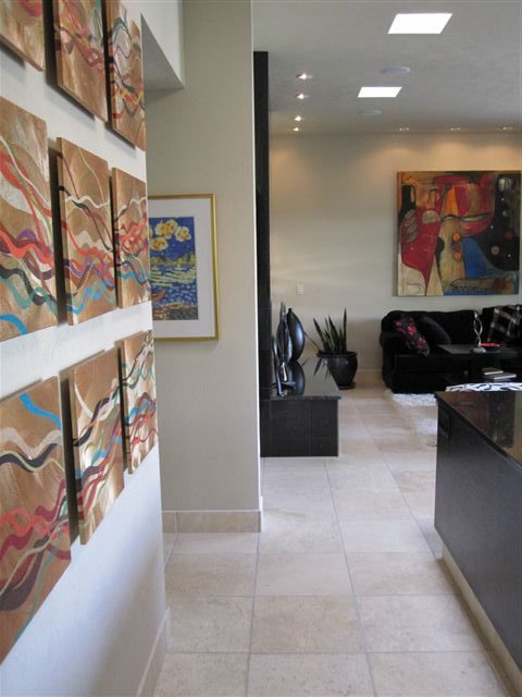
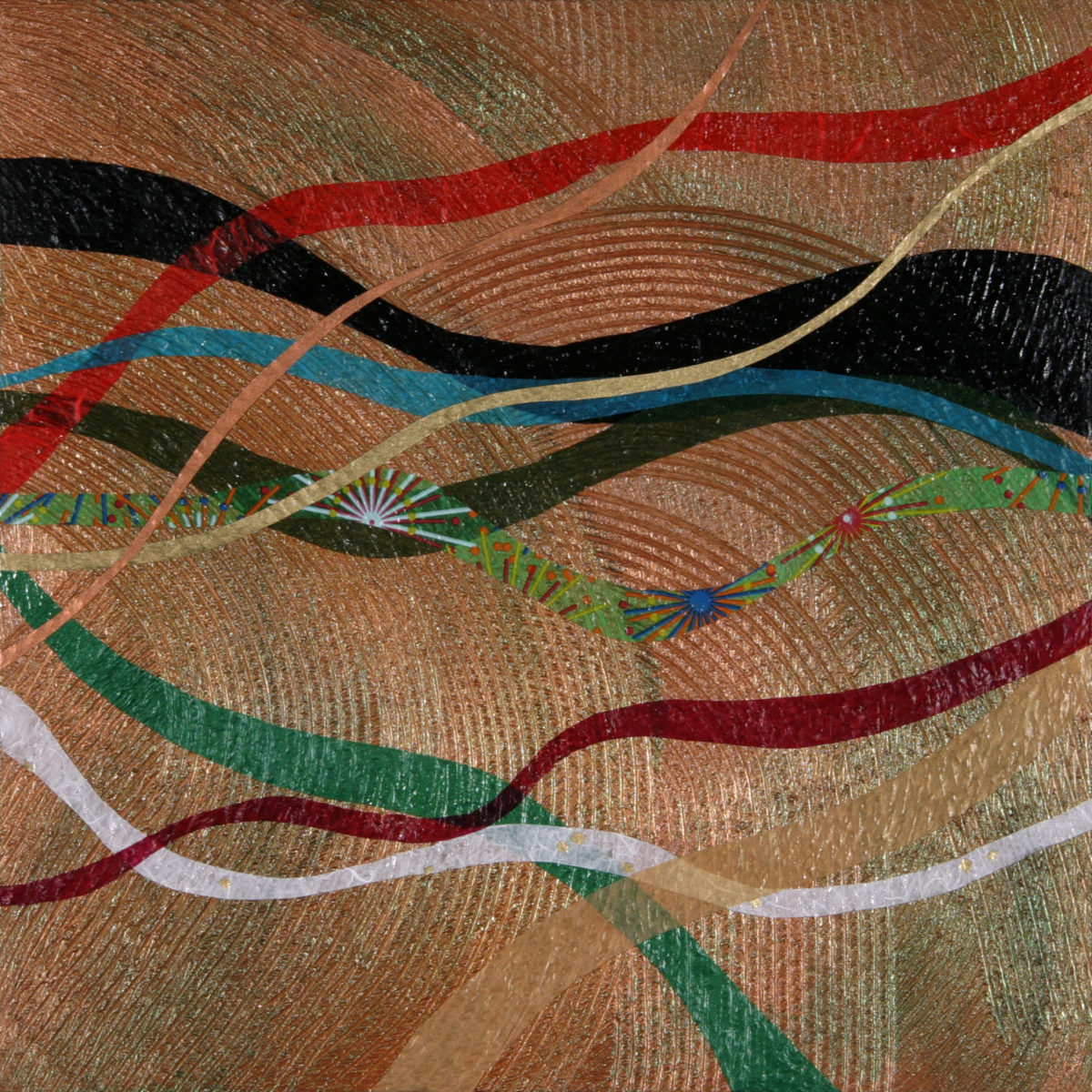
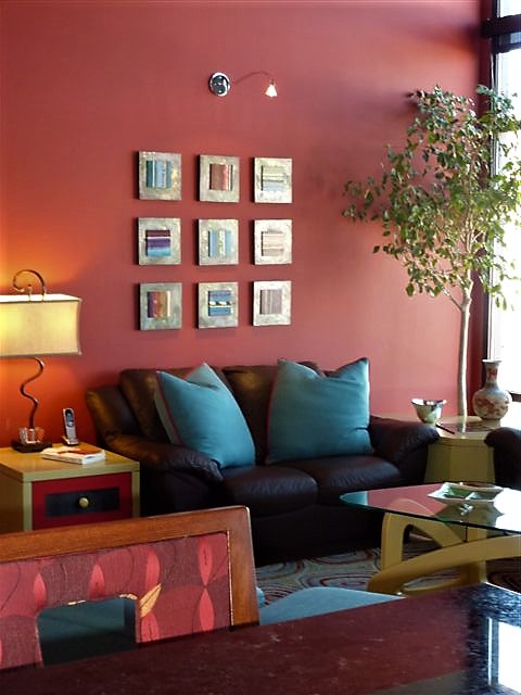
Here I took inspiration from a single panel that Forbes had constructed and requested a series of 9 panels grouped in a grid to make a larger statement on the wall. The interest created from a grid of images adds movement and dimension to this series already complex with sculpted texture and applied layers.
Color, texture, size, style, subject (or not) all are aspects of art that are to be considered for the personal interests of both artist and patron. If the patron has selected an artist to approach about a commission it is as a result of experiencing their work and appreciating it. The artist, in response, is to accept the parameters of the request and enjoy the challenge and process of creating the intended/desired finished product.
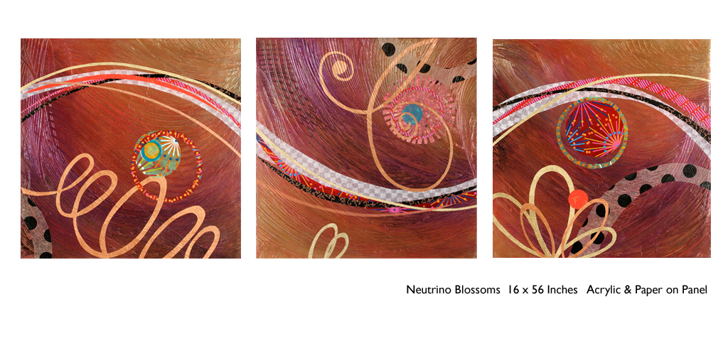
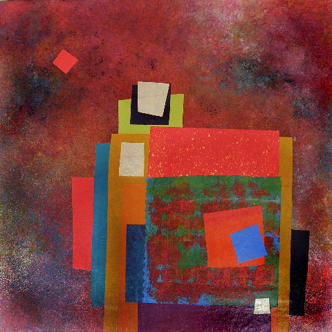
The intensity of this rich red wall was decided early in the design process. As we built layers of existing elements and introduced new pieces, the desire for a custom installation became apparent. This Urban Elements series was a collaborative effort between Forbes and me to provide a bit of an edgy, industrial vibe to this eclectic urban loft. Note too that the end table and coffee table were locally crafted for the project by Kirt Kirkpatrick
Forbes’ creativity is rooted in pattern, color and texture.
Primarily non-objective, her pieces are compositions of movement and dimension.
Working with a layering technique, she builds her action with a collage of
papers and fibers, paint and stain. Action is key when describing Forbes’ artwork.
She creates for herself, but when called upon to collaborate
on a project, her eager curiosity for what might result is enthusiastic and
ever-promising. About her style and self-expression she states “When I
have created a joyfulness and vibrancy in the work, I know I ahve created an
experience I wish to share.”
When asked…
1. How/when/why did you start your abstract technique of
layering colors and textures?
Forbes has always been drawn to color as a means of her personal expression, once she “experimented with acrylic materials that would hold a texture and started playing with those using combs and rubber spatulas and sticks to mark in the materials” she was hooked. “Metallic and interference paints call to me — so I began to combine the over the textured backgrounds, and then discovered that with acrylic one could imbed paper. It was really experimentation and discovery of what these amazing materials could do…”
2. What is the most satisfying aspect of your art for you personally?
The
element of surprise is what gets Forbes excited! “When something comes
together almost unexpectedly and I wonder how I did that — it’s always a search
for the right combination of elements, colors, textures, feelings.”
When they all come together she experiences great satisfaction. “It’s
like turning over pieces to see what fits. Sometimes I have to turn over a lot
of pieces to get the right combination — sometimes wondering whether to
continue. Seems like it is always worth continuing the work to a happy
conclusion.”
3. Why do you enjoy commissions to create specific pieces
for interiors/patrons?
Forbes
expresses genuine gratitude for her patrons. “I feel honored and
appreciated when someone likes and appreciates my work and invites me to do
something special for their home or office space.”
4. What pleases/satisfies you about this custom commission process?
The
process of working together with her
patrons is positive creative challenge. “I enjoy the collaborative aspect
and going through the process with a client or designer and receiving their
feedback as the work progresses.”
The
satisfaction for a designer in partnering with an artist is designing and realizing
a vision to complete a space. Bringing visions to reality. I often say that my team provides tremendous
support in making my dreams come true. From artists and craftspeople to seamstresses
and all manner of contractors, it is truly a team effort to achieve great
results!
Time to remodel the kitchen!! This charming little bungalow had already experienced its share of remodeling – well, not so much structural – although, many interior design transformations had occurred over the decades. In the mix, the well-used and enjoyed kitchen was feeling a quite tired and dated.
You might remember I have used this now completed project, in the last few months, during its transformation process to identify certain features and design practices. Here is the as-promised unveiling of the before and after photos for further discussion about the design process, intent and results.
We loved the mottled color and organic character of the existing slate floors and opposing green-grey beams with spanning boards of a caramel stain. These were the two elements that went well together as though intentionally planned. Yet in between, the pale, peachy pickled oak cabinets with their radius detailing and red-rose/black matrix of the tiled granite counter-tops, didn’t seem to speak at all well with the ceiling treatment and slate floor’s greens, rusts and charcoal tones. It was a dark, confused space.
When observing and “listening to” the house, it was evident that the current kitchen, in addition to being poorly coordinated, had absolutely nothing to do with the original architectural intent. The new owners had brought a few very fine antique pieces into the home. The mid-century circa 1964 age of the house accepted them on its original hardwood floors also adorned with their fine antique rugs…but something was missing. There was no cohesive thread running through the house. Over the years finishes and decorative elements had been selected and installed without any consideration for original materials or an attempt to introduce compatible and harmonious materials for the good of the home’s overall theme.
In all fairness, had the entire interior been gutted and a
contemporary interior been uniformly installed into the framework/shell of the structure,
I might have considered it a success. However, this multiple decade decor was a
mix of disparate trends and preferences that had no commonality.
To begin the process of bringing this home into a cohesive
design last year, we had redesigned the living room. There we introduced a classic
blue and white color scheme derived from the Persian rug in the adjacent dining
room.
To the corner kiva fireplace, we added a sandstone hearth and
mantle with just enough blue and white Talavera tile trim at the base of the
hearth to subtly coordinate with the new scheme. The Talavera was an
appropriate material for this New Mexican bungalow.
The original fireplace had a dark, broken brick quarry tile hearth and no cap on the mantle.The face-lift replaced the hearth material with broken-edged sandstone slab and matching mantle cap with Talavera detailing at the bottom.
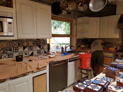
With this living room having been so successfully re-designed, the obvious thought came into the discussion to continue the vernacular of the blue and white Talavera into the kitchen. As a bit of a purist when it comes to application and termination of materials, I was not content for a mere back-splash. No, if the tile were to be effective and commandeer the stage, it had to be used wall-to-wall as though an entire wall treatment.
Treating the Talavera tile as wall-covering, it continues from the kitchen, into the adjacent pocket-space housing a desk and laundry machines.
But wait! The addition of an earthy aqua handmade tile from
Spain offered an appealing and unexpected accent woven intermittently through
the Talavera. It created a coordinating thread from the colors found in the mottled
slate floors and ceiling beams.
Pre-grout shot shows the individually cut 1″ pieces inserted as mosaics into the random field of Talavera
The cabinets were in excellent condition, but the doors were
sadly dated and in no way spoke to the home’s other cabinets, doors and finish
carpentry.
The confused interior finishes we in need of a transformation!
With the white raised panel theme throughout the home’s original appointments, we elected to salvage the cabinet boxes and replace the doors and drawer fronts with a similar raised panel detail. The same red oak was used and, with a glossy white paint applied, the grain “read-through” with a very intentional yet subtle moiré-like pattern. The new raised panel white doors and drawers, with crowning top molding provided a crisp, timeless motif. The random patterned Talavera used as an entire wall-covering was very effective. The kitchen was quite gussied-up!!
The transformation was dramatically successful!
The existing slate floor was beautifully organic and I felt, from a design standpoint, was a must to salvage. Making it look like an intentional selection – part of the new scheme – was imperative. Therefore, selecting a counter-top that communed with the tones in the floor resulted in a selection of concrete-like engineered Italian quartz material – balancing the floor with the next horizontal plane and ultimately with the stained and green-grey boards of the existing ceiling treatment.
The new concrete-like Italian quartz counter-tops coordinate well with the other materials.
Another asset was the connection to the outdoors, however the existing window over the sink was high and small.
The window over the sink was high and small…
By bucking the warranty of the Pella people, we had a new double-hung window made to close down onto the new counter-top that passed through from inside to out. They would not fabricate the window to do what we intended, so we had the contractor remove the bottom of the new window frame, thus rendering the warranty null and void, in order to have a completely open, uninterrupted pass-through when raised.
Amusing and interesting…existing family pieces of blue and white ceramics are being discovered and used as decorative accessories in the new kitchen!
We also captured the opportunity to open the opposing wall into the hallway adding pass-through light and dimension to the space. This exponentially expanded the space and made the encapsulated kitchen feel much less confined.
Before, the kitchen felt small and dark…Opening the wall into the hallway brought in additional light and dimension.
To add drama to the newly created dimension, we discussed having a painting commissioned to pop an accent of yellow into the blue and white scheme on the far hallway wall. Lemons, a perfect citrus for the kitchen, was decided for the theme.
A miniature oil painting by Federico Leon de la Vega was used to Photoshop into the scene to inspire and convey the design intent.
The additional POP of yellow is a dramatically effective contribution to the overall composition. After consideration, the owners selected a local artist to paint the full-scale painting.
A local Albuquerque artist, Thomas Tomlinson rendered the lemons in acrylic with blue and white tile details.
In summary…keeping the original slate floor, existing cabinet boxes (replacing door and drawer-fronts only), with a bling of new chrome cabinet pulls, switching out the stained glass pendants, replacing the island’s surface with a handsome solid walnut top and a new coordinating concrete-like counter-tops on the periphery, with the decorative embellishment of the Talavera tile continued from the subtle introduction at the living room’s kiva fireplace, the transformation of the kitchen is stunning – not trendy – and was truly, uniquely designed for the architecture and forward, on-going contextual design conversation of the home.
Uniquely designed…
Look around and listen to the environment for and in which
you are designing. What makes the best sense for the design direction
considering the function and context of your project?
Pick a color. What’s your fav? Do you HAVE a favorite color? I was asked the other day that very question and I was really at a loss…I looked at her, furrowed my brow and cocked my head. I wanted to have an answer – a simple answer that stated a definitive preference for a color – my most favorite. Rather than producing a quick sure pick, I faltered as she stepped in and said – I’ll bet it’s purple!
Well, actually I can definitively say that purple is NOT my favorite color, but the funny thing is I can love purple, in certain context. The real answer is that I love nearly any color in a certain context.
When I ponder the question a bit more, I can assertively say bright pinks, cornflower blues, golden yellows, chartreuse and brilliant orange. But the truth is, I love so many colors that I am hard-pressed to select just one! It sounds like a Lilly Pulitzer color board.
So I thought of a little exercise. I decided to pick a color at random. Then overwhelmed with the myriad colors that might produce one random pick, I fine-tuned random and said to myself, perhaps a color of the season. To me that was currently and boldly orange. So the idea was that I would walk in and around my house today and capture things that were orange.
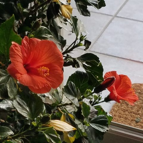
This screaming orange hibiscus just came in from the patio to escape the chilling temperatures that have swept down in the last couple of days…happy to transition indoors for the winter!
Try it. Pick a color – not necessarily your favorite – but certainly one you like and walk inside and outside of your house and see how many examples you can find, of that color, in your immediate world. Photograph things that have that color – all or in part, even little details – anyplace that color occurs. It’s fun and very interesting to see what you discover!!
Autumn is loaded with vibrant colors, but orange is one of the most fiery.
So I selected orange as my color today. I dashed around the house and collected a variety of things that were orange. I was actually astonished at how many I discovered.
This dramatic Hopi – influenced kachina by Gregory Lomayesva sports stylized antlers in a flat but brilliant orange.
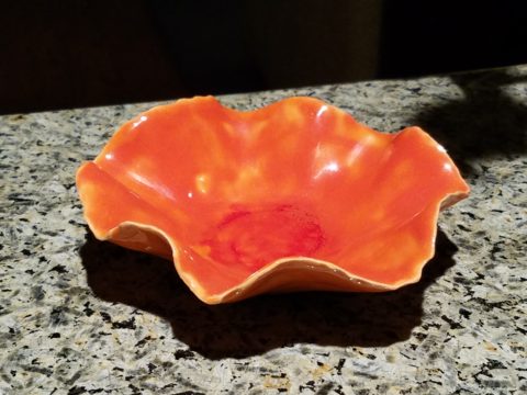
Festive ceramics by Ann Marie Werner Smith – here a graceful orange bowl that sits on the counter…it pops against the contrasting granite.
It is interesting because I know my world is not heavily orange, but I found so many wonderful splashes of it throughout my interior and even startling exterior, in the way of the leaves on the Bradford Pear tree.
From fresh mini pumpkins and flowers…
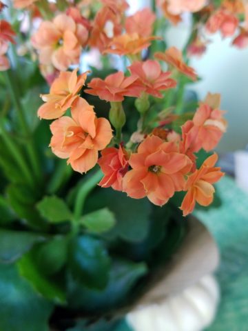
A succulent orange flowering Kalanchoe is our seasonal centerpiece on the kitchen table.
A variegated Croton plant has lacy veining of bright orange, pink and yellow contrasted against it dark green background.
to artwork with swaths of orange streaking through them.
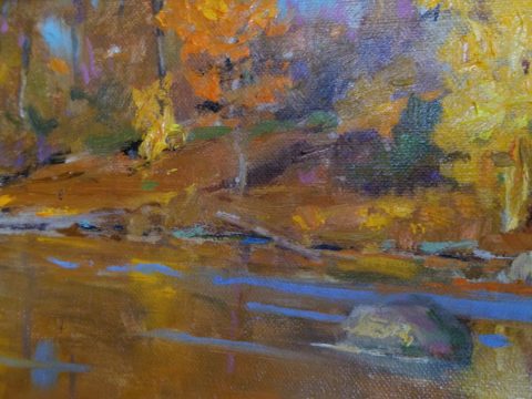
A lovely little oil painting by Jeff Otis depicts a very autumnal New Mexico river scene.
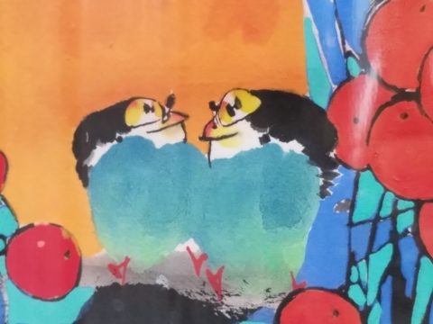
At the last minute, while waiting in the Bejing airport, I found this precious little painting of birds and berries. The background is a vibrant orange. Notice the fresh blues adjacent to the orange. This is a detail of the much larger piece.
Peggy Zuris really knew color. Her bold and confident brush strokes applied in luscious swaths placed adjacent colors perfectly juxtaposed creating uplifting renditions of daily life. This little chicken is a detail of a fanciful rural scene.
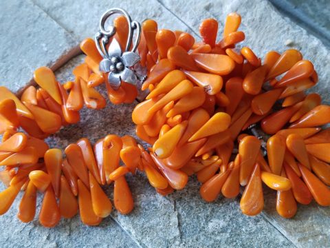
The balance of color was so interesting. Where I found orange, I nearly always found blue – unless it was a stand-alone like the glass bowl of oranges – or my coral necklace with its nuggets of bright orange coral.
Fresh oranges with their intricately textured rinds fill a glass bowl on the kitchen counter.
Nuggets of coral look like candy corn tightly beaded on this delicious necklace I wore too Santa Fe today!!
Colors balance and contrast.
Even the coasters that attracted my attention last weekend at a bar. I was so taken by them that I brought them home and had them sitting on the kitchen counter. They were intriguing and offered interest and visual stimulation to my graphic art sensibilities.
I began this story earlier today, then took a break and tootled up to Santa Fe where I came across a couple more bright orange pieces…
And on the way home, I was even blinded by an orange fireball glowing beneath the stormy sky silhouetting the dark mesas and glistening off the wet pavement. It’s intense heat contrasting with the cold, damp asphalt that was a result of our first seasonal snow seen here spitting at the windshield.
Gather your collection of photos of your color today. Ponder how they and the color make you feel. Do you get joy from the color and the things you have discovered? Was this not your thought-to-be favorite color and if not, might it be one of them? How do YOU answer the question, what is your favorite color and having determined that, ask yourself: Do I wear it a lot? Would I paint my walls that color? Do I have upholstery that color? When is a favorite color an accent? Is the joy in the little spots of punctuation? Are they intense, but small, elements of joy without over-doing it? I see a collection of abstract images, details of things – some of which can be cropped more – to create an abstract collage of wall art. Voila!
Color – an amazing facet of design and it’s most versatile component. It’s been a fun test and a compelling story. So what’s YOUR favorite color?
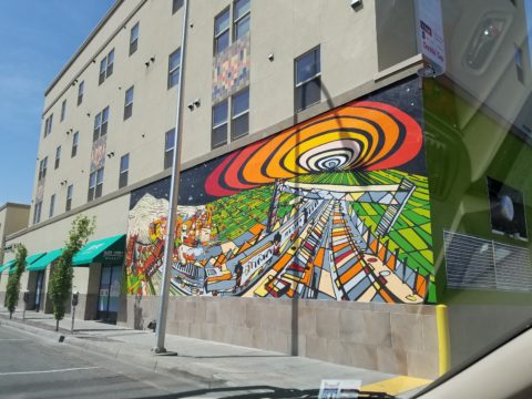
We are excited to have the opportunity to bring a design installation(s) into a new project that will serve to support the brand with a twist. A nearly completed new smokehouse is coming to Albuquerque. This home-grown eatery blends family history and southern roots with southwestern barbecue flavors including indigenous wood and iconic chile blends. But this is not about their cooking profile. It is about how we have arrived at a design theme that will define and further the identity in this new, specialized smokehouse department of this larger local brand.
To accomplish this task, we examined the concept the owner had to remodel an existing facility that had been a popular gathering post serving this community for decades. The fringe barrio location was of a demographic primarily comprised of Mexican/Americans. Decades past it was home to a heavily black community. The fabric of these cultural combinations suggested a mosaic of color and vibrant heritages.
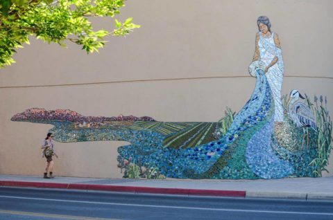
The spark of cultural references lead to discussion of the popular artistic expression of urban mural painting.
When we began the dialogue, the decision to have a mural painted by local neighborhood kids, with a mentor to design and supervise the work, seemed to be the direction we were headed. After subject matter debate and development, I veered off on another tangent that might take a less subjective approach, be weather-proof and more durable for a patio location – mosaic.
This new more impervious and durable medium still offered the opportunity to engage the community, but with less focus on a specific subject and more about geometric color and texture. We discussed the details of installation so as to keep it simple for kids to participate using whole tiles – minimize cutting, if any, for starters.
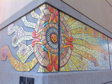
Inspiration came from several other installations such as the Albuquerque Convention Center’s on-going mosaic mural project wrapping many sections of the buildings with intricate scenes of New Mexican lifestyle and cultural diversity. The colorful mosaic is an elegant and sophisticated contribution to our city’s cultural aesthetic.
Helen Atkins, manager of consignment art at PATRICIAN DESIGN’s downtown boutique gallery and the lead on their current restaurant mural project, has worked on several phases of the Convention Center’s mural project.
We have incorporated mosaic into several of our own design projects such as last week’s blog https://patriciandesign.com/trust-and-custom-designs/about a residential kitchen installation.
Here, in another installation, a fireplace surround of mosaic adds movement, color and textural interest to the room.
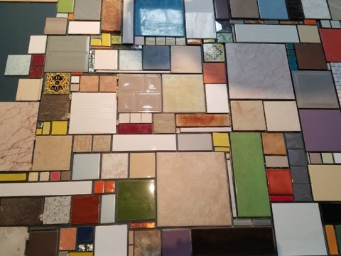
Ultimately, one of Helen Atkin’s personal photographs cemented the approach. It was decided that a geometry of different sizes and disparate glazes and designs of tiles pieced together in a colorful, textural panel would be our design theme.
Helen Atkins, a recognized artist in many media, captured this in passing while visiting New Zealand. It’s crisp, yet irregular composition was intriguing and pleasing. It became the springboard for the concept for a geometric mosaic panel to anchor the theme of this new New Mexico eating establishment.
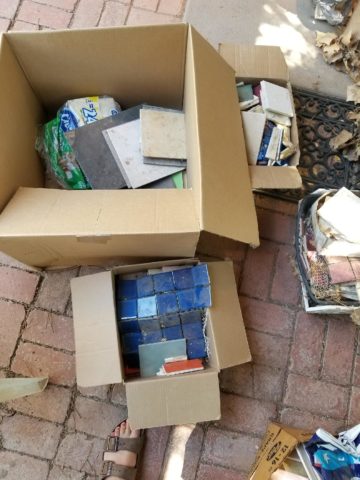
The idea became more exciting as we began gathering material from local tile distributors and our own personal inventories of favorite treasures saved for a special project. Here it was. It seemed such a strong design element and therefore offered a new direction for the actual brand of this establishment. We embraced the idea and brought it into the interior and distributed murals throughout the space.
Still under construction, we will not divulge the identity or locations of this project just yet. But suffice it to say, the murals are an exciting part of this interior design scheme.
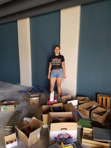
As we further discussed the plans to implement this project, school started and the ease of coordinating the assistance of neighborhood kids became more difficult. Helen lead the project as primary installer, coordinator and supervisor. She enlisted the assistance of a couple of people – one experienced and the other not at all.
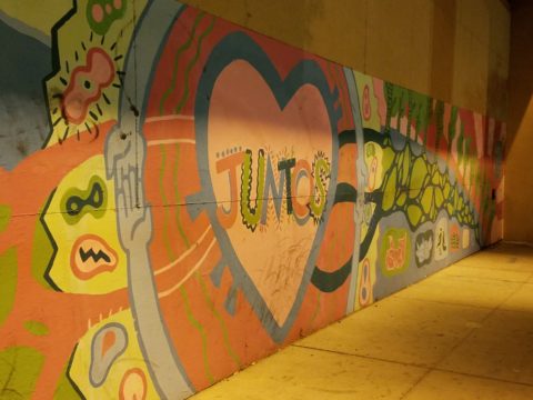
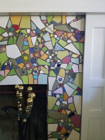
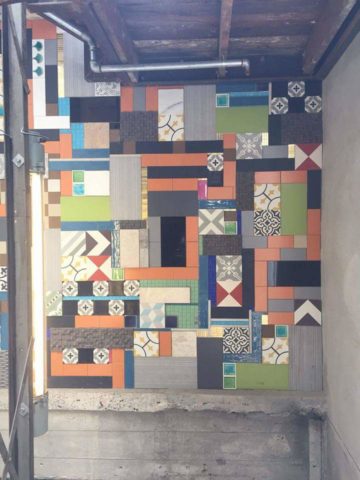
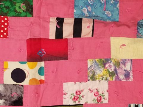
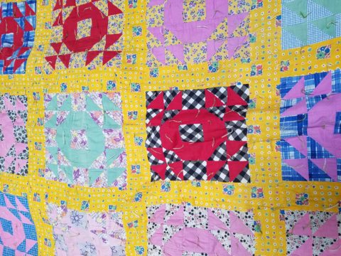
We have named this series, Urban Pieced Work – an artistic narrative. Here we are interpreting generations old sewing patchwork using ceramic, glass and pottery pieces rather than the traditional fabric patches. The original folk art needlework has been in the American vernacular for ages. In these installations, this up-cycled use of discarded or discontinued tiles is similar to patchwork fabrics, re-purposed to make clothing, wall decor, window treatments and bed dressing when times were tough – often referred to as “pieced work.”
My paternal grandmother in New Mexico made this twin quilt for my bed when I was a child in Virginia.
My same grandmother made this and was given to me by my cousin, her only other granddaughter.
Mosaic is often, like fabric patchwork, a practical art form that puts scrap, shards and fragments to good use in an artistic fashion. Note though that more sophisticated mosaics have been designed more intentionally for centuries not merely as salvaged material. These masterpieces both in contemporary work and antiquities represent many periods in history and movements in artistic expression.
This mosaic version connects with the history of the restaurant’s roots and southern heritage. The panels’ mural nature speaks to the urban murals found throughout the community.
Located strategically throughout the interior, these murals have become a strong design element and anchor for this facet of the brand.
Another shot of the spectacular cultural story murals at the Albuquerque Convention Center.
We have woven a meaningful artistic statement throughout the interior and also on the exterior of the building. In addition, we will be inserting a graphic version into the signage and logo design.
Urban Pieced Work – an artistic narrative, of a New Mexican Smokehouse, will provide pleasing design visuals throughout this new interior, provoke conversation and interaction, weave an element of history and context with the southern roots of this exciting new eatery!
Join the conversation and watch for the first succulent flavors to come out of the smokers later this year.