Everyone loves “Before & Afters.” The transformation of an object or a space is the magic of interior design. One of the most valuable elements in our design wheelhouse is fabric. Fabrics have the ability to transform. Like paint – color – altering to enhance a piece or the entire environment, fabrics offer not only color, but texture, pattern, design and style.
I love a good find. Call it antiquing, thrifting, scouting, treasure hunting…the hunt is the intrigue. Exploring random sources to find the perfect piece. Once found – knowing what, if anything, is needed to transform it.
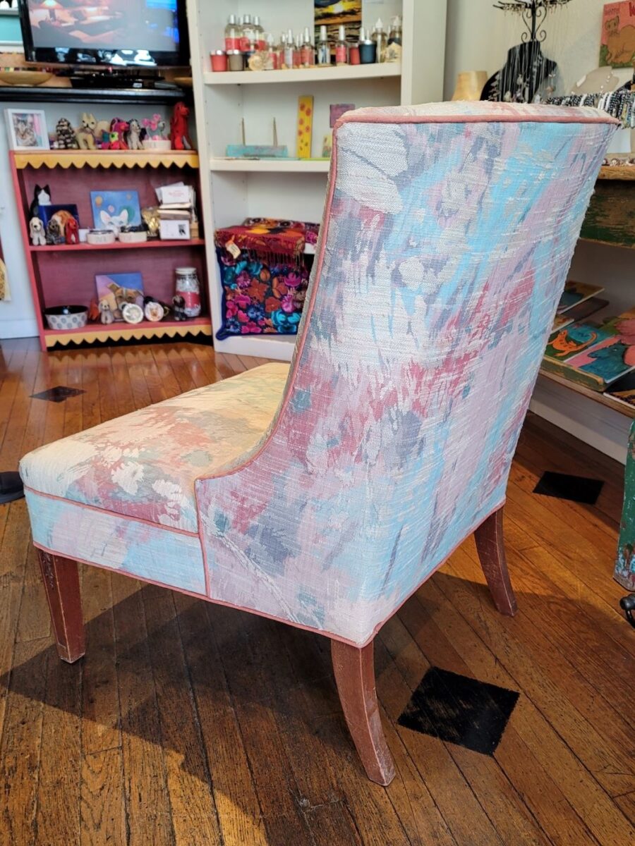
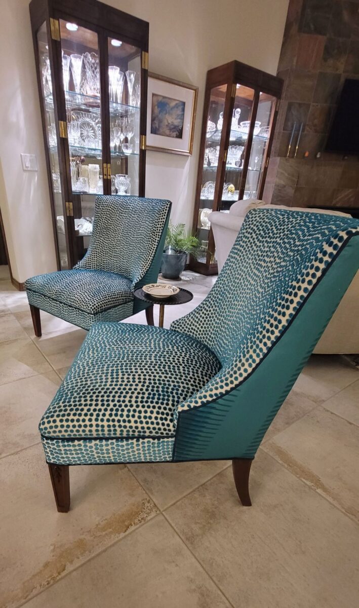
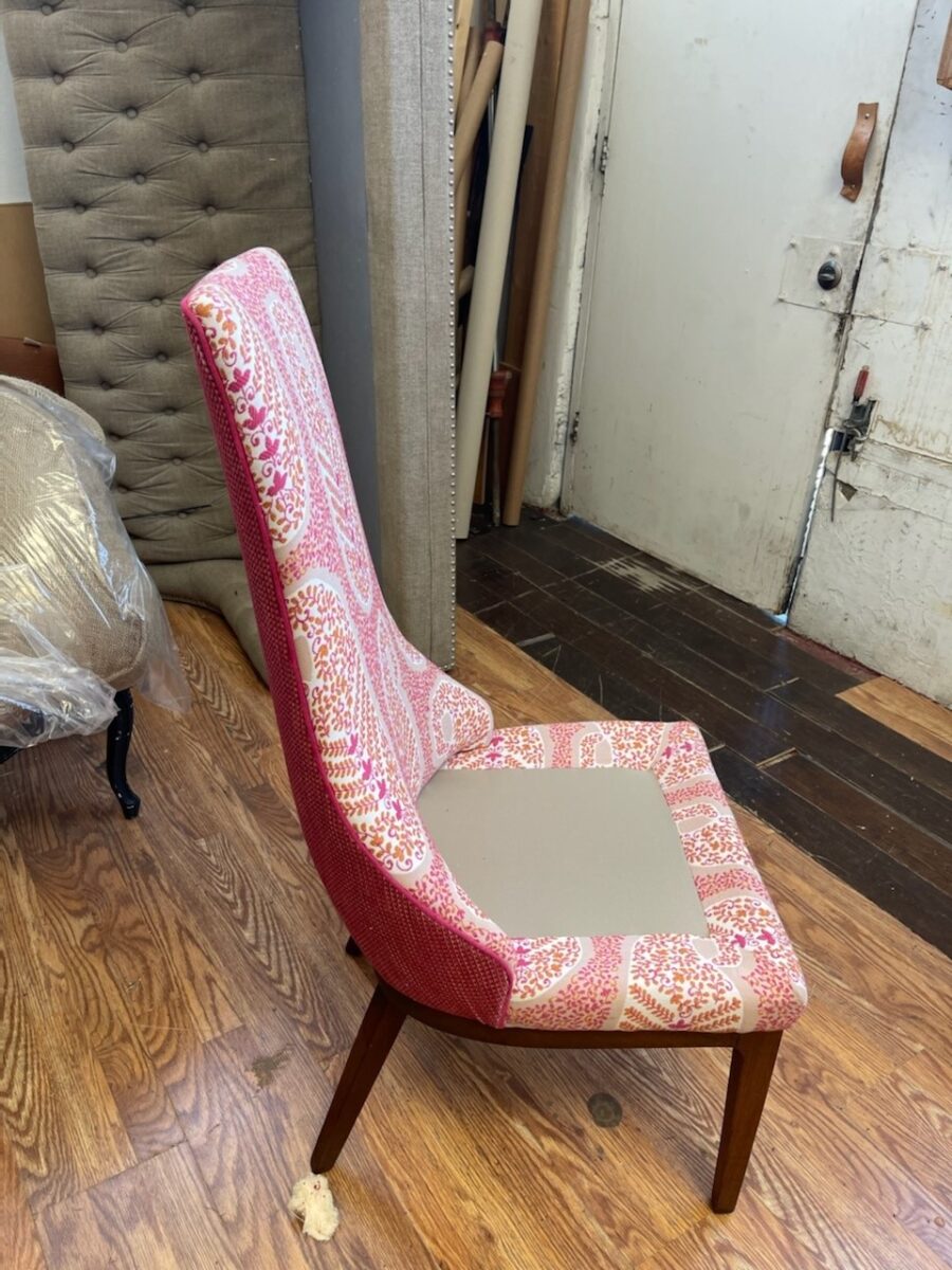
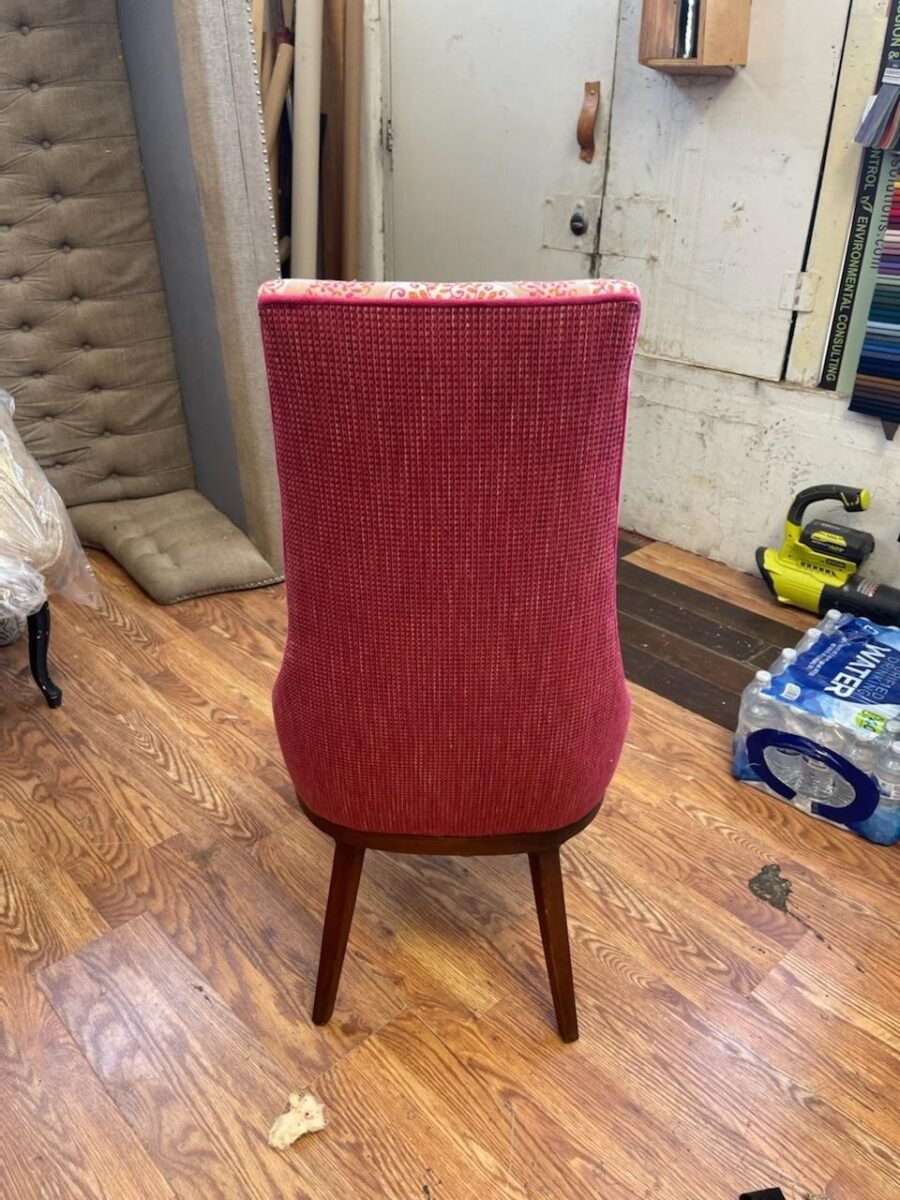
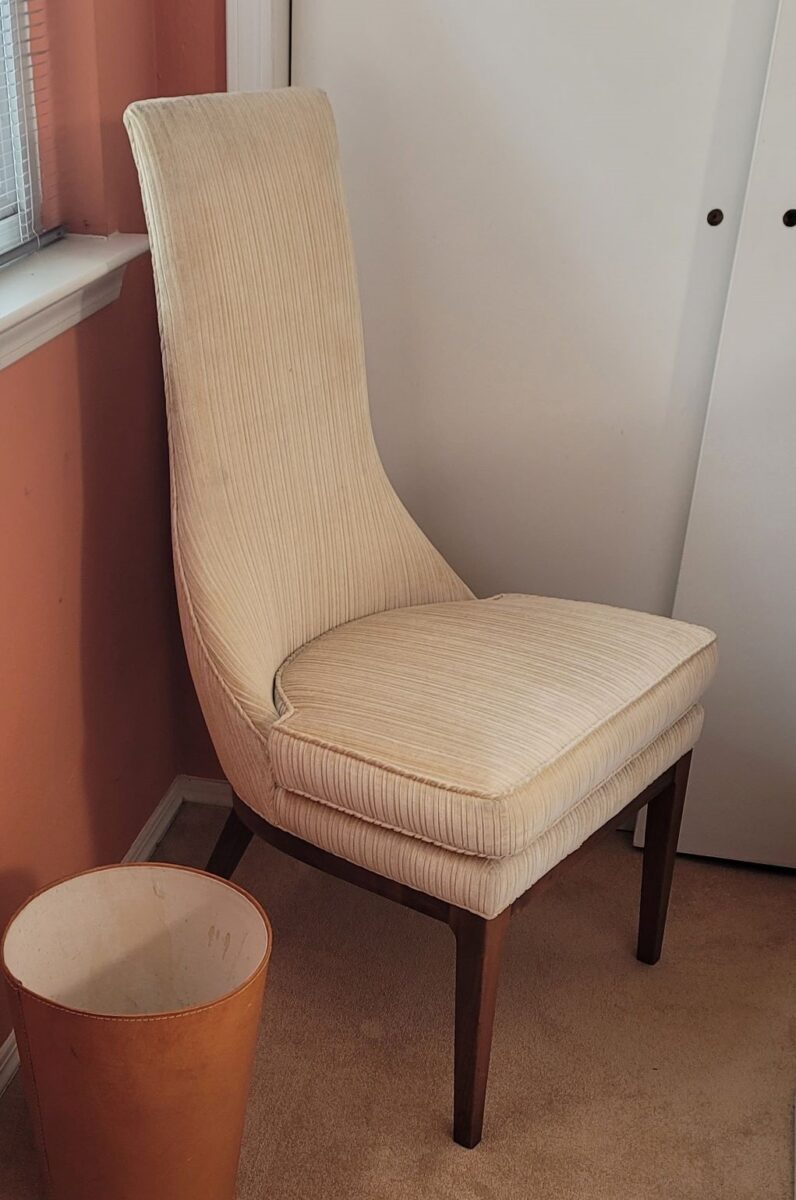
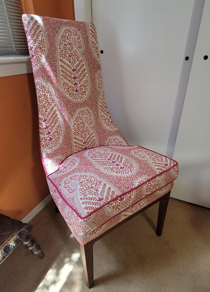
The lines of these handsome armless chairs caught our attention out in the elements, on the front porch as we passed by.We inquired of the owners if they were for sale and they said yes! it was apparent that they were nicely done in their original iteration, but the dated floral fabric was tired and ready for replacement.Having fun mixing fabrics is another layer of design detail. Here, the backs of the chairs have an intricate overstitching over the printed graphics.Piping the chair with a solid welt cord to complement the other two fabrics defines and details the chairs.
Reupholstery is a life-saving treatment. To salvage a tired piece with good bones and great lines is a service to good design. Pairing old pieces with new fabrics is rejuvenating. Inserting fabulous fabrics into a design scheme is a fine art that gives aged pieces a new life and contributes to the uniqueness of the composition of a space.
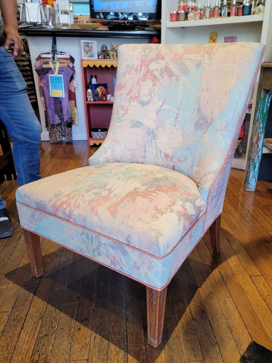
As we placed the chairs for an intimate conversational grouping, the scene started to take shape. Seeing the chairs in the context of the new interior illustrates how effectively they contribute to the composition of the room’s design.
Of the design elements, paint is the one with the seemingly limitless choices. Fabrics are next. The worldwide variety of textiles, creatives, fibers and the combinations thereof are vast. Searching for just the right fabric for a specific piece is part of that treasure hunt.
You have heard the term “run of the mill.” Even for many, having never thought of this as a fabric metaphor – this phrase is used commonly to describe the common. It means ordinary – a common, mass-produced product’s run of a manufacturing mill. Using common fabrics is a cop-out when it comes to creating unique designs – especially when there are so many incredible fabrics from which to choose.
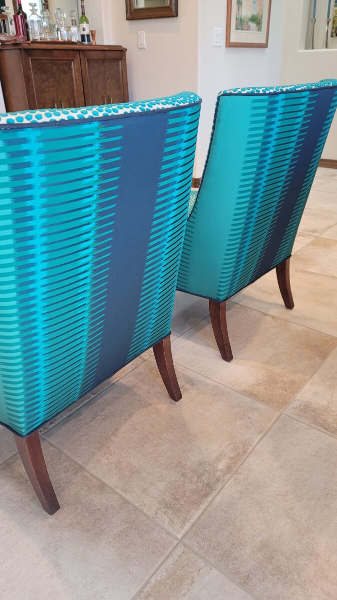
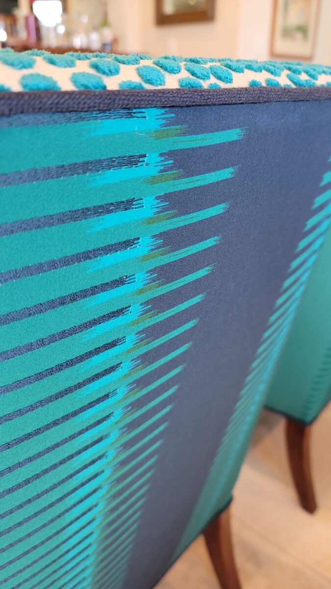
Focusing on a close-up of this recent upholstery fabric, we see the intricacies of the colors and textures of the weave.Here too, upon closer inspection, the overstitching on the printed graphic is an exquisite detail.
Personality comes into play when selecting a fabric. Along with function (how durable/cleanable it needs to be), the taste and preferences of the user, and the context in which it might occur – personality of the pieces plays a major role. For example, reading the personality of a chair – its lines and scale.
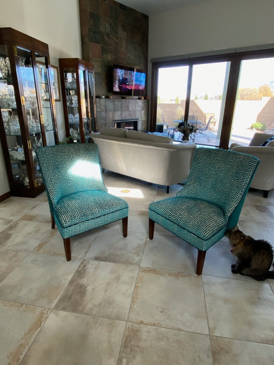
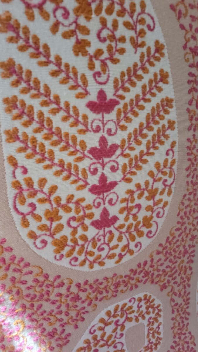
In the workroom, the chair begins to express its new identity.Extracting the raspberry color from the paisley pattern we’re using on the front of the chair, once again offers layers of design detail.This elegant little pair of chairs exhibited grace and style.Once reupholstered, it took on even more personality!
The personalities of fabrics are as endless as the textiles themselves. Fabrics evoke moods, seasons and even attitude. For commercial use, as well as heavy-use residential – workhorse fabrics have evolved. Not long ago, durable fabrics looked durable, less attractive and limited. And without turning this into a continuing education course about fiber content, it is obvious once you investigate the options, durability for wear, ultraviolet tolerance, mildew resistance, and antimicrobial properties – are all woven or applied to fabrics allowing amazing installations in commercial interiors that you would not hesitate to have on your living room sofa!
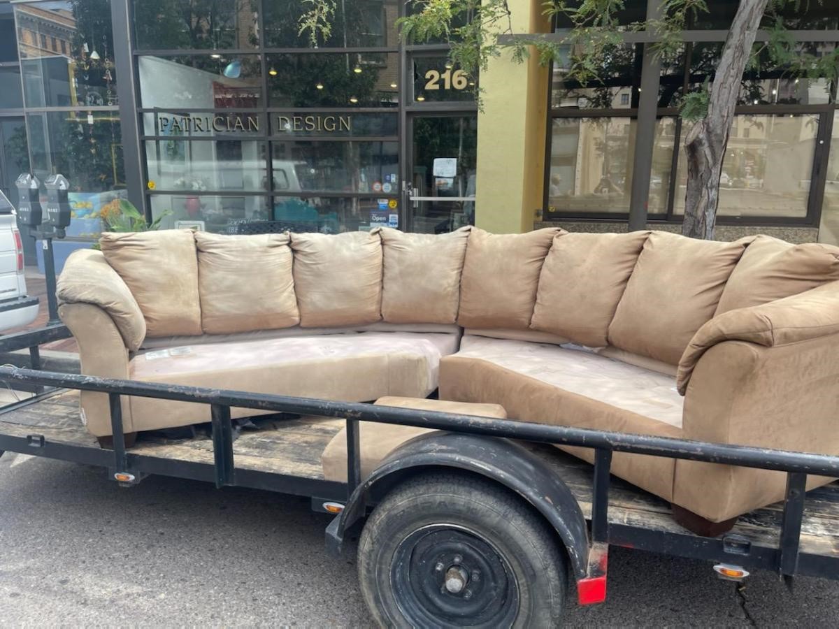
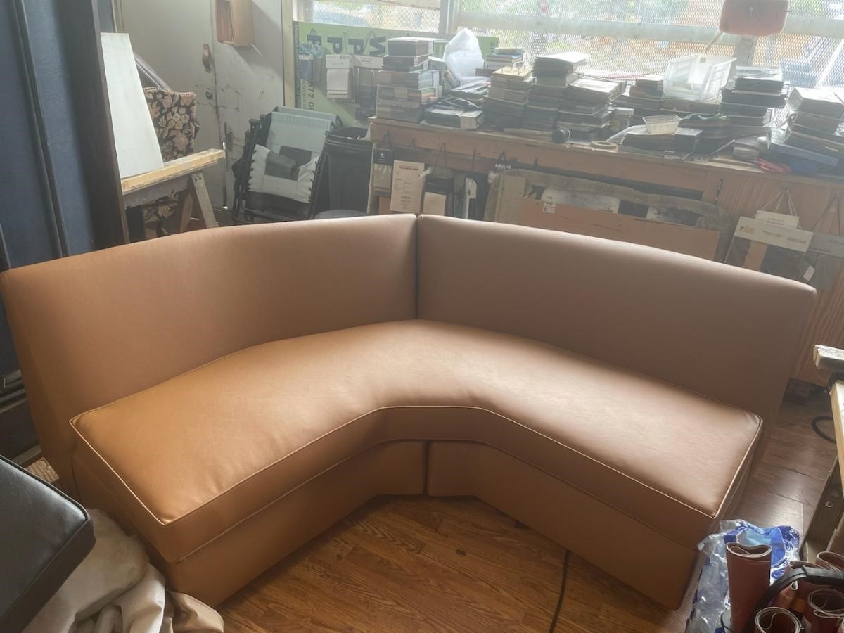
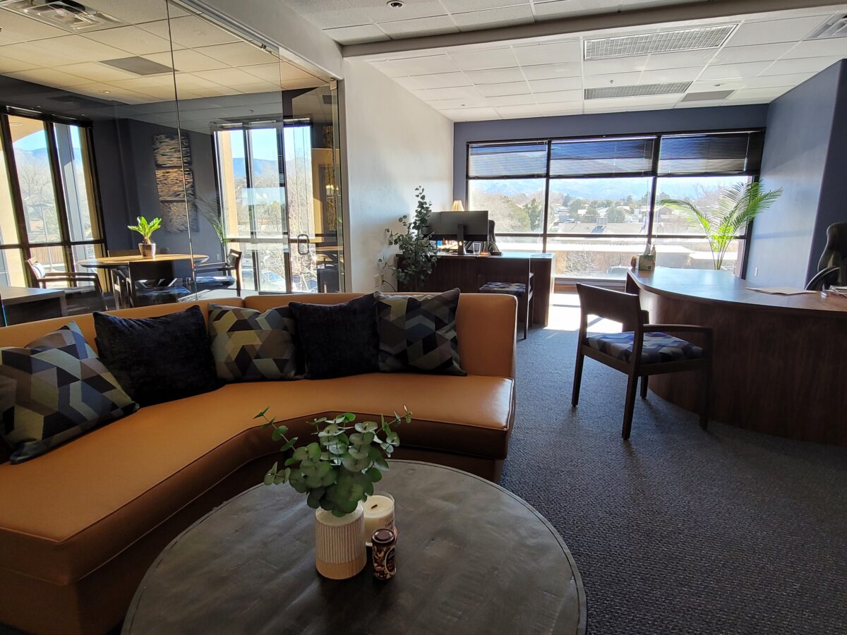
Most people wouldn’t look twice at this tired sectional, however, we knew we wanted a portion of a curved sectional (not an “L”, but a soft curve).Once we determined the bones were good, we realized it was going to work perfectly in its new interior. We selected a commercial-grade faux leather for the new skin.Voila! The finished sectional is further detailed with custom throw pillows to bring together the caramel and blue tones of this color scheme. Warmly greeting guests upon arrival.
Residential interiors can now enjoy what commercial interiors have realized for years. By incorporating the durability and cleanability which allows for the wear and tear – without showing those signs of real life – residential and commercial interiors incorporate fabulous fabrics that defy their strength – beauty and style conquer!
Sustainability of the fiber sources is an increasing topic of conversation. That and the fiber contents regarding the health/safety of the materials and treatments, if any, used (Okeo Tex certification, for example).
With all this information regarding the myriad options, enhanced durability and the unique opportunities that textiles provide to dress your great pieces – treasure the history, family hand-me-downs (if not heirlooms) and give them new life!!!! Its ART!!!
Color schemes are limitless. The permutations are endless. Color is exciting and fun. It is personal. Colors evoke feelings, memories, emotions and are key to a comfortable interior.
How often have you been asked or pondered on your own…”What is your favorite color?” Some people hesitate to answer, while others blurt-out readily with their fav. But what color you choose to wear versus what you enjoy in your interior surroundings and how much might be quite different.
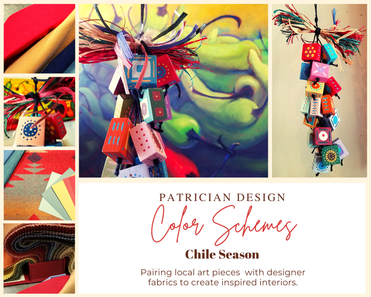
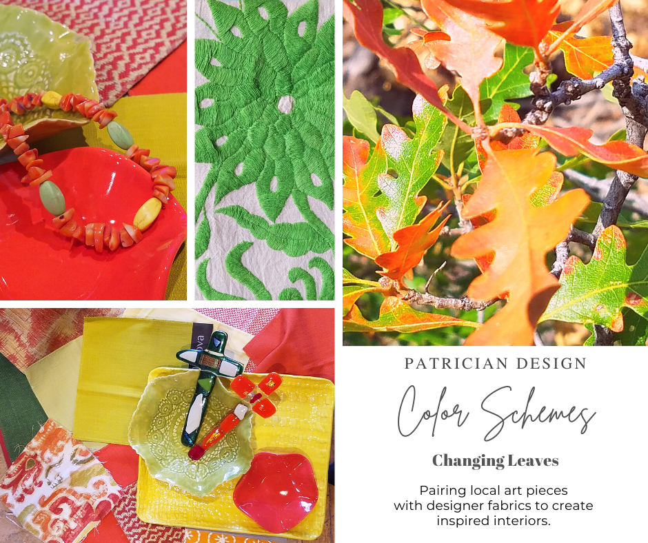
Several weeks ago, I launched a weekly post on our PATRICIAN DESIGN Facebook page called “Color Schemes.” The idea is to inspire design ideas by pairing artwork with designer fabrics. When planning an interior there is always a focal point complimented and surrounded by supporting elements. Whether a key painting will command the space or an expansive window with a view will direct the focus to a scene of outside colors and textures – that key element will greatly influence a successful interior color scheme.
Annette Donald creates colorful cubes in her creative take on our beloved chile ristras. A serrano chile oil painting, on canvas, by Federico Leon de la Vega is quite representational. Paired here with Romo and Ralph Lauren fabrics, Sherwin Williams paints…fresh and festive!
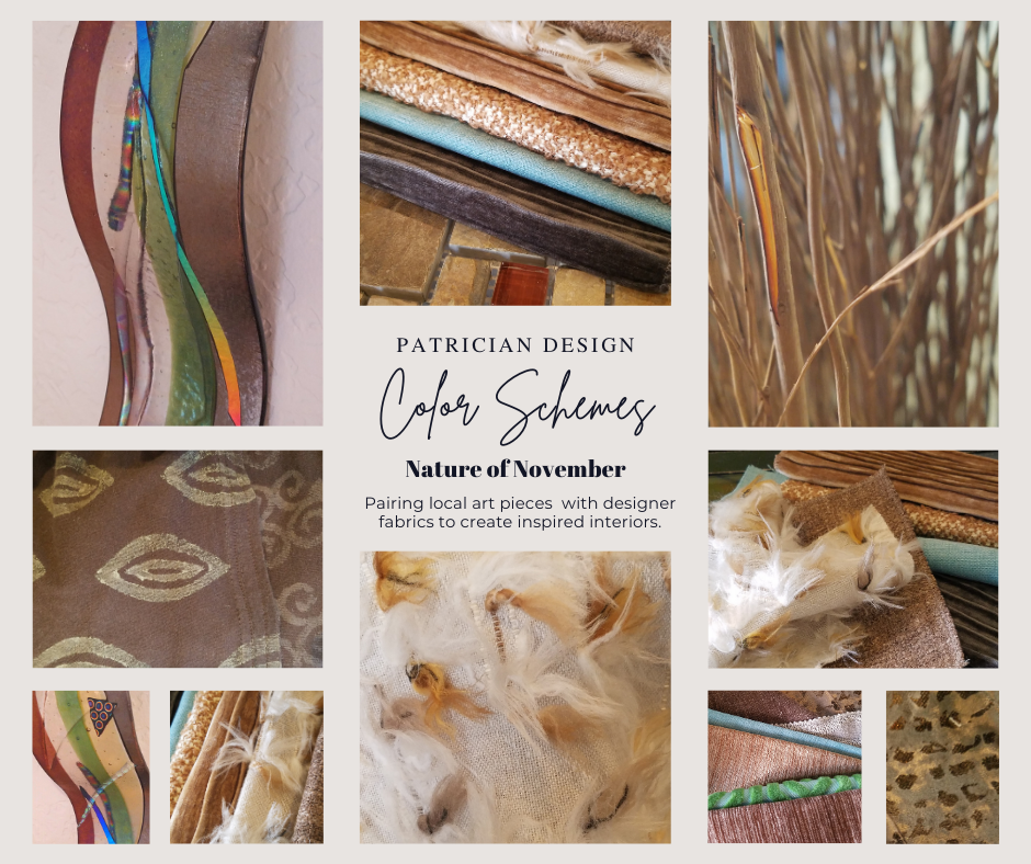
Here is the example of a November Scheme and you can scroll back each Monday for the past few months to enjoy a variety of the Color Schemes! https://www.facebook.com/PatricianDesignABQ/photos/a.243005986618/10157154423221619/
We embrace the The Nature of November with its unique colors and textures. As the air becomes chilly and the leaves fade…warm, soft colors bring us indoors. Featured here an elegant fused glass ribbon wall piece by Lisa Checnoff.
There are four primary considerations that I discuss with my clients when determining which colors to choose, emphasize, avoid, use as accents and where. To establish these selections, we evaluate personal preferences, contextual implications, seasonal influences and even trends.
PERSONAL: In planning an interior, I always want to know what colors make our clients happy, comfortable, stimulated, vexed or relaxed. These personal insights reveal important information for selecting types of materials too.
By examining what might be one’s favorite color, the discussion will navigate the distinctions, if any, regarding preferences for clothes versus interior furnishings. Interestingly, they are not always the same – although, by mere comfort and familiarity, they often are. Simply asking about a favorite color is not enough.
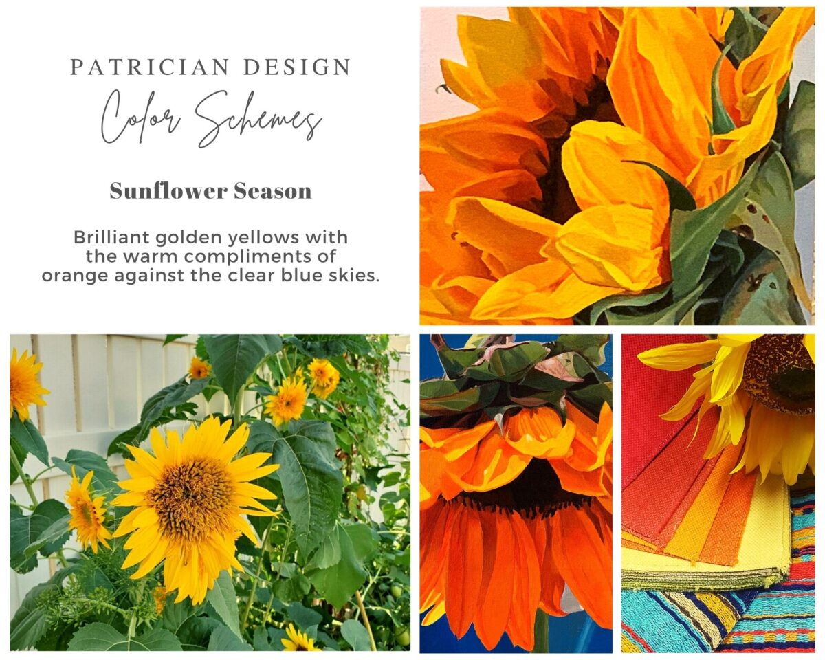
Brilliant golden yellows and blues – splash color! Featured here are fabulous photo-realistic acrylic paintings by Sheri Mays paired with amazing fabrics of the same exciting palette.
CONTEXT: The context of the interior might dictate or at least steer the direction of the design. The luxury of having multiple personal environments offers the opportunity to have different color pleasures exercised in different places. The ski condo might be woodsy and textural with browns, greys, stone and wood punctuated with a pop of color versus the seaside retreat with its crisp whites and cool blues and greens punctuated with pastels or bold contrasts. Therefore, the location of an interior might direct the desired color palette.
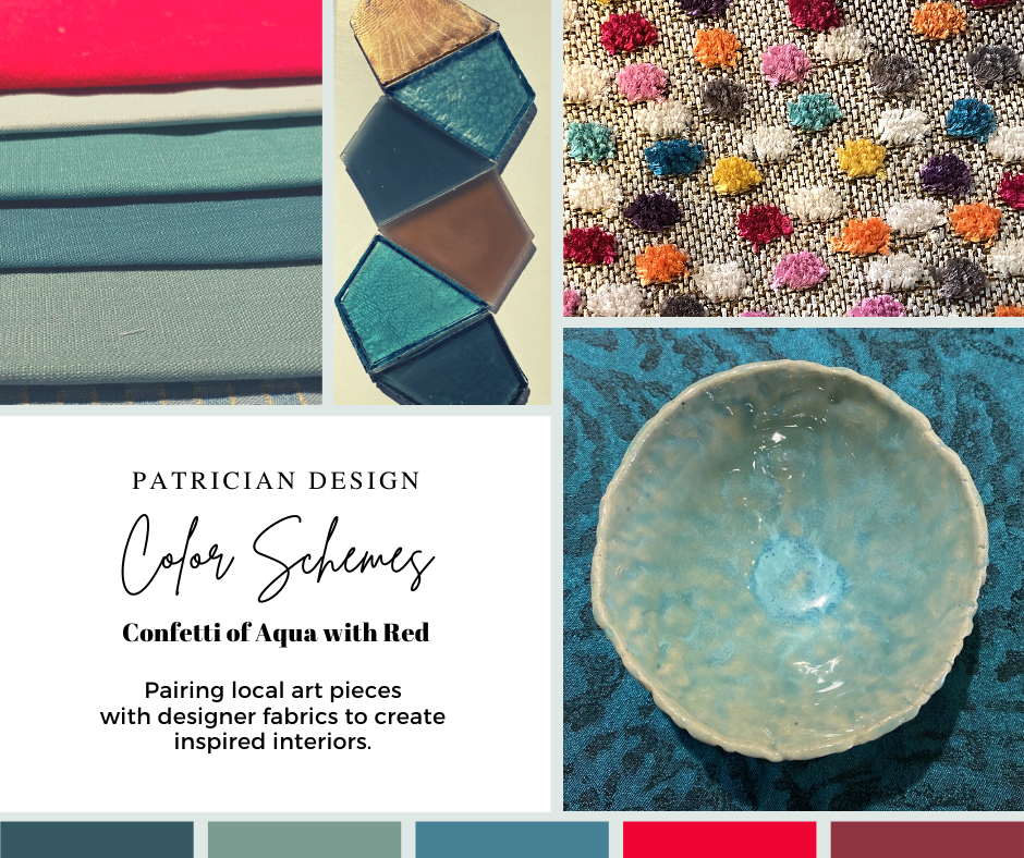
Inspired by this spa-aqua pottery bowl by Penny Roberts and the custom glass tile mosaic we recently combined to face a newly remodeled kitchen wall – the cool seaside/spa feel balanced with ambers and warm dots of color – pink, fuchsia, orange and golden yellow. Durable brushed cotton solids come in myriad colors and are perfect for pillows or upholstery.
SEASONAL: This one is tricky because it plays on the perceived climate outside – even if the interior is maintained at a constant temperature. It takes a concerted effort to plan a color scheme – including textures and finishes in anticipation of changing seasons and relative temperatures. I previously mentioned that a window with a view might be the focal point of a room…imagine the effect the changing seasons might have on the selection of interior colors and textures versus a consistent tropical scene, for example?
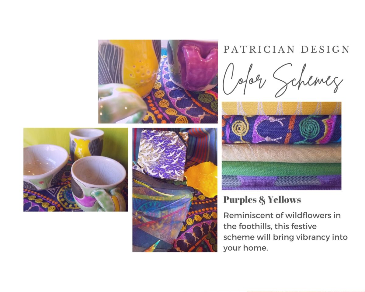
Perhaps you love purple – ever pair it with golden yellow? Here, functional, fantasy pottery designed and crafted with the most precise attention to detail by Jen DePaolo inspires our boldly brilliant scheme.
TRENDS: Inasmuch as I avoid being steered by trends, it is impossible and not advisable – in design – to avoid them. Clients are influenced by them and bring that would-be preference to the table. It is essential to continue to have “colors-of-the-year” and other market-driven colors change to stimulate the economy with buying and selling, replacement and updating. It’s our socio/economic norm. It also serves as an encouragement to re-fresh. But to limit that influence, in favor of long-term personal pleasures, is best. The pressure of this marketing color influence contributes to our being a disposable culture. Not time here for a lecture on such things – but rather to instill an appreciation for and confidence in personal selections an decisions – in this case, color.
Patinaed pearls and stunning glasswork by Margaret Hidalgo Vanderheyden inspire the soft, greyed lavenders and blues of this cool scheme.
An interesting and on-going test for evaluating a successful interior is when designing in one season – it has to work in all others. For example, when I meet with clients in the heat of July with lush foliage and color, warm temperatures and long days, that same interior has to succeed when it is frigid outside, barren, and with darker, shorter days. What might the challenges be in creating a successful scheme and what might be the solutions to make it work?
Having noted all of this and knowing the different reactions people have to color, isn’t it interesting when an interior is so successful that it appeals to many, if not the majority, of those who experience it? This is more applicable to commercial or public spaces – from doctors’ offices to hotels. However, the challenge and success is in knowing the many things to be considered and implementing a balance of them throughout all aspects of the interior.
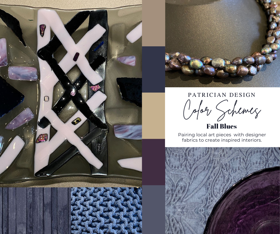
Anne Marie Werner-Smith’s brilliantly glazed pottery here with Margaret Hidalgo-Vanderheyden’s lovely fused glass crosses along with coral and dyed stone necklace and woven table runner from Chiapas reflect the changing colors of fall leaves…
Appreciating color is a gift to designers. It truly is an imperative to appreciate all colors and have the sensitivity to discern the nuances between various values and the effects of selections and combinations from the infinite choices.
I hope this has given you ideas and inspiration to move forward with YOUR color schemes! Sign-up for our weekly email of Color Schemes with classic blue and white and stunning neutral greys coming!! And follow the posts on Facebook every Monday.
Last August 11, 2019, I left you hanging with a radical bathroom remodel that was in the throws of being transformed. The title of the blog was Everyone Loves Before and Afters. https://patriciandesign.com/everyone-loves-before-and-afters/ Here today, I am excited to present the finished product and a little more to the story…
Everyone DOES Love “before and afters.” The original blog identifies the material process of the project, but as important as the material applications are the emotional aspects of design and precede the material selections.
The home is a bungalow style home from the 1950s. Charming architectural elements and traditional details set the stage, sensitivity, and the emotions behind any design decisions we were to consider. See the first phase of this home’s updating design in the primary living space at this link: https://patriciandesign.com/project/classic-blue-white/ The kitchen was also re-finished. Maintaining the same design layout and appliances, the new finishes resulted in a startling transformation. https://patriciandesign.com/project/kitchen-transformation/
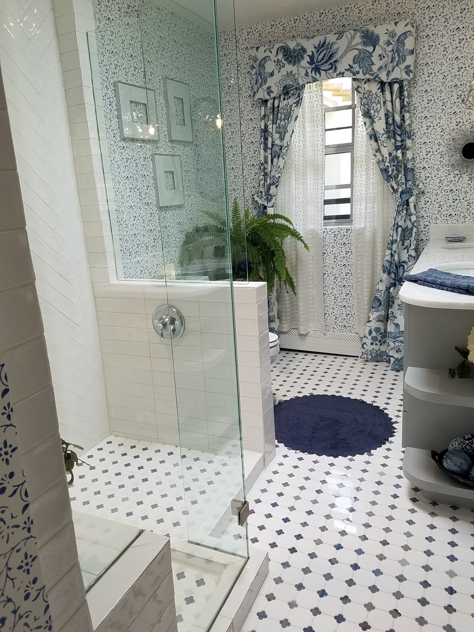
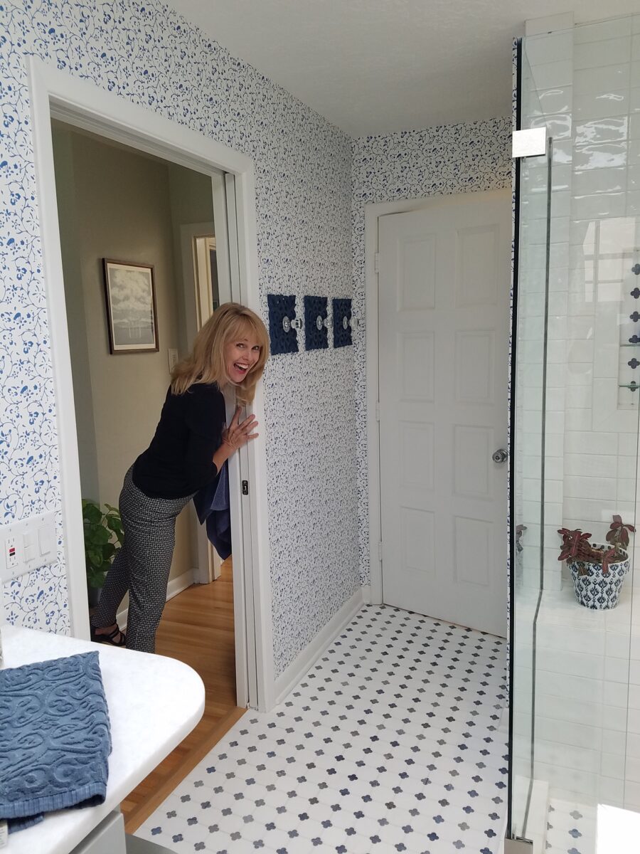
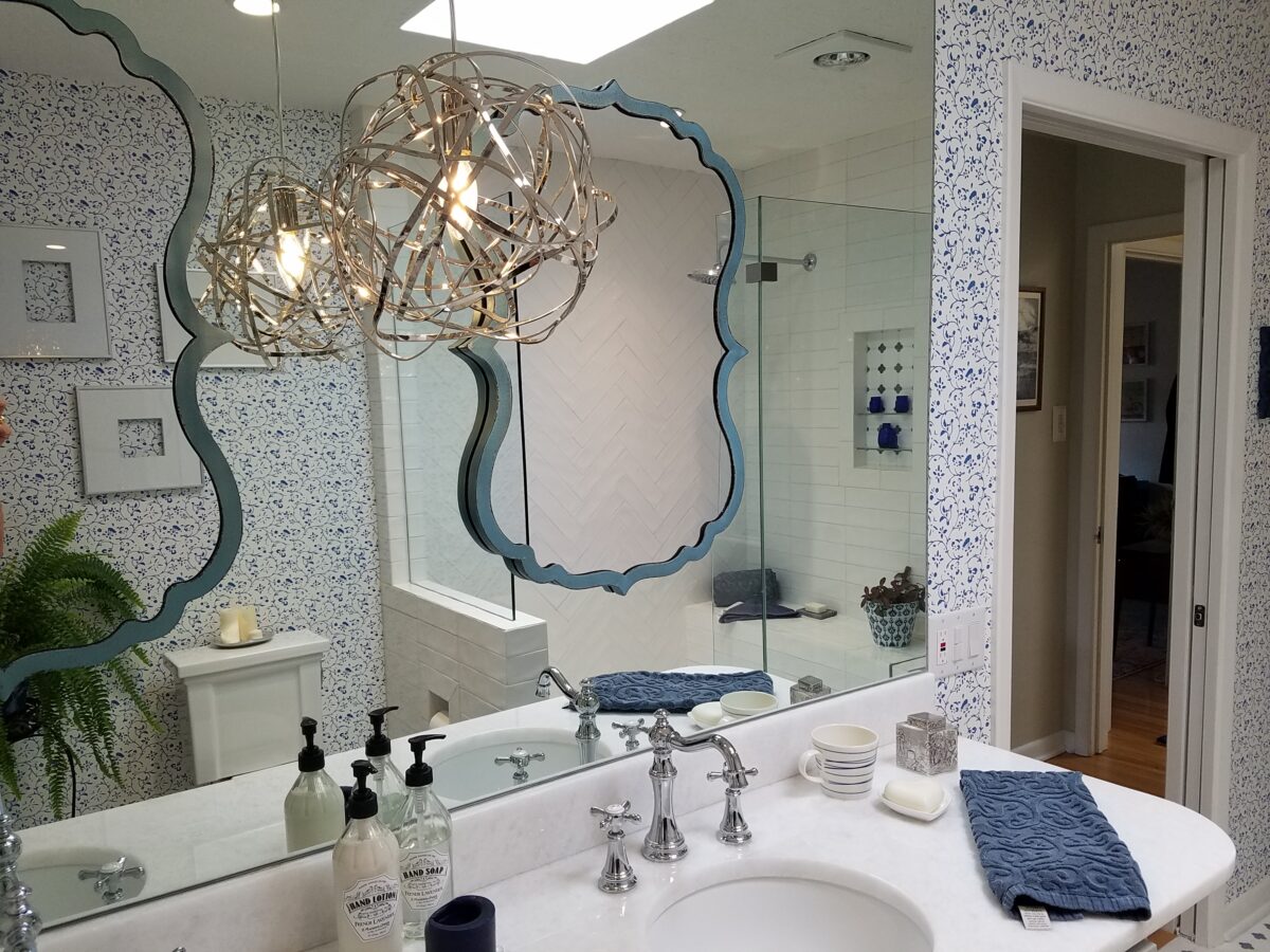
The challenge in this project was to retain the character and traditional charm that the couple so enjoyed about their home, while introducing new, modern design features and trends melding with traditional design elements. New custom cabinets for the vanity and linen storage/display unit along with the re-design of the shower – eliminating the tub and making a “doorless” access and a pocket door connecting to the adjacent guest room were the three key construction components.
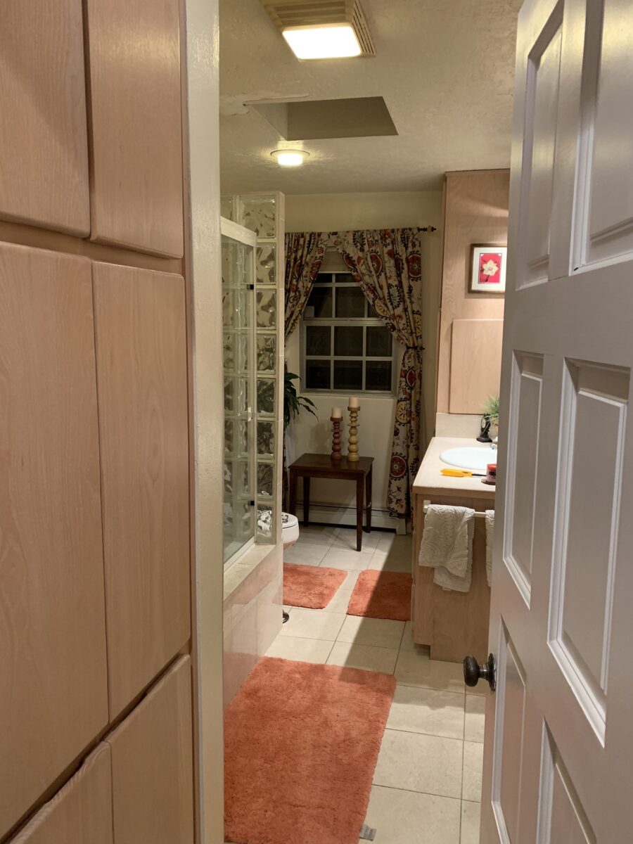
Dated finishes done in the 80s, by previous owners, were common and bland. The tub and shower were enclosed with by-passing glass doors in aluminum tracks and frames. This bathroom was the dated and fussy room that we presented last August. The tired and dull finishes needed replacing and refreshing. It was to be a complete make-over to compliment other recent improvements in the home.
Once the general concept for the remodel is determined, the “what if” stage begins. The stage where ideas are tossed about and decisions lead to other decisions. The options are massaged giving way to different combinations and considerations.
After all the options are discussed the plan is adopted – a combination of everyone’s input. Hopefully not design by committee, but in this case the couple, in whose house we were working, and the me, the designer. After the design is determined, the input of the general contractor and/or the sub-contractors can come into play. They are generally given the opportunity to evaluate existing conditions and voice opinions and procedures or details that their expertise can bring to the project. Everything is considered until a cohesive plan is developed.
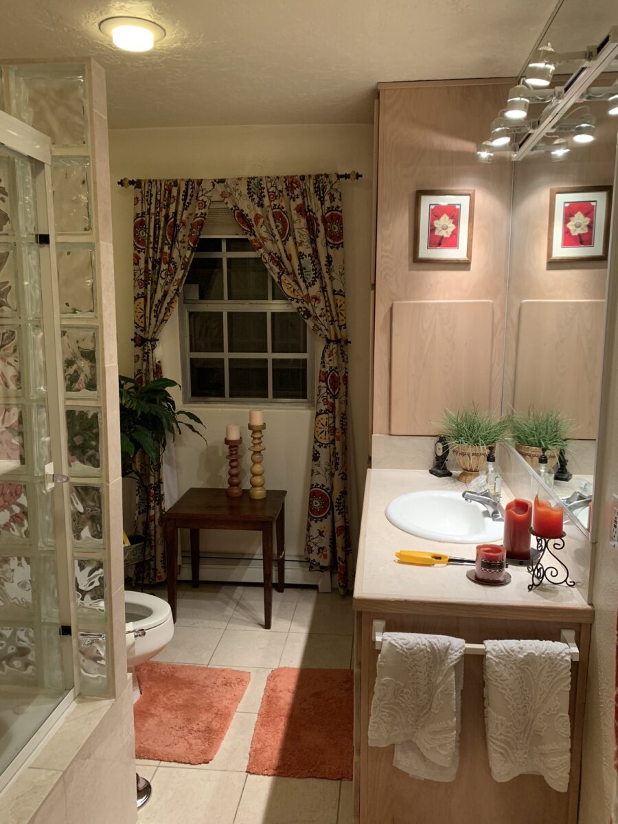
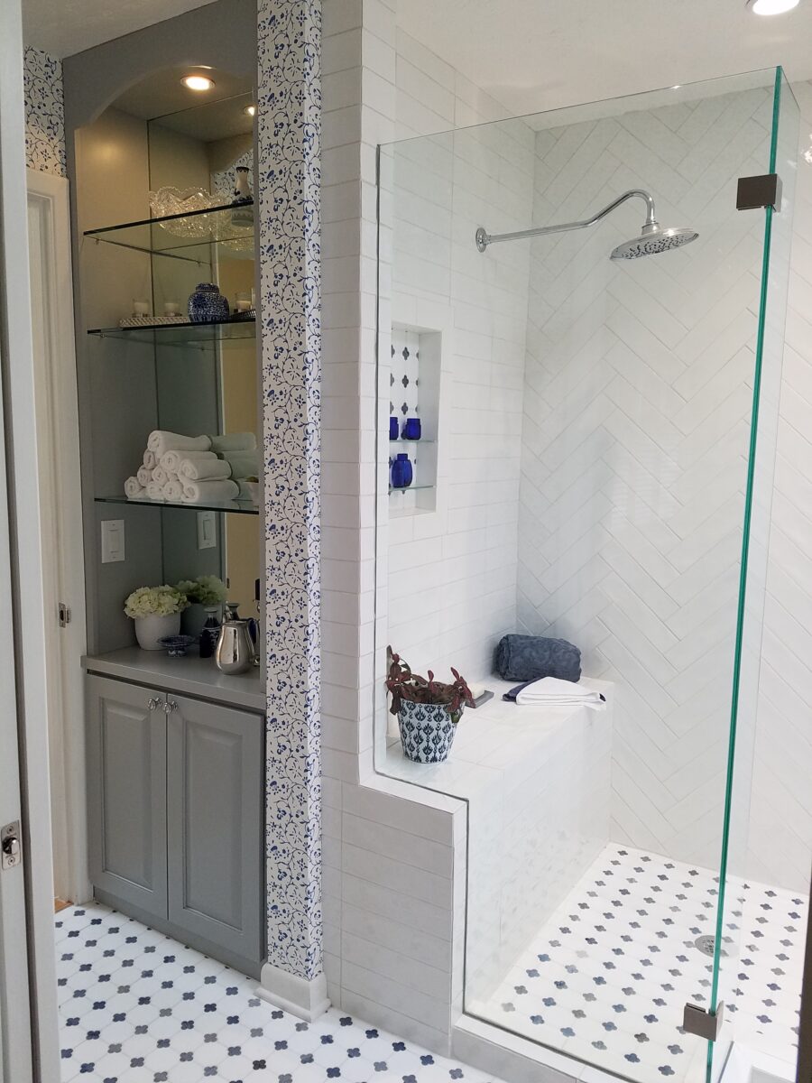
New cabinets were locally fabricated to not only insure excellent craftsmanship, but to customize the fit (left to right) and provide specific drawer configurations for the desired new height of the cabinets with an additional sink.The tub was removed, and the new shower enclosure was clear glass and given a wider footprint to allow for a jog which eliminated the need for a door. The shower valve was relocated from beneath the shower head to the opposite “pony” wall, making it easier to operate the temperature and flow without getting wet first!
Other than the shower reconfiguration, new cabinets, and pocket doorway into the guest room all else was superficial cosmetic design features. This is where the layers of embellishment come into play.
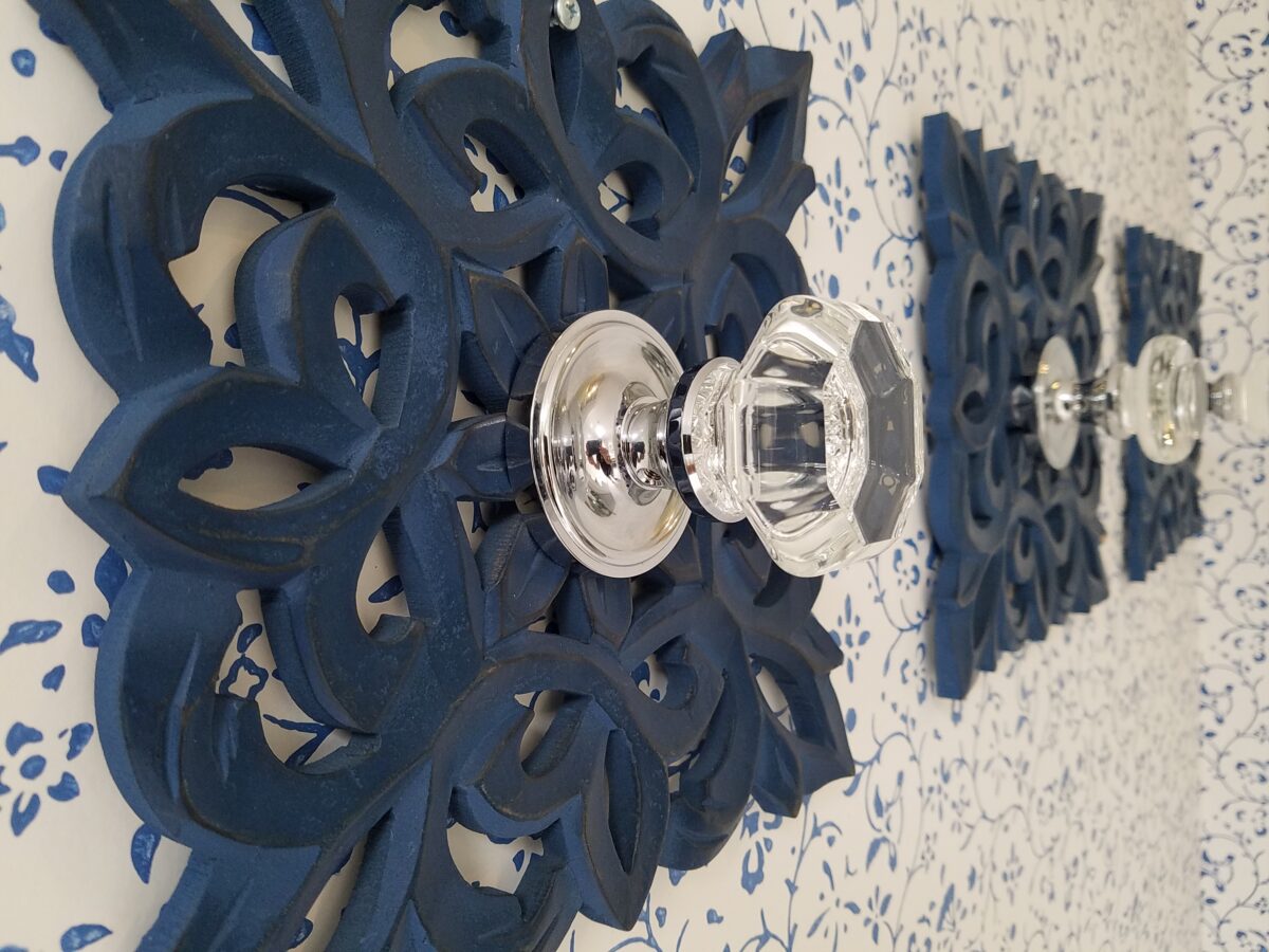
During the process, there were certainly hesitations about the combination of patterns and finishes being proposed…however, you know you’re on the right track when the happy homeowner has fun accessorizing and creates the perfect towel/robe hooks! DIY – finding these blue, wooden, open-work plaques, our creative homeowner bought polished chrome and glass doorknobs and attached them securely to the plaques – Voila!
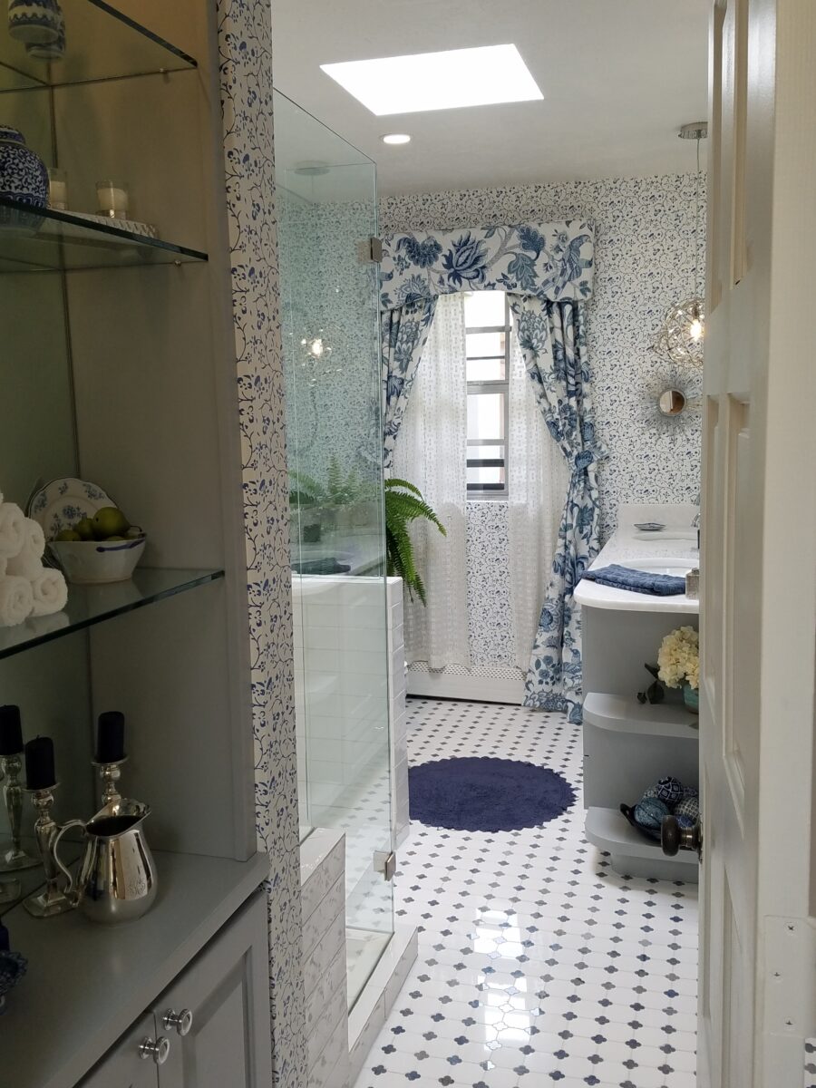
In keeping with the traditional design direction previously adopted in updating the interior, the flooring was selected for its natural stone mosaic authenticity. With a warm grey selected for the custom cabinets and white herringbone patterned subway tile on the rear wall of the shower enclosure made for a fresh modern look.
A mix of patterns – a balancing act – the art of design. Do not be afraid.
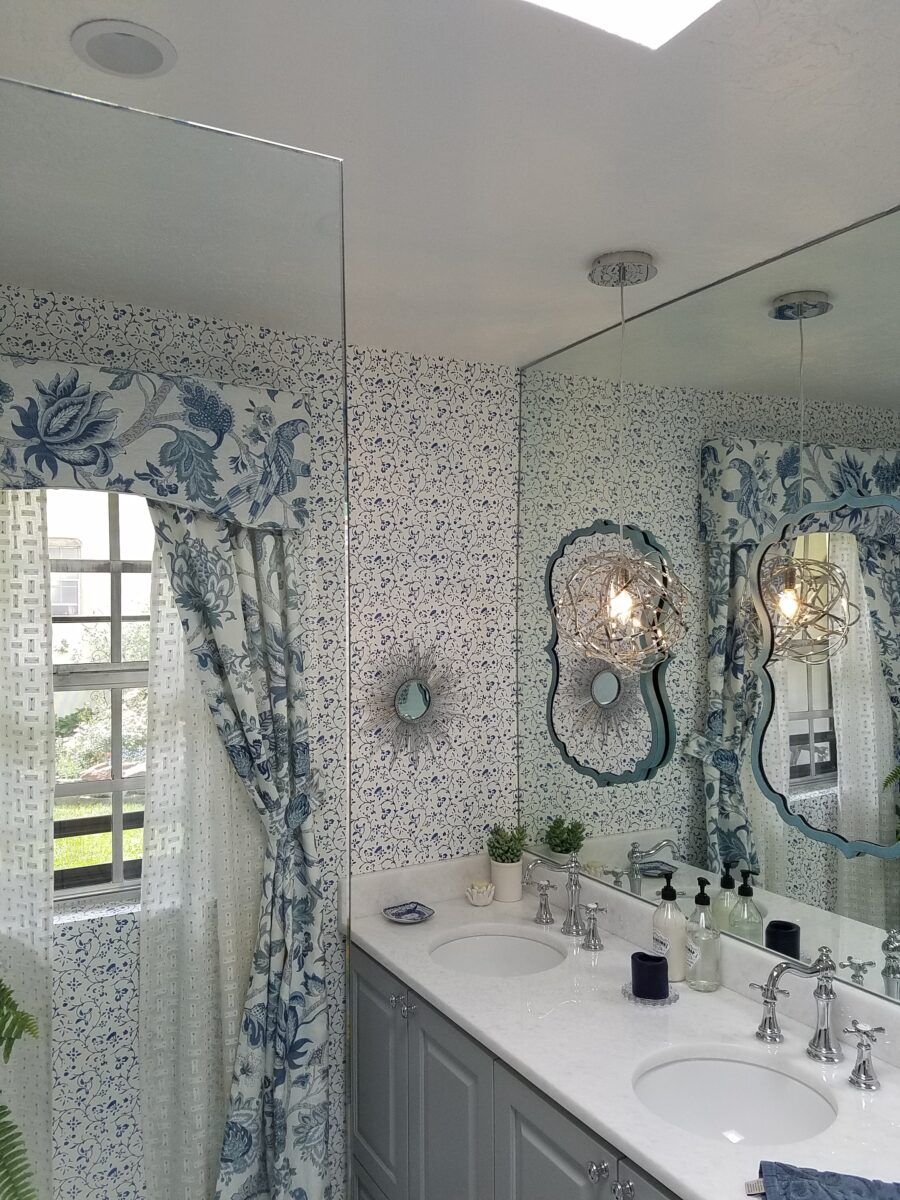
But wait! These traditional elements and modern trends were further embellished with a second layer of curvy turquoise mirrors installed over the full-wall mirror – suspended between is a polished chrome sphere of open bands providing ambient light and additional task light for the vanity area.
Layer upon layer until the composition is complete!
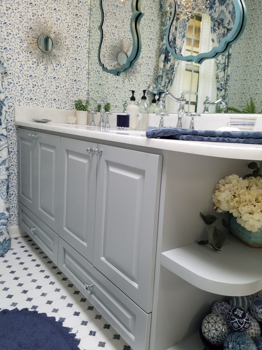
Classic blue and white screen-print on paper with an overall pattern of vines and leaves fills in the voids creating a not-too-busy backdrop – adding further dimensions to the design.
Natural stone slab of a white crystal-like granite – looks like a stone quartz crystal.
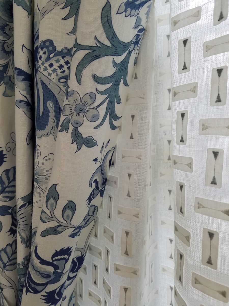
Drapery fabric in a traditional floral on linen with whimsical, modern “martini glass” sheers soften the window and diffuse the incoming light.
The resulting completed interior is a radical transformation from the dull beige and peach of the previous scheme. Fresh and crisp – with just enough busy to be playful – the new owners claim that they smile every time they enter or even walk by.
Remember the first photo? The BEFORE & AFTER transformation is extraordinary.
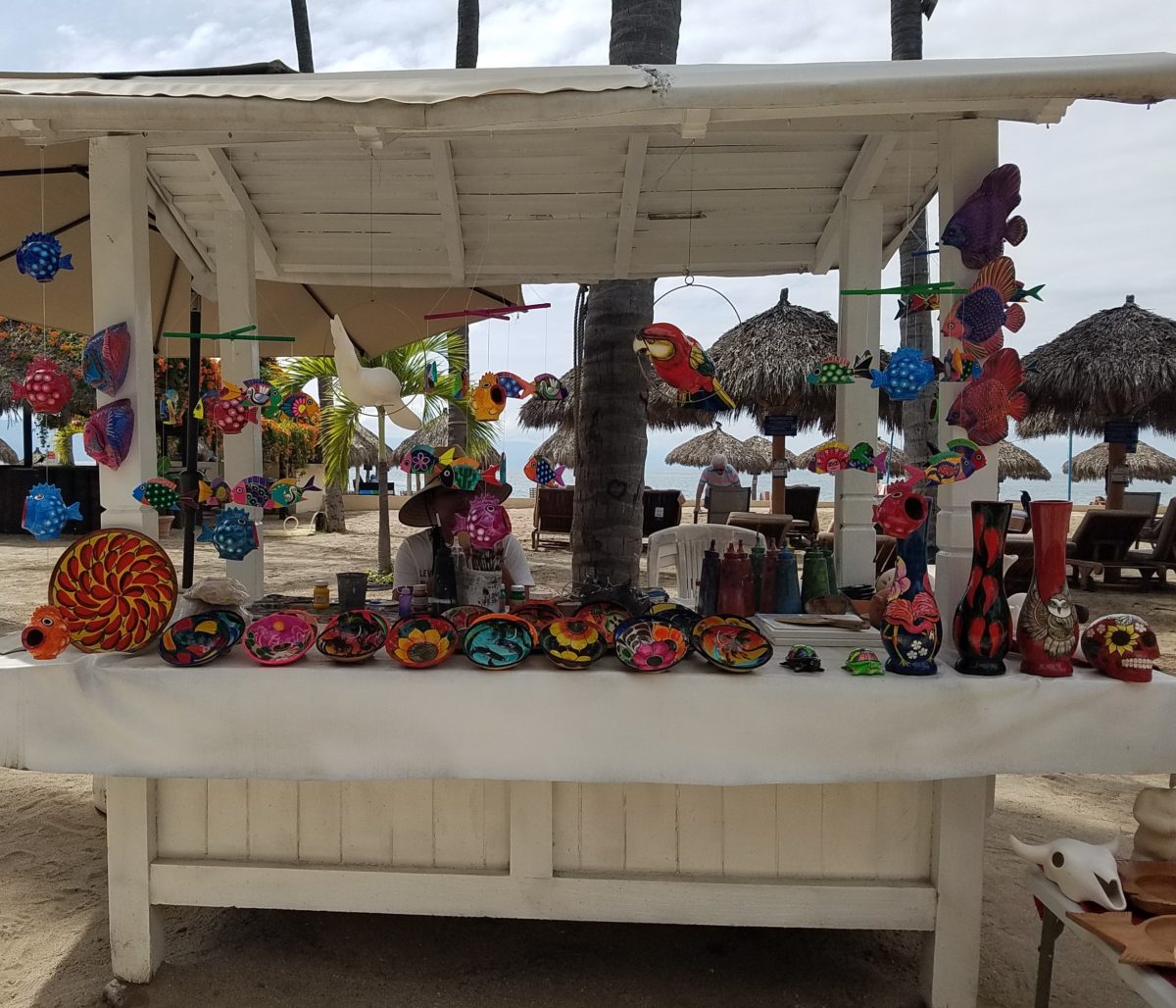
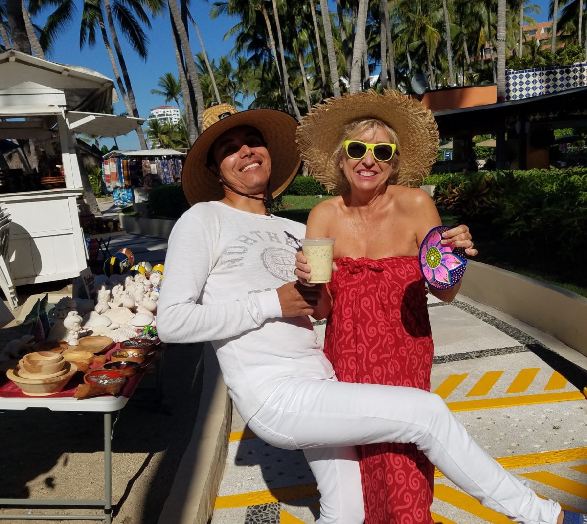
Hidden genius can be found amidst seemingly redundant arts and crafts. Walking by you might not notice. Passing by many beach stands, they begin to look alike – very repetitive. The colorful wares and handcraft are striking and eye-catching and full of fiesta, yet if you pay attention you will notice the nuances. Discovering the true designer/artist.
An escape to the tropics and especially to another country offer a reprieve from the cold and add an exotic element to getting out-of-town. Discovering the many indigenous art forms that come from all over Mexico is fun and exciting. Getting to know the makers and the distinctions in their work is another exciting level of appreciation.
As is true with so many things, detail and design matter. I buy a smattering of things for my gallery/gift boutique. I like to support the local vendors and makers that produce these fantasy-filled folk-art pieces. From fabrics to stuffed animals, painted pottery to murals and mosaics, the art is abundant and deserves to be examined.
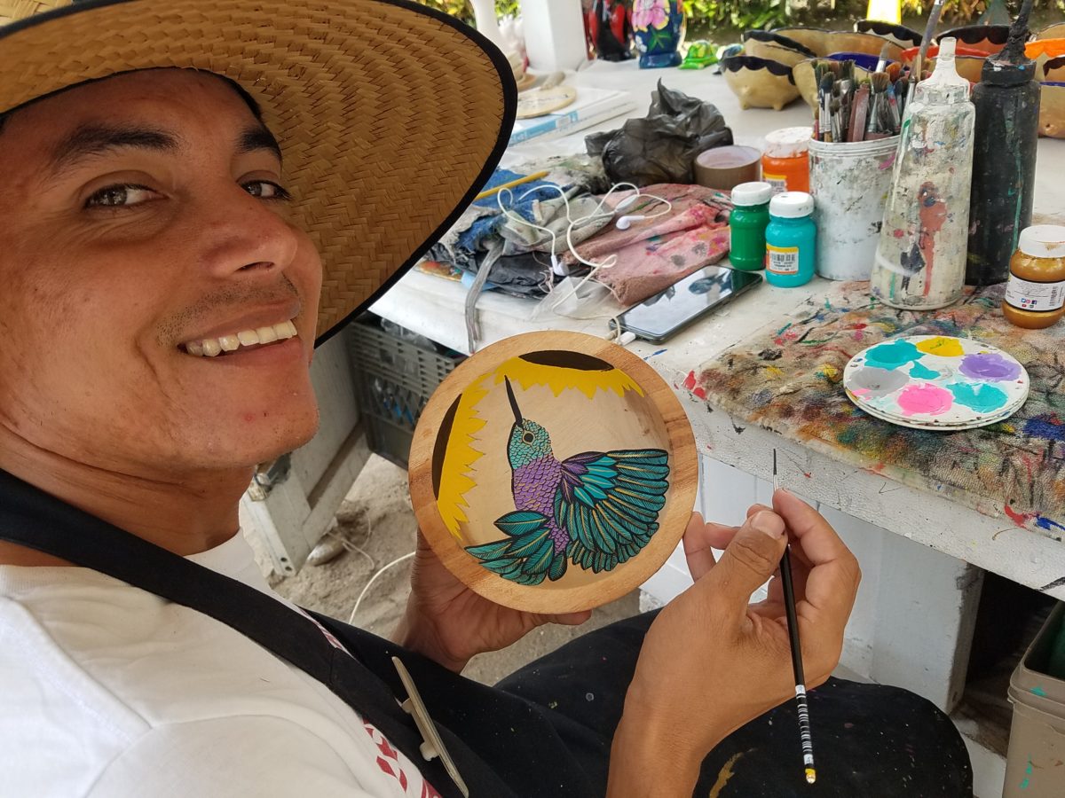
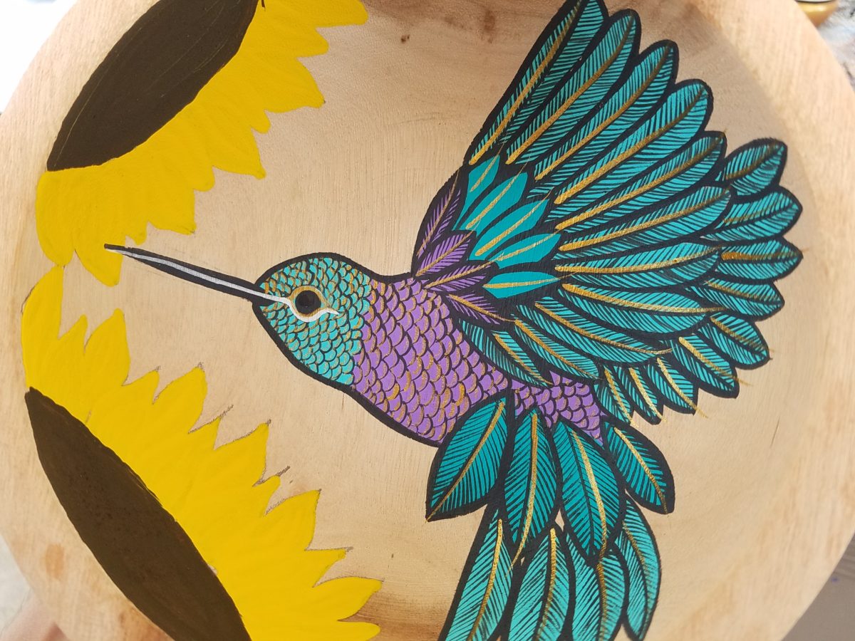
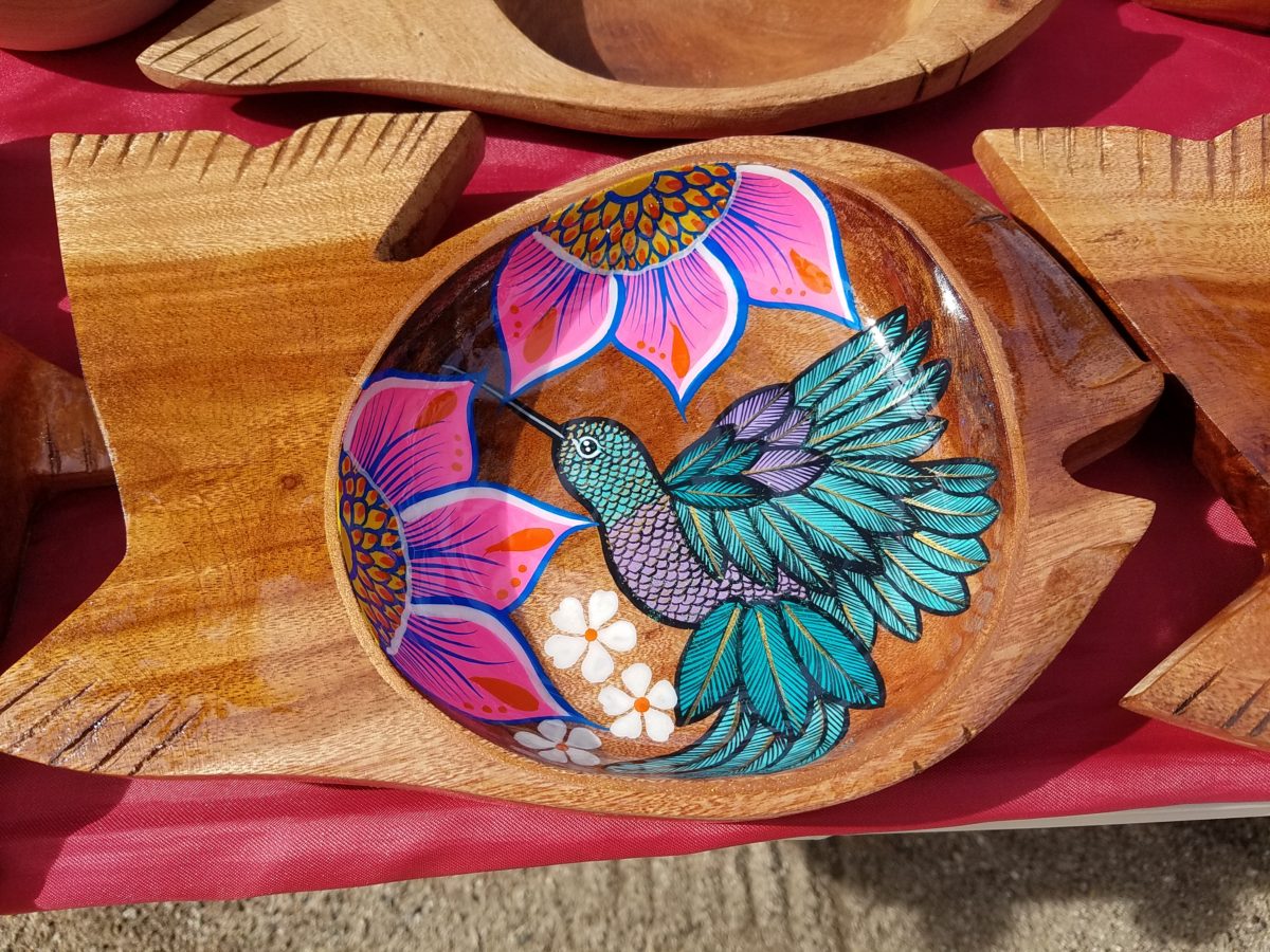
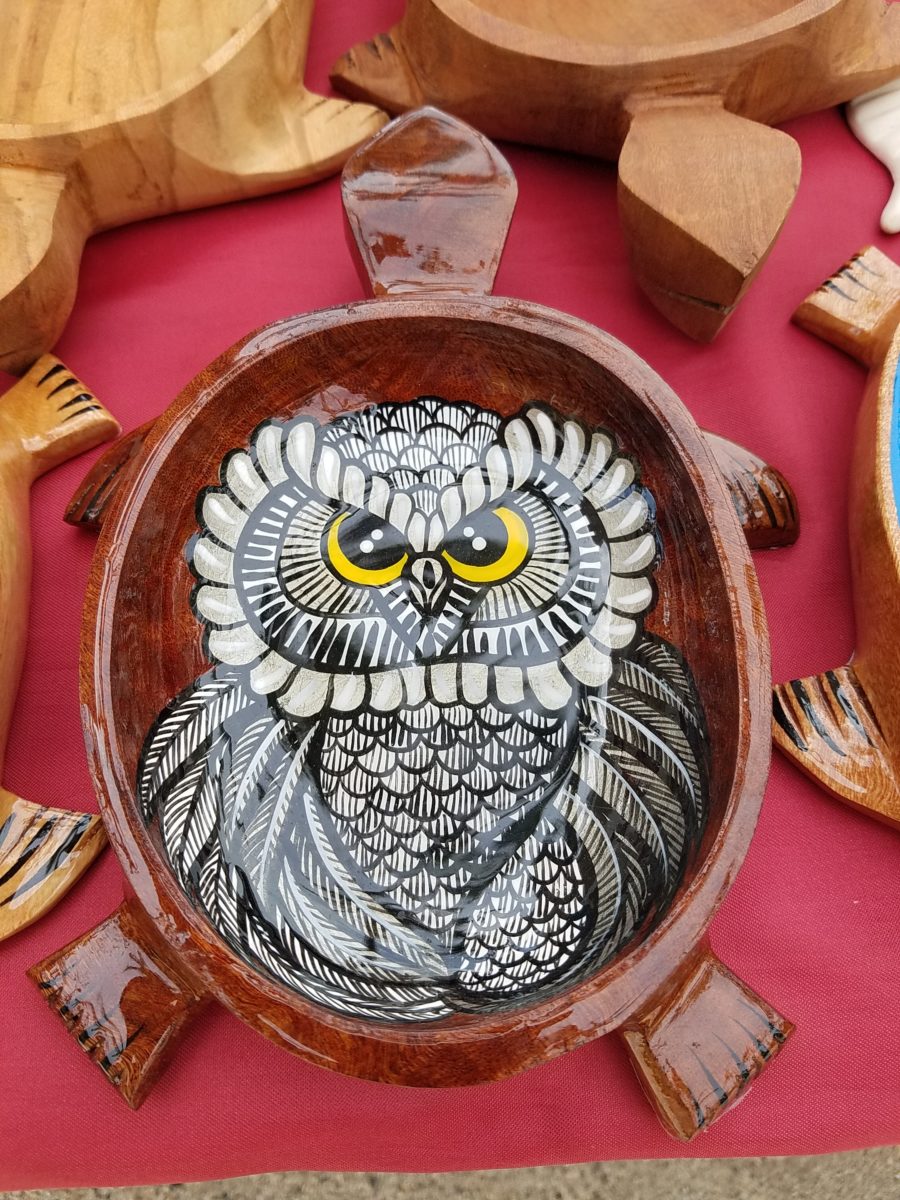
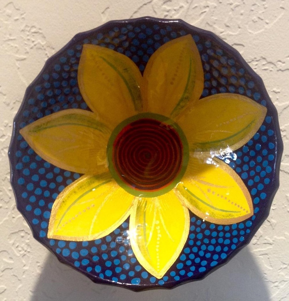
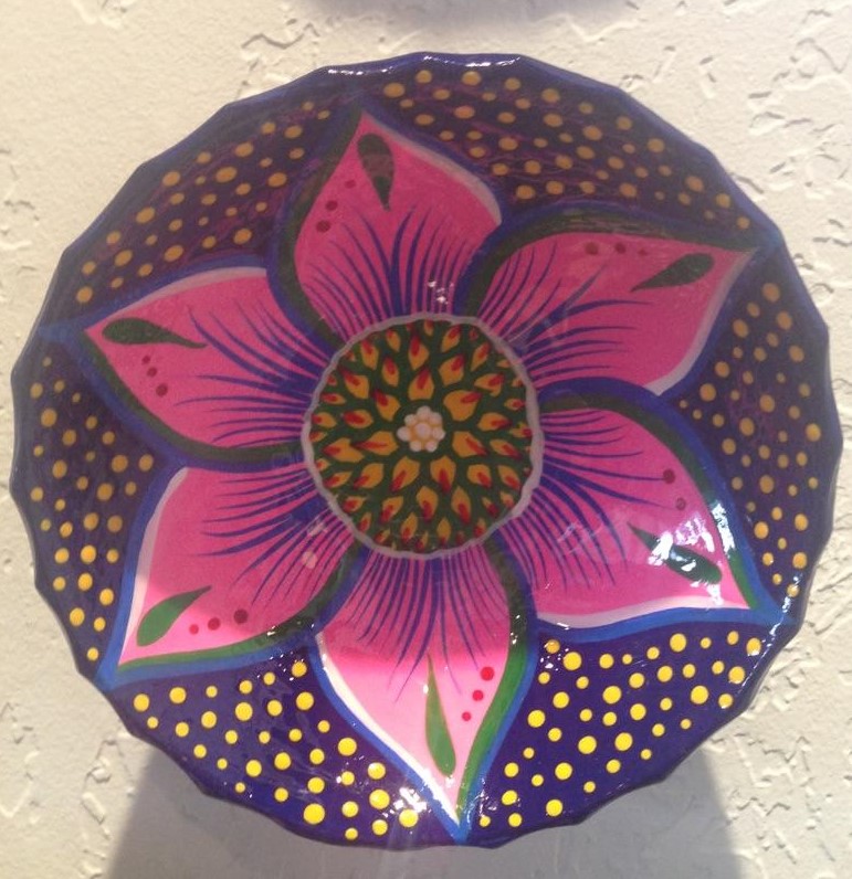
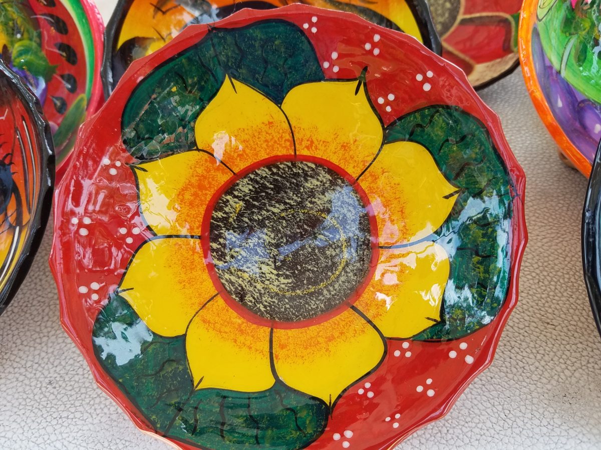
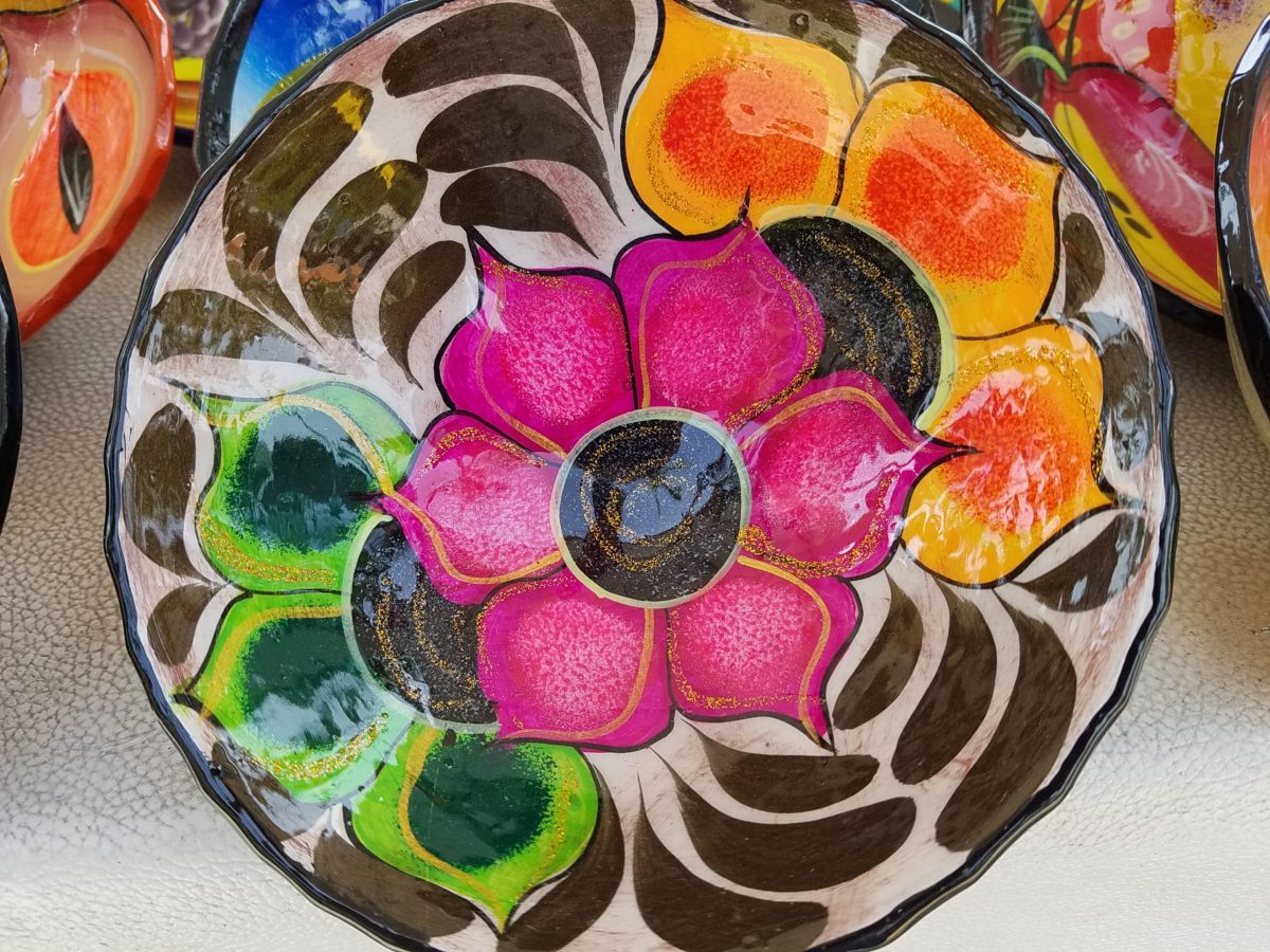
As an example, I am focusing on Victor Rivera. Victor is an artist and more so, an incredibly gifted designer. His sense of pattern and imagery is exquisite. It reminds me of my mother’s love of Marimekko and Lily Pulitzer in the 60s and 70s. Her appreciation was a tremendous influence on me. The joy of color and pattern was a exhilarating celebration to wear and accessorize your home. Victor seems to possess a like-kind of innate sensibility and talent for devising and executing sensational color, pattern, motif and resulting design. He is currently creating, from a modest beach stand, what I believe is clearly different from others doing what might be thought to be similar work.
Like Maija Isola – a peer of my mother’s, having been born in the 20s her designs transcend the many decades in which she influenced color, pattern and bold imagery. Her work continues to live and influence the evolution of Scandinavian artistic direction and its impact on the world of design. https://www.marimekko.com/com_en/world-of marimekko/design/designers/maija-isola
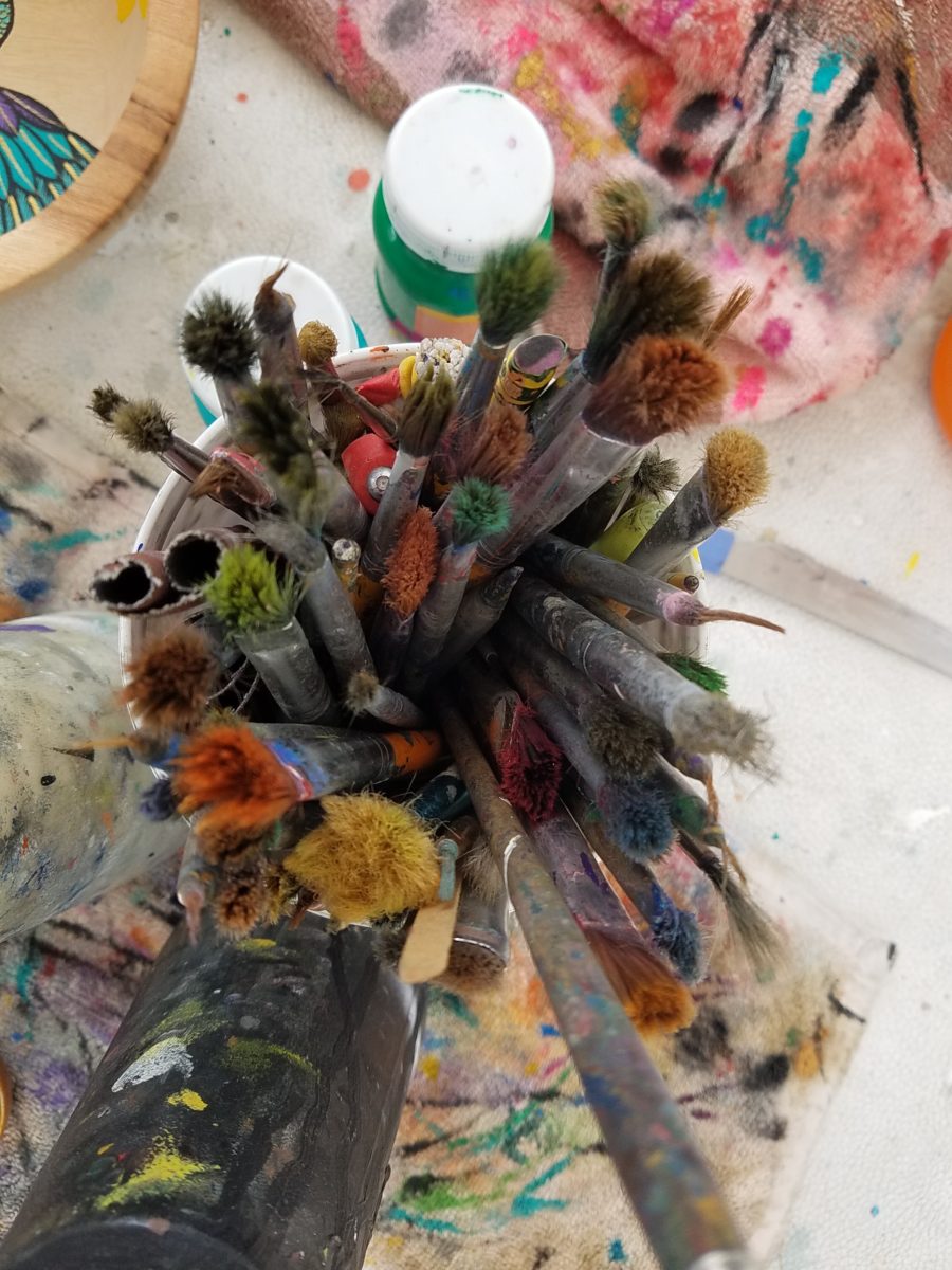
Watching Victor select his brushes, for the various applications and control on his designs, is fascinating and amazing.
The sense of pattern and design is a different category of artistic talent, in my observation and estimation. A master, of pattern, form, design detail and art, is an artist. However, the focus on the repetition and integral connection of patterns – for this purpose in a one-dimensional application – is an intensely different pocket of an artistic brain.
And this brings me back to Victor. I want someone in a position to embrace and promote him, in the world of fabric design and influence, to catapult him to the level to which he can and should aspire. Shout-out to Alegreea and the fabulous designers at Pineda Colavin!!!!!!!
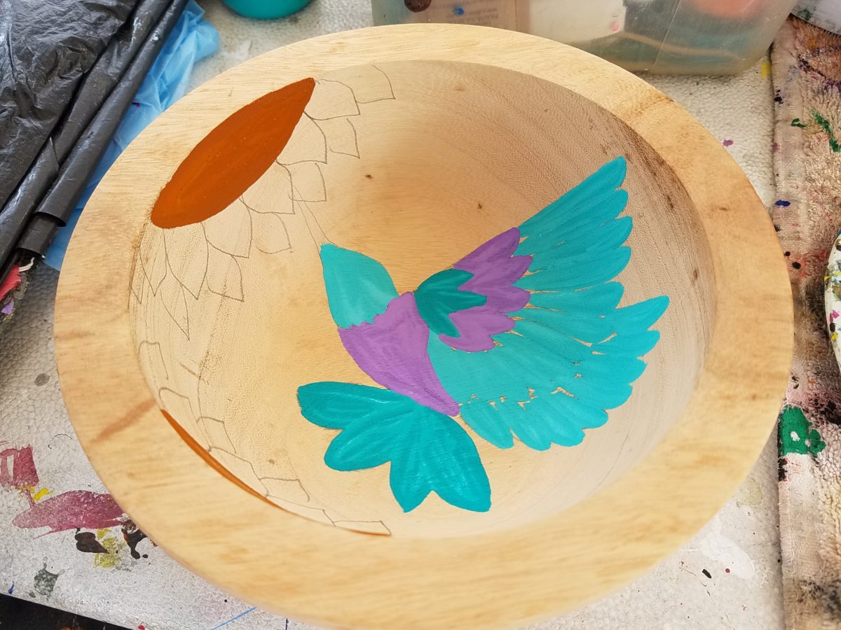
His hummingbirds begin with a pencil drawing and basic “fill” colors at the start. Working on both clay and wood prefabricated bowls by other artisans, his many layers of colors and details take shape.
With myriad, mostly monotonous, Mexican street/beach artists, Victor is a beacon of light that stands out among the throngs. Once you stop to notice – the work he is creating is astonishingly unique and beautiful. His designs are laced with meticulous detail, outstanding color combinations captivating and beautiful.
He will paint expeditiously simple works to satisfy the tourists and keep an inventory at the ready for spontaneous purchase – but when he has quiet time and is caught-up on his table of offerings, he creates amazing pieces that are truly remarkable. It is important to note though, that his more expeditious pieces still have a color combination with strokes of accents that still are above and well beyond the common.
He will paint commissions all day long – but left to his own devices, his creativity is boundless. And, referencing back to the Scandinavian designers, his floral designs are outstanding!
Taking time to examine the world around you and the beauty of detail that awaits, is a joyful experience of great discovery and satisfaction! Not to mention great fun!!!