Whether a minimalist or an eclectic collector/gatherer, one’s details of home are important and personal. Like personality types, what is important to one person is not so much for another. However, it tells a story. The details of a home make it just that. Home.
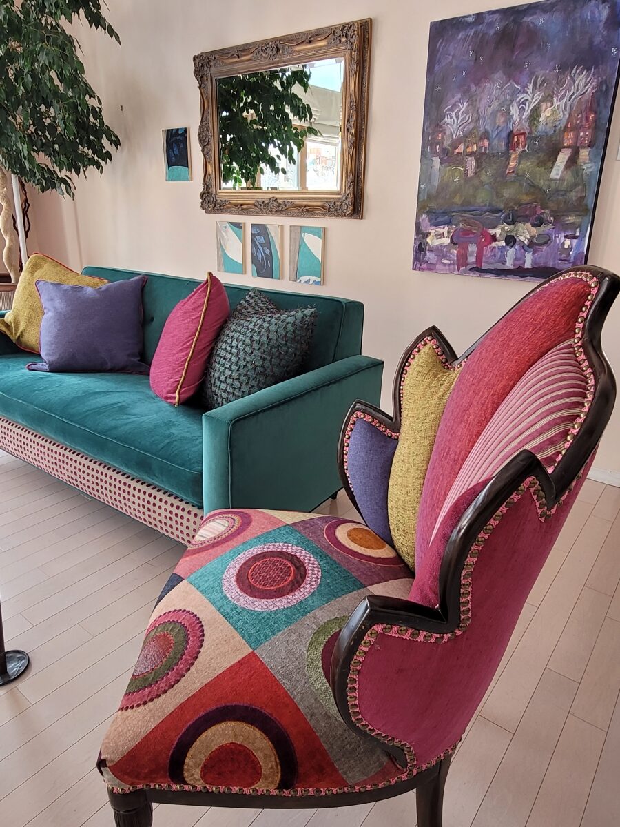
This interior has a lot of personality and very much reflects the artist who lives here. Antique family side chairs take a near full century leap with this new, colorfully eclectic upholstery.
Residences, the dwellings in which we live, can take many forms – from short-term to decades of ensconced living. To “reside” regardless of the length of time – suggests a certain level of comfort to include some detail(s) to make it “home.”
Each home is an individually personal space filled with details that make it so.
What might YOU consider imperative elements of what you call “home?” Consider comfort, color, ambiance, familiarity, convenience, nostalgia and perhaps just pure joy.
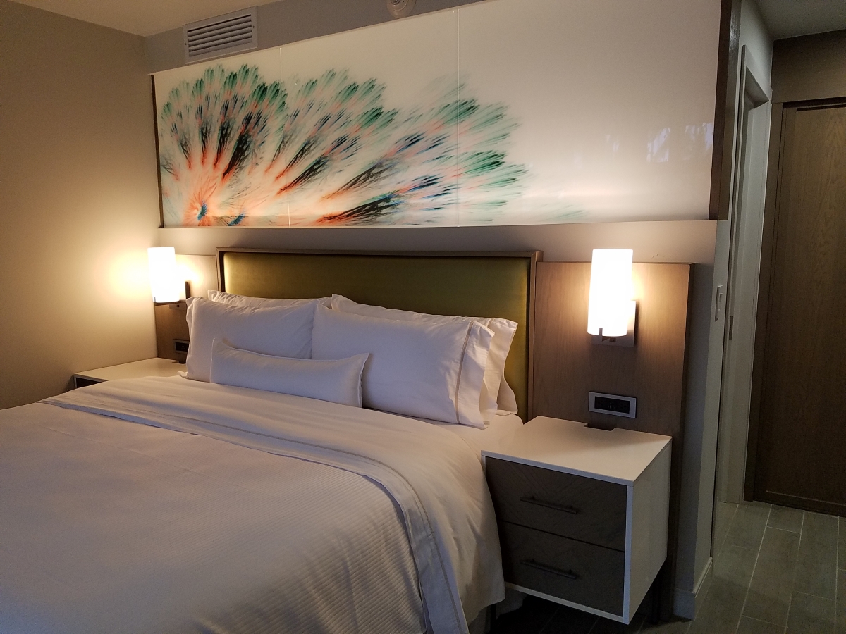
A hotel room for the busy “road warrior” traveling for business, might reveal a photo of a loved one placed thoughtfully on the nightstand. Something as simple as this can make a temporary residence feel more like “home.”
Upon plopping the overnight bag on the hotel bed, one of the first things to unpack might be the framed photo of a loved one to place on the nightstand.
Dorm rooms will reflect personalities, pleasures, interests, colors and imagery for young people leaving home for the first time. They create their own sense of place and “home” while embarking on their new chapters of life.
While looking around your place of residence – this place you call “home,” consider what is important to you. It might be the actual architecture, quality of natural light, a collection, a piece of art, furniture, photographs, decorative accessories…
A little over a year ago during the throws of our introspective isolation, my cousin, a thoughtful artist of photography, commented from Connecticut about The Essence of Home. In it she shares intimate observations and encourages personal study of your significant space – memory or current abode. She also suggests an interesting little project in which she invites us to “take half an hour and create a photo essay of a place that has significance” to us. “Challenge yourself to capture a feeling. Wait for the right time of day and seek out the mystery of the place. (This is a great activity for kids, too. You’ll be amazed by what they choose to photograph – what “home” means to them.) See what thing you’re drawn to capturing; become aware of the everyday beauty in the space around you.” https://www.catebarryphotography.com/
As an interior designer, I am engaged in creating and illuminating details that are meaningful. Whether a view or an object, color or finish, access or privacy – inside or out of the interior these elements collectively contribute to create the overall design. I encourage my clients to identify things they do and things they own – things they have gathered and how they live. What of them is of greater importance and why. This process begins a dialog of preference, value, and interests. Establishing priorities to springboard a project is key to a firm platform for the design.
You know the old question…If your house were on fire, what would you want to get out? It might be a person or a pet certainly – but if it were a material possession(s), it is a question worth pondering. The same is true if you moved or remodeled, what elements would you want to retain or replicate and what would you eliminate or change?
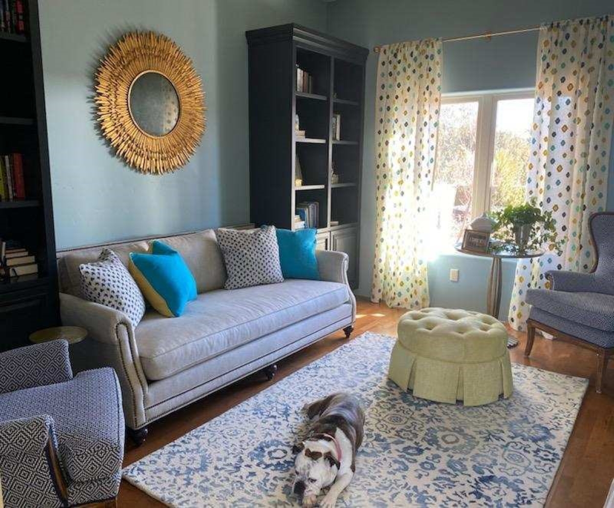
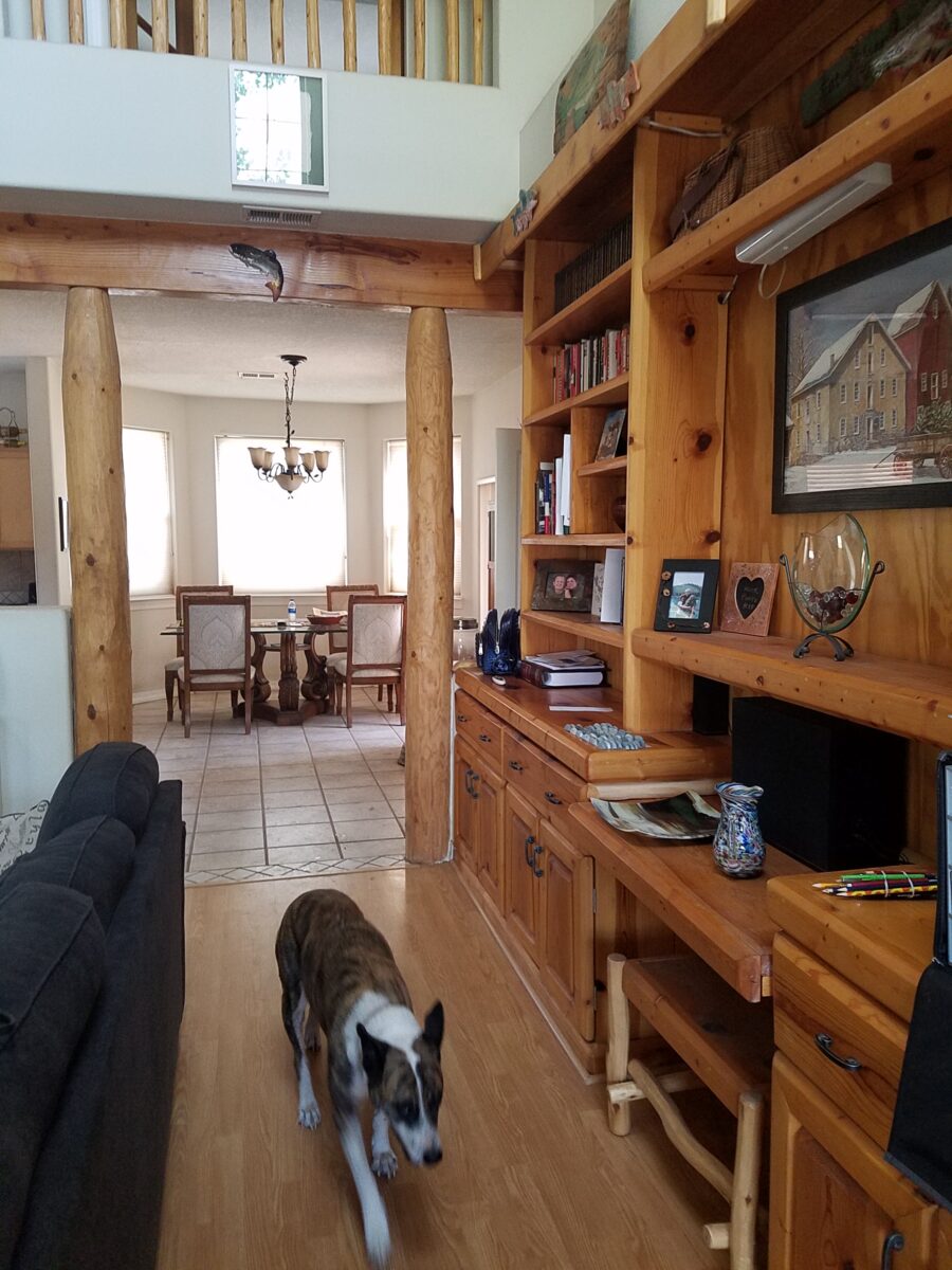
Vintage family pieces reupholstered, new pieces repurposed, bookcases filled with personal treasures, and the precious pet in the center of the action. Home.
The details of your home are personal, identifying, comforting aspects of your interior design. Discovering these important details is significant in effectively planning your interiors.
Once upon a time there was a quiet little house in the woods. Nestled among the juniper and pinons of the rolling hills of Estancia, the little house lacked design details to make it feel a part of its surroundings. The owners and their dogs had lived there for a decade and realized that a move was not pending and therefore it was time to bring the house into its own.
The neighbors…
Color was the primary element that they wanted to introduce – that along with a look better suited to the organic, woodsy setting and updates for fixtures and finishes. So, this plain, dated house in the woods began a magical transformation. Not wanting to embrace the sleek white and grey trends of the day, they expressly requested warmth and color.
The interior was plain vanilla with warm honey-colored wood accents.
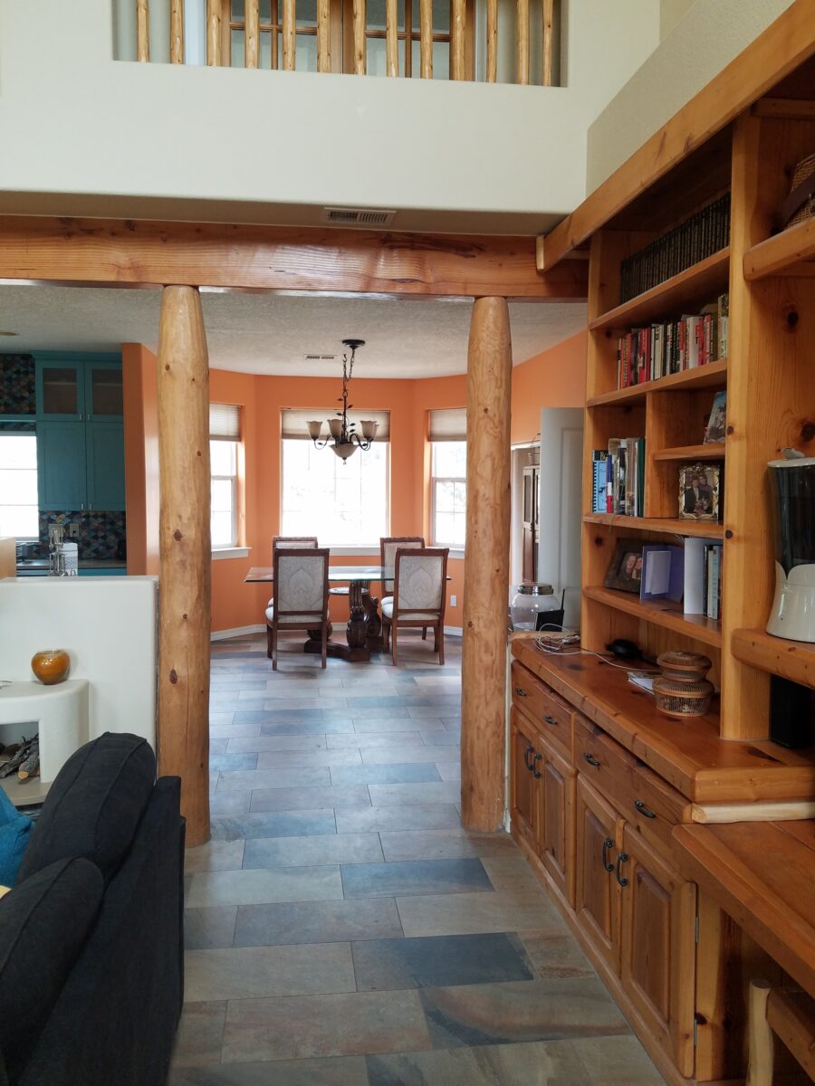
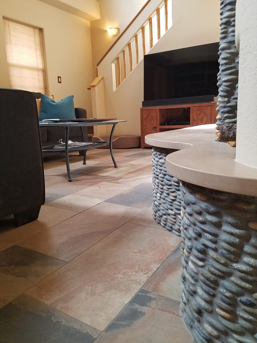
Beginning with the floor, we selected a porcelain tile that had a finish simulating a mottled slate. The outstandingly durable, slip-resistant material had earthen color variegations in the various pieces which were highly effective at concealing dusty dirt and debris from the out-of-doors and camouflaging the anticipated dog hair that was shed about. The resemblance of the tile to cut stone was remarkable. Due to its multi-color rendition of ochre, rust, charcoal, black and sand offered many tones from which to grow the design’s palette.
The flooring was a bland combination of slippery wood laminate and 12″ ceramic tiles.The new porcelain slate floor tile is multi-toned and rich with warmth. New wall colors and cabinets are peeking from behind…
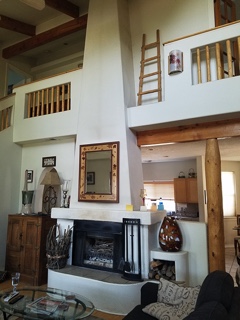
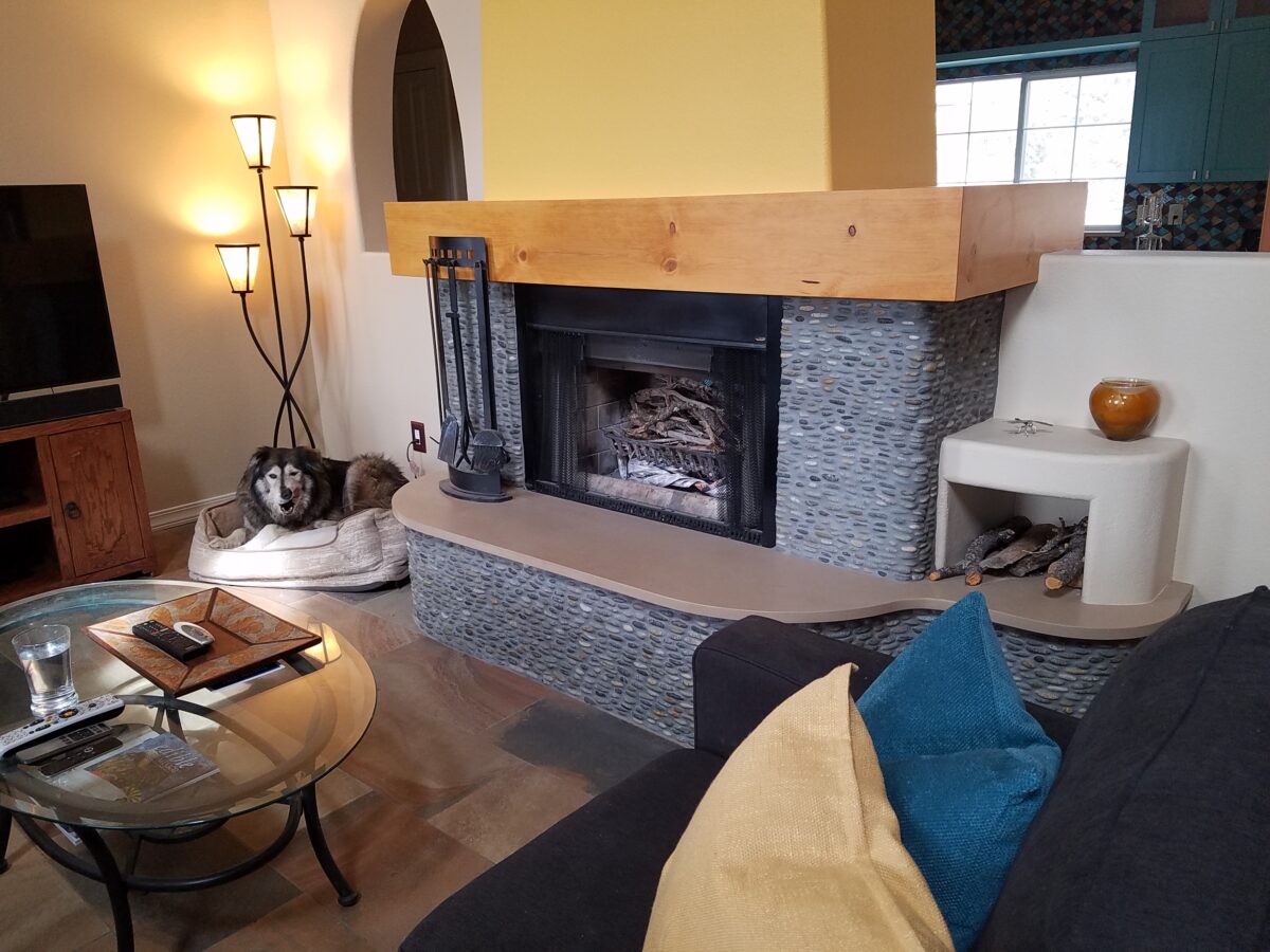
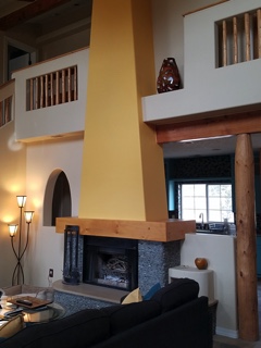
Rising from this new base for the interior scheme, we selected a dark, black/charcoal stacked stone. The smooth ovoid shapes added further organic texture with a subtle woven appearance to the surface of the fireplace.
Texture, color, form…the design is transformed…
The mantle and hearth were both the plain vanilla white of the walls and despite the fact that white can be crisp, clean and fresh – the owners were eager for bold commitment to color. In keeping with the pine columns and other cabinets and architectural detailing, we wrapped the existing form of the mantle in knotty pine finished with a honey stain to coordinate with the existing wood accents. The hearth became an undulating slab of Cambria quartz material in a craft-paper bag/sand color also derived from the swirling “slate” floor.
The graceful shape of the hearth was enhanced with the addition of the stacked stone and new slab surface.
Towering from the now strengthened façade of the fireplace, the tapered form of the chimney was begging for the color-pop that the owner’s desired. The honey color of the pine along with the warm tones in the flooring invited a golden ochre paint to command the space.
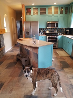
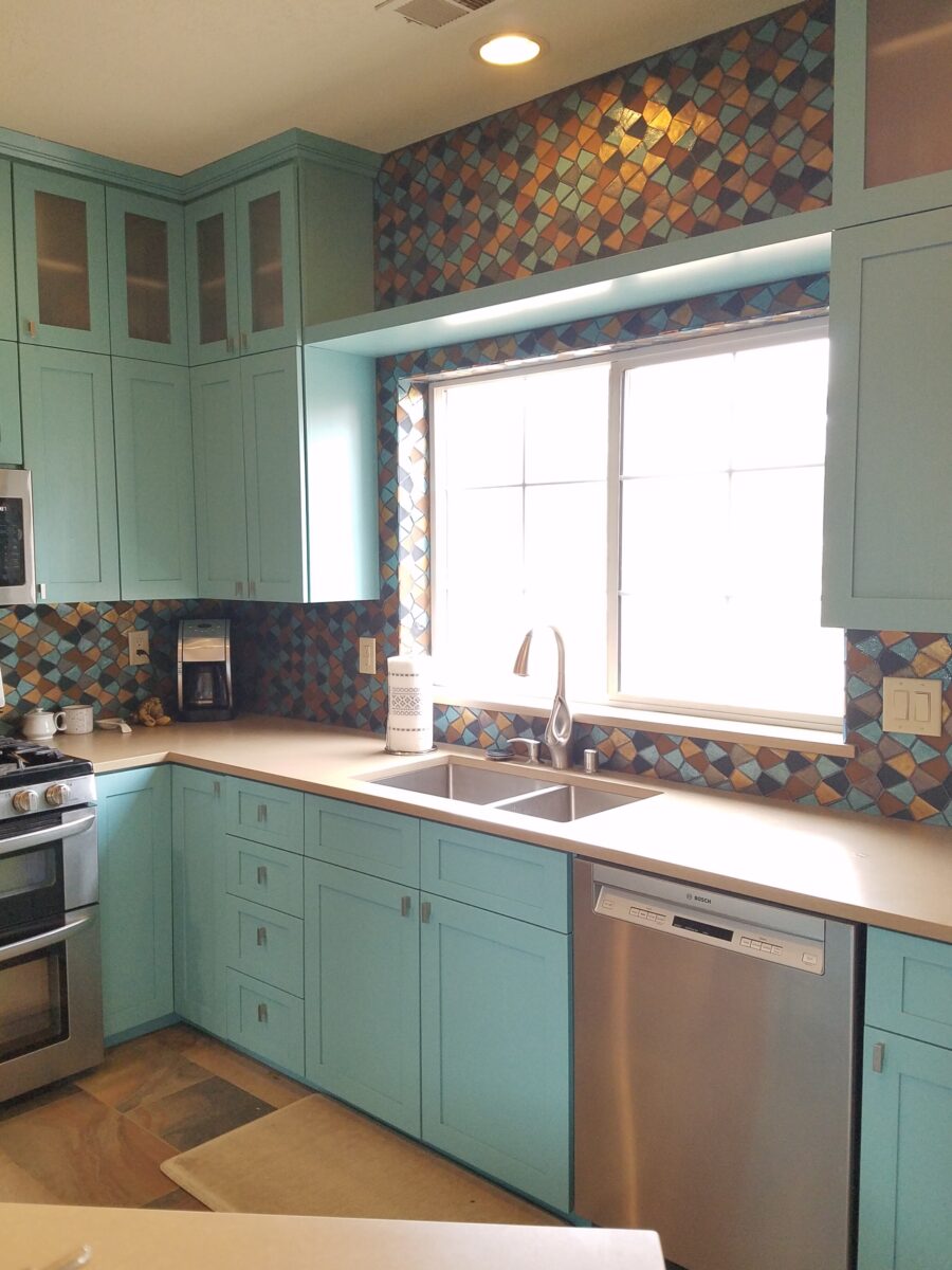
Specifically requesting the insertion of the owner’s favorite accent color – turquoise, we departed from the warm, earthen tones and punctuated the scheme in the new kitchen cabinets.
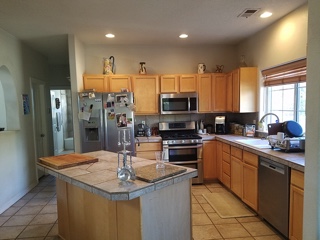
The original kitchen…tile floors and countertops, oak cabinets with off-white painted walls.
Salvaging the existing boxes and painting the faces, fabricating new doors, drawers, upper glass cabinets and end panels, the open kitchen is the fulcrum of the house. We see the trending minimalism of little or few cabinets in the kitchen, perhaps open shelving…however, this couple wanted even more concealed storage to keep their cooking and entertaining accessories out-of-sight, but close at hand.
The kitchen transformation features new color, new faces, additional upper cabinets with etched glass panels, luminous glass tile backsplash, new quartz countertops with a new bowed shape for the island…all while keeping existing appliances, cabinet boxes and layout of the space.
Repeating the slab material of the fireplace’s hearth which passes through from the living room to the kitchen, the new Cambria quartz countertops continue the craft-paper bag/sand color. The slate floor wraps up the face of the island for a durable kick-surface and visual continuity.
But wait! To further the focal features of the kitchen, we created a custom mix of colorful glass segments suggesting an interpretation of fallen aspen leaves golden and glossy in the damp of late fall/early winter precipitation. The combination of golden ochre and dark amber with the luminous turquoise of this stunning wall treatment dramatically contributes to the whimsically wonderful colorful scheme.
Saving the bathrooms for another story…there is more to be said about this woodsy transformation. Stay tuned and do not fear color! Embrace the context of your special places.
Color schemes are limitless. The permutations are endless. Color is exciting and fun. It is personal. Colors evoke feelings, memories, emotions and are key to a comfortable interior.
How often have you been asked or pondered on your own…”What is your favorite color?” Some people hesitate to answer, while others blurt-out readily with their fav. But what color you choose to wear versus what you enjoy in your interior surroundings and how much might be quite different.
Several weeks ago, I launched a weekly post on our PATRICIAN DESIGN Facebook page called “Color Schemes.” The idea is to inspire design ideas by pairing artwork with designer fabrics. When planning an interior there is always a focal point complimented and surrounded by supporting elements. Whether a key painting will command the space or an expansive window with a view will direct the focus to a scene of outside colors and textures – that key element will greatly influence a successful interior color scheme.
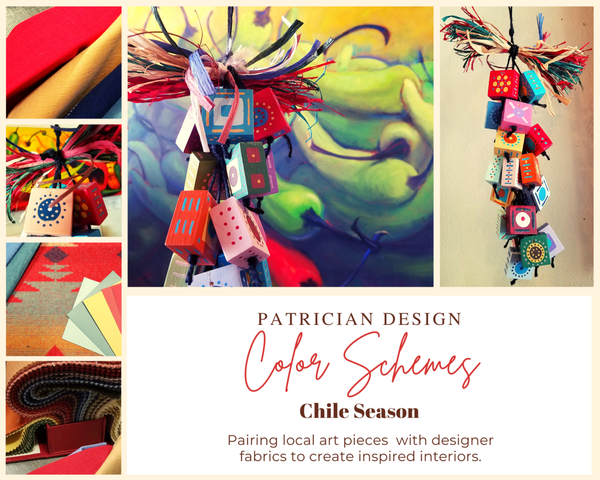
Annette Donald creates colorful cubes in her creative take on our beloved chile ristras. A serrano chile oil painting, on canvas, by Federico Leon de la Vega is quite representational. Paired here with Romo and Ralph Lauren fabrics, Sherwin Williams paints…fresh and festive!
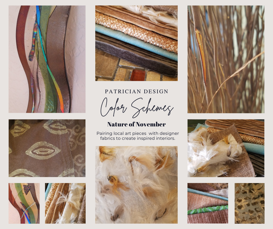
Here is the example of a November Scheme and you can scroll back each Monday for the past few months to enjoy a variety of the Color Schemes! https://www.facebook.com/PatricianDesignABQ/photos/a.243005986618/10157154423221619/
We embrace the The Nature of November with its unique colors and textures. As the air becomes chilly and the leaves fade…warm, soft colors bring us indoors. Featured here an elegant fused glass ribbon wall piece by Lisa Checnoff.
There are four primary considerations that I discuss with my clients when determining which colors to choose, emphasize, avoid, use as accents and where. To establish these selections, we evaluate personal preferences, contextual implications, seasonal influences and even trends.
PERSONAL: In planning an interior, I always want to know what colors make our clients happy, comfortable, stimulated, vexed or relaxed. These personal insights reveal important information for selecting types of materials too.
By examining what might be one’s favorite color, the discussion will navigate the distinctions, if any, regarding preferences for clothes versus interior furnishings. Interestingly, they are not always the same – although, by mere comfort and familiarity, they often are. Simply asking about a favorite color is not enough.
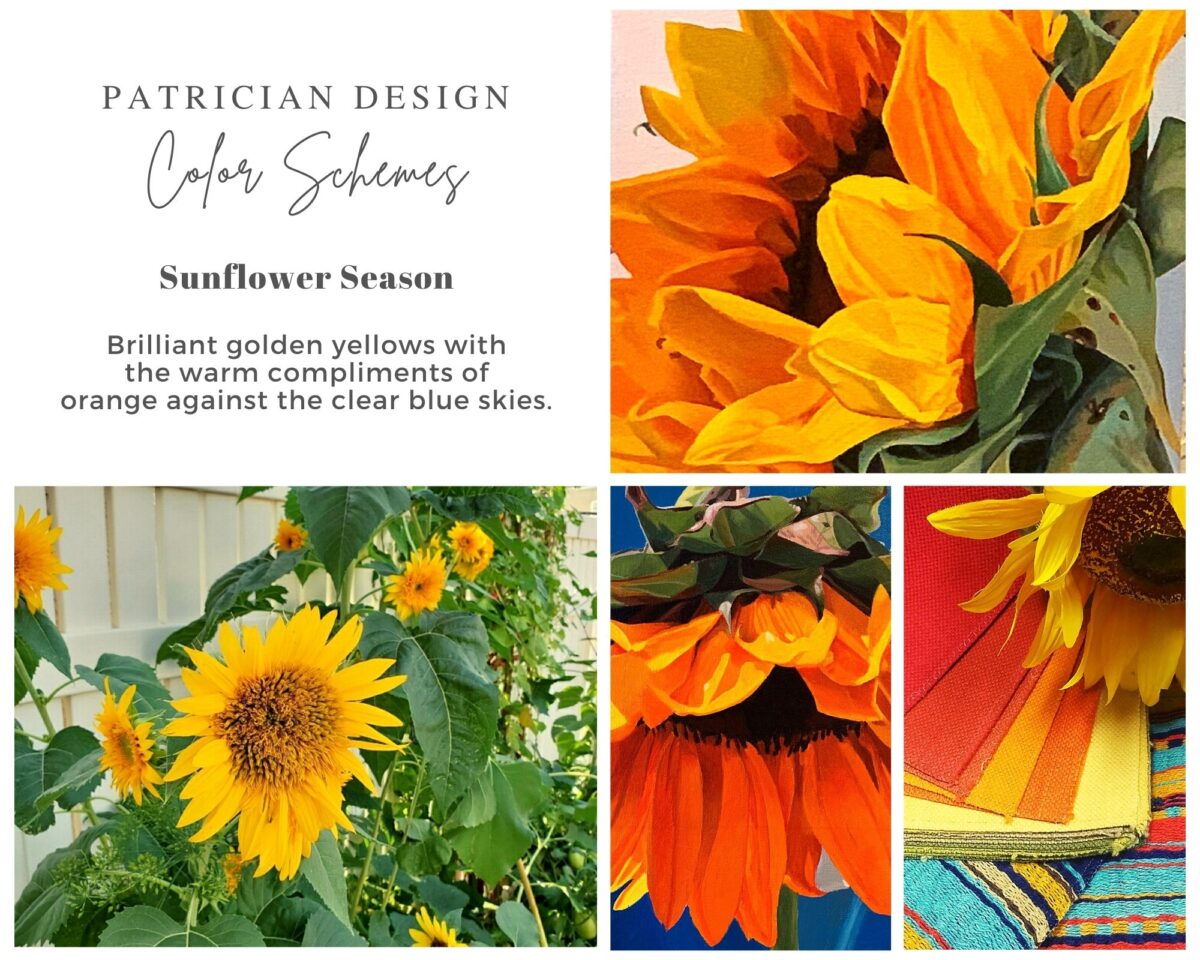
Brilliant golden yellows and blues – splash color! Featured here are fabulous photo-realistic acrylic paintings by Sheri Mays paired with amazing fabrics of the same exciting palette.
CONTEXT: The context of the interior might dictate or at least steer the direction of the design. The luxury of having multiple personal environments offers the opportunity to have different color pleasures exercised in different places. The ski condo might be woodsy and textural with browns, greys, stone and wood punctuated with a pop of color versus the seaside retreat with its crisp whites and cool blues and greens punctuated with pastels or bold contrasts. Therefore, the location of an interior might direct the desired color palette.
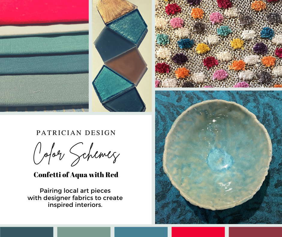
Inspired by this spa-aqua pottery bowl by Penny Roberts and the custom glass tile mosaic we recently combined to face a newly remodeled kitchen wall – the cool seaside/spa feel balanced with ambers and warm dots of color – pink, fuchsia, orange and golden yellow. Durable brushed cotton solids come in myriad colors and are perfect for pillows or upholstery.
SEASONAL: This one is tricky because it plays on the perceived climate outside – even if the interior is maintained at a constant temperature. It takes a concerted effort to plan a color scheme – including textures and finishes in anticipation of changing seasons and relative temperatures. I previously mentioned that a window with a view might be the focal point of a room…imagine the effect the changing seasons might have on the selection of interior colors and textures versus a consistent tropical scene, for example?
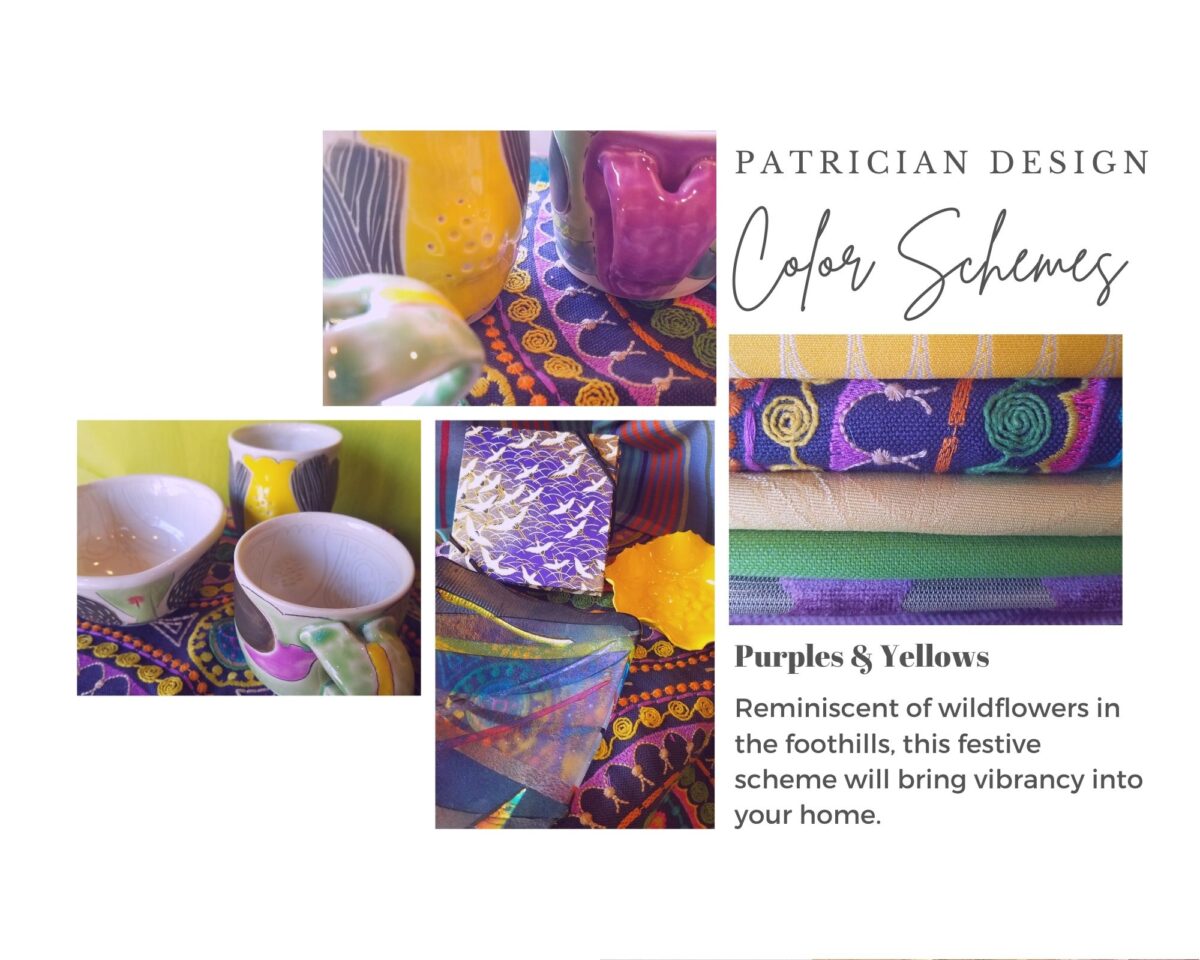
Perhaps you love purple – ever pair it with golden yellow? Here, functional, fantasy pottery designed and crafted with the most precise attention to detail by Jen DePaolo inspires our boldly brilliant scheme.
TRENDS: Inasmuch as I avoid being steered by trends, it is impossible and not advisable – in design – to avoid them. Clients are influenced by them and bring that would-be preference to the table. It is essential to continue to have “colors-of-the-year” and other market-driven colors change to stimulate the economy with buying and selling, replacement and updating. It’s our socio/economic norm. It also serves as an encouragement to re-fresh. But to limit that influence, in favor of long-term personal pleasures, is best. The pressure of this marketing color influence contributes to our being a disposable culture. Not time here for a lecture on such things – but rather to instill an appreciation for and confidence in personal selections an decisions – in this case, color.
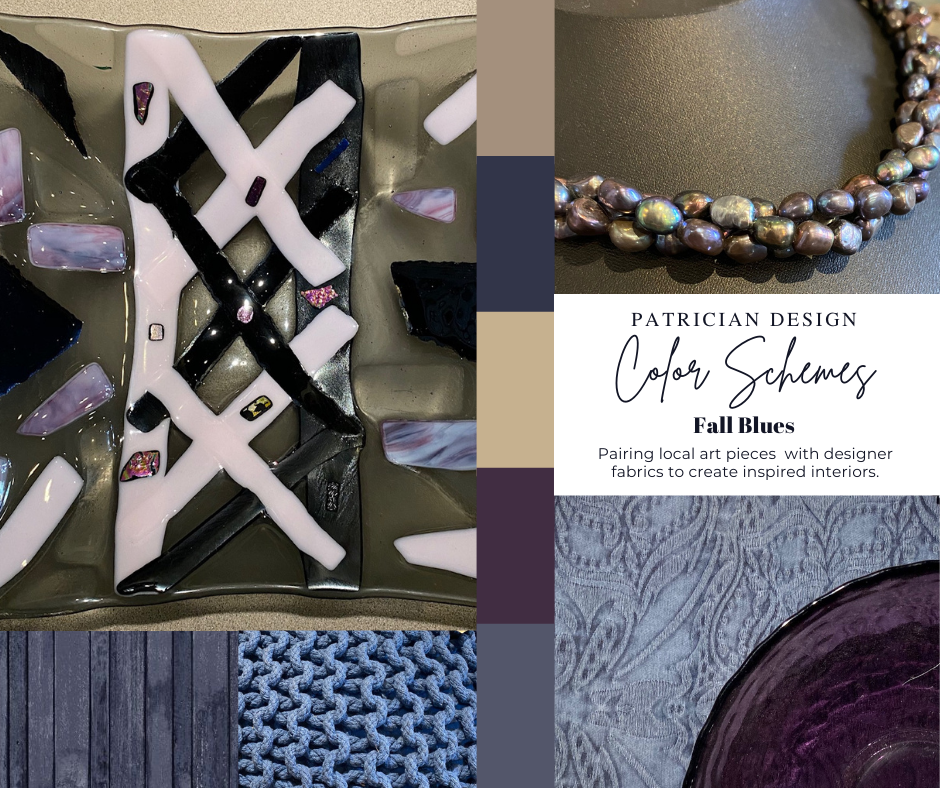
Patinaed pearls and stunning glasswork by Margaret Hidalgo Vanderheyden inspire the soft, greyed lavenders and blues of this cool scheme.
An interesting and on-going test for evaluating a successful interior is when designing in one season – it has to work in all others. For example, when I meet with clients in the heat of July with lush foliage and color, warm temperatures and long days, that same interior has to succeed when it is frigid outside, barren, and with darker, shorter days. What might the challenges be in creating a successful scheme and what might be the solutions to make it work?
Having noted all of this and knowing the different reactions people have to color, isn’t it interesting when an interior is so successful that it appeals to many, if not the majority, of those who experience it? This is more applicable to commercial or public spaces – from doctors’ offices to hotels. However, the challenge and success is in knowing the many things to be considered and implementing a balance of them throughout all aspects of the interior.
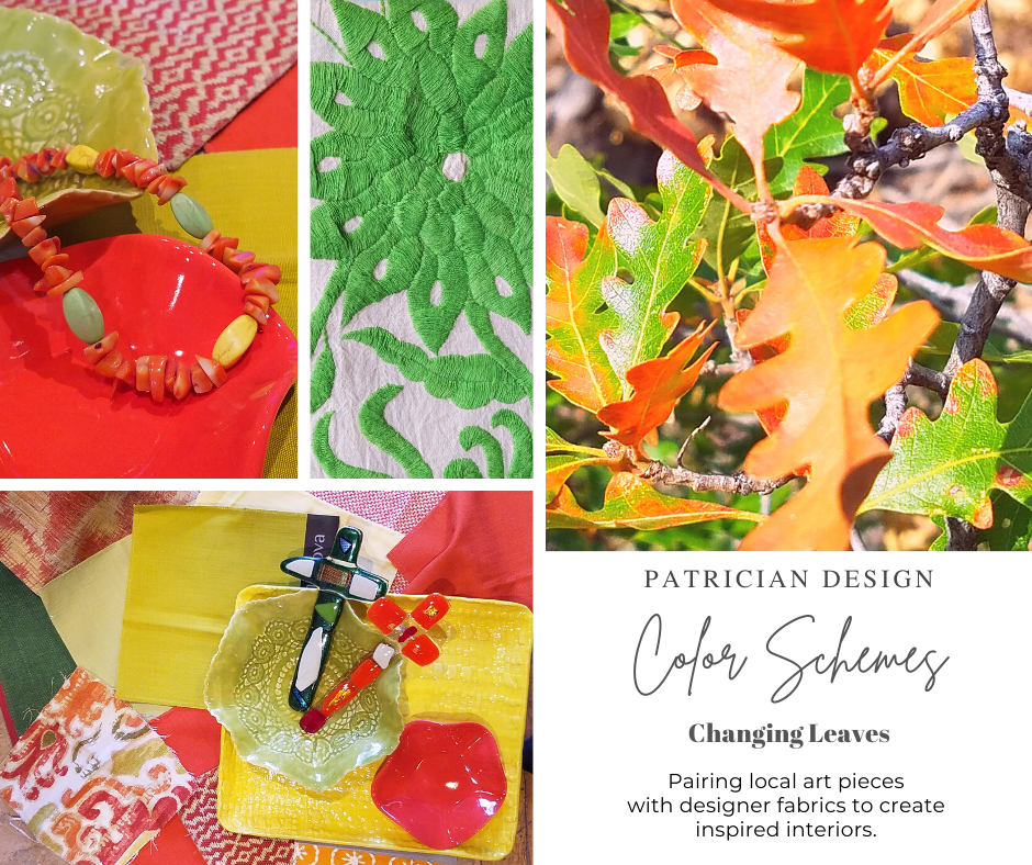
Anne Marie Werner-Smith’s brilliantly glazed pottery here with Margaret Hidalgo-Vanderheyden’s lovely fused glass crosses along with coral and dyed stone necklace and woven table runner from Chiapas reflect the changing colors of fall leaves…
Appreciating color is a gift to designers. It truly is an imperative to appreciate all colors and have the sensitivity to discern the nuances between various values and the effects of selections and combinations from the infinite choices.
I hope this has given you ideas and inspiration to move forward with YOUR color schemes! Sign-up for our weekly email of Color Schemes with classic blue and white and stunning neutral greys coming!! And follow the posts on Facebook every Monday.