Once upon a time there was a quiet little house in the woods. Nestled among the juniper and pinons of the rolling hills of Estancia, the little house lacked design details to make it feel a part of its surroundings. The owners and their dogs had lived there for a decade and realized that a move was not pending and therefore it was time to bring the house into its own.
The neighbors…
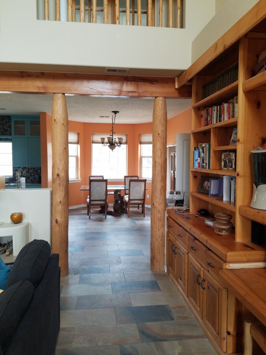
Color was the primary element that they wanted to introduce – that along with a look better suited to the organic, woodsy setting and updates for fixtures and finishes. So, this plain, dated house in the woods began a magical transformation. Not wanting to embrace the sleek white and grey trends of the day, they expressly requested warmth and color.
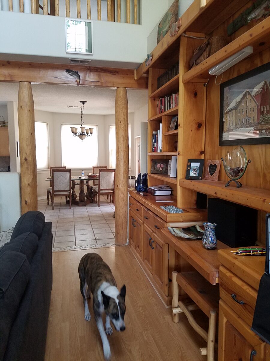
The interior was plain vanilla with warm honey-colored wood accents.
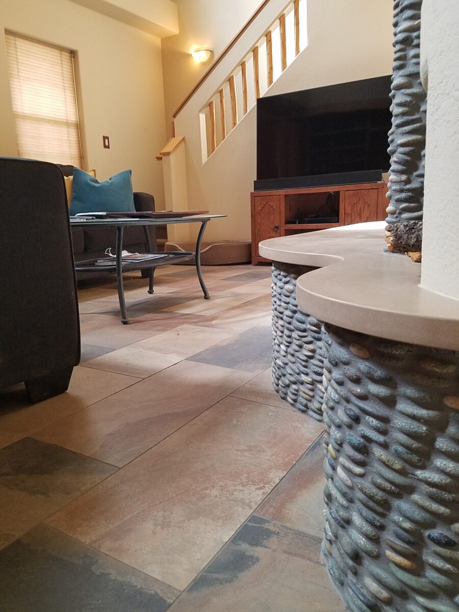
Beginning with the floor, we selected a porcelain tile that had a finish simulating a mottled slate. The outstandingly durable, slip-resistant material had earthen color variegations in the various pieces which were highly effective at concealing dusty dirt and debris from the out-of-doors and camouflaging the anticipated dog hair that was shed about. The resemblance of the tile to cut stone was remarkable. Due to its multi-color rendition of ochre, rust, charcoal, black and sand offered many tones from which to grow the design’s palette.
The flooring was a bland combination of slippery wood laminate and 12″ ceramic tiles.The new porcelain slate floor tile is multi-toned and rich with warmth. New wall colors and cabinets are peeking from behind…
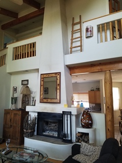
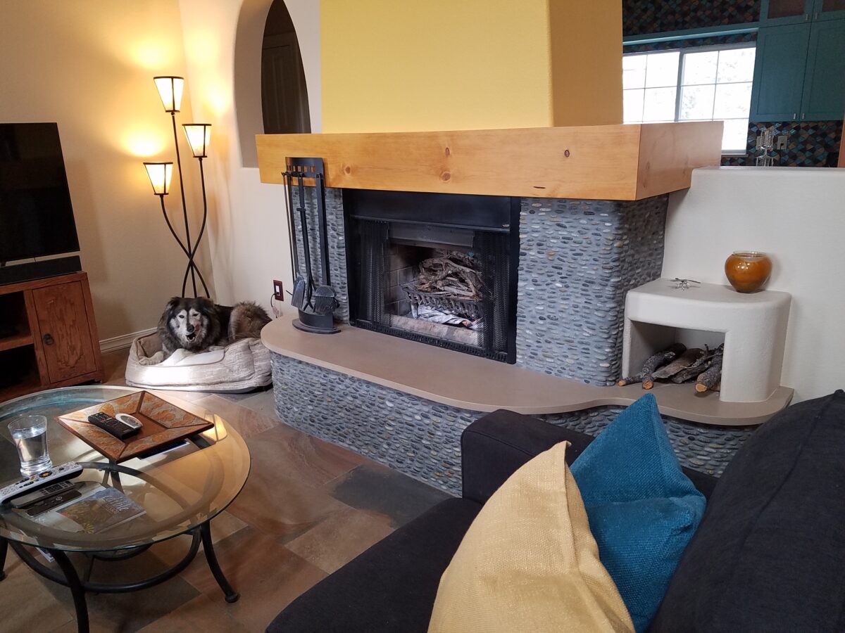
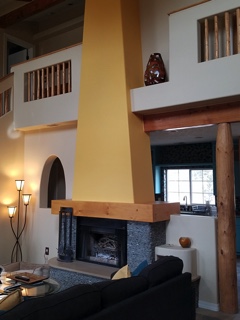
Rising from this new base for the interior scheme, we selected a dark, black/charcoal stacked stone. The smooth ovoid shapes added further organic texture with a subtle woven appearance to the surface of the fireplace.
Texture, color, form…the design is transformed…
The mantle and hearth were both the plain vanilla white of the walls and despite the fact that white can be crisp, clean and fresh – the owners were eager for bold commitment to color. In keeping with the pine columns and other cabinets and architectural detailing, we wrapped the existing form of the mantle in knotty pine finished with a honey stain to coordinate with the existing wood accents. The hearth became an undulating slab of Cambria quartz material in a craft-paper bag/sand color also derived from the swirling “slate” floor.
The graceful shape of the hearth was enhanced with the addition of the stacked stone and new slab surface.
Towering from the now strengthened façade of the fireplace, the tapered form of the chimney was begging for the color-pop that the owner’s desired. The honey color of the pine along with the warm tones in the flooring invited a golden ochre paint to command the space.
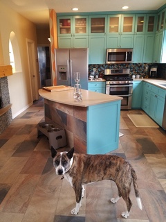
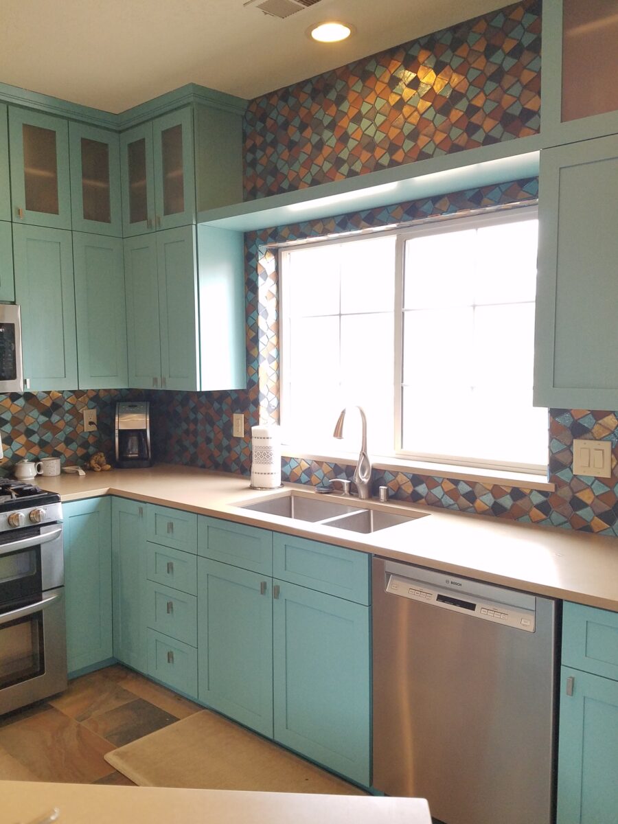
Specifically requesting the insertion of the owner’s favorite accent color – turquoise, we departed from the warm, earthen tones and punctuated the scheme in the new kitchen cabinets.
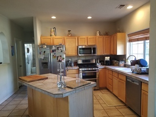
The original kitchen…tile floors and countertops, oak cabinets with off-white painted walls.
Salvaging the existing boxes and painting the faces, fabricating new doors, drawers, upper glass cabinets and end panels, the open kitchen is the fulcrum of the house. We see the trending minimalism of little or few cabinets in the kitchen, perhaps open shelving…however, this couple wanted even more concealed storage to keep their cooking and entertaining accessories out-of-sight, but close at hand.
The kitchen transformation features new color, new faces, additional upper cabinets with etched glass panels, luminous glass tile backsplash, new quartz countertops with a new bowed shape for the island…all while keeping existing appliances, cabinet boxes and layout of the space.
Repeating the slab material of the fireplace’s hearth which passes through from the living room to the kitchen, the new Cambria quartz countertops continue the craft-paper bag/sand color. The slate floor wraps up the face of the island for a durable kick-surface and visual continuity.
But wait! To further the focal features of the kitchen, we created a custom mix of colorful glass segments suggesting an interpretation of fallen aspen leaves golden and glossy in the damp of late fall/early winter precipitation. The combination of golden ochre and dark amber with the luminous turquoise of this stunning wall treatment dramatically contributes to the whimsically wonderful colorful scheme.
Saving the bathrooms for another story…there is more to be said about this woodsy transformation. Stay tuned and do not fear color! Embrace the context of your special places.
When designing for a vacation rental property, the first order of business is to select things that are durable and easy to maintain. This means finishes to furnishings. I know this from practical life experiences and also working with commercial/hospitality interiors. To do so, one needs time to place and receive the orders with enough contingency for mishap. It is also dependent upon the housekeeping arrangements planned for on-going maintenance.
In this recent project, the work began 12 months out – plenty of time you think…but it was all about the physical remodel. We began with the drawings for floor plan re-configuration and specifications for new lighting, cabinets and finishes throughout. The decision to furnish was not made until nearly 10 months later with a deadline to complete in less than 7 weeks. The delay was partially due to an indecision over how many of the 4 units (all on one floor) were to be short-term or long-term rentals. Then a new city ordinance imposed a moratorium, of sorts, on short-term rentals and while that was tossed about over several weeks…more indecision ensued.
It’s a riot to see overnight design projects transform interiors in 24 hours. That’s due to a free-reign for design decisions, a team(s) and vehicles to pick-up/deliver, all trades on deck, a single director calling the shots and an organized chaos that results in a magical finished project – yes, like magic. Open your eyes, be stricken with awe, cry a little and exclaim repeatedly that you “just can’t believe it!!!!”
Real life is generally not like that. Real life has in-put by owners, limited schedule openings by the various trades, little spontaneous decision-making and fleeting time riddled with unwanted surprises and delays. Real life, in this case, was a theme provided by the owner, a preconceived “look” developed in the mind’s eye and scratch paper of the designer during the selection of finishes and floor plan modifications and vacillation for several reasons, of what units to furnish and when. Over the course of a year, leading up to less than the last 30 days, the project was to be fully furnished and finished – ready to rent!
The good news is that with controlled frenzy, changing
availability of products, focused efforts and teamwork, we are pleased to present
the Lobster! Completed all but hanging the TVs by the requested July 1st
deadline, it is beautifully appointed and offers a colorful and a bit
whimsical, spacious, clean and did I mention enviable location- 2 blocks from Pacific Beach
in San Diego?
This entire project, except the move-in this last week, was done long-distance with the owner in Maine, her management company SHORE on-site in California and we the design team in New Mexico. This is not at all unusual, but Maine prompted the owner’s desire to name the unit Lobster. Not your spiny lobster from the local waters, but the New England version from the Atlantic with the classic recognizable form that accompanies the imagined crustacean – including the brilliant reds of the often appreciated steamed version!!
With fond memories of her childhood helping her elders maintain this property, the owner wanted to commemorate the building with an entry plaque visible from the street on the new redwood gate (soon to be completed). In addition, we suggested an individual name/theme for each of the 4 apartments which were all initially designated as fully-furnished short-term rentals – hence the bold identity for each! I designed the new name plaques and had them fabricated by Artistic Bronze in Florida. The backing was built by our talented Enrique Jimenez, in New Mexico, and all shipped to California. Bronze was selected for its timeless presentation, handsome durability and commanding respect. Parisienne was the font I selected which may now be used to identify the property as though a logo to tie-in with the on-site signage. Subliminal cues that are recognized even slightly are effective reminders and triggers for recognition. The idea was intended to offer a fun, but lasting, introduction and identification which was to be reflected in the interiors. The Lobster was the largest unit with 2 bedrooms. It was ultimately chosen to the be one fully-furnished unit and owner’s second home when visiting the area.
For budget and availability, we sacrificed certain durable
features that would have been better long-term investments, resulting in some
knock-down furniture that was never intended for much abuse. Fragile painted
table surfaces – for example – better in laminate, wood or stone…but time
will tell.
The look is clean and fun, colorful and beachy – with a slightly up-scaled twist. Cool aquas accent a few walls in the otherwise crisp white interior. Red punctuates effectively in lobster accent pillows, decorative accessories and the full-wall mosaic glass tile treatment in the kitchen. Yes, once again, we like to treat tile on the walls as not mere back-splashes, but wall-covering full height and width!
Weathered grey toned LVT (Luxury Vinyl Tile) in the way of interlocking planks were an easy to maintain and durable floor finish. The faux wood adds warmth and is softer underfoot than other hard surfaces. Perfectly matched with all trim pieces, this flooring is fabulous!!
Lighting is key and here we added recessed directional lights to spot the walls and related artwork. Switching was also an important detail to have options for the lighted areas and accents.
The owner found a novel lobster rug with a great textural,
tufted, yarn system that brings fun and great color and warmth to the bunk-bed
room! Busy, colorful bed dressings intentionally selected (over the hospitality
white that is still trending) contrast against the bright white bed frames
stacked for space optimization and a little kid fun!
A cool find in the way of the glass vessel lamp…where
usually the stem with electrical cord feeds down through the center of the base
and of the back, this one feeds from the socket stem with a cork top that
removes allowing the vessel to be filled with treasures – in this case southern
California beach shells and fragments! And for a little more animation, I found
a carved wooden shark to insert cruising above the shells to make the lamp even
more interesting!!!
A pair of vintage photographs of a lobster shack and fishing
boat contributed by a friend in Albuquerque – taken by him in Maine in 1962 –
were enhanced with bright red mats in their original polished silver metal
frames along with a large painting on canvas of a Maine lobster/fishing boat sent
by the owner in Maine provide interest to further perpetuate the lobster theme.
The master bedroom is a comfortable retreat with another
lobster pillow for punch! To give the room the best approach and make it feel
as large as it can be, placing the bed in front of the windows was the
solution. Beds facing the entrance to the room are always preferable to
arriving into the side of them – for visual space and a more inviting
orientation.
The original bathroom layout was all one space with tiny
appointments jammed together…so we removed the tall storage cabinets and sink
vanity allowing more room for the commode beside the tub/shower and added a
privacy door. Then the new cabinets and counter have their own space with
another privacy door resulting in a two-compartment bathroom area for maximum
use and enjoyment. Red mosaic glass tiles were repeated from the kitchen to further
coordinate the theme.
The bold color scheme was thoroughly distributed throughout
the unit which is an intentional design emphasis especially effective and novel
in a short-term vacation rental – where such a thorough scheme might be too
intense for one’s primary place of residence.
Effective design both functionally and visually should be a significant asset in the marketing of rental property. When used consistency in marketing material with logos and repeated features, this and other properties with attention to detail should attract the discriminating guests. Once there, repeated stays are the key to maintaining a strong guest population – of desired visitors.
Please watch for the entire slide show of before and afters of this dramatic transformation in the commercial projects section of our website, in coming weeks, entitled Emerald Green Beach Rentals – Lobster!
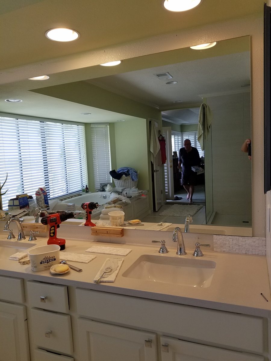
It’s true. If you think designer’s projects go more smoothly than the ones they do with and for you, you’re wrong. It’s true – they don’t! It’s about Murphy’s Law and I have been remodeling our master bath for months. Starting in November and as recently as this weekend personally installing (DIY) the stone surrounding our mirror, it is still not finished. But it’s close.
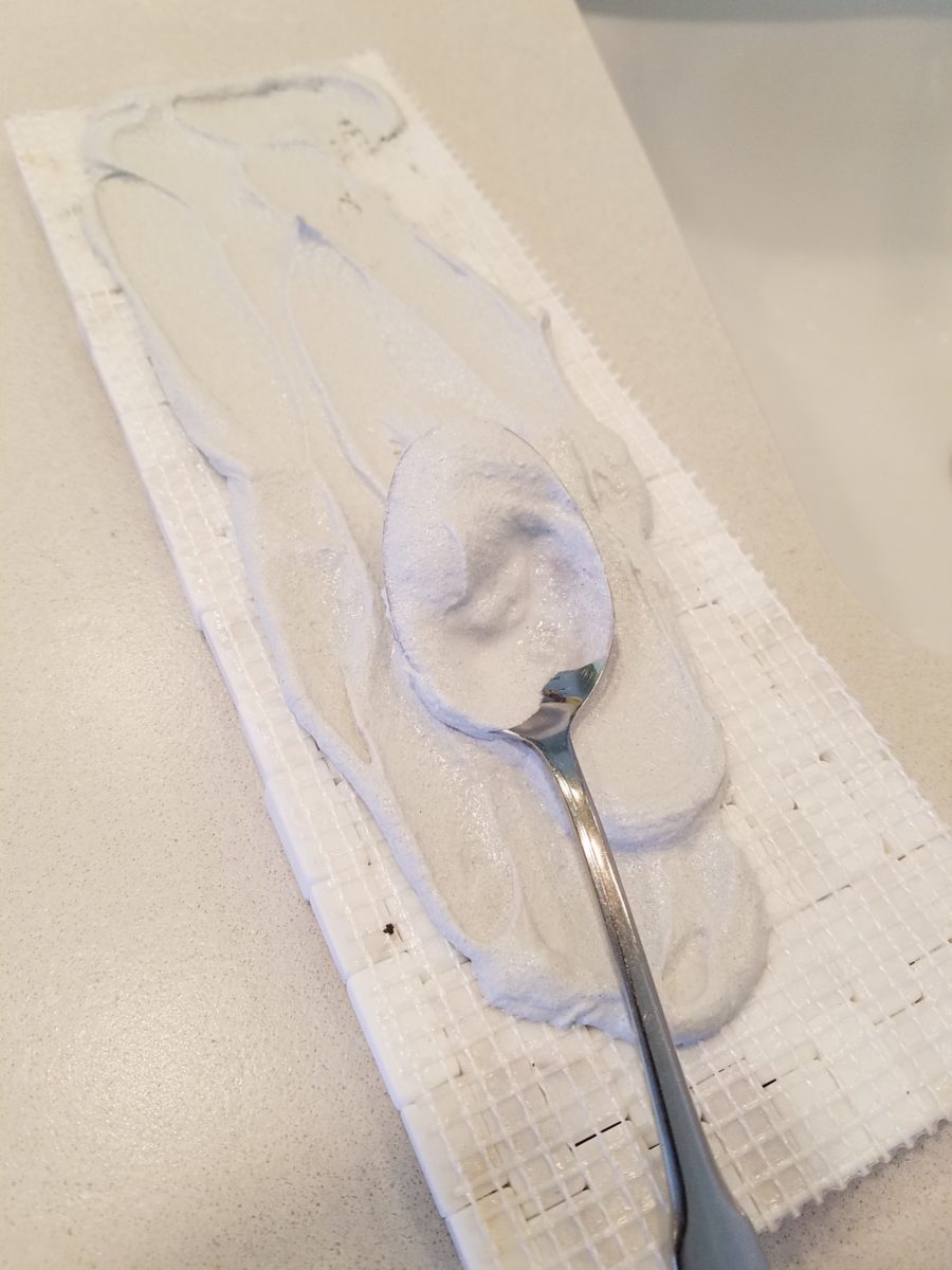
The full-wall mirror was re-used. During the removal and transportation to be cut-down, the edge cracked and had to be cut down…we lost an inch or so – no big deal EXCEPT that it then affected the dimensions of the new stone surround that had already been determined. Oh well…we now will have to cut the tile – had intended not to have to do that. One of the many little surprises and delays. We had to order more stone and will now engage the installer to cut the ones that would not fit the new and slightly non-parallel conditions .
It’s actually fun to tile…until you have to cut it. It is like frosting a cookie and then pressing it onto the wall. It goes quickly and gives instant gratification. But when things are not perfectly parallel, something has to give. That’s when we cut. (Or call someone to cut!!!)
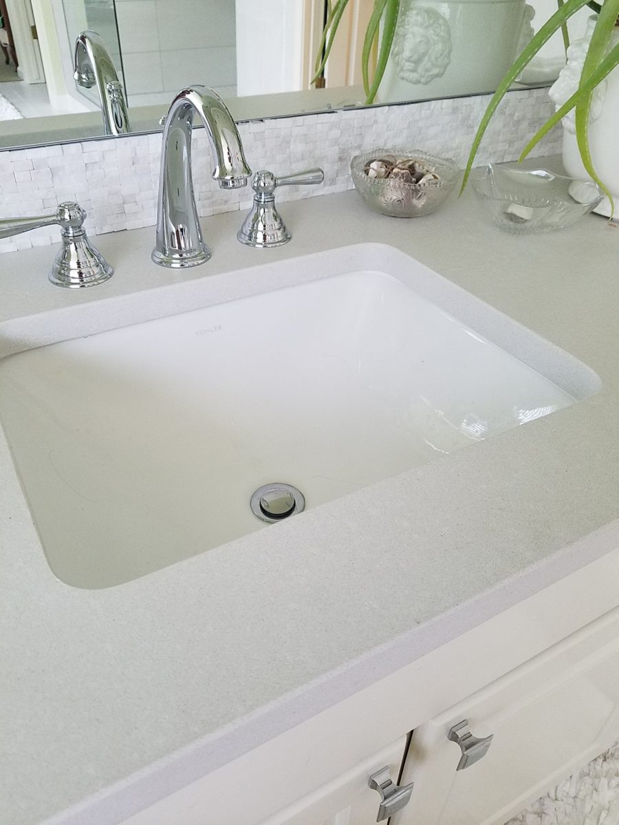
The effect, of having almost all of the mirror surround finished, gets us that much closer. The effect is great and is beginning to feel like the intended design.
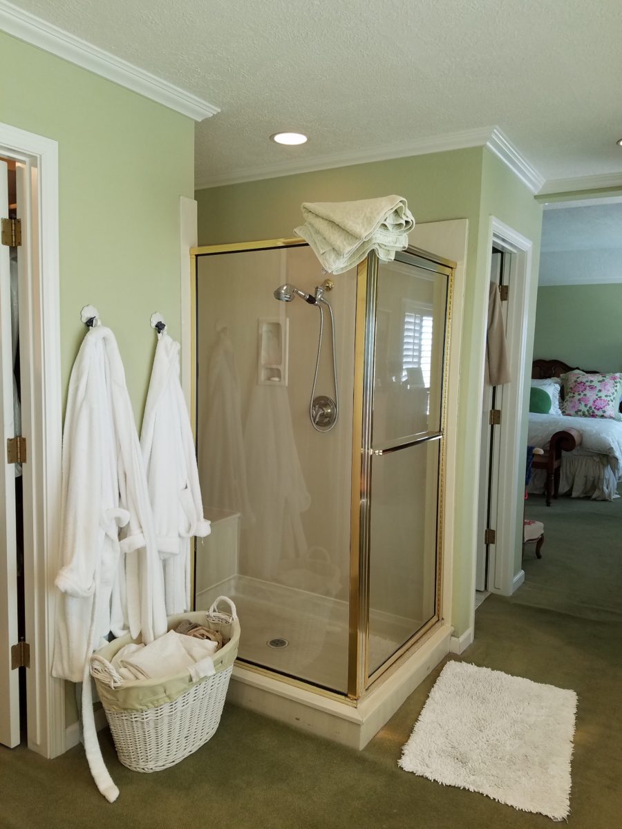
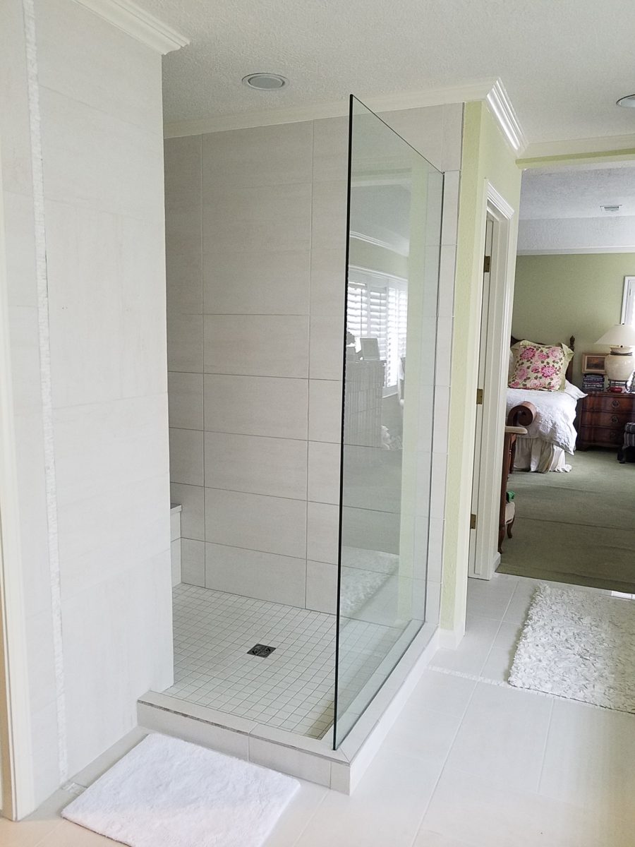
The shower before and after is providing the open expansive look that our little shower enclosure didn’t provide. Despite the facts that the footprint is nearly the same and the old enclosure was all clear glass – albeit framed in gold finished aluminum – this new single panel of 1/2″ clear glass and white-on-white floor and walls looks clean and open. Not a snail design – but, no door. Prepared to add a white shower curtain on a custom curved aluminum ceiling track once winter returns – but for now we’re enjoying the refreshing and comfortable atmosphere.
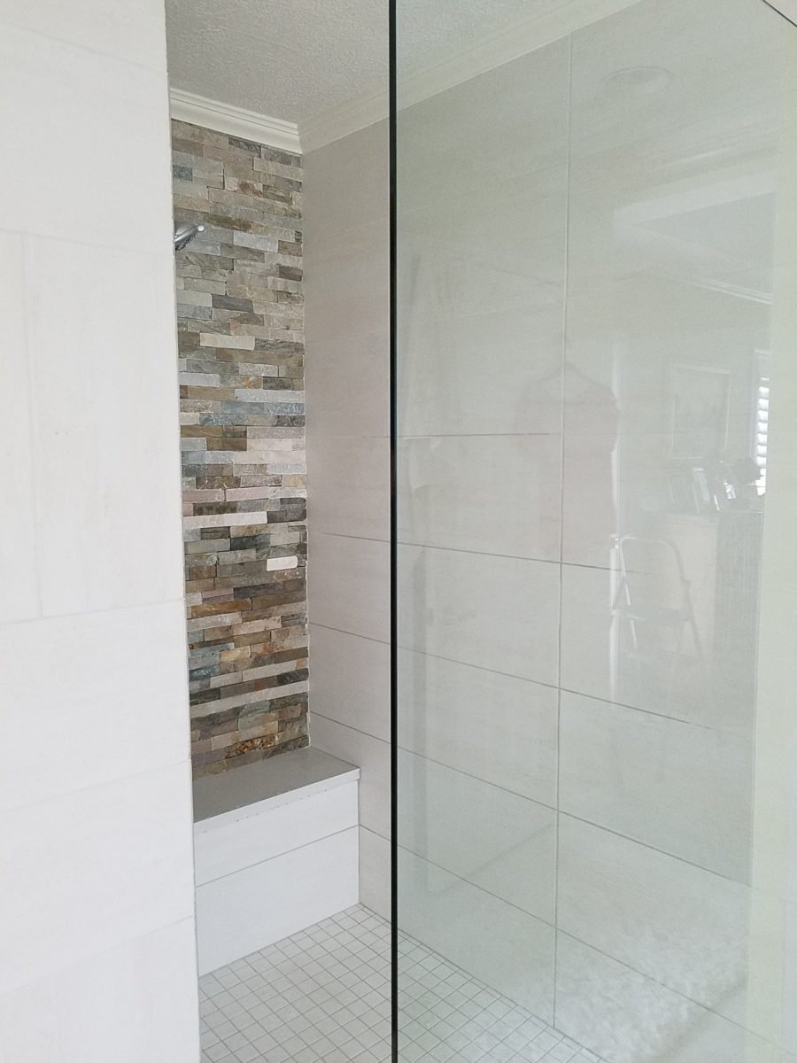
We elected to use stacked stone on the rear wall of the shower as our house sits at the base of the majestic Sandia Mountain and selecting stone seemed more grounded and contextual than other decorative options – of which there are a million from printed concrete, glass mosaic, embossed porcelains…the list goes on…
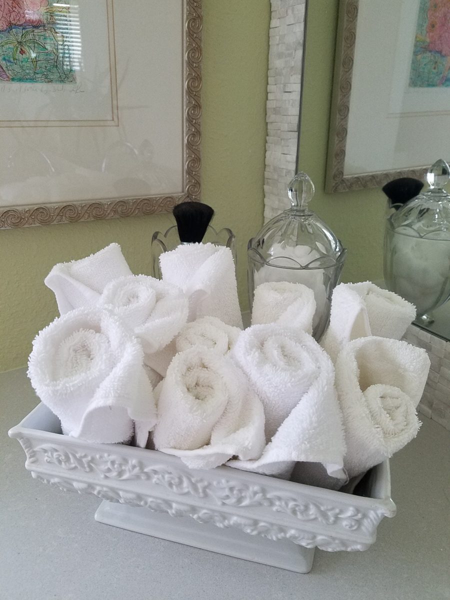
Decorative elements are beginning to “read”
against the new finishes. The same Portuguese ceramic footed rectangular
container holds a bouquet of white washcloths. Yes, I think that the rolled
terry towels look like rosebuds and I have always enjoyed the softening effect
they provide amidst all the other hard surfaces. Plus they are handy on the
countertop for clean replacements.
Footed Italian porcelain has had wash cloths in it for years and stays on the new counter top in a slightly different location.
Behind the terry rosettes, notice the pair of Heisey open and lidded pair of stemmed glass vessels that I use for make-up brushes and cotton balls respectively.
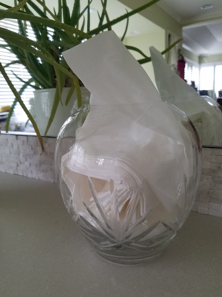
The same crystal wide-mouth vase holds and dispenses the facial tissues. I love the effect of the white-on-white coiled folds of the tissues. They are soft and read interestingly through the cut crystal.
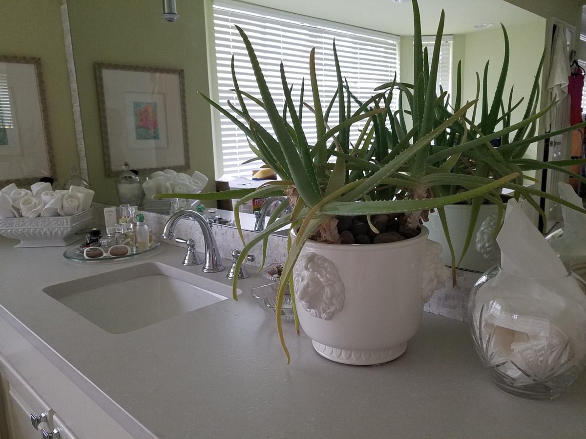
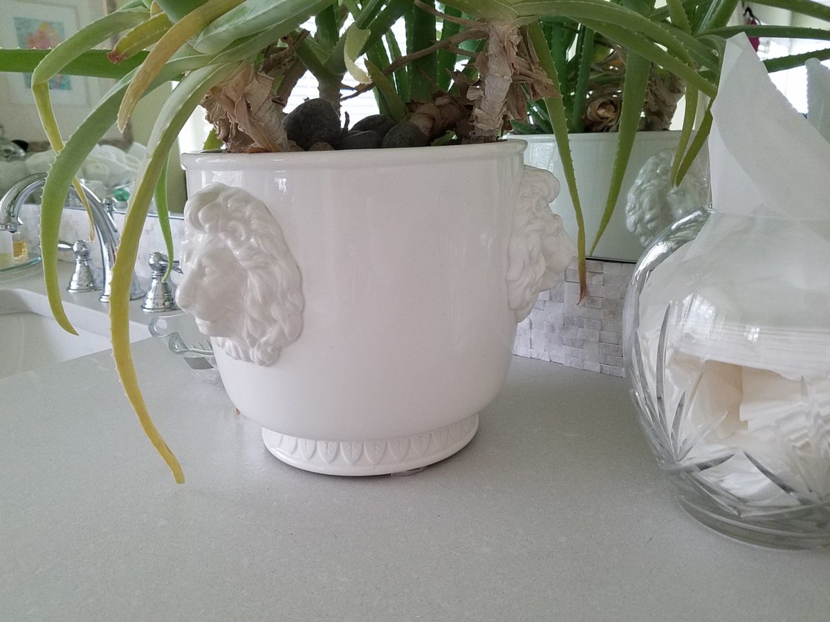
I’m a LEO and find myself discovering and enjoying subtle references to lions. Our front door knocker and this cache pot that I’ve had for over 20 years as examples.
Nothing in this new scene is new. These accessories are all
the exact items that were scattered on the countertop previously! Funny how the
exact same decorative accessories work so well in this new interior!
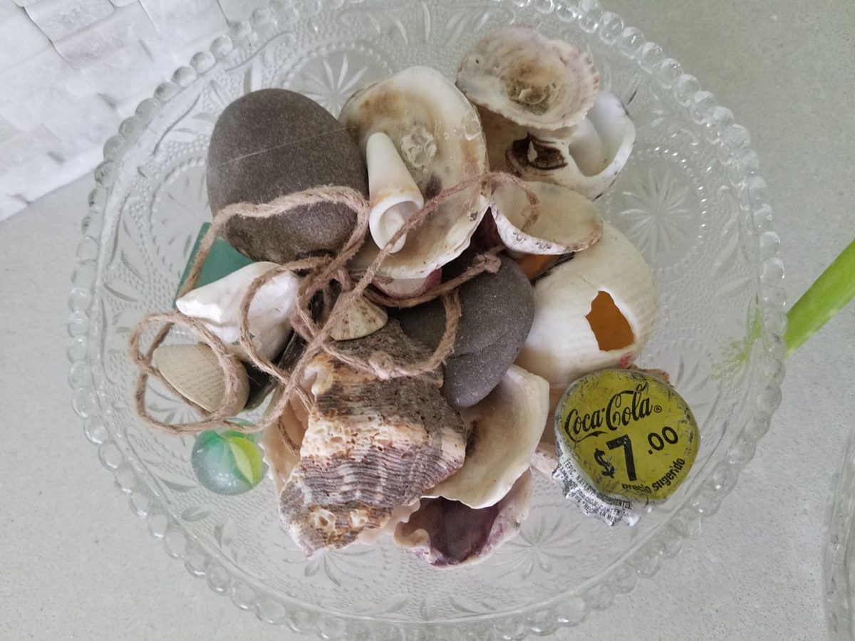
A silly little collection of found things in a family inherited vintage pressed glass bowl including a glass marble, square frosted glass coke-bottle-colored mosaic tile, various sea shells and fragments, a squashed bottle Coca Cola bottle cap from Mexico, a hemp cord DIY necklace with a shell pendant…
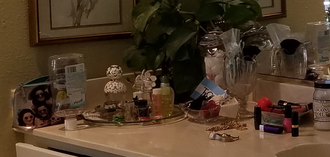
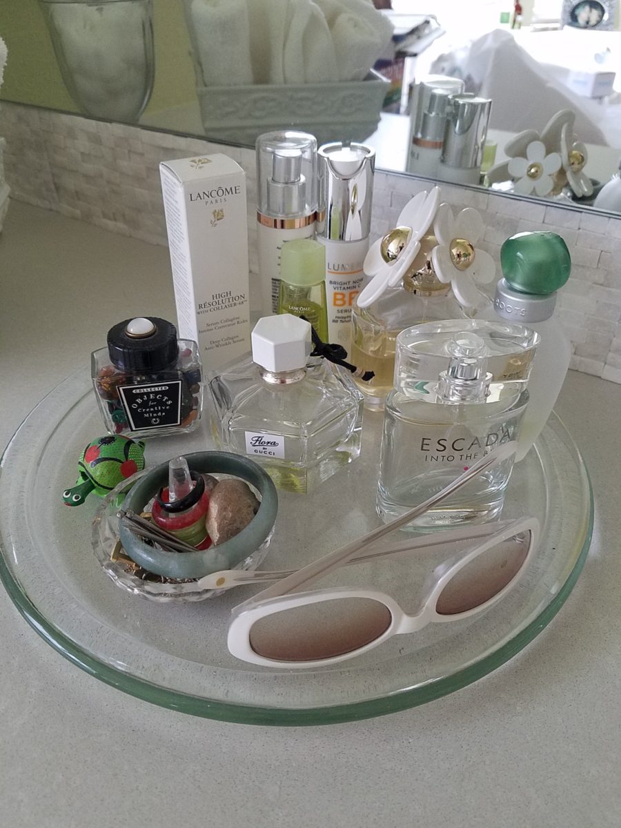
Another glass tray that was also on the previous countertop presents my fragrances, a few products, a bobble-head turtle, my Waterford ring stand stacked with costume glass rings, my tragic, yet miraculous jade bracelet (save for another story), a fossilized bone – in – stone I found as a child, my white framed sunglasses which might seem selected for the new color scheme – when, in fact, they are a result of my love for white framed glasses and these that I bought even though I didn’t like the would-be “reader” small lenses – I kept. I don’t like the way they look on – so have relegated them to the master bath for emergency dashes to the outdoors, on the upstairs deck when my other sunglasses are downstairs!
Still to complete…the stone mirror surround, hang the glass shade for the new pendant light fixture, install the towel/robe plugs, install the polished chrome drawer bar handles to match the new square door and drawer pulls, clear all the remaining stone pieces, thin-set and grout bags and boxes from the tub deck, install the new window sills…
Re-evaluate your existing accessories (and/or furniture)
before feeling the need to change everything when you remodel. Watch for the
completed before and after shots of this remodel soon to come. Well, relatively
soon!!