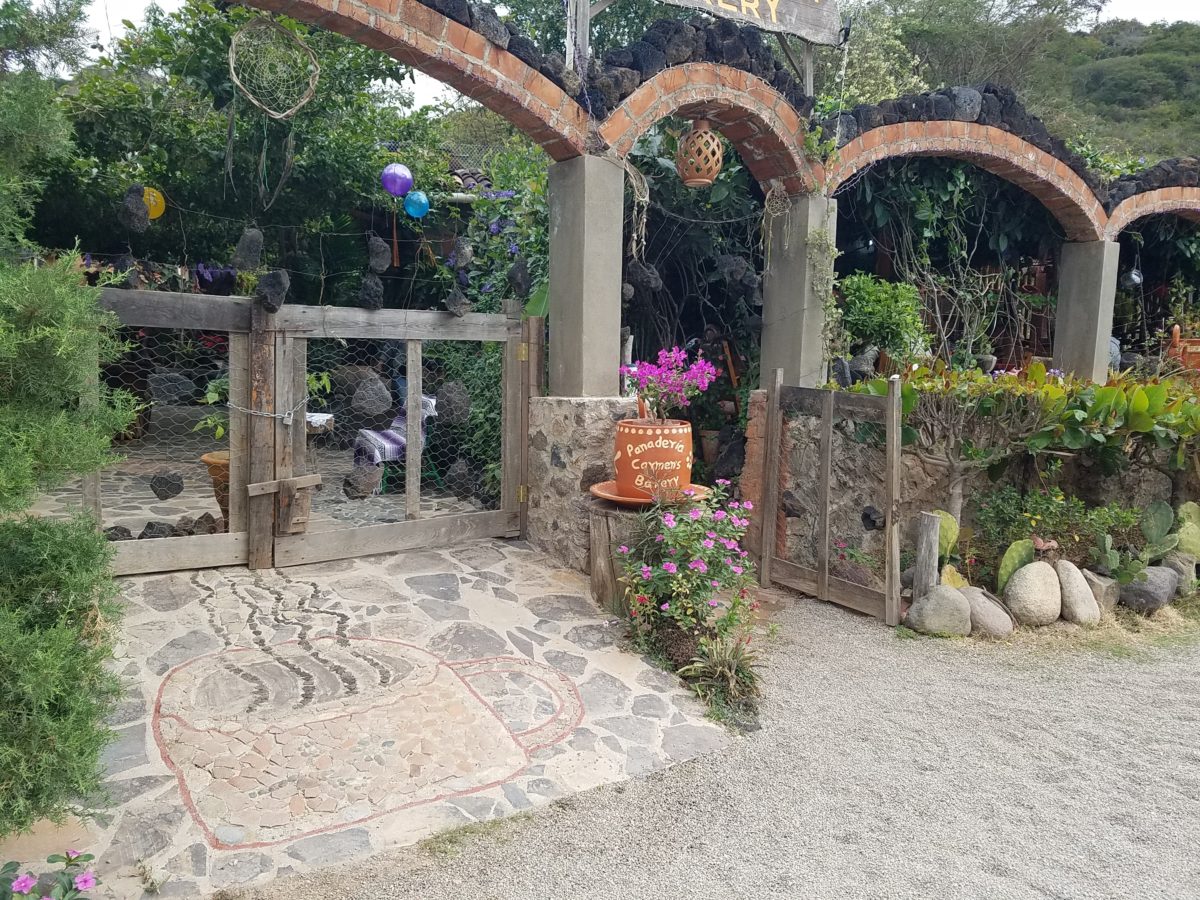
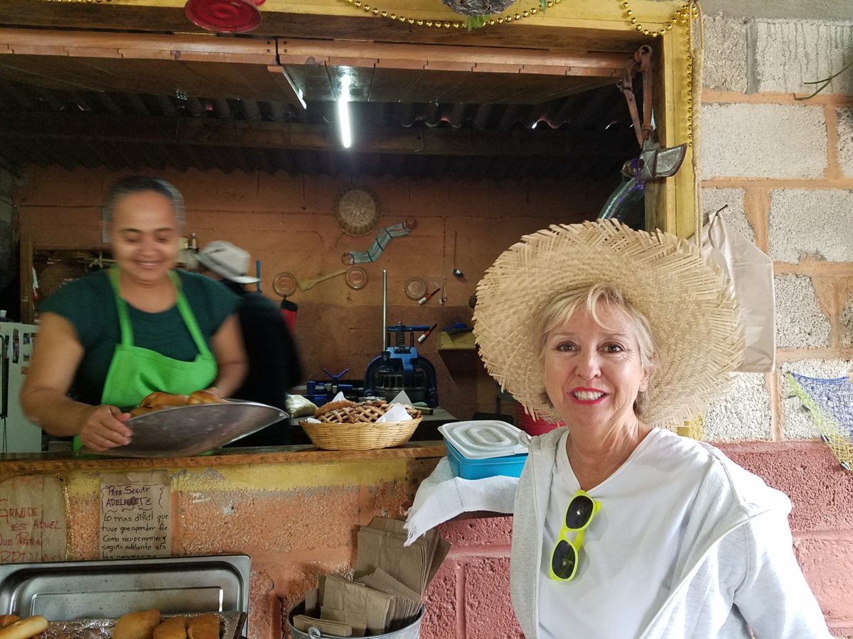
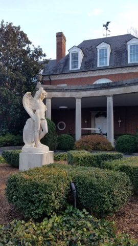
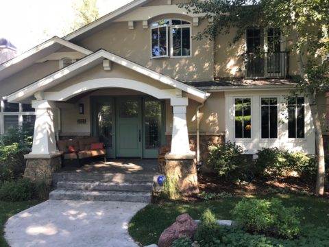
After experiencing and pondering the value of incorporating nature’s elements into architectural planning in the previous blog, I find myself winding into the countryside from sea level to a mile high into jungles and ultimately pine forests, across vast expanses of rivers and towering bridges spanning grand abysses…and stopping at a modest panaderia (bakery) on the side of the road.
You can’t tell a book by its cover as this simple little rural structure – standing alone – looked curiously intriguing and quaint enough, with an unpaved parking area transitioning to well-tended pea-gravel. Traffic cruised by, on the way across the bridge.
Those that knew, turned in. We pulled off the road and were told that this couple had a wonderful bakery and were promised an exceptional treat! Fresh empanadas that would bring remarkably satisfying mid-morning joy.
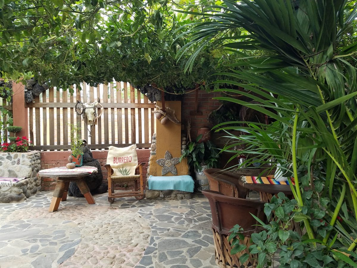
Very tidy and thoughtfully eclectic, this little destination bakery is a precious find.
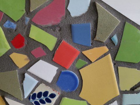
Oh, were we in for a surprise! At the entry, I stopped to shoot the whimsical cup of coffee mosaic set in a field of stone and concrete. I thought – what a fun design element to greet arrivals and set the stage. But I had no idea to what extent I was about to be elated. What unfolded so exceeded my expectations that I wanted to stay all day!!!
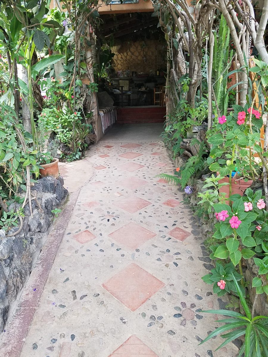
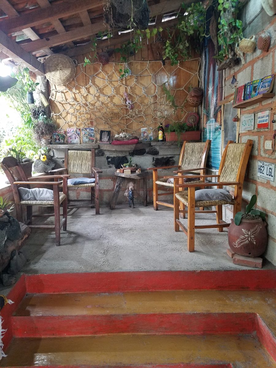
Happy stone and tile-work adorned the pathways. From the textures of stone and brick, tile and wood – it was an organic fantasy – an unexpected design experience.
Simple, yet spectacular – simply spectacular!!!!!
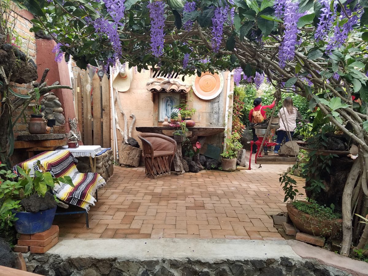
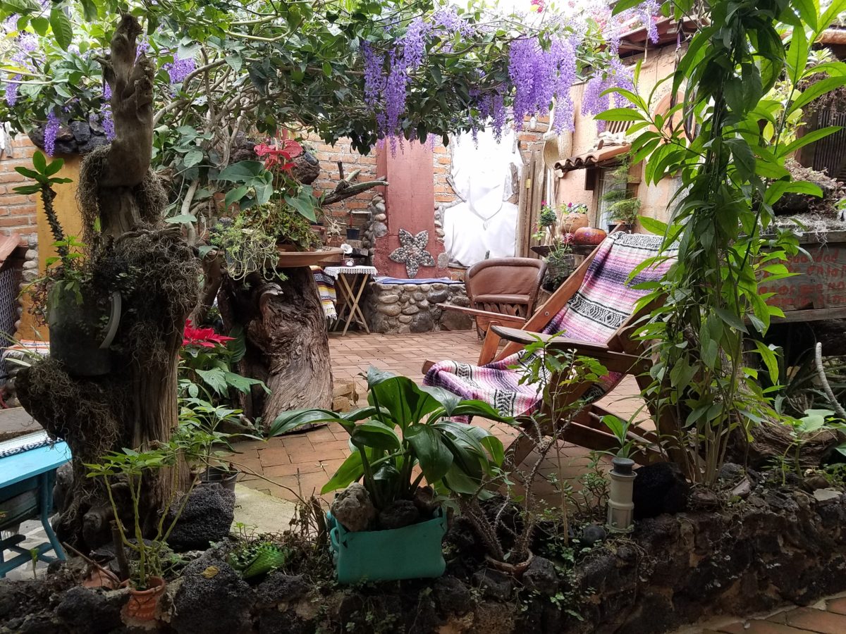
Ceilings of colorful floral blooms – perhaps wisteria – suspended from their vines and other plantings intertwined with the structure.
Spotless and meticulous the eclectic elements were a harmonious creation.Stone walls, wooden slats, vines and adobe all worked together to define the spaces.
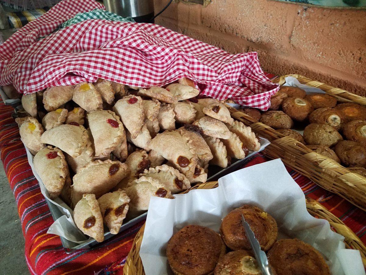
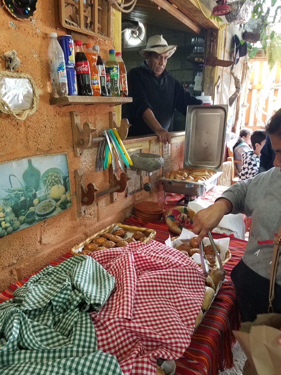
The wafting aroma of fresh baked goods – it was more than delightful. From warm savory clouds with mushroom filling and another with chile-laced sausages – and an array of sweet strawberry, cream and pineapple empanadas to corn muffins, banana muffins and more! All nestled beneath colorfully woven cotton tablecloths.
Light and delicious – the best empanadas ever!! With a tiny sprinkles of granulated sugar, for a sweet crunch, before sinking into the fabulous fillings! Muffins challenged any others and savory treats were so satisfyingly delectable. Little buttons of banana slices on top denoted which were the banana muffins!!
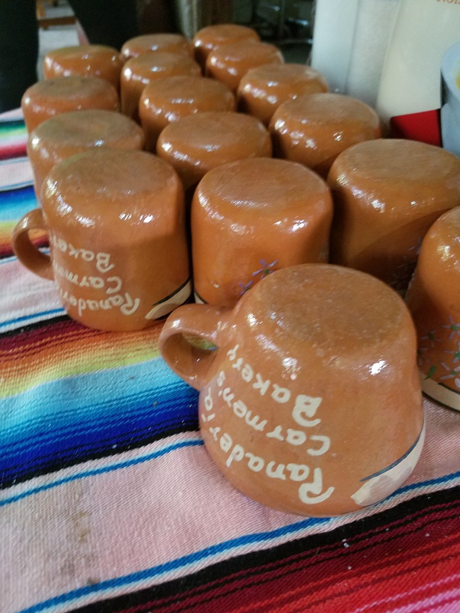
Rich Mexican coffee with a touch of freshly ground cinnamon and luscious hot chocolate were served in custom-glazed “barro ware” complimenting the fresh-from-the-oven confections.
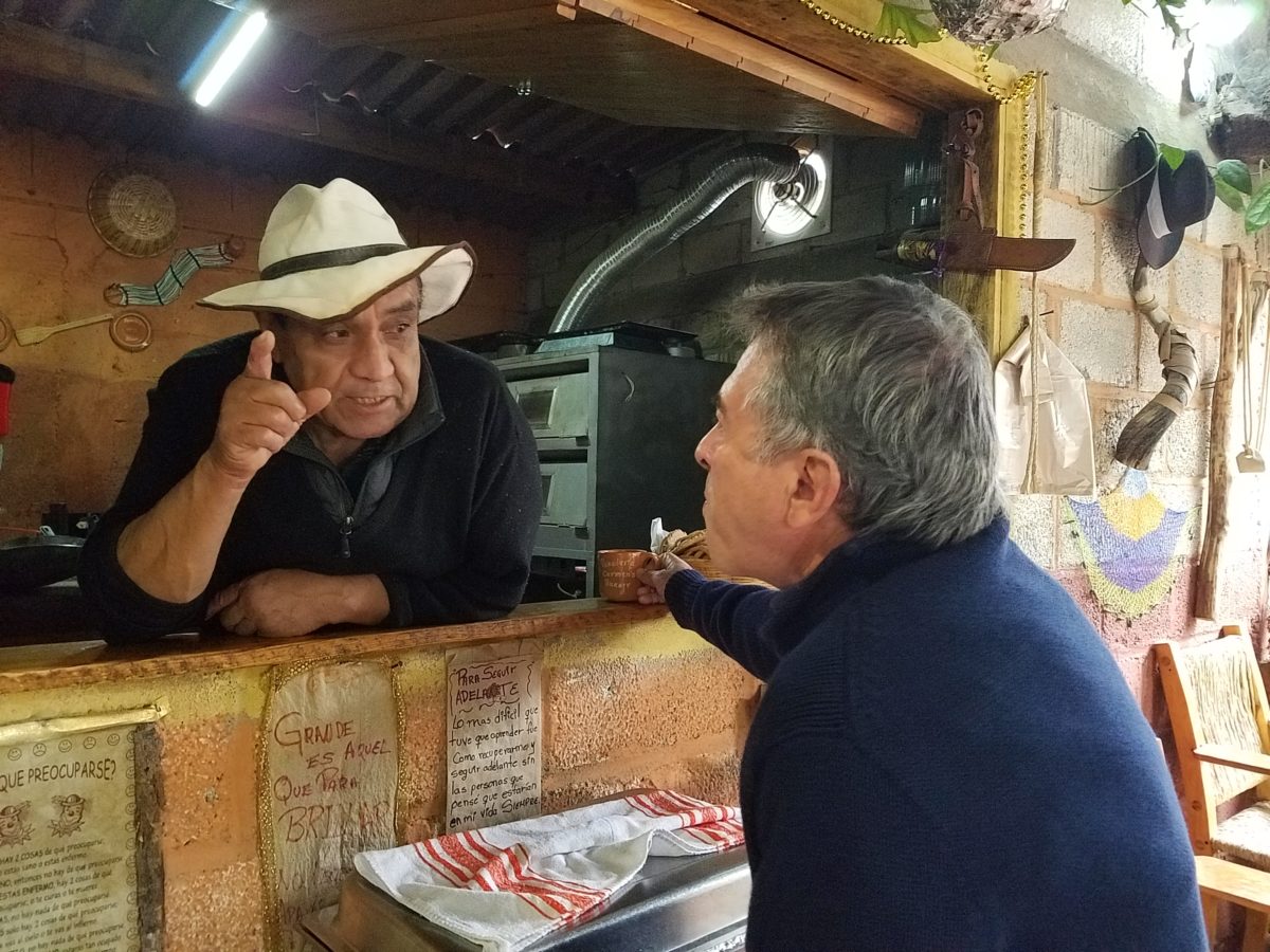
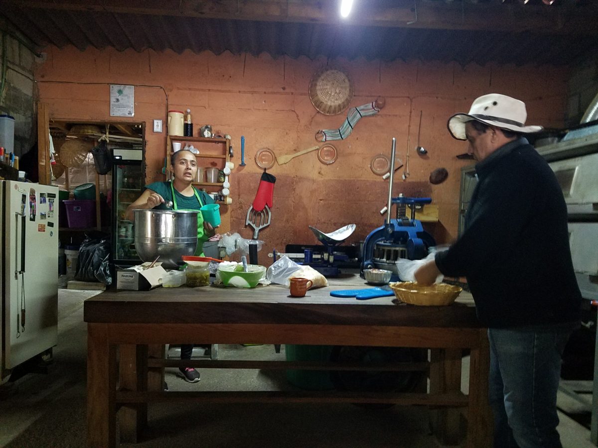
The exhibition baking kitchen overlooked the serving line. The buffet of pastries thoughtfully explained by our gracious and welcoming host, Jesus!
Carmen presents fresh strawberry tarts just from the oven!!! A combination of old and new – tradition and technology meet in this cozy kitchen.
Fragmented spaces open, yet enclosed, offered intimate pockets in which to pause and enjoy.
Color-pops insert themselves effectively around the interior and exterior spaces.Inviting seating areas semi-concealed offer private repose. Tucked away – more areas to enjoy…
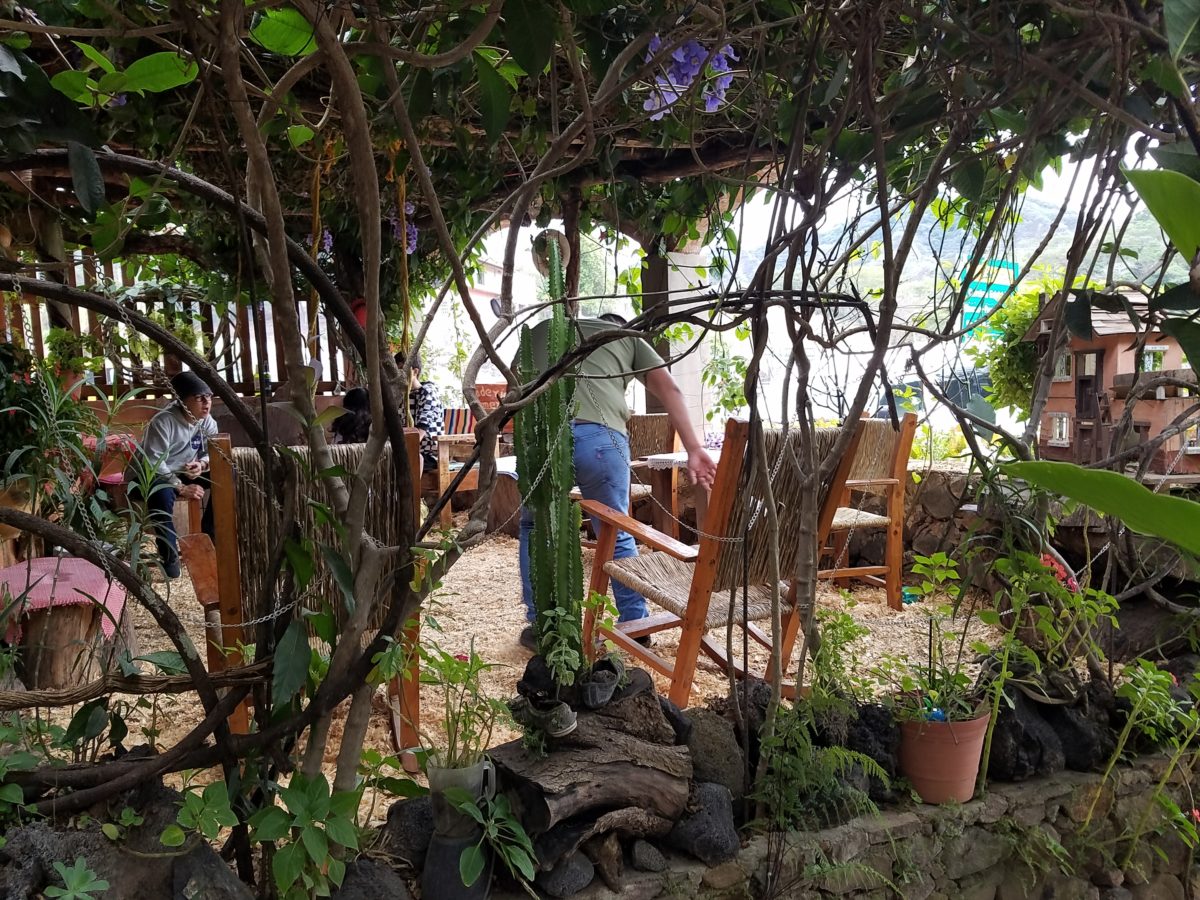
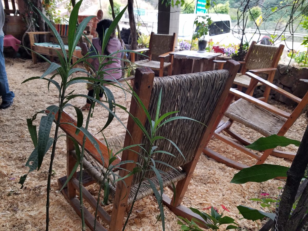
Clever use of clean blond wood shavings on the floor of the main covered patio created a wall-to-wall carpet of fresh aromatics complimenting the inviting aromas emitted from the ovens. Rocking chairs and rigid sturdy versions, with a fun little rope swing, all surrounded by tropical plantings made a cozy area to gather.
Soft underfoot and subtly fragrant – the wood chips make a great shag carpet!!!
As I meandered around exploring all the interesting spaces, textures, colors and plantings, I marveled at the sensitivity with which this had all been crafted and assembled. It was artful interior design with an exterior feel – open air and charming, with a decidedly handcrafted, Mexican sense of place.
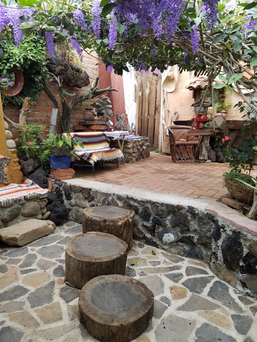
Slices of handsome tree trunks make perfect stepping “stones” with graduated heights.
It was an eclectic collage of furniture, structure and organics – living and static – that was welcoming and artful, delightful and so pleasing, that it was a treat for all the senses.
The cool morning air of the mountains mingled, with the comforting fragrances, creating an atmosphere inviting gentle conversations of people gathered around good food and artfully relaxed surroundings.
Peek in places and through doorways to find worlds of design
waiting to be discovered!!!
When designing for a vacation rental property, the first order of business is to select things that are durable and easy to maintain. This means finishes to furnishings. I know this from practical life experiences and also working with commercial/hospitality interiors. To do so, one needs time to place and receive the orders with enough contingency for mishap. It is also dependent upon the housekeeping arrangements planned for on-going maintenance.
In this recent project, the work began 12 months out – plenty of time you think…but it was all about the physical remodel. We began with the drawings for floor plan re-configuration and specifications for new lighting, cabinets and finishes throughout. The decision to furnish was not made until nearly 10 months later with a deadline to complete in less than 7 weeks. The delay was partially due to an indecision over how many of the 4 units (all on one floor) were to be short-term or long-term rentals. Then a new city ordinance imposed a moratorium, of sorts, on short-term rentals and while that was tossed about over several weeks…more indecision ensued.
It’s a riot to see overnight design projects transform interiors in 24 hours. That’s due to a free-reign for design decisions, a team(s) and vehicles to pick-up/deliver, all trades on deck, a single director calling the shots and an organized chaos that results in a magical finished project – yes, like magic. Open your eyes, be stricken with awe, cry a little and exclaim repeatedly that you “just can’t believe it!!!!”
Real life is generally not like that. Real life has in-put by owners, limited schedule openings by the various trades, little spontaneous decision-making and fleeting time riddled with unwanted surprises and delays. Real life, in this case, was a theme provided by the owner, a preconceived “look” developed in the mind’s eye and scratch paper of the designer during the selection of finishes and floor plan modifications and vacillation for several reasons, of what units to furnish and when. Over the course of a year, leading up to less than the last 30 days, the project was to be fully furnished and finished – ready to rent!
The good news is that with controlled frenzy, changing
availability of products, focused efforts and teamwork, we are pleased to present
the Lobster! Completed all but hanging the TVs by the requested July 1st
deadline, it is beautifully appointed and offers a colorful and a bit
whimsical, spacious, clean and did I mention enviable location- 2 blocks from Pacific Beach
in San Diego?
This entire project, except the move-in this last week, was done long-distance with the owner in Maine, her management company SHORE on-site in California and we the design team in New Mexico. This is not at all unusual, but Maine prompted the owner’s desire to name the unit Lobster. Not your spiny lobster from the local waters, but the New England version from the Atlantic with the classic recognizable form that accompanies the imagined crustacean – including the brilliant reds of the often appreciated steamed version!!
With fond memories of her childhood helping her elders maintain this property, the owner wanted to commemorate the building with an entry plaque visible from the street on the new redwood gate (soon to be completed). In addition, we suggested an individual name/theme for each of the 4 apartments which were all initially designated as fully-furnished short-term rentals – hence the bold identity for each! I designed the new name plaques and had them fabricated by Artistic Bronze in Florida. The backing was built by our talented Enrique Jimenez, in New Mexico, and all shipped to California. Bronze was selected for its timeless presentation, handsome durability and commanding respect. Parisienne was the font I selected which may now be used to identify the property as though a logo to tie-in with the on-site signage. Subliminal cues that are recognized even slightly are effective reminders and triggers for recognition. The idea was intended to offer a fun, but lasting, introduction and identification which was to be reflected in the interiors. The Lobster was the largest unit with 2 bedrooms. It was ultimately chosen to the be one fully-furnished unit and owner’s second home when visiting the area.
For budget and availability, we sacrificed certain durable
features that would have been better long-term investments, resulting in some
knock-down furniture that was never intended for much abuse. Fragile painted
table surfaces – for example – better in laminate, wood or stone…but time
will tell.
The look is clean and fun, colorful and beachy – with a slightly up-scaled twist. Cool aquas accent a few walls in the otherwise crisp white interior. Red punctuates effectively in lobster accent pillows, decorative accessories and the full-wall mosaic glass tile treatment in the kitchen. Yes, once again, we like to treat tile on the walls as not mere back-splashes, but wall-covering full height and width!
Weathered grey toned LVT (Luxury Vinyl Tile) in the way of interlocking planks were an easy to maintain and durable floor finish. The faux wood adds warmth and is softer underfoot than other hard surfaces. Perfectly matched with all trim pieces, this flooring is fabulous!!
Lighting is key and here we added recessed directional lights to spot the walls and related artwork. Switching was also an important detail to have options for the lighted areas and accents.
The owner found a novel lobster rug with a great textural,
tufted, yarn system that brings fun and great color and warmth to the bunk-bed
room! Busy, colorful bed dressings intentionally selected (over the hospitality
white that is still trending) contrast against the bright white bed frames
stacked for space optimization and a little kid fun!
A cool find in the way of the glass vessel lamp…where
usually the stem with electrical cord feeds down through the center of the base
and of the back, this one feeds from the socket stem with a cork top that
removes allowing the vessel to be filled with treasures – in this case southern
California beach shells and fragments! And for a little more animation, I found
a carved wooden shark to insert cruising above the shells to make the lamp even
more interesting!!!
A pair of vintage photographs of a lobster shack and fishing
boat contributed by a friend in Albuquerque – taken by him in Maine in 1962 –
were enhanced with bright red mats in their original polished silver metal
frames along with a large painting on canvas of a Maine lobster/fishing boat sent
by the owner in Maine provide interest to further perpetuate the lobster theme.
The master bedroom is a comfortable retreat with another
lobster pillow for punch! To give the room the best approach and make it feel
as large as it can be, placing the bed in front of the windows was the
solution. Beds facing the entrance to the room are always preferable to
arriving into the side of them – for visual space and a more inviting
orientation.
The original bathroom layout was all one space with tiny
appointments jammed together…so we removed the tall storage cabinets and sink
vanity allowing more room for the commode beside the tub/shower and added a
privacy door. Then the new cabinets and counter have their own space with
another privacy door resulting in a two-compartment bathroom area for maximum
use and enjoyment. Red mosaic glass tiles were repeated from the kitchen to further
coordinate the theme.
The bold color scheme was thoroughly distributed throughout
the unit which is an intentional design emphasis especially effective and novel
in a short-term vacation rental – where such a thorough scheme might be too
intense for one’s primary place of residence.
Effective design both functionally and visually should be a significant asset in the marketing of rental property. When used consistency in marketing material with logos and repeated features, this and other properties with attention to detail should attract the discriminating guests. Once there, repeated stays are the key to maintaining a strong guest population – of desired visitors.
Please watch for the entire slide show of before and afters of this dramatic transformation in the commercial projects section of our website, in coming weeks, entitled Emerald Green Beach Rentals – Lobster!
Busy lives in a new town, he in his residency and she working
in a busy OR, they bought a house – their first house – and asked for help
making it theirs.
They have traveled the world and collected art along the
way, a disparate inventory of things that caught their eye, spoke of their
experiences and reminded them of people, places and things to savor once home.
Home, that was the task. Create HOME in this new, old house. Built mid-century, it was simple, clean with some patchy remodeling from previous owners reflecting rather common decisions, with limited funds. We needed to discuss priorities and budget, evaluate what should stay and what needed to be changed.
They both had a love of Guatemala. Their travels there left
them with dreams of color and pattern, handmade functional art and an exotic
sense of place. Having these elements ingrained in their longing, they
expressed a desire to have that sense, but with a bit of a modern twist.
Assembling the colors and materials…
We salvaged the existing natural granite slab countertop and
unfortunate surface-mounted sink. The granite was a practical save and the sink
came along for the ride. In order to integrate the granite as though
intentional, I selected a multi-colored
Talavera tile that specifically had a dollop of mustard glaze in the design
picking up that Dijon field color in the speckled granite. As is my usual
preferred mode of installation, we took it wall-to-wall as a complete wall-covering.
We also saved the cabinet boxes and doors, but needed to
give them a lift from their median caramel stain on oak. Deconstructing the
colors in the design of the Talavera, we
knew we wanted blue cabinets – so the paint shades were fanned and the color
pinned-down. To give the cabinets that wabi-sabi look of loving wear, we sanded
the edges after the painting was finished. We also added cabinets over the
stove for additional storage space and utilization of that blank wall.
We removed all the doors and drawer fronts, filled the holes from the old pulls/knobs and painted them off-site. We painted the boxes in the field. Granite was salvaged along with the sink. New paint, Saltillo flooring, Talavera tile and cabinet pulls along with new appliances gave an updated look to the scene.
In real life, when
practicality rules, certain things have to give way for the good of the
whole. The whole being the pocketbook and other elements that take precedence
at the time. So we live with the radiant heaters, keep the chandelier for now,
until they have one fabricated to their specifications, use a machined rug
instead of a handcrafted piece and know that over the years they will massage
this starting place and truly make it their home.
Continuing to dissect the colors from the new wall tile, our
colorful young couple wanted more color…we chose individual values of bold
paint colors – smoky turquoise, slightly
burnt orange and brilliant golden yellow to intersect the planes throughout the
space.
Typical mahogany doors common to that era of home interiors,
the decision to match the white trim would have been easy, but we labored over
the existing natural, tropical wood and decided to keep it in the mix.
Although the nearly immaculate, original hardwood oak floors
were revealed after removing the wall-to-wall carpeting, the kitchen floor
throughout the rear vestibule and laundry room was an inexpensive and
uninspired sheet vinyl. Saltillo clay
tiles were the answer to furthering the Guatemalan feel. More commonly
associated with Mexico, these clay tiles are historically the plebian choice.
Taking many forms, some artful enough to be the cornerstone of patrician interiors
in fine mosaic installations and other patterns and designs, clay tiles –
glazed and unglazed always add an artful, soulful human element. Speaking to
that, we inserted 2″x2″ glazed Talavera accent tiles into the floor’s
new Saltillo field in the vestibule creating
an almost area-rug-like definition.
The dated floor-plan enclosed the kitchen separating it from the rest of the living area. The very first comment made by our clients was questioning if we could open that wall – connecting with the living room and large picture window beyond.
The mottled cobalt blue light fixtures add another punctuation of color over the bar along with the parrot green barstools that our home-owners spontaneously nailed in an irresistible lust for even more color!!
Rather than trying to continue the existing “Dijon” granite, white Talavera tiles were used on the new pass-through bar counters – both high and low on the new cabinets.
The first phase of this colorful project has set the stage for an enjoyable work-in-progress for years to come as they now have a basis for design, more collectibles to come, and all they enjoy from places near and far. The upcoming annual trip to Guatemala, in April, will reinforce the joy and appreciation for this special place “home base” in their lives.
The dogs look in eagerly, but are limited to their expansive backyard, their vestibule and full run of the master suite.
Although they selected a durable denim twill fabric to reupholster their sofa and loveseat that they were gifted from a friendly neighbor, the primary living area is – for the most part – “off-limits,” but that seems to work for everyone in the family!!!
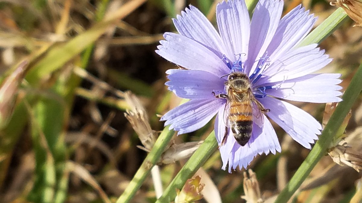
What’s all the buzz about bees this week?? Seems it has been studied and determined that they can discern between blue and yellow in order to prove they can perform remarkable arithmetic.
Last fall while hiking in Boulder, I spied this little fellow on a cornflower.
Yes, it’s official – they can distinguish colors – blue and yellow – in order to prove their math skills! Want to know more? You can immerse yourself in the study here:
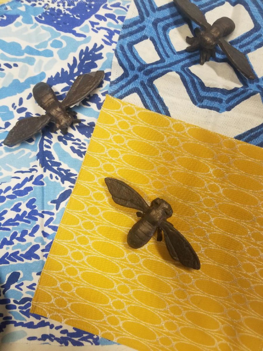
In our source library at PATRICIAN DESIGN, we have hundreds of fabric samples from designers all over the world…these little iron bees were irresistible for our purposes today!!
Blue and yellow as a color palette is classic. I never tire of it. I find myself encountering it often. Blue and white…often punctuated with yellow. It transcends styles.
Color schemes are the basis for so many design related exercises. Finding your color preferences for your lifestyle from clothing fashions to interior appointments – it’s about personality, temperature, lighting…
Here’s a great link to get you thinking about color palettes
or finding one that suits your personality.
Time to remodel the kitchen!! This charming little bungalow had already experienced its share of remodeling – well, not so much structural – although, many interior design transformations had occurred over the decades. In the mix, the well-used and enjoyed kitchen was feeling a quite tired and dated.
You might remember I have used this now completed project, in the last few months, during its transformation process to identify certain features and design practices. Here is the as-promised unveiling of the before and after photos for further discussion about the design process, intent and results.
We loved the mottled color and organic character of the existing slate floors and opposing green-grey beams with spanning boards of a caramel stain. These were the two elements that went well together as though intentionally planned. Yet in between, the pale, peachy pickled oak cabinets with their radius detailing and red-rose/black matrix of the tiled granite counter-tops, didn’t seem to speak at all well with the ceiling treatment and slate floor’s greens, rusts and charcoal tones. It was a dark, confused space.
When observing and “listening to” the house, it was evident that the current kitchen, in addition to being poorly coordinated, had absolutely nothing to do with the original architectural intent. The new owners had brought a few very fine antique pieces into the home. The mid-century circa 1964 age of the house accepted them on its original hardwood floors also adorned with their fine antique rugs…but something was missing. There was no cohesive thread running through the house. Over the years finishes and decorative elements had been selected and installed without any consideration for original materials or an attempt to introduce compatible and harmonious materials for the good of the home’s overall theme.
In all fairness, had the entire interior been gutted and a
contemporary interior been uniformly installed into the framework/shell of the structure,
I might have considered it a success. However, this multiple decade decor was a
mix of disparate trends and preferences that had no commonality.
To begin the process of bringing this home into a cohesive
design last year, we had redesigned the living room. There we introduced a classic
blue and white color scheme derived from the Persian rug in the adjacent dining
room.
To the corner kiva fireplace, we added a sandstone hearth and
mantle with just enough blue and white Talavera tile trim at the base of the
hearth to subtly coordinate with the new scheme. The Talavera was an
appropriate material for this New Mexican bungalow.
The original fireplace had a dark, broken brick quarry tile hearth and no cap on the mantle.The face-lift replaced the hearth material with broken-edged sandstone slab and matching mantle cap with Talavera detailing at the bottom.
With this living room having been so successfully re-designed, the obvious thought came into the discussion to continue the vernacular of the blue and white Talavera into the kitchen. As a bit of a purist when it comes to application and termination of materials, I was not content for a mere back-splash. No, if the tile were to be effective and commandeer the stage, it had to be used wall-to-wall as though an entire wall treatment.
Treating the Talavera tile as wall-covering, it continues from the kitchen, into the adjacent pocket-space housing a desk and laundry machines.
But wait! The addition of an earthy aqua handmade tile from
Spain offered an appealing and unexpected accent woven intermittently through
the Talavera. It created a coordinating thread from the colors found in the mottled
slate floors and ceiling beams.
Pre-grout shot shows the individually cut 1″ pieces inserted as mosaics into the random field of Talavera
The cabinets were in excellent condition, but the doors were
sadly dated and in no way spoke to the home’s other cabinets, doors and finish
carpentry.
The confused interior finishes we in need of a transformation!
With the white raised panel theme throughout the home’s original appointments, we elected to salvage the cabinet boxes and replace the doors and drawer fronts with a similar raised panel detail. The same red oak was used and, with a glossy white paint applied, the grain “read-through” with a very intentional yet subtle moiré-like pattern. The new raised panel white doors and drawers, with crowning top molding provided a crisp, timeless motif. The random patterned Talavera used as an entire wall-covering was very effective. The kitchen was quite gussied-up!!
The transformation was dramatically successful!
The existing slate floor was beautifully organic and I felt, from a design standpoint, was a must to salvage. Making it look like an intentional selection – part of the new scheme – was imperative. Therefore, selecting a counter-top that communed with the tones in the floor resulted in a selection of concrete-like engineered Italian quartz material – balancing the floor with the next horizontal plane and ultimately with the stained and green-grey boards of the existing ceiling treatment.
The new concrete-like Italian quartz counter-tops coordinate well with the other materials.
Another asset was the connection to the outdoors, however the existing window over the sink was high and small.
The window over the sink was high and small…
By bucking the warranty of the Pella people, we had a new double-hung window made to close down onto the new counter-top that passed through from inside to out. They would not fabricate the window to do what we intended, so we had the contractor remove the bottom of the new window frame, thus rendering the warranty null and void, in order to have a completely open, uninterrupted pass-through when raised.
Amusing and interesting…existing family pieces of blue and white ceramics are being discovered and used as decorative accessories in the new kitchen!
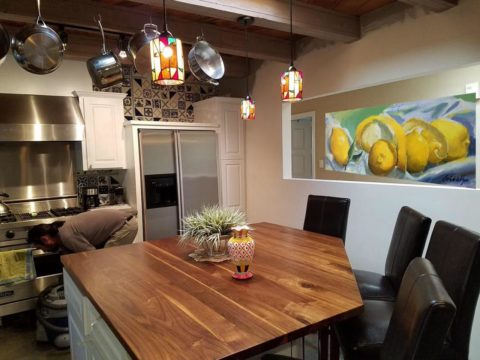
We also captured the opportunity to open the opposing wall into the hallway adding pass-through light and dimension to the space. This exponentially expanded the space and made the encapsulated kitchen feel much less confined.
Before, the kitchen felt small and dark…Opening the wall into the hallway brought in additional light and dimension.
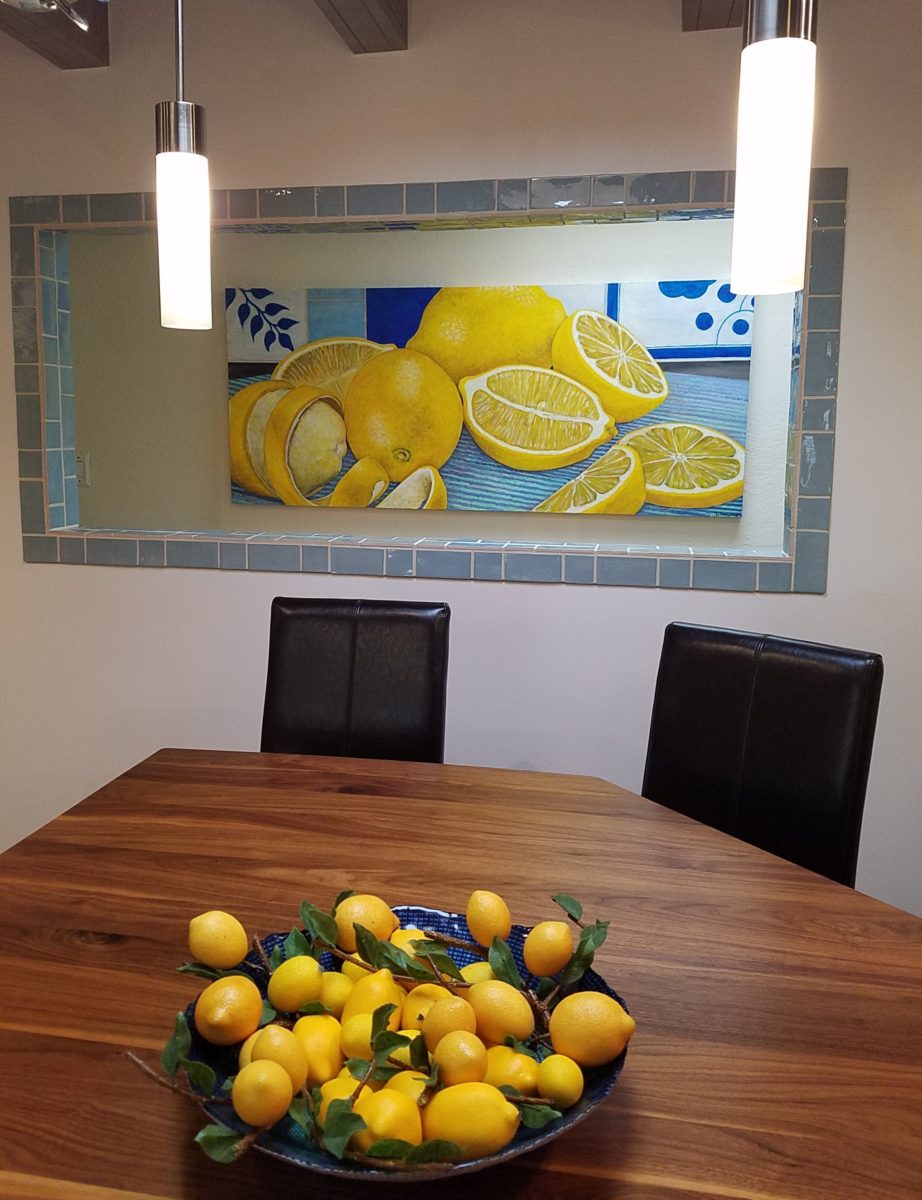
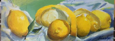
To add drama to the newly created dimension, we discussed having a painting commissioned to pop an accent of yellow into the blue and white scheme on the far hallway wall. Lemons, a perfect citrus for the kitchen, was decided for the theme.
A miniature oil painting by Federico Leon de la Vega was used to Photoshop into the scene to inspire and convey the design intent.
The additional POP of yellow is a dramatically effective contribution to the overall composition. After consideration, the owners selected a local artist to paint the full-scale painting.
A local Albuquerque artist, Thomas Tomlinson rendered the lemons in acrylic with blue and white tile details.
In summary…keeping the original slate floor, existing cabinet boxes (replacing door and drawer-fronts only), with a bling of new chrome cabinet pulls, switching out the stained glass pendants, replacing the island’s surface with a handsome solid walnut top and a new coordinating concrete-like counter-tops on the periphery, with the decorative embellishment of the Talavera tile continued from the subtle introduction at the living room’s kiva fireplace, the transformation of the kitchen is stunning – not trendy – and was truly, uniquely designed for the architecture and forward, on-going contextual design conversation of the home.
Uniquely designed…
Look around and listen to the environment for and in which
you are designing. What makes the best sense for the design direction
considering the function and context of your project?
The world is full of detail. From the wonders of nature and the perfection of a flower, to the man-made creations that come from inspiration of all sorts. The combined influences that result, in interesting and good design, are limitless and we now have layers of platforms upon which ideas are presented. The access to creativity is staggering.
Take Etsy and Pinterest. There the ideas abound. Everyone has access to creative ideas unlike ever before in our world. In the past, a keen eye observed and discerned. The clever managed to find inspiration in the most obscure places, analyze observations and interpret them for their own purposes. Creativity was spawned from observation paired with original thought. Yet, that observation was generally first-hand. Therefore, those that got about more, saw more and had greater exposure to more (and there you have it) were creatively stimulated more!
We (perhaps I should say I since it is from my own vantage point and experiences, from whence I speak/write), often are so busy observing that we don’t take the time to dissect and catalog the information we discover. I am so very guilty of that as I am so captivated by design and creativity that I forget to remember!!! Ha – yes – forget to remember or record!!!!
I constantly find myself regretting to have taken a photo of something (some who know how many photos I take might want to take exception with this point), but it’s true. I regret not taking a photo or studying something which, retrospectively, I recognize as something quite special. In the rush to experience the entire scene, I fail to notice or retain the details. Have you ever felt that you were so caught-up in a new experience that afterward you feel you should have paid closer attention? I forget to remember to store the observations or I forget to take a photo – regretting it afterward.
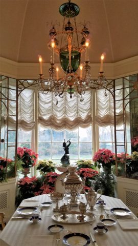
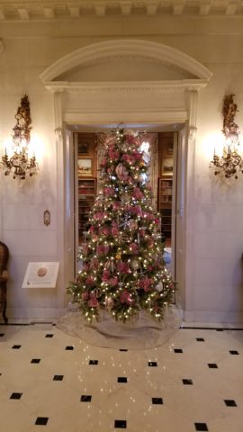
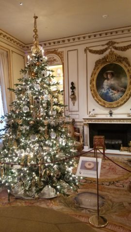
The breakfast room aat Hillwood Mansion where Marjorie Post rarely entertained, but was always set to do so. Pink poinsettias are the seasonal choice.
This can be from a class lecture to a theatrical production. I wish I had focused more closely rather than getting distracted by my own imagination which often runs rampant with the encounter. However, the stimulation can be so great that the imagination kicks in and causes diversions, in the attention, resulting in a deficit of detail gathering. Hence a clear case of un-diagnosed ADD!!!
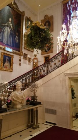
With all of this having been the prelude to my thoughts for the day, I have elected to pick out a few details from a recent tour of the Hillwood Estate and Gardens nestled on magnificent wooded grounds in the heart of northeast Washington, DC. And how wonderful to have had the opportunity this week to stroll through the mansion, now museum, of the late Marjorie Merriweather Post during the Christmas season.
As previously mentioned, I would have, could have, should have taken more photos, but was so enchanted at every turn by the beauty and gracious luxury that unfolded, I was too busy darting from one magnificent scene to the next to capture more than I share here. I apologize.
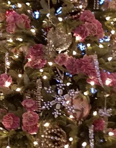
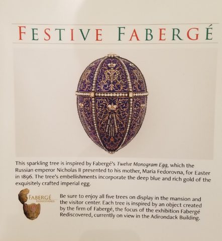
Her favorite color was pink and this tree greeting visitors upon arrival is a precious jewel among many beautiful Christmas trees and decorations displayed in the mansion.
From the reflection on the polished floors of the little white lights to the shimmering crystal punctuated with pink blossoms bedecking the tree was undeniably elegant.
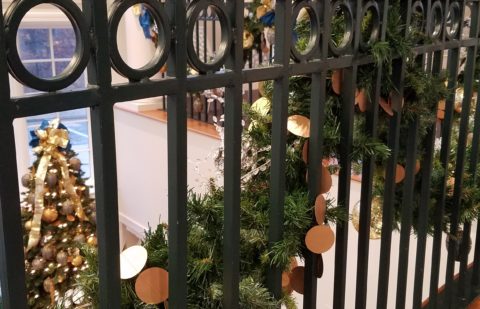
The railings ascending the staircase at the reception desk were draped with garland and strung with simple gold painted discs which were repeated in the coordinating tree which also featured a collection of blue reproduction Faberge eggs.
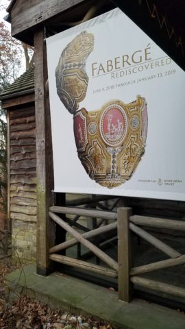
Marjorie Post was a discerning collector of all manner of artistic beauty including exceptional Russian decorative art. The actual exhibit of Faberge currently available for view on the property is nearing its end. Many dazzlingly detailed pieces from her own collection and others on loan for the exhibit are being shown.
If you are in Washington this month, please treat yourself. This exhibit of Faberge pieces is outstanding.
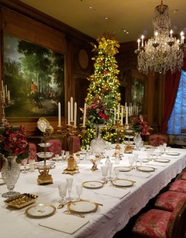
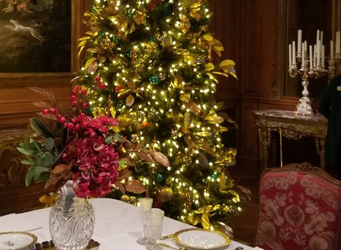
The gold leaves on this magnificent tree in the dining room would be fun to replicate. Could have easily been dipped in gold leaf. Like lime leaves – or from your garden perhaps photinia or laurel even rhododendron – maybe go faux with silk from the craft store – spray ’em gold!!! Paint magic!
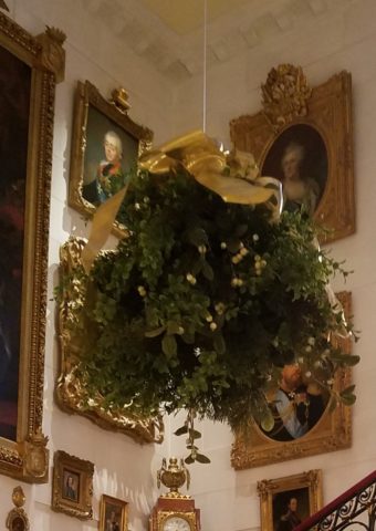
And if you have ever installed a dangle of mistletoe…check this out! This elegant bundle suspended, from the towering heights of the entry hall, puts all other sprigs to shame!!! In the opulent foyer, this grand ball of gilded ribbon-clad mistletoe invites those to tempt the fates of love and superstition, with but a kiss!
Whether it is a theme of gold or a snowy season of white, find details and enjoy the creative opportunities that present themselves to you in passing or from the depths of your imagination and create your own holiday magic!!!
Creating fantasy, festivity or seasonal celebration, gather the details every day from observing all the particulars around you. It is amazing from where you can collect ideas and be inspired to create your own festive fantasy!!!!!! Then be sure to take some photos!!!!!!!
In past blogs Patti Says a lot about selecting paint colors. Pondering paint colors and the elusive nature of selecting just the right color. https://patriciandesign.com/5677-2/
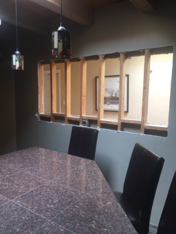
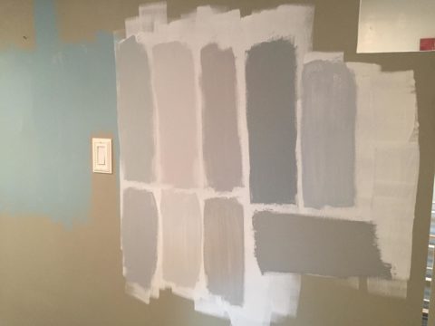
Walls surround your world. Walls encapsulate and enclose your personal spaces. They can also frame your world and dramatize a focal point. They add effective dimension when punctured.
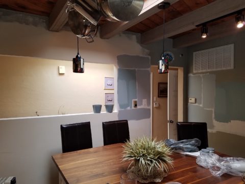
A current study we have in front of us is about those specific things. Walls – opening them, their color and the context of the color decision. Months ago we examined a wall in a kitchen soon to be remodeled. Re-painting it was the most obvious and least complicated of the options. We also looked at creating a dimensional recess to house art or an accent color or something to take the curse off of its up-close, massive, solidness. It was like the 10,000 pound elephant in the room!
The wall encapsulated close quarters. It divided the space between the kitchen and the parallel hallway.
What we were looking to change was atmosphere. This involved improving the dated and worn cabinets and counter-tops, updating the lighting, enhancing the back-splash and addressing the closed, isolated feeling of the room.
Smoke and mirrors might be the answer. Like a magician appearing and disappearing behind a veil/dimension of smoke – or when the physical space is not negotiable, mirrors will give the illusion of added space. They are VERY effective tools, but neither was the right solution for this room’s current condition. Yet, we knew we needed dimension, depth and something to help expand the space.
Hmmm…the window over the sink offered an exciting option to open out to the patio. We did that – save that for another story. However, this large elephant of a wall was still so confining.
Sometimes small spaces can be cozy. Some people prefer tight spaces while others find them to be claustrophobic. This was not exactly claustrophobia instilling, yet it certainly spoke to all of us as an imposing, confining factor that needed attention.
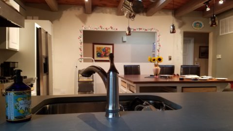
After discussing all the colors and recessed options someone has the brilliant idea to ask – “What about removing the wall?” That seemed a bit radical considering that it only opened to the hallway and it served a purpose of defining the access to the kitchen and opposite bedroom quarters. To open it entirely might have given an orientation to the kitchen that suggested that the island seats be positioned facing that point-of-arrival. Hence looking directly into the far hallway wall. That was not the desire. Rather, we decided to cut a large opening in the wall exposing the far hallway wall while maintaining the orientation of the kitchen toward the outdoors and island seats facing into the kitchen not out into the hall. It worked!
The space was instantly enlarged. Opening the space onto the patio and this opposing generous puncture of the Great Wall of Kitchen changed everything! The light borrowed from the skylights in the hallway was significant and the sensation of enlarging the space was undeniable. Except the footprint had not changed.
The physical feeling of a space is what counts. It was proven here that it wasn’t about enlarging the space but feeling like it was enlarged. Like mirrors, the illusion of space is so important. But, unlike mirrors this space was physically opened creating the sensation of enlarging the space by adding actual dimensional reality . The benefits were immediate. It actually conveyed a palpable feeling of relaxation. It was freeing and created an entirely new experience of enjoyment.
A passing idea for a stenciled surround was entertained…
Tight spaces give some people comfort. Contrarily, open spaces give comfort to others. Personal reactions to space, color, texture, temperature all enter into the equation of good design. What tasks are being performed also play a part in determining what solutions are best.
This dark, isolated kitchen benefited from changing the cabinets to a white traditional raised panel style detailed with crown molding which added a refreshingly light element. The house was a decades old vintage bungalow and had been dealt a disservice to have had the kitchen remodeled years ago in a not-so-sensitive, style-of-the-day fashion. But, in addition to the more traditional timeless approach to the design, opening the space resulted in additional natural light borrowed from the hall’s skylight and an enlarged interior over-the-sink window brought more coming in from the patio. Now colors…
So we know that picking colors is contextual.. .what’s in and around the room are all part of the equation. Any walls that are seen beyond (through doorways, around corners) contribute to the layering of colors and therefore, participate as well. The floors are multi-colored mottled slate. The tile chosen to enhance the backsplash and also serve as wall-covering was a blue and white Talavera accented with a soft aqua mosaic. The ceiling mimicked the floor as the beams were a smoky grey with caramel-color stained knotty pine boards between – we embraced these existing design features as their unselfconscious non-trendy nature suggested a more grounded, permanent place – one with organic finishes that might have resulted from local availability sourcing and craft – and probably did all those decades ago. See what Patti Says in another blog about this very project: https://patriciandesign.com/trust-and-custom-designs/
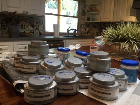
The fact that all of these elements contribute to the equation, for deciding a color, is key to our study today. After discussing the options for treating this newly opened wall, we found ourselves doing the paint sample potpourri on the walls!
Taking cues from the aqua accent mosaic which was derived from those tones found in the slate floor, we directed the color choices toward smoky aquas and grey blue tones.
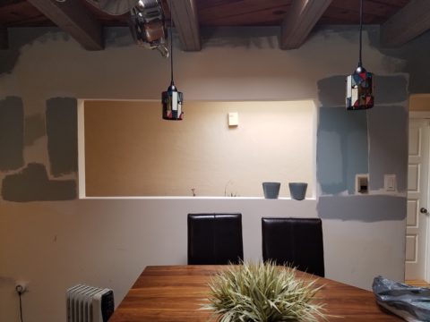
Sometimes white is actually a color, rather than the absence of color. The wall was currently frosted with smooth crisp drywall mud as an aftermath to the demolition and framing of the new opening. The stark white was clean and fresh. Like matting around a painting – this might just be the way to go.
And at this point, we must introduce the idea that was also in the works and that was to have a painting commissioned that would POP through the opening providing a spectacular backdrop to the kitchen and dress the dimensional contribution that the opening into the far wall of the hall presented.
We knew that yellow was a great color POP for this cool kitchen pallet. A recurring bowl of lemons kept proving that to be true. Lemons became the fresh, culinary subject that seemed to be the perfect fit. So we enlisted our master muralist Federico Leon de la Vega to meet the challenge. Armed with the blue and white scheme and the accents of aqua he created a miniature to test the concept.
Isolating the image and framing it is always an important component in the formatting of scene. Whether to spotlight a sculpture on a pedestal, or properly and effectively matting a painting in a frame, this aura is important to highlight art. The same became true as we considered the painting being “framed” by this opening. The wall itself became the mat. So to get an idea of what this might look like, a quick digital manipulation did the trick.
The final decision seems to be that we will keep the wall with the opening white, as though a matting around a painting, while painting the perpendicular wall a smoky aqua. Another opportunity for layering these two colors occurs when the smoky aqua wall is layered over a receding laundry room wall soon to also be painted white.
Watch for the completion of this wonderfully unique little kitchen to be unveiled with all the dramatic before and afters! Meanwhile, look around your interior and see if opening a wall might be an option to expanding your sense of space. The transformation can be rejuvenating!
Pick a color. What’s your fav? Do you HAVE a favorite color? I was asked the other day that very question and I was really at a loss…I looked at her, furrowed my brow and cocked my head. I wanted to have an answer – a simple answer that stated a definitive preference for a color – my most favorite. Rather than producing a quick sure pick, I faltered as she stepped in and said – I’ll bet it’s purple!
Well, actually I can definitively say that purple is NOT my favorite color, but the funny thing is I can love purple, in certain context. The real answer is that I love nearly any color in a certain context.
When I ponder the question a bit more, I can assertively say bright pinks, cornflower blues, golden yellows, chartreuse and brilliant orange. But the truth is, I love so many colors that I am hard-pressed to select just one! It sounds like a Lilly Pulitzer color board.
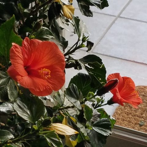
So I thought of a little exercise. I decided to pick a color at random. Then overwhelmed with the myriad colors that might produce one random pick, I fine-tuned random and said to myself, perhaps a color of the season. To me that was currently and boldly orange. So the idea was that I would walk in and around my house today and capture things that were orange.
This screaming orange hibiscus just came in from the patio to escape the chilling temperatures that have swept down in the last couple of days…happy to transition indoors for the winter!
Try it. Pick a color – not necessarily your favorite – but certainly one you like and walk inside and outside of your house and see how many examples you can find, of that color, in your immediate world. Photograph things that have that color – all or in part, even little details – anyplace that color occurs. It’s fun and very interesting to see what you discover!!
Autumn is loaded with vibrant colors, but orange is one of the most fiery.
So I selected orange as my color today. I dashed around the house and collected a variety of things that were orange. I was actually astonished at how many I discovered.
This dramatic Hopi – influenced kachina by Gregory Lomayesva sports stylized antlers in a flat but brilliant orange.
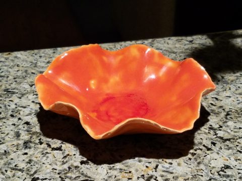
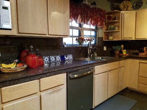
Festive ceramics by Ann Marie Werner Smith – here a graceful orange bowl that sits on the counter…it pops against the contrasting granite.
It is interesting because I know my world is not heavily orange, but I found so many wonderful splashes of it throughout my interior and even startling exterior, in the way of the leaves on the Bradford Pear tree.
From fresh mini pumpkins and flowers…
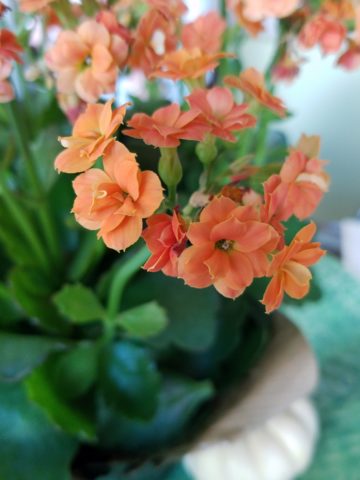
A succulent orange flowering Kalanchoe is our seasonal centerpiece on the kitchen table.
A variegated Croton plant has lacy veining of bright orange, pink and yellow contrasted against it dark green background.
to artwork with swaths of orange streaking through them.
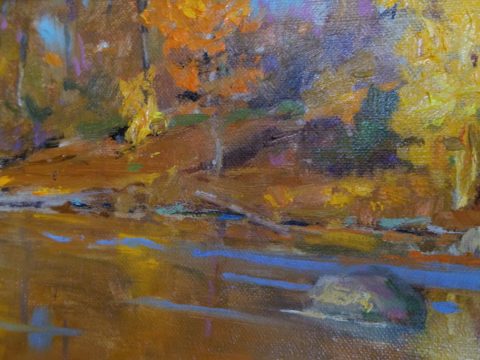
A lovely little oil painting by Jeff Otis depicts a very autumnal New Mexico river scene.
At the last minute, while waiting in the Bejing airport, I found this precious little painting of birds and berries. The background is a vibrant orange. Notice the fresh blues adjacent to the orange. This is a detail of the much larger piece.
Peggy Zuris really knew color. Her bold and confident brush strokes applied in luscious swaths placed adjacent colors perfectly juxtaposed creating uplifting renditions of daily life. This little chicken is a detail of a fanciful rural scene.
The balance of color was so interesting. Where I found orange, I nearly always found blue – unless it was a stand-alone like the glass bowl of oranges – or my coral necklace with its nuggets of bright orange coral.
Fresh oranges with their intricately textured rinds fill a glass bowl on the kitchen counter.
Nuggets of coral look like candy corn tightly beaded on this delicious necklace I wore too Santa Fe today!!
Colors balance and contrast.
Even the coasters that attracted my attention last weekend at a bar. I was so taken by them that I brought them home and had them sitting on the kitchen counter. They were intriguing and offered interest and visual stimulation to my graphic art sensibilities.
I began this story earlier today, then took a break and tootled up to Santa Fe where I came across a couple more bright orange pieces…
And on the way home, I was even blinded by an orange fireball glowing beneath the stormy sky silhouetting the dark mesas and glistening off the wet pavement. It’s intense heat contrasting with the cold, damp asphalt that was a result of our first seasonal snow seen here spitting at the windshield.
Gather your collection of photos of your color today. Ponder how they and the color make you feel. Do you get joy from the color and the things you have discovered? Was this not your thought-to-be favorite color and if not, might it be one of them? How do YOU answer the question, what is your favorite color and having determined that, ask yourself: Do I wear it a lot? Would I paint my walls that color? Do I have upholstery that color? When is a favorite color an accent? Is the joy in the little spots of punctuation? Are they intense, but small, elements of joy without over-doing it? I see a collection of abstract images, details of things – some of which can be cropped more – to create an abstract collage of wall art. Voila!
Color – an amazing facet of design and it’s most versatile component. It’s been a fun test and a compelling story. So what’s YOUR favorite color?
Patience. Good design requires patience. Do you have it? The design process can either take the route of “all planned before anything starts” (everything drawn and detailed, all finishes selected, all fixtures and furnishings, fabrics and accessories decided and specified, for perfect inclusion into the design) or the process of “design-as-you-go”. The “all planned” design process allows for exact pricing and budget planning. But if the process takes too long, some of the things specified might no longer be available – that has happened more than once! The other “design-as-you-go process” is more random. There can be and often is a combination of these two approaches, but the second requires more patience and less precisely scheduled time.
The luxury of time, experimentation, trial and error, wait and see, what if, all are elements of the “design-as-you-go” process. It is decidedly the more fun and more participatory process. It starts and evolves before your very eyes, with the in-the-field options, to change, modify, massage, delete, add, think and re-think, all available while the action takes place, it is like creating an art piece one stroke at a time. Artistic expression rarely progresses in a straight line.
All of the above can be said of the pre-planning process too. You can illustrate, render, draft, erase, alter and change all the while – but you are doing it prior to commitment, prior to actually seeing the actual design unfold in real time.
Changes and additions can arrest the process – whether in pre-construction planning or live-in-the-field. However, live-in-the-field is much more int-eruptive and possibly costly. Changes and additions can cause scheduling delays which can domino throughout the otherwise planned program. This can result in not only cost considerations, but disarray and a prolonged inability to use the space.
As I visited one of two parallel kitchen remodels nearing completion that I have previously mentioned, the owner mused “It’s a painful process.” But as we stand there enjoying the transformation he continues “It is almost hard to remember all the phases we’ve been through to get here. Kind of like childbirth.” We laughed at the fact that the world would be filled with “only children” as no mother in their right mind would go through that pain again!! He and I both never having experienced it for ourselves – yet, “they say” that it’s true. All very much worth it in the end!!! The ultimate reward!
This BEFORE shot of this kitchen shows dated, anemic face-framed radius flat panel cabinets, granite tile counter-tops and back-splash.
Not quite finished, cabinet pulls are being installed, final painting details are underway and the transformation is being unveiled. New cabinet doors add a classic raised panel detail painted white, with new concrete-like engineered Italian counter-tops, and striking Talavera tile back-splash punctuated with mini mosaic Spanish tile accents. A new window opens to the outside patio with the counter-top passing through and the window closing directly on the top.
Residential design – those private, personal spaces always involve knitted brows, vacillation, additional worry and more indecision than commercial designs. Not to say that commercial designs don’t involve interested parties, if not actual owners, the investment in the personal pocketbook and personal emotion is not the same. Furthermore, there are greater personal thrills and disappointments in the residential projects.
Well, back to patience. It’s a virtue and I often struggle to practice it. I tend to be overly eager for instant gratification. But patience is very important when creating something of value and timeless appeal.
Design takes patience during the various stages of design details. We are not talking about building a rocket ship – but imagine the design and engineering required for that!. Let’s just talk about something simple, like custom drapery rods. The client thinks – fastand easy. While on vacay they experience a lovely accommodation that features hand-forged drapery rods. “Cool” they say. Filing that away among their thoughts of interesting interior details. A couple of weeks later, they are in front of an art booth and meet an iron-worker who offers all manner of custom iron work. So they recall the cool drapery rods and inquire as to whether he would do something like they described. “Sure,” he sings and whips out his portfolio of photos among which are very cool twisted iron drapery rods with swirly finials adorning the ends. They’re sold! They invite him over to see their windows and get started. At this point, their interior designer knows nothing of this idea or the contact and engagement.
Remember, they are thinking fast and easy. So they expose their idea and plan that is already underway asking their interior designer on advice for drapery fabric. With this opening, the designer asks about the rods. Come to find, they aren’t sure how far past the windows they have been measured to go, they haven’t considered that the 5/8″ solid stock might want to sag after a while spanning 8 feet and they have no idea how they are going to hang the draperies…”Oh” we need rings? So it seems that the conversation with the iron-worker has been rather cursory. Questions that needed to be asked and answered at the outset had not been thoroughly considered.
Fortunately, these details will now be addressed, issues solved and finished product all as it should be with proper extension past the actual window opening, matching rings to the iron rods, and a stout enough rod so as not to require a center support – an element to be avoided if at all possible. Whew – caught that one before it was too late!! (Watch for the installation of the hand-forged rods and custom draperies in the next few weeks).
Paint colors often wait until other decisions are made. I have mentioned previously that we usually pick things that have fewer options. There are more paint colors than anything else in our design world with fewer fabrics and even fewer rugs. In that order, we might pick the rug first, fabrics to build upon it and paint colors to bring it all together. Not necessarily – but that is a pretty good example.
Starting with an existing hardwood floors well preserved by decades of wall-to-wall carpeting, we discussed the desire to create a colorfully transforming interior and opening of the space to better connect the kitchen with the living area.
As we met to hang artwork, discuss iron drapery rods, custom chandelier and finishing touches, the clients remarked that this was so exciting to be nearing the end of this dramatically colorful transformation that so nearly has transported them back to Guatemala where so many fond memories have been established over the years.
Well, back to patience. It’s a virtue and I often struggle to practice it. I tend to be overly eager for instant gratification. But patience is very important when creating something of value and timeless appeal. Go forth and design your dreams with all the patience to make them come true!
Thirteen or so years ago we designed the interior of a home for a young family complete with a toddler. The desire was to bring color and modern accents while still selecting durable materials and hopefully timeless elements.
Fast forward these many years later and this same family now with two beautiful daughters is relocating to another city, another state and a new home. This home was well furnished and much, of what was shown, stayed with the house. The trick was, after having adopted so much from the previous owners, how would they make this house their home?
The point of arrival – the front door – was a tasteful charcoal grey, but by changing it to a bit lighter smoky green, it made a significant difference.
It’s tough to be up-rooted anytime in your school years…these girls missed the only home they had ever had, friends, activities, groups and familiar environs. This challenge was to help all four of them – parents and kids – get settled and assist in making this new house their true home.
As I flew to consult with them, I imagined the scene having seen photos to get somewhat oriented. I made the natural assumption that paint would make new statements to alter the previous owner’s selections and introduce the new family’s preferences. However, despite the change we made to the front door, it wasn’t all about paint once I arrived.
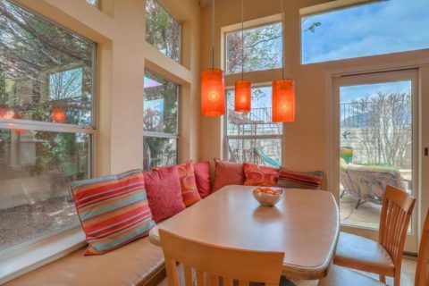
In the previous residence all those many years ago, we punctuated the interior with paint accents. Good design transcends trends and the years. Who would think that this interior was created thirteen years ago?
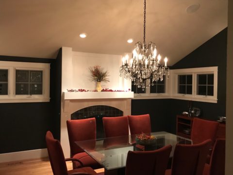
The dining room in the new home was painted entirely charcoal – trim and walls. Oppressive was an understatement and before I even got there they painted all the trim white to match the rest of the home. However, they left the fireplace charcoal – waiting for a discussion as to how to proceed.
Notice the dining room furniture having moved from one home into the next. We decided to paint all the wood trim surrounding the fireplace area white to match the rest. But it produced a startling brightness that will be absorbed once a new painting is selected for above the mantle.
They inherited the chandalier with the home and although it is quite different from their previous dining room fixtures, they are making it their own by mixing their chairs, table, rug and sideboard.
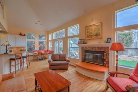
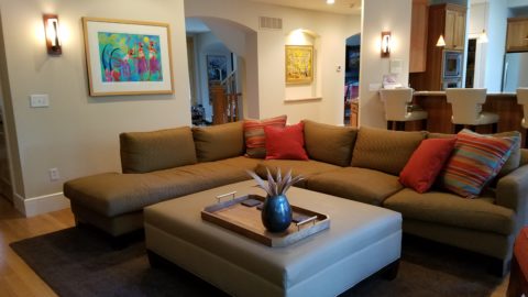
The framed lounge chair found a home in the new living room alongside the large sectional that they acquired from the previous owners of the house.
Here in the previous home, the painting over the fireplace has a prominent position, yet also has a place of prominence in the new home along with the chair and a half and the arm chair in the foreground.
Checking out a sample of a rug to add further color to the otherwise neutral scene.
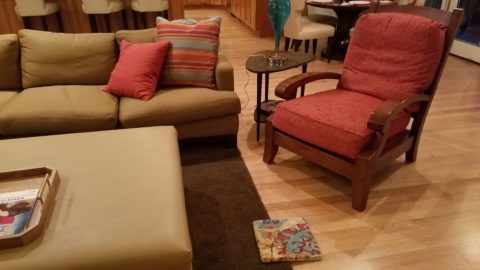
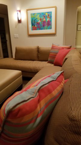
The simple placement of custom throw pillows initially designed for the banco in the kitchen are now colorful accents in the living room, on the newly acquired sectional left by the previous owners, are a remarkable save.
These pillows had seen their share of spilled milk and ground-in cereal over the years. But with periodic cleaning, they maintained their appearance perfectly.
Here the pillows are the perfect accent on the camel-colored sectional that came with the new house. The painting has been a family favorite for years.
The rest of the collection of throw pillows from that original breakfast nook are being re-purposed on the sectional in the lower level media room/office. They add the necessary splash of color in this neutral scene.
The fully upholstered chair-and-a-half also transferred from old to new. Previously in the family room, now in the music room/office. The master bedroom transferred completely. The girls’ rooms have a mix of their things and some new features. All in all it is beginning to take shape.
It pays to buy good materials that maintain well and take proper care of them. Not only will they offer years of enjoyment, in this case they bring the familiarity, to the new house, that is beginning to make it feel like “home.”
Sure, some might like the opportunity to start new without remnants of the previous life – but in this case, they cling to that which was comforting, familiar and theirs. Moving to a new home and being able to mix existing pieces so well with new ones to make this new house a home is a design success story!