Once upon a time there was a quiet little house in the woods. Nestled among the juniper and pinons of the rolling hills of Estancia, the little house lacked design details to make it feel a part of its surroundings. The owners and their dogs had lived there for a decade and realized that a move was not pending and therefore it was time to bring the house into its own.
The neighbors…
Color was the primary element that they wanted to introduce – that along with a look better suited to the organic, woodsy setting and updates for fixtures and finishes. So, this plain, dated house in the woods began a magical transformation. Not wanting to embrace the sleek white and grey trends of the day, they expressly requested warmth and color.
The interior was plain vanilla with warm honey-colored wood accents.
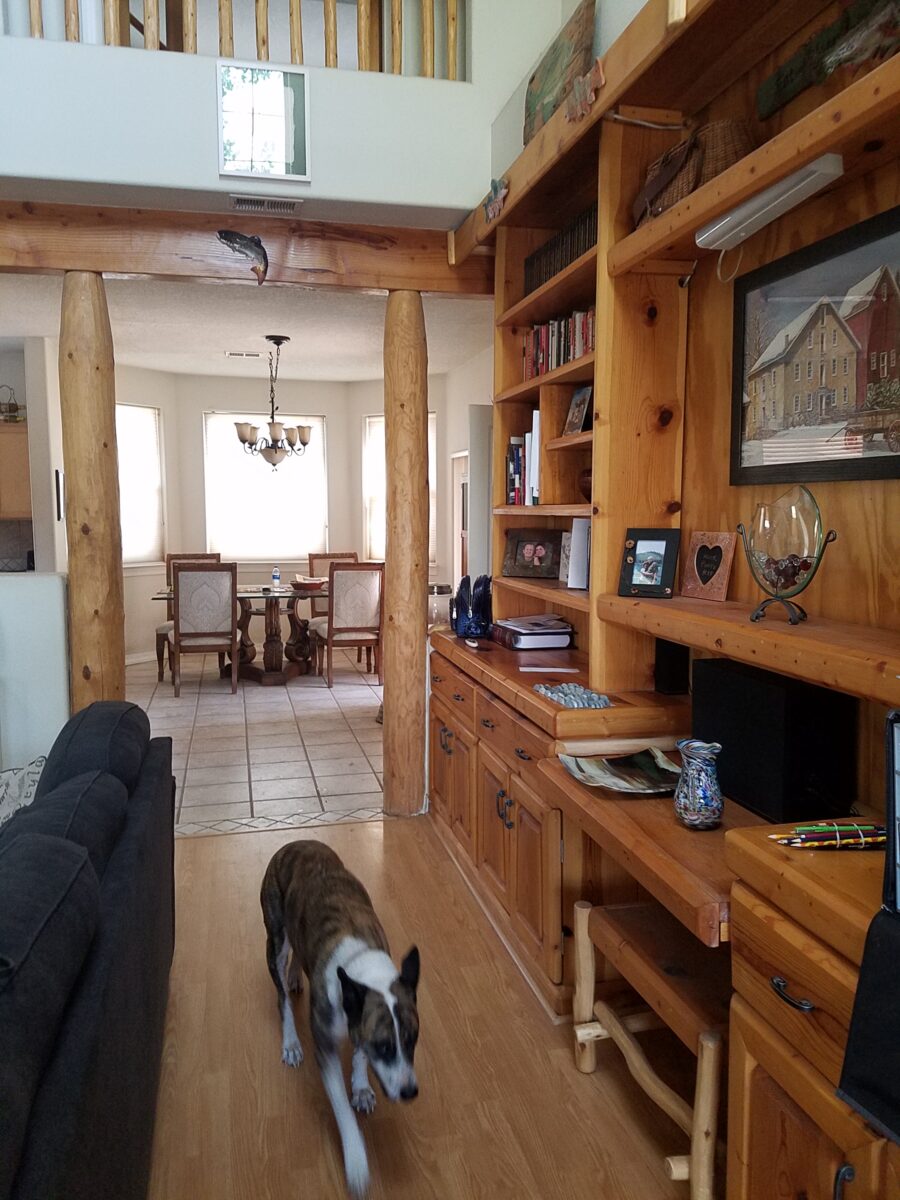
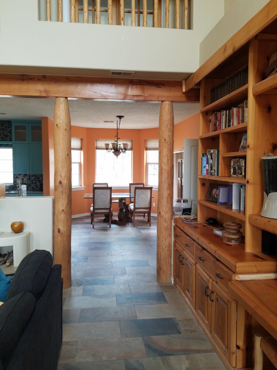
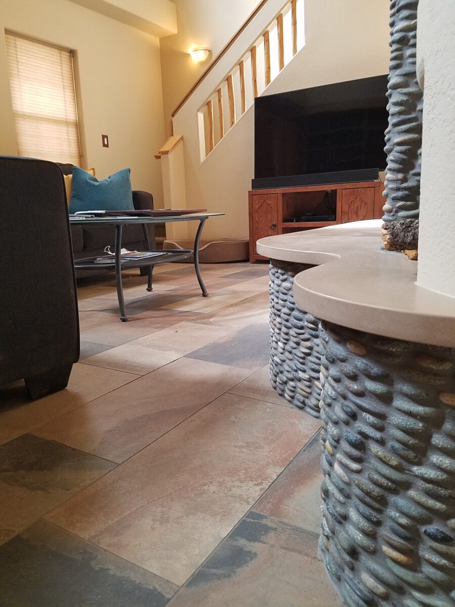
Beginning with the floor, we selected a porcelain tile that had a finish simulating a mottled slate. The outstandingly durable, slip-resistant material had earthen color variegations in the various pieces which were highly effective at concealing dusty dirt and debris from the out-of-doors and camouflaging the anticipated dog hair that was shed about. The resemblance of the tile to cut stone was remarkable. Due to its multi-color rendition of ochre, rust, charcoal, black and sand offered many tones from which to grow the design’s palette.
The flooring was a bland combination of slippery wood laminate and 12″ ceramic tiles.The new porcelain slate floor tile is multi-toned and rich with warmth. New wall colors and cabinets are peeking from behind…
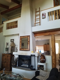
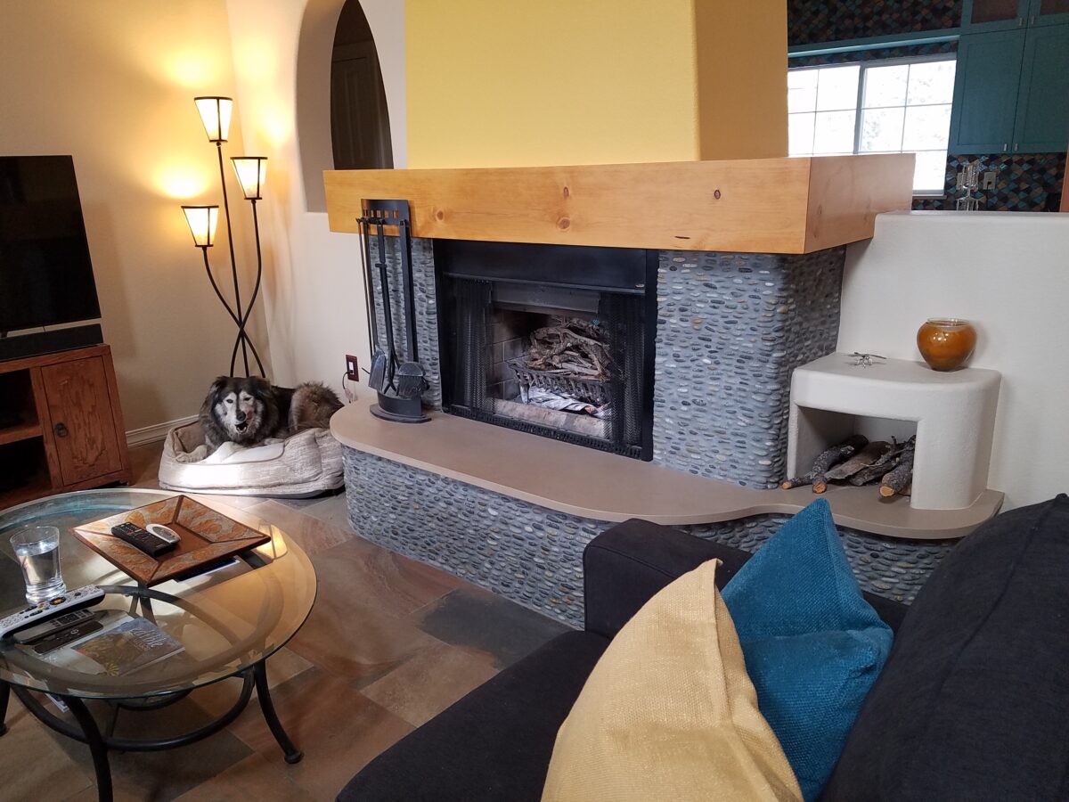
Rising from this new base for the interior scheme, we selected a dark, black/charcoal stacked stone. The smooth ovoid shapes added further organic texture with a subtle woven appearance to the surface of the fireplace.
Texture, color, form…the design is transformed…
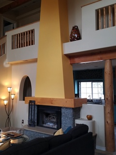
The mantle and hearth were both the plain vanilla white of the walls and despite the fact that white can be crisp, clean and fresh – the owners were eager for bold commitment to color. In keeping with the pine columns and other cabinets and architectural detailing, we wrapped the existing form of the mantle in knotty pine finished with a honey stain to coordinate with the existing wood accents. The hearth became an undulating slab of Cambria quartz material in a craft-paper bag/sand color also derived from the swirling “slate” floor.
The graceful shape of the hearth was enhanced with the addition of the stacked stone and new slab surface.
Towering from the now strengthened façade of the fireplace, the tapered form of the chimney was begging for the color-pop that the owner’s desired. The honey color of the pine along with the warm tones in the flooring invited a golden ochre paint to command the space.
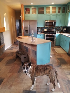
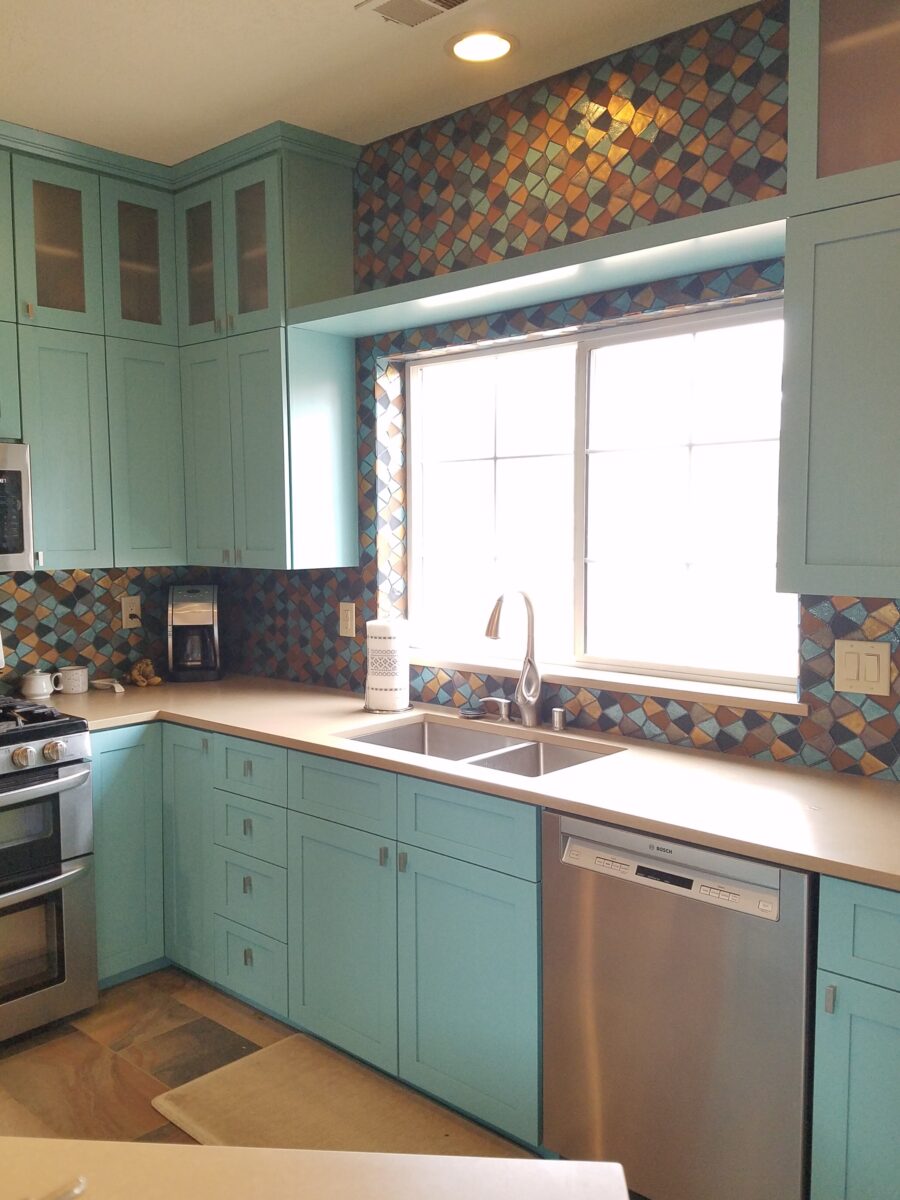
Specifically requesting the insertion of the owner’s favorite accent color – turquoise, we departed from the warm, earthen tones and punctuated the scheme in the new kitchen cabinets.
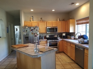
The original kitchen…tile floors and countertops, oak cabinets with off-white painted walls.
Salvaging the existing boxes and painting the faces, fabricating new doors, drawers, upper glass cabinets and end panels, the open kitchen is the fulcrum of the house. We see the trending minimalism of little or few cabinets in the kitchen, perhaps open shelving…however, this couple wanted even more concealed storage to keep their cooking and entertaining accessories out-of-sight, but close at hand.
The kitchen transformation features new color, new faces, additional upper cabinets with etched glass panels, luminous glass tile backsplash, new quartz countertops with a new bowed shape for the island…all while keeping existing appliances, cabinet boxes and layout of the space.
Repeating the slab material of the fireplace’s hearth which passes through from the living room to the kitchen, the new Cambria quartz countertops continue the craft-paper bag/sand color. The slate floor wraps up the face of the island for a durable kick-surface and visual continuity.
But wait! To further the focal features of the kitchen, we created a custom mix of colorful glass segments suggesting an interpretation of fallen aspen leaves golden and glossy in the damp of late fall/early winter precipitation. The combination of golden ochre and dark amber with the luminous turquoise of this stunning wall treatment dramatically contributes to the whimsically wonderful colorful scheme.
Saving the bathrooms for another story…there is more to be said about this woodsy transformation. Stay tuned and do not fear color! Embrace the context of your special places.
After experiencing and pondering the value of incorporating nature’s elements into architectural planning in the previous blog, I find myself winding into the countryside from sea level to a mile high into jungles and ultimately pine forests, across vast expanses of rivers and towering bridges spanning grand abysses…and stopping at a modest panaderia (bakery) on the side of the road.
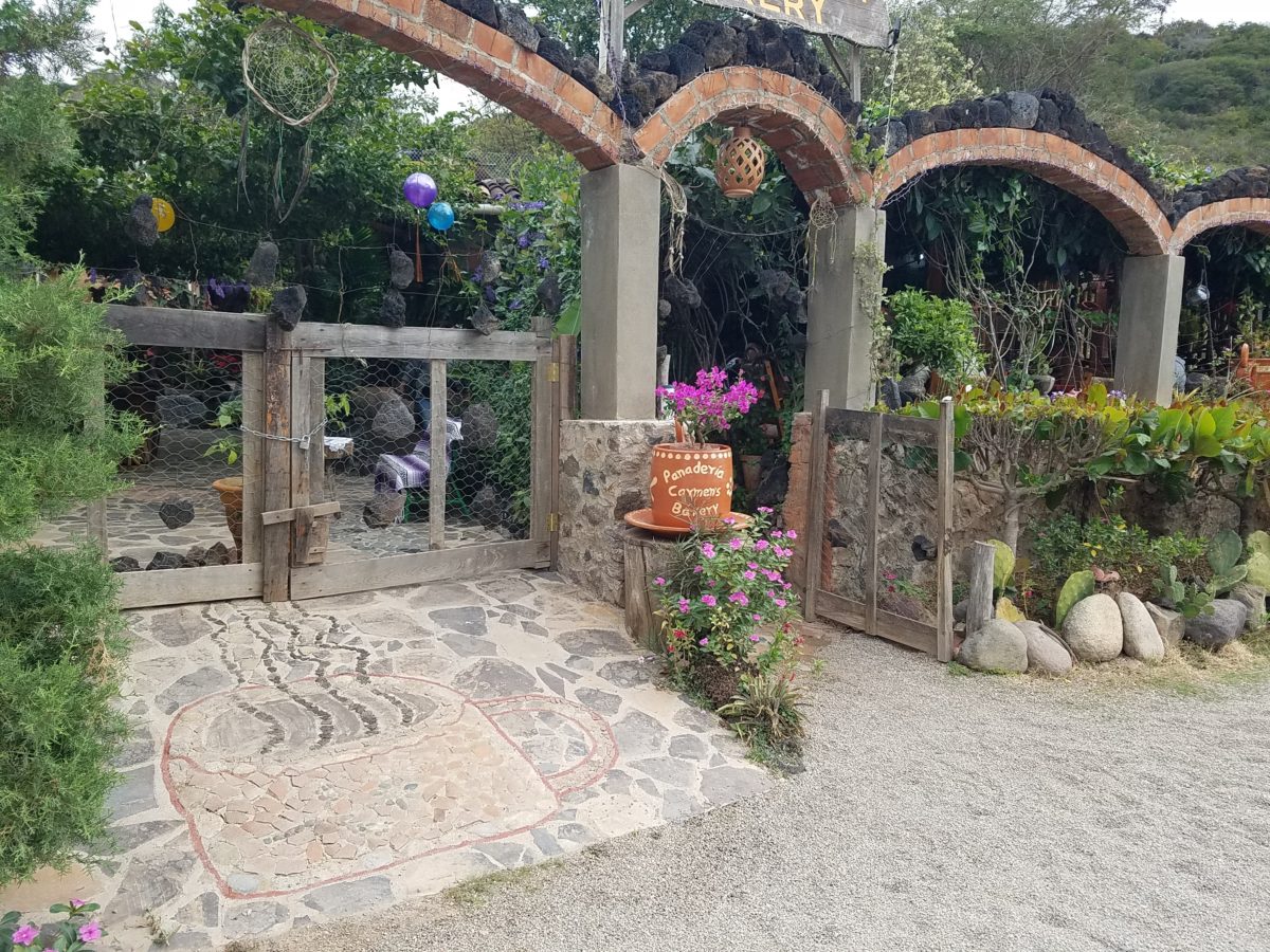
You can’t tell a book by its cover as this simple little rural structure – standing alone – looked curiously intriguing and quaint enough, with an unpaved parking area transitioning to well-tended pea-gravel. Traffic cruised by, on the way across the bridge.
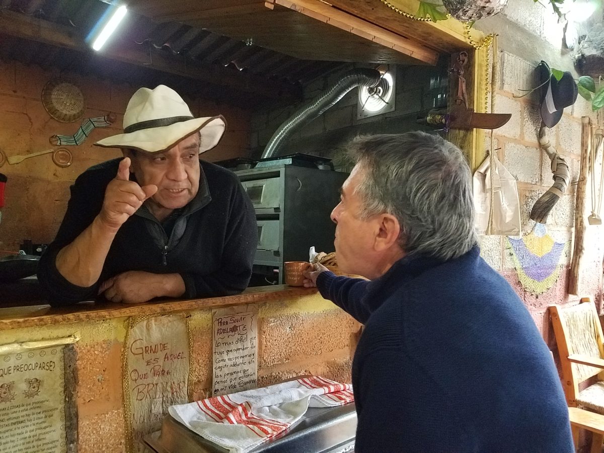
Those that knew, turned in. We pulled off the road and were told that this couple had a wonderful bakery and were promised an exceptional treat! Fresh empanadas that would bring remarkably satisfying mid-morning joy.
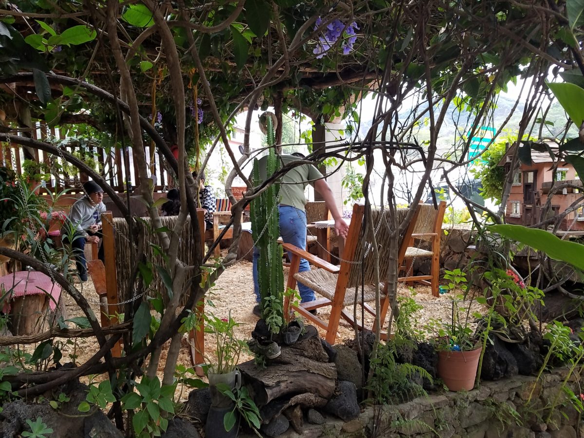
Very tidy and thoughtfully eclectic, this little destination bakery is a precious find.
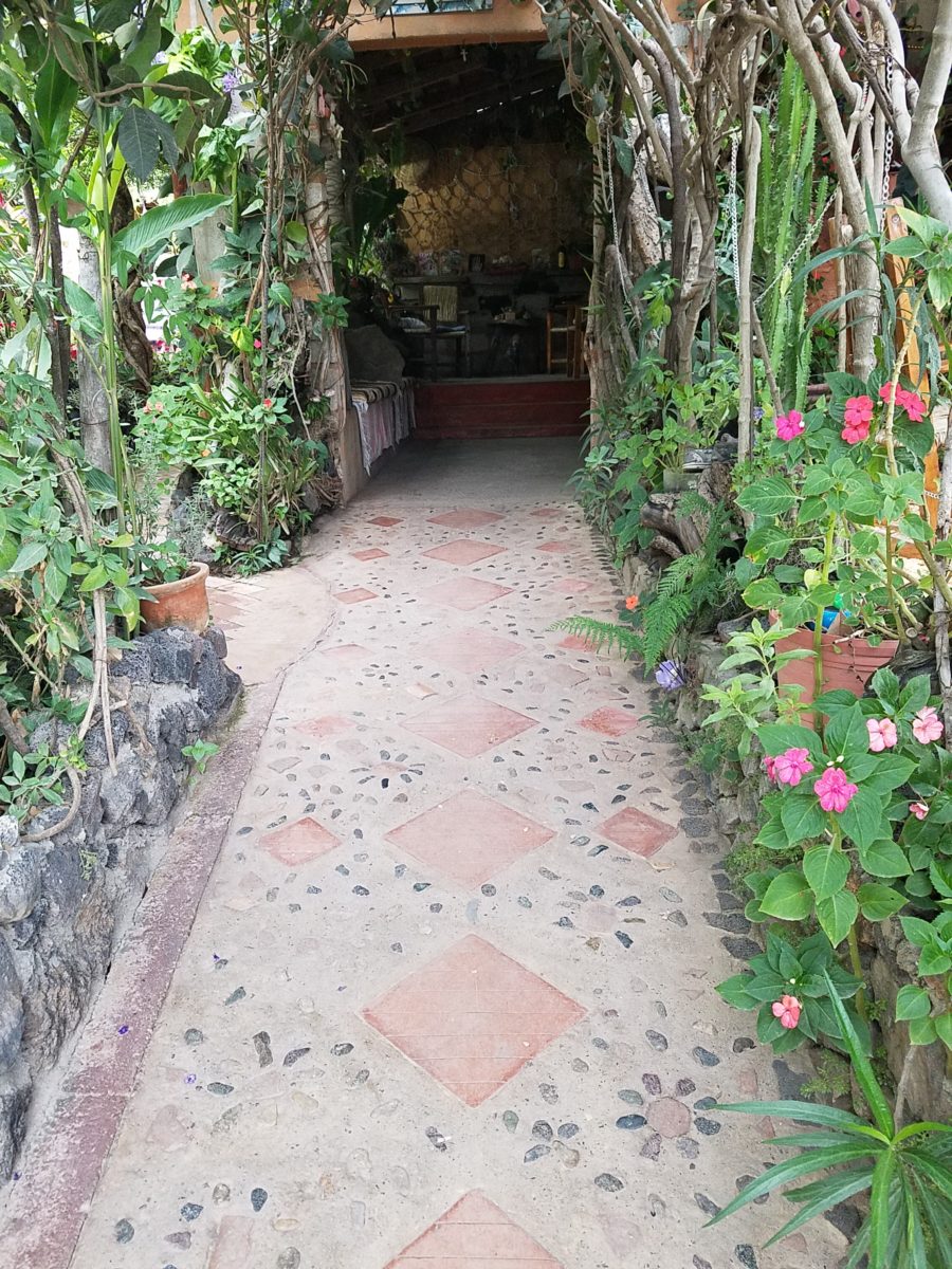
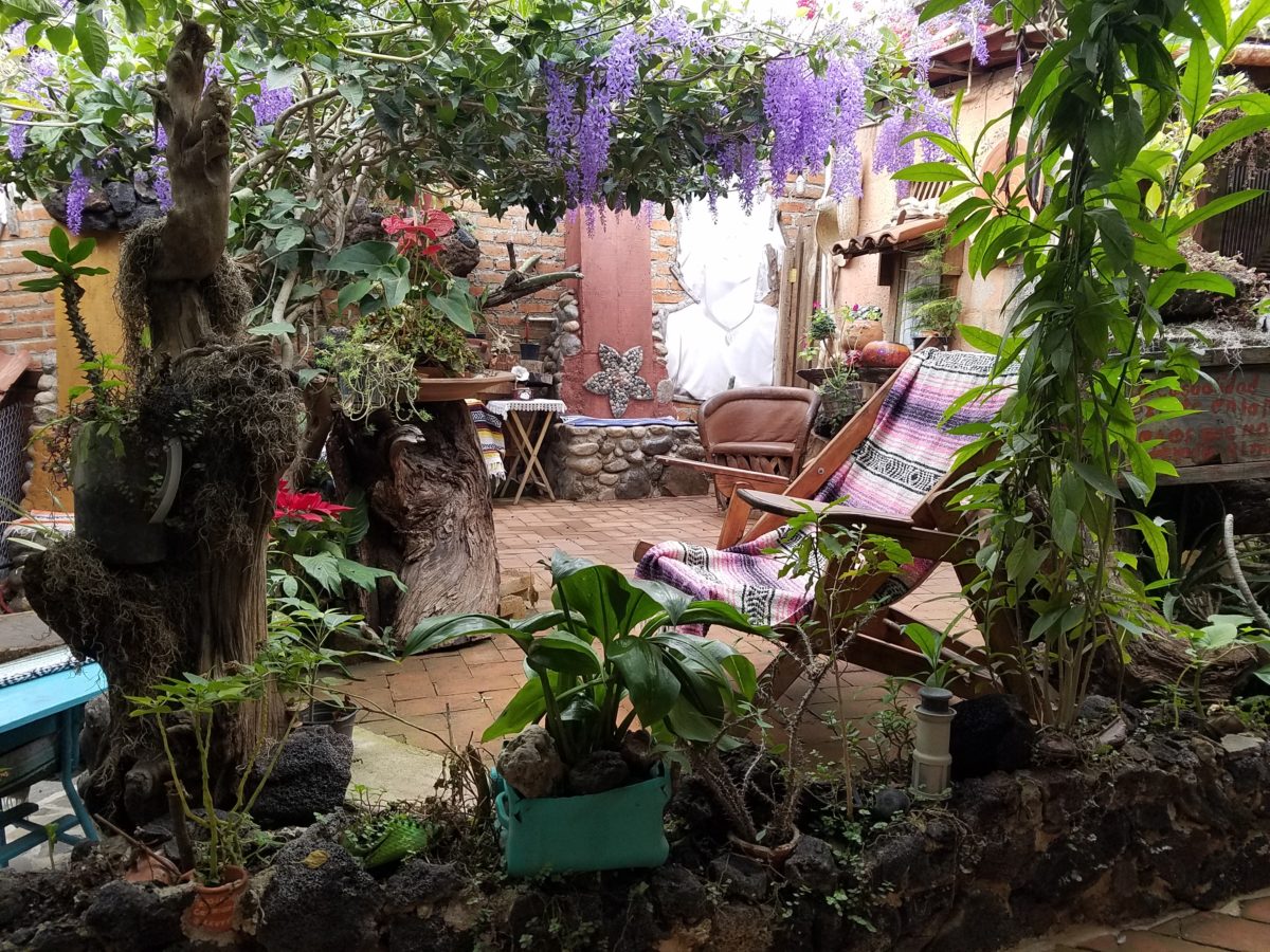
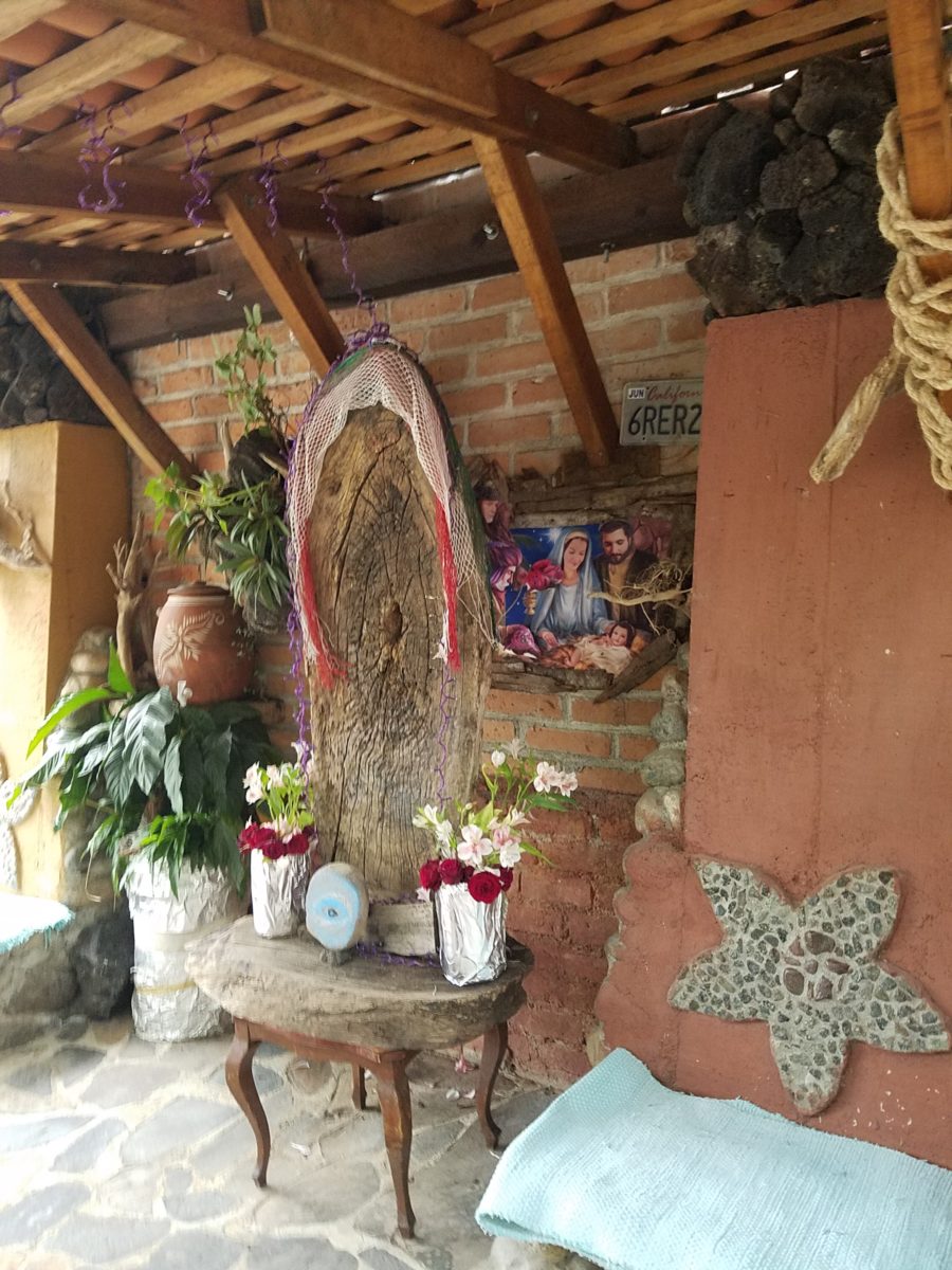
Oh, were we in for a surprise! At the entry, I stopped to shoot the whimsical cup of coffee mosaic set in a field of stone and concrete. I thought – what a fun design element to greet arrivals and set the stage. But I had no idea to what extent I was about to be elated. What unfolded so exceeded my expectations that I wanted to stay all day!!!
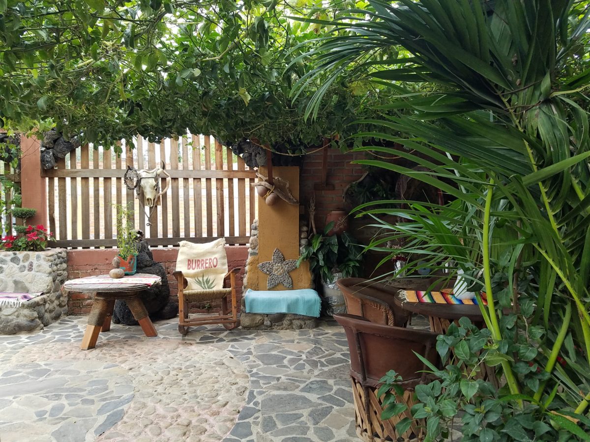
Happy stone and tile-work adorned the pathways. From the textures of stone and brick, tile and wood – it was an organic fantasy – an unexpected design experience.
Simple, yet spectacular – simply spectacular!!!!!
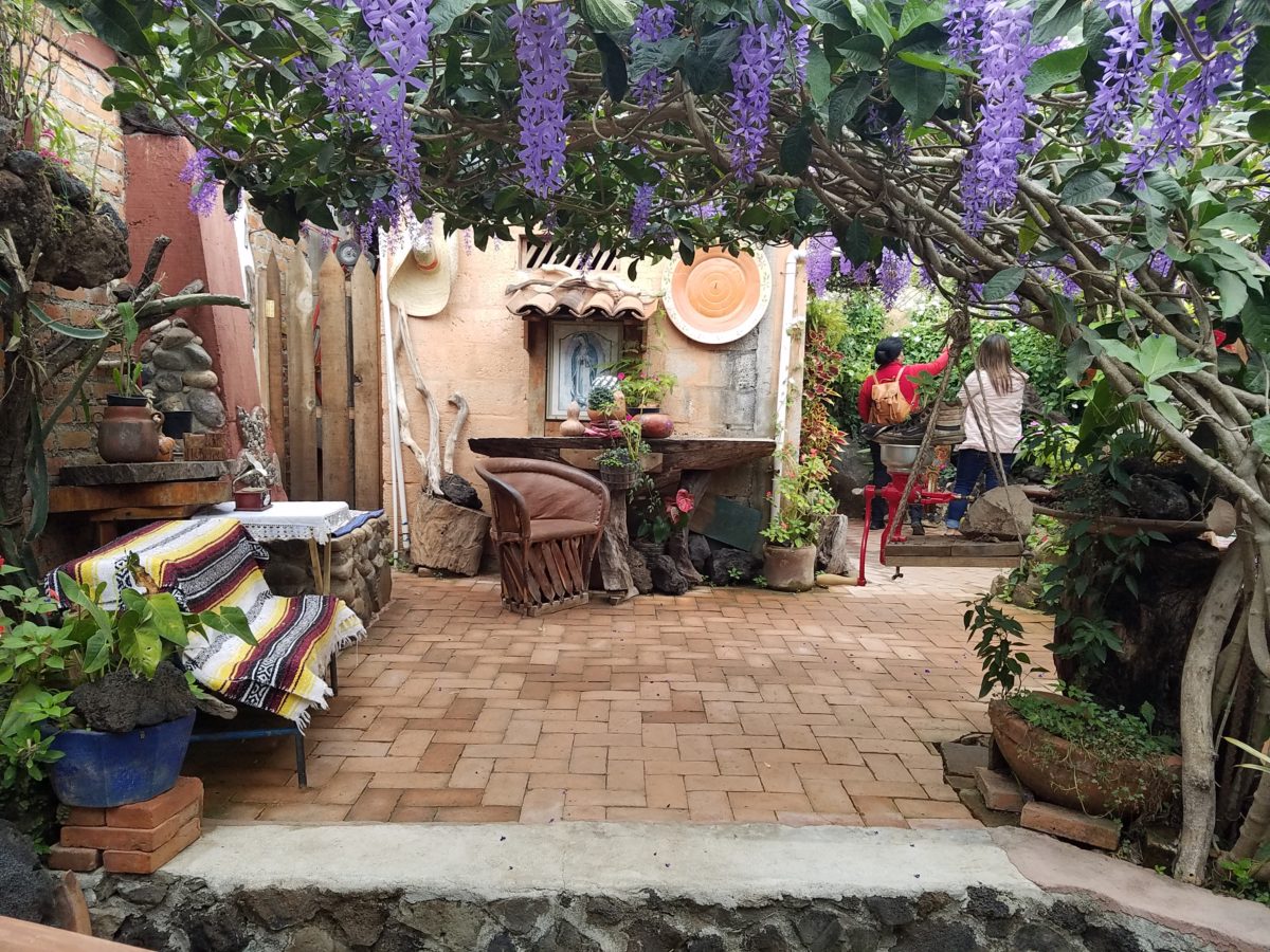
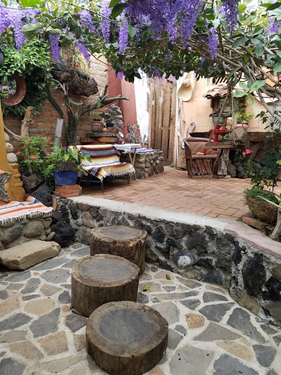
Ceilings of colorful floral blooms – perhaps wisteria – suspended from their vines and other plantings intertwined with the structure.
Spotless and meticulous the eclectic elements were a harmonious creation.Stone walls, wooden slats, vines and adobe all worked together to define the spaces.
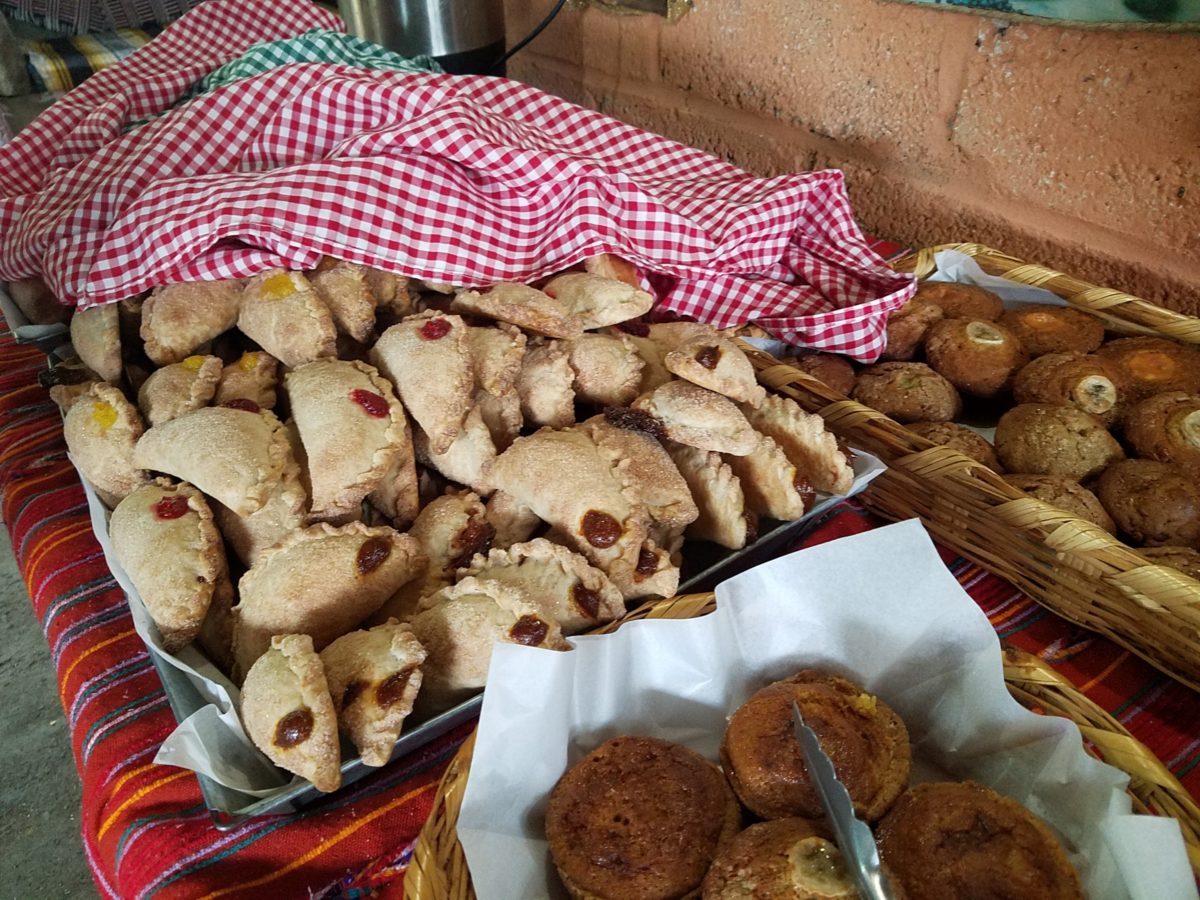
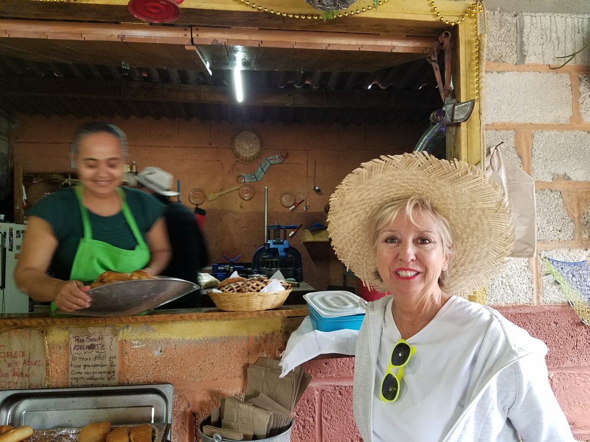
The wafting aroma of fresh baked goods – it was more than delightful. From warm savory clouds with mushroom filling and another with chile-laced sausages – and an array of sweet strawberry, cream and pineapple empanadas to corn muffins, banana muffins and more! All nestled beneath colorfully woven cotton tablecloths.
Light and delicious – the best empanadas ever!! With a tiny sprinkles of granulated sugar, for a sweet crunch, before sinking into the fabulous fillings! Muffins challenged any others and savory treats were so satisfyingly delectable. Little buttons of banana slices on top denoted which were the banana muffins!!
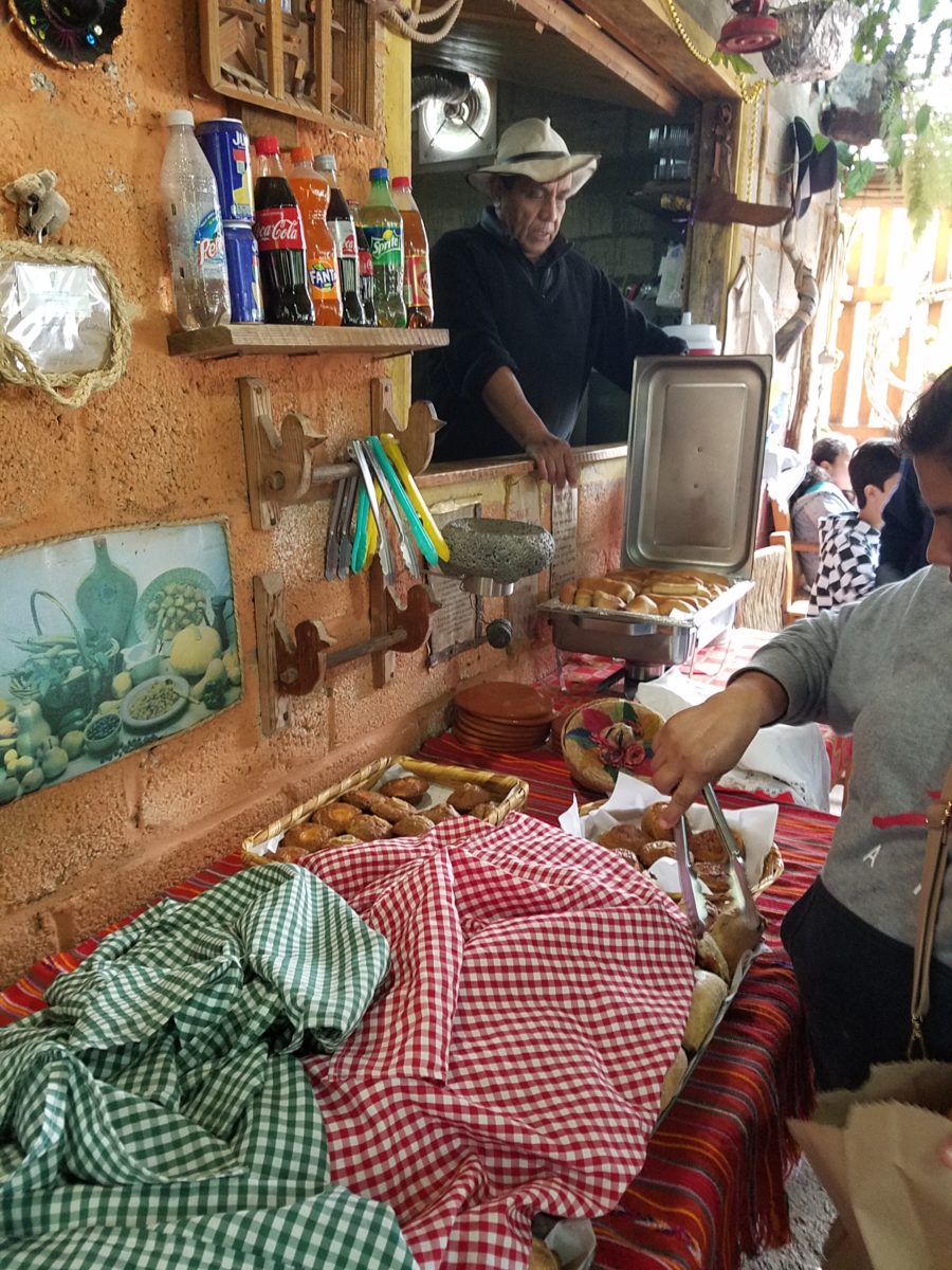
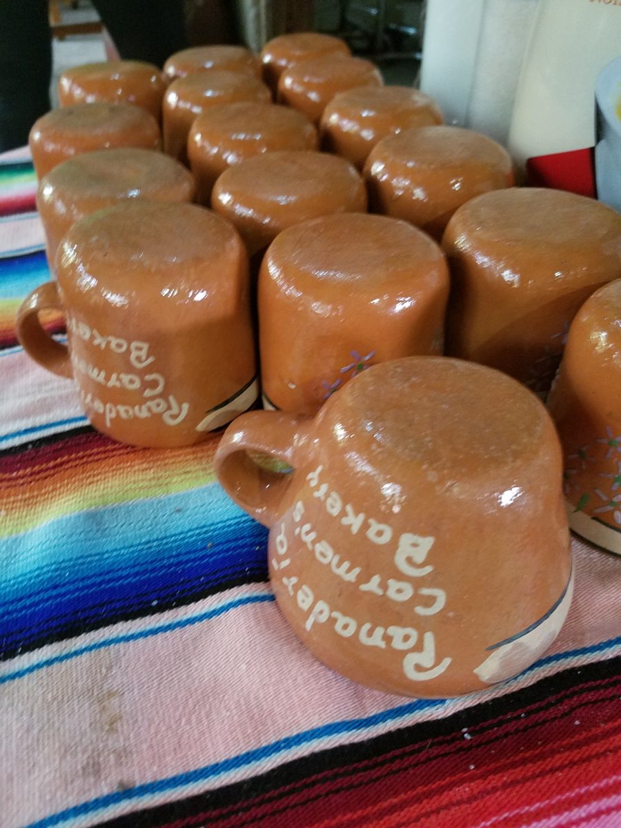
Rich Mexican coffee with a touch of freshly ground cinnamon and luscious hot chocolate were served in custom-glazed “barro ware” complimenting the fresh-from-the-oven confections.
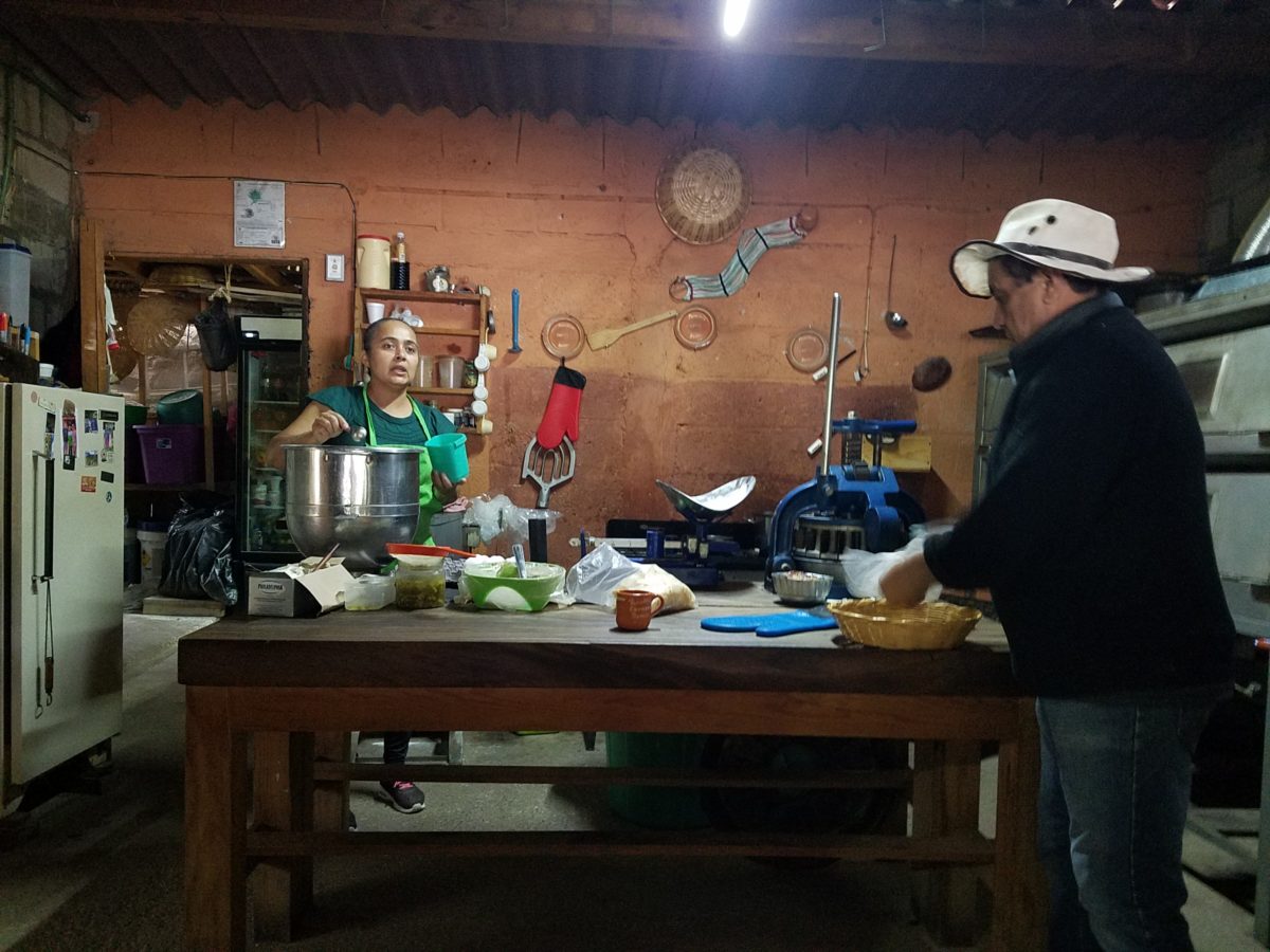
The exhibition baking kitchen overlooked the serving line. The buffet of pastries thoughtfully explained by our gracious and welcoming host, Jesus!
Carmen presents fresh strawberry tarts just from the oven!!! A combination of old and new – tradition and technology meet in this cozy kitchen.
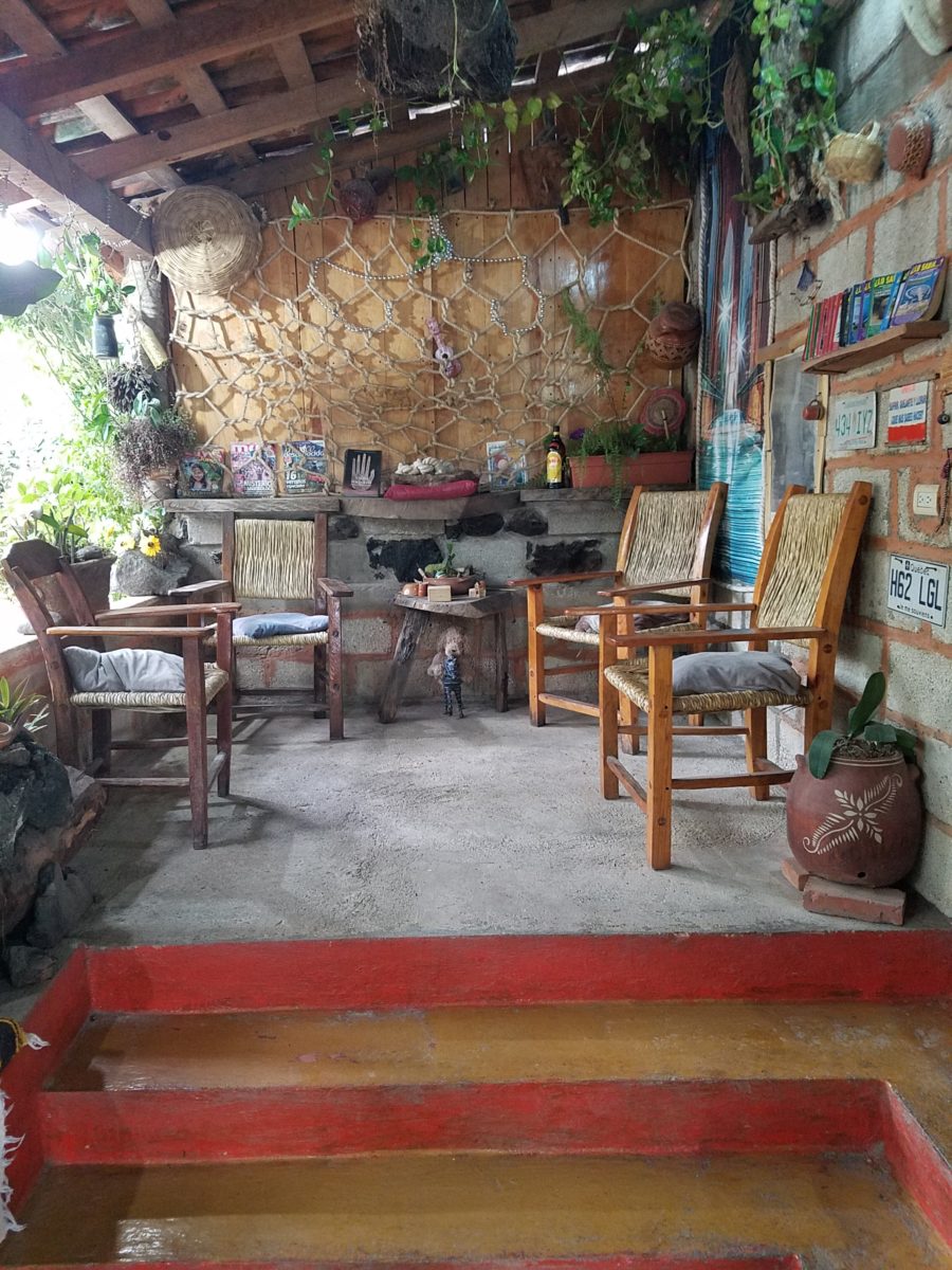
Fragmented spaces open, yet enclosed, offered intimate pockets in which to pause and enjoy.
Color-pops insert themselves effectively around the interior and exterior spaces.Inviting seating areas semi-concealed offer private repose. Tucked away – more areas to enjoy…
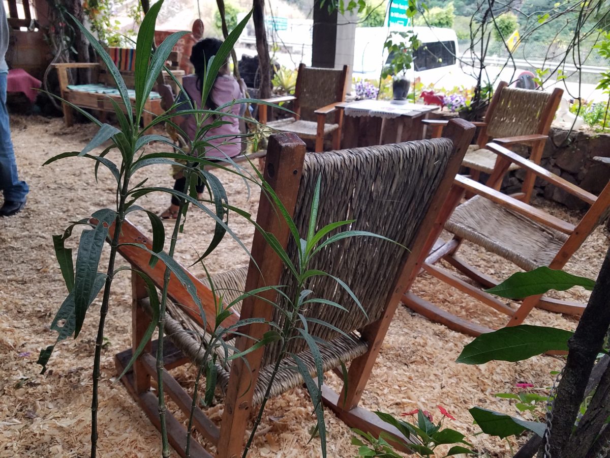
Clever use of clean blond wood shavings on the floor of the main covered patio created a wall-to-wall carpet of fresh aromatics complimenting the inviting aromas emitted from the ovens. Rocking chairs and rigid sturdy versions, with a fun little rope swing, all surrounded by tropical plantings made a cozy area to gather.
Soft underfoot and subtly fragrant – the wood chips make a great shag carpet!!!
As I meandered around exploring all the interesting spaces, textures, colors and plantings, I marveled at the sensitivity with which this had all been crafted and assembled. It was artful interior design with an exterior feel – open air and charming, with a decidedly handcrafted, Mexican sense of place.
Slices of handsome tree trunks make perfect stepping “stones” with graduated heights.
It was an eclectic collage of furniture, structure and organics – living and static – that was welcoming and artful, delightful and so pleasing, that it was a treat for all the senses.
The cool morning air of the mountains mingled, with the comforting fragrances, creating an atmosphere inviting gentle conversations of people gathered around good food and artfully relaxed surroundings.
Peek in places and through doorways to find worlds of design
waiting to be discovered!!!
Busy lives in a new town, he in his residency and she working
in a busy OR, they bought a house – their first house – and asked for help
making it theirs.
They have traveled the world and collected art along the
way, a disparate inventory of things that caught their eye, spoke of their
experiences and reminded them of people, places and things to savor once home.
Home, that was the task. Create HOME in this new, old house. Built mid-century, it was simple, clean with some patchy remodeling from previous owners reflecting rather common decisions, with limited funds. We needed to discuss priorities and budget, evaluate what should stay and what needed to be changed.
They both had a love of Guatemala. Their travels there left
them with dreams of color and pattern, handmade functional art and an exotic
sense of place. Having these elements ingrained in their longing, they
expressed a desire to have that sense, but with a bit of a modern twist.
Assembling the colors and materials…
We salvaged the existing natural granite slab countertop and
unfortunate surface-mounted sink. The granite was a practical save and the sink
came along for the ride. In order to integrate the granite as though
intentional, I selected a multi-colored
Talavera tile that specifically had a dollop of mustard glaze in the design
picking up that Dijon field color in the speckled granite. As is my usual
preferred mode of installation, we took it wall-to-wall as a complete wall-covering.
We also saved the cabinet boxes and doors, but needed to
give them a lift from their median caramel stain on oak. Deconstructing the
colors in the design of the Talavera, we
knew we wanted blue cabinets – so the paint shades were fanned and the color
pinned-down. To give the cabinets that wabi-sabi look of loving wear, we sanded
the edges after the painting was finished. We also added cabinets over the
stove for additional storage space and utilization of that blank wall.
We removed all the doors and drawer fronts, filled the holes from the old pulls/knobs and painted them off-site. We painted the boxes in the field. Granite was salvaged along with the sink. New paint, Saltillo flooring, Talavera tile and cabinet pulls along with new appliances gave an updated look to the scene.
In real life, when
practicality rules, certain things have to give way for the good of the
whole. The whole being the pocketbook and other elements that take precedence
at the time. So we live with the radiant heaters, keep the chandelier for now,
until they have one fabricated to their specifications, use a machined rug
instead of a handcrafted piece and know that over the years they will massage
this starting place and truly make it their home.
Continuing to dissect the colors from the new wall tile, our
colorful young couple wanted more color…we chose individual values of bold
paint colors – smoky turquoise, slightly
burnt orange and brilliant golden yellow to intersect the planes throughout the
space.
Typical mahogany doors common to that era of home interiors,
the decision to match the white trim would have been easy, but we labored over
the existing natural, tropical wood and decided to keep it in the mix.
Although the nearly immaculate, original hardwood oak floors
were revealed after removing the wall-to-wall carpeting, the kitchen floor
throughout the rear vestibule and laundry room was an inexpensive and
uninspired sheet vinyl. Saltillo clay
tiles were the answer to furthering the Guatemalan feel. More commonly
associated with Mexico, these clay tiles are historically the plebian choice.
Taking many forms, some artful enough to be the cornerstone of patrician interiors
in fine mosaic installations and other patterns and designs, clay tiles –
glazed and unglazed always add an artful, soulful human element. Speaking to
that, we inserted 2″x2″ glazed Talavera accent tiles into the floor’s
new Saltillo field in the vestibule creating
an almost area-rug-like definition.
The dated floor-plan enclosed the kitchen separating it from the rest of the living area. The very first comment made by our clients was questioning if we could open that wall – connecting with the living room and large picture window beyond.
The mottled cobalt blue light fixtures add another punctuation of color over the bar along with the parrot green barstools that our home-owners spontaneously nailed in an irresistible lust for even more color!!
Rather than trying to continue the existing “Dijon” granite, white Talavera tiles were used on the new pass-through bar counters – both high and low on the new cabinets.
The first phase of this colorful project has set the stage for an enjoyable work-in-progress for years to come as they now have a basis for design, more collectibles to come, and all they enjoy from places near and far. The upcoming annual trip to Guatemala, in April, will reinforce the joy and appreciation for this special place “home base” in their lives.
The dogs look in eagerly, but are limited to their expansive backyard, their vestibule and full run of the master suite.
Although they selected a durable denim twill fabric to reupholster their sofa and loveseat that they were gifted from a friendly neighbor, the primary living area is – for the most part – “off-limits,” but that seems to work for everyone in the family!!!
Time to remodel the kitchen!! This charming little bungalow had already experienced its share of remodeling – well, not so much structural – although, many interior design transformations had occurred over the decades. In the mix, the well-used and enjoyed kitchen was feeling a quite tired and dated.
You might remember I have used this now completed project, in the last few months, during its transformation process to identify certain features and design practices. Here is the as-promised unveiling of the before and after photos for further discussion about the design process, intent and results.
We loved the mottled color and organic character of the existing slate floors and opposing green-grey beams with spanning boards of a caramel stain. These were the two elements that went well together as though intentionally planned. Yet in between, the pale, peachy pickled oak cabinets with their radius detailing and red-rose/black matrix of the tiled granite counter-tops, didn’t seem to speak at all well with the ceiling treatment and slate floor’s greens, rusts and charcoal tones. It was a dark, confused space.
When observing and “listening to” the house, it was evident that the current kitchen, in addition to being poorly coordinated, had absolutely nothing to do with the original architectural intent. The new owners had brought a few very fine antique pieces into the home. The mid-century circa 1964 age of the house accepted them on its original hardwood floors also adorned with their fine antique rugs…but something was missing. There was no cohesive thread running through the house. Over the years finishes and decorative elements had been selected and installed without any consideration for original materials or an attempt to introduce compatible and harmonious materials for the good of the home’s overall theme.
In all fairness, had the entire interior been gutted and a
contemporary interior been uniformly installed into the framework/shell of the structure,
I might have considered it a success. However, this multiple decade decor was a
mix of disparate trends and preferences that had no commonality.
To begin the process of bringing this home into a cohesive
design last year, we had redesigned the living room. There we introduced a classic
blue and white color scheme derived from the Persian rug in the adjacent dining
room.
To the corner kiva fireplace, we added a sandstone hearth and
mantle with just enough blue and white Talavera tile trim at the base of the
hearth to subtly coordinate with the new scheme. The Talavera was an
appropriate material for this New Mexican bungalow.
The original fireplace had a dark, broken brick quarry tile hearth and no cap on the mantle.The face-lift replaced the hearth material with broken-edged sandstone slab and matching mantle cap with Talavera detailing at the bottom.
With this living room having been so successfully re-designed, the obvious thought came into the discussion to continue the vernacular of the blue and white Talavera into the kitchen. As a bit of a purist when it comes to application and termination of materials, I was not content for a mere back-splash. No, if the tile were to be effective and commandeer the stage, it had to be used wall-to-wall as though an entire wall treatment.
Treating the Talavera tile as wall-covering, it continues from the kitchen, into the adjacent pocket-space housing a desk and laundry machines.
But wait! The addition of an earthy aqua handmade tile from
Spain offered an appealing and unexpected accent woven intermittently through
the Talavera. It created a coordinating thread from the colors found in the mottled
slate floors and ceiling beams.
Pre-grout shot shows the individually cut 1″ pieces inserted as mosaics into the random field of Talavera
The cabinets were in excellent condition, but the doors were
sadly dated and in no way spoke to the home’s other cabinets, doors and finish
carpentry.
The confused interior finishes we in need of a transformation!
With the white raised panel theme throughout the home’s original appointments, we elected to salvage the cabinet boxes and replace the doors and drawer fronts with a similar raised panel detail. The same red oak was used and, with a glossy white paint applied, the grain “read-through” with a very intentional yet subtle moiré-like pattern. The new raised panel white doors and drawers, with crowning top molding provided a crisp, timeless motif. The random patterned Talavera used as an entire wall-covering was very effective. The kitchen was quite gussied-up!!
The transformation was dramatically successful!
The existing slate floor was beautifully organic and I felt, from a design standpoint, was a must to salvage. Making it look like an intentional selection – part of the new scheme – was imperative. Therefore, selecting a counter-top that communed with the tones in the floor resulted in a selection of concrete-like engineered Italian quartz material – balancing the floor with the next horizontal plane and ultimately with the stained and green-grey boards of the existing ceiling treatment.
The new concrete-like Italian quartz counter-tops coordinate well with the other materials.
Another asset was the connection to the outdoors, however the existing window over the sink was high and small.
The window over the sink was high and small…
By bucking the warranty of the Pella people, we had a new double-hung window made to close down onto the new counter-top that passed through from inside to out. They would not fabricate the window to do what we intended, so we had the contractor remove the bottom of the new window frame, thus rendering the warranty null and void, in order to have a completely open, uninterrupted pass-through when raised.
Amusing and interesting…existing family pieces of blue and white ceramics are being discovered and used as decorative accessories in the new kitchen!
We also captured the opportunity to open the opposing wall into the hallway adding pass-through light and dimension to the space. This exponentially expanded the space and made the encapsulated kitchen feel much less confined.
Before, the kitchen felt small and dark…Opening the wall into the hallway brought in additional light and dimension.
To add drama to the newly created dimension, we discussed having a painting commissioned to pop an accent of yellow into the blue and white scheme on the far hallway wall. Lemons, a perfect citrus for the kitchen, was decided for the theme.
A miniature oil painting by Federico Leon de la Vega was used to Photoshop into the scene to inspire and convey the design intent.
The additional POP of yellow is a dramatically effective contribution to the overall composition. After consideration, the owners selected a local artist to paint the full-scale painting.
A local Albuquerque artist, Thomas Tomlinson rendered the lemons in acrylic with blue and white tile details.
In summary…keeping the original slate floor, existing cabinet boxes (replacing door and drawer-fronts only), with a bling of new chrome cabinet pulls, switching out the stained glass pendants, replacing the island’s surface with a handsome solid walnut top and a new coordinating concrete-like counter-tops on the periphery, with the decorative embellishment of the Talavera tile continued from the subtle introduction at the living room’s kiva fireplace, the transformation of the kitchen is stunning – not trendy – and was truly, uniquely designed for the architecture and forward, on-going contextual design conversation of the home.
Uniquely designed…
Look around and listen to the environment for and in which
you are designing. What makes the best sense for the design direction
considering the function and context of your project?