Once upon a time there was a quiet little house in the woods. Nestled among the juniper and pinons of the rolling hills of Estancia, the little house lacked design details to make it feel a part of its surroundings. The owners and their dogs had lived there for a decade and realized that a move was not pending and therefore it was time to bring the house into its own.
The neighbors…
Color was the primary element that they wanted to introduce – that along with a look better suited to the organic, woodsy setting and updates for fixtures and finishes. So, this plain, dated house in the woods began a magical transformation. Not wanting to embrace the sleek white and grey trends of the day, they expressly requested warmth and color.
The interior was plain vanilla with warm honey-colored wood accents.
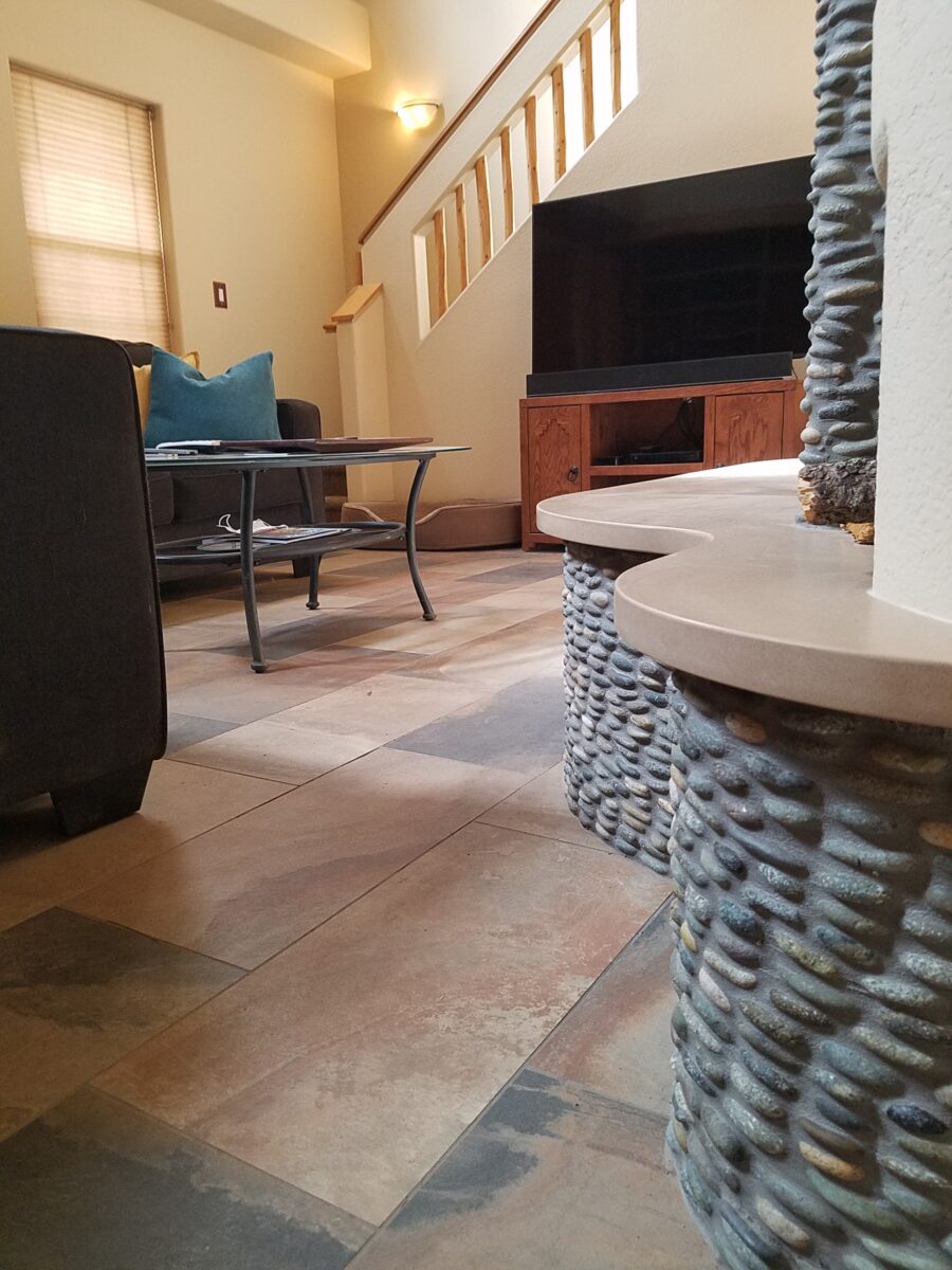
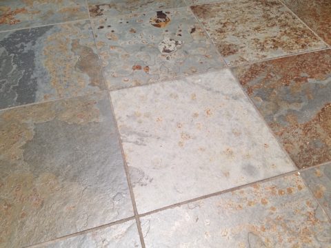
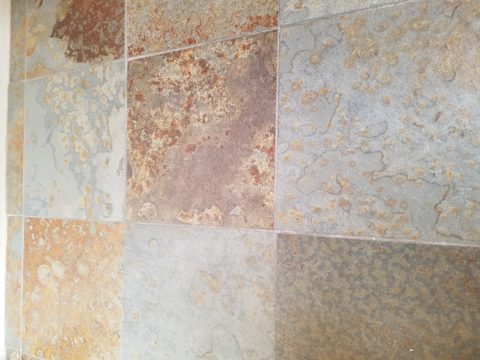
Beginning with the floor, we selected a porcelain tile that had a finish simulating a mottled slate. The outstandingly durable, slip-resistant material had earthen color variegations in the various pieces which were highly effective at concealing dusty dirt and debris from the out-of-doors and camouflaging the anticipated dog hair that was shed about. The resemblance of the tile to cut stone was remarkable. Due to its multi-color rendition of ochre, rust, charcoal, black and sand offered many tones from which to grow the design’s palette.
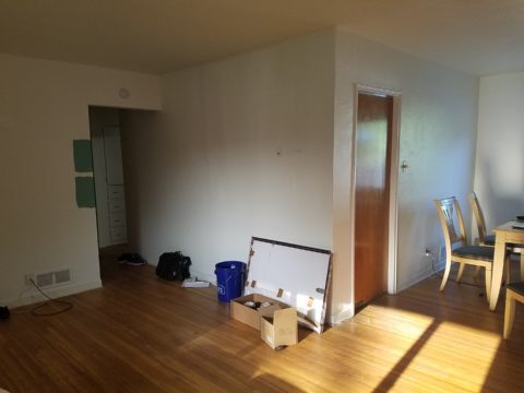
The flooring was a bland combination of slippery wood laminate and 12″ ceramic tiles.The new porcelain slate floor tile is multi-toned and rich with warmth. New wall colors and cabinets are peeking from behind…
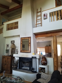
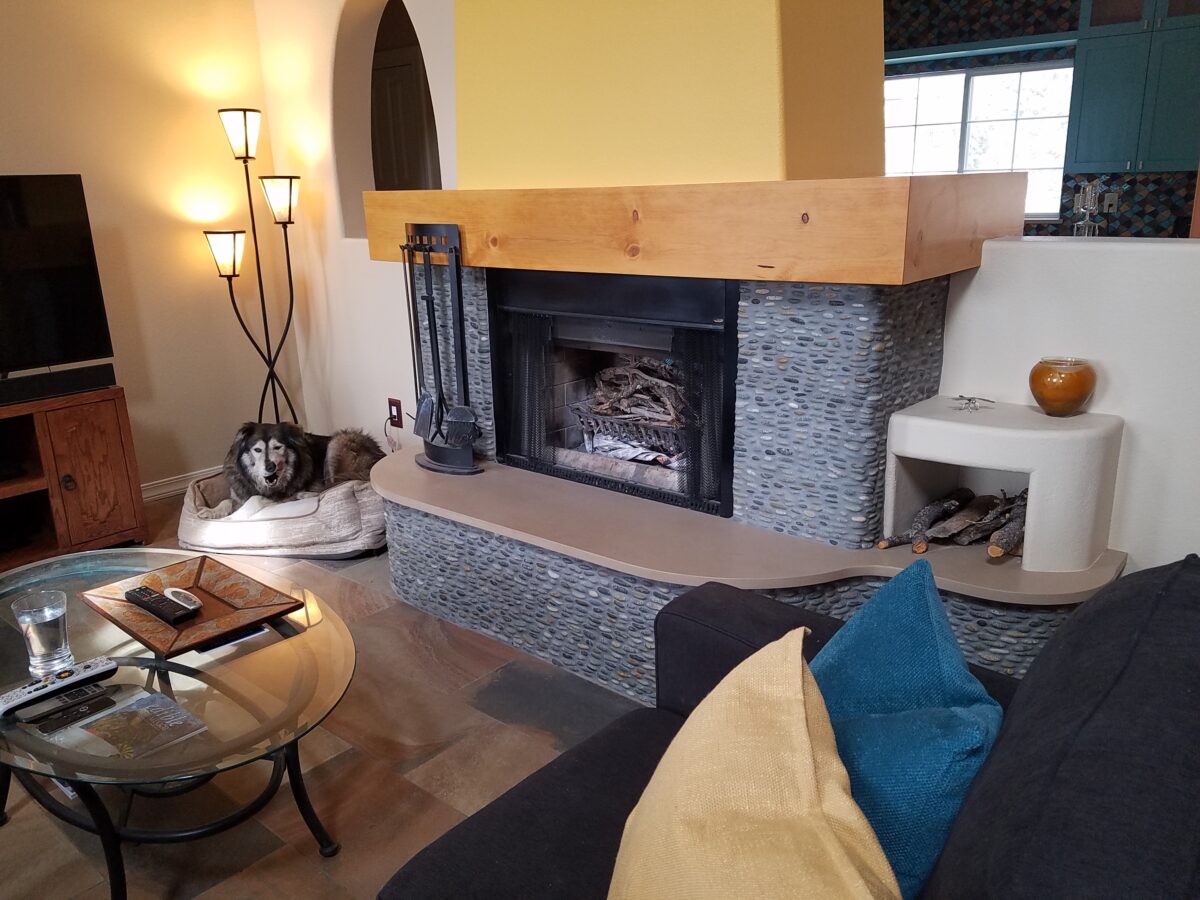
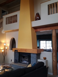
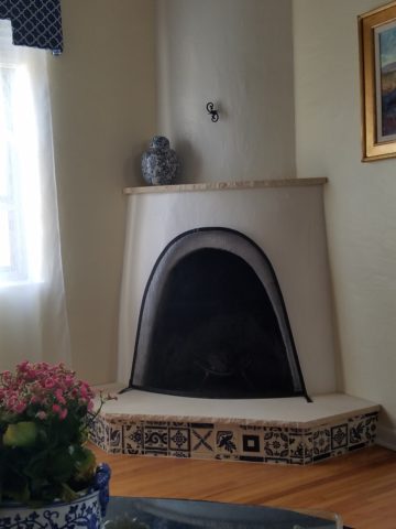
Rising from this new base for the interior scheme, we selected a dark, black/charcoal stacked stone. The smooth ovoid shapes added further organic texture with a subtle woven appearance to the surface of the fireplace.
Texture, color, form…the design is transformed…
The mantle and hearth were both the plain vanilla white of the walls and despite the fact that white can be crisp, clean and fresh – the owners were eager for bold commitment to color. In keeping with the pine columns and other cabinets and architectural detailing, we wrapped the existing form of the mantle in knotty pine finished with a honey stain to coordinate with the existing wood accents. The hearth became an undulating slab of Cambria quartz material in a craft-paper bag/sand color also derived from the swirling “slate” floor.
The graceful shape of the hearth was enhanced with the addition of the stacked stone and new slab surface.
Towering from the now strengthened façade of the fireplace, the tapered form of the chimney was begging for the color-pop that the owner’s desired. The honey color of the pine along with the warm tones in the flooring invited a golden ochre paint to command the space.
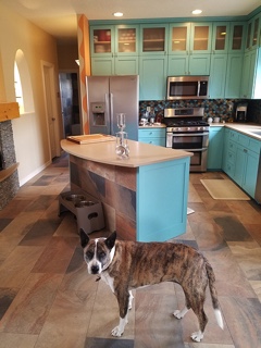
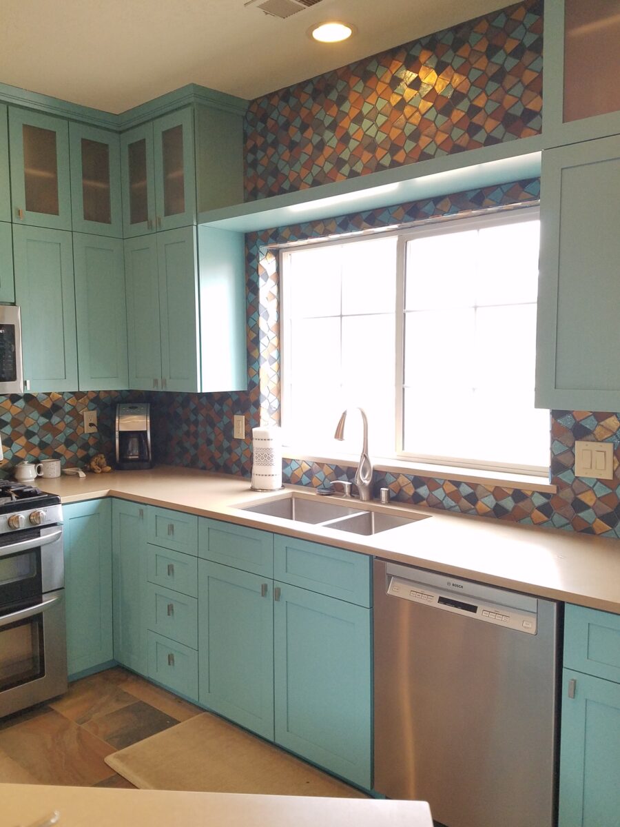
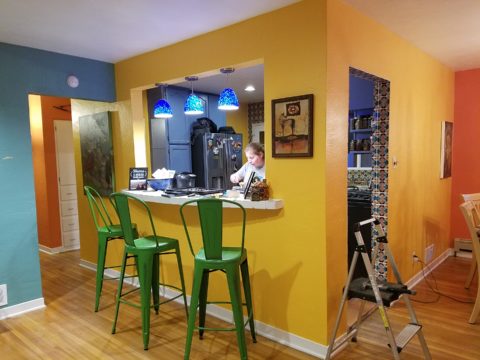
Specifically requesting the insertion of the owner’s favorite accent color – turquoise, we departed from the warm, earthen tones and punctuated the scheme in the new kitchen cabinets.
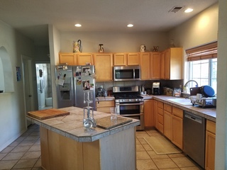
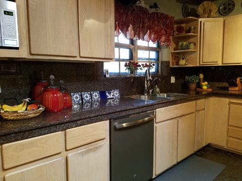
The original kitchen…tile floors and countertops, oak cabinets with off-white painted walls.
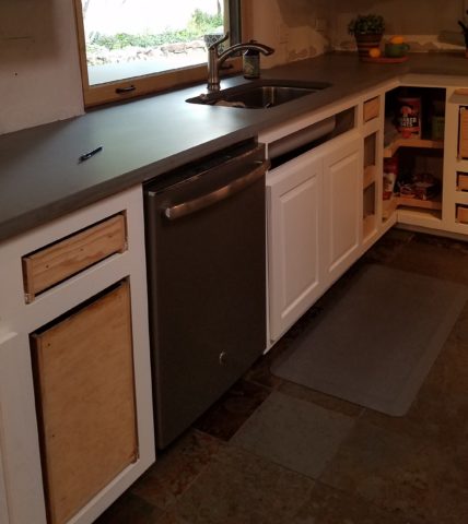
Salvaging the existing boxes and painting the faces, fabricating new doors, drawers, upper glass cabinets and end panels, the open kitchen is the fulcrum of the house. We see the trending minimalism of little or few cabinets in the kitchen, perhaps open shelving…however, this couple wanted even more concealed storage to keep their cooking and entertaining accessories out-of-sight, but close at hand.
The kitchen transformation features new color, new faces, additional upper cabinets with etched glass panels, luminous glass tile backsplash, new quartz countertops with a new bowed shape for the island…all while keeping existing appliances, cabinet boxes and layout of the space.
Repeating the slab material of the fireplace’s hearth which passes through from the living room to the kitchen, the new Cambria quartz countertops continue the craft-paper bag/sand color. The slate floor wraps up the face of the island for a durable kick-surface and visual continuity.
But wait! To further the focal features of the kitchen, we created a custom mix of colorful glass segments suggesting an interpretation of fallen aspen leaves golden and glossy in the damp of late fall/early winter precipitation. The combination of golden ochre and dark amber with the luminous turquoise of this stunning wall treatment dramatically contributes to the whimsically wonderful colorful scheme.
Saving the bathrooms for another story…there is more to be said about this woodsy transformation. Stay tuned and do not fear color! Embrace the context of your special places.
Time to remodel the kitchen!! This charming little bungalow had already experienced its share of remodeling – well, not so much structural – although, many interior design transformations had occurred over the decades. In the mix, the well-used and enjoyed kitchen was feeling a quite tired and dated.
You might remember I have used this now completed project, in the last few months, during its transformation process to identify certain features and design practices. Here is the as-promised unveiling of the before and after photos for further discussion about the design process, intent and results.
We loved the mottled color and organic character of the existing slate floors and opposing green-grey beams with spanning boards of a caramel stain. These were the two elements that went well together as though intentionally planned. Yet in between, the pale, peachy pickled oak cabinets with their radius detailing and red-rose/black matrix of the tiled granite counter-tops, didn’t seem to speak at all well with the ceiling treatment and slate floor’s greens, rusts and charcoal tones. It was a dark, confused space.
When observing and “listening to” the house, it was evident that the current kitchen, in addition to being poorly coordinated, had absolutely nothing to do with the original architectural intent. The new owners had brought a few very fine antique pieces into the home. The mid-century circa 1964 age of the house accepted them on its original hardwood floors also adorned with their fine antique rugs…but something was missing. There was no cohesive thread running through the house. Over the years finishes and decorative elements had been selected and installed without any consideration for original materials or an attempt to introduce compatible and harmonious materials for the good of the home’s overall theme.
In all fairness, had the entire interior been gutted and a
contemporary interior been uniformly installed into the framework/shell of the structure,
I might have considered it a success. However, this multiple decade decor was a
mix of disparate trends and preferences that had no commonality.
To begin the process of bringing this home into a cohesive
design last year, we had redesigned the living room. There we introduced a classic
blue and white color scheme derived from the Persian rug in the adjacent dining
room.
To the corner kiva fireplace, we added a sandstone hearth and
mantle with just enough blue and white Talavera tile trim at the base of the
hearth to subtly coordinate with the new scheme. The Talavera was an
appropriate material for this New Mexican bungalow.
The original fireplace had a dark, broken brick quarry tile hearth and no cap on the mantle.The face-lift replaced the hearth material with broken-edged sandstone slab and matching mantle cap with Talavera detailing at the bottom.
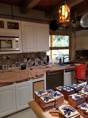
With this living room having been so successfully re-designed, the obvious thought came into the discussion to continue the vernacular of the blue and white Talavera into the kitchen. As a bit of a purist when it comes to application and termination of materials, I was not content for a mere back-splash. No, if the tile were to be effective and commandeer the stage, it had to be used wall-to-wall as though an entire wall treatment.
Treating the Talavera tile as wall-covering, it continues from the kitchen, into the adjacent pocket-space housing a desk and laundry machines.
But wait! The addition of an earthy aqua handmade tile from
Spain offered an appealing and unexpected accent woven intermittently through
the Talavera. It created a coordinating thread from the colors found in the mottled
slate floors and ceiling beams.
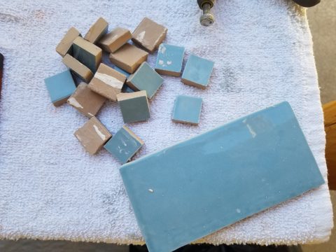
Pre-grout shot shows the individually cut 1″ pieces inserted as mosaics into the random field of Talavera
The cabinets were in excellent condition, but the doors were
sadly dated and in no way spoke to the home’s other cabinets, doors and finish
carpentry.
The confused interior finishes we in need of a transformation!
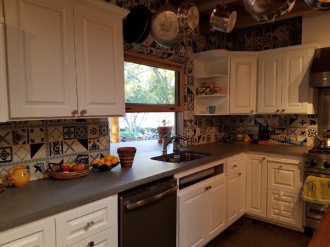
With the white raised panel theme throughout the home’s original appointments, we elected to salvage the cabinet boxes and replace the doors and drawer fronts with a similar raised panel detail. The same red oak was used and, with a glossy white paint applied, the grain “read-through” with a very intentional yet subtle moiré-like pattern. The new raised panel white doors and drawers, with crowning top molding provided a crisp, timeless motif. The random patterned Talavera used as an entire wall-covering was very effective. The kitchen was quite gussied-up!!
The transformation was dramatically successful!
The existing slate floor was beautifully organic and I felt, from a design standpoint, was a must to salvage. Making it look like an intentional selection – part of the new scheme – was imperative. Therefore, selecting a counter-top that communed with the tones in the floor resulted in a selection of concrete-like engineered Italian quartz material – balancing the floor with the next horizontal plane and ultimately with the stained and green-grey boards of the existing ceiling treatment.
The new concrete-like Italian quartz counter-tops coordinate well with the other materials.
Another asset was the connection to the outdoors, however the existing window over the sink was high and small.
The window over the sink was high and small…
By bucking the warranty of the Pella people, we had a new double-hung window made to close down onto the new counter-top that passed through from inside to out. They would not fabricate the window to do what we intended, so we had the contractor remove the bottom of the new window frame, thus rendering the warranty null and void, in order to have a completely open, uninterrupted pass-through when raised.
Amusing and interesting…existing family pieces of blue and white ceramics are being discovered and used as decorative accessories in the new kitchen!
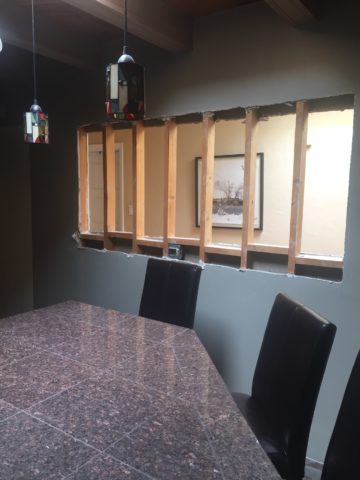
We also captured the opportunity to open the opposing wall into the hallway adding pass-through light and dimension to the space. This exponentially expanded the space and made the encapsulated kitchen feel much less confined.
Before, the kitchen felt small and dark…Opening the wall into the hallway brought in additional light and dimension.
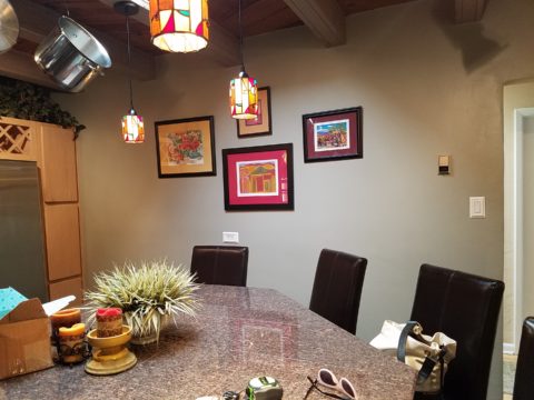
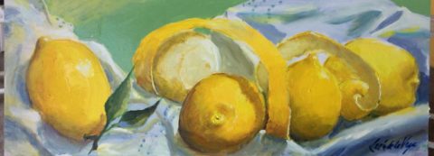
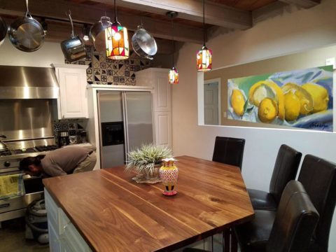
To add drama to the newly created dimension, we discussed having a painting commissioned to pop an accent of yellow into the blue and white scheme on the far hallway wall. Lemons, a perfect citrus for the kitchen, was decided for the theme.
A miniature oil painting by Federico Leon de la Vega was used to Photoshop into the scene to inspire and convey the design intent.
The additional POP of yellow is a dramatically effective contribution to the overall composition. After consideration, the owners selected a local artist to paint the full-scale painting.
A local Albuquerque artist, Thomas Tomlinson rendered the lemons in acrylic with blue and white tile details.
In summary…keeping the original slate floor, existing cabinet boxes (replacing door and drawer-fronts only), with a bling of new chrome cabinet pulls, switching out the stained glass pendants, replacing the island’s surface with a handsome solid walnut top and a new coordinating concrete-like counter-tops on the periphery, with the decorative embellishment of the Talavera tile continued from the subtle introduction at the living room’s kiva fireplace, the transformation of the kitchen is stunning – not trendy – and was truly, uniquely designed for the architecture and forward, on-going contextual design conversation of the home.
Uniquely designed…
Look around and listen to the environment for and in which
you are designing. What makes the best sense for the design direction
considering the function and context of your project?
In past blogs Patti Says a lot about selecting paint colors. Pondering paint colors and the elusive nature of selecting just the right color. https://patriciandesign.com/5677-2/
Walls surround your world. Walls encapsulate and enclose your personal spaces. They can also frame your world and dramatize a focal point. They add effective dimension when punctured.
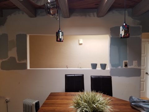
A current study we have in front of us is about those specific things. Walls – opening them, their color and the context of the color decision. Months ago we examined a wall in a kitchen soon to be remodeled. Re-painting it was the most obvious and least complicated of the options. We also looked at creating a dimensional recess to house art or an accent color or something to take the curse off of its up-close, massive, solidness. It was like the 10,000 pound elephant in the room!
The wall encapsulated close quarters. It divided the space between the kitchen and the parallel hallway.
What we were looking to change was atmosphere. This involved improving the dated and worn cabinets and counter-tops, updating the lighting, enhancing the back-splash and addressing the closed, isolated feeling of the room.
Smoke and mirrors might be the answer. Like a magician appearing and disappearing behind a veil/dimension of smoke – or when the physical space is not negotiable, mirrors will give the illusion of added space. They are VERY effective tools, but neither was the right solution for this room’s current condition. Yet, we knew we needed dimension, depth and something to help expand the space.
Hmmm…the window over the sink offered an exciting option to open out to the patio. We did that – save that for another story. However, this large elephant of a wall was still so confining.
Sometimes small spaces can be cozy. Some people prefer tight spaces while others find them to be claustrophobic. This was not exactly claustrophobia instilling, yet it certainly spoke to all of us as an imposing, confining factor that needed attention.
After discussing all the colors and recessed options someone has the brilliant idea to ask – “What about removing the wall?” That seemed a bit radical considering that it only opened to the hallway and it served a purpose of defining the access to the kitchen and opposite bedroom quarters. To open it entirely might have given an orientation to the kitchen that suggested that the island seats be positioned facing that point-of-arrival. Hence looking directly into the far hallway wall. That was not the desire. Rather, we decided to cut a large opening in the wall exposing the far hallway wall while maintaining the orientation of the kitchen toward the outdoors and island seats facing into the kitchen not out into the hall. It worked!
The space was instantly enlarged. Opening the space onto the patio and this opposing generous puncture of the Great Wall of Kitchen changed everything! The light borrowed from the skylights in the hallway was significant and the sensation of enlarging the space was undeniable. Except the footprint had not changed.
The physical feeling of a space is what counts. It was proven here that it wasn’t about enlarging the space but feeling like it was enlarged. Like mirrors, the illusion of space is so important. But, unlike mirrors this space was physically opened creating the sensation of enlarging the space by adding actual dimensional reality . The benefits were immediate. It actually conveyed a palpable feeling of relaxation. It was freeing and created an entirely new experience of enjoyment.
A passing idea for a stenciled surround was entertained…
Tight spaces give some people comfort. Contrarily, open spaces give comfort to others. Personal reactions to space, color, texture, temperature all enter into the equation of good design. What tasks are being performed also play a part in determining what solutions are best.
This dark, isolated kitchen benefited from changing the cabinets to a white traditional raised panel style detailed with crown molding which added a refreshingly light element. The house was a decades old vintage bungalow and had been dealt a disservice to have had the kitchen remodeled years ago in a not-so-sensitive, style-of-the-day fashion. But, in addition to the more traditional timeless approach to the design, opening the space resulted in additional natural light borrowed from the hall’s skylight and an enlarged interior over-the-sink window brought more coming in from the patio. Now colors…
So we know that picking colors is contextual.. .what’s in and around the room are all part of the equation. Any walls that are seen beyond (through doorways, around corners) contribute to the layering of colors and therefore, participate as well. The floors are multi-colored mottled slate. The tile chosen to enhance the backsplash and also serve as wall-covering was a blue and white Talavera accented with a soft aqua mosaic. The ceiling mimicked the floor as the beams were a smoky grey with caramel-color stained knotty pine boards between – we embraced these existing design features as their unselfconscious non-trendy nature suggested a more grounded, permanent place – one with organic finishes that might have resulted from local availability sourcing and craft – and probably did all those decades ago. See what Patti Says in another blog about this very project: https://patriciandesign.com/trust-and-custom-designs/
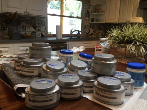
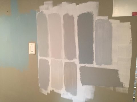
The fact that all of these elements contribute to the equation, for deciding a color, is key to our study today. After discussing the options for treating this newly opened wall, we found ourselves doing the paint sample potpourri on the walls!
Taking cues from the aqua accent mosaic which was derived from those tones found in the slate floor, we directed the color choices toward smoky aquas and grey blue tones.
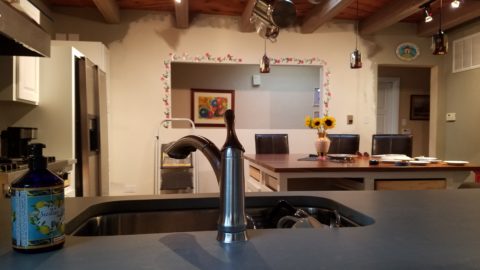
Sometimes white is actually a color, rather than the absence of color. The wall was currently frosted with smooth crisp drywall mud as an aftermath to the demolition and framing of the new opening. The stark white was clean and fresh. Like matting around a painting – this might just be the way to go.
And at this point, we must introduce the idea that was also in the works and that was to have a painting commissioned that would POP through the opening providing a spectacular backdrop to the kitchen and dress the dimensional contribution that the opening into the far wall of the hall presented.
We knew that yellow was a great color POP for this cool kitchen pallet. A recurring bowl of lemons kept proving that to be true. Lemons became the fresh, culinary subject that seemed to be the perfect fit. So we enlisted our master muralist Federico Leon de la Vega to meet the challenge. Armed with the blue and white scheme and the accents of aqua he created a miniature to test the concept.
Isolating the image and framing it is always an important component in the formatting of scene. Whether to spotlight a sculpture on a pedestal, or properly and effectively matting a painting in a frame, this aura is important to highlight art. The same became true as we considered the painting being “framed” by this opening. The wall itself became the mat. So to get an idea of what this might look like, a quick digital manipulation did the trick.
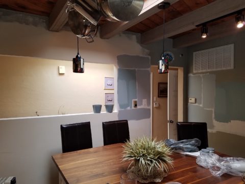
The final decision seems to be that we will keep the wall with the opening white, as though a matting around a painting, while painting the perpendicular wall a smoky aqua. Another opportunity for layering these two colors occurs when the smoky aqua wall is layered over a receding laundry room wall soon to also be painted white.
Watch for the completion of this wonderfully unique little kitchen to be unveiled with all the dramatic before and afters! Meanwhile, look around your interior and see if opening a wall might be an option to expanding your sense of space. The transformation can be rejuvenating!
Patience. Good design requires patience. Do you have it? The design process can either take the route of “all planned before anything starts” (everything drawn and detailed, all finishes selected, all fixtures and furnishings, fabrics and accessories decided and specified, for perfect inclusion into the design) or the process of “design-as-you-go”. The “all planned” design process allows for exact pricing and budget planning. But if the process takes too long, some of the things specified might no longer be available – that has happened more than once! The other “design-as-you-go process” is more random. There can be and often is a combination of these two approaches, but the second requires more patience and less precisely scheduled time.
The luxury of time, experimentation, trial and error, wait and see, what if, all are elements of the “design-as-you-go” process. It is decidedly the more fun and more participatory process. It starts and evolves before your very eyes, with the in-the-field options, to change, modify, massage, delete, add, think and re-think, all available while the action takes place, it is like creating an art piece one stroke at a time. Artistic expression rarely progresses in a straight line.
All of the above can be said of the pre-planning process too. You can illustrate, render, draft, erase, alter and change all the while – but you are doing it prior to commitment, prior to actually seeing the actual design unfold in real time.
Changes and additions can arrest the process – whether in pre-construction planning or live-in-the-field. However, live-in-the-field is much more int-eruptive and possibly costly. Changes and additions can cause scheduling delays which can domino throughout the otherwise planned program. This can result in not only cost considerations, but disarray and a prolonged inability to use the space.
As I visited one of two parallel kitchen remodels nearing completion that I have previously mentioned, the owner mused “It’s a painful process.” But as we stand there enjoying the transformation he continues “It is almost hard to remember all the phases we’ve been through to get here. Kind of like childbirth.” We laughed at the fact that the world would be filled with “only children” as no mother in their right mind would go through that pain again!! He and I both never having experienced it for ourselves – yet, “they say” that it’s true. All very much worth it in the end!!! The ultimate reward!
This BEFORE shot of this kitchen shows dated, anemic face-framed radius flat panel cabinets, granite tile counter-tops and back-splash.
Not quite finished, cabinet pulls are being installed, final painting details are underway and the transformation is being unveiled. New cabinet doors add a classic raised panel detail painted white, with new concrete-like engineered Italian counter-tops, and striking Talavera tile back-splash punctuated with mini mosaic Spanish tile accents. A new window opens to the outside patio with the counter-top passing through and the window closing directly on the top.
Residential design – those private, personal spaces always involve knitted brows, vacillation, additional worry and more indecision than commercial designs. Not to say that commercial designs don’t involve interested parties, if not actual owners, the investment in the personal pocketbook and personal emotion is not the same. Furthermore, there are greater personal thrills and disappointments in the residential projects.
Well, back to patience. It’s a virtue and I often struggle to practice it. I tend to be overly eager for instant gratification. But patience is very important when creating something of value and timeless appeal.
Design takes patience during the various stages of design details. We are not talking about building a rocket ship – but imagine the design and engineering required for that!. Let’s just talk about something simple, like custom drapery rods. The client thinks – fastand easy. While on vacay they experience a lovely accommodation that features hand-forged drapery rods. “Cool” they say. Filing that away among their thoughts of interesting interior details. A couple of weeks later, they are in front of an art booth and meet an iron-worker who offers all manner of custom iron work. So they recall the cool drapery rods and inquire as to whether he would do something like they described. “Sure,” he sings and whips out his portfolio of photos among which are very cool twisted iron drapery rods with swirly finials adorning the ends. They’re sold! They invite him over to see their windows and get started. At this point, their interior designer knows nothing of this idea or the contact and engagement.
Remember, they are thinking fast and easy. So they expose their idea and plan that is already underway asking their interior designer on advice for drapery fabric. With this opening, the designer asks about the rods. Come to find, they aren’t sure how far past the windows they have been measured to go, they haven’t considered that the 5/8″ solid stock might want to sag after a while spanning 8 feet and they have no idea how they are going to hang the draperies…”Oh” we need rings? So it seems that the conversation with the iron-worker has been rather cursory. Questions that needed to be asked and answered at the outset had not been thoroughly considered.
Fortunately, these details will now be addressed, issues solved and finished product all as it should be with proper extension past the actual window opening, matching rings to the iron rods, and a stout enough rod so as not to require a center support – an element to be avoided if at all possible. Whew – caught that one before it was too late!! (Watch for the installation of the hand-forged rods and custom draperies in the next few weeks).
Paint colors often wait until other decisions are made. I have mentioned previously that we usually pick things that have fewer options. There are more paint colors than anything else in our design world with fewer fabrics and even fewer rugs. In that order, we might pick the rug first, fabrics to build upon it and paint colors to bring it all together. Not necessarily – but that is a pretty good example.
Starting with an existing hardwood floors well preserved by decades of wall-to-wall carpeting, we discussed the desire to create a colorfully transforming interior and opening of the space to better connect the kitchen with the living area.
As we met to hang artwork, discuss iron drapery rods, custom chandelier and finishing touches, the clients remarked that this was so exciting to be nearing the end of this dramatically colorful transformation that so nearly has transported them back to Guatemala where so many fond memories have been established over the years.
Well, back to patience. It’s a virtue and I often struggle to practice it. I tend to be overly eager for instant gratification. But patience is very important when creating something of value and timeless appeal. Go forth and design your dreams with all the patience to make them come true!
Trust. When asking any kind of advice, you generally ask those you trust. That’s not to say that you might not question the advice. There is never only one way to accomplish something, therefore, advice can be as different as the number of advisers you ask!
From a design standpoint, to offer and create custom elements, it’s often the case that the client will say, “Can you show me an example of that?” If something is new and different, created specifically in context and for this project, there IS no example. There might be similar things, or close approximations of the design – or not – but not the actual design. Trusting your designer to extract your wishes, taste, preferences and applicability to the space is key to creating something very special.
So, I can show examples of mixed pattern Talavera on a wall. I first did this in Tucson about 13 years ago to create a wallpaper-like full wall installation.
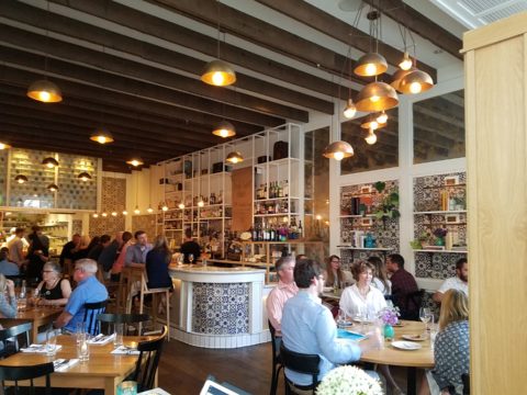
As I referenced this casita installation for my clients, while planning their kitchen remodel, I also came upon a restaurant in St. Louis this last spring that used a similar approach in an Italian theme…Talavera? Mexican? Italian? Oh well…another example I brought to the conversation.
For this new kitchen remodel project, we were working with existing conditions, the layout and the mottled green, rust, aqua, charcoal slate floor. All else was up for grabs. However, because I really feel strongly about context, I mentally gathered elements from other parts of the home and intentionally embraced the floor.
This fireplace was given a face lift last year to add the stone hearth and mantle with the decorative Talavera tile detailing.
I believe to abandon existing design themes reads like a designer show home – each room done by a different designer, without any cohesive design continuity. Pair the idea to make an effort to lace the rooms together, with the effort to adopt certain fixed materials and you have compelling diagram of creative remodeling guidelines.
When it is either not practical to replace an existing design element or when the existence of the that design element makes for an un-self conscious part of the composition, it can be priceless. The slate floor was of smaller 12″ format tiles than might be more popular today, but it’s unusual color and very organic feel was worth the challenge. Turning a questionable design element into an asset is success!
Once the flooring was determined to be key in the new design, extracting features (specifically colors) from it became the next task. We had already discussed bringing the blue and white Talavera in from the living room, but my client was not feeling the joy of pairing it with this wildly mottled slate floor.
To meld the design elements together, I selected a concrete-like engineered countertop (which came in two colors both of which were seen in the mottled slate – and provides fodder for a future story). This provided a solid anchor for the design between the mottled floor and the multi-patterned Talavera.
But what might be the one more thing to make this design be even more unique and more cohesive? I set forth to find the impossible, an aqua, handmade tile that would complement the Talavera in the light irregularity and “hecho a mano” feel.
The perfect handmade aqua tile from Spain (photo reads more blue) from DAL tile was the perfect accent.
The absolutely ideal accent appeared unexpectedly as I thought I would be searching farther and wider for this perfect piece. By cutting it into 1″ pieces we would have the artistic accent woven through the patchwork of Talavera, thereby inserting the aqua and adding interest and unexpected detail.
By not planning a symmetrical grid of the accent mosaics, but by creating random lines the unexpected quality of the installation continues.
At this stage, the grout could be grey or white – specifically off white (of which there are many). Opting for the white, to allow the tile to read in its patchwork pattern, without added confusion with a grid of grout competing for attention. We then made a last minute switch on the white grout to a creamier one after seeing the many colors of off-white Talavera up on the wall – leaning more creamy than merely off-white. Could I have shown an example of this design scheme? No, this was created specifically for this project, this client and the space that deserves such attention to detail.
We’re not finished yet. Watch for this transformation to be unveiled in coming weeks complete with before and afters!