Hidden Talent Exposed

Hidden talent – that remarkable artwork that appears (seemingly) out of nowhere, on a par with great masters of the medium. I considered this element of surprise – looking back several decades to a local painter, Wilson Hurley, who had more than one very different, distinguished career and diverse life experiences before he delved deeply into his passion for painting in his 40s. Once exposed, his paintings revealed his extraordinary talents and he become a nationally recognized treasure for his sweeping landscapes and a variety of other subjects.  

On that note, I have just gotten off the phone with a very good friend, in Florida, Houston Evans. I have recently learned that he is a passionate weekend photographer! An amazing photo appeared in a Facebook post and I was astonished by the enchanting image, color and composition. I was instantly captivated – and curious. Upon closer inspection, his stylish swashbuckling  signature made me realize that this hobby was subtly becoming more than that – yes, he had his mark digitally mastered and is probably THE perfect brand for his diverse and stunning work.

“Star Power” is the luminous celebration of a pineapple.

As I quizzed him about his interest in photography, I learned that he attributes his eye for art, color and design to his mother who’s side of the family has spawned other talented artists, in his generation. He has been posting on Instagram for quite some time – hundreds of images. I didn’t know. I didn’t “follow.” He is modest about his photos and does it for his own amusement, pure pleasure and personal enjoyment – that he likes to share. “I don’t do it to imagine it on someone’s wall.” Yet this observer believes that there is where it absolutely should be! Many walls…many places! #houstonevansphotography

He plays with the medium and all the tools and tricks of the trade. He enjoys the freedom of experimentation. The results are controlled, yet spontaneous. From high resolution to fuzzy pixels that require distance to assimilate. Up close for precise detail and soft smears for imagination to take hold, the variety of clarity or lack thereof are a part of the experience and expression.  

“Makin’ Hay” has an enhanced pointillist treatment – a Van Gogh-esque subject with a twist.

From my interior designer’s perspective, his bold images would be key focal points in the drama of architectural spaces – interiors from Miami to Honolulu and on around the world!!! I can see the towering orchids in hotel lobbies, bars, restaurants and swanky condos everywhere!!! I am eager to find a project, for which his work would be the key to the scheme, unveiling a spontaneous design resulting from the inspiration of the image.

“Oblique Orchid” screams floral superiority as a commanding focal image.
“Shooting the Bird” speaks to paradise revisited!!!

In the beginning, the photos stood on their own merits. Evans keeps his originals – some of which remain just that – in their original form, while others are tweaked or more radically manipulated to create stunning subjects and compositions.

This brilliant, fresh simplicity of “Aqua Eye” observes the droplet’s reflection in the center of the cheery chartreuse petal.
Coming upon a cool caddie “Daddy Long Legs.”

I can see his limitless fantasies contributing to the imaginative narrative of Meow Wolf, gracing hotel lobbies with larger-than-life orchid explosions and commanding condo walls with magical statements of tropical color, subject and form. Translucent installations of LED illumination could result in magnificent walls of design influence.

“No Flies on Me” is a fantasy of oozing colors and form melting and melding around the psychedelic dragon fly.

The digital age is advancing with such a pace that we are all caught-up in photos of food, whacky selfies and sunsets on fire…but having an artist’s eye, to truly see the potential and master the tools that are now available – using them to create valid and valued masterpieces of art, is extraordinary.

“Copy Cat” reflections mirror a chorus of color from sky to watery impressionistic likeness.
This “Roadside Attraction” must have been a startling scene to distract dazzled drivers.

I truly believe that his work is exceptional – full of heart and soul – and spectacular fun!!!!!!!! I’m thrilled to learn of these images and now enjoy the continued progress of his discoveries and creations. Let’s see where this goes!!!!! He just might be coming out of hiding!!

Yes, his selfie – “Prickled!”

The Wealth of Art That is Our Elegant Library of Congress

If the Basilica in my last blog didn’t get your juices flowing about incredible public art spaces, the Library of Congress was our next stop. Yes, it houses nearly everything having to do with writing, recording, documenting…but the building itself is amazing! It in itself is a wealth of artistic detailing. The interior has more gold leaf – not gold paint – but hammered metal gold leaf – than any other building in our Nation’s Capital. Inside and out, the craftsmanship of the stone carvings and architectural embellishments is magnificent. This inestimable landmark is so much more than the sober name suggests.

We parked in the garage of Union Station and walked the few blocks past the Supreme Court and the Capitol Building to our destination of the Library of Congress. The brilliant blue skies behind the bright white edifices belied what some regarded as the oppressive heat. I however am a heat freak – it’s summer – bring it on!

Columbus Fountain at Union Station also known as the Columbus Memorial is a public artwork by American sculptor  Lorado Taft, located serves as a tribute to the explorer Christopher Columbus.
The Supreme Court – cool, brilliant white against a striking blue sky – at 100 °
Crouching to get a shot of our Nation’s Capitol Building.

Symbolism is executed with every inch of the design details both inside and out of the imposing Library of Congress. Ascending the exterior stairs sets the stage for arriving at a monument of immeasurable wealth of human dissertation and history. Here I can only touch on the tip of the iceberg…

Picnic tables out front at our Library of Congress…relax, grab and bite and read a bit before going back to work!!!

From an inauspicious beginning of modest expectations to greater expanses with devastating fiery catastrophes in between, the Library of Congress has an amazing story. Thomas Jefferson played a significant role in re-building the foundation of what we now have today.

While waiting for the tour to begin in the magnificent Thomas Jefferson building, we were directed to two remarkably entertaining exhibits on the lower level – a Gershwin gathering and a Hope homage.

The George and Ira Gershwin Room is a tribute to the two brothers and their contribution to American music. This nostalgic and very familiar subject matter makes you hum and tap your toes. The exhibit presents George’s piano and custom-designed writing desk, Ira’s table and typewriter, self portraits and myriad documents that trace their lives and amazing careers.

The Hope for America Exhibit focuses on the varied careers of Bob Hope along with other recognizable entertainers. The exhibit offers the satirical humor – crossing party lines – both socially and politically for which Hope was so appreciated, admired and beloved. Hope received the U.S. Congressional Medal of Honor and the Presidential Medal of Freedom for his commitment, in his nearly 50 year service, entertaining the men and women of the armed forces abroad.

As the actual tour began, we were introduced with a short film as an overview of what was to come. We were then guided up a staircase and gathered in what was a most astonishingly beautiful, expansive space full of piercing, daylight, sunbeams glancing off incredibly detailed architectural stone carving and sculpture. Vast murals, vaults and arches in the 360 degrees of beauty from floor to voluminous ceiling was staggering.

” Founded in 1800, the Library of Congress is the nation’s oldest federal cultural institution. The Library seeks to spark the imagination and creativity and to further human understanding and wisdom by providing access to knowledge through its magnificent collections, programs and exhibitions.” Thomas Jefferson stepped-in to save the Library of Congress after a few inauspicious starts.  Not enough time devoted here to a history lesson – learn more at https://www.loc.gov/  –   but this grand space into which we entered is the Thomas Jefferson Building.

The focus of this blog is to share a bit of the art and decorative embellishments of this stunning architectural environment – beginning with the Commemorative Arch by Olin L. Warner (1844-1896) featuring a young man to the left and a bearded elder man on the right signifying that the process of learning never ceases…

Grand staircases on opposing sides of the space are adorned with carvings of “putti” – Italian for little boys – as they are pictured representing various occupations from gardeners to astronomers – the depiction of each vocation is fascinating with what it means to have that respective knowledge to pursue one’s career path.

Beneath the string of putti are representations of the 4 corners of the globe depicting figures of each, Asia paired with Europe and American paired with Africa.

Minerva, the Roman Goddess of Learning and Wisdom is aptly featured in a series of statues and images.

Most fascinating to me, up in an adjacent domed ceiling area was the “Evolution of the Written Word,” a series of lunettes by John White Alexander (1856-11915). Having previously written about the importance of handwriting for a million reasons that go beyond, but are directly connected to, this depicted evolution, I found this to be simple, yet profound. It is a beautifully rendered and fascinatingly distilled artistic expression of a very significant timeline. Beginning with The Cairn – we see them stacked stones on beaches for fun and on paths in the wilderness as markers, but here Alexander renders primitive man communicating by stacking stones to possibly mark the dead, a passage or a place of significance. 

As the history progresses, Oral Tradition becomes the means of communication – but only/obviously in personal contact. Words are created. Then Egyptian Hieroglyphics enter the scene with images representing words depicted on surfaces.

Picture Writing on animal skin – and ultimately more refined to vellum – becomes a more mobile means of communication.

Theologians recording ancient stories of biblical history brought monks to the art of the written word in compilations of the Bible as the first manuscripts/books became recorded.

And then an exponential leap in communication came with the invention of John Gutenberg ca. 1400-1468 of the Printing Press! Asia had its versions of printing machines even before Gutenberg, but inspired by seeing grapes at harvests being “pressed,” he put that concept into the process of placing individual letters in place and pressing them onto paper. Western Europe then had a movable metal type process that increased productivity of printed material – printing the first ……in Western Europe. The tour guide sadly explained to us that Gutenberg died a pauper as his investors, not patient with economic fluctuations, excused him from his rightful place in the business and left him to live out his life only to receive proper recognition posthumously.

It is the first complete book extant in the West and is also the earliest to be printed from movable type. This rare version is printed on vellum.

Unfortunately, at this point in the tour, we had to excuse ourselves with a quick wave and thanks to our guide as we were departing later that afternoon. Before leaving the building though, we dashed upstairs to discover the main Reading Room – entering from a way upper tier, we had a bird’s-eye view of this grand space. The scale was daunting and the spectacular architectural detail was breath-taking. The WOW-factor was palpable!

The Reading Room.

Eight giant marble columns each support 10-foot-high allegorical female figures in plaster representing characteristic features of civilized life and thought: Religion, Commerce, History, Art, Philosophy, Poetry, Law and Science.

Layer upon layer of intricate, symbolic details.

The 16 bronze statues upon the balustrades of the galleries are a tribute to men whose lives symbolized the thought and activity represented by the plaster statues.

Shhhhhhhhh……it’s the Reading Room

And with that – we only had enough experience and education about this incredible resource and monument of artistic beauty to whet our appetite for more and surely lure us there again for more information about all that comprises this amazing public gift and resource.  

Ta Da!!! Seriously – standing there in awe…taken with my phone!

There are so many wonderful things to see and do – get out there and see it!!!

Mosaic Majesty at the National Shrine

Artistically embellished architectural splendor is an understatement for all the wonders that await when visiting our Nation’s Capitol. Washington, D.C. is my home town. Growing up inside the Beltway, venturing into the District for work or pleasure was once my norm.  I know I took it for granted. Like many, when one lives and plays in a place, it often becomes routine. Work the same place, drive the same route, play in the same spots…unless there is a special concert to catch or event prompted by others to attend, one often misses the wonders that are right around the corner.

Therefore, when I visit, I try to make it a point to investigate and experience things I have never seen or things that I haven’t seen for quite some time. This visit featured the grand dome of the Basilica of the National Shrine of the Immaculate Conception.

It was the focus of our outing, but the surrounding chapels and all there was to see became such an educational and eye-candy dazzling afternoon of mosaic artistry that our eyes and neck were fatigued from staring at the details and craning to view the enormous vaulted expanses of blazing glory.

Lest you think I exaggerate, know that the majesty of the iconic images have been rendered in such exquisite detail and with such amazing colors of tiny, precisely placed tiles that the work makes you gasp and say “whoa” at every turn.

And this is just touring the many spectacular chapels on the way to the nave where the vaulted domed ceilings explode with color, detailed imagery and astonishingly expansive scale! It is then, upon entering this awe-inspiring space, that gasps and whoa fall away to near breathless speechlessness as eyes well with tears at the splendor.  

The detail was similar to that of the magnificent mosques we experienced in Istanbul – but there, we walked in and BAM the spectacular space was huge and instantly revealed – definite WOW factor – but here at the Basilica, it was a fascinating process of discovery as we investigated each chapel and made our way up to the grand expanse of the vaulted nave.

I am not going to give you a guided tour of what we experienced, nor am I going to attempt to convey any aspect of the historical tracings of the biblical references…but I am going to attempt to impart the beauty and artistry that one doesn’t have to be a catholic to appreciate. Photos can’t begin to accomplish what it takes to get the full effect of these amazing designs, patterns, details…

Marble columns throughout the Basilica are identified by place of origin of the stone.

I encourage everyone to experience this majestic edifice and the beautiful grounds towering above the trees in NE Washington, D.C.. It will not disappoint. https://www.nationalshrine.org/

Designing with Your Story in Mind

Is your story important? Does anyone care about your story? And what does this have to do with interior design?

Whether you are marketing yourself or your business, your story has merit. It is about identity, branding and connecting. It is about letting people in a bit. It is about sharing history, experiences and process. It is about your unique reason for doing what you do.

For the past several months, I have been working with a client on a combination of interior design, graphic design, exterior design…it is all intertwined. A successful design laces together all these design elements. And that brings me to “the story.”

Even Facebook features a section to tell “your story.”  Yet, my client resisted presenting/using the story of this new business venture as a part of the design. He told me that was “so seventies.” That he had read that it was a dated concept that was no longer relevant. I begged to differ. For months I begged to differ! We agreed to disagree.

I believe that this is similar to many interpretations of design. What might be considered “dated” is often the manner in which it is used or done – not the thing itself. Whether a color,  a font, a style of furniture, a wall tile or wallpaper, an architectural detail or form…so many design elements are considered dated due to their context. Often, this is fair to observe. But, mix it up a bit and use things differently or with other different elements than the original trend presented and – Voila! You have a perfectly valid, even fabulous design – think outside the box!

The idea of a “story” is not unlike the “mission statement” which became a standard feature decades ago in every company’s presentation on printed media, lobby plaques, conference room walls, break rooms… Some say it is passe, but when something is good and has meaning – re-consider. Like “the story”, “the mission statement” identifies goals and intent…when paired with the story, it provides an overview of the who, what, why that inquiring patrons want to know.

So back to the story…about “the story.”  When a business or any concept is respected or liked, revered or praised, it is natural for people to wonder “How did they get started?” “How did they come up with this idea?” “What is their history in this business?” These are common questions that clever ideas or designs invite. So why not satisfy that interest, create a buzz…Let’s give them something to talk about!!!

In this world of disconnection, making connections seem all the more important. What used to be a natural exchange – of communication, ideas, sharing – is now something that has to be inserted with greater intention.

So this new business, for which I have been designing, is a barbeque establishment. There are a million. They have certain things in common. Without my enumerating them here – can you envision some common denominators that you might connect with barbeque joints? As is true with any venture, I asked: “What makes this one different? Better barbeque? Maybe. Cool interior? Hopefully. Are those the only unique traits? Is that the memorable take-away?  It certainly isn’t a bad one – the idea is to have great food – and a fun environment, but what else might contribute to the experience of this barbecue being unforgettable? What might you have, to tell your friends, to spread the word?”

My opinion was a  combination of an intriguing brand and “the story.” But before I go further, they coined a word to express their beer brewing prowess – exbeerience!  This will enter into the story as we go along.

Now maybe my opinion about their story was so worthy of consideration because there was so much to this story. That certainly helps. It happens to be a great story with layers of interesting twists and turns – riddled with history and significance. Plus, it had a local interest angle that has the potential to create a buzz far beyond their actual location.  

To begin to tell the story, I encouraged the development of a unique logo for this specific branch of the brand. Taking the lead to design it,  and incorporating it into interior/exterior design was part of my vision for a complete design package and presentation. Extracting from the story to create the logo seemed natural. The private persona was becoming public.

As we developed the logo, featuring a wood-carved graphic of an original log cabin/smokehouse, the story was recorded and edited down to a summarized version.

It was available for printed material, social media, and as art to be presented on walls. Yes, it was intended to become a decorative element too.

The Story became a focal piece in the interior along with authentic, original photos of the log smokehouse and an interpretation of patchwork quilts entitled Urban Piecework made from leftover ceramic and porcelain tiles, glass and clay assembled in wall-mounted panels throughout the interior and exterior spaces. 

Photos of the original smokehouse in North Carolina will soon be presented to further reiterate the story on the interior walls.
Urban Piecework commands the interior with bold mosaics reminiscent of patchwork quilts – an intriguing backdrop installed both inside and out.

Connecting with patrons, followers, clients, friends, family and acquaintances is valuable. As a business, it wraps who and those elements that are important to you in a familiar cocoon of context. It can instill a level of comfort and confidence in addition to sparking additional interest that might have taken longer to establish, without the introduction of your story.

The final multi-dimensional and multi-textural wall-piece featuring the story and mission is a striking 4’x6′ multi-textural panel. It offers patrons an opportunity to get a few questions answered as they enjoy their “exbeerience” at BLUE.

It was a privilege to promote, extract and produce this story and contribute such an important and valuable element to this business’s marketing and solidifying it’s new, exciting chapter of their brand.

Consider your story. Own it. Share it. Celebrate the uniqueness of your story. Design with your story in mind.

Rejuvenate and Expand Your Interior Spaces by Opening Walls

In past blogs Patti Says a lot about selecting paint colors. Pondering paint colors and the elusive nature of selecting just the right color. https://patriciandesign.com/5677-2/

Walls surround your world. Walls encapsulate and enclose your personal spaces. They can also frame your world and dramatize a focal point. They add effective dimension when punctured.

A current study we have in front of us is about those specific things. Walls – opening them, their color and the context of the color decision. Months ago we examined a wall in a kitchen soon to be remodeled. Re-painting it was the most obvious and least complicated of the options. We also looked at creating a dimensional recess to house art or an accent color or something to take the curse off of its up-close, massive, solidness. It was like the 10,000 pound elephant in the room!

The wall encapsulated close quarters. It divided the space between the kitchen and the parallel hallway.

What we were looking to change was atmosphere. This involved improving the dated and worn cabinets and counter-tops, updating the lighting, enhancing the back-splash and  addressing the closed, isolated feeling of the room.

Smoke and mirrors might be the answer. Like a magician appearing and disappearing behind a veil/dimension of smoke –  or when the physical space is not negotiable, mirrors will give the illusion of added space. They are VERY effective tools, but neither was the right solution for this room’s current condition. Yet, we knew we needed dimension, depth and something to help expand the space.

Hmmm…the window over the sink offered an exciting option to open out to the patio. We did that – save that for another story. However, this large elephant of a wall was still so confining.

Sometimes small spaces can be  cozy. Some people prefer tight spaces while others find them to be claustrophobic. This was not exactly claustrophobia instilling, yet it certainly spoke to all of us as an imposing, confining factor that needed attention.

After discussing all the colors and recessed options someone has the brilliant idea to ask – “What about removing the wall?” That seemed a bit radical considering that it only opened to the hallway and it served a purpose of defining the access to the kitchen and opposite bedroom quarters. To open it entirely might have given an orientation to the kitchen that suggested that the island seats be positioned facing that point-of-arrival. Hence looking directly into the far hallway wall.  That was not the desire. Rather, we decided to cut a large opening in the wall exposing the far hallway wall while maintaining the orientation of the kitchen toward the outdoors and island seats facing into the kitchen not out into the hall. It worked!

The space was instantly enlarged. Opening the space onto the patio and this opposing generous puncture of the Great Wall of Kitchen changed everything! The light borrowed from the skylights in the hallway was significant and the sensation of enlarging the space was undeniable. Except the footprint had not changed.

The physical feeling of a space is what counts. It was proven here that it wasn’t about enlarging the space but feeling like it was enlarged.  Like mirrors, the illusion of space is so important. But, unlike mirrors this space was physically opened creating the sensation of enlarging the space by adding actual dimensional reality . The benefits were immediate. It actually conveyed a palpable feeling of relaxation. It was freeing and created an entirely new experience of enjoyment.


A passing idea for a stenciled surround was entertained…

Tight spaces give some people comfort. Contrarily, open spaces give comfort to others.  Personal reactions to space, color, texture, temperature all  enter into the equation of good design. What tasks are being performed also play a part in determining what solutions are best.

This dark, isolated kitchen benefited from changing the cabinets to a white traditional raised panel style detailed with crown molding which added a refreshingly light element.  The house was a decades old vintage bungalow and had been dealt a disservice to have had the kitchen remodeled years ago in a not-so-sensitive, style-of-the-day fashion. But, in addition to the more traditional timeless approach to the design, opening the space resulted in additional natural light borrowed from the hall’s skylight and an enlarged interior over-the-sink window brought more coming in from the patio. Now colors…


So we know that picking colors is contextual.. .what’s in and around the room are all part of the equation. Any walls that are seen beyond (through doorways, around corners) contribute to the layering of colors and therefore, participate as well. The floors are multi-colored mottled slate. The tile chosen to enhance the backsplash and also serve as wall-covering was a blue and white Talavera accented with a soft aqua mosaic. The ceiling mimicked the floor as the beams were a smoky grey with caramel-color stained knotty pine boards between – we embraced these existing design features as their unselfconscious non-trendy nature suggested a more grounded, permanent place – one with organic finishes that might have resulted from local availability sourcing and craft – and probably did all those decades ago.  See what Patti Says in another blog about this very project: https://patriciandesign.com/trust-and-custom-designs/

The fact that all of these elements contribute to the equation, for deciding a color, is key to our study today.  After discussing the options for treating this newly opened wall, we found ourselves doing the paint sample potpourri on the walls!

Taking cues from the aqua accent mosaic which was derived from those tones found in the slate floor, we directed the color choices toward smoky aquas and grey blue tones.

Sometimes white is actually a color, rather than the absence of color. The wall was currently frosted with smooth crisp drywall mud as an aftermath to the demolition and framing of the new opening. The stark white was clean and fresh. Like matting around a painting – this might just be the way to go.

And at this point, we must introduce the idea that was also in the works and that was to have a painting commissioned that would POP through the opening providing a spectacular backdrop to the kitchen and dress the dimensional contribution that the opening into the far wall of the hall presented.

We knew that yellow was a great color POP for this cool kitchen pallet. A recurring bowl of lemons kept proving that to be true. Lemons became the fresh, culinary subject that seemed to be the perfect fit. So we enlisted our master muralist Federico Leon de la Vega to meet the challenge. Armed with the blue and white scheme and the accents of aqua he created a miniature to test the concept.

Isolating the image and framing it is always an important component in the formatting of scene. Whether to spotlight a sculpture on a pedestal, or properly and effectively matting a painting in a frame, this aura is important to highlight art. The same became true as we considered the painting being “framed” by this opening. The wall itself became the mat.  So to get an idea of what this might look like, a quick digital manipulation did the trick.

The final decision seems to be that we will keep the wall with the opening white, as though a matting around a painting, while painting the perpendicular wall a smoky aqua. Another opportunity for layering these two colors occurs when the smoky aqua wall is layered over a receding laundry room wall soon to also be painted white.

Watch for the completion of this wonderfully unique little kitchen to be unveiled with all the dramatic before and afters!  Meanwhile, look around your interior and see if opening a wall might be an option to expanding your sense of space. The transformation can be rejuvenating!

Urban “Pieced Work” – an artistic narrative

We are excited to have the opportunity to bring a design installation(s) into a new project that will serve to support the brand with a twist. A nearly completed new smokehouse is coming to Albuquerque. This home-grown eatery blends family history and southern roots with southwestern barbecue flavors including indigenous  wood and iconic chile blends. But this is not about their cooking profile. It is about how we have arrived at a design theme that will define and further the identity in this new, specialized smokehouse department of this larger local brand.

To accomplish this task, we examined the concept the owner had  to remodel an existing facility that had been a popular gathering post serving this community for decades. The fringe barrio location was of a demographic primarily comprised of Mexican/Americans. Decades past it was home to a heavily black community. The fabric of these cultural combinations suggested a mosaic of color and vibrant heritages.

The spark of cultural references lead to discussion of the popular artistic expression of urban mural painting.


When we began the dialogue, the decision to have a mural painted by local neighborhood kids, with a mentor to design and supervise the work,  seemed to be the direction we were headed. After subject matter debate and development, I veered off on another tangent that might take a less subjective approach, be weather-proof and more durable for a patio location – mosaic.

This new more impervious and durable medium still offered the opportunity to engage the community, but with less focus on a specific subject and more about geometric color and texture. We discussed the details of installation so as to keep it simple for kids to participate using whole tiles – minimize cutting, if any, for starters.

Inspiration came from several other installations such as the Albuquerque Convention Center’s on-going mosaic mural project wrapping many sections of the buildings with intricate scenes of New Mexican lifestyle and cultural diversity. The colorful mosaic is an elegant and sophisticated contribution to our city’s cultural aesthetic.

Helen Atkins, manager of consignment art at PATRICIAN DESIGN’s downtown boutique gallery and the lead on their current restaurant mural project, has worked on several phases of the Convention Center’s mural project.

We have incorporated mosaic into several of our own design projects such as last week’s blog https://patriciandesign.com/trust-and-custom-designs/about a residential kitchen installation.

Here, in another installation, a fireplace surround of mosaic adds movement, color and textural interest to the room.

Ultimately, one of Helen Atkin’s personal photographs cemented the approach. It was decided that a geometry of different sizes and disparate glazes and designs of tiles pieced together in a colorful, textural  panel would be our design theme.

Helen Atkins, a recognized artist in many media, captured this in passing while visiting New Zealand. It’s crisp, yet irregular composition was intriguing and pleasing. It became the springboard for the concept for a geometric mosaic panel to anchor the theme of this new New Mexico eating establishment.

The idea became more exciting as we began gathering material from local tile distributors and our own personal inventories of favorite treasures saved for a special project. Here it was.  It seemed such a strong design element and therefore offered a new direction for the actual brand of this establishment. We embraced the idea and brought it into the interior and distributed murals throughout the space.

Still under construction, we will not divulge the identity or locations of this project just yet. But suffice it to say, the murals are an exciting part of this interior design scheme.

As we further discussed the plans to implement this project, school started and the ease of coordinating the assistance of neighborhood kids became more difficult. Helen lead the project as primary installer, coordinator and supervisor. She enlisted the assistance of a couple of people – one experienced and the other not at all.

We have named this series, Urban Pieced Work – an artistic narrative. Here we are interpreting generations old sewing patchwork using ceramic, glass and pottery pieces rather than the traditional fabric patches. The original folk art needlework has been in the American vernacular for ages.  In these installations, this up-cycled  use of discarded or discontinued tiles is similar to patchwork fabrics, re-purposed to make clothing, wall decor, window treatments and bed dressing when times were tough – often referred to as “pieced work.”

My paternal grandmother in New Mexico made this twin quilt for my bed when I was a child in Virginia.


My same grandmother made this and was given to me by my cousin, her only other granddaughter.

Mosaic is often, like fabric patchwork, a practical art form that puts scrap, shards and fragments to good use in an artistic fashion. Note though that more sophisticated mosaics have been designed more intentionally for centuries not merely as salvaged material. These masterpieces both in contemporary work and antiquities represent many periods in history and movements in artistic expression.


This mosaic version connects with the history of the restaurant’s roots and southern heritage. The panels’ mural nature speaks to the urban murals found throughout the community.

Located strategically throughout the interior, these murals have become a strong design element and anchor for this facet of the brand.


Another shot of the spectacular cultural story murals at the Albuquerque Convention Center.

We have woven a meaningful artistic statement throughout the interior and also on the exterior of the building. In addition, we will be inserting a graphic version into the signage and logo design.


Urban Pieced Work – an artistic narrative, of a New Mexican Smokehouse, will provide pleasing design visuals throughout this new interior, provoke conversation and interaction, weave an element of history and context with the southern roots of this exciting new eatery!

Join the conversation and watch for the first succulent flavors to come out of the smokers later this year.


Decorative Wallcovering – Fun with Tile

When you think about finishing a wall, you probably think about paint colors…you might think about a wallcovering – wallpaper, or even a mirror – I’ve previously noted how mirroring an entire wall can exponentially expand a room – a dimensional effect/illusion that suggests the room extends well beyond its actual size. But another wall treatment, with which I LOVE to play, is tile!

All over the world, the art of designing and creating decorative finishes with tile has been evolving for centuries. All cultures have utilized mud and clay, glazes and fire to bake beautiful patterns and colors onto geometric slabs. Shapes of rectangular, square, octagonal, dots or diamonds – the geometric shapes are many and the designs are limitless.

As is true with other wall treatments, I prefer not to stop on an outside corner. I believe that the color or material should suggest a built mass – part of the architecture. To stop on an outside corner suggests a veneer. It proves that the finish on the element is not a structural/integral part of a built mass. When you paint into an inside corner and stop, it allows the mass the read as though solid and not merely superficially treated. The same is true with tile. Don’t stop it until you get to an inside corner – if possible. There are situations that force a finished edge on the flat plain of a wall – but avoid outside corners at all cost!!

This entire shower is tiled floor to ceiling, around the pony wall, bench…no door…it reads like a built environment of stone tile.

Think of the surface as an architectural element. Tile from floor to ceiling, inside corner to inside corner – wrapping corners, if needed, along the way.

Take a backsplash…customarily used to do just that – catch splashes at the back wall of a wet area (sink) countertop…bathrooms and kitchens, behind sinks and between upper and lower cabinets – but why stop there?

The entire back wall of this kitchen is mosaic marble tiles in a herringbone pattern.

Think of it as a true wallcovering – wallpaper. Commit to the entire surface. Here are more effective examples…

The backsplash and entire adjacent wall were covered in glass mosaic tiles. It “reads” like wallpaper.

here again, the classic blue and white Talavera tile backsplash is continued along the entire wall from floor to ceiling.

We are currently working on a couple of kitchen projects that will soon be completed. They both use tile liberally. Each quite different from the other. Stay tuned for the finished products!

In bathrooms, the area around a mirror can be more than merely the backsplash. Embed the mirror into the tile surround or tile the entire wall and hang a mirror on top of the tile surface.

This mirror is flush with the surrounding tile, suggesting that it is embedded into a tile wall.


Planning this transformation, the mosaic vase was the inspiration. Then loose tiles were scattered on the countertop and the concept began. Note, the existing mirror was attached to wall with light fixture mounted above it and a medicine cabinet off to the side.


The transformation involved removing the medicine cabinet, taking the floor tile up the wall and wrapping it floor to ceiling. It was also cut into smaller squares to use behind the sink as a “full-wall backsplash.” Then punctuated with glass and glazed tiles to create an updated design. Relocating electrical to flanking the mirror for a pair of new sconces and a new countertop, faucet and sink with existing cabinets painted resulted in a cost-effective design.


Here a mirror is mounted on top of the fully tiled wall. Inside and outside of the shower enclosure the tile is a true wall treatment.

I recently received this advertisement in my email. It was such a spectacular collection that it caught my eye and I share here one of the patterns and context shots as the backdrop to a range.

Mosaic assemblages can be fun! Here is a fireplace surround.

The addition of three-dimensional pieces adds interest.


This exterior fireplace surround tolerates the elements – an all-season installation.

Here is a mosaic mural of a dynamic geometric abstraction  discovered in New Zealand. We are using this inspiration to establish a theme in a current restaurant project. An interpretation of this in the form of geometric tiles of various sizes, colors and patterns  will  be used to create a cohesive repeated design element through various areas of the restaurant – both inside and out. Watch for this completed project in coming months.

Commercial restrooms can benefit from full-wall tile treatments too. Not only does it look complete, but it is an ease of maintenance consideration.

Three dimensional tiles add interest to this cactus motif!


Fun with color and texture, tile are also easy too keep clean – terrific for public restrooms.

Murals are also terrific ways to use tile as art in your  interior/exterior designs!

This is embedded into the stucco for an integral installation.

When using outside though, remember to consider the range of temperature and moisture to which  it will be exposed. Porcelain is the most durable in areas where the temperatures get to and below freezing. Freezing and thawing can destroy tile. Many murals are made from clay that is not suitable in cold climates!

Inset into the tile wall treatment is this stunning glass mosaic abstract mural.

Tile – it’s a nearly limitless medium. So consider the possibilities for your next project! As a piece of art, an accent wall or an entire installation – full-wall treatments make a statement! Have fun with tile!


Mirror Mirror on the Wall – Do You Even Notice Me at All?

Designers use tricks, “trompe l oeil” – ever heard of it? Parlez-vous français? It’s a trick of the eye – and how handy is that to create an effect? Often murals are painted to give the illusion of depth or a scene that is not real, yet might fool you into thinking it is.  Similarly, mirrors can create the illusion of dimension and improve spaces – especially small spaces or rooms that feel particularly one-sided. Like the idea? Want to hear some fun designer tips?

Large decorative mirrors expand the dining space in this restaurant. Faux finish  composite material give the impression of hand-carved wood – not!

Mirrors in the Bath We know mirrors are commonly used for practical purposes such as bathroom vanities. They can be simple over-the-sink functional elements or framed versions for decorative pizzazz.

Below,  a built-in tiled surround is nearly a full-wall treatment but with a little relief.

an a more encapsulated/inset mirror shown here

or full wall-to wall treatments that “go away” leaving only the illusion that the room continues beyond…you don’t really “see” the mirror, you see the illusion of space that it creates.

Bathrooms can be intimate spaces of decorative interest


or expanded to be grand spaces of extraordinary volume.

Dining Room Décor and Expansion Other rooms of the house can benefit from mirrors too. Often mirrors are placed in dining rooms over buffets to once again give the illusion of space to a room that is often small for the number of furniture pieces and people that gather there. It is an opportunity to add a decorative element as well as expand the space.

Mixing Geometrics A rectangular console table, sideboard, buffet or dresser enjoys the contrast of a round mirror

Mirrors as Artistic Accessories There are also fun additions to existing pieces like this framed grill-work which is given a new element of interest by adding a mirror behind the iron, set into the frame. Depth and interest instantly change the nature of this decorative wall piece.

Yes, the mirror becomes the decorative focal point. Large framed mirrors can become just that – a great focal point AND provide an illusion of depth. Notice too, the entire wall was tiled behind this focal piece adding further drama and interest.

The limitless options for frames and shapes makes mirrors a valuable accessory similar to a piece of artwork!

Kitchen Surprises Here’s a little trick…rather than looking into a tiled wall behind your cook-top, insert a mirror into the back-splash! It will give the illusion of an opening passing through to another room!!

Wish for a Window Add a “window” where you have none. A “fake window” adds dimension to an otherwise encapsulated interior space. This can be with an actual window to which you add mirrored glass to replace existing or merely a grouping of mirrors to suggest a window to the world.

Embellish with Crafts Here we added white shells to have a little DIY fun!

Make it BIGGER – Make it Better Expand your living space, add value and create perceived square-footage!! Truly enlarging a room with a trick of design expertise is to know where to mirror an entire wall to achieve that illusion of a much larger space.

Consider what is being reflected. You won’t want it reflecting an open bathroom door necessarily…You can even enhance the area that will be reflected to maximize the effect.

Theatrical/Dramatic Lighting Effects and Mirrors

ART & Technology As is true with our fast-paced word today, the art of creating mirrors has gone from fine craft to commodity. Phenomenal prices are now available for what once was a luxury item.  Certainly, there are exquisite hand carved, fantastically finished and even gilded wood frames still being designed and handcrafted by artisans around the world,

but the offerings for production pieces of man-made faux wood and other interesting composites are now on the market. Beveling used to be an art. It was performed by hand (and still is – but it is a lost art and it’s not as necessary a trade with the advances in technology to achieve the detail).

Difficult to see the hand-beveled work on this amazing hand-carved mirror.

The effects of a bevel either on the mirror within a frame or here as a frame itself, bevels add detail of angular reflection that add interest to a mirror’s single-plane depth providing the angular plane to reflect other surrounding facets of the scene.

Mirrors are one of the most versatile and effective design components. Look at them, look into them, use them, play with them – they will expand your world!!

A Most Illuminating Lighting Course Proves – It Exists!

As is often the case, after attending an engaging and informative continuing education class, I am compelled to share at least a fraction of the energy that I experienced today. When a class is good, it is energizing. This was a most illuminating lighting course!

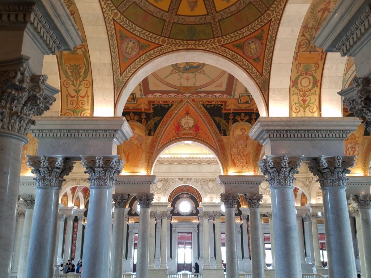
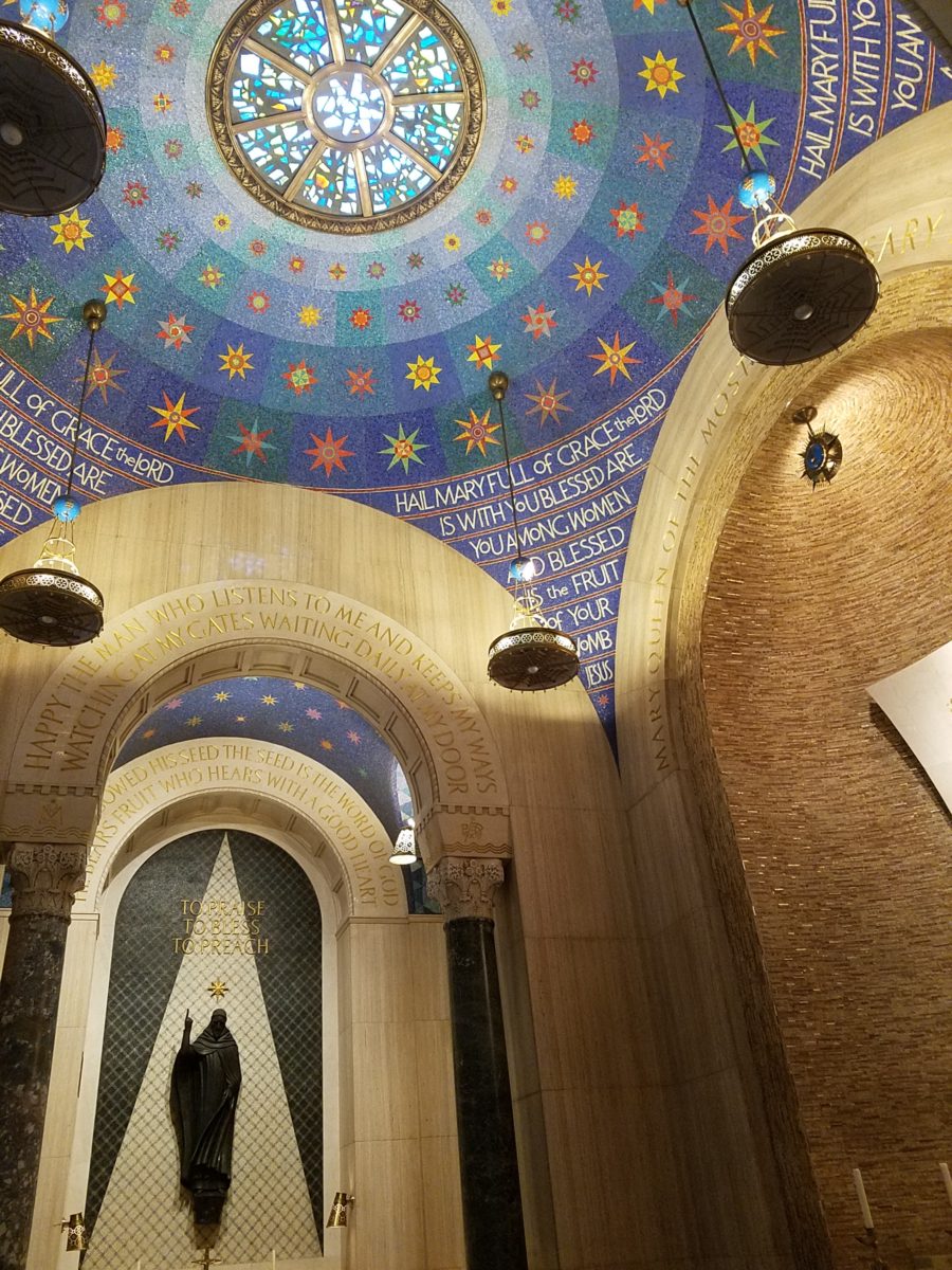
We know that as interior designers that light plays a significant role in creating a scene. Whether task lighting, ambient lighting, spot lighting or washes of color – light plays an important role. What’s so exciting and compelling is the technology that is so rapidly changing the possibilities!

The profound change is a result of the perfected application of Light Emitting Diodes – LED lighting. Lynne Wilkinson takes the complexity of physics and speaks in plain language with a humorous and entertaining delivery distilling that which is incredibly complex into digestible information.

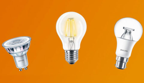
Here’s a link to Philips for more information:

https://www.usa.philips.com/c-m-li/led-light-bulbs

So today I want to impart a tiny bit of the exciting content of this day. If a child asked you – “what is light?” How might you answer that?  Um…well…it’s uh…Electromagnetic radiation. Duh! After clearing that hurdle, we settled into distinguishing the technology between incandescent and fluorescent and a number of other lighting sources.  We discussed temperature Kelvin, luminescence, illumination and the atomic composition of protons, neutrons and electrons that are involved. So how is this interesting to YOU?

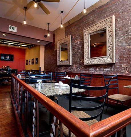
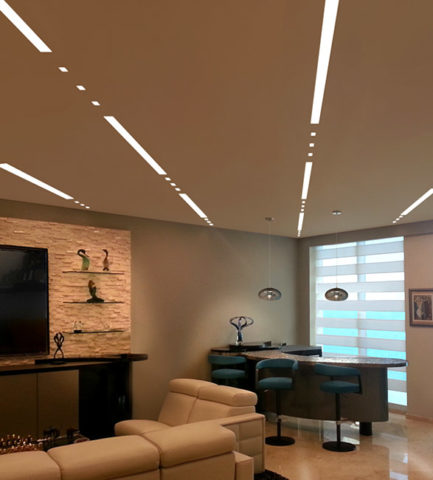
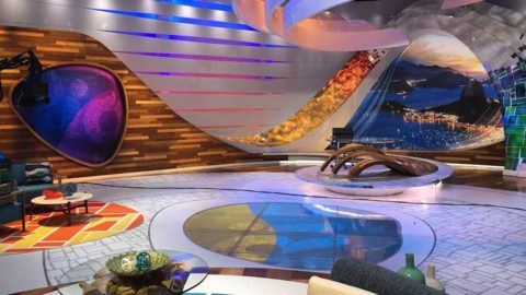
Well…inasmuch as we in the field have kept step with much  of this terminology throughout our careers, and the sci-fi interpretations of the possibilities – the future is HERE! If you just look at I-Phones being only 10 years old, yes, 2007 – we’ve come a long way baby!! Nearly anything you can imagine already exists! And if it doesn’t yet, the brains in the incubators are racing to discover and invent the next iteration of these amazing possibilities!! Look at these cool dots and dashes dramatically streaking across a living room ceiling!


You probably know that LEDs are energy efficient. Have you noticed how dramatically their price has come down in the last, say, three years? They used to be $50 and now they are under $10..  They burn for 50,000 hours…but as they diminish, the quality of their light changes – they will burn long after the accuracy of their illumination has changed. Do you care?

So many health issues are still being discovered with regard to the effectiveness of lighting. Circadian rhythms – how your body is biologically on a timer. How it needs rest and waking hours. What interferes with the natural melatonin in your system that can affect your health. Dark is for sleep. Blue light versus red light can interfere with your good sleep? Here’s a hint – don’t leave computer screens or cell phones on in your bedroom – get rid  of the clocks and other light-emitting devices when you are trying to sleep. AVOID the cool colors – blue especially.

To take this to a higher level of interaction, artificial lighting can be “tuned.” We know it can be dimmed and change color – but tuning is the technology of changing the temperature and related color to compliment the activity in the space. Your living room can be tuned to track the time of day to compliment warm early morning, bright cool mid day, dimming down to the warmth of an evening glow. Do you care? Maybe not today – but to better organize and track a busy day, this can be soothing to compliment your morning coffee…energize you into a more productive mode as the day progresses and calm you as the day closes. It might be handy if you lived in Scandinavia where the days are shorter and the desire to create a sense of daylight’s progression is real.

In an operating room – do you want your surgeon to see well into your body parts? By tuning the room in zones, you can place certain colors of light over the surgery to better illuminate and contrast the focal point or dim the light to read monitors better (as in many endoscopic procedures where they go in with a camera and don’t even see the action except on the monitors which are better read with a darkened surrounding quality of light or lack thereof), or brighten other areas where medical implements, keyboards, etc need brighter light to do the job. The understanding and ability to control these various light levels, colors and luminescence is becoming very apparent. Might ultimately be invaluable.

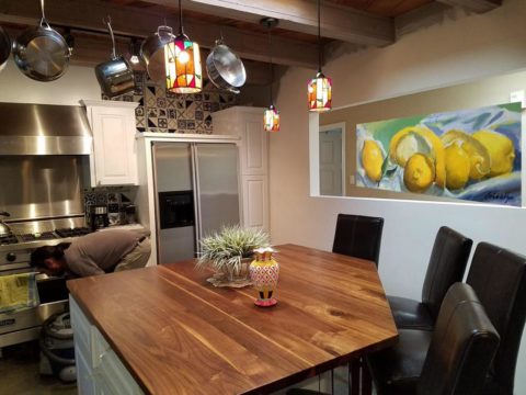
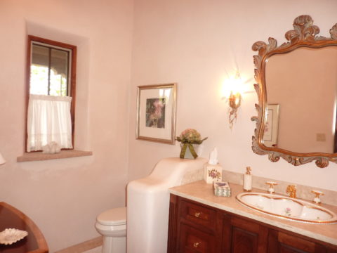
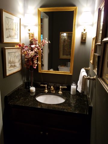
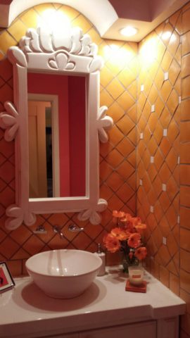
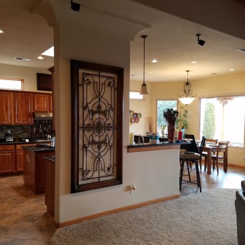
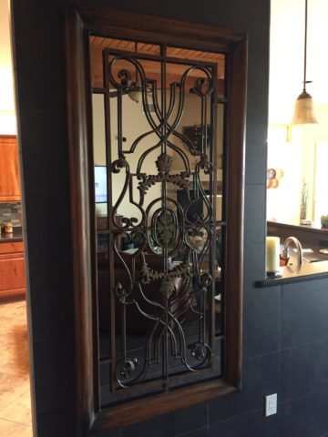
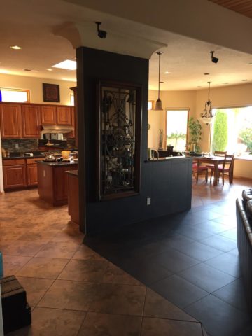
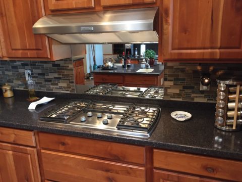
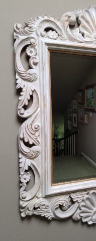
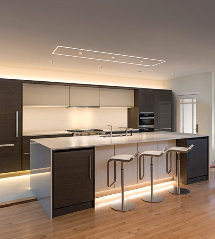
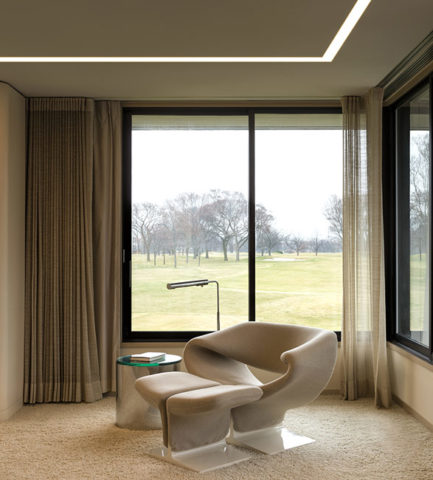
Back to interior design applications and concerns – the idea is to create effective, appropriate light and not see the source. I have always said this especially in the realm of landscape lighting – yes outside. I never use the “runway lights,” rather I chose to conceal the light source and have it spill, wash, spot and filter without giving away the source of the light.  It is more subtle, effective, natural, soft, and pleasing. So in a kitchen, don’t let the under-counter lights be spotty, reflected on any adjacent dark or shiny surface, use smaller aperture ceiling fixtures (cans), hockey pucks in cabinets create shadows…with all the new LED tapes, fixtures and diffusers these faux pas are very avoidable.

Lightology has an exciting site full of great images, ideas and information

http://www.lightology.com/index.php?module=how_to&sub=new-recessed-lighting

As recently as 18 months ago we were remodeling a bar and wanted to use LED tape the full-length beneath the long countertop  – but the cost was significant. Today, that cost is a fraction of what it was. So I might be re-visiting that bar detail!!!

So many lights can be field modified cut and shaped. With the perfection of Organic LEDs, seemingly limitless possibilities exist. Imagine your laptop being so pliable that you can roll it into a tight tube and pack it effortlessly without fear of cracking or breaking. Light-weight and completely flexible. They exist.

Imagine an entire wall in your home that is a touch screen that can be installed as easily as wallpaper. Yes, pliable and paper thin, glued onto the wall and operate as a computer – all your news and information at your fingertips at a scale that commands the room. Smart surfaces – they exist.

Learn more from Planar

http://www.planar.com/products/led-video-walls/led-calculator/#!/welcome

Learn more from Corning:

https://www.corning.com/au/en/about-us/news-events/features/willow-samples.html

Back to now – smart homes can do so much from an app on your phone and lighting is a huge part of that control. You already know that you can turn you lights on and off from your phone on a beach in Tahiti. But did you know that your phone can be as small as a lipstick tube or small flashlight and have a retractable screen of flexible OLED – easy to hold, pack, carry and with a simple tug, click or push of a button reveal a thin full screen? It exists.

Learn more about OLED:

https://www.oled-info.com/introduction

Architecture and interior design benefit greatly from this technology, but are probably the last to be jumping on the bandwagon. This technology is introduced in so many other aspects of our world before it gets to mere offices and residences. Fabric panel walls that have lights IN the fabric and can be controlled for color and movement, resin furniture glowing from inside that can be used outside in all-weather, stair treads that sparkle with glass embedded into them and coffee tables that have pressure sensitivity that when you touch them they respond. So many of these creative applications are already very cost-effective and remarkably accessible.

Here is more about glowing furniture from Marceladick:

A German company, Cerion, making exciting glass pieces embedded with LEDs

http://glassprocessing.eu/dg-glass-furniture-glass-processing-3d-laser.htm

Glowing ceiling layers that once were inconvenient to replace lamps (bulbs) often were left dark rather than scale the heights to maintain. Now the long lasting light sources produce their glow for many years.

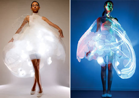
Fashion is also enhanced with the advent of these light sources in the actual fabrics. Models sporting luminous layers, glowing translucence, sparkling luminescence adding elements to clothing imagined. Think about draperies!

Here is a fashion-forward blog to share:

These exciting applications will be sure to get you thinking about the many possibilities. Love light? Use light!!

Discovering Design Dangling Three Dimensionally in Space at the Estudio Cafe

They hung from the exposed structure of the portico that ran the length of the house over-looking the marina and the tropical glistening scene that surrounded the estudio-cafe. Gently twirling blades of colorful aluminum balanced and counter-balanced on wire and suspended from nearly invisible filament. Petals of flowers, leaves, triangles, they dangled and spun in the gentle movement of air. What local artist created such magical sculptures that added such color and dimension to the various heights of space both inside and out ? I must find this fanciful person.P1040400
I discovered he was not a local, rather a visitor del norte. Yes, an American snow-bird escaping the chilly climes and bringing his art, as he vacationed in the southern resort of Puerto Vallarta, for others to share. There was a kismet, a chemistry between the two men, the host and the new-comer. Both teeming with artistic juices looking for challenging means of expression in a variety of media. The host was more than willing to share his space to exhibit these delicate yet powerful pieces. The new-comer when describing his work references “poetic spaces and meaningful places” and nothing could better describe where he found himself and his new venue, the estudio-cafe.20140118_125532
Having enjoyed for years the magic of the estudio-cafe with it’s perfect waterside setting and continuous collection of artists presenting exquisite musical talent and fine art of all manner, engaging conversation in an ever stimulating artistic dynamic, it was this day with the sun-bathed ochre stucco walls and shadows cast by the progression of the day with soft breezes wafting through the architecture, that I was moved once again by the composition of it all.
A three-dimensional collage of color and style, form and scale, art both created and spontaneous – an unselfconscious collection of rare confluence that cannot be created – but happens. This is an incredible experience. And it was with this overwhelming experience that first introduced us to our host and has since brought so many fascinating people into our lives.20140125_131409
This was the beginning of the friendship, spawned by the love of art, related color and shapes, that brought Terry Welker’s work to New Mexico. After a couple of years admiring the enchantment and thrill of his mobiles at the estudio-cafe, I made the call that connected our common love of design and resulted in a premiere exhibit of spectacular, yet modest sized kinetic pieces a our boutique gallery in downtown Albuquerque.A0968D4A-813E-4E75-86B9-71807134DAA5 As he says of his work, “he animates space with sculpture.”
Come to PATRICIAN DESIGN to see these fantastic suspended sculptures and smile at the joy they bring. And also the “host.” This wonderful artist, Federico Leon de la Vega, who by warmly embracing family and friends has created a nurturing atmosphere of love and friendship, limitless talent and sensitivity and who has also generously exhibited his magnificent oil paintings at PATRICIAN DESIGN.20150117_121847 We invite you to experience these two outstanding artists brought together by a remarkable union of creative energy and goodwill.