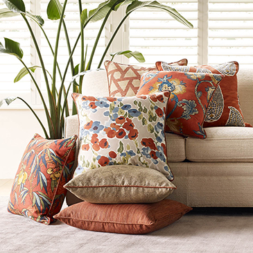
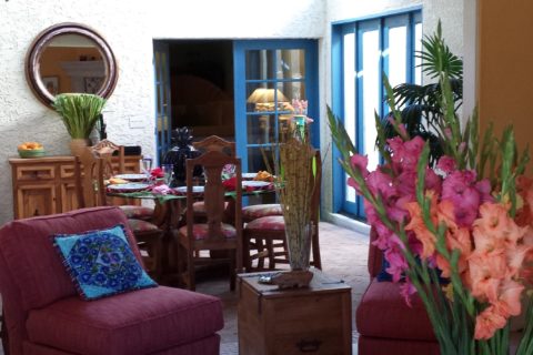
Whether a minimalist or an eclectic collector/gatherer, one’s details of home are important and personal. Like personality types, what is important to one person is not so much for another. However, it tells a story. The details of a home make it just that. Home.
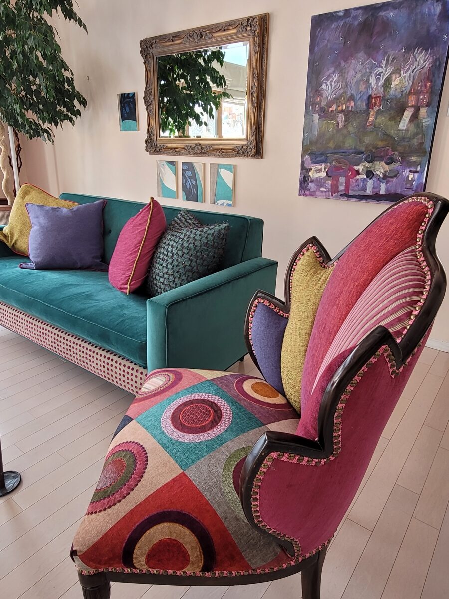
This interior has a lot of personality and very much reflects the artist who lives here. Antique family side chairs take a near full century leap with this new, colorfully eclectic upholstery.
Residences, the dwellings in which we live, can take many forms – from short-term to decades of ensconced living. To “reside” regardless of the length of time – suggests a certain level of comfort to include some detail(s) to make it “home.”
Each home is an individually personal space filled with details that make it so.
What might YOU consider imperative elements of what you call “home?” Consider comfort, color, ambiance, familiarity, convenience, nostalgia and perhaps just pure joy.
A hotel room for the busy “road warrior” traveling for business, might reveal a photo of a loved one placed thoughtfully on the nightstand. Something as simple as this can make a temporary residence feel more like “home.”
Upon plopping the overnight bag on the hotel bed, one of the first things to unpack might be the framed photo of a loved one to place on the nightstand.
Dorm rooms will reflect personalities, pleasures, interests, colors and imagery for young people leaving home for the first time. They create their own sense of place and “home” while embarking on their new chapters of life.
While looking around your place of residence – this place you call “home,” consider what is important to you. It might be the actual architecture, quality of natural light, a collection, a piece of art, furniture, photographs, decorative accessories…
A little over a year ago during the throws of our introspective isolation, my cousin, a thoughtful artist of photography, commented from Connecticut about The Essence of Home. In it she shares intimate observations and encourages personal study of your significant space – memory or current abode. She also suggests an interesting little project in which she invites us to “take half an hour and create a photo essay of a place that has significance” to us. “Challenge yourself to capture a feeling. Wait for the right time of day and seek out the mystery of the place. (This is a great activity for kids, too. You’ll be amazed by what they choose to photograph – what “home” means to them.) See what thing you’re drawn to capturing; become aware of the everyday beauty in the space around you.” https://www.catebarryphotography.com/
As an interior designer, I am engaged in creating and illuminating details that are meaningful. Whether a view or an object, color or finish, access or privacy – inside or out of the interior these elements collectively contribute to create the overall design. I encourage my clients to identify things they do and things they own – things they have gathered and how they live. What of them is of greater importance and why. This process begins a dialog of preference, value, and interests. Establishing priorities to springboard a project is key to a firm platform for the design.
You know the old question…If your house were on fire, what would you want to get out? It might be a person or a pet certainly – but if it were a material possession(s), it is a question worth pondering. The same is true if you moved or remodeled, what elements would you want to retain or replicate and what would you eliminate or change?
Vintage family pieces reupholstered, new pieces repurposed, bookcases filled with personal treasures, and the precious pet in the center of the action. Home.
The details of your home are personal, identifying, comforting aspects of your interior design. Discovering these important details is significant in effectively planning your interiors.
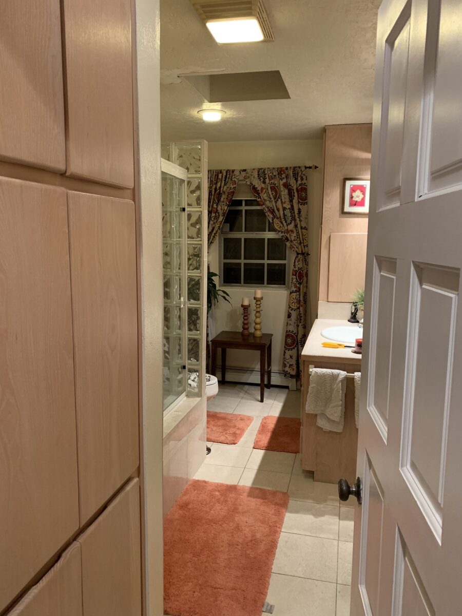
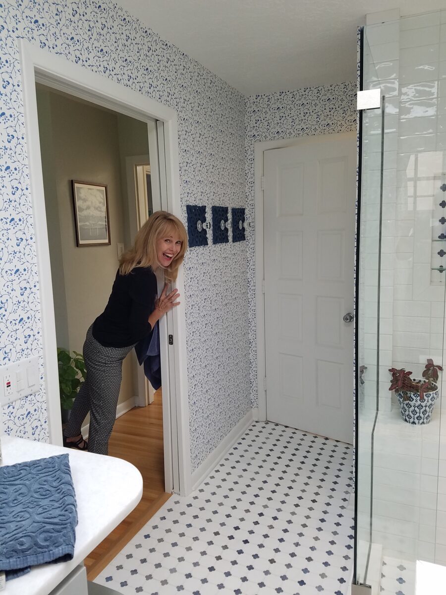
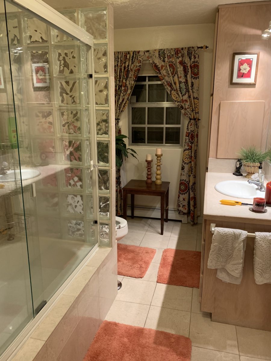
Last August 11, 2019, I left you hanging with a radical bathroom remodel that was in the throws of being transformed. The title of the blog was Everyone Loves Before and Afters. https://patriciandesign.com/everyone-loves-before-and-afters/ Here today, I am excited to present the finished product and a little more to the story…
Everyone DOES Love “before and afters.” The original blog identifies the material process of the project, but as important as the material applications are the emotional aspects of design and precede the material selections.
The home is a bungalow style home from the 1950s. Charming architectural elements and traditional details set the stage, sensitivity, and the emotions behind any design decisions we were to consider. See the first phase of this home’s updating design in the primary living space at this link: https://patriciandesign.com/project/classic-blue-white/ The kitchen was also re-finished. Maintaining the same design layout and appliances, the new finishes resulted in a startling transformation. https://patriciandesign.com/project/kitchen-transformation/
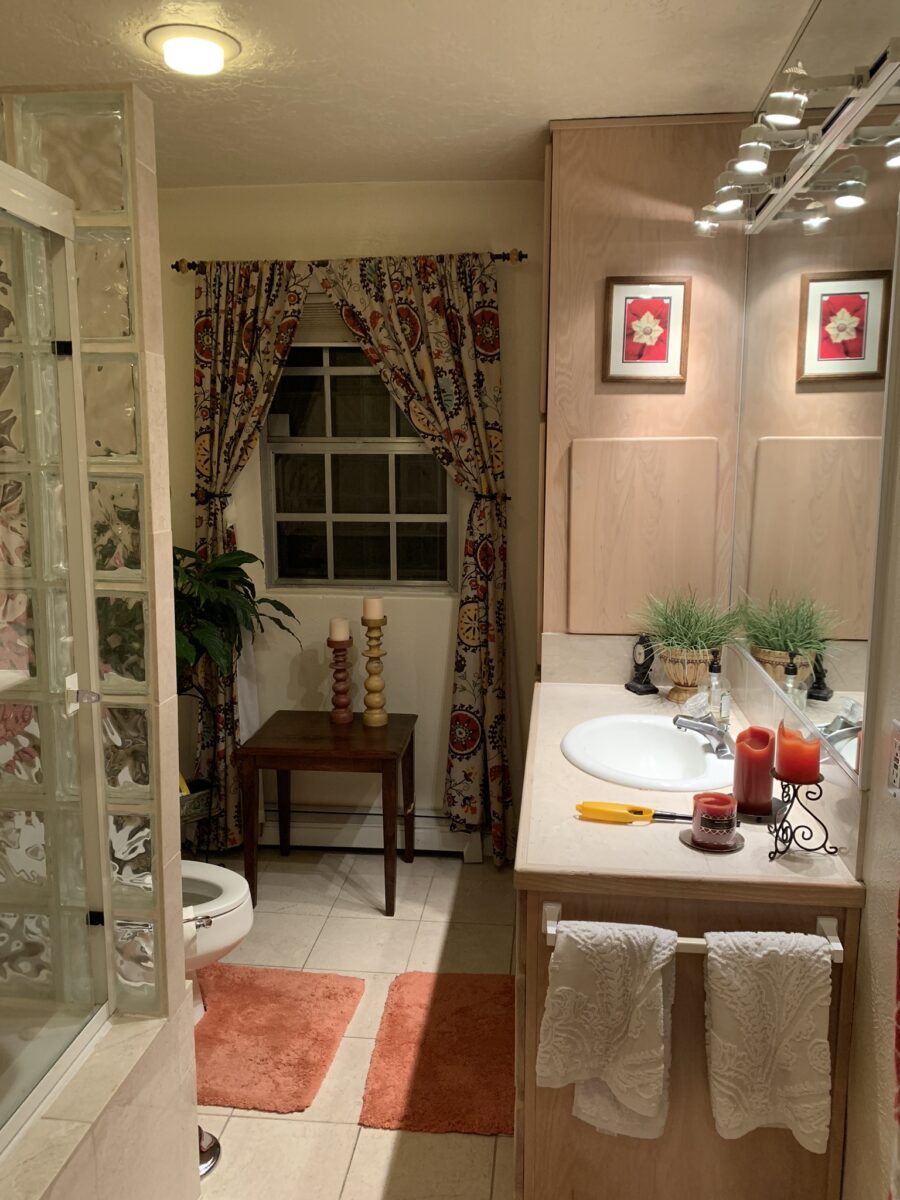
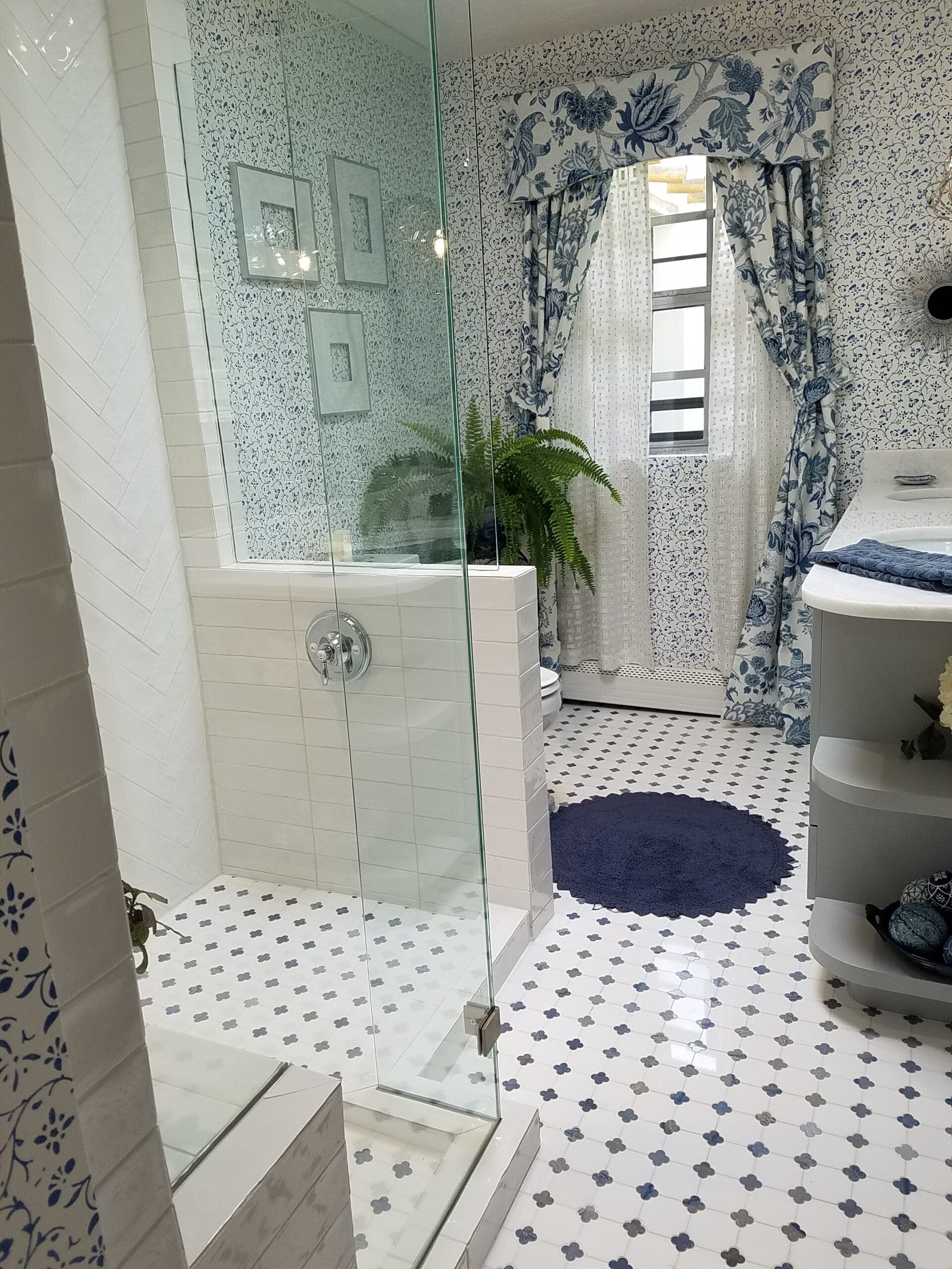
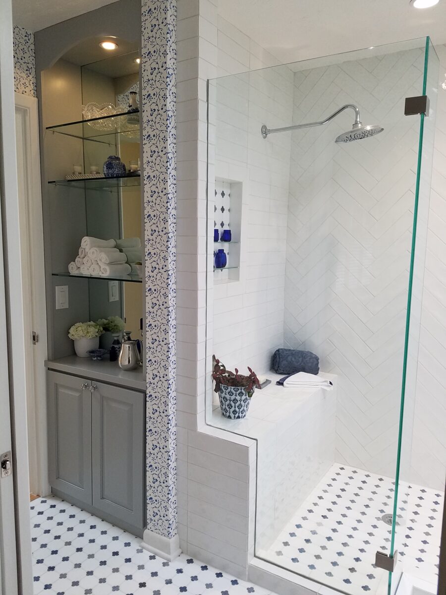
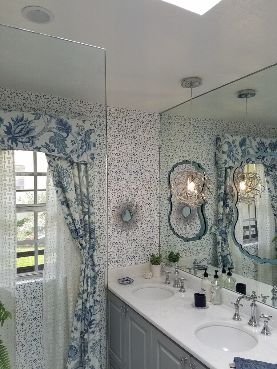
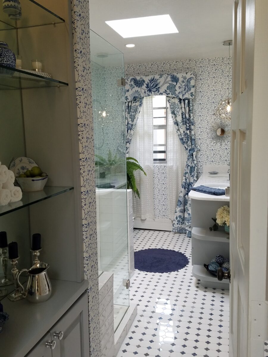
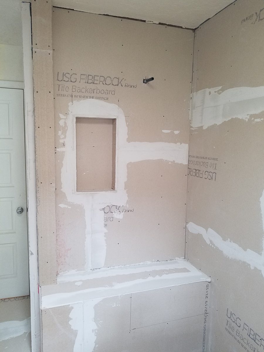
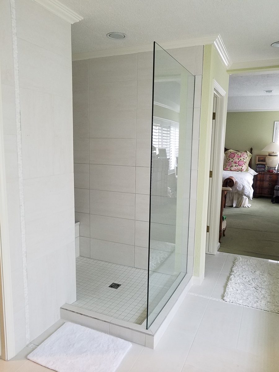
The challenge in this project was to retain the character and traditional charm that the couple so enjoyed about their home, while introducing new, modern design features and trends melding with traditional design elements. New custom cabinets for the vanity and linen storage/display unit along with the re-design of the shower – eliminating the tub and making a “doorless” access and a pocket door connecting to the adjacent guest room were the three key construction components.
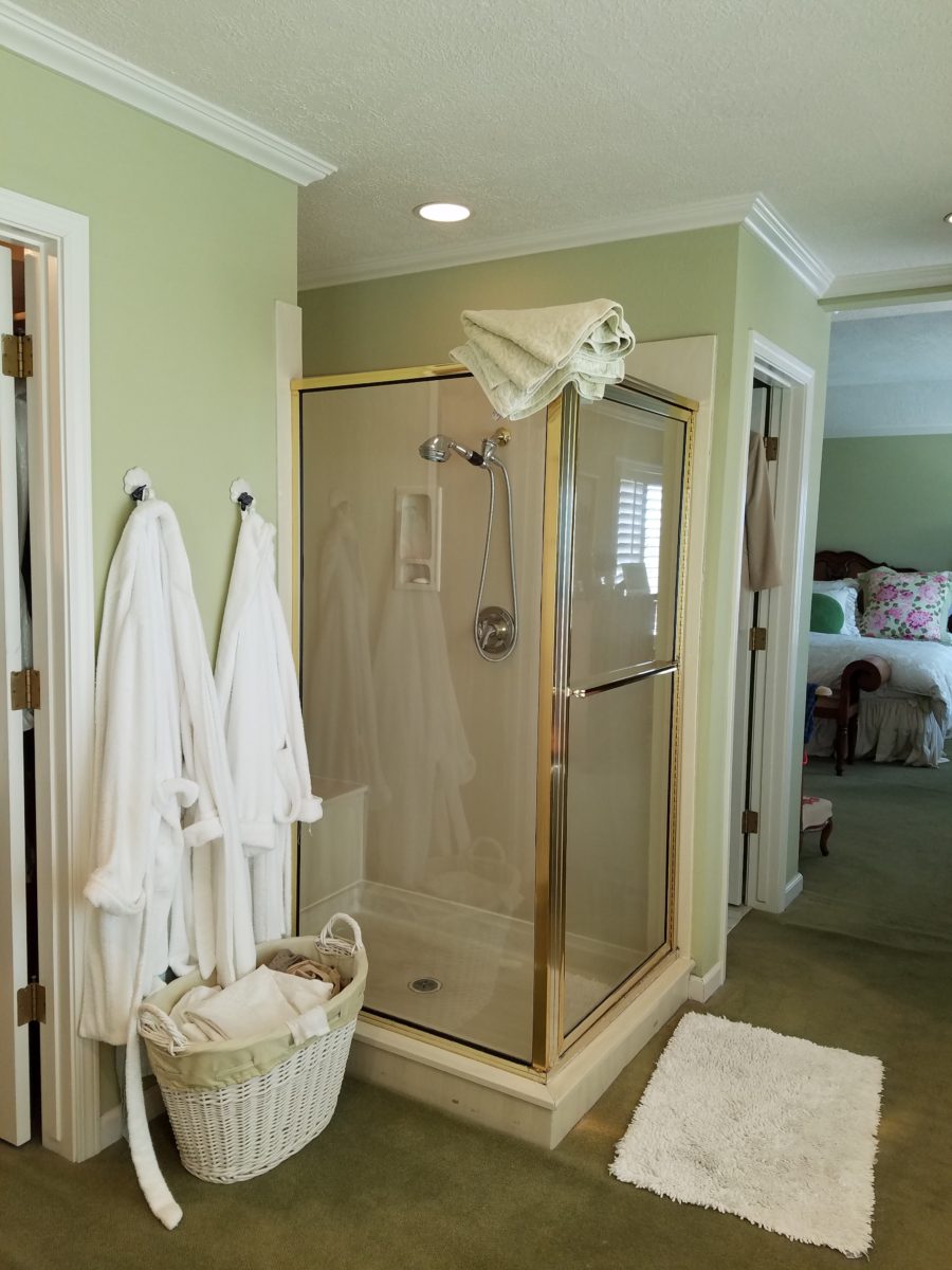
Dated finishes done in the 80s, by previous owners, were common and bland. The tub and shower were enclosed with by-passing glass doors in aluminum tracks and frames. This bathroom was the dated and fussy room that we presented last August. The tired and dull finishes needed replacing and refreshing. It was to be a complete make-over to compliment other recent improvements in the home.
Once the general concept for the remodel is determined, the “what if” stage begins. The stage where ideas are tossed about and decisions lead to other decisions. The options are massaged giving way to different combinations and considerations.
After all the options are discussed the plan is adopted – a combination of everyone’s input. Hopefully not design by committee, but in this case the couple, in whose house we were working, and the me, the designer. After the design is determined, the input of the general contractor and/or the sub-contractors can come into play. They are generally given the opportunity to evaluate existing conditions and voice opinions and procedures or details that their expertise can bring to the project. Everything is considered until a cohesive plan is developed.
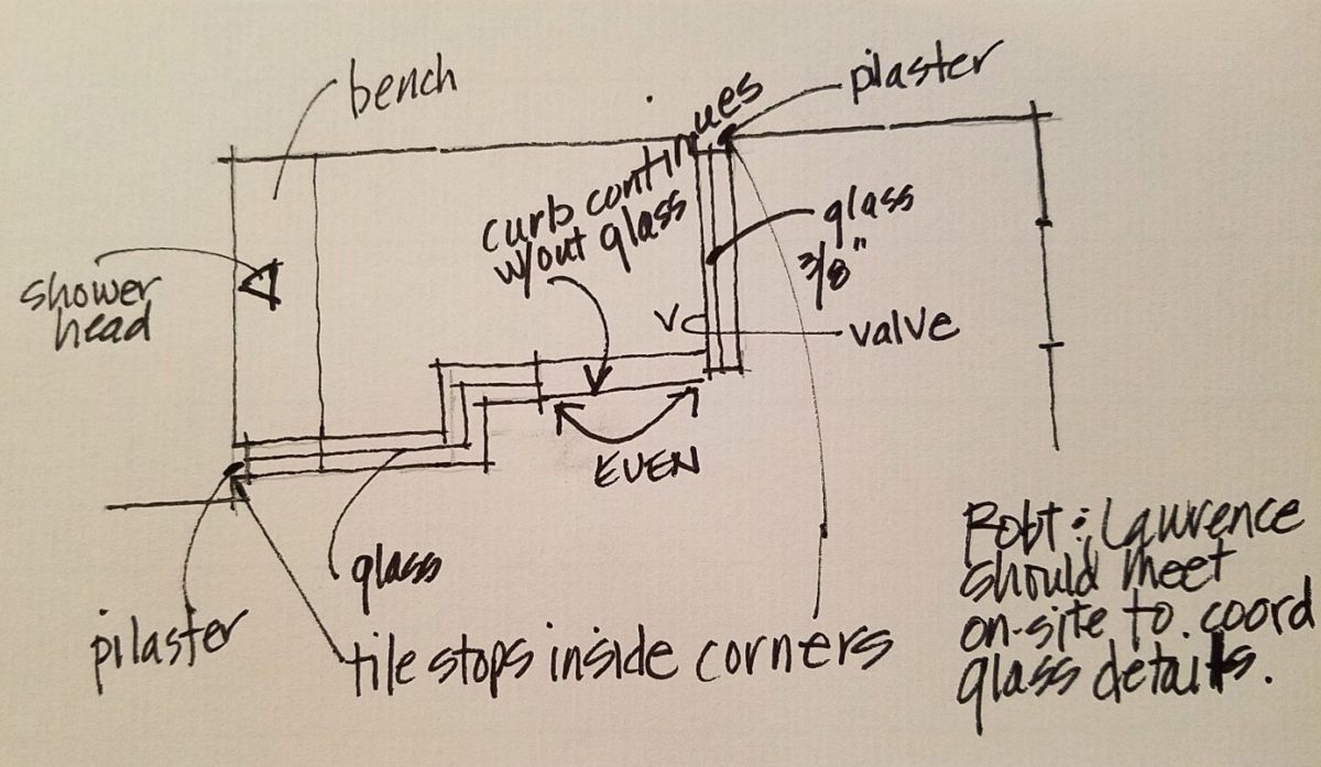
New cabinets were locally fabricated to not only insure excellent craftsmanship, but to customize the fit (left to right) and provide specific drawer configurations for the desired new height of the cabinets with an additional sink.The tub was removed, and the new shower enclosure was clear glass and given a wider footprint to allow for a jog which eliminated the need for a door. The shower valve was relocated from beneath the shower head to the opposite “pony” wall, making it easier to operate the temperature and flow without getting wet first!
Other than the shower reconfiguration, new cabinets, and pocket doorway into the guest room all else was superficial cosmetic design features. This is where the layers of embellishment come into play.
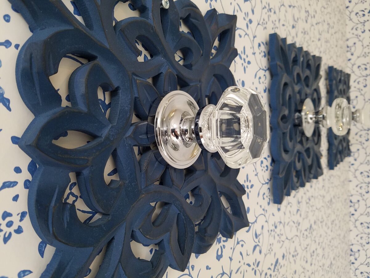
During the process, there were certainly hesitations about the combination of patterns and finishes being proposed…however, you know you’re on the right track when the happy homeowner has fun accessorizing and creates the perfect towel/robe hooks! DIY – finding these blue, wooden, open-work plaques, our creative homeowner bought polished chrome and glass doorknobs and attached them securely to the plaques – Voila!
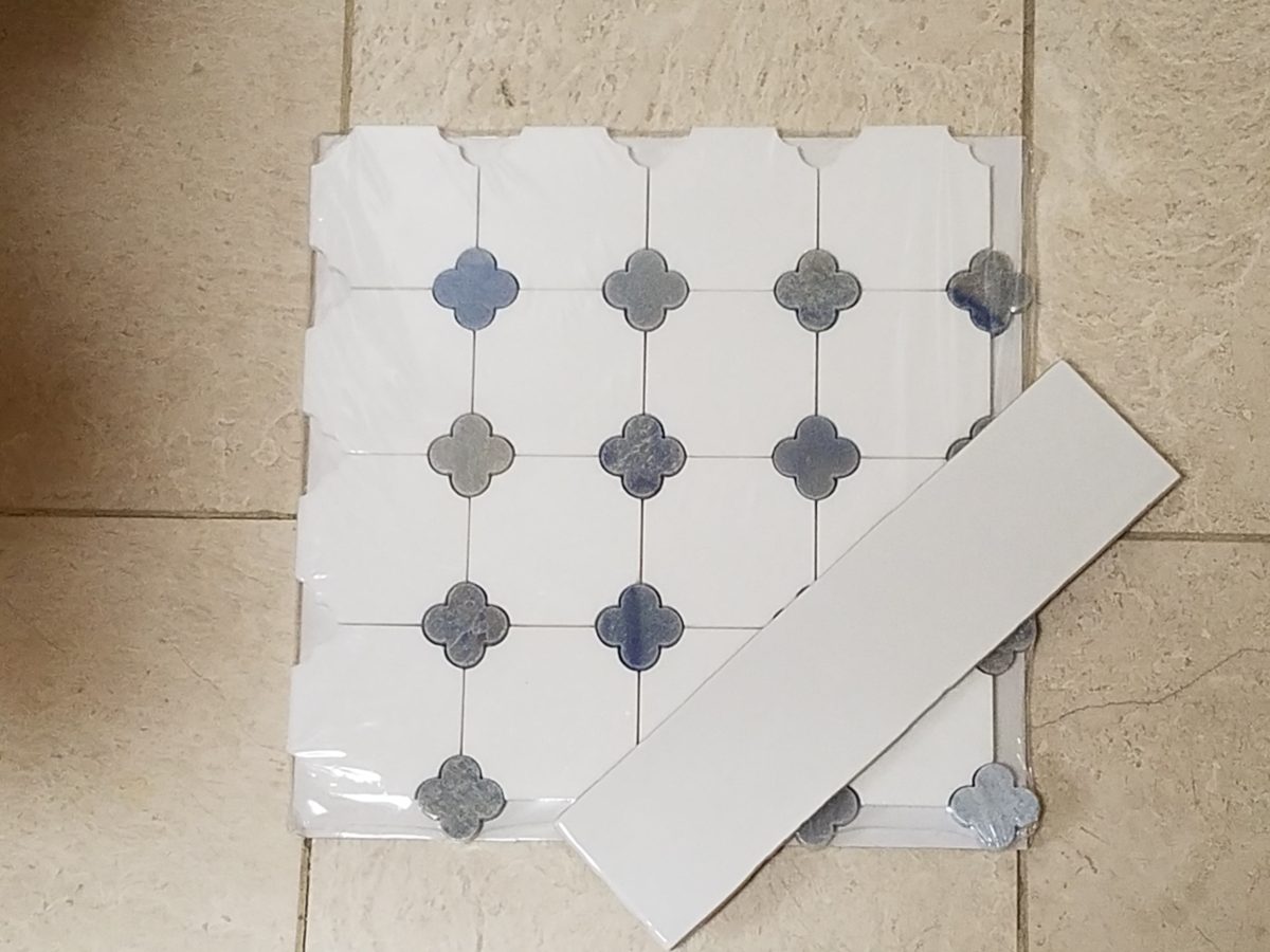
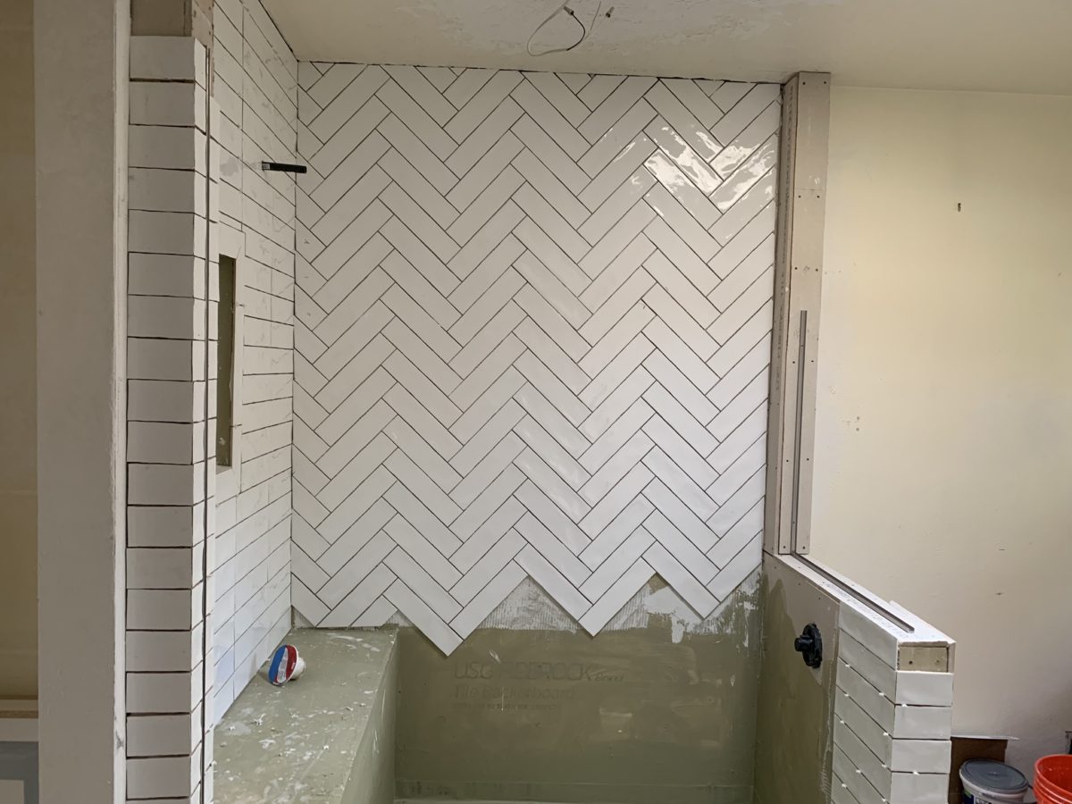
In keeping with the traditional design direction previously adopted in updating the interior, the flooring was selected for its natural stone mosaic authenticity. With a warm grey selected for the custom cabinets and white herringbone patterned subway tile on the rear wall of the shower enclosure made for a fresh modern look.
A mix of patterns – a balancing act – the art of design. Do not be afraid.
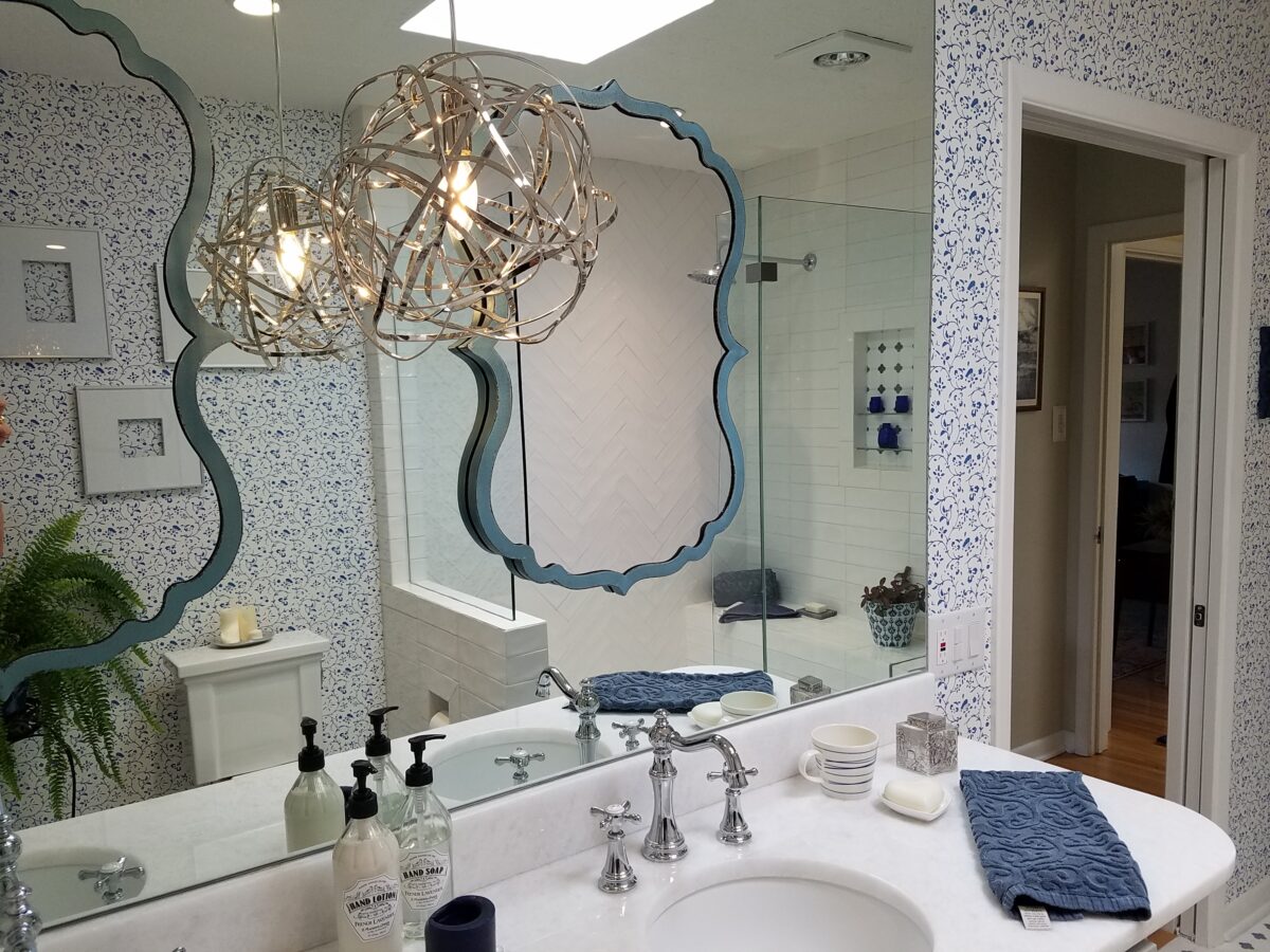
But wait! These traditional elements and modern trends were further embellished with a second layer of curvy turquoise mirrors installed over the full-wall mirror – suspended between is a polished chrome sphere of open bands providing ambient light and additional task light for the vanity area.
Layer upon layer until the composition is complete!
Classic blue and white screen-print on paper with an overall pattern of vines and leaves fills in the voids creating a not-too-busy backdrop – adding further dimensions to the design.
Natural stone slab of a white crystal-like granite – looks like a stone quartz crystal.
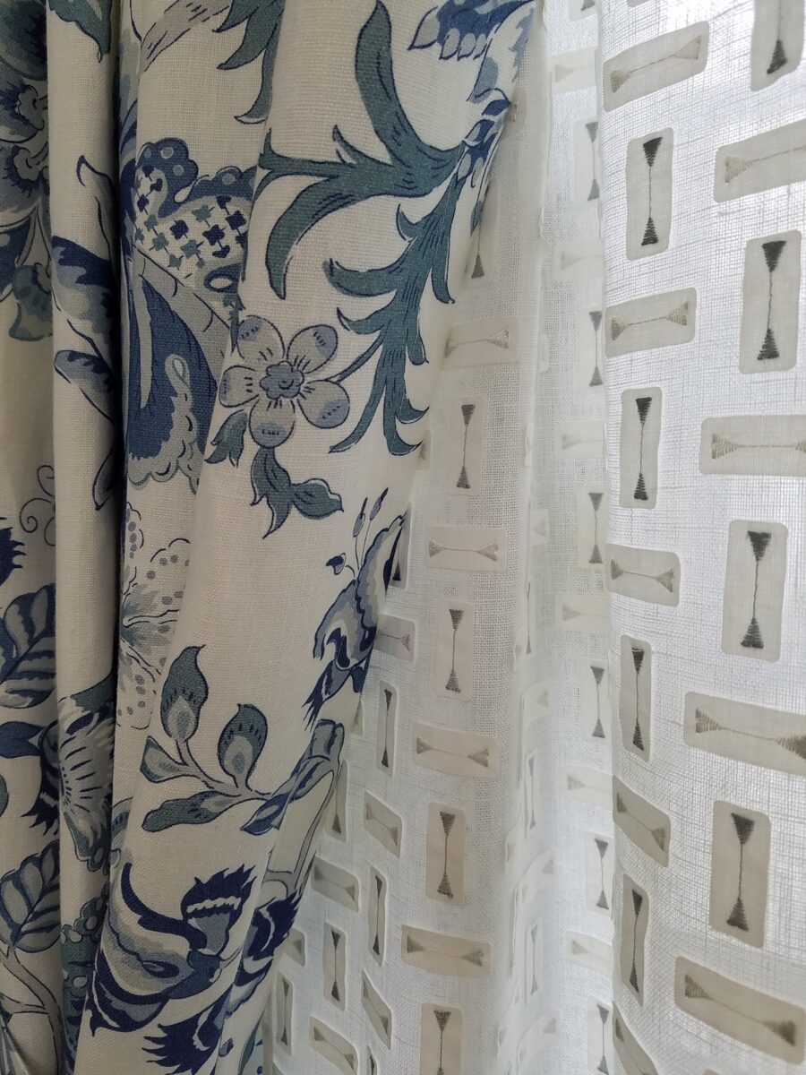
Drapery fabric in a traditional floral on linen with whimsical, modern “martini glass” sheers soften the window and diffuse the incoming light.
The resulting completed interior is a radical transformation from the dull beige and peach of the previous scheme. Fresh and crisp – with just enough busy to be playful – the new owners claim that they smile every time they enter or even walk by.
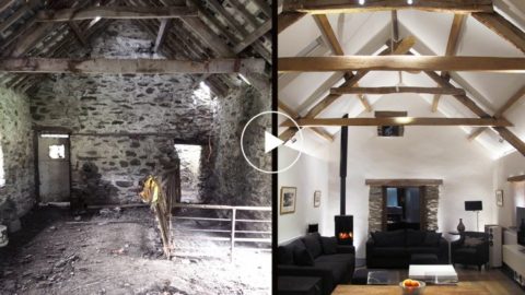
Remember the first photo? The BEFORE & AFTER transformation is extraordinary.
Here, today, find designer focus and pro-tips for improving our living spaces. Most of us have spent more time at home than we have in years. Sure, we usually wake up, prepare for the day and return in the evening, to end the day. Weekends are usually that bonus time around the house – unless we spend them on road trip excursions. However, being at home every day is unusual for many and has provided opportunities to critique and take stock. Go from “making-do” to making better, with a little focus on the details and some professional help!
New catch-phrases like “shelter-in-place” have become part of our vernacular. Staying home has resulted in massive numbers of internet orders, cautious home improvement store visits and related activity. The shared anxious energy and creative energy spawned, from our restricted living and working regimens, is “going viral!”
Well, we certainly never really considered that trendy term of something being popular being a REAL virus spreading across the planet – but the humor, common complaints and simple joys, of this surreal modification to our lives, are “going viral” all over the internet. From the vantage point of the design world, we are seeing a multitude of comments about people going stir-crazy and making plans for needed home and office improvement.
HOME DEPOT – Pick-up in the store or have it delivered FREE to your doorstep!!
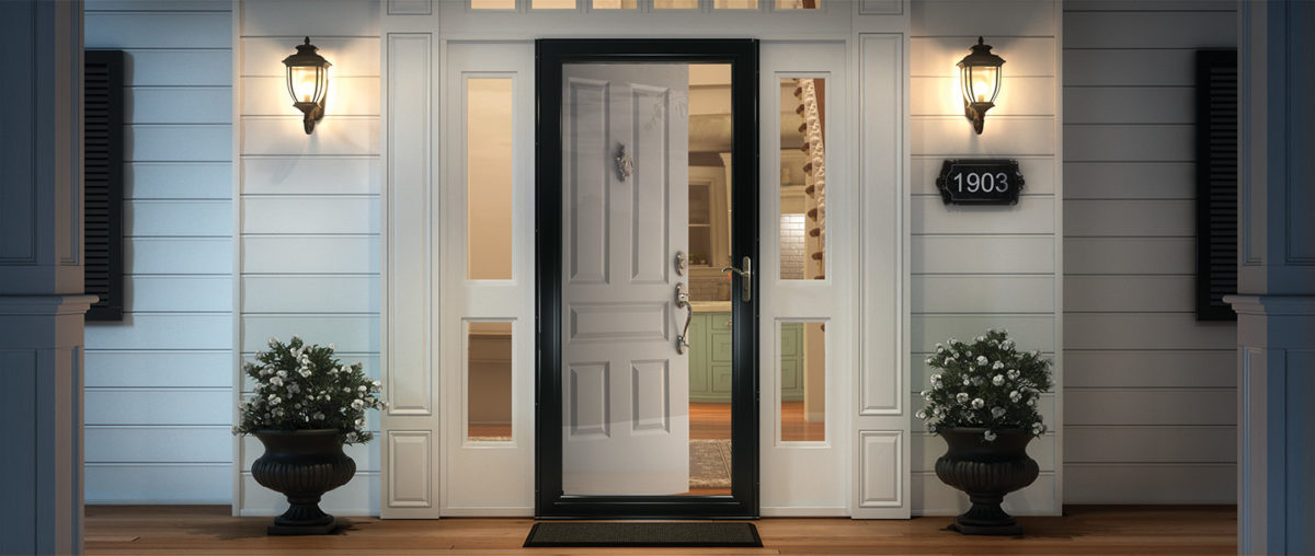
We are finally – and I say finally, after nearly everyone else we know has done so – ordering storm doors. Yes, to leave open and let in the light of day!!! It has taken being around the house for so many consecutive days that has geared us to the circadian rhythm that our orientation provides and illustrated the need to avail our interior of a significant missed opportunity for natural light! Just never seemed that important…until now! We have labored over having lights (glass) in new primary doors, but after weighing the options for light, security and transparency have opted for clear, full-panel laminated glass storm doors with interchangeable screens, for fresh air – weather permitting.
Yes – Anderson DOES do double storm doors – but try finding that information on their website or even through Home Depot – they’re terrific – you just need to inquire!!!
This unique opportunity to be quarantined inside our homes has given us an opportunity to evaluate the flow, function and lifestyle within our private environments. Have you noticed any things that you want to change as a result of this confinement and forced, close-up evaluation?
Here are a few topics and tips that have come-up in recent conversations from both consumer/clients and designers:
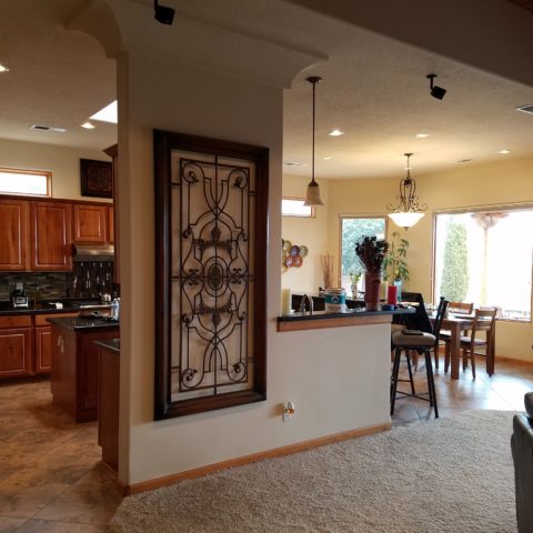
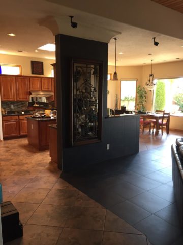
More perceived space: Perhaps open a wall or completely remove a wall(s) and connect two rooms for better communication and visual enlargement of the floor plan.
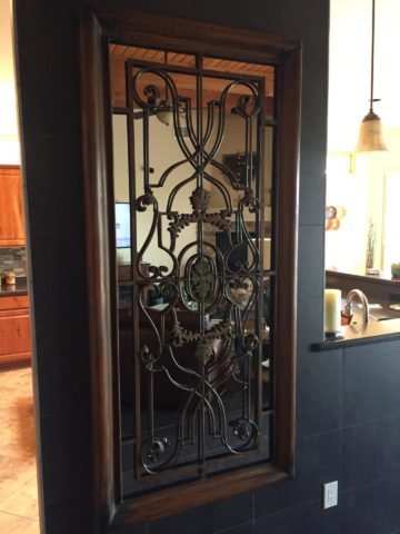
Adding mirrored walls or individual mirrors add depth and also expands a space to give it a perceived increase in size.
Add cozy color and texture with area rugs, throws and accent pillows.
Add skylights for more daylight.
Change paint colors for a refreshed feel.
Remodel kitchens and bathrooms – people have been sharing intimate spaces and preparing meals significantly more than regular lifestyles dictate and now recognize limitations in their current designs.
Re-upholstery of existing pieces that function well, but need to be refreshed and modernized.
Purchase new furnishing to improve the comfort, function and visual appearance of the interior.
Desires for additional lighting or replacement fixtures, to improve and enhance the quality and color of light inside all rooms for tasks, ambiance, accent spots, indirect illumination, decorative fixtures and even landscape lighting to highlight the features of the plantings and exterior structures, have been heightened.
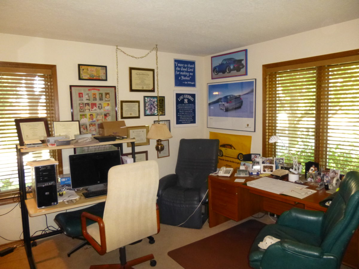
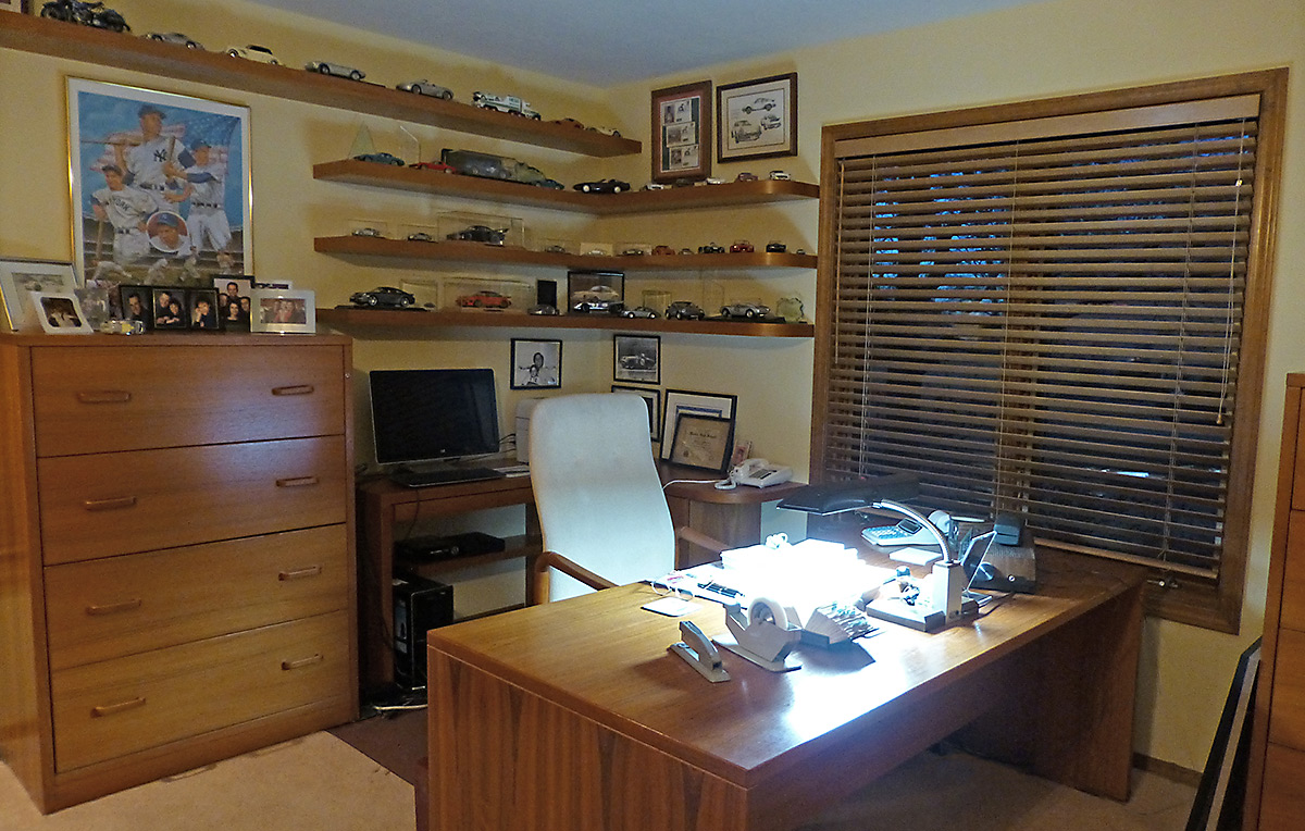
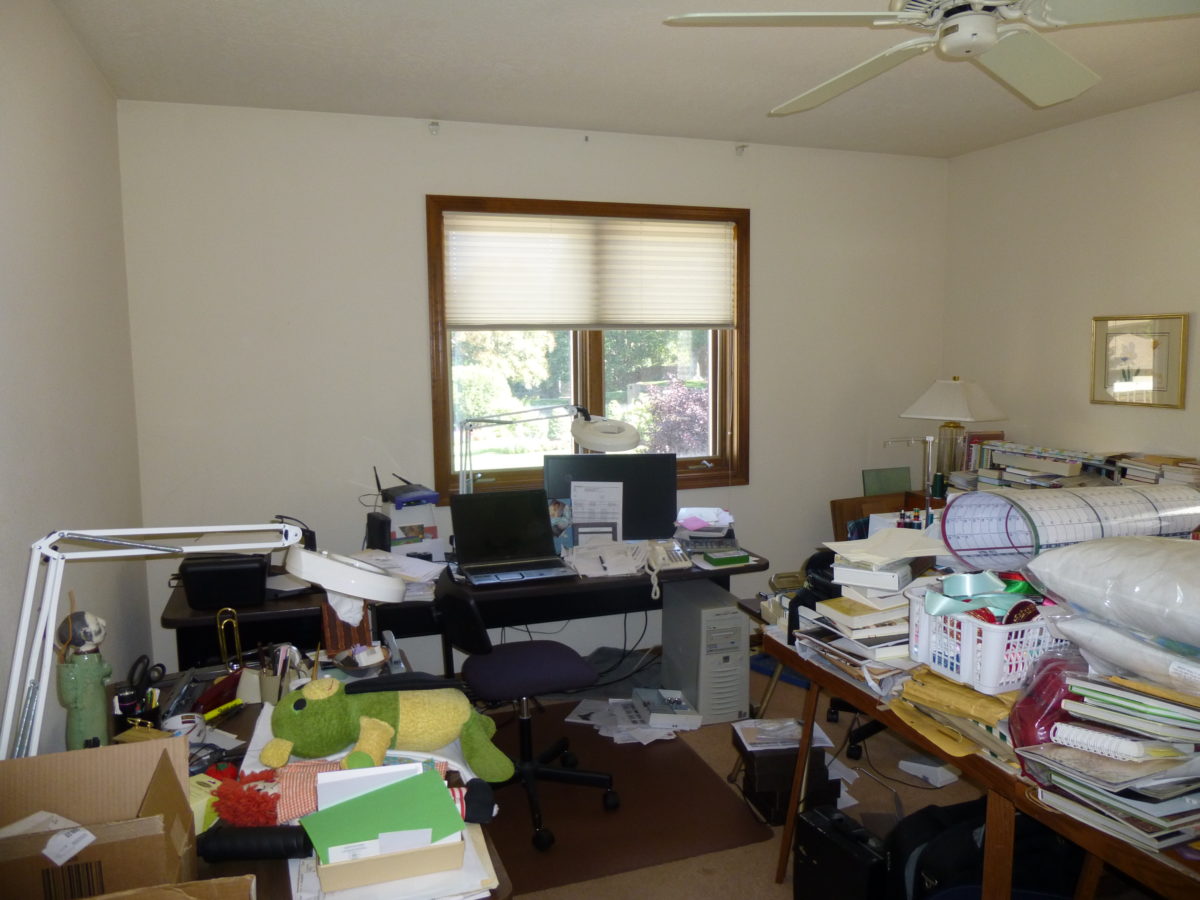
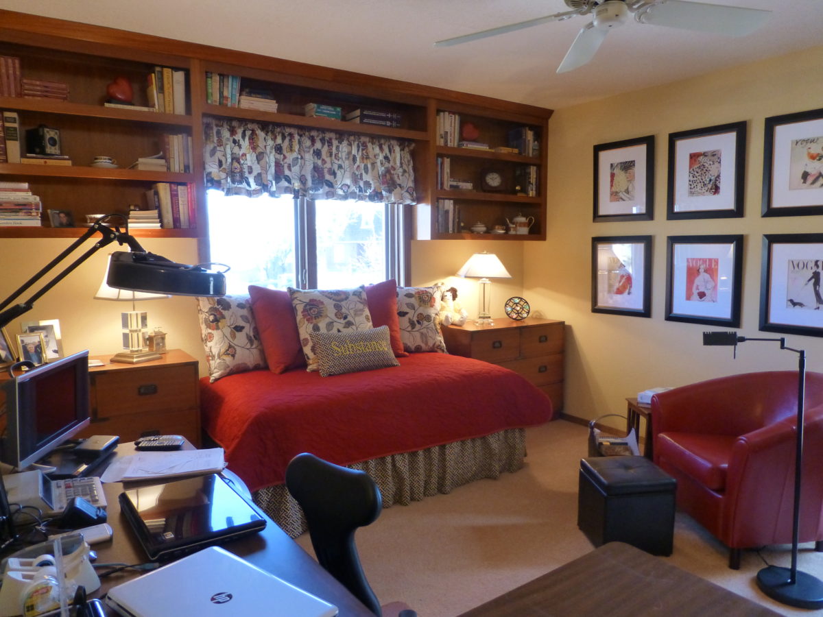
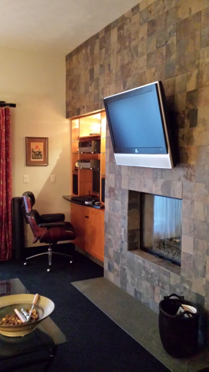
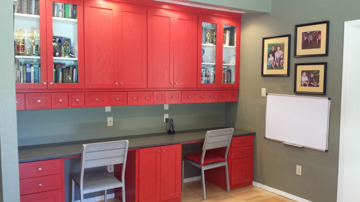
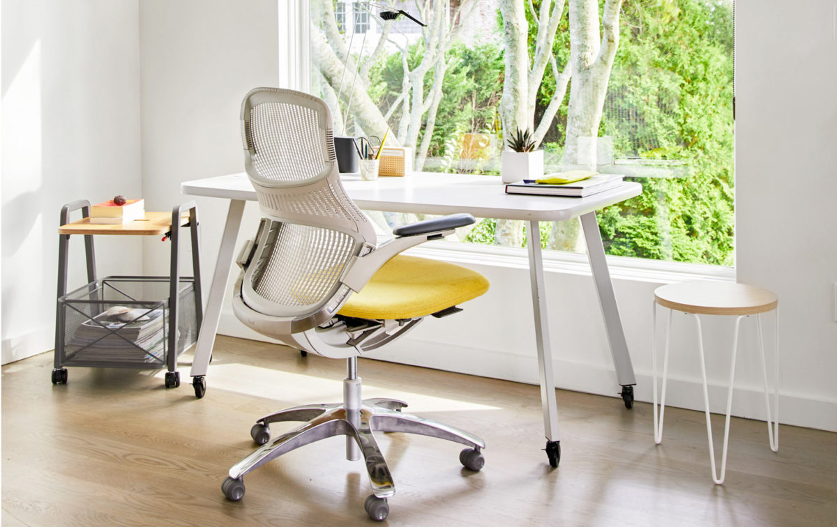
Workplace design has migrated into homes prompting consideration for a more efficient permanent pocket of living spaces designed for that specific purpose of home-offices. A few from our website portfolio are illustrated here…
Before – this cluttered space was serving as an office – but without organization or pleasing aesthetics. After – this same space reorganized furniture placement, added new work-surfaces and cantilevered shelves to match existing teak pieces, creating an atmosphere of organization, enhanced workspace and display of personal hobbies and memorabilia. Before – this room doubled as a sewing room and home office – but the lack of organization made it inefficient and unpleasant.After – by adding storage, cutting a steel trundle bed (found in their storage unit) down to window-width, and rearranging the workspaces, this same room can now comfortably accommodate a guest, organize work and sewing spaces and pleasantly display art and memorabilia.
For both working from home and schooling from home – the needs, for this space, have become critical. Imagine, down the road, more on-line courses might be considered and even more opportunities to work from home now that the practice has been proven!!
Even a pocket tucked in the corner of a room can be ample space for quiet focus and an organized workspace. Areas designed for study can also be used for arts and crafts and other projects.
Office spaces will reflect this modification in the working environment, by creating more flexible workspaces allowing a variety of scenarios for performing tasks between home and office and an increasing appreciation for a more fluid arrangement of office layouts and furnishings.
During this isolation, I have enjoyed several ZOOM continuing education classes offered by Knoll that have centered on workspace layout and furniture both at home and in corporate settings.
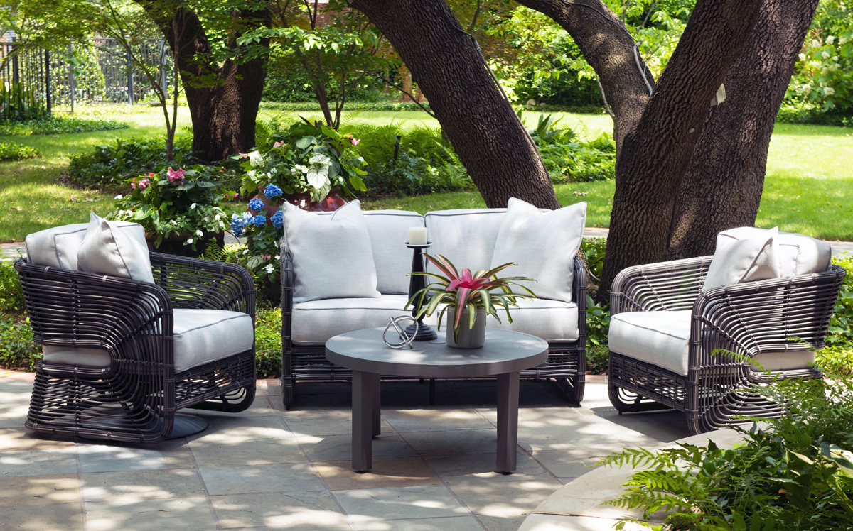
Patio perk-ups to expand the enjoyment outdoors – at both home and office – maximizing the livable exterior areas of either small balconies to expansive spaces, backyards, decks, improved landscaping, outdoor kitchens and fully-furnished furnished living spaces – are seeing increased attention to detail.
Woodard furniture – one of our favorites – has been designing and fabricating for well over a hundred and fifty years. Since 1934 they have perfected the art of metal furniture design and fabrication. As industry leaders, their expertise brings a collection of superior craftsmanship and a wide variety of materials and styles to accommodate both commercial and residential applications.
Let’s keep moving forward through this pandemic with positive vibes for creating enhanced living spaces – both inside and out – for more productive and enjoyable living!
Everyone loves before and after shots – they are so telling, dramatic and fun to compare. How about during? This week, we are nearing completion of a project that has been in the works for the past few months. Not quite finished, here is a little story about the stages of the design process…
Are YOU planning a remodel…a room an entire house?
Once a project is identified, the options are studied. Usually each party involve has their preconceived notions…images and ideas come to mind. The mind is that arena from which it is tough to articulate images and especially between people. The design process requires that ideas need to be expressed, defined and argued – pros and cons.
This room was dated and fussy. The finishes were tired and needed refreshing. The project was described as a complete makeover to compliment other recent updates in the home.
The scope of work was to remove the tub, replace the cabinets, add a second sink and create an opening into the guest room. At that point, the “what ifs” began.
Healthy arguing ensues – meaning sharing ideas back and forth, explaining the approach and concepts. More like presenting than arguing. It’s actually a fun, creative process – full of choices, ideas and seemingly limitless opportunities. It’s the “What if…” stage. Sketches are used, arm-waving and samples, photos and words all contribute to the compilation of the ultimate design. Each person contributes to the process until a common plan is adopted.
Whether formal plans are needed depends upon the code requirements, if applicable (“cosmetic only” changes requiring no modifications to structure, electrical or HVAC – for example – might not need formal drawings). Therefore, the development of documents is dependent upon the requirements of the municipality and/or methods of the contractors. Regardless, sketches begin the process.
If code requirements necessitate permitting, the process
must proceed through that stage prior to commencing the work. So after weeks of
ideas being tossed about, a plan was conceived, client approved drawings were
made and the process moved forward.
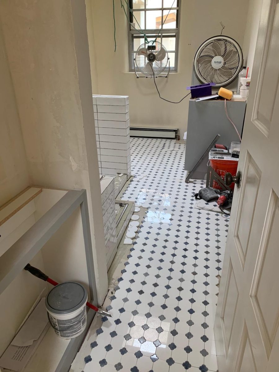
The scheme was set with the first materials selected – glossy glazed imperfect wall tiles for an interesting and textural herringbone pattern with a stone mosaic for the floor.
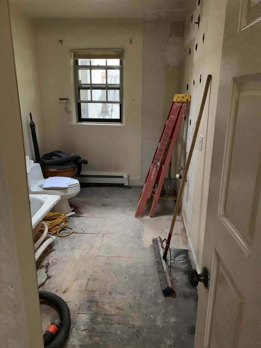
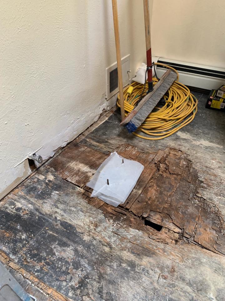
The demolition – always a shock – but “you have to break and egg to make an omelet!” Unbeknownst to anyone, the floor was rotted beneath the toilet and required repair. Mirror, glass block, tile and much sheet-rock was removed.
Old cabinets were removed and after all the dust had settled, the bare bones exposed and a clean slate presented, the new work began.
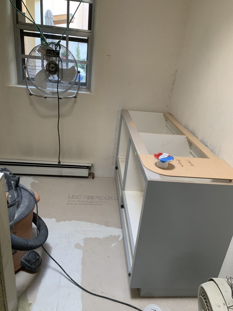
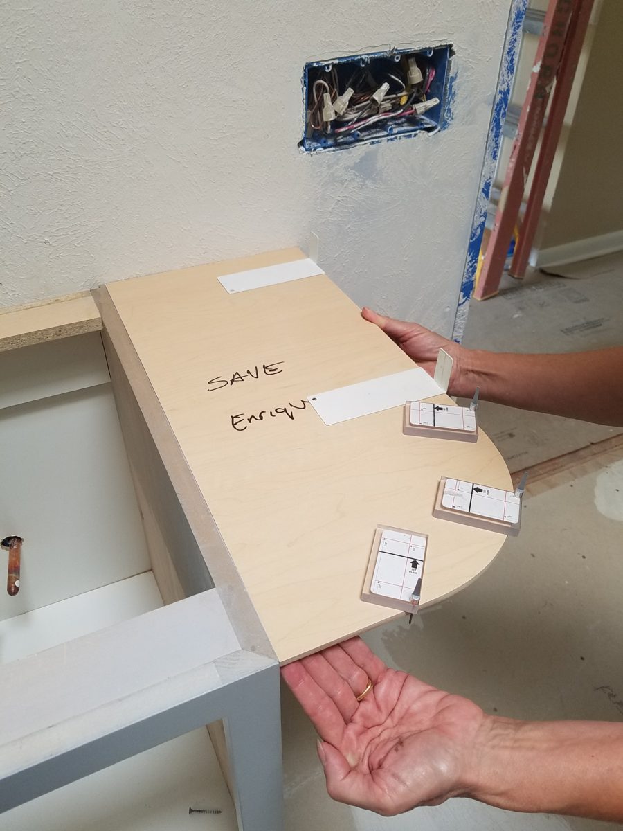
The new cabinets were to accommodate a second sink and slightly longer counter-top. To make sure access between the shower and counter-top was not too restricted, I designed a radius to ease the squeeze. Enrique made a template of the radius that would be represent his end shelving and counter-top. When Rocky Mountain Stone arrived to shoot their lasers to measure for their templates, the radius template Enrique had made was very helpful.
The end of this cabinet will have radius shelves with counter-top following the radius. Until then, Enrique made a template of the shape so that the counter-top could be measured in advance of end piece being completed and installed.The laser process to template the counter-top begins…with the help of the mock-up of the radius!
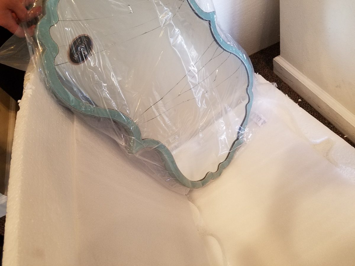
Decisions regarding lighting had not been finalized, with the completion of the plans. Having eliminated the desire to have recessed fixtures, whether to use a center sconce, two flanking sconces or a single pendant in the center between the sinks was still up in the air. Love the pun! Debating a full height panel of mirror versus two wall hung framed pieces, was also undecided.
But here’s an “oops” when we discovered the power for the light fixture off-center for a center-hung pendant.
Taking the risk to be disappointed, but with little investment
to do so, our client elected to buy the
two curvy framed mirrors that almost promised to be too small. Upon arrival one
of the two mirrors were broken. Bummer.
The inevitable, unexpected happens on every project…we had decided not too use these so rather than have the one of the pair replaced, we requested a refund. However, upon further study, we modified the design to accommodate both mirrors – we are re-ordering the second mirror.
But in an effort to determine if we wanted to have the
broken mirror replaced or refunded. We held it up on the wall, as we feared, it
was confirmed that they could not carry the space. We asked that the company
not replace the broken mirror, but refund the cost.
We really loved the
whimsical quality of the curvy framed mirrors and their distressed turquoise finish
was a great addition to the otherwise blue and white scheme. So, a week later,
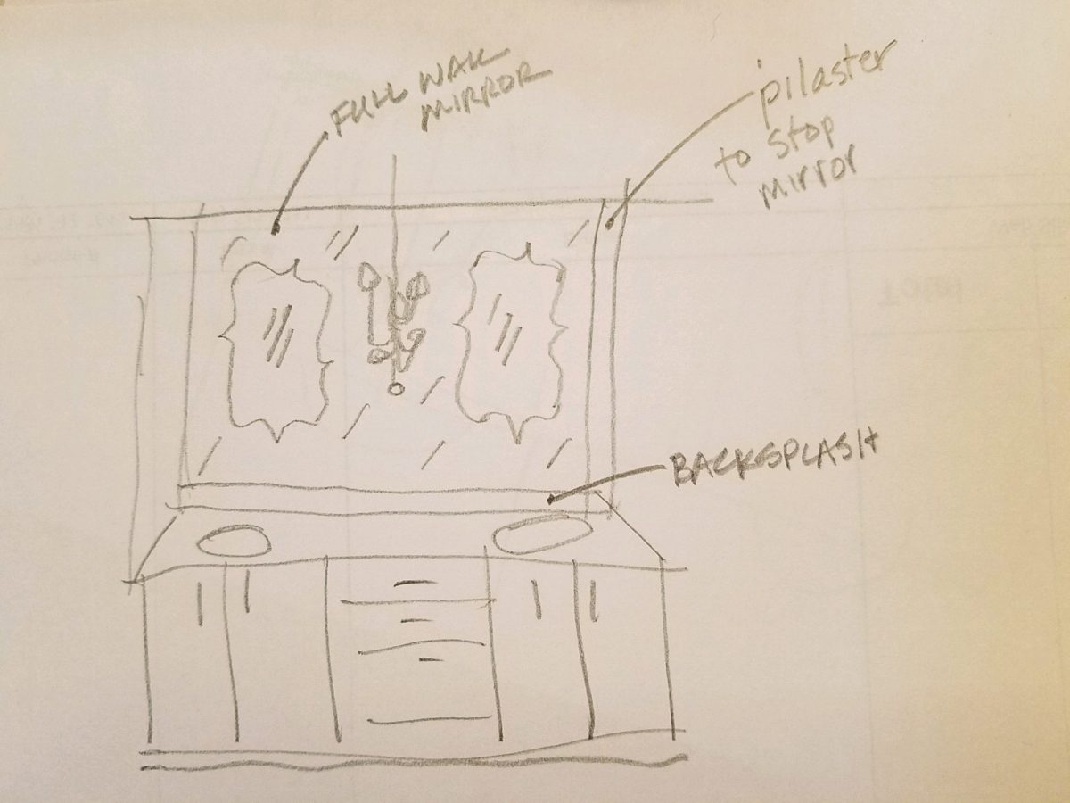
after pondering the dilemma of the mirrors…I offered what seemed to be a radical
suggestion (but not really), and that was to install a full-panel wall mirror –
backsplash to ceiling – and then mount (over it) the two mirrors. To do so, our
very able and talented glass master, Robert, would have to cut (prior to installing) holes
in the mirror panel located behind where the framed mirrors were prepared for hanging. The result would be the
pair of mirrors hanging on top of the full panel creating a floating, multi
dimensional effect. Watch for “afters” in a couple weeks, of this
completed installation.
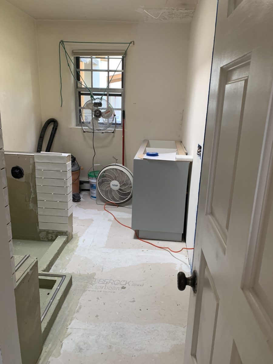
As the project proceeds, the flooring is nearly completed and all but the finishing touches remain.
Pilasters were added at each end to stop the tile on an inside corner, rather than having it quit flush on the wall. The shower will not have a door, but nearly encapsulated with frame-less clear glass to give an illusion of a more spacious room.
Best to stop here and reserve the finale for the finished “after” shots as promised.
When designing for a vacation rental property, the first order of business is to select things that are durable and easy to maintain. This means finishes to furnishings. I know this from practical life experiences and also working with commercial/hospitality interiors. To do so, one needs time to place and receive the orders with enough contingency for mishap. It is also dependent upon the housekeeping arrangements planned for on-going maintenance.
In this recent project, the work began 12 months out – plenty of time you think…but it was all about the physical remodel. We began with the drawings for floor plan re-configuration and specifications for new lighting, cabinets and finishes throughout. The decision to furnish was not made until nearly 10 months later with a deadline to complete in less than 7 weeks. The delay was partially due to an indecision over how many of the 4 units (all on one floor) were to be short-term or long-term rentals. Then a new city ordinance imposed a moratorium, of sorts, on short-term rentals and while that was tossed about over several weeks…more indecision ensued.
It’s a riot to see overnight design projects transform interiors in 24 hours. That’s due to a free-reign for design decisions, a team(s) and vehicles to pick-up/deliver, all trades on deck, a single director calling the shots and an organized chaos that results in a magical finished project – yes, like magic. Open your eyes, be stricken with awe, cry a little and exclaim repeatedly that you “just can’t believe it!!!!”
Real life is generally not like that. Real life has in-put by owners, limited schedule openings by the various trades, little spontaneous decision-making and fleeting time riddled with unwanted surprises and delays. Real life, in this case, was a theme provided by the owner, a preconceived “look” developed in the mind’s eye and scratch paper of the designer during the selection of finishes and floor plan modifications and vacillation for several reasons, of what units to furnish and when. Over the course of a year, leading up to less than the last 30 days, the project was to be fully furnished and finished – ready to rent!
The good news is that with controlled frenzy, changing
availability of products, focused efforts and teamwork, we are pleased to present
the Lobster! Completed all but hanging the TVs by the requested July 1st
deadline, it is beautifully appointed and offers a colorful and a bit
whimsical, spacious, clean and did I mention enviable location- 2 blocks from Pacific Beach
in San Diego?
This entire project, except the move-in this last week, was done long-distance with the owner in Maine, her management company SHORE on-site in California and we the design team in New Mexico. This is not at all unusual, but Maine prompted the owner’s desire to name the unit Lobster. Not your spiny lobster from the local waters, but the New England version from the Atlantic with the classic recognizable form that accompanies the imagined crustacean – including the brilliant reds of the often appreciated steamed version!!
With fond memories of her childhood helping her elders maintain this property, the owner wanted to commemorate the building with an entry plaque visible from the street on the new redwood gate (soon to be completed). In addition, we suggested an individual name/theme for each of the 4 apartments which were all initially designated as fully-furnished short-term rentals – hence the bold identity for each! I designed the new name plaques and had them fabricated by Artistic Bronze in Florida. The backing was built by our talented Enrique Jimenez, in New Mexico, and all shipped to California. Bronze was selected for its timeless presentation, handsome durability and commanding respect. Parisienne was the font I selected which may now be used to identify the property as though a logo to tie-in with the on-site signage. Subliminal cues that are recognized even slightly are effective reminders and triggers for recognition. The idea was intended to offer a fun, but lasting, introduction and identification which was to be reflected in the interiors. The Lobster was the largest unit with 2 bedrooms. It was ultimately chosen to the be one fully-furnished unit and owner’s second home when visiting the area.
For budget and availability, we sacrificed certain durable
features that would have been better long-term investments, resulting in some
knock-down furniture that was never intended for much abuse. Fragile painted
table surfaces – for example – better in laminate, wood or stone…but time
will tell.
The look is clean and fun, colorful and beachy – with a slightly up-scaled twist. Cool aquas accent a few walls in the otherwise crisp white interior. Red punctuates effectively in lobster accent pillows, decorative accessories and the full-wall mosaic glass tile treatment in the kitchen. Yes, once again, we like to treat tile on the walls as not mere back-splashes, but wall-covering full height and width!
Weathered grey toned LVT (Luxury Vinyl Tile) in the way of interlocking planks were an easy to maintain and durable floor finish. The faux wood adds warmth and is softer underfoot than other hard surfaces. Perfectly matched with all trim pieces, this flooring is fabulous!!
Lighting is key and here we added recessed directional lights to spot the walls and related artwork. Switching was also an important detail to have options for the lighted areas and accents.
The owner found a novel lobster rug with a great textural,
tufted, yarn system that brings fun and great color and warmth to the bunk-bed
room! Busy, colorful bed dressings intentionally selected (over the hospitality
white that is still trending) contrast against the bright white bed frames
stacked for space optimization and a little kid fun!
A cool find in the way of the glass vessel lamp…where
usually the stem with electrical cord feeds down through the center of the base
and of the back, this one feeds from the socket stem with a cork top that
removes allowing the vessel to be filled with treasures – in this case southern
California beach shells and fragments! And for a little more animation, I found
a carved wooden shark to insert cruising above the shells to make the lamp even
more interesting!!!
A pair of vintage photographs of a lobster shack and fishing
boat contributed by a friend in Albuquerque – taken by him in Maine in 1962 –
were enhanced with bright red mats in their original polished silver metal
frames along with a large painting on canvas of a Maine lobster/fishing boat sent
by the owner in Maine provide interest to further perpetuate the lobster theme.
The master bedroom is a comfortable retreat with another
lobster pillow for punch! To give the room the best approach and make it feel
as large as it can be, placing the bed in front of the windows was the
solution. Beds facing the entrance to the room are always preferable to
arriving into the side of them – for visual space and a more inviting
orientation.
The original bathroom layout was all one space with tiny
appointments jammed together…so we removed the tall storage cabinets and sink
vanity allowing more room for the commode beside the tub/shower and added a
privacy door. Then the new cabinets and counter have their own space with
another privacy door resulting in a two-compartment bathroom area for maximum
use and enjoyment. Red mosaic glass tiles were repeated from the kitchen to further
coordinate the theme.
The bold color scheme was thoroughly distributed throughout
the unit which is an intentional design emphasis especially effective and novel
in a short-term vacation rental – where such a thorough scheme might be too
intense for one’s primary place of residence.
Effective design both functionally and visually should be a significant asset in the marketing of rental property. When used consistency in marketing material with logos and repeated features, this and other properties with attention to detail should attract the discriminating guests. Once there, repeated stays are the key to maintaining a strong guest population – of desired visitors.
Please watch for the entire slide show of before and afters of this dramatic transformation in the commercial projects section of our website, in coming weeks, entitled Emerald Green Beach Rentals – Lobster!
It’s true. If you think designer’s projects go more smoothly than the ones they do with and for you, you’re wrong. It’s true – they don’t! It’s about Murphy’s Law and I have been remodeling our master bath for months. Starting in November and as recently as this weekend personally installing (DIY) the stone surrounding our mirror, it is still not finished. But it’s close.
The full-wall mirror was re-used. During the removal and transportation to be cut-down, the edge cracked and had to be cut down…we lost an inch or so – no big deal EXCEPT that it then affected the dimensions of the new stone surround that had already been determined. Oh well…we now will have to cut the tile – had intended not to have to do that. One of the many little surprises and delays. We had to order more stone and will now engage the installer to cut the ones that would not fit the new and slightly non-parallel conditions .
It’s actually fun to tile…until you have to cut it. It is like frosting a cookie and then pressing it onto the wall. It goes quickly and gives instant gratification. But when things are not perfectly parallel, something has to give. That’s when we cut. (Or call someone to cut!!!)
The effect, of having almost all of the mirror surround finished, gets us that much closer. The effect is great and is beginning to feel like the intended design.
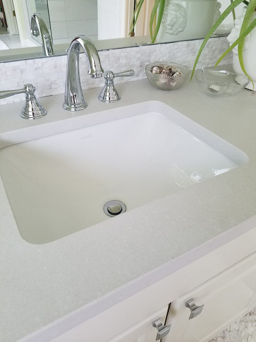
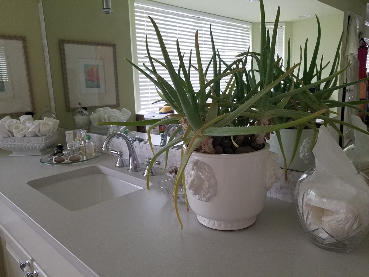
The shower before and after is providing the open expansive look that our little shower enclosure didn’t provide. Despite the facts that the footprint is nearly the same and the old enclosure was all clear glass – albeit framed in gold finished aluminum – this new single panel of 1/2″ clear glass and white-on-white floor and walls looks clean and open. Not a snail design – but, no door. Prepared to add a white shower curtain on a custom curved aluminum ceiling track once winter returns – but for now we’re enjoying the refreshing and comfortable atmosphere.
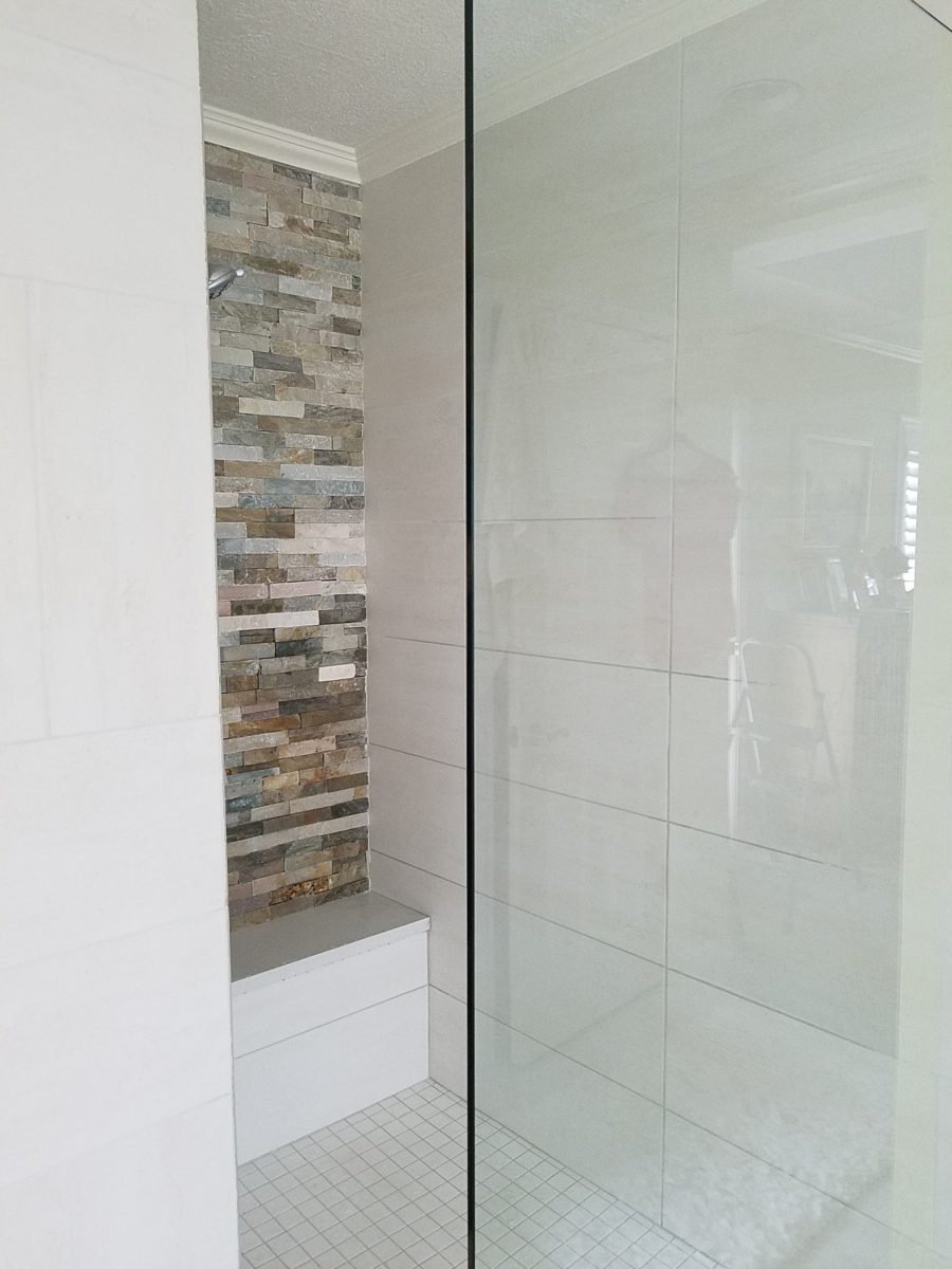
We elected to use stacked stone on the rear wall of the shower as our house sits at the base of the majestic Sandia Mountain and selecting stone seemed more grounded and contextual than other decorative options – of which there are a million from printed concrete, glass mosaic, embossed porcelains…the list goes on…
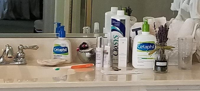
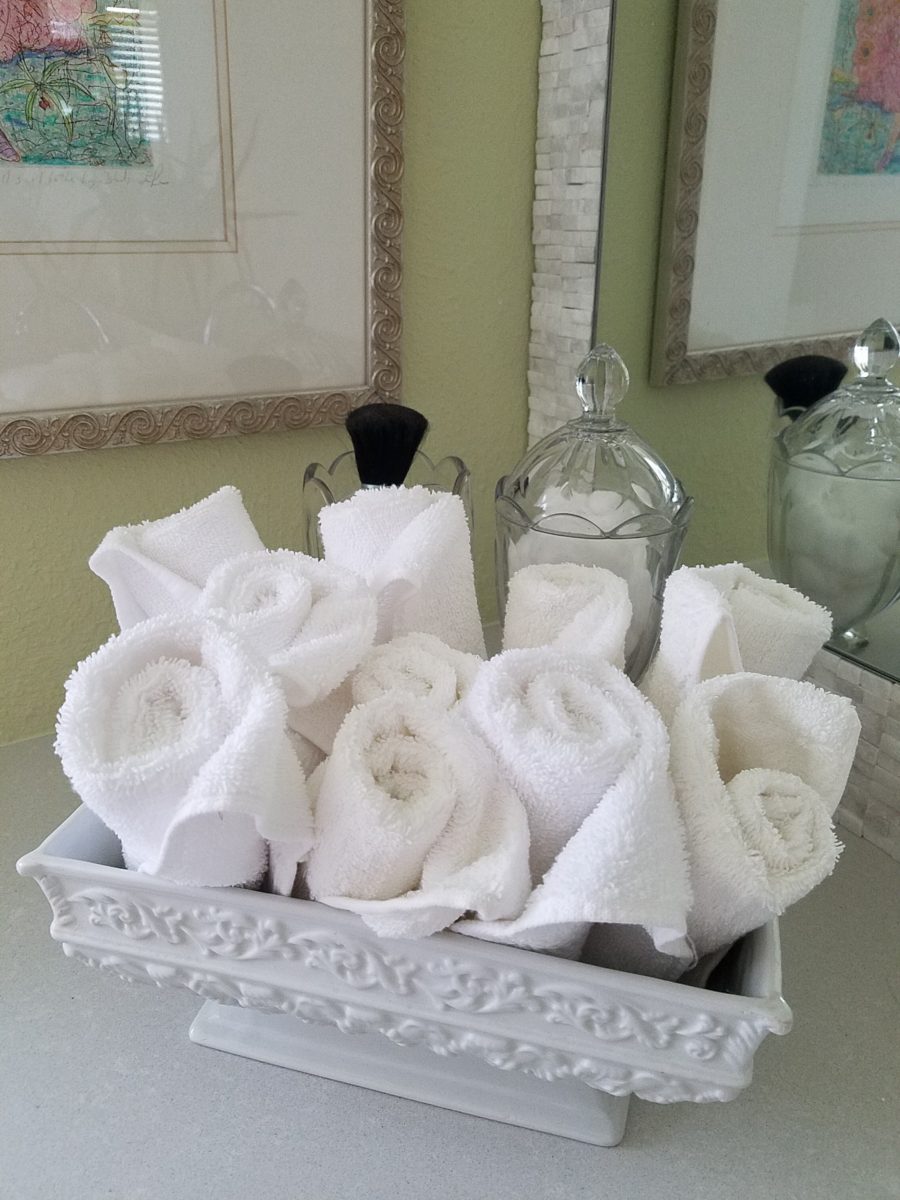
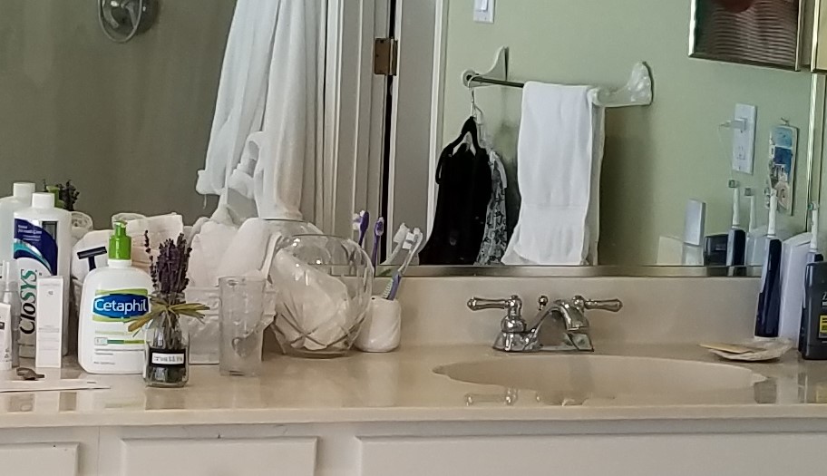
Decorative elements are beginning to “read”
against the new finishes. The same Portuguese ceramic footed rectangular
container holds a bouquet of white washcloths. Yes, I think that the rolled
terry towels look like rosebuds and I have always enjoyed the softening effect
they provide amidst all the other hard surfaces. Plus they are handy on the
countertop for clean replacements.
Footed Italian porcelain has had wash cloths in it for years and stays on the new counter top in a slightly different location.
Behind the terry rosettes, notice the pair of Heisey open and lidded pair of stemmed glass vessels that I use for make-up brushes and cotton balls respectively.
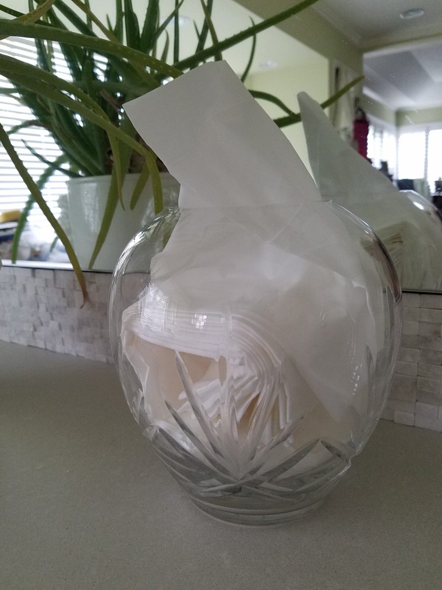
The same crystal wide-mouth vase holds and dispenses the facial tissues. I love the effect of the white-on-white coiled folds of the tissues. They are soft and read interestingly through the cut crystal.
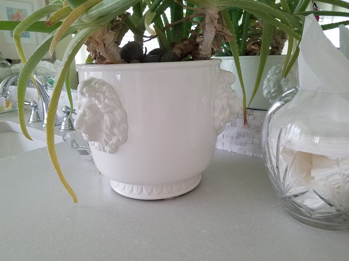
I’m a LEO and find myself discovering and enjoying subtle references to lions. Our front door knocker and this cache pot that I’ve had for over 20 years as examples.
Nothing in this new scene is new. These accessories are all
the exact items that were scattered on the countertop previously! Funny how the
exact same decorative accessories work so well in this new interior!
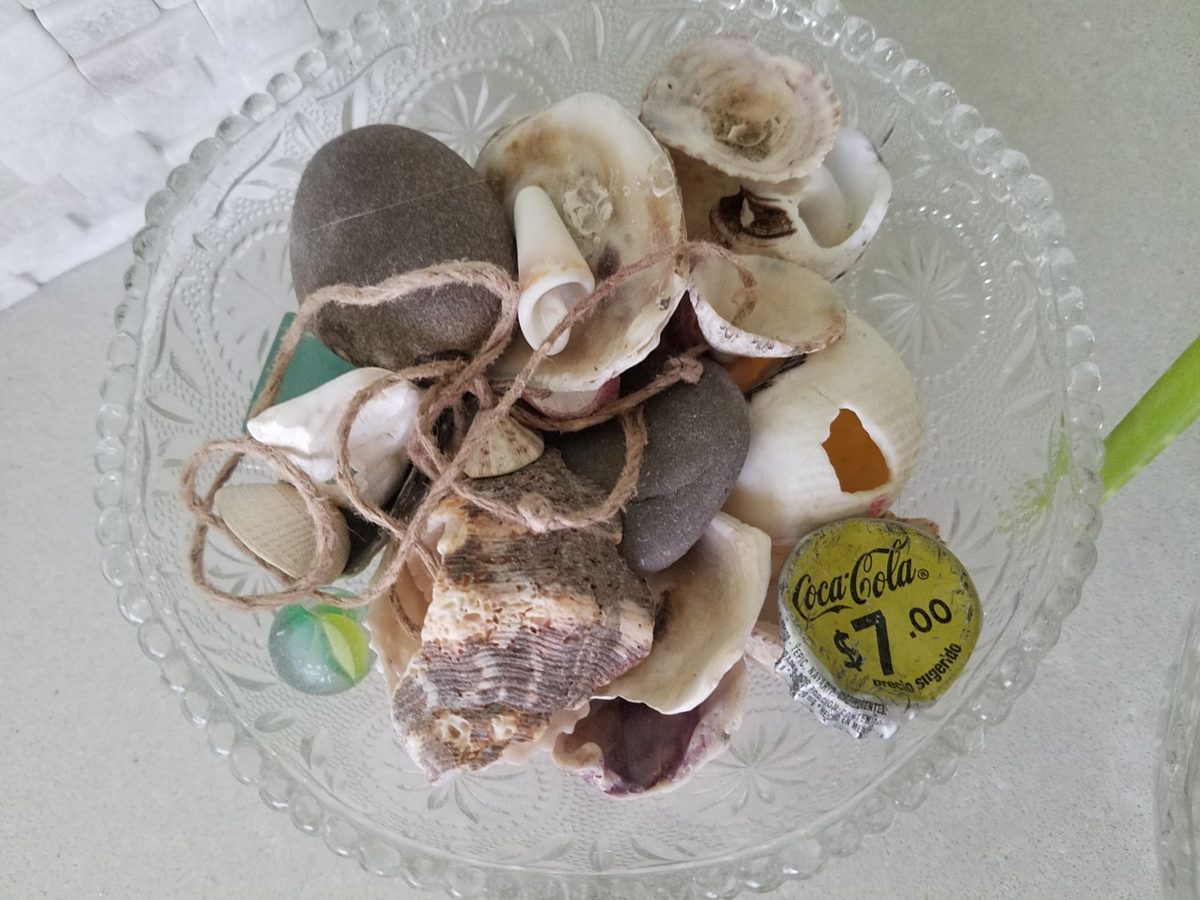
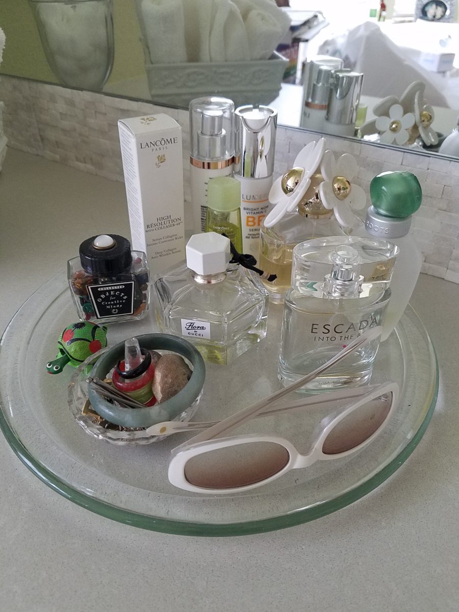
A silly little collection of found things in a family inherited vintage pressed glass bowl including a glass marble, square frosted glass coke-bottle-colored mosaic tile, various sea shells and fragments, a squashed bottle Coca Cola bottle cap from Mexico, a hemp cord DIY necklace with a shell pendant…
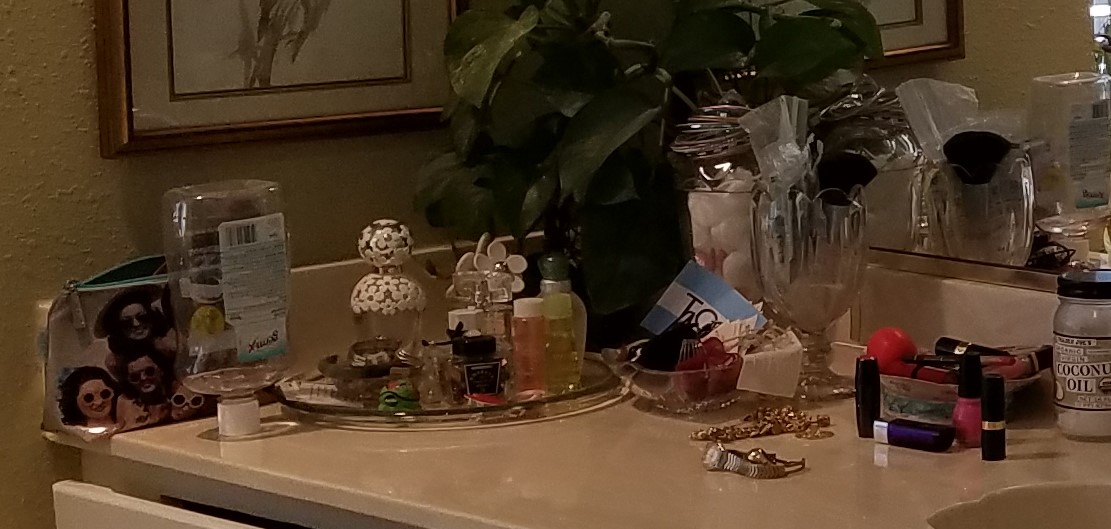
Another glass tray that was also on the previous countertop presents my fragrances, a few products, a bobble-head turtle, my Waterford ring stand stacked with costume glass rings, my tragic, yet miraculous jade bracelet (save for another story), a fossilized bone – in – stone I found as a child, my white framed sunglasses which might seem selected for the new color scheme – when, in fact, they are a result of my love for white framed glasses and these that I bought even though I didn’t like the would-be “reader” small lenses – I kept. I don’t like the way they look on – so have relegated them to the master bath for emergency dashes to the outdoors, on the upstairs deck when my other sunglasses are downstairs!
Still to complete…the stone mirror surround, hang the glass shade for the new pendant light fixture, install the towel/robe plugs, install the polished chrome drawer bar handles to match the new square door and drawer pulls, clear all the remaining stone pieces, thin-set and grout bags and boxes from the tub deck, install the new window sills…
Re-evaluate your existing accessories (and/or furniture)
before feeling the need to change everything when you remodel. Watch for the
completed before and after shots of this remodel soon to come. Well, relatively
soon!!
Finishing touches are always the beast to tame at the end of the hunt. Yes, you’ve hunted, you’ve searched, you’ve gathered, you’ve assembled and stood back and observed your work. What’s needed? What’s missing? When is it finished?
Just the word finish sets up a mental block for many. It’s like decisions period. Once you make a decision, you’ve lost your choices. Losing choices can be a dilemma in itself! So, from Pinterest to HGTV and the internet at your fingertips the choices and options are endless, but what do YOU want to do, to call it “done? It’s all in the details…
Schumacher offers details right down to the trim on the draperies! This bold key design makes all the difference!
And inasmuch as you can’t seem to GET it done, you WANT it done – just can’t seem to get there from here. How do you decide what you need to add for those incomplete finishing touches – to be FINISHED? Know though, that to have the feeling that it is finished is a good thing. Yet, that doesn’t mean you can’t change it – sooner or later!
We interior designers have jobs because our clients need to do things, change things, finish things. It seems that with all the options presented on TV and the internet, people are jumping in with inspired ideas, making decisions, buying things and doing things – then coming to a screeching halt! “HELP!” is the cry when everything seems to be too much – or not enough – or too uncertain and overwhelming – or not just right.
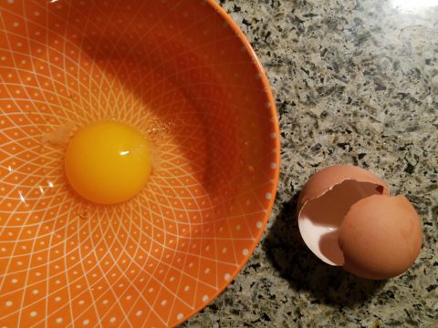
As if your own self-imposed frustrations and pressures are not enough, your partner rants…”Just finish it – will you? Be DONE with it!!!” Not everyone loves a DIY project. Most people don’t even like the disruption of a professional team coming in and tackling the job. Alas, “you have to break an egg to make an omelet,” some wise person once said.
Whether you’re changing paint colors for the third time in a month or tossing throw pillows around the room, to no satisfactory avail, there’s something missing…something is not quite right…it’s not there yet.
Have you removed everything from the walls and lined them up waiting for inspiration as to how and where they should be placed and grouped – maybe re-framed?
What about a mirror to add depth? Is it an installed mirror – the illusion of space without calling attention to the mirror itself or should I hang a framed mirror that makes the statement in its entirety? Do I lean it against the wall or is that a trendy affectation?
Uttermost is one of our favorite sources!
Studied nonchalance is an art form. How to achieve that intentionally unpretentiously naturally relaxed look is a challenge. Just writing about it here is an effort in describing that which is supposed to be effortless!!!!
Perhaps it is a monotony of height. Do you need a tall piece among other lower elements in the room? Maybe a tree in the corner is the answer or a statue of some vertical art statement, to add interest and height. Perhaps you might consider hanging something, from the ceiling – a mobile or origami bird or even a light fixture, to draw the eye up from the otherwise low furniture pieces.
Robert Allen presents perfect fabrics for colorful pillow accents…and there’s that tall plant for height!
Speaking of light fixtures…how does your almost finished, but not quite there yet, room look at night? Are there dark pockets and corners that would benefit from some concealed up-lights – indirect lighting can be quite effective and enhance a spooky, dismal space.
LOVE this before & after! Check out John Cullen Lighting for some great ideas and inspiration!! https://www.johncullenlighting.com/
Spooky is the season and, with the holidays approaching, the need to get things finished before guests arrive or you leave to visit… or just the hectic nature of the baking, gift-buying and wrapping, shipping and other communications aspects of the season are upon you – pressure you to want to get things finished!
Brunschwig and Fils by Kravet offers an amazing collection of prints – mix and match!!!
Have you consulted with a friend? Do they rise to the invitation of critiquing your present state of affairs and offer design ideas that further serve to confuse you? Better yet, ask two friends and get two different options for finishing your space and then what? Pick one and the other’s feelings are hurt that you didn’t take their advice – even if they are not aware that your decisions moving forward were offered by another friend.
From the rug (thank you Company C for your “Colorful Living!” to the table accessories and all the things, pieces, fabrics, details in-between – finishing touches FINISH the job!!!
A designer is a problem solver, a tie-breaker, a marriage counselor, a creative who extracts your needs and – evaluating all options – offers the best solutions to get your job finished!
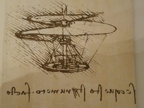
When you hear the name da Vinci, Leonardo da Vinci, its undeniably familiar. You might instantly call-up a synonym – genius. But what do you really, other than the Mona Lisa, recognize? And what do you even know about her and the painting itself? For the past several months now nearing the end of its run, the exhibition Da Vinci, The Genius, at the Albuquerque Natural History Museum, presented by Grande Exhibitions of Victoria, Australia in collaboration with the Museo Leonardo da Vinci , Rome and the French Scientific engineer Pascal Cotte is an amazing consolidation of information on this singularly remarkable man.
An artist or even designer are such understated titles for this man of extraordinary inventions, concepts, engineering, art and science, because he was the true Renaissance Man! He touched so many things to advance countless trades and disciplines many of which are the basis of machinery and equipment in use today. But as brilliant as the universal exploits of this amazing polymath are, this would be a tedious blog if I focused on the many pulley systems, gadgets, mirrors, SCUBA suits and even flying machines that he created in his lifetime.
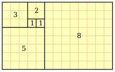
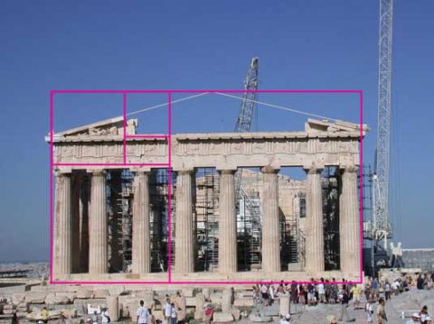
Rather, I would like to use this fascinating field trip that I just experienced to examine how I as a designer have been influenced by da Vinci – specifically, the spectacular rendition of the Golden Mean – nature’s perfect ratio that occurs in nearly everything around us. This common mathematical ratio is used to create subliminal perfection and pleasing compositions that mimic the perfect ratio found in nature and specifically, for my purposes, in design.
If you remove this square from the rectangle, you’ll be left with another, smaller Golden Rectangle. This could continue infinitely.
I have written about this previously in greater depth. It is a subject that has no limits as the application of this ratio helps assure good compositions whether you realize it or not. For graphic designers it is a must. For interior designers and architects it the formula for so many aspects of their work. People in art and design have employed the use of this perfect ratio for thousands of years. If you apply it – it is foolproof.
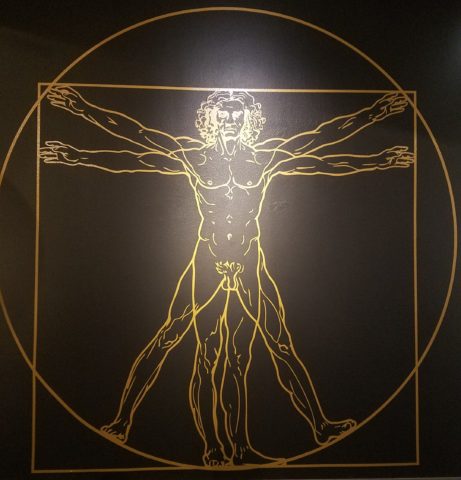
But back to the exhibit…there he was – the iconic man rendered in gold on black. You’ve seen it. But to know him is to see the perfection in the proportions that da Vinci used to create this perfect figure.
Right there in a commanding focal point was da Vinci’s drawing of Vitruvian Man. The accompanying video explained the relationship of all the dimensions as they related to the perfection of the Golden Ratio. Time and time again it is evident in the sections of this perfect anatomy.
Da Vinci correlated that the perfection of the proportions should be applied to represent the perfect human anatomical body and that it was an analogy for the entire workings of the universe.
His magnificent study of knots became sought-after for luxury fabrics used in 15th century fashion – many of which costumes and finery he designed. Interpretations as lover’s knots – the bond between them was a popular notion of his time and afterward.
It is an exhibition worth seeing. Even if you have stood in front of the real Mona Lisa and have visited sites exhibiting his vast creations and noted observations, this exhibition is worth a visit!
When you think about finishing a wall, you probably think about paint colors…you might think about a wallcovering – wallpaper, or even a mirror – I’ve previously noted how mirroring an entire wall can exponentially expand a room – a dimensional effect/illusion that suggests the room extends well beyond its actual size. But another wall treatment, with which I LOVE to play, is tile!
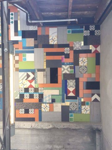
All over the world, the art of designing and creating decorative finishes with tile has been evolving for centuries. All cultures have utilized mud and clay, glazes and fire to bake beautiful patterns and colors onto geometric slabs. Shapes of rectangular, square, octagonal, dots or diamonds – the geometric shapes are many and the designs are limitless.
As is true with other wall treatments, I prefer not to stop on an outside corner. I believe that the color or material should suggest a built mass – part of the architecture. To stop on an outside corner suggests a veneer. It proves that the finish on the element is not a structural/integral part of a built mass. When you paint into an inside corner and stop, it allows the mass the read as though solid and not merely superficially treated. The same is true with tile. Don’t stop it until you get to an inside corner – if possible. There are situations that force a finished edge on the flat plain of a wall – but avoid outside corners at all cost!!
This entire shower is tiled floor to ceiling, around the pony wall, bench…no door…it reads like a built environment of stone tile.
Think of the surface as an architectural element. Tile from floor to ceiling, inside corner to inside corner – wrapping corners, if needed, along the way.
Take a backsplash…customarily used to do just that – catch splashes at the back wall of a wet area (sink) countertop…bathrooms and kitchens, behind sinks and between upper and lower cabinets – but why stop there?
The entire back wall of this kitchen is mosaic marble tiles in a herringbone pattern.
Think of it as a true wallcovering – wallpaper. Commit to the entire surface. Here are more effective examples…
The backsplash and entire adjacent wall were covered in glass mosaic tiles. It “reads” like wallpaper.
here again, the classic blue and white Talavera tile backsplash is continued along the entire wall from floor to ceiling.
We are currently working on a couple of kitchen projects that will soon be completed. They both use tile liberally. Each quite different from the other. Stay tuned for the finished products!
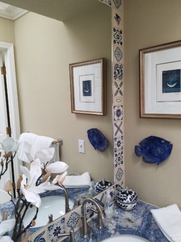
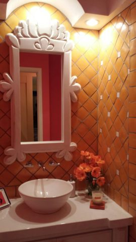
In bathrooms, the area around a mirror can be more than merely the backsplash. Embed the mirror into the tile surround or tile the entire wall and hang a mirror on top of the tile surface.
This mirror is flush with the surrounding tile, suggesting that it is embedded into a tile wall.
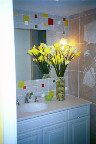
Planning this transformation, the mosaic vase was the inspiration. Then loose tiles were scattered on the countertop and the concept began. Note, the existing mirror was attached to wall with light fixture mounted above it and a medicine cabinet off to the side.
The transformation involved removing the medicine cabinet, taking the floor tile up the wall and wrapping it floor to ceiling. It was also cut into smaller squares to use behind the sink as a “full-wall backsplash.” Then punctuated with glass and glazed tiles to create an updated design. Relocating electrical to flanking the mirror for a pair of new sconces and a new countertop, faucet and sink with existing cabinets painted resulted in a cost-effective design.
Here a mirror is mounted on top of the fully tiled wall. Inside and outside of the shower enclosure the tile is a true wall treatment.
I recently received this advertisement in my email. It was such a spectacular collection that it caught my eye and I share here one of the patterns and context shots as the backdrop to a range.
Mosaic assemblages can be fun! Here is a fireplace surround.
The addition of three-dimensional pieces adds interest.
This exterior fireplace surround tolerates the elements – an all-season installation.
Here is a mosaic mural of a dynamic geometric abstraction discovered in New Zealand. We are using this inspiration to establish a theme in a current restaurant project. An interpretation of this in the form of geometric tiles of various sizes, colors and patterns will be used to create a cohesive repeated design element through various areas of the restaurant – both inside and out. Watch for this completed project in coming months.
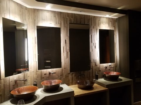
Commercial restrooms can benefit from full-wall tile treatments too. Not only does it look complete, but it is an ease of maintenance consideration.
Three dimensional tiles add interest to this cactus motif!
Fun with color and texture, tile are also easy too keep clean – terrific for public restrooms.
Murals are also terrific ways to use tile as art in your interior/exterior designs!
This is embedded into the stucco for an integral installation.
When using outside though, remember to consider the range of temperature and moisture to which it will be exposed. Porcelain is the most durable in areas where the temperatures get to and below freezing. Freezing and thawing can destroy tile. Many murals are made from clay that is not suitable in cold climates!
Inset into the tile wall treatment is this stunning glass mosaic abstract mural.
Tile – it’s a nearly limitless medium. So consider the possibilities for your next project! As a piece of art, an accent wall or an entire installation – full-wall treatments make a statement! Have fun with tile!
Designers use tricks, “trompe l oeil” – ever heard of it? Parlez-vous français? It’s a trick of the eye – and how handy is that to create an effect? Often murals are painted to give the illusion of depth or a scene that is not real, yet might fool you into thinking it is. Similarly, mirrors can create the illusion of dimension and improve spaces – especially small spaces or rooms that feel particularly one-sided. Like the idea? Want to hear some fun designer tips?
Large decorative mirrors expand the dining space in this restaurant. Faux finish composite material give the impression of hand-carved wood – not!
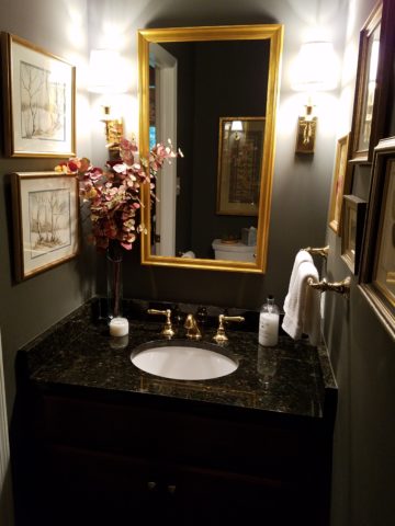
Mirrors in the Bath We know mirrors are commonly used for practical purposes such as bathroom vanities. They can be simple over-the-sink functional elements or framed versions for decorative pizzazz.
Below, a built-in tiled surround is nearly a full-wall treatment but with a little relief.
an a more encapsulated/inset mirror shown here
or full wall-to wall treatments that “go away” leaving only the illusion that the room continues beyond…you don’t really “see” the mirror, you see the illusion of space that it creates.
Bathrooms can be intimate spaces of decorative interest
or expanded to be grand spaces of extraordinary volume.
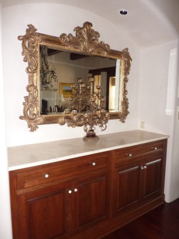
Dining Room Décor and Expansion Other rooms of the house can benefit from mirrors too. Often mirrors are placed in dining rooms over buffets to once again give the illusion of space to a room that is often small for the number of furniture pieces and people that gather there. It is an opportunity to add a decorative element as well as expand the space.
Mixing Geometrics A rectangular console table, sideboard, buffet or dresser enjoys the contrast of a round mirror
Mirrors as Artistic Accessories There are also fun additions to existing pieces like this framed grill-work which is given a new element of interest by adding a mirror behind the iron, set into the frame. Depth and interest instantly change the nature of this decorative wall piece.
Yes, the mirror becomes the decorative focal point. Large framed mirrors can become just that – a great focal point AND provide an illusion of depth. Notice too, the entire wall was tiled behind this focal piece adding further drama and interest.
The limitless options for frames and shapes makes mirrors a valuable accessory similar to a piece of artwork!
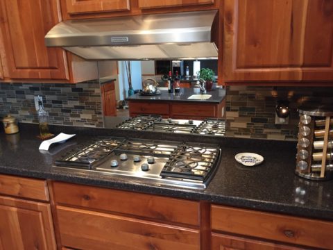
Kitchen Surprises Here’s a little trick…rather than looking into a tiled wall behind your cook-top, insert a mirror into the back-splash! It will give the illusion of an opening passing through to another room!!
Wish for a Window Add a “window” where you have none. A “fake window” adds dimension to an otherwise encapsulated interior space. This can be with an actual window to which you add mirrored glass to replace existing or merely a grouping of mirrors to suggest a window to the world.
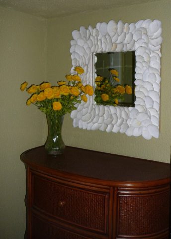
Embellish with Crafts Here we added white shells to have a little DIY fun!
Make it BIGGER – Make it Better Expand your living space, add value and create perceived square-footage!! Truly enlarging a room with a trick of design expertise is to know where to mirror an entire wall to achieve that illusion of a much larger space.
Consider what is being reflected. You won’t want it reflecting an open bathroom door necessarily…You can even enhance the area that will be reflected to maximize the effect.
Theatrical/Dramatic Lighting Effects and Mirrors
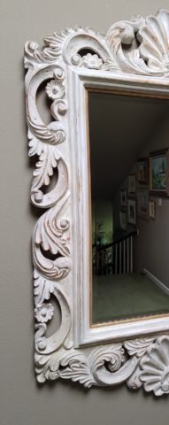
ART & Technology As is true with our fast-paced word today, the art of creating mirrors has gone from fine craft to commodity. Phenomenal prices are now available for what once was a luxury item. Certainly, there are exquisite hand carved, fantastically finished and even gilded wood frames still being designed and handcrafted by artisans around the world,
but the offerings for production pieces of man-made faux wood and other interesting composites are now on the market. Beveling used to be an art. It was performed by hand (and still is – but it is a lost art and it’s not as necessary a trade with the advances in technology to achieve the detail).
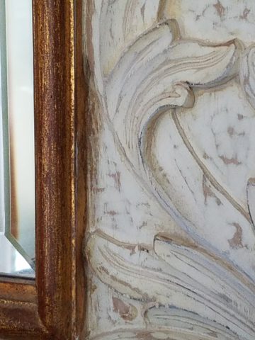
Difficult to see the hand-beveled work on this amazing hand-carved mirror.
The effects of a bevel either on the mirror within a frame or here as a frame itself, bevels add detail of angular reflection that add interest to a mirror’s single-plane depth providing the angular plane to reflect other surrounding facets of the scene.
Mirrors are one of the most versatile and effective design components. Look at them, look into them, use them, play with them – they will expand your world!!