Isolation Invites Innovation

Here, today, find designer focus and pro-tips for improving our living spaces. Most of us have spent more time at home than we have in years.  Sure, we usually wake up, prepare for the day and return in the evening, to end the day.  Weekends are usually that bonus time around the house – unless we spend them on road trip excursions. However, being at home every day is unusual for many and has provided opportunities to critique and take stock. Go from “making-do” to making better, with a little focus on the details and some professional help!

New catch-phrases like “shelter-in-place” have become part of our vernacular. Staying home has resulted in massive numbers of internet orders, cautious home improvement store visits and related activity.  The shared anxious energy and creative energy  spawned, from our restricted living and working regimens, is “going viral!”

Well, we certainly never really considered that trendy term of something being popular being a REAL virus spreading across the planet – but the humor, common complaints and simple joys, of this surreal modification to our lives, are “going viral” all over the internet.  From the vantage point of the design world, we are seeing a multitude of comments about people going  stir-crazy and making plans for needed home and office improvement.

HOME DEPOT – Pick-up in the store or have it delivered FREE to your doorstep!!

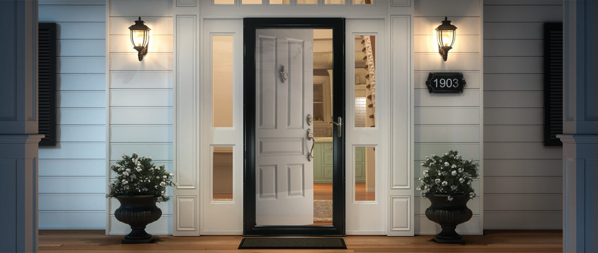
We are finally – and I say finally, after nearly everyone else we know has done so – ordering  storm doors. Yes, to leave open and let in the light of day!!! It has taken being around the house for so many consecutive days that has geared us to the circadian rhythm that our orientation provides and illustrated the need to avail our interior of a significant missed opportunity for natural light! Just never seemed that important…until now! We have labored over having lights (glass) in new primary doors, but after weighing the options for light, security and transparency have opted for clear, full-panel laminated glass storm doors with interchangeable screens, for fresh air – weather permitting.

Yes – Anderson DOES do double storm doors – but try finding that information on their website or even through Home Depot – they’re terrific – you just need to inquire!!!

This unique opportunity to be quarantined inside our homes has given us an opportunity to evaluate the flow, function and lifestyle within our private environments.  Have you noticed any things that you want to change as a result of this confinement and forced, close-up evaluation?

Here are a few topics and tips that have come-up in recent conversations from both consumer/clients and designers:

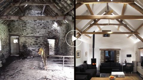
More perceived space:  Perhaps open a wall or completely remove a wall(s) and connect two rooms for better communication and visual enlargement of the floor plan.   

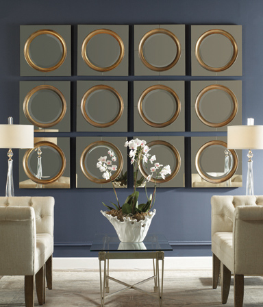
Adding mirrored walls or individual mirrors add depth and also expands a space to give it a perceived increase in size.  

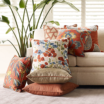
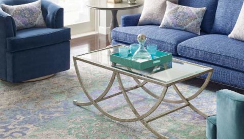
Add cozy color and texture with area rugs, throws and accent pillows.

Add skylights for more daylight.

Change paint colors for a refreshed feel.

Remodel kitchens and bathrooms – people have been sharing intimate spaces and preparing meals significantly more than regular lifestyles dictate and now recognize limitations in their current designs.

Re-upholstery of existing pieces that function well, but need to be refreshed and modernized.

Purchase new furnishing to improve the comfort, function and visual appearance of the interior.

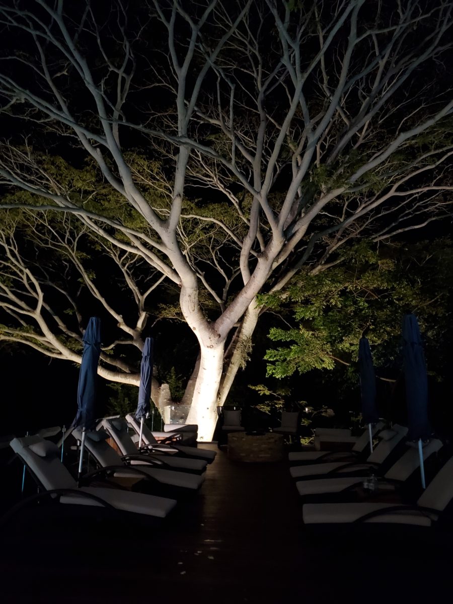
Desires for additional lighting or replacement fixtures, to improve and enhance the quality and color of light inside all rooms for tasks, ambiance, accent spots, indirect illumination, decorative fixtures and even landscape lighting to highlight the features of the plantings and exterior structures, have been heightened.

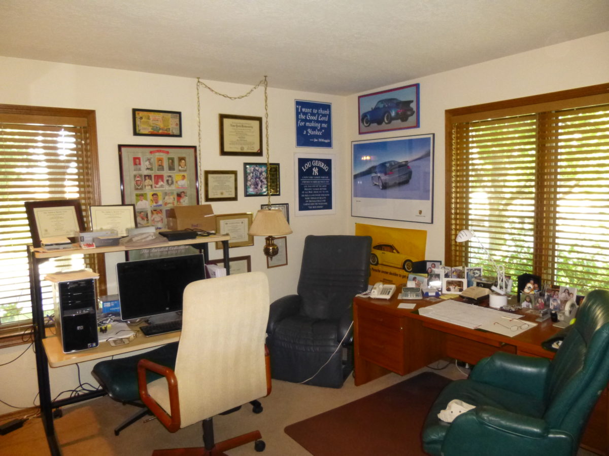
Workplace design has migrated into homes prompting consideration for a more efficient permanent pocket of living spaces designed for that specific purpose of home-offices. A few from our website portfolio are illustrated here…

Before – this cluttered space was serving as an office – but without organization or pleasing aesthetics.
After – this same space reorganized furniture placement, added new work-surfaces and cantilevered shelves to match existing teak pieces, creating an atmosphere of organization, enhanced workspace and display of personal hobbies and memorabilia.
Before – this room doubled as a sewing room and home office – but the lack of organization made it inefficient and unpleasant.
After – by adding storage, cutting a steel trundle bed (found in their storage unit) down to window-width, and rearranging the workspaces, this same room can now comfortably accommodate a guest, organize work and sewing spaces and pleasantly display art and memorabilia.

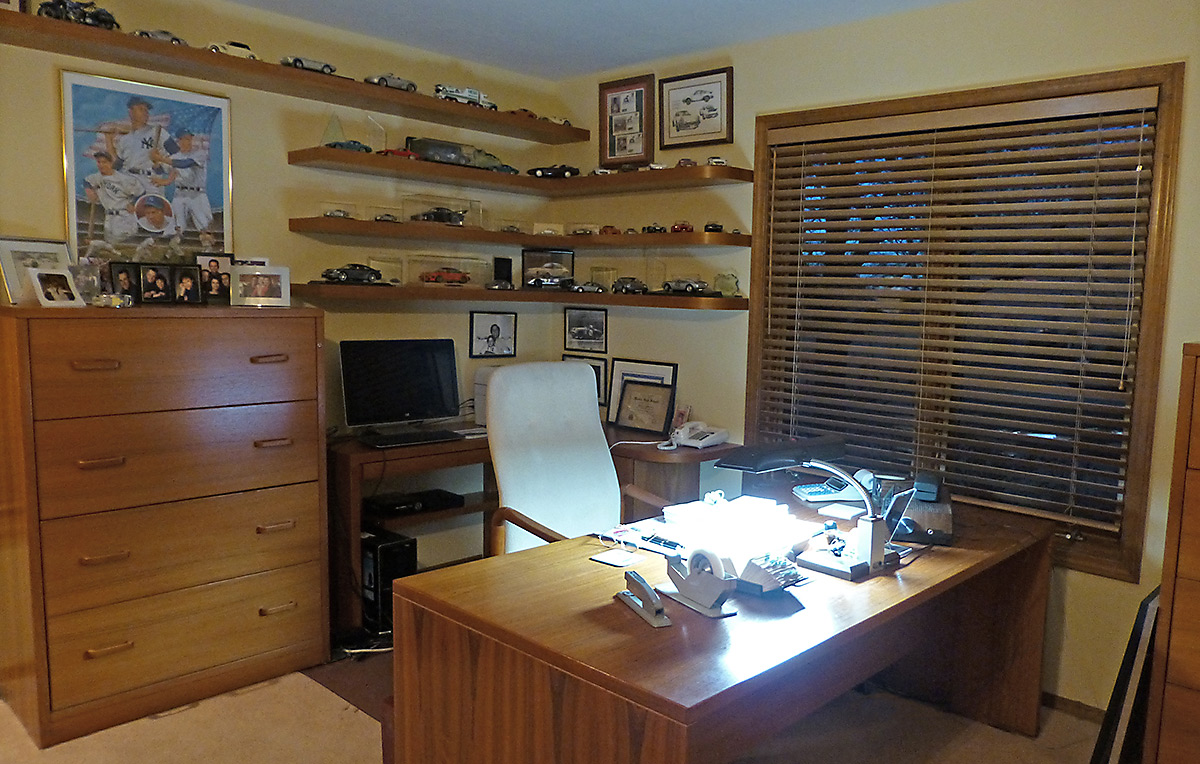
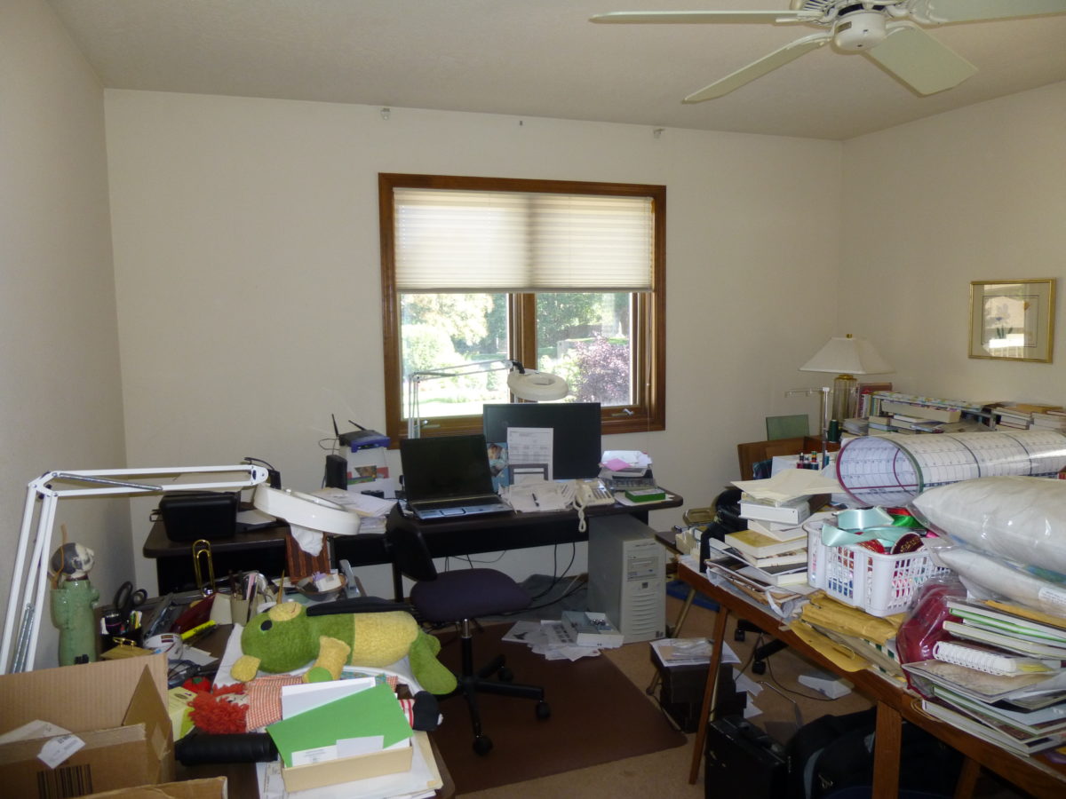
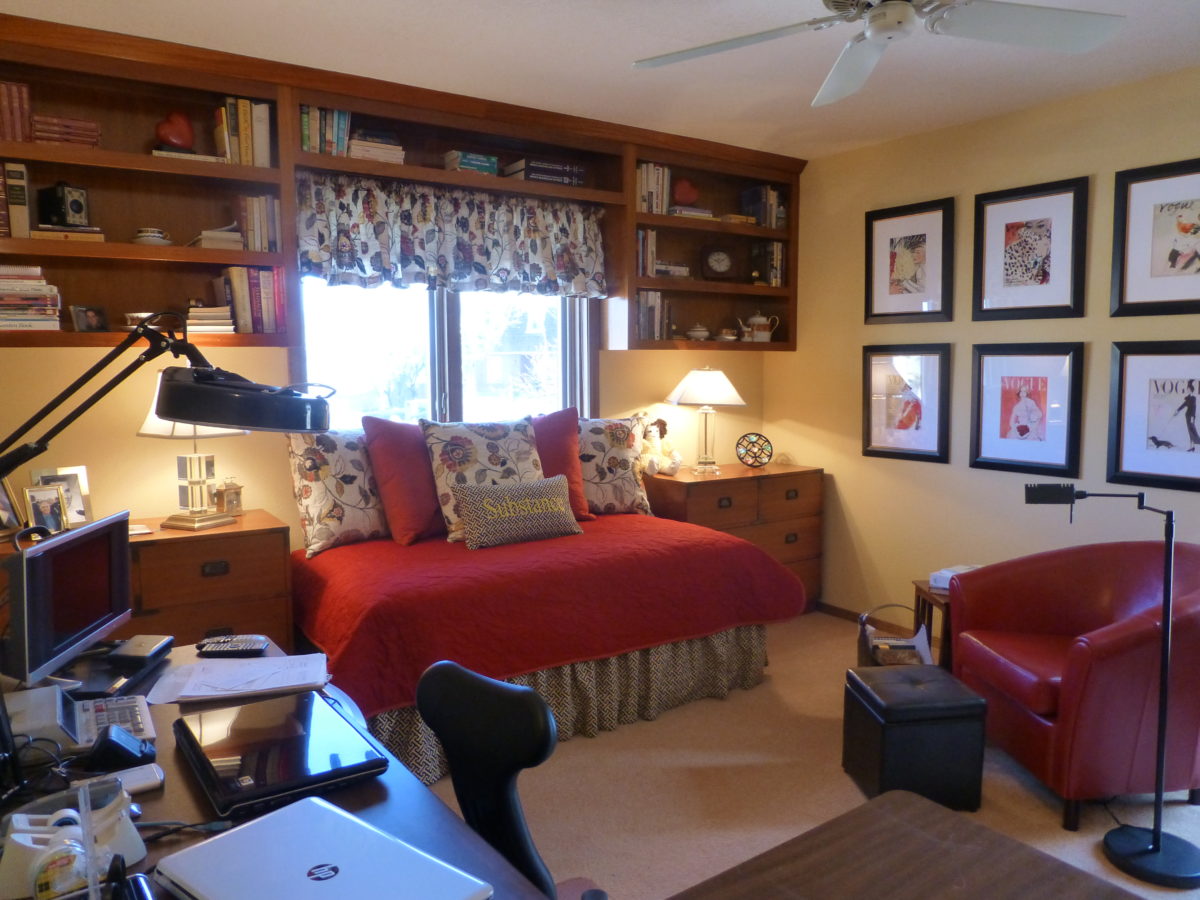
For both working from home and schooling from home – the needs, for this space, have become critical. Imagine, down the road, more on-line courses might be considered and even more opportunities to work from home now that the practice has been proven!!

Even a pocket tucked in the corner of a room can be ample space for quiet focus and an organized workspace.
Areas designed for study can also be used for arts and crafts and other projects.

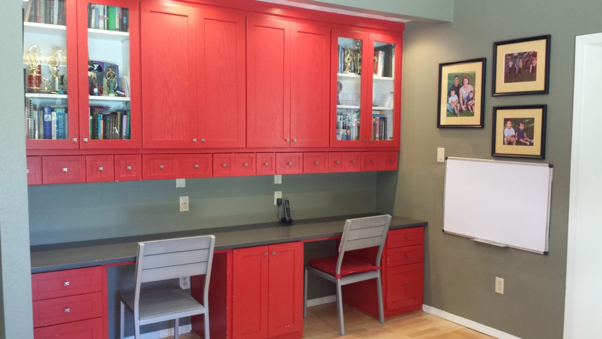
Office spaces will reflect this modification in the working environment, by creating more flexible workspaces allowing a variety of scenarios for performing tasks between home and office and an increasing appreciation for a more fluid arrangement of office layouts and furnishings. 

During this isolation, I have enjoyed several ZOOM continuing education classes offered by Knoll that have centered on workspace layout and furniture both at home and in corporate settings.

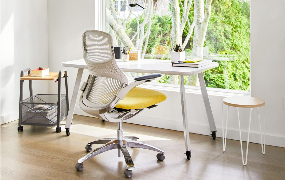
Here are more helpful tips from Knoll for your consideration when planning a home-office. https://www.knoll.com/shop/work-from-home/home-office-setup-guide

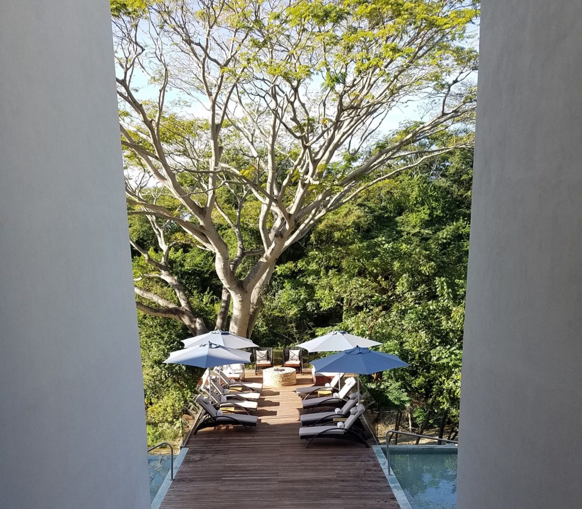
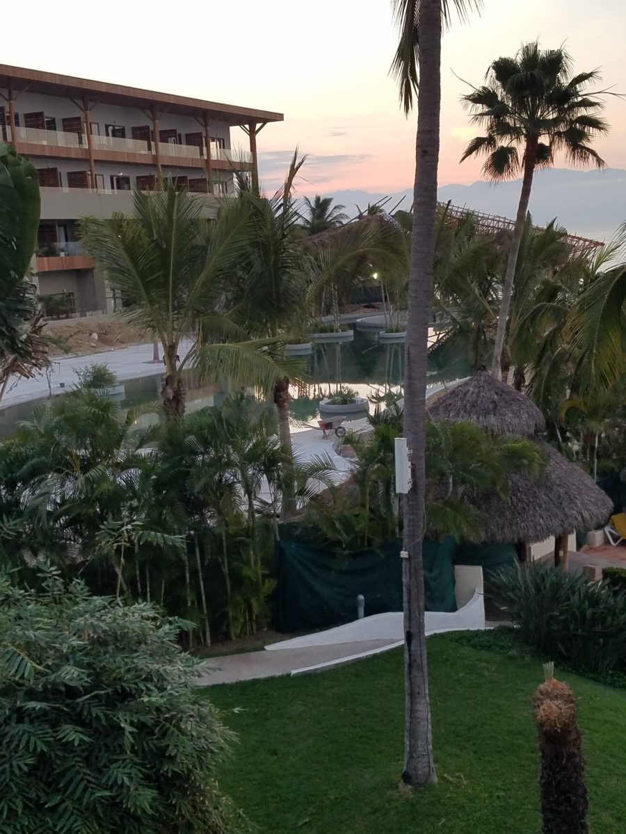
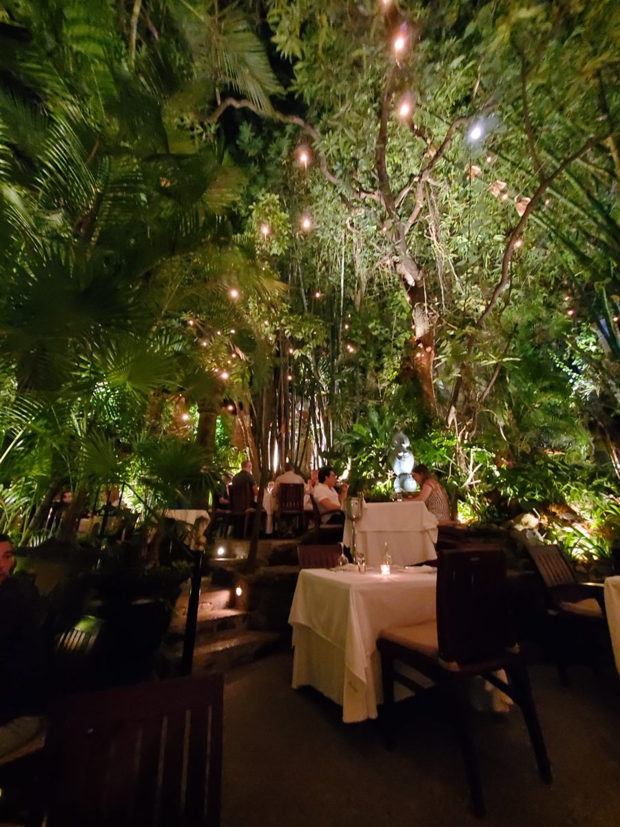
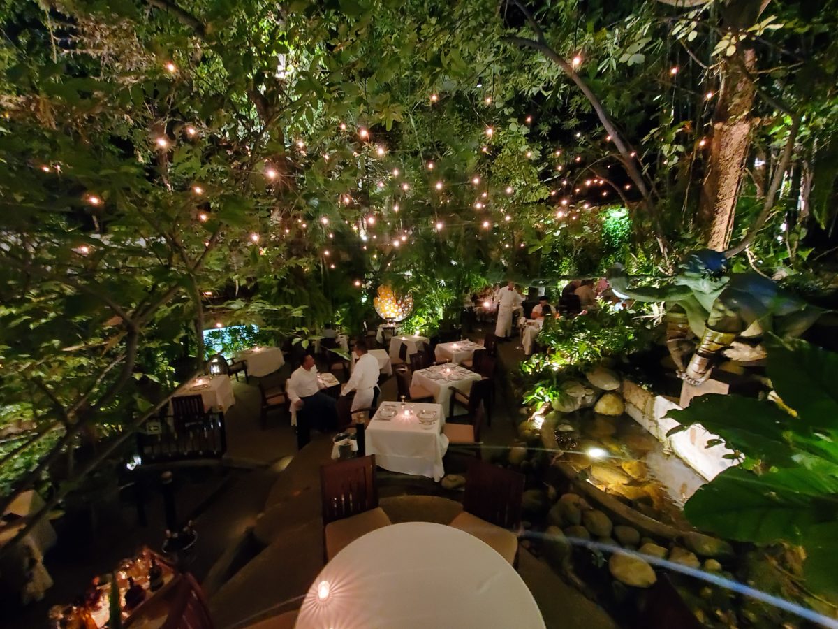
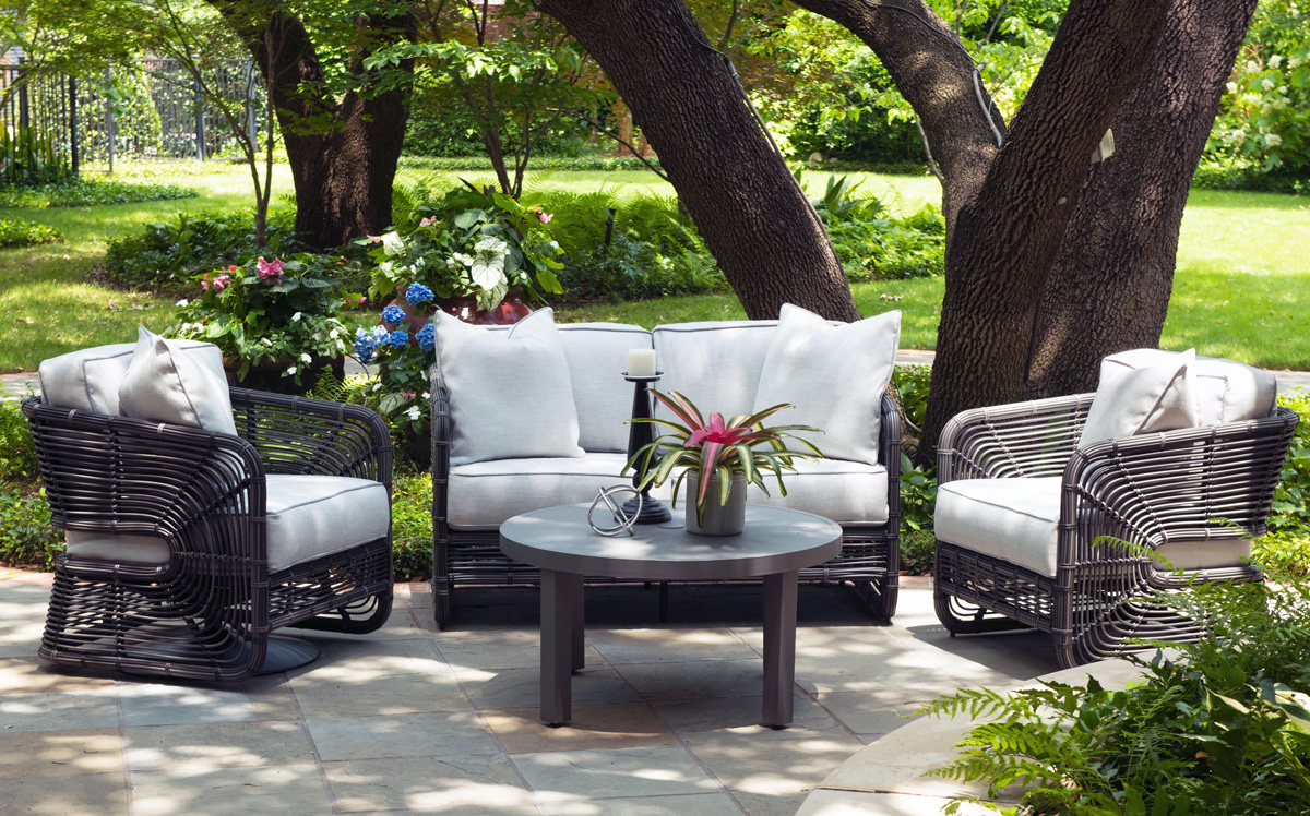
Patio perk-ups to expand the enjoyment outdoors –  at both home and office – maximizing the livable exterior areas of either small balconies to expansive spaces, backyards, decks, improved  landscaping,  outdoor kitchens and fully-furnished furnished living spaces – are seeing increased attention to detail.

Woodard furniture – one of our favorites –  has been designing and fabricating for  well over a hundred  and fifty years. Since 1934 they have perfected the art of metal furniture design and fabrication. As industry leaders, their expertise brings  a collection of superior craftsmanship and a wide variety of materials and styles to accommodate both commercial and residential applications.

Let’s keep moving forward through this pandemic with positive vibes for creating enhanced living spaces – both inside and out – for more productive and enjoyable living!  

Nature’s Design Elements

Neighborhood covenants, zoning, physical practicality, budgetary constraints…all enter into whether it is realistic or desirable to save vegetation when clearing land for development. Carving around existing  growth can be a tedious and costly addition to a project. But there are times when it is a design asset – an imperative even – to the over-all setting and effect of the scene.

Saving trees when designing a built environment is a challenge that often pays off.

A spectacular backdrop to this seating area – the decades old tree is the focal point.
At night – well lit – the same tree towers with dramatic illumination in the darkness as the rear “wall” of this seating area.

Raping acres of woods for barren subdivisions and adding back newly planted saplings the caliper of a quarter is unfortunate and takes years to satisfy. FHA requirements were the tell-tale token of bringing green back after a bulldozer’s brutal removal of all plant-life on a property. That lanky stick standing in the center of a dirt patch, that might get sod or seed…or rock, was a pitiful attempt to give back to the environment.  However, in addition to broad-sweeping examples, individual decisions to saver rather than remove can prove valuable.

Years ago, when planning a patio expansion and exterior kitchen, friends brought the plans to me for a quick check before committing to the design from the design/build contractors that they had engaged. The new patio plan meandered along nearly the entire back facade of the house.  With all the exciting kitchen layout and bar, seating areas and dining space, I instantly focused on the fact that their beautiful red-bud tree was gone – not in evidence on the pans!  I exclaimed about it and was told that they were told it had to go. That was about 10 years ago – or more, yet it still stands today having modified the design to include a tree-well in the patio and opening in the proposed high-ceiling patio cover.  The stunning multi-truck tree thrives, in the ground as it had for decades, and climbs skyward through the opening spreading widely toward the second story of the home. A wonderful, living, sculptural element, in the space. Good save!

Warmer climates invite the indoor/outdoor melding of living spaces. We all try to achieve them despite bitter cold transitions and near, if not complete shut-downs “off-season.” But in the tropics, outdoor living spaces become remarkable dimensions to expand living.

Sculptural trees are powerful elements viewed from inside and outside.

This past week, that situation came to mind as I enjoyed several examples of incorporating nature into the design scheme. Yes, landscape design is just that. Landscape architects do just that. They design exterior spaces with organic material. But what I was feeling recently was two complimentary things – one that designing in and around existing growth is so satisfying and in some cases, the living plant material becomes the architecture – not merely compliments it.

In addition to their sculptural beauty, they add balance, scale and a canopy over the exterior rooms.

This past couple of weeks, we have see the results of 2 years of preparation and construction which transformed of a piece of partially vacant land into a seaside resort. Several key palms and a couple other key trees  were saved and hundreds more were brought to the site to complete the design. The towering new trees showed signs of shock with their dried frond tips  – but will surely survive.

What has been a foreground of some landscaping and virgin jungle ,with houses beyond, was bladed and terraced last year in preparation for a new project.
Buildings and pools appeared, jungle growth was removed and a few key organic elements retained.
The recently finished scene is dramatically different – incorporating specimen trees throughout the property into the new plan.

When landscaping becomes architecture you know you have crossed an exciting line. What I mean by that is to have the growth become walls – to have the vegetation read as though structural framework.

This terraced dining patio is framed by massive bamboo and other large trees and plantings. They are substantial enough to read like screens, if not walls, framing the space.
From a canopy of growth, strings of LED lights are suspended as though from the ceiling – a ceiling of branches over this enchanting outside dining venue.

A tree house is another example. The tree is the structure – the framework to begin the additional elements that create a suspended room.

This entertaining and imagination-spurring book by Philip Jodidio is worth investigation. Here. find extraordinary examples of trees as the structure of other amazingly fanciful spaces!

By observing examples in your world, you will see, when designing around and in concert with the natural landscaping, the effects can be dramatic and of great value to the scene. On your next project, consider the possibilities of saving rather than removing – incorporating and celebrating nature’s design elements!

Fantasy Centerpieces in a Magical Setting

Inspiration for centerpieces – here – a neutral color scheme – white on white on white…Often limited to weddings, take a tip from a social phenomenon – Diner en Blanc for dramatic centerpieces! Any of which could be ablaze with seasonal color – depending upon your desired theme. And with the advancements in LED lighting, the colors are limitless and instantly changeable.

The Diner en Blanc is an international event that began in Paris, 1988. An amazing concept that began with an invitation among friends to an elegant al fresco affair. This unique gathering was prestigious and decadent.

Someone gave a nod to the city of origin!

Everyone wore white so that they could find each other amidst other crowds who were gathered at the venue. ( Which becomes rather humorous amidst 2,000 people ALL wearing white!!) https://www.google.com/search?q=origin+diner+en+blanc&oq=origin+diner+en+blanc&aqs=chrome..69i57j0.5779j0j4&sourceid=chrome&ie=UTF-8

The remarkable event spread around the world and Albuquerque has celebrated this creative event for several years. This is my second experience with this white fantasy. Every year the venue is kept secret only to be revealed at the last moment when attendees are assembled and usually transported on buses to the destination. This surprise location was right across from the designated gathering places downtown. And instead of boarding a bus each group, expecting just that, cued up as though to go aboard – only to be led single file across the street to the expansive Civic Plaza!

One big patio party!

This year with the Hyatt Regency team screaming with creativity from the table dressings…to the phenomenal food…to the fabulous frivolity – it was magic!

Would you believe luscious, chunky lobster salad served in a half tail, sliced beef filet and many artfully decadent extras…

Asked to wear white, bring your own tables, chairs, table dressings, centerpieces – all in white – the evening unfolds with exciting flurries of fabric, flowers, statuary, lights – all intended to make a spectacular statement for each group’s table.

Imagine all of this theatrical staging with 2,000 performers (we) in one enormous space – outside in the perfection of a last ditch of summer evening. It is a remarkable event.

Pretty parasols…
mysterious masks…

As I strolled through the tables capturing photos of the various “tablescapes”, I realized that the creativity was applicable to so many possibilities of table dressings – with color added!

LED lighting set the scene aglow with myriad magical colors! It changes the perceived temperature of a scene.

So enjoy seeing these creations and imagine them in seasonal splendor – fall now…winter coming…spring bursting forth and summer ablaze with color – for your upcoming parties throughout the year!

The scene changed and darkness fell..

With magnificent mariachis to flowing flamenco dancers the entertainment was dazzling and morphed into an enthusiastic DJ who rocked the stage for dancing into the night… It was an exterior nightclub – an excellent setting for a many faceted affair! https://www.facebook.com/DinerEnBlanc.Albuquerque/

An elegant table for Dion’s Pizza and water bottles!!!

Cheers to elegant parties! Who needs an excuse???

Designing a Cool Theme for a Vacay Rental Property

When designing for a vacation rental property, the first order of business is to select things that are durable and easy to maintain. This means finishes to furnishings. I know this from practical life experiences and also working with commercial/hospitality interiors. To do so, one needs time to place and receive the orders with enough contingency for mishap. It is also dependent upon the housekeeping arrangements planned for on-going maintenance.

In this recent project, the work began 12 months out – plenty of time you think…but it was all about the physical remodel. We began with the drawings for floor plan re-configuration and specifications for new lighting, cabinets and finishes throughout. The decision to furnish was not made until nearly 10 months later with a deadline to complete in less than 7 weeks. The delay was partially due to an indecision over how many of the 4 units (all on one floor) were to be short-term or long-term rentals. Then a new city ordinance imposed a moratorium, of sorts, on short-term rentals and while that was tossed about over several weeks…more indecision ensued.

It’s a riot to see overnight design projects transform interiors in 24 hours. That’s due to a free-reign for design decisions, a team(s) and vehicles to pick-up/deliver, all trades on deck, a single director calling the shots and an organized chaos that results in a magical finished project – yes, like magic. Open your eyes, be stricken with awe, cry a little and exclaim repeatedly that you “just can’t believe it!!!!”

Real life is generally not like that. Real life has in-put by owners, limited schedule openings by the various trades, little spontaneous decision-making and fleeting time riddled with unwanted surprises and delays. Real life, in this case, was a theme provided by the owner, a preconceived “look” developed in the mind’s eye and scratch paper of the designer during the selection of finishes and floor plan modifications and vacillation for several reasons, of what units to furnish and when. Over the course of a year, leading up to less than the last 30 days, the project was to be fully furnished and finished – ready to rent!

The good news is that with controlled frenzy, changing availability of products, focused efforts and teamwork, we are pleased to present the Lobster! Completed all but hanging the TVs by the requested July 1st deadline, it is beautifully appointed and offers a colorful and a bit whimsical, spacious, clean and did I mention  enviable location- 2 blocks from Pacific Beach in San Diego?

This entire project, except the move-in this last week, was done long-distance with the owner in Maine, her management company SHORE on-site in California and we the design team in New Mexico. This is not at all unusual, but Maine prompted the owner’s desire to name the unit Lobster. Not your spiny lobster from the local waters, but the New England version from the Atlantic with the classic recognizable form that accompanies the imagined crustacean – including the brilliant reds of the often appreciated steamed version!!

With fond memories of her childhood helping her elders maintain this property, the owner wanted to commemorate the building with an entry plaque visible from the street on the new redwood gate (soon to be completed). In addition, we suggested an individual name/theme for each of the 4 apartments which were all initially designated as fully-furnished short-term rentals – hence the bold identity for each!   I designed the new name plaques and had them fabricated by Artistic Bronze in Florida. The backing was built by our talented Enrique Jimenez, in New Mexico, and all shipped to California. Bronze was selected for its timeless presentation, handsome durability and commanding respect. Parisienne was the font I selected which may now be used to identify the property as though a logo to tie-in with the on-site signage. Subliminal cues that are recognized even slightly are effective reminders and triggers for recognition. The idea was intended to offer a fun, but lasting, introduction and identification which was to be reflected in the interiors. The Lobster was the largest unit with 2 bedrooms. It was ultimately chosen to the be one fully-furnished unit and owner’s second home when visiting the area.

For budget and availability, we sacrificed certain durable features that would have been better long-term investments, resulting in some knock-down furniture that was never intended for much abuse. Fragile painted table surfaces – for example – better in laminate, wood or stone…but time will tell.

The look is clean and fun, colorful and beachy – with a slightly up-scaled twist. Cool aquas accent a few walls in the otherwise crisp white interior. Red punctuates effectively in lobster accent pillows, decorative accessories and the full-wall mosaic glass tile treatment in the kitchen. Yes, once again, we like to treat tile on the walls as not mere back-splashes, but wall-covering full height and width!

Weathered grey toned LVT (Luxury Vinyl Tile) in the way of interlocking planks were an easy to maintain and durable floor finish. The faux wood adds warmth and is softer underfoot than other hard surfaces. Perfectly matched with all trim pieces, this flooring is fabulous!!

Lighting is key and here we added recessed directional lights to spot the walls and related artwork. Switching was also an important detail to have options for the lighted areas and accents.

The owner found a novel lobster rug with a great textural, tufted, yarn system that brings fun and great color and warmth to the bunk-bed room! Busy, colorful bed dressings intentionally selected (over the hospitality white that is still trending) contrast against the bright white bed frames stacked for space optimization and a little kid fun!

A cool find in the way of the glass vessel lamp…where usually the stem with electrical cord feeds down through the center of the base and of the back, this one feeds from the socket stem with a cork top that removes allowing the vessel to be filled with treasures – in this case southern California beach shells and fragments! And for a little more animation, I found a carved wooden shark to insert cruising above the shells to make the lamp even more interesting!!!

A pair of vintage photographs of a lobster shack and fishing boat contributed by a friend in Albuquerque – taken by him in Maine in 1962 – were enhanced with bright red mats in their original polished silver metal frames along with a large painting on canvas of a Maine lobster/fishing boat sent by the owner in Maine provide interest to further perpetuate the lobster theme.

The master bedroom is a comfortable retreat with another lobster pillow for punch! To give the room the best approach and make it feel as large as it can be, placing the bed in front of the windows was the solution. Beds facing the entrance to the room are always preferable to arriving into the side of them – for visual space and a more inviting orientation.

The original bathroom layout was all one space with tiny appointments jammed together…so we removed the tall storage cabinets and sink vanity allowing more room for the commode beside the tub/shower and added a privacy door. Then the new cabinets and counter have their own space with another privacy door resulting in a two-compartment bathroom area for maximum use and enjoyment. Red mosaic glass tiles were repeated from the kitchen to further coordinate the theme. 

The bold color scheme was thoroughly distributed throughout the unit which is an intentional design emphasis especially effective and novel in a short-term vacation rental – where such a thorough scheme might be too intense for one’s primary place of residence.

Effective design both functionally and visually should be a significant asset in the marketing of rental property. When used consistency in marketing material with logos and repeated features, this and other properties with attention to detail should attract the discriminating guests. Once there, repeated stays are the key to maintaining a strong guest population – of desired visitors.

Please watch for the entire slide show of before and afters of this dramatic transformation in the commercial projects section of our website, in coming weeks, entitled Emerald Green Beach Rentals – Lobster!

WHITE by Design…

With all the New Year buzz about the new color forecasts…I started taking notice of the seeming non-color, white. It is often considered the absence of color when in fact it is a very complex color of many shades and values. Just try to select a white and you will know what I mean.

When you look at white paint samples, you will notice the nuances. There are pink whites and blue white, grey whites and yellow whites. Each white is off-set and contrasting to another. You see the differences by comparison and by context. You think you have just the right white until you place it against another sample and see that it is grey or cream and then second guess yourself again…and again…How do you know which white is right?

Dunn Edwards groups their whites and pastels in a separate section of their fan deck as do other paint companies. What is interesting here is that the background is a sheet of white copy paper. Notice how is reads against the colors in the samples…it seems to be a purple blue color. This shot was taken under a full-spectrum LED lamp. The colors should be true. The range of “white” is amazing.

To intentionally design with white is bold. To have the confidence, to decide that white IS the color and that white IS the scheme, is challenging. To effectively design with white, you not only have to select the right white(s), but you have to know just how much of anything else might be effective yet not detract.

Le Leche in Puerto Vallarta is a fabulous example of designing exclusively with white. Only with minimal punctuation with black lettering on the wall of containers and also by allowing shadows is the white interrupted. But the blacks’ minor interruptions gives depth and fine detail.

White design can be cold or warm. Depending upon the desired effect, mood or function of the space, the whites need to be carefully selected. This is true with lighting as well. Warm whites or cool whites…what gives you the desired result?

Popular white string lights add festivity and a warm glow to an evening scene.
See how many lighting colors you can identify in this scene…Starting on the left, a cool pocket glows through the underbrush. The walkway has a warm pink-ish light. The very cool blues of the pool area give a dramatic read. A bold yellow accent peeks from the far left and also over on the right. The palm trees are wrapped in a warm white tube lights while the far right side illuminates the entry to the dining palapa with a cool white light source. The foam of the surf on the beach is captured with a cool white spotlight that maintains its naturally expected white color.

Knowing when to add color to a white scene to achieve an intentional POP is an art. The color itself, the amount and placement is all part of the success of a good design result. From the fine black detailing in the previous shot of La Leche to this still-life composition of a tropical cocktail that I propped the other day, the minimal punctuation of color is key.

White mosaic shards of tile in the background of this composition featuring a peeled coconut and the POP of a pretty pink party umbrella result in a white-on white scene. Yes, this shot says PARTY with a perky smile!

The bench which served as the backdrop for the coconut cocktail is a dramatic serpentine sculpture of site furniture that plays with the white-on-white of the tile and grout.

Contrasting against the organic wood decking, this white monolithic bench snakes around the periphery of this outdoor lounge area. The sunset is casting a soft pink wash over the all white glazed tile.

Beach settings using white materials compliment the white sand and greenery of the tropical plants. From wood frame platform cabanas to the sprinkling of umbrellas, white is a wonderful, fresh color for a crisp clean scene.

Whites on whites…creamy sand colors to crisp white terrycloth, the white-on-white scheme is soft, inviting and clean.
Greenery compliments the white umbrellas and sunning beds on the lawn by the beach.
Palm trunks and other fruit trees are often painted white to protect against insects and what insects insist on climbing the surface are easily spotted by birds who appreciate the help to capture a snack! In this case, they contribute to the white design theme.

The soft creamy off-white folds of fabric offer a soft, inviting scene.

Shadows in the creases and depths of the folds add the dimension to the luxurious feel of the cotton damask fabric.
White stucco is dappled by shadows and greenery while given a warm, strong base by the brick pavers. White as an architectural finish is only successful if the context compliments it. This is true in all design.

Architectural color and texture of surfaces is a moving target. A recent discussion about a white building with black detailing would not have proved right for this particular use of white. The hard, commercial read would have been too severe for the intended effect. Yet that same project, with a warm white and an ochre accent, will be just the right combination to achieve the desired result. Watch for this project to be featured in a few months.

Architectural surfaces incorporating tones and textures of white provide interesting opportunities

Block and crumbled edge accent bands on the facade of an exterior wall.

White in design is an exciting selection. Knowing how, when and why to use it is a test of your creativity. Picking the right white is the challenge.

The limitless colors of white found in a pile of gravel…..

So the next time you think white, think a lot about it. Study the context and what you are trying to accomplish. Feel freed by the fact that white is a color to express and enjoy.

Finishing Touches FINISH the Job!

Finishing touches are always the beast to tame at the end of the hunt. Yes, you’ve hunted, you’ve searched, you’ve gathered, you’ve assembled and stood back and observed your work. What’s needed? What’s missing? When is it finished?

Just the word finish sets up a mental block for many. It’s like decisions period. Once you make a decision, you’ve lost your choices. Losing choices can be a dilemma in itself!   So, from Pinterest to HGTV and the internet at your fingertips the choices and options are endless, but what do YOU want to do, to call it “done? It’s all in the details…

Schumacher  offers details right down to the trim on the draperies! This bold key design makes all the difference!

And inasmuch as you can’t seem to GET it done, you WANT it done – just can’t seem to get there from here. How do you decide what you need to add for those incomplete finishing touches – to be FINISHED?  Know though, that to have the feeling that it is finished is a good thing. Yet, that doesn’t mean you can’t change it – sooner or later!

We interior designers have jobs because our clients need to do things, change things, finish things. It seems that with all the options presented on TV and the internet, people are jumping in with inspired ideas, making decisions, buying things and doing things – then coming to a screeching halt! “HELP!” is the cry when everything seems to be too much – or not enough – or too uncertain and overwhelming – or not just right.

As if your own self-imposed frustrations and pressures are not enough, your partner rants…”Just finish it – will you? Be DONE with it!!!” Not everyone loves a DIY project. Most people don’t even like the disruption of a professional team coming in and tackling the job. Alas, “you have to break an egg to make an omelet,” some wise person once said.

Whether you’re changing paint colors for the third time in a month or tossing throw pillows around the room, to no satisfactory avail,  there’s something missing…something is not quite right…it’s not there yet.

Have you removed everything from the walls and lined them up waiting for inspiration as to how and where they should be placed and grouped – maybe re-framed?

What about a mirror to add depth? Is it an installed mirror – the illusion of space without calling attention to the mirror itself or should I hang a framed mirror that makes the statement in its entirety? Do I lean it against the wall or is that a trendy affectation?

Uttermost is one of our favorite sources!

Studied nonchalance is an art form.  How to achieve that intentionally unpretentiously naturally relaxed look is a challenge.  Just writing about it here is an effort in describing that which is supposed to be effortless!!!!

Perhaps it is a monotony of height. Do you need a tall piece among other lower elements in the room? Maybe a tree in the corner is the answer or a statue of some vertical art statement, to add interest and height. Perhaps you might consider hanging something, from the ceiling – a mobile or origami bird or even a light fixture, to draw the eye up from the otherwise low furniture pieces.

Robert Allen presents perfect fabrics for colorful pillow accents…and there’s that tall plant for height!

Speaking of light fixtures…how does your almost finished, but not quite there yet, room look at night? Are there dark pockets and corners that would benefit from some concealed up-lights – indirect lighting can be quite effective and enhance a spooky, dismal space.

LOVE this before & after! Check out John Cullen Lighting for some great ideas and inspiration!! https://www.johncullenlighting.com/

Spooky is the season and, with the holidays approaching, the need to get things finished before guests arrive or you leave to visit… or just the hectic nature of the baking,  gift-buying and wrapping, shipping and other communications aspects of the season are upon you – pressure you to want to get things finished!

Brunschwig and Fils by Kravet offers an amazing collection of prints – mix and match!!!

Have you consulted with a friend? Do they rise to the invitation of critiquing your present state of affairs and offer design ideas that further serve to confuse you? Better yet, ask two friends and get two different options for finishing your space and then what? Pick one and the other’s feelings are hurt that you didn’t take their advice – even if they are not aware that your decisions moving forward were offered by another friend.

From the rug (thank you Company C for your “Colorful Living!” to the table accessories and all the things, pieces, fabrics, details in-between – finishing touches FINISH the job!!!

A designer is a problem solver, a tie-breaker, a marriage counselor, a creative who extracts your needs and – evaluating all options – offers the best solutions to get your job finished!