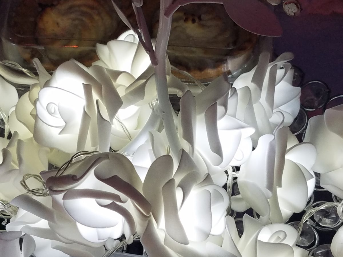
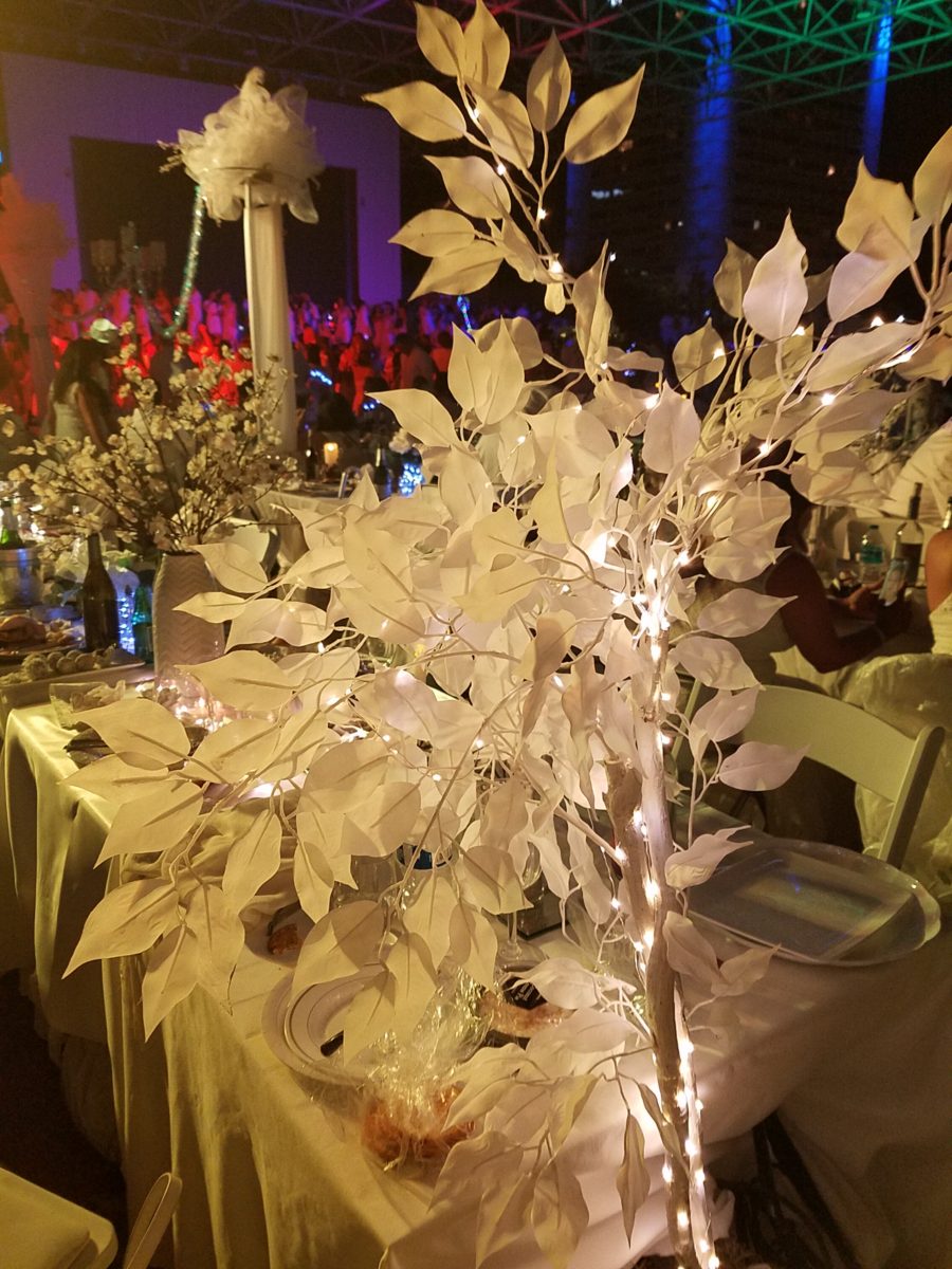
Inspiration for centerpieces – here – a neutral color scheme – white on white on white…Often limited to weddings, take a tip from a social phenomenon – Diner en Blanc for dramatic centerpieces! Any of which could be ablaze with seasonal color – depending upon your desired theme. And with the advancements in LED lighting, the colors are limitless and instantly changeable.
The Diner en Blanc is an international event that began in Paris, 1988. An amazing concept that began with an invitation among friends to an elegant al fresco affair. This unique gathering was prestigious and decadent.
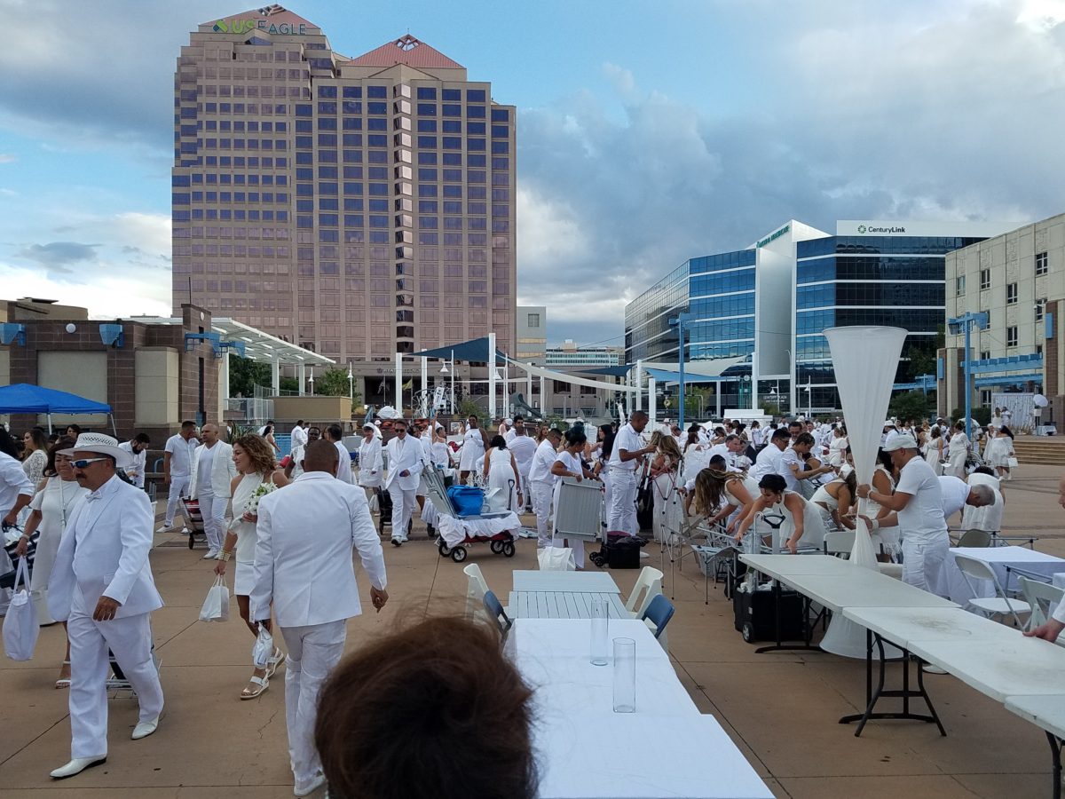
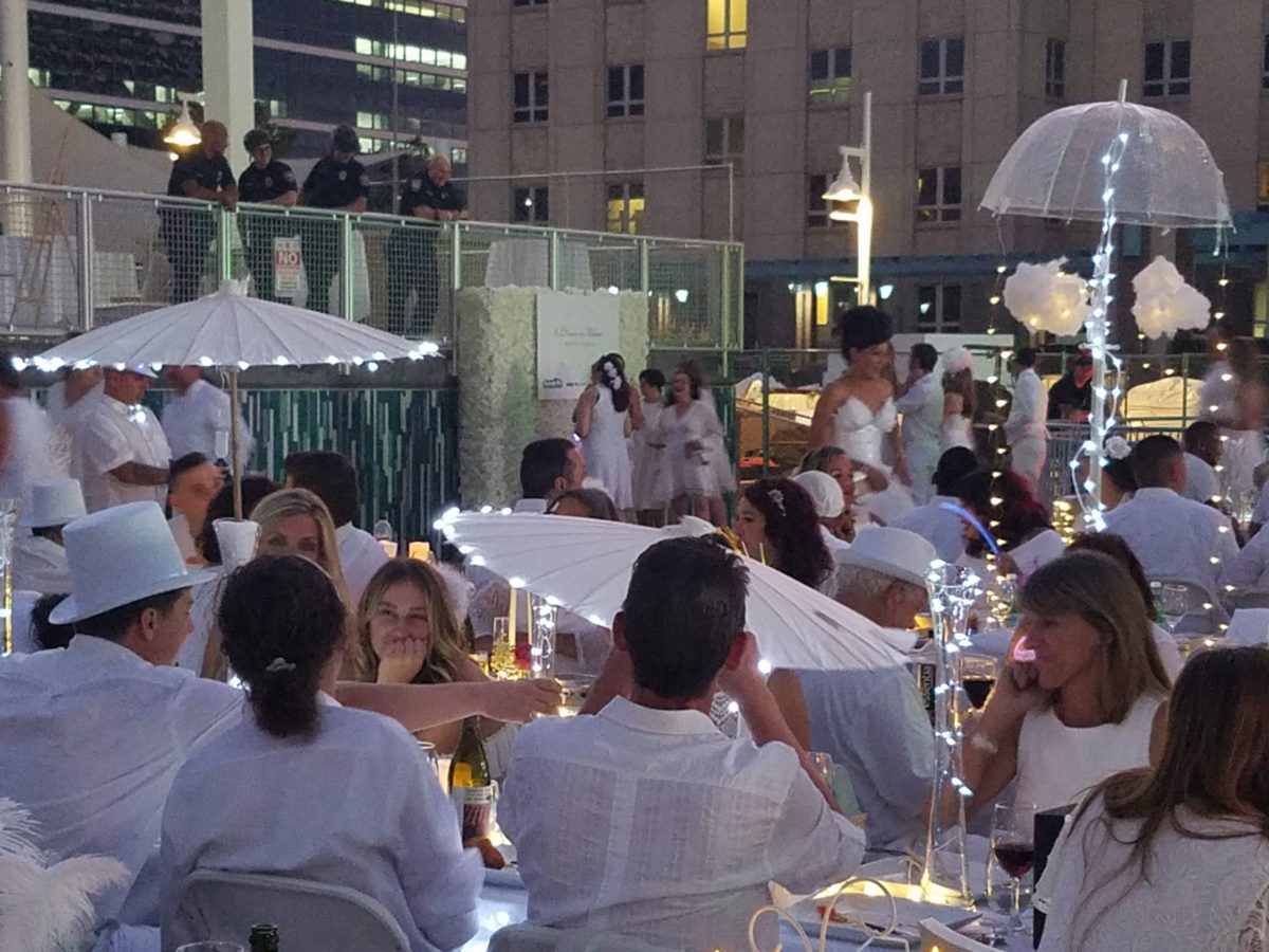
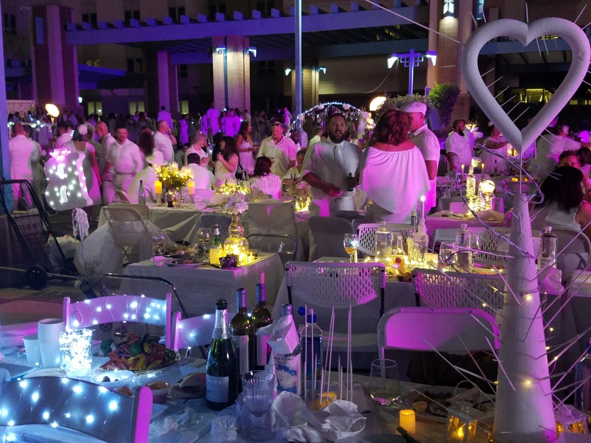
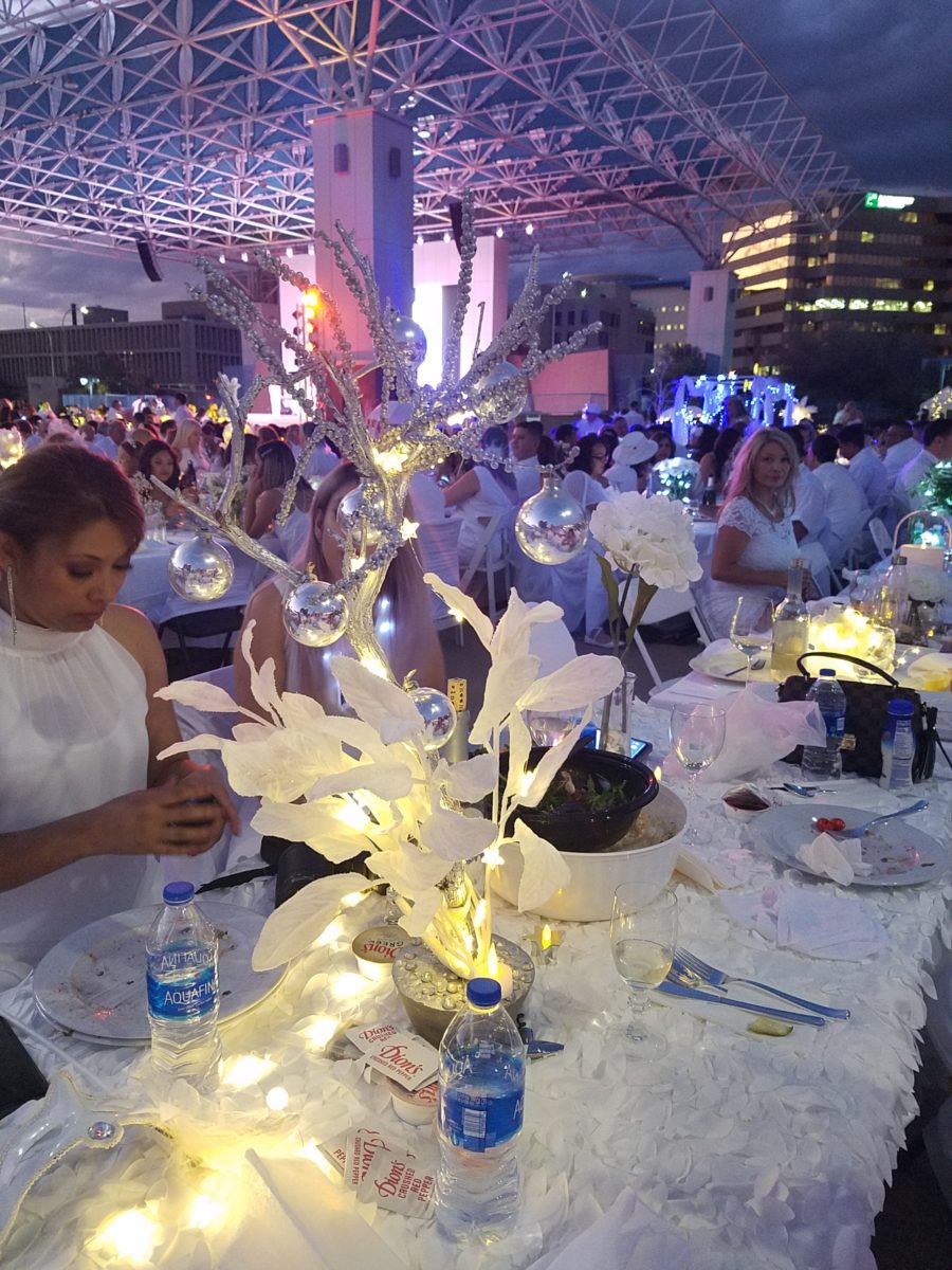
The remarkable event spread around the world and Albuquerque has celebrated this creative event for several years. This is my second experience with this white fantasy. Every year the venue is kept secret only to be revealed at the last moment when attendees are assembled and usually transported on buses to the destination. This surprise location was right across from the designated gathering places downtown. And instead of boarding a bus each group, expecting just that, cued up as though to go aboard – only to be led single file across the street to the expansive Civic Plaza!
One big patio party!
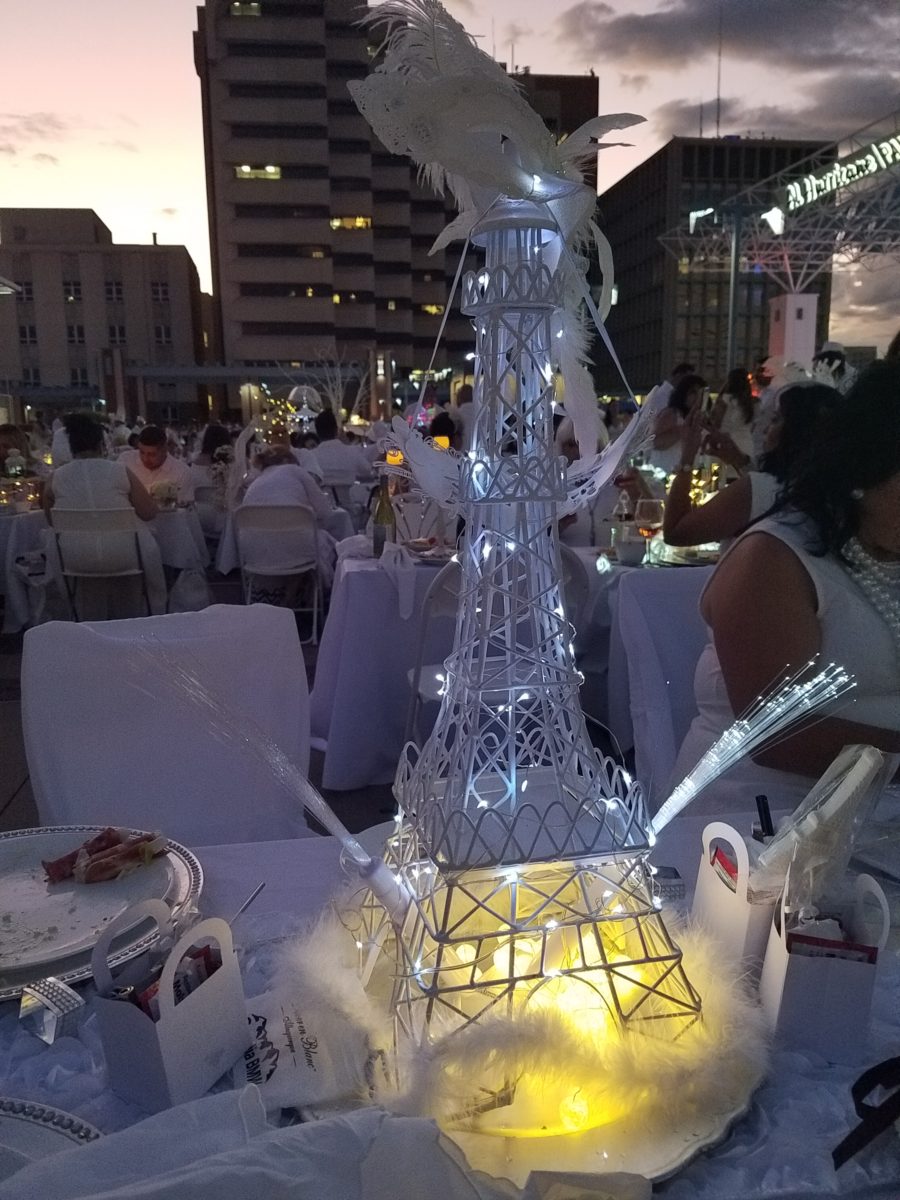
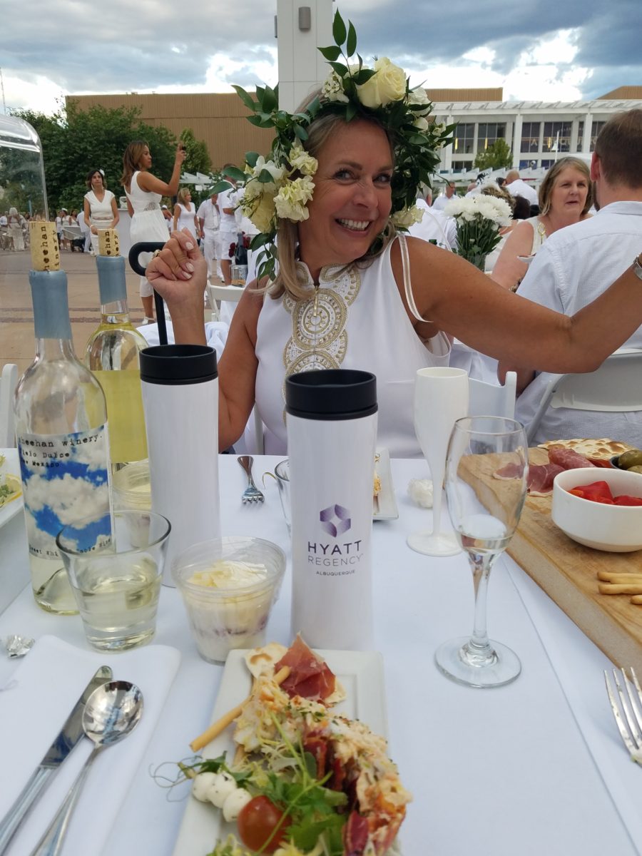
This year with the Hyatt Regency team screaming with creativity from the table dressings…to the phenomenal food…to the fabulous frivolity – it was magic!
Would you believe luscious, chunky lobster salad served in a half tail, sliced beef filet and many artfully decadent extras…
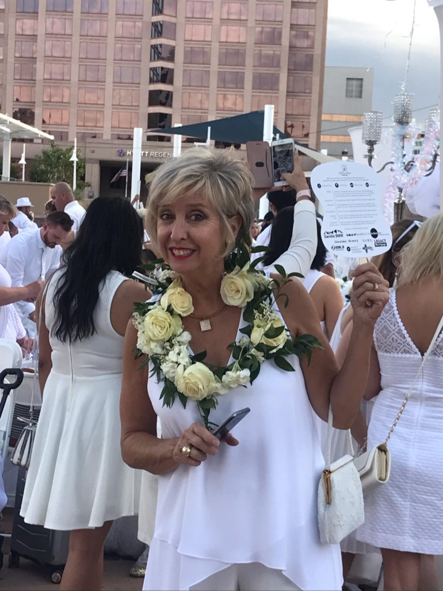
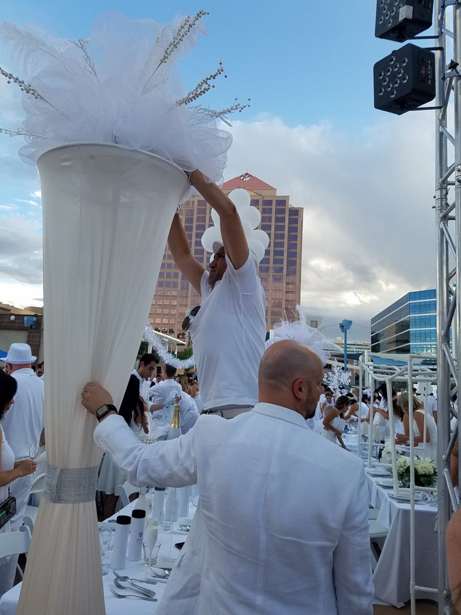
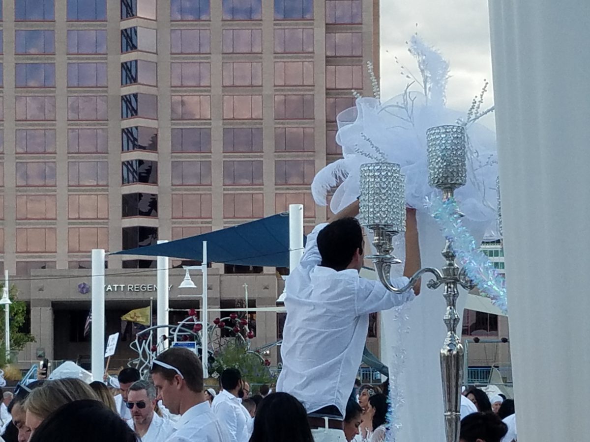
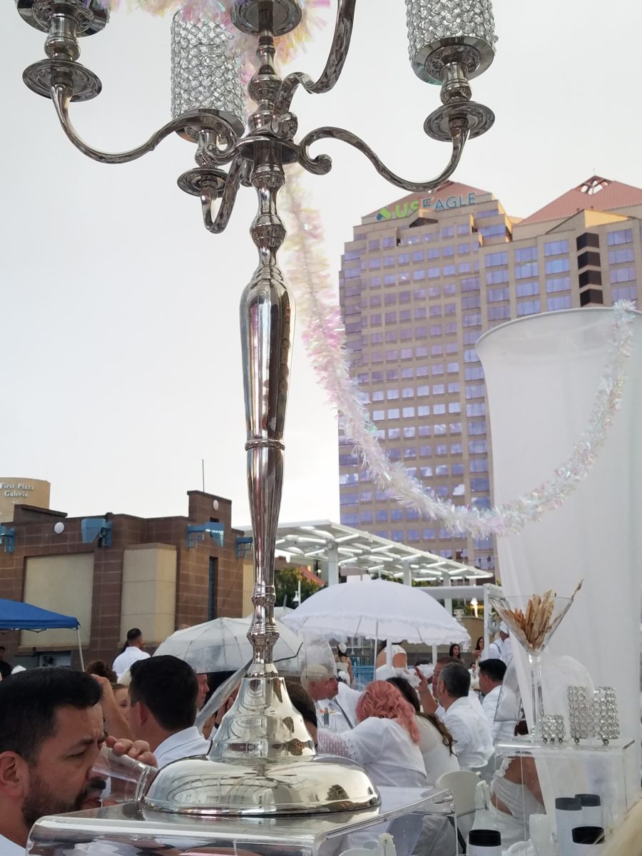
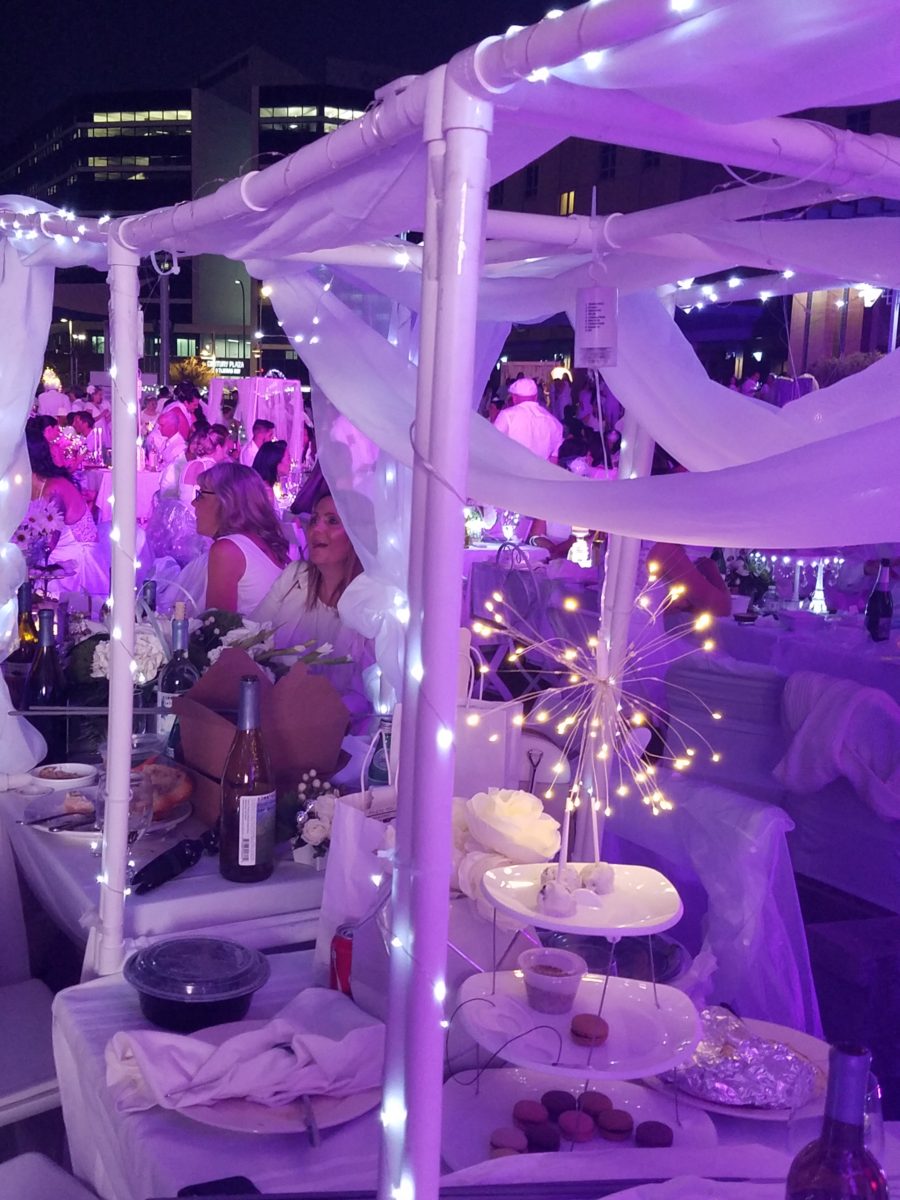
Asked to wear white, bring your own tables, chairs, table
dressings, centerpieces – all in white – the evening unfolds with exciting
flurries of fabric, flowers, statuary, lights – all intended to make a
spectacular statement for each group’s table.
Imagine all of this theatrical staging with 2,000 performers (we) in one enormous space – outside in the perfection of a last ditch of summer evening. It is a remarkable event.
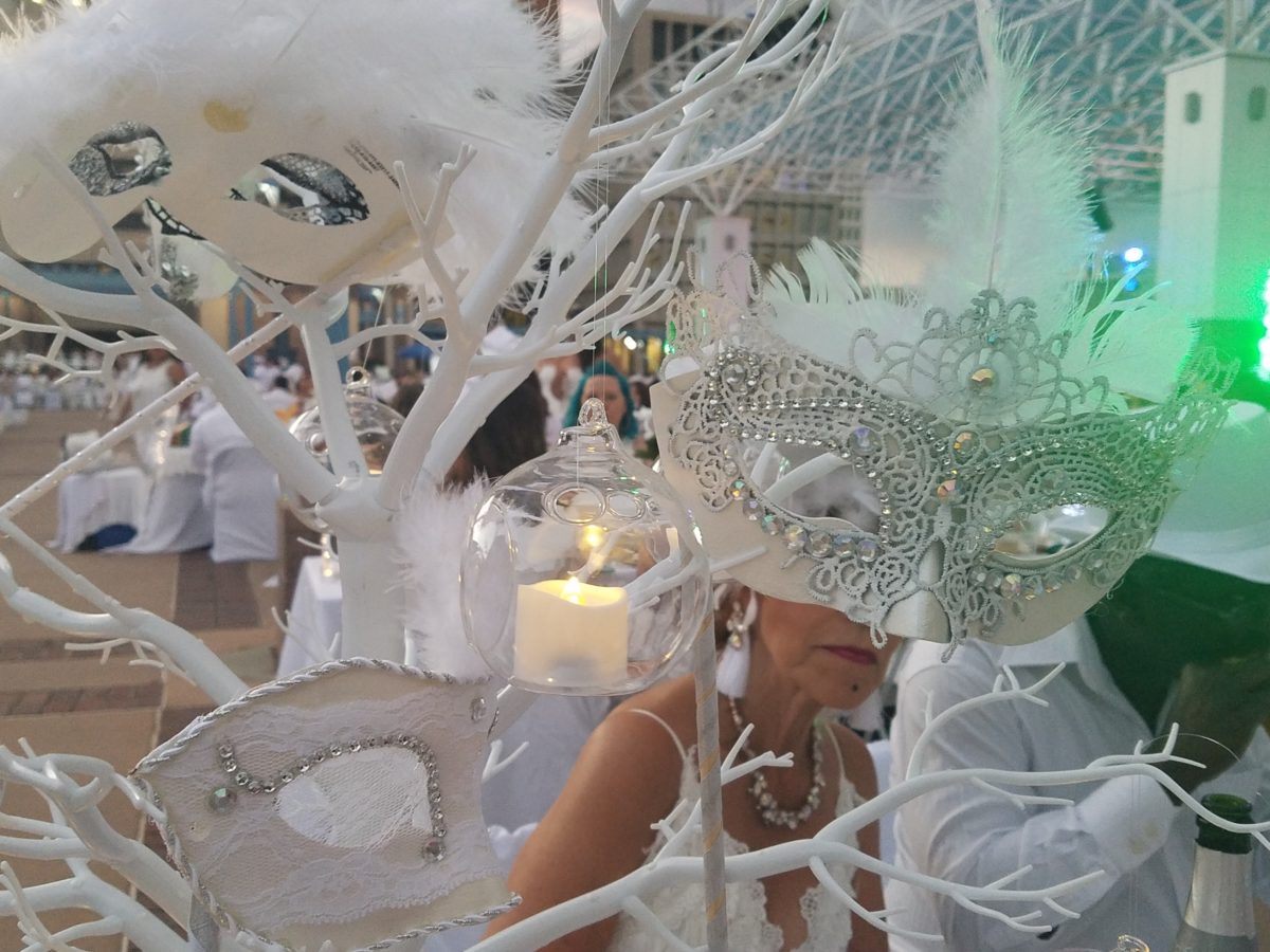
Pretty parasols…mysterious masks…
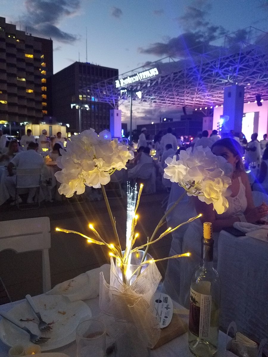
As I strolled through the tables capturing photos of the various “tablescapes”, I realized that the creativity was applicable to so many possibilities of table dressings – with color added!
LED lighting set the scene aglow with myriad magical colors! It changes the perceived temperature of a scene.
So enjoy seeing these creations and imagine them in seasonal splendor – fall now…winter coming…spring bursting forth and summer ablaze with color – for your upcoming parties throughout the year!
The scene changed and darkness fell..
With magnificent mariachis to flowing flamenco dancers the entertainment was dazzling and morphed into an enthusiastic DJ who rocked the stage for dancing into the night… It was an exterior nightclub – an excellent setting for a many faceted affair! https://www.facebook.com/DinerEnBlanc.Albuquerque/
An elegant table for Dion’s Pizza and water bottles!!!
With all the New Year buzz about the new color forecasts…I started taking notice of the seeming non-color, white. It is often considered the absence of color when in fact it is a very complex color of many shades and values. Just try to select a white and you will know what I mean.
When you look at white paint samples, you will notice the nuances. There are pink whites and blue white, grey whites and yellow whites. Each white is off-set and contrasting to another. You see the differences by comparison and by context. You think you have just the right white until you place it against another sample and see that it is grey or cream and then second guess yourself again…and again…How do you know which white is right?
Dunn Edwards groups their whites and pastels in a separate section of their fan deck as do other paint companies. What is interesting here is that the background is a sheet of white copy paper. Notice how is reads against the colors in the samples…it seems to be a purple blue color. This shot was taken under a full-spectrum LED lamp. The colors should be true. The range of “white” is amazing.
To intentionally design with white is bold. To have the confidence, to decide that white IS the color and that white IS the scheme, is challenging. To effectively design with white, you not only have to select the right white(s), but you have to know just how much of anything else might be effective yet not detract.
Le Leche in Puerto Vallarta is a fabulous example of designing exclusively with white. Only with minimal punctuation with black lettering on the wall of containers and also by allowing shadows is the white interrupted. But the blacks’ minor interruptions gives depth and fine detail.
White design can be cold or warm. Depending upon the desired effect, mood or function of the space, the whites need to be carefully selected. This is true with lighting as well. Warm whites or cool whites…what gives you the desired result?
Popular white string lights add festivity and a warm glow to an evening scene.See how many lighting colors you can identify in this scene…Starting on the left, a cool pocket glows through the underbrush. The walkway has a warm pink-ish light. The very cool blues of the pool area give a dramatic read. A bold yellow accent peeks from the far left and also over on the right. The palm trees are wrapped in a warm white tube lights while the far right side illuminates the entry to the dining palapa with a cool white light source. The foam of the surf on the beach is captured with a cool white spotlight that maintains its naturally expected white color.
Knowing when to add color to a white scene to achieve an intentional POP is an art. The color itself, the amount and placement is all part of the success of a good design result. From the fine black detailing in the previous shot of La Leche to this still-life composition of a tropical cocktail that I propped the other day, the minimal punctuation of color is key.
White mosaic shards of tile in the background of this composition featuring a peeled coconut and the POP of a pretty pink party umbrella result in a white-on white scene. Yes, this shot says PARTY with a perky smile!
The bench which served as the backdrop for the coconut cocktail is a dramatic serpentine sculpture of site furniture that plays with the white-on-white of the tile and grout.
Contrasting against the organic wood decking, this white monolithic bench snakes around the periphery of this outdoor lounge area. The sunset is casting a soft pink wash over the all white glazed tile.
Beach settings using white materials compliment the white sand and greenery of the tropical plants. From wood frame platform cabanas to the sprinkling of umbrellas, white is a wonderful, fresh color for a crisp clean scene.
Whites on whites…creamy sand colors to crisp white terrycloth, the white-on-white scheme is soft, inviting and clean.Greenery compliments the white umbrellas and sunning beds on the lawn by the beach.Palm trunks and other fruit trees are often painted white to protect against insects and what insects insist on climbing the surface are easily spotted by birds who appreciate the help to capture a snack! In this case, they contribute to the white design theme.
The soft creamy off-white folds of fabric offer a soft, inviting scene.
Shadows in the creases and depths of the folds add the dimension to the luxurious feel of the cotton damask fabric.White stucco is dappled by shadows and greenery while given a warm, strong base by the brick pavers. White as an architectural finish is only successful if the context compliments it. This is true in all design.
Architectural color and texture of surfaces is a moving target. A recent discussion about a white building with black detailing would not have proved right for this particular use of white. The hard, commercial read would have been too severe for the intended effect. Yet that same project, with a warm white and an ochre accent, will be just the right combination to achieve the desired result. Watch for this project to be featured in a few months.
Architectural surfaces incorporating tones and textures of white provide interesting opportunities
Block and crumbled edge accent bands on the facade of an exterior wall.
White in design is an exciting selection. Knowing how, when and why to use it is a test of your creativity. Picking the right white is the challenge.
The limitless colors of white found in a pile of gravel…..
So the next time you think white, think a lot about it. Study the context and what you are trying to accomplish. Feel freed by the fact that white is a color to express and enjoy.