Serenity and Peace in Water Features

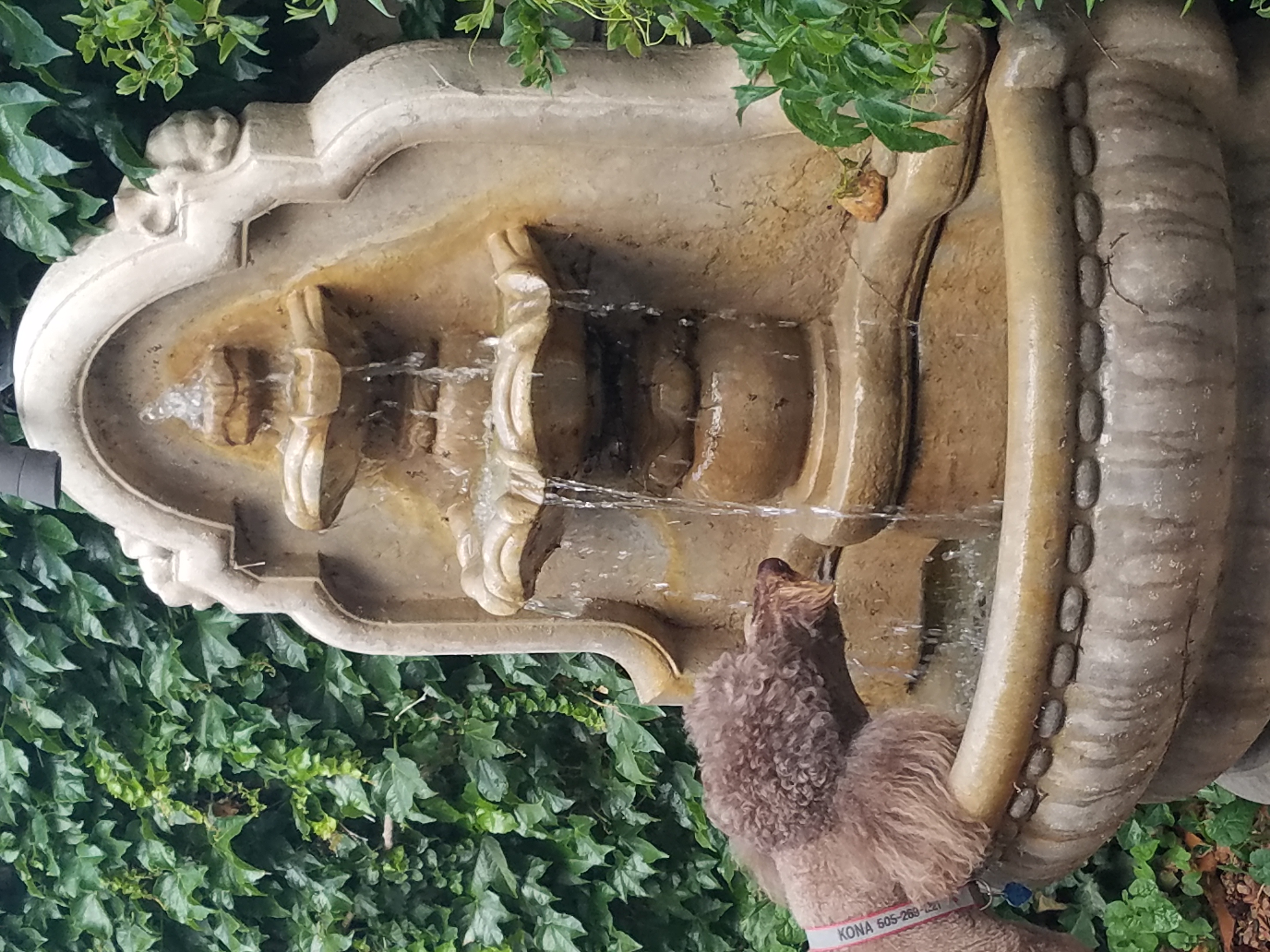
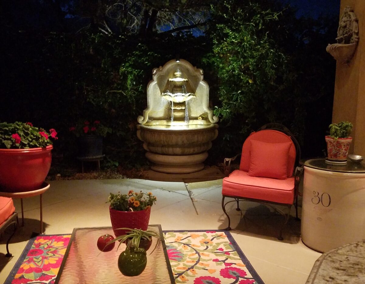
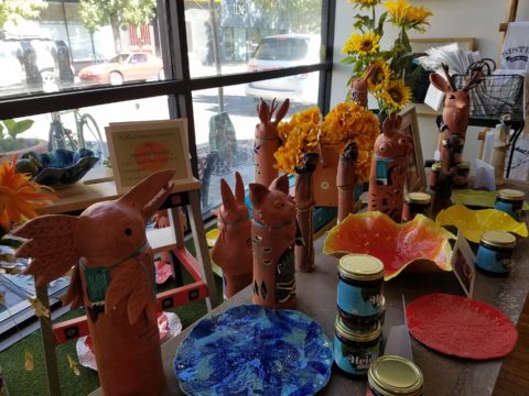
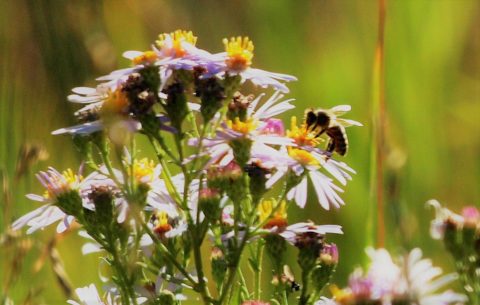
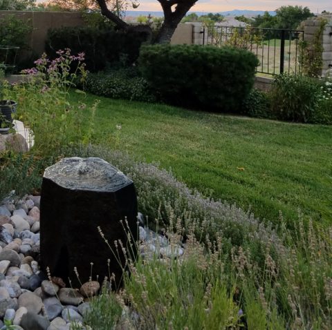
The serene sound of a fountain can provide mesmerizing relaxation. Like white noise, but better. Close your eyes, in close proximity to a little fountain, and be lulled into a wonderful respite zone. Even indoors, this is an effective relaxation element…outside the birds and breeze contribute to the joy. 

Pets reap benefits too! Kona gets a refreshing sip from the fountain!!!
At night, that same fountain offers gentle water sounds and an interesting sculptural effect.

Social distancing and isolation – these two popular terms that have defined so much of our daily living in the last several months and imparted a negative connotation. They paint a picture of living more at home – alone and even “out-of-touch” – literally.  All of my childhood I heard the phrase “ne touche pas!” My uncle’s favorite, for sure! And now I hear it in my mind all the time. Don’t touch the shopping cart, door handle, people’s hands, “ne touche pas!” and if you do – wash and sanitize to a fare-thee-well!

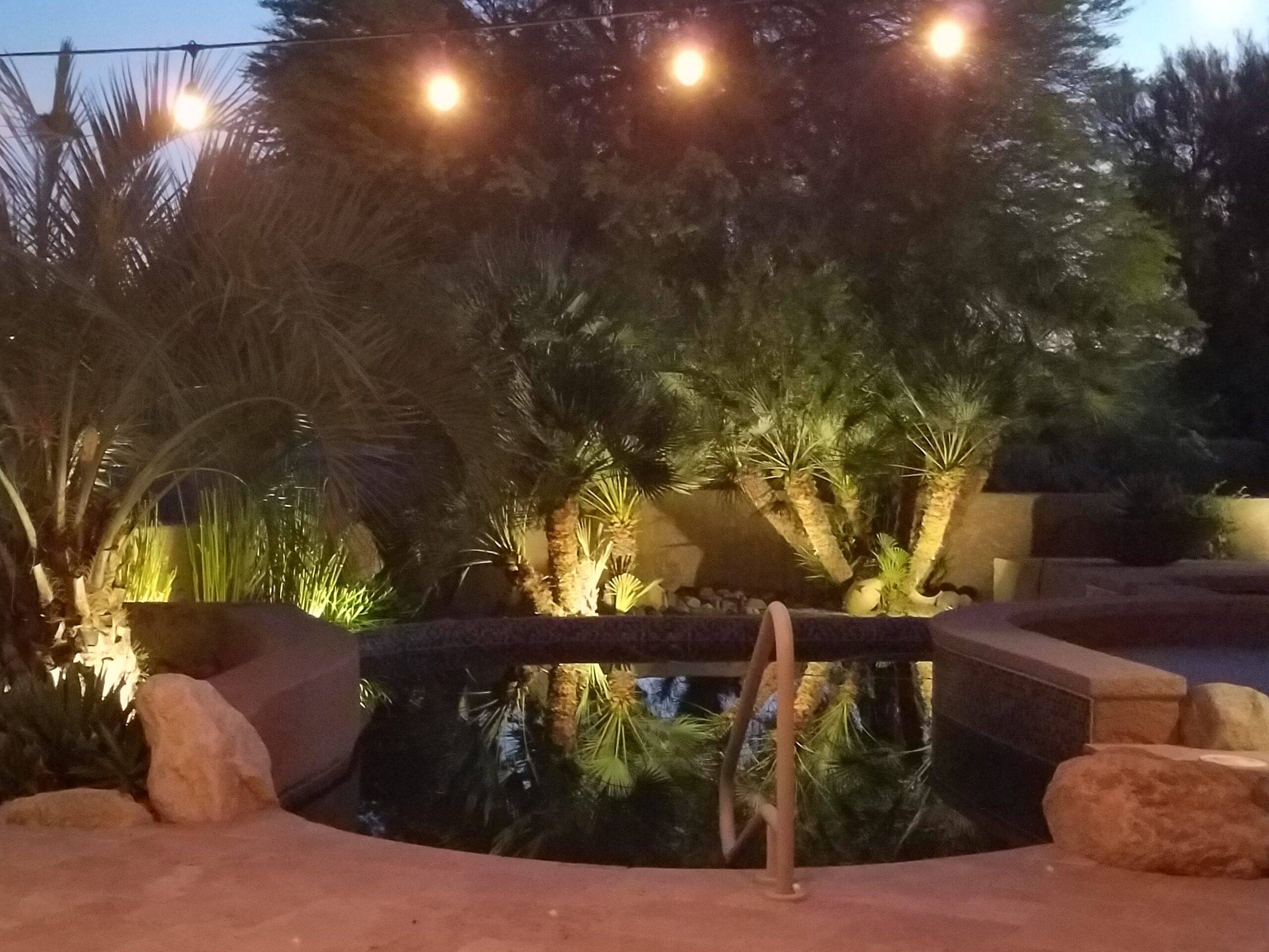
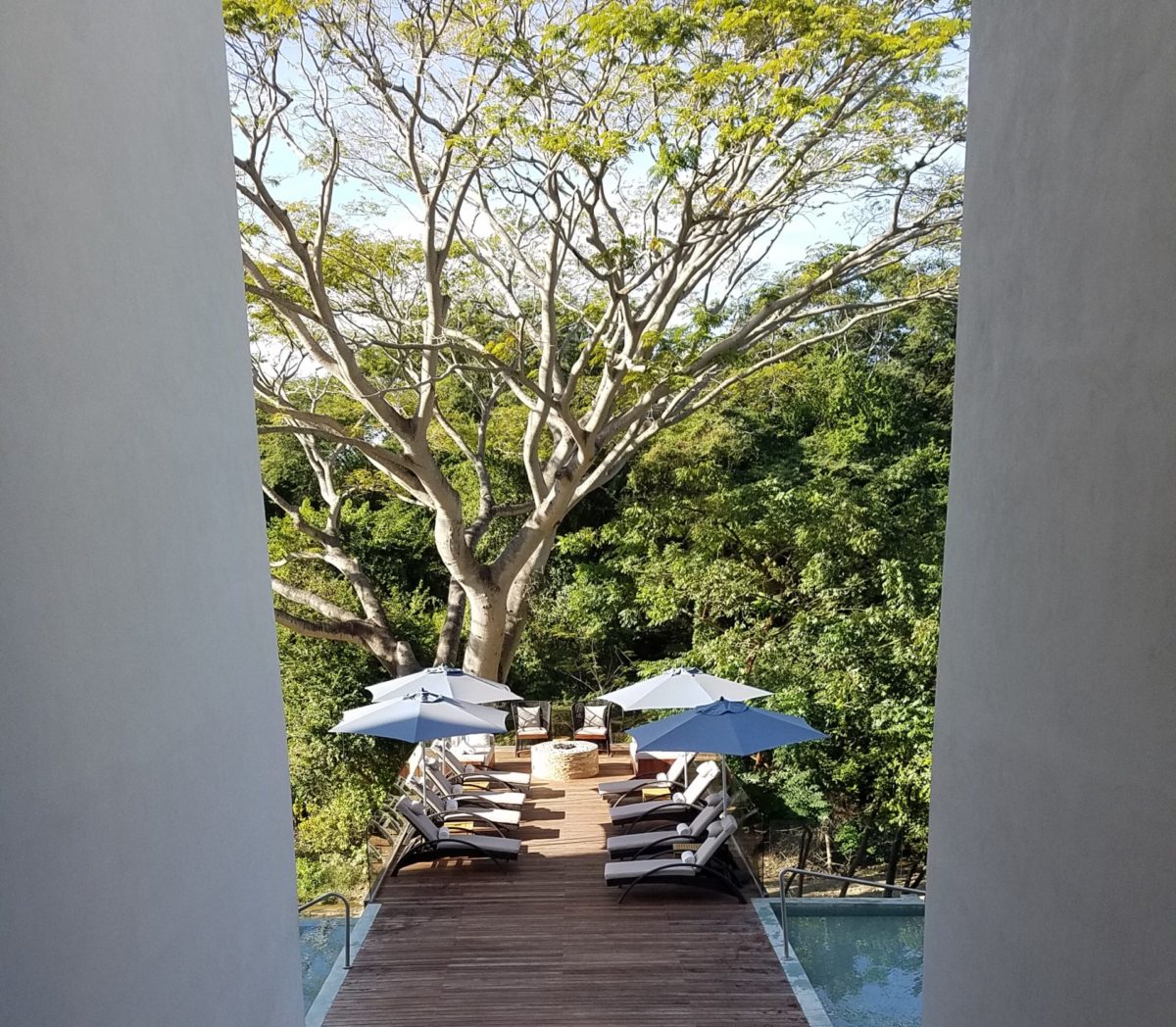
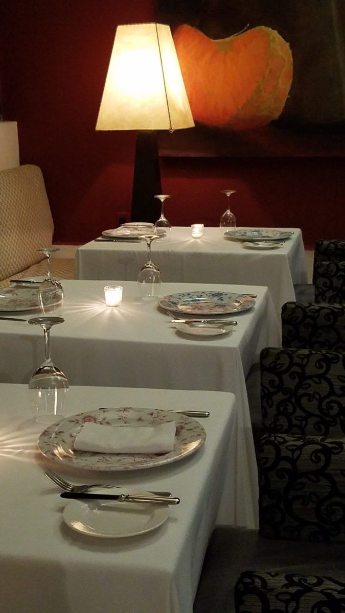
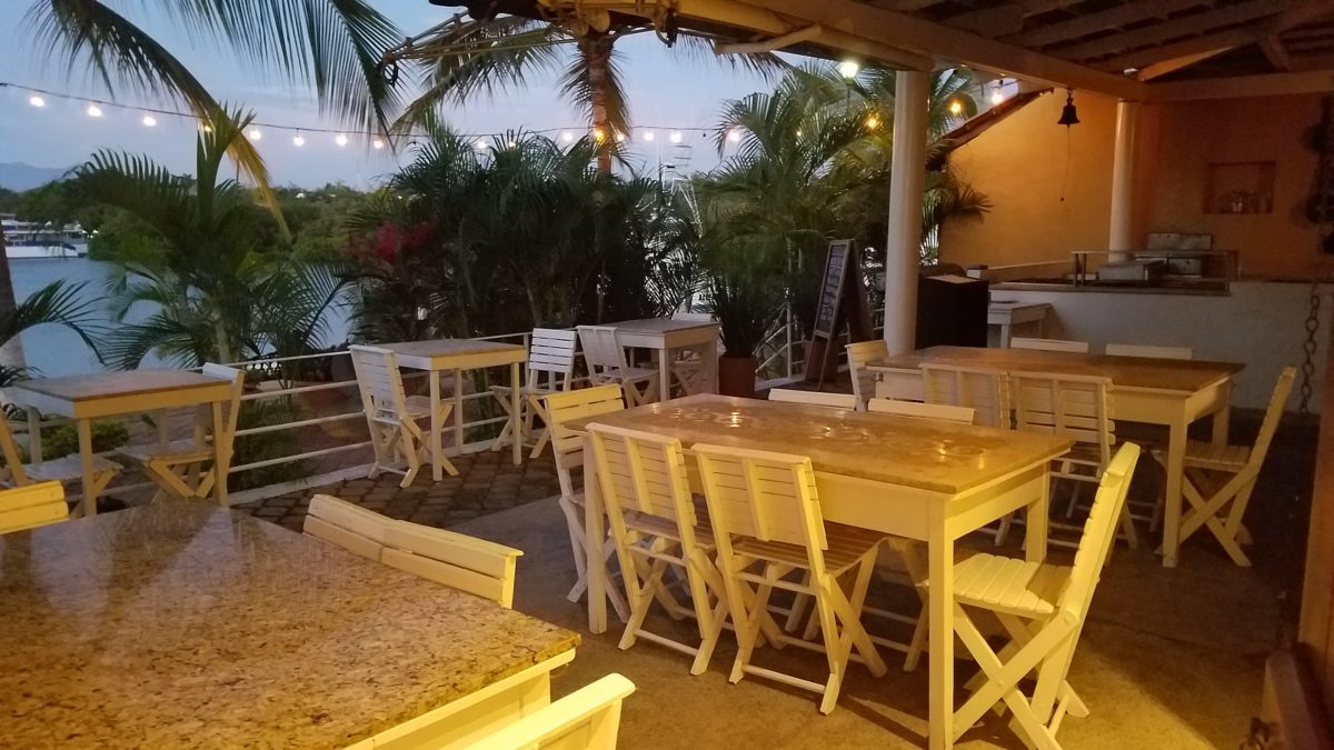
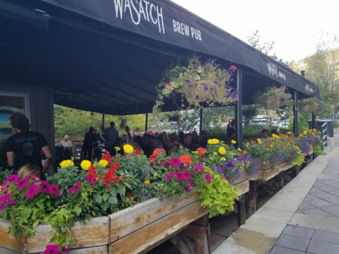
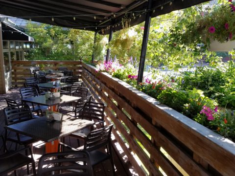
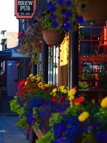
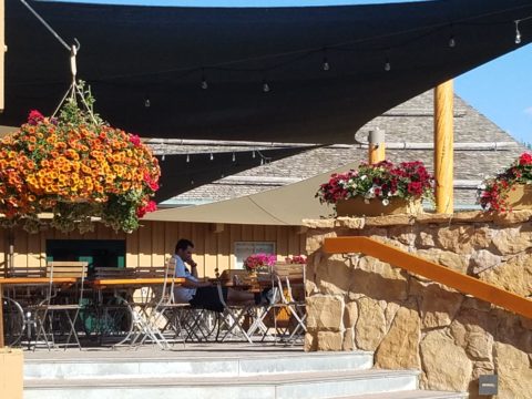
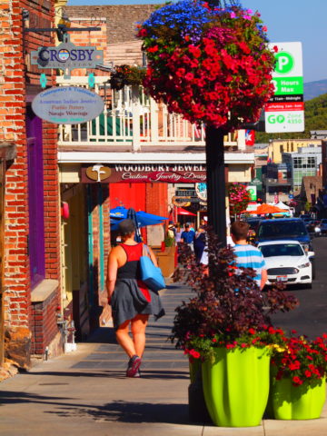
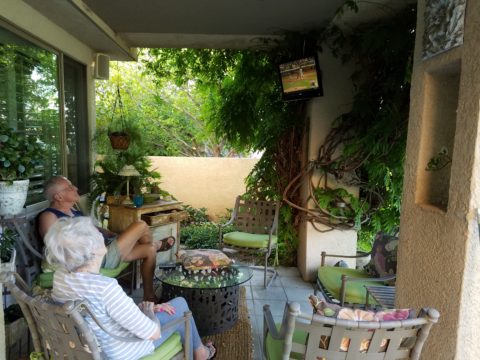
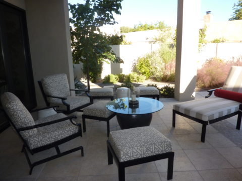
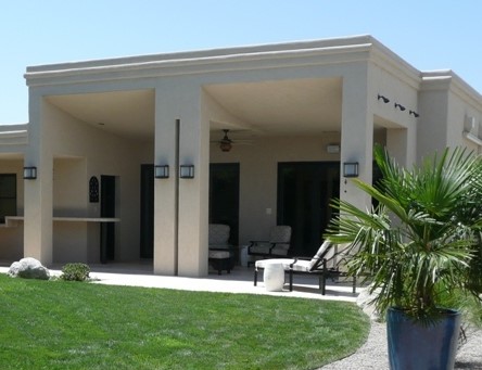
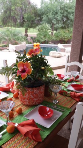
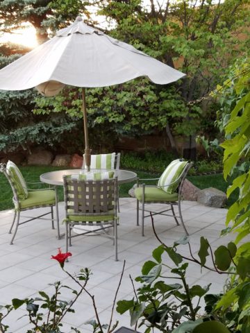
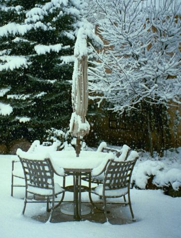
Yet, on a positive note, this stay safe – be safe – living at home has spawned creativity to maximize that environment and relieve stress. It means, more than ever, expanding your outdoor options from placing a pair of chairs and tiny table on a previously unused, diminutive urban balcony or adding a palatial pool in your backyard…there are many options in-between depending on your circumstances and means. 

Our cousin in Tucson has created a lagoon effect with the dark bottom and mosaic trim. an oasis in the desert.

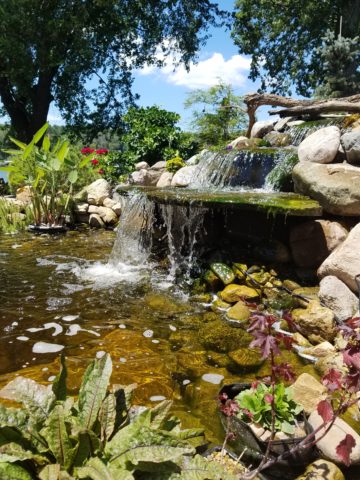
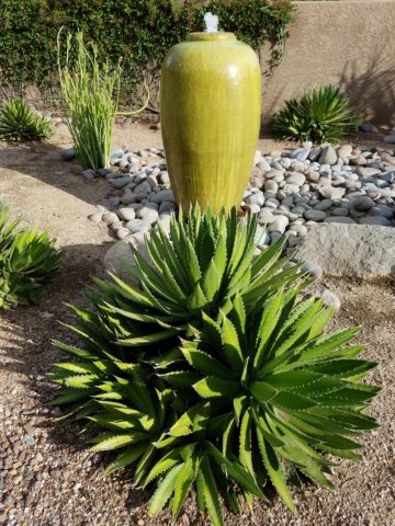
Water features are an amazingly therapeutic design element. Water suggests cleansing. It is refreshing and renewing. Water has promise. It can also suggest escape.

The Calgon add campaign of decades ago resonates today for those of us who remember…”Calgon, take me away…Lose yourself in luxury” The escape and indulgence of a relaxing soak in a tub. The gentle buoyancy relieves tension and encourages rest. It often suggests leisure. It is a luxurious, pampering exercise.

 https://www.youtube.com/watch?v=8yjGPgs0_S0  Here is a video from the 70s to take you back to “Take me away…” Come back Calgon!!! We miss your commercials now more than ever!!!

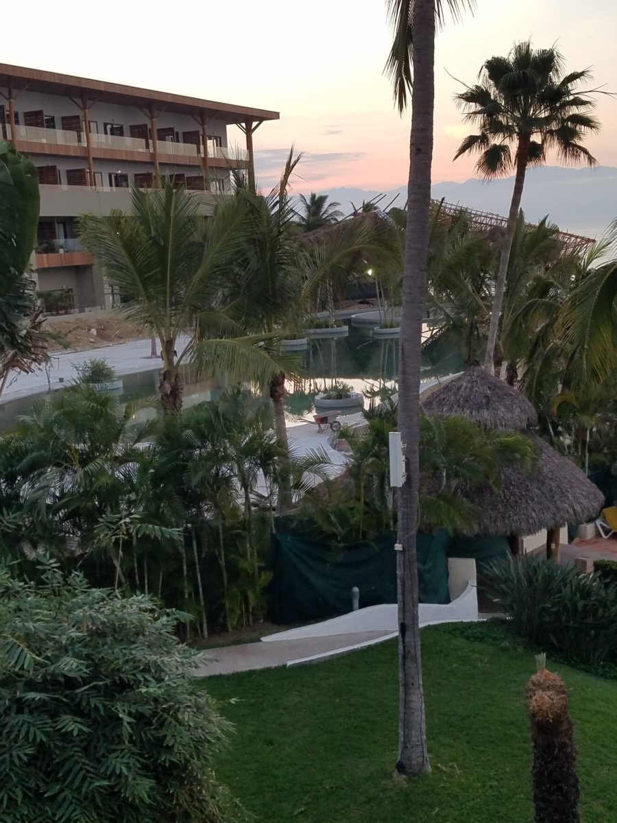
Taking that refreshing water scene outdoors is one of the most popular design projects trending today. From DIY to major construction people are discovering ways to escape without leaving home. Water features provide virtual escapes and actual refreshment for many people seeking that added dimension, diversion and sought-after pleasure in their lives.

A friend in Phoenix has tricked out her pool with fabulous landscaping, spectacular iridescent glass tiles and LED lighting – the luminous colors an be changed with her mood!!!!

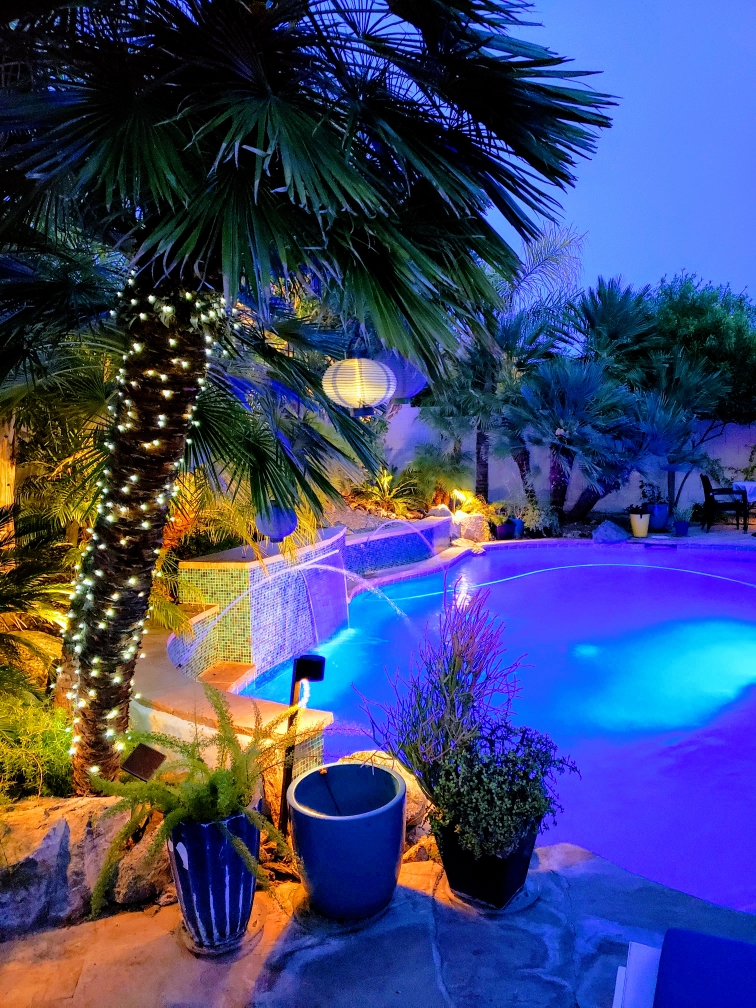
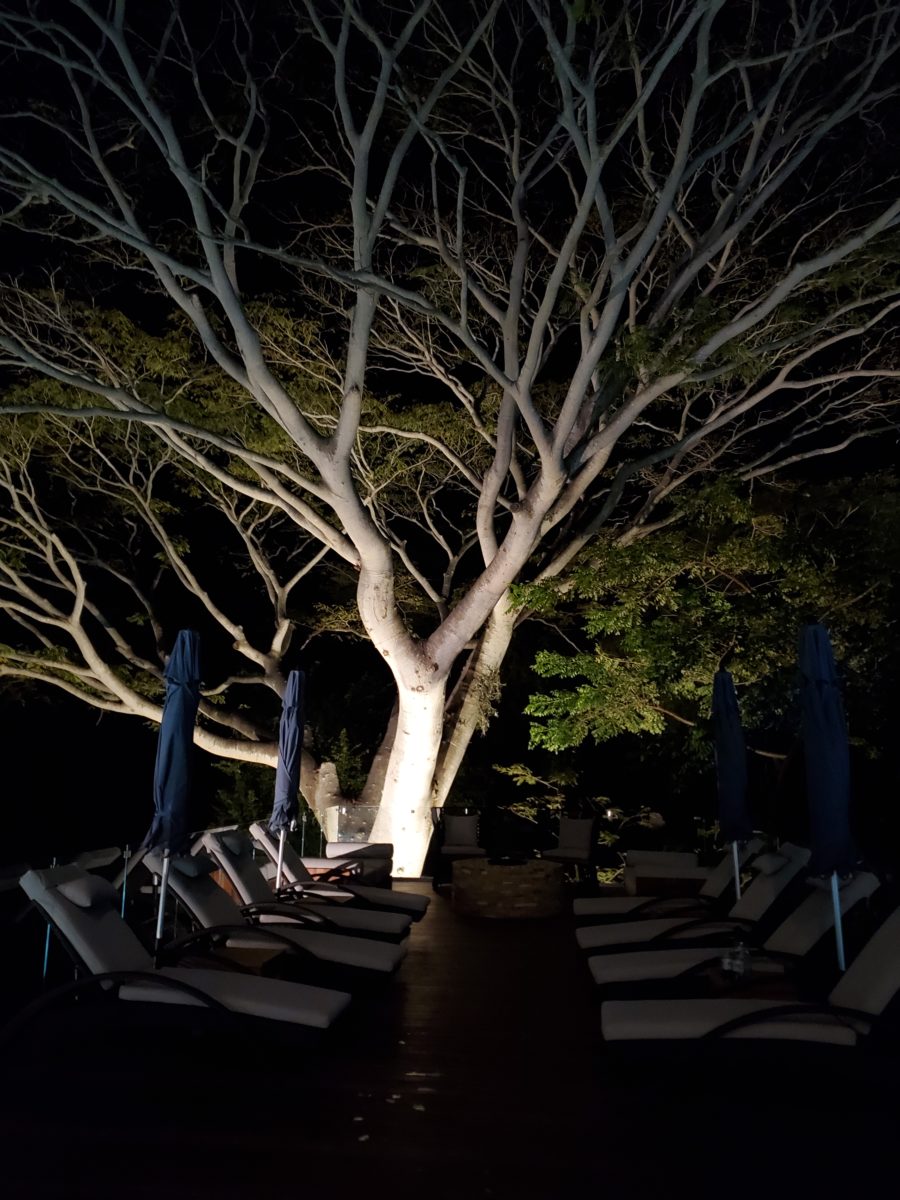
Swimming pools, a gorgeous grotto, lap lane, all afford the luxury of submersion and even exercise.

We’re speaking with Diamond Spas of Longmont, Colorado this week on behalf of a client who is interested in a partially above ground swim spa!! https://www.diamondspas.com/swimming-pool-spa-collection/custom-pools/stainless-steel-swimming-pools/

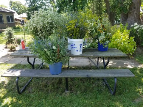
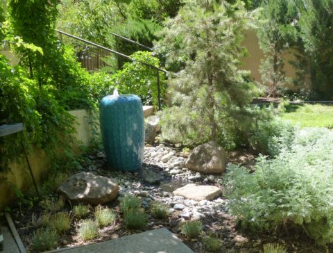
The sound of a small water feature to a creek-like landscape addition in your yard – the projects are many. This DIY guy created what he fondly calls “Covid Creek” – a project that took several weeks of focused creativity and back-breaking work all prompted by being stuck at home. The results are a magical mountain stream flowing beneath the trees in their modest-sized backyard. A creek-like water feature or pond can offer a respite to sit beside, dangle your toes and imagine scene far from the confines of our limited environs. You would be amazed at what beautiful illusions can be accomplished!!!

A babbling backyard book built as a therapeutic DIY project during the COVID confinement.

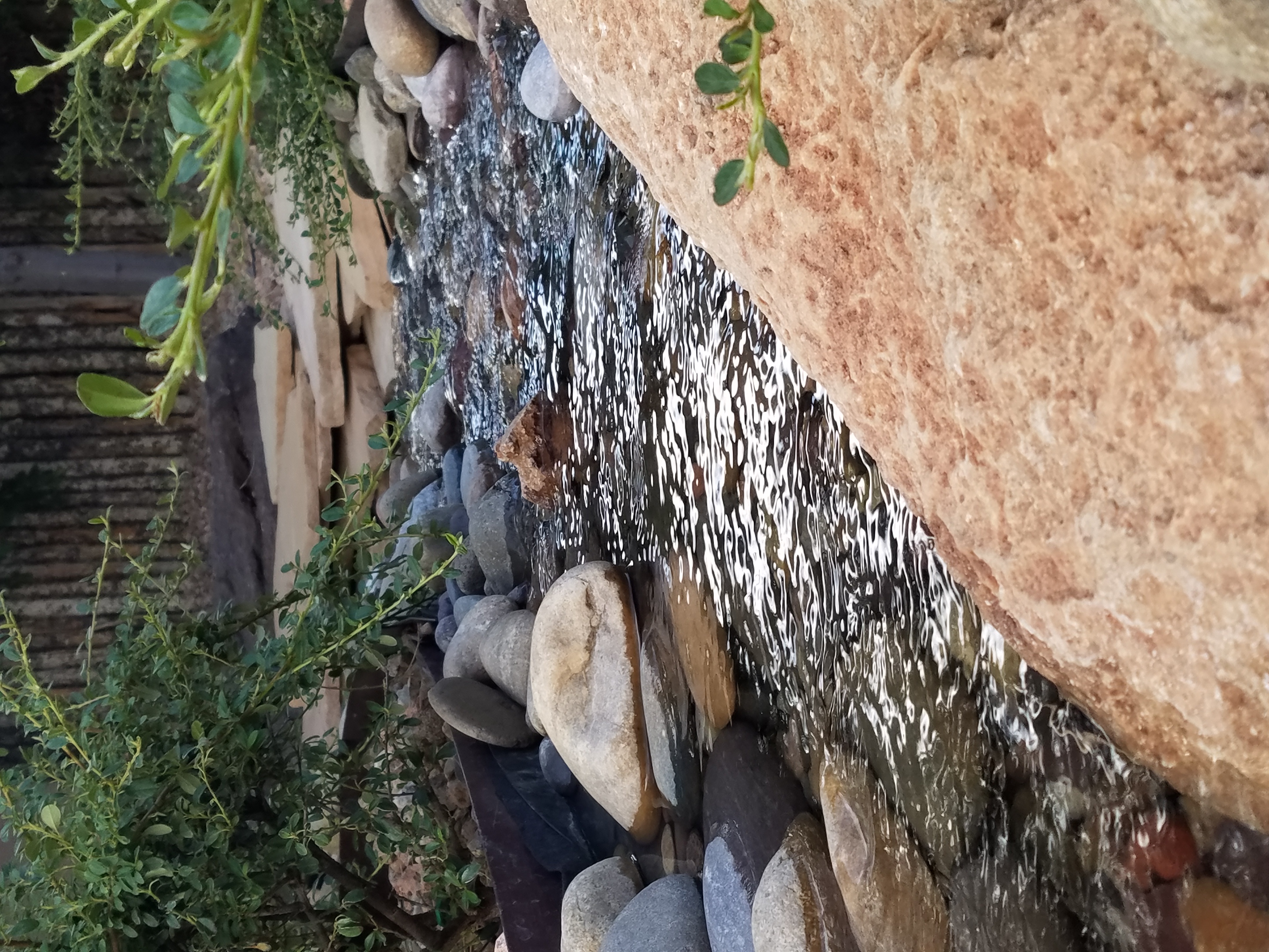
Such multi-sensory water features offering the touch and feel of water, gentle sound and visual beauty are powerful design elements to exercise the senses. Our senses suffer with redundant stimulation.  The reclusive limitations of recent months have us stagnating with sameness.  It’s the variety if stimuli we are so accustomed to experiencing that keeps things interesting and alive. Moving water is one of these exceptional sensory stimulations. 

Organic garden sculptures – chiseled granite boulders with re-circulating water – meld with the landscaping.

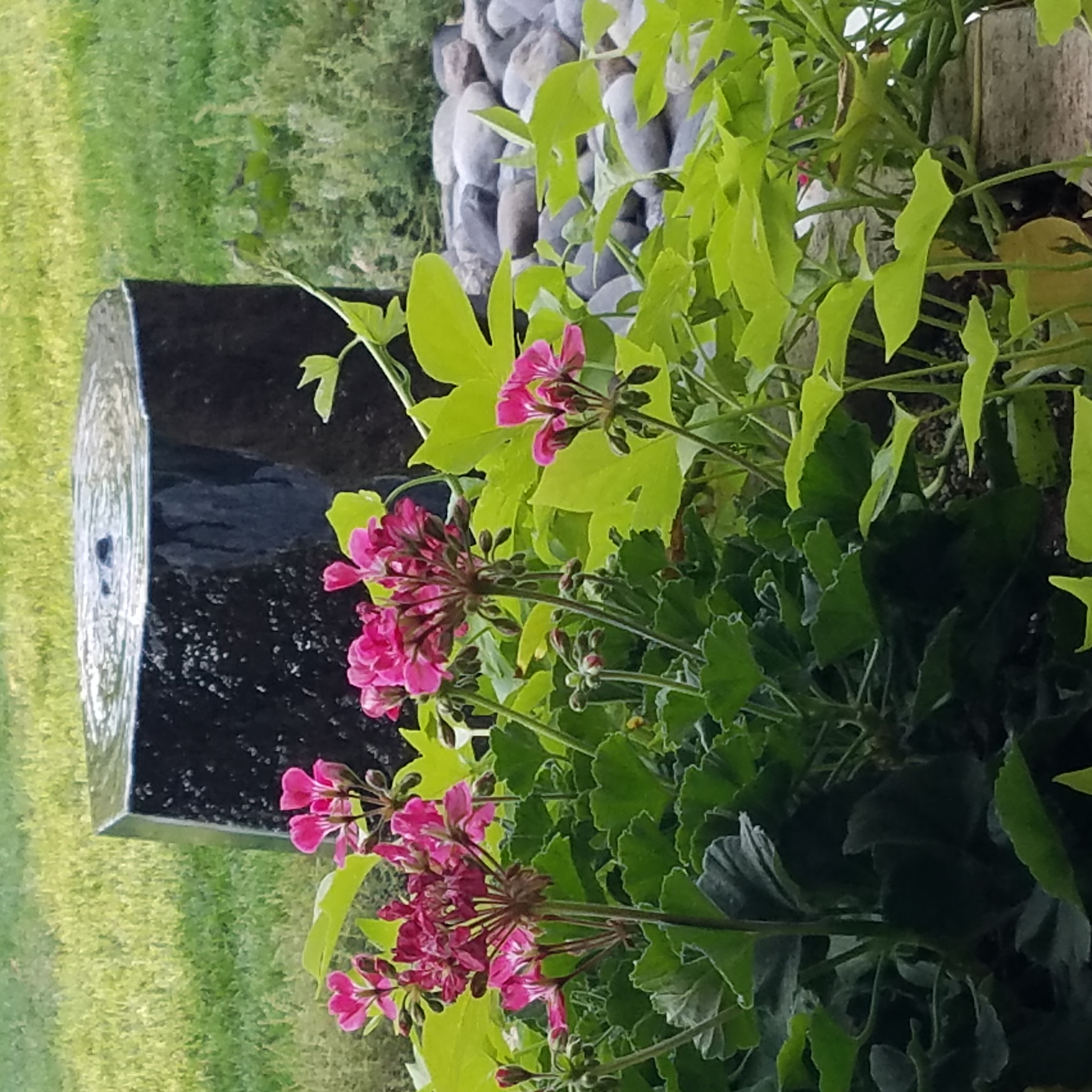
Whether a tiny fountain or in-ground pool…even a galvanized livestock tub – investigate your options. Regard your environment and study your spaces to select the best design elements for your setting. 

Nature’s Design Elements

Neighborhood covenants, zoning, physical practicality, budgetary constraints…all enter into whether it is realistic or desirable to save vegetation when clearing land for development. Carving around existing  growth can be a tedious and costly addition to a project. But there are times when it is a design asset – an imperative even – to the over-all setting and effect of the scene.

Saving trees when designing a built environment is a challenge that often pays off.

A spectacular backdrop to this seating area – the decades old tree is the focal point.
At night – well lit – the same tree towers with dramatic illumination in the darkness as the rear “wall” of this seating area.

Raping acres of woods for barren subdivisions and adding back newly planted saplings the caliper of a quarter is unfortunate and takes years to satisfy. FHA requirements were the tell-tale token of bringing green back after a bulldozer’s brutal removal of all plant-life on a property. That lanky stick standing in the center of a dirt patch, that might get sod or seed…or rock, was a pitiful attempt to give back to the environment.  However, in addition to broad-sweeping examples, individual decisions to saver rather than remove can prove valuable.

Years ago, when planning a patio expansion and exterior kitchen, friends brought the plans to me for a quick check before committing to the design from the design/build contractors that they had engaged. The new patio plan meandered along nearly the entire back facade of the house.  With all the exciting kitchen layout and bar, seating areas and dining space, I instantly focused on the fact that their beautiful red-bud tree was gone – not in evidence on the pans!  I exclaimed about it and was told that they were told it had to go. That was about 10 years ago – or more, yet it still stands today having modified the design to include a tree-well in the patio and opening in the proposed high-ceiling patio cover.  The stunning multi-truck tree thrives, in the ground as it had for decades, and climbs skyward through the opening spreading widely toward the second story of the home. A wonderful, living, sculptural element, in the space. Good save!

Warmer climates invite the indoor/outdoor melding of living spaces. We all try to achieve them despite bitter cold transitions and near, if not complete shut-downs “off-season.” But in the tropics, outdoor living spaces become remarkable dimensions to expand living.

Sculptural trees are powerful elements viewed from inside and outside.

This past week, that situation came to mind as I enjoyed several examples of incorporating nature into the design scheme. Yes, landscape design is just that. Landscape architects do just that. They design exterior spaces with organic material. But what I was feeling recently was two complimentary things – one that designing in and around existing growth is so satisfying and in some cases, the living plant material becomes the architecture – not merely compliments it.

In addition to their sculptural beauty, they add balance, scale and a canopy over the exterior rooms.

This past couple of weeks, we have see the results of 2 years of preparation and construction which transformed of a piece of partially vacant land into a seaside resort. Several key palms and a couple other key trees  were saved and hundreds more were brought to the site to complete the design. The towering new trees showed signs of shock with their dried frond tips  – but will surely survive.

What has been a foreground of some landscaping and virgin jungle ,with houses beyond, was bladed and terraced last year in preparation for a new project.
Buildings and pools appeared, jungle growth was removed and a few key organic elements retained.
The recently finished scene is dramatically different – incorporating specimen trees throughout the property into the new plan.

When landscaping becomes architecture you know you have crossed an exciting line. What I mean by that is to have the growth become walls – to have the vegetation read as though structural framework.

This terraced dining patio is framed by massive bamboo and other large trees and plantings. They are substantial enough to read like screens, if not walls, framing the space.
From a canopy of growth, strings of LED lights are suspended as though from the ceiling – a ceiling of branches over this enchanting outside dining venue.

A tree house is another example. The tree is the structure – the framework to begin the additional elements that create a suspended room.

This entertaining and imagination-spurring book by Philip Jodidio is worth investigation. Here. find extraordinary examples of trees as the structure of other amazingly fanciful spaces!

By observing examples in your world, you will see, when designing around and in concert with the natural landscaping, the effects can be dramatic and of great value to the scene. On your next project, consider the possibilities of saving rather than removing – incorporating and celebrating nature’s design elements!

The Wealth of Art That is Our Elegant Library of Congress

If the Basilica in my last blog didn’t get your juices flowing about incredible public art spaces, the Library of Congress was our next stop. Yes, it houses nearly everything having to do with writing, recording, documenting…but the building itself is amazing! It in itself is a wealth of artistic detailing. The interior has more gold leaf – not gold paint – but hammered metal gold leaf – than any other building in our Nation’s Capital. Inside and out, the craftsmanship of the stone carvings and architectural embellishments is magnificent. This inestimable landmark is so much more than the sober name suggests.

We parked in the garage of Union Station and walked the few blocks past the Supreme Court and the Capitol Building to our destination of the Library of Congress. The brilliant blue skies behind the bright white edifices belied what some regarded as the oppressive heat. I however am a heat freak – it’s summer – bring it on!

Columbus Fountain at Union Station also known as the Columbus Memorial is a public artwork by American sculptor  Lorado Taft, located serves as a tribute to the explorer Christopher Columbus.
The Supreme Court – cool, brilliant white against a striking blue sky – at 100 °
Crouching to get a shot of our Nation’s Capitol Building.

Symbolism is executed with every inch of the design details both inside and out of the imposing Library of Congress. Ascending the exterior stairs sets the stage for arriving at a monument of immeasurable wealth of human dissertation and history. Here I can only touch on the tip of the iceberg…

Picnic tables out front at our Library of Congress…relax, grab and bite and read a bit before going back to work!!!

From an inauspicious beginning of modest expectations to greater expanses with devastating fiery catastrophes in between, the Library of Congress has an amazing story. Thomas Jefferson played a significant role in re-building the foundation of what we now have today.

While waiting for the tour to begin in the magnificent Thomas Jefferson building, we were directed to two remarkably entertaining exhibits on the lower level – a Gershwin gathering and a Hope homage.

The George and Ira Gershwin Room is a tribute to the two brothers and their contribution to American music. This nostalgic and very familiar subject matter makes you hum and tap your toes. The exhibit presents George’s piano and custom-designed writing desk, Ira’s table and typewriter, self portraits and myriad documents that trace their lives and amazing careers.

The Hope for America Exhibit focuses on the varied careers of Bob Hope along with other recognizable entertainers. The exhibit offers the satirical humor – crossing party lines – both socially and politically for which Hope was so appreciated, admired and beloved. Hope received the U.S. Congressional Medal of Honor and the Presidential Medal of Freedom for his commitment, in his nearly 50 year service, entertaining the men and women of the armed forces abroad.

As the actual tour began, we were introduced with a short film as an overview of what was to come. We were then guided up a staircase and gathered in what was a most astonishingly beautiful, expansive space full of piercing, daylight, sunbeams glancing off incredibly detailed architectural stone carving and sculpture. Vast murals, vaults and arches in the 360 degrees of beauty from floor to voluminous ceiling was staggering.

” Founded in 1800, the Library of Congress is the nation’s oldest federal cultural institution. The Library seeks to spark the imagination and creativity and to further human understanding and wisdom by providing access to knowledge through its magnificent collections, programs and exhibitions.” Thomas Jefferson stepped-in to save the Library of Congress after a few inauspicious starts.  Not enough time devoted here to a history lesson – learn more at https://www.loc.gov/  –   but this grand space into which we entered is the Thomas Jefferson Building.

The focus of this blog is to share a bit of the art and decorative embellishments of this stunning architectural environment – beginning with the Commemorative Arch by Olin L. Warner (1844-1896) featuring a young man to the left and a bearded elder man on the right signifying that the process of learning never ceases…

Grand staircases on opposing sides of the space are adorned with carvings of “putti” – Italian for little boys – as they are pictured representing various occupations from gardeners to astronomers – the depiction of each vocation is fascinating with what it means to have that respective knowledge to pursue one’s career path.

Beneath the string of putti are representations of the 4 corners of the globe depicting figures of each, Asia paired with Europe and American paired with Africa.

Minerva, the Roman Goddess of Learning and Wisdom is aptly featured in a series of statues and images.

Most fascinating to me, up in an adjacent domed ceiling area was the “Evolution of the Written Word,” a series of lunettes by John White Alexander (1856-11915). Having previously written about the importance of handwriting for a million reasons that go beyond, but are directly connected to, this depicted evolution, I found this to be simple, yet profound. It is a beautifully rendered and fascinatingly distilled artistic expression of a very significant timeline. Beginning with The Cairn – we see them stacked stones on beaches for fun and on paths in the wilderness as markers, but here Alexander renders primitive man communicating by stacking stones to possibly mark the dead, a passage or a place of significance. 

As the history progresses, Oral Tradition becomes the means of communication – but only/obviously in personal contact. Words are created. Then Egyptian Hieroglyphics enter the scene with images representing words depicted on surfaces.

Picture Writing on animal skin – and ultimately more refined to vellum – becomes a more mobile means of communication.

Theologians recording ancient stories of biblical history brought monks to the art of the written word in compilations of the Bible as the first manuscripts/books became recorded.

And then an exponential leap in communication came with the invention of John Gutenberg ca. 1400-1468 of the Printing Press! Asia had its versions of printing machines even before Gutenberg, but inspired by seeing grapes at harvests being “pressed,” he put that concept into the process of placing individual letters in place and pressing them onto paper. Western Europe then had a movable metal type process that increased productivity of printed material – printing the first ……in Western Europe. The tour guide sadly explained to us that Gutenberg died a pauper as his investors, not patient with economic fluctuations, excused him from his rightful place in the business and left him to live out his life only to receive proper recognition posthumously.

It is the first complete book extant in the West and is also the earliest to be printed from movable type. This rare version is printed on vellum.

Unfortunately, at this point in the tour, we had to excuse ourselves with a quick wave and thanks to our guide as we were departing later that afternoon. Before leaving the building though, we dashed upstairs to discover the main Reading Room – entering from a way upper tier, we had a bird’s-eye view of this grand space. The scale was daunting and the spectacular architectural detail was breath-taking. The WOW-factor was palpable!

The Reading Room.

Eight giant marble columns each support 10-foot-high allegorical female figures in plaster representing characteristic features of civilized life and thought: Religion, Commerce, History, Art, Philosophy, Poetry, Law and Science.

Layer upon layer of intricate, symbolic details.

The 16 bronze statues upon the balustrades of the galleries are a tribute to men whose lives symbolized the thought and activity represented by the plaster statues.

Shhhhhhhhh……it’s the Reading Room

And with that – we only had enough experience and education about this incredible resource and monument of artistic beauty to whet our appetite for more and surely lure us there again for more information about all that comprises this amazing public gift and resource.  

Ta Da!!! Seriously – standing there in awe…taken with my phone!

There are so many wonderful things to see and do – get out there and see it!!!

Animating Interiors – for Fun!

The total sum of an interior…comprised of the shape and volume of a space, the colors and textures, architectural details…then layer the lighting, furnishings and decorative accessories and ta-da! But is that all there is?

The beauty and intrigue of interiors is what keeps us discovering and creating. Yes, finding intimate pockets or grand expanses that please and dazzle.

The romance of this setting caught my eye…the far table by the window – set for two seemed a likely scene for a tete e tete to take place!

While traveling in the tropics these last few weeks, I discovered many interesting places. Oddly, while experiencing all the sights and sounds flavors and colors of this paradise, I immersed myself in the unlikely and completely opposite world of early 20th century Russia with A Gentleman in Moscow.

Just for fun, I sat with Federico Leon de la Vega today as he did 4 – minute sketches of some of my photos…needless to say, proper illustrations would have proved more telling of my romanticizing the talents of artists conveying imaginary activities in interiors…but it was fun to play with this today!

The beautifully and artistically articulate writing style of Amor Towles held me captive. And what a dichotomy to play ping-pong with my brain as I digest the restricted realm of Count Alexander Ilyich Rostov while basking in the warm sunshine with fresh sea air and palms rustling overhead…It seems that the extremes of this pairing suited me well as it was a dual escape – a vacation getaway while taking me further into fantasy with another dimensional experience of this incredibly great read!

Although there were many fascinating observations made by the author, it was this passage regarding the Count encountering a young artist/architect that prompted this subject for this week’s blog. The architect, finding himself in Moscow in the post Czar age of socialistic experimentation and implementation, bemoans the lack of work “The way things stand, I’d be happy to design a birdhouse.”

“The way things stand, I would be happy to design a birdhouse!” Sketch by PH

The mayor of Moscow has made an observation espousing the birth of  “the golden age of the prefabrication, cement-walled, five-story apartment building”  – with the very practical  “four-hundred-square-foot living spaces with ready access to communal bathrooms boasting four-foot tubs (after all. who has time to lie down in a bath when your neighbors are knocking at the door).” The mayor further emphasizes and rationalizes “So let us not get bogged down with elaborate designs or bow to aesthetic vanities. Let us apply ourselves instead to a universal ideal that is  fitting for our times.” A horribly inhuman decree in my opinion, rather than a should-be, truly magnanimous spirit. Humans are designed to design!!

The sentiments of the new regime left the architect with having to find avenues to utilize his talents – specifically sketching as he set forth to illustrate a brochure of the city’s finest hotels as retained by the Intourist department. How sad to possess the talent and passion and be reduced to capturing the grandeur without having the opportunity to design??!!

So three things struck me about this situation…one – that the artist was practicing only a portion of his talents and not the true, complete creativity that beckoned him to pursue his career…two – that renderings not only offer the opportunity to preview the proposed design of a space, but they can use artistic license to animate the space for its intended function and three – that spaces are not truly realized until they are filled with the people that are intended to occupy them.

So much so is a room not really finished until it is occupied by the inhabitants for whom it was intended to function, but Towles observes through the renewed appreciation by his architect, “I suppose a room is the summation of all that has happened inside it.” And that is what I enjoyed being revealed as a result of this simple exchange in this one of many experiences in this remarkable storyline .

Humans are designed to design. Rooms are intended to perform a function. They cannot function until they are animated with whatever they were intended to serve. Sketches allow the preview. Sketches are more spontaneous and artfully creative than computer generated versions of the same. Celebrate beauty, creativity and artists!

WHITE by Design…

With all the New Year buzz about the new color forecasts…I started taking notice of the seeming non-color, white. It is often considered the absence of color when in fact it is a very complex color of many shades and values. Just try to select a white and you will know what I mean.

When you look at white paint samples, you will notice the nuances. There are pink whites and blue white, grey whites and yellow whites. Each white is off-set and contrasting to another. You see the differences by comparison and by context. You think you have just the right white until you place it against another sample and see that it is grey or cream and then second guess yourself again…and again…How do you know which white is right?

Dunn Edwards groups their whites and pastels in a separate section of their fan deck as do other paint companies. What is interesting here is that the background is a sheet of white copy paper. Notice how is reads against the colors in the samples…it seems to be a purple blue color. This shot was taken under a full-spectrum LED lamp. The colors should be true. The range of “white” is amazing.

To intentionally design with white is bold. To have the confidence, to decide that white IS the color and that white IS the scheme, is challenging. To effectively design with white, you not only have to select the right white(s), but you have to know just how much of anything else might be effective yet not detract.

Le Leche in Puerto Vallarta is a fabulous example of designing exclusively with white. Only with minimal punctuation with black lettering on the wall of containers and also by allowing shadows is the white interrupted. But the blacks’ minor interruptions gives depth and fine detail.

White design can be cold or warm. Depending upon the desired effect, mood or function of the space, the whites need to be carefully selected. This is true with lighting as well. Warm whites or cool whites…what gives you the desired result?

Popular white string lights add festivity and a warm glow to an evening scene.
See how many lighting colors you can identify in this scene…Starting on the left, a cool pocket glows through the underbrush. The walkway has a warm pink-ish light. The very cool blues of the pool area give a dramatic read. A bold yellow accent peeks from the far left and also over on the right. The palm trees are wrapped in a warm white tube lights while the far right side illuminates the entry to the dining palapa with a cool white light source. The foam of the surf on the beach is captured with a cool white spotlight that maintains its naturally expected white color.

Knowing when to add color to a white scene to achieve an intentional POP is an art. The color itself, the amount and placement is all part of the success of a good design result. From the fine black detailing in the previous shot of La Leche to this still-life composition of a tropical cocktail that I propped the other day, the minimal punctuation of color is key.

White mosaic shards of tile in the background of this composition featuring a peeled coconut and the POP of a pretty pink party umbrella result in a white-on white scene. Yes, this shot says PARTY with a perky smile!

The bench which served as the backdrop for the coconut cocktail is a dramatic serpentine sculpture of site furniture that plays with the white-on-white of the tile and grout.

Contrasting against the organic wood decking, this white monolithic bench snakes around the periphery of this outdoor lounge area. The sunset is casting a soft pink wash over the all white glazed tile.

Beach settings using white materials compliment the white sand and greenery of the tropical plants. From wood frame platform cabanas to the sprinkling of umbrellas, white is a wonderful, fresh color for a crisp clean scene.

Whites on whites…creamy sand colors to crisp white terrycloth, the white-on-white scheme is soft, inviting and clean.
Greenery compliments the white umbrellas and sunning beds on the lawn by the beach.
Palm trunks and other fruit trees are often painted white to protect against insects and what insects insist on climbing the surface are easily spotted by birds who appreciate the help to capture a snack! In this case, they contribute to the white design theme.

The soft creamy off-white folds of fabric offer a soft, inviting scene.

Shadows in the creases and depths of the folds add the dimension to the luxurious feel of the cotton damask fabric.
White stucco is dappled by shadows and greenery while given a warm, strong base by the brick pavers. White as an architectural finish is only successful if the context compliments it. This is true in all design.

Architectural color and texture of surfaces is a moving target. A recent discussion about a white building with black detailing would not have proved right for this particular use of white. The hard, commercial read would have been too severe for the intended effect. Yet that same project, with a warm white and an ochre accent, will be just the right combination to achieve the desired result. Watch for this project to be featured in a few months.

Architectural surfaces incorporating tones and textures of white provide interesting opportunities

Block and crumbled edge accent bands on the facade of an exterior wall.

White in design is an exciting selection. Knowing how, when and why to use it is a test of your creativity. Picking the right white is the challenge.

The limitless colors of white found in a pile of gravel…..

So the next time you think white, think a lot about it. Study the context and what you are trying to accomplish. Feel freed by the fact that white is a color to express and enjoy.

Seasonal Shifts in Design – When Do YOU Make the Transitions Between Seasons?

I am often asked, “When should I make seasonal changes and how?” This can come from retailers debating their front window displays to individuals wondering when, to change the wreath on the front door and on into their interior decor, to reflect the seasons.

The answer is a combination of things. It’s personal – probably starting with where you live. And for me, it is more than just decorative accents, it’s food and drink and clothing for sure. Clothing though might have real, practical adjustments for temperature, but fashion design and seasonal changes are part of the fun!

So to kick-off fall, I shifted into my seasonal drinking modification  – dark drinks – moving from citrus embellishments to the delightful, succulent, marinated cherry at the bottom of a well crafted Manhattan. The perceived warmth of darker drinks is real for me. I would never select a Manhattan in the summer. But I must admit, a vodka martini with a twist is a 365 fall-back beverage for any festive situation.

The rich warmth of a well crafted Manhattan…

Clothing and the opportunity to make design statements that reflect the seasonal shift are also fun to embrace! Along with the Manhattan last Friday night, I transitioned into a felted wool tunic with a local artist’s hand-woven black chenille over-sized scarf. Still sleeveless – as the shift is still a bit of a struggle to let go of summer, it was a decidedly seasonal reality nod!

Truth be known, the wide expanse of floor to ceiling folding glass panel doors were wide open right behind us as we sat at the bar allowing a direct connection with the crowds gathered on the patio beneath the high-hat heaters. Truly a straddling of the seasonal shift – not quite ready to let go of al fresco dining???!!!

Seasonal shifts in weather will be a sure way to respond to a want to change decorative elements. And even being a bit pro-active can be a good thing – but when is too early – too early?

Most of us cringe when we hear Christmas music in October or see the merchandise out that early – combining Halloween costumes and candy corn with Christmas trees and all the ornaments. Awful!!!!!!

Across the country, we have experienced a delay in the autumnal shift this year. Summer kept clinging. Warm weather belied the calendar. But when the weather shifts…and the temperature drops…we want to hunker down and cozy up. Perhaps in addition to the decorative items, you might simmer cinnamon sticks on the stove or light candles with spicy scents. How about a hearty beef stew for dinner?

Here we are in mid-October and summer was here yesterday and gone today with the incoming storms, cool drizzle and cloudy skies.

I just got off the phone with Victoria up and over in Fairfield and she bemoaned the fact that last week she was attending classes in shorts and today she is bundled up in a Patagonia fleece jacket not wanting to leave her bed! The seasons have shifted like a slap in the face!

Color is a key element in expressing the seasons. Between summer and fall, golden yellows bridge the gap. Leaves on our red bud tree change from brilliant lime green of summer to brilliant lemon yellow as fall sets in…lime to lemon – a brilliant color statement!

From late summer sunflowers to early autumn chrysanthemums, the brilliant golden yellow satisfies the transition between seasons.

As fall proceeds, the darker tones of rust and caramels suggest the waning season…crunchy, dried leaves and final wisps of foliage going dormant for the winter.

I’m hanging my Black-eyed Susan wreath today out on the front door! I might even leap to the addition of a funky black cat that I have to welcome Halloween. But it has not been a gradual expression of acknowledging the change in seasons, it has been summer…bam – fall.

DIY – I made this and one for Mom a few years ago – they last. Get a grapevine wreath, select your favorite leaves, fruit and flowers, grab your glue gun and wire clippers – Voila!

What spurred this subject for this week’s blog was seeing my neighbor’s witch’s legs a few days ago sticking out from the elegant planter by her front door. I first thought – what a riot! Then I realized, it’s mid-October and I have yet to accept that!

I am very reluctant to release summer. I’m a warm weather one for sure. I cling to the last vestiges of sunlight as it tracks around out house…less evident, less accessible…shorter days…darker mornings and evenings… NO!!!!!!! I resist, but must succumb. There’s no escaping it. The seasons change and time marches on….The happy fuchsia and pink vinca in our front yard might not make it another day with night temperatures threatening to drop.

The happy pinks and greens of vinca out by the mailbox are about to get nipped!!!

Decorative accessories punctuate the landscape of autumnal interior design. From real pumpkins and gourds, squashes and mums, to their artificial counterparts made from many media. Glass and pottery, papier-mâché and straw-like wraps, silk flowers and faux fall leaves, the possibilities are endless.

This year some outstanding hand-built pottery figurines caught my eye. Artist Robyn Chlad of Tucson, Arizona has designed and created a collection of wonderful statuary luminarias that are an extraordinary design decree for this and all seasons! Kachina-like, these art-pieces make a fabulously functional statement!

This proud raven holds a berry in his beak!

At first I was attracted to their vertical shape and fine detailing. The characters had personality – rigid in their cylindrical forms, yet very animated of expression and fine features.

Chlad has depicted regional animals with a bit of folkloric whimsy (in the jackalope – half jack rabbit/half horned antelope) to  present a collection of irresistible characters to gather at your dining table, or greet you on your entry console, perk-up your powder room, collect on your cocktail table, grace your patio, or animate your kitchen!!! How fun are they?

A caped coyote – the masked bandit!

They each are pierced with designs, to allow the light to glow from inside, that depict the landscape or regional architecture in and around which these creatures roam. Illuminated by electrical lamps, battery bulbs, or candles, they are fantastic!


Functional art – these pottery luminarias are exciting art pieces to add a joyful glow to your shorter days and darker hours….

The raw terracotta clay contributes to their natural beauty and complimentary color with a fall palette.  It is a strong statement, yet the surfaces are smoothly burnished and have a soft read. The touches of matte glazes add just enough adornment enhancing the statues with soft earthen color accents.


Embrace the seasons and have fun selecting your personal design statements as you transform between seasons!!!

FLOWER POWER – A Marketing Imperative

While in Park City this weekend, I pondered what might the subject of this week’s story be. Dazzled by the smart presentation of this hidden little jewel of a town, I was continuously remarking about the fresh abundance of flowers, well maintained facades, manicured lawns and medians and the obviously collective appreciation for what draws patrons to want, if not need, to invest in property, art, clothing, home decor and food! Yes, need – it can become an imperative!

Here a restaurant has dressed their facade with brilliant red flowering boxes beneath the sidewalk window.

Oh – oops…do you think it might have been the Ferrari that was drawing attention?

Imagine your patrons being drawn into your establishment as an imperative – a must see, or must buy here, or must try this place, or must check out their wares, or must taste their food or drink their craft beer!

The patio of this brew pub is surrounded by fresh flowers in rustic wooden boxes.

Preparing to open for the day, this pub also has light strings to animate the patio at night.

You see this charming presentation potential in small resort communities and those who have cultivated their assets to the max, reap the benefits of their vision, smart development and on-going maintenance.

 Another brew pub sees value in an eye-catching floral frontage. Courtesy – Heather Harrell

The architecture is decidedly mountain themed, vintage 19th century colorful and textural, but interestingly punctuated by modern elements and fresh ideas. The practical pitched roofs, quaint scale, textural wood trim and detailing, all contribute to this charming scene.

Courtesy – Heather Harrell

To dismiss the value of flowers in marketing is to ignore the Flower Power!

Some places take a little more work to grow seasonal sprays of abundant color in pots, buckets,  bowls, barrels and boxes, but the effect of drawing people is undeniable.

 Courtesy – Heather Harrell

From Key West to Anchorage, the results are proven. Beauty, color, nature sells.

It’s a combination of color being a visual POP amidst concrete and brick, but it is also the positive life-affirming statement that it projects.

We know color in advertising is a draw and we know that anything that adds animation is a draw – flowers colorfully animate the street-scape and draw customers to them.

Here the passers-by are drawn to the menus posted in the window by the red geraniums that brilliantly are placed in planters in front of them.


Courtesy – Heather Harrell

They infuse the built environment with nature.


Like hummingbirds swiftly hone in on the finest blooms or like bees collecting pollen, we are drawn toward that which speaks visually from the surrounding foliage.


Courtesy – Heather Harrell

Texture is another element in this mix. We know that good design is about balance. Flowers balance the otherwise hard surfaces in their periphery. The finishes on a streetscape or sidewalk scene are generally, if not exclusively, hard. Flowers soften the surrounding surfaces and also balance the smooth and hard with random shape, texture, flexibility and even movement.

Whether a casual bar or fine dining restaurant, retail shop or any business wanting to attract and invite the public to them, flowers are an asset.

I feel about flowers similarly to how I feel about twinkling lights on a patio or in public trees. The advantage in the lights is that they can survive the frigid elements and make their statement in all seasons. Lesson here – once the plants are spent for the season, keep the lights on!!! Both elements are valuable draws and enhance the atmosphere of any establishment or environment. (Go back and notice how many photos have visible stringed lights in them!)

And if possible, plant those past-season pots with hearty pansies, ornamental kale or evergreen shrubs to keep the life calling from the sidewalks.

An art gallery has boxwood in steel vessels at the entrance.

A potted evergreen will add life to the paved surfaces when the flower season has passed.

And  for the sake of broadening the reach on this subject, to include not only the flowers and the mention of stringed lights, is the inclusion of creative signs, banners, flags, umbrellas and other elements that contribute to the festive nature that attracts peoples interest and draws them into your business.

Courtesy – Heather Harrell


Rooftop bar with flowers, flags and umbrellas – King Edward too!        Courtesy – Heather Harrell

Celebrate the the power of flowers!


Design Inspirations in the City Different

Do YOU know the way to Santa Fe, to play off of a song by another title? Up the hill and beneath a brilliant blue sky, the thunder clouds scatter with dramatic splendor. Past the cedar dotted landscape with punctuation of piñon the seasonal monsoonal green is blanketing the desert. A thrilling view passing swiftly, outside the window, like a series of paintings capturing  surreal scenes – always picturesque.

It’s July in The Land of Enchantment and a weekend getaway, in Santa Fe, promises stimulating design treats and artistic inspiration! Every visit is familiar – yet new. Around every corner, there is detail and color, decoration and un-selfconscious art.

Just when you think the Santa Fe market is saturated with myriad fabulous dining options, Paloma hits the ground running, on Guadalupe Street, to shake things up a bit!

The joy of experiencing the very new restaurant of an amazing friend was exhilarating! Marja Martin, la propietaria of this great new venue Paloma, brings limitless talent, outstanding vision and distinctive creativity to everything she touches.

The quite well-seeded Santa Fe dining scene is recipient of her newest endeavor. Already a well-established and well loved caterer, her artistic sensitivity and smart culinary concepts – that have been her signature – now result in a presentation of stunning unpretentious decor and exceptional  flavors. She’s giving patrons bold flavors and creative combinations inspired by true dining experiences, with our many-faceted Mexican neighbor’s to the south. The result is fun and transporting, in its authenticity.

Walking home, to the lovely casita of dear friends, the gates and doorways, patterns and particulars – uniquely New Mexican in their expression of design offer photographic treats. It’s magic. It’s exciting. It should be on everyone’s list to take the time to explore.

It’s as though history and current trends collide to create a patchwork of texture and color all to stimulate the senses. Exotic flavors and international everything all presented in the confines and context of this extraordinary place.

Interior design and exterior design bombarding from every pocket including this provocative little prose to ponder at Sonder. Get out there are feed your senses!


Exterior Design – Celebrating Summer

As summer blazes on and we continue to enjoy the freedom offered by expanding our living spaces into the out-of-doors, I’m contemplating the variety of versions of outdoor living that are made possible by different climates. While friends in the tropics of coastal Mexico are complaining about the inescapable sweltering heat and humidity these summer months, the rest of the upper regions are rejoicing in the mere fact that the bitter cold is replaced by warm air and things are growing and green and flowering and alive!

Various water features come to life springing forth suggesting the refreshing sight and sound of a trickling brook,

bumble bees light on flowers that would be disintegrating clumps of dead growth in winter,

comfortable enjoyment of TVs on patios that become desolate, barren, outdoor rooms in winter.

The reverse is trending too however, where organic materials, (stone, woven reed rugs, plants, wood, bamboo) are used bringing nature inside the home.

This connecting nature indoors the home is a refreshing, rejuvenating  approach to design – in stark contrast to the crisp geometric inorganic feeling of other design trends. Taking it a step further is the seamless transition of the two.

Interior stone flooring flows out onto the patio…telescoping patio doors open allowing seamless transition between indoors and out.

“Transteriors” was coined by landscape designer Jamie Durie and his team who have enjoyed the broadening of his brand to link his exterior designs to the adjacent interior spaces with a celebration of sustainability and organic appeal. The brief mention in last month’s June 2017  edition of vmsd (Visual Merchandising + Store Design) was a validating article reinforcing my appreciation for the different climates and the design options and limitations we experience from zone to zone.

I’m returning this weekend to a project that I designed a few years ago in the Sonora Desert – it seems to have stood the test of time and is still referenced as a “Tangerine Dream” of indoor/outdoor living.

We didn’t have the luxury of telescoping doors opening glass walls to connect the inside with out, but we maximized the colors, materials, plants and design scheme to allow the transitional lifestyle flow. Stone and tropical plants inside speak to the same materials outside. Colors correlate and, in this case, the climate allows enjoyment outdoors all year around…with some minor limitations and yes, decided temperature changes.

But nothing like what occurs in the snowy climes where outdoor living – except some frigid winter sports – is all but closed for the season.

Advancements in technology and ideology have made transterior design much more viable –  allowing for amazing options for furniture, fabrics,

kitchens, fireplaces, flooring (take that same material from inside right out onto the patios – if its frost-proof), lighting and more from which designers can create exterior living spaces. These outdoor rooms so emulate the interiors that the transition is often difficult to see.  Not being able to discern the line between indoors and out is often the optimal effect – but not always…

Seasonal changes with interior/exterior design, like a change of clothes with the seasons, can also offer the expansion and exploration to entirely different spaces when the warm weather arrives that emphasize the design distinctions rather than trying to meld the two.

So venture out of your cozy bear’s lair the next time the crocuses begin to peek through the soil and the birds start to sing, whip out your rattan or faux wicker, teak lounges, hammocks, fabulous fabrics and potted palms and design your tropical summer retreat in your own backyard!


Everyone Needs a Little Country Sometime

I would like to share a treat of a house in a magical setting along a quiet waterway in the lush rural lake community of Edgerton, Wisconsin. A most talented friend has created a riverside home from a modest rambler. What was a dated structure with limited interior appointments, low ceilings, tiny high windows, and ordinary fixtures is now a soft, sophisticated, space outfitted with treasures gathered in the countryside, filled with history, character and antique charm.

Hands on and knowing exactly what she wanted to achieve, she began collecting interesting fixtures and hardware, furniture pieces and finishes. She hired a remodeling contractor, but worked closely with him and his architect to detail every facet of this home. Unwilling to compromise certain features, she enlarged all window openings, reconfigured the entry, gutted the kitchen, redesigned the bathrooms, ripped out the ceiling exposing structure – increasing volume exponentially – and added a garage.

Exposed beams, new white-washed tongue and groove boards applied to raised ceiling, a found wooden column used for structural support, new crown molding, bead-board wainscoting, re-designed fireplace surround, and creatively concealed storage closets, have re-shaped the entire character of this interior so dramatically that all who entered, not having yet seen this incredible transformation, were awed.

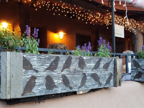
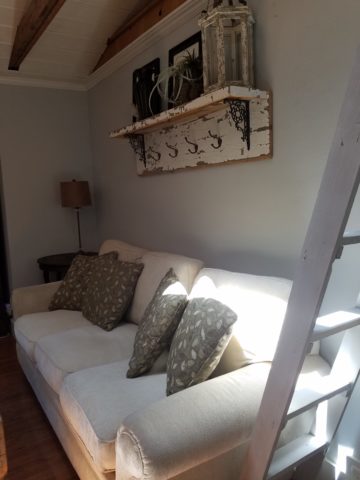
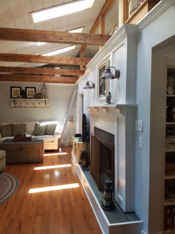
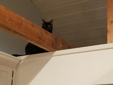
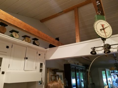
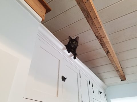
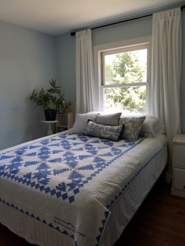
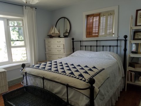
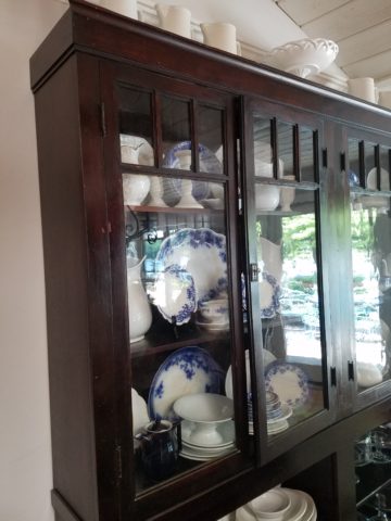
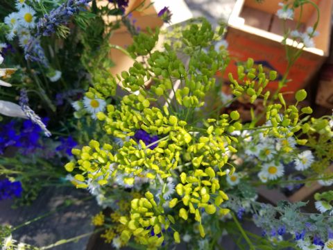
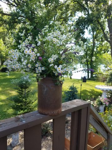
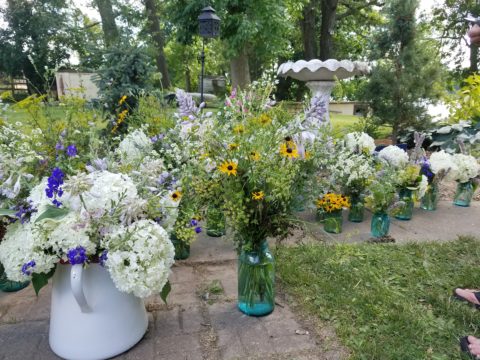
Hearing their comments as they passed through the spaces was amusing in their commonality. Everyone was amazed at the amount of work done, creative elements incorporated, fun finds she had collected to transform this modest house into this cozy cottage. Her two cats have wonderful vantage points to watch the activities in the rooms below as guests gathered to celebrate the weekend’s family wedding festivities.
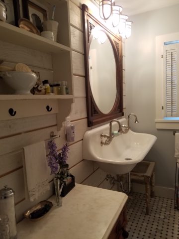
Daylight streams through windows and floribunda gardens around the house are now communing beautifully with the interior.

Ever-so-soft blues, with whites of every shade, create a soft backdrop to collections of fine china to vintage scales and myriad eclectic antiques.

Outside a recently completed multi-tiered pond emits soft trickling background sound which wafts inside through the many open windows. Not to be reticent about being hands-on, this tenacious designer personally packed 23 loads of boulders and large stones into her truck, off-loaded and placed around the periphery of the pond. She planted tiny creeping vegetation among the stones, water plants, multiple trees and perennials to establish instant-gratification landscaping in her expansive backyard, which is a lush verdant botanical expression that grows abundantly right down to meet the river.

A great get-acquainted bonding of disparate family and friends occurred when we collected buckets of roadside flowers to make arrangements for the reception venue.

Wild bouquets punctuated with spectacular domestic flowers from the gardens surrounding the cottage provided fun activity and contributed to the charm of the scene.

Everyone needs a little country sometime.