What is a Picture Worth as You Plan Your Design?

We’ve all heard the expression “A picture speaks a thousand words.” And today, as I set forth to use it, I investigated its origin…seems the original quote might have been “A picture is worth ten thousand words” as stated by Fred R. Barnard in the 1920s. Either way, it conveys the same – seeing is believing and seeing is more literal in most people’s eyes. Words can describe and attempt to convey an intent or, in my world, a design concept. But to sketch it – well that’s the best way to show the intended idea. There were other unsubstantiated references to an old Japanese phrases, but suffice it to say – it is such a truism that it is referenced often.

Here is an illustration of a courtyard that we have proposed. Our custom designed hand crafted iron gate inserted into the existing low wall, water feature, flagstone and plantings are all new proposals. Can you picture it? If I had arm-waived with a verbal description would it have been as helpful? It’s a small space, so it would have been easier to convey than other more complicated design concepts, but for the sake of an example, this works. I’m thinking that your answer would be – “Yes, I get it! The illustration sets the stage and really helps me visualize the intended finished product!” It is exciting and more stimulating than a rigid CAD drawing and evokes more emotion in most, if not all, clients.

I realize as I write this that it directly reflects the observations in Federico Leon de la Vega’s comments about the value and actually critical importance of handwriting as he expressed in his TED TALKS last year.


Therefore, I prefer the artist’s rendering – to support and promote the talents thereof and also for the much better rendition of the concept! So as technology advances in the realm of illustration, I intend to continue to support the skills of the artists that so effectively express our designs.

Let’s get together and plan your next design project, find solutions and create the images that will springboard the work and ultimately represent your new reality!!!

Patio Primavera- Fabrics and Finishes for Outdoor Living

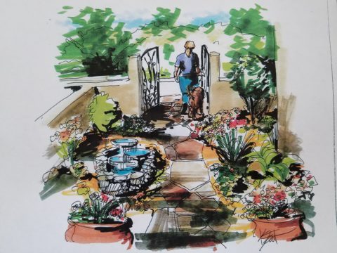
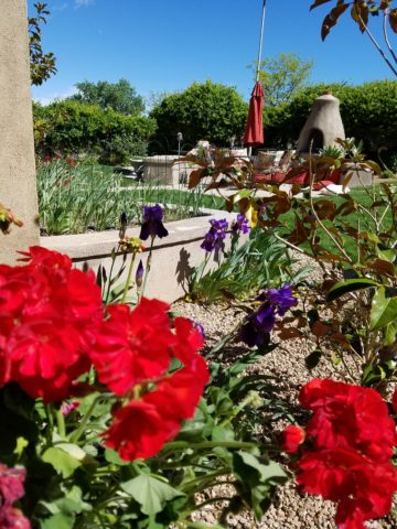
Finally spring is settling in with more consistent warm weather, garden shops are abundant with flowers, leaves are maturing and all is getting green!! The out-of-doors is beckoning us to expand our living spaces and set-up patios and outdoor kitchens, gardens and play areas for the coming months! YAY – Patio Primavera!!!

Every season introduces more and more fabulous products and paraphernalia for making moving outside more and more inviting and comfortable. Leafing through catalogs that jam our mailboxes, cruising the home decor sites, strolling through the big box home improvement stores and the local nurseries, the multitude of possibilities get our summer juices going – chomping at the bit to plan this and buy that, plant this and arrange that…it’s  rejuvenating and freeing from the interior spaces that we love to be cozy in all winter, but long to escape the confines of, as the warm weather progresses.

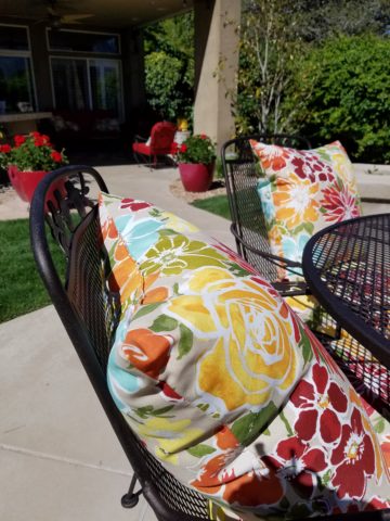
Advanced methods and materials for outside area rugs and fabrics, of polyester and better yet – acrylic fabrics that will tolerate the exposure to the elements, allow freedom to leave things set-up without running out into the rain, or worrying about too much sun which might require we bring things safely inside and then back out again.

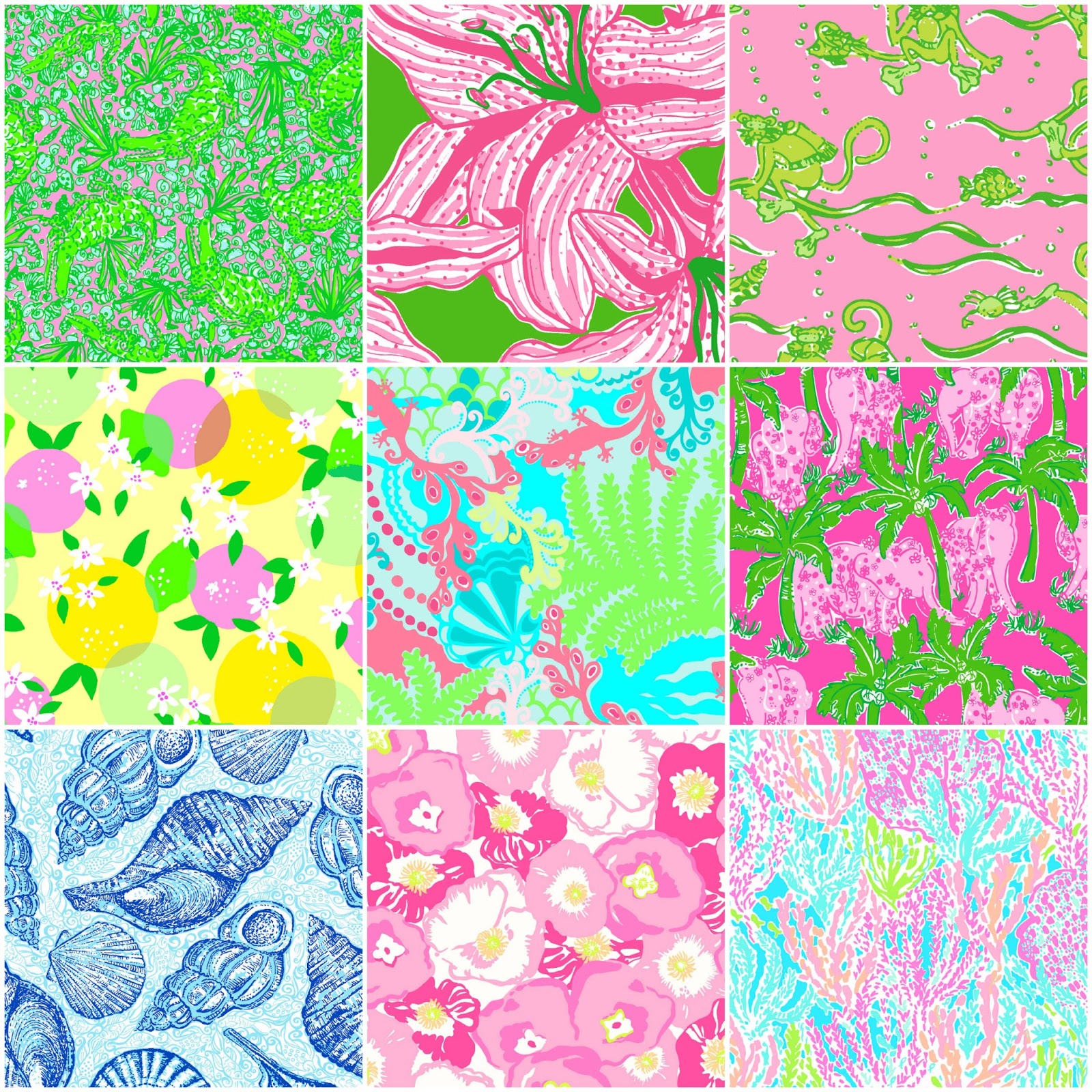
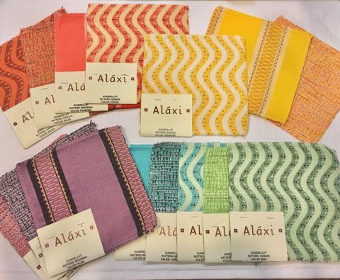
Some of these fabrics defy being so durable and practical. Here are some amazing examples of bold colors, exciting patterns, plush textures and complex weaves that are all 100% acrylic – the most UV tolerant and mildew resistant of all!! But be prepared, they come with a handsome price tag. It is an investment to know that you are creating a scene that will last – that does not have to be replaced every year or two.

Incredible colors – brilliant and fade-proof.

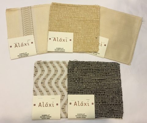
Lovely rich neutrals are stunning enough to be considered for indoor use too.

When shopping for outdoor materials – watch for that fiber content…it makes a difference. But know that there are thousands of incredible fabrics that you won’t find in the seasonal departments of local stores. We search the world to find these exceptional fabrics in order to present exclusive offerings to make outdoor spaces defy outdoor “exterior” design. IF only  for pillow accents (due to the precious prices), that can be THE show-stopper for your outdoor rooms. Find some that you LOVE and take the plunge.

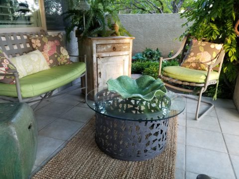
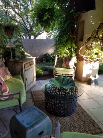
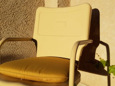
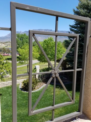
Another investment for outdoor furnishings is powder-coating. Give new life to old pieces, salvage vintage pieces for new use! My grandmother’s white, bouncy metal chair was well used and rusty. Shown here, I powder-coated it 20 years ago this month and it has been sitting out in full high-desert sun and all the seasonal elements ever since – a testimonial to the durability of a good powder coat finish.

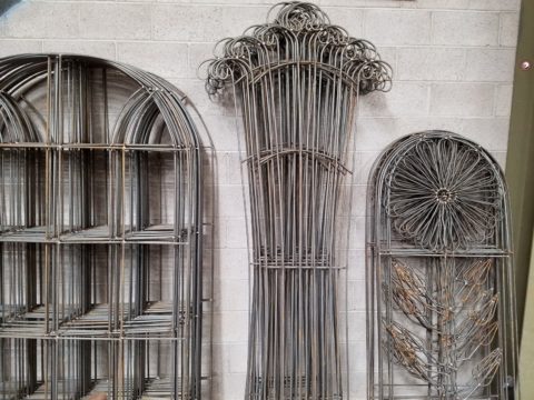
Discover garden elements that would surely rust if left out in the rain – these are perfect for powder-coating! Once treated, these fabulous “finds” will be durable exterior design features without a care – retaining their appearance and supporting your climbers for years in your garden!!!

More durable than paint, this process for metal furniture (and more) usually starts with sandblasting the existing finish – rust and all – clean as a whistle – and provide a finish that will protect and preserve the appearance  for years of exposure to the elements – sun, wind, rain – no problem! Powder coatings are just that – a complex combination of materials that are combined and manipulated and ground into a soft powder. The application is done with electrostatic charge delivered via a spray gun. The powder-coated pieces are baked where the heat cures the coating. Powder-coatings come in so many colors! The resulting finish is extremely durable and will last for decades.

Other than furniture, it is also applicable for architectural detailing around your home and is certainly used in large-scale commercial applications. Powder-coating can be applied to other than metal pieces – but the technique differs slightly.

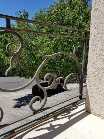
If you have pieces that you treasure or merely want to have around outside for a while without extra concern or maintenance, this is something worth investigating.

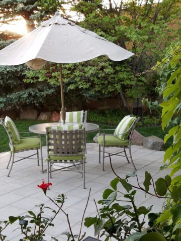
The take-away here is in recognizing the quality of life that is gained by utilizing and  celebrating your outdoor spaces. Whether a tiny balcony, intimate courtyard or an expansive patio area, decorate it! Explore the many design tricks, great materials, fabulous finishes and all the possibilities 
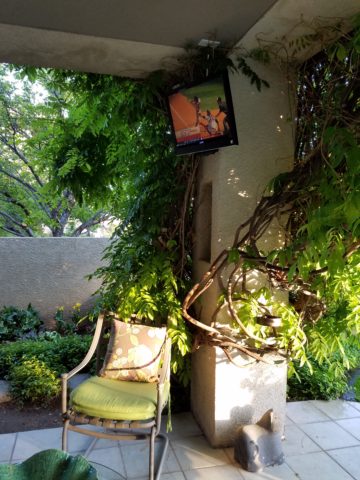
add a  TV,  fireplace,

or chimenea, that will transform your exterior pockets into worry-free and priceless outdoor room additions for many months to come!!! You’ll want to LIVE out there!


Color of the Year 2017 Greenery!!

Ta Da! Pantone announces its color of the year for the coming 2017…drum roll please…and the color is Greenery!! Yay!!! Last year there were two  – yes, imagine that – they couldn’t decide so they slurried Rose Quartz and Serenity resulting in a pale, cool, wimpy blend of soft rose and lavenderesque shades into a blended wispy pastel dream. Non-committal, in my opinion…lacking confidence.  Last year the rationale was stated by Pantone’s Executive Director, Leatrice Eiseman as…

pantone-color-of-the-year-lee-eiseman-quote-2016

But this year they have it with this fresh organic hue in a yellow-ish shade primed for this year’s rationale from Ms. Eiseman which is:

pantone-color-of-the-year-lee-eiseman-quote-2017

I have always loved green. I grew up in a Virginia jungle of a suburban neighborhood inside the Beltway surrounding my hometown of Washington DC. where the first signs of spring were the tiny tips of dogwood leaves poking forth from the delicate branches of those beautiful under-growth trees. The dogwoods were the graceful, human-scale layer beneath the towering canopy of the immense, rigid, vertical tulip poplar and white oak trees that commanded the woods.

Soft mosses, lacey ferns and perky lily of the valley carpeted the hidden pockets of our backyard. New growth is that prediction of amazing renewal and promise of the start of summer. So it is a prime observation that as Eiseman states in her 2017 rationale “greenery…bursts forth…with a reassurance we yearn for…” although I do not feel this is peculiar to this year as winter always makes me yearn for greenery and the reassurance  that spring and summer will return.

My mother also loved green and that probably influenced my childhood perception of comfort and context of it in interior design. She had and still has an eye for color. In 1959 she selected an amazing sculpted wool pile carpet in a warm, dark, neutral, taupe tone and built upon it a color scheme of pinks and greens that was subtle and relaxing, organic and contrasting, blending beautifully in our wooded setting of verdant lushness in which we were cozily situated.

That was upstairs where we felt like we lived in a flowering tree house amidst the dense collection of green leafy between the trees and surrounded by all shades of pink and white azaleas. Downstairs, where we retreated in the winter months, her greens were mixed with gold tones creating a warm interpretation of the greenery around us.

When so many in that era, between the 60s and 70s, were styling interiors with heavy oranges, browns and golds,

orange-and-brown-f934b00ae8a8aabb9fa7d7d8e3ccec30

my mother gravitated toward Lily Pulitzer’s fresh, tropical palette of lime green and hot pinks, clean crisp turquoise and citrusy lemon yellow – both in her wardrobe and her interior accent colors.

most-popular-lilly-pulitzer-prints-no-names

Our beach house was turquoise and teal, navy and tan – the sea and the sand.

Following color trends is a slippery slope. I have blogged about it in the past. Adopting that which is often a combination of colors instantly records a place in time when everything from bath towels and shower curtains, bed dressings to draperies appears in the marketplace and inserts its predetermined obsolescent combinations into the lives of so many who would rather catch the wave – often behind the crest – to own and participate in what is conveyed by the market to be the “in” thing to do and to have.

It is best not to embrace and adopt the combinations that the market presents. It is better to select color and combinations that transcend the trends – skirt them so as not to fall into the trap of dated color schemes and tired combinations. Some avoid the trap by staying neutral. The safe, timeless colors of whites and grays mushrooms and taupes- but where is the risk and fun in that?

“Too bad for them” I often remark. It is such a missed opportunity…a limitation to select colors that you think you are supposed to like rather than those that truly bring you joy. I say “go for joy every time.” Color is such personality. It is a stage-setting element. It is a backdrop or foreground. It is a theme. It is an atmosphere.

With all that having been said, I for one am thrilled with this fresh selection for the new year. A bright beginning full of hope and new growth, fresh starts and positive forward movement – organic and life-affirming. So seek the colors that brings you joy and go forth with color in this new 2017 soon to arrive. My personal schemes will always have greenery!!!

Table Dressings From Nature – Inspirational Fun!


It could have been a sculptural piece of drift wood or a gnarly tree branch from the woods or a twisted piece of metal from a salvage yard…but the idea is to see things in a different way and once again—as I have done this before— to make something from nothing. And in this case, with no effort or manipulation—just the natural beauty of the found object.

The tide was out making the beach so wide it was like a great runway of wet sand. Scattered on the surface were the leavings of the waves – pieces of shell and polished stones. There amidst the beautiful debris was what looked like the suggestion of an abandoned boat hull—a dried, darkened palm sheath. I instantly knew, this would be another beginning of the tropical table-scape that I am so fond of creating when we are at the beach. P1110860

“Creating something from nothing,” my father would often say. He was a great believer in that idea that one man’s trash was another man’s treasure. We loved to beach comb together whenever we found ourselves at the tide’s edge. Sometimes it was tropical and the coral was bleached white and pocked with texture. Fine mesh pieces of purple sea fan and perfect little green “hat” shells would be nestled among the dense collections of heavier piles of white coral.

Then other scenes would find us on northern beaches of the Maryland coast where there was no coral but the ocean would wash multi-colored surf-polished stones onto the shore blanketing the sand particularly at the very edge where the water would curl between the beach and the ocean’s depths. Tiny purple and pink clam shells would peek, being abruptly exposed and quickly bury themselves back into the wet sand moistened with  each incoming wave.

On this day, the warm breeze is tropical and the beach is expansive offering rare treasures scattered broadly but sparingly on the pristine surface of sand. It is here that I encountered my centerpiece.

Don of course is saying—”what are you going to do with that? It’s too big. Leave it here.” And I assure him that it is in fact a treasure and that it will be magnificent in the center of our dinner table where we are entertaining 11 for festivities this coming weekend. He, as always, acquiesces knowing that it is futile to stand in the way of my wildly enthusiastic creativity. P1110861 P1110871

Over the next couple of days, he and I both collect white stones and shells on our daily beach walks. At my instruction, we only collect white unless it is a particularly interesting shell. The idea is to have the stark contrast with the dark hull of the palm sheath.P1120142

Our dining table is a handsome slab of travertine marble. Laminated to a double thickness and finely finished with a smooth full bull-nose edge, it is the perfect organic surface to build this also very organic centerpiece.

It needs something…the neutral tones are lovely. Yet, the dark espresso brown of the palm sheath with the white of the stones, against the creamy surface of the travertine invites something more. I realize that it can only be enhanced with another layer of organic material – here in the form of the fresh verdant green palm fronds – the perfect punctuation! P1120102

Oh would that I had collected more flat oyster shell halves…they work so well for votive candle bases…but alas, parrot green cocktail napkins will have to do for this last minute detail.

Our woven palm place mats, in their natural dried flaxen color, compliment the rest of the organics on our table. And as night falls, the sun drops beneath the sea’s horizon and twinkle of scattered candles finish our scene. Salud!


A True Beach House…

The soft diaphanous salt air wafts through the open concept of this simple yet effective architectural design – would that it had gauze draping the sides to illustrate the motion of the ever so soft breeze. Thatch top still green from the recent construction, sturdy crooked legs like that of the broken men who braved the seas and might have found themselves beached here to build this primitive, yet artistic structure. It was picture perfectly inspired dwelling on this glorious tropical day.

Here we are lolly-gagging along…shelling, exercising, making our way across this pristine stretch of fine sand exaggerated in girth by the low tide that allows the seemingly unrestrained beach to read with expanded proportions when we come upon this precious little structure.

What a find! When you least expect it, you often encounter the best opportunities – like this one – strolling down the beach and encountering this creative little casita – beachfront for sure – organic, open and airy!!! Surfers? Nomads? The possible stories of our imagination are limitless within the physical parameters of this delightful discovery.

The roof allows filtered light in and open sides allow the sea breeze to flow through…organic material used to create these authentic and so very contextual furnishings speak volumes about the focus of the fabricators. Nestled against the out-cropping of jungle trees and wild flowers spilling onto the sand, the scene is more magical than Gilligan’s – maybe even more so that Robinson Crusoe!!  Tom Hanks would have thought he had stumbled into the Ritz! Yet, the simplicity of it all was the emphasis of less is more – spare and understated – it pared down the essential elements to create this special little one room accommodation.

The furnishings are minimalist – yet so very functional. The sofa is crafted from a log supported, and suspended above the beach sand – quite comfortable and ergonomic as a seat structure. A triad coffee table is comprised from three logs topped with three handsome flat stones. Perfect!  And a sculptural,  beautiful branch of driftwood sits off to the side reminding us that beauty without function is essential.

Image

Take a walk in the woods…of into the fields…onto a wild untamed beach and discover the natural elements that were the primitive beginnings of our interior design – the modified native habitats that we reside in today. And see that stretch!!!!! Evolution can reverse its course as we investigate and appreciate the value and beauty in simple things…

ImageImage

For the LOVE of Life – Bring the Plants Inside!

It’s here…perhaps a week ago- but soon, if not right now –if you haven’t done so already – it’s time to Bring the Plants Inside!!! There is a fine line between being a slave to your geraniums which seem to rejuvenate and thrive with bountiful clusters of flowers just when the air is the coolest, right before the first frost and the person who can ignore the pending doom. HOW can you possibly let them just die in the cold after such a profuse growth spurt and promise of beautiful blooms to come? That’s the irony of seasonal plants – yet, you can successfully bring them inside to weather out the winter months and return to your patio in the spring!
The problem is – where to put them??? It messes with our Interior Design to impose this wild collection of plants into the interior setting that is so precisely organized. You might even consider bringing an étagère from the patio to the inside of your home for the express purpose of placing/saving these many plants in a consolidated vertical footprint. You might place them on the floor if they are large enough to do so – that means occupying a space probably big enough for a lounge chair!!
But it is a season dilemma –very real and continuously challenging. Then there are those brave souls who make that ultimate decision – to “heck” with them – this year I am vindicated – let the frost take them – I’ll watch them shrivel into little clumps of what looks like cooked spinach!! I’ll just buy more next year! Hmmm, an economical decision – maybe…
Versus those who nurture these babies year after year and watch them change, evolve, and grow who could no more leave them to the sure death in the cruel cold of the seasonal change than stay out there themselves to freeze to death in that quiet way that “they say” that particular type of death overcomes one. No – that would NOT be an option!!
So plan ahead and eek out the space needed to house your precious plants for the cold winter months so as to enjoy releasing them to the warmth of spring on your patios bringing their new growth and joy to your outdoor living spaces!