This is the second in a series of three about recent downsizing projects for which we have been designing. The couple, long-time, wonderful clients/friends with whom I have designed interiors over 3 decades and 4 states, was ready for what they believe might be their final move.
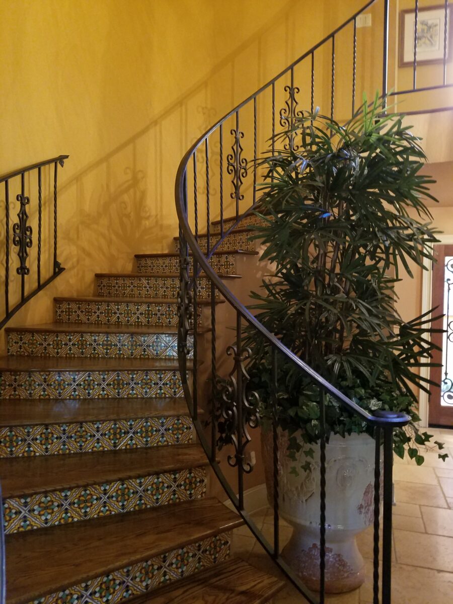
The stairs of their home were making life in their 3,500+ square foot home taxing. Note to all, having the master bedroom upstairs looks like privacy, possible views and good step exercise in the beginning, but doesn’t offer the flexibility to adjust to aging or even accommodate temporary rehab due to injuries over time.
Aging eyes also begin to require better light for the aesthetic read of the space and the practical function of being able to see!!
Moving from a private residence into a condo offers maintenance services and relieves much of the responsibilities of home ownership. It is also easier to lock up and get away for travel and other excursions.
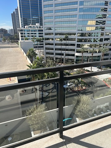
After investigating several properties in their extended neighborhood so as to keep within their familiar area of shopping and services, they decided upon a three-bedroom unit, with plenty of windows/daylight and a spectacular view.
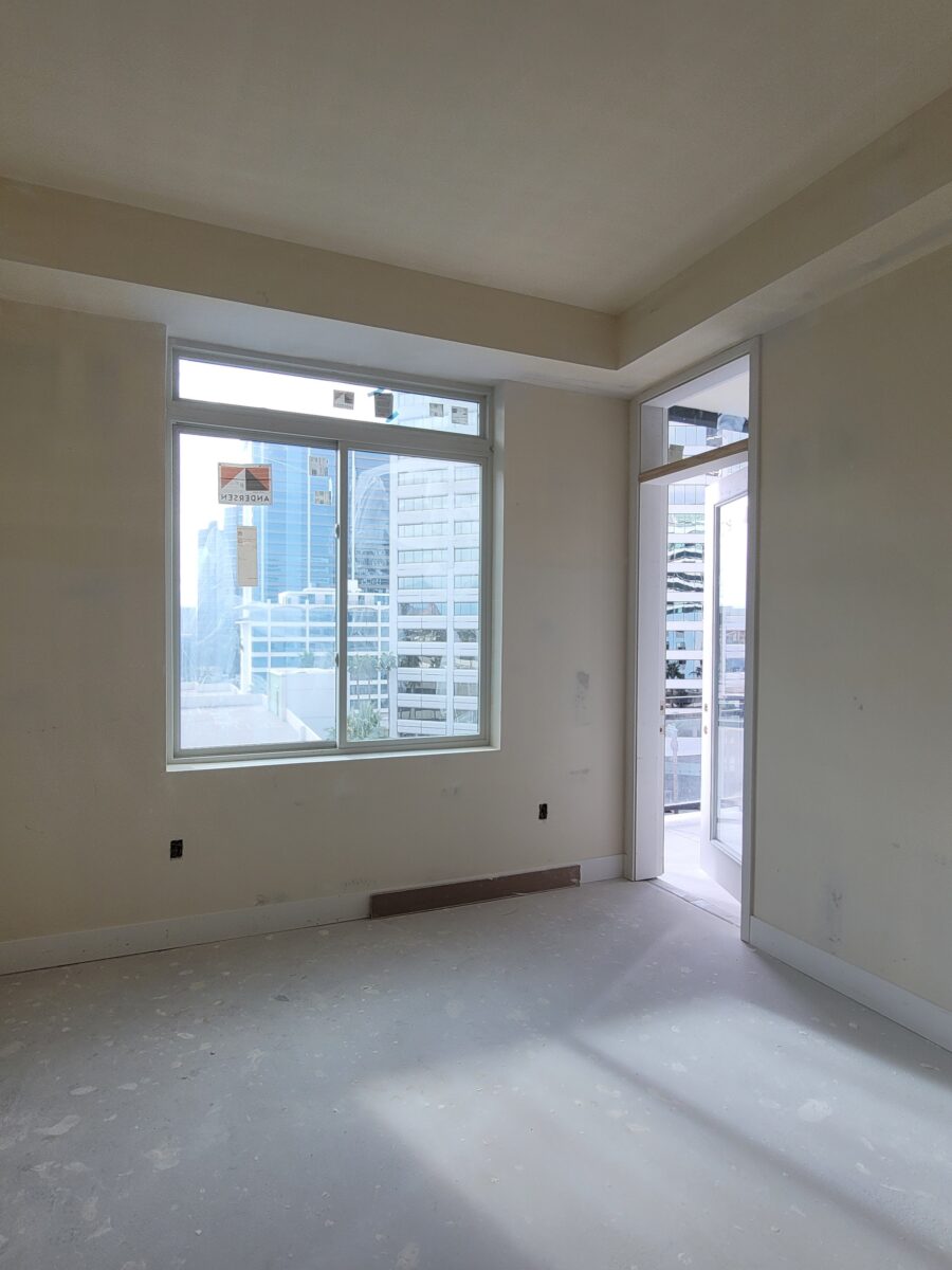
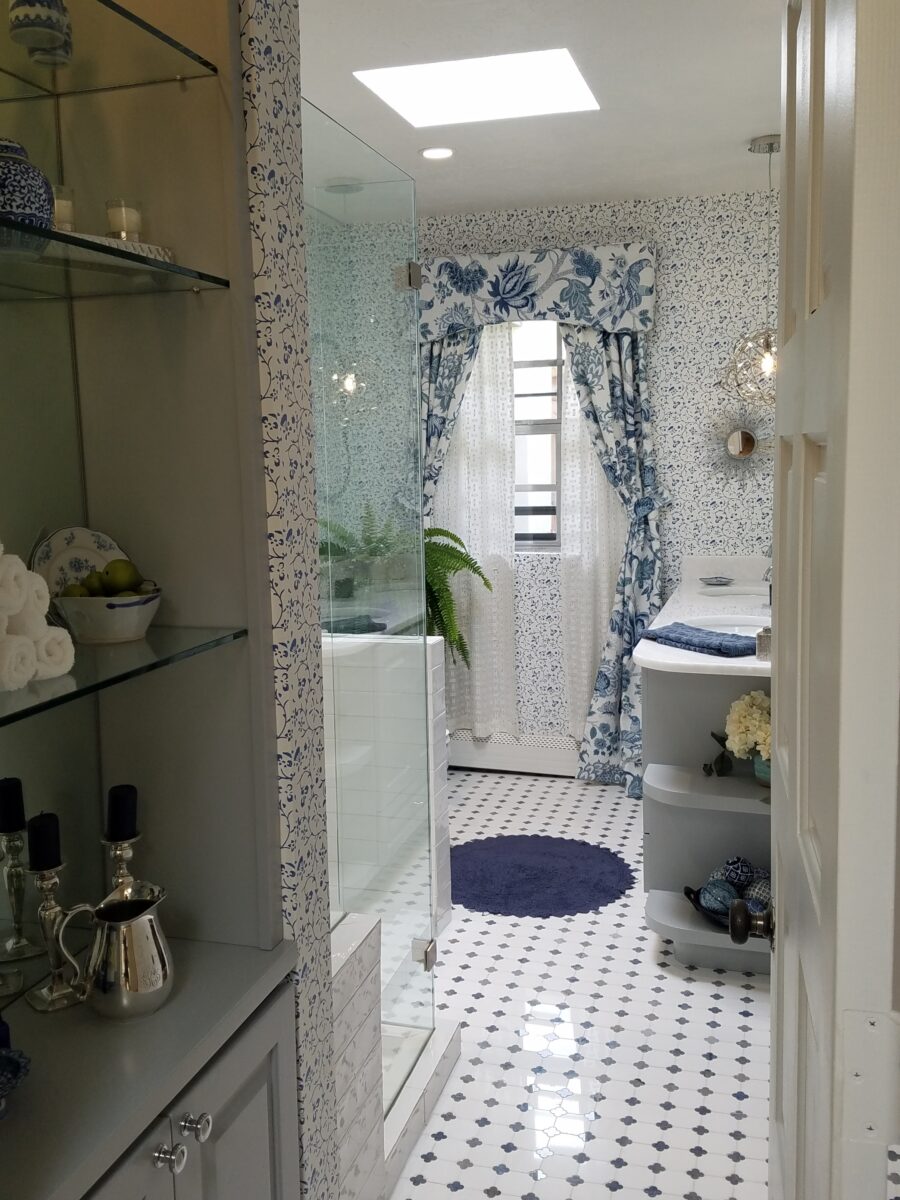
The new walls were a near white neutral with easy-to-maintain vinyl wood plank flooring (that was offered in grey and we changed to a warmer, medium-brown). The grey was cold and didn’t compliment their furniture. The decision to make the change (even though the grey had not yet been installed) was met with a bit of push-back, but ultimately my clients won their little battle and had their preferred flooring color installed.
Certain things were “standard” as was the grey vinyl plank flooring. As the contract for the flooring was set in stone, my clients were required to stay with the same product and select from a limited range of colors. This medium-brown was a far better choice than the building-standard grey for their interior furnishings. We kept much of the standard selections, but made a few other changes to personalize the space both aesthetically and functionally. Knowing what the best selections/decisions are and how to negotiate and advocate for them is important.
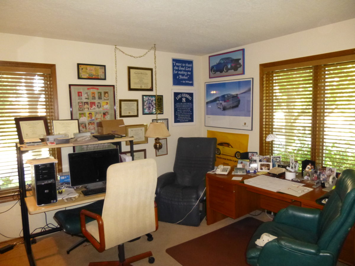
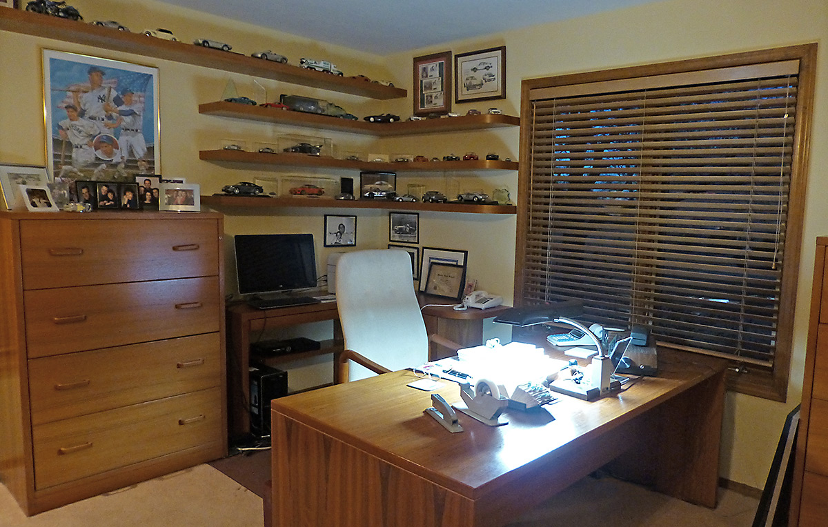
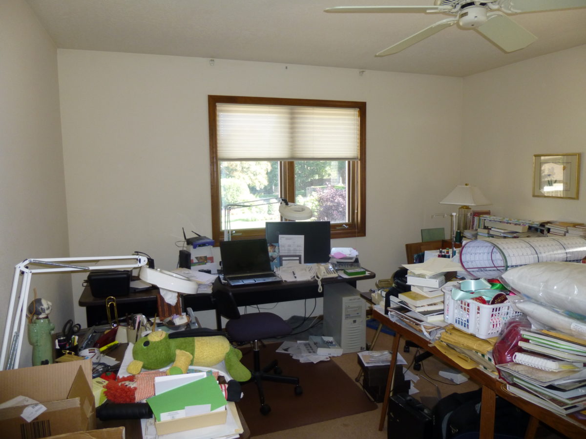
We had a closet removed from one of the bedrooms. This room was to serve as the home office for the husband of the pair. The room was already built with an acute angle that ate up valuable space. With the closet carved out of it, it reduced the footprint even more. Had it been designed with parallel lines it would have offered a much easier space to furnish. Therefore, we discussed eliminating the closet to add a significant amount of valuable square footage. This was done without intent, but in talking with the superintendent of the construction crew, mention was made to make this adjustment. I was not present when the conversation ensued, however, the walls were already built and being painted. The superintendent instructed the change to be made. AFTER the work was finished, the project manager walked through the space and noticed the missing closet and exclaimed that it wasn’t allowed and hadn’t been approved, but since it was their team who did the work, and it was completely finished, it was a done deal. A minor miscommunication resulted in a great gain for my clients!
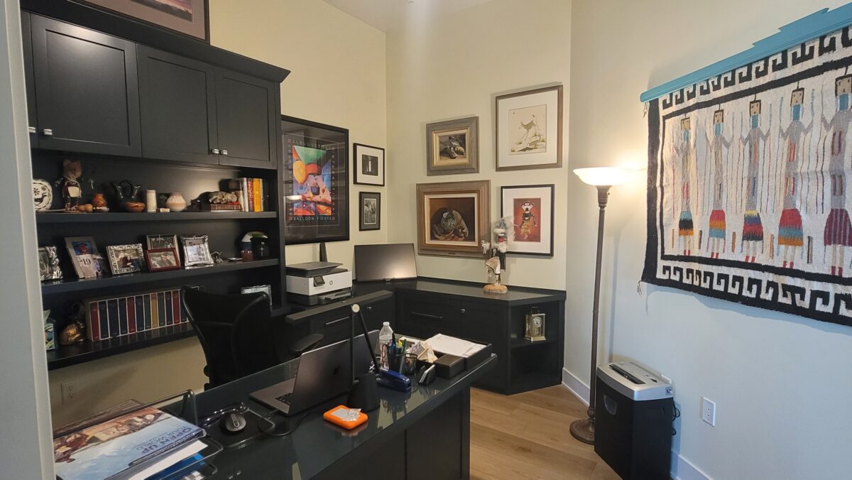
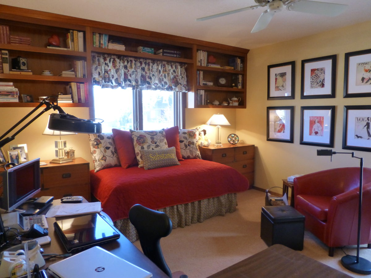
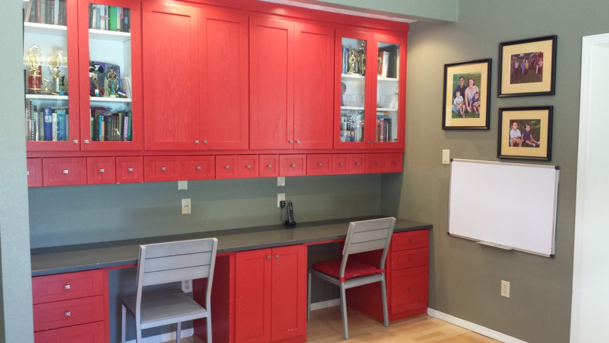
We contracted with an outside custom cabinetry shop to build custom casework in both the bedrooms. This was for maximum storage and space utilization, aesthetic appeal and very practical function for each of them. One, for the husband’s office (still working full-time) and the other, for the wife’s office/study (also still consulting and volunteering) which was also to double as a guest room with sleeper sofa. When challenged with acute space utilization parameters, designing to maximize a small space is like designing a “tiny house,” or a motor coach or a boat – every inch matters!
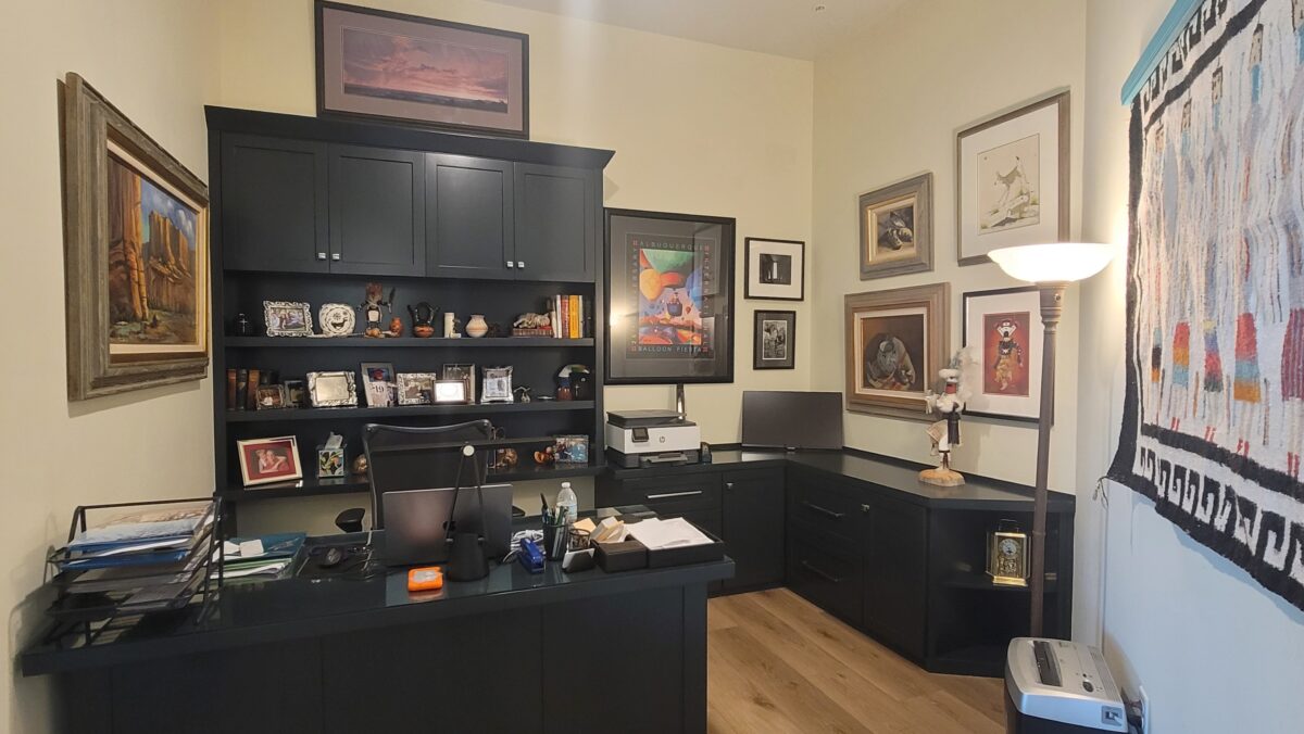
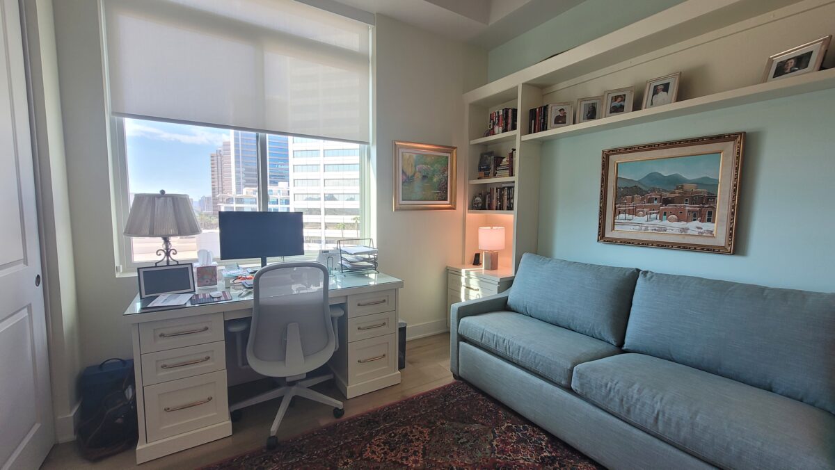
I guess the point of these two modifications, regarding the flooring selection and the space gained by removing the closet, is that details are important and when confronted with standardized plans, capturing any opportunity for modifications that can make the space more personal is invaluable. Custom built-ins maximize the footprint taking it vertical for storage and display space.
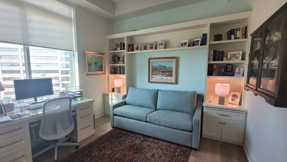
We then had a very light space with very specifically designed custom cabinets in the offices, warm-colored flooring and we added more lighting in the ceiling for spots and a more ambient spread of light – all with dimmers. Table lamps contributed to the ambient light in each room.
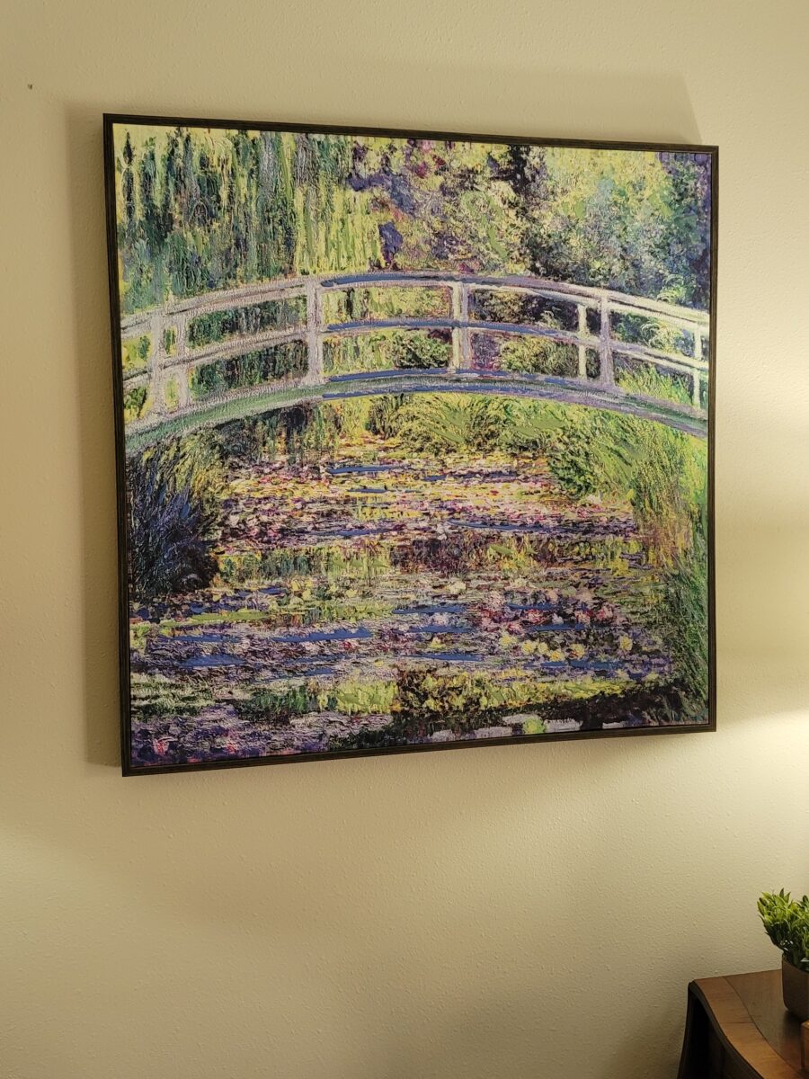
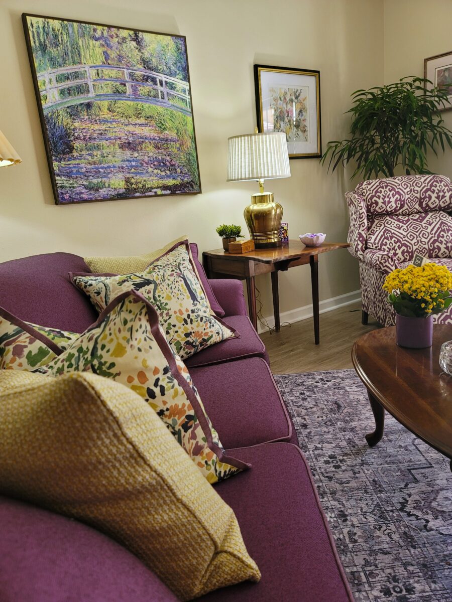
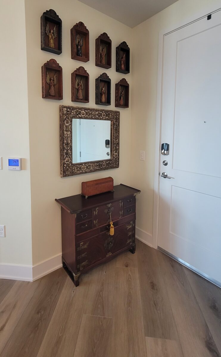
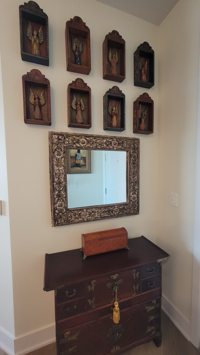
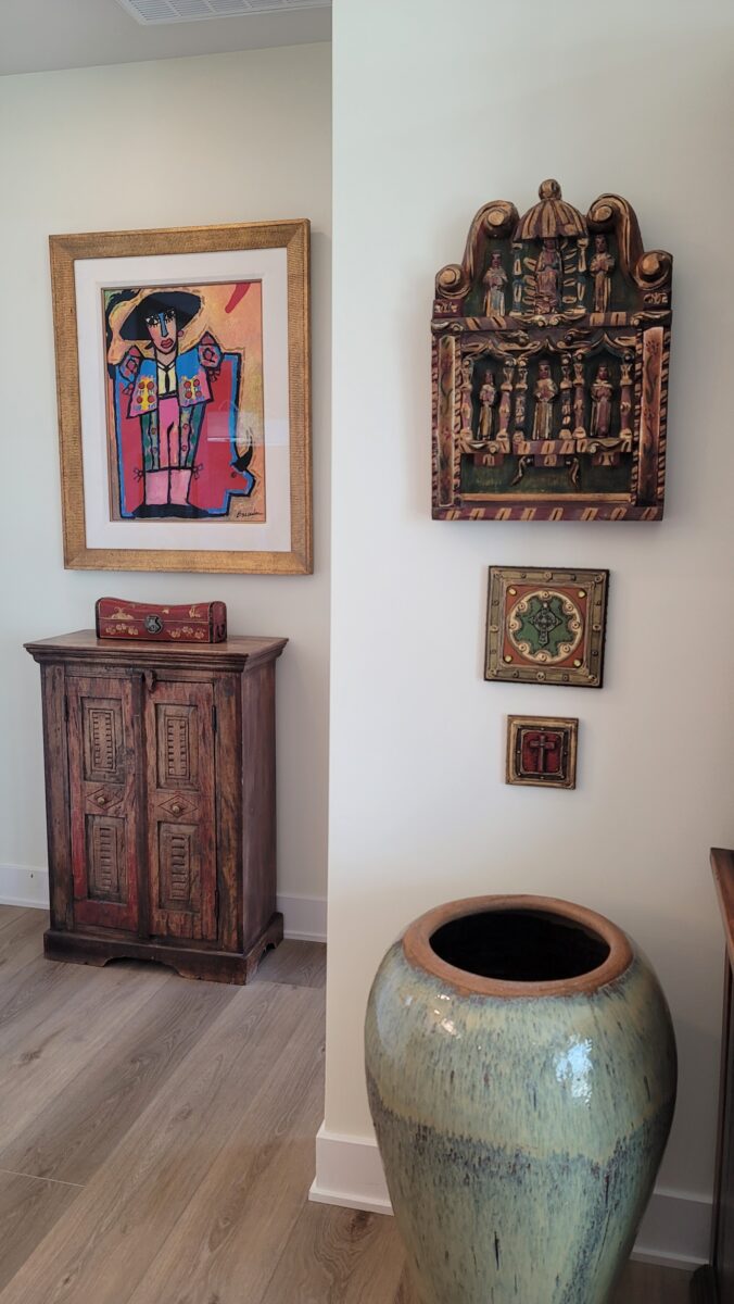
At this point we began to fill in with finishes and furniture to make the space their new home. From carefully selecting pieces from the previous residence and placing them on the floorplan for arrangement and scale, to culling the artwork for the best original pieces and specifically nostalgic objects which also each had an assigned place in the new home, we began layering their things in the new apartment.
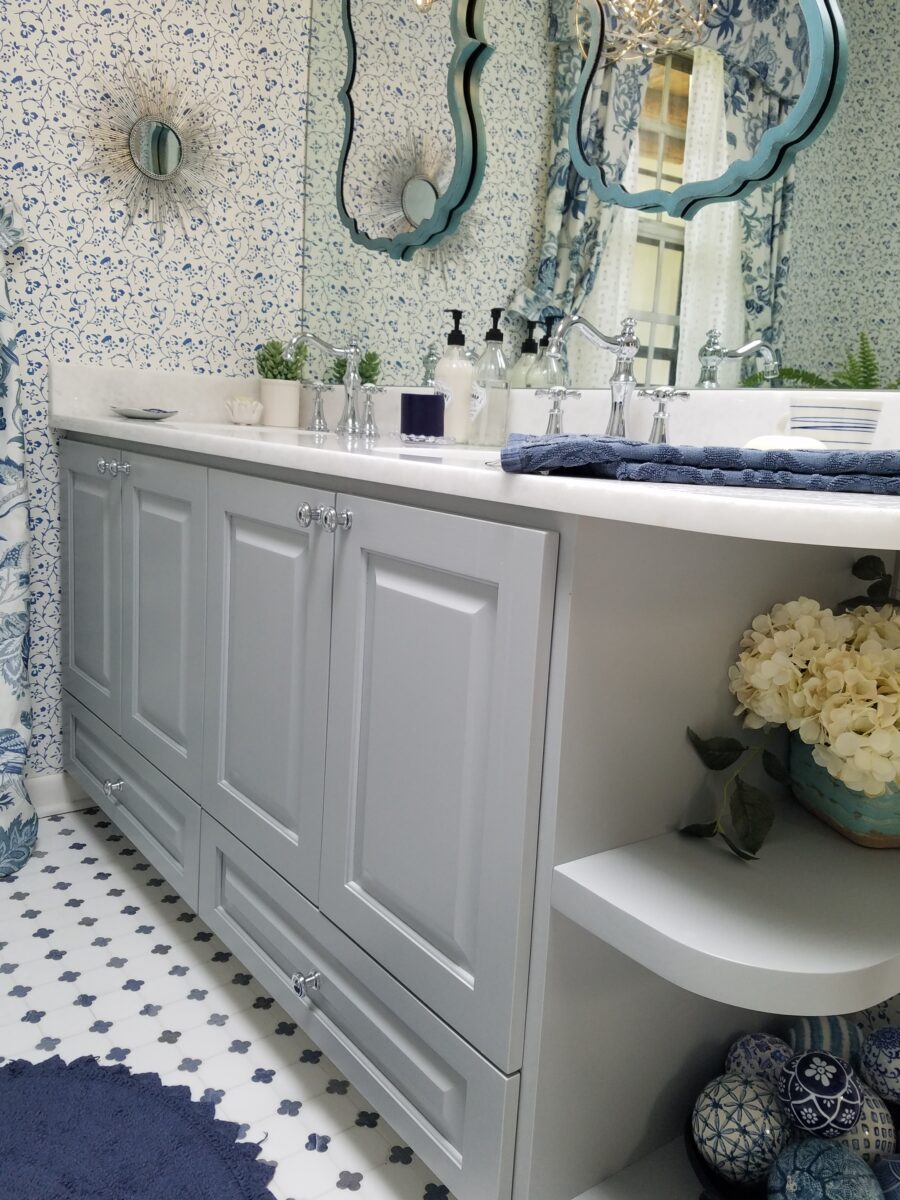
The previous kitchen had stunning custom cabinets that we designed in 2004 in a knotty, medium-stained wood tone. About 5 years ago we replaced the original tile we had selected in that previous 2004 kitchen, with a “new” tile which was lighter and patterned. Therefore, for this brand new space, we selected a mottled glossy white glazed tile – super neutral and fresh with a traditional feel. The subtle variation in the glaze contributed to the handmade look of the material and resulted in a clean, neutral, monotone color scheme with the white cabinets and light granite slabs. To add a bit of detail and freshness, we tiled the island with a large format Talavera tile of a pale, organic, celery green pattern on creamy white field.
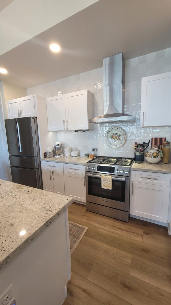
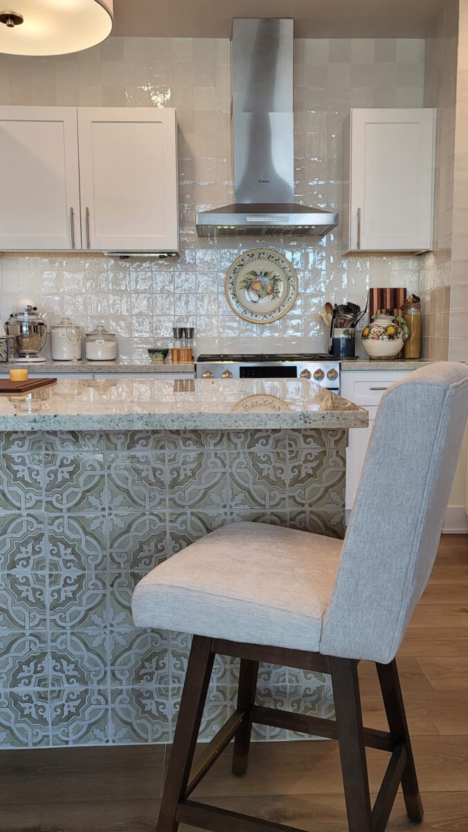
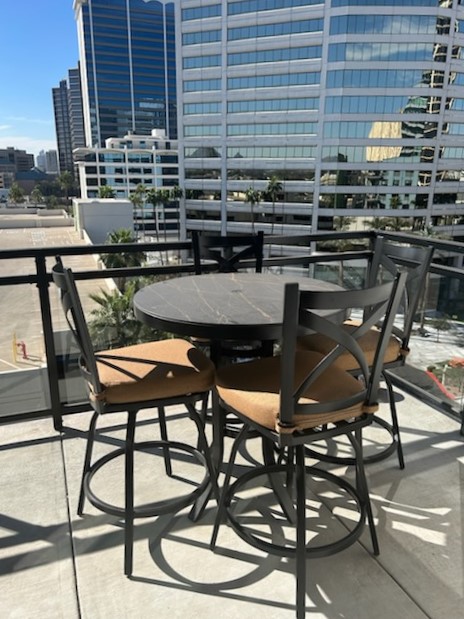
Due to space limitations, we elected not to place even a small dining table, in favor of a cantilevered overhang of the island countertop with counter stools. Weather permitting, there is a four-top table that we placed on the balcony for alfresco dining.
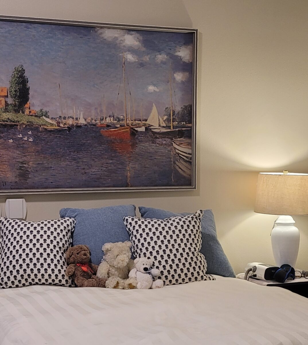
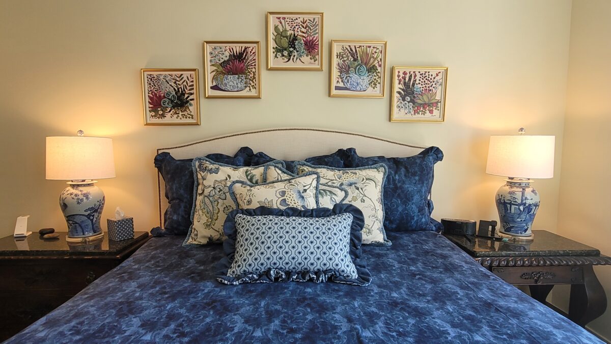
We had also re-done the master bedroom in the former residence from the warm gold and brick Spanish colonial theme, from 2004, to a refreshed navy and cream just a few years ago in 2021. We moved the key pieces from the master bedroom furniture and recreated the same feel in the new, smaller bedroom space.
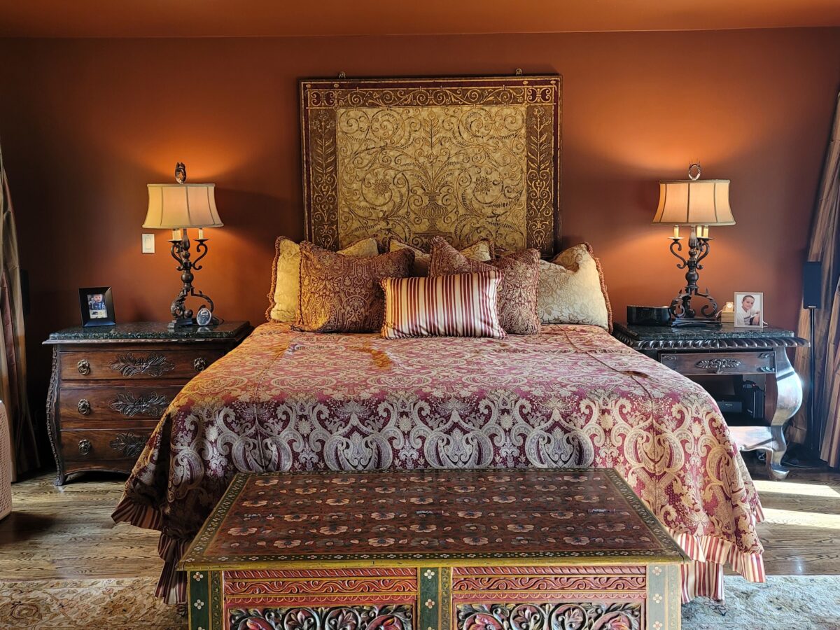
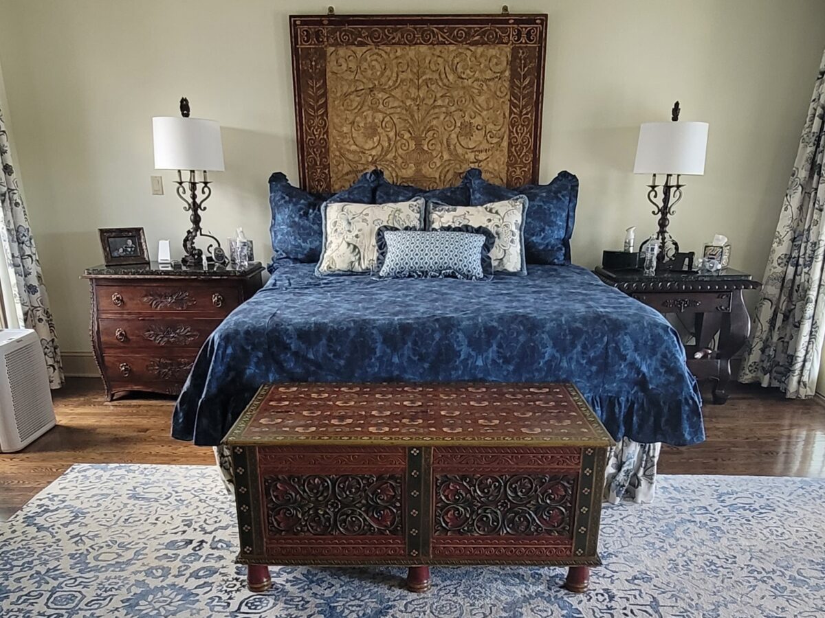
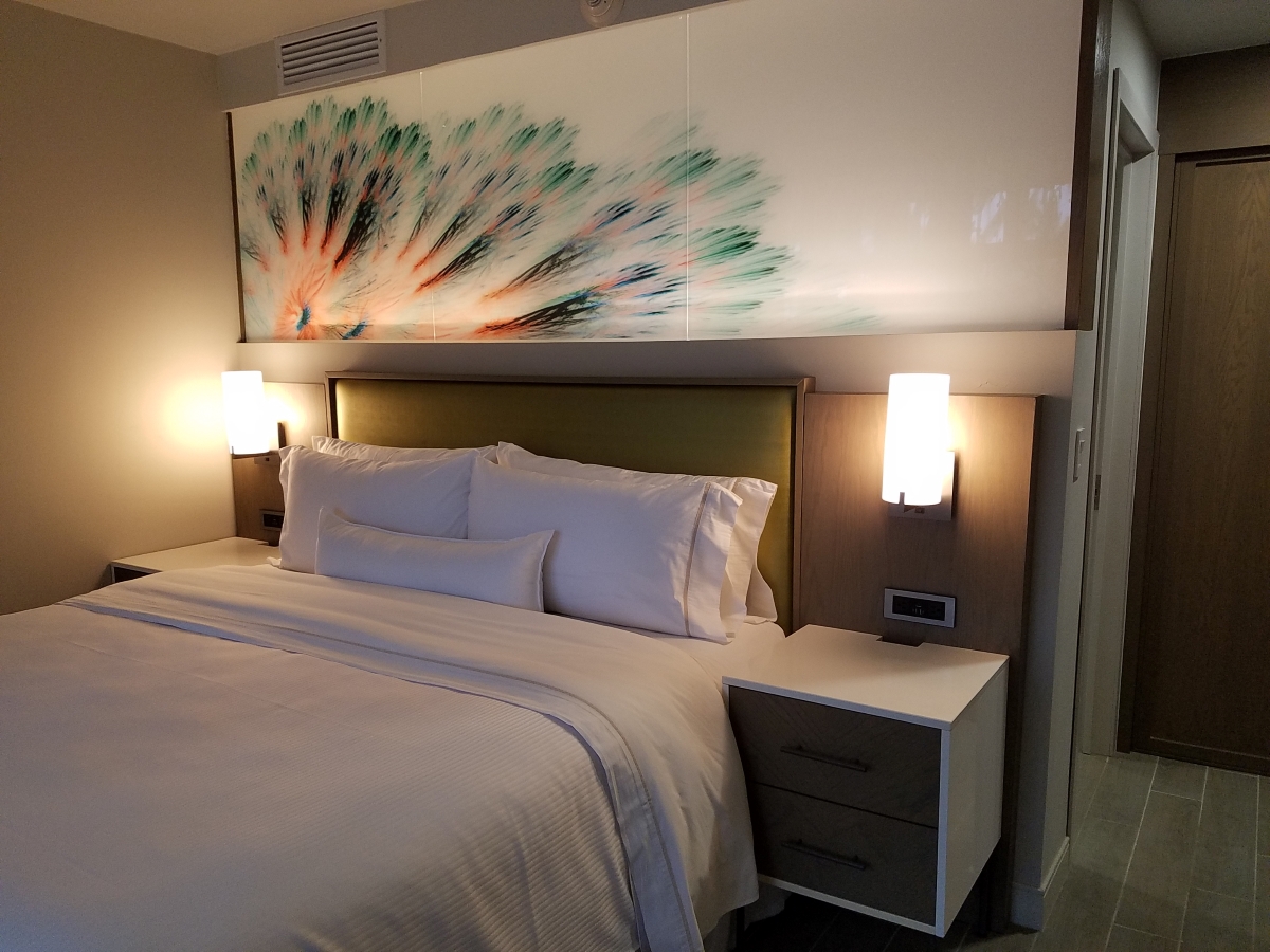
The owners fell in love with a new, creamy upholstered bed which replaced the enormous, dark, albeit spectacular headboard panel from the previous room. This new, upholstered headboard was curvilinear – sort of a camel-back. We commissioned an Albuquerque artist, Alane Foug, to paint a series of miniature paintings to follow the contour of the headboard and splash a bit of pinks and greens into the blue and cream scene. We changed the bedside lamps and had them made from large jardinières that we found at a local treasure shop.
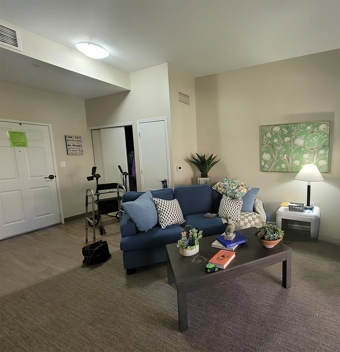
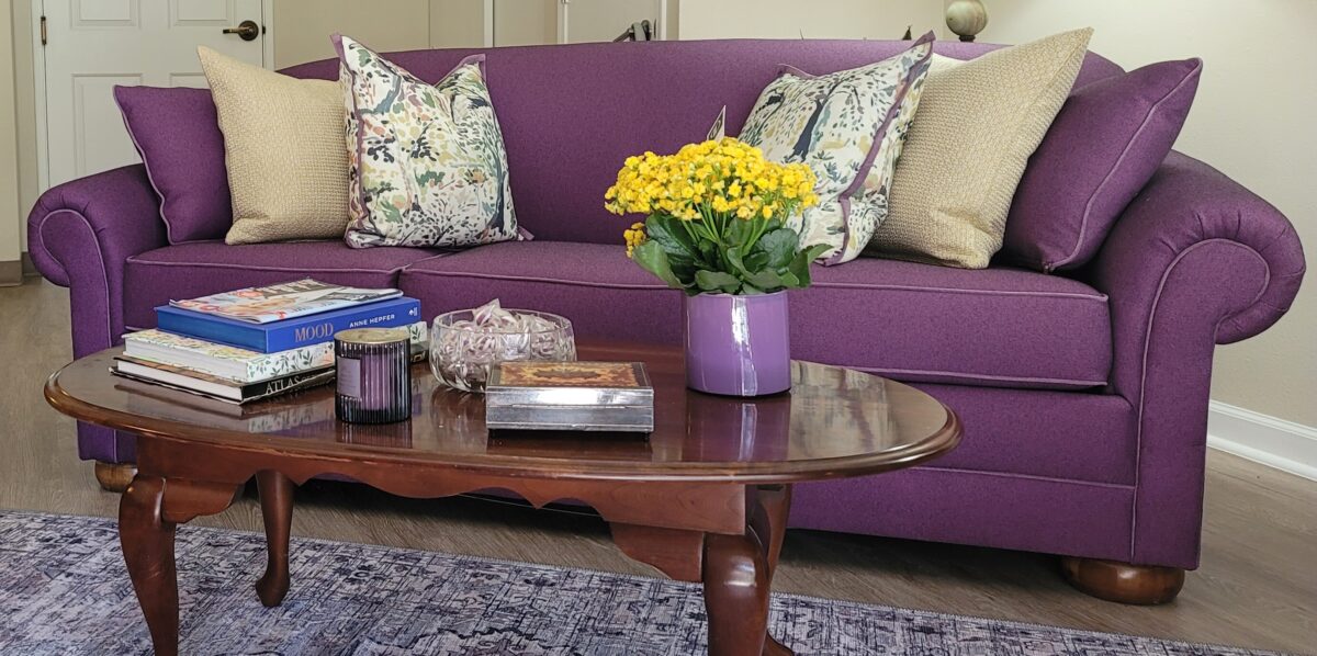
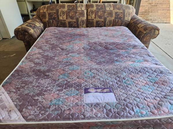
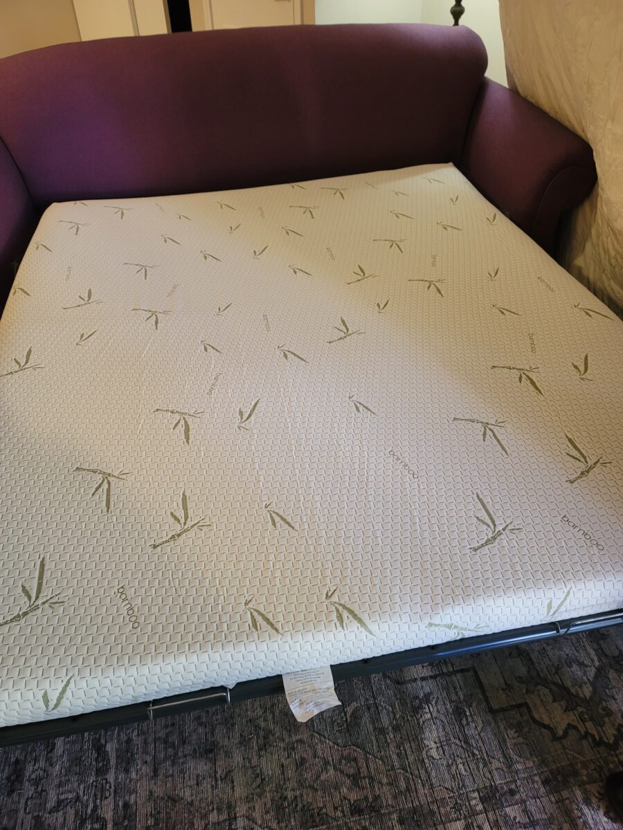
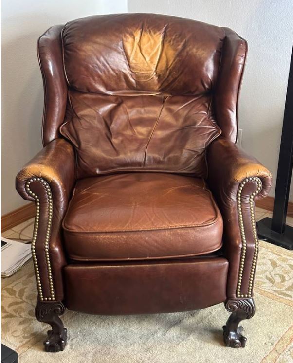
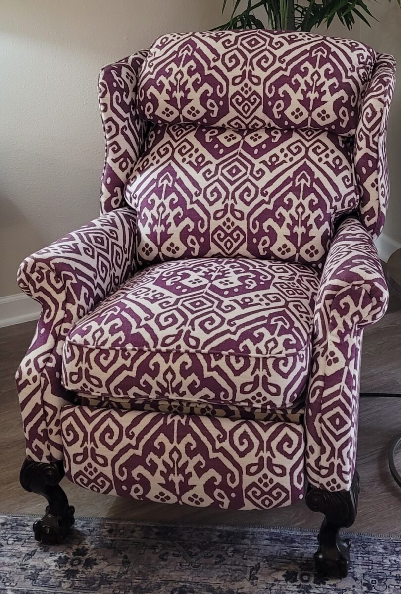
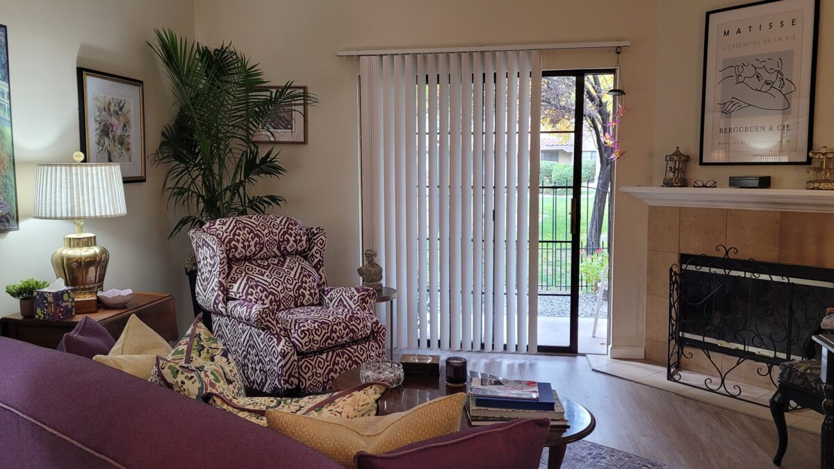
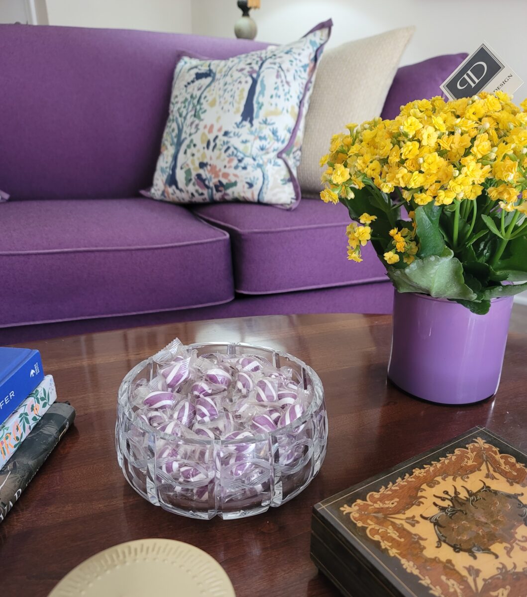
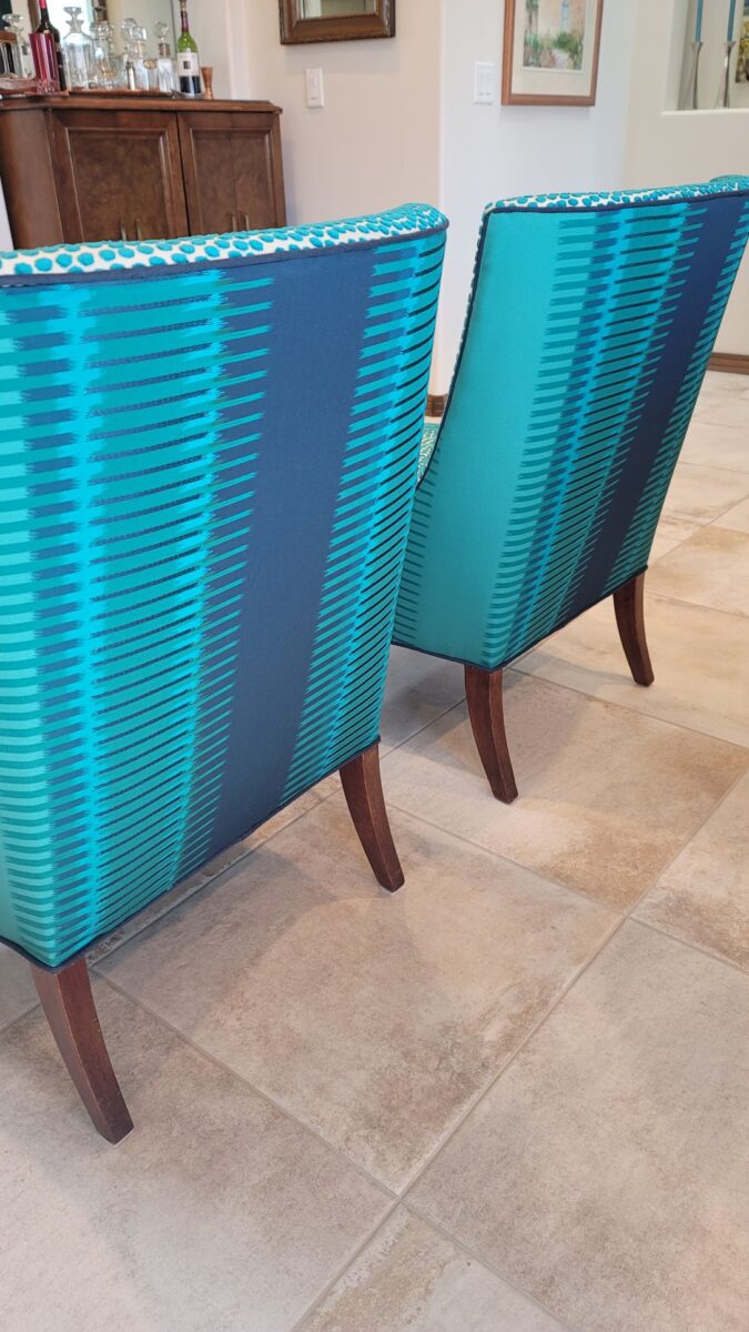
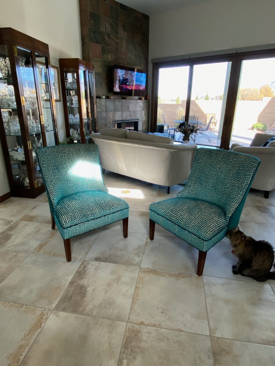
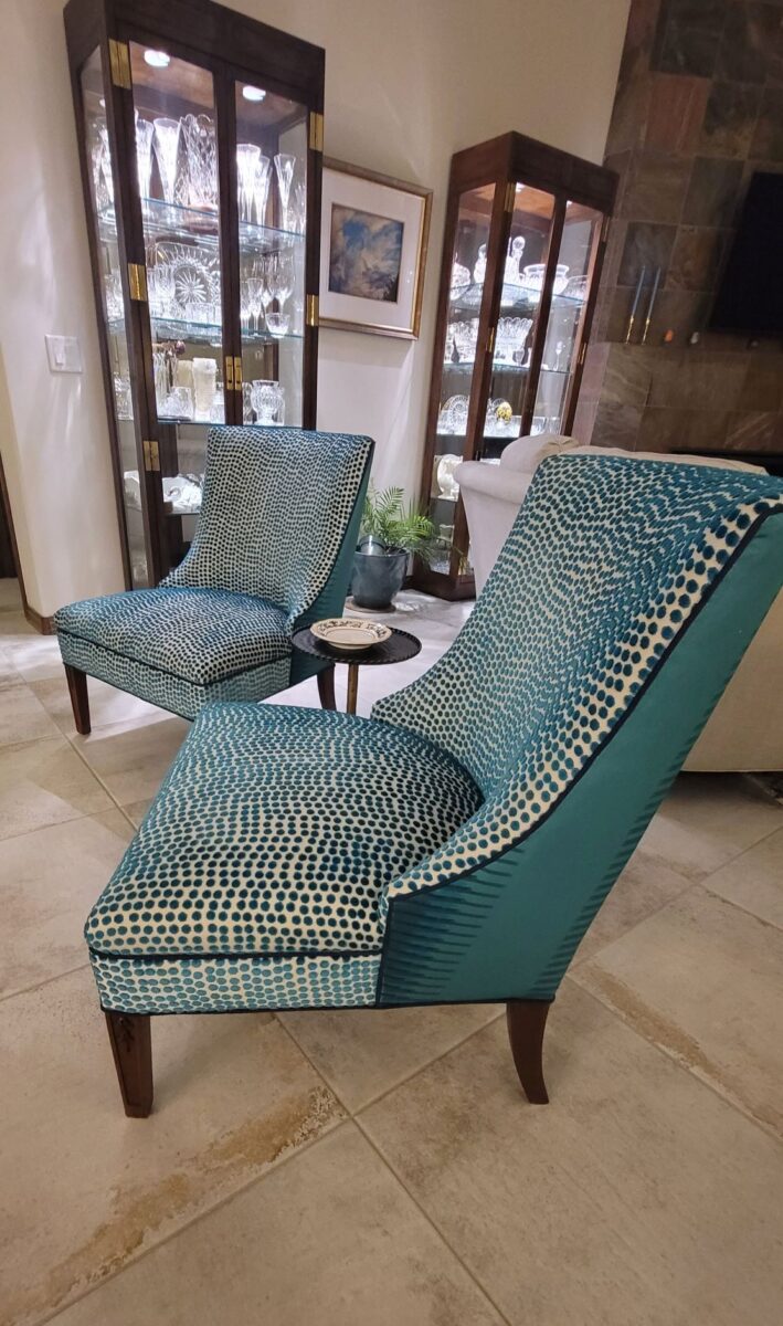
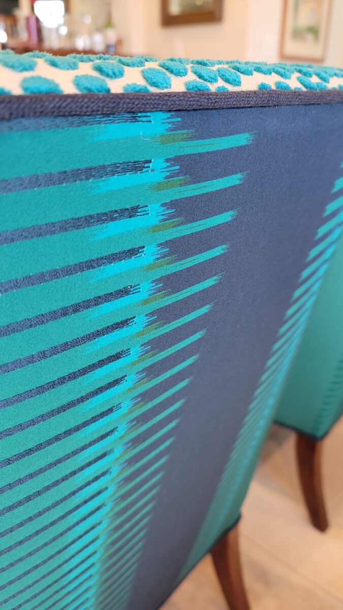
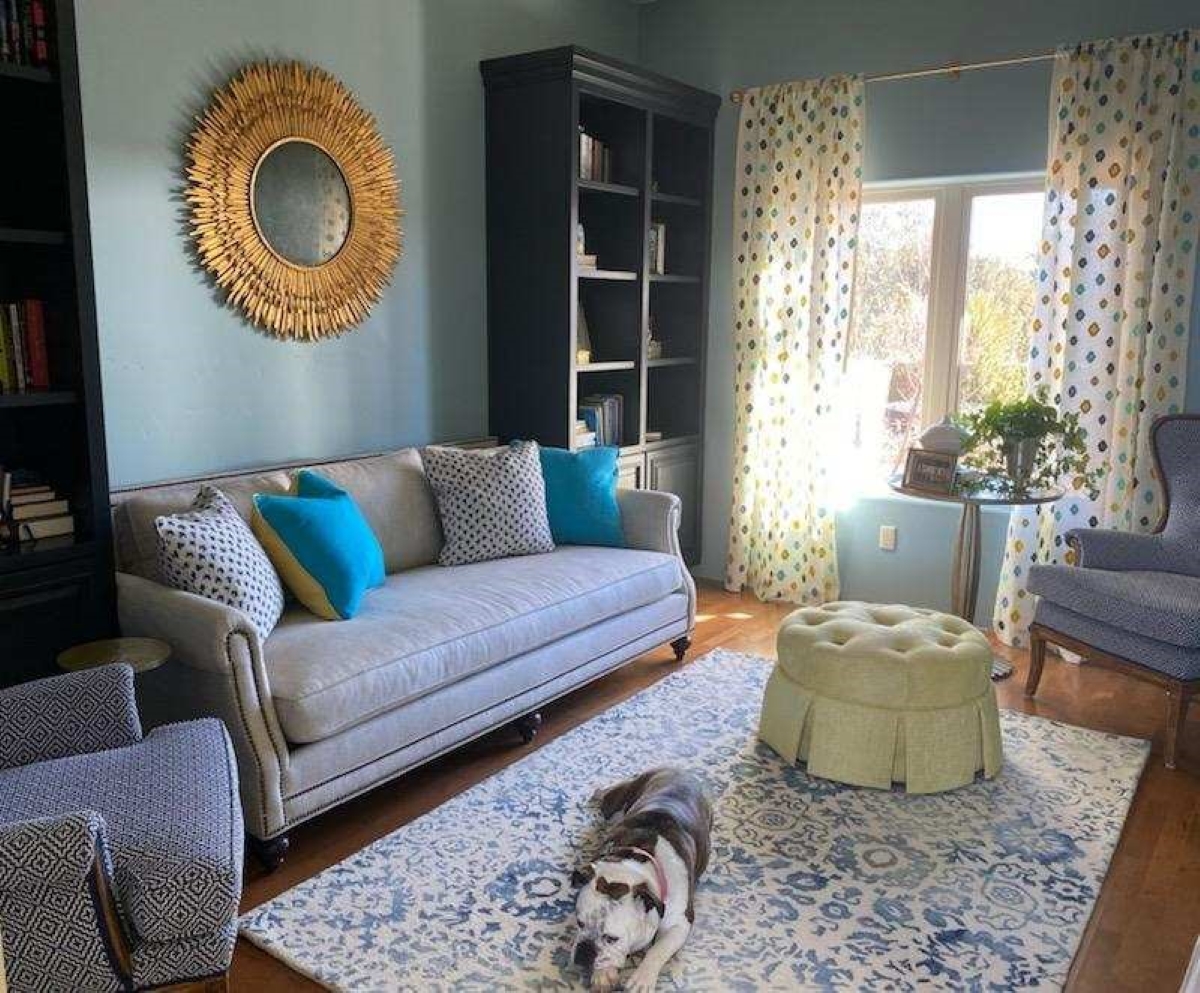
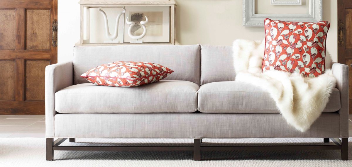
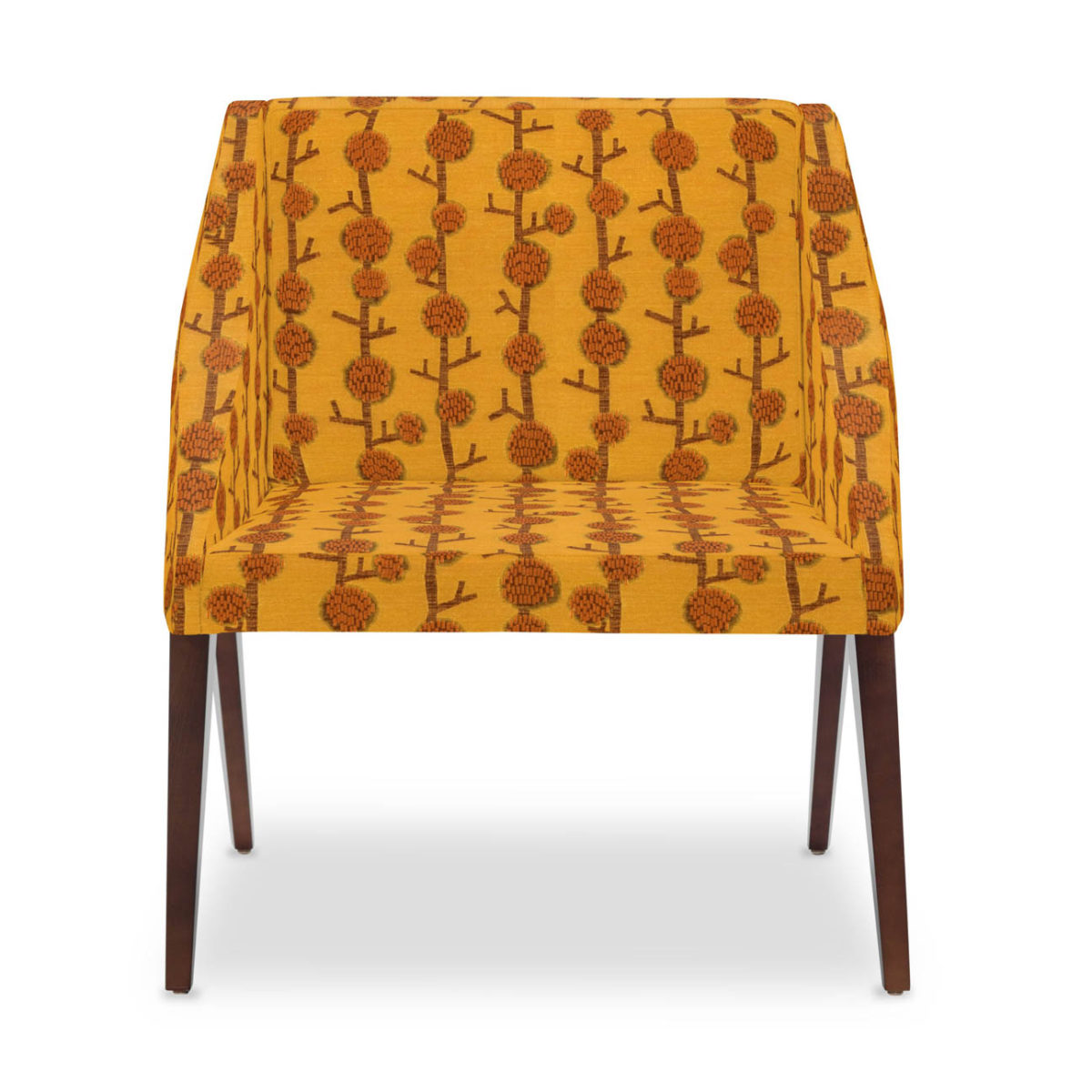
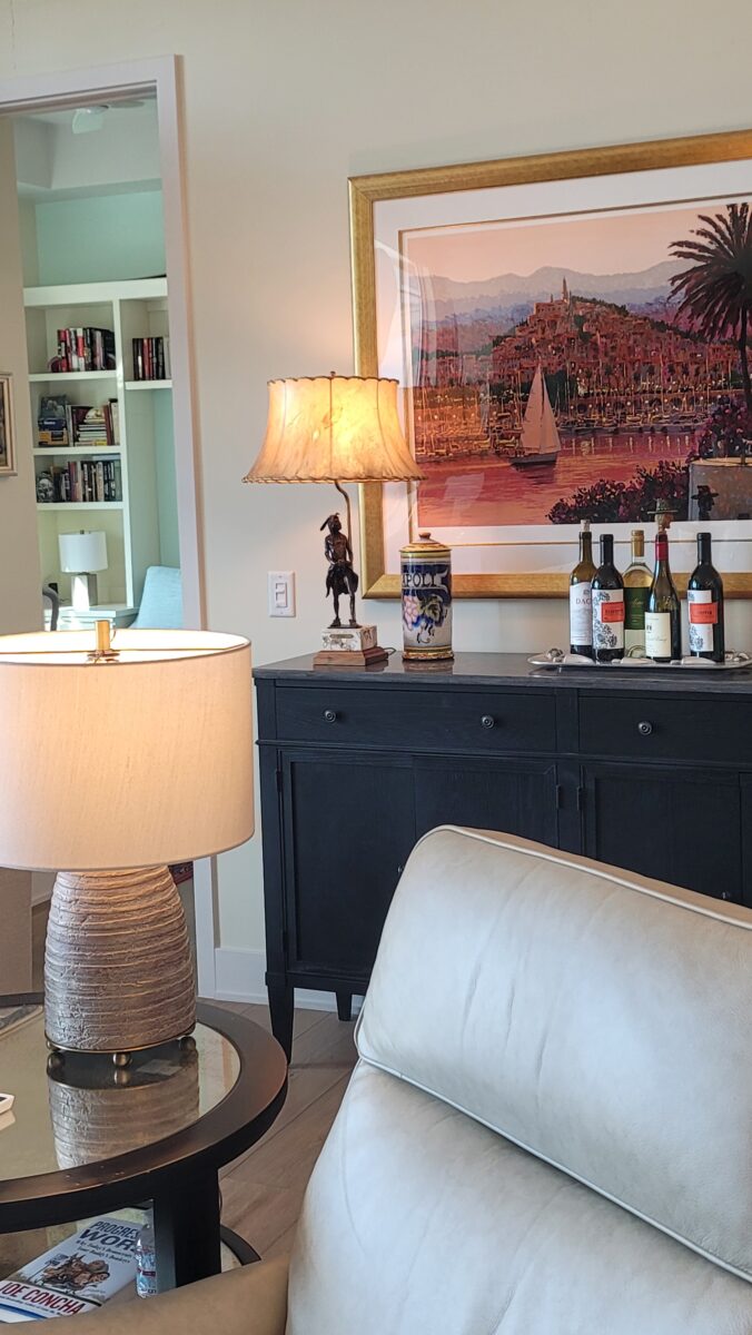
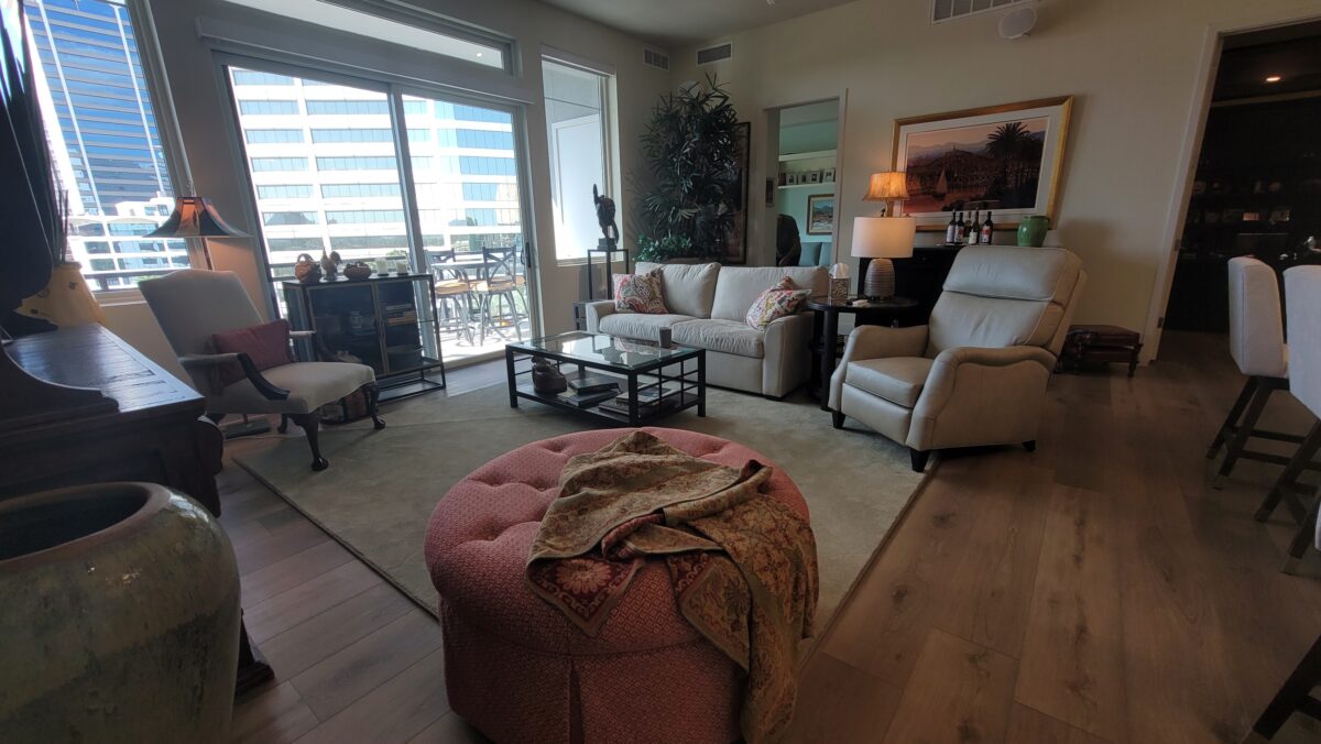
We “punched up” the living room by keeping very few key pieces while purchasing a few new, necessary, and accent items. A new, smaller, sleeper sofa, well-designed recliner, pair of small-scale curio cabinets and an area rug completed the scene. We found the curio cabinets in a consignment store which always adds to the fun of discovery and eclecticism.
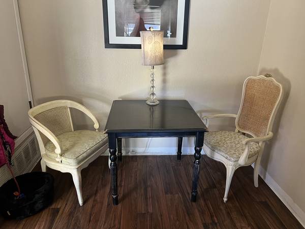
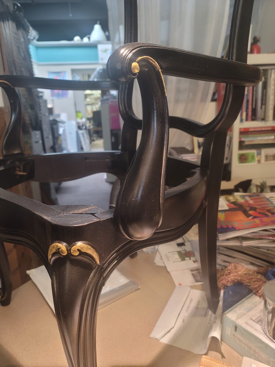
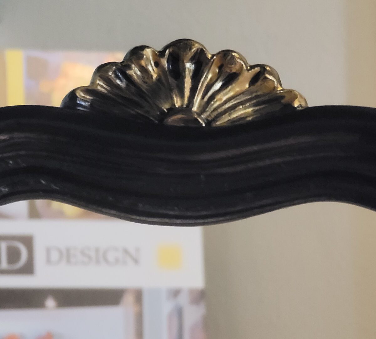
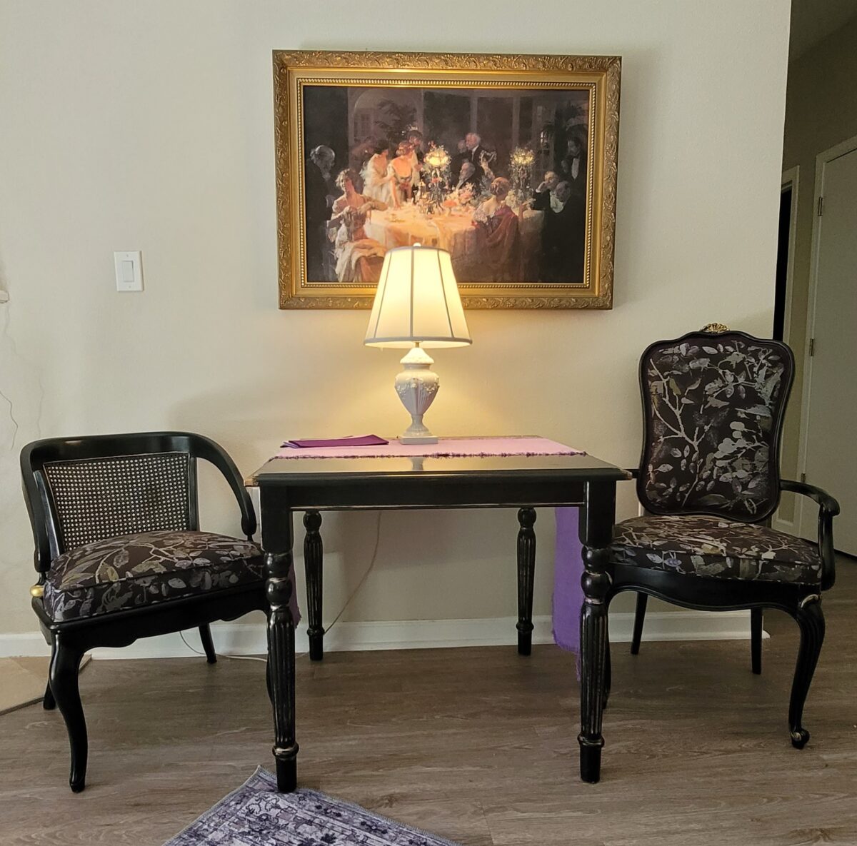
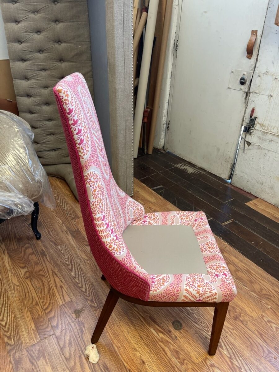
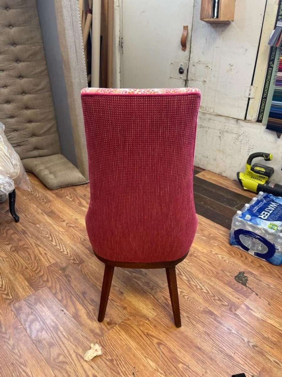
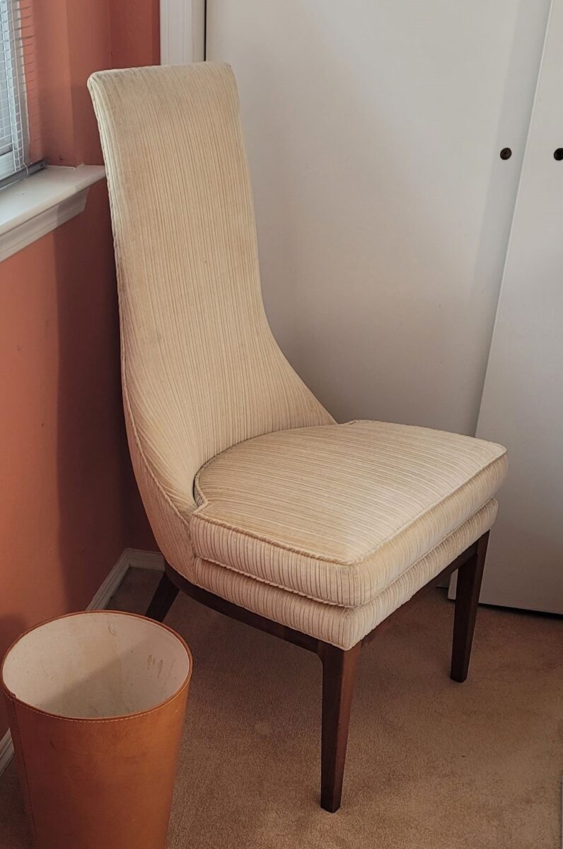
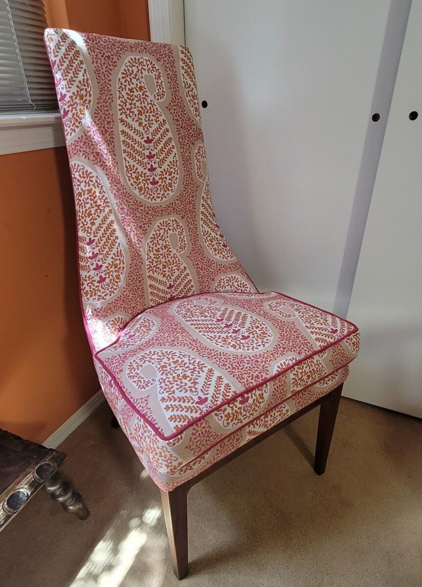
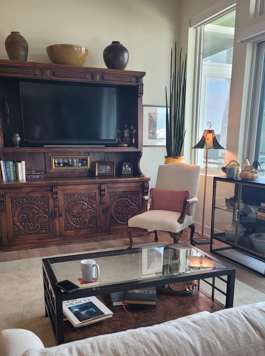
We reupholstered a large, round ottoman and a carved Queen Anne reproduction side chair in a creamy neutral, but accented with a pop of a rich brick heavily woven fabric for the ottoman and lumbar pillow. We also kept the handsome cocktail table and massive sideboard.
By combining familiar treasured pieces and updating with necessary new pieces, the finished product was both familiar and refreshed.
As I previously mentioned at the start of this series, connecting with an interior design professional who can assist with the process of planning the move, placing the furnishings, selecting the finishes and colors of the new space, finding things to better fit the new rooms, while curating the things that mean the most or work the best is invaluable.

Helping to organize, make decisions, prioritizing, placing items on a floorplan to better understand size and scale – what to take with and what to leave behind. It can be exciting, but it can be emotionally stressful. Parting with things that have been collected over a lifetime is a huge chapter to turn.
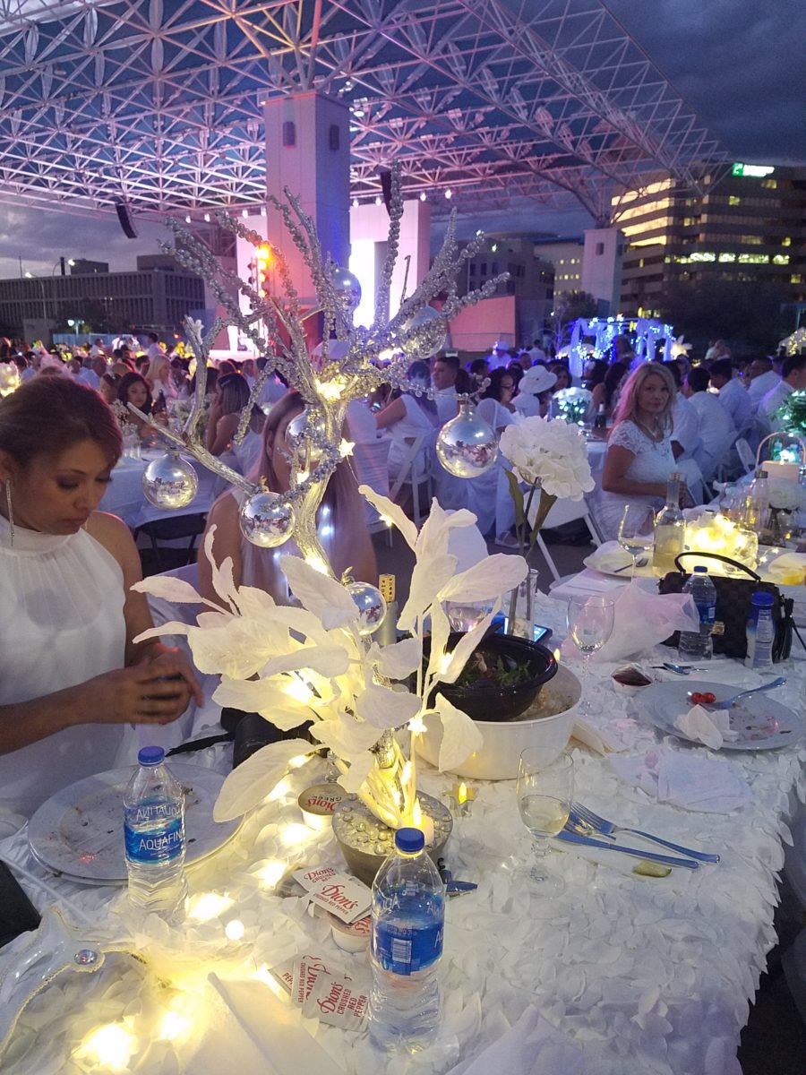
In contrast to the previous article about the single woman being displaced in a less than enthusiastic manner, this case was about a mutually decided new chapter – an adventure. It was completely voluntary and well planned. Downsizing can be emotionally draining at best, but when the decision is mutual, it can be exciting and fun! Making any downsizing situation positive is the key!