Whether a minimalist or an eclectic collector/gatherer, one’s details of home are important and personal. Like personality types, what is important to one person is not so much for another. However, it tells a story. The details of a home make it just that. Home.
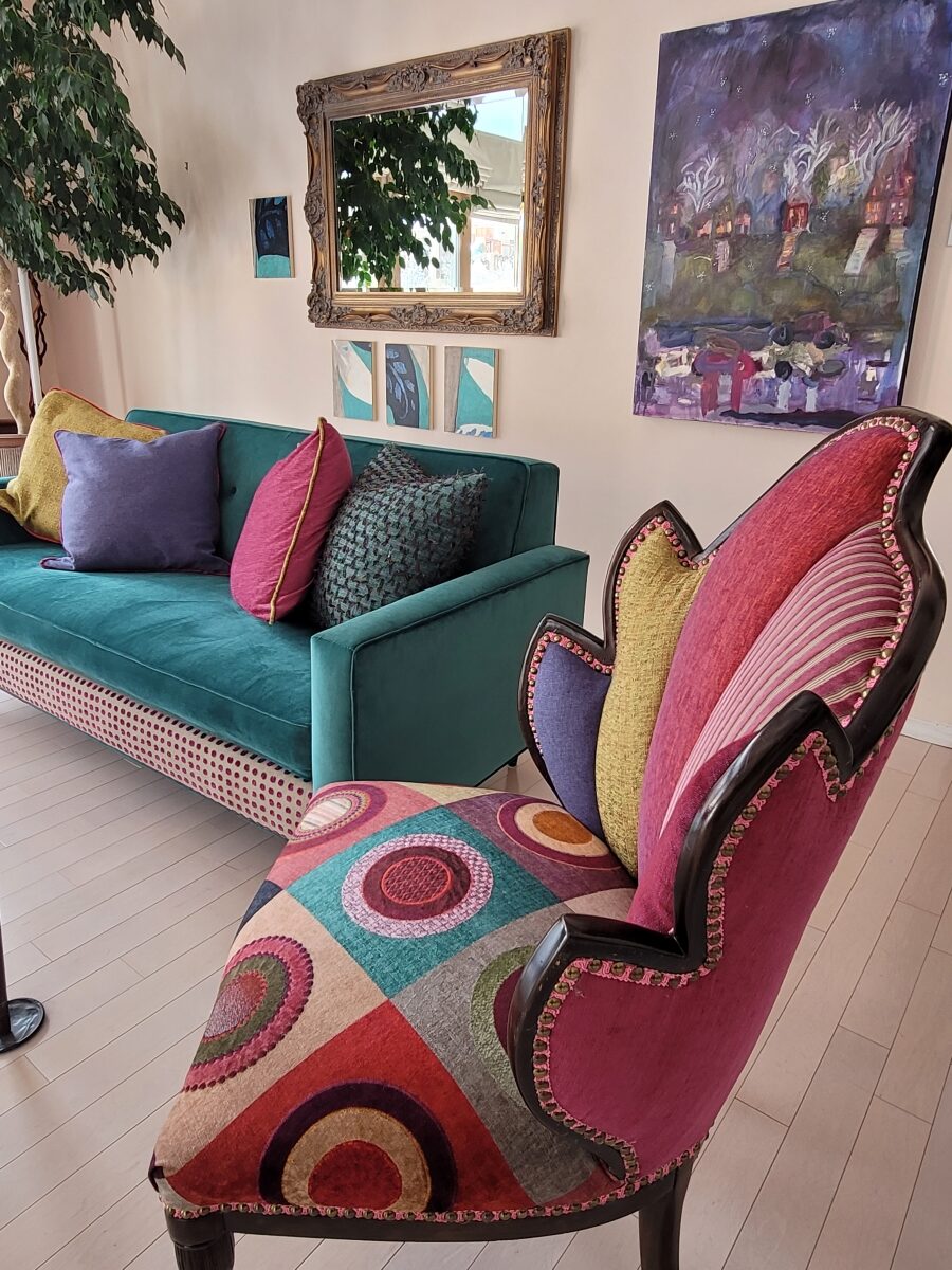
This interior has a lot of personality and very much reflects the artist who lives here. Antique family side chairs take a near full century leap with this new, colorfully eclectic upholstery.
Residences, the dwellings in which we live, can take many forms – from short-term to decades of ensconced living. To “reside” regardless of the length of time – suggests a certain level of comfort to include some detail(s) to make it “home.”
Each home is an individually personal space filled with details that make it so.
What might YOU consider imperative elements of what you call “home?” Consider comfort, color, ambiance, familiarity, convenience, nostalgia and perhaps just pure joy.
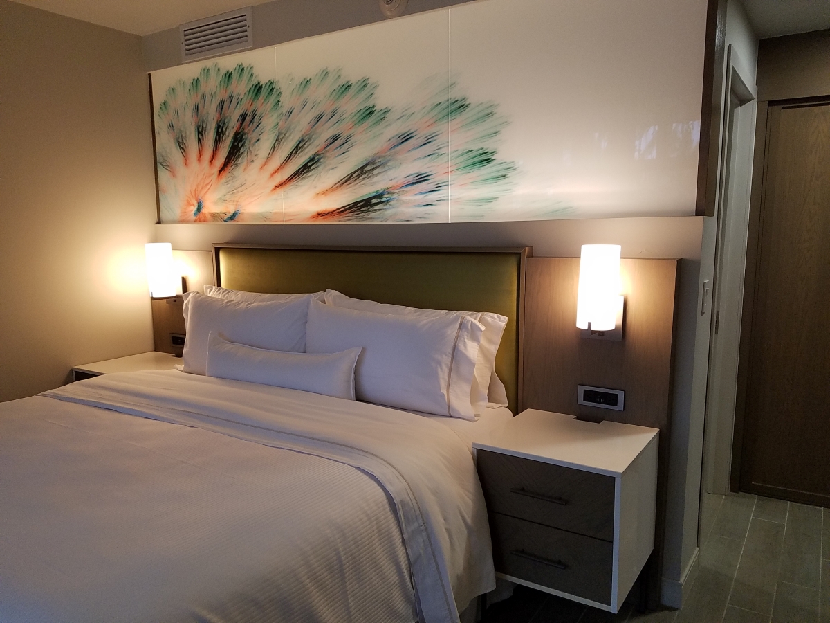
A hotel room for the busy “road warrior” traveling for business, might reveal a photo of a loved one placed thoughtfully on the nightstand. Something as simple as this can make a temporary residence feel more like “home.”
Upon plopping the overnight bag on the hotel bed, one of the first things to unpack might be the framed photo of a loved one to place on the nightstand.
Dorm rooms will reflect personalities, pleasures, interests, colors and imagery for young people leaving home for the first time. They create their own sense of place and “home” while embarking on their new chapters of life.
While looking around your place of residence – this place you call “home,” consider what is important to you. It might be the actual architecture, quality of natural light, a collection, a piece of art, furniture, photographs, decorative accessories…
A little over a year ago during the throws of our introspective isolation, my cousin, a thoughtful artist of photography, commented from Connecticut about The Essence of Home. In it she shares intimate observations and encourages personal study of your significant space – memory or current abode. She also suggests an interesting little project in which she invites us to “take half an hour and create a photo essay of a place that has significance” to us. “Challenge yourself to capture a feeling. Wait for the right time of day and seek out the mystery of the place. (This is a great activity for kids, too. You’ll be amazed by what they choose to photograph – what “home” means to them.) See what thing you’re drawn to capturing; become aware of the everyday beauty in the space around you.” https://www.catebarryphotography.com/
As an interior designer, I am engaged in creating and illuminating details that are meaningful. Whether a view or an object, color or finish, access or privacy – inside or out of the interior these elements collectively contribute to create the overall design. I encourage my clients to identify things they do and things they own – things they have gathered and how they live. What of them is of greater importance and why. This process begins a dialog of preference, value, and interests. Establishing priorities to springboard a project is key to a firm platform for the design.
You know the old question…If your house were on fire, what would you want to get out? It might be a person or a pet certainly – but if it were a material possession(s), it is a question worth pondering. The same is true if you moved or remodeled, what elements would you want to retain or replicate and what would you eliminate or change?
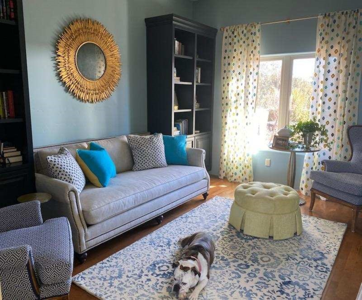
Vintage family pieces reupholstered, new pieces repurposed, bookcases filled with personal treasures, and the precious pet in the center of the action. Home.
The details of your home are personal, identifying, comforting aspects of your interior design. Discovering these important details is significant in effectively planning your interiors.
After
last week’s Color of the Year observations, I furthered the subject regarding
the importance, influence and value of colors.
I
don’t know the science behind how individual’s eyes perceive and translate
color… rods and cones and the anatomy of the eye as it speaks to the
brain…but what I do know is that
COLOR and the context of COLOR MATTERS even if it is not perceived exactly the
same by everyone.
My
parents were coincidentally both apt to notice, remark about and describe color
specifically. To them, and ultimately to me, colors were something to
regard and absorb, for better or for worse, and all colors deserved acknowledgement
and specification.
I distinctly remember their descriptions, “Parrot Green, Sapphire Blue, Lemon Yellow, Fire Engine Red and Brown as a berry” – a compliment which indicated that you had tanned sufficiently! I think it was a result of our island home-away-from-home that prompted many of these titles. We, for sure, had no parrots making their presence known in Virginia! But for some reason, colors in the islands prompted unusual appreciation and scrutiny. This parrot green was like grass green but a bit more intense – saturated – not a dark green and certainly not a spring green – just a brilliant, clear, secondary green! The result of true, primary blue and yellow mated to make GREEN!
Color is a communication tool to convey – color. But what color? What type of color? What specific color? Is your version of a color the same as mine? Do we “read” color the same way? Do we express the description of color the same way? How might you explain a color to a person who is blind?
I’m writing this today from the tropics and it seems worthy to note that colors are abundant here in brilliant evidence through all seasons. Whereas in a decidedly changing seasonal and climate, colors come alive in spring, progress through changes and pretty much crash for the dormant winter months. Contrarily, the topics meld their rainbow of blooming floribunda, bounty of fruits and palette of these brilliant colors year round.
Maybe
it is because we straddled both worlds. The lush, verdant, colorfully blooming
and always reliable tropics countered by the decidedly and distinctly changing
seasons through dormancy in the northern climes. There must be an appreciation
for the change. The lovely, yet possibly monotonous climates that produce
blooming color all year round might dull the senses to the seasonal reemergence
and staggering beauty of new growth and blooming abundance and mute the verbal
expression and appreciation thereof.
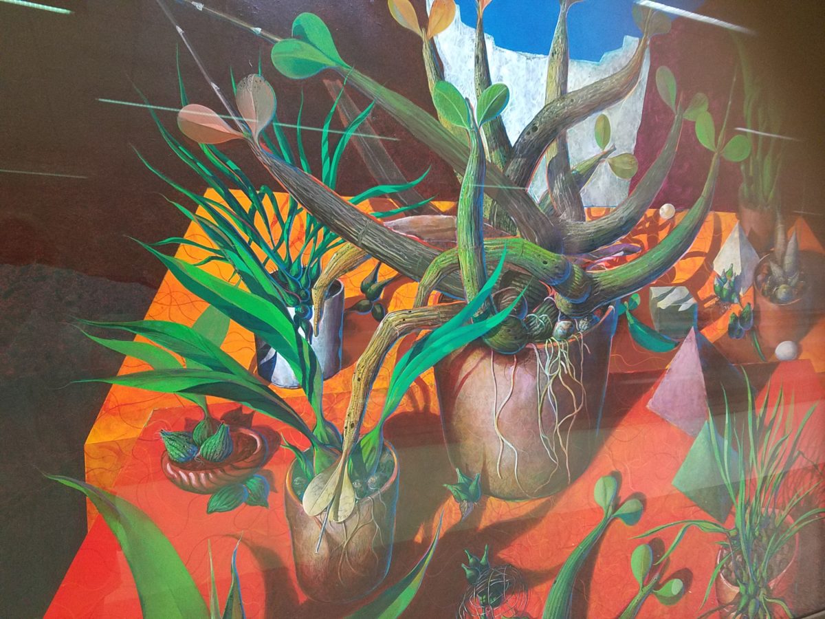
For example, my color antenna is always up and running. As I struggled with my pair of carry-on luggage monstrosities clearly in excess of 75 pounds (good thing there is only a size and not a weight limit!!), I came upon 2 art pieces in the Houston Hobby airport. The colors beckoned me. Although I had noticed them in swift passing, I couldn’t help wanting to see more. So I stopped and dashed back, disassembled my cumbersome haul and quickly took photos of these two paintings on exhibit, in the concourse, in order that I could enjoy them a bit later. Initially attracted by the color, they arrested me allowing and inviting an opportunity for further examination of their subject matter and detail later, when I had the luxury of time.
The wildly organic plant life, featuring an animated orchid that tangled and writhed on the painting’s surface in a variety of verdant green’s set against a perfectly selected fiery orange table surface, was brilliantly alluring and seemed to set the stage as a precursor to my soon-to-be-destination in tropical Mexico. ARTIST: Lucas Johnson Still Life with Schomburgkia
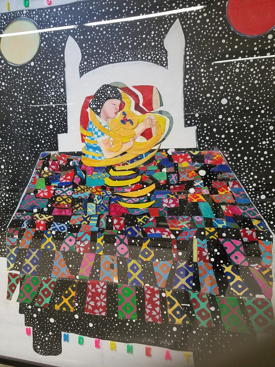
A bit further down the corridor of the concourse another piece caught my attention. Similarly with its colorful invitation, but with entirely different subject matter which upon closer inspection was quite intriguing, a patchwork quilt of batik fabrics and collage with applied letters beckoning the viewer to wonder what might be beneath was magic. The woman or child and beloved pet in the center of the action nestled under a cozy and colorful quilt, wrapped in a cloak of starry darkness which might suggest clinging to each other against the foreboding imaginings of the night.
The intense collection of the brilliant colors contrasting against black was dramatic, mystic and inescapable in this powerful piece, It Helps to Think We’re Sleeping Underneath the Same Big Sky by artist Joo Young Choi.
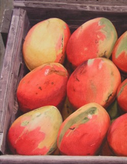
Watercolor
artist extraordinaire, Susan Weeks, captured this crate of mangos at
an exotic market somewhere very south of here. Peru? Ecuador? I don’t remember.
Susan gets around. And, Susan sees color and detail and renders it with
remarkably exacting precision.
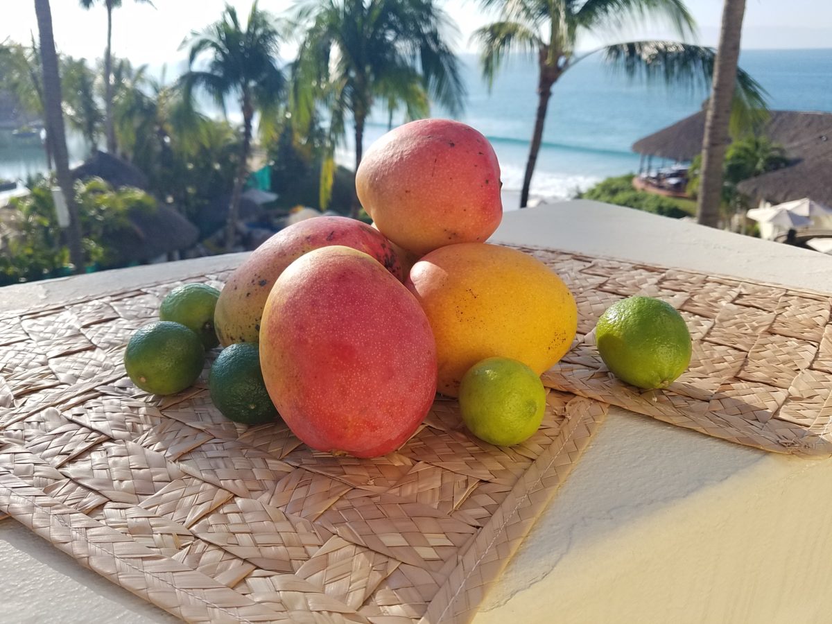
As I greet the day, I’m taking my stash of mangoes out onto the balcony to be seen and photographed in context. Reminded of how Susan rendered this succulent sweet fruit, with the delightfully “hairy pit” (nods to Tricia), I celebrate this colorful collection of nature in a sensational setting! These gorgeous tones of warm golden yellow, baby iguana green and yes, 2019’s rosy warm coral (Pantone’s “Living Coral”) are nature’s color scheme. The orbs are sensuous and the colors are excitingly bright and luscious.
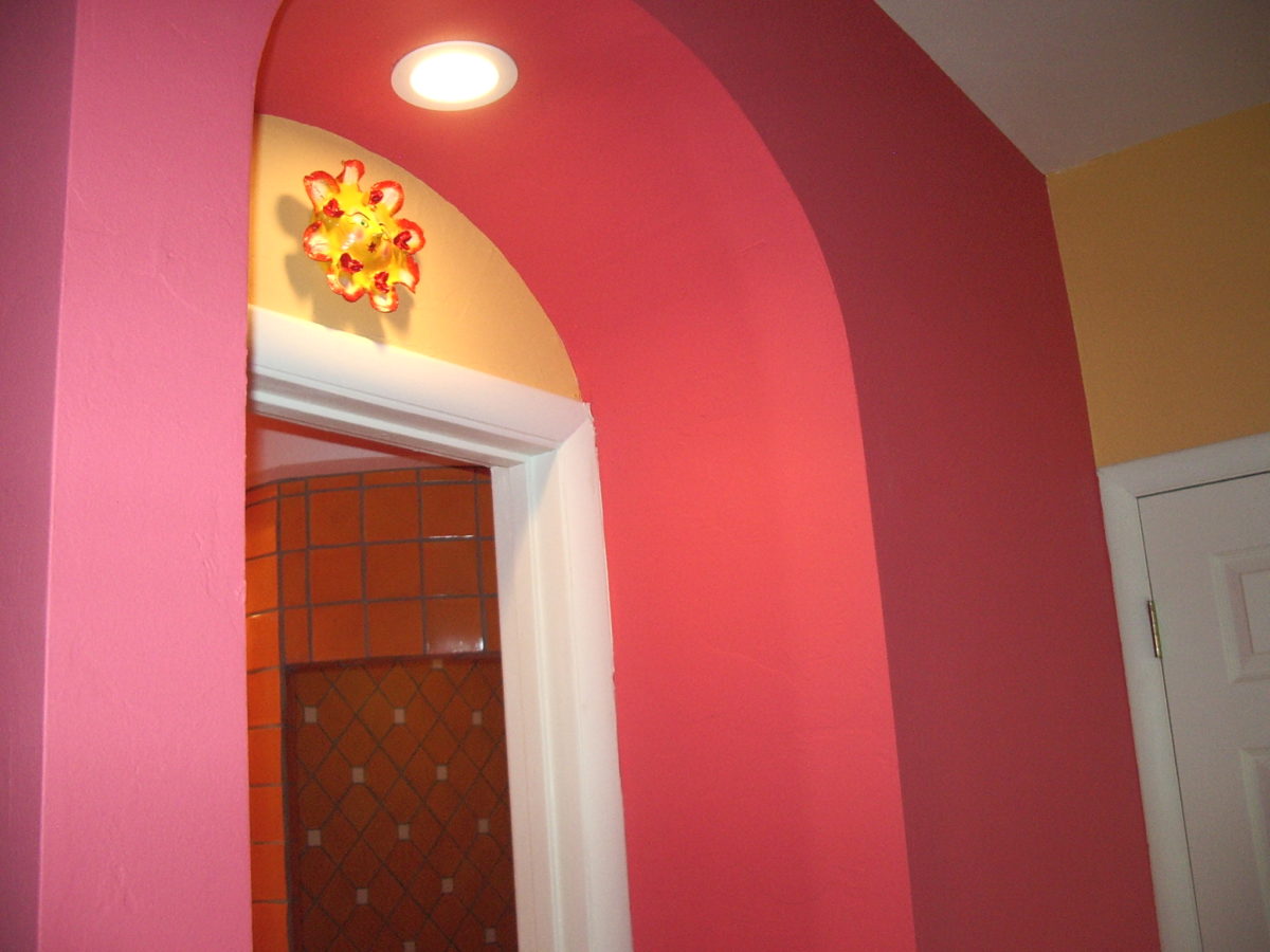
Mango colors of rosy coral and warm, golden yellow are paired in this arched interior entry.
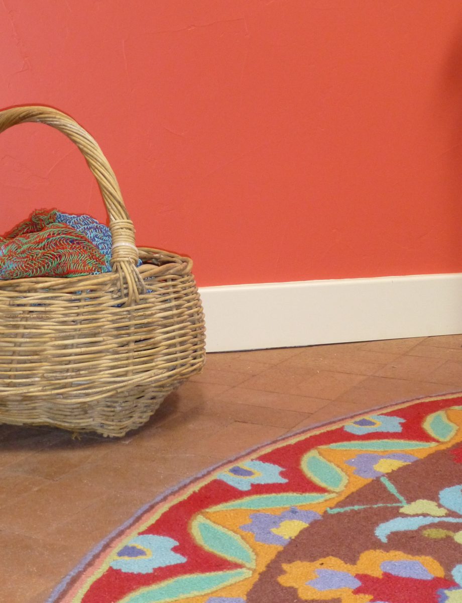
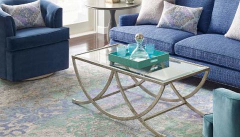
Here a similar scheme featuring one of our favorite Company C rugs illustrates the bold, effective power of color selection.
Try this exercise with color. I have no idea what your eyes see and your brain translates, but walk around and look at things in your world. Notice color. Notice individual items…book bindings to fresh fruit. Evaluate each color’s effect. Does it evoke any emotion…good or bad? If you wanted a painter to paint a wall that color and you didn’t have the paint selected, how would you describe that color in an attempt to get it on the wall as you desired?
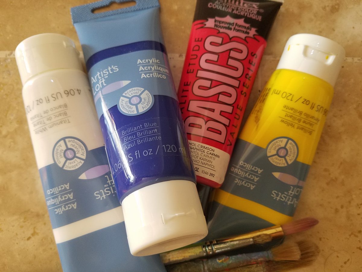
In a more thorough test, you might be prepared with actual paint – like tubes of acrylic from the craft store. Get a print-out of a color wheel to illustrate the primary, secondary and tertiary colors. https://bit.ly/2SVKUMg Buy red, blue, yellow and white and use them to attempt to create the color being described. This could be a party game – but you would need to also have paint chips from the home improvement store or paint store to use as the prompts that would have to be described and used to match the success or failure of the person attempting to create the color.
Noticing color brings appreciation to the details and nuances of our color-filled world. The little exercise/game, to try to convey a color to another person based upon similar life experiences and references, is interesting. Please share your thoughts and experiences, dilemmas and frustrations with this project through the blog’s email.
I hope this encourages you to go forth with a new-found appreciation of color and how it adds layers of depth and interest to all that you see. Examine the natural world, or man-made creations in film, set-design, architecture, graphic advertisements, fashion design or interior design. See why color matters!
Finishing touches are always the beast to tame at the end of the hunt. Yes, you’ve hunted, you’ve searched, you’ve gathered, you’ve assembled and stood back and observed your work. What’s needed? What’s missing? When is it finished?
Just the word finish sets up a mental block for many. It’s like decisions period. Once you make a decision, you’ve lost your choices. Losing choices can be a dilemma in itself! So, from Pinterest to HGTV and the internet at your fingertips the choices and options are endless, but what do YOU want to do, to call it “done? It’s all in the details…
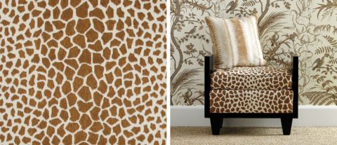
Schumacher offers details right down to the trim on the draperies! This bold key design makes all the difference!
And inasmuch as you can’t seem to GET it done, you WANT it done – just can’t seem to get there from here. How do you decide what you need to add for those incomplete finishing touches – to be FINISHED? Know though, that to have the feeling that it is finished is a good thing. Yet, that doesn’t mean you can’t change it – sooner or later!
We interior designers have jobs because our clients need to do things, change things, finish things. It seems that with all the options presented on TV and the internet, people are jumping in with inspired ideas, making decisions, buying things and doing things – then coming to a screeching halt! “HELP!” is the cry when everything seems to be too much – or not enough – or too uncertain and overwhelming – or not just right.
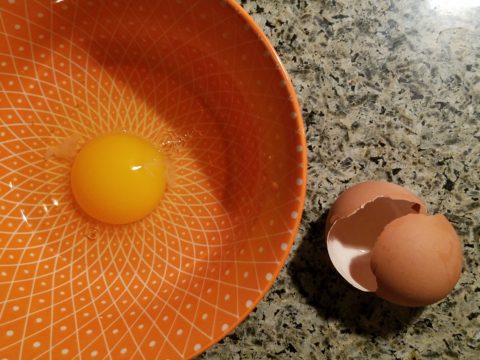
As if your own self-imposed frustrations and pressures are not enough, your partner rants…”Just finish it – will you? Be DONE with it!!!” Not everyone loves a DIY project. Most people don’t even like the disruption of a professional team coming in and tackling the job. Alas, “you have to break an egg to make an omelet,” some wise person once said.
Whether you’re changing paint colors for the third time in a month or tossing throw pillows around the room, to no satisfactory avail, there’s something missing…something is not quite right…it’s not there yet.
Have you removed everything from the walls and lined them up waiting for inspiration as to how and where they should be placed and grouped – maybe re-framed?
What about a mirror to add depth? Is it an installed mirror – the illusion of space without calling attention to the mirror itself or should I hang a framed mirror that makes the statement in its entirety? Do I lean it against the wall or is that a trendy affectation?
Uttermost is one of our favorite sources!
Studied nonchalance is an art form. How to achieve that intentionally unpretentiously naturally relaxed look is a challenge. Just writing about it here is an effort in describing that which is supposed to be effortless!!!!
Perhaps it is a monotony of height. Do you need a tall piece among other lower elements in the room? Maybe a tree in the corner is the answer or a statue of some vertical art statement, to add interest and height. Perhaps you might consider hanging something, from the ceiling – a mobile or origami bird or even a light fixture, to draw the eye up from the otherwise low furniture pieces.
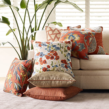
Robert Allen presents perfect fabrics for colorful pillow accents…and there’s that tall plant for height!
Speaking of light fixtures…how does your almost finished, but not quite there yet, room look at night? Are there dark pockets and corners that would benefit from some concealed up-lights – indirect lighting can be quite effective and enhance a spooky, dismal space.
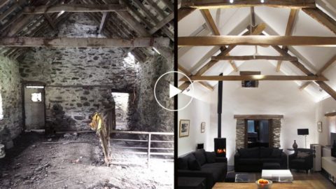
LOVE this before & after! Check out John Cullen Lighting for some great ideas and inspiration!! https://www.johncullenlighting.com/
Spooky is the season and, with the holidays approaching, the need to get things finished before guests arrive or you leave to visit… or just the hectic nature of the baking, gift-buying and wrapping, shipping and other communications aspects of the season are upon you – pressure you to want to get things finished!
Brunschwig and Fils by Kravet offers an amazing collection of prints – mix and match!!!
Have you consulted with a friend? Do they rise to the invitation of critiquing your present state of affairs and offer design ideas that further serve to confuse you? Better yet, ask two friends and get two different options for finishing your space and then what? Pick one and the other’s feelings are hurt that you didn’t take their advice – even if they are not aware that your decisions moving forward were offered by another friend.
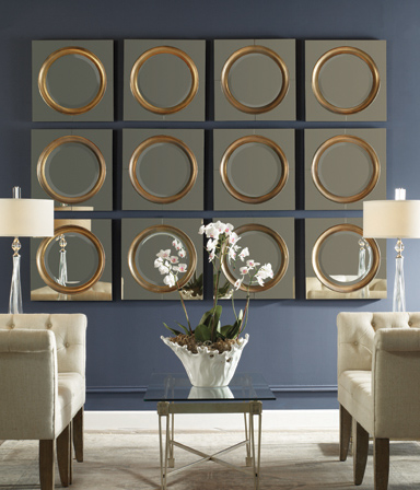
From the rug (thank you Company C for your “Colorful Living!” to the table accessories and all the things, pieces, fabrics, details in-between – finishing touches FINISH the job!!!
A designer is a problem solver, a tie-breaker, a marriage counselor, a creative who extracts your needs and – evaluating all options – offers the best solutions to get your job finished!