Da Vinci, The Genius

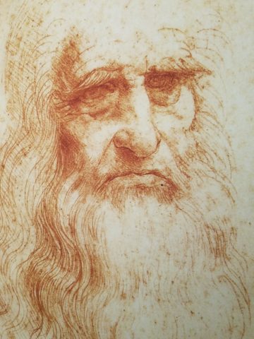
When you hear the name da Vinci, Leonardo da Vinci, its undeniably familiar. You might instantly call-up a synonym – genius. But what do you really, other than the Mona Lisa, recognize? And what do you even know about her and the painting itself? For the past several months now nearing the end of its run, the exhibition Da Vinci, The Genius, at the Albuquerque Natural History Museum, presented by Grande Exhibitions of Victoria, Australia in collaboration with the Museo Leonardo da Vinci , Rome and the French Scientific engineer Pascal Cotte is an amazing consolidation of information on this singularly remarkable man.

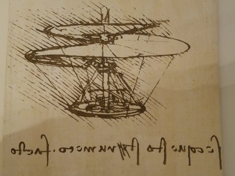
An artist or even designer are such understated titles for this man of extraordinary inventions, concepts, engineering, art and science, because he was the true Renaissance Man! He touched so many things to advance countless trades and disciplines many of which are the basis of machinery and equipment in use today. But as brilliant as the universal exploits of this amazing polymath are, this would be a tedious blog if I focused on the many pulley systems, gadgets, mirrors, SCUBA suits and even flying machines that he created in his lifetime.

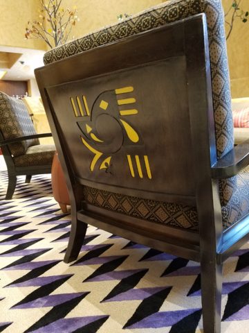
Rather, I would like to use this fascinating field trip that I just experienced to examine how I as a designer have been influenced by da Vinci – specifically, the spectacular rendition of the Golden Mean – nature’s perfect ratio that occurs in nearly everything around us. This common mathematical ratio is used to create subliminal perfection and pleasing compositions that mimic the perfect ratio found in nature and specifically, for my purposes, in design.

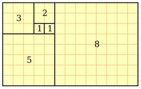
If you remove this square from the rectangle, you’ll be left with another, smaller Golden Rectangle. This could continue infinitely.

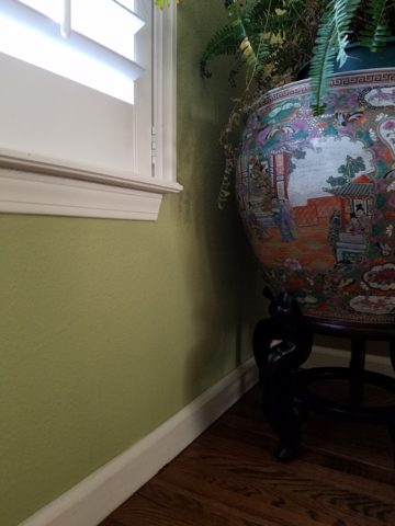
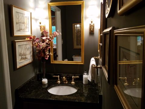
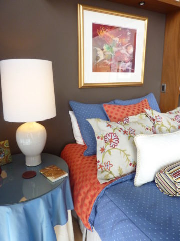
I have written about this previously in greater depth. It is a subject that has no limits as the application of this ratio helps assure good compositions whether you realize it or not. For graphic designers it is a must. For interior designers and architects it the formula for so many aspects of their work. People in art and design have employed the use of this perfect ratio for thousands of years. If you apply it – it is foolproof.


But back to the exhibit…there he was – the iconic man rendered in gold on black. You’ve seen it. But to know him is to see the perfection in the proportions that da Vinci used to create this perfect figure.

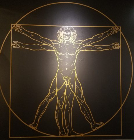
Right there in a commanding focal point was da Vinci’s drawing of Vitruvian Man. The accompanying video explained the relationship of all the dimensions as they related to the perfection of the Golden Ratio. Time and time again it is evident in the sections of this perfect anatomy.

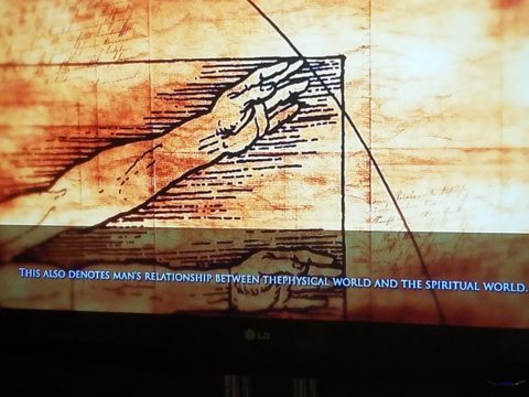
Da Vinci correlated that the perfection of the proportions should be applied to represent the perfect human anatomical body and that it was an analogy for the entire workings of the universe.

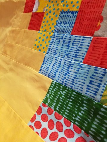
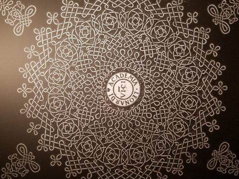
His magnificent study of knots became sought-after for luxury fabrics used in 15th century fashion – many of which costumes and finery he designed. Interpretations as lover’s knots – the bond between them was a popular notion of his time and afterward.


It is an exhibition worth seeing. Even if you have stood in front of the real Mona Lisa and have visited sites exhibiting his vast creations and noted observations, this exhibition is worth a visit!

Decorative Wallcovering – Fun with Tile

When you think about finishing a wall, you probably think about paint colors…you might think about a wallcovering – wallpaper, or even a mirror – I’ve previously noted how mirroring an entire wall can exponentially expand a room – a dimensional effect/illusion that suggests the room extends well beyond its actual size. But another wall treatment, with which I LOVE to play, is tile!

All over the world, the art of designing and creating decorative finishes with tile has been evolving for centuries. All cultures have utilized mud and clay, glazes and fire to bake beautiful patterns and colors onto geometric slabs. Shapes of rectangular, square, octagonal, dots or diamonds – the geometric shapes are many and the designs are limitless.

As is true with other wall treatments, I prefer not to stop on an outside corner. I believe that the color or material should suggest a built mass – part of the architecture. To stop on an outside corner suggests a veneer. It proves that the finish on the element is not a structural/integral part of a built mass. When you paint into an inside corner and stop, it allows the mass the read as though solid and not merely superficially treated. The same is true with tile. Don’t stop it until you get to an inside corner – if possible. There are situations that force a finished edge on the flat plain of a wall – but avoid outside corners at all cost!!

This entire shower is tiled floor to ceiling, around the pony wall, bench…no door…it reads like a built environment of stone tile.

Think of the surface as an architectural element. Tile from floor to ceiling, inside corner to inside corner – wrapping corners, if needed, along the way.

Take a backsplash…customarily used to do just that – catch splashes at the back wall of a wet area (sink) countertop…bathrooms and kitchens, behind sinks and between upper and lower cabinets – but why stop there?

The entire back wall of this kitchen is mosaic marble tiles in a herringbone pattern.

Think of it as a true wallcovering – wallpaper. Commit to the entire surface. Here are more effective examples…

The backsplash and entire adjacent wall were covered in glass mosaic tiles. It “reads” like wallpaper.

here again, the classic blue and white Talavera tile backsplash is continued along the entire wall from floor to ceiling.

We are currently working on a couple of kitchen projects that will soon be completed. They both use tile liberally. Each quite different from the other. Stay tuned for the finished products!

In bathrooms, the area around a mirror can be more than merely the backsplash. Embed the mirror into the tile surround or tile the entire wall and hang a mirror on top of the tile surface.

This mirror is flush with the surrounding tile, suggesting that it is embedded into a tile wall.


Planning this transformation, the mosaic vase was the inspiration. Then loose tiles were scattered on the countertop and the concept began. Note, the existing mirror was attached to wall with light fixture mounted above it and a medicine cabinet off to the side.


The transformation involved removing the medicine cabinet, taking the floor tile up the wall and wrapping it floor to ceiling. It was also cut into smaller squares to use behind the sink as a “full-wall backsplash.” Then punctuated with glass and glazed tiles to create an updated design. Relocating electrical to flanking the mirror for a pair of new sconces and a new countertop, faucet and sink with existing cabinets painted resulted in a cost-effective design.


Here a mirror is mounted on top of the fully tiled wall. Inside and outside of the shower enclosure the tile is a true wall treatment.

I recently received this advertisement in my email. It was such a spectacular collection that it caught my eye and I share here one of the patterns and context shots as the backdrop to a range.

Mosaic assemblages can be fun! Here is a fireplace surround.

The addition of three-dimensional pieces adds interest.


This exterior fireplace surround tolerates the elements – an all-season installation.

Here is a mosaic mural of a dynamic geometric abstraction  discovered in New Zealand. We are using this inspiration to establish a theme in a current restaurant project. An interpretation of this in the form of geometric tiles of various sizes, colors and patterns  will  be used to create a cohesive repeated design element through various areas of the restaurant – both inside and out. Watch for this completed project in coming months.

Commercial restrooms can benefit from full-wall tile treatments too. Not only does it look complete, but it is an ease of maintenance consideration.

Three dimensional tiles add interest to this cactus motif!


Fun with color and texture, tile are also easy too keep clean – terrific for public restrooms.

Murals are also terrific ways to use tile as art in your  interior/exterior designs!

This is embedded into the stucco for an integral installation.

When using outside though, remember to consider the range of temperature and moisture to which  it will be exposed. Porcelain is the most durable in areas where the temperatures get to and below freezing. Freezing and thawing can destroy tile. Many murals are made from clay that is not suitable in cold climates!

Inset into the tile wall treatment is this stunning glass mosaic abstract mural.

Tile – it’s a nearly limitless medium. So consider the possibilities for your next project! As a piece of art, an accent wall or an entire installation – full-wall treatments make a statement! Have fun with tile!


Discovering Patterns

This week began with a juicy fabric presentation. I say juicy because it got my design juices working and I was inspired to take photos and imagine the opportunities to insert these wonderful colors, patterns and textures into upcoming projects.

Take the chicken and the egg scenario. Do YOU often find that exciting design elements invite thoughts of projects for which to use them?

A fun exercise is to take your camera and search for patterns to photo…patterns are everywhere from cast shadows to fabrics, signs and graphics to fallen leaves.

Seeing these exciting new fabrics – you had no intention of changing all your throw pillows, but these stimulating samples might make you consider changing your entire collection!

The opportunity to offer unique fabrics for clients who would otherwise never be exposed to the samples – not know of the possibilities – is exciting. Being able to make this introduction is a treat.

This first batch was of clean, sophisticated, woven, geometrics in blacks, whites and charcoal tones.

Whimsical patterns and textures, with splashes of color, offer more possibilities.

Now see these rich woven patterns and colors in this next series. An explosion of color and pattern  with a decidedly native direction – prime for New Mexico and design projects looking to evoke the elements of the southwest and other opportunities inspired by indigenous art.

With all this freshly implanted in my ever-swirling brain of design fragments waiting to be assembled, I traveled north this weekend for an enchanting New Mexico wedding that further fed the theme of indigenous art, pattern and design.

The lobby of Buffalo Thunder was riddled with magnificent pueblo pottery. The designs were wonderfully intricate and I saw them as stand-alone elements that could easily be fabric motifs. Here on pottery – but so fascinating to consider as possible inspirations for fabric patterns and designs.

Anasazi Buffalo Pot – Acoma Pueblo

Suggestive of a court jester, this expressive piece tells a figure story. The bold patterns make a powerfully beautiful statement. Who loves bold stripes? Do you wear them? Do you upholster with them?

Evening Star by Katherine Wall from the Jemez Pueblo

Cut-outs on lobby lounge chairs, with geometric upholstery, atop bold zig-zags of the area rug proves combining patterns creates a fine line between exciting juxtapositions and pairings – and risking possible disturbing disruption of order. Comedian Steven Wright uses dry wacky wit delivering hysterically funny observations to convey a sense of the obvious with a twist. I’m paraphrasing one I remember from years ago… “You know that feeling that you get when you lean way back in a chair…way back on the back legs…back so far that you are just about to fall…I feel like that all the time.” That’s like that feeling with challenging design. It goes just far enough to get your attention…designers get that feeling as they push the theoretical limits of design – all the time!

Ok- this is not perhaps THE most outrageous example of this theory – but a fun, eye-catching combination nonetheless!

Buffalo Thunder resort was the jumping off point to then venture beyond into the thrilling landscape of La Mesita Ranch.

Mixing different colors of brick make this random patterned walkway very pleasing and interesting.

The setting was natural, organic and inspired.

Simply lovely centerpieces

See a lovely, intense example blooming blue and white and much more in Nantucket on the cover of the new June 2018 issue of Architectural Digest.  http://www.theenglishroom.biz/2018/05/29/nantucket-beauty-by-markham-roberts/

So look for patterns all around. Discover exciting opportunities to mix patterns and textures.

Be brave – play with patterns!


Cats, Patterns and Participation

During the course of this day’s consultation this precious and perky bob-tailed cat, Kachina, inserted herself into the entire process.  She greeted me upon arrival, walked all manner of adjacent furniture as we discussed the scope of work. She tip-toed across tables, sofa and chair backs, and ultimately the hides we were considering for upholstery.

Initially we viewed the room and its present arrangement and realized that the l-shaped right angle position of the sofa, loveseat and recliner conflicted with the angles in the room. the sofa was perpendicular to the TV/display. The fireplace was at an angle in the corner. Neither one had the central focus – the attention was split from all angles. So the question was…Is it necessary to have the recliner as the primary TV viewing piece? Seemed like all the pieces were crammed together and the room was not being utilized to its full potential.

Kachina even has her eye on that bulky sofa as though to say – MOVE IT!


Kachina leaped onto the sofa to make her point- agreeing to the subject of our conversation!

It was determined that the recliner need not be positioned to directly view the TV. Once we turned the sofa to be parallel to the fireplace, it also opened the angle to the entire room and framed both the TV/display unit and fireplace. The recliner tucked into the far corner -not facing the TV – created a cozy nook for reading and next to the patio doors allowed a view of the backyard.

Needless to say, this fireplace crowned by this magnificent buffalo was an incredible focal point.  Formerly from Wyoming, this couple knew this buffalo. They knew his name and knew that he became too aggressive and gored at least one female to death – who had to also be put down and who’s pelt was on the floor in another area of the home. The hunt and subsequent shoot has been preciously preserved and revered. These were not mere trophies.

This is the most extraordinary collection of very fine Native American Art I have ever seen in a private residence. From to carved stone, amazing weavings to paintings and pottery, the presentation is stunning.

To soften all the hard and cold materials of the floor tile, leather and iron detailing, we are now on the hunt for the perfect area rug. Probably a shag to carry the balance of the contrasting finishes. Design is all about contrast, balance and harmony.  Unless the intent is to intentionally disrupt, in which case, the contrast takes center stage!!!!

These gorgeous brindle cow hides were so exotic and beautiful. The patterns and colors were wonderful and the couple who owned them had a great respect for the animals, and the celebration of their beautiful pelts.

Kachina was nearly camouflaged with her pretty pelt against theirs.

It’s fun when pets participate.

We will be making a pair of ottomans  with these two hides. Great for pull-up at parties to gather around the cocktail table in the center of the room. Watch for the additional photos once the work is finished.

Quilting – An At-Home Workroom of Color!

It’s not your grandmother’s quilting these days…computers have radically altered the landscape of this generations old art form.  
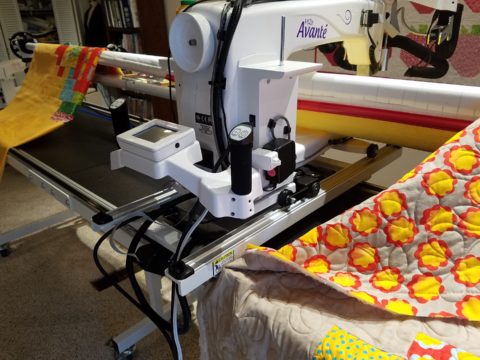
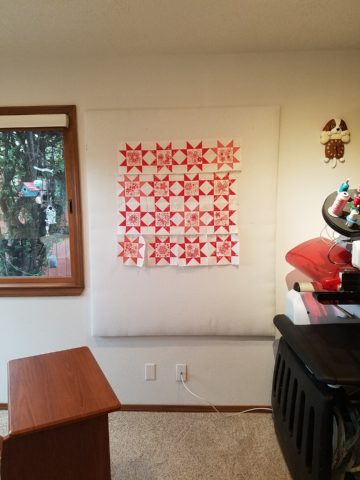
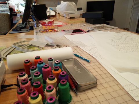
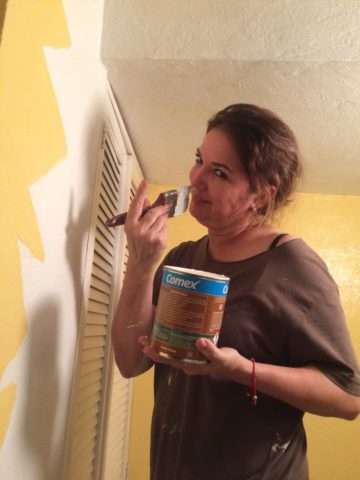
Two days ago I found myself in an in-home art-studio/workroom that blew me away!

Initially a craft born out of necessity, as creative survivors accustomed to “making something out of nothing” re-purposed scraps of material to patchwork new articles of clothing, homegoods and ultimately art for the walls. This clever, resourceful, utilization was celebrated in Dolly Parton’s song turned movie, about her true-life “Coat of Many Colors.” https://en.wikipedia.org/wiki/Dolly_Parton%27s_Coat_of_Many_Colors

The intricate designs and refinement of pattern details was obviously all done by hand, but with the development of machines and now computers for this purpose, the possibilities are endless.

So as I turned the corner, to see a would-be remodel of combining two bedrooms and expanding to the north of the existing shell, I was astonished to see this remarkable, expansive workroom – all white – punctuated with colorful creativity. Colors, textures, patterns…this extraordinary, rather Renaissance, woman had carved out a generous space to explore this phenomenal art and craft.

As an artist, Sue Watrous’ paintings and sketches are quite photo-real. On a few of her pieces, she has deconstructed the elements in the painting cutting them from fabric of many grey-tones defying the fact that they are textile assemblages.

This original pencil drawing – yes, photo-realistic, is amazing.

Then to create the same image as a patchwork quilt is remarkable!!

Yes, look closely, you can see the patches of fabric that are assembled in the many grey tones to create this amazing piece.

Her joie de vivre is derived from this magical space and the creations that she imagines and brings to fruition.

Upon entering her amazing domain, I felt as though I was entering an operating room – everything in perfect order, clean and spare – like a clean-room at Intel – I should gown-out or suit-up!!!

I might be exaggerating because it was white and clean, but warm and welcoming with the rainbow spectrum of thread spools and quilts both finished and in progress displayed on the walls and on the other many surfaces.

Self-taught, she nonchalantly references the many computerized machines strategically placed around the  room. There is an order to the layout and her approach is meticulous. Despite the fact that there is an active quilting community here – they are too busy quilting to teach – so Sue jumped into this after having seen a presentation at a show about five years ago. Years ago she quilted – but at this juncture, she knew at once that she wanted to enter this exciting and challenging realm, of computerized art assist!

Like the shoemaker who has no shoes, her quilts have yet to adorn the walls or bed dressings throughout the rest of her home. She doesn’t sell her work – but her family all has homes riddled with choice pieces.

Her paintings are placed amidst her interior, but not her quilts. Today I focused on a large wall to be the future home of a near-to-be- completed quilt.

She tells me that the fabrics are like paints – she is painting with fabric.


And although she is not yet dying her own pieces, she told me of meeting a textile artist who spun her own thread from her own llamas, dyed it, designed and fabricated her own work.  Sue has created most if not all of her patterns and designs and I am confident that before this is over, she will be donning rubber gloves and dunking material in dye vats to find a new layer of creativity.


Friends Don’t Let Friends Pick Paint Colors

WHY? It’s never as easy as it seems! You can track the trends. See what is relevant to today’s popular design concepts. But how do you really pick a paint color? Warm versus cool, safe versus bold…there are seemingly limitless choices and so many things affect the decision. HELP!!!!!!

Does it help to swipe a swath on a wall?

Not usually. The surrounding often white paint isolates the color in a small concentration and it cannot begin to give the full effect of an entire wall or more. The most telling is to paint an entire section of wall that you can frame in your field of vision without seeing anything else.  That or painting an entire wall, for the best test.

Here a frustrated color connoisseur tried several test patches before calling for HELP!!! But we LOVE the novelty of the effect! What a conversation  piece – a work of art in its own right!!

When is the ceiling painted other than white and why?

Some colors stand-out and are more imposing while others meld with their associates.  It depends upon your personal comfort level. For example a room painted a sunny yellow might be too bold or imposing if the ceiling were to be painted that same color – white would be customary and give relief and contrast to the yellow vertical surfaces.  A more mellow color (like a taupe) might work well on all surfaces creating a soft, unifying encapsulation.  Shades of the same color – lighter or darker – can also prove to be an effective treatment. Light reflectance – artificial versus natural, depth, the hue and value all play a part in determining what works in a given situation. Not to mention any existing furnishings that might direct a color direction/selection.

Should different walls be different colors?

Why not? Variety is the spice of fabulous interiors – but that doesn’t negate the beauty of an all white interior . Knowing when you want color, how much and from what source is part of the balance of design.

Remodeling this room was comprised of removing walls, adding a serpentine banco and hearth, stone wall surface, painting stained cabinets…We started this project with a new white on white texture and contrast of 3 different stone materials adjacent white walls and white wood trim.


We ultimately added coral punctuation in the recesses of the niches.

What is color layering with paint?

Planes of color seen over-lapping can provide a fantastic effect of colors literally layering over each other. Looking through an interior and reading a wall of one color and another wall behind it peeking out with a different color can add interest and contrast.

How do you stop colors from wall to wall?

I prefer stopping on an inside corner – always. But that’s me. I prefer to “read” the element (wall, monolith, enclosure, etc) as a structural unit. As though the wall were build of that material – the finish suggests the material rather than illustrating a surface application that quits. And I feel the same way about any surface application – tile, wall-covering – preferring to stop on an inside corner to define the element from beginning to end.

EXCEPTION: I have had several instances where we have a little  fun with transitions between colors – a zig-zag motif, for example, can provide a surface graphic and change colors on one surface!!

Wrapping a corner from a full wall of yellow to another – but not wanting the yellow on the entire following wall – intentional graphics are fun and allow for the change of color.

Semi-gloss versus flat?

Glossy finishes show more defects in the surface material. So a wall with imperfections such as texture flaws, repairs, any uneven detail will be enhanced. So to minimize defects, a flat paint is preferable. It also depends upon what you are trying to convey – a smooth plaster finish – might be better expressed with a semi-gloss but an earthen softness is better with a flat paint. Clean ability and durability might play into this decision – but not at the expense of the desired visual effect as there are many grades of paint to accomplish various levels of ease of maintenance – consult your paint products professional.

Contrasting a gloss against a flat on different adjacent elements is a nice contrast such as wood trim in a gloss against flat on the adjacent wall. Is the trim the same color as the wall or is it a contrasting color?

Do dark colors make small spaces smaller?

It is a deceptive misconception that this is the case. Dark colors recede and therefore can actually expand the illusion of space. A dark ceiling seems to recede into the void and creates the feeling that the surface is far much higher than it really is. Dark colors behind light colors does the same – recede as a back-drop. Do not fear dark colors – they contribute depth and drama.

Picking paint colors is like selecting the backdrop for your world. All your things are set against this plane.  Applying paint is having control of transformation. Like controlling when and how the sun washes the dawn or the night envelopes in darkness and all the amazing colors that occur in-between.  Visualizing the end result, creating the transformation that takes place beneath the brush, roller or spray gun as it alters the scene are magical powers.