Cool Rides Hot Design!

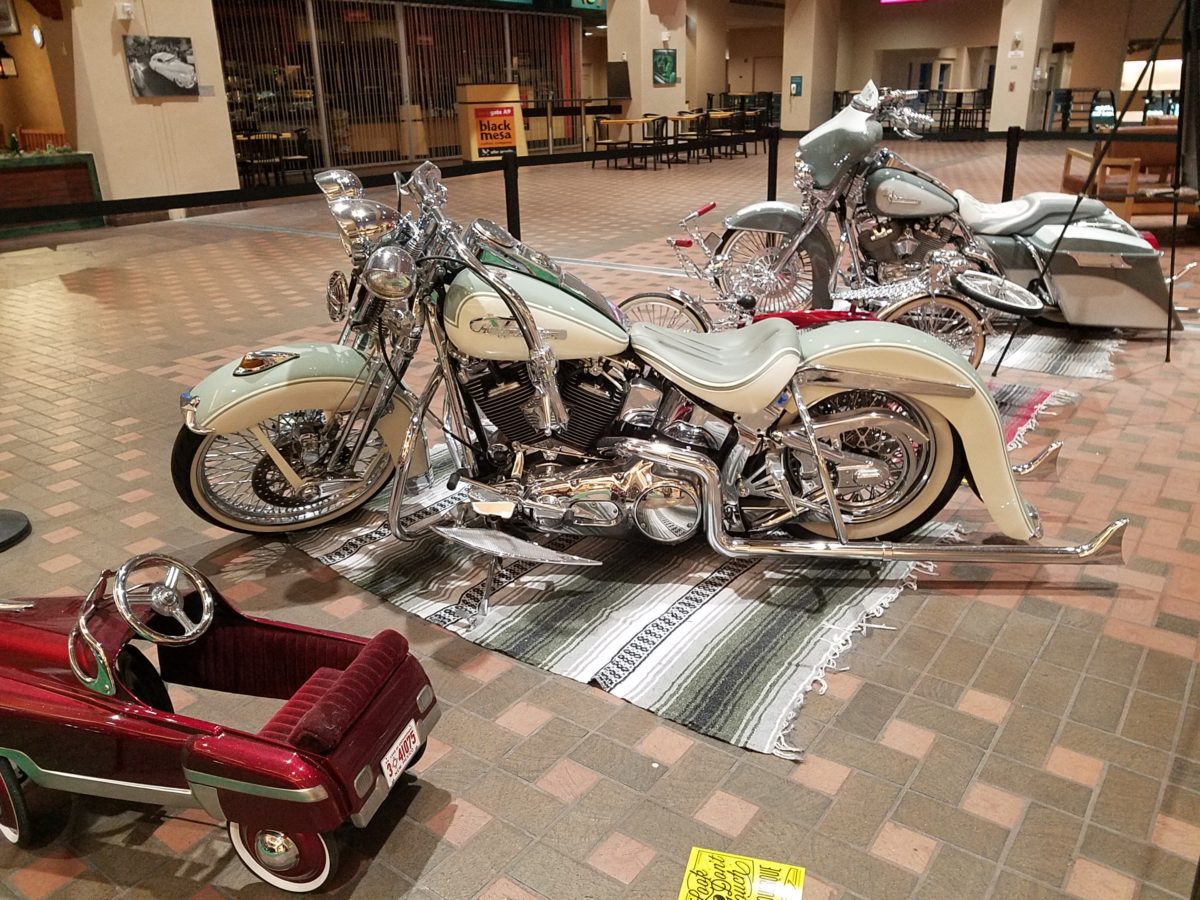
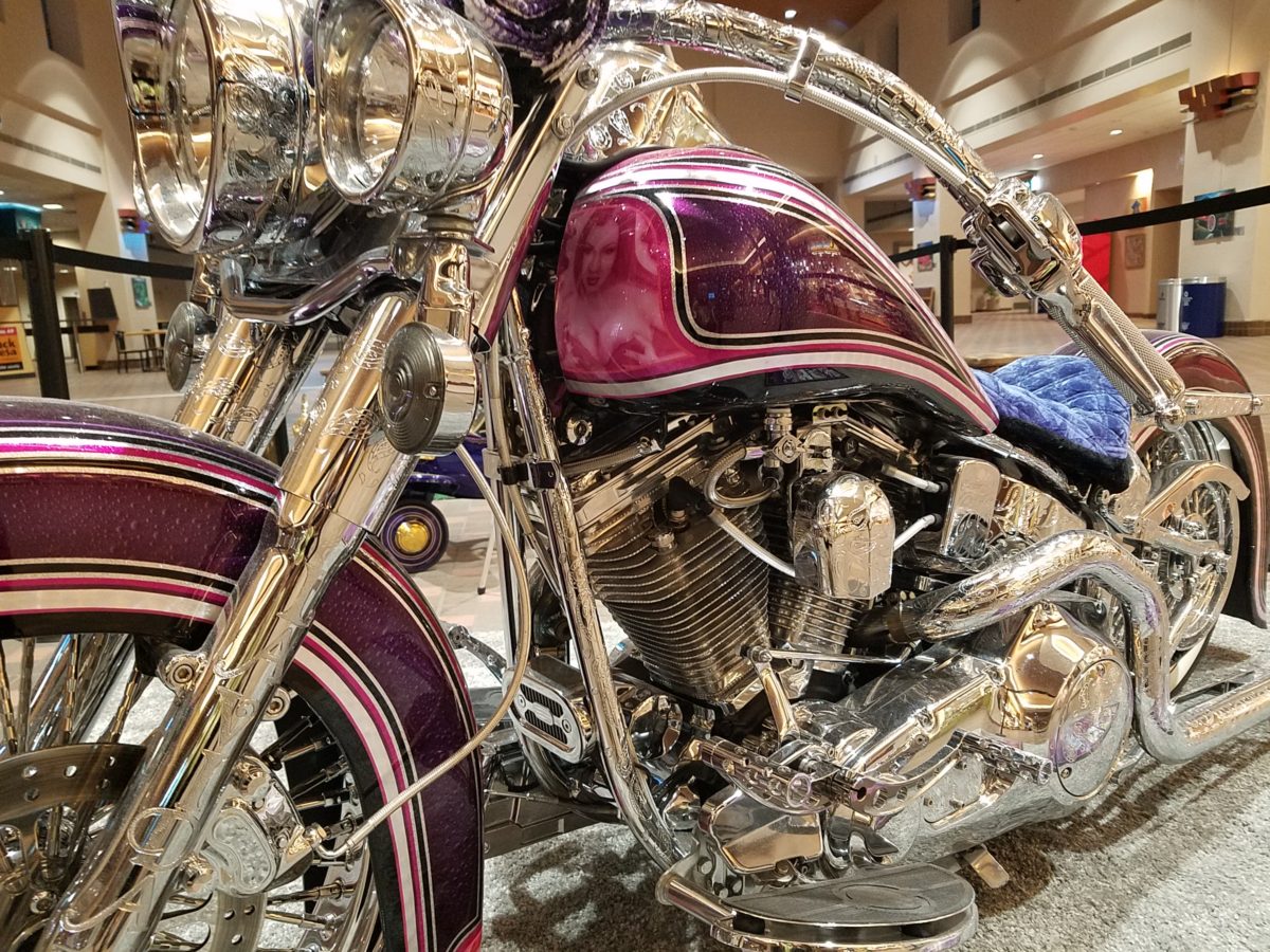
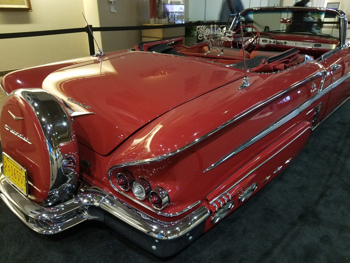
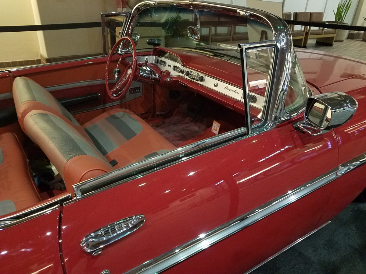
Racing through the Albuquerque Sunport several times this summer, I had seen in swift passing the blindingly brilliant bling of the Low Rider exhibit that had been set-up at the end of June. Last week I had an opportunity, while waiting in the arrival area, to peruse the many amazing rides that commanded the concourse.

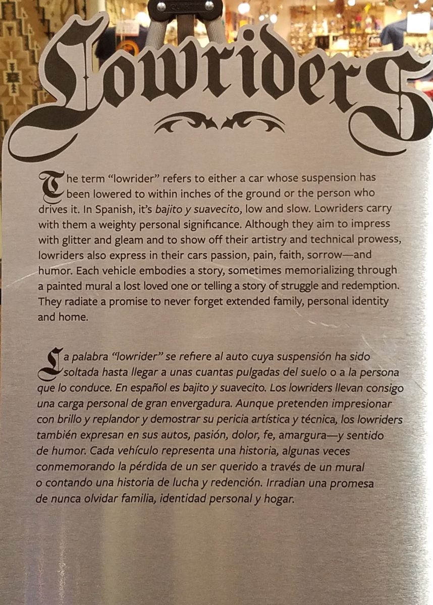
This powerful art exhibit of the unique Latino culture of Low Riders represents great personal pride and emotional attachment on behalf of the owners and artists (often one and the same).

These finished products are almost like songs…from memorials to love interests, family and friendships – they express heartfelt emotions to present and share with the world.

Once stereotypically  thought to be limited to the bad boys taunting law enforcement with their wild paint jobs, gleaming chrome, bold moves, wild suspension, blaring music in a defiant statement of cultural expression, these amazing art pieces have since been recognized by distinguished museums worldwide for their exquisite attention to detail and the stories they tell.

In this exhibit, these moving statements of artistic expression are all home-grown. Yes, each made here in New Mexico it makes it all the more relevant.

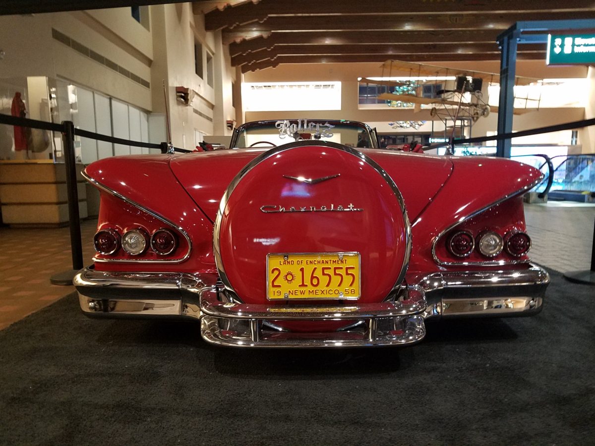
Visitors to the Sunport have this wonderful opportunity – up close and personal – to examine the seemingly flawless machines adorned with sensational color, pattern and design. “Kids” of all ages will appreciate this show!

Each as though a canvas for the artist…motorcycles, kid’s versions and cars adorned with glitter, shine, polish and paint colors all contributing to the each unique statement. From airbrush to tedious handwork and limitless patient detailing results in exciting assemblages.

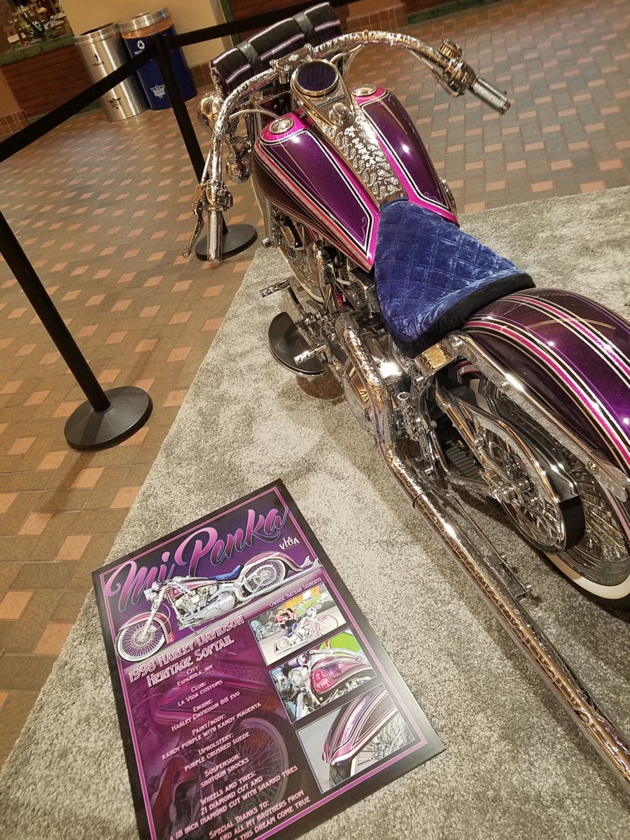
There are also decades of photos featuring the evolution of the culture here.  

By highlighting these fine, local examples the City hopes to elevate the art form on its merits and dismiss some of the stigmas attached with the stereotypes.  

And we all will have a little fun imagining the thrill of taking a ride in/on one of these beauties!!!

Entrepreneurs! Getting Started with Design!

Starting out with your first brick and mortar business, the tasks are many. After homing in on your business specifics, selecting a name, designing a logo, deciding colors…you have your license and your business plan, you’ve found a place and then you need to present your business to the world!

A few weeks ago, we began a new project that is just what I have described…an exciting first-timer in the business world, having worked for others is now ready to do her own thing, be her own boss, make her own decisions and assume the risks necessary to take this leap into entrepreneurial adventure.

It’s exciting and scary, daunting at times and fun too. And it should be fun. Finding something that you enjoy, something you believe in and believe that you can do as well as, if not (hopefully) better than, anyone else in your market.

With inventory determined, name and logo designed the last task was to create the space to present her concept. We won’t divulge that today, the project is yet to be presented, but the framework is on what I want to comment.

We began compiling some finish options…paint, upholstery, privacy curtains, carpet and a little brushed aluminum bling!! We want to reinforce her brand with key colors and finishes.

Knowing the terms of the lease agreement – what is the landlord’s responsibility, what is grandfathered-in, what can be changed, any spending allowances amortized into the lease…these are all things that are necessary to determine how to go about designing the interior. It is necessary to establish costs within the over-all start-up budget. Having helpful, knowledgeable, creative people around you with whom to assemble your team is imperative.

We arrived at the site to find a very clean slate. Located in a retail strip center, it was a white box.

We instantly decided the flooring would be a combination of polished concrete and broadloom carpeting, some lights stay and some go, spots will be added, colors will reinforce her brand.

Toward the back, a break-room kitchen area needed demolition. This pocket would become fitting rooms.

There was existing ceramic tile on the floor that also needed to be removed. These were things that our client could attack herself – saving money and getting to know her space.

We learned that the restrooms were grandfathered in and did not require any additional improvements – other than cosmetic.

We learned that we could make changes and additions to the lights and only needed a permit for electrical portion of the work.

Many of these discoveries were of pleasant surprise to our client who had been miss-directed a bit and was in a state of frustration and near defeat. Gathering good information is imperative, in order to save time and money, make good decisions and know your options. Get out there and get busy!!!!!

Soon to bee completed, watch for this transformation in coming weeks.

Ten Tips on Mixing Metals – Making Sense of It All

How to mix and not mix metals….that is the question. Is it nobler to stick with one throughout or might I venture into a mix of metallic material? From switch plates to chandeliers, this question comes up all the time – and it’s fair. With all the options and the TRENDS saying one thing or another (probably to sell you something or to stand with a current trend fearful of venturing forth), it is a common dilemma. Here are a few tips to give you confidence in the  metal mixing mêlée.

  1. IF the door hinges are one thing – the handles should match. We often see pre-hung doors with brass hinges and a retro-fit of brush chrome or bronze – that is a no-no. 
  2. Is brass finish out – should I change all my hinges and door handles? In – out…no sooner does one hear that a finish is passé or they think they themselves are stuck with a less than new and trendy finish – be calm and carry on – to quote a couple of “trendy” phrases that drive me up a wall – it’s all good.
  3. If you have brass – embrace it! Fear not – it is all about the manner in which you present it – in what context you design with it. 
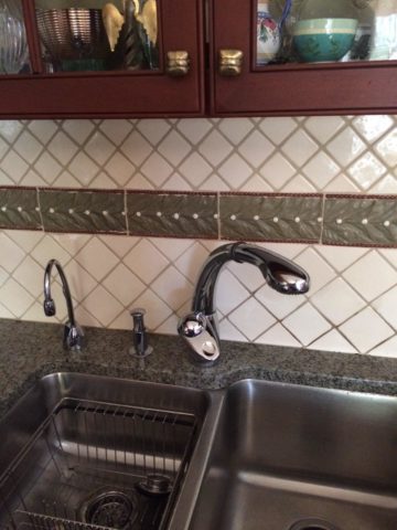
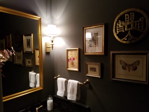
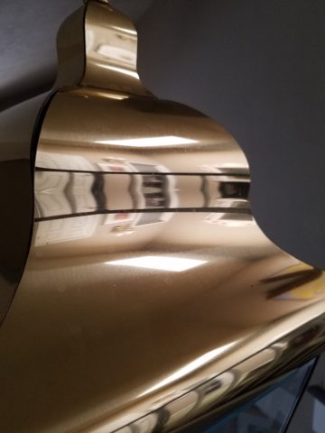
Following trends can be costly, unnecessary and unimaginative. Gold/brass finishes have been making a come-back in recent years. Sometimes it takes time for it to trickle into your purview. But the point is – good design is good design. So it’s not so much about if it is perceived to be good enough or right or wrong…it is if you can design around it and make it great. 
  4. Should you mix a bright brass chandelier with brushed stainless door hardware? 
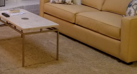
Probably not, but it is not so much about the mixing – it is that to make something like that REALLY work, the overall design would have to be so intentionally mixed that it in itself (the intentional mixing) is an art-form. 
  5. If a kitchen has brushed chrome detailing (appliance trim, faucet, etc…), may I use brass cabinet pulls?  
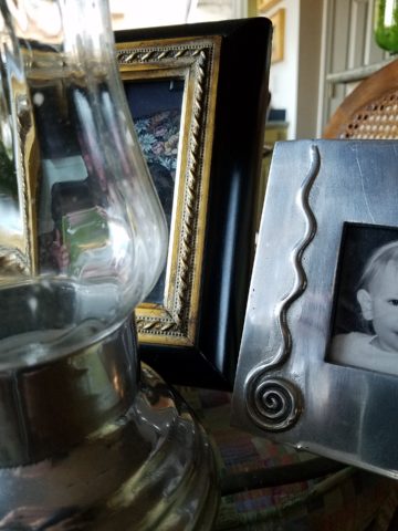
The answer is YES. In some contextual situations, the language of the materials speaks in vernaculars that separate certain groups from others as though allowed to be intentionally different – as they ARE different. 
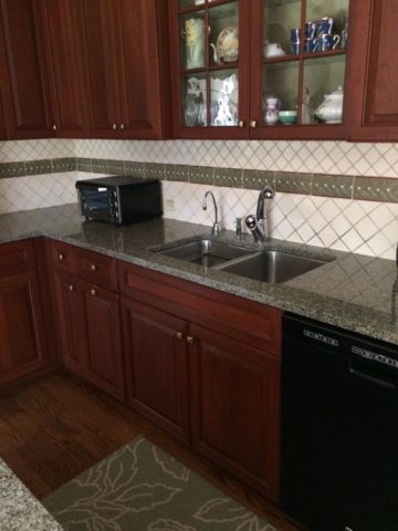
The great thing about knowing when to make statements in contrast – not conflict, is just that – knowing.
  6. The old world and contrasting contemporary look of Bronze, the stalwart wrought iron read of Black, the bling of Polished Chrome, the modern softening of the silver with Brushed Chrome or Stainless, the traditions and suggested opulence of Brass and Gold, the warm median balance of brushed nickel – guess what? They all have their place depending upon the context of design. 
  7. New finishes for appliances rule the kitchen. We thought we had it made when Sub Zero and others offered slots for panels for the fronts of appliances to enable matching of the flanking cabinets. But for those who wanted off-the-shelf units, beyond the merry-go-round colors from harvest gold to avocado green, burnt orange to basic white – the colors of the past were challenged by bold black and brushed stainless finishes – the new fab. But now we are seeing matte black – and oh is that hot! Complimenting the concrete finishes and raw steel – contrasting with the brushed stainless – punctuating the trend of the clean commercial kitchen style of design. It is a bold yet soft new option for the edgy everyday kitchen.                                    http://www.foodandwine.com/cooking-techniques/look-these-beautiful-matte-black-major-appliances-refrigerator-ranges-ovens-and
  8. Ceiling fans present the same conundrum. Do they match the ceiling and go away? Do they hang suspended like a giant menacing propeller threatening to decapitate anyone who comes near? A black fan against a white ceiling might. A bronze fan in the middle of everything might appear a bit top-heavy. Ceiling height makes a difference. Surrounding decor makes a huge difference. Whether it is to be noticed or quietly disrupt the air for refreshing breezes without screaming their source – those are compelling questions. I cannot even address whether it should match the door handles – it makes me crazy. Unless it is an intentional focal point – like palm-frond paddles in a tropical bar – or industrial mechanisms intended to further that contextual theme, I think nearly all of them should visually go away.  Who wants the focal point of a room to be a fan centered and suspended from the ceiling to hover overhead and command the visual impact of a nose-diving airplane? Unless of course – that is the theme.  The fan designers would argue.

    Oh my – brass, chrome, bronze…where is the focal point? My eyes are darting everywhere!

  9. Fireplace grills…often found in polished brass – they can stay or be painted out – with a flat black that makes them fade into the void of the opening or simulate a cast-iron grate. They can be painted with a faux-rust finish – there are many possibilities – maybe even fire-engine red. The point is, once again, it is the context that makes it successful or appropriate – there is really no right or wrong answer here. 
  10. Tip # 10 is to take each offered finish as it comes, evaluate the context, find your focal point(s), what is the most cost-effective to change? All the door handles and hinges or the light fixture over the dining table? I say it in so many blogs…do not let trends rule your life. Have confidence in your own likes and comfort and go with it – good design never goes out of style. 
  11. BONUS TIP!! Do all my picture frames have to be the same finish? Do I have to re-frame my gold frames or change my maple to chrome or go black on all of them?  
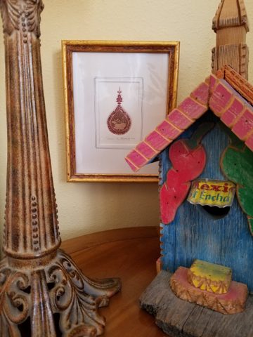
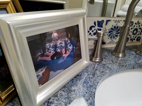
Have I ever mentioned context? Eclectic mixes can be quite fun and interesting.  
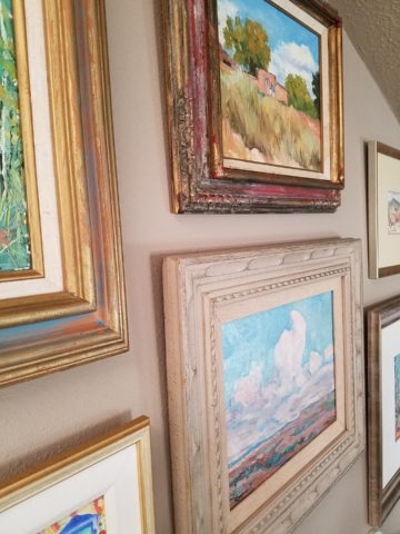
Groupings of identical moldings can be effective.    
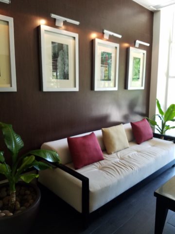
Random pieces scattered throughout can each be singularly nice. So don’t rush out and re-frame all your art. See how you intend to use it, group it, where and with what else. Be sensible and creative – be brave and do what you like! That makes sense!!!!!