It was quite by accident that we ran into SAAM! Truly, our destination and plan for the afternoon was to catch a bite at the hip and artsy Jaleo tapas restaurant and head to the Bible Museum to see some cool film of all of the buildings in downtown DC that feature biblical quotes on their facades – or something to that effect. But as we sat there in this trippy Spanish-themed interior, right next to the window, we
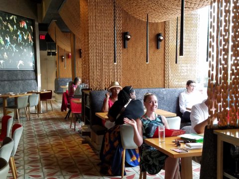
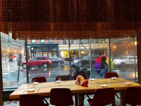
watched the staff bring in umbrellas from the sidewalk seating areas as the wind picked-up and the sky darkened. Our plans soon began to change. We dawdled at the table well past our tantalizing tapas feast and watched the rain come down in sheets.
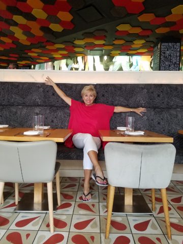
As the time past, it became apparent that the Bible Museum was too daunting a task to embark on after the storm subsided. So we dashed between the drops to the nearby Smithsonian American Art Museum – SAAM!
Having never been there before and not having planned this outing, we entered without a clue as to what we might find – except perhaps the portraits of the Presidents – cool enough. Yet inasmuch as the exhibits were wonderful and many faceted, I want to focus on one inspired installation that pertains directly to architecture and design.
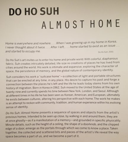
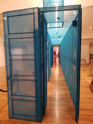
Considered to be perhaps the most compelling architectural artists around today, Do Ho Suh takes nostalgia for “home” to a whole new dimension. He figured out that he didn’t need to wait for enchanted ruby red slippers – no, he re-creates memories of “home” and makes them transportable all over the planet. And by whole new dimension, I mean we walked through fine translucent fabrics – taught and stitched – over concealed stainless steel frames creating hallways of houses where he had formerly lived around the world.
With great attention to detail, he stitched door hardware, radiators, and wood trim details. It was remarkable.
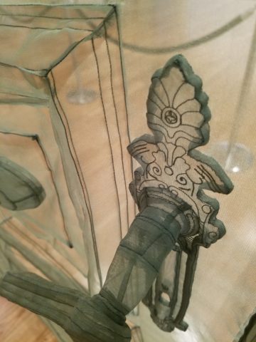
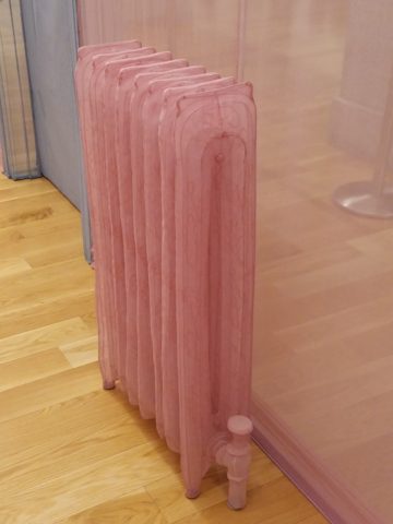
This interactive immersion was thought provoking. I think it is impossible to pass through this presentation without experiencing a few fleeting personal memories of the your own past homes. As Dorothy taught us,”There’s no place like home.”
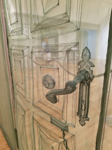
It was as though the sheer polyester fabric was misty or ethereal as though not really there – a very effective medium to suggest a thought or memory. How fascinating to render a structure with such a diaphanous, fragile sense – tangible yet not. “Almost Home.” There, but not quite.
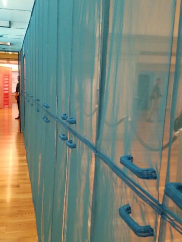
The time it must have taken to create this tedious textile architectural art-piece, of delicately painstaking work, surely proves his love for these past dwellings.
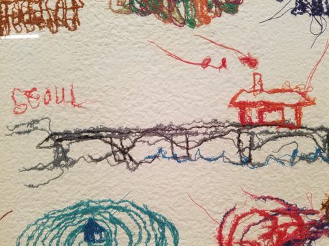
This presentation will be the most comprehensive of Do Ho Suh’s work ever shown on the East Coast. And wait – there’s more! After having navigated the Twilight Zone of Do Ho Suh’s recollections, I was even more strongly drawn to this large-scale piece of stitched textile work mounted on the wall! It was a colorful and beautifully complex collection of images of people and homes in various states of movement and fantasy.
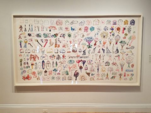
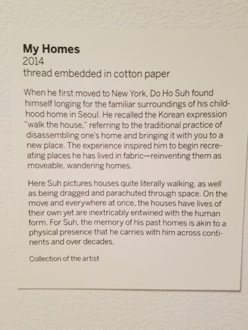
Colorful threads intentionally strewn from the stitched images of human figures, some sporting houses on their heads, another running with memories flying behind his head…taking the home (s) through life’s stages – memories…home is where the heart is…taking their memories with them…
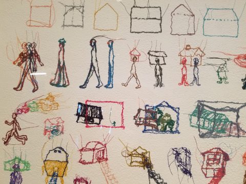
People parachuting with houses floating through the air…pitched roofs and domes – all manner of interpretations of “home.”

There is a stitched reference to Seoul and a house on a jetty suspended above a wild, choppy sea.
Live – dwell – reside – inhabit…Be quick – it’s only there until the 5th of August.

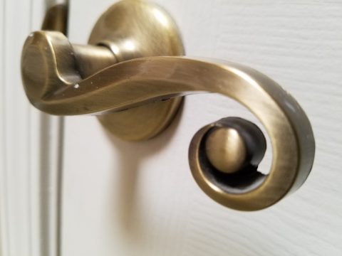
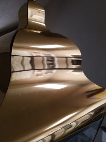 Following trends can be costly, unnecessary and unimaginative. Gold/brass finishes have been making a come-back in recent years. Sometimes it takes time for it to trickle into your purview. But the point is – good design is good design. So it’s not so much about if it is perceived to be good enough or right or wrong…it is if you can design around it and make it great.
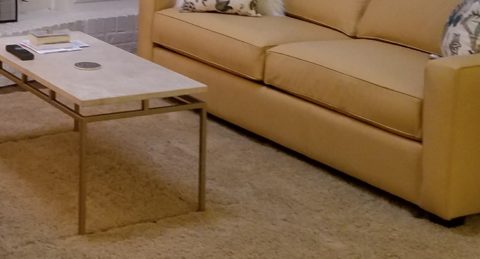
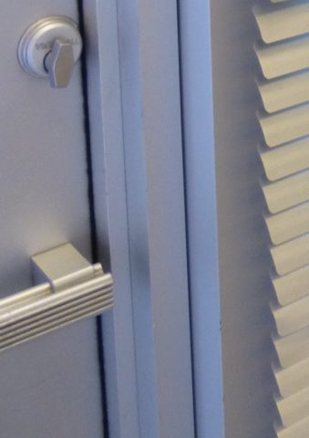 Probably not, but it is not so much about the mixing – it is that to make something like that REALLY work, the overall design would have to be so intentionally mixed that it in itself (the intentional mixing) is an art-form.
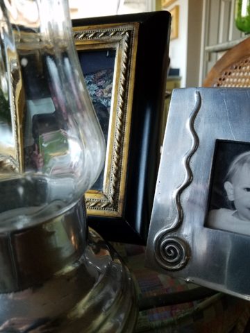
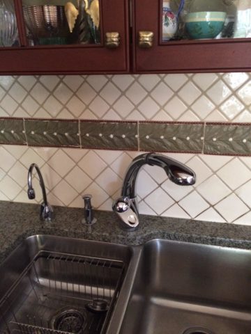 The answer is YES. In some contextual situations, the language of the materials speaks in vernaculars that separate certain groups from others as though allowed to be intentionally different – as they ARE different.
 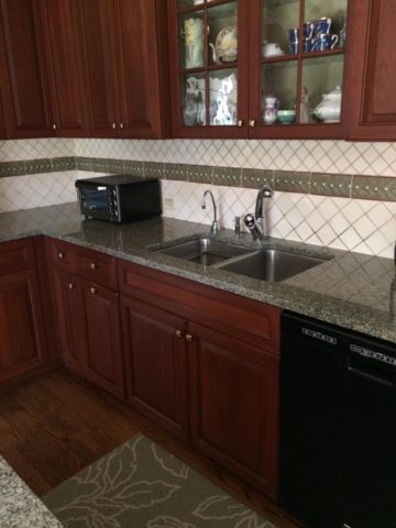 The great thing about knowing when to make statements in contrast – not conflict, is just that – knowing.
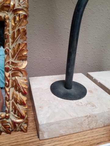
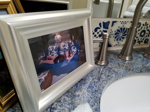 But now we are seeing matte black – and oh is that hot! Complimenting the concrete finishes and raw steel – contrasting with the brushed stainless – punctuating the trend of the clean commercial kitchen style of design. It is a bold yet soft new option for the edgy everyday kitchen. http://www.foodandwine.com/cooking-techniques/look-these-beautiful-matte-black-major-appliances-refrigerator-ranges-ovens-and

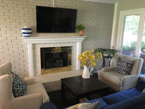
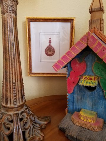
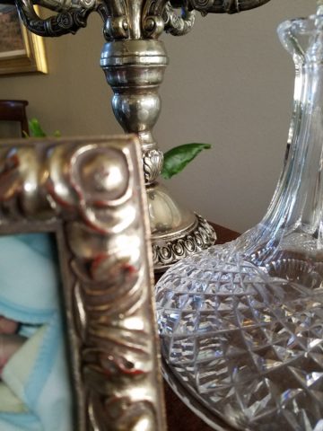
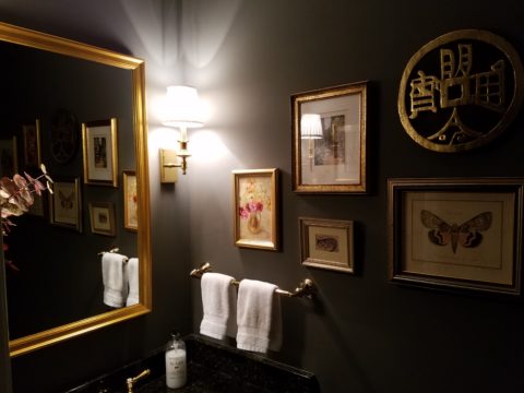 Have I ever mentioned context? Eclectic mixes can be quite fun and interesting.
 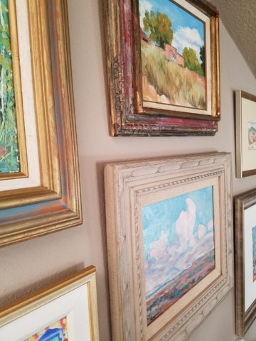 Groupings of identical moldings can be effective.
 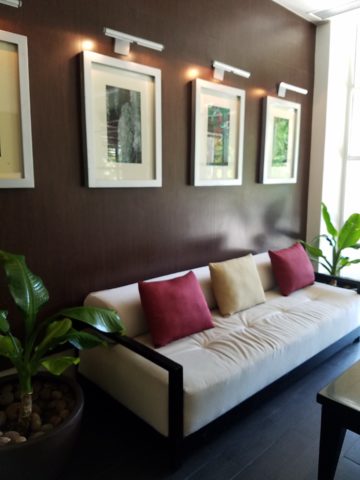 Random pieces scattered throughout can each be singularly nice. So don’t rush out and re-frame all your art. See how you intend to use it, group it, where and with what else. Be sensible and creative – be brave and do what you like! That makes sense!!!!!