Valentine Expressions

You know…we designers design for our clients and ourselves around themes, we design around events, we design around seasons and of course we design around the trends…it all keeps the commerce of products and materials in motion.  And at this time of year, we see focus on wine clubs, pajama grams, stuffed teddy bears in enormous sizes, hearts, hearts, hearts…and roses natural red or gilded, it’s Valentine’s Day!!!

But it’s fair to note that all seasons have valid design consideration. Setting the scene, enhancing the moment – either for you, your family or a romantic encounter, the holidays and especially this one, evoke a desire to create a scene that conveys love and romance.

To that end , my blog is brief. Enjoy that which brings you joy. Revel in the happiness that presents itself. Create beauty where you can. And as we are want to say….art and good design can almost always bring a better scene to anyone’s place on this precious planet.

So be it a candy heart with a common message of joy, a product acquired to create a scene, a piece of jewelry to promise, a token to send love, a greeting of friendship, a message to offer support, it is all about connecting.

I decided to paint a bowl for my sweetheart. Yes, I had passed this guy’s booth, encouraged others to partake, had appreciated his talent, but never ventured forth. This year, I enjoyed sitting alongside Victor in the shade, with the waves lapping the beach, and soft music wafting through the  air…allowing a moment of focus on an artistic expression, a blank canvas (my bowl) to say Happy Valentine’s Day to MY Valentine.

Here is the finished result.

Connecting. We at PATRICIAN DESIGN support local artists and hope that the next time that you need a gift, want to send a message, or desire a creative addition to your personal space, that you will consider local talent to fulfill that need. OR do it yourself DIY!!!

Wear ART – Shop Local – Support LOCAL artists –  Need we say more?

Ok…we provide the greatest FREE gift wrap to get you on your way!!!

XXX000 Happy Valentine’s Day – (it’s Tuesday – better get prepared!!!)

PATRICIAN DESIGN

Nature’s Valentine’s Greeting!!!

So when you least expect it…nature speaks. On a silent coastline on a great lake in the wilds of Wisconsin the stones on the beach offered a hidden alphabet of opportunity. Upon making this discovery, I searched for and collected just the right pieces and sent a love note to my sweetheart. Wishing he were there to share in the wonderful adventure that was hiking through the enchanted woods to this lakeside hideaway, I did the next best thing and found an expression of LOVE , took a photo and messaged off to him…technology and instant gratification – well, across the miles…

20160809_182944-copy

The lovely white stones were amazing…I don’t know the geology…could probably Google it, but suffice it to say they were white and soft, angular but smooth, bleached and clean – massed in a thick bed for miles along the shoreline. I wish I could have taken buckets of them to do something…fill a large snifter, layer in the sink for the water to spill over and remind me of this scene, touch and fondle – they were so special, so uniform in size – such a natural phenomenon of raw beauty.

Paired with the rough, elegant, weathered, driftwood that was scattered along the rubble and upon which I carefully placed the stones, the composition was truly a work of art – inspired by  nature and assembled by my eager fascination with the media.

20160809_182212-copy

Take away…love is all around – OH! has that been said before? Well…love IS all around us and to find an actual, natural formation of alphabet letters that allowed the simplest expression of literal words, to be transported across the miles,  was magic.

Art…design…nature…find it!!! Happy almost Valentine’s Day!!!!

Color of the Year 2017 Greenery!!

Ta Da! Pantone announces its color of the year for the coming 2017…drum roll please…and the color is Greenery!! Yay!!! Last year there were two  – yes, imagine that – they couldn’t decide so they slurried Rose Quartz and Serenity resulting in a pale, cool, wimpy blend of soft rose and lavenderesque shades into a blended wispy pastel dream. Non-committal, in my opinion…lacking confidence.  Last year the rationale was stated by Pantone’s Executive Director, Leatrice Eiseman as…

pantone-color-of-the-year-lee-eiseman-quote-2016

But this year they have it with this fresh organic hue in a yellow-ish shade primed for this year’s rationale from Ms. Eiseman which is:

pantone-color-of-the-year-lee-eiseman-quote-2017

I have always loved green. I grew up in a Virginia jungle of a suburban neighborhood inside the Beltway surrounding my hometown of Washington DC. where the first signs of spring were the tiny tips of dogwood leaves poking forth from the delicate branches of those beautiful under-growth trees. The dogwoods were the graceful, human-scale layer beneath the towering canopy of the immense, rigid, vertical tulip poplar and white oak trees that commanded the woods.

Soft mosses, lacey ferns and perky lily of the valley carpeted the hidden pockets of our backyard. New growth is that prediction of amazing renewal and promise of the start of summer. So it is a prime observation that as Eiseman states in her 2017 rationale “greenery…bursts forth…with a reassurance we yearn for…” although I do not feel this is peculiar to this year as winter always makes me yearn for greenery and the reassurance  that spring and summer will return.

My mother also loved green and that probably influenced my childhood perception of comfort and context of it in interior design. She had and still has an eye for color. In 1959 she selected an amazing sculpted wool pile carpet in a warm, dark, neutral, taupe tone and built upon it a color scheme of pinks and greens that was subtle and relaxing, organic and contrasting, blending beautifully in our wooded setting of verdant lushness in which we were cozily situated.

That was upstairs where we felt like we lived in a flowering tree house amidst the dense collection of green leafy between the trees and surrounded by all shades of pink and white azaleas. Downstairs, where we retreated in the winter months, her greens were mixed with gold tones creating a warm interpretation of the greenery around us.

When so many in that era, between the 60s and 70s, were styling interiors with heavy oranges, browns and golds,

orange-and-brown-f934b00ae8a8aabb9fa7d7d8e3ccec30

my mother gravitated toward Lily Pulitzer’s fresh, tropical palette of lime green and hot pinks, clean crisp turquoise and citrusy lemon yellow – both in her wardrobe and her interior accent colors.

most-popular-lilly-pulitzer-prints-no-names

Our beach house was turquoise and teal, navy and tan – the sea and the sand.

Following color trends is a slippery slope. I have blogged about it in the past. Adopting that which is often a combination of colors instantly records a place in time when everything from bath towels and shower curtains, bed dressings to draperies appears in the marketplace and inserts its predetermined obsolescent combinations into the lives of so many who would rather catch the wave – often behind the crest – to own and participate in what is conveyed by the market to be the “in” thing to do and to have.

It is best not to embrace and adopt the combinations that the market presents. It is better to select color and combinations that transcend the trends – skirt them so as not to fall into the trap of dated color schemes and tired combinations. Some avoid the trap by staying neutral. The safe, timeless colors of whites and grays mushrooms and taupes- but where is the risk and fun in that?

“Too bad for them” I often remark. It is such a missed opportunity…a limitation to select colors that you think you are supposed to like rather than those that truly bring you joy. I say “go for joy every time.” Color is such personality. It is a stage-setting element. It is a backdrop or foreground. It is a theme. It is an atmosphere.

With all that having been said, I for one am thrilled with this fresh selection for the new year. A bright beginning full of hope and new growth, fresh starts and positive forward movement – organic and life-affirming. So seek the colors that brings you joy and go forth with color in this new 2017 soon to arrive. My personal schemes will always have greenery!!!

Resourceful Creative Festive Fun

When it’s time sensitive and just can’t wait – what do you get? A BONUS BLOG!!!  Yes! A mid-week blog for the holidays! It began beneath a brilliant blue sky yesterday as the air, with a teeny bit of a  chill, was contrasted by the then warm sunshine glistening through a deciduous denuded Honey Locust making it’s lonely leftover pods look like birds silhouetted against the sky.

Scattered all over the ground were the same fallen wonderfully twisted mahogany-colored pods writhing amidst the dried leaves.

The color was so rich and warm it was irresistible. As I bent over to inspect one, I was captured by the unique quality of each pod and the amazing contours of their graceful, elongated shapes.

Almost as though they were varnished, they had a semi-gloss that was naturally beautiful. This is art in nature. This is inspiration. I can see this as a magnificent drapery fabric – a grand wall of these intertwined ribbons of organic seed pods.

20161120_140253

However, on a more current and immediate note – I saw a centerpiece or multiple centerpieces as it turned out. I gathered the pods in my fist as though a wonderfully wild bouquet. I then needed a bag (thank you Becky) as I kept dropping them, in an effort to force the ever growing collection.

Here is the quickie result of the awesome autumnal centerpiece. I had a faux wreath of berries and leaves, tossed in a few recently harvested local apples, (thank you Vigils), some leaves gathered from the driveway as the Bradford Pear – which, a little late this year due to our unseasonably warm Indian Summer this fall, has only started to drop its gloriously radiant leaves. And Voila!

I stood back and looked over my shoulder and saw the collapsed plastic bag still spilling pods out over the counter-top.

20161121_103710

I was about to call all my friends and ask “Do you want a piece of this fabulous, festive, fall, focus of attention? And I quickly realized I could expand the joy for those of you with grand tables  needing a longer statement down the center.

So flanking glass vases provided the extension I needed. Now this was quick – adding gravel, sand or moss in the vases would add interest and depth, maybe pheasant feathers, other dried flower pods and grasses – this was just a start based upon an irresistible inspiration scattered before me.

20161121_101825

So keep your eyes peeled for opportunities when you least expect them and make something out of nothing. Save unnecessary expense when you find your design accessories for free!!! Happy Thanksgiving!!!

pd-exteriors-logo

WONDER at the Renwick

At 4 years old my teeny cousin, Katherine whom I nicknamed Katie-belle, took my hand as we ventured forth with great discovery stepping down into the carport of our beach house. With commiserating whispers, like the two adventurers that we were that night, we exchanged queries about where we were headed and what we might find and she said ” I Wonder…”

“So what?” you might say. What’s such a big deal about that? Well the concept of wondering, being able to ponder with amazement at what might result, was astonishing to me coming from the mouth of such a young child.

When we returned upstairs to join the group, I was eager to share my amazement about her simple phrase, “I wonder.” I exclaimed  “She wonders!” Repeating it incredulously about 5 times!

Today she is a dedicated grown-up pursuing exciting adventures in education as she navigates the University system and teaches students with a creative approach that captivates and engages beyond their expectations.

What is wonder? What is wonderful? Yesterday I visited the Renwick Gallery in Washington, D.C. . The current exhibit is called WONDER. P1150084
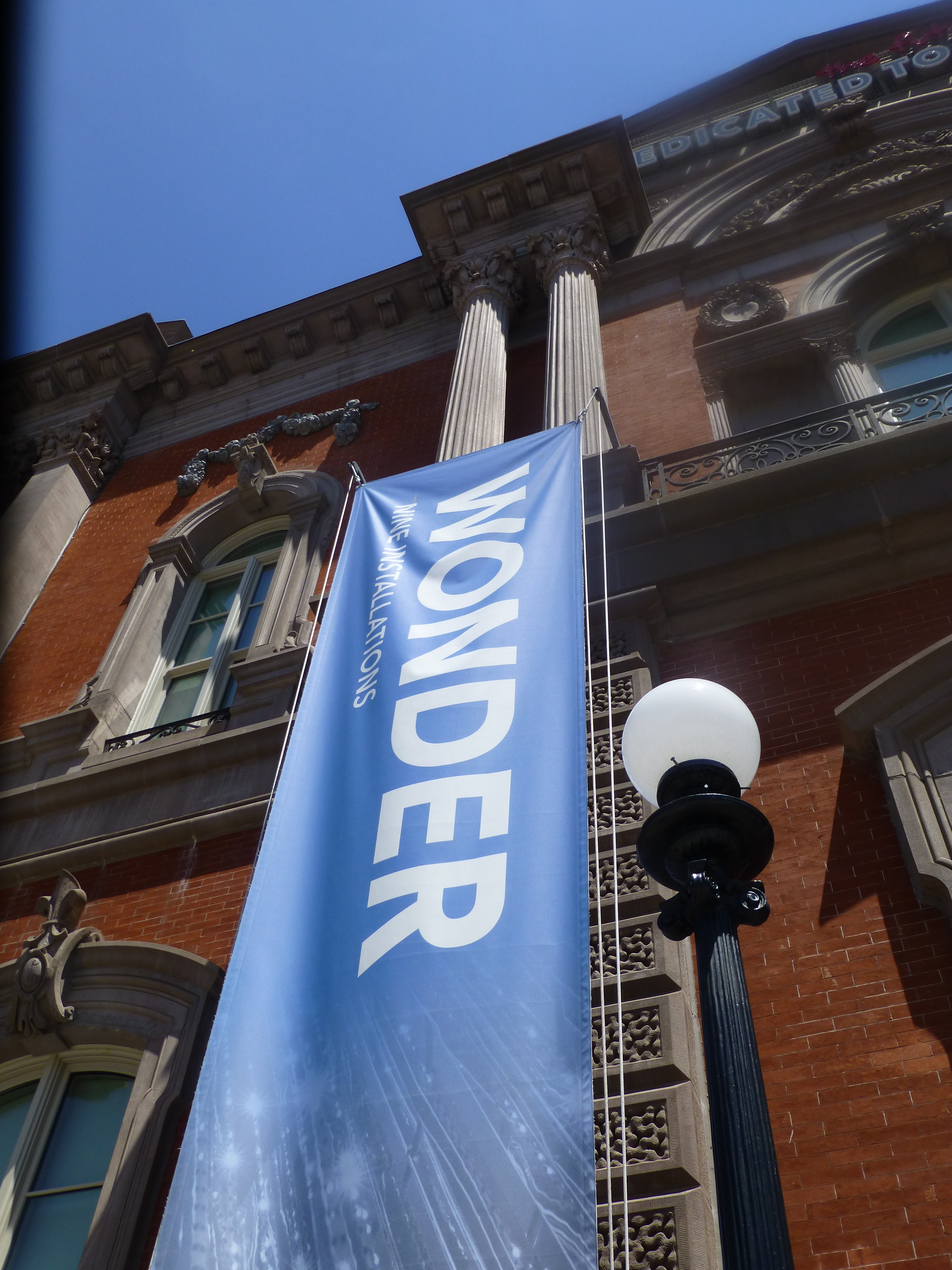
It truly is a wonderment for all ages. This architecturally magnificent building designed in 1859 by James Renwick, in the then chic Parisian Second Empire Style, is the elegant backdrop for a most progressive and creative collection of present day modern artists’ works. Diverse examples, of spectacular displays using simple materials,  brought to life in forms unexpected – of grand proportion and thrilling magnitude. Although my learned and previewer cousin had introduced me to the exhibit in advance, it captivated and engaged beyond my expectations.

This grand yet intimate edifice welcomes and encourages close observation of both itself and its contents. The spectacular main staircase, centered upon entry, presents a brilliant coral red carpet installed with a curvy,  serpentine migration up to the second level. Ooh – if copying is cool and emulating is the greatest form of compliment – I will be looking for an opportunity to specify a similarly whimsical installation. P1150052

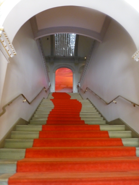
Glittering overhead, spanning the entire length of the staircase, is a rectangular chandelier of mirror-like stainless steel punctuated with little LED lights blinking in random patterns. P1150066 
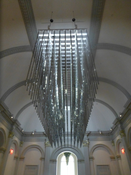
The glitz and bling make such a striking, formal, contemporary statement in this expansive volume that it startles with joyful contrast. The artist, Leo Villareal of whom I had heard in advance, was originally from Albuquerque – where we now call home. A remote desert origination transplanted into the fast pace of the urban centers of the east coast resulting in this shiny experimentation with light, form and wonderfully reflective surfaces. Villareal melds basic high-tech coding to use his own algorithm of the binary system 1s and 0s communicating to the lights when to turn off and turn on – yet sequences that are never exactly repeated .P1150064 
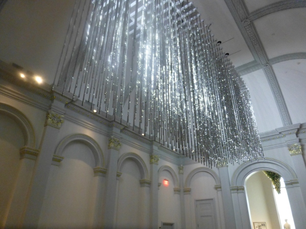
It’s not just your linear code of characters that is read on a screen –  here it is an artistic experience shared by all who look up in this gallery’s exciting exhibit.

Straight ahead, through the massive opening to the next exhibit hall, was the wispy fishnet-like rainbow of woven warm-colored fiber representing both  wonder and danger. Artist Janet Echelman’s inspiration is from a map of the energy released across the Pacific Ocean during the Tohoku earthquake and tsunami on March 11, 2011.  A natural disaster so devastating that it shifted the earth on its axis and cost us a fraction of a second in time. Surreal? Sci-fi? No, it really happened.  Beauty and grace depicting a horrific event. P1150063 
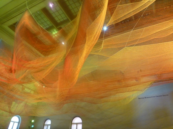
Large scaffolding at the end of the room suggests the manual installation that was required to suspend this wondrous drape catching light and glowing with golden aura. P1150068

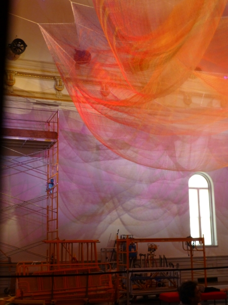
The lower level still had wonders to explore starting with the magical woven willow saplings – creations of artist Patrick Dougherty. He has wound these great lengths of supple branches to form Hobbit – like holes of imaginary forest habitats. P1150056 
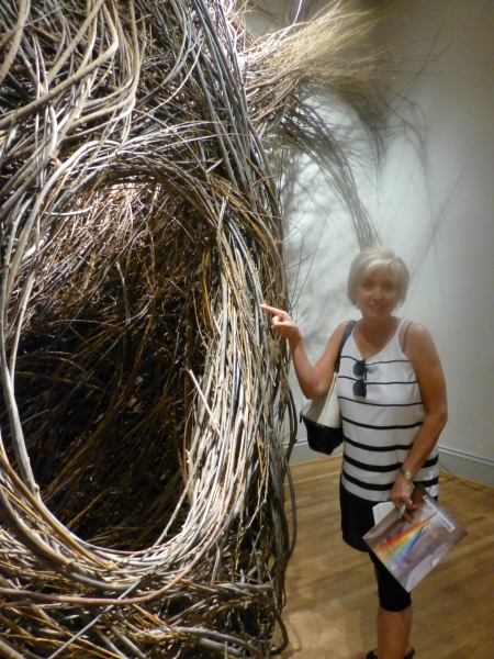
We were at once drawn into these cozy nurturing cubbies of what appeared to be nature – not forms created by man. Nature. Organic and raw, elegant and graceful winding toward the far reaches of the very high ceilings. Like a sculptor who says that the stone dictates what it wants to be and how he carves it – Dougherty knows that the long willow branches have a true will and bend their own way challenging him to work with them toward that goal of partnership with nature. The beauty is in the end result.  People of all ages wandered in and out, peeking through window-like openings pretending to be exploring an enchanted forest of wonder.

Next – stacked index cards- really? P1150061 
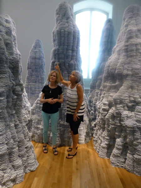
Have you ever experienced Tent Rocks?  8-24-12 Placitas lunch, Tent Rocks Heather, Tricia, Zeke 044
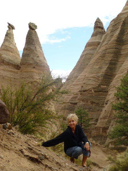
Have you ever looked upward and around and through the magnificent forms created by nature eroding the earth’s strata revealing layers of color and creating spires of rocky towers? It is a magic land just south of Cochiti in a very unexpected pocket of nature’s magnificence in our Land of Enchantment. And the spires that artist Tara Donovan created with stacks of index cards – an overwhelming accumulation of millions of index cards suggest grey spires replicating nature’s wonders in the canyons among the spires of the Tent Rocks. P1150062 
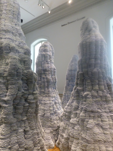
It’s as though a photographer captured this natural formation in black and white.  Donovan’s interpretations are tones of grey as a result of the stacked white index cards with slivers of shadow sucking away light in between each of them. Clustered and staggering in height, the “Untitled” towers are inviting to walk amidst and pass between, winding around them like a  tourist or explorer or perhaps inhabitant in ages past and present as they have stood for ages.

Snap out of it and see what is glowing like a fine fiber sail in the sunset in the next room. Stretching upward and crossing midway are thousands of incredibly fine threads woven from small hooks on the base. P1150059
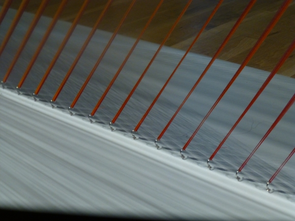
How could a human working only by hand – without computer generated machines digitally fabricating such perfection create this finished piece that we are studying with such wonder? How can this fine tedious seemingly impossible count of thousands of threads be executed with such grandeur and grace by one mere mortal? gabriel-dawe-plexusa1-wonder-renwick-gallery-washington-designboom-03 
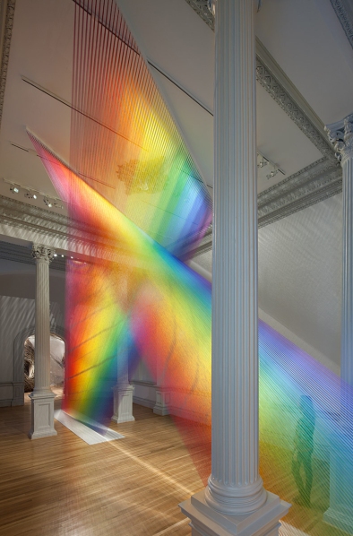
The artist Gabriel Dawe transcends our ability to comprehend the exactness of his beautiful accomplishment with extraordinary patience, precision and creative foresight to imagine the end result and bring it to fruition.  It is a wondrous, luminous sculpture of rainbow colored threads inspired by the skies of his native Mexico and current home in East Texas. The fine weavings also inspired by his Mexican heritage are interpreted, stretched and exaggerated here reflecting the light and spectrum of color from its base to ceiling. P1150060

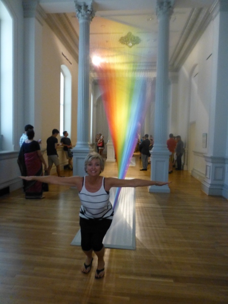
We missed a couple of early installations of WONDER but were thrilled by today’s adventure. We had many opportunities to wonder…wonder how the artists conceive of their fantastic ideas and actually build their dreams to share with the world. We wondered what it takes to spark that creativity and passion that requires commitment and demands such unfailing determination. We wondered about those who collect these talents and curate these exhibits for the joy of so many. We wondered about the practical side of marketing these concepts to support the artists and this amazing  accommodation started so many years ago by a true visionary William W. Corcoran.

My next blog will trace the history of this wonderful architectural treasure, the Renwick, and share more of the day’s discoveries that you might visit and experience as you tour my birthplace – our Nation’s Capital.


TRENDS – How Does One Decide?

TRENDS…we HAVE to have them…it makes us think, makes us shift…not to mention keeping viscosity in the economy. The shift is the element that moves the economy forward. Without that shift, we would be stagnantly content. And who wants to be stagnantly content – except the “Settlers” from the Direct TV ads?  DIRECTV_Commercial_2015_The_Settlers-520x245

Yet if you Google design trends they are all over the place. The intrigue is when they land on an actual theme that becomes THE TREND.

So as we advance into the new year and winter fades to spring – what lies ahead? I’m finding lots of nostalgia – features on milk glass and floral patterns and fancy geometric patterns, a recall to wallcoverings in floral prints and botanicals…Rose-wallpaper-Bari-J-WallAppeal-pattern-pink-yellow-zoom

The trick is how to invest in these elements and not have them become passé by next year. It’s all about balance – unless you have the desire and pocketbook to change out your interior annually! The desire to add something new to your personal spaces, or as my mother has always said “punch it up” is an art unto itself. How does one decide?

Information is so accessible. Access to ideas is endless. But HOW does one decide? How to make the decisions, the right combinations, what to keep and what to change…? The internet and TV…Anthropologie to Pottery Barn, Pinterest and beyond…You pin a gazillion things – but how do YOU decide?

But it gets kind of funny  – because for as many sites as you visit – there are oh so many professed “trends.” Therefore,  sifting through is the challenge and distilling what seems to take the lead. Pastels, patterns and florals is my finding…but is this just spring? Will this fade with the next season? Or is this a “look” that will last for a while? And do I embrace it all or pick and chose? How does one decide? Elle Decor 2016 design trends table

Pantone the color experts are even all over the place. Their designers were “inspired by the contrast of urban design and lush vegetation.” Whoa, really? That sure is a wide swath of possibilities!  And to say that these colors  are unisex is as though attempting to blurr the lines. A guy might wear a pastel pink, Rose Quartz, shirt – but would he upholster his sofa with it? Fashion and Home Decor often parallel their trends – and then they must veer off that same course for practical if not socially directed reasons.  Redford-3-Seater-Sofa-Peony-Pink

But the rationale is so amusing…for example,  Pantone writes: “Colors this season transport us to a happier, sunnier place where we feel free to express a wittier version of our real selves.” Yes, we all long to escape the doldrums of the short, dark, cold days of winter – hence the positive effect of transporting us to a happier, sunnier place is obvious – every year for that matter. That’s why tropical destinations are the prime vacations for winter getaways. Even most avid snow skiers manage to sneak in a run to the white sand beaches for some sun and fun alongside their plans to hit the slopes, get frost-bitten and nestle by the big fires.

I guess I’m looking for a more cerebral explanation for the color movements. And yet, maybe there aren’t any – so let’s not pretend then. What does it mean a “place where we feel free to express a wittier version of our real selves.” Wittier like a guy upholstering or painting his man cave with Rose Quartz or Peach Echo? That’s witty all right!!!!! That’s not the cerebral that I meant. But it is an interesting rationale. Color is giving us permission to express our REAL selves. I guess that’s one way.

Yet, here are 5 different color series for the upcoming year…and as you can see – it’s all there – it’s all covered.  Pantone color-trends-2016


So as you climb out of the dark, cold recesses of winter and squint your eyes at the bright, colorful luminosity of spring in bloom, where will trends take you on your journey to “punch-up” your interiors?


Red – A GIFT of LOVE and the Little Bug Behind the Magic

A little bug selectively bred on a cactus in Mexico way back in the 1500s, for its use as a magnificently unique red dye, soon became recognized, by European traders who discovered it while bartering  in the Aztecan markets, as the most dazzling rich red on the planet. The result was the realization that this red bug juice was a rare trading commodity that rivaled even gold!  Yes, a squished bug that oozed a red color that was so extraordinary that it was nearly valued above all. This indigenous American discovery spread worldwide and altered the course of history for art (obviously), cultural  influences, certainly its trading value and even science.

Before I continue with this brief summary of this extraordinary discovery and my personal  comments on the subject, try this little experiment.  Think of all the things that you associate with red. Think of all the things that are special and standout because they are red. Do this yourself – make a list or maybe make it a game of it at a party – have everyone make their own list and then share the lists – see how many make the same observations and how many identify different items.  More on this later…

This story behind  today’s blog is derived from a book by Amy Butler Greenfield, A Perfect Red Empire, Espionage, and the Quest for the Color of Desire which influenced a collective of international experts, in a variety of fields of expertise, to produce an incomparable exhibit  at the Museum of International Folk Art in Santa Fe that astonished the world.  The book that compiles photographs of worldly treasures and narrative describing the making of and content of this extraordinary exhibit is A Red Like No Other – How Cochineal Colored the World. It was my Valentine’s gift and it truly is a treasure – a gift of love. A red likeno other - book

Cocheneal, this little bug and its unexpected authority and influence, is the center of this universal love affair. A love affair with a color so seductive and so powerful that it evokes passion and emotion with everything that bears its true hue. The forward of this book by co-editor Carmella Padilla states that “everyone has a visceral knowledge of red. Therein lies its power. ” Red is imperative. And if you didn’t realize the depth of this statement, you will be amused, challenged,  amazed and intrigued beyond belief to read about the history and processes behind this exhibit .

Carmine  – this regal bug juice, so purely red, the prized pigment – is something all artists revere. They know the importance of this hue as they strive to create their projects. The quest for the perfect colors and the balance of colors in painting and in other art forms is an ongoing progressive journey. I feel remiss to not have known about this earlier. How can you take art history for semesters on end and not be introduced to this? It’s been an exciting discovery for me to learn of this viscose bug extract, carmine, and this recent journey I have taken to read of its history has been truly thrilling.

As I write this, by stark contrast to the wonderfully cerebral documentation and observations in this book, I find myself watching the endearingly inane movie Nacho Libre out of the corner of my eye.  And  what surprises me all of a sudden is that the color red is so effectively inserted into the scenes. nacholibre

The director, Jared Hess,  knowingly or not recognized the value of the color pop and punctuated many artful scenes that would have lacked depth and interest had he not had the eye to do so. My heightened awareness amuses me – especially in the context of this crazy, silly movie. The creatively artful incorporation and placement of red is so apparent in this nutty, fun film.  Ana de la Reguera lips Nacho  LibreHer lips, his costume, the children’s masks, a sunspot on a bus, the fighting ring ropes, structural elements in the arena are all so subliminal yet so vivid. Consistent and repeated use of the contrast with the bold red color in combination with turquoise is also a key element in this film.Nacho Libre masks

So back to the party where everyone is listing things they associate with red. If you can get a copy of this book and whip it out after everyone has read the lists, I promise everyone will find it captivating on so many levels and subjects – great lively conversation, fun, fascination and amazement will ensue!!


What is art? Enjoying The Art Forger

I just finished a book. So? Well…with great books piled on many surfaces around my bedroom, the time never seems to avail. I’ll have the best intentions – like selecting one to take on a trip, but I work for hours in the car or upon settling in on a plane, I tend to open the in-flight magazine and flip through the articles – generally discovering some tasty tidbits and then nod off for the rest of the flight – whether for 45 minutes or 4 hours! No better chance upon arrival at the destination, as relaxing is generally not my primary activity anywhere!!

So the recent completion of The Art Forger was a silly accomplishment by most people’s the art forger
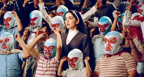
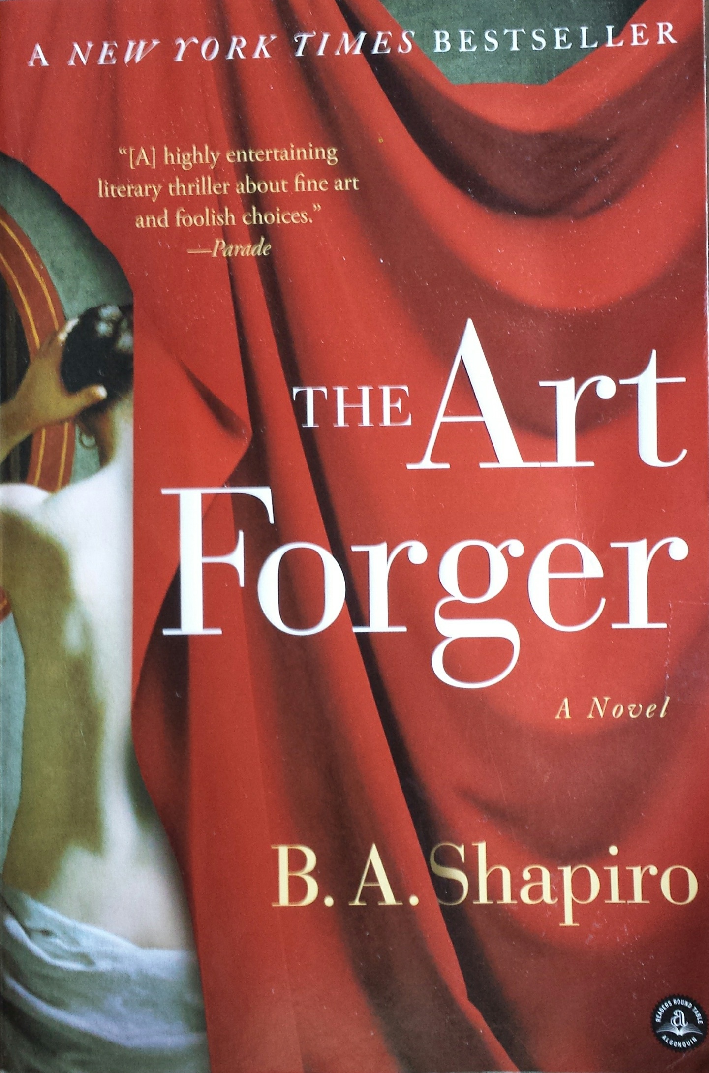
measure.  I followed B. A. Shapiro’s protagonist, Claire, as she navigated the mystery of a missing Degas. Set in a relatively small footprint of NYC, the story is one that could only effectively happen here in this city of superlatives. From the best of the beset to the worst of the worst  and the enormous middle ground of mediocrity which again is superlative due to its sheer density of people, texture, concentration of multi-cultural influences, exceptional urban scenarios and unique prospects.


I have imagined Claire and her extraordinary artistic talents living in a one horse town someplace in the  middle of nowhere. This story would not take place or it would have to have had many more chapters and be quite convoluted. In NYC the seemingly faceless masses live, thrive, struggle and prosper in a dense infrastructure of architecture and opportunity. It provides a setting and gathering of people breathing the aspirations of personal dreams and collective shared frustrations and weary survival efforts in a remarkably competitive urban microcosm(s).

The story centers around Claire’s innate and learned talent for reproducing paintings. With which talents, she actually works for a company who pays her to copy originals for sale. Degas bathers She is not forging as that would mean that the copies were intended to be marketed as, or represent, or be sold as though the original. Hers are legally sold as reproductions – until the plot thickens…Where a love interest, temptations of wealth and fame, innocent confusion and clever problem solving are woven between the past and the present and ultimately begs the question about the value of art – how is it established and when is it talent versus celebrity? The chicken and the egg thing or the Emperor’s New Clothes, either way,a mystery that boils down to what the market will bear.

With just enough technical information regarding the processes required to create an effective reproduction or, more importantly, a convincing forgery – the story weaves clever innocence with selfishly profitable and ego-feeding intents. It includes petty jealousies and fiercely loyal friendships which provide a believable combination to embody Claire’s world.

In the end, without giving anything away, as an interior designer and more specifically, a gallery owner representing the varied talents of a variety of media, my enjoyment of the story and ultimate amusement for placing value and awarding varying degrees of talent was satisfied. The nod to the OTC (Over the Couch) acronym that derogatorily describes art purchased for the express purpose of matching one’s decor was spot on! And I even gave a talk once entitled “I Want to Buy a Painting to Match My Red Sofa” as a valid niche for some. There is an endless  equation of context, timing, association, validity, originality, creativity, exposure, personality, and marketing. Which leaves me thinking, once again, about the base question – What is art? That too could join the classic bumper stickers  “What is reality?” and “Why be normal?” Hmmm…..something else to ponder…

And next I intend to immerse myself in what I expect to be my Valentine’s present tomorrow – A red likeno other - book 
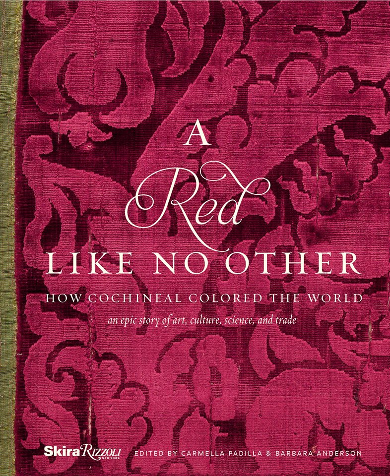
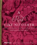
A Red Like No Other – but unless I am on a roll, it might take me a while.

Whales Up Close and Observations on the Spirit of Joy Series

How can I say that I am too busy to write this week? As Saturday approaches,  I realize that I have not stopped long enough to focus on any one thing, of the many that are bombarding me from all angles, about which I might formulate a theme for my story. I have to apologize, for once again, missing my Saturday deadline and hope that this was worth the wait!

Oh, to be so entertained by an onslaught of inspirational design elements as I have seen in the past few days only. And yet not only design – there was more. So I would like to start with an insert about Saturday as I (instead of writing my blog) took one last kayak cruise of the year.

A few people had gathered at the edge of the sand, pointing and remarking that they thought they had seen a whale. I looked in that direction and noticed that a few boats had gathered – often a sign that whales are spotted. I quickly pushed off in my single kayak through the gentle surf out onto the beautiful Banderas Bay and experienced for the first time whales from that most intimate vantage point. Up close and personal, it was thrilling to say the least. The beach was crowded with onlookers oohing and ahhing as they blew mists of water into the air and rose up from and back down, under the bay’s glistening surface. I paddled out and maintained a safe distance, but close enough to hear and feel the graceful power. Hump-backed and for which they are aptly named, the dark, sleek black bodies of the mother and calf were magnificent as they broke the surface and greeted the encircling boats full of eager spectators wanting to catch the show. And a show it was as the mama rolled onto her side and raised her unbelievably long, towering fin to slap the water sending spray high into the air. She slapped again and everyone thought that once was a rush and two was a treat and three and then four and I lost count at 30 times she slapped the water as though to say – “You want a show? I’ll give you a show!” She must have known that it was too dangerous to breach at that point, for a grand finale, as the close proximity of boats could have had deadly results. And I was right on the water with them. Unforgettable. The pity is that I was without camera and have only the memory of this life affirming event . An event that was awesome and outrageous and yet brought a surreal, serene sense of calm, peace and palpable, tingling joy. Friends on the beach greeted me upon my return in awe of what they had witnessed and welcoming me warmly, with enthusiasm, over my good fortune to have been out there for such an amazing display.

P1120423

This photo taken a week earlier – a bit choppier seas, with Tricia in the single and I with Victoria in the double, sets the scene of the Bay surrounded by the Sierra Madre range.

Now, having shared that incredible experience, I have decided to focus on one of the many design inspirations that I have encountered this week, but I hope you will visit our PATRICIAN DESIGN facebook page to see the collage of colorful art and texture that I have compiled to represent the many images that I have seen and offer to further stimulate your imagination.

https://www.facebook.com/media/set/?set=a.10153225877316619.1073741934.232272436618&type=3

My focus at this seaside gallery of  delights today, as we  bring to a close a magical month,  is a collection of precious little figures made from synthetic foam, wood and steel. These humble little animations represent three shared events, a group hug, the “wave” at a stadium event and a gathering for solemn prayer lead by a figure of distinction – the one in the red scarf.


The spirit of collective participation is conveyed. The spirit of humble expression is conveyed. They present a sense of simplicity of some of life’s joyful moments. These simple figures are happy and content. They are intriguing and relaxing to study from many angles.

P1130108


Form and movement, color and  texture the Spirits of Joy by Federico Leon de la Vega are a wonderful representation of life’s simplest and most basic moments of sharing joy. To see art in such a distillation, such a unpretentious media, execution of mechanics and form is true pleasure. It is not overwhelming or startling, it is not outrageous or provoking – it is moving and modest.

I hope that they bring a sense of joy to the start of your week and create an indelible memory to which you can return in your quiet thoughts to bring you peace and joy.


Table Dressings From Nature – Inspirational Fun!


It could have been a sculptural piece of drift wood or a gnarly tree branch from the woods or a twisted piece of metal from a salvage yard…but the idea is to see things in a different way and once again—as I have done this before— to make something from nothing. And in this case, with no effort or manipulation—just the natural beauty of the found object.

The tide was out making the beach so wide it was like a great runway of wet sand. Scattered on the surface were the leavings of the waves – pieces of shell and polished stones. There amidst the beautiful debris was what looked like the suggestion of an abandoned boat hull—a dried, darkened palm sheath. I instantly knew, this would be another beginning of the tropical table-scape that I am so fond of creating when we are at the beach. P1110860

“Creating something from nothing,” my father would often say. He was a great believer in that idea that one man’s trash was another man’s treasure. We loved to beach comb together whenever we found ourselves at the tide’s edge. Sometimes it was tropical and the coral was bleached white and pocked with texture. Fine mesh pieces of purple sea fan and perfect little green “hat” shells would be nestled among the dense collections of heavier piles of white coral.

Then other scenes would find us on northern beaches of the Maryland coast where there was no coral but the ocean would wash multi-colored surf-polished stones onto the shore blanketing the sand particularly at the very edge where the water would curl between the beach and the ocean’s depths. Tiny purple and pink clam shells would peek, being abruptly exposed and quickly bury themselves back into the wet sand moistened with  each incoming wave.

On this day, the warm breeze is tropical and the beach is expansive offering rare treasures scattered broadly but sparingly on the pristine surface of sand. It is here that I encountered my centerpiece.

Don of course is saying—”what are you going to do with that? It’s too big. Leave it here.” And I assure him that it is in fact a treasure and that it will be magnificent in the center of our dinner table where we are entertaining 11 for festivities this coming weekend. He, as always, acquiesces knowing that it is futile to stand in the way of my wildly enthusiastic creativity. P1110861 P1110871

Over the next couple of days, he and I both collect white stones and shells on our daily beach walks. At my instruction, we only collect white unless it is a particularly interesting shell. The idea is to have the stark contrast with the dark hull of the palm sheath.P1120142

Our dining table is a handsome slab of travertine marble. Laminated to a double thickness and finely finished with a smooth full bull-nose edge, it is the perfect organic surface to build this also very organic centerpiece.

It needs something…the neutral tones are lovely. Yet, the dark espresso brown of the palm sheath with the white of the stones, against the creamy surface of the travertine invites something more. I realize that it can only be enhanced with another layer of organic material – here in the form of the fresh verdant green palm fronds – the perfect punctuation! P1120102

Oh would that I had collected more flat oyster shell halves…they work so well for votive candle bases…but alas, parrot green cocktail napkins will have to do for this last minute detail.

Our woven palm place mats, in their natural dried flaxen color, compliment the rest of the organics on our table. And as night falls, the sun drops beneath the sea’s horizon and twinkle of scattered candles finish our scene. Salud!