Oh the Faces! Spanish Market

The sky was grey and the air had a decidedly seasonal still-cool yesterday which called for a cozy indoor activity – offered this weekend in the handsome Hotel Albuquerque, host of the Winter Spanish Market. Yes, the decades old traditional Spanish Market held in Santa Fe outside around the Plaza, on warm summer days in July, has begun a new tradition in Albuquerque in the opposite season indoors. http://www.visitalbuquerque.org/abq365/events/detail/28th-Annual-Winter-Spanish-Market/31793/

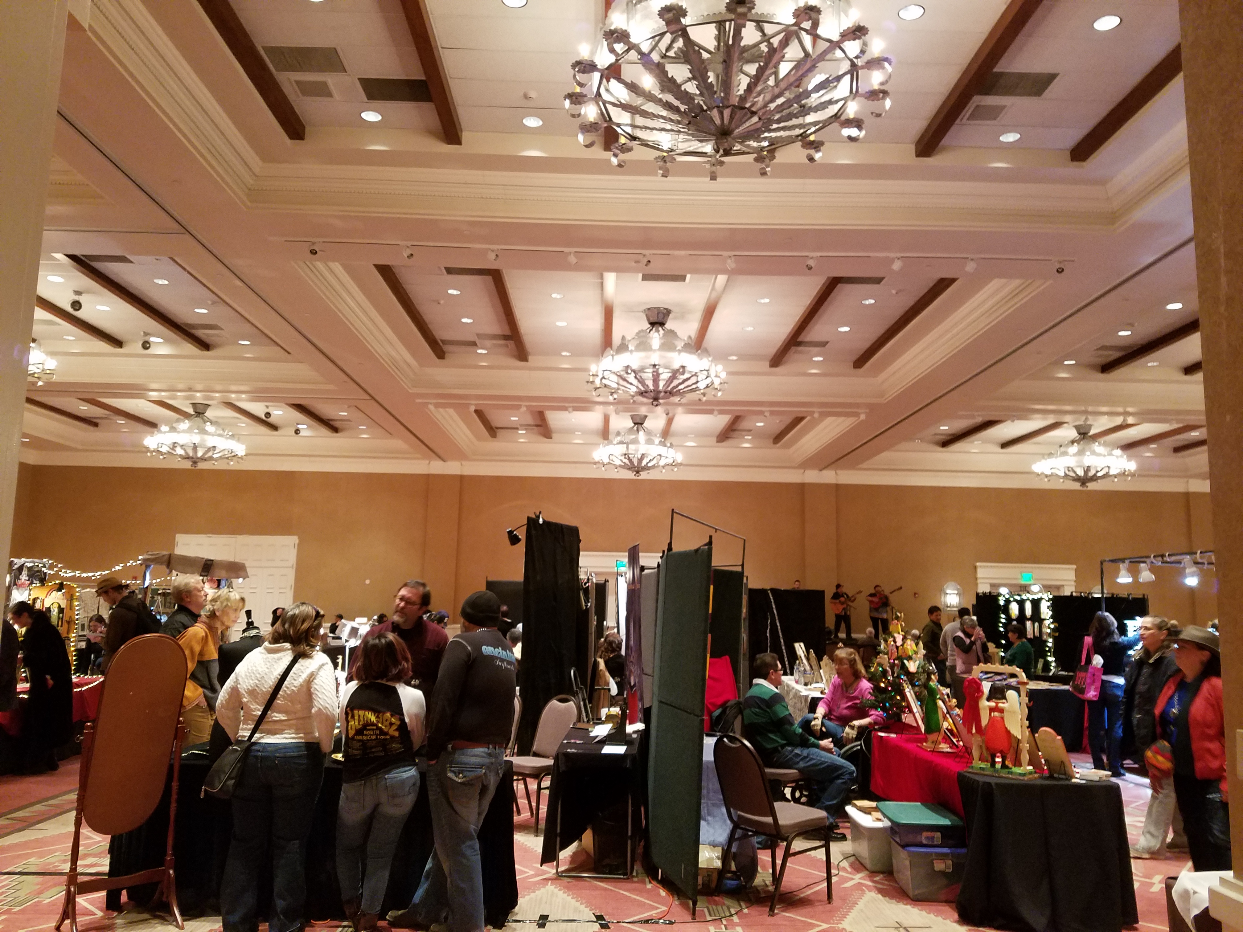
The collection of world class artists’ booths beneath the enormous hand-tooled tin chandeliers suspended from the spacious ballroom sparkled with festive illumination and colorful creations.
20161126_151417

A variety of Mariachi bands played to the crowds as the curious and collectors wove in and out of the rows of talented exhibitors.

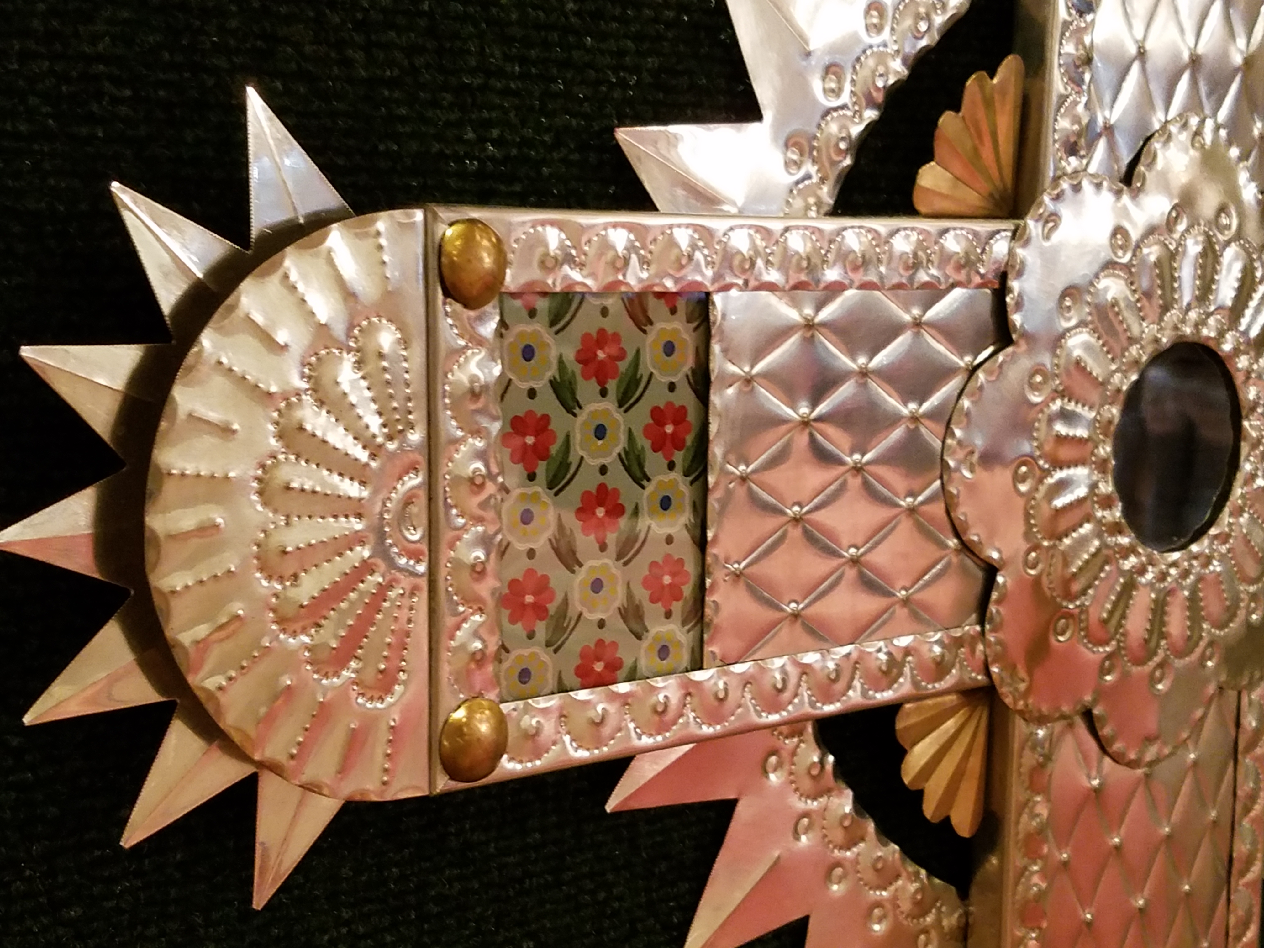
Fine tin-work, dyed and cut straw assemblies, weavings and jewelry presented an incredible variety of work. Fine crafted furniture and spectacular wall pieces were displayed by master carvers. It was a collection of world-class art and fine craft.
20161126_151517

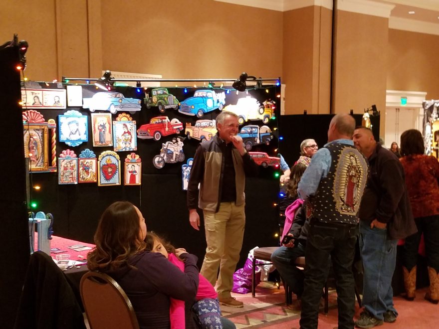
Crazy interpretations of his beloved traditional retablos are Charlie Carillos commically contemporary interpretations of vintage cars with saints at the wheel. Humor that is received with mixed reviews. But his talent is undisputed. Here he entertains at his booth with his colorful delivery.

20161126_151446

By startling contrast, the rich warm colors and traditional reverence that Catherine Robles-Shaw displays in her incredible carvings and painting techniques, wonderful detail and soulfully expressive faces. Her rich hues are Old World in their sensitivity to tone on tone and dark earthen colors outlined and enhanced with ribbons of gold.

Daughter, Roxanne Shaw-Galindo, a respected santero in her own right has continued to carve her own niche in this exclusive world of bultos, retablos and other manner of fine carving and painting.

The mystic powders carefully sought and gathered from ancient land forms and mineral-rich geology diluted with water and even the precious red of the rare cochineal all contribute to the luminous, translucent colors that read so differently from other media.

And further contrast is Frank  L. Garcia with his primary colors of electric blue, yellow and  red shining off of his wood surfaces. Uplifting and extracting smiles from all who pass his booth.
20161127_085738

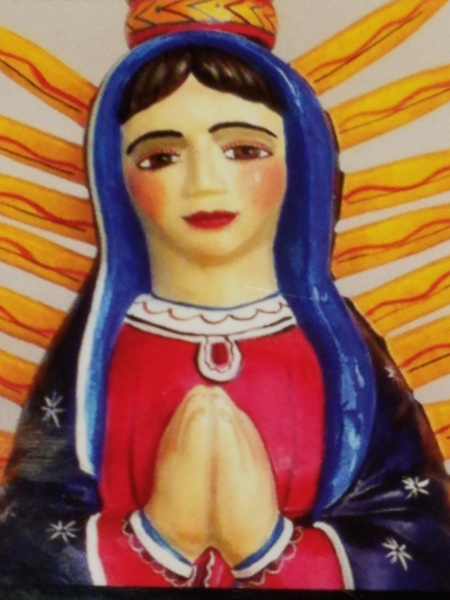
Oh the faces!! Each santero has his or her own style.  Like fingerprints, the santeros each have cultivated a unique “look” to their work and expressions of their subjects.  The eyes say so much. Mournful, cheerful, pensive or stony stares, the characters are exclusively their own. Despite the similarities bound by tradition, each artist presents a specifically unique style which conveys incredible personality. These signature expressions, as individual as fingerprints, represent so distinctly each  inimitable artist. Despite the similarities bound by tradition, the methods and materials, each shine with startling individuality!

Here santero Ruben Gallegos poses with Mary Anne Green an avid collector and fond owner of several of Gallegos’ work.

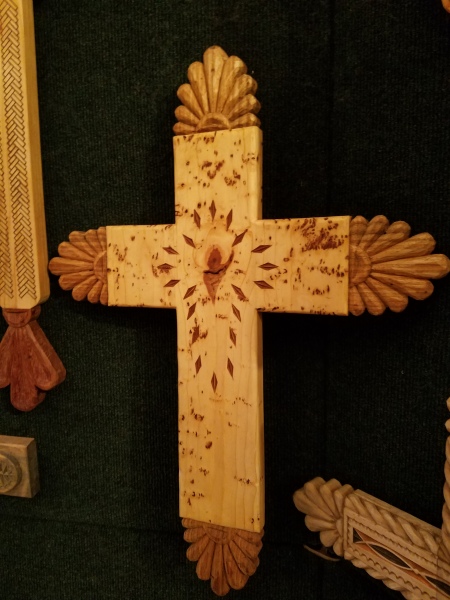
Lee Valdez hunches over his soon-to-be cross carefully carving the rope detail around the edges. Light pencil lines define the decoration that he follows with remarkable precision – and look – he is sporting two pair of glasses stacked atop one another – which he says works just fine.

Behind him displayed on the wall are several other crosses in all manner of carving and decorative woodwork. One piece in particular is a yellow pine cross that is riddled with dark cinnamon colored worm holes – splattered actually – creating a spectacularly natural design. And further marks of nature that Lee captures are a knot hole and adjacent burled wood that he places dead center in the intersection of the cross. The four end pieces are carved from a piece of butternut wood providing the perfect natural contrast to the yellow pine yet complimenting the dark flecks of the worm holes. Quite a find, in this amazing piece of wood he spied in a hardware store, and remarkable sensitivity to isolate and assemble the various pieces to create the whole.
20161126_145127

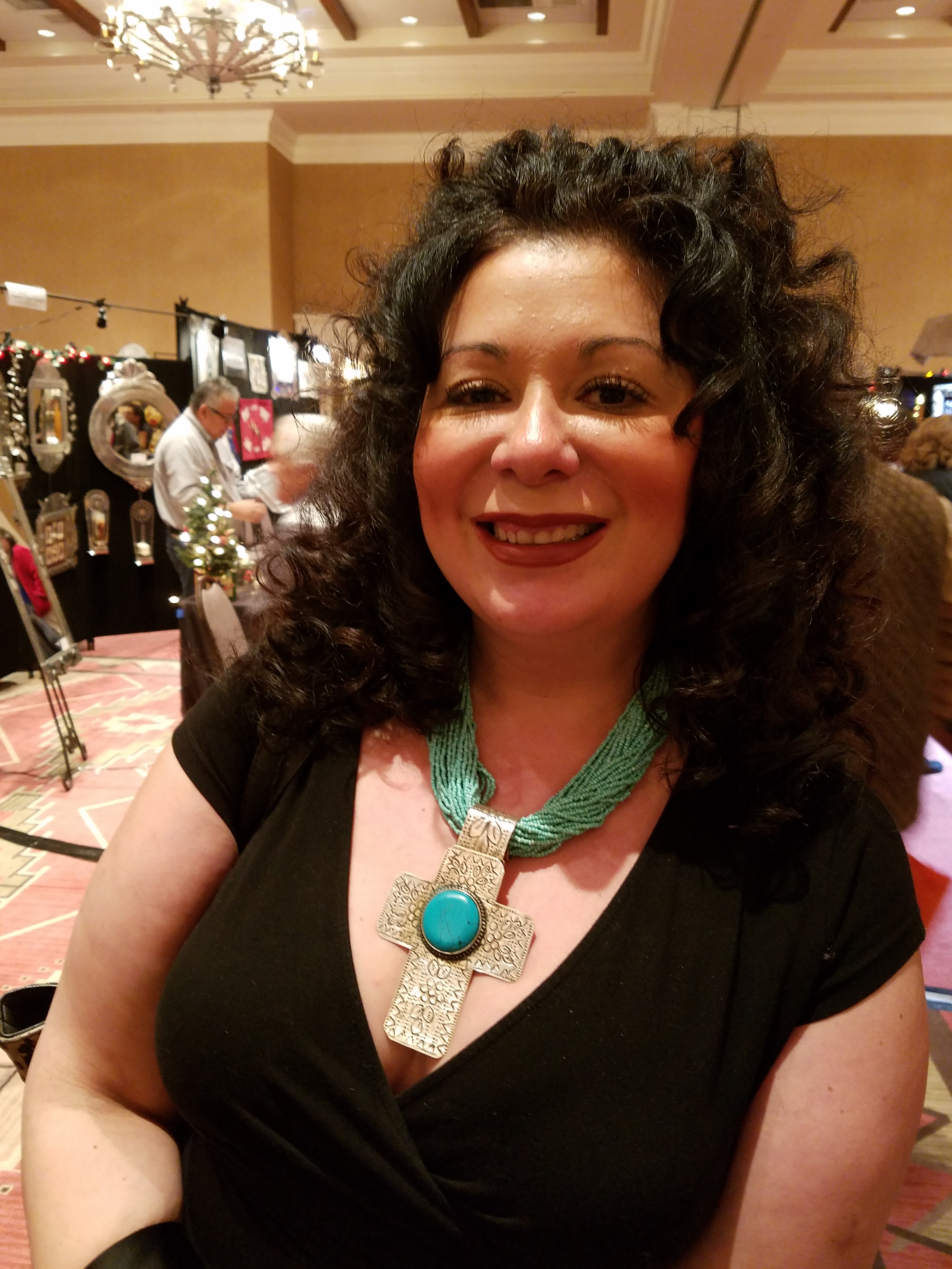
A striking woman caught my eye. Her thick curly black hair and handsome silver cross strung on a multi-strand necklace of turquoise made a big statement amidst all of the art and drama. Meet Vanessa Baca.
20161126_140328

As we visited briefly I learned that she is a fellow blogger and I am sure it was fate that we met as her foodinbooks.com is a wealth of observations centered around great books and fabulous food within described. She writes with great depth of description and observation AND she breaks it down and teaches you how to prepare that about what you have just read!

Sean Wells painting as we watched, represents her art in her own striking appearance. Dark hair whipped and twisted with a stylish flair and topped with screaming orange flowers.

Wells’ images are equally colorful, happy and festive. If not her fine retablos, You might recognize her Fanciful Day of the Dead wine bottles and famous, collectible Lottery Scratchers! Find her on Etsy!

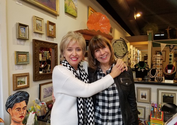
It was an inspiring day of extraordinary art in a genre that is so historically and regionally rooted with original methods and patient execution paired with the artistic imaginative people who practice and study this fine work. Thanks so much Mary Ann for a rare treat!
20161126_155650-copy

Today YOU can go see this final day of  the 28th Annual Spanish Market 2016! Get over there!


Resourceful Creative Festive Fun

When it’s time sensitive and just can’t wait – what do you get? A BONUS BLOG!!!  Yes! A mid-week blog for the holidays! It began beneath a brilliant blue sky yesterday as the air, with a teeny bit of a  chill, was contrasted by the then warm sunshine glistening through a deciduous denuded Honey Locust making it’s lonely leftover pods look like birds silhouetted against the sky.

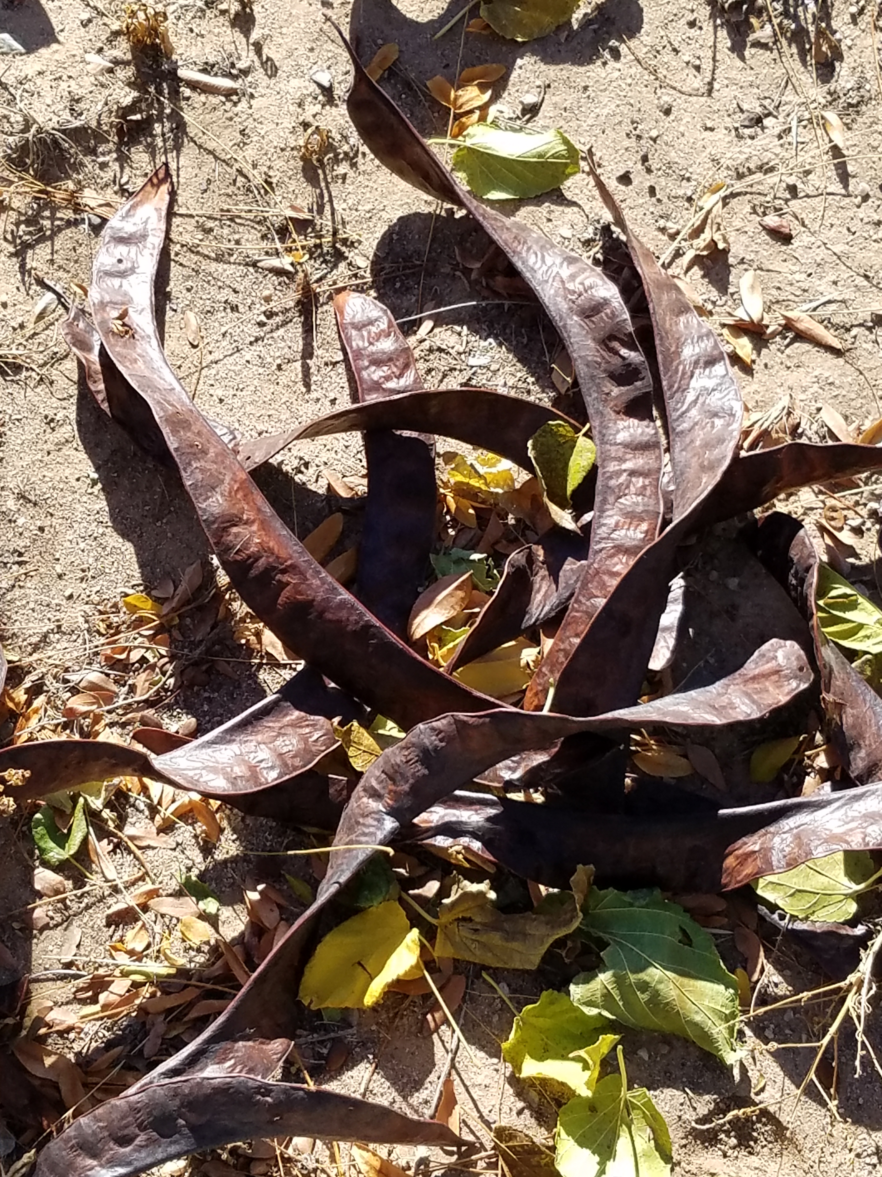
Scattered all over the ground were the same fallen wonderfully twisted mahogany-colored pods writhing amidst the dried leaves.

The color was so rich and warm it was irresistible. As I bent over to inspect one, I was captured by the unique quality of each pod and the amazing contours of their graceful, elongated shapes.

Almost as though they were varnished, they had a semi-gloss that was naturally beautiful. This is art in nature. This is inspiration. I can see this as a magnificent drapery fabric – a grand wall of these intertwined ribbons of organic seed pods.

20161120_140253

However, on a more current and immediate note – I saw a centerpiece or multiple centerpieces as it turned out. I gathered the pods in my fist as though a wonderfully wild bouquet. I then needed a bag (thank you Becky) as I kept dropping them, in an effort to force the ever growing collection.

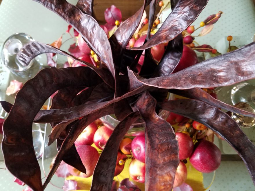
Here is the quickie result of the awesome autumnal centerpiece. I had a faux wreath of berries and leaves, tossed in a few recently harvested local apples, (thank you Vigils), some leaves gathered from the driveway as the Bradford Pear – which, a little late this year due to our unseasonably warm Indian Summer this fall, has only started to drop its gloriously radiant leaves. And Voila!

I stood back and looked over my shoulder and saw the collapsed plastic bag still spilling pods out over the counter-top.

20161121_103710

I was about to call all my friends and ask “Do you want a piece of this fabulous, festive, fall, focus of attention? And I quickly realized I could expand the joy for those of you with grand tables  needing a longer statement down the center.

So flanking glass vases provided the extension I needed. Now this was quick – adding gravel, sand or moss in the vases would add interest and depth, maybe pheasant feathers, other dried flower pods and grasses – this was just a start based upon an irresistible inspiration scattered before me.

20161121_101825

So keep your eyes peeled for opportunities when you least expect them and make something out of nothing. Save unnecessary expense when you find your design accessories for free!!! Happy Thanksgiving!!!

pd-exteriors-logo

Resourcefulness in the Field

A bird in the hand or resourcefulness pays off – this is just a quick bit of designer humor for your Saturday morning. As I flew on an early bird flight to Phoenix for a couple of projects last week, I was sitting on the flight taking stock of what I wanted to accomplish, what was on the agenda and all the tools of the trade and accouterments and finish materials that I was taking with me. After feeling well prepared, I settled into the always enjoyable Southwest Airlines in-flight magazine.

Arriving in Phoenix was a climate change right off the bat as the outside air seeped into the jetway with a warm, welcoming temperature in the high 70s at that already early hour. As an aside just to continue the story, we had been alerted from the flight deck that there was a delay in the concourse and that we would be held at the gate until the disturbance was cleared. Sure enough, upon deplaning and entering the gate area, hundreds of people were jammed together facing to the right in anticipation of learning what was happening and hoping to soon be released. So I took my place among the hoards of travelers and occasionally stood on my tip-toes to see the TSA barrier of agents keeping us at bay.

20161114_095141

After nearly an hour we were herded to the adjacent gate and led single file out onto a mobile ramp staircase down to the tarmac and into buses which wheeled us to the D concourse where we could get to baggage claim and ground transportation. Half of the travelers making connecting flights were still held risking connections and trying patience.

Nobody was offering an explanation and when asked the response was merely that there was a security breach. Until one young SWA agent whispered to me that there was a suspicious package and that security was waiting for the dogs to investigate and until they arrived the package could not be touched. So that answered that.

Excitement over, I retrieved my bag full of engineered stone and laminate samples, paint fan decks and fabrics. Grateful that an earlier mishap at security required that I check my would-be carry-on rolling bag (which weighed a ton and would not have been fun to stow overhead) when I had forgotten about a lovely little jar of local Heidi’s Chile Raspberry jam that I was taking to my client as a hostess gift. Stopped and searched by TSA the agent kindly offered that I check my bag to save the jam – she escorted me out so that I could retrace my steps back down to the main level and check my bag.

At the SWA ticket counter I hoisted the bag onto the scales and began telling the agent about my return from TSA with my contraband and I began unzipping the bag. Clumsily juggling my purse and holding the jar of jam it flew from my hands dropping with a crash onto the brick floor and rolled away as she and I stood saucer-eyed with horror. Miracle of miracles it did not break – even crack- how that was possible, falling from that height onto a brick floor, we will never know. But it appeared after having been discovered and confiscated at security and surviving a fall from about 24 inches above a brick floor that it was destined to get to Phoenix.

As the time unfolded, we found ourselves in a meeting with the architect to do a plan review and some minor revisions prior to beginning construction. The place was demolished and debris was all about.

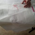
We found a table and spread the plans. As we began discussing the details, I realized  that with all my preparation that I had forgotten the roll of flimsy. I never travel without flimsy – trace – the roll of translucent paper that is the quick-study tool for sketching over plans. Dang.  So there we were and all of a sudden Felicia looks over a few feet away and spies a blue cardboard box covered with drywall dust. There sitting on a planter ledge in the elevator lobby of the third floor was a forgotten box of toilet seat liners!!!! Yes, how funny – she offered “won’t this work?” And we tore out a few sheets and began our work tracing options over the plans. Brian, the architect, will surly enjoy seeing himself here in today’s blog hard at work over his paper toilet seat cover!!!

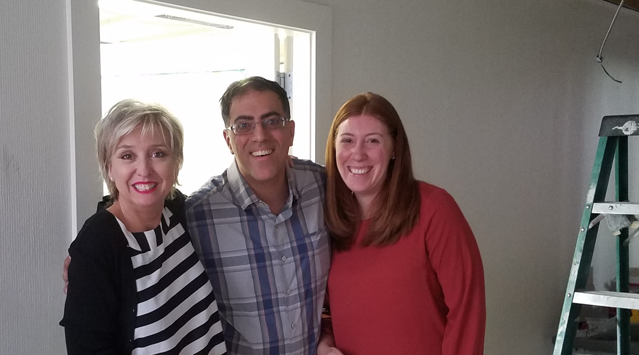
We look forward to a fabulous interior for Dr. Farhan Taghizadeh’s new Arizona Facial Plastics office scheduled for completion in January!!!

20161115_123527-copy

Buying the Bones…Re-upholstering

Re-upholstery is good. If you like a piece of existing furniture and it has “good bones” it is fun to give it an instant face-lift with new upholstery. I find myself salvaging clients’ pieces often when they had every  intention of complete replacement. The satisfaction of transforming a tired or dated piece is quite gratifying.

The next best thing is finding a piece that is value-priced for the aforementioned reasons of looking tired or dated and recognizing that is has “good bones.” This is like a treasure hunt. Whether on Craig’s List or in a Thrift Shop, searching for a piece is exciting. You have to see beyond it – you can’t tell a book by its cover – right?

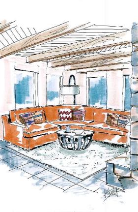
Many of my clients are believers in this practice, but often did not start out that way. In fact for this blog’s example, I have the perfect scenario. It began as I remodeled and designed a spectacular renovation for a  single man who wanted a sleek, modern interior. We started from scratch with all new finishes throughout, custom cabinets, enhanced lighting, and then the search for a piece of furniture that had eluded us. It was the primary focal point that I envisioned – a large orange ultra-suede sectional. I stood beside my illustrator render the room based upon photos of the space and a very loose sketch that I prepared. A picture truly does speak a thousand words and is a fantastic aid in communicating design ideas that might otherwise be misconstrued or just plain missed by the client.

illustration-resi-crop

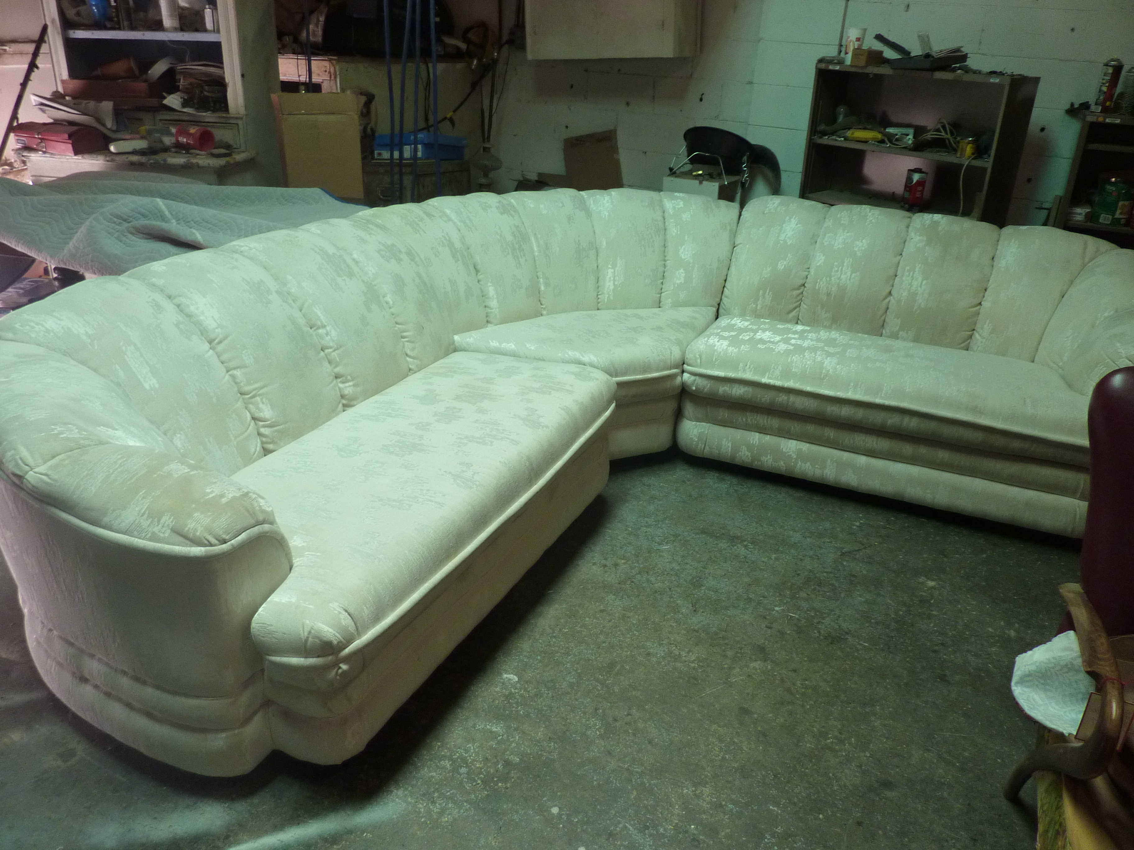
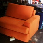
We began pricing custom fabric on a number of options, but everything was over budget. So I asked if he minded if I looked locally for a used piece that we could transform. Luckily, he was busy and trusting and told me to have at it – so I did. It looked like it was made from marshmallows, but the key detail was the curved corner piece. I did not want an “L” with right angles – I wanted that rounded, welcoming, beckoning corner piece.  This crazy, puffy, formal, dated piece was in perfect condition and the woman, original owner, was moving and could not take it with her. In step I and paid this grateful woman her requested few hundred dollars, called my upholsterer and scheduled the pick-up for the next day.

keiths-sectional-before-008

When I saw it for the second time in the back of the upholstery shop, I was psyched. It’s always fun- but this transformation was going to be amazing! Inasmuch as my wonderful client trusted me, I didn’t dare let him see it in its original form. I didn’t want to risk the probable fear and foreboding. I didn’t want to give him a permanent unsettling visual, of this puffy, white, marshmallow sectional, every time he saw his gorgeous, sleek, modern, orange masterpiece.

Therefore, the process began as I had already found the perfect orange ultra-suede and the guys at the shop stripped the layers of white damask, foam and fuzzy dacron from the solid wood bones of this beautiful frame. They slicked it clean as a whistle.

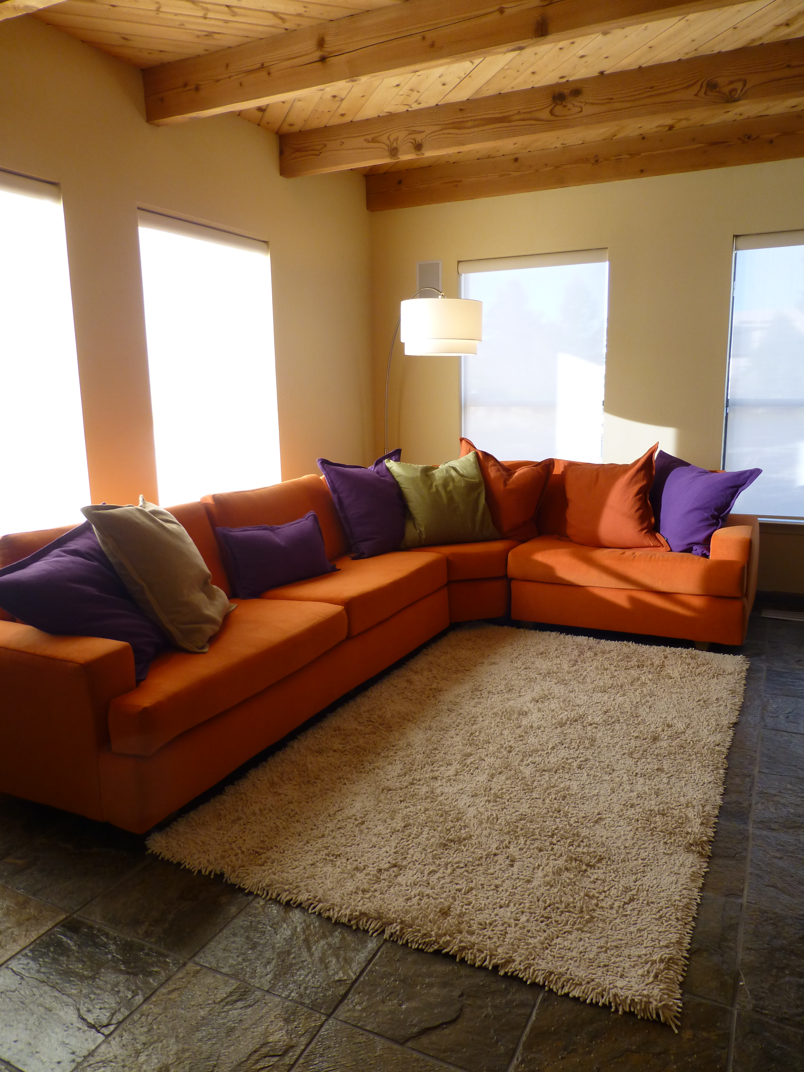
With a bit of work to lengthen on side to an imposing 10′ and shortening the other side by a few inches, the new sectional began taking shape. The arms were modified and the cushions squared and the lines simplified. In this case, the concealed feet were fine. Although we often replace feet, or replace skirts with feet, or feet for skirts – those options were not necessary in this case.

The finished product was the perfect piece. Our client was blown away with seeing it delivered and looking like the original illustration that we used to convey the design concept. The biggest response was that of the cost which was a fraction of the cost of buying this over-sized piece new. Because of the unusual size, it would have had to be custom all the way or we would have had to settle for a size less than perfect. Not to mention this was accomplished in less than 2 weeks rather than waiting a couple of months or more for a custom order.

p1030518


Ready-made, down-filled,  Ralph Lauren throw pillows were a great find to add a splash of color. The rug is temporary as a larger, lighter one is intended along with the custom cocktail table. Once again my team makes my dreams come true and the client has a unique piece perfect for his needs.


Designing with Balance and the Creation of the Can Wall!

Given the opportunity to improve upon a recently completed taproom, we instantly realized that painting the entire interior would be the best quick-fix. But that instant gratification was not enough to give this needy/hungry interior some meat to get it off and running.

Atmosphere in interiors is so much a part of the brand, the identity, and the success of a business. Popularity is based upon a certain comfort level, the clientele who gravitate there and the product that they are effectively providing. Whether that is food or drink or both, the atmosphere, (including lively enjoyment by clientele), service and food/beverage – all contribute to a successful establishment.

This does not mean high-end, elegant, fancy or even simply hip – although the definition of hip can vary from spare unpretentious and un-self-conscious funky, to studied funky, to affected stylized, to trendy hip and happening,…but, it does NOT always have to represent expensive interior design.

Yet a strip center generally lacks pizzazz and to install a taproom into that generic scene takes some creativity. That does not mean money – it means just what I said, creativity.  And creative interior design is all about ingenuity and balance.

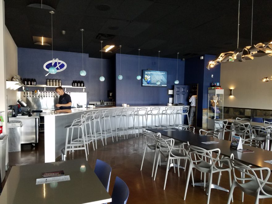
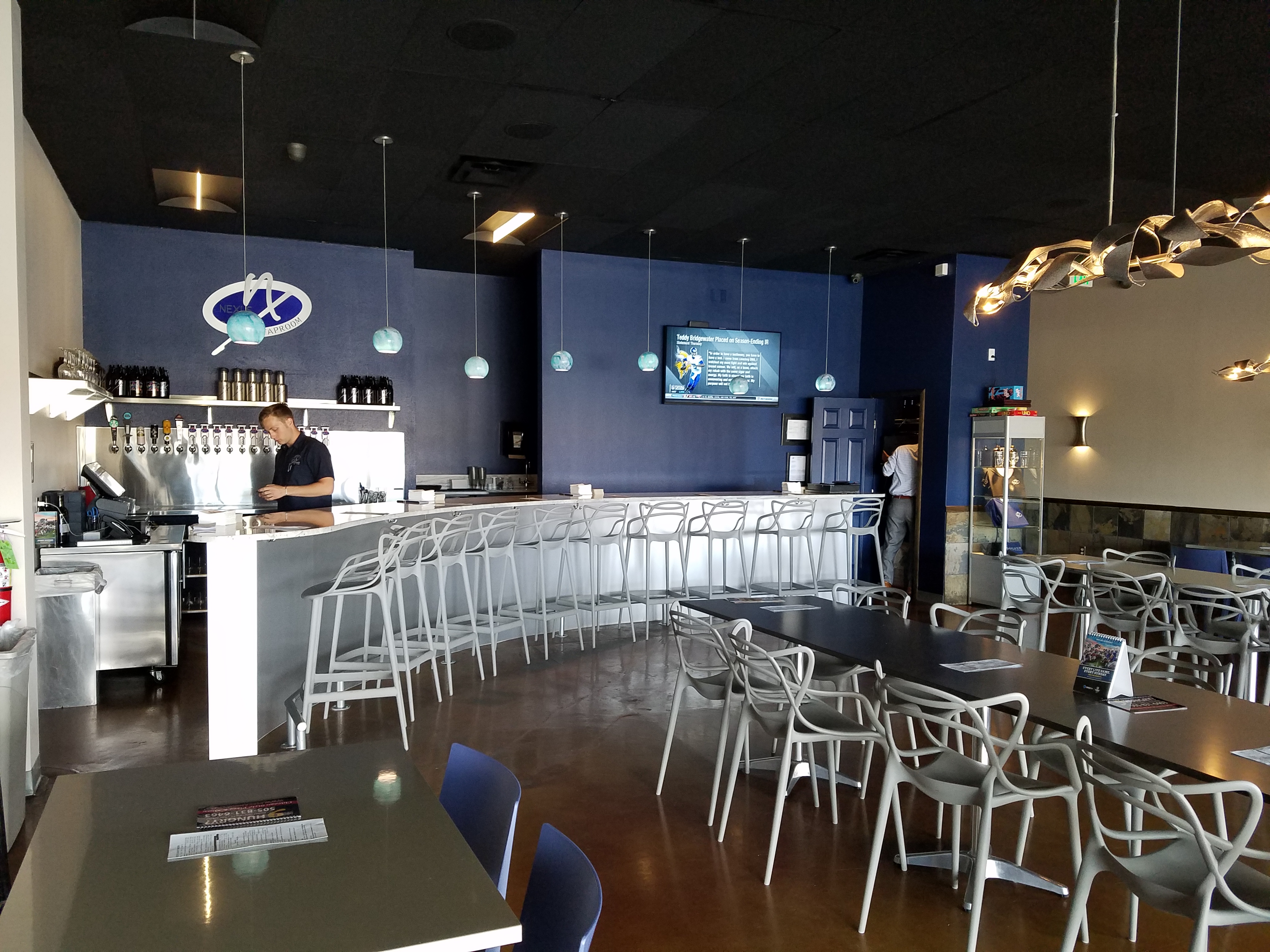
Balance in interior design is key. This interior was filled with hard, cold surfaces – concrete floors, silver-grey laminate table tops, brilliant silver table bases, grey chairs, polished white granite bar top, silver laminate bar face, silver metallic wall sconces, glistening silver under-scaled chandeliers, white walls with cobalt blue accent wall. Brrrrrrr….makes me chilly just recounting the scene. And this was summer! Imagine this setting with crisp cold wind blowing outside and snow blanketing the mountain – not the place you want to gather for a beer in the wintertime!!

20160901_160828

To instantly soften and add warmth, we painted all walls a dark taupe. The soft, mousy grey/brown color pulled from the existing slate wainscoting to tie the two wall parts into a unified “read.” It gave the silver elements (especially the sconces) a contrast – which results in “interest.”

20161103_091444

The back bar was bland even with the new paint color and to add dimension and animation we mirrored the rear center section. This illusion added depth and interest to carry the ceiling through and add a mirrored storefront and exterior reflection which created an illusion of space and character where there had been nothing.

But unlike most back-bars, this area was conspicuously naked. A couple of stainless shelves housing stemmed wine glasses, and growlers felt spare. Plus the right side of the back bar was closer to the bar and the patrons were a mere few feet from a plain, painted sheet-rock wall. Yes, there was a large format TV screen above, but straight ahead – it was just blank wall.

In the wee hours of the morning, as I tossed and turned for a variety of reasons, I jumped from thought to thought, project to project, and personal concerns pelting all the while in a seemingly endless stream of insomnia. Yet, it was during the angst that the idea of the taproom being named “Silver”…silver…beer cans are silver/aluminum…beer cans crushed and nailed to a wall…texture, silver (theme of the taproom) interest – maybe?- all converged into one of those light-bulb moments of revelation.

And yet you might say – “silver…aluminum…more cold and hard. Why would this be an asset to this interior?” I felt that the texture and dimension of the cans would add more interest than the perceived cold and hard of them. The pockets of folded shadows and the relief off from the wall, paired with the over-all massive full-wall of pattern, would all contribute a positive design element to the scene.

As I pictured the wall of circularly flattened aluminum cans in my in my  mind’s eye (a tool that I employ daily while envisioning concepts and finished products well in advance of their fruition), I furthered the concept to encompass possible bar games. Yes, derived from this perfect grid of circular aluminum discs, I began creating games in my head. A bar is often animated by bar games and this was just another opportunity to interact using this unique wall-scape. Since that initial concept, I have created 3 different versions of the animated interaction in the form of games, on this fantastic Can Wall.

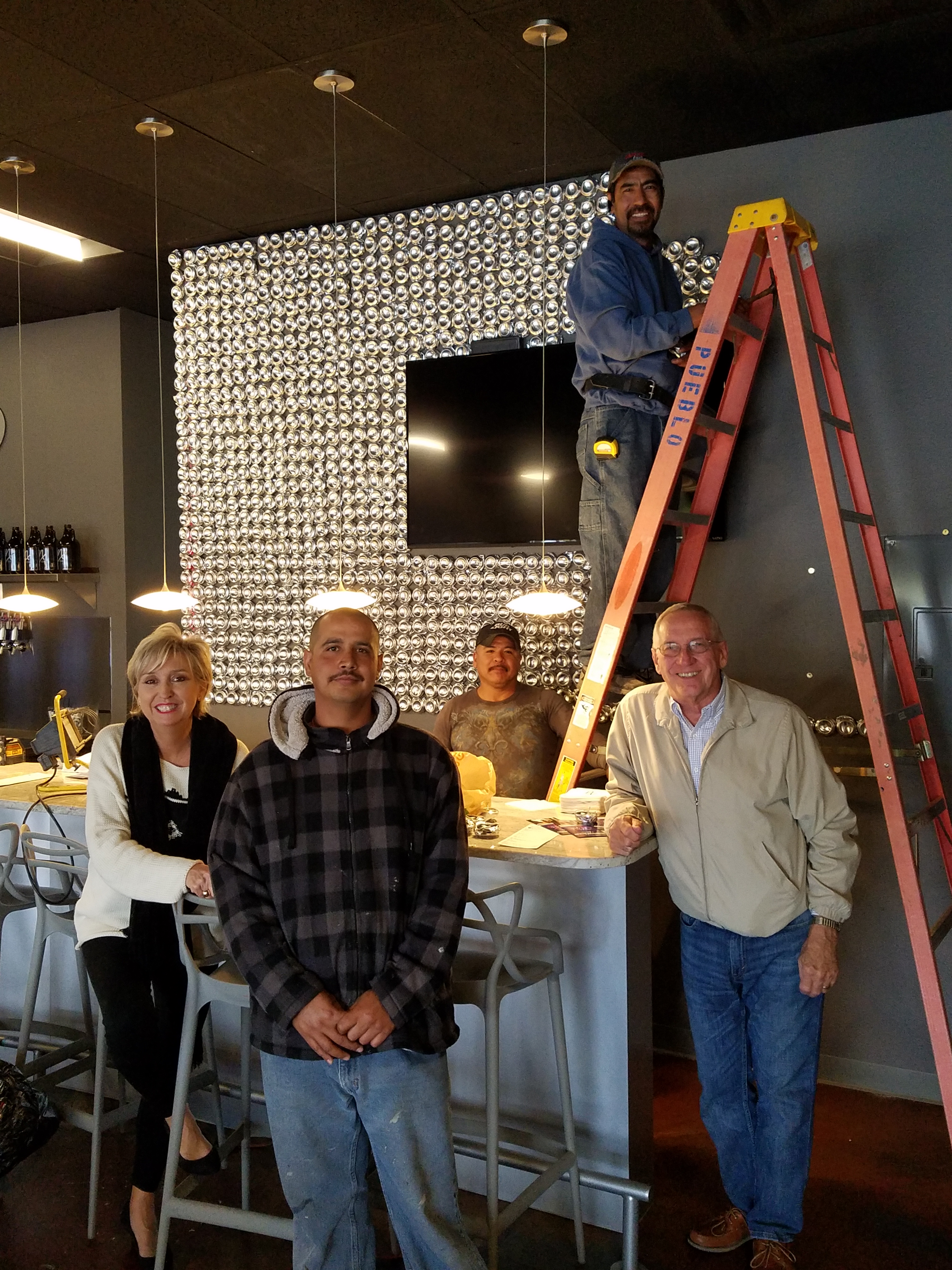
So with great patience, Enrique planned the layout with literally laser precision in a perfect grid. We counted the expected number of cans vertically and horizontally aligning with the brilliant red light beams. The previously crushed cans were laid out on a table – well a handful of the 3,200 that we had prepared for the wall. It was determined that punching the nails into the cans prior to installation would expedite the process of affixing them to the Can Wall. Labor intensive from start to finish, this wall was a great accomplishment for a devoted few.

20161103_094518

As the cans were laid out on the table – initially upside down exposing the crinkly open side (devoid of tops), I instantly LOVED the complexity of the depth, texture and shadows. A tight, random application of them would have resulted in a fabulously complex matrix of design. But upon closer inspection, the “texture” was really raw, with sharp threatening edges that were not possibly reasonable within close contact with people brushing by. So, lacerating the staff was not an option – even for a really cool textural metallic wall treatment. Perhaps this application will surface in a more appropriate location away from human flesh in the not-too-distant-future!

Like hubcaps fastened to the broad side of a country barn at dusk, the reflective silver discs pop in the flanking darkness.

20161104_140152


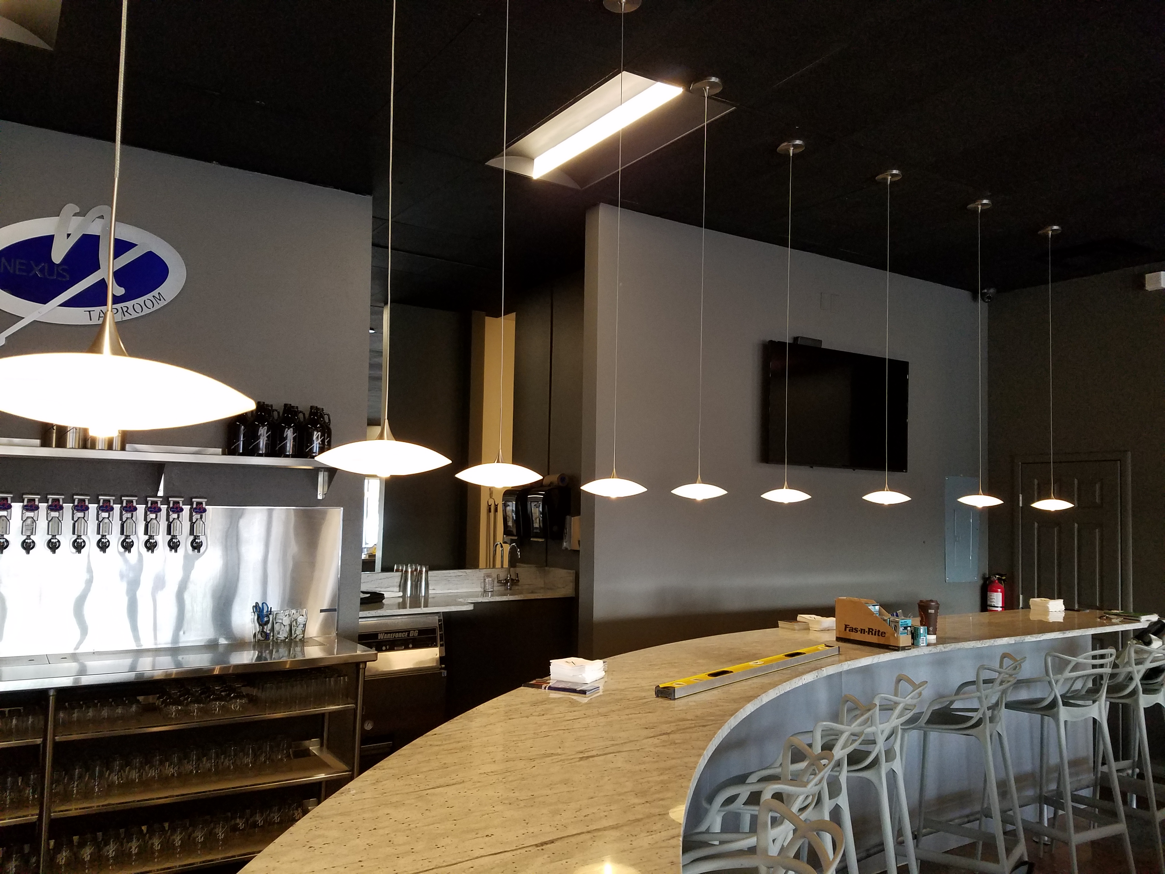
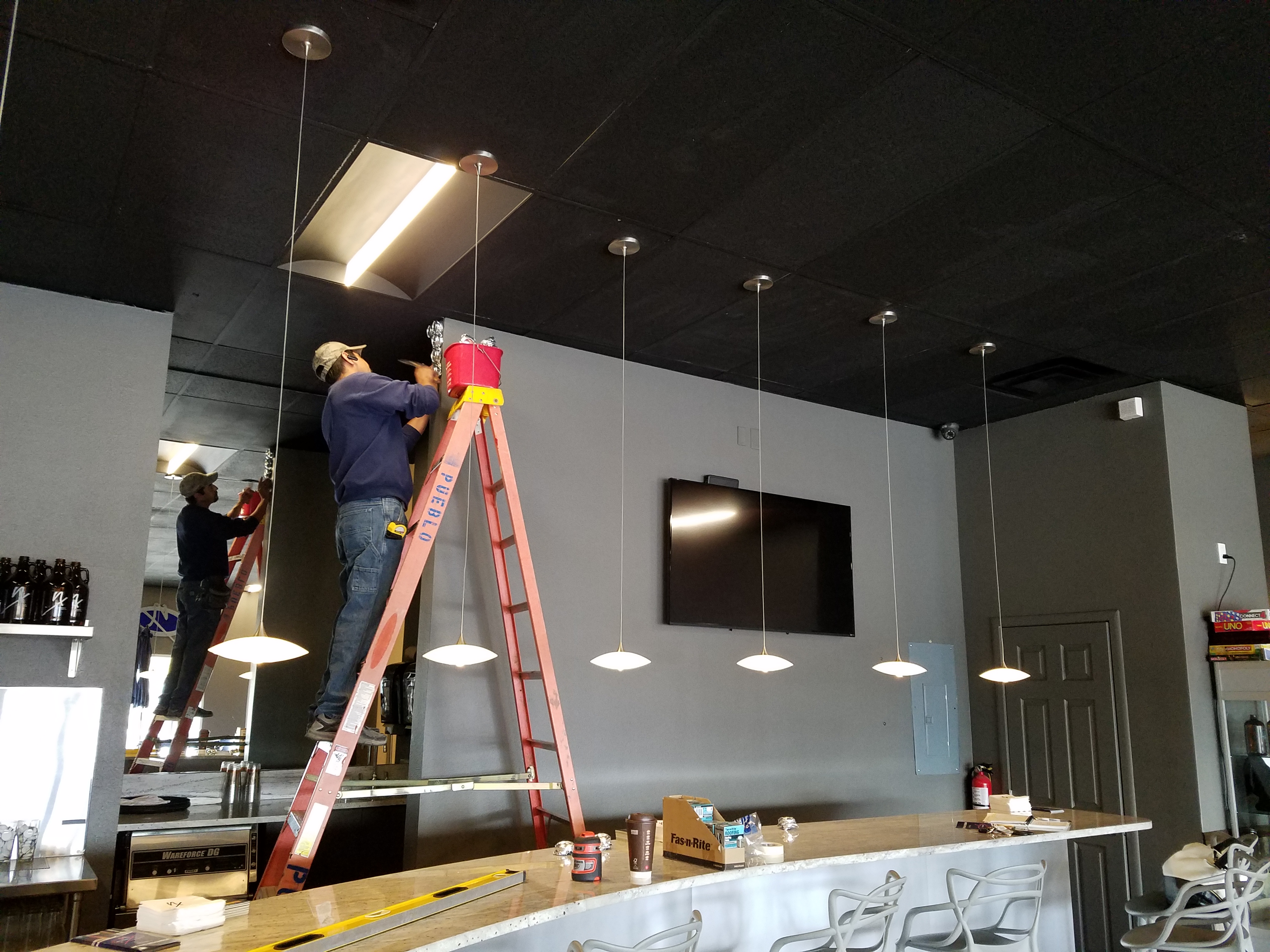
The process is nearing completion and I will save for another blog sharing the fun and games emanating from the Can Wall,  and the entire finished project complete with new warm white pendant discs over the bar and soon-to-install enormous perforated drum light fixtures suspended from the ceiling, over-sized photo images of the brewery behind the scenes and tantalizing signature dishes in the unique category of the Nexus New Mexico Soul Food.


Meanwhile, the take-away here is…balance cold and rigid with warm and textural – along with all the other opposites that attract – when designing be balanced.