Eye Associates West
In a previous project, we featured this prominent medical practice and its embarking on a fresh new look. In the first clinic that we designed for Eye Associates in this new phase we created a theme around the fresh photographs of enlarged succulents. Coordinating with the colors in the art were the new fabrics selected to reupholster their waiting room chairs.
Here, in the second clinic of this new design phase, we wanted to maintain the same design direction but alter the color scheme and theme of the artwork.
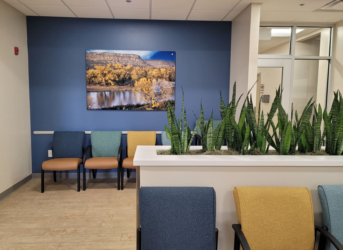
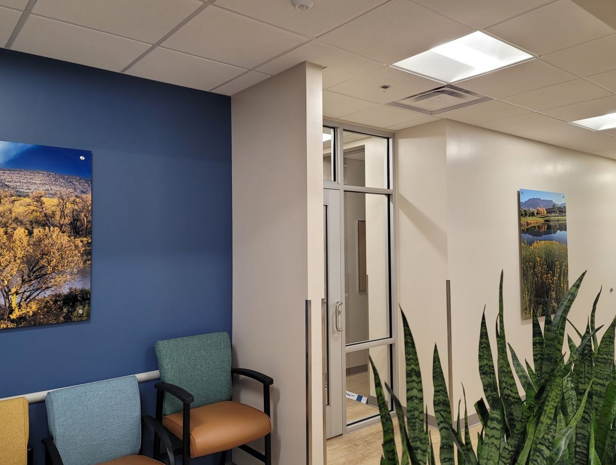
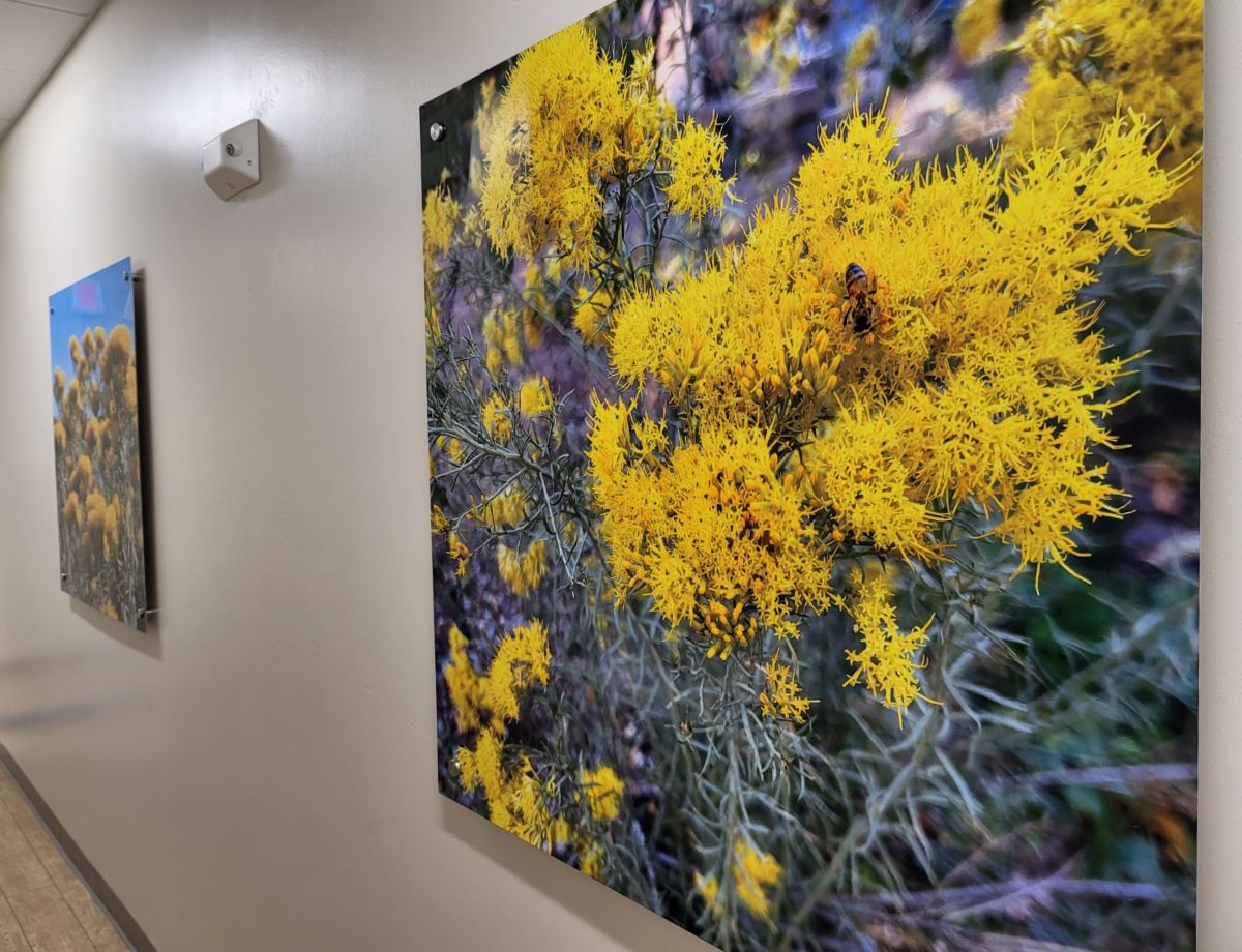
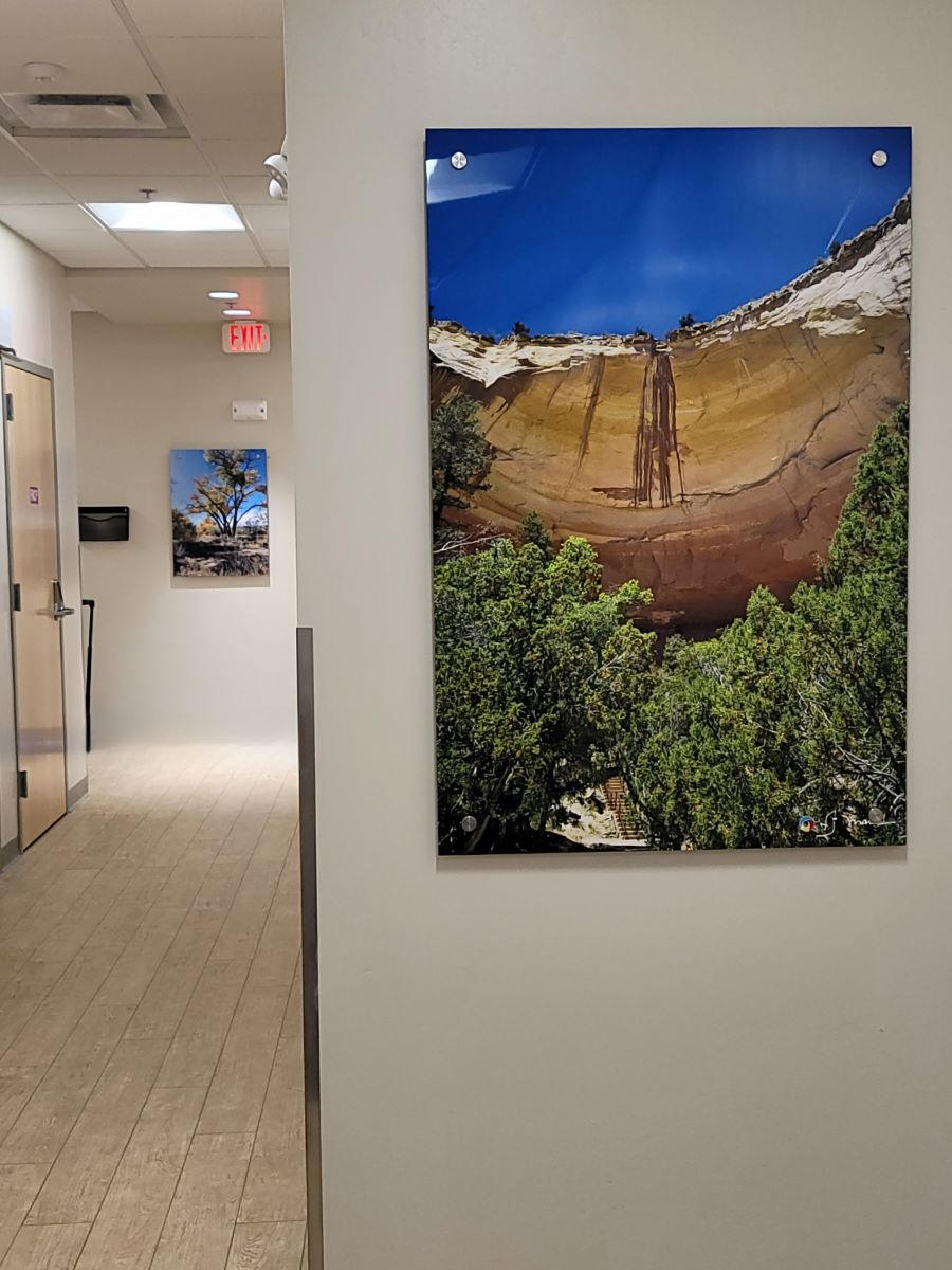
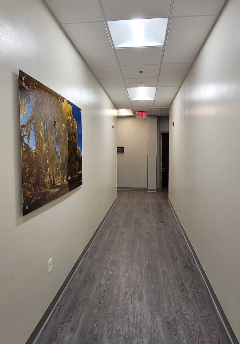
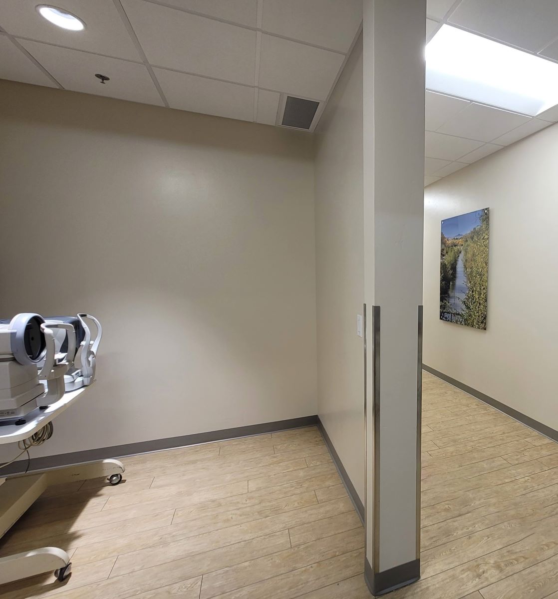
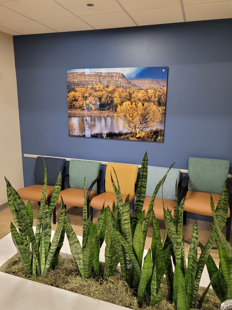
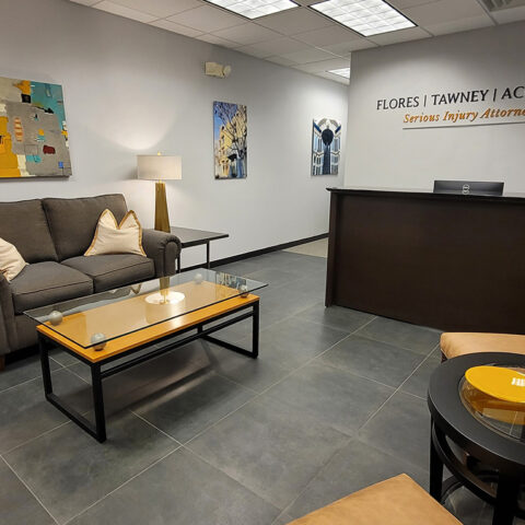
Here, we selected images from all around the state of New Mexico, each of which has yellow, blue, and green in the subject matter. All are printed on aluminum panels and mounted from the wall with standoffs for a dimensional read. The effective use of a theme in both of these projects results in a strong color scheme while reinforcing a common denominator in all of the artwork.
Prior to finalizing the selection of the photographs, there was much discussion about using a random selection of photographs from around the state, without concern for the commonality of the color scheme. However, it is evident in both projects that by adhering to a tightly curated collection, the effectiveness is stronger and more unified and presents a subliminal and also obvious cohesiveness. This results in a well anchored, well coordinated interior design.
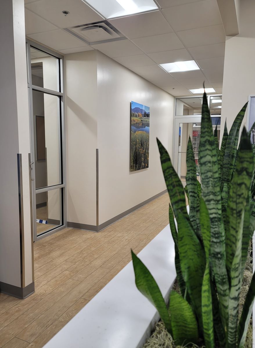
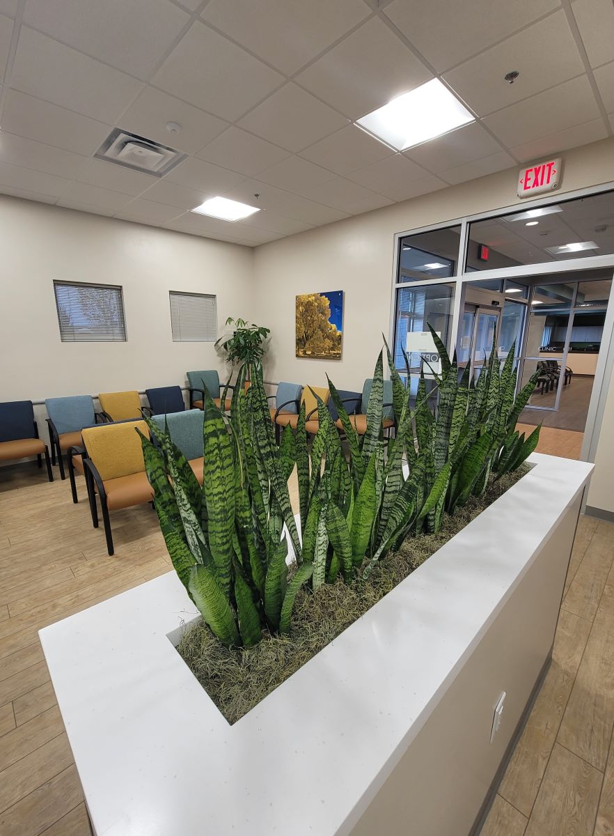
Snake plants were used in a partial height wall/planter box to create a sense of separation in the reception area. The live green plants are easy to maintain, have a strong vertical growth pattern and add a fresh feel to the space. These plants in particular are one of the few plants that can convert carbon dioxide into oxygen at night and are also known for their ability to help remove some toxic air pollutants.
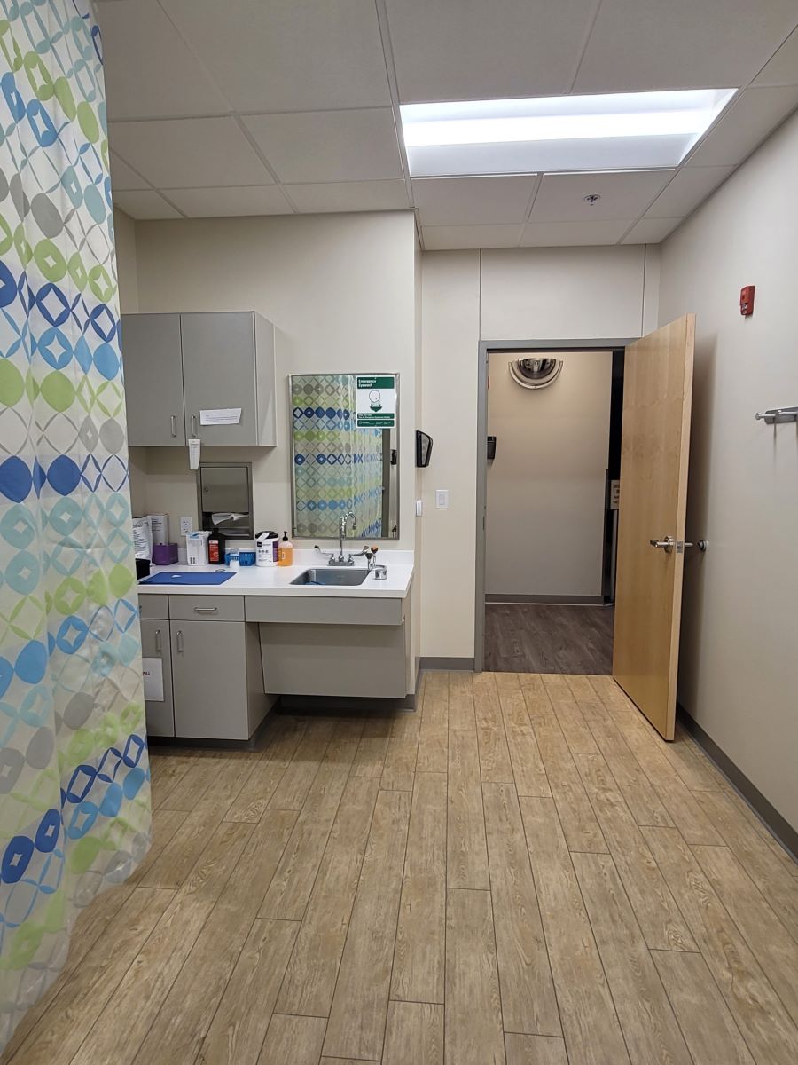
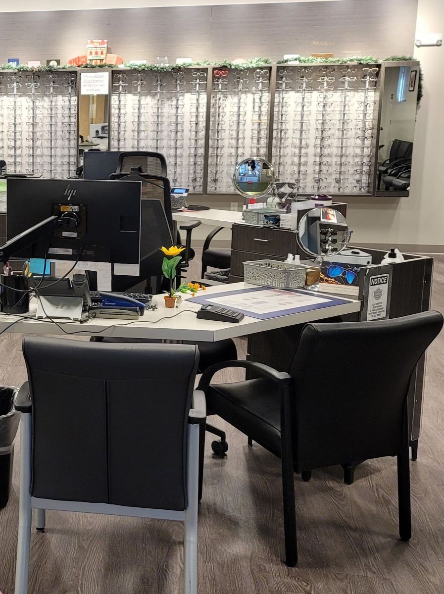
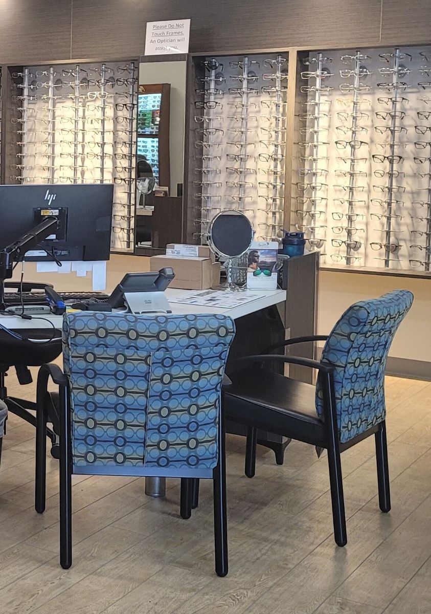
Always mindful of ease of maintenance, we maintained the same neutral wall color from the previous clinic and warmed the floor with a different vinyl plank. The warm wood tone of the floor reads well with the golden tones found in the artwork and repeated in the performance fabric of the chair reupholstery. Similarly, the blue found throughout the photo images is repeated for wall accents and again in the chair upholstery. An aqua tone is also pulled together in the wall art and upholstery and as a common denominator from the previous clinic, the caramel color is used in a vinyl on all the seats. By pairing the textural chair back fabric with the faux leather/vinyl seats we establish a wearable and easy-to-clean surface with a more inviting textural fabric. The optical shop was also tidied up and new fabric brought new life to the chairs with the bonus of a subliminal pattern suggesting black spectacles! The result is a well balanced combination of warm contrasting cool as the blue tones are set against the warmer tones of the flooring, gold and yellow colors of the artwork and furniture.

