A conversation between stalls, in the women’s room in the lower level of a fabulous church building, centered around the unattractive condition of the bathroom itself. These commiserating women agreed then and there that this restroom needed improvement.
This lovely little campus in Virginia has a magnificent combination of historic and new architecture. Modest yet appreciated improvements have been done recently to perk-up the tired corridors of the administrative areas and restrooms on that level. Here below, where classes are held and the social gatherings take place, these other two restrooms have been sadly neglected.
The thing is, design matters – even on such a simple, basic level. This doesn’t mean ground-breaking design or startlingly award-winning design – but basic selections for attractive finishes and colors in the context in which they occur. It’s also about maintenance – what once was attractive wall-covering, now peeling and worn in places, dated light fixtures, dusty faded silk flowers in a plastic container – someone’s attempt at “decorating,” – an odd, green vinyl chair at the dressing counter, worn faucets and surfaces…all contribute to an uncomfortable sense of neglect and even lack of cleanliness that these women were observing. 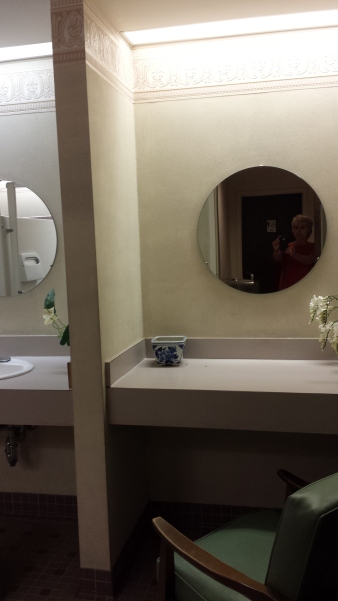
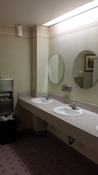
Funny though that these photos do not begin to convey the real feel and appearance of this restroom!! Doesn’t look so bad here! So much for my illustration! (Hopefully soon we will see improvements that will effectively contrast.)
So just for grins, I’ll insert this shot of a anonymous, barren, anemic restroom that could easily be improved – starting with picking up the towels! 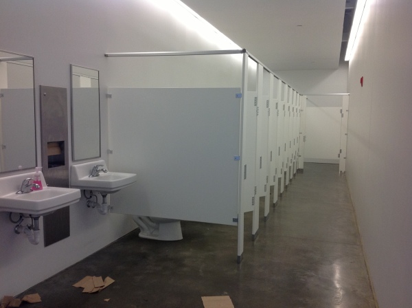
While on the subject of restrooms, a talented chef in a chic eatery in Santa Fe dished delicious presentations of sensational food but failed to recognize the importance of the appearance and maintenance of his restrooms. It’s funny that you can attend a popular place and enjoy fine cuisine and dine in a beautiful, creative atmosphere and never visit the restrooms. When once you do, especially after having enjoyed the dining experience more than once, the unpleasant realization that this does not matter to the establishment and in this case the chef/owner, is disappointing if not astonishing.
We initially thought, surely he must have a restroom in the back of the house and may not even venture into these two reserved for his guests ,relying on staff to do their jobs. But when we brought this to his attention, he said in an off-hand fashion, “guys don’t care” (really?) and he directed a waitress to wipe the basin in the women’s room – which was the tip of the iceberg – he had no clue.
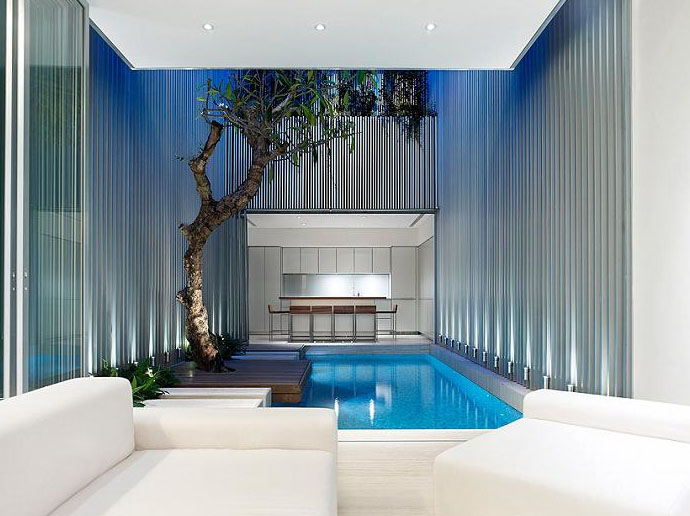
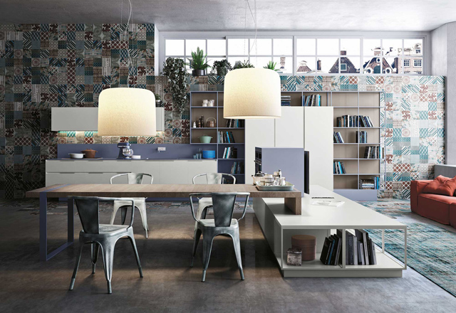
It is a reflection on the business on many levels…conscientiousness, concern for the comfort of the patrons, respect for the patrons…the list of “why” goes on…The design should continue with the same thread of the theme. here are some fabulous examples:
Perhaps the budget is limited and it is the wall color that flows into the restrooms but a touch of design and cleanliness is paramount. Odors and horrible masking room scents are equally as offensive as neglected design.
We took that otherwise delightful dining venue off of our list as there were many other choices that we felt made us more comfortable in that department.
Clean, well-maintained design matters. These aforementioned establishments don’t realize the negative impression and unpleasant sensation that such conditions evoke and serve to remind. It can be bad for business.

 Like reaching into a hole or looking into space, and not seeing the boundaries well. It s a brain thing. If the brain reads dark, it suggests a depth of space and therefore more than is really apparent. This is often used in ceiling treatments. Having a low ceiling appear higher, when painted dark, due to the illusion of depth.


![smsall apt AQ Unit 2014 11 01 pr[1]](https://pattisays.files.wordpress.com/2016/03/smsall-apt-aq-unit-2014-11-01-pr11.jpg)


 DIY is inspirational and fun! The ideas and instructions flooding the internet and TV networks are endless – but it still means that having guidance to decide what to do with what and which to pick and pair – the consultation is how you distill the choices.


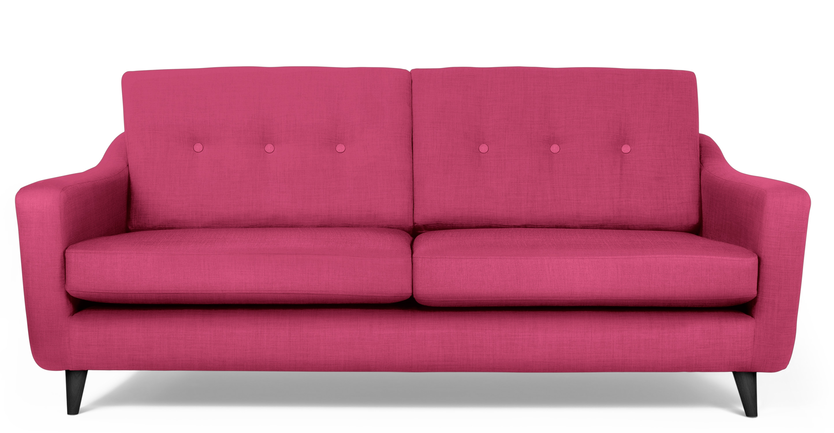

 Her lips, his costume, the children’s masks, a sunspot on a bus, the fighting ring ropes, structural elements in the arena are all so subliminal yet so vivid. Consistent and repeated use of the contrast with the bold red color in combination with turquoise is also a key element in this film.
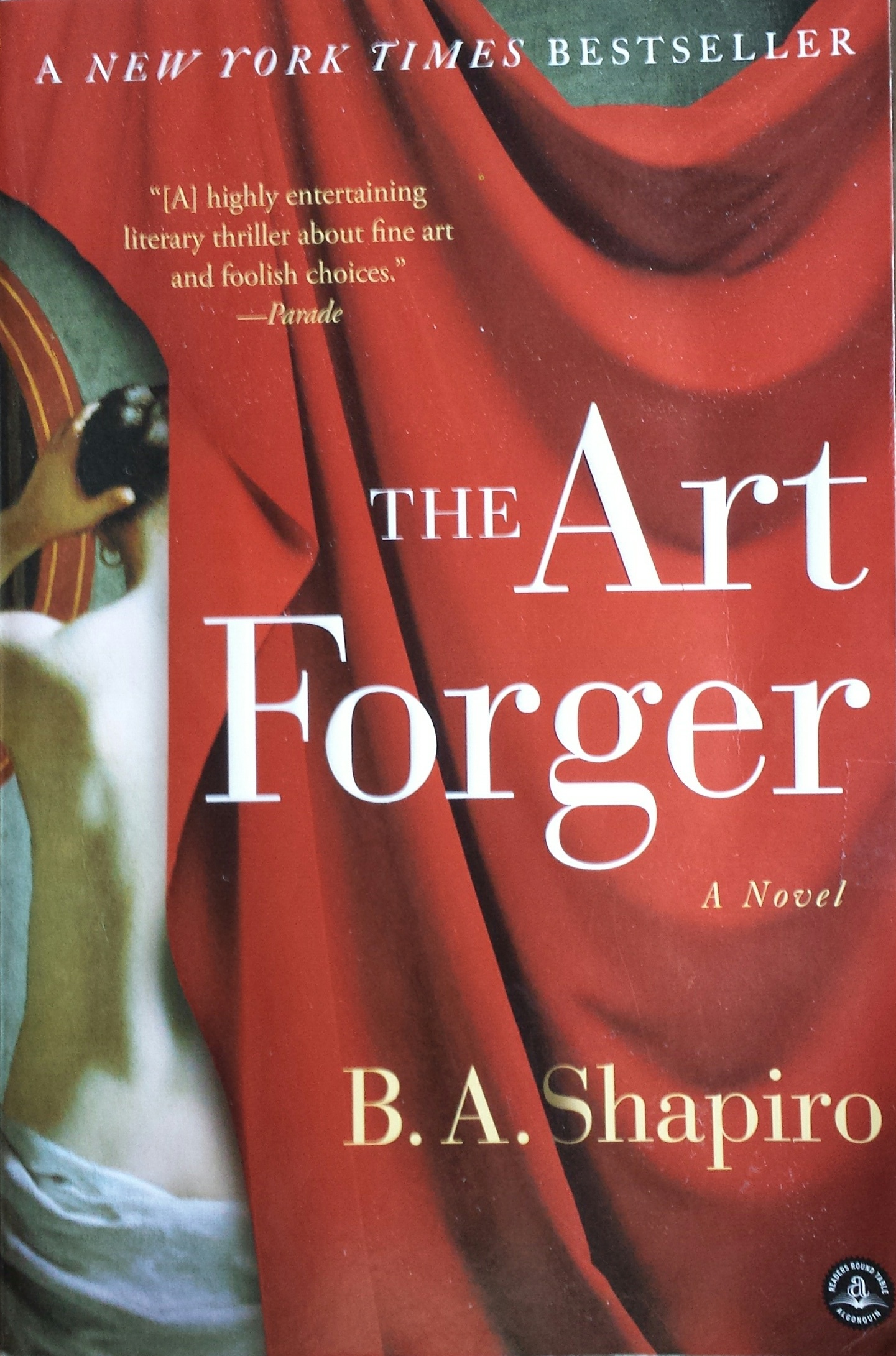 measure. I followed B. A. Shapiro’s protagonist, Claire, as she navigated the mystery of a missing Degas. Set in a relatively small footprint of NYC, the story is one that could only effectively happen here in this city of superlatives. From the best of the beset to the worst of the worst and the enormous middle ground of mediocrity which again is superlative due to its sheer density of people, texture, concentration of multi-cultural influences, exceptional urban scenarios and unique prospects.
 She is not forging as that would mean that the copies were intended to be marketed as, or represent, or be sold as though the original. Hers are legally sold as reproductions – until the plot thickens…Where a love interest, temptations of wealth and fame, innocent confusion and clever problem solving are woven between the past and the present and ultimately begs the question about the value of art – how is it established and when is it talent versus celebrity? The chicken and the egg thing or the Emperor’s New Clothes, either way,a mystery that boils down to what the market will bear.
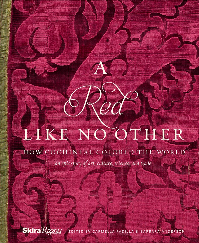
 A Red Like No Other – but unless I am on a roll, it might take me a while.


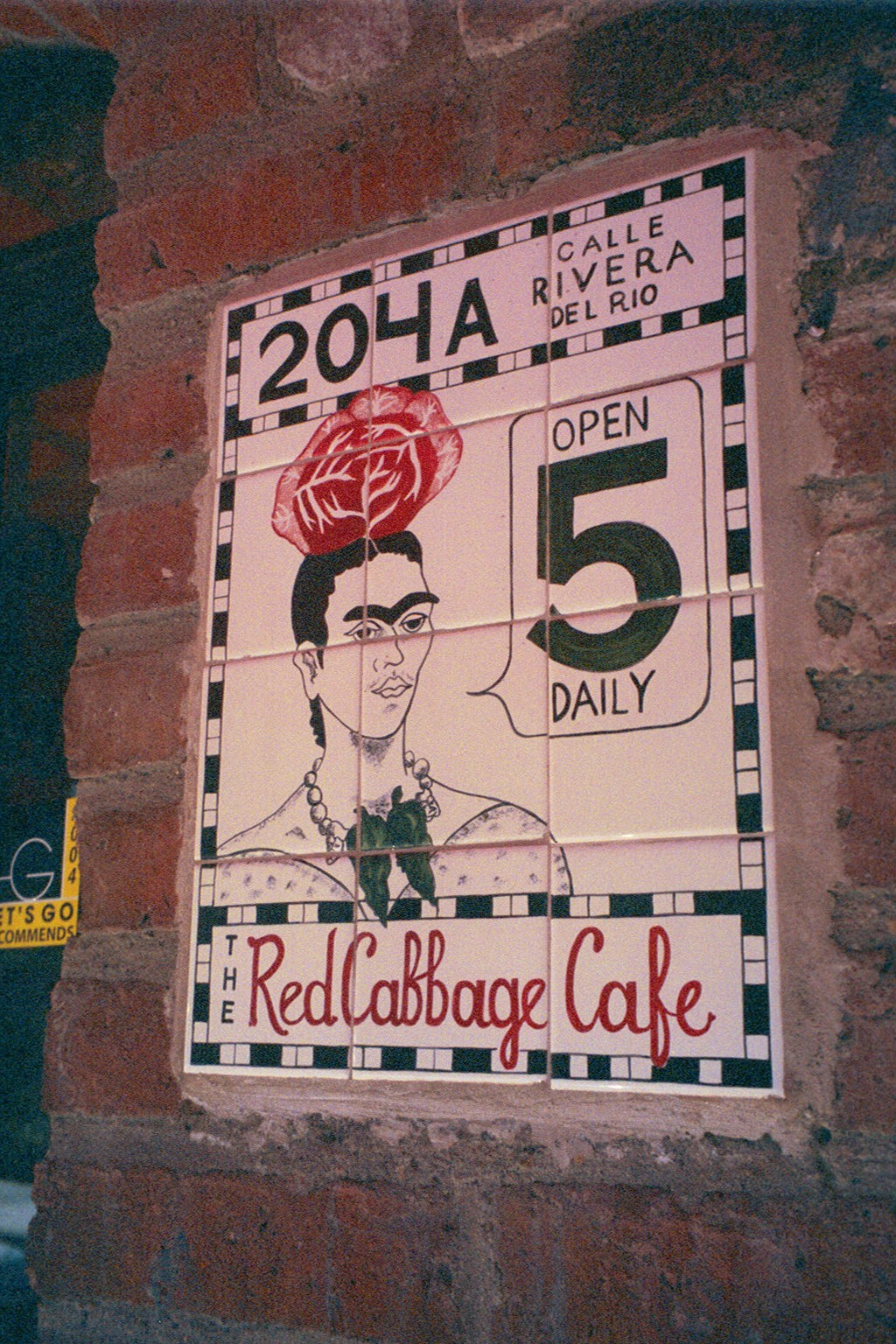
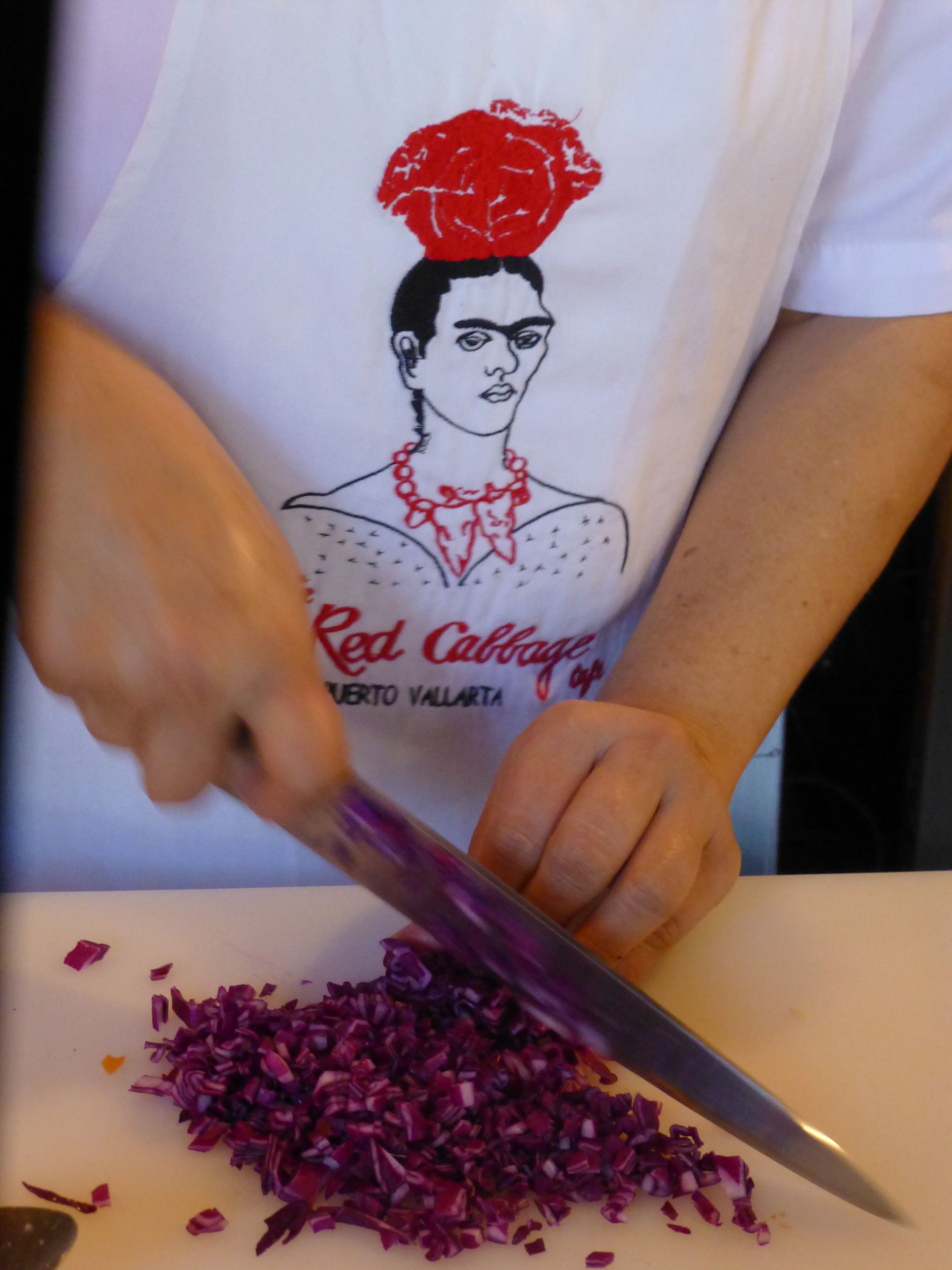
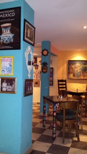 At night this place buzzes with animated conversations and is alive with color and funky memorabilia, art and posters, collages of collectibles all on brilliantly painted walls creating an eclectic artistic interior of fun and festivity. But on this morning, the room is dormant save the three other guests waiting to participate in the morning’s class.
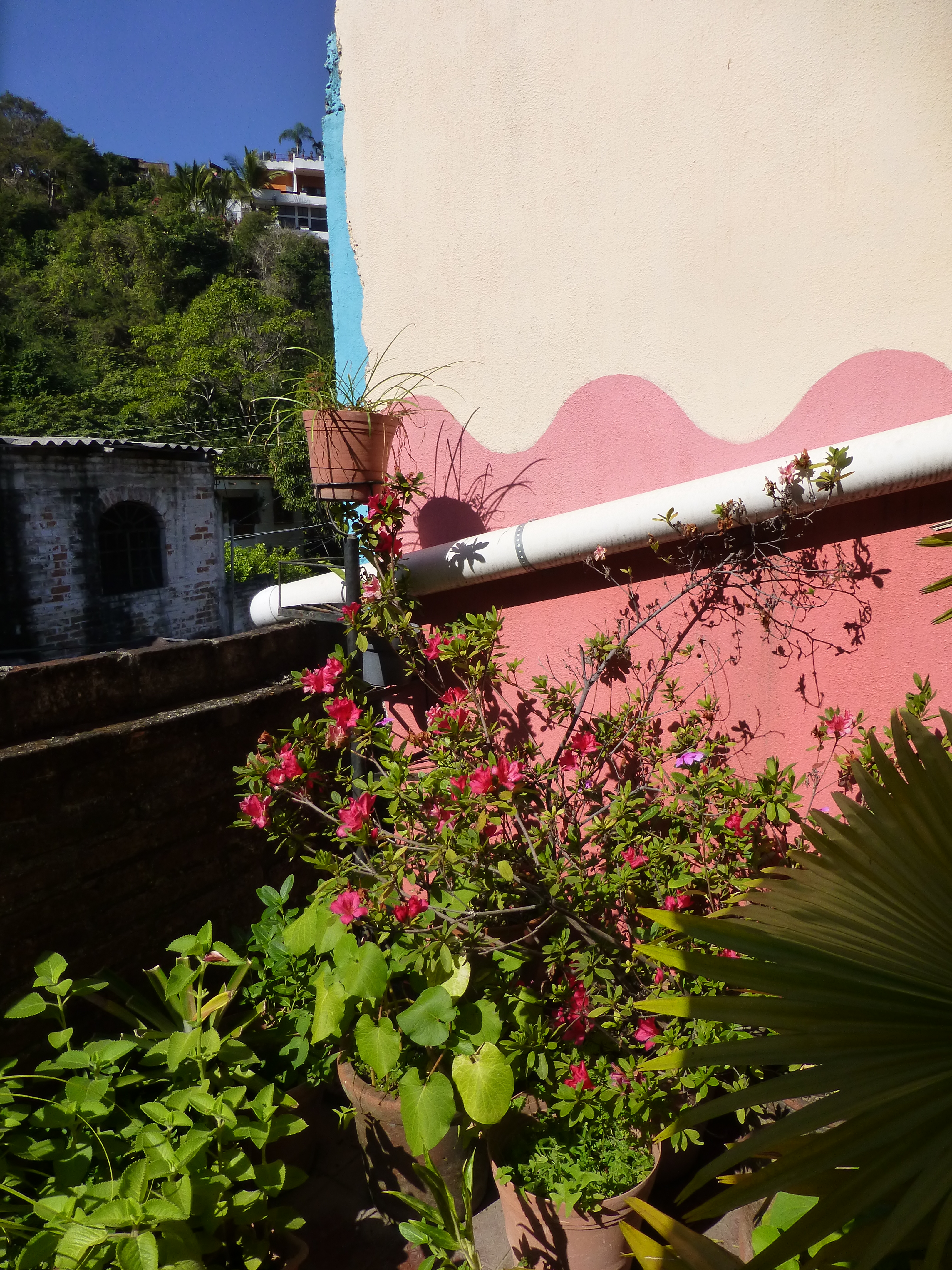
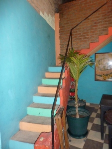 Daylight streams from above and we ascend past more brilliantly painted walls to a second floor open to the sky onto a patio rimmed with potted herbs and flowering plants.
 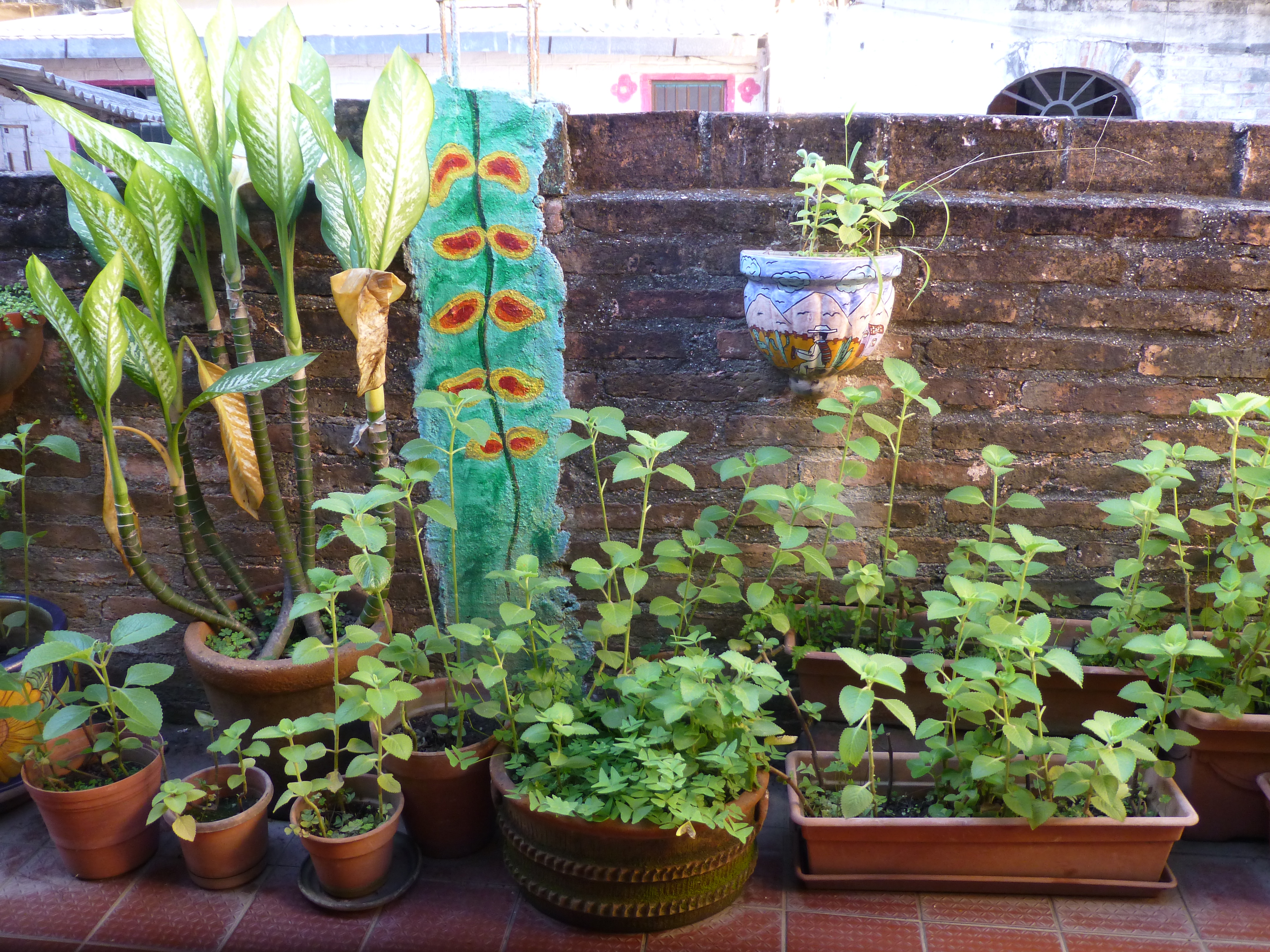 To the right we realize that the rest of the space is undercover, yet always exposed to the elements from that one open east-facing orientation.
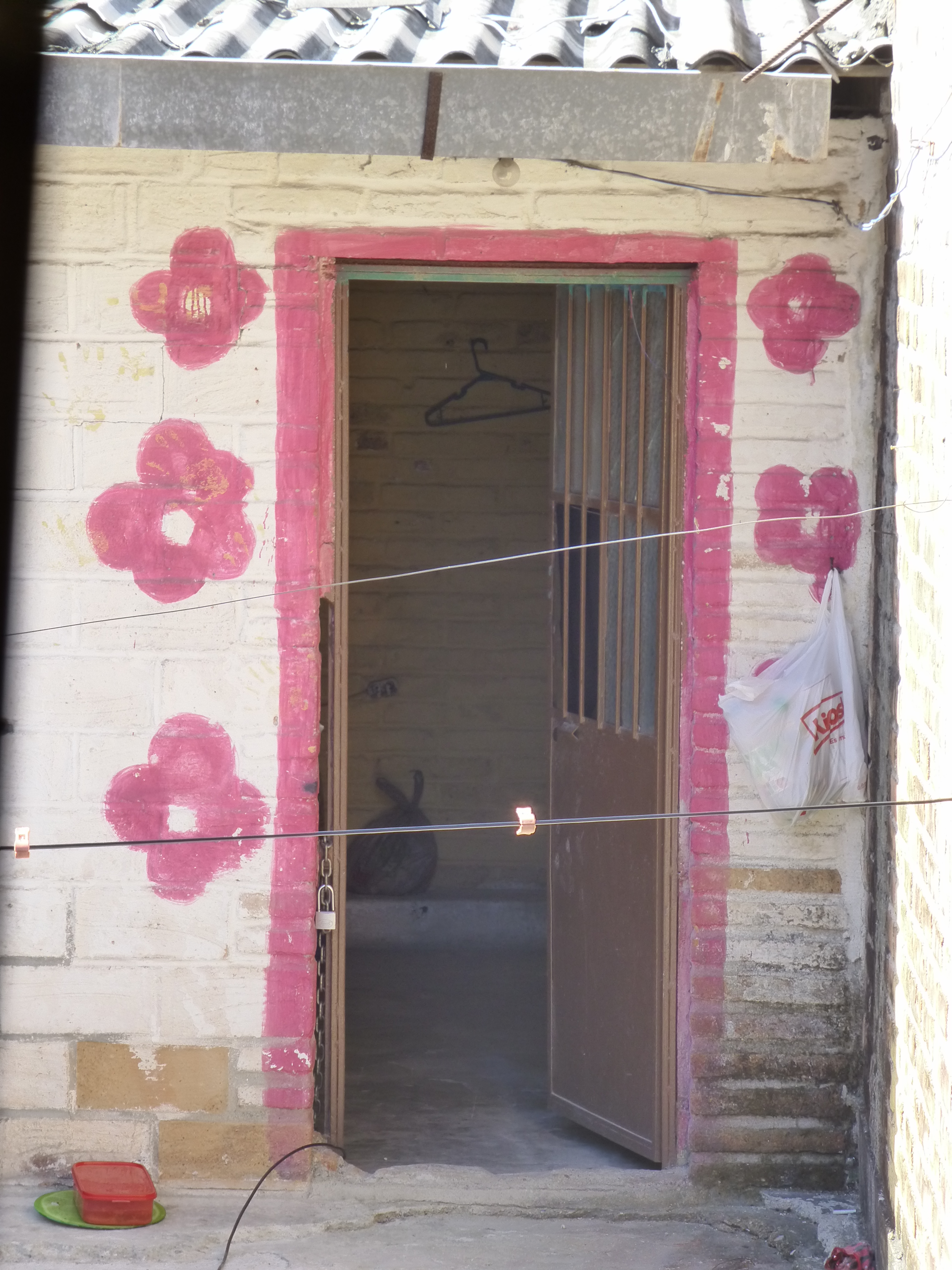 The surrounding area is quite run-down and depressed, yet this jewel of a creative kitchen space shines boldly amidst the impoverished surrounds.