Don’t Be Afraid to Paint Wood!

Really gotta love red – it is passionate, fun, vibrant, warm and here are some cabinets to illustrate all of that! We recently completed an installation of custom cabinets that we designed for a busy family with two kids needing a work area for homework and craft projects. The upper cabinets were in place along with part of the lowers…but they were golden oak…So we designed the completed components and painted the whole thing a brilliant, semi-glossy red! The work-surface is a manufactured material – a durable engineered product, “Caesar Stone,” in a dark charcoal color. The cabinet “jewelry” is a handsome pewter pull with an Asian bent. They read as punctuations accenting the bold color.
Who wrote these rules? Painting wood is a sacrilege! Yet, I can appreciate the natural beauty and integrity of any organic material – oak is a richly grained wood – cut/sliced many ways – rift or quarter, the character changes completely. But to paint a course-grained wood, one gets the details reading through the painted finish and it is almost like a moiré fabric – water-marks dragged through the surface – but in this case reading through with a wonderfully dimensional quality.
Don’t be afraid to paint wood – it’s just another beautiful way to celebrate its magnificent character!

COLOR – Be Brave – Take the Step!

A happy coconut face on a sunshine yellow wall surrounded by lipstick!

How many of you LOVE color when you see it, but shy away when it comes to your own Interior Design? Go ahead, raise your hands!! Now, I appreciate and even embrace the taupe/neutral colors that are some peoples’ version of bold as opposed to standard off-white walls…at least they “pop” off of the white trim creating a contrast for crying out loud!!! I have a few chartreuse accents. But what IF you painted a wall red??????????????
I hosted an Open House this past weekend where the walls were bright yellow accented with blue and white Talavera Mexican tile and punctuated with “lipstick” coral/pink walls all trimmed in white . Sounds daring – doesn’t it? Well, it is – but it works! EVERY single person who came through the house had positive comments. Most were exclamatory and startlingly complimentary. Perhaps the house was too small or they could not use the furniture (without giving up their entire life’s inventory), but over-all the comments were almost those of jealous envy – envy of the nerve it seemed to take to make such decisions to use such festive colors – wishing it were theirs and that they could move in right away.
I spoke to couples who punched at each other saying things like “we could do this,” or “why can’t WE do this?” Seeing the completed project and everything in context makes it all very good. The scary thing is making that first color choice and swishing it on the wall…it’s very scary. But, GET OVER IT!!!! Until you make the decision to take the step – to make the move – to begin to commence to start the process, you’re sunk.
But it IS all about CONTEXT. I’ve seen many “accent” walls disturb a space rather than compliment it. That’s scary – if not unfortunate. It’s a shame to waste the exercise. It’s worse to waste the exercise and not know why it doesn’t work. Color is interactive. Color is dynamic. Color can enhance or detract. Color is powerful.
So think about what you like when you see color. Think about what you have and how color can enhance what you have. Think about what colors make you happy and how (if applicable) those colors can participate in your color scheme.
Have fun. Call me…..:)

Backyard Celebration of Spring Flowers and New Growth

Purple is the color exploding in my garden today – well, this week…I blew around the yard this afternoon to discover all that was happening. In the blustery wind as the aqua tips of the new growth on the branches of our mammoth blue spruce trembled and the young leaves of the peach tree (we sadly missed the cheerful pink blooms that came and went over the last two weeks while we raced around NYC and flew over the pond to Greece) shook with the gusts, I marveled at Spring’s exhilarating progress.
The redbud tree’s branches are bursting with those red-purple blossoms while the lilac is choked with new green leaves and spires of blue-purple clusters. What an incredible contrast against all that new green growth!
Albuquerque actually looked green from the plane as we landed yesterday – compared with New York and Chicago that are just beginning their long-awaited spring transformation – their vast wooded areas are still brown/gray from the plane window. Yet Albuquerque is quite green from the sky! What usually looks like another planet devoid of foliage by comparison to other more lush and densely forested areas this time of year it sings its song of spring’s seasonal change with bold pride.
I was content to leave the flowers on their bushes today but tomorrow I will clip several bouquets of lilacs and trim some branches off the red bud to bring inside and cheer up the interior in celebration of this wonderful time of year! The fragrance of the lilac is enchanting and promises to waft through the house with the soft breeze that I’ll invite inside on what is forecast to be a wonderfully warm spring day.

Spring Purples

The Color Purple is Outrageous and Elegant, Whimsical and Fun!

The Color Purple is rich, garish, and outrageous when worn by ladies sporting red hats. Purple is royalty, has liturgical significance and makes tongues brand the color after sucking down a cold glass of grape juice or room temperature bouquet of good – or not-so-good red wine (what a waste).
Alice Walker expressed great symbolism of pain and beauty when writing her novel. It is certainly a complex color which for our purposes of interior design would want to focus on the positive attributes and not the less attractive. Purple continually surfaces in interior design and it’s probably due to be an upcoming trend. Whether eggplant or lavender, it is a wonderful, classic, good color (aren’t they all in some context?), – yes, purple can be quite fun!
In nature, our Sandias at sunset – although said to be “watermelon” red, by their very Spanish name, transition from many shades of pastel colors including pinks, blues, lavenders and rosy reds. Lavender fields, lavender bouquets, periwinkle blossoms, red bud trees…the list goes on… Currently, I am designing a purple scheme in a home that will be all of fun and stunning, whimsical and elegant. It seems that the brighter colors of purple often bring a smile. Extracted from a charming oil painting, of a northern New Mexico calle with brilliant white and purple lilac bushes blooming along a  dirt road accented by a royal blue picket fence, that we have selected as a focal point – the colors are enchanting. These will be more robust than pastels but softer than the royals – delineated with crisp white against a neutral backdrop of sage/stone.
I often reference colors in nature influencing interiors – and here captured in the artist’s painting is a scene from nature setting the stage as the focal element of the space.
Meanwhile, take a look around. See the earth and sky, new blossoms and colors in the built environment – and consider the possibilities for building a color scheme or punctuating with accents in your interiors.

Refresh Your Interiors – Eco-style

The Color, GREEN – we associate it with nature’s renewal, growth, promise…it’s fresh, clean and a signature of the environmentally conscientious. In the design world the Eco-style is connecting the inside with the out-of-doors…bringing the green inside with fabulous decorative accessories to refresh your interiors. As we leave January and move through February looking toward March and the promise of springtime’s rejuvenation we long for the sight of green. So to incorporate it into your interior environment here are some ideas.
These delicate hand-blown glass vessels come in a variety of shapes and sizes and make wonderful clusters of color empty or with the added boost using flower stems – only one per each for the lighter, simpler look or bunches of baby’s breath perhaps – delicately drooping tulips or little sticks of near-budding branches from your yard. You decide – they are pocked with bubbles that signify the blown glass method and are translucent with shades of dark to chartreuse green shades – simply wonderful!
As bulbs begin to sprout and trees hint of buds…inside our homes we have the opportunity to push it along a bit. Bring home a pot of tulips or daffodils. Fresh is best – like bowls of artichokes as a centerpiece or feature on your countertop, maybe green apples or pears in a bowl made from renewable bamboo, but if that is not practical we have remarkably real-looking faux fruit to use for the suggested effect – that have an indefinite shelf life! Our faux branches are a hit too as a bouquet for your entryway or table dressing.

Picturing Designs – In Advance of Reality

Today started off fun. I saw the finished product of some custom cabinets that I designed with my cabinet-maker, Enrique. We had been working on this for months…stages…interspersed with other projects to keep the peace among eager, anxious clients. The red was vibrant. The maple was clean and contemporary…one project, two rooms, different material, different finishes, side-by-side – sleek, fun, cool.
Also today, I had spoken with another client about her backyard and described to her how after working with a concept and developing it into a design, after awhile the design comes to life so much so that I actually picture the finished product long before it is complete. So much so that I often have entered clients’ homes/yards/offices and not responded to a key component that they had waited weeks to receive and to their disappointment, I had not exclaimed about its addition to the scene. When brought to my attention, I realized that is was as though I had already seen it. I had envisioned it for so long it was as though it already existed. Oops! Sorry…
Then there are the really funny scenes, like that same client this morning who was expressing where she thought her Asian soaking tub should be located and why. She described it in the far corner of the yard…NOT where I had placed it on the plans. She said that she didn’t mind going that far to the tub and that in that particular corner, in the farthest corner of the yard against a fence with spaces between the fence pieces, that it was the most private. Ok, I countered…”So in the depth of winter, when the air is frosty and the night is dark, you are prepared to go streaking in your mid-calf bathrobe with scuffies on your feet to the far reaches of the yard dashing into your steamy soaking tub in the supposed privacy of that far corner of your yard only to find that your neighborhood hoods have set-up bleachers, checked their watches and convened to watch you on your accustomed/predictable schedule through the gaping spaces in the fence that YOU think is a private corner.” She was nearly in tears we were all laughing so hard! I could picture it – she ultimately did.
At the near end of a busy day full of creative consultations and entertaining exchanges, I received a call that my friend Enrique, mentioned in the first paragraph – at the start of my day – my most fabulous cabinet-maker – cut off three of his fingers and of last report, did not know if they could be successfully saved. I picture him mended and back at what he does so well…the stark contrasts between pleasure and pain, reward and disappointment…that’s reality.

DESIGN YOUR NEW YEAR’S PROGRAM

I keep thinking that I have finished eating with gusto – holiday fashion – and then another fabulous opportunity presents itself. We have now entered the New Year of 2011 and veal marsala was offered irresistibly tonight and I selected braised spinach instead of the accompanying pasta. Do I get points?
As I recently spoke about “cleansing the color palette” of design and seasonal decoration in the face of the New Year – I recommend that we do the same for that over-taxed gastronomic palette that has been painted with all manner of food extravagances this past season.
Pass those silver platters with crisp leaves of endive topped with olive tapenades or celery stalks stuffed with lighter fare of herbed goat cheese. Chase that martini with lots of water and get out there and walk it off!!!
I was in TWO homes today – unrelated to each other and BOTH of them had two – not just one – but TWO enormous plastic orbs – yes, Pilates balls – smack dab in the center of the primary living area!! I asked each owner how and when they used them – both were shy about admitting that they were NOT employed to the extent to which they were designed and initially brought into the homes. Yet, there they were, front and center in the interior of these otherwise quite well composed living centers.
I’m thinking – put them right by your bed so that you trip over them upon arising and have to face the decision right then and there whether to do the deed and take up the task before the events of the day interfere.
Design your exercise program around a realistic living schedule. IF you can discipline yourself to set a standing appointment away from home before, during or after your day’s activities, more power to you…if jumping into something right out of the sack insures better commitment and continuity – go for it!! But design this new year’s regimen in your home, out of your home, or whatever it takes to burn off the last months’ ingested temptations and get a new start!
Happy Healthy New Year!!!

The Cleansing White of Winter

The window at our shop has just been transformed from the Christmas scene of ornamented tree and colorful gift ideas emphasizing lots of reds and greens to our winter scene of startling white and silver. It seems that after the bright colors of summer transform into the warm oranges and golds of autumn’s leaves falling leaving the enduring evergreens and contrasting rich reds of the Christmas season, we’re ready to cleanse our color palette and start the New Year with the “clean crisp white” as Votivo has aptly named one of its more popular candle scents.
Our feature statement, for the kid in all of us, is a fanciful prancing white carousel horse on a white blanket of snowy fabric surrounded with sparkling reflective cast pewter serving pieces, picture frames, candles and a spectacular bouquet of pearly and bejeweled white branches all contributing to a stunning display of white and silver brilliance.
As we settle into the next few weeks of winter, the crisp white and brilliant metallic of silver suggest snowy nights entertaining friends for cozy evening gatherings with sparkling serving pieces of pewter, sterling, crystal and firelight. Food enters my field of vision with delectable hors d’ oeuvres on those silver serving pieces, warming drinks in crystal glassware, lively conversation, smiles and good cheer.
In the design world, the conversations surrounding “white” are always interesting. Not only are there endless colors of white – put one next to another to test this fact – one will tint pink and the other lean yellow…some have a blue cast and others grey…it’s all about contrast and context. What one identifies as white changes dramatically when placed next to another version of the same – or supposedly the same. Yet, they are distinctly NOT the same.
When an interior – a tract home, for example – offers “white” walls, more often than not, they are an off-white, warmer yet still perceived as “white.” To that scene, in that context, the walls probably seem un-done – a non-color. They appear to not have been addressed and beg for color attention. However, white can also BE a color. If it is an intentional color in the Interior Design scheme, white can be as powerful as the most brilliant red or the most complex black. Save this in-depth discussion for another time.
Now, just nestle in for the cold winter days ahead with an eye on a fresh start for colors to come…light some candles, burn a fire and set out some silver trays of tasty treats, and sip from a crystal vessel finding warmth, contentment and promise in the start of this coming New Year.

Awaken the Neutral Schemes with Color!


I LOVE this statement…”The craving for color is a natural necessity just as for water and fire.” Fernand Léger – Pantone just posted this quote and it comes on the heels of two very coincidental client meetings that I had today.

One began early with discussions about an ongoing project in a newly transformed contemporary interior carved out of a rather ordinary traditional tract-style home. Big points go to the client, who in this case, knows what she wants and has a great eye for design and finding what she knows will make her happy. The basis however, is NOT about color, it is all about neutrals. We have designed a scheme specifically tailored to her requirements that is calm and serene, edgy and crisp, balanced with interesting fabrics for texture against the otherwise smooth hard elements of glass, wood flooring, painted walls and chrome accents -yet neutral (per her) thus far.

We discussed a possible painting that will bring bold color and from which accents will be derived. But even with that intention, it seems unlikely or unwanted that a boldly colored fabric be used on the upcoming chrome-framed bench along the dark chocolate coffee table, framed with brushed nickel of some metal inlay and framework, and across from the slightly iridescent simple cross-weave fabric on the custom settee with an open back up against the new, low to nearly the floor, uninterrupted fixed glass picture window. “Why?” you ask. Because the idea of the neutral is so her and the option to accent on the whim of a mood or change of the seasons suits her spontaneous tendencies.

So, accent pillows that can be tossed on the settee in any manner of color, pattern and texture, or as bold fuchsia orchid now sits in the center of the round glass dining table surface, a future woven throw draped as an accent – this is the way that the starved for color room will receive it’s lifeblood of color – like the “natural necessity just as for water and fire.”

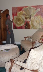
The second meeting today that coincided with the theme of this observation was a humorous comment about a brilliantly colored open-weave Brazilian lace camisole that I was wearing today about which my client chided me – “I love what you’re wearing – must be the inspiration for the colors in our bedroom.” To which his wife smiled and chuckled because her desires for soft, restful colors of pastel to neutral have been decidedly expressed. The idea of bright, bold colors is in diametric opposition to her vision. Yet, with that in mind, her prized possession in her room is a boldly colorful and incredibly realistic oil painting of a larger than life bouquet of flowers screaming of hot pinks, blues and chartreuse (photo below is NOT that painting – but an illustration of another bold piece of white roses by Federico Leon de la Vega inserted into a neutral scheme) – like the “natural necessity just as for water and fire.”

It seems that even the most determined people wishing to create an interior environment of neutral colors and softer tones crave the undeniable exhilarating punctuation of bold colors. The calm must be awakened with the life affirming inclusion of color!PD Federico, Beth's roses 083

All’s Well That Ends Well

The last leaves are about to drop and the intensity of these red ones was smack dab on the mark of an elegant drapery design/installation that we recently completed. And what a trial it was…
After so many years in practice …need I count? I have had the genuine pleasure of working with so very many people on a broad variety of projects and none to date have rivaled the Murphy’s Law series of events of this one.
Wonderful people, smart, thoughtful and creative – a follow-up consultation to a successful one of a year or two past, and an interesting combination of new design opportunities presented a creative challenge. The first item was concern for privacy and possible dressing of dining room windows. At the same time, two adjacent windows – long skinny and operable – begged for some attention.
The solution, (in this Asian-themed fairly formal dining room)was a fully lined, embroidered rich crimson red fabric of side panels backed by lightly textured but translucent full- width sheers – hung by rings on an iron rod with hand-forged hammered ball finals.
The fabric was in stock. It was put on reserve while we received approval to proceed with the order. The urgency of securing the fabric was the first order of business. Once done, the schedule to fabricate could be pursued. The order was placed and the fabric arrived within a week. That was the first phase. Without the fabric, nothing else can happen. You can select a fabric – fall in love with it – and then find that it is not in stock or even if you have reserved it, the stock has been sold out from under you. So in this case, securing the fabric was a coup.
The seamstress – our favorite – was pressed with many other orders and her daughter’s wedding. We said we could wait. She thought that she could have the order out in 6 weeks. And just about that time, maybe seven weeks, she finished the draperies. The client was anxious (not due to any date that we had previously been advised about) and indicated that she had waited “so long” for the draperies. We scheduled the installation and arrived on the scene. The installer proceeded to assemble the iron hardware that had been delivered to the site.
He elected to use his own counter-sinks instead of the ones include by the iron fabricator. The installer’s sinks were larger than the hand-painted screws provided by the installer so that when he put his in the wall and proceeded to install the screws – they spun around in the sinks – oops. At that point, the holes by his sinks were larger than the sinks proved by the fabricator – so an alternative was not at hand. He decided that they would hold for now and that he would come back and adjust the pieces later.
Then we carefully unwrapped the finely pressed to perfection draperies – only to find that they were a couple of inches too short – YES! At which point we could only re-wrap them with great care so as not to ruin the perfectly pressed folds and return them to the seamstress.
As it turned out, the communication about the placement of the double rods and their rings and relative length of the draperies was in error – oops! So the rods remained and draperies were returned to the seamstress with instructions to lengthen them accordingly.
Unbeknownst to us, the seamstress had enlisted the aid of a friend with a larger table as she didn’t want to work on such fine material at such a length on her smaller table. Unfortunately, the friend left town without leaving access to her home so we were 8 days waiting for her return in order to access her house and the draperies left on her table. The client was beside herself.
Inasmuch as we had never determined a date for completion, it was becoming an unusually protracted exercise in time to fabricate and install a drapery treatment – especially in light of the fact that the fabric had been immediately available. It was more about the delay in starting on the part of the seamstress – which at first was not perceived as a problem – but when they were the wrong length, the client was perturbed and more than disappointed and then to have them inaccessible in another’s house was strange – but true – and seemed to be the straw that broke the camel’s back. So that’s where we stood. The client was in tears.
The seamstress came to the site to verify the dimensions, learned that the client was hosting a luncheon in a week and was unable to commit to having them finished due to the fact that they were stuck in a friend’s inaccessible house.
The seamstress hovered over the phone of the absent friend to insure that she would have access immediately upon her return. And as soon as she did returned, the process to modify the draperies began. Within 24 hours the changes were made and the draperies were scheduled to install. The client’s luncheon was the following day. The install went without a hitch. The draperies and their installation were perfection. Except for one other thing, (remember, Murphy’s Law?). The center bracket was too long and projected down an inch into the window. NOT apparent to anyone in passing but the owners knew and it certainly was not the right detail. So it sat in their craw for a couple more days until we could get the iron fabricator out there and with the help of the client, cut, paint and re-install it.
There are many cruel and frightening things happening in the world every day. Inconveniences like this in a privileged world – not intentional – and among many caring and responsible people –who for unknown reasons of coincidence, human error, or some fantastic confluence of energy is a Murphy’s Law that is to be recognized as such, understood – if not laughed about – and moved beyond. However, this particular series of events (and a couple of equally innocent others that occurred for this one couple on their four month design project) unnerved them.
The end product was beautiful. They have expressed their pleasure with the final outcome and we hope that they will appreciate all the effort that went into the compensating accommodations despite and/for the freaky series of Murphy’s Law events that riddled their project. All’s well that ends well.