As we know, kitchens and bathrooms lead the features that often make or break a house sale. Investing in such improvements can not only enhance your living experience, but also serve you well when it comes time to sell. There are a few basic tips to follow as you embark on this could-be, (but need-not be) daunting project. Here are some important things to consider for all facets of the experience!
- To begin, note what things about your kitchen you would like to improve – both functional and aesthetic.
- Gather inspirations – make a hard-copy file or at least collect in a folder in your computer things that inspire you in your quest for your improved kitchen. Use kitchen design magazines, Pinterest posts or remodeled kitchen ideas that you Google-search. These ideas are a great springboard to narrowing your design direction and conveying your concept to your design professional.
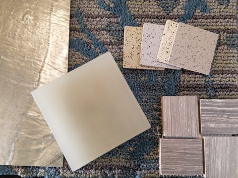
- Based upon your “inspirations” what is your color scheme? This direction will impact options and decisions for finish materials such as flooring, cabinets, countertops, back-splashes, wall finish and window treatments.
- Is it merely a facelift? New cabinet doors and drawer fronts? Perhaps new countertops and back-splash. Or is it a complete gut and replace?
- New appliances – replacements or additional components?
- Sketch the layout of your new kitchen, if applicable. Make sure the available space accomplishes what you are imagining.
- Imagine the finished product. Illustrations of the “after” design are the best way to accomplish this.
- When in this process should you consult with a design professional? Perhaps after number 3 once you have gathered examples of your preferences…I let the list continue beyond number 3 to give you an idea of where in the process you might feel the need to have some qualified assistance!! An experienced designer will see things you don’t, know things you might not have considered and ideally maximize your budget by avoiding costly mistakes or missed opportunities.
- For example, don’t miss opportunities for additional storage – this is a critically creative design detail that results, in great benefit, to the finished product.
- In fairness to you and your contractor, try to establish a budget. Do a little homework. Gather rough costs for lineal feet of cabinets, appliances, design consultation and construction costs (a good resource are the home-improvement stores). Give yourself some latitude as this cannot be a finite budget at this early stage of the planning.
- With your design pro, discuss contractors that fit the bill to what you are trying to accomplish. If you are only tackling cosmetic improvements, a general contractor might not be needed. For example, new wall finish, countertops and appliances or new cabinet fronts, a new light fixture…these are individual sub-contractor projects. But as soon as you get into moving plumbing and electric, adding or removing walls, puncturing the envelope with windows or skylights – you had better hire a general contractor to take responsibility for the scheduling, coordination, licensing and permitting of the work.
- Once your scope of work is determined, you might need to get familiar with great carry-out in your neighborhood!!! That and a few great restaurants too, as you might be without your kitchen during a portion, if not all, of the process once the work begins!!!
Here are a few projects that we have documented with pretty effective “before and afters” to help you consider some of the above referenced tips.
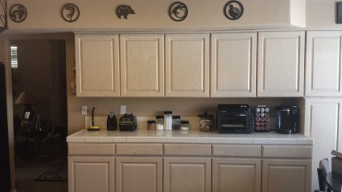
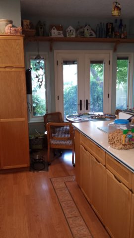
These peachy pickled white-washed red-oak cabinets had classic lines and were in excellent shape after 30 years! The original owners were ready for an update.
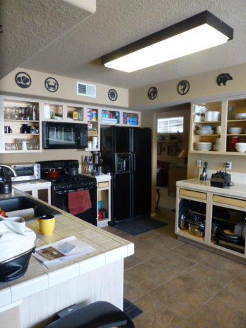
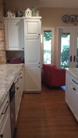
Purely cosmetic (except for replacing the lighting) we saved the cabinets in their entirety, painted the boxes, doors and drawers. By shooting the fronts remotely, quality control was insured and caused less imposition at the residence.
Black accent pieces were already in play. The new black finish was a dramatic transformation. Using a special tinted varnish, proper prep and several coats results in a very strong new finish. All other finishes were replaced with a conscientious effort to coordinate with the existing flooring. The result “reads” as though it was all done at the same time. The floor tile looks good as new!
Similarly, we saved the cabinet boxes, but differently from the previous project, we added a few updated cabinet features and replaced the door and drawer fronts to a more classic raised panel detail.
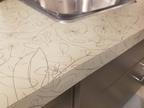
Again the transformation was exciting, but by saving the perfectly good cabinets, we had far less disruption to the home-owners. Enhanced cabinet details for improved drawer glides, additional storage, new counter-tops, new lighting, and as is true with all of these projects “cabinet jewelry,” in the way of new door and drawer pulls and handles, adds the finishing touches.
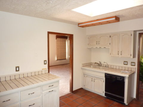
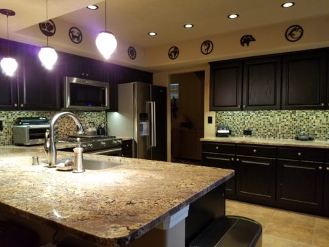
This very dated kitchen from the early 70s, had a new owner – a single man – and he definitely didn’t want this provincial look!
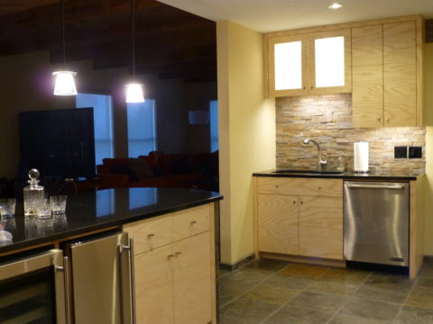
In this case, a general contractor was in order. We opened walls, re-designed all the lighting, replaced all cabinets with new custom cabinets, appliances, flooring, counter-tops and back-splashes. The transformation is astonishing!