Color Schemes and the Complex Simplicity of It All

Color schemes are many. Color schemes evoke a mood or convey an atmosphere. They certainly can and often are responsible for imagined temperatures and/or seasonal sensations. What constitutes a pleasing color scheme? What constitutes pleasing? It all comes down to balance, layering and subsequent interest. It takes a enlightened eye and usually cannot be achieved by accident.

We are nearing completion of a living room that incorporates many design elements. Family heirloom antiques add a vintage touch along with the architectural style of the bungalow home.  Contrasting these pieces is a sleek-lined, modern, sofa that we found and reupholstered. And while not driven or influenced by current color trends, we selected a scheme derived from the existing Persian rugs. By extracting the blue and white from the patterns to refresh the interior – a classic, timeless color combination – we blended a wonderful scheme. Finding the common denominator(s) blue and white, we sought to anchor all with this consistent theme. Differing patterns provided additional layering and interest.

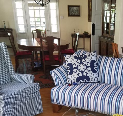
Then, just last week while dashing through the DCA terminal for SWA, my eye caught the attention of several magazine covers all featuring blue and white schemes!  Always in vogue, but not always featured as the cover story, this coincidental (or not) collection of blue and white photo images was a riot! I was forced to snap a few shots to send to my happy blue and white client.

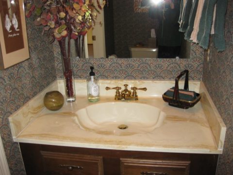
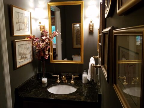
If I described a new master bath remodel project as all white, I wonder what might come to mind. All whites are not created equal and the variation is startling when you see them in context, adjacent to one another. So here is the easiest example. A fan-deck from Sherwin Williams shows a collection of whites. They “read” very differently from one to the next. Yet taken one at a time – isolated from the rest – each would seem to be just plain white. Notice too how they differ from the white paper upon which they are printed – it is the spacing between the color chips – and even the white fabric upon which they were placed for the photo!

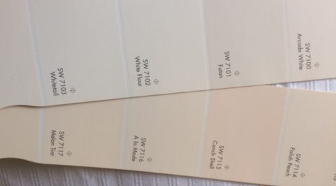
But there is really no such thing as “just plain white.” Once seen next to another, their unique qualities of hue come into play. A yellow white is creamy, while a cool white reads blue. It’s the context that makes the  color more legible. Without that they could be assumed and accepted to be merely “white.”

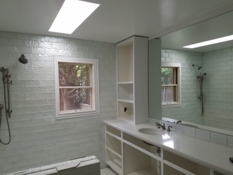
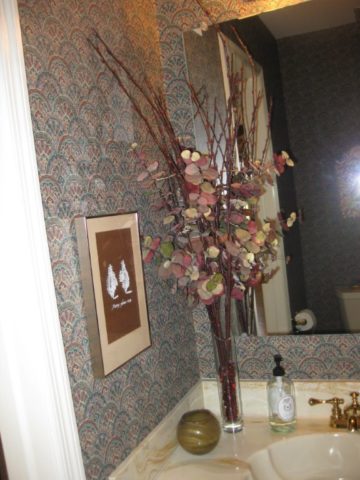
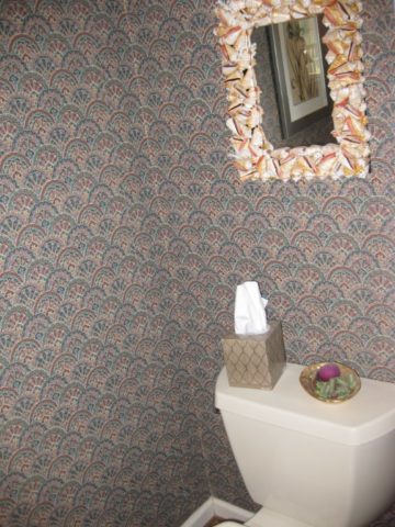
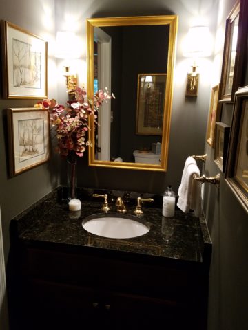
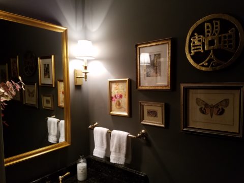
So, in this recent color scheme nearing completion, whites in context show their many colors. At first glance and if asked, one would say “the room is all white.”

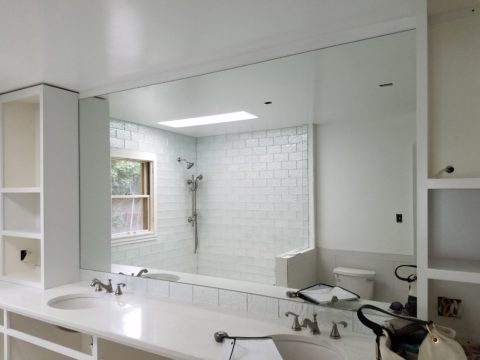
Upon closer inspection (photos taken from a different angle seconds apart), that simplicity is replaced by a more complex, heightened level of awareness. This complexity is what adds interest and results in a better finished product than a true monochrome. What was a collection of white materials, in this master bath, is truly revealed as shades of white varying from ever so soft celadon to cream and grey to what might be read as actual “white” white.


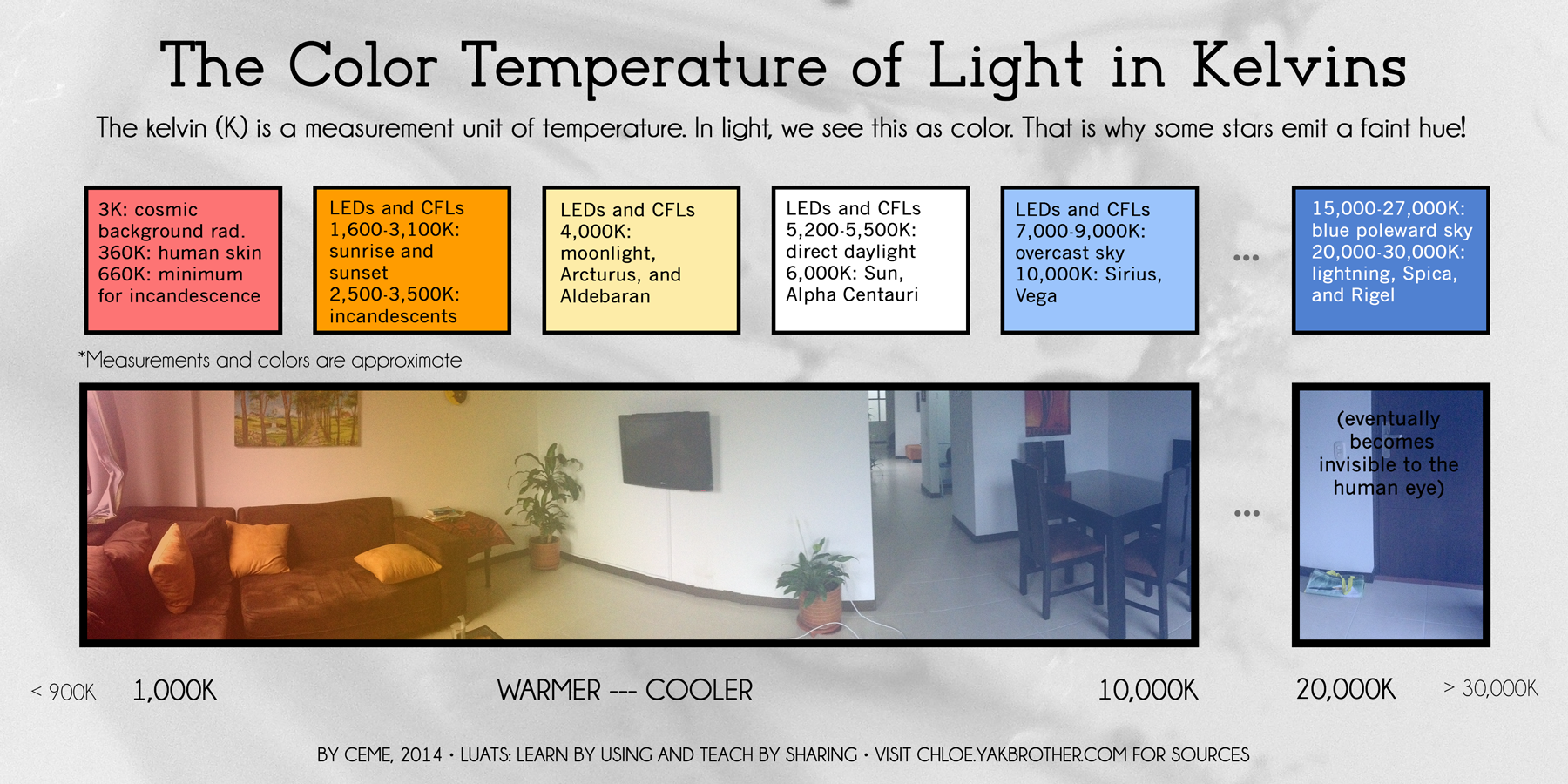
Don’t trust your eye when it comes to color. Discover how paint on walls changes all through the day. Artificial light-sources alter the way a color appears.  Context with other colors alters the way one perceives color. Color is fun! Colors are fun! When designing interiors, enjoy the process of layering and the varying effects colors have on each other. Simplicity is usually not really simple. That term can be deceptive. Making it look that way is an art. Encourage the enjoyment of discovery.

Moody Blues – Moody Rooms

What’s more trendy than an existing word that comes into the mainstream with a new relevance or targeted use? I’m sure you will giggle a bit thinking about some of the trendy words – original or re-constituted – that have come and gone. How do they get inserted in our popular culture? Who started it? How quickly did it catch-on and how? I will have fun with a variety of trending design words in coming blogs – enjoy expanding your design vocabulary with these if they are not already a part of your vernacular.

I’ve written about dark rooms and dark colors in the past…don’t be afraid of the dark! But to now discover that the use of the word “moody” has surfaced and playing a role in describing such spaces is novel. Trending now – “moody” rooms. Or at least describing dark spaces as “moody.”

We recently gave a face-lift to a tiny powder room. It was dark-ish before, but with a printed wallcovering from the 80s. It had stood the test of time and served the owners well, but it was time for new cabinets, countertop, hardware and fixtures.

We decided to run new floor tile from the entry through to this room. It was a large format dark porcelain. This dark chocolate leather-like look was a deep and “moody” selection to recede and add depth  to the space.

Yes, it creates a decided “mood.” A mood of somber elegance. The quiet space is perfect for the duty it performs. As a powder room, it is visited quickly and by many. We selected a velvety dark wall paint Benjamin Moore HC 166 Kendall Charcoal rather than replacing the wall-covering with new.


For interest, instead of one large commanding piece, we  gathered a collection of complimentary wall art from other rooms and even some clever thrifting (always an entertaining and satisfying treasure hunt) to create an interesting grouping to be enjoyed from the intimate vantage point.

The new lighting flanking the mirror rather than coming from a bar above is soft and  in keeping with the  colonial decor of the home located inside the beltway of our Nation’s Capital. New granite is dark and rich, white porcelain adds a crisp contrast and new cabinets coordinate with other renovated casework in the home.

When surfing the internet for design inspiration and subsequently speaking with design professionals, be clear. Picking up new ways of expressing design ideas is fun – but the simple truth is just that – simple. Keep it simple, explain your goals, go dark if you like, be a bit moody if it is the effect that you wish to achieve. Have fun and don’t be afraid of the dark!!


The Excitement of Design Updating and Transformation!

For years, Barcelona Tapas has been a creatively successful culinary and social scene on a quiet cobblestone backstreet in the tropical, seaside, destination of Puerto Vallarta. The vertical profile of the sun-bleached white building is distinctive with its open spaces – dining rooms on each ascending level.

20170204_205154

It is a extremely popular, hip and happening, dining venue which has recently had a spectacular face-lift that brings the structure and open-aired/interior environment up to par with the culinary delights.

Upon arrival, the familiar, welcoming doorway opens to softly lit aggregate stairs that sweep up each tier of the towering edifice.

A massive Cantera stone fountain babbles gently amidst tropical plantings and an iron grill-work is indirectly illuminated for a dramatic effect. An expansive patio all with honed stone tile floors begins the layers of available spaces.

Next an intimate open-aired dining area with an adjacent chef’s table and luminous, full-wall wine cooler beckons with an inviting aura. The intense red drama of a bullfight is rendered in a large painting on the rear wall – a suiting backdrop to the Spanish theme.

20170201_225220

Continuing the ascension, the delightful glossy black ironwork railing follows along and up the open-to-the-sky aggregate staircase turning past the last landing.  Ahead, the beautiful,  warm glow of the new dimensional ceiling treatment accented with wood and indirect lighting draws the eye upward.

Upon arrival on this rooftop dining platform, what was always an exciting view of the city lights, both in the foreground and circling the bay miles around to the north,  now expresses the new architectural features and finishes dazzling the eye.

20170201_212626

Effective lighting, recessed ceiling details, a new clear glass railing, and modern ceiling fans dangling like detached white nosecone propellers present a whole new, fresh, modern look. The drama and effectiveness of the lighting paired with the wonderful surround sound, coming from eight Bose wall-mounted speakers and 2 sub-woofers recessed into the ceiling, result in an atmosphere and music that are seductive and sensational.

But wait – there’s more!!! Yes, an additional rooftop dining patio is revealed upon discovering the hidden staircase at the far end of the bar. New furniture and a billowing fabric-draped portico are soon to arrive!

20170204_230116

This new space not only increases the seating capacity, but offers yet another  panoramic view and trendy design-themed open venue – expanding the options even more!

The project is Chef/Owner Bill Carballo’s passion.

20170204_214701

He has been at it for years creating deliciously original and traditional Spanish tapas (here his exquisie presentations have been half eaten in the rush to enjoy)

from the immaculate exhibition kitchen at the start of the long bar, with a fine-tuned staff eager to assist and cater to your every need.

20170201_225019

This enchanting transformation has attracted new discriminating, trend-setting clients and welcomed the return of  loyal fans to experience this exciting new and stylish interpretation of Barcelona Tapas.

20170201_200631

The doormen Luis and his affable sidekick are there to greet and assist!

Thank you gentlemen and Buenos Noches until next time!!!!

Let There Be Light for the New Year!!

Short days and longs nights…Do you find that your interior is dull, lifeless and even feels a bit cavernous after dark? As the sun  sets and the lamps come on, the effects can be horrible, adequate or sensational.

Poor lighting can have remarkable subliminal effects on mood, energy, and attitude. The subtle signs of poor lighting such as dark corners, shadows on faces, difficulty reading and dull colors are all important factors that contribute to an uncomfortable interior in these short days of long, dark nights.

Lighting has multiple reasons for being—three primary ones—to see, yes, ambient light. But to do tasks (reading, sewing, playing games), and accent lighting to illuminate artwork and other interior features. Mood lighting such as candlelight (once the primary light source – now an effect in most cases) is a lesser but effective  lighting tool.  Good lighting makes amazing differences.

Beware of down-lights. Lights that shine down from the ceiling. Although a very effective and common lighting tool, they must be balanced with good ambient light.  I have often used this example of sitting in a restaurant across from your date and their face is painted with ghoulish dark shadows under their eyes, beneath their nose, and accentuating all the folds of their features. It is the opposite of a kid putting a flashlight under their chin shining upward creating similarly haunting effects. Creepy. Certainly not flattering.

2008-10-13_001

The same unpleasant effects happen in the home. It’s such a common malady of ineffective lighting that most people assume it is a necessary evil of short days. It’s sad—no, really it’s SAD—Seasonal Affective Disorder! To treat the serious effects of this syndrome there are many studies and inventive solutions, but for most of us, the less arresting effects of poor lighting can be greatly improved and our lives enhanced.

To begin this process of evaluating your lighting an improving it right away, start with the lamps—the light bulbs! We have so many choices these days including the familiar incandescent, compact fluorescent, and the newer LED with excellent color choices and low energy usage.  We could talk about the “temperature” of light sources measured in Kelvin, but we won’t—only that it runs a spectrum of warm to cool.

e6bca6db6f0faf4f9ecb0775cb4bc4eb

Walk around your home and look specifically at the color that glows from the various light sources. Does it look yellow? Does it look white? Does it look blue-ish? Recognizing these distinctions from warm to cool is the start.

light_bulb_color_temperature

Where are the shadows? Are the corners dark and recessive? And, when you combine these two, do you find, for example, dark areas and yellow glowing sources? Sometimes that soft, warm yellow is preferred while other scenes are made more intentionally crisp with cooler light.

Experiment with different lamps in your fixtures – light bulbs in your table lamps and recessed cans, hallway sconces and bathroom fixtures. It’s a fun experiment and very illuminating – yes, the pun was intended.

Are your lamp shades opaque or translucent? Do the shades themselves cast a color? Do they block the light or allow it through? Do they throw the light up and down or up, down and out? This is another detail of which to take note.

If you have dated recessed fluorescent tube units – common in kitchens for example – they are often housed in a box either recessed or surface-mounted on the ceiling. Take a look at the plastic lenses – are they discolored and yellow? This aging process can dramatically affect the quality of light that is emitted. So if you are not ready to replace these fixtures with more effective modern lighting statements, try replacing the lenses.

001-flat_sheets_before_after

A similar installation is that of skylights which have fluorescent lamps up inside the wells with that same plastic lens over the opening to the skylight. The original idea was to have the natural light pass through during the day and artificial light take over after hours. The lens  was to intentionally conceal the unattractive fluorescent tubes, but it sacrificed the depth of the framed well. A quick update is to remove the lenses and fluorescents and expose the well of the skylight adding dimension to the room and eliminating the unattractive lens that conceals the dimensional cavity. Recessed can fixtures around the skylight in the surrounding ceiling are the most common solution to this transition from old to new, a cable can be strung, pendants can be hung, but if budget constraints prohibit that investment at this time, you might investigate the power source up inside the skylight well and replace the fluorescent fixture with an inexpensive, adjustable, surface-mounted spotlight – perhaps with two heads to provide light from that same source while opening the skylight well without the unnecessary lens.

franklite-scintilla-2-light-nickel-finish-spotlight-spot8882-a94

The dark pockets around your rooms can be improved with up-lights in corners and up under plants. Inexpensive fixtures are available at any lighting store or big box home improvement stores. Place one of these up-lights (remember to select the color “temperature” that pleases you the most) and see what that additional pop in the corner does to open your space. When up-lights are used beneath plants to shoot upward and cast shadows onto the walls and ceilings can create drama and exotic interest at night. This is true both indoors and out.

Torchiere floor lamps are those that face upward. Like a torch, they send the light toward the ceiling – another effective splash of light in an otherwise dark space in the room.

Colors are radically affected by the color of light that shines upon them. Therefore, an interior color scheme can be horribly tweaked to not resemble at all the actual colors chosen and combined to create the scene, when artificially illuminated after dark. Contrarily, colors can be rendered with great brilliance and accuracy when illuminated with the right combination of lighting. (although daylight contributes in these two examples).

By the same token we can have great fun and “paint” with light creating a color scheme entirely with colored lamps washing the walls, and interior elements just for the art and exercise of doing so, but I digress.

images

In summary, look around your rooms after dark and look for opportunities to make changes that will dramatically affect the comfort level – the results will be startling!!! If planning new construction or remodel – have plenty of light in key places throughout the space. Think dimmers so you can control the amount of light. Let there be light in this Happy New Year!


Fun with PERF!

Currently finishing a project that has provided a great theme for incorporating metal, it seemed a worthy blog subject for it’s fun and flexibility! Perf is the product – a perforated steel that comes in several percentages of perforation.

We have used this many times for rolling window shades in a flexible coated nylon material. It is great for filtering for sunlight and privacy while allowing a certain amount of “see-through.” It has been used as an architectural screening material for years. You have probably seen it and not realized it on building storefronts and bus wraps – the perforated vinyl coatings are often used for advertisement because they read as though a solid from the one side and are transparent from within.

Here we are playing around with the steel to create cool elements that compliment the theme of this new taproom. The theme is silver and what material does bring to mind? Metallic. So by dressing raw steel with paint – we apply the silver finish and there we have it!

The required outside patio fencing was constructed with very generic square stock. I called it a hamster cage. It was a bland beige when we first arrived and, without notice, the shopping center management had it and the other structural columns lining the canopy/portico painted chocolate brown.

The plan had been to screen it with perforated panels. The darker paint color created a little better contrast and aided in providing a depth of detail to set-off the silver painted perf.

Inside we needed to fill the volume of this most uninteresting dropped ceiling. Already painted black and looking quite voluminous – but not in a good way – the empty space needed some mass. So in one of those restless, middle-of-the-night design sessions of insomnia the idea to create large drums for lighting shades came to mind.

Drums have been in vogue for several years now. Nothing original from the initial use for table lamp shades except their use was broadened to include suspended fixtures and halved for wall sconces. You’ve seen them – hip and happening – and these were quite over-sized and carried the space.

We needed to fill the void of the 12′ high ceilings in this room that had little or no comfort. All hard surfaces, it was a challenge to maintain the silver theme and edginess of a popular taproom while creating comfort. Seemed an oxymoron of a task. But the mass of the perforated drums in three different sizes grouped in the near center of the room did just that.

The addition of multiple warm white lamps inside will be the crowning touch. (photo to be added here in a week or so)

Then a third use of the perforated material came in the idea for a room-divider/hostess station.

img_2342

We needed a place to create a point of arrival. Whether manned or unmanned, this unit can have a chalkboard or other signage identifying special events or beer tastings, with a podium in front creates a translucent backdrop to partially cordon off the rest of the space until the customers are greeted and it also can divide the space for special events and table groupings. to accomplish all of those various purposes we designed it with heavy duty commercial casters complete with brakes so that it could be moved easily for its grand height and weight and  placed where needed for the best advantage.

Stay tuned for the complete un-veiling of this cool new interior in the coming weeks. And meanwhile dream of all the fun you can have with perf!


Designing with Balance and the Creation of the Can Wall!

Given the opportunity to improve upon a recently completed taproom, we instantly realized that painting the entire interior would be the best quick-fix. But that instant gratification was not enough to give this needy/hungry interior some meat to get it off and running.

Atmosphere in interiors is so much a part of the brand, the identity, and the success of a business. Popularity is based upon a certain comfort level, the clientele who gravitate there and the product that they are effectively providing. Whether that is food or drink or both, the atmosphere, (including lively enjoyment by clientele), service and food/beverage – all contribute to a successful establishment.

This does not mean high-end, elegant, fancy or even simply hip – although the definition of hip can vary from spare unpretentious and un-self-conscious funky, to studied funky, to affected stylized, to trendy hip and happening,…but, it does NOT always have to represent expensive interior design.

Yet a strip center generally lacks pizzazz and to install a taproom into that generic scene takes some creativity. That does not mean money – it means just what I said, creativity.  And creative interior design is all about ingenuity and balance.

Balance in interior design is key. This interior was filled with hard, cold surfaces – concrete floors, silver-grey laminate table tops, brilliant silver table bases, grey chairs, polished white granite bar top, silver laminate bar face, silver metallic wall sconces, glistening silver under-scaled chandeliers, white walls with cobalt blue accent wall. Brrrrrrr….makes me chilly just recounting the scene. And this was summer! Imagine this setting with crisp cold wind blowing outside and snow blanketing the mountain – not the place you want to gather for a beer in the wintertime!!

20160901_160828

To instantly soften and add warmth, we painted all walls a dark taupe. The soft, mousy grey/brown color pulled from the existing slate wainscoting to tie the two wall parts into a unified “read.” It gave the silver elements (especially the sconces) a contrast – which results in “interest.”

20161103_091444

The back bar was bland even with the new paint color and to add dimension and animation we mirrored the rear center section. This illusion added depth and interest to carry the ceiling through and add a mirrored storefront and exterior reflection which created an illusion of space and character where there had been nothing.

But unlike most back-bars, this area was conspicuously naked. A couple of stainless shelves housing stemmed wine glasses, and growlers felt spare. Plus the right side of the back bar was closer to the bar and the patrons were a mere few feet from a plain, painted sheet-rock wall. Yes, there was a large format TV screen above, but straight ahead – it was just blank wall.

In the wee hours of the morning, as I tossed and turned for a variety of reasons, I jumped from thought to thought, project to project, and personal concerns pelting all the while in a seemingly endless stream of insomnia. Yet, it was during the angst that the idea of the taproom being named “Silver”…silver…beer cans are silver/aluminum…beer cans crushed and nailed to a wall…texture, silver (theme of the taproom) interest – maybe?- all converged into one of those light-bulb moments of revelation.

And yet you might say – “silver…aluminum…more cold and hard. Why would this be an asset to this interior?” I felt that the texture and dimension of the cans would add more interest than the perceived cold and hard of them. The pockets of folded shadows and the relief off from the wall, paired with the over-all massive full-wall of pattern, would all contribute a positive design element to the scene.

As I pictured the wall of circularly flattened aluminum cans in my in my  mind’s eye (a tool that I employ daily while envisioning concepts and finished products well in advance of their fruition), I furthered the concept to encompass possible bar games. Yes, derived from this perfect grid of circular aluminum discs, I began creating games in my head. A bar is often animated by bar games and this was just another opportunity to interact using this unique wall-scape. Since that initial concept, I have created 3 different versions of the animated interaction in the form of games, on this fantastic Can Wall.

So with great patience, Enrique planned the layout with literally laser precision in a perfect grid. We counted the expected number of cans vertically and horizontally aligning with the brilliant red light beams. The previously crushed cans were laid out on a table – well a handful of the 3,200 that we had prepared for the wall. It was determined that punching the nails into the cans prior to installation would expedite the process of affixing them to the Can Wall. Labor intensive from start to finish, this wall was a great accomplishment for a devoted few.

20161103_094518

As the cans were laid out on the table – initially upside down exposing the crinkly open side (devoid of tops), I instantly LOVED the complexity of the depth, texture and shadows. A tight, random application of them would have resulted in a fabulously complex matrix of design. But upon closer inspection, the “texture” was really raw, with sharp threatening edges that were not possibly reasonable within close contact with people brushing by. So, lacerating the staff was not an option – even for a really cool textural metallic wall treatment. Perhaps this application will surface in a more appropriate location away from human flesh in the not-too-distant-future!

Like hubcaps fastened to the broad side of a country barn at dusk, the reflective silver discs pop in the flanking darkness.

20161104_140152


The process is nearing completion and I will save for another blog sharing the fun and games emanating from the Can Wall,  and the entire finished project complete with new warm white pendant discs over the bar and soon-to-install enormous perforated drum light fixtures suspended from the ceiling, over-sized photo images of the brewery behind the scenes and tantalizing signature dishes in the unique category of the Nexus New Mexico Soul Food.


Meanwhile, the take-away here is…balance cold and rigid with warm and textural – along with all the other opposites that attract – when designing be balanced.


50 Tips Patti says will help assist with design dilemmas!

These observations have proven valuable and will be the subject of upcoming posts for the weekly blog…almost weekly blog. A compilation of themes prompted by real clients and personal answers & ideas for YOU from Doorstep Design Delivery by PATRICIAN DESIGN!!

  1. Use dimmer switches whenever possible.
  2. Do not be afraid of color.
  3. Treasure family heirlooms.
  4. Know why you are installing window treatments.
  5. Mirrors can be your friends.
  6. All leather is not alike.
  7. Layering adds dimension.
  8. Trends can be your downfall.
  9. Eclecticism is personality
  10. Odd numbers of elements make better groupings.
  11. Rugs are wonderful.
  12. Discover new ways to use existing pieces.
  13. Fresh flowers are joyful.
  14. Focal points speak volumes.
  15. Minor changes can make major differences.
  16. Ceilings are opportunities.
  17. Find alternate uses for common things.
  18. Collections can be cool.
  19. Treat yourself to statement pieces.
  20. Enjoy connecting interiors with the outdoors.
  21. Prioritize to plan effectively.
  22. Deconstructing parts can result in creative assemblies.
  23. Balance is key – opposites attract.
  24. Pillows are easy seasonal punctuations.
  25. Plants bring life.
  26. Mobiles and kinetic sculptures add animation.
  27. Even small water features can be soothing.
  28. Incorporate old with new schemes…conversely new with vintage interiors.
  29. Do not fear dark walls in small spaces.
  30. Everyone benefits from a bit of bling.
  31. Test samples do not always satisfy actual finished effect.
  32. Avoid stopping finishes mid-surface or on outside corners.
  33. Textures tantalize.
  34. Scale is critical.
  35. Faux fur has come a long way.
  36. Matching might be monotonous.
  37. Find treasures at second hand shops.
  38. Collect ideas – inspiration abounds.
  39. Zones matter regardless of size.
  40. Punch it up often.
  41. Music and sound are design elements.
  42. Masking unwanted sounds is an art.
  43. Form should follow function but sometimes they are simultaneous.
  44. Context is critical.
  45. When white is an intentional wall color.
  46. Appearance retention is key.
  47. Beware of light sources solely from above.
  48. Fish tanks relax – as art, architecture or furniture.
  49. Daylight vital – circadian rhythm count
  50. Wabi Sabi has value.


Good design enhances life. Consultations no longer are dependent upon personal interviews. Technology has facilitated communication between designers and clients.Custom solutions in the form of samples and sketches can be delivered to your doorstep! Doorstep Design Delivery from PATRICIAN DESIGN.

Please contact us regarding cost-effective, quick fixes for your design dilemmas. email@patriciandesign.com or 505-242-7646.

Visit our website www.patriciandesign.com

WONDER at the Renwick

At 4 years old my teeny cousin, Katherine whom I nicknamed Katie-belle, took my hand as we ventured forth with great discovery stepping down into the carport of our beach house. With commiserating whispers, like the two adventurers that we were that night, we exchanged queries about where we were headed and what we might find and she said ” I Wonder…”

“So what?” you might say. What’s such a big deal about that? Well the concept of wondering, being able to ponder with amazement at what might result, was astonishing to me coming from the mouth of such a young child.

When we returned upstairs to join the group, I was eager to share my amazement about her simple phrase, “I wonder.” I exclaimed  “She wonders!” Repeating it incredulously about 5 times!

Today she is a dedicated grown-up pursuing exciting adventures in education as she navigates the University system and teaches students with a creative approach that captivates and engages beyond their expectations.

What is wonder? What is wonderful? Yesterday I visited the Renwick Gallery in Washington, D.C. . The current exhibit is called WONDER. P1150084
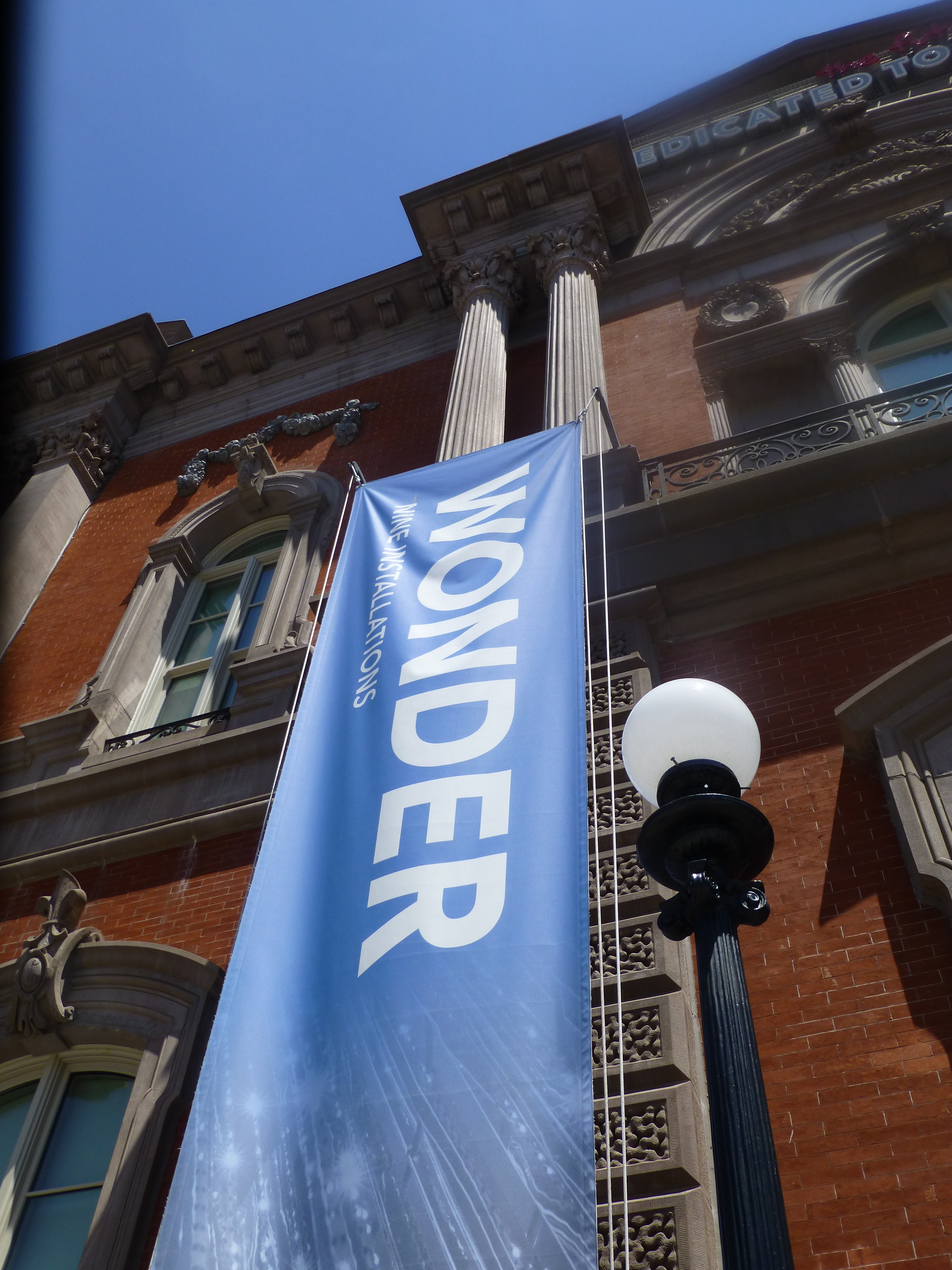
It truly is a wonderment for all ages. This architecturally magnificent building designed in 1859 by James Renwick, in the then chic Parisian Second Empire Style, is the elegant backdrop for a most progressive and creative collection of present day modern artists’ works. Diverse examples, of spectacular displays using simple materials,  brought to life in forms unexpected – of grand proportion and thrilling magnitude. Although my learned and previewer cousin had introduced me to the exhibit in advance, it captivated and engaged beyond my expectations.

This grand yet intimate edifice welcomes and encourages close observation of both itself and its contents. The spectacular main staircase, centered upon entry, presents a brilliant coral red carpet installed with a curvy,  serpentine migration up to the second level. Ooh – if copying is cool and emulating is the greatest form of compliment – I will be looking for an opportunity to specify a similarly whimsical installation. P1150052

Glittering overhead, spanning the entire length of the staircase, is a rectangular chandelier of mirror-like stainless steel punctuated with little LED lights blinking in random patterns. P1150066 
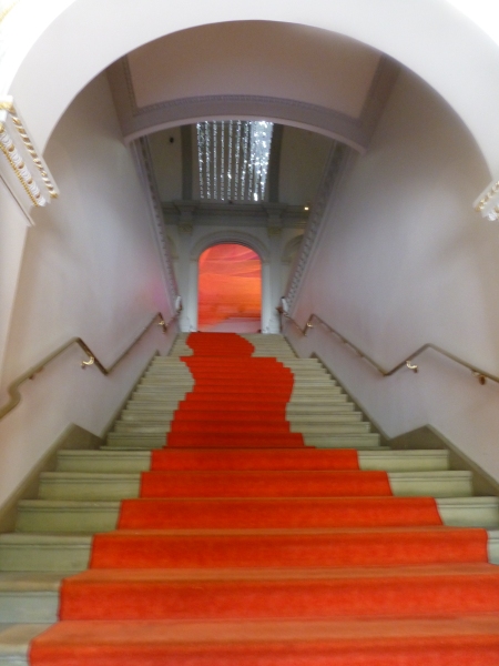
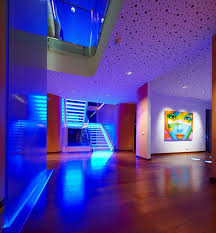
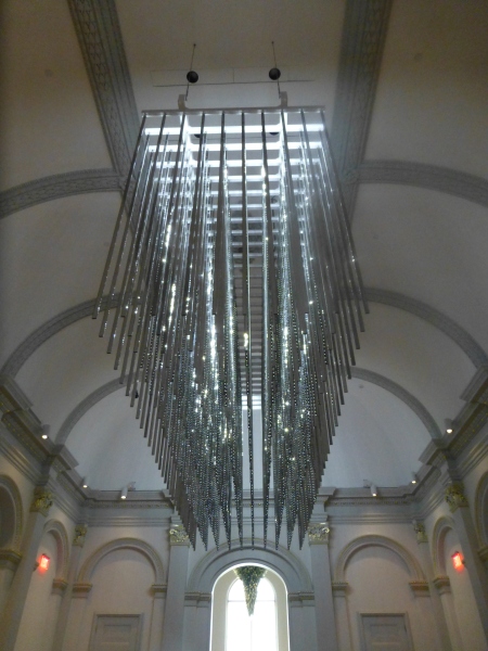
The glitz and bling make such a striking, formal, contemporary statement in this expansive volume that it startles with joyful contrast. The artist, Leo Villareal of whom I had heard in advance, was originally from Albuquerque – where we now call home. A remote desert origination transplanted into the fast pace of the urban centers of the east coast resulting in this shiny experimentation with light, form and wonderfully reflective surfaces. Villareal melds basic high-tech coding to use his own algorithm of the binary system 1s and 0s communicating to the lights when to turn off and turn on – yet sequences that are never exactly repeated .P1150064 
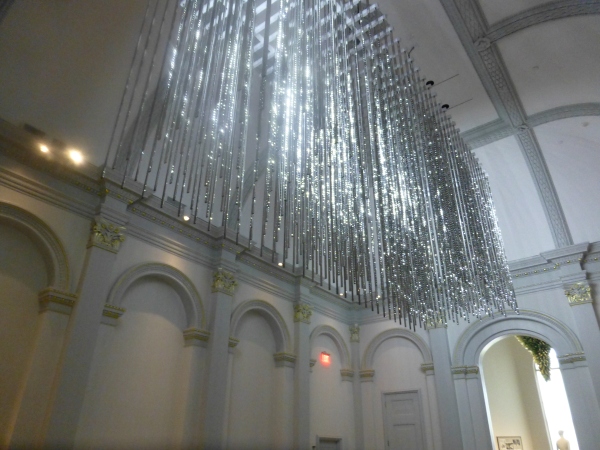
It’s not just your linear code of characters that is read on a screen –  here it is an artistic experience shared by all who look up in this gallery’s exciting exhibit.

Straight ahead, through the massive opening to the next exhibit hall, was the wispy fishnet-like rainbow of woven warm-colored fiber representing both  wonder and danger. Artist Janet Echelman’s inspiration is from a map of the energy released across the Pacific Ocean during the Tohoku earthquake and tsunami on March 11, 2011.  A natural disaster so devastating that it shifted the earth on its axis and cost us a fraction of a second in time. Surreal? Sci-fi? No, it really happened.  Beauty and grace depicting a horrific event. P1150063 
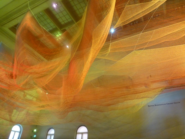
Large scaffolding at the end of the room suggests the manual installation that was required to suspend this wondrous drape catching light and glowing with golden aura. P1150068

The lower level still had wonders to explore starting with the magical woven willow saplings – creations of artist Patrick Dougherty. He has wound these great lengths of supple branches to form Hobbit – like holes of imaginary forest habitats. P1150056 
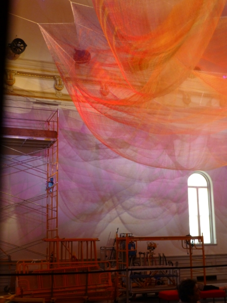
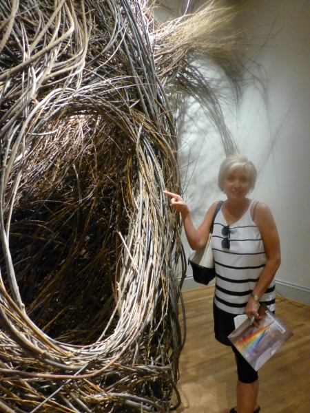
We were at once drawn into these cozy nurturing cubbies of what appeared to be nature – not forms created by man. Nature. Organic and raw, elegant and graceful winding toward the far reaches of the very high ceilings. Like a sculptor who says that the stone dictates what it wants to be and how he carves it – Dougherty knows that the long willow branches have a true will and bend their own way challenging him to work with them toward that goal of partnership with nature. The beauty is in the end result.  People of all ages wandered in and out, peeking through window-like openings pretending to be exploring an enchanted forest of wonder.

Next – stacked index cards- really? P1150061 
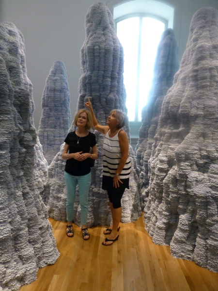
Have you ever experienced Tent Rocks?  8-24-12 Placitas lunch, Tent Rocks Heather, Tricia, Zeke 044Have you ever looked upward and around and through the magnificent forms created by nature eroding the earth’s strata revealing layers of color and creating spires of rocky towers? It is a magic land just south of Cochiti in a very unexpected pocket of nature’s magnificence in our Land of Enchantment. And the spires that artist Tara Donovan created with stacks of index cards – an overwhelming accumulation of millions of index cards suggest grey spires replicating nature’s wonders in the canyons among the spires of the Tent Rocks. P1150062 
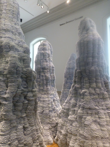
It’s as though a photographer captured this natural formation in black and white.  Donovan’s interpretations are tones of grey as a result of the stacked white index cards with slivers of shadow sucking away light in between each of them. Clustered and staggering in height, the “Untitled” towers are inviting to walk amidst and pass between, winding around them like a  tourist or explorer or perhaps inhabitant in ages past and present as they have stood for ages.

Snap out of it and see what is glowing like a fine fiber sail in the sunset in the next room. Stretching upward and crossing midway are thousands of incredibly fine threads woven from small hooks on the base. P1150059
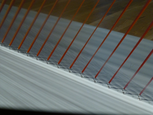
How could a human working only by hand – without computer generated machines digitally fabricating such perfection create this finished piece that we are studying with such wonder? How can this fine tedious seemingly impossible count of thousands of threads be executed with such grandeur and grace by one mere mortal? gabriel-dawe-plexusa1-wonder-renwick-gallery-washington-designboom-03 
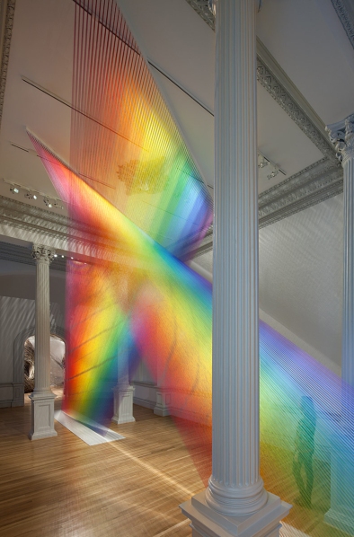
The artist Gabriel Dawe transcends our ability to comprehend the exactness of his beautiful accomplishment with extraordinary patience, precision and creative foresight to imagine the end result and bring it to fruition.  It is a wondrous, luminous sculpture of rainbow colored threads inspired by the skies of his native Mexico and current home in East Texas. The fine weavings also inspired by his Mexican heritage are interpreted, stretched and exaggerated here reflecting the light and spectrum of color from its base to ceiling. P1150060

We missed a couple of early installations of WONDER but were thrilled by today’s adventure. We had many opportunities to wonder…wonder how the artists conceive of their fantastic ideas and actually build their dreams to share with the world. We wondered what it takes to spark that creativity and passion that requires commitment and demands such unfailing determination. We wondered about those who collect these talents and curate these exhibits for the joy of so many. We wondered about the practical side of marketing these concepts to support the artists and this amazing  accommodation started so many years ago by a true visionary William W. Corcoran.

My next blog will trace the history of this wonderful architectural treasure, the Renwick, and share more of the day’s discoveries that you might visit and experience as you tour my birthplace – our Nation’s Capital.


Stage Sets, Christmas and Cozy Fires

Old movies provide an extraordinary view into periods of history, social norms, and the interior design of the times. Watching old movies exposes lifestyles and context like a text book. Whether capturing modest environments or posh extravagances, they depict with accuracy – if not exaggeration – exciting opportunities to transport the viewer into another world.

From my perspective, I drink in all of this creativity as I scan the sets, peek around the actors and study the minutia of the many varied interiors. I marvel at the sensitivity and attention to detail and decorative arts required to create effective set designs.

When movies are in color they illustrate such interesting decisions for artistic contrast and combinations; but in black and white, the imagination must fill in the blanks. The emphasis on the chiaroscuro adds a very  different focus. Scenes in color are often exaggerated realism stretching the art. While black and white scenes are rich with tonal values, shading and bathed with the art and drama of lighting.

Perfect for this season the 1942 classic film Holiday Inn, with Bing Crosby and Marjorie Reynolds shown here by the fireside, allows the viewer to feel the cozy setting,  the warmth and take in the details of the room all without benefit of color. It’s fun to wonder what is the color of the walls, fabrics, accessories and other accents could be. The possibilities are endless – but probably not really  – if one is to design with accuracy for the time period.  movie Holiday Inn Bing Crosby Marjorie Reynolds   
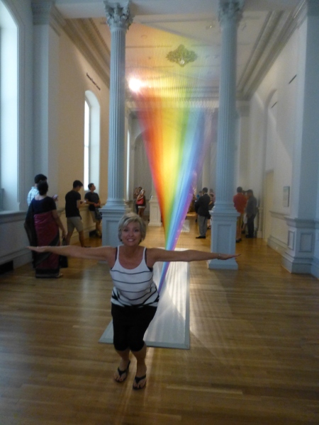
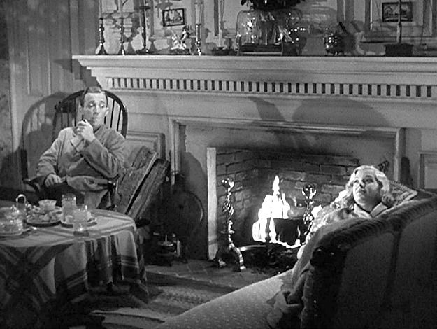
Try it with this still shot from the movie…imagine the colors…it’s fun!

Tis the season to light fireplaces and enjoy the flickering light, golden white colors sparked with jewel-toned color bursts, the visual and physical warmth that come in many forms. Step into the scene and feel the temperature, textures…see the colors and combinations.

I recently said – as sexist as it might sound – that I would never have a gas-log fireplace as long as there was a physically capable, self-respecting man around to fetch the wood and haul it home and stack it up, go outside in the frigid air to lug in the logs and of course clean it out from all the wonderful timber turned ashes.  Spoiled? Yes. I love a REAL fire in a fireplace – you bet…the crackle and smoky aroma of distinctly different species, real fire dancing and real wood “combusting” – natural elements that create a concert of sensory experiences and evoke so many memories. Is it working? Can you imagine it?

Fantasy mirroring reality, with the creativity of set design replicating accurate portrayals of life, provides another tool for historical markers and study outside of a museum setting. Perhaps you will find yourself scanning the sets and peering around the actors to see what you can discover surrounding and beyond the action.

And as this movie has so emblazoned in our holiday  traditions…I’m dreaming of a white Christmas. Thank you Bing.

Valentine’s Dinner at HOME!

Creating a romantic and interesting table for a special Valentine’s dinner offers so many opportunities for presenting your heart-felt feelings. With a little effort to select some key pieces to dress the table and by selecting some simple yet scrumptious delights, you will have a wonderful memory to cherish. Here are some suggestions and a couple of easy menu ideas too!

We’ve heard the truism of “The way to a man’s heart is through his stomach.” But the same can be said in reverse as there is something irresistible about a man in control of his kitchen. Pairing the two is the ultimate love cuisine when a couple cooks together sharing the tasks, sipping cocktails and enjoying the process.

The recipe for a romantically successful Valentine’s Dinner at home is so easy. Realize that you don’t have to drive – thereby eliminating that concern after enjoying your cocktail and bottle of wine over dinner. Not to mention the after dinner sip of brandy or bubbly.

Starting with cocktails and hors d’ oeuvres, go to your favorite online foodie place for recipes for things such as stuffed ripe red cherry tomatoes – luscious and sensuous. For the carnivores, a rich and savory pate with toast points is a delectable treat. Maybe shrimp cocktail – easy cooked shrimp with a spicy valentine red cocktail sauce. It’s fun to have your appetizer someplace other than at the dinner table. If you use different places to enjoy the different phases of the evening, it will create more interest. So perhaps around a coffee table or at a bar counter-top.

Consider taking a walk after the cocktail hour before you progress into dinner. Whether freezing or mild, as long as it is not terribly windy, the temperature shouldn’t matter. Strolling under the darkness of night – perhaps moonlight – is a great way to transition through the phases of the evening.

Candles are a must. There cannot be too many. They don’t have to match. They can be tall tapers, multi-height columns, squat votives or all of the above…Obviously, on the dinner table…but don’t forget other end tables and cocktail tables, fireplace mantles, window sills, bookshelves, counter-tops, bathroom counters or shelves. Watch what’s above – or use artificial candles to avoid burning an upper shelf or art above them. Any light fixtures should be on dimmers. Avoid over-head lighting as it is generally not flattering, casting unpleasant shadows that can ruin the mood. Lighting is like a paint color – it bathes the space with ambient light and also task specific spots – getting the right balance controls the mood.

Image

WE LOVE New Mexico’s own Besito Caliente ! This spicy sauce of hot little kisses is great on grilled meats, drizzled over cheeses for hors d’oeuvres or a dash in a special cocktail concoction! You tell us how YOU enjoy this tasty condiment from the sunny southwest’s Land of Enchantment!

Main courses are easiest by minimizing time in the kitchen. Grilling is perhaps the least complicated. To make it special, select something that is a little different from your norm like lamb chops or bone-in rib-eye steaks. Potatoes are classic in many forms baked, twice baked, mashed with various herbs, but don’t forget something fast and festive like quinoa. It is a fabulous grain-like nutritional bead that cooks in less than 15 minutes! Vegetarians might grill a shish-kabob of goodies like zucchini, mushrooms, cherry tomatoes, sliced turnip…limitless possibilities – great with quinoa too! Salads fit the bill and can be varied according to your taste, sweet cranberry or strawberry laced greens or garlicky Caesars – the possibilities are endless. By putting the salad on the main dinner plate you eliminate the need for a veggie on the plate. If you prefer the more formal setting of a separate dinner salad, the veggie can also be an easy piece of the program with steamed Brussels sprouts or broccoli which take so few minutes, slathered with butter and voila!

Of course you can make the cooking more complex and complicated – but here the idea is to DO IT and not be intimidated or worried about making things too difficult to tackle! Focus evenly on a simple but romantically fun themed table dressings, menu items, and schedule for the evening and it will be easy and successful!!!

Image

Find fun table dressings to create your Valentine’s dinner scene.

So pick up some red plates or smaller dishes or bowls for salad or dessert to layer on your existing white ones, find some fun cocktail glasses, wine stems, clever cocktail napkins, a great serving platter for hors d’oeuvres, heart-shaped confetti or rose petals to sprinkle on the table and dare I say, between the sheets?Image

Find a great vase in which you cluster fresh flowers for the dinner table and perhaps another primary surface like the cocktail table or bar. Buy or make a great card and/or a memorable gift.

An extra thought for this holiday…Can you think of someone with whom you would not usually exchange Valentines’ but who would be cheered by your gesture? Pick out a simple token to mark the day for someone you know.