The sky was grey and the air had a decidedly seasonal still-cool yesterday which called for a cozy indoor activity – offered this weekend in the handsome Hotel Albuquerque, host of the Winter Spanish Market. Yes, the decades old traditional Spanish Market held in Santa Fe outside around the Plaza, on warm summer days in July, has begun a new tradition in Albuquerque in the opposite season indoors. http://www.visitalbuquerque.org/abq365/events/detail/28th-Annual-Winter-Spanish-Market/31793/
The collection of world class artists’ booths beneath the enormous hand-tooled tin chandeliers suspended from the spacious ballroom sparkled with festive illumination and colorful creations.
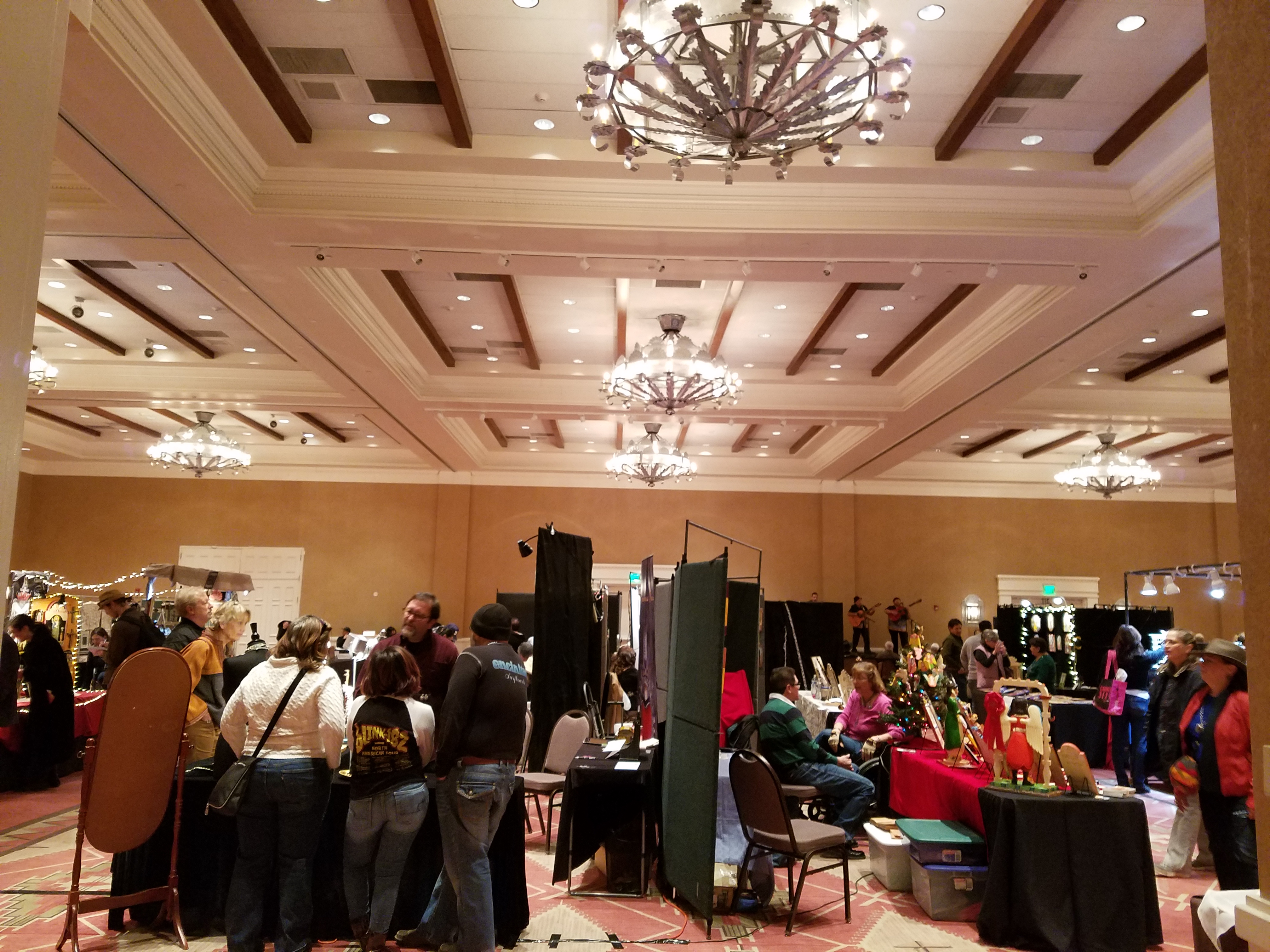
A variety of Mariachi bands played to the crowds as the curious and collectors wove in and out of the rows of talented exhibitors.
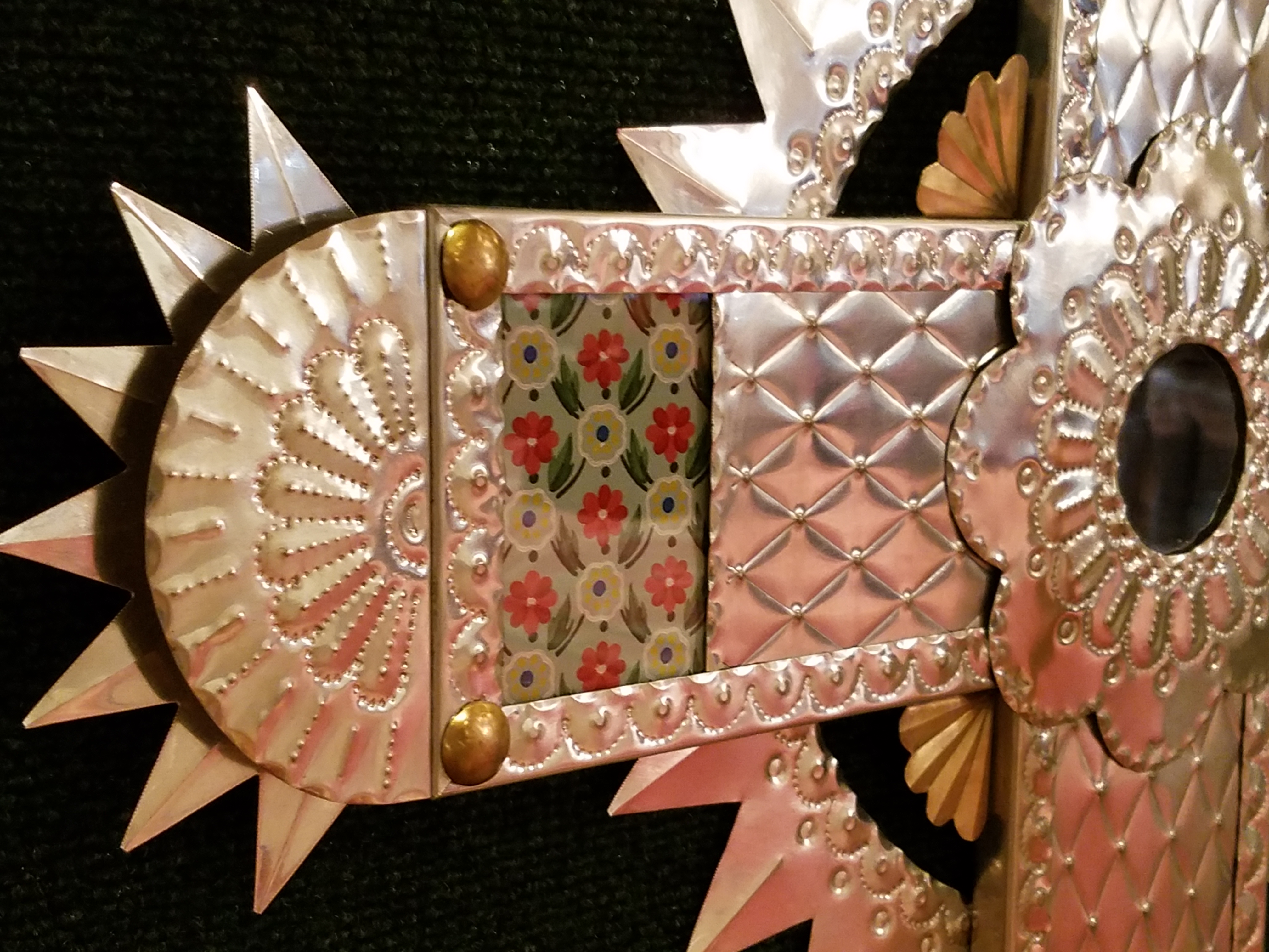
Fine tin-work, dyed and cut straw assemblies, weavings and jewelry presented an incredible variety of work. Fine crafted furniture and spectacular wall pieces were displayed by master carvers. It was a collection of world-class art and fine craft.
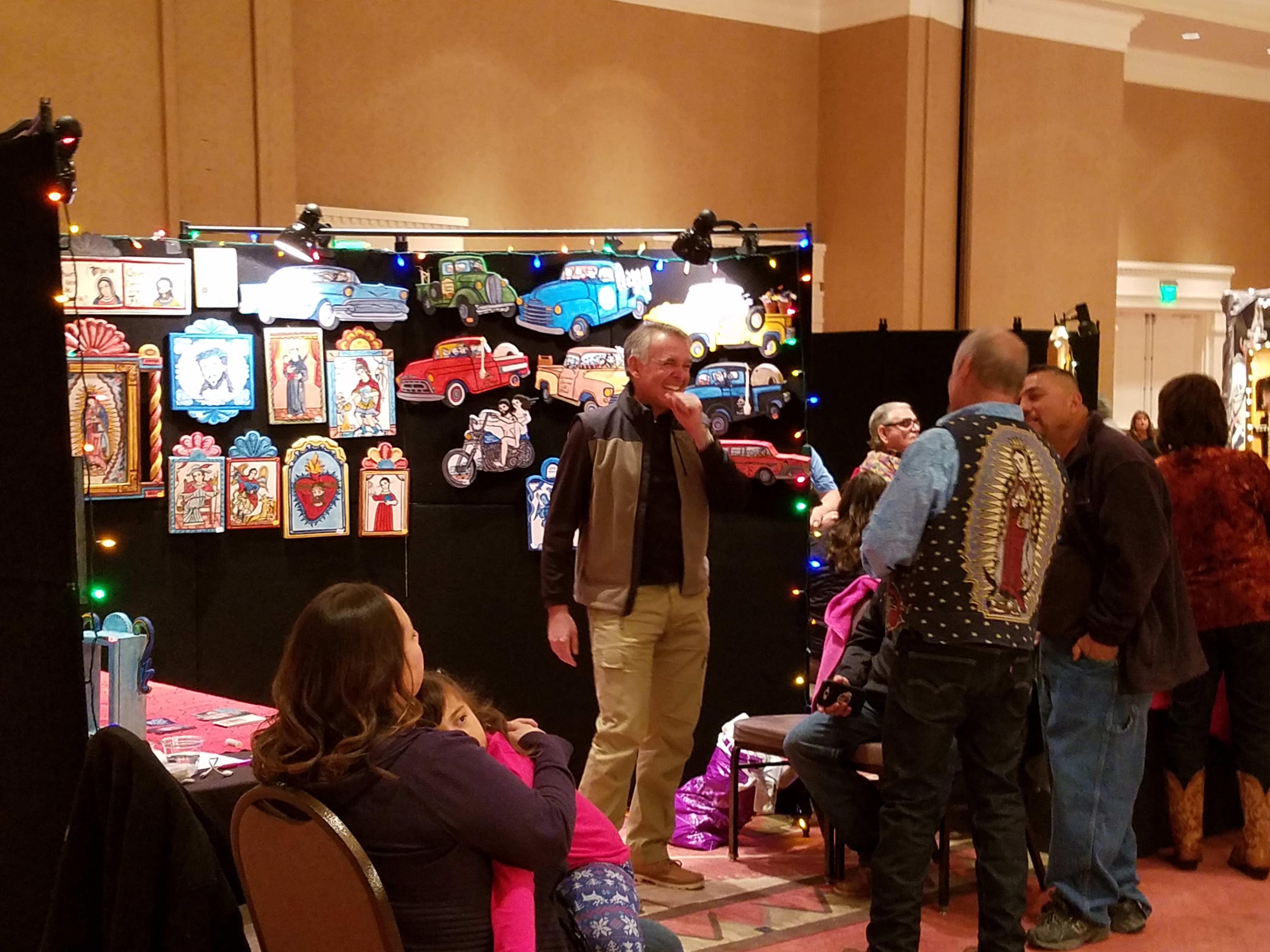
Crazy interpretations of his beloved traditional retablos are Charlie Carillos commically contemporary interpretations of vintage cars with saints at the wheel. Humor that is received with mixed reviews. But his talent is undisputed. Here he entertains at his booth with his colorful delivery.
By startling contrast, the rich warm colors and traditional reverence that Catherine Robles-Shaw displays in her incredible carvings and painting techniques, wonderful detail and soulfully expressive faces. Her rich hues are Old World in their sensitivity to tone on tone and dark earthen colors outlined and enhanced with ribbons of gold.
Daughter, Roxanne Shaw-Galindo, a respected santero in her own right has continued to carve her own niche in this exclusive world of bultos, retablos and other manner of fine carving and painting.
The mystic powders carefully sought and gathered from ancient land forms and mineral-rich geology diluted with water and even the precious red of the rare cochineal all contribute to the luminous, translucent colors that read so differently from other media.
And further contrast is Frank L. Garcia with his primary colors of electric blue, yellow and red shining off of his wood surfaces. Uplifting and extracting smiles from all who pass his booth.
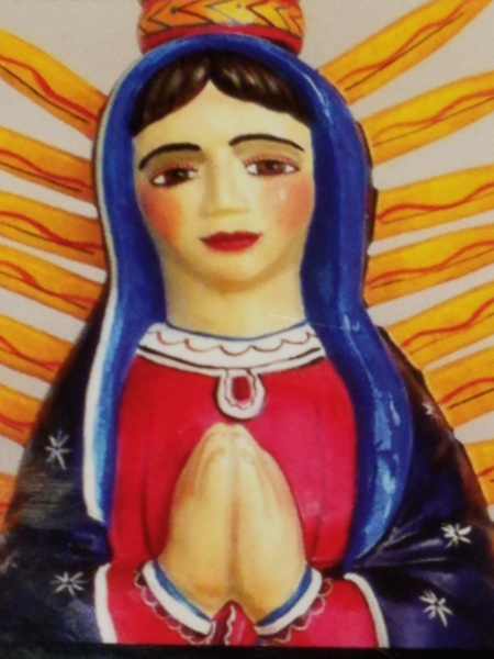
Oh the faces!! Each santero has his or her own style. Like fingerprints, the santeros each have cultivated a unique “look” to their work and expressions of their subjects. The eyes say so much. Mournful, cheerful, pensive or stony stares, the characters are exclusively their own. Despite the similarities bound by tradition, each artist presents a specifically unique style which conveys incredible personality. These signature expressions, as individual as fingerprints, represent so distinctly each inimitable artist. Despite the similarities bound by tradition, the methods and materials, each shine with startling individuality!
Here santero Ruben Gallegos poses with Mary Anne Green an avid collector and fond owner of several of Gallegos’ work.
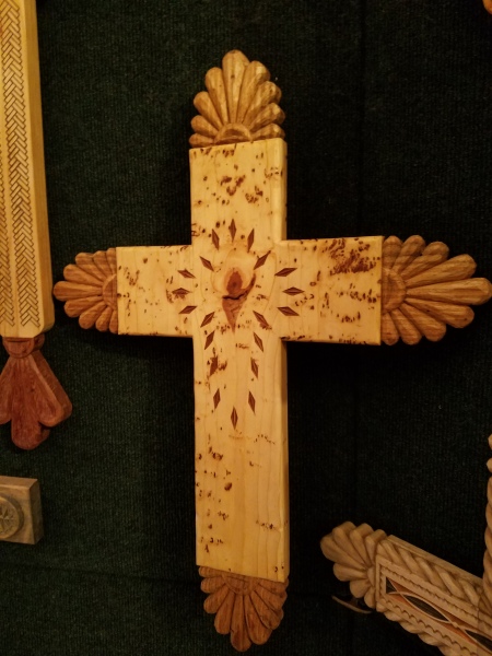
Lee Valdez hunches over his soon-to-be cross carefully carving the rope detail around the edges. Light pencil lines define the decoration that he follows with remarkable precision – and look – he is sporting two pair of glasses stacked atop one another – which he says works just fine.
Behind him displayed on the wall are several other crosses in all manner of carving and decorative woodwork. One piece in particular is a yellow pine cross that is riddled with dark cinnamon colored worm holes – splattered actually – creating a spectacularly natural design. And further marks of nature that Lee captures are a knot hole and adjacent burled wood that he places dead center in the intersection of the cross. The four end pieces are carved from a piece of butternut wood providing the perfect natural contrast to the yellow pine yet complimenting the dark flecks of the worm holes. Quite a find, in this amazing piece of wood he spied in a hardware store, and remarkable sensitivity to isolate and assemble the various pieces to create the whole.
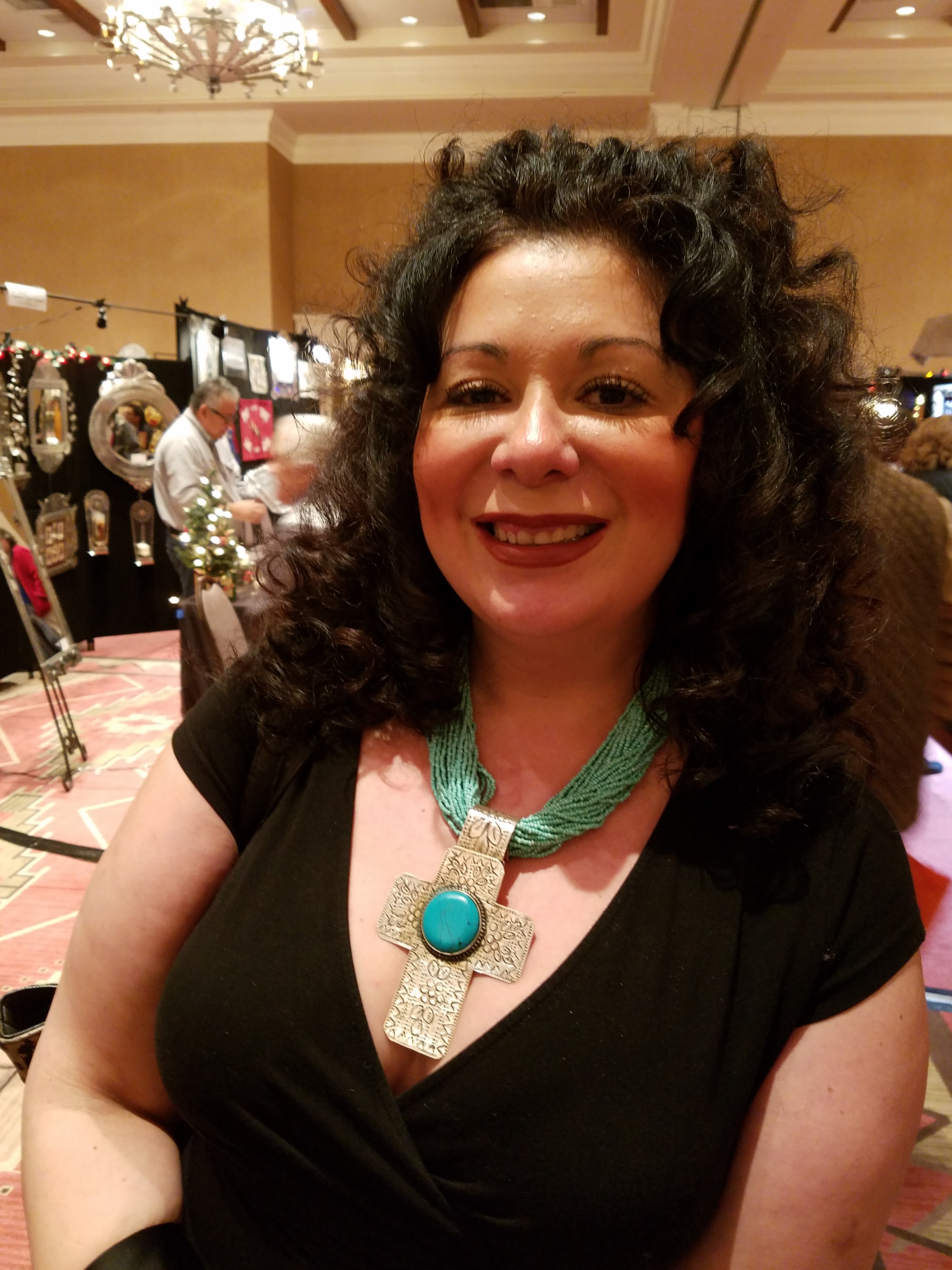
A striking woman caught my eye. Her thick curly black hair and handsome silver cross strung on a multi-strand necklace of turquoise made a big statement amidst all of the art and drama. Meet Vanessa Baca.
As we visited briefly I learned that she is a fellow blogger and I am sure it was fate that we met as her foodinbooks.com is a wealth of observations centered around great books and fabulous food within described. She writes with great depth of description and observation AND she breaks it down and teaches you how to prepare that about what you have just read!
Sean Wells painting as we watched, represents her art in her own striking appearance. Dark hair whipped and twisted with a stylish flair and topped with screaming orange flowers.
Wells’ images are equally colorful, happy and festive. If not her fine retablos, You might recognize her Fanciful Day of the Dead wine bottles and famous, collectible Lottery Scratchers! Find her on Etsy!
It was an inspiring day of extraordinary art in a genre that is so historically and regionally rooted with original methods and patient execution paired with the artistic imaginative people who practice and study this fine work. Thanks so much Mary Ann for a rare treat!
Today YOU can go see this final day of the 28th Annual Spanish Market 2016! Get over there!


 to basic block alphabetic
  to the loop de loops of beginning cursive,
  the lessons encourage and open doors to very personal and individualistic communication.