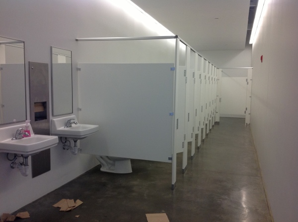
Given the opportunity to improve upon a recently completed taproom, we instantly realized that painting the entire interior would be the best quick-fix. But that instant gratification was not enough to give this needy/hungry interior some meat to get it off and running.
Atmosphere in interiors is so much a part of the brand, the identity, and the success of a business. Popularity is based upon a certain comfort level, the clientele who gravitate there and the product that they are effectively providing. Whether that is food or drink or both, the atmosphere, (including lively enjoyment by clientele), service and food/beverage – all contribute to a successful establishment.
This does not mean high-end, elegant, fancy or even simply hip – although the definition of hip can vary from spare unpretentious and un-self-conscious funky, to studied funky, to affected stylized, to trendy hip and happening,…but, it does NOT always have to represent expensive interior design.
Yet a strip center generally lacks pizzazz and to install a taproom into that generic scene takes some creativity. That does not mean money – it means just what I said, creativity. And creative interior design is all about ingenuity and balance.
Balance in interior design is key. This interior was filled with hard, cold surfaces – concrete floors, silver-grey laminate table tops, brilliant silver table bases, grey chairs, polished white granite bar top, silver laminate bar face, silver metallic wall sconces, glistening silver under-scaled chandeliers, white walls with cobalt blue accent wall. Brrrrrrr….makes me chilly just recounting the scene. And this was summer! Imagine this setting with crisp cold wind blowing outside and snow blanketing the mountain – not the place you want to gather for a beer in the wintertime!!
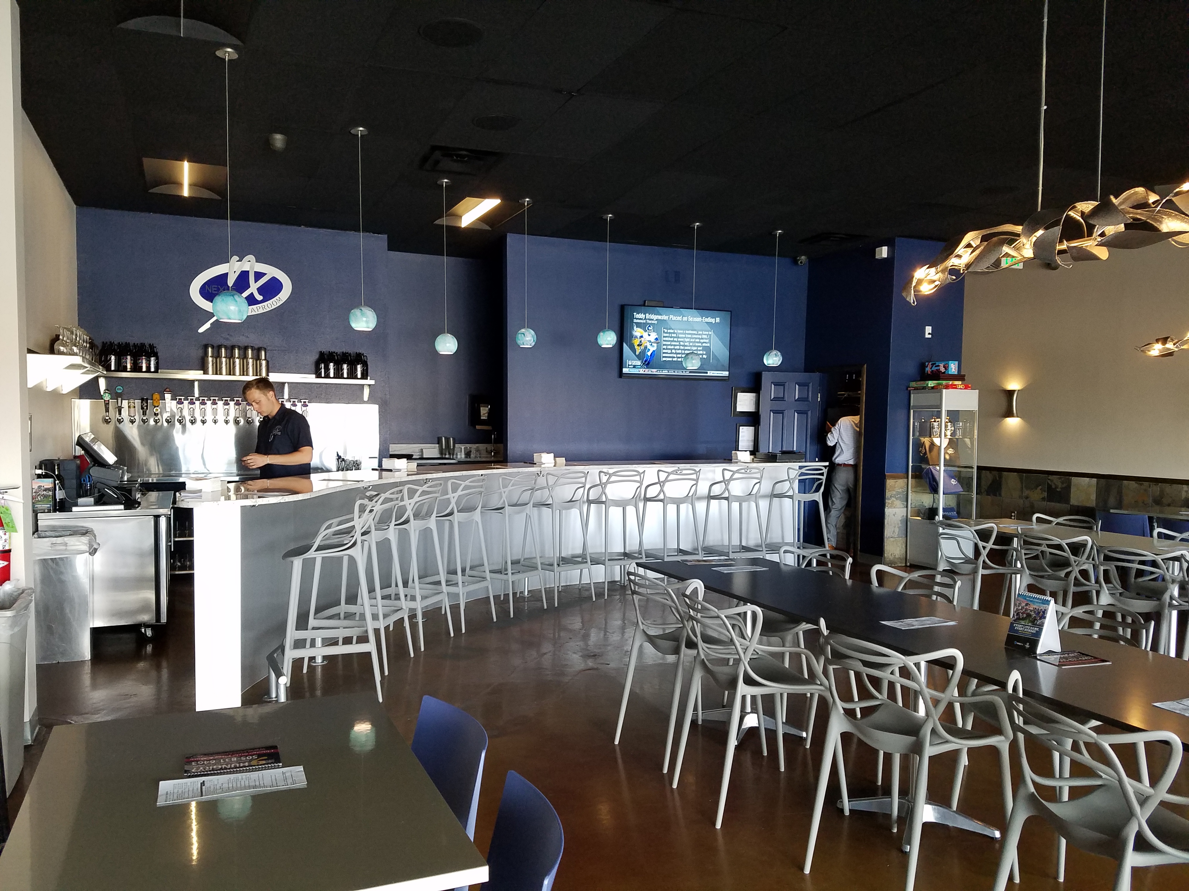
To instantly soften and add warmth, we painted all walls a dark taupe. The soft, mousy grey/brown color pulled from the existing slate wainscoting to tie the two wall parts into a unified “read.” It gave the silver elements (especially the sconces) a contrast – which results in “interest.”
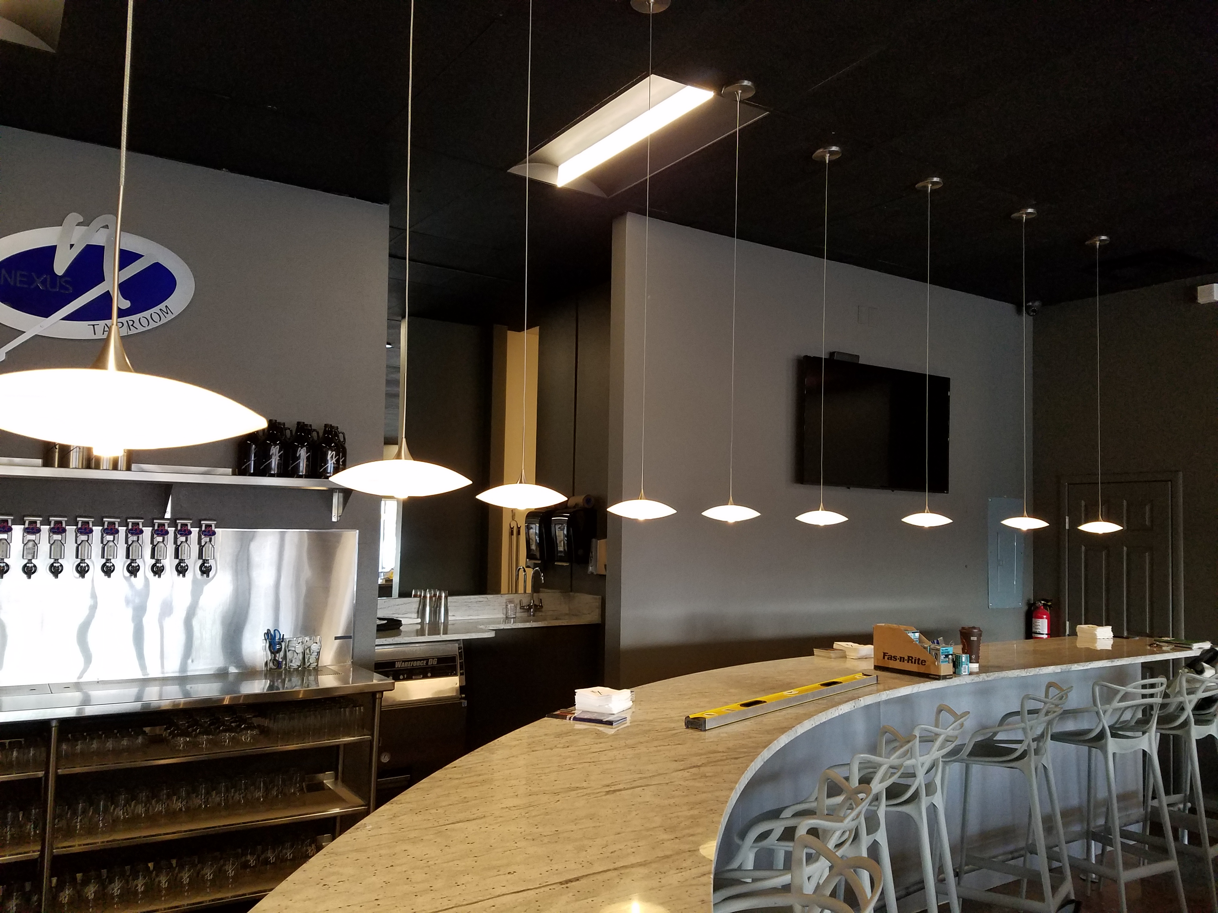
The back bar was bland even with the new paint color and to add dimension and animation we mirrored the rear center section. This illusion added depth and interest to carry the ceiling through and add a mirrored storefront and exterior reflection which created an illusion of space and character where there had been nothing.
But unlike most back-bars, this area was conspicuously naked. A couple of stainless shelves housing stemmed wine glasses, and growlers felt spare. Plus the right side of the back bar was closer to the bar and the patrons were a mere few feet from a plain, painted sheet-rock wall. Yes, there was a large format TV screen above, but straight ahead – it was just blank wall.
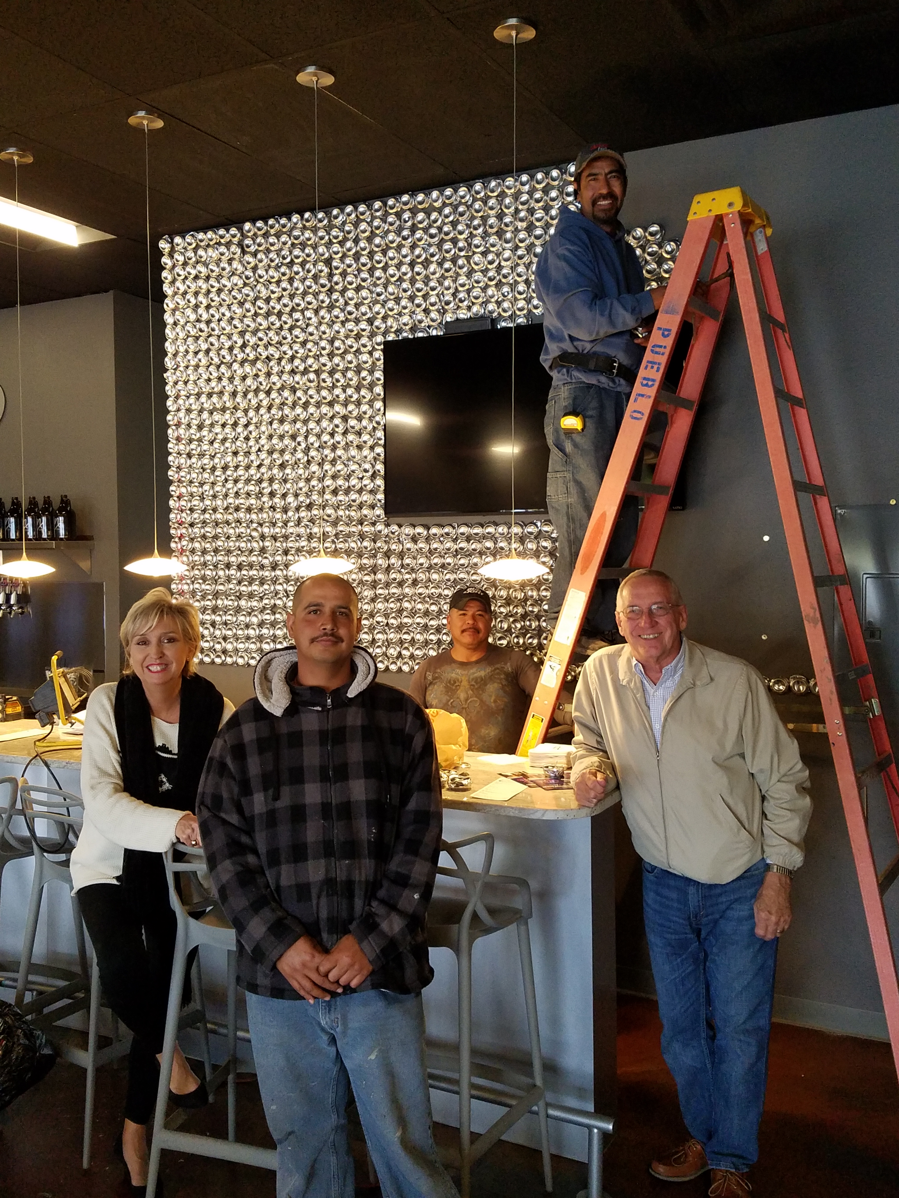
In the wee hours of the morning, as I tossed and turned for a variety of reasons, I jumped from thought to thought, project to project, and personal concerns pelting all the while in a seemingly endless stream of insomnia. Yet, it was during the angst that the idea of the taproom being named “Silver”…silver…beer cans are silver/aluminum…beer cans crushed and nailed to a wall…texture, silver (theme of the taproom) interest – maybe?- all converged into one of those light-bulb moments of revelation.
And yet you might say – “silver…aluminum…more cold and hard. Why would this be an asset to this interior?” I felt that the texture and dimension of the cans would add more interest than the perceived cold and hard of them. The pockets of folded shadows and the relief off from the wall, paired with the over-all massive full-wall of pattern, would all contribute a positive design element to the scene.
As I pictured the wall of circularly flattened aluminum cans in my in my mind’s eye (a tool that I employ daily while envisioning concepts and finished products well in advance of their fruition), I furthered the concept to encompass possible bar games. Yes, derived from this perfect grid of circular aluminum discs, I began creating games in my head. A bar is often animated by bar games and this was just another opportunity to interact using this unique wall-scape. Since that initial concept, I have created 3 different versions of the animated interaction in the form of games, on this fantastic Can Wall.
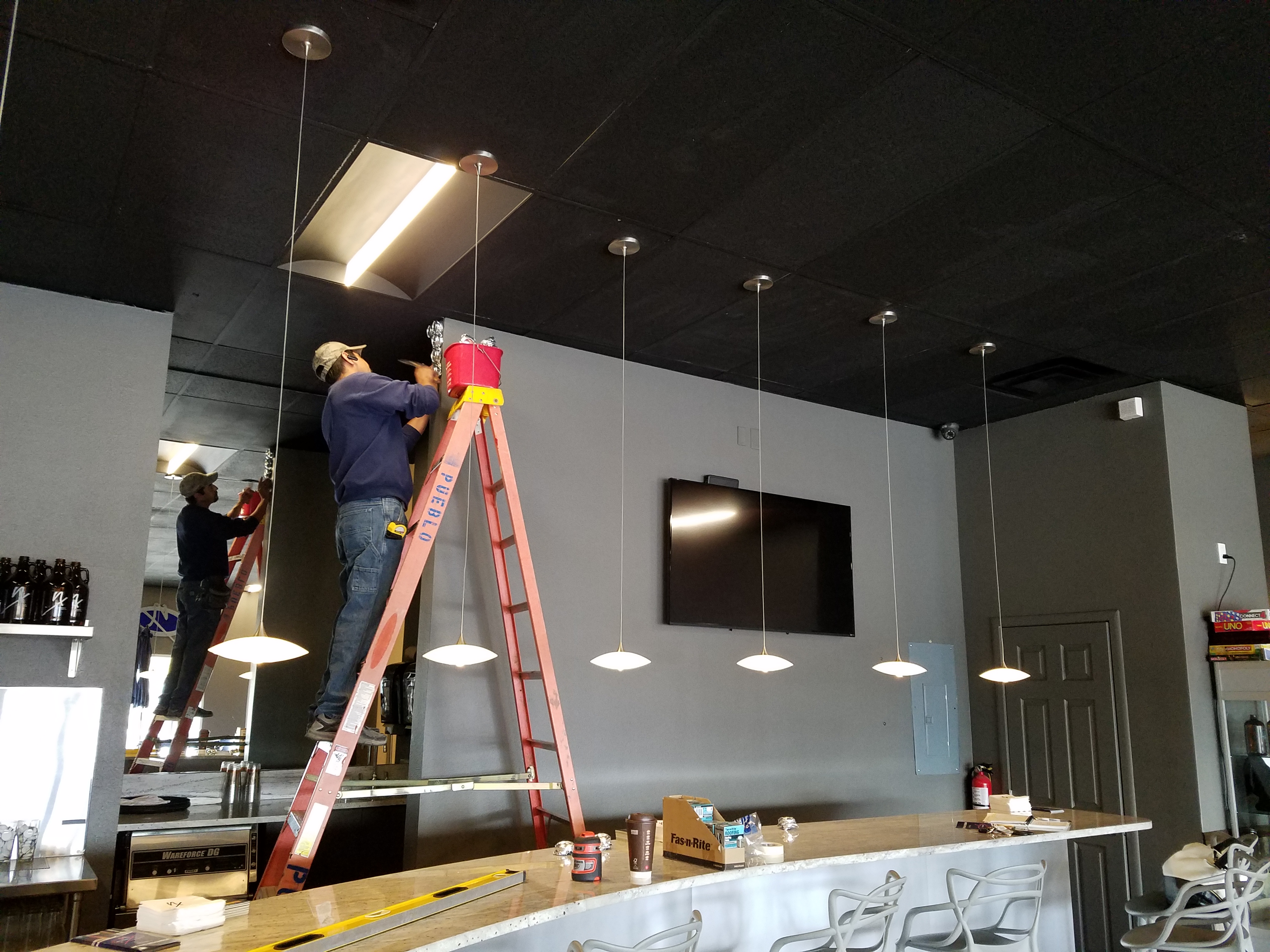
So with great patience, Enrique planned the layout with literally laser precision in a perfect grid. We counted the expected number of cans vertically and horizontally aligning with the brilliant red light beams. The previously crushed cans were laid out on a table – well a handful of the 3,200 that we had prepared for the wall. It was determined that punching the nails into the cans prior to installation would expedite the process of affixing them to the Can Wall. Labor intensive from start to finish, this wall was a great accomplishment for a devoted few.
As the cans were laid out on the table – initially upside down exposing the crinkly open side (devoid of tops), I instantly LOVED the complexity of the depth, texture and shadows. A tight, random application of them would have resulted in a fabulously complex matrix of design. But upon closer inspection, the “texture” was really raw, with sharp threatening edges that were not possibly reasonable within close contact with people brushing by. So, lacerating the staff was not an option – even for a really cool textural metallic wall treatment. Perhaps this application will surface in a more appropriate location away from human flesh in the not-too-distant-future!
Like hubcaps fastened to the broad side of a country barn at dusk, the reflective silver discs pop in the flanking darkness.
The process is nearing completion and I will save for another blog sharing the fun and games emanating from the Can Wall, and the entire finished project complete with new warm white pendant discs over the bar and soon-to-install enormous perforated drum light fixtures suspended from the ceiling, over-sized photo images of the brewery behind the scenes and tantalizing signature dishes in the unique category of the Nexus New Mexico Soul Food.
Meanwhile, the take-away here is…balance cold and rigid with warm and textural – along with all the other opposites that attract – when designing be balanced.
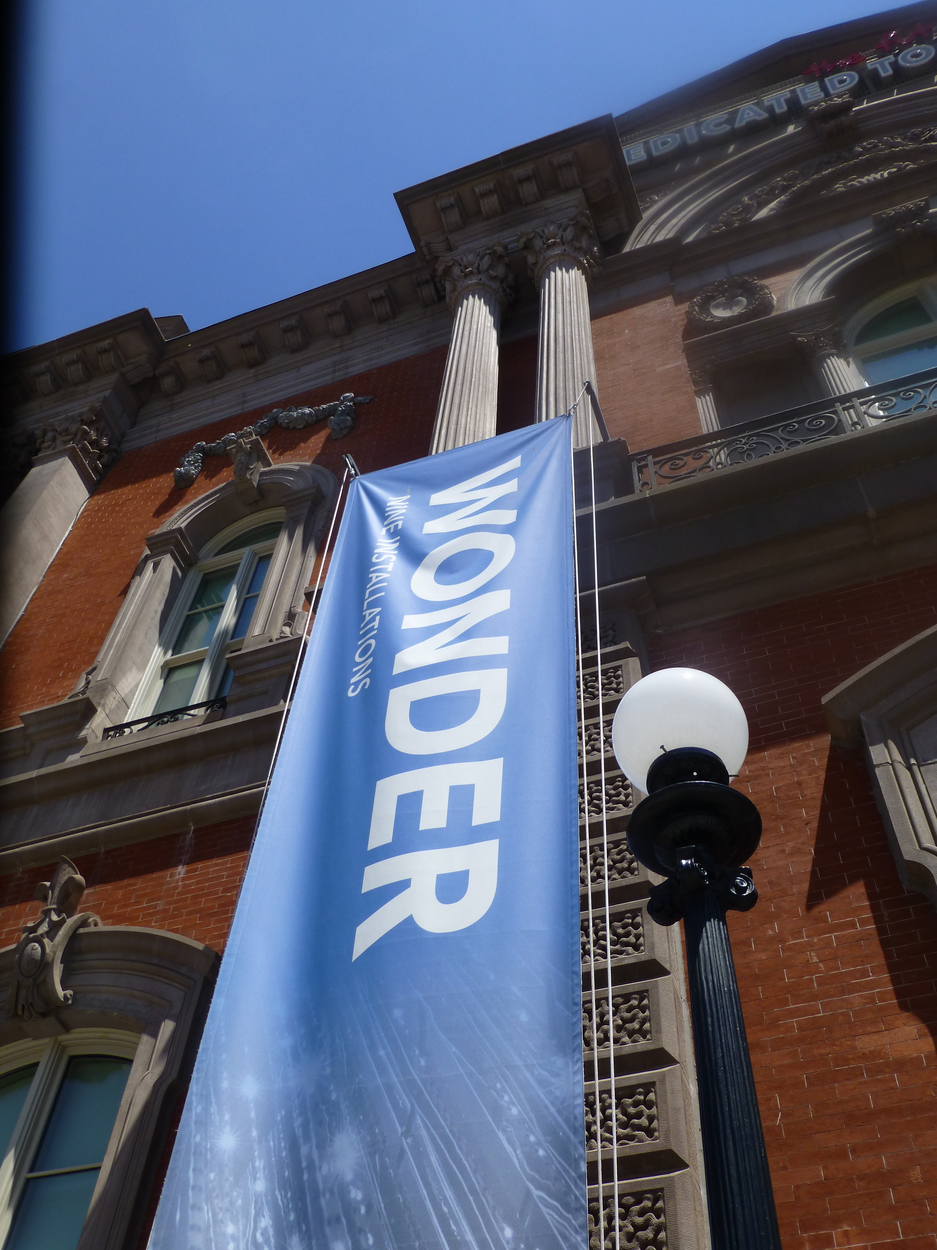 It truly is a wonderment for all ages. This architecturally magnificent building designed in 1859 by James Renwick, in the then chic Parisian Second Empire Style, is the elegant backdrop for a most progressive and creative collection of present day modern artists’ works. Diverse examples, of spectacular displays using simple materials, brought to life in forms unexpected – of grand proportion and thrilling magnitude. Although my learned and previewer cousin had introduced me to the exhibit in advance, it captivated and engaged beyond my expectations.
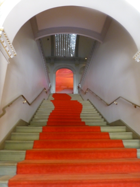
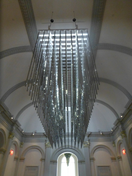 The glitz and bling make such a striking, formal, contemporary statement in this expansive volume that it startles with joyful contrast. The artist, Leo Villareal of whom I had heard in advance, was originally from Albuquerque – where we now call home. A remote desert origination transplanted into the fast pace of the urban centers of the east coast resulting in this shiny experimentation with light, form and wonderfully reflective surfaces. Villareal melds basic high-tech coding to use his own algorithm of the binary system 1s and 0s communicating to the lights when to turn off and turn on – yet sequences that are never exactly repeated .
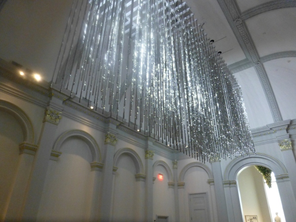 It’s not just your linear code of characters that is read on a screen – here it is an artistic experience shared by all who look up in this gallery’s exciting exhibit.
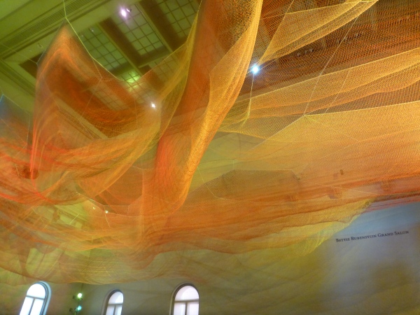 Large scaffolding at the end of the room suggests the manual installation that was required to suspend this wondrous drape catching light and glowing with golden aura.
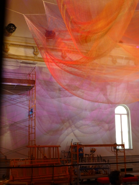
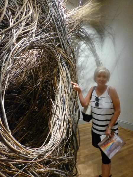 We were at once drawn into these cozy nurturing cubbies of what appeared to be nature – not forms created by man. Nature. Organic and raw, elegant and graceful winding toward the far reaches of the very high ceilings. Like a sculptor who says that the stone dictates what it wants to be and how he carves it – Dougherty knows that the long willow branches have a true will and bend their own way challenging him to work with them toward that goal of partnership with nature. The beauty is in the end result. People of all ages wandered in and out, peeking through window-like openings pretending to be exploring an enchanted forest of wonder.
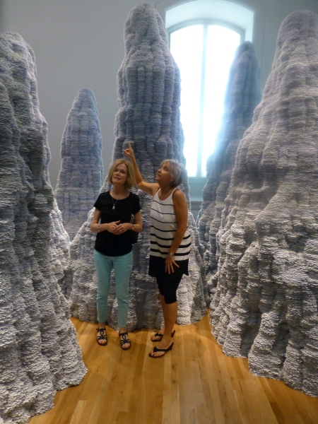 Have you ever experienced Tent Rocks?
 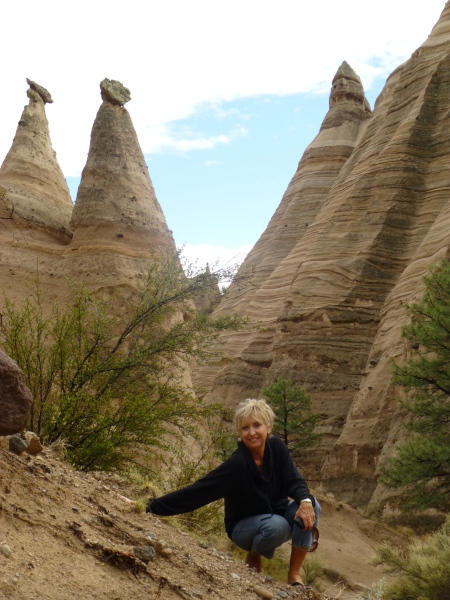 Have you ever looked upward and around and through the magnificent forms created by nature eroding the earth’s strata revealing layers of color and creating spires of rocky towers? It is a magic land just south of Cochiti in a very unexpected pocket of nature’s magnificence in our Land of Enchantment. And the spires that artist Tara Donovan created with stacks of index cards – an overwhelming accumulation of millions of index cards suggest grey spires replicating nature’s wonders in the canyons among the spires of the Tent Rocks.
 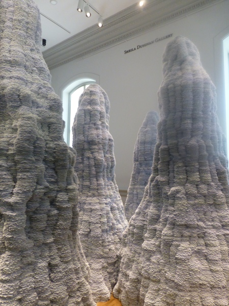 It’s as though a photographer captured this natural formation in black and white. Donovan’s interpretations are tones of grey as a result of the stacked white index cards with slivers of shadow sucking away light in between each of them. Clustered and staggering in height, the “Untitled” towers are inviting to walk amidst and pass between, winding around them like a tourist or explorer or perhaps inhabitant in ages past and present as they have stood for ages.
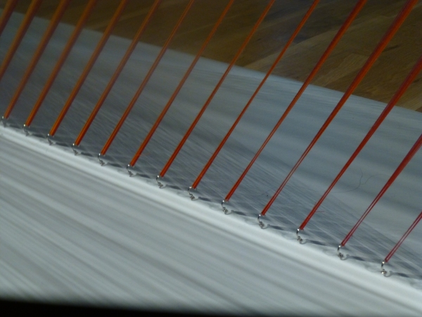 How could a human working only by hand – without computer generated machines digitally fabricating such perfection create this finished piece that we are studying with such wonder? How can this fine tedious seemingly impossible count of thousands of threads be executed with such grandeur and grace by one mere mortal?
 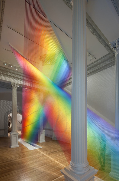 The artist Gabriel Dawe transcends our ability to comprehend the exactness of his beautiful accomplishment with extraordinary patience, precision and creative foresight to imagine the end result and bring it to fruition. It is a wondrous, luminous sculpture of rainbow colored threads inspired by the skies of his native Mexico and current home in East Texas. The fine weavings also inspired by his Mexican heritage are interpreted, stretched and exaggerated here reflecting the light and spectrum of color from its base to ceiling.
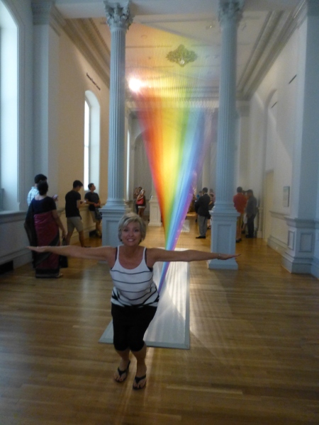
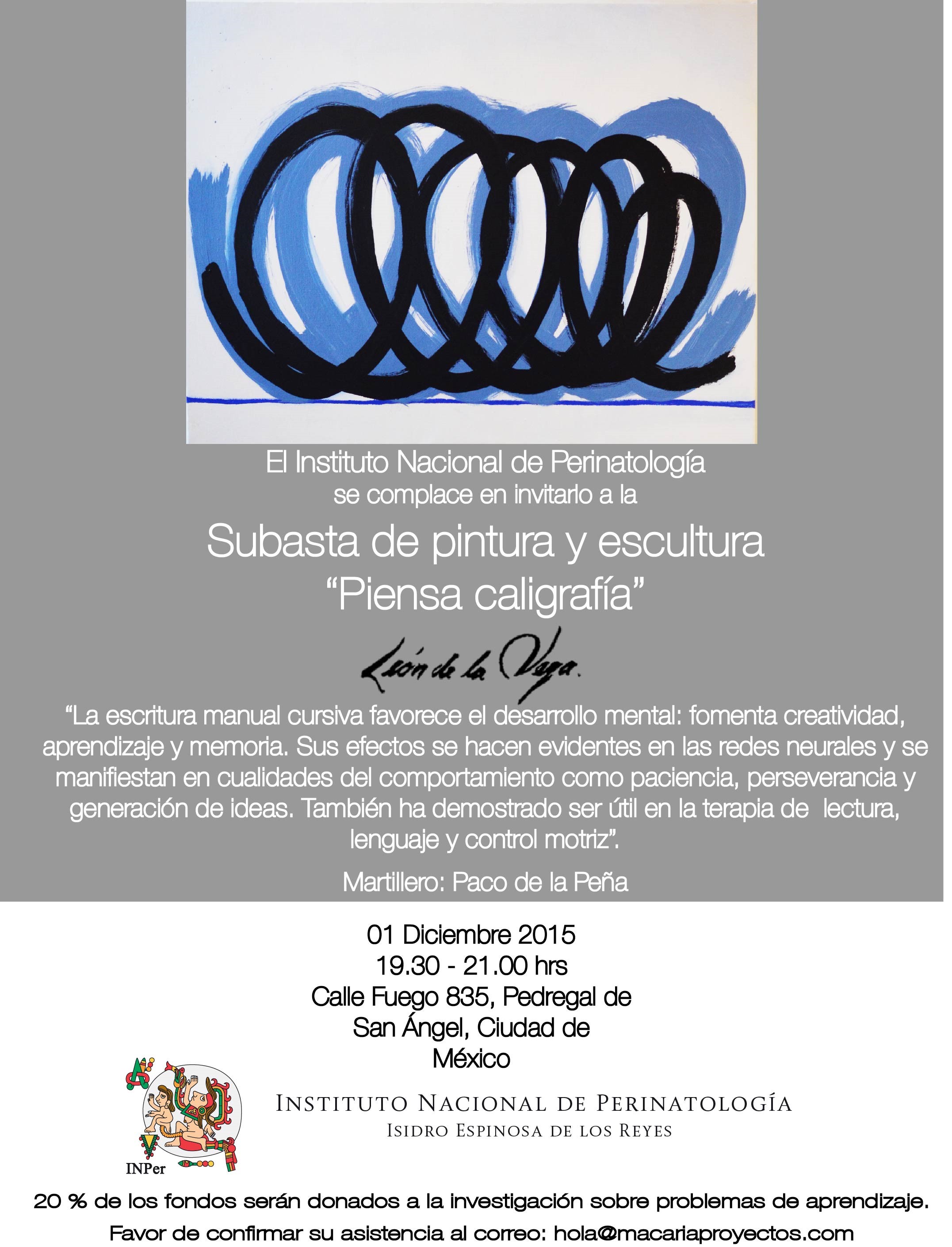
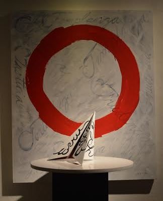
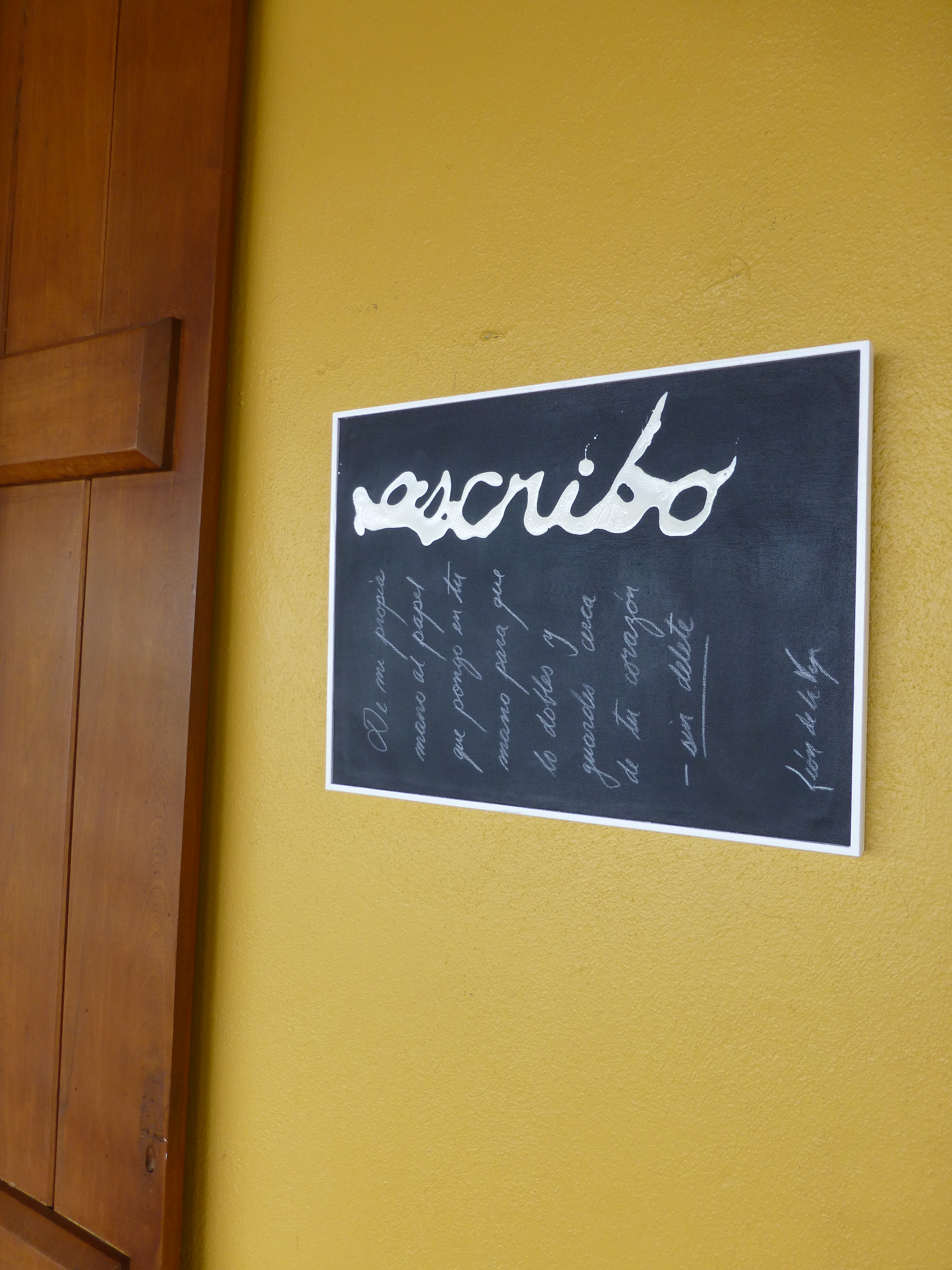
 Today the primary focus was a topic with which everyone seemed to view from the same perspective. All were in avid agreement as they discussed the recent exhibit in Mexico City from where the artist, Leon de la Vega, has recentlyjust returned. This significant event was an important auction where part of the proceeds were to benefit the Mexican Institute of Neonatology toward research on children’s learning and therapy and no less to benefit the artist expressing his concerns for the current state of affairs with the lost art of writing by hand.