It could have been a sculptural piece of drift wood or a gnarly tree branch from the woods or a twisted piece of metal from a salvage yard…but the idea is to see things in a different way and once again—as I have done this before— to make something from nothing. And in this case, with no effort or manipulation—just the natural beauty of the found object.
The tide was out making the beach so wide it was like a great runway of wet sand. Scattered on the surface were the leavings of the waves – pieces of shell and polished stones. There amidst the beautiful debris was what looked like the suggestion of an abandoned boat hull—a dried, darkened palm sheath. I instantly knew, this would be another beginning of the tropical table-scape that I am so fond of creating when we are at the beach. 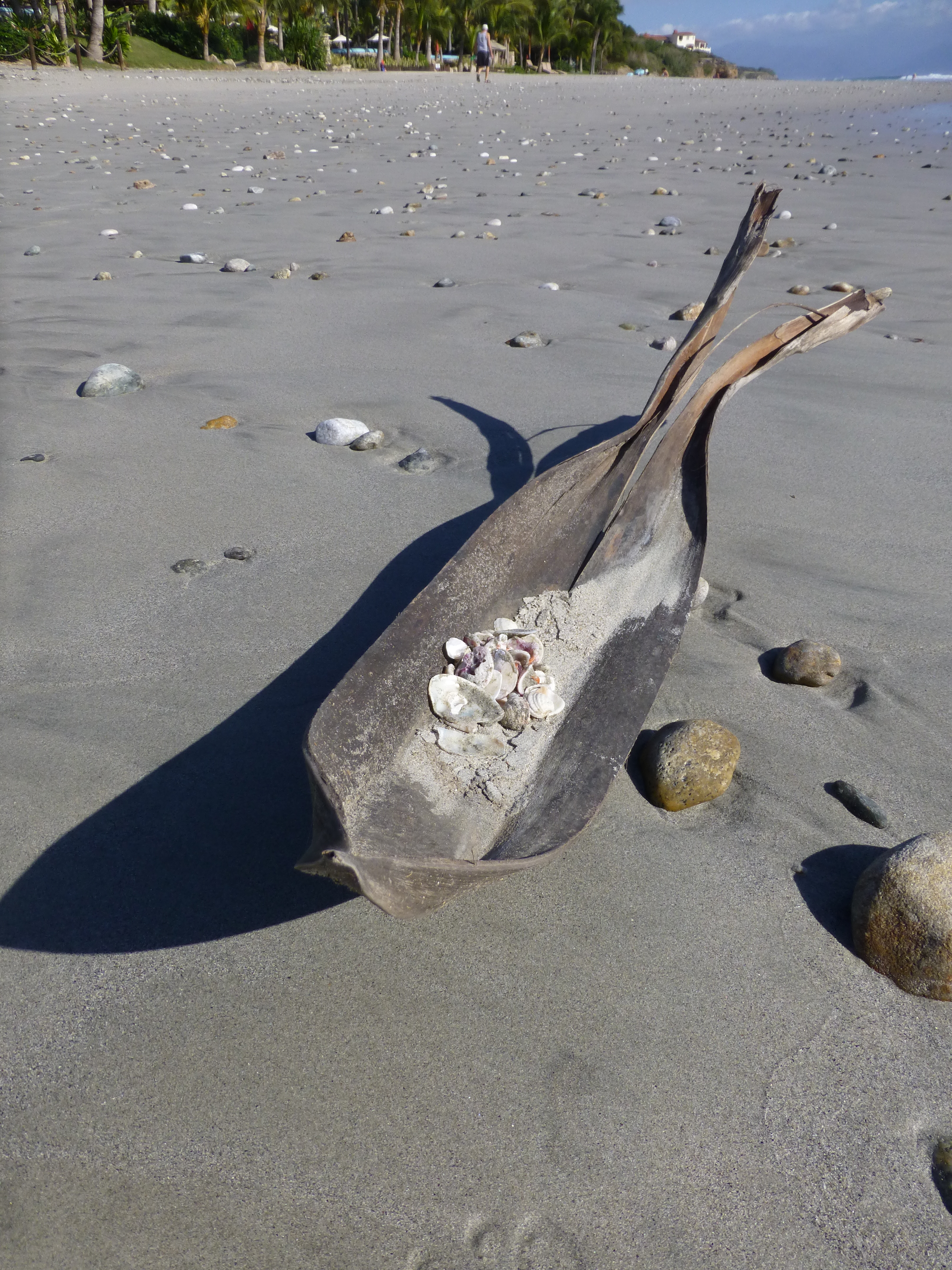
“Creating something from nothing,” my father would often say. He was a great believer in that idea that one man’s trash was another man’s treasure. We loved to beach comb together whenever we found ourselves at the tide’s edge. Sometimes it was tropical and the coral was bleached white and pocked with texture. Fine mesh pieces of purple sea fan and perfect little green “hat” shells would be nestled among the dense collections of heavier piles of white coral.
Then other scenes would find us on northern beaches of the Maryland coast where there was no coral but the ocean would wash multi-colored surf-polished stones onto the shore blanketing the sand particularly at the very edge where the water would curl between the beach and the ocean’s depths. Tiny purple and pink clam shells would peek, being abruptly exposed and quickly bury themselves back into the wet sand moistened with each incoming wave.
On this day, the warm breeze is tropical and the beach is expansive offering rare treasures scattered broadly but sparingly on the pristine surface of sand. It is here that I encountered my centerpiece.
Don of course is saying—”what are you going to do with that? It’s too big. Leave it here.” And I assure him that it is in fact a treasure and that it will be magnificent in the center of our dinner table where we are entertaining 11 for festivities this coming weekend. He, as always, acquiesces knowing that it is futile to stand in the way of my wildly enthusiastic creativity. 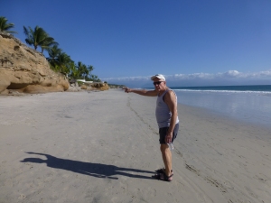
Over the next couple of days, he and I both collect white stones and shells on our daily beach walks. At my instruction, we only collect white unless it is a particularly interesting shell. The idea is to have the stark contrast with the dark hull of the palm sheath.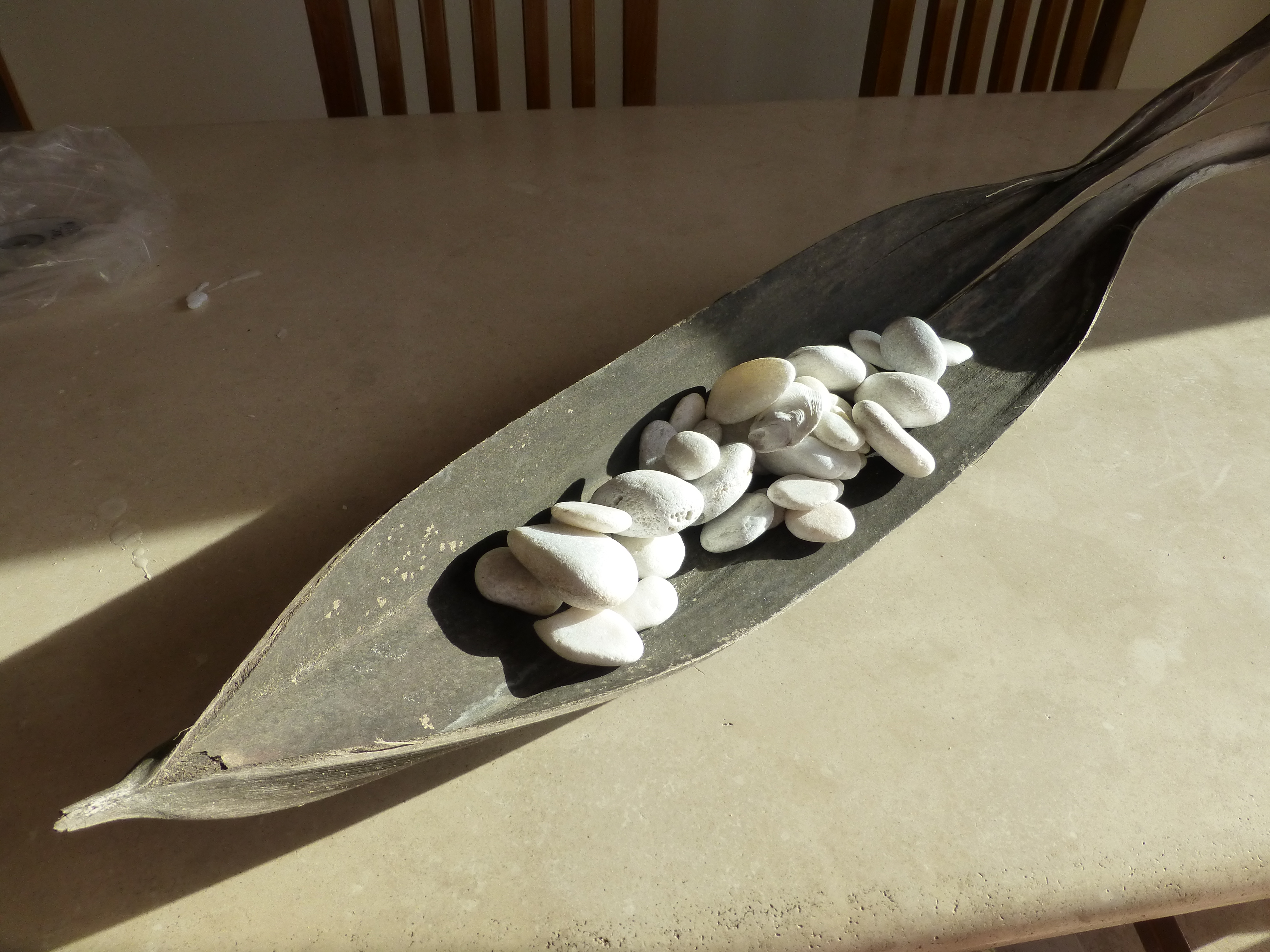
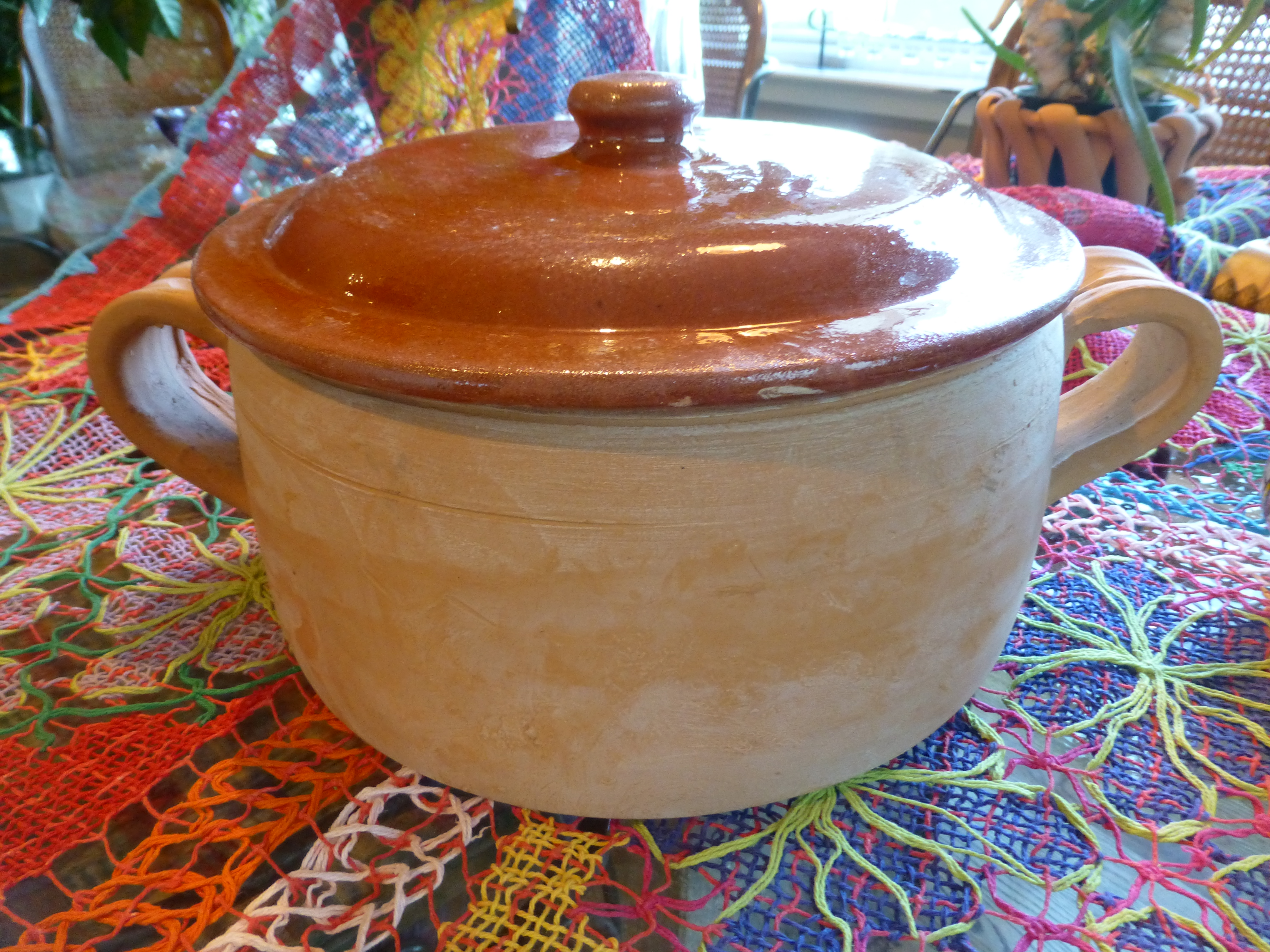
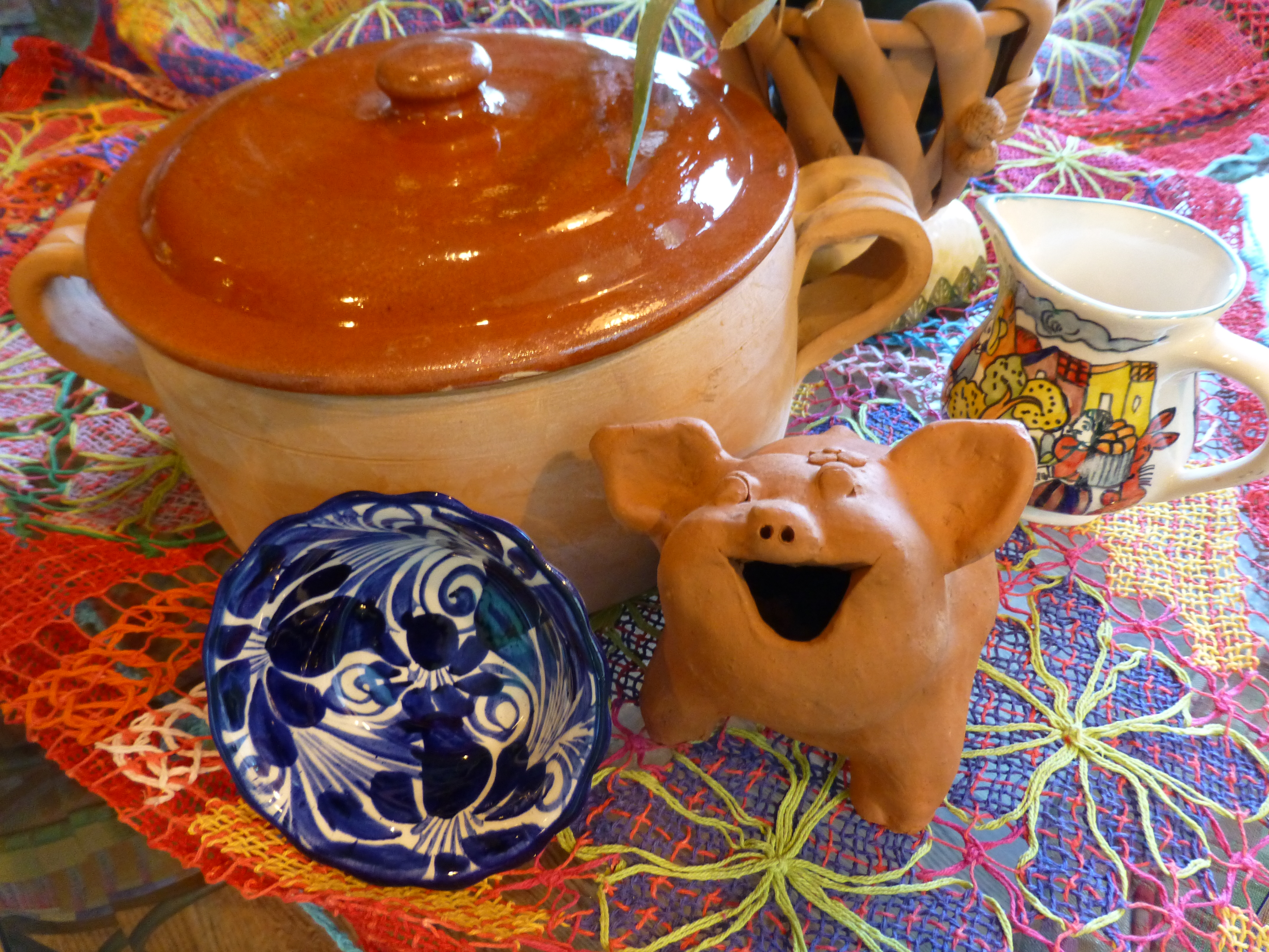
Our dining table is a handsome slab of travertine marble. Laminated to a double thickness and finely finished with a smooth full bull-nose edge, it is the perfect organic surface to build this also very organic centerpiece.
It needs something…the neutral tones are lovely. Yet, the dark espresso brown of the palm sheath with the white of the stones, against the creamy surface of the travertine invites something more. I realize that it can only be enhanced with another layer of organic material – here in the form of the fresh verdant green palm fronds – the perfect punctuation! 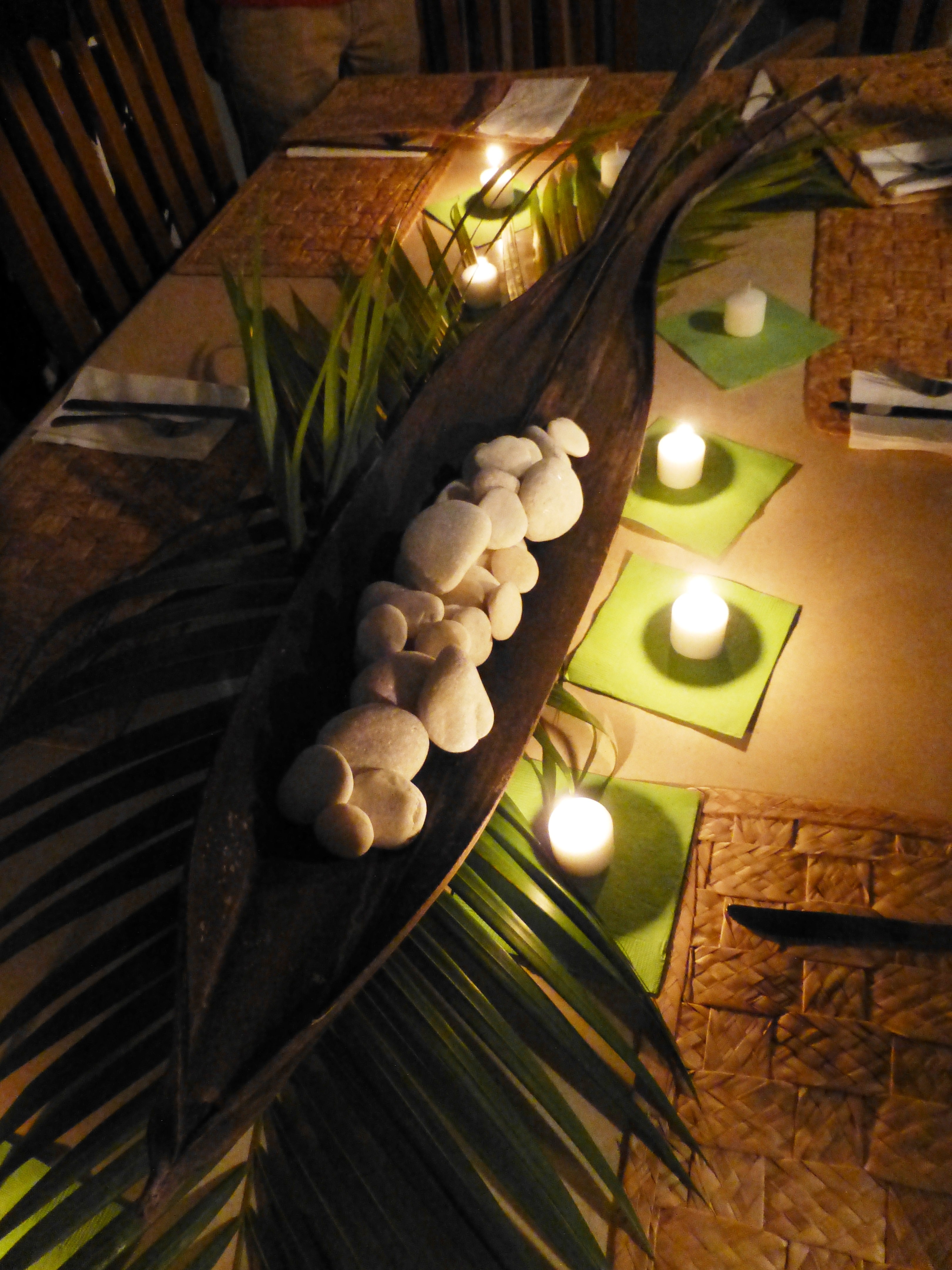
Oh would that I had collected more flat oyster shell halves…they work so well for votive candle bases…but alas, parrot green cocktail napkins will have to do for this last minute detail.
Our woven palm place mats, in their natural dried flaxen color, compliment the rest of the organics on our table. And as night falls, the sun drops beneath the sea’s horizon and twinkle of scattered candles finish our scene. Salud!
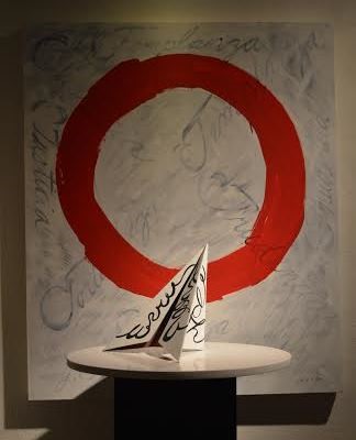
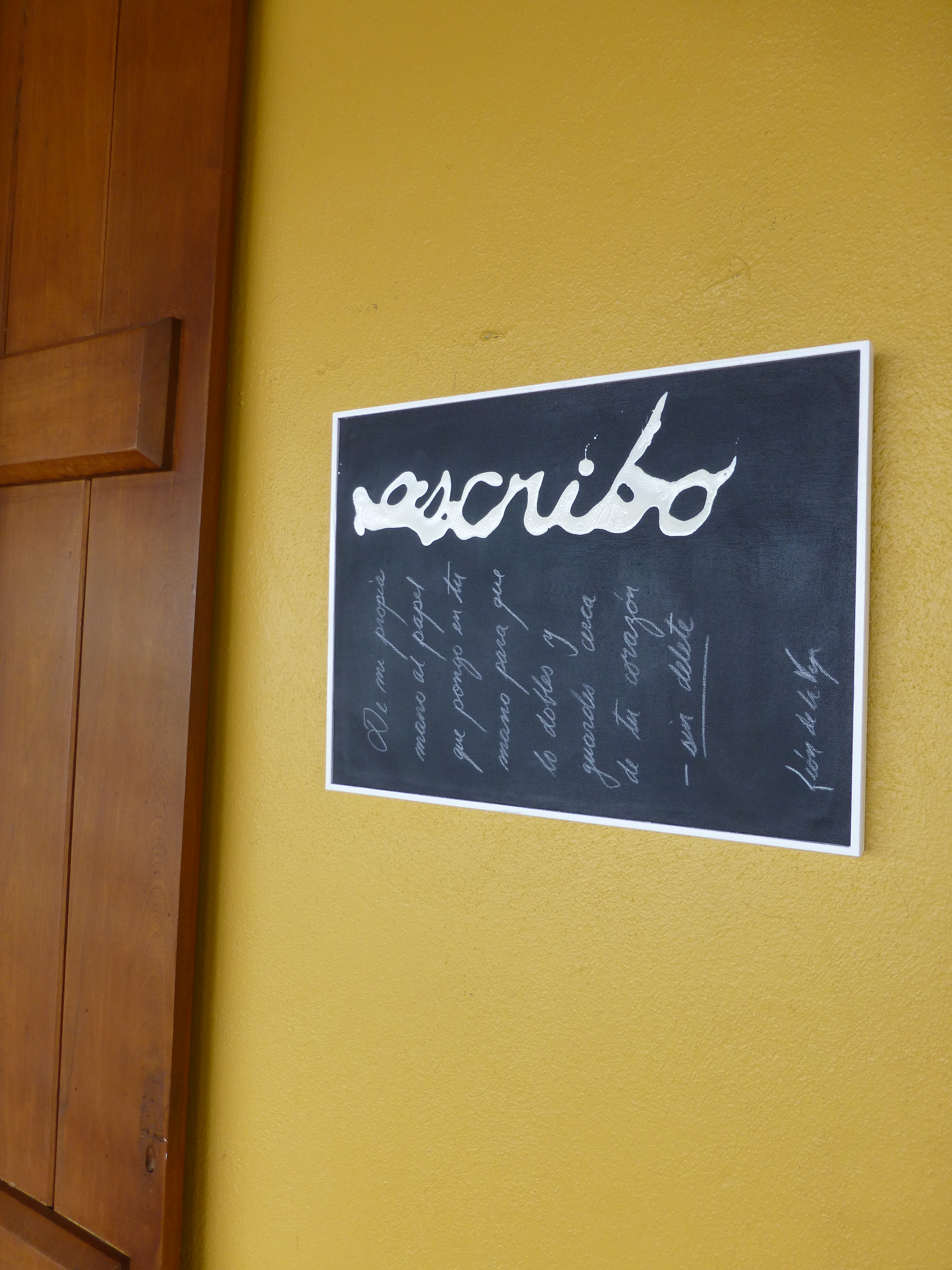
 Today the primary focus was a topic with which everyone seemed to view from the same perspective. All were in avid agreement as they discussed the recent exhibit in Mexico City from where the artist, Leon de la Vega, has recentlyjust returned. This significant event was an important auction where part of the proceeds were to benefit the Mexican Institute of Neonatology toward research on children’s learning and therapy and no less to benefit the artist expressing his concerns for the current state of affairs with the lost art of writing by hand.
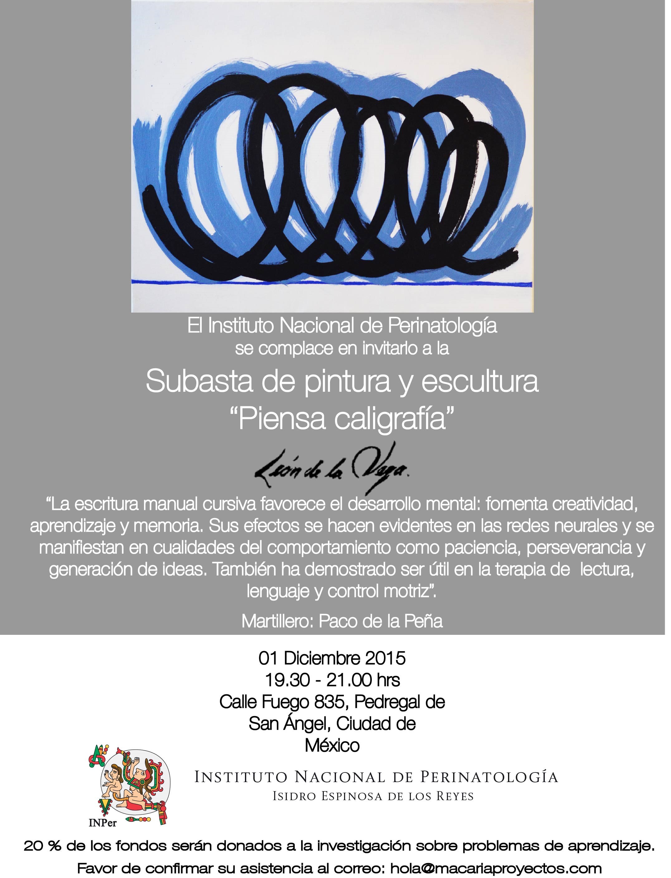
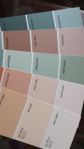
 it is always a representation of what makes us feel good. So ask yourself—what do you need? Not things, but environmentally…what would feel good and what represents a change for the new season and the New Year?
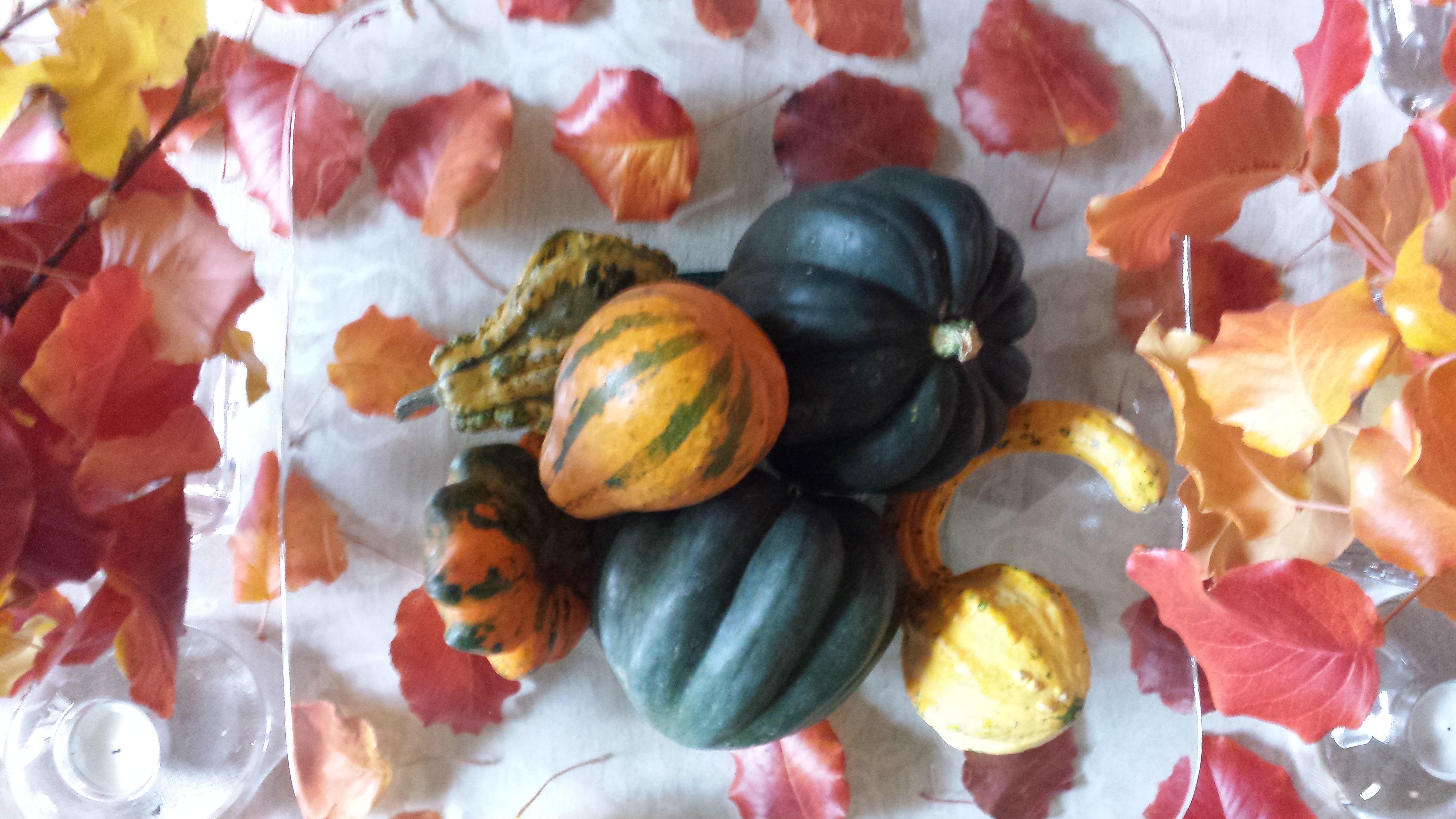 Inspired by the changing leaves, produce of the season—the results are a last burst of strength of warm oranges, golds, rusty reds, and of course the resignation of the fading vestiges of summer leaves…tired comfortable olives. Followed by Christmas, often before Thanksgiving has graced the turkey laden tables—the seasonal colors and decorative clutter insert themselves into our lives whether we like it or not.
 Punctuated with gold and silver…perhaps to symbolize opulence and riches…for adoration and celebration.
 We are not going to deny the frigid temperatures (although this is not true for everyone) of winter, but it is also true of purging the heavy colors of fall and the holidays to refresh with something that is opposite of all the warm tones.
 The blue and white might be the choice of the celebrations because of the Israeli flag, but as Amanda Green writes in Mental Floss: “Blue and white come with universal associations, too. White suggests purity, peace, and light. Blue is associated with the sky, faith, wisdom, and truth. (The expression isn’t “true blue” for nothing.)” We also see silver punctuating the festivities in Hanukkah decorations. Ms Green writes…”some people think the holidays call for a little more sparkle, not to mention the popularity of silver menorahs. Blue and white clearly aren’t just the colors of Hanukkah. They’re symbolic all year long.” True too is the fact that blue and white are a classic color combination in interior design for many cultures over many centuries.
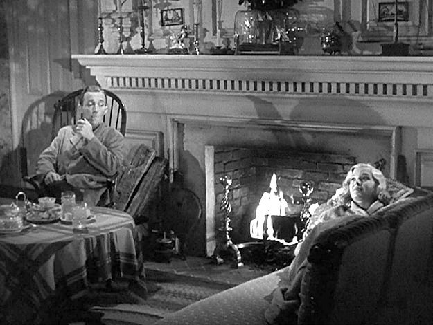 Try it with this still shot from the movie…imagine the colors…it’s fun!
 to which I have added many various colors and textures that I enjoy using throughout the year. Christmas is notoriously red and green accented with the bling of silvers and golds. Chanukah is blue and white…but I enjoy all of the colors to celebrate every occasion! So the many hues of the season can be found in the collection of colorful containers and serving pieces, accents and textiles that I often meld to create the festive celebration of the seasons.
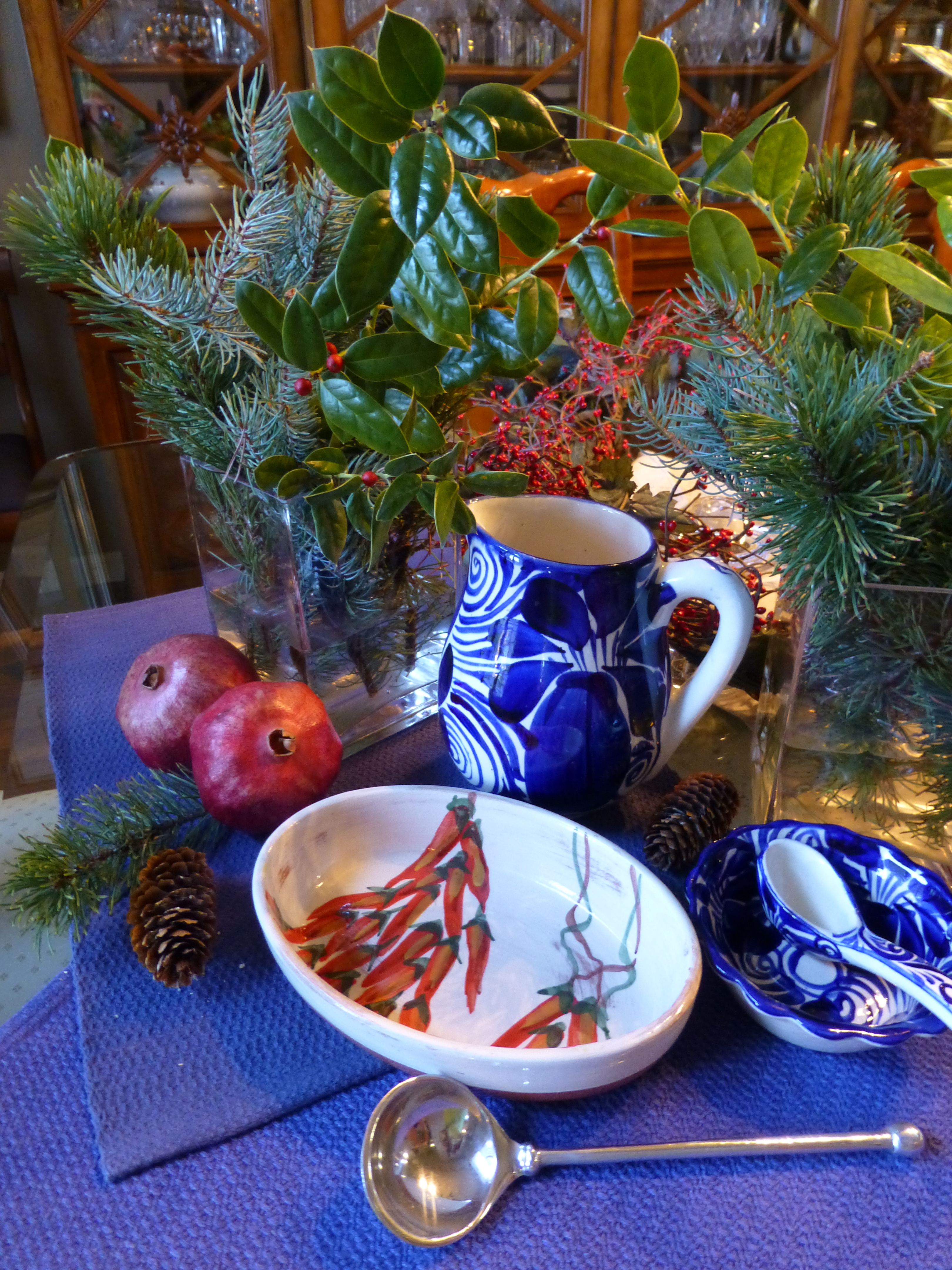
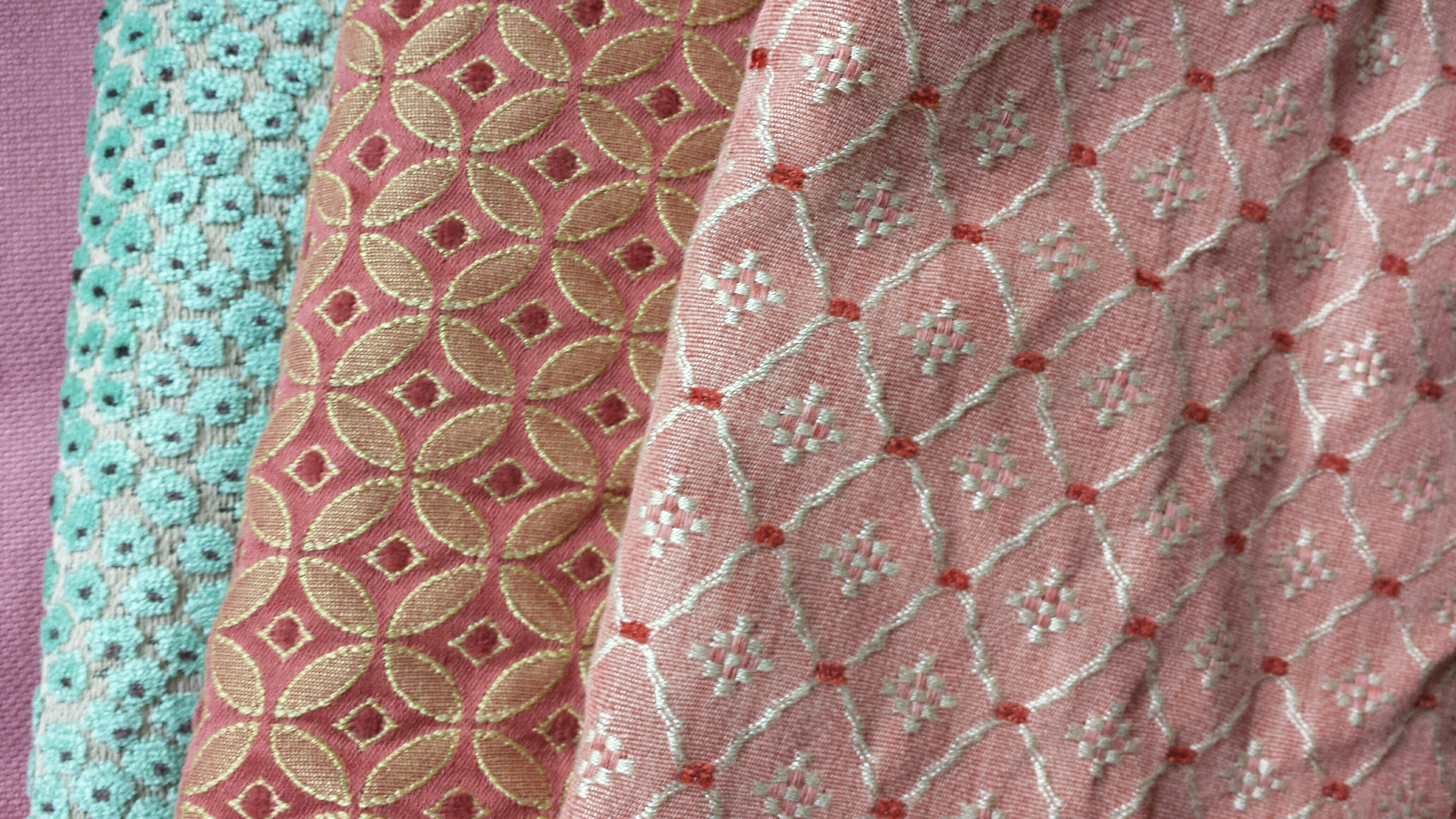
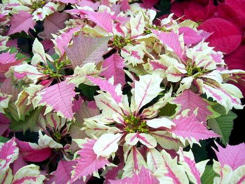
 Notice here, the brilliant colors and intricate open-weaving of the Brazilian lace.
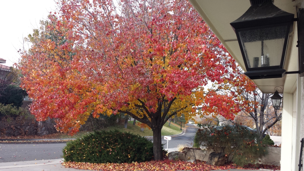 The rich maroons transitioning to corals and rosy tones into brilliant golds and even bright yellows were irresistible. It’s similar to a maple tree with its magnificent range of fall colors but with precious little round heart-shaped leaves.
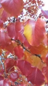
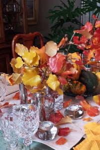 I created a tablescape using short-cut branches in a pair of squatty square glass vessels flanking a large square hand-blown glass platter. In the center on the platter, I gathered acorn squash which we will be enjoying baked with brown sugar and butter later this week, and added some ornamental gourds for their interesting shapes and colors.
 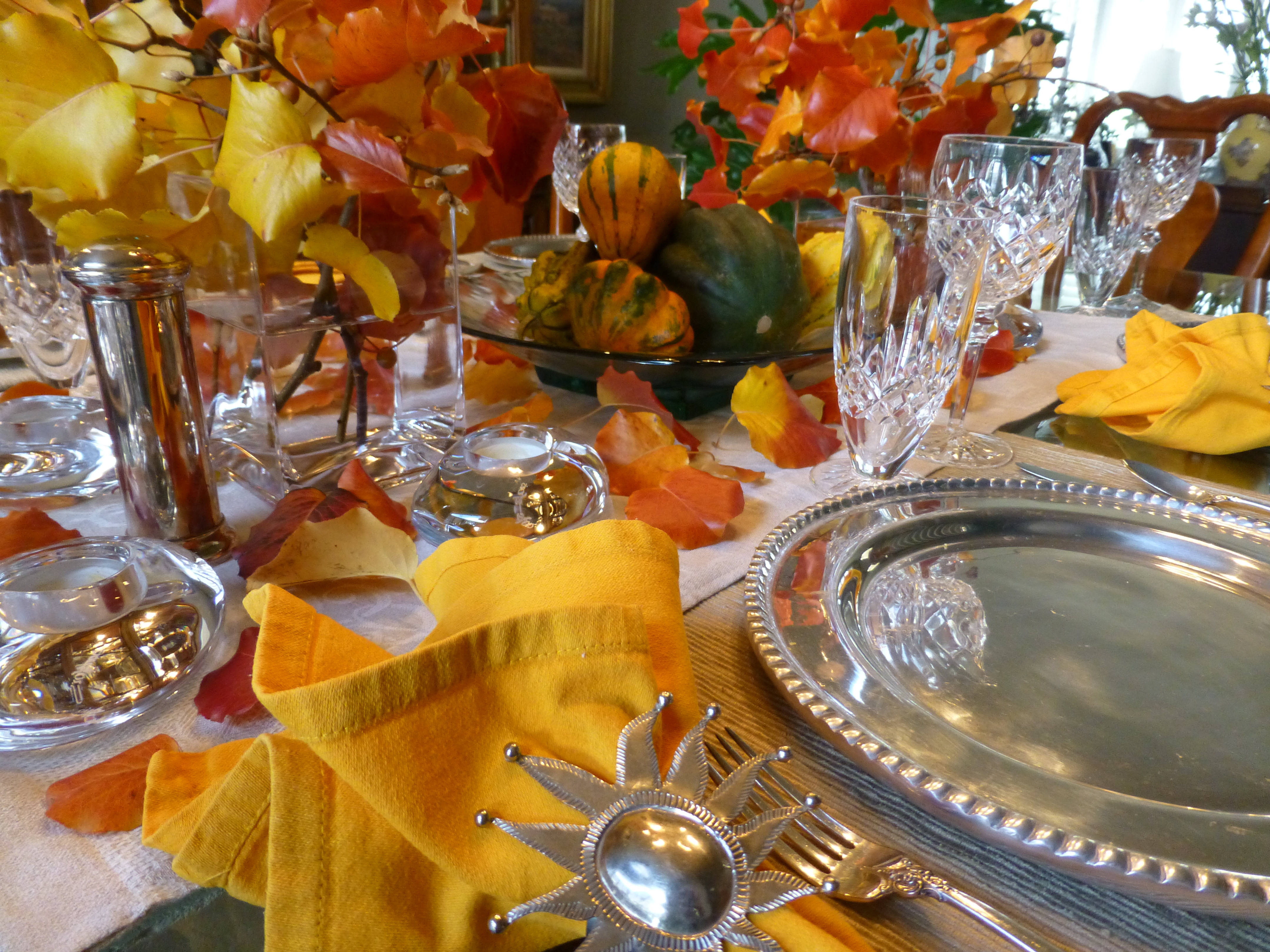 So as I pondered this setting this morning, two days later…the leaves on the table were getting crunchy, the branches were dropping leaves and the water in the containers was a bit cloudy…time to clean it up! Since it seems that everyone is already transitioning to Christmas themes, I thought why not do the same?! The alternative of merely cleaning it up and leaving it barren was a bit anticlimactic after enjoying the spectacular beauty of this recent holiday table. So here again nature was calling to venture forth and scour the yard for the next seasonal statement.
 a few holly sprigs from the bushes in front and jammed them into the same freshly refilled square glass vases. In the center, the neutral linen runner remained and on the glass platter I kept the acorn squash, traded the gourds for electric green granny smith apples and a couple of pomegranates ( I had bought three last week and had already picked my way through the many juicy morsels of one – leaving two to do the red thing in my centerpiece today).
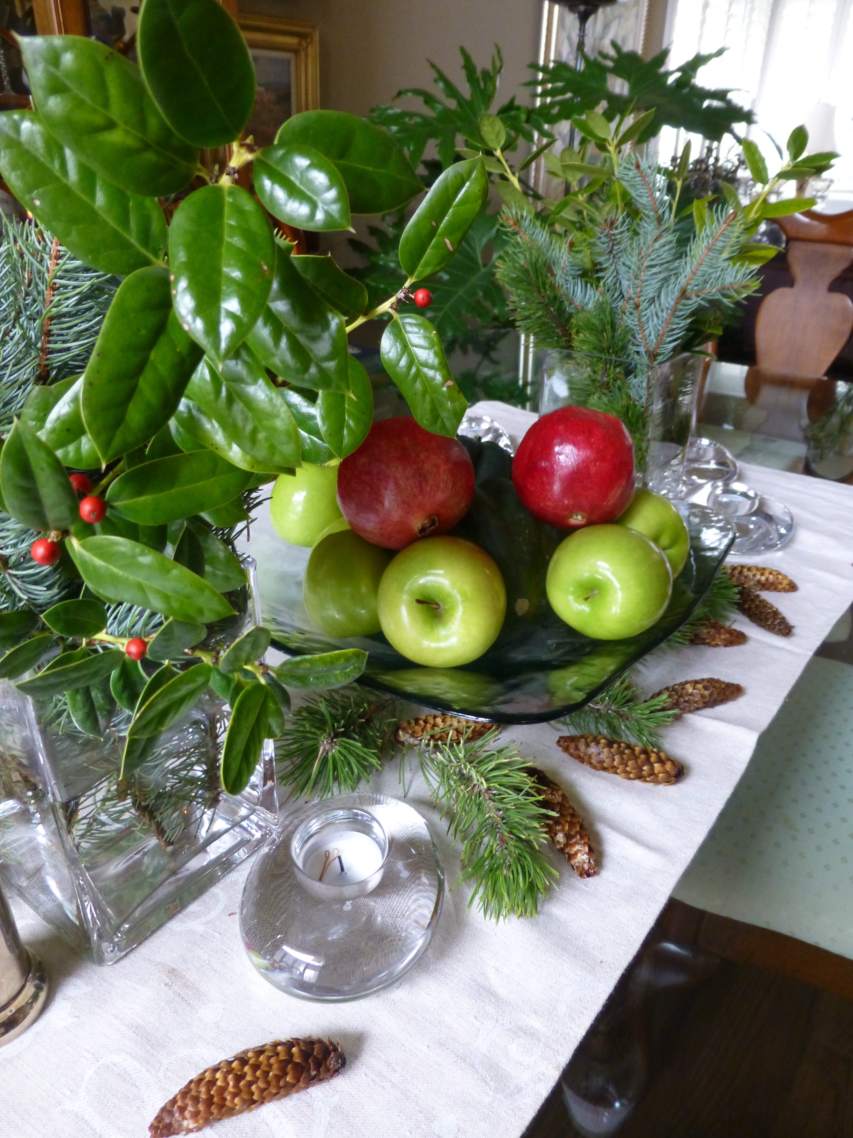
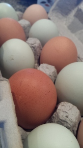
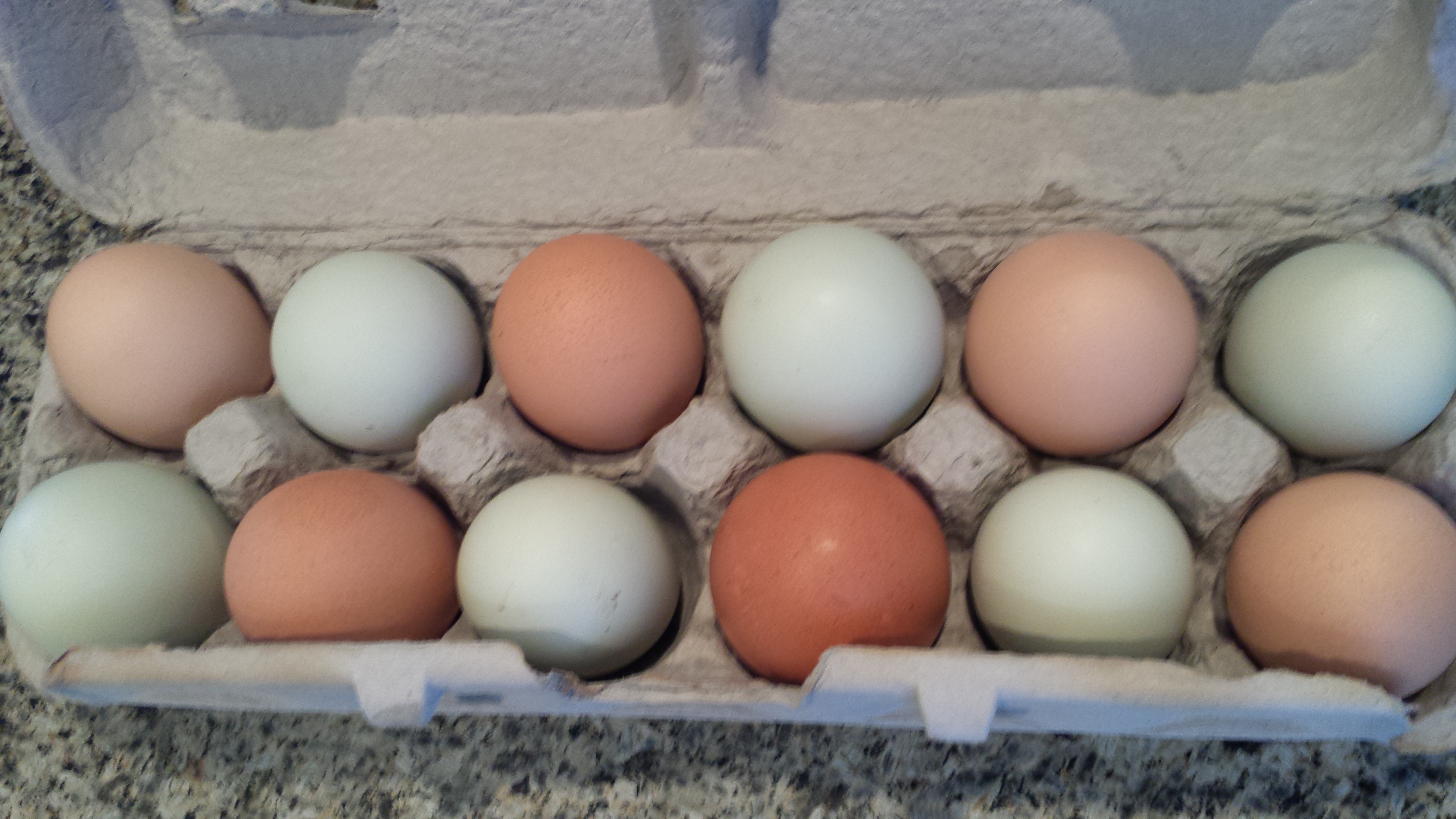
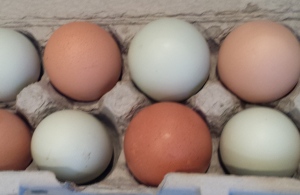
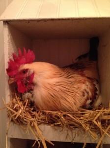 His women are a fine group of chicks named simply Hello Ladies as that is how they are collectively greeted daily.
 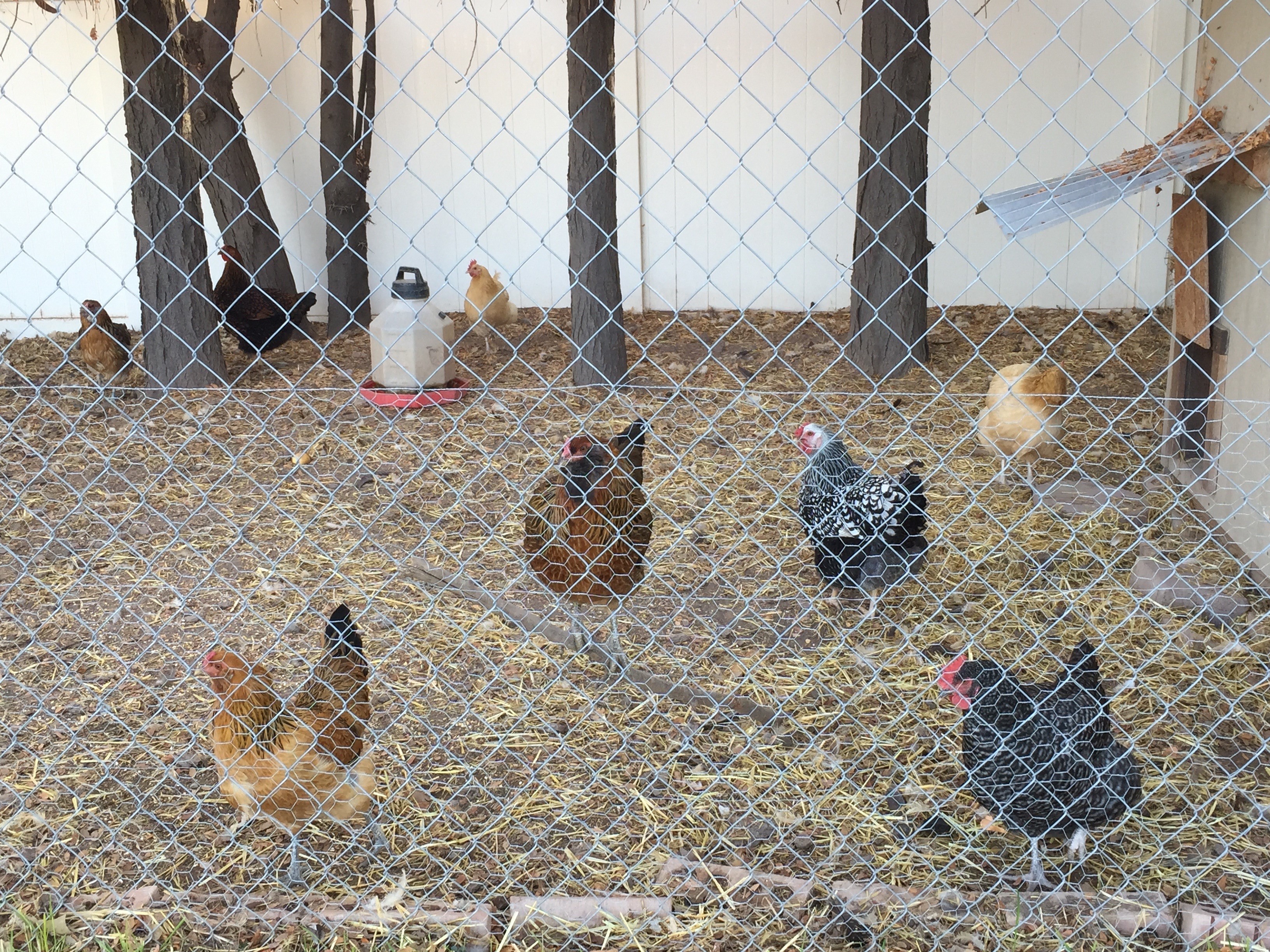 They represent the breeds Ameraucanas which produces the green/blue series, Buffs Orpington for peachy/light brown and Wyandotte for the darker orange brown shell shades. The combination is a color scheme that is so wonderfully balanced with complimentary opposites that it is one of pleasing perfection.