A couple of years ago, I did a workshop entitled “I Want to Find a Painting to Go with My Red Sofa.” And I want to do it again…because the interesting thing is that this same subject surfaces on a regular basis. It is an age-old argument about art for art’s sake and the reality that context is design. Context is ART. Whether you are in accord with the context as a compatible nod or against it as a decidedly bold statement to the contrary, art and design occur in context for or against it like yin and yang. However, buying decorative reproductions versus original art is the next layer of this conversation.
Have you read this in my blogs before? Context is a subject about which I am particularly passionate. How to begin to invest in art for the sake of your interior’s design or for the sake of investment or why…that is the question. Let’s address the “why?”
Why invest in original art when there are so many outlets for reproduction work such as posters – framed or unframed, copies framed nicely in a design-trendy or classic fashion, prints on canvas or paper that “read” like paintings, and the intriguing term being tossed about “giclees.” Wikipedia says Giclee “is a neologism coined in 1991 by printmaker Jack Duganne[1] for fine art digital prints made on inkjet printers. The name originally applied to fine art prints created on IRIS printers in a process invented in the late 1980s but has since come to mean any inkjet print. It is often used by artists, galleries, and print shops to denote high quality printing but since it is an unregulated word it has no associated warranty of quality.” The problem with the latter of these repro options is that the prices can be frighteningly high under the guise of the inflated value based upon an artist’s signature, fresh applications on the gliclee or some limited edition – and sadly most are not worth more than the surface upon which they occur.
So “why invest in true “original” art?” Perhaps it is because if you stop to think about it, you are making a connection with someone who has captured a moment, or a feeling or an impression that attracts you and different from a reproduction, you get a “feeling” that you have camaraderie with this particular artist and this particular piece. The most common experience for most is when traveling you see something that connects you to a particular experience or scene…you want to “take home” a memory of this experience – this event – this place. Having an “original” piece of art makes you feel a connection to the place. It’s yours and yours alone – it is a one-of-a-kind – often spontaneous and is an exclusive object that happened just that one time – and now, just for YOU. This intimacy, this nostalgia is very special.
Intimacy evokes emotion and emotion is so much a part of art appreciation – from the inception on the part of the artist to the viewer who responds to the piece. Positive or negative, the emotion of response is THE primary element in the expression and appreciation of art.
Wait, this is getting too personal…let’s continue with the generic, “one.” If one were to experience a moment of connectivity with a piece of art – a painting, let’s say, that so grabs the attention, speaks directly and strikes a chord – all these sensations that represent those feelings that draw one into a piece and say “buy me, have me, own me – take me home – that’s what it’s all about. And, it’s fun. It’s exciting. It’s satisfying. It’s spontaneous. It’s stimulating. It’s pleasing. It’s rewarding. And, it can be challenging too.
So, is it a crime to want to find and buy a piece of art to go with one’s red sofa? Is it against all objectivity and intrinsic value to pair the two? I think not. It is not the only way to select art, but it is a valid way. If context is such an important element in design and art…then, having a piece work well, be compatible with another contextual piece will create a harmony that works – it is perfect for some in those instances. So let’s not be such snobs. Juxtapositions can work, contrast can work and other manner of objectivity obviously works, but subjectivity is equally valid – not to necessarily value a piece in the chronicles of art history, but in the value that it means to one in one’s personal world.
So, as an investment, it comes right down to the fact that anything is worth what someone will pay for it – right? Ask Steve Martin in his book An Object of Beauty, where he so effectively paints a picture of the art world and it’s fleetingly changing whims, trends, values, and those that chase them.
Buy original art because it makes you happy – because you want to.
Late Snowstorm and the Context of Design
So it becomes very apparent – design is contextual. Whether with architectural style and the context in which it occurs, or geographical context against which it is presented, I always stress that. And it is no more apparent than when traveling between different temperature zones. I do this often – visiting warmer climes in the colder months…but that too is a relative thing…
So MY norm is the enchanting 4-season temperate zone of Albuquerque, New Mexico. It is from there that I base my perceptions…until I leave. Yes, we have four distinct seasons….we actually HAVE to have different wardrobes – unlike some areas that force a change in clothing just to create that difference, just to buy those cool seasonal togs and accessories…OR the truly freezing locales that demand warm layers for mere survival from the cold.
However, in Albuquerque, at a mile and more high, we experience those Rocky Mountain elements – high altitude temperature extremes and otherwise lovely moderate temperatures all summer long. No humidity to speak of and no bugs – unless of course you board horses down in the valley by the Rio Grande!!
I digress…back to design…it is always contextual. Whether to boldly design against context, or embrace it for the natural order of things, the fact is that context is the “it” of design.
As I posted on our facebook from Albuquerque in the last couple of weeks, where we were experiencing true bursts of spring…”bring in the branches” – which are now in full bloom on their very own trees – bulbs are bursting from the warmed earth – daffodils, hyacinth and the phlox are lovely!! Bring in the branches to force the beauty of spring into your homes to expedite the glory that is the birth of a new season of growth and wonder!
Ok – I get carried away. However, the sobering experience of being enveloped in one of the largest snowstorms in the “whatever” amount of time – a long time – is awesome. A word often over-used…but apt for this tremendously magnificent late winter expression (its technically spring now) of the chilly, fluffy white precipitation of well over a foot that we have experienced in Innsbrook, Missouri today.
My design direction in this environment is to grab a warm snuggly throw, start the fire, pour a toddy, surround yourself with warm colors, soft textures, and for “hope,” have a brilliantly blooming bouquet to remind you that spring is only temporarily delayed, it is right around the corner and next week’s higher temperatures are sure to get you chomping at the bit to be outside, unveil the patio furniture, grill a few steaks, and start planting!!!
Wall Treatment of Scribbles and Scrawls Speaks Volumes of Almost Accidental Design
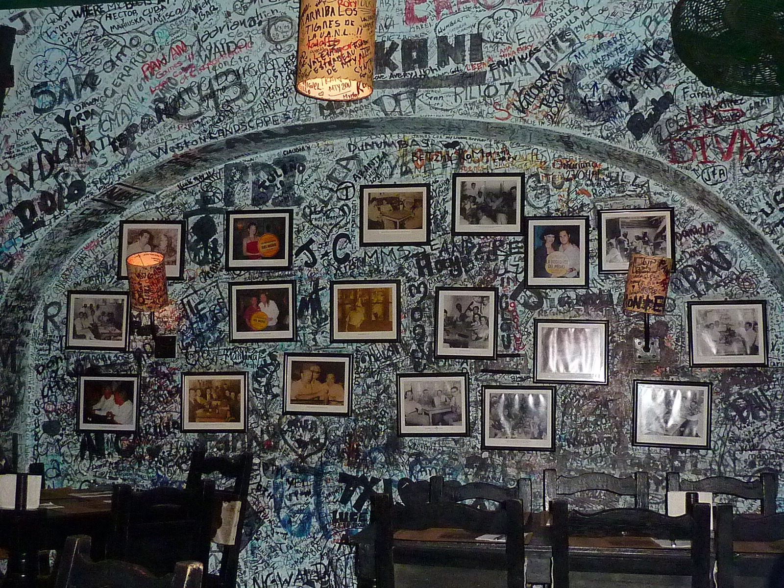
Habana – Cuba that is…reconstructed elsewhere in the bars of Bogedita del Medio and the resulting fantastic feel that is created by the once unconscious lexis of ultimately decorative elements that are the walls of words and markings. Graffiti you say? Yes, after a manner. It is an atmosphere of festivity – an interior that speaks of layers of revelers enjoying the music and mojitos. Yet it all blends into a graphic design that is exceptionally unique and interesting.
Salsa – dancing and flavors. The complexity that is found in the movements and ingredients -pairing the dance and the food – both are spicy – and the scene is warm and energized. These walls of markings, names and poems, tributes and proclamations are a backdrop of expressions from layers over years.
When else might this work? I’m fascinated by the effectiveness of this design treatment – a celebration of reactions, emotions and personalities all marked for everyone to see. Bold or meek, artful or mere blocks the styles speak with the words.
Perhaps the free-form walls of a child’s playroom – if isolated to these wall and not the whole house…it affords a huge blackboard – chalkless board for freedom of expression. For adults perhaps a party room might invite this kind of signature expression – layers of good times recorded on the walls – texture and design in an all-over pattern of script, lettering, lines and figures.
I like it a lot. I thoroughly enjoyed the scene and wanted to share the possibilities for this unusually free-form treatment in your interior design.
Fragmenting a Well Choreographed Interior Due to a Relocation
Moving is a chore. The future might be exciting, the move might be upwardly mobile – or not. Disbanding a home is not fun. We have a client who had no sooner settled into a fabulous loft condominium in the hip urban architecture of her new digs when a fantastic job transfer forced a move.
She transferred into this new environment from another climate – another world. This was exciting, new, challenging and riddled with opportunity to go outside the box for the design choices to feather her nest. She enthused about everything that she encountered that was different, well-crafted, unique, artistically functional, colorful, and textural – all things beautifully combined to create an art piece of an interior.
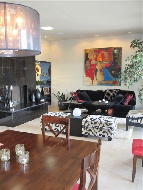
Moving might not always mean what it does in this instance. She already had a primary place of residence filled with family pieces, nostalgic treasures and gatherings of a lifetime, and this new urban scene was a departure from her norm. This had been an opportunity to experiment with contemporary design, bold colors, abstract and expressionistic art and sadly there is no place to incorporate it in the tiny new interior where she has placed herself practically and with a purpose – where she now finds herself – in yet another world.
The new place is straddling the design direction of her primary abode filled with lovely traditional furnishings and will be punctuated with her contemporary artwork and a couple of the special pieces that she had crafted for the loft – but after photographing, recording dimensions, laying out the furniture in the new floor plan, agonizing over limitations and choices, the decisions were made. And after all the thorough deliberation it was apparent that many of the recently custom designed and fabricated elements must go. Fragmenting this well-balanced and choreographed interior has been heartrending.
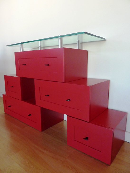
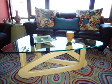
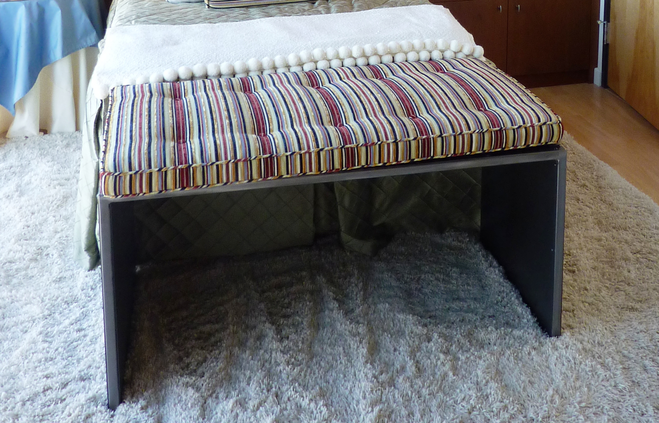
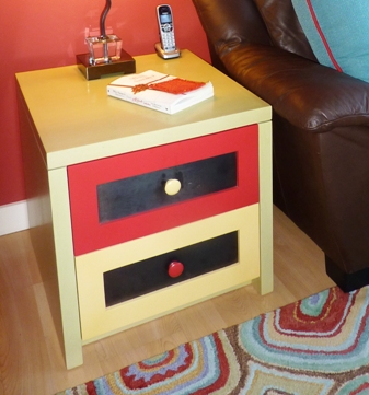
Among the outstanding functional art pieces that I and my team designed for her – here are a few of the unique items made by local artists and craftsmen that are available for purchase.
The Value and Variety of Good Lighting Effects in Interior Design
We paint with pigments but we can also paint with light. We can actually color a space or surface with a color of light or we can illuminate a color of a space or surface with the addition of light. Accenting items or areas in a space or exterior environment is an exciting element of interior or exterior design. We know that the fact that light exists in a space allows us to visually “read” that space. It makes me think though of the clever Kohler ad with the blind guy at a party coming back to his date from the restroom and exclaiming something like “Wait ‘til you see that bathroom!” Not the manner that most people experience a room – but like the last blog about lavender…there are many senses that comprise the effective or ineffective design of a room.
So lighting in this instance is of key importance. With short days of winter still ahead, the nights are longer and the need for artificial light is not just a design element, it is a functional requirement for utilizing or experiencing the space. Differently from ambient daylight however, artificial light offers many opportunities to manipulate, accent and create special effects.
Shadow and light the two opposing forces in the drama of lighting. The absence and the presence, the voids and depths versus the illuminations, accents and “pops” all contribute to the balance and effectiveness of the area’s influence. It gives us the opportunity to enhance, accent, draw attention to, and remove from the focus.
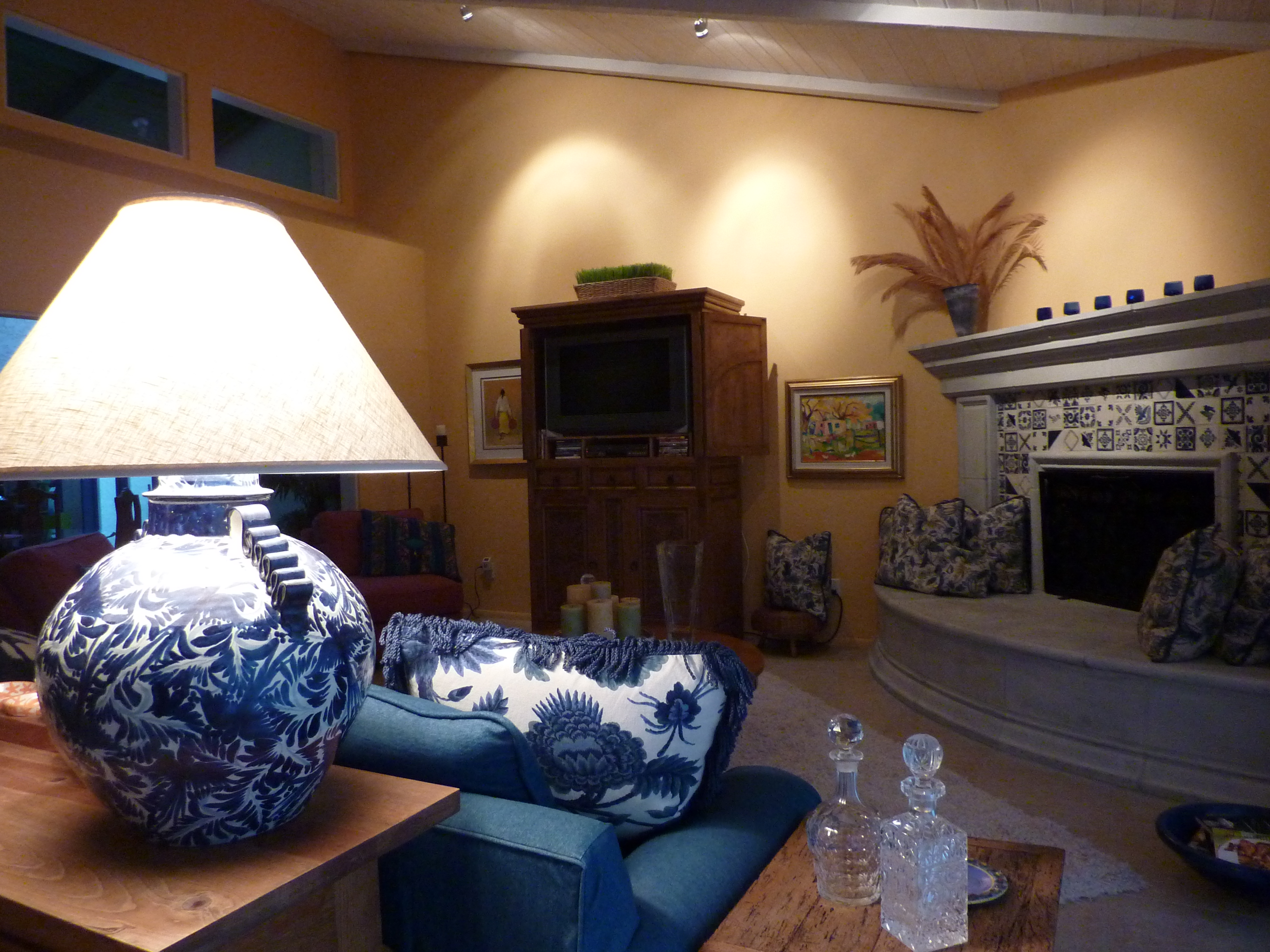
Inside, bring forward the things to emphasize and send back to the recesses of light or the lack thereof those that you choose not to place in importance. Accent a painting on a wall with a spotlight. Cast an ambient glow around the room from a translucent lampshade. Multiple light sources are often the best. They add variety, interest and balance to a scene.
Some light sources are decidedly decorative and they may or may not contribute greatly to the scene. Decorative fixtures can be chandeliers, table lamps, floor lamps, wall sconces, or surface mounted ceiling fixtures. They are selected not just for the illumination that they provide, but for their design influence in the scheme. How they play a part in the illumination of the space is another story – and variable.
People are best viewed from a light source at the face level rather than down from recessed or track lights in the ceiling, which is why table lamps are an asset when creating a setting in which people gather. Social settings differ from display settings. Lighting from above as an exclusive source can be limiting if not ineffective. The shadows cast are not attractive – rather, they can be ghoulish. It’s like the effects of a flashlight either from above or below on your face in a mirror – test this – you will never want to be on a date sitting beneath a light source glowing down from over your table. Scary.
To set the stage of an interior, determine where you want the viewer to go -where you want the destination of the “read” of the space to be. There are these accent spots – points of interest…and then the harmony of the entire area takes shape. Find the attractive features in various parts of the room…a plant in the corner might be lit from beneath to cast shadows on the wall – an inexpensive and dramatic effect. Buy an “up” light at Home Depot or Lowes – a local lighting store might have a greater price range and variety of lamping types and fixture styles. Also, a spot direct down onto a plant or sculpture on a pedestal or vase on a table – the drama of highlighting amidst the otherwise low-light is powerful.
Lighting creates mood, alters perception, and has subliminal as well as obvious effects. Use it to change the feel of a space. You want someone to linger, soften the light – you want them on edge and ready to leave – up the lighting to an unpleasant range. Restaurants and residential dining rooms are perfect examples of soft lighting providing a relaxed atmosphere – in those same rooms where the light levels are higher, notice the less relaxed sensation that is experienced. Likewise, if you want someone to feel welcome, soften the light rather than blasting it.
Light up you life with really good light!
Caribbean Rum, Words, and Relaxation
As the white dots of cyber snow float across my wordpress screen, I realize that it’s telling me that its winter. Unlike real snow however, it does not accumulate lest it make it impossible to write the text necessary to post this blog. So rather, it dissipates as it cycles – nice. But it does conjure up cold and that’s when I long for the warmth of southern climes.
What says vacation…relaxation – some might say iced tea and a hammock -sounds awfully nice. As a foodie and partier I like the booze and food of the local environment to accompany my activities. The context of it all – like “when in Rome”…it’s blue agave tequila in Mexico and it’s sugar cane RUM in the islands and in this case, the US Virgin Islands. Rum punch or, for me, just rum and water – with a squeeze of lime if available…it’s much of the history of the Caribbean. Here our very own St. Croix “Cruzan” rum – along with that lime and a couple of ripe juicy mangoes on the side – just for good measure- and it certainly makes a gorgeously colorful photo op!
And BTW, that’s CARIB-BEEEEEAN – stressing the EEEEEEE! Yes, the Carib (Care-ib) Indians…have you read about them? Try Mitchner – a lengthy beach read. It was not a British affectation to start the Carib (accent on the rib)ean falling off the end. Actually, even in the BVI, back in the day, everyone clearly said Carib-beeean with that lovely accent.
No, at some point, it was decided by some to make the change. In the case of the Caribbean, was it Carnival Cruise Line and/or some marketing upstart behind some “new” pronunciation campaign to design the “new” image of the islands? Hmmm…thought it sounded British?! ”You say tomato and I say tomatto” as the song goes!
When you listen to Bob – Marley, that is – need I say? He sang and his recordings still sing today “In the heart of the Caribbeeeeean. ” He sang it loudly and clearly with his magnificent, melodic and authentic Jamaican accent – old pirates! Weren’t they listening?
So you go to the sun…feel the balmy breeze – “Christmas wind” – greet you as you climb into a cab at the airport and the question that has been puzzling you for some time in advance of this trip comes out…and you ask the driver “Down here do you say Ca-RIB -ean or do you say Caribbeeean”? To which he answers “We say West Indies.” Ha – what a great answer – to keep above the fray!
Perhaps you’ll put on some music and relax with your mind adrift – just design your holiday getaway around what is fun for you. Cheers!
ART Beneath Your Feet
- Art beneath your feet
It’s an expensive finish material, so we don’t see it a lot, but terrazzo floors are beautiful, wear like iron and fascinate me. Yes, in larger urban centers and often in major airports the artistic treatments that are designed into the matrix of stone chips, and other materials are fantastic. The colors are now endless as the manipulation of the materials and additional materials have expanded the medium. Once rather common and often now considered dated – I take exception – and so do the many who participate in the design, fabrication and installation of these fabulous floors!
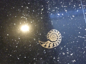
Other materials, such as the shell flecks strewn through the dark matrix of stone that is the primary surface of several concourses of the Miami airport, make a contextual statement – here, the context that shells are found scattered on the sandy beaches of sunny Florida. The brass inlay suggests shell skeletons embedded in the black sand – sounds more like the lava beaches of Guadalupe than Florida – but that’s the artistic license of the artist(s). The shine of the brass and the iridescence of the shell chips add bling against the high contrast of the dark background. It also, upon closer inspection, looks like a star constellations amidst the galaxies and myriad particles of twinkling lights in outer space. Maybe they are floating in an abyss in the dark depths of the sea. Especially here with the explosion of the flash reflecting against the hard, smooth glossy surface you can imagine either scenario – that of deep space with a burst of light penetrating the blackness or the ocean depths and a light source attempting to capture the existence of the creatures – a dark glittery scene with weightless, floating images.
Look down next time you are waiting for a Sky Link or rushing to your gate…you might be surprised to see the art beneath your feet.
Less is Enough as Observed by Zorba’s Associate, Boss
When in Rome…or other places, I like to read in context with my travels. So last week while cruising the Greek isles and a couple of neighboring Turkish ports, I explored the timeless novel by Nikos Kazantzakis, none other than Zorba the Greek! What an engaging exploration of the human spirit seen from two distinctly different viewpoints. The detail and descriptions are fantastic. This observation on the part of the narrator, Boss, hit a chord so perfectly within me that it resonated a concept that we all must ponder…what are our needs, our comforts, and our pleasures when it comes to interior design?
“It is a great pleasure to enter a Cretan peasant’s home. Everything about you is patriarchal: the hearth, the oil lamp, the earthenware jars lining the wall, a few chairs, a table and, on the left as you enter, in a hole in the wall, a pitcher of fresh water. From the beams hang strings of quinces, pomegranates and aromatic plants: sage, mint, red peppers, rosemary and savory.
At the far end of the room a ladder for a few wooden steps lead up to the raised platform, where there is a trestle bed and, above it the holy icons with their lamps. The house appears empty, but it contains everything needful, so few in reality are the true necessities of man.”
It seems as we start out in life, that we want to gather things, express our interests, and decorate with the stuff that says who we are…then later, many people want to reduce the clutter, eliminate the maintenance and strive for a simpler life. This too can be said in light of catastrophes like the recent earthquake and tsunami in Japan. The devastation that robbed so many of their things and even their loved ones certainly puts things in perspective.
But healthy consumerism and the capitalistic way of life that encourages, promotes and rewards the buying and selling to keep the machine in motion is a far cry from this simple scene. But for a moment, pause and re-read those two paragraphs and wonder if it doesn’t come back to architect, Mies Van der Rohe’s famous phrase that he adopted from painter Andrea del Sarto that “less is more”? Or in the case of the peasant’s house…less is enough.
A Happy Scene on the Island of Mykonos Inspires Exterior Designs.
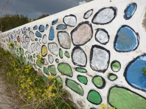
At first glance, this looked like a sacrilege. After encountering so much graffiti in Athens , (see the photo album on PATRICIAN DESIGN’s face book page) anything remotely related in appearance took on that “read.” To see the colors applied to, what was actually large local stone embedded in a plastered wall – which we often found painted all white in the Greeks isles, sometimes with white plaster leaving the natural stone exposed and then this – I was startled. But upon viewing this wall the other day in context on the beautiful island of Mykonos, I appreciated it as a happy scene.
When planning your exterior design it can be fun to release some of the norms associated with restraint. The beauty of the conventional use of materials in the built environment is not to be discounted – but neither is the bold expression of other possibilities.
Garden art can take on many forms. When you punctuate your exterior design with a bold red metal sculpture, dangle a glazed ceramic or glass wind chime or add a painted wooden door or furniture, you are making a colorful statement within the context of your exterior design. More on this later…
For now, know that there are many possibilities – and have a little fun creating a happy scene in your exterior design.
The Color Purple is Outrageous and Elegant, Whimsical and Fun!
The Color Purple is rich, garish, and outrageous when worn by ladies sporting red hats. Purple is royalty, has liturgical significance and makes tongues brand the color after sucking down a cold glass of grape juice or room temperature bouquet of good – or not-so-good red wine (what a waste).
Alice Walker expressed great symbolism of pain and beauty when writing her novel. It is certainly a complex color which for our purposes of interior design would want to focus on the positive attributes and not the less attractive. Purple continually surfaces in interior design and it’s probably due to be an upcoming trend. Whether eggplant or lavender, it is a wonderful, classic, good color (aren’t they all in some context?), – yes, purple can be quite fun!
In nature, our Sandias at sunset – although said to be “watermelon” red, by their very Spanish name, transition from many shades of pastel colors including pinks, blues, lavenders and rosy reds. Lavender fields, lavender bouquets, periwinkle blossoms, red bud trees…the list goes on… Currently, I am designing a purple scheme in a home that will be all of fun and stunning, whimsical and elegant. It seems that the brighter colors of purple often bring a smile. Extracted from a charming oil painting, of a northern New Mexico calle with brilliant white and purple lilac bushes blooming along a dirt road accented by a royal blue picket fence, that we have selected as a focal point – the colors are enchanting. These will be more robust than pastels but softer than the royals – delineated with crisp white against a neutral backdrop of sage/stone.
I often reference colors in nature influencing interiors – and here captured in the artist’s painting is a scene from nature setting the stage as the focal element of the space.
Meanwhile, take a look around. See the earth and sky, new blossoms and colors in the built environment – and consider the possibilities for building a color scheme or punctuating with accents in your interiors.


