The Value of Privacy in the Workplace

Open-concept-office
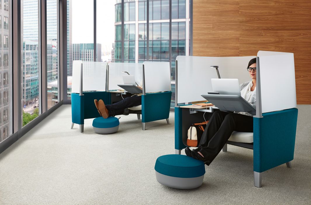
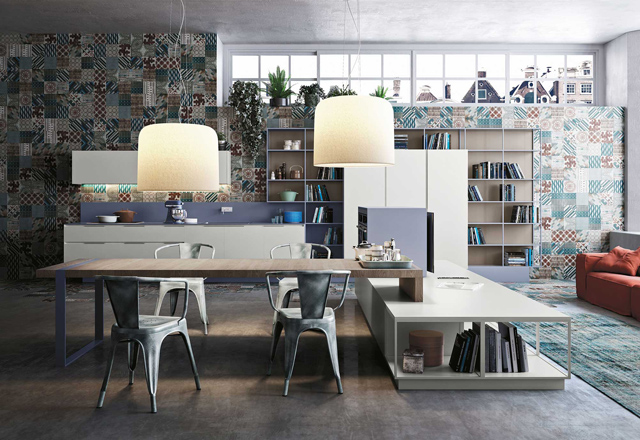
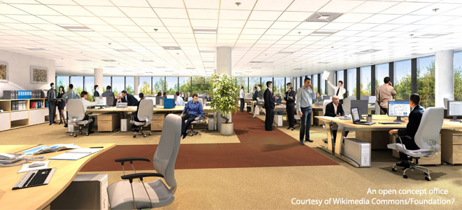
Studying the design of workplaces comes from focusing on the methods of the business, nature of the business, various practices and work of the  business…and then there’s the actual look at the individual’s who make up the work team and how best they perform their work in any given business environment.

It is NOT a cookie cutter process. I have been watching the morph of open-office design. Mid-century modern approaches adopted these grand, open landscape layouts  and then the pendulum swung and private offices were the thing to attract employees. We’ve seen Mad Men replicate this era and it prompted a sexy nostalgia for social scene depicted as the workplace norm. 462be137dd7783b16320dfcbdf3d9290

The era and advantages provided by the privacy in those private offices…..

Attracting employees is an art unto itself. Extracting their productivity, once you have them is next. But what is certain as the pendulum swings again is that what has been in recent years the seeming popularity of the open, group work areas, the lack of privacy intended to generate collaborative productivity. And inasmuch as there are bonafide circumstances and business environments which nurture and benefit from this design approach, the pendulum left so many business practices and employees out of the equation for success.

At the start of 2012 Susan Cane wrote a book titled QUIET. It discusses her observations and interpretations of introverts versus extroverts. It address many  aspects of what this distinction is all about and the environments that encourage and those that intimidate or hamper productivity. These observations addressed personal issues such as self esteem as part of the recipe for success. But this  blog is concerned with the reasons for certain physical design approaches in the workplace.

The emphasis has seemed to be upon pitting the opposing personalities against each other and directly or indirectly favoring the  bold and unreserved extrovert over the meek and quiet introvert but it is not about that, the real design picture and life picture should be greater than that as there are many personality types that make-up an effective workforce.

Steelcase has identified a Privacy Crisis. They have performed studies to better understand the design of the workplace in its many iterations. I recently  took a continuing education class addressing this very point and it was so interesting to apply recent observations in my own collection of design projects presenting some of these very issues. A credit to Steelcase for bringing this to the fore but funny how the pendulum has swung once again. True that as one of the leaders in office and specifically systems furniture, they have had ulterior motives in studying what the next “trend” will be.

null

Semi-privacy….work…study??? Cost.

It’s good business to create things that will attract buyers and users but I found that some of the cool little pods that are new to their collection are more fun than practical and the rationalizing by the sales staff is often humorous in their attempt to make it relevant, desirable, and necessary.

I do like the idea when design has a good functional function – and yet I am frivolous enough to LOVE design for design’s sake…but when it is SUPPOSSED to function – it makes me crazy when it is primarily if not entirely frivolous!!!! Get that? Now the BEST is frivolous that REALLY FUNCTIONS…ponder those examples…I will after I finish this!!!

I regress…my point here is to recognize the need to establish the balance between the  collaborative design of an open team-thinking workplace with the need for privacy to focus, regroup and refresh. And in the case of certain very productive individuals, just get their work done.

I have two examples that in my own practice brought these issues to the design table. One was an accounting firm where conversations with clients about their financial dealings warranted privacy. Having a client later walk through the office and realize that some of their own conversations might have occurred in open areas where privacy was not respected would be a poor business decision and poor business practice. The second example was similarly based around client’s financial planning and preferences at a non-profit organization. An open area where discussions of an intimate and personal nature might take place would not be appropriate. Although at first glance the attraction of a common area where employees could enjoy each other’s camaraderie and interaction, it did not benefit their productivity nor did it benefit the end result which was the confidentiality of the client’s financial planning.

So,  sometimes it is the nature of the work to be done. Sometimes it is the enhancement and facility of the team effort. Sometimes it is the style of the employee doing the work and their best environment for productivity. In the last instance for individual’s personal style of private productivity there are many considerations of interfering distractions… whether it be noise – some enhances the working environment and other distracts terribly – or movement and peripheral activity, distractions come in many forms.

Good design will always be sensitive…sensitive to the object of the design (client and sub-clients as in employees), context of neighboring elements, applicability and efficacy of the design for its intended purpose.

One thing  Susan Cain said stands out, “The secret to life is to put yourself in the right lighting.”

E-design…Is It for YOU?

An article from the Washington Post came across my desk a couple of weeks ago by Bonnie McCarthy “E-decorators” draw cost-conscious clients. In this article she identifies what she calls the “modern trappings of online interior designers – designers who by her estimation are “renovating the process of how style comes home.” 20160416_103139_resized

In this writing she interviews interior designers about their various methods of providing services to their clients and certainly the newer way is more virtual than hands-on in-person. But think about it – designers have always had to deal with virtual conditions. Working from plans is just that!

With the new generation of consumers – millennials and those to follow –  computers are an appendage. Everything is referenced or accessed via a computer, tablet or smart phone. So it’s natural for them to utilize these tools for design inspiration or consultation. The article however is noting this new approach for everyone who expects a designer to be an expensive on-site investment.

Throughout the article it references the “new” e-design approach as a now more cost-effective, affordable exchange with interior designers. I think that sounds like a gimmick. The time spent is the time spent – the ideas provided are just that and the fees are the fees. Now, if these e-designers or unlicensed decorators are lowering their fees – well then that’s part of the story. However, I do not get the feeling that they are. Rather, I get the feeling that they are merely marketing to a broader audience than those found in their immediate physical locations. Smart. There’s another part of the story. Selling the idea that this is cost-effective over having to meet live with a designer and thereby getting those customers and also broadening the reach to those potential clients is a gimmick that seems to be working.

The fact that the article suggests that this new “e-design” consultation is more cost-effective than live and in-person versions of the same is interesting. Maybe it is – maybe not. It would save transportation time for the designer and they might pass that savings on to their clients – or they might just have higher fees and more profit for their time involved. Difficult to know – hourly consultation rates vary according to location and market price.

For the designers or firms that have established a formula and template for their clients, this seems fairly efficient. On-line information forms quiz clients on their likes and dislikes, personality and requirements. However,this can also be can occur on a local level at the outset of an in-person consultation. The combination of digital communication and in-person, on-site design consults might just be the best process. A client’s form might even be filled out in advance of the first meeting via email to give the designer an intro to the project. Digital images of the space in question can be uploaded for the designer to review, evaluate, and critique. What once was the method of clients snipping magazine articles and photos for review and discussion, sites like Pinterest allow for a place where designer and client can “pin” their ideas for visual communication and discussion.

So is it the cost? Is it the seeming efficiency? Is it the working at your own convenience after hours? What makes the e-design attractive? Why is it better than having a designer come to your residence and discuss on-site with images and tangible samples what you want and the designer recommends?

Tangible samples…I don’t even like or trust what I see on-line regarding fabrics and carpets – anything textile for sure is impossible on a monitor. Tangible samples that you can touch and feel, press and fold, rub and caress are invaluable features of the selection process. Therefore, the sensory deprivation of e-design is one negative. Yes, samples can be mailed – but there is a lag-time there too.

The myriad choices made available online now for home decor shopping has opened up the entire world of possibilities for the consumer. But that same client exposed to these limitless wonders of the world cannot cull their finds with confidence to bring together a cohesive design. In this design process, some things have to be forfeited and others embraced and incorporated. It’s all about making the right decisions. The designer aids in and facilitates making those right decisions and bringing in even more ideas to the project with their expertise and experience.

With thorough websites, designers can present their work and potential clients can research until they find one that they think meets their expectations. Once that has been established, the client can even interview a few designers to make sure that the in-person chemistry is there between them. Or…there’s face-time!!

So back to the e-design. It’s not new – the methods are – but design across the miles has been going on for decades. Plans mailed, faxed and now digitally shot over the globe. Prior to a building being built – it is a virtual place designed diagrammatically, built in models, illustrated, and sketched – by hand or CAD it only exists in the mind’s eye of the designers and those to whom they are conveying these concepts. ILLUSTRATION RESI CROP P1030518  Selecting the interior furnishings and finishes for these edifices has always been similarly virtual. Until something is built and furnishing  installed, the designs are all “virtual.”

So “e-design” is on another plane of communication with the client with new tools to facilitate and communicate. But the advantages or lack thereof are many and seem to be more applicable to a client in a remote location without benefit of good local designers.

I knew an incredibly creative and adventurous couple who, back in the 60s and 70s, established a private resort on an island where everything was selected and obtained via mail-order catalogs, shipped across the water, received in docks, transported to local delivery vessels and dropped on a beach weeks later. Not so different today for those located far from the modern conveniences but connected now to the  world via the internet, fast jets of Federal Express, DHL, UPS and all the trucks, sea trains and land rails that move goods around the world. That’s when this instantaneous assistance for decision-making with a designer over the miles can be extremely advantageous – you have no other means of getting together and the framework is in place to do it all remotely.

So if you fancy the idea of having an LA designer consult for your condo in Dupont Circle or a Denver designer make their recommendations for you in Boston, so be it.  Yet, I say investigate your local interior designers, visit their websites, contact their references,  and see how their fees and talents compare between each other, and then compare to them to the e-offerings on-line and go with what works best for you!


The Drama of Dark

It seems counter intuitive – and that is why so many people ask me about the effect of dark wall colors – “won’t it make it look small?” and I assure them – “no,” and they are still not so sure. The most recent example of this was in an expansive home  where we were talking about accent walls – not willy nilly mind you, but in an architectural recess behind the stately china cabinet in the dining room and a doorway recess in another room. In this case, using neutral, warm grey tones – shades of same hue – value shifts for depth and architectural enhancement. Not yet painted, check out our website in a few weeks for befores paired with afters to see this example. Here though is another example Corine-Maggio_La-Jolla-Shores_1.jpg.rend.hgtvcom.1280.1280

The above photograph for CM Natural Designs by Chipper Hatter.

If a dark color was to make anything look small – why would one want to paint it in a tiny space? There is the more specific, counterintuitive question. The answers is that there are illusions of space. A dark color in a small space can actually read as though there is more depth to the space. Where it can be close and cozy, it is also a subtle enhancer of depth and therefore size. dark-room-collage3_large_jpg

So in another example currently in a state of remodel, a petite powder room previously papered in a dark green patterned wall-covering, now was being refreshed. There are no rules – it could have been bright, light, bold or dark…flat, glossy, organic or metallic – the possibilities are endless. But the previous rendition of this space was pleasing for its dark tones and therefore a decision was made to select a deep-toned paint for the re-do.

Dark colors, contrasts and lighting all can have dramatic effects on the perception of a space. Dark colors actually recede. Therefore, in many situations, if  the application of a dark color will convey a sense of depth and additional space it’s an intriguing experiment. Black-Feature-Wall-for-Bedroom
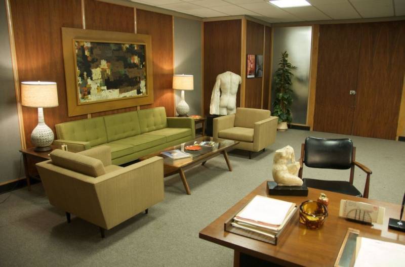
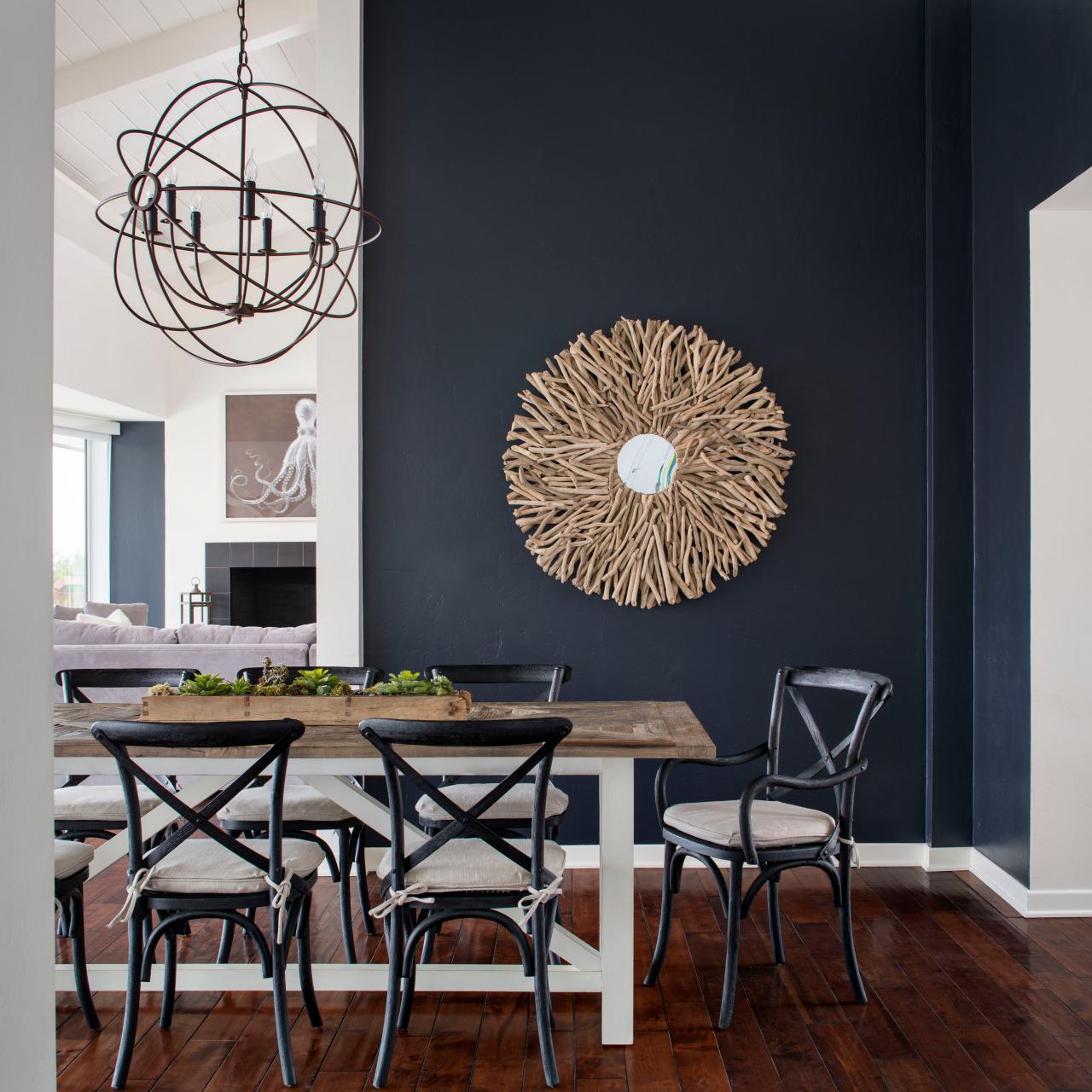
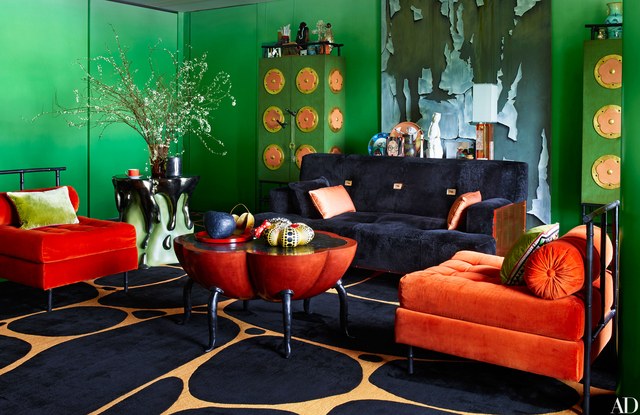
Like reaching into a hole or looking into space, and not seeing the boundaries well. It s a brain thing. If the brain reads dark, it suggests  a depth of space and therefore more than is really apparent. This is often used in ceiling treatments. Having a low ceiling appear higher, when painted dark, due to the illusion of depth.

OLYMPUS DIGITAL CAMERA

It is also effective to make something go away. An exposed mechanical or white lay-in acoustical ceiling can be institutional looking and not desirable in certain settings. Painting it black or another dark value of color, while sacrificing a bit of acoustical rating,  the ceiling will seem higher, less distinguishable and not as imposing upon the decor of the space.

So the petite powder room currently being re-floored with dark tile, re-painted with Benjamin Moore HC-166 Kendall Charcoal, new dark matrix granite vanity top and cabinet, new lighting and mirror…will soon be finished and we will post the drama of dark in before and after shots!

Millenials Setting & Drivng Market & Trends

The conversation about the lifestyles or preferred lifestyles of today’s millennials is leading trends from real estate and development to interior design.  The vocalization of the desires and needs is an enormous help to the market on all fronts. Rather than the market trends guessing about and driving the consumers – the consumers are speaking out and driving the trends.

I guess I’m not hearing anything new though. It seems that 30 years ago the wishes were similar- but there was no conduit to express the collective ideas and preferences.  Upon graduation the want to stay connected to your peers, be close to bars and restaurants and fun shops was certainly a desire…but there was no platform to express those would-be market-driving desirable features.   But what is happening is that the voice is more audible  and the markets are responding . It’s an obvious result attributable  to social media – fast, accessible voices sharing and communing about their lives and their dreams.  Generation Y is telling everyone what will work for them and if you want their business – provide the products.   After all, they ARE the Net Generation – living, eating and breathing  and influencing all that bombards the screens from wrist watches to full mega monitors. The power of the internet.

Small Living Room Zen Design

They search and pin, collecting ideas and forming concepts about their interiors. Whether these interiors are in tiny urban condos or trendy lofts, suburban apartments or affordable houses,  the trends are voiced. They prefer open plans, creative space-utilization, LED lighting, and all things tied to flat screen technology. But remember, there are practical things to consider in these millennial maisons.black trim modern-rustic-3

When in a multi-unit building, rules apply – like certain percentages of flooring must be covered. Sound transmittance of hard surfaces must be minimized. This is true of other noise restrictions. Some places will not allow storage in parking spaces – which makes space-utilization all the more critical. Nor will they allow pets.

But the communal nature of this density housing is also great common areas to work and play. Office-like rooms for those who work from home but don’t want to be isolated in their unit. Swimming pools and workout rooms…lots of amenities – lots of style. open plan cucina-Orange-Evolution-32

This subject of interior design style for the millennials will continue next week…ideas and examples!


Red – A GIFT of LOVE and the Little Bug Behind the Magic

A little bug selectively bred on a cactus in Mexico way back in the 1500s, for its use as a magnificently unique red dye, soon became recognized, by European traders who discovered it while bartering  in the Aztecan markets, as the most dazzling rich red on the planet. The result was the realization that this red bug juice was a rare trading commodity that rivaled even gold!  Yes, a squished bug that oozed a red color that was so extraordinary that it was nearly valued above all. This indigenous American discovery spread worldwide and altered the course of history for art (obviously), cultural  influences, certainly its trading value and even science.

Before I continue with this brief summary of this extraordinary discovery and my personal  comments on the subject, try this little experiment.  Think of all the things that you associate with red. Think of all the things that are special and standout because they are red. Do this yourself – make a list or maybe make it a game of it at a party – have everyone make their own list and then share the lists – see how many make the same observations and how many identify different items.  More on this later…

This story behind  today’s blog is derived from a book by Amy Butler Greenfield, A Perfect Red Empire, Espionage, and the Quest for the Color of Desire which influenced a collective of international experts, in a variety of fields of expertise, to produce an incomparable exhibit  at the Museum of International Folk Art in Santa Fe that astonished the world.  The book that compiles photographs of worldly treasures and narrative describing the making of and content of this extraordinary exhibit is A Red Like No Other – How Cochineal Colored the World. It was my Valentine’s gift and it truly is a treasure – a gift of love. A red likeno other - book

Cocheneal, this little bug and its unexpected authority and influence, is the center of this universal love affair. A love affair with a color so seductive and so powerful that it evokes passion and emotion with everything that bears its true hue. The forward of this book by co-editor Carmella Padilla states that “everyone has a visceral knowledge of red. Therein lies its power. ” Red is imperative. And if you didn’t realize the depth of this statement, you will be amused, challenged,  amazed and intrigued beyond belief to read about the history and processes behind this exhibit .

Carmine  – this regal bug juice, so purely red, the prized pigment – is something all artists revere. They know the importance of this hue as they strive to create their projects. The quest for the perfect colors and the balance of colors in painting and in other art forms is an ongoing progressive journey. I feel remiss to not have known about this earlier. How can you take art history for semesters on end and not be introduced to this? It’s been an exciting discovery for me to learn of this viscose bug extract, carmine, and this recent journey I have taken to read of its history has been truly thrilling.

As I write this, by stark contrast to the wonderfully cerebral documentation and observations in this book, I find myself watching the endearingly inane movie Nacho Libre out of the corner of my eye.  And  what surprises me all of a sudden is that the color red is so effectively inserted into the scenes. nacholibre

The director, Jared Hess,  knowingly or not recognized the value of the color pop and punctuated many artful scenes that would have lacked depth and interest had he not had the eye to do so. My heightened awareness amuses me – especially in the context of this crazy, silly movie. The creatively artful incorporation and placement of red is so apparent in this nutty, fun film.  Ana de la Reguera lips Nacho  Libre
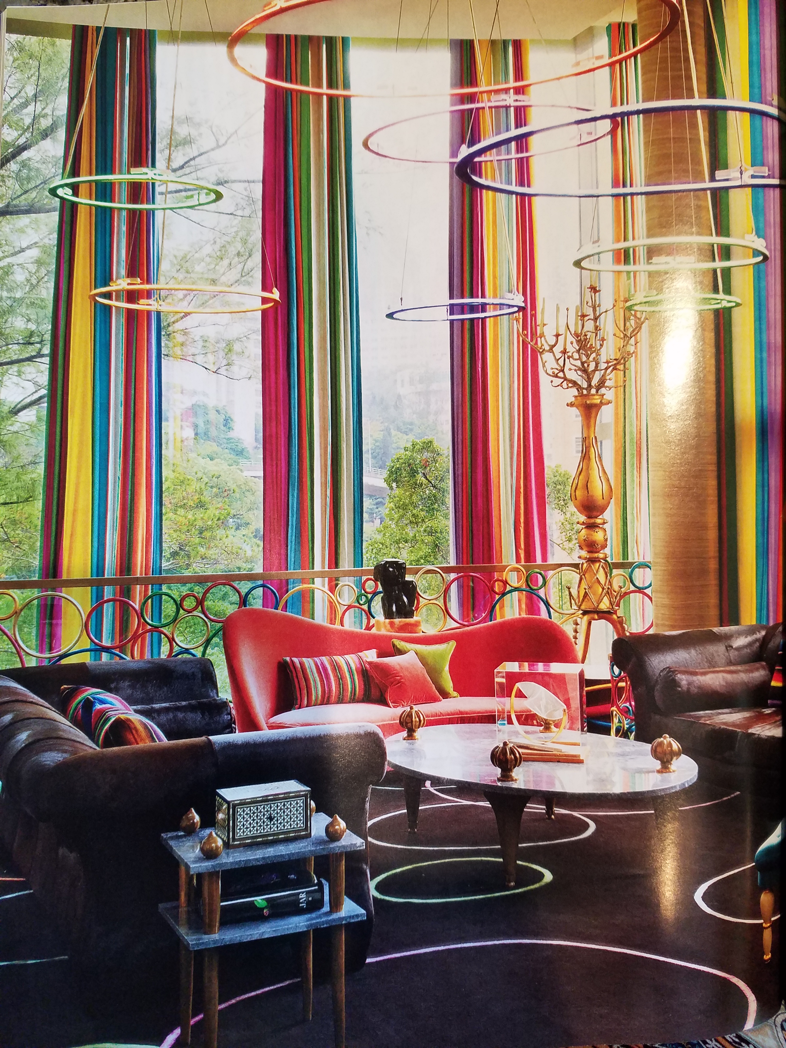
Her lips, his costume, the children’s masks, a sunspot on a bus, the fighting ring ropes, structural elements in the arena are all so subliminal yet so vivid. Consistent and repeated use of the contrast with the bold red color in combination with turquoise is also a key element in this film.Nacho Libre masks

So back to the party where everyone is listing things they associate with red. If you can get a copy of this book and whip it out after everyone has read the lists, I promise everyone will find it captivating on so many levels and subjects – great lively conversation, fun, fascination and amazement will ensue!!


What is art? Enjoying The Art Forger

I just finished a book. So? Well…with great books piled on many surfaces around my bedroom, the time never seems to avail. I’ll have the best intentions – like selecting one to take on a trip, but I work for hours in the car or upon settling in on a plane, I tend to open the in-flight magazine and flip through the articles – generally discovering some tasty tidbits and then nod off for the rest of the flight – whether for 45 minutes or 4 hours! No better chance upon arrival at the destination, as relaxing is generally not my primary activity anywhere!!

So the recent completion of The Art Forger was a silly accomplishment by most people’s the art forger
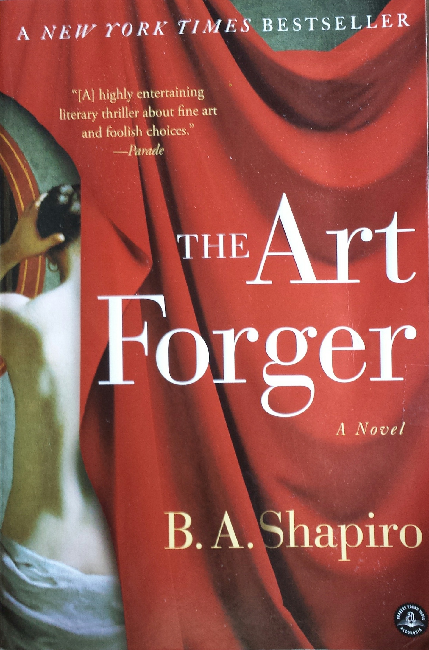
measure.  I followed B. A. Shapiro’s protagonist, Claire, as she navigated the mystery of a missing Degas. Set in a relatively small footprint of NYC, the story is one that could only effectively happen here in this city of superlatives. From the best of the beset to the worst of the worst  and the enormous middle ground of mediocrity which again is superlative due to its sheer density of people, texture, concentration of multi-cultural influences, exceptional urban scenarios and unique prospects.


I have imagined Claire and her extraordinary artistic talents living in a one horse town someplace in the  middle of nowhere. This story would not take place or it would have to have had many more chapters and be quite convoluted. In NYC the seemingly faceless masses live, thrive, struggle and prosper in a dense infrastructure of architecture and opportunity. It provides a setting and gathering of people breathing the aspirations of personal dreams and collective shared frustrations and weary survival efforts in a remarkably competitive urban microcosm(s).

The story centers around Claire’s innate and learned talent for reproducing paintings. With which talents, she actually works for a company who pays her to copy originals for sale. Degas bathers She is not forging as that would mean that the copies were intended to be marketed as, or represent, or be sold as though the original. Hers are legally sold as reproductions – until the plot thickens…Where a love interest, temptations of wealth and fame, innocent confusion and clever problem solving are woven between the past and the present and ultimately begs the question about the value of art – how is it established and when is it talent versus celebrity? The chicken and the egg thing or the Emperor’s New Clothes, either way,a mystery that boils down to what the market will bear.

With just enough technical information regarding the processes required to create an effective reproduction or, more importantly, a convincing forgery – the story weaves clever innocence with selfishly profitable and ego-feeding intents. It includes petty jealousies and fiercely loyal friendships which provide a believable combination to embody Claire’s world.

In the end, without giving anything away, as an interior designer and more specifically, a gallery owner representing the varied talents of a variety of media, my enjoyment of the story and ultimate amusement for placing value and awarding varying degrees of talent was satisfied. The nod to the OTC (Over the Couch) acronym that derogatorily describes art purchased for the express purpose of matching one’s decor was spot on! And I even gave a talk once entitled “I Want to Buy a Painting to Match My Red Sofa” as a valid niche for some. There is an endless  equation of context, timing, association, validity, originality, creativity, exposure, personality, and marketing. Which leaves me thinking, once again, about the base question – What is art? That too could join the classic bumper stickers  “What is reality?” and “Why be normal?” Hmmm…..something else to ponder…

And next I intend to immerse myself in what I expect to be my Valentine’s present tomorrow – A red likeno other - book 
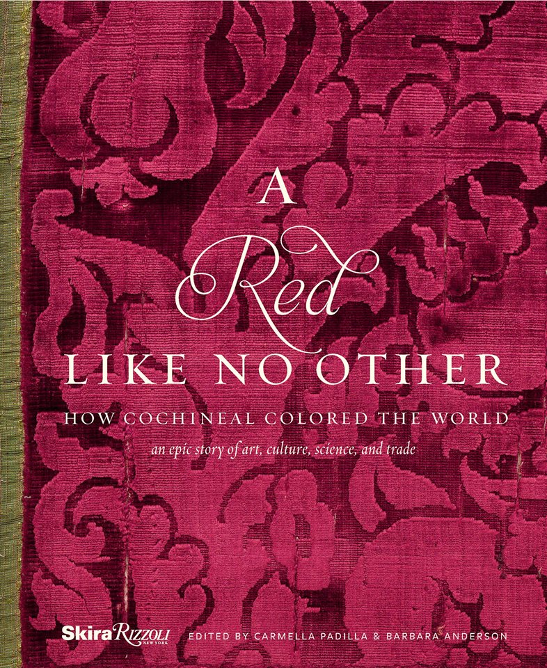
A Red Like No Other – but unless I am on a roll, it might take me a while.

Table Dressings From Nature – Inspirational Fun!


It could have been a sculptural piece of drift wood or a gnarly tree branch from the woods or a twisted piece of metal from a salvage yard…but the idea is to see things in a different way and once again—as I have done this before— to make something from nothing. And in this case, with no effort or manipulation—just the natural beauty of the found object.

The tide was out making the beach so wide it was like a great runway of wet sand. Scattered on the surface were the leavings of the waves – pieces of shell and polished stones. There amidst the beautiful debris was what looked like the suggestion of an abandoned boat hull—a dried, darkened palm sheath. I instantly knew, this would be another beginning of the tropical table-scape that I am so fond of creating when we are at the beach. P1110860

“Creating something from nothing,” my father would often say. He was a great believer in that idea that one man’s trash was another man’s treasure. We loved to beach comb together whenever we found ourselves at the tide’s edge. Sometimes it was tropical and the coral was bleached white and pocked with texture. Fine mesh pieces of purple sea fan and perfect little green “hat” shells would be nestled among the dense collections of heavier piles of white coral.

Then other scenes would find us on northern beaches of the Maryland coast where there was no coral but the ocean would wash multi-colored surf-polished stones onto the shore blanketing the sand particularly at the very edge where the water would curl between the beach and the ocean’s depths. Tiny purple and pink clam shells would peek, being abruptly exposed and quickly bury themselves back into the wet sand moistened with  each incoming wave.

On this day, the warm breeze is tropical and the beach is expansive offering rare treasures scattered broadly but sparingly on the pristine surface of sand. It is here that I encountered my centerpiece.

Don of course is saying—”what are you going to do with that? It’s too big. Leave it here.” And I assure him that it is in fact a treasure and that it will be magnificent in the center of our dinner table where we are entertaining 11 for festivities this coming weekend. He, as always, acquiesces knowing that it is futile to stand in the way of my wildly enthusiastic creativity. P1110861 P1110871

Over the next couple of days, he and I both collect white stones and shells on our daily beach walks. At my instruction, we only collect white unless it is a particularly interesting shell. The idea is to have the stark contrast with the dark hull of the palm sheath.P1120142

Our dining table is a handsome slab of travertine marble. Laminated to a double thickness and finely finished with a smooth full bull-nose edge, it is the perfect organic surface to build this also very organic centerpiece.

It needs something…the neutral tones are lovely. Yet, the dark espresso brown of the palm sheath with the white of the stones, against the creamy surface of the travertine invites something more. I realize that it can only be enhanced with another layer of organic material – here in the form of the fresh verdant green palm fronds – the perfect punctuation! P1120102

Oh would that I had collected more flat oyster shell halves…they work so well for votive candle bases…but alas, parrot green cocktail napkins will have to do for this last minute detail.

Our woven palm place mats, in their natural dried flaxen color, compliment the rest of the organics on our table. And as night falls, the sun drops beneath the sea’s horizon and twinkle of scattered candles finish our scene. Salud!


Holiday Tablescapes KISS Theory!

For the fast switch , KISS is the name of the game – keep it simple and sensational! The Thanksgiving weekend creates a great opportunity to get a jump on Christmas. Yesterday neighbors were out precariously placing lights along their rooflines, lining walkways and blanketing shrubs. We noticed this as we were out walking, observing, not quite ready to dive in to the next holiday ourselves.

But I did think that this was a great opportunity to illustrate a continuation of my favorite seasonal design practices and that is going outside to nature to get inspiration and actual elements for my creations. And the most remarkable aspect of this exercise is that it is all in our own yard. Look around and you will be amazed at what is out there!

For Thanksgiving I had been inspired by the blazing colors of the Bradford Pear that was – is still – screaming with color at the front of our house. 20151126_093537
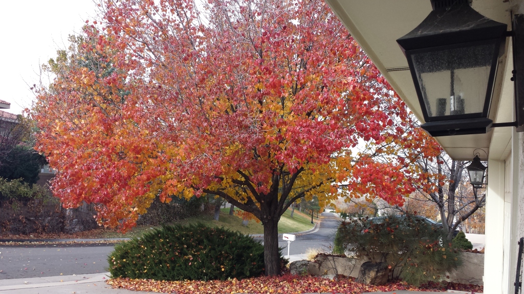
The rich maroons transitioning to corals and rosy tones into brilliant golds and even bright yellows  were irresistible. It’s similar to a maple tree with its magnificent range of fall colors but with precious little round heart-shaped leaves. 20151126_093558

20151126_095436 - CopyI created a tablescape using short-cut branches in a pair of squatty square glass vessels flanking a large square hand-blown glass platter. In the center on the platter, I gathered acorn squash which we will be enjoying baked with brown sugar and butter later this week, and added some ornamental gourds for their interesting shapes and colors. 20151126_093945 
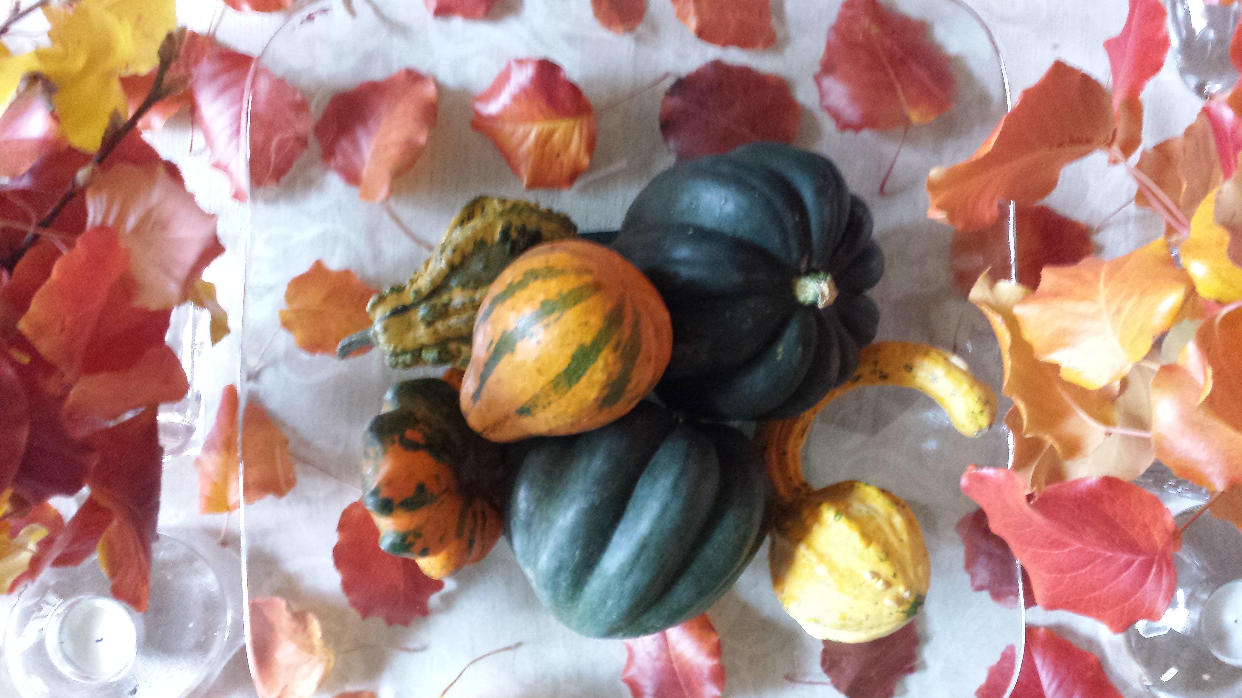
After scattering some of the leaves around the arrangement on the neutral linen table runner, the result was boldly colorful, organic and spicy scene bursting with autumnal warmth.P1110503
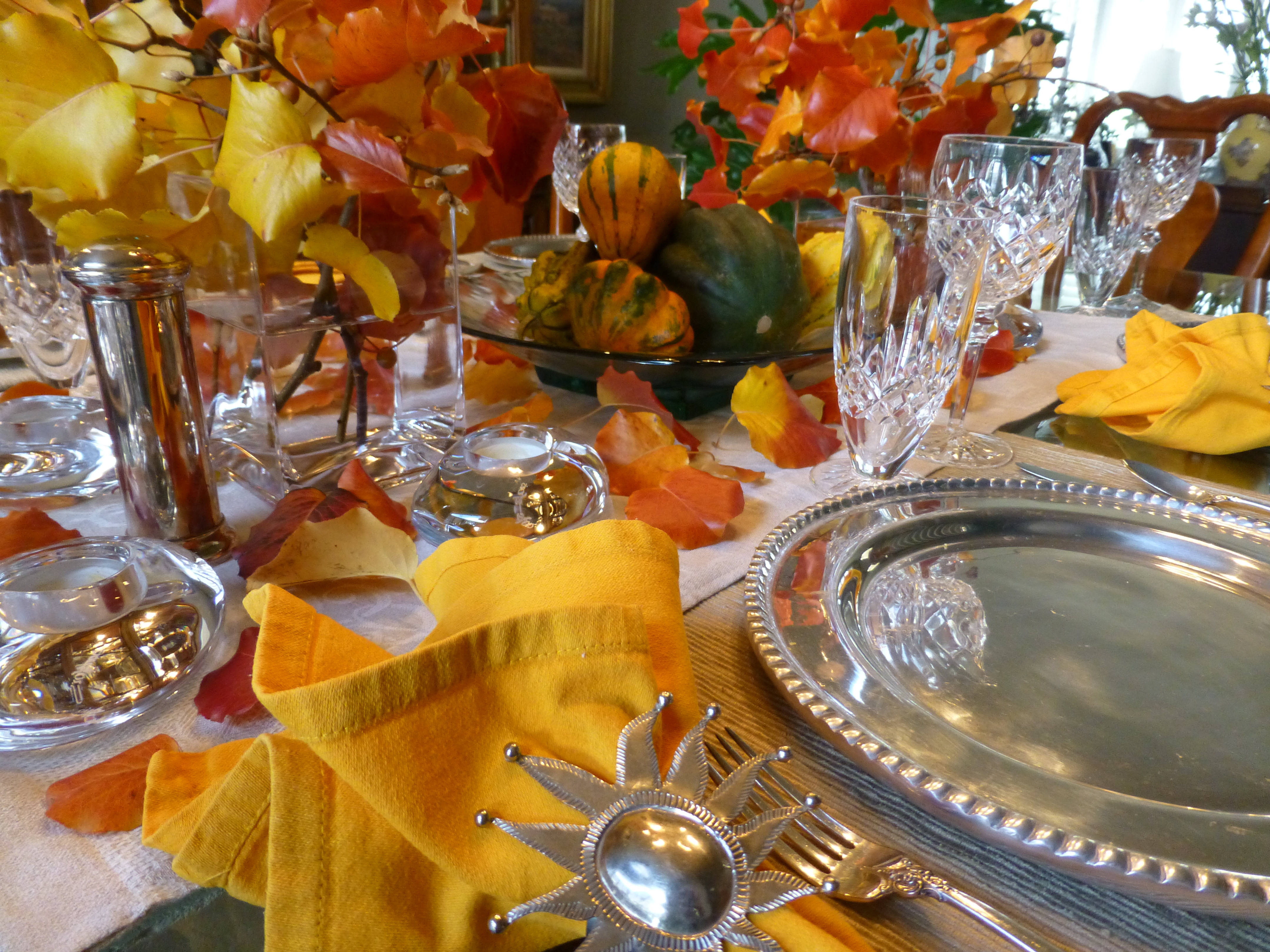
So as I pondered this setting this morning, two days later…the leaves on the table were getting crunchy, the branches were dropping leaves and the water in the containers was a bit cloudy…time to clean it up! Since it seems that everyone is already transitioning to Christmas themes, I thought why not do the same?! The alternative of merely cleaning it up and leaving it barren was a bit anticlimactic after enjoying the spectacular beauty of this recent  holiday table. So here again nature was calling to venture forth and scour the yard for the next seasonal statement.

Now remember, this is just a quick transition…I can take it leagues and layers further as the weeks progress by adding holiday runners, ornaments, some bling and other accoutrements. But for today, the switch is quick. I ventured out into the yard and cut some bushy mugo pine and smoky blue spruce branches,  P1110558 
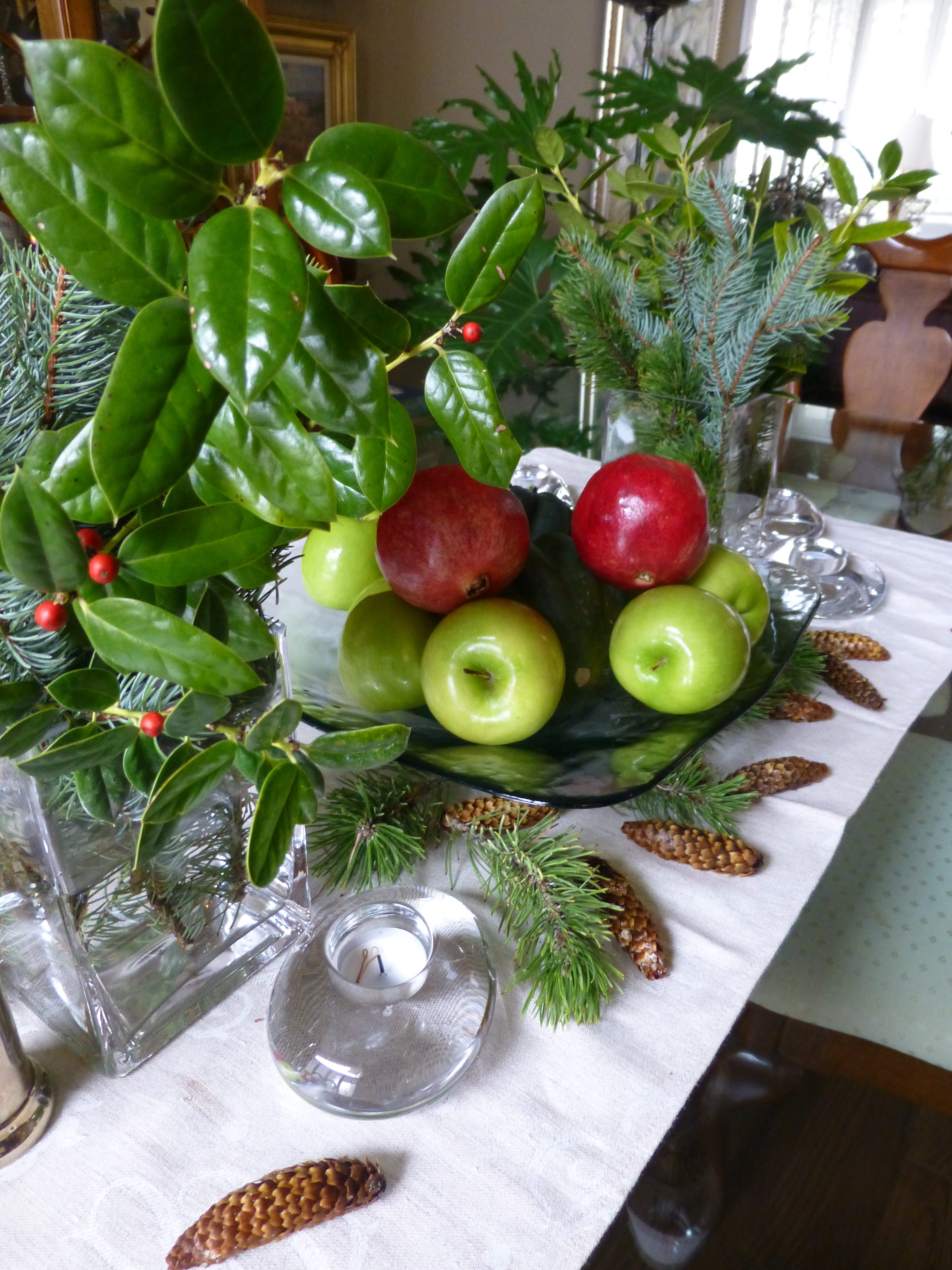
a few holly sprigs from the bushes in front and jammed them into the same freshly refilled square glass vases. In the center, the neutral linen runner remained and on the glass platter I kept the acorn squash, traded the gourds for electric green granny smith apples and a couple of pomegranates ( I had bought three last week and had already picked my way through the many juicy morsels of one – leaving two to do the red thing in my centerpiece today).P1110556

I scattered a few pine cones and Voila – my instantly transitioned tablescape said “Christmas is on its way!”


Random Colors in Nature’s Eggs


When I opened this cartoon of eggs given to us by friends the other night fresh from their chicken coop, I was amazed by the soft rich color combination that  burst forth.  And color is so a part of my design sensitivity that anytime I encounter an unexpected scheme, the inspiration is incredibly stimulating. So much so in this case that I created today’s story!  20151114_085947

My friends have a ridiculously chic chicken coop.  By that I mean being beautifully white-washed and accessorized including having a crystal chandelier complete with a dimmer—for the rooster and his women to “get into the mood.” chandalier in coop

I might have thought that this contributed to the glorious soft colors that they produced—mood colors…but I actually do know better. I know that it is the breed that produces the color of the shells and not eating carrots for peachy/orange shades or leafy greens for the soft aqua and celadon tones.

These colors though—grouped all together in this random collection, looked like intentionally dyed Easter eggs. The artist of this collection was nature and random selection of hens and collection of eggs and unconscious placement in the carton. I did not rearrange them and they did not arrange them in advance of sending them home with us. It is truly random beauty created by nature. 20151114_085930

Meet Handsome Boy the rooster of this coop. rooster  His women are a fine group of chicks named simply Hello Ladies as that is how they are collectively greeted daily.  hens in coop  They represent the breeds Ameraucanas which produces the green/blue series, Buffs Orpington for  peachy/light brown and Wyandotte for the darker orange brown shell shades. The combination is a color scheme that is so wonderfully balanced with complimentary opposites that it is one of pleasing perfection.

Here are a few color cards from a Benjamin Moore fan-deck of paint colors that represent the range of  complimentary hues and soft values in this earthen clay-like warm palette paired with and balanced by the cool water and flora reminiscent shades.  20151115_125439

Upon closer inspection, the range of tones from these cards closes in on the soft colors of the egg shells.

20151114_085930

Nature’s random beauty translated by the design-eye into paint colors and fabric samples for an inspired interior design. fabric 20151121_075630_resized


Discovering Design Dangling Three Dimensionally in Space at the Estudio Cafe

They hung from the exposed structure of the portico that ran the length of the house over-looking the marina and the tropical glistening scene that surrounded the estudio-cafe. Gently twirling blades of colorful aluminum balanced and counter-balanced on wire and suspended from nearly invisible filament. Petals of flowers, leaves, triangles, they dangled and spun in the gentle movement of air. What local artist created such magical sculptures that added such color and dimension to the various heights of space both inside and out ? I must find this fanciful person.P1040400
I discovered he was not a local, rather a visitor del norte. Yes, an American snow-bird escaping the chilly climes and bringing his art, as he vacationed in the southern resort of Puerto Vallarta, for others to share. There was a kismet, a chemistry between the two men, the host and the new-comer. Both teeming with artistic juices looking for challenging means of expression in a variety of media. The host was more than willing to share his space to exhibit these delicate yet powerful pieces. The new-comer when describing his work references “poetic spaces and meaningful places” and nothing could better describe where he found himself and his new venue, the estudio-cafe.20140118_125532
Having enjoyed for years the magic of the estudio-cafe with it’s perfect waterside setting and continuous collection of artists presenting exquisite musical talent and fine art of all manner, engaging conversation in an ever stimulating artistic dynamic, it was this day with the sun-bathed ochre stucco walls and shadows cast by the progression of the day with soft breezes wafting through the architecture, that I was moved once again by the composition of it all.
A three-dimensional collage of color and style, form and scale, art both created and spontaneous – an unselfconscious collection of rare confluence that cannot be created – but happens. This is an incredible experience. And it was with this overwhelming experience that first introduced us to our host and has since brought so many fascinating people into our lives.20140125_131409
This was the beginning of the friendship, spawned by the love of art, related color and shapes, that brought Terry Welker’s work to New Mexico. After a couple of years admiring the enchantment and thrill of his mobiles at the estudio-cafe, I made the call that connected our common love of design and resulted in a premiere exhibit of spectacular, yet modest sized kinetic pieces a our boutique gallery in downtown Albuquerque.A0968D4A-813E-4E75-86B9-71807134DAA5 As he says of his work, “he animates space with sculpture.”
Come to PATRICIAN DESIGN to see these fantastic suspended sculptures and smile at the joy they bring. And also the “host.” This wonderful artist, Federico Leon de la Vega, who by warmly embracing family and friends has created a nurturing atmosphere of love and friendship, limitless talent and sensitivity and who has also generously exhibited his magnificent oil paintings at PATRICIAN DESIGN.20150117_121847 We invite you to experience these two outstanding artists brought together by a remarkable union of creative energy and goodwill.