Presidents’ Day – and what is the more significant focus for interior design on this day that celebrates the preeminent leaders of our country and the world? Well, the relatively modest (by some country’s standards), but significant home in which they reside, the White House.
Many years before I had a glimmer of interior design in my purview, I remember the buzz of my mother and her peers surrounding the exciting and noteworthy changes that Jackie Kennedy was bringing to her White House. The exhilarating tone of that time was super-charged with the young, beautiful Camelot couple who made such an indelible impression on all they touched. I sat on my father’s shoulders on November 17, 1962 at the dedication of Dulles airport – Washington’s “jet airport” watching and listening to President Kennedy describe this “distinguished ornament of a great country.” At the same time he recognized the value and beauty of historical properties that warranted restoration and protection. Back then it was a little too much for me to digest, but their sensitivity and appreciation regarding the importance of good design and their influence on the world of fashion and design was astonishingly profound. Everyone was touched by their style and discriminating sense of all things surrounding art, architecture, fashion and interiors.
Having graduated from Mount Vernon College in Washington DC in the first graduating class that was a model for FIDER accreditation in Interior Design, I was surrounded by architectural history and American decorative arts. From the State Department to the Winterthur Museum in Delaware, Washington, DC to Williamsburg – we had an exhilarating education that mere books cannot convey.
Aileen Mehle wrote in Architectural Digest of the first ladies and their very public opportunity to leave their mark on many elements of popular interest not the least of which is the most famous residence on earth. “As the wife of the most powerful man on earth, she commands the attention of the world, placed under a sometimes unforgiving microscope, dissected. From the top of her hairdo to the height of her heels, she is fair game. People want to know: What does she eat, drink, think? Does she like red, pink, mink? How and who does she entertain? Above all, what in her eyes is it like to be the chatelaine of the White House, the most famous house in the land? What mark will this woman make on her surroundings? What evidence of her personal taste and style will she leave behind, hoping that her loving imprimatur will last longer than the few years it was her temporary residence?”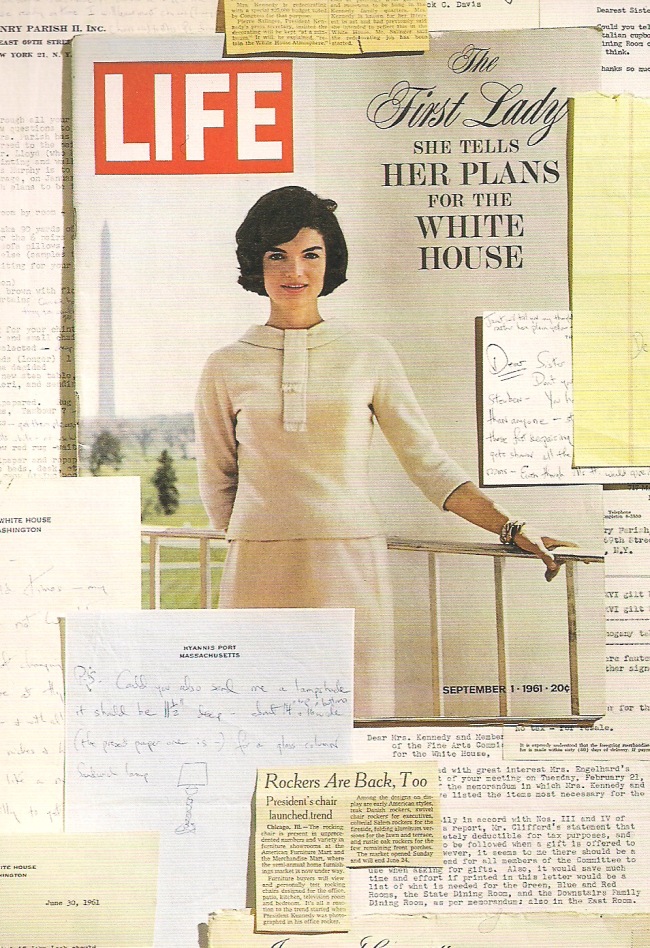
Mehle narrowed the field of focus by highlighting two of the most effective first ladies in what I like to reference as the Department of Décor. She stated that “Jacqueline Kennedy and Nancy Reagan were two of the most remarkably caring first ladies of the 20th century. Previously they had both enjoyed brilliant lifestyles.” She notes that both women “were chic and stunning, refined and impeccable. They brought these personal traits to bear almost from the moment they walked through the door of 1600 Pennsylvania Avenue. How lucky (for their eras and posterity) that they cared so passionately about history. That the White House looked much more authentically beautiful and harmonious when they left than when they arrived is a testament to their exquisite stewardship.”
Jackie enlisted the internationally recognized French interior designer Stéphane Boudin, regarded as a “master of the grand and the opulent” regards Mehle. “He was the star of the renowned Paris decorating firm Jansen” and it was with his brilliant guidance that they transformed many of the more relevant rooms of the White House into exquisite statements of period elegance with timeless good design.
Catrin Morris reviewed Jackie’s fine work and quotes the White House Museum, as stating that the then new First Lady’s appreciation of antiques and fine art prompted her to “not merely redecorate but to restore the White House to a grander, more authentic period look appropriate to its role in American life.”
Decades later, Nancy Reagan, a stellar woman well recognized for her exquisite sense of style Mehle observes “left her own individual mark on the second- and third-floor private quarters of the White House, the Yellow Room, the Treaty Room, the Lincoln Bedroom and the Queens’ Bedroom. Ted Graber, a personal friend and noted decorator in the Hollywood scene was selected by Nancy to work to create an atmosphere bringing “beauty, color, graciousness and comfort. 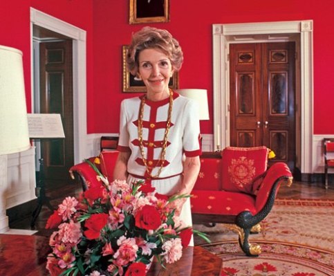
It was during her reign as matriarch of the White House’s Department of Décor that I had the good fortune and extraordinary opportunity to have a private tour behind the scenes of the White House. It was in the middle of my career and the wives of a visiting NFL team had just been through earlier that day and although velvet ropes cordoned off many areas beyond which tours could not step, we were escorted by a longtime family friend to get behind the scenes and experience an intimate exploration of the stately rooms. President and Mrs. Reagan were not in residence that weekend. I remember touching Dolly Madison’s tea service and remarking how incredible that felt. Priceless decorative arts – significant artifacts of history were not only on display but presented in a way that suggested that the past Presidents and their wives were still present as following Presidents and their families passed through the halls. This melding of an ongoing, living history is quite unique and inspiring to witness first hand. From the Oval Office where a dutiful agent sat behind an outer desk granting us access to peek inside this dauntingly important headquarters to the spotless stainless steel subterranean kitchen…we explored it all.
Although our tour was limited to a daytime excursion, at that time, any guest privileged enough to stay overnight Mehle offers “might sleep in the Queens’ Bedroom, where five visiting queens have slept in the canopy bed. All was pastel—the Turkish rug, the striped silk taffeta on the bed and at the windows. The 19th-cen-tury painting and mirror over the antique mantel was a gift to the U.S. government from Queen Elizabeth when she was still a princess. Nancy kept intact the cerulean-blue fabric that covered the walls of the adjacent Queens’ Sitting Room.” Such extraordinary history of our fairly recently established great country preserved and made available for view in this exceptional context!
Mehle also tells readers that “many of the furnishings were authorized gifts from the Reagans’ devoted friends and others who loved and respected the White House. In nearby rooms, she kept her own collection of Battersea boxes, blue-and-white porcelain and jade on small tables. Paintings by Cassatt, Cézanne and Peale adorned other spaces in the private quarters.” Said Graber, “She was responsible for its same elegance and easy charm she herself epitomizes.”
Alas, despite the discriminating efforts of these extraordinary First Ladies, much of their fine work has since been modified as is the prerogative of those who follow. Historians have recorded the periods and transitions while history will determine and confirm the contributions of all who have the key responsibilities for the contents and presentation of the treasures within these walls. Beauty may be in the eye of the beholder, yet in the final analysis, good design reads through and hopefully transcends attempts at transient change for mere ego. The value of sensitivity is priceless.


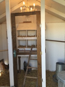

 His women are a fine group of chicks named simply Hello Ladies as that is how they are collectively greeted daily.
 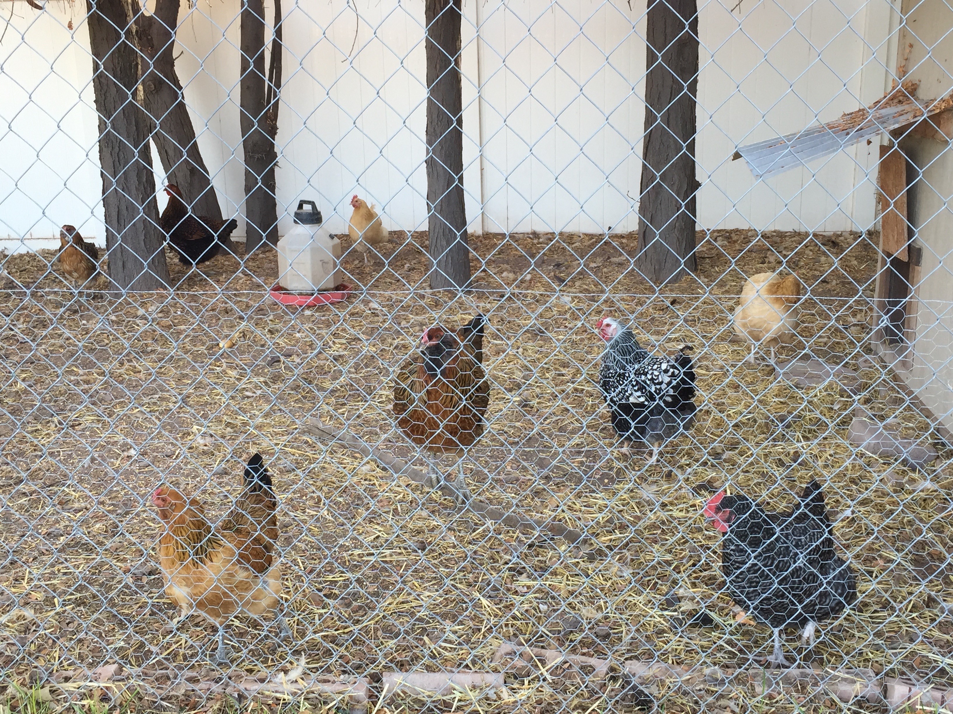 They represent the breeds Ameraucanas which produces the green/blue series, Buffs Orpington for peachy/light brown and Wyandotte for the darker orange brown shell shades. The combination is a color scheme that is so wonderfully balanced with complimentary opposites that it is one of pleasing perfection.


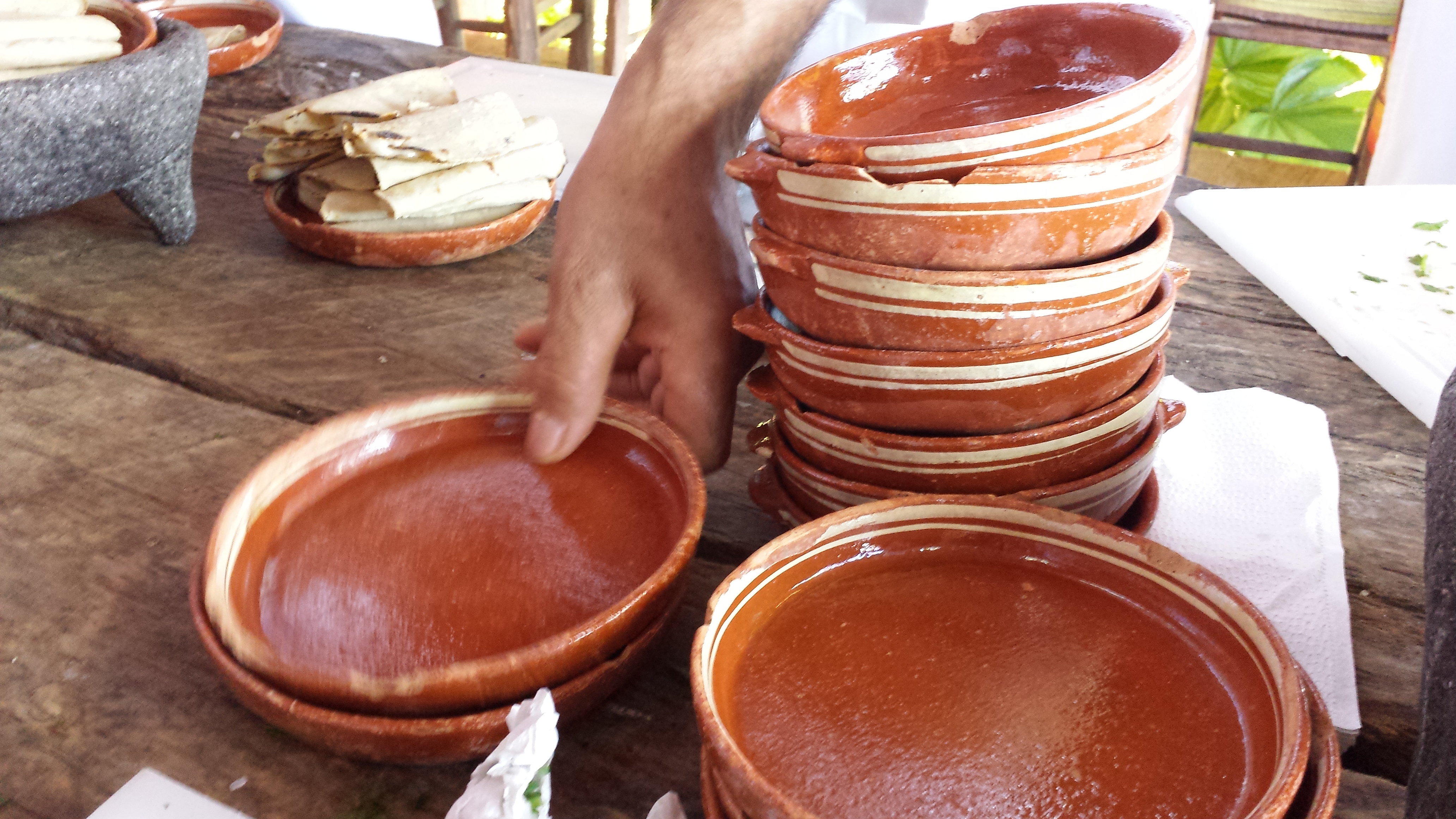
 mole! Creating a good time—is an art. And as is true with most artistic ventures—as in life in general—some people do it better than others. Enthusiasm is infectious and it generates such greatness from its energy that is should be harnessed. It is about this that I write today.