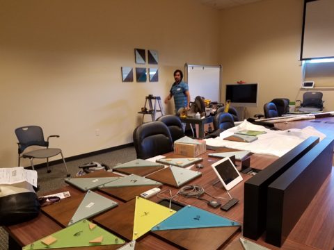
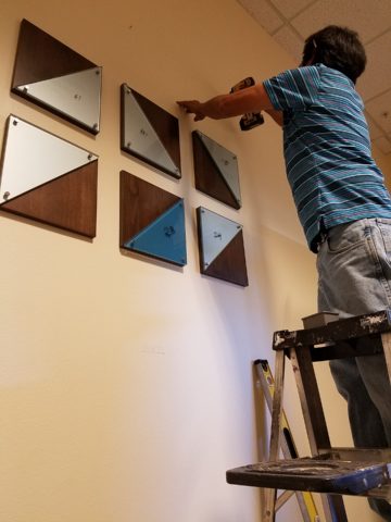
This happening scene provided fabulous fodder, to observe existing conditions being incorporated into a design, for great benefit on many levels. Applicable to all remodel projects – see what you think!
In this case, Night Club design. The styles are many, but the concept is of a commonality comprised of a few basic functions – a fun place to socialize, meet people and enjoy the entertainment of the overall scene often including live performances. We probably all picture the image of a flashy, glitzy environment.
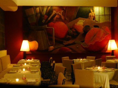
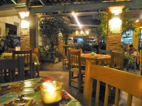
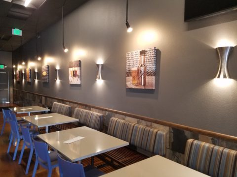
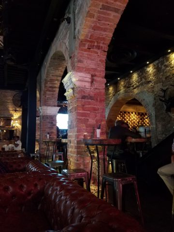
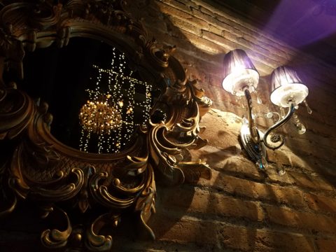
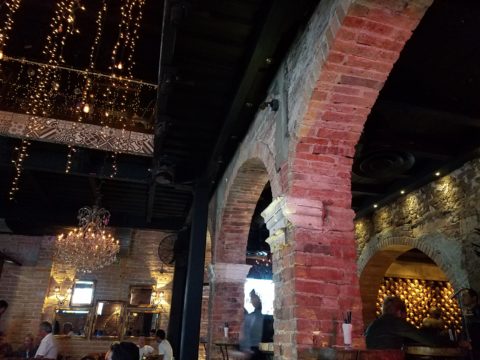
We were recently in a most unusual space that combined the glitz and bling you might expect with a “nightclub” atmosphere, but juxtaposed with rustic finishes that were unique to the original architecture. This brick expressed in some of the remaining structural elements – walls and column/arched spans of structure – was warm and rich providing an unexpected pleasing combination that so easily might have been eliminated – concealed behind slick new finishes.
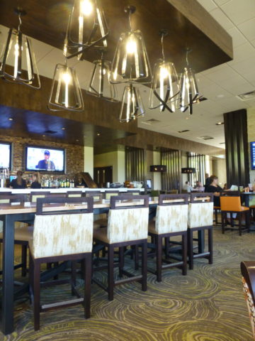
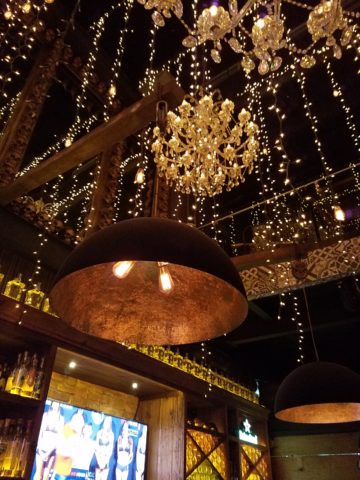
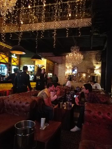
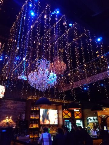
To play-up the vintage aspects of the space, ornate traditional chandeliers were suspended amidst myriad dangling strands of sparkling, golden LED lights. These provided a glittering glow of ambient light in the upper reaches of the space effecting both the downstairs and upper level of the club. This mixed lighting treatment was obviously the eye-catching emphasis of the interior.
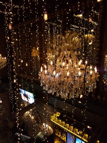
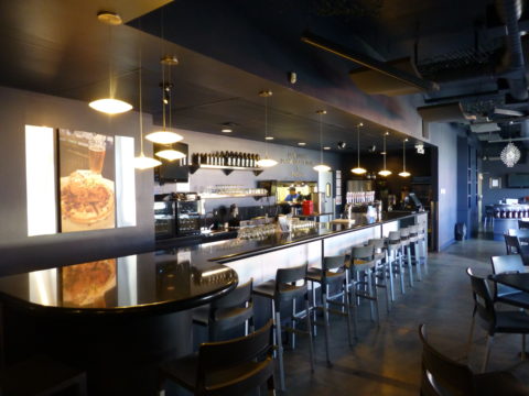
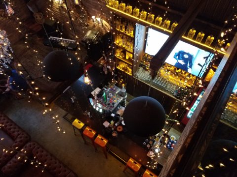
Ample light was provided by the luminous chandeliers and thousands of dangling LED pin-dot lights along with the indirect lighting of the back-bar shelves. Therefore, the large steel domes that hung suspended over the bar needed not to contribute ambient light, but were limited to effectively cast direct downward light on the bar surface. Their golden interiors provided a warm glow while the exterior surface disappeared into the darkness.
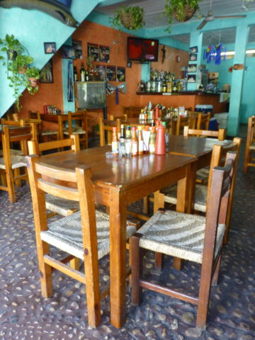
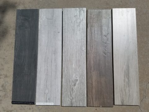
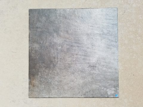
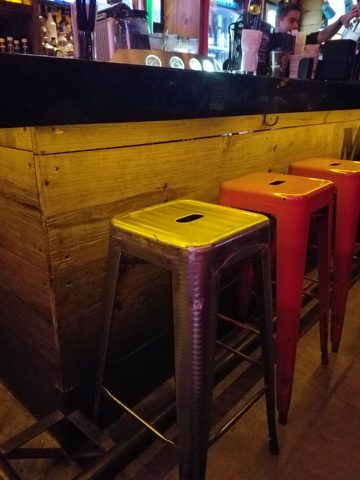
The bar was quite simple and raw, yet read in enough of an interesting and complex fashion, to compliment the scene. The design was sufficient in its components and indirect lighting worked well with all the other design decisions.
The simple Tolix-styled stools were an understated easy fit with the other surprisingly raw materials of the bar.
To answer the need for friendly group conversations, there were comfortable places to gather with zoned seating areas of tufted leather sofas and leopard-patterned rugs, wooden grouping tables, then hi-top tables with stools and finally barstools along the length of the bar. The various areas provided options for patrons to pick the most inviting or appropriate spot to enjoy the atmosphere with friends.
Having choices in any hospitality setting is invaluable. It allows the patrons to make their own decision how best to utilize and enjoy the space. It answers different needs and appeals to different people for different reasons, therefore inviting a variety of patrons to invest their time and money in the establishment. A broader reach of clientele. A broader client base.
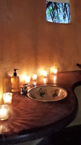
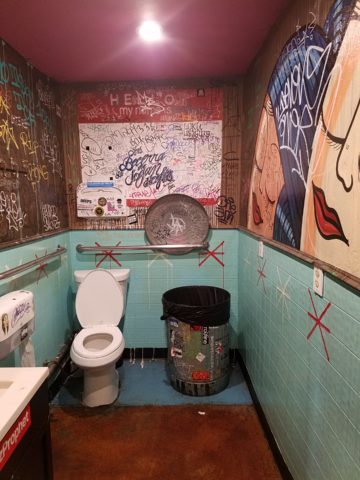
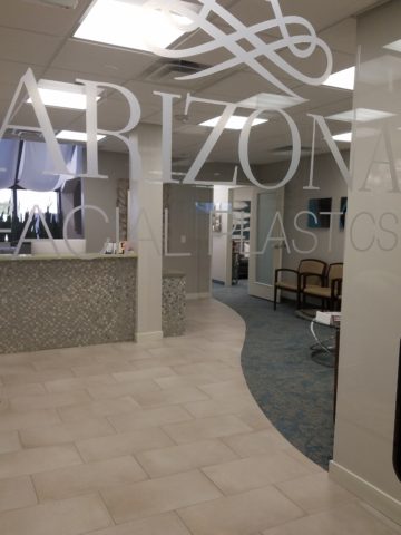
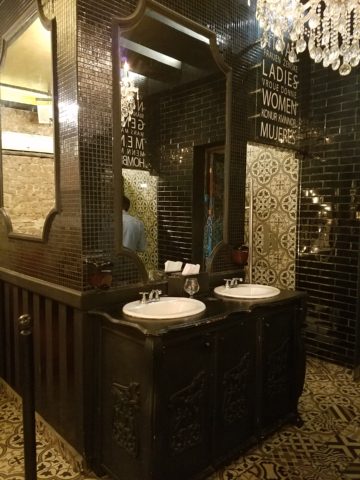
I’ve mentioned more than once that having restroom design follow the theme and quality, of the rest of the interior, is imperative. As it relates to night clubs, it is often the meeting-ground for dating, meeting new people, attracting new people and therefore, the restroom should promote attractive feelings of approval and confidence in the guests.
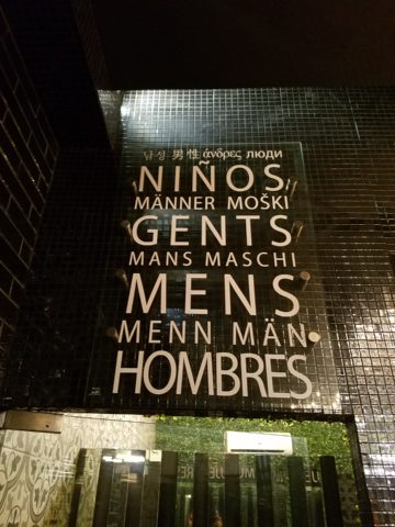
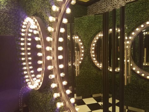
Jazzing up the restrooms in keeping with the jazzy feeling of the club environment should be a natural continuation of the design scheme. That means mirrors – full length – not merely above the sinks, good lighting without down-lights to cast unappealing shadows on the guests.
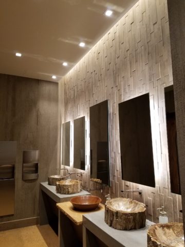
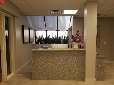
Here the placement of sinks outside the restrooms frees up space in the stall areas, while adding interest to the extended restroom area. The design theme presents free-standing bureaus for the sink cabinets. Often shared sinks are used in these anti-room set-ups, but in this case opposing sides of the vestibule provided an attractive vanity area for men and a separate one for women.
What was so inspiring and interesting as we scanned the interior were the various zones all within this complex mix of original, traditional architectural elements and adding traditional if not vintage lighting fixtures paired with modern high-tech lighting effects and large brilliant monitors featuring exotic, playful, getaway beach videos. It worked.
Have you ever encountered a structure that at first glance did not comply with the supposed new program? Awkward supports, raw materials, exposed mechanical…so ,many “unfortunate” things to get in the way of your design. Often the “imagined” design over-rides the reality of the moment. The challenge is to allow the moment – the reality of the existing conditions – to participate in the process rather than being briskly eliminated without thorough consideration.
And the additional bonus might often be cost-savings and budget stretching while not betraying that benefit at expense of the finished design. Brilliant to have incorporated the “whatever it is” – wasn’t that creative and hence, interesting!! OK – I’ll take that!
To have concealed or negated the architecture would have been almost criminal – certainly a loss of architectural integrity and textural interest.
The crime of missing opportunities like the seemingly conflicting traditional elements with the need to be glitzy and modern is to be too one-directional . It’s like having “design-blinders” on that direct and focus a theme without recognizing the value of thoughtful salvage of content, contrast and context.
All of what we observed applies to both residential and commercial design. The takeaway is to consider existing conditions and, if applicable, embrace them. Give thoughtful consideration to the opportunities before glossing over them, concealing them or eliminating them altogether. Try to appreciate the gifts that might escape you if you insist on unnecessarily hammering and manipulating a space into submission – design submission. Rather, let it tell a story and contribute to the design process – which would more than likely result in a more unique and creative end project for that thoughtful integration of the existing elements.