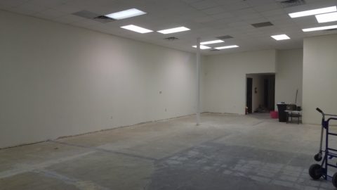
Finishing touches are always the beast to tame at the end of the hunt. Yes, you’ve hunted, you’ve searched, you’ve gathered, you’ve assembled and stood back and observed your work. What’s needed? What’s missing? When is it finished?
Just the word finish sets up a mental block for many. It’s like decisions period. Once you make a decision, you’ve lost your choices. Losing choices can be a dilemma in itself! So, from Pinterest to HGTV and the internet at your fingertips the choices and options are endless, but what do YOU want to do, to call it “done? It’s all in the details…
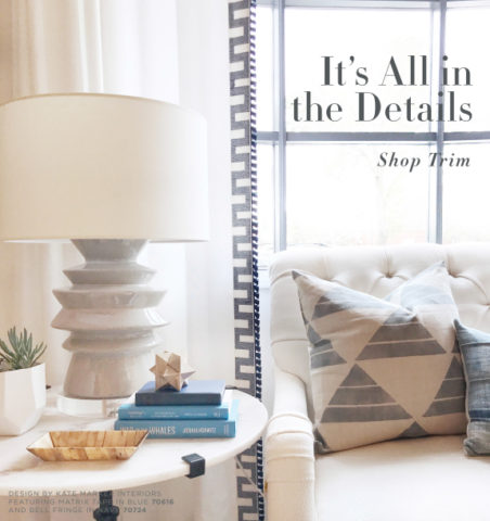
Schumacher offers details right down to the trim on the draperies! This bold key design makes all the difference!
And inasmuch as you can’t seem to GET it done, you WANT it done – just can’t seem to get there from here. How do you decide what you need to add for those incomplete finishing touches – to be FINISHED? Know though, that to have the feeling that it is finished is a good thing. Yet, that doesn’t mean you can’t change it – sooner or later!
We interior designers have jobs because our clients need to do things, change things, finish things. It seems that with all the options presented on TV and the internet, people are jumping in with inspired ideas, making decisions, buying things and doing things – then coming to a screeching halt! “HELP!” is the cry when everything seems to be too much – or not enough – or too uncertain and overwhelming – or not just right.
As if your own self-imposed frustrations and pressures are not enough, your partner rants…”Just finish it – will you? Be DONE with it!!!” Not everyone loves a DIY project. Most people don’t even like the disruption of a professional team coming in and tackling the job. Alas, “you have to break an egg to make an omelet,” some wise person once said.
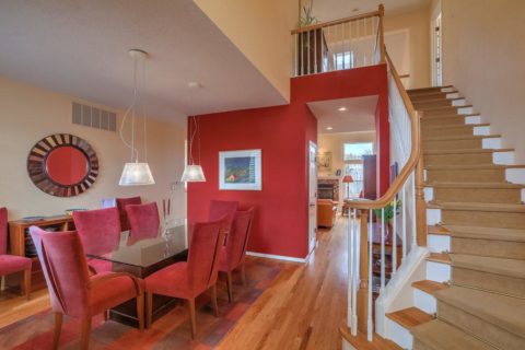
Whether you’re changing paint colors for the third time in a month or tossing throw pillows around the room, to no satisfactory avail, there’s something missing…something is not quite right…it’s not there yet.
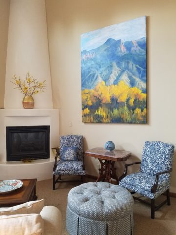
Have you removed everything from the walls and lined them up waiting for inspiration as to how and where they should be placed and grouped – maybe re-framed?
What about a mirror to add depth? Is it an installed mirror – the illusion of space without calling attention to the mirror itself or should I hang a framed mirror that makes the statement in its entirety? Do I lean it against the wall or is that a trendy affectation?
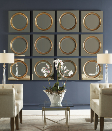
Uttermost is one of our favorite sources!
Studied nonchalance is an art form. How to achieve that intentionally unpretentiously naturally relaxed look is a challenge. Just writing about it here is an effort in describing that which is supposed to be effortless!!!!
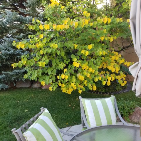
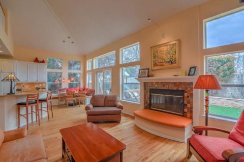
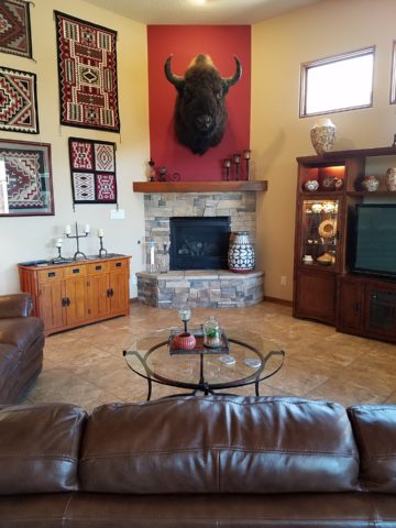
Perhaps it is a monotony of height. Do you need a tall piece among other lower elements in the room? Maybe a tree in the corner is the answer or a statue of some vertical art statement, to add interest and height. Perhaps you might consider hanging something, from the ceiling – a mobile or origami bird or even a light fixture, to draw the eye up from the otherwise low furniture pieces.
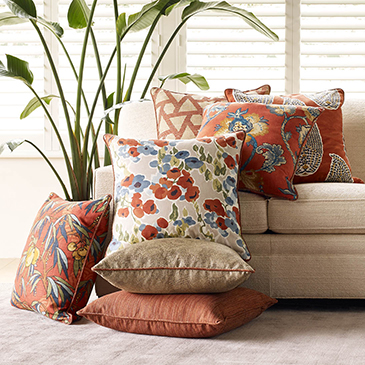
Robert Allen presents perfect fabrics for colorful pillow accents…and there’s that tall plant for height!
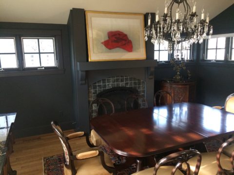
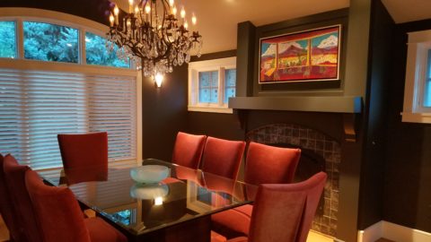
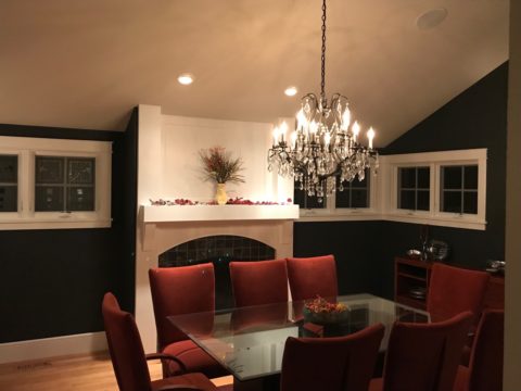
Speaking of light fixtures…how does your almost finished, but not quite there yet, room look at night? Are there dark pockets and corners that would benefit from some concealed up-lights – indirect lighting can be quite effective and enhance a spooky, dismal space.

LOVE this before & after! Check out John Cullen Lighting for some great ideas and inspiration!! https://www.johncullenlighting.com/
Spooky is the season and, with the holidays approaching, the need to get things finished before guests arrive or you leave to visit… or just the hectic nature of the baking, gift-buying and wrapping, shipping and other communications aspects of the season are upon you – pressure you to want to get things finished!
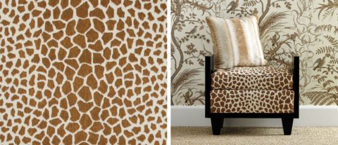
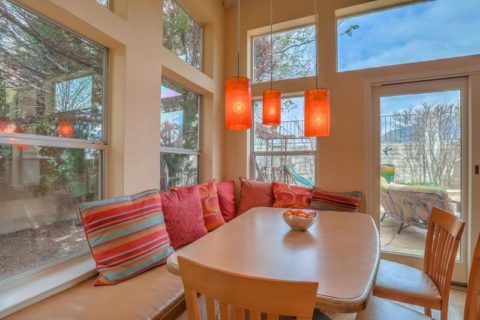
Brunschwig and Fils by Kravet offers an amazing collection of prints – mix and match!!!
Have you consulted with a friend? Do they rise to the invitation of critiquing your present state of affairs and offer design ideas that further serve to confuse you? Better yet, ask two friends and get two different options for finishing your space and then what? Pick one and the other’s feelings are hurt that you didn’t take their advice – even if they are not aware that your decisions moving forward were offered by another friend.
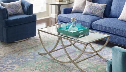
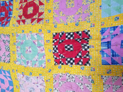
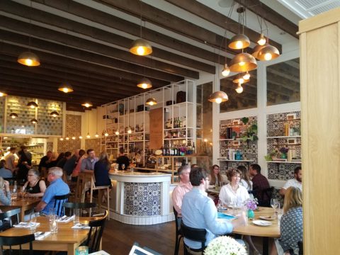
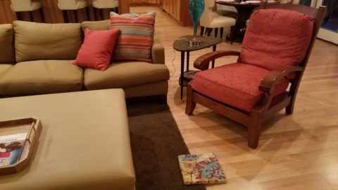
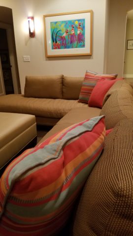
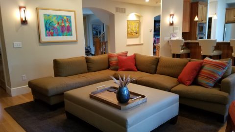
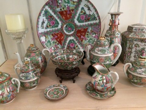
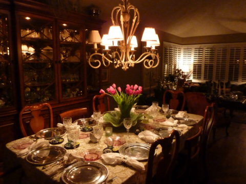
From the rug (thank you Company C for your “Colorful Living!” to the table accessories and all the things, pieces, fabrics, details in-between – finishing touches FINISH the job!!!
A designer is a problem solver, a tie-breaker, a marriage counselor, a creative who extracts your needs and – evaluating all options – offers the best solutions to get your job finished!