Designing with a purpose is always the way to begin a project. But it is particularly valuable as a tool to start the New Year off fresh! What I mean by purpose is that your interiors should reflect the purpose that they serve for you and your family. By establishing a purpose for your spaces, you will achieve happiness.
Sounds simple, but happiness is proved by what brings you joy, peace and a smile to your face. To achieve this, you will need to evaluate your lifestyle, routines and the rooms in which you perform certain functions.
Upon entering your home, do you feel satisfied? Does arriving home make you feel happy? Is it your safe and comfy retreat from the outside world? Do you like the smell? Yes it matters. Like a realtor telling a home seller to boil some cinnamon sticks on the stove to create the scent of spices in the chilly months or fragrant floral bouquets in the spring and summer…all of the senses come into play when you are staging an interior. And to enhance the design of your own home – you are staging for yourself! If your home smells musty or stale, consider the sources and do a little fabric refreshing, open windows, check for grease in the kitchen…purge the unpleasant odors.
So how do you start your day? Is your room light or dark and how adjustable is it to modify as needed? Is the floor upon which you first set your feet in the morning warm or cool, rough or soft? How do these elements make you feel? How do you want to feel? Consider all of your senses. Consider the purpose of the space and what you want it to do for you. As you evaluate these small details, ask yourself “Do I want to make changes in any of these existing conditions? It’s usually fairly easy to do and if you just take one piece at a time, you will find that the improvements are very effective.
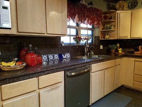
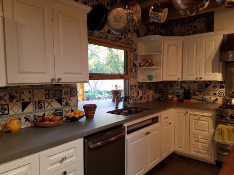
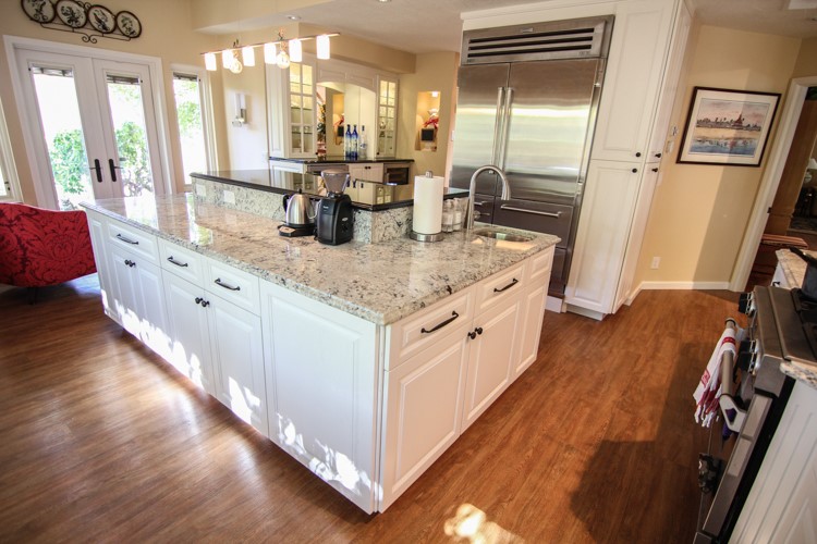
If you enjoy cooking, see how your kitchen functions and how it looks to you as a workplace. Do you have things handy? Is what you use most often easily accessible? Evaluate and rearrange if needed. Re-organize your kitchen.
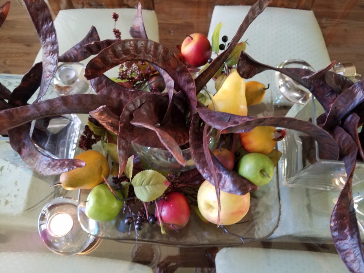
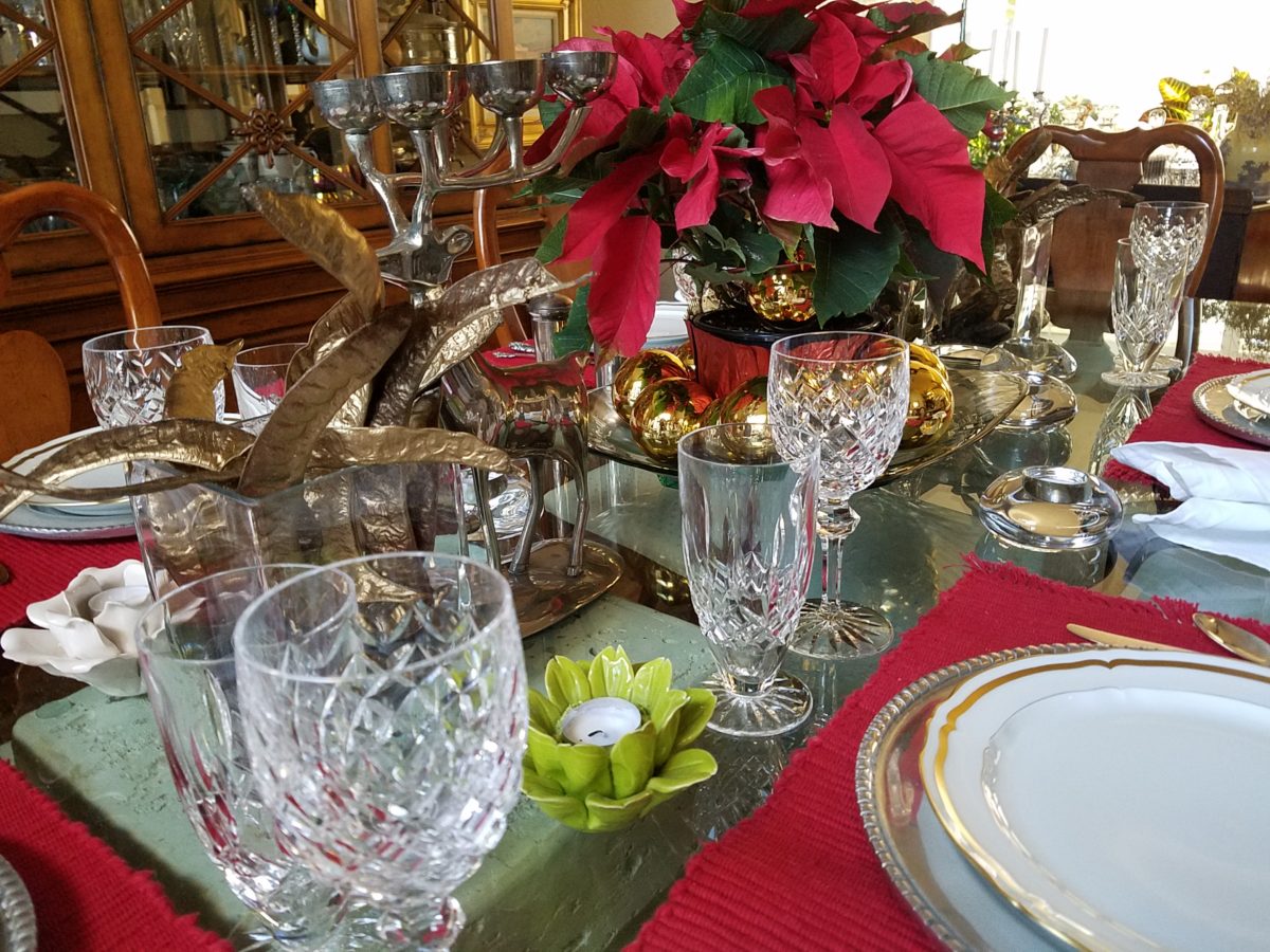
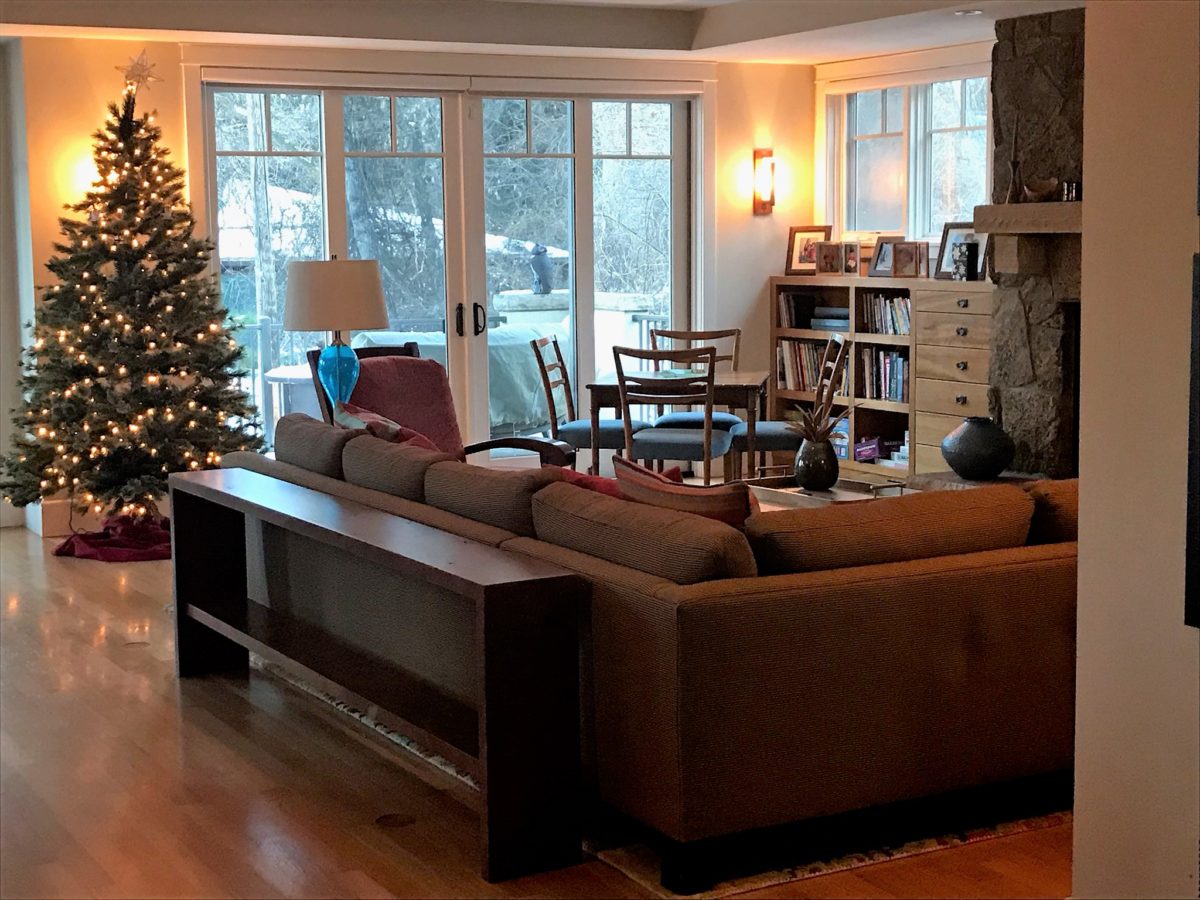
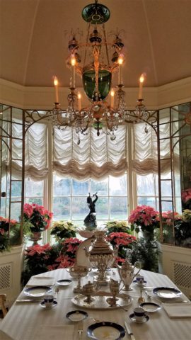
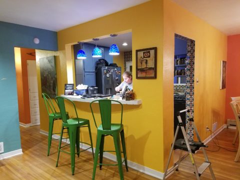
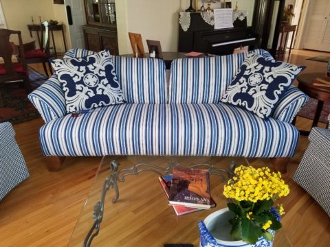
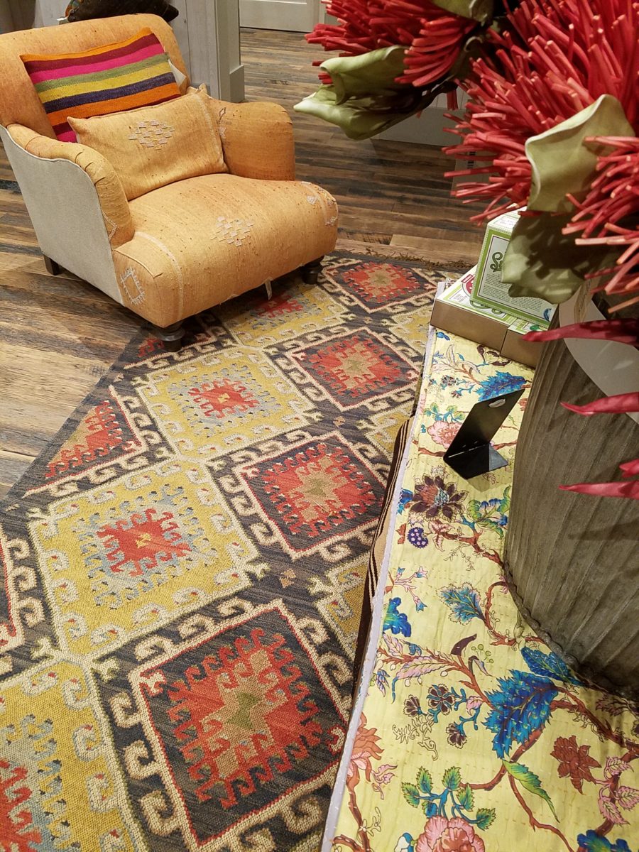
When you entertain, how do you like to do it? Is your style casual or more formal? Where do people gather and how many at a given time? You can “zone” your entertaining so that some are gathered in established seating areas while others might pull up a stool and watch you cook. Consider the flow of your gatherings. Consider the purpose. I find that I am up and down a lot and therefore I opt for a little upholstered ottoman that I can scoot under the glass top coffee table when not in use. Benches, ottomans, even floor pillows can be great supplemental seating for overflow and these pieces are lower and visually less crowded than pulling chairs in from adjacent rooms.
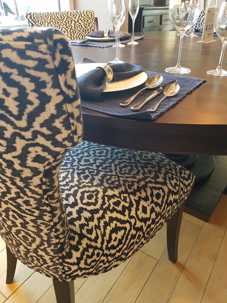
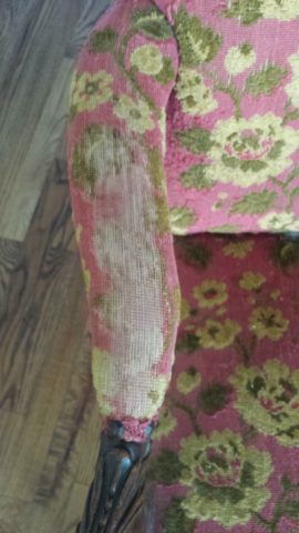
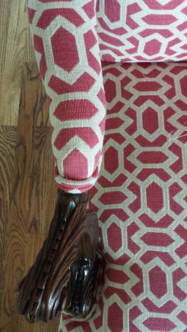
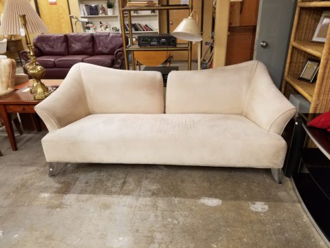
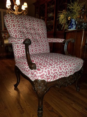
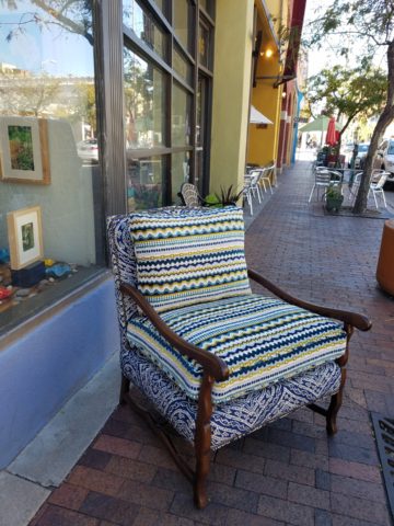
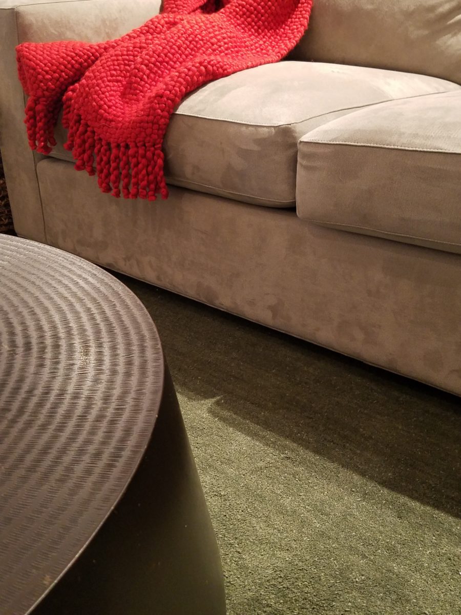
With regard to seating, do you have pets, kids? Are you hard on your upholstery? This might determine what fabrics you select, if you are considering new pieces or re-upholstery of existing pieces, in your home.
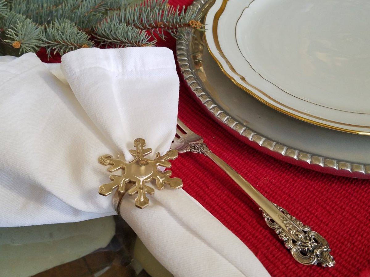
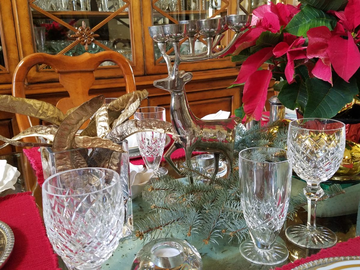
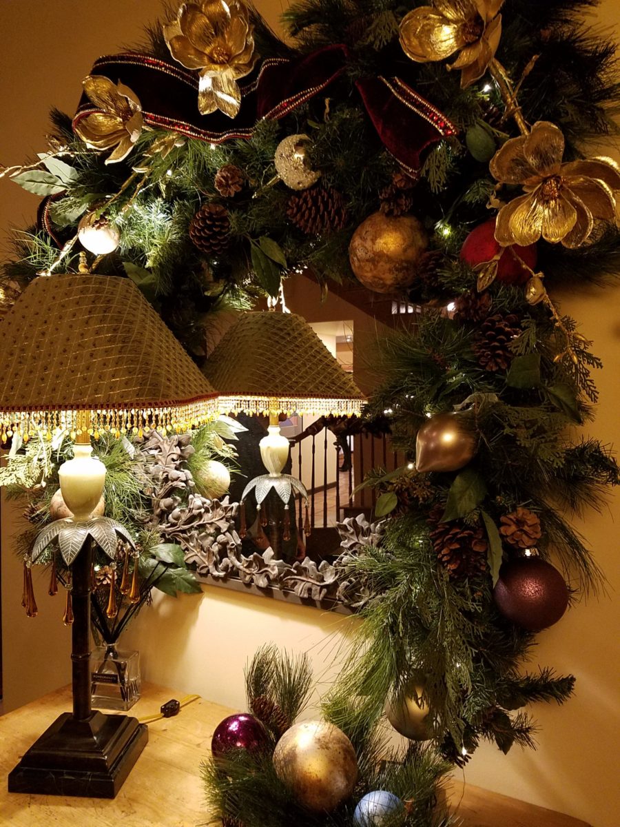
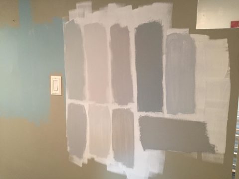
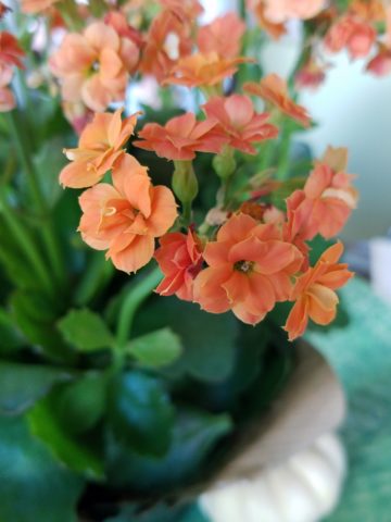
I write often about color. There are so many paint choices that is impossible not to find the right color combinations for your spaces. Consider the purpose. Remember that different rooms can have different color schemes, if that serves your purpose. If you want a space to be restful, select soothing colors and if your want to express a more vibrant spirited feeling, choose colors that are more bright, bold and intense. Consider the purpose of the space and its color scheme regarding how you want it to make you feel.
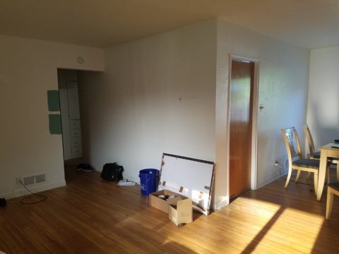
It all boils down to observing your rooms and their details, letting go of things that no longer serve a purpose. If they do not function well or make you smile – let go. Rearrange your things. This is a neat trick to re-purposing your possessions and giving rooms a new look. Move things from one room to another or just within the same room. You will feel refreshed merely by making these simple changes.
As is true with all good New Year’s resolutions…don’t put off tomorrow, what you can do today! So get started and see how you can make your home the place where you gain strength and rejuvenation, achieve happiness and surround yourself with the things that bring you joy.