To experience this glorious morning, on the open patio of a tiny commercial kitchen, in an otherwise residential neighborhood paralleling the river Cuale, in the very foodie coastal city of Puerto Vallarta, is a treat beyond measure—but I will try to share. I will attempt to take you to this special place full of unselfconscious art and function.
The cobblestone streets are dusty and send fine particulates of powder into the atmosphere causing a fairy-dust-like twinkle in the bright morning light. We bump along in a taxi turning and curving along the circuitous route that surely would lead most to believe what they say—that “this place is so hard to find, it has to be good!!!”
The front is shut and obviously closed for business. The taxi driver brings this to our attention, “is closed” he says simply— assuming that he will be continuing along the bumpy calle along the rio back to the bustling scene of the awakening city and return us to our point of earlier departure. 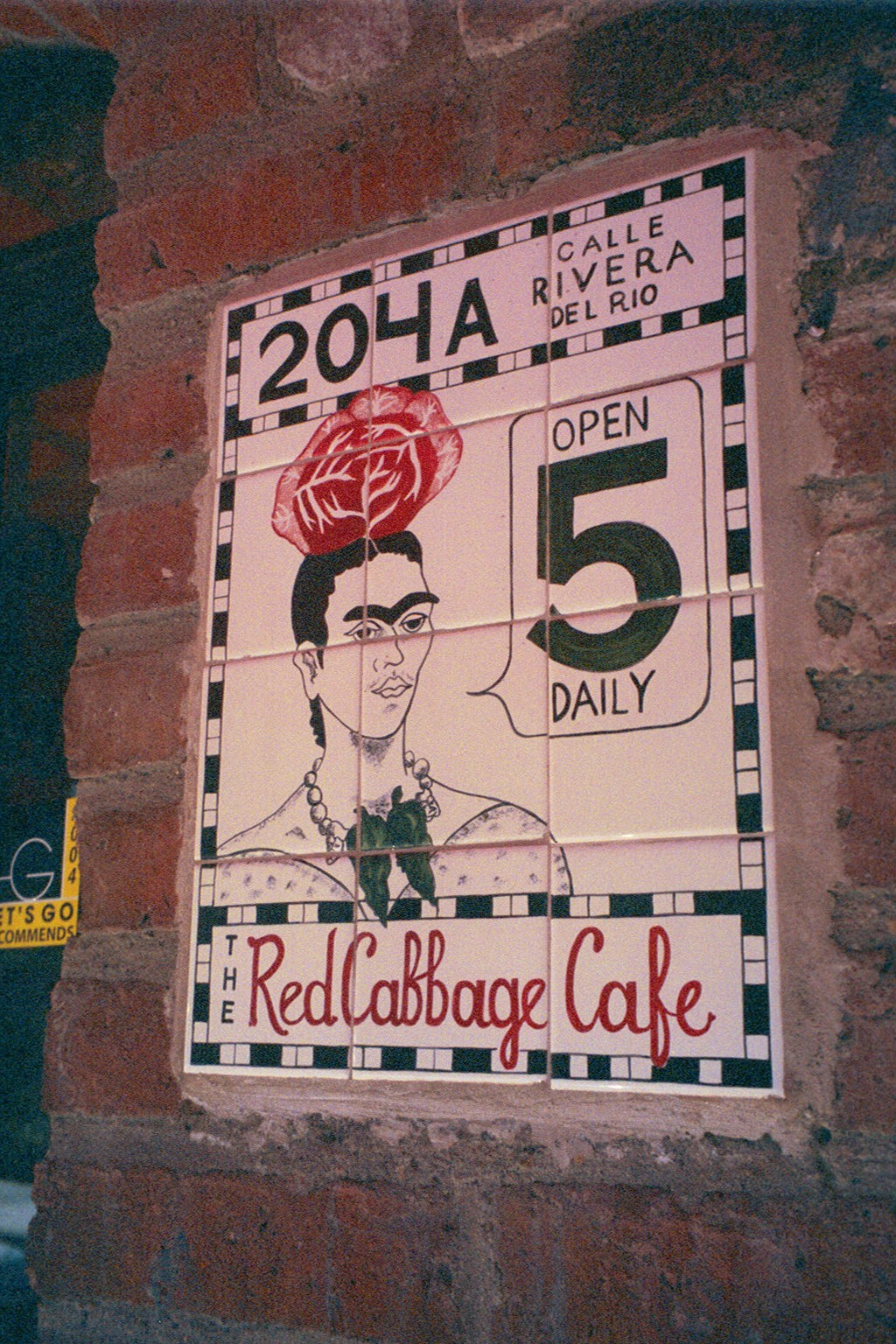
“No,” we tell him “we’re taking a cooking class” “leciones en la cocina” we attempt to convey and with that he beams a broad smile and says “really?” and stops the cab along the wrong side against the opposing traffic on the little street in front of the café.
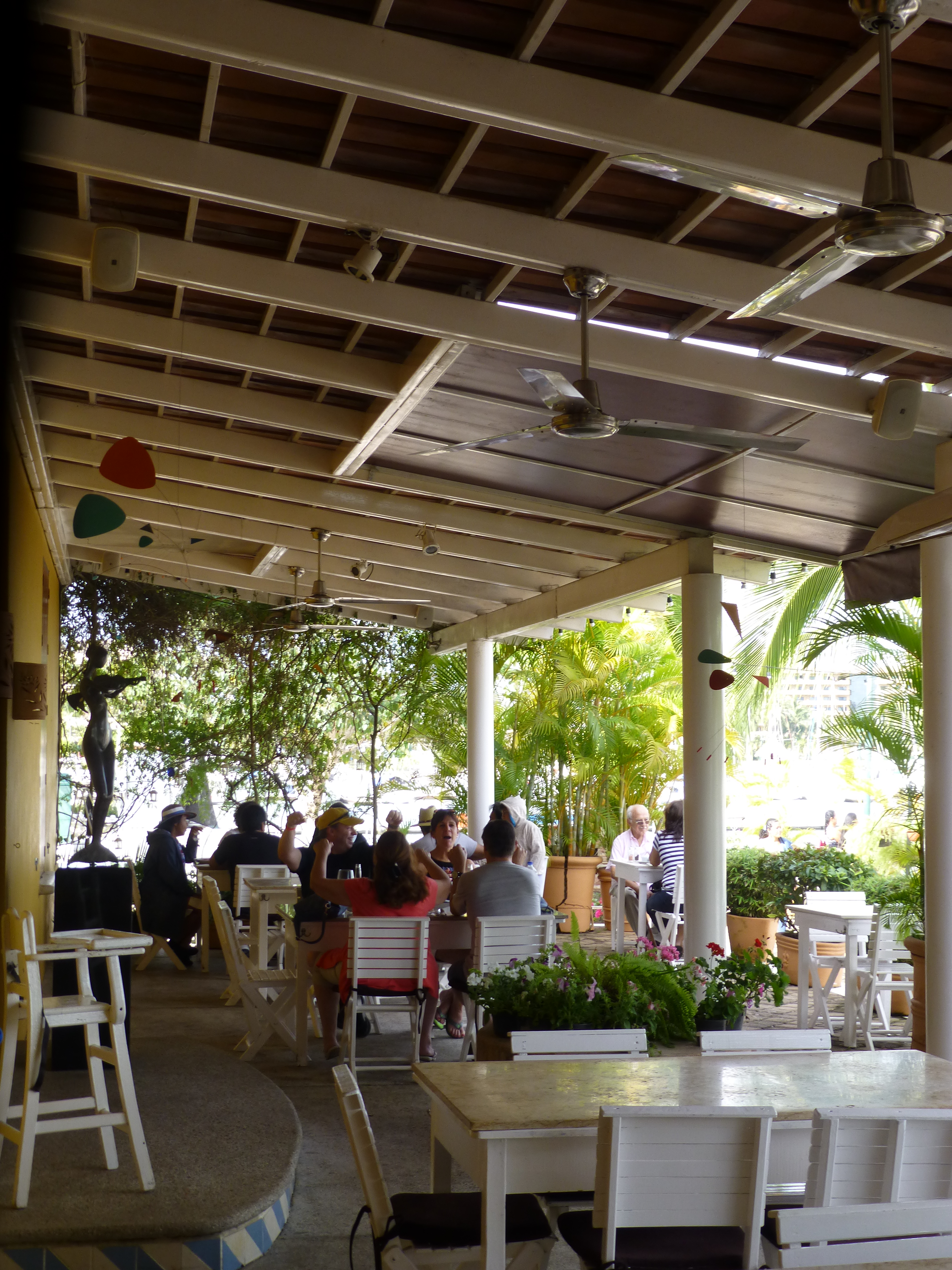
We notice Lola peeking through the door at us as she unlatches the locks motioning us through and welcoming us as we enter the quiet little checkerboard floored dining room. 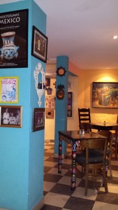 At night this place buzzes with animated conversations and is alive with color and funky memorabilia, art and posters, collages of collectibles all on brilliantly painted walls creating an eclectic artistic interior of fun and festivity. But on this morning, the room is dormant save the three other guests waiting to participate in the morning’s class.
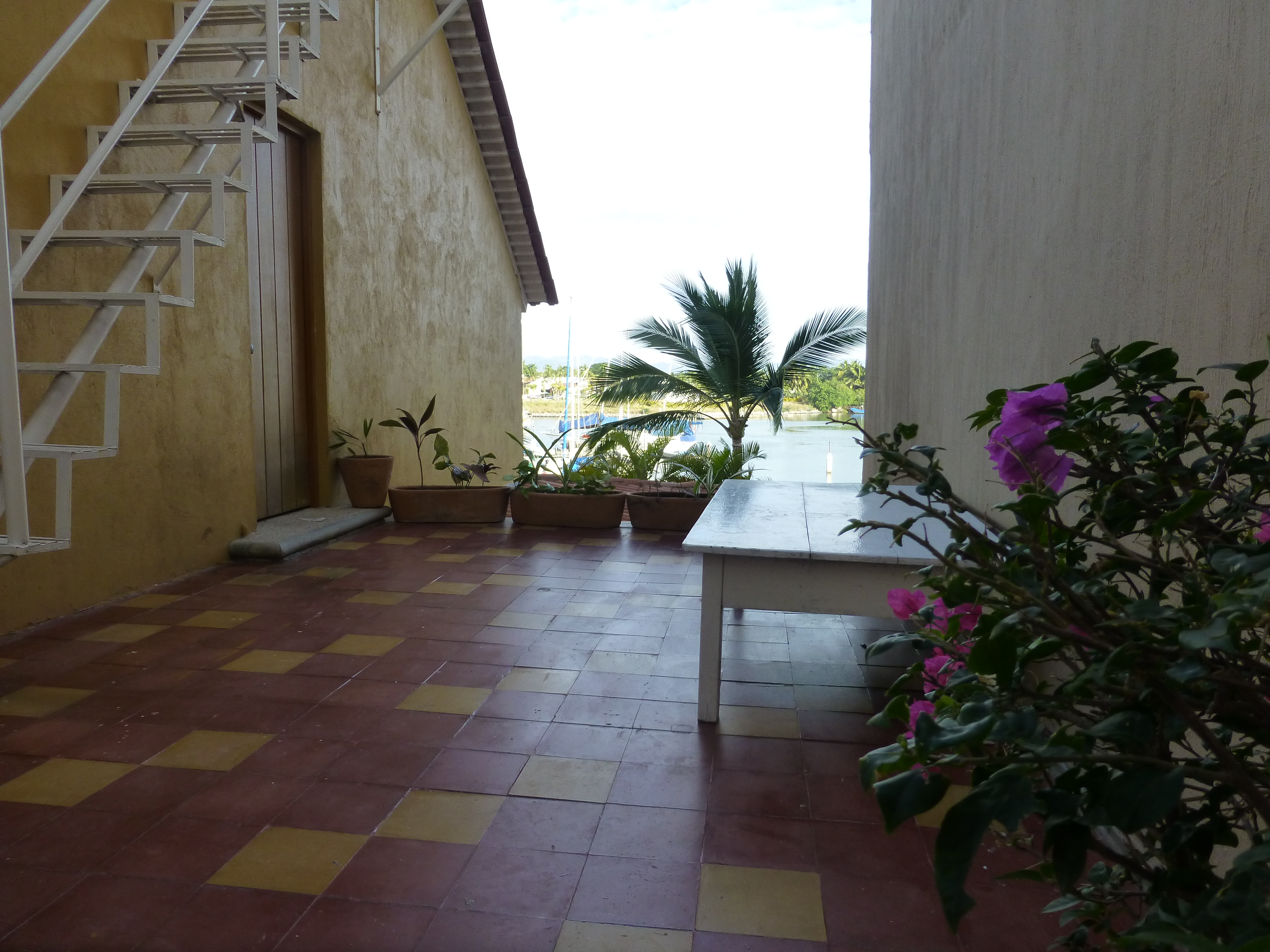
After brief introductions we are escorted through a doorway to a narrow concrete staircase. 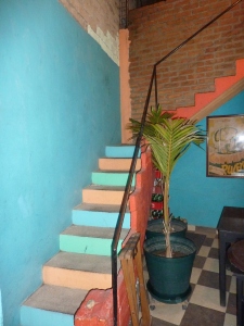 Daylight streams from above and we ascend past more brilliantly painted walls to a second floor open to the sky onto a patio rimmed with potted herbs and flowering plants.
 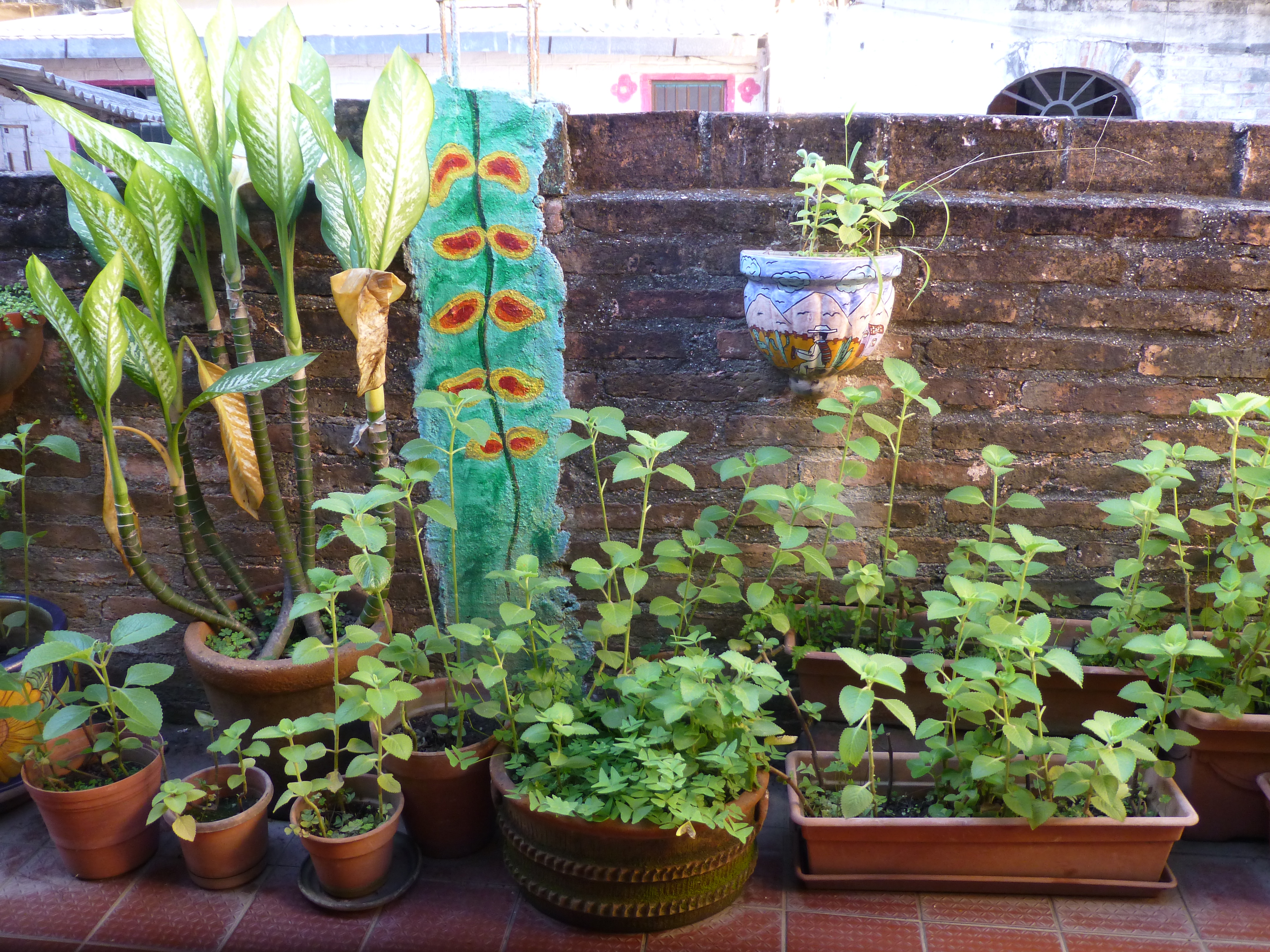 To the right we realize that the rest of the space is undercover, yet always exposed to the elements from that one open east-facing orientation.
Inasmuch as I love cooking and eating and all things related to culinary pleasures, this is not the focus of this story, but rather, it is to describe this artfully inspired space and all the raw style and primitive grace we encounter in this wonderfully entertaining class of good and indigenous fresh foods and their fabulous flavors.
The space is charming and intimate and spotless. The colors are screaming from every direction including a whimsical pink door surround seen over the wall of the patio. 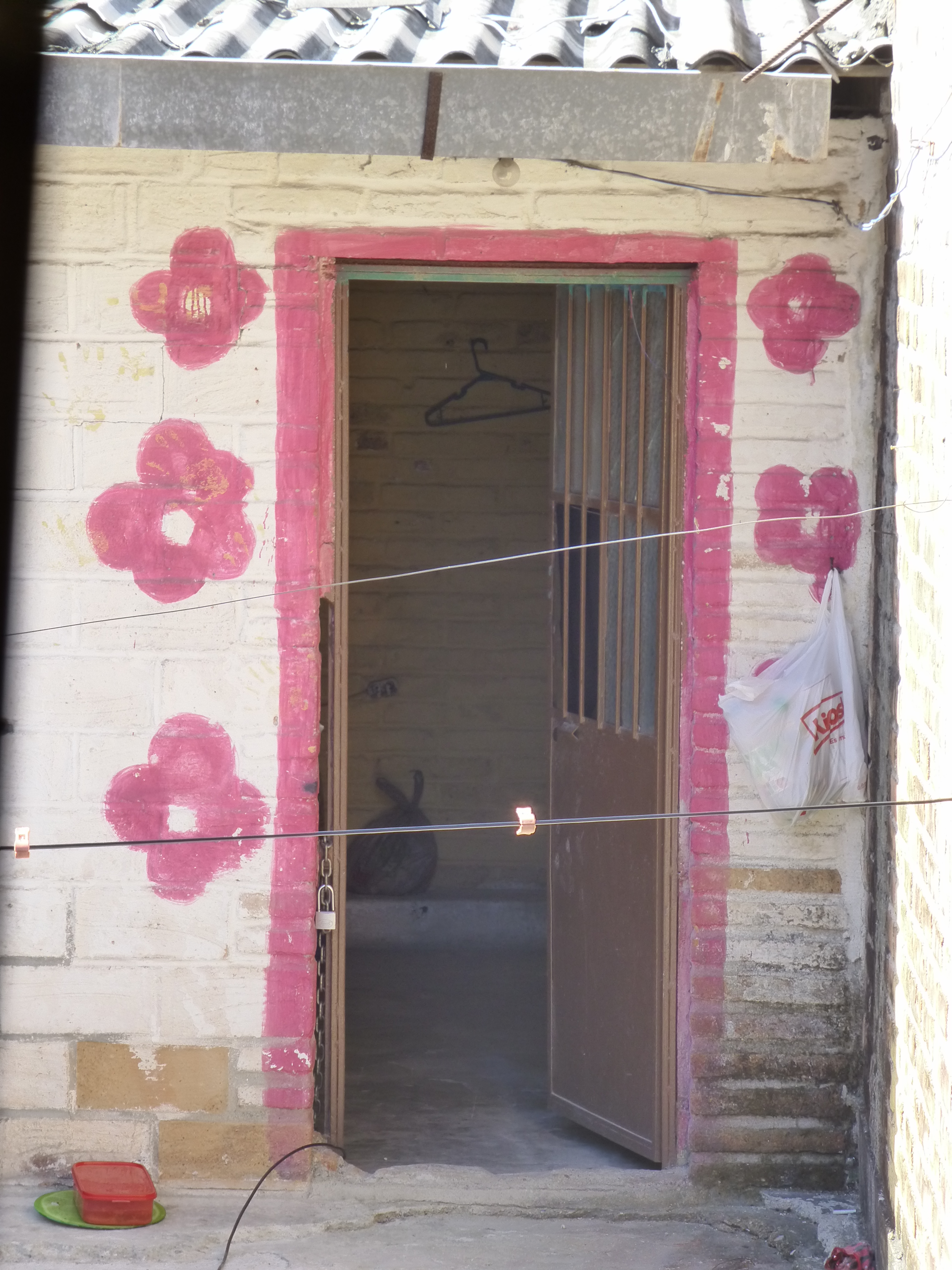 The surrounding area is quite run-down and depressed, yet this jewel of a creative kitchen space shines boldly amidst the impoverished surrounds.
The sky is perfect blue and sharply contrasts against the wavy pink paints dividing between pale and happy bubble gum of the stucco wall. A functioning drain-pipe of clean white PVC bisects the wall beneath which is a profusely blooming rose-colored azalea in a clay pot. 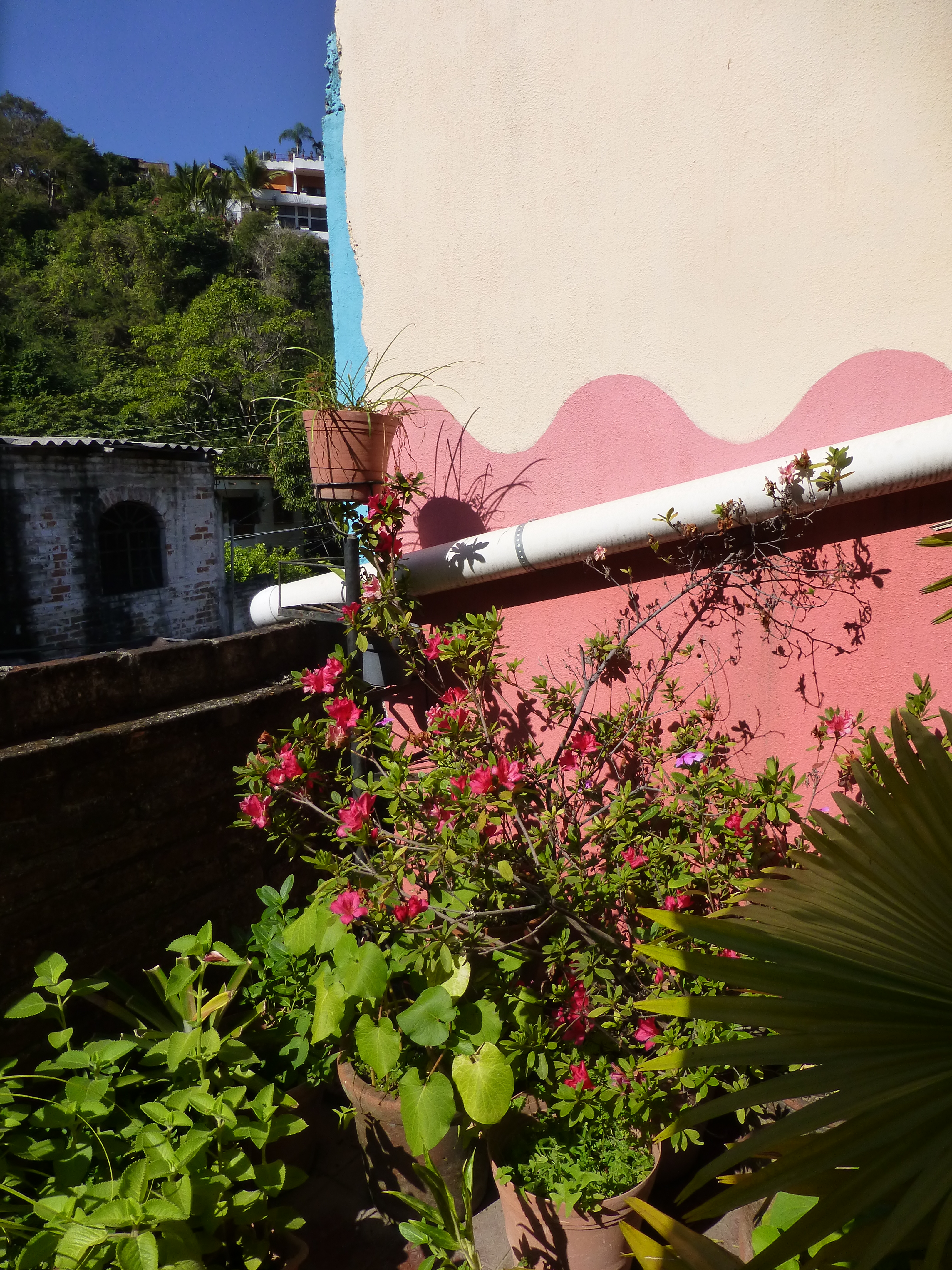
Panning into the covered portion of the space, the radiant coral color wall wraps to the back and transitions with gracefully wavy detail to a paint remarkably resembling the sky blue—of the actual sky—that we encountered out front which slams into a dazzling yellow-gold wall half painted and half tiled with the same luminous yellow color. And I have only described the backdrop!
Against these boldly painted and tiled walls are layers of other things that add even more dimension and interest to the kitchen. Blue and white tableware, glazed clay vessels, and a mysteriously faded poster of Frida Kahlo. More of the sky-like blue is hanging in the form of various sized and shaped enamel cooking pots on the coral wall.
The crisp white aprons of the two chefs pop against the background of multi-colors branded with the embroidered red and black logo of Frida with a red cabbage balanced atop her head. 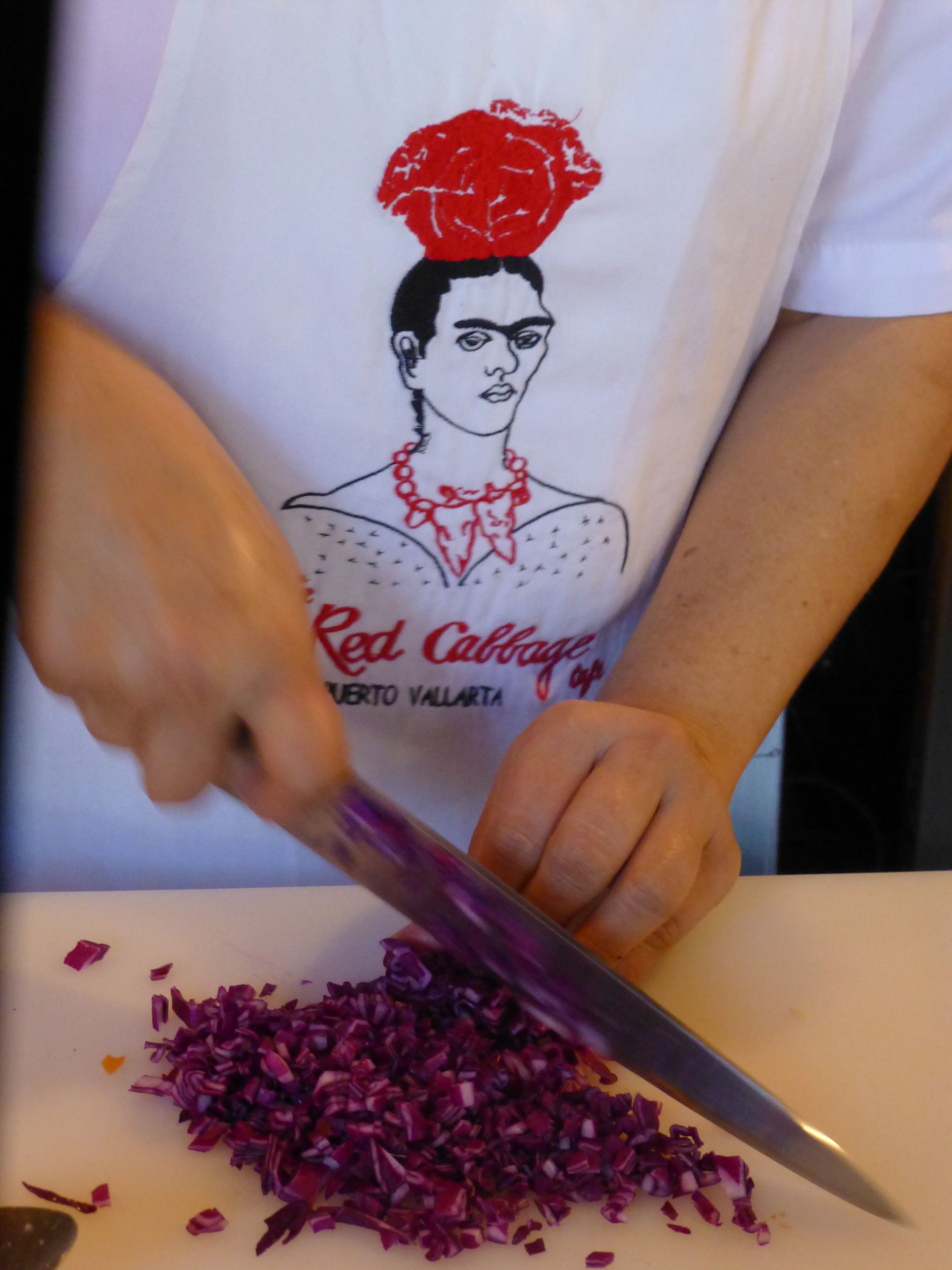
It seems from the murmurs coming from the eager students that this enchanting environment represents the promise of a flavorful feast of color and texture. The food matches the interior. The stuffing for the dark rich green roasted poblano peppers is a colorful collection of shredded carrots, red cabbage, zucchini, tomatoes, raisins and pine nuts creating a seemingly woven fabric of colors and texture. 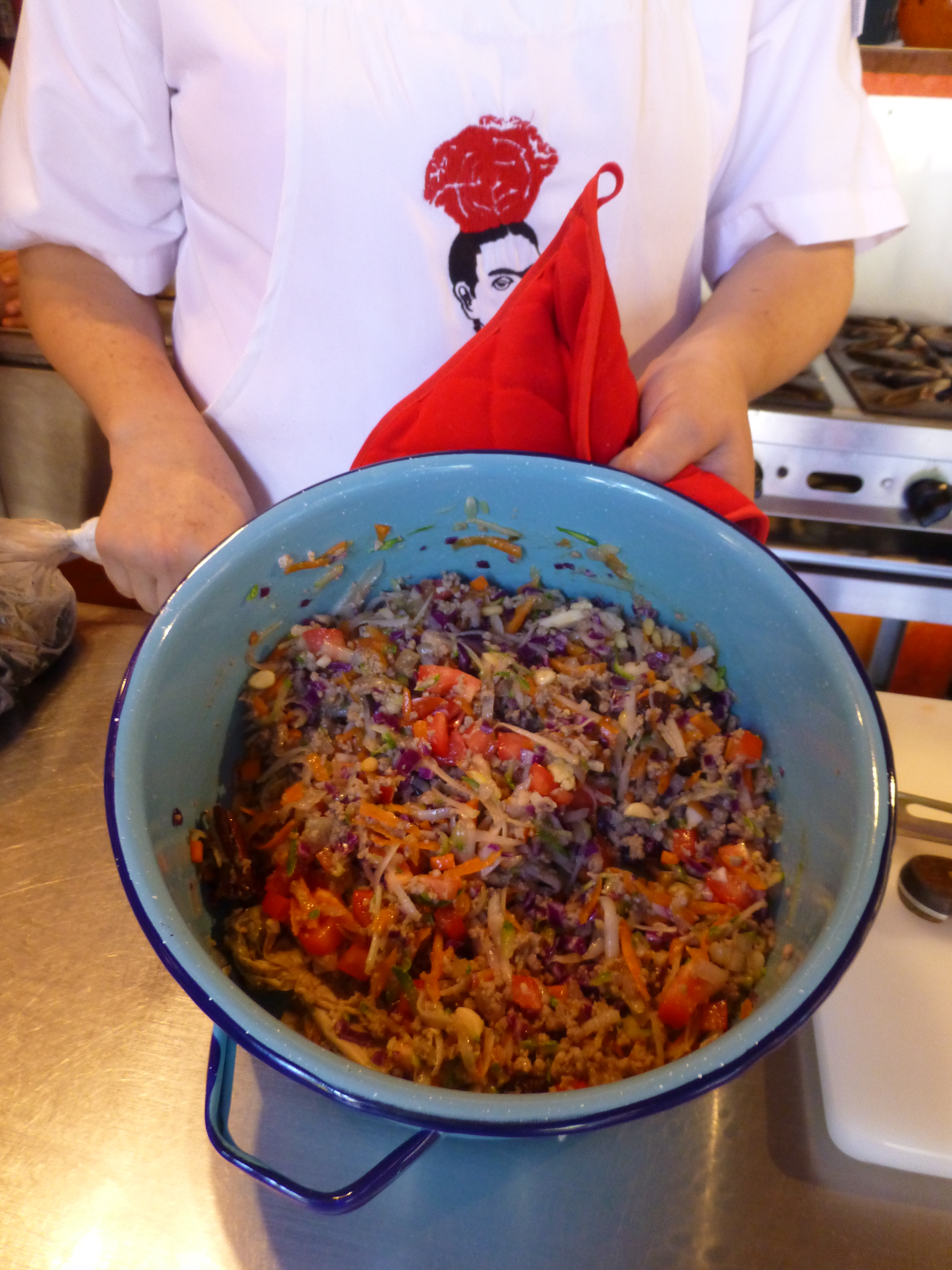
The finished product, Chiles en Nogada, represents the Mexican flag of red green and white. Plated here on red glass for an artful presentation. 
Myriad handmade condiment dishes and traditional serving pieces contribute to the collection of color we are experiencing in this spectacular sensory bombardment. And I mean that in a really good way. The intensity of the colors and layering, the structure and accessories right down to the food and its presentation results in an artistic expression that goes way beyond the sterile experience often connected with the laboratory of a commercial cooking experience.
So we say—why be status quo when you can be individually fabulous, cooking and creating in an unconventional environment that reflects the animation and joy of the flavors that comprise the artful meals?! Thank you Lola for imagining and realizing the Red Cabbage and bringing so many artful, entertaining years and delicious meals to the community of fortunate residents and happy visitors—happy that they were able to find the place!

 The characters have large saucer-like eyes belying their Japanese origin. Their story-lines appeal on many levels for all ages.
 From over-sized dangling flowers to disco balls sparkling from the rafters, the place is alive with static animation. Well, monitors too airing the vary anime of this initial topic!
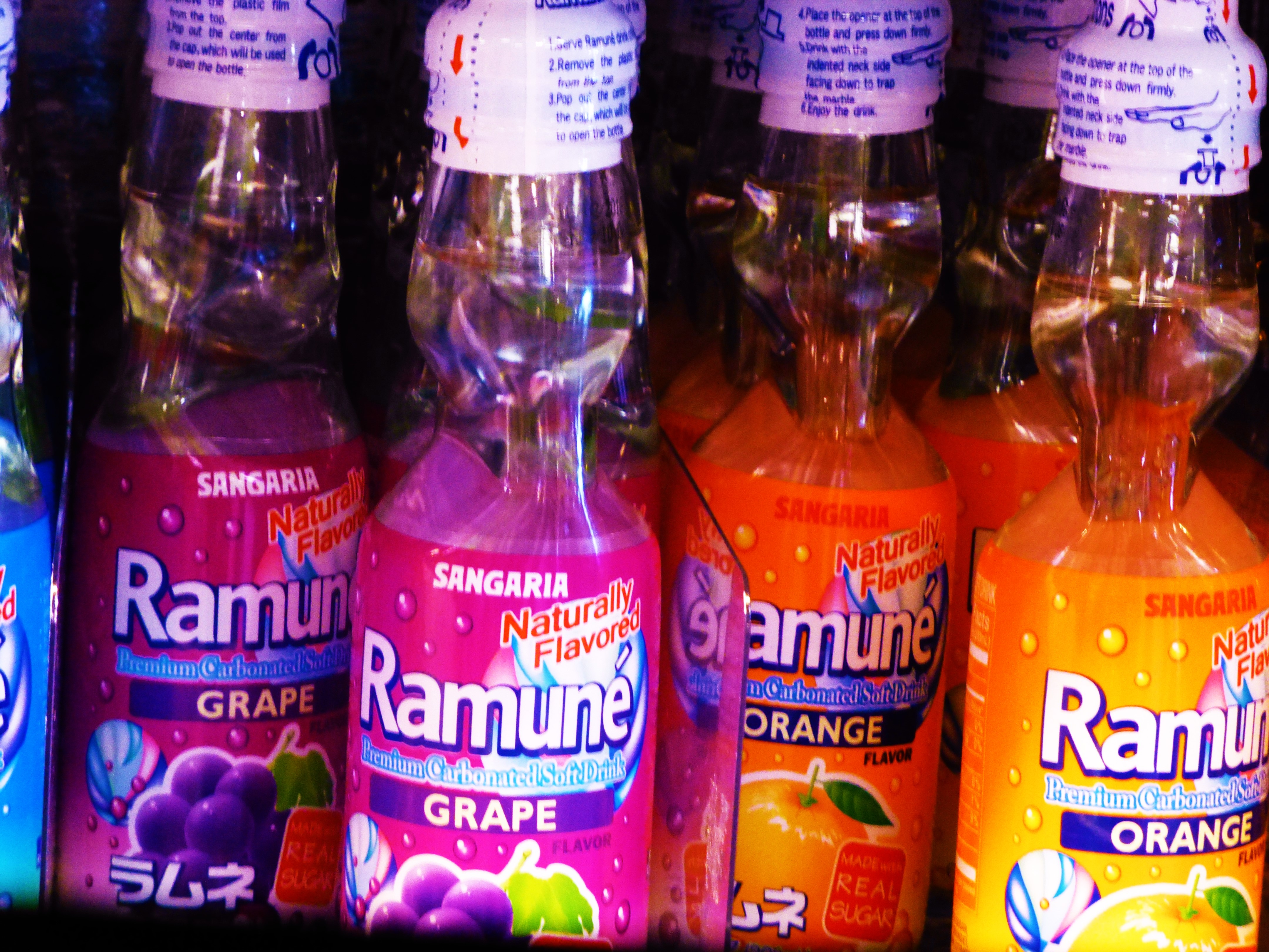 From beverage bottles to bears, pink kitties to hair and make-up lotions and potions, games and costumes – yes you too can dress-up like a bowl of Ramen Noodles or an egg yolk named Gudetama.
 Thank you Katrink for this amazing experience we shared for your birthday!!!
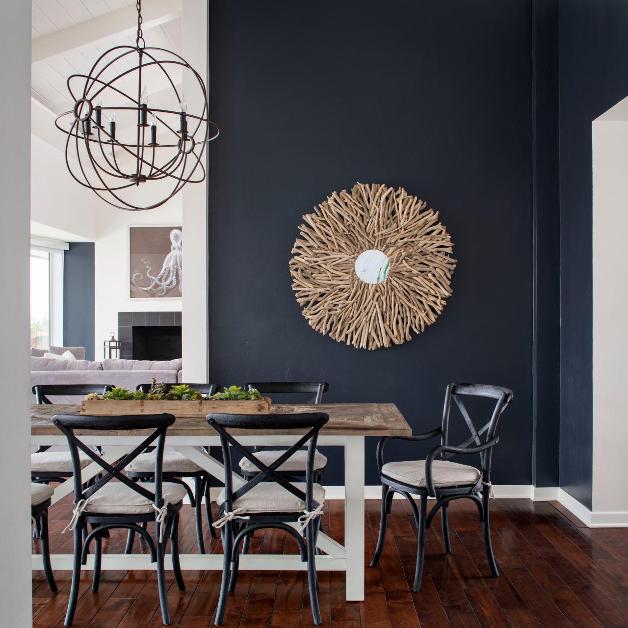

 Like reaching into a hole or looking into space, and not seeing the boundaries well. It s a brain thing. If the brain reads dark, it suggests a depth of space and therefore more than is really apparent. This is often used in ceiling treatments. Having a low ceiling appear higher, when painted dark, due to the illusion of depth.


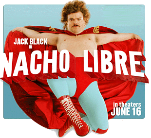
 Her lips, his costume, the children’s masks, a sunspot on a bus, the fighting ring ropes, structural elements in the arena are all so subliminal yet so vivid. Consistent and repeated use of the contrast with the bold red color in combination with turquoise is also a key element in this film.
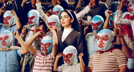
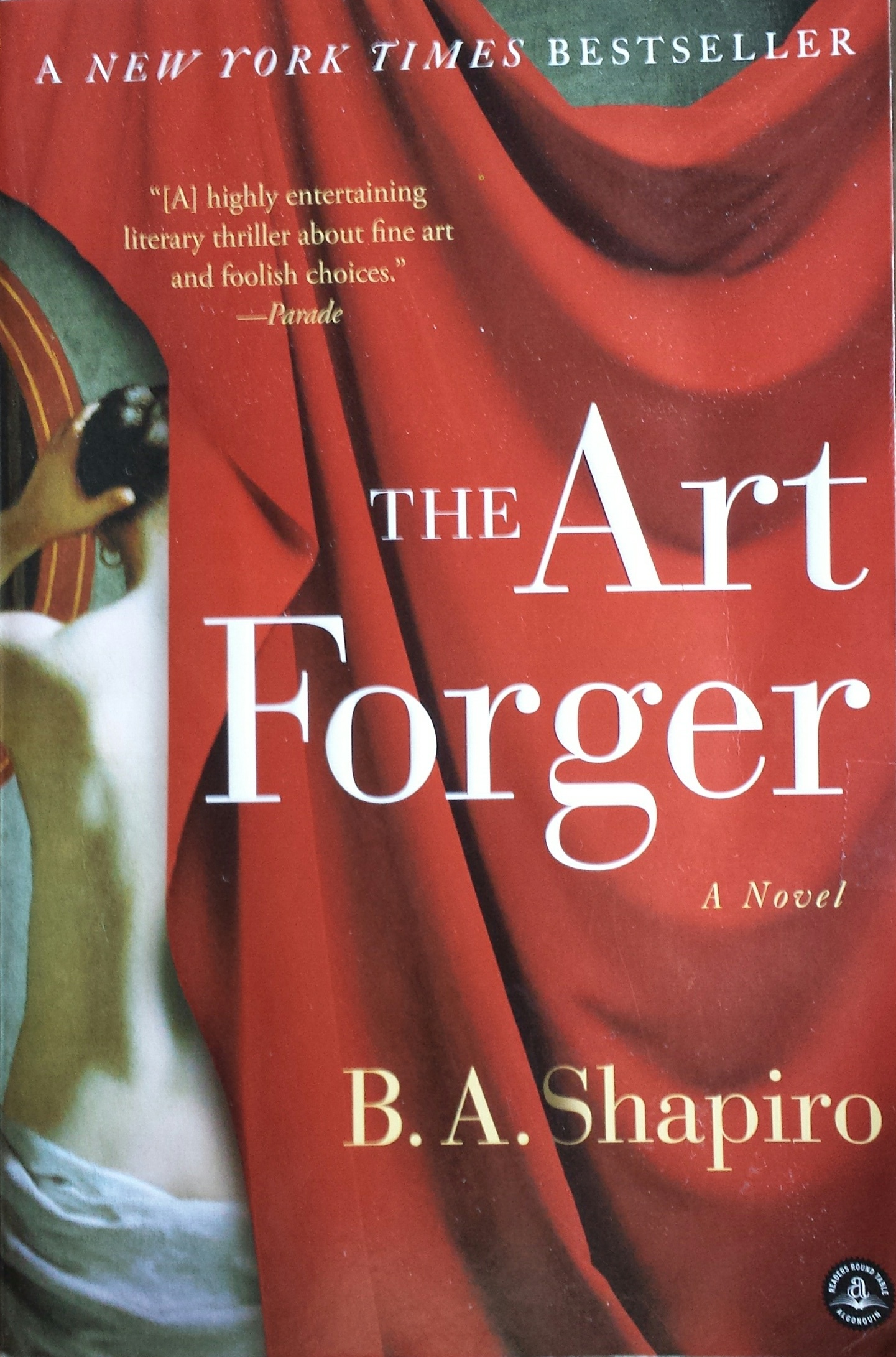 measure. I followed B. A. Shapiro’s protagonist, Claire, as she navigated the mystery of a missing Degas. Set in a relatively small footprint of NYC, the story is one that could only effectively happen here in this city of superlatives. From the best of the beset to the worst of the worst and the enormous middle ground of mediocrity which again is superlative due to its sheer density of people, texture, concentration of multi-cultural influences, exceptional urban scenarios and unique prospects.
 She is not forging as that would mean that the copies were intended to be marketed as, or represent, or be sold as though the original. Hers are legally sold as reproductions – until the plot thickens…Where a love interest, temptations of wealth and fame, innocent confusion and clever problem solving are woven between the past and the present and ultimately begs the question about the value of art – how is it established and when is it talent versus celebrity? The chicken and the egg thing or the Emperor’s New Clothes, either way,a mystery that boils down to what the market will bear.
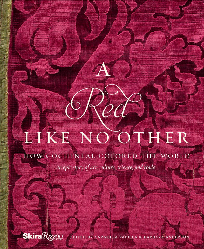
 A Red Like No Other – but unless I am on a roll, it might take me a while.


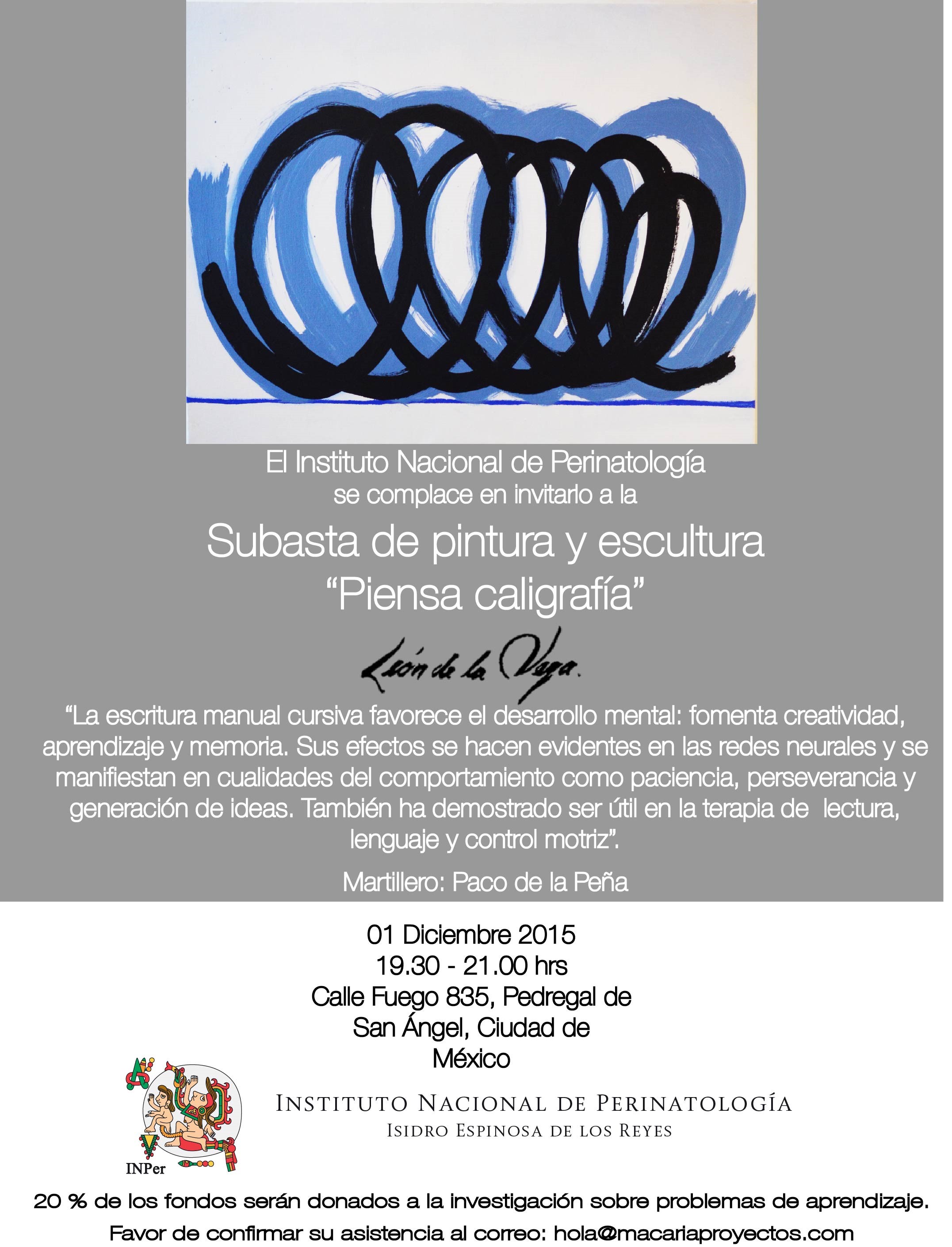
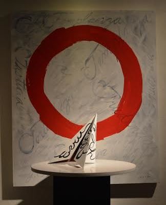
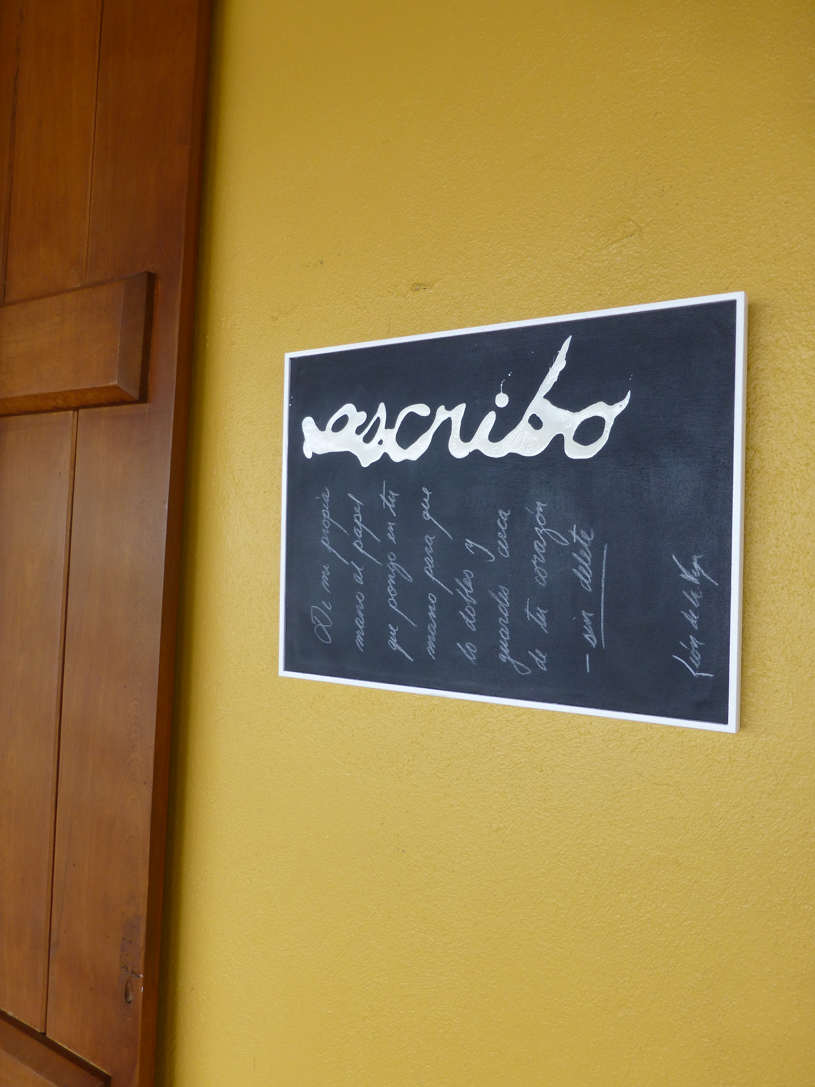
 Today the primary focus was a topic with which everyone seemed to view from the same perspective. All were in avid agreement as they discussed the recent exhibit in Mexico City from where the artist, Leon de la Vega, has recentlyjust returned. This significant event was an important auction where part of the proceeds were to benefit the Mexican Institute of Neonatology toward research on children’s learning and therapy and no less to benefit the artist expressing his concerns for the current state of affairs with the lost art of writing by hand.