SPANISH STYLE BRINGS INTERIOR SPICE

Fabulous clients – turned great friends – bought a good-sized townhome in Phoenix. It was plain vanilla inside with wall-to-wall broadloom and everything painted the same creamy neutral. They stood in the center of this bland slate and called me saying we think we want to clean this up and go with a mission-style simplicity.

They saw the ornate cream-painted wrought iron ascending the curved staircase and wanted it gone!

I flew over and saw for myself this dated interior with very good bones. Layout had great flow, nice lines, handsome coffered ceiling and other interesting features. I pondered the elements and the context of the exterior architecture. It was stucco with red clay tile roof, and iron railing details. Sure, we could slick it up, remove the embellishments…but should we?

The desert heat can be oppressive.  Some choose to embrace the glories of the sunshine and design bright airy interiors with plenty of refrigerated air to compensate for nature’s blistering temperatures.  This approach we were about to take was to be quite different, in that it offered a shady reprieve from the elements.

Therefore, despite the initial suggestion, for the style of the remodel, by my clients I offered another design direction . Why not spice it up with Spanish? Here we are in Phoenix, with architecture suggesting this genre. Knowing their bent for traditional interiors, from two past residences that we had designed together, and with a detailed discussion of the possibilities and evaluation of the elements, we agreed on the Spanish theme and began the transformation.

This is a perfect example of isolating the existing features and determining what to salvage and what to remove. Of the things to be salvaged, how can they be revitalized? So, with that in mind, the staircase was stripped of its carpeting and solid wood treads were added with custom-designed glazed ceramic tile, for the risers. A Moorish influence was the basis for the geometric motif.  The staircase’s semi-ornate railing  was  painted a dark, nearly black, charcoal. The result was startling.

Throughout the home, colors changed, stone columns and fireplace details were added, a wet bar was abandoned in favor of opening into the kitchen. Travertine stone floors were installed throughout the lower level with hardwood upstairs.

An open loft area was compartmentalized into a narrow gallery-bookcase with isolated and fully closed office beyond. Bold colors over-lap and contrast on layers of interior planes.


The result is a cozy retreat from the desert heat incorporating design elements suggestive of Spanish Colonial, transitioning to other modern elements complementing the overall design. To begin a remodel, look at the existing elements, the style of the architecture, the context of the structure and see if you can find a story.

This house now tells a story of intentional decisions, cohesive finishes, a directional theme and a finished product that represents the owners’ giving personal identity to their home.


The Importance of Color in Design – How to Begin

This last week I was inspired by a rainbow that appeared over our great Sandia Mountain and within 3 minutes I nearly tripped over a bed of flowers presenting the same rainbow of colors. With this pairing of color coincidence, I felt compelled to write this week’s blog about color.

Color can be difficult. It is so critical to effective design decisions whether graphic design, fashion design, interior design or architecture.  It might be used for a logo to brand a business , a room scheme or the exterior of a monumental building…how do you begin to select a color or a color scheme?

Well first you have to consider your client. What are their needs and desires? Once narrowed, the search for the perfect colors to convey their project’s personality begins.

Computers aid designers in finding fine nuances between colors. Exploring the range of values in a hue – the range of light to dark of a specific color and the adjacent colors that meld from one to the next has become easier.

It all comes down to the color wheel. It’s a circle illustrating the colors of the spectrum. The relationship of these colors are the building blocks of all the colors. Sir Isaac  Newton – the same of the apple and gravity fame – devised this understanding of the rainbow of colors back in the 1600s using a prism to identify the components.

As children we are taught about the rainbow of colors comprising ROY G BIV – the easy to remember name that represents the colors RED ORANGE YELLLOW GREEN BLUE INDIGO VIOLET

Decisions regarding the selection of colors and the resulting schemes are identified by the following relationships:

Complimentary –  two opposite colors on the color wheel

Monochromatic – three different values of the same color

Analogous –  three adjacent colors on the color wheel

Split Complements –  one color and the two adjacent tertiary colors of its complement

Triadic – three evenly spaced colors on the color wheel

Tetradic – two complimentary pairs of colors

As I pursued this topic today, I encountered an interesting site by a guy Jason Cohen. If you are curious to know more on the subject,  check out  https://blog.asmartbear.com/color-wheels.html

This last week, over the course of 2 days, I encountered several examples of these colors all around me. From the rainbow to the flowers and myriad balloons. It didn’t hurt that it was during the International Balloon Fiesta http://www.balloonfiesta.com/ which is one of the most colorful events in the world.


Unless we have a limitless budget affording custom design materials, it is best to begin with the materials that offer the fewest colors. I have mentioned this in the past, there are more paint colors than there are carpet colors, fabric colors, or solid surface materials. Therefore, selecting your color scheme based upon the selection of a material with fewer color options is the best start…you build from there…paint being the easiest component to finish the scheme.

Color affects mood, perceived temperature, individual’s reaction to seasonal cues, and all manner of context. Pastels in springtime and warm tones in the fall – color makes powerful suggestions and should be used as a tool with that power in mind. The power of suggestion. What are you suggesting? What are you trying to convey?

With your best intentions, colors will change with light sources, time of day, adjacent colors and people’s own perceptions. It is not a perfect science when you consider all those variables. Take caution to select colors based upon the conditions that will occur in the final location/presentation. Without fear, pick your color schemes and beware, but don’t be afraid!

Color Schemes and the Complex Simplicity of It All

Color schemes are many. Color schemes evoke a mood or convey an atmosphere. They certainly can and often are responsible for imagined temperatures and/or seasonal sensations. What constitutes a pleasing color scheme? What constitutes pleasing? It all comes down to balance, layering and subsequent interest. It takes a enlightened eye and usually cannot be achieved by accident.

We are nearing completion of a living room that incorporates many design elements. Family heirloom antiques add a vintage touch along with the architectural style of the bungalow home.  Contrasting these pieces is a sleek-lined, modern, sofa that we found and reupholstered. And while not driven or influenced by current color trends, we selected a scheme derived from the existing Persian rugs. By extracting the blue and white from the patterns to refresh the interior – a classic, timeless color combination – we blended a wonderful scheme. Finding the common denominator(s) blue and white, we sought to anchor all with this consistent theme. Differing patterns provided additional layering and interest.

Then, just last week while dashing through the DCA terminal for SWA, my eye caught the attention of several magazine covers all featuring blue and white schemes!  Always in vogue, but not always featured as the cover story, this coincidental (or not) collection of blue and white photo images was a riot! I was forced to snap a few shots to send to my happy blue and white client.

If I described a new master bath remodel project as all white, I wonder what might come to mind. All whites are not created equal and the variation is startling when you see them in context, adjacent to one another. So here is the easiest example. A fan-deck from Sherwin Williams shows a collection of whites. They “read” very differently from one to the next. Yet taken one at a time – isolated from the rest – each would seem to be just plain white. Notice too how they differ from the white paper upon which they are printed – it is the spacing between the color chips – and even the white fabric upon which they were placed for the photo!

But there is really no such thing as “just plain white.” Once seen next to another, their unique qualities of hue come into play. A yellow white is creamy, while a cool white reads blue. It’s the context that makes the  color more legible. Without that they could be assumed and accepted to be merely “white.”

So, in this recent color scheme nearing completion, whites in context show their many colors. At first glance and if asked, one would say “the room is all white.”

Upon closer inspection (photos taken from a different angle seconds apart), that simplicity is replaced by a more complex, heightened level of awareness. This complexity is what adds interest and results in a better finished product than a true monochrome. What was a collection of white materials, in this master bath, is truly revealed as shades of white varying from ever so soft celadon to cream and grey to what might be read as actual “white” white.


Don’t trust your eye when it comes to color. Discover how paint on walls changes all through the day. Artificial light-sources alter the way a color appears.  Context with other colors alters the way one perceives color. Color is fun! Colors are fun! When designing interiors, enjoy the process of layering and the varying effects colors have on each other. Simplicity is usually not really simple. That term can be deceptive. Making it look that way is an art. Encourage the enjoyment of discovery.

Moody Blues – Moody Rooms

What’s more trendy than an existing word that comes into the mainstream with a new relevance or targeted use? I’m sure you will giggle a bit thinking about some of the trendy words – original or re-constituted – that have come and gone. How do they get inserted in our popular culture? Who started it? How quickly did it catch-on and how? I will have fun with a variety of trending design words in coming blogs – enjoy expanding your design vocabulary with these if they are not already a part of your vernacular.

I’ve written about dark rooms and dark colors in the past…don’t be afraid of the dark! But to now discover that the use of the word “moody” has surfaced and playing a role in describing such spaces is novel. Trending now – “moody” rooms. Or at least describing dark spaces as “moody.”

We recently gave a face-lift to a tiny powder room. It was dark-ish before, but with a printed wallcovering from the 80s. It had stood the test of time and served the owners well, but it was time for new cabinets, countertop, hardware and fixtures.

We decided to run new floor tile from the entry through to this room. It was a large format dark porcelain. This dark chocolate leather-like look was a deep and “moody” selection to recede and add depth  to the space.

Yes, it creates a decided “mood.” A mood of somber elegance. The quiet space is perfect for the duty it performs. As a powder room, it is visited quickly and by many. We selected a velvety dark wall paint Benjamin Moore HC 166 Kendall Charcoal rather than replacing the wall-covering with new.


For interest, instead of one large commanding piece, we  gathered a collection of complimentary wall art from other rooms and even some clever thrifting (always an entertaining and satisfying treasure hunt) to create an interesting grouping to be enjoyed from the intimate vantage point.

The new lighting flanking the mirror rather than coming from a bar above is soft and  in keeping with the  colonial decor of the home located inside the beltway of our Nation’s Capital. New granite is dark and rich, white porcelain adds a crisp contrast and new cabinets coordinate with other renovated casework in the home.

When surfing the internet for design inspiration and subsequently speaking with design professionals, be clear. Picking up new ways of expressing design ideas is fun – but the simple truth is just that – simple. Keep it simple, explain your goals, go dark if you like, be a bit moody if it is the effect that you wish to achieve. Have fun and don’t be afraid of the dark!!


Regional Design Fun!

So many regions, so little time!!!! All the design directions available based upon where you are and what you love – just think!! Regional design provides a strong connection to the surrounding environs. From selecting artwork to color schemes, decorative accessories and even room scents, creating regionally specific interiors is a fun way to go. Often reserved for second homes, the novelty of focusing  on the design theme specific to the region does not always reflect real life.

Real life is usually comprised of a variety  of experiences, tastes, acquired objects, interests etc…designing around a specific regional theme is more deliberately focused and therefore not as eclectic as a person’s true life experiences and resulting accumulation of possessions and reflection of varied interests.

Seaside design would incorporate decorative accessories, fabrics and colors to represent the surroundings such as nautical themes and the elements of the natural scene incorporating seashells, seascapes, etc…

Therefore, the primary place of residence in such a locale would reflect that context but not necessarily be completely designed around it. The second home would have the novelty of centering the design exclusively on that seaside theme.

Here is a stunning example of the Americana By the Sea Bungalow! A spritz or burning of Votivo’s White Ocean Sands in this scene – oh heck – why? Just open the windows and breathe in the salty sea air!!!

While in the metropolitan Washington area, one can’t help but notice the architectural influence of colonial times and the interiors which reflect the same.

Steeped in the history of our relatively young country and the pre-colonial decorative arts that came across the water to the New World, the antiques, reproductions and embellishments are telling.

This whimsical casita in Santa Fe illustrates the colorful folk-art of both old and New Mexico, bold paint colors, graphic transitions, and the enchanting architecture of adobe charm. As a second home, the extravagance of collecting and displaying in a fanciful setting is a fun, on-going project!

A corner cabinet by acclaimed folk-art painter Barbara Peabody makes a bold statement housing additional collectibles from Old and New Mexico. A giclee print of a fabulous watercolor by Susan Weeks – the art of decoratively detailed cowboy boots.

Where do YOU live? What themes from your area do you incorporate in your interior design? Get out there are soak it in, gather ideas, start collections, buy local and have fun!!!!!!

The Accidental Art of Beet Paint

This week is a bit spontaneous as it has been a busy one. Lots in the mill so upcoming blogs will have some good fodder. But our anniversary punctuated the center of this last week, on Wednesday night, and I couldn’t resist sharing this delicious coincidence. These splendid short ribs drizzled with a roasted beet root reduction made a sensational presentation. The fresh greens and artful placement of whipped potato dollops with a handsome chunk of juicy, perfection – tender boneless beef atop – all laced with the fabulous fuchsia tumble of tender baby beets and their sassy sauce was an aromatic and visual treat for the senses.

I cut away at the magnificent morsels scraping the gooey beet paint as I went along…

Good ’til the last drop, I hated to be finished. As I ran the edge of my fork over the hot pink cochineal-like residue of all that was left of my delectable dish, the waiter came by to clear and exclaimed- “a heart!” And so it was. An artfully noteworthy finale, to a wonderful evening. Happy Anniversary!


Let There Be Light for the New Year!!

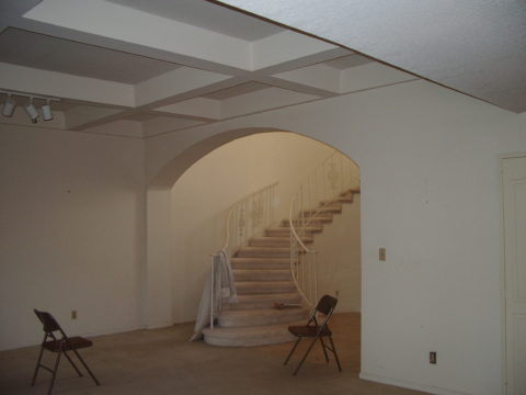
Short days and longs nights…Do you find that your interior is dull, lifeless and even feels a bit cavernous after dark? As the sun  sets and the lamps come on, the effects can be horrible, adequate or sensational.

Poor lighting can have remarkable subliminal effects on mood, energy, and attitude. The subtle signs of poor lighting such as dark corners, shadows on faces, difficulty reading and dull colors are all important factors that contribute to an uncomfortable interior in these short days of long, dark nights.

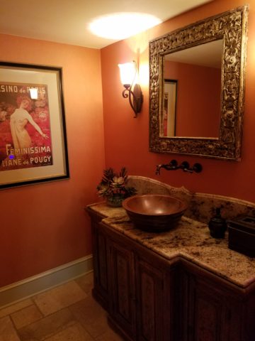
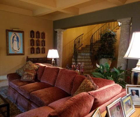
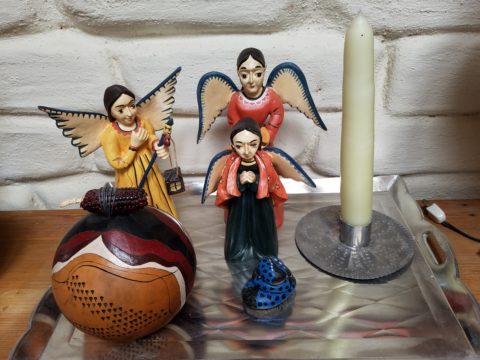
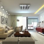
Lighting has multiple reasons for being—three primary ones—to see, yes, ambient light. But to do tasks (reading, sewing, playing games), and accent lighting to illuminate artwork and other interior features. Mood lighting such as candlelight (once the primary light source – now an effect in most cases) is a lesser but effective  lighting tool.  Good lighting makes amazing differences.

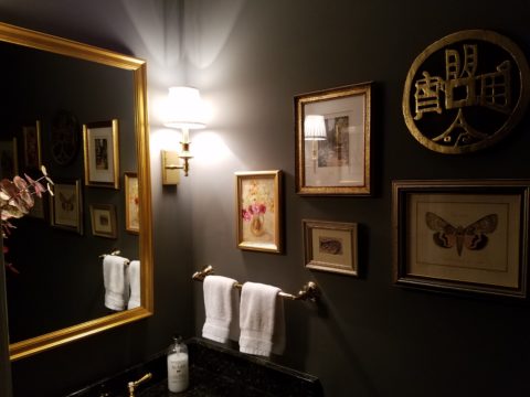
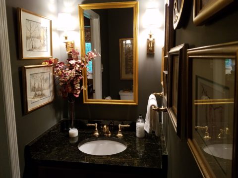
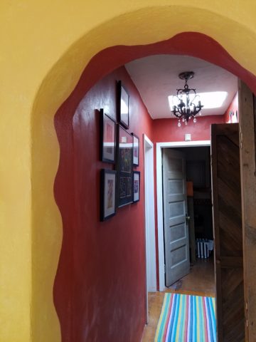
Beware of down-lights. Lights that shine down from the ceiling. Although a very effective and common lighting tool, they must be balanced with good ambient light.  I have often used this example of sitting in a restaurant across from your date and their face is painted with ghoulish dark shadows under their eyes, beneath their nose, and accentuating all the folds of their features. It is the opposite of a kid putting a flashlight under their chin shining upward creating similarly haunting effects. Creepy. Certainly not flattering.

2008-10-13_001

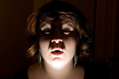
The same unpleasant effects happen in the home. It’s such a common malady of ineffective lighting that most people assume it is a necessary evil of short days. It’s sad—no, really it’s SAD—Seasonal Affective Disorder! To treat the serious effects of this syndrome there are many studies and inventive solutions, but for most of us, the less arresting effects of poor lighting can be greatly improved and our lives enhanced.

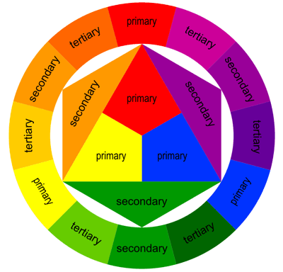
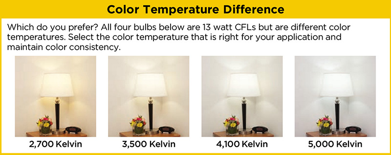
To begin this process of evaluating your lighting an improving it right away, start with the lamps—the light bulbs! We have so many choices these days including the familiar incandescent, compact fluorescent, and the newer LED with excellent color choices and low energy usage.  We could talk about the “temperature” of light sources measured in Kelvin, but we won’t—only that it runs a spectrum of warm to cool.

e6bca6db6f0faf4f9ecb0775cb4bc4eb

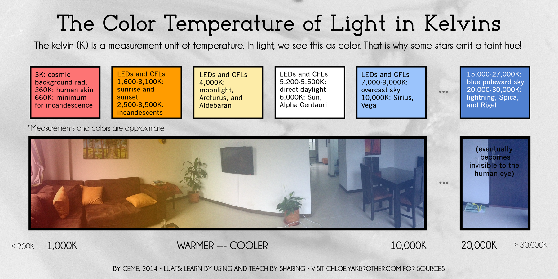
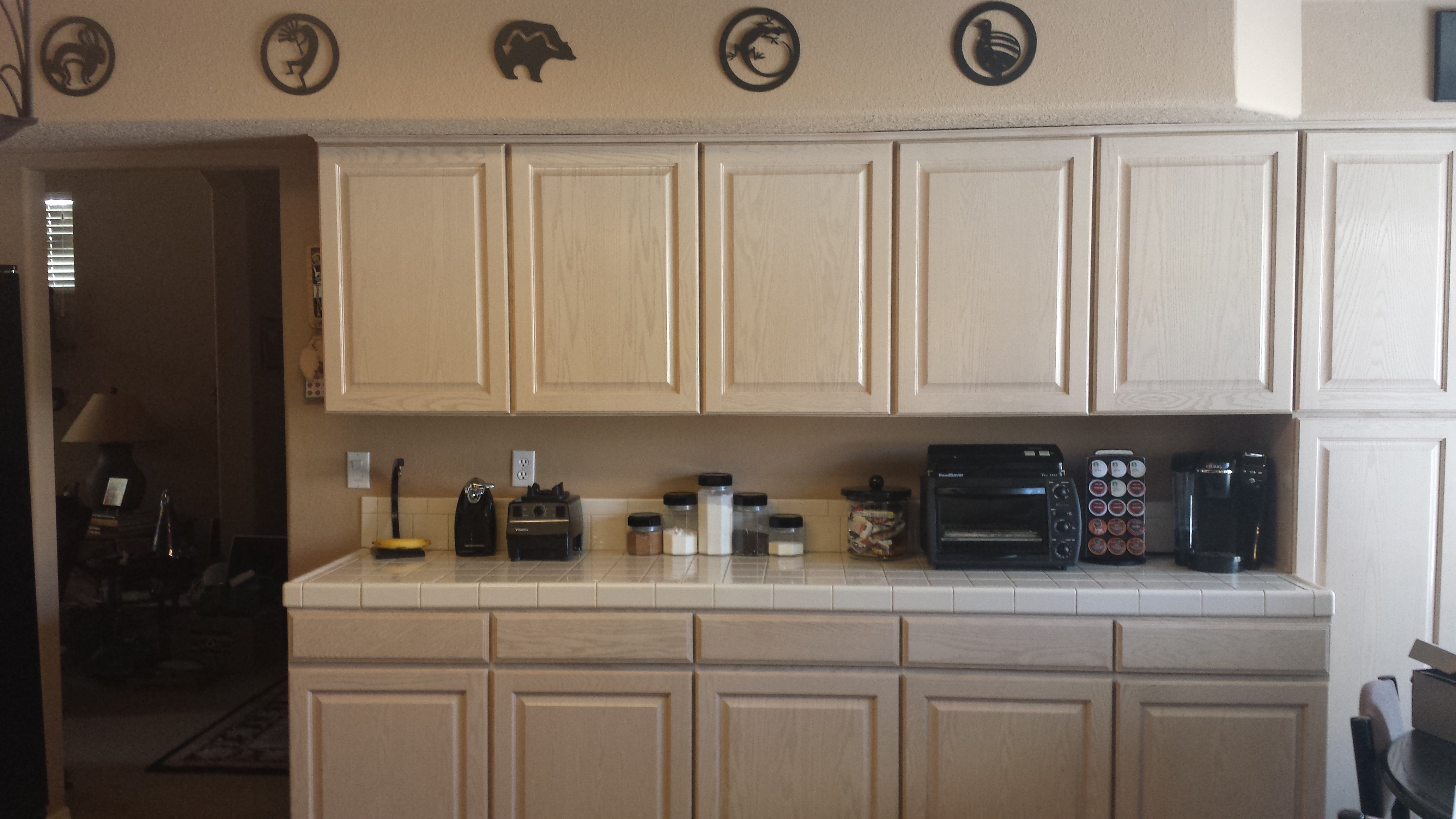
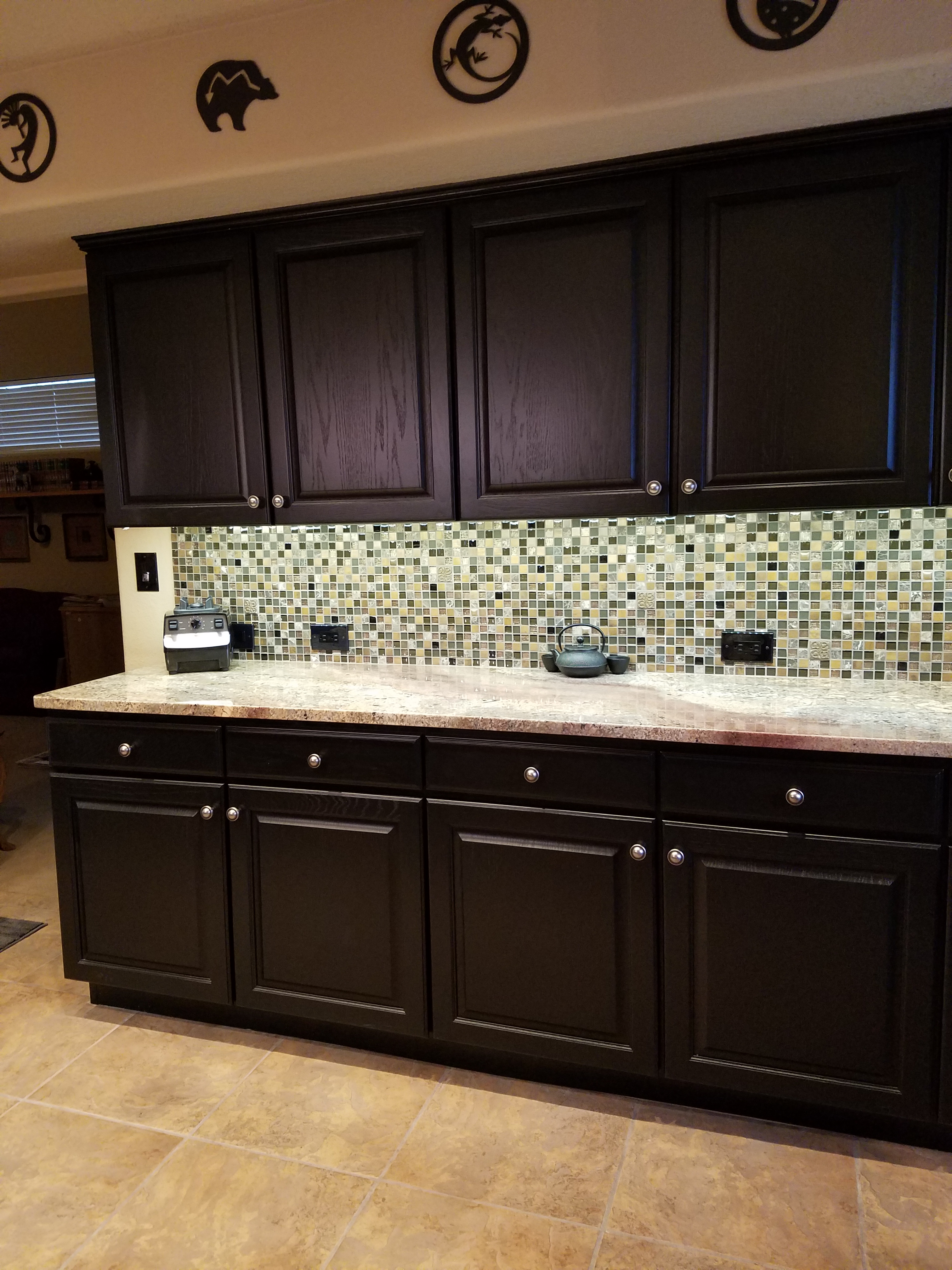
Walk around your home and look specifically at the color that glows from the various light sources. Does it look yellow? Does it look white? Does it look blue-ish? Recognizing these distinctions from warm to cool is the start.

light_bulb_color_temperature

Where are the shadows? Are the corners dark and recessive? And, when you combine these two, do you find, for example, dark areas and yellow glowing sources? Sometimes that soft, warm yellow is preferred while other scenes are made more intentionally crisp with cooler light.

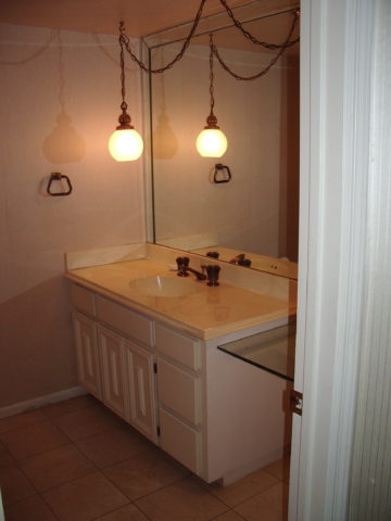
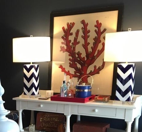
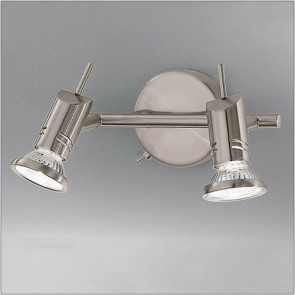
Experiment with different lamps in your fixtures – light bulbs in your table lamps and recessed cans, hallway sconces and bathroom fixtures. It’s a fun experiment and very illuminating – yes, the pun was intended.

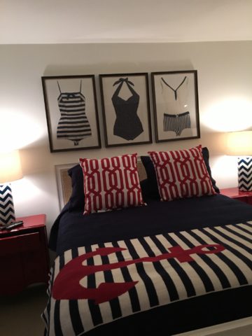
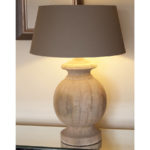
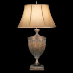
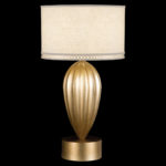
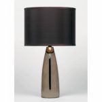
Are your lamp shades opaque or translucent? Do the shades themselves cast a color? Do they block the light or allow it through? Do they throw the light up and down or up, down and out? This is another detail of which to take note.

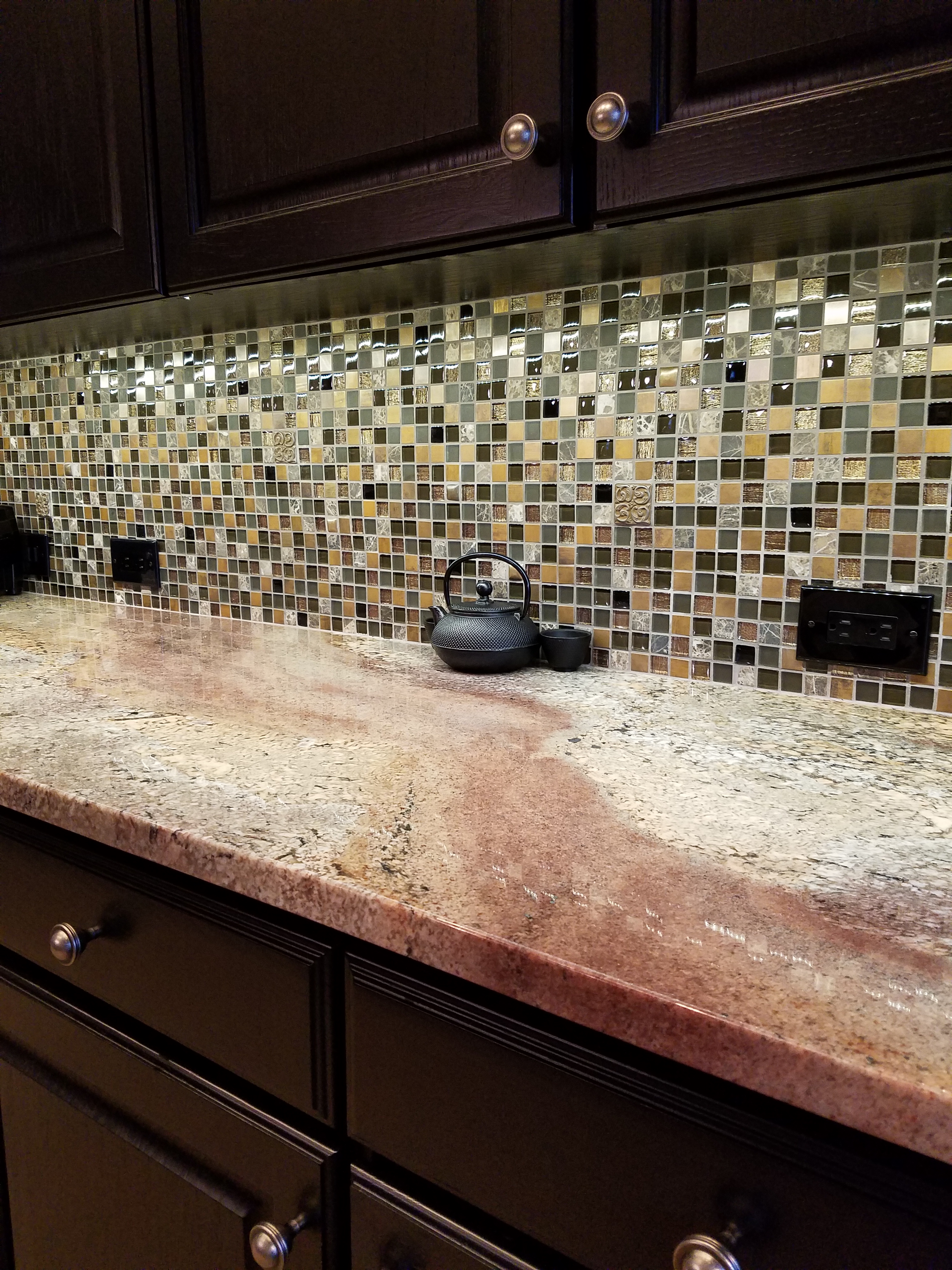
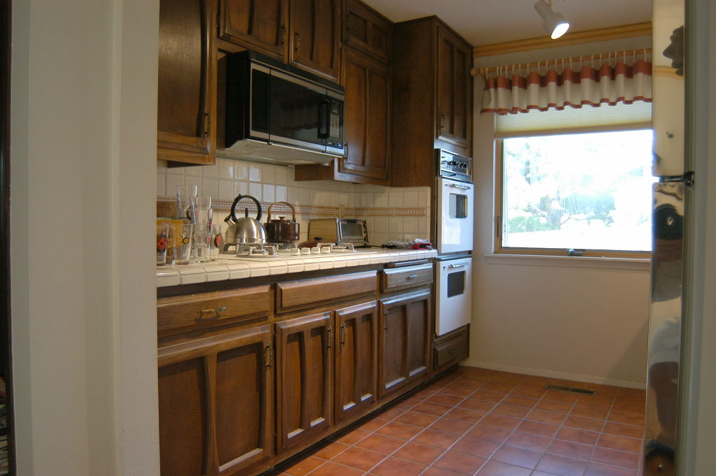
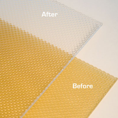
If you have dated recessed fluorescent tube units – common in kitchens for example – they are often housed in a box either recessed or surface-mounted on the ceiling. Take a look at the plastic lenses – are they discolored and yellow? This aging process can dramatically affect the quality of light that is emitted. So if you are not ready to replace these fixtures with more effective modern lighting statements, try replacing the lenses.

001-flat_sheets_before_after

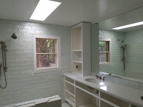
A similar installation is that of skylights which have fluorescent lamps up inside the wells with that same plastic lens over the opening to the skylight. The original idea was to have the natural light pass through during the day and artificial light take over after hours. The lens  was to intentionally conceal the unattractive fluorescent tubes, but it sacrificed the depth of the framed well. A quick update is to remove the lenses and fluorescents and expose the well of the skylight adding dimension to the room and eliminating the unattractive lens that conceals the dimensional cavity. Recessed can fixtures around the skylight in the surrounding ceiling are the most common solution to this transition from old to new, a cable can be strung, pendants can be hung, but if budget constraints prohibit that investment at this time, you might investigate the power source up inside the skylight well and replace the fluorescent fixture with an inexpensive, adjustable, surface-mounted spotlight – perhaps with two heads to provide light from that same source while opening the skylight well without the unnecessary lens.

franklite-scintilla-2-light-nickel-finish-spotlight-spot8882-a94

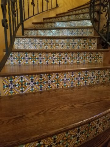
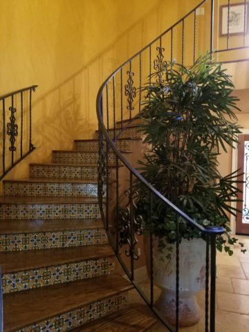
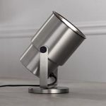
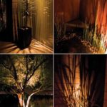
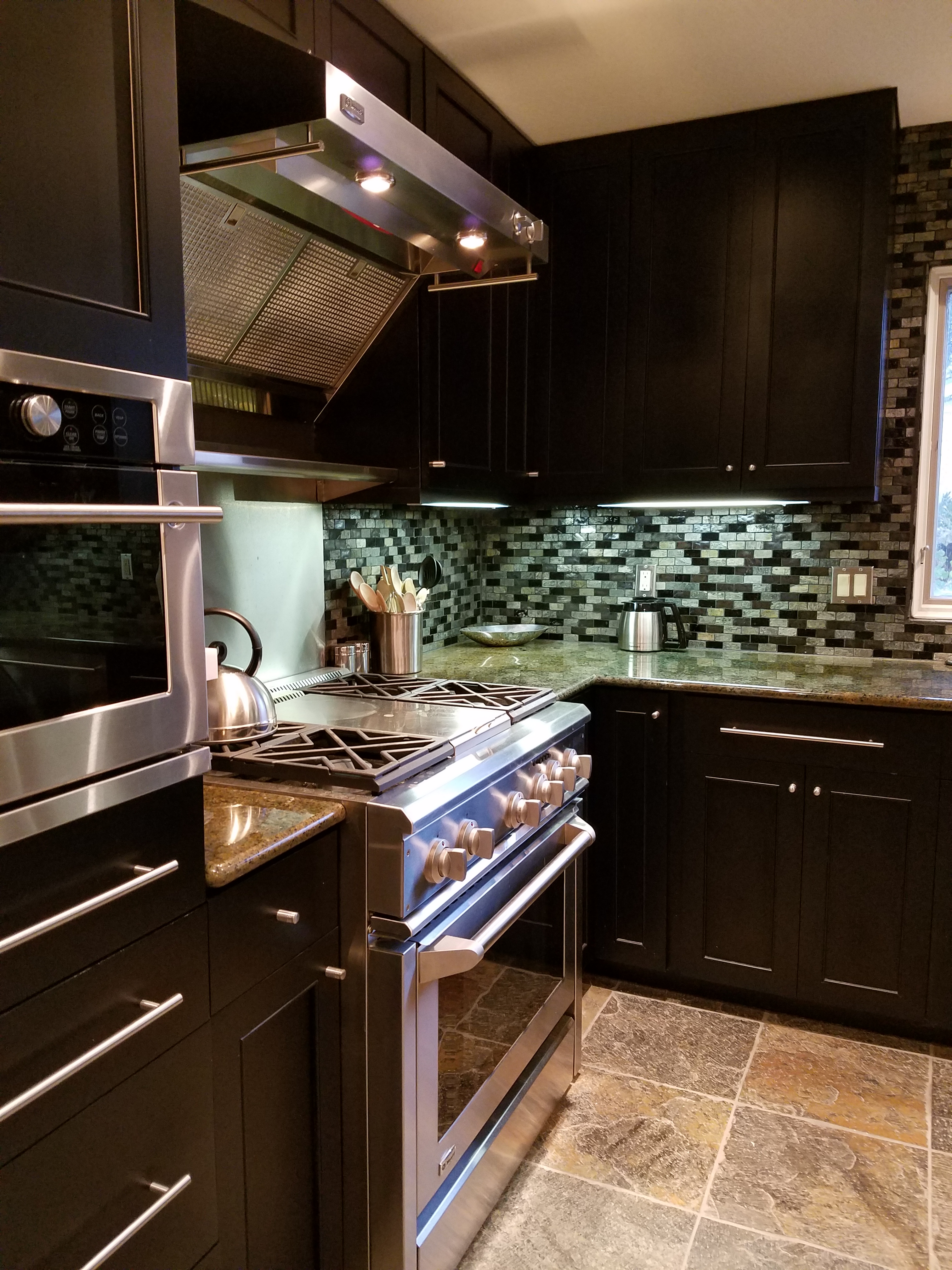
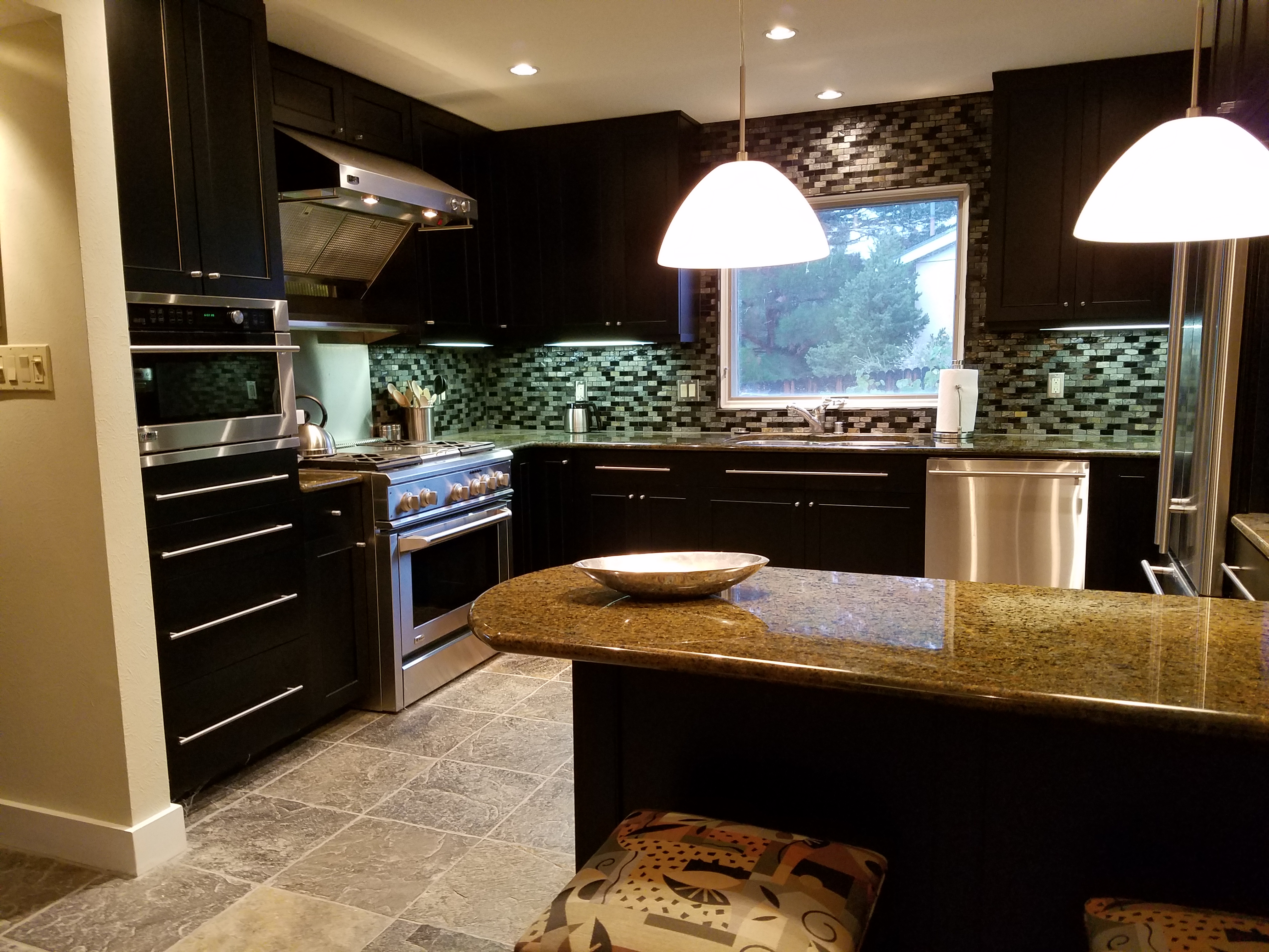
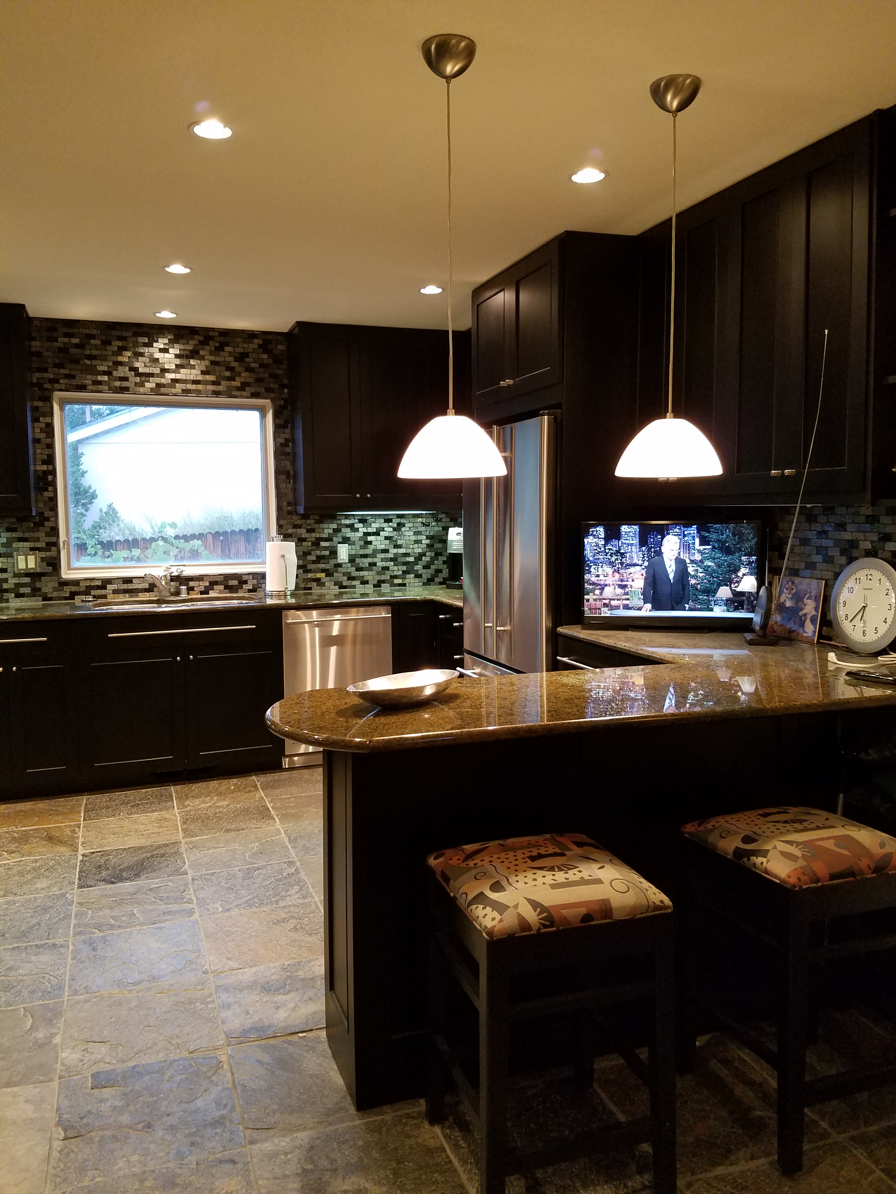
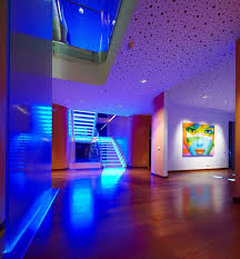
The dark pockets around your rooms can be improved with up-lights in corners and up under plants. Inexpensive fixtures are available at any lighting store or big box home improvement stores. Place one of these up-lights (remember to select the color “temperature” that pleases you the most) and see what that additional pop in the corner does to open your space. When up-lights are used beneath plants to shoot upward and cast shadows onto the walls and ceilings can create drama and exotic interest at night. This is true both indoors and out.

Torchiere floor lamps are those that face upward. Like a torch, they send the light toward the ceiling – another effective splash of light in an otherwise dark space in the room.

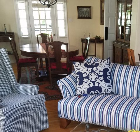
Colors are radically affected by the color of light that shines upon them. Therefore, an interior color scheme can be horribly tweaked to not resemble at all the actual colors chosen and combined to create the scene, when artificially illuminated after dark. Contrarily, colors can be rendered with great brilliance and accuracy when illuminated with the right combination of lighting. (although daylight contributes in these two examples).

By the same token we can have great fun and “paint” with light creating a color scheme entirely with colored lamps washing the walls, and interior elements just for the art and exercise of doing so, but I digress.

images

In summary, look around your rooms after dark and look for opportunities to make changes that will dramatically affect the comfort level – the results will be startling!!! If planning new construction or remodel – have plenty of light in key places throughout the space. Think dimmers so you can control the amount of light. Let there be light in this Happy New Year!


Color of the Year 2017 Greenery!!

Ta Da! Pantone announces its color of the year for the coming 2017…drum roll please…and the color is Greenery!! Yay!!! Last year there were two  – yes, imagine that – they couldn’t decide so they slurried Rose Quartz and Serenity resulting in a pale, cool, wimpy blend of soft rose and lavenderesque shades into a blended wispy pastel dream. Non-committal, in my opinion…lacking confidence.  Last year the rationale was stated by Pantone’s Executive Director, Leatrice Eiseman as…

pantone-color-of-the-year-lee-eiseman-quote-2016

But this year they have it with this fresh organic hue in a yellow-ish shade primed for this year’s rationale from Ms. Eiseman which is:

pantone-color-of-the-year-lee-eiseman-quote-2017

I have always loved green. I grew up in a Virginia jungle of a suburban neighborhood inside the Beltway surrounding my hometown of Washington DC. where the first signs of spring were the tiny tips of dogwood leaves poking forth from the delicate branches of those beautiful under-growth trees. The dogwoods were the graceful, human-scale layer beneath the towering canopy of the immense, rigid, vertical tulip poplar and white oak trees that commanded the woods.

Soft mosses, lacey ferns and perky lily of the valley carpeted the hidden pockets of our backyard. New growth is that prediction of amazing renewal and promise of the start of summer. So it is a prime observation that as Eiseman states in her 2017 rationale “greenery…bursts forth…with a reassurance we yearn for…” although I do not feel this is peculiar to this year as winter always makes me yearn for greenery and the reassurance  that spring and summer will return.

My mother also loved green and that probably influenced my childhood perception of comfort and context of it in interior design. She had and still has an eye for color. In 1959 she selected an amazing sculpted wool pile carpet in a warm, dark, neutral, taupe tone and built upon it a color scheme of pinks and greens that was subtle and relaxing, organic and contrasting, blending beautifully in our wooded setting of verdant lushness in which we were cozily situated.

That was upstairs where we felt like we lived in a flowering tree house amidst the dense collection of green leafy between the trees and surrounded by all shades of pink and white azaleas. Downstairs, where we retreated in the winter months, her greens were mixed with gold tones creating a warm interpretation of the greenery around us.

When so many in that era, between the 60s and 70s, were styling interiors with heavy oranges, browns and golds,

orange-and-brown-f934b00ae8a8aabb9fa7d7d8e3ccec30

my mother gravitated toward Lily Pulitzer’s fresh, tropical palette of lime green and hot pinks, clean crisp turquoise and citrusy lemon yellow – both in her wardrobe and her interior accent colors.

most-popular-lilly-pulitzer-prints-no-names

Our beach house was turquoise and teal, navy and tan – the sea and the sand.

Following color trends is a slippery slope. I have blogged about it in the past. Adopting that which is often a combination of colors instantly records a place in time when everything from bath towels and shower curtains, bed dressings to draperies appears in the marketplace and inserts its predetermined obsolescent combinations into the lives of so many who would rather catch the wave – often behind the crest – to own and participate in what is conveyed by the market to be the “in” thing to do and to have.

It is best not to embrace and adopt the combinations that the market presents. It is better to select color and combinations that transcend the trends – skirt them so as not to fall into the trap of dated color schemes and tired combinations. Some avoid the trap by staying neutral. The safe, timeless colors of whites and grays mushrooms and taupes- but where is the risk and fun in that?

“Too bad for them” I often remark. It is such a missed opportunity…a limitation to select colors that you think you are supposed to like rather than those that truly bring you joy. I say “go for joy every time.” Color is such personality. It is a stage-setting element. It is a backdrop or foreground. It is a theme. It is an atmosphere.

With all that having been said, I for one am thrilled with this fresh selection for the new year. A bright beginning full of hope and new growth, fresh starts and positive forward movement – organic and life-affirming. So seek the colors that brings you joy and go forth with color in this new 2017 soon to arrive. My personal schemes will always have greenery!!!

Don’t Be Afraid of the DARK!!

For a while in the world of design trends, dark colors intimidated. Bold designers dared to apply dark eggplants,  chocolates, charcoals and black to surfaces of their projects, but only a rare few clients would take the leap. Now it seems that we are seeing people accept the dare and more dark surfaces and intense envelopes of color are appearing on the scene.  I have often been asked – “Won’t it make it small?” or “Will it be too dark?” and the reason I am making the suggestion is because I already know that it won’t!!!

I’ve blogged about small rooms with dark walls in the past, but two recent projects featured my recommendation for dark cabinets. Not dark walnut or the market-saturated “espresso” which is the trendy generic for “whatever the wood – or pretend wood, we’ll make it dark brown” – very dark.

In this first case, my client – friend after many years of consultations – brought me into their home that they had occupied for a couple+ decades. It began with the  “pickled” wood cabinets that were in vogue at the time – stained red oak with a white-wash that resulted in a peachy finish. When we first did a “punch-up” we added steel cut-outs of Mimbres designs affixed to the soffit. We also added a black table and chairs with a splashy fabric as a valance in bold colors intertwined with black. The drama lifted the anemic peach theme to new heights.

Fast-forward another 15 years and my dear client was ready for a change. She called and brought me into that familiar kitchen scene and announced that she thought she wanted to re-purpose/paint her cabinets white. l looked around the adjacent family room and beyond and pondered this request.

What you might like in a magazine spread or a Pinterest post is not necessarily applicable to your context. I visualized the dramatic change. Looked at her floor (oh, we had upgraded to a large format stone-textured porcelain from the original 8×8 glazed ceramics in the last 15 years – perhaps a decade ago), looked at her family room furniture and finishes and said “I’m not so sure that’s where you want to go.”

I knew she was fairly thorough in her investigations and would not have called me prior to doing quite a bit of research and trend monitoring so I tread a bit softly when I said “I think you should go black.”  And her response was EXACTLY what I expected as she repeated the color in complete quizzical surprise.

“Yes” I said and continued to explain why. She loved her fabric that had been hanging over her breakfast nook window for years. The table was virtually unused and the steel cut-out art was one of their favorite design elements. Black was a natural. “Don’t be afraid of the dark.” I laughingly said.

Black on oak gives a wonderful moiré effect to the grain texture as it reads though the painted surface. It’s a bit exotic, rich in texture and interesting to boot. So with a bit of hand-holding and massaging the description of the intended finished effect, she took the leap – husband in cautious adgreement – they braved this bold departure from the norm.

We first selected a granite to coordinate with the floor tiles and the soon-to-be black cabinets. A swirly geology of glorious goop featuring the rose-clay tones of the mottled stone floor with black tracing through and clear quartz for pizzazz. We then set forth creating the back-splash which began with her love of glass – but to depart from the off-the-shelf 1×1 offering we cut away sections and punctuated it with 2x2s and some 1×1 domed bullets that added further interest to the multi-toned field. 20160906_173401

With those complimentary materials selected, we began the process of painting the cabinets. Boxes in place and door and drawer fronts finished off-site. All flawlessly sprayed, with many coats of conversion varnish tinted black, the transformation was dramatic.

20140418_10474120160906_173522

The second example, of this fear of the dark when it comes to finishes, was another kitchen which was a small galley-styled golden walnut stained oak 70s model. To which, we added a rough iridescent slate floor to complement the existing stone fireplace – of the same material – only in boulder form. Seemed at this point, for this sophisticated bachelor, the perfect complement to the handsome slate would be striking black cabinets. In this case –  new, without the character of the oak in the previous project, as the cabinets were completely replaced and the new selection was made from a factory fabricated series. Similarly dramatic, the sleek black was perfect against the slate’s rugged grey/golden iridescence.

kit10-resized20160906_183640

The galley footprint was greatly expanded, by carving out of the garage work-bench  area. And again, the transformation was daunting. Here we selected a mosaic of horizontal stones and glass for the backsplash – one of the stones was exactly the same iridescent grey-golden slate as the original fireplace and stunning new floors throughout.

20160906_18371520160906_183747

Be bold, be brave and consider your context. You might just find that black is your best bet to transform your cabinets into stunning statements.


Bonetti Designs Like a Party with Dr. Seuss, Willy Wonka and Dali

This month’s Architectural Digest August 2016 sports Anderson Cooper lounging on the  cover in a backdrop of lush tropical vegetation and a glistening pool. But it was what I discovered inside about which I blog today. Paris-based designer Mattia Bonetti and his love of color and wacky style caught my eye. How could it help but do so? His creativity gone wild with little restraint is like Dr. Seuss parties with Willy Wonk and Dali!! Fanciful forms and incredible colors are the signatures of his psychedelic scenes.

Whether you like his designs or are a bit overwhelmed by them, he made a profound quote that I think bears some discussion. Evidently the author of the article, Mitchell Owens thought so too as he isolated it as a leading statement. Bonetti predicts “If people who can afford incredible decors keep commissioning bland minimalist interiors, it’s the end of decoration.” 20160804_091417

I loved that statement. Yet inasmuch as I appreciate the bland minimalists for their value in their own context, I just liked the premise that decoration is what puts things out there. It’s what sets things apart. It is what stirs new creativity, commentary and explosions of art and design decadence.

Decoration – boldly going where no designer has gone before, Bonetti creates many of his pieces from tables to lamps,  rugs to headboards and all with a fanciful animation that nearly comes alive. Like it or not, you can’t help but react. It catches the eye and forces response.

Fine scribbles on the wall in a graphite grey contrasting with loud geometrics all with splashes if not washes of color – maybe better said drowning in color in some instances – Bonetti is not afraid. Embracing the extraordinary he mixes and crashes his forms and  colors in screaming crescendos that excite and disturb. His tables look as though they could walk – or slither – or in some way motate themselves across the room. 0816-bonetti-hong-kong-house-5

As a designer we should (my opinion) be designing for the client. To find a client who would want such creative experimentation is rare. Either in cases of wild abandon, second or third homes, freaky fanaticism over art and decoration – they are not the rule, but could be fun if given the license to proceed.

20160804_091447

Hula hoops…Iridescent life-savers…fun with circles and stripes of color!!!

I play with color. As evidenced in my portfolio www.patriciandesign.com but never with such unfettered, unleashed audacity. Yet I believe that color is the best way to punctuate a design.

An overall view of Bonetti’s work will unveil these fanciful forms for sure but not always accompanied by the intense colors displayed in this featured article of the Hong Kong apartment. But Dr. Seuss’s design influence is nearly always present in his creations which are inspired and freeing. So let’s unleash decoration today!!!